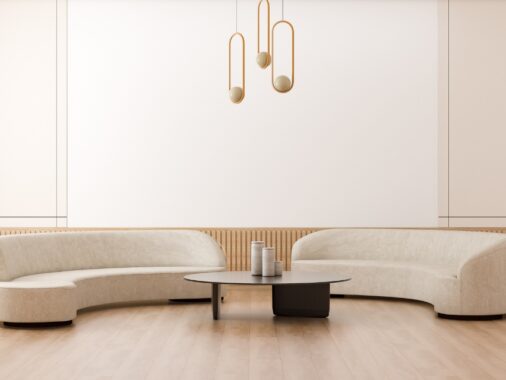
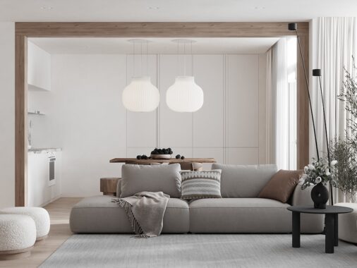
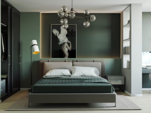
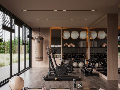
Bridging the gap between the traditional and contemporary, neoclassical design offers a rich method of self-expression that differs from eclectic and transitional styles in a few important ways. Neoclassical interiors embrace luxury – far from modest, but careful to remain tasteful. It offers a playground for bold colors more than its transitional pastel-hued neighbor. It requires a more curated approach to furniture than its distant cousin the free-spirited eclectic. The interiors featured in this post range from those inspired by Hollywood regency style all the way to a super-modern interpretation with faint neoclassical influences.
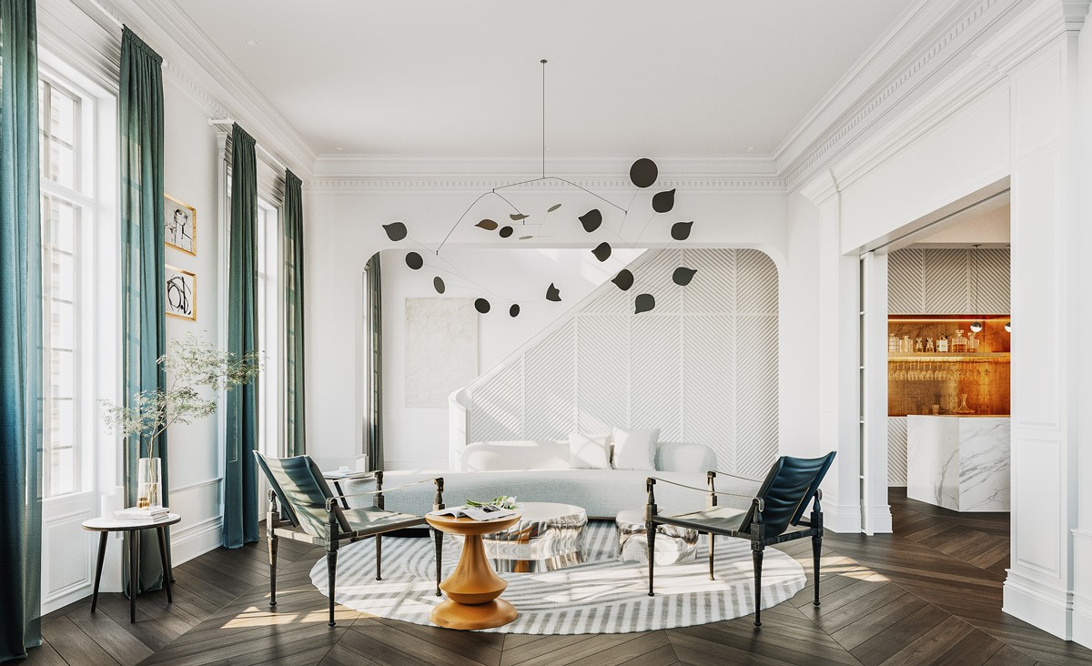
This lovely space combines a lot of the charms of the Hollywood regency style with a smooth modern approach to neoclassical design. Here, you will find opulent materials, glimmers of metallic accents, traditional features like crown molding and boiserie – all paired alongside unforgettable contemporary accents.
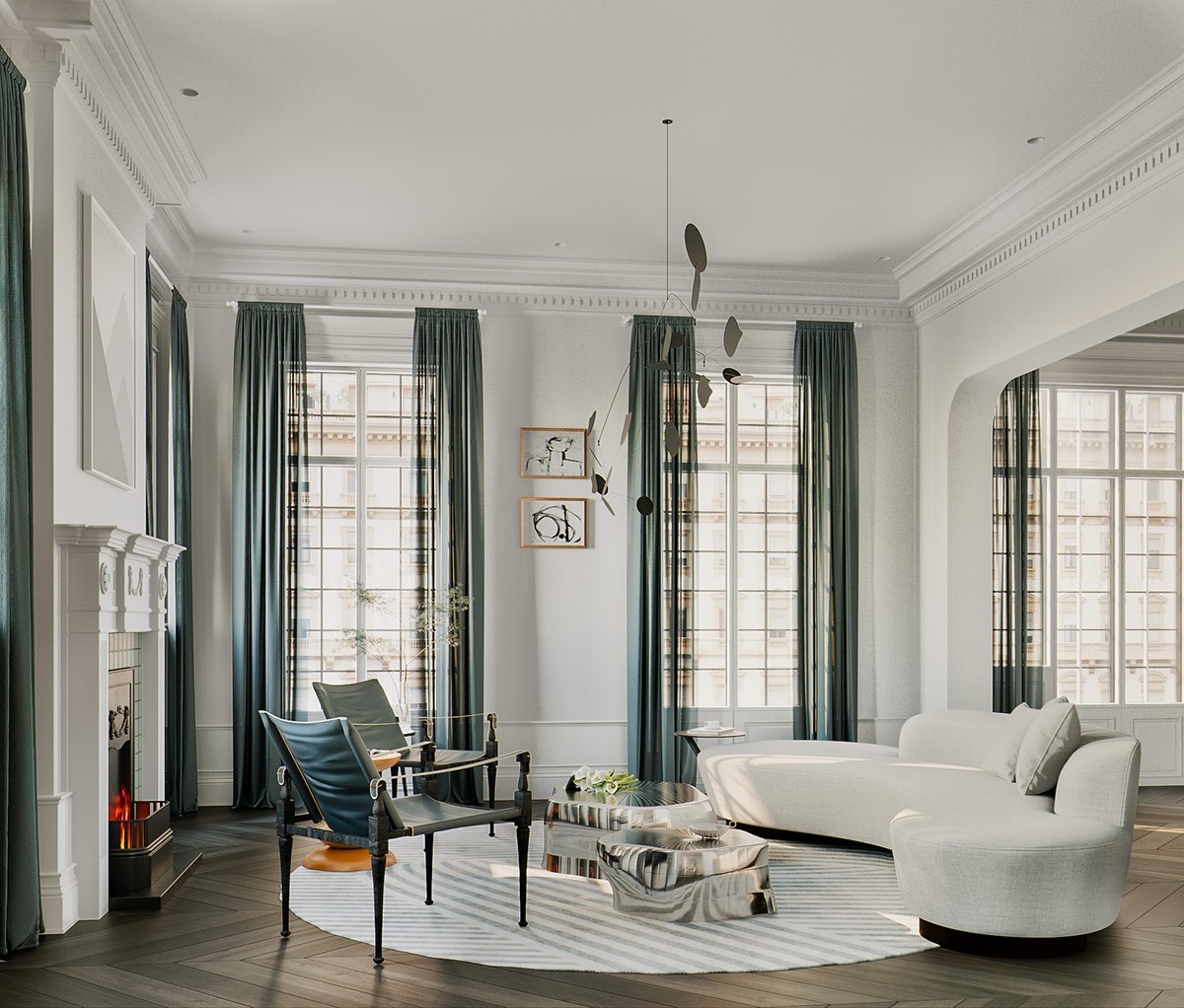
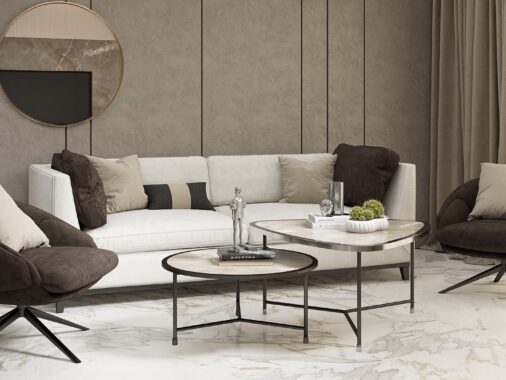
This tour opens with a luxurious formal living room centered around two unique coffee tables. Notice the distinctive contrast between the curvaceous divan sofa and the more structured classic-feeling side chairs.
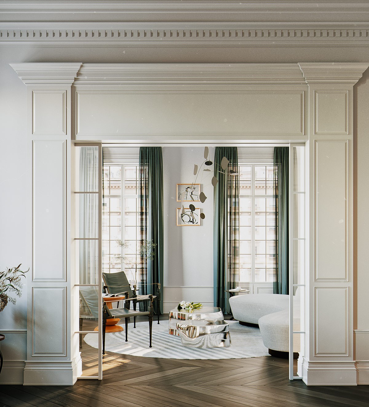
Classic architectural elements set the stage for a high-end look. Prominent column-style door framing creates a grand entry to the living room, concealing glass pane pocket doors.
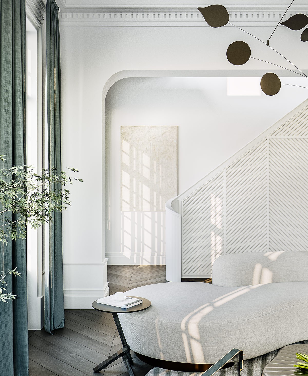
Details span a variety of eras, like this small side table that would fit effortlessly within even the most modern interior.
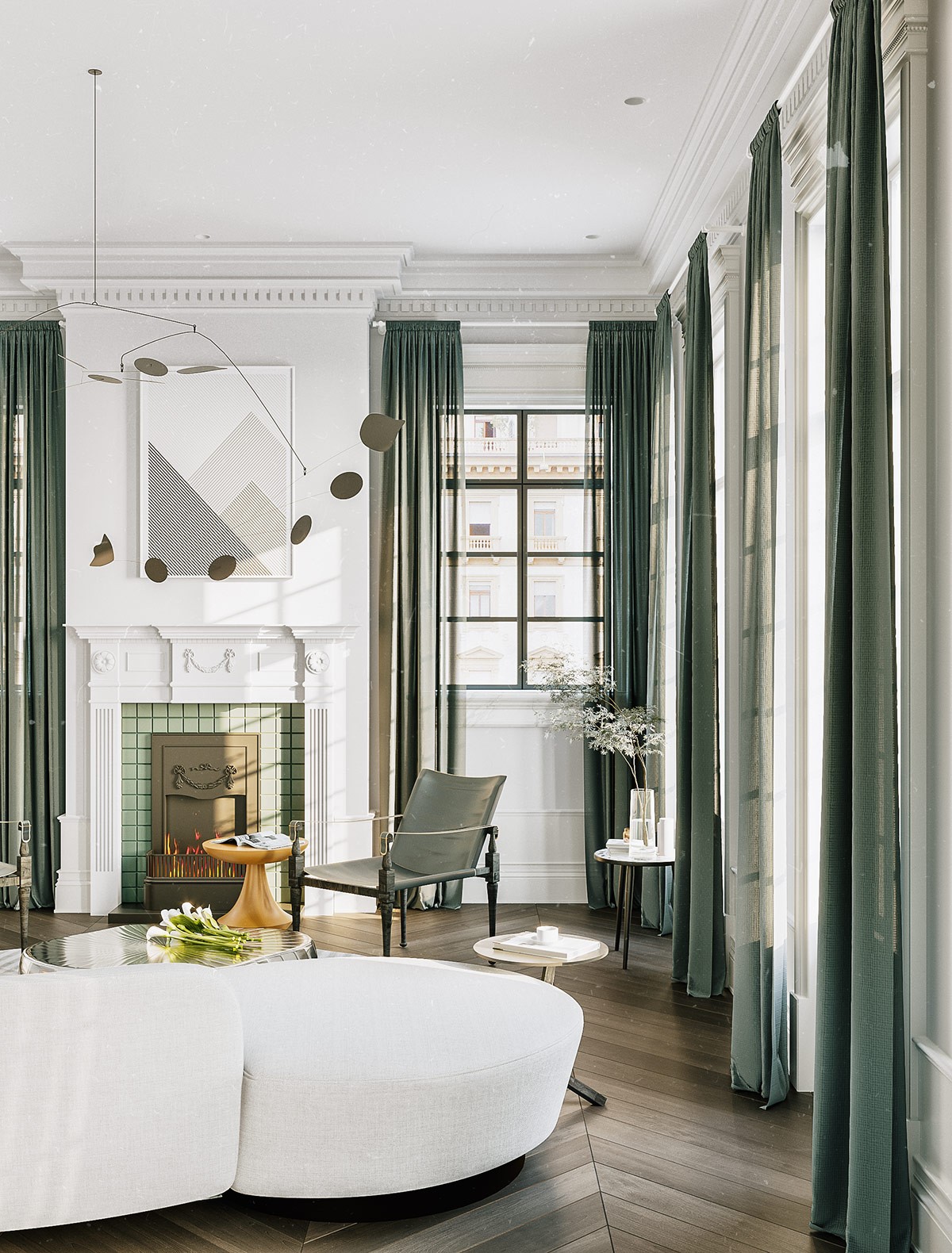
The accent color chosen here is perfect for both neoclassical interiors and Hollywood regency styles. The subdued emerald green feels elegant and welcoming at once.
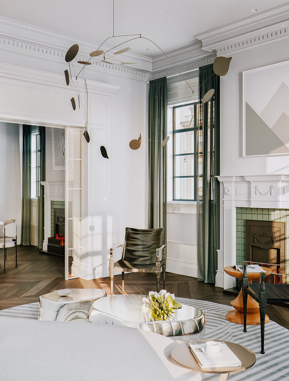
Artistic appeal flows through every detail. Other artistic elements are more obvert, like the Calder-style mobile hanging from the ceiling.
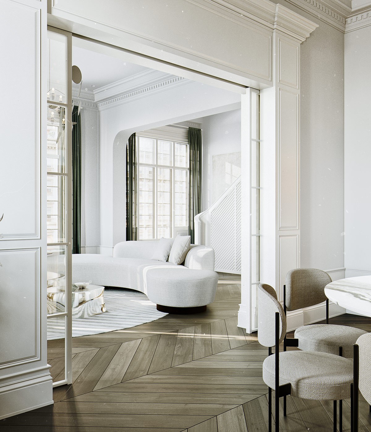
The floors offer an updated take on classic chevron parquetry, brought in line with contemporary sensibilities thanks to the wide boards and varied finish.
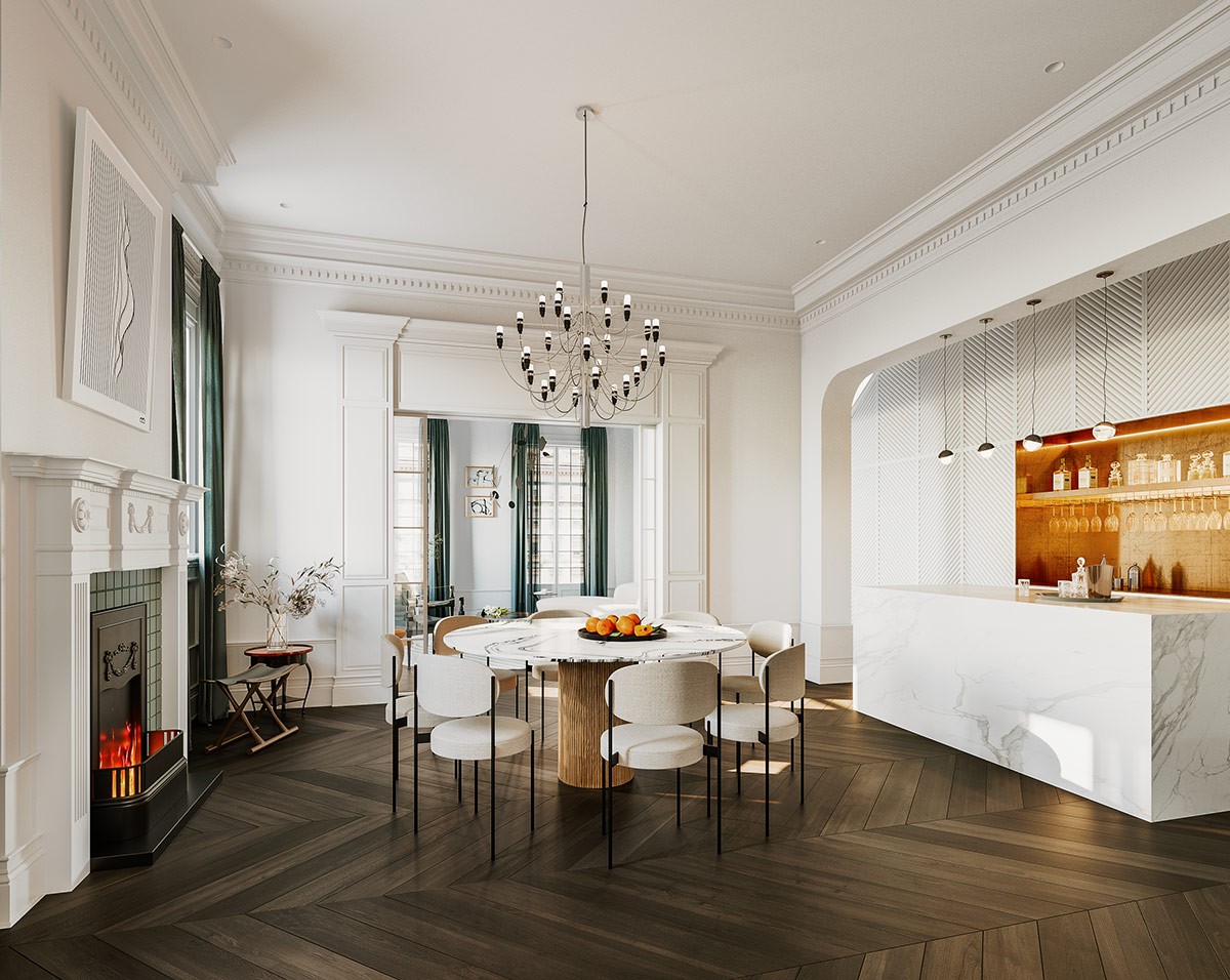
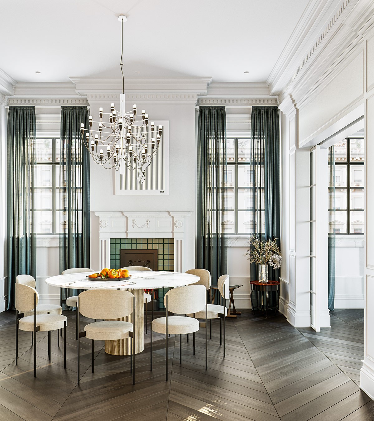
In the dining room, simple scaled-down furniture goes further to support the Hollywood Regency style.
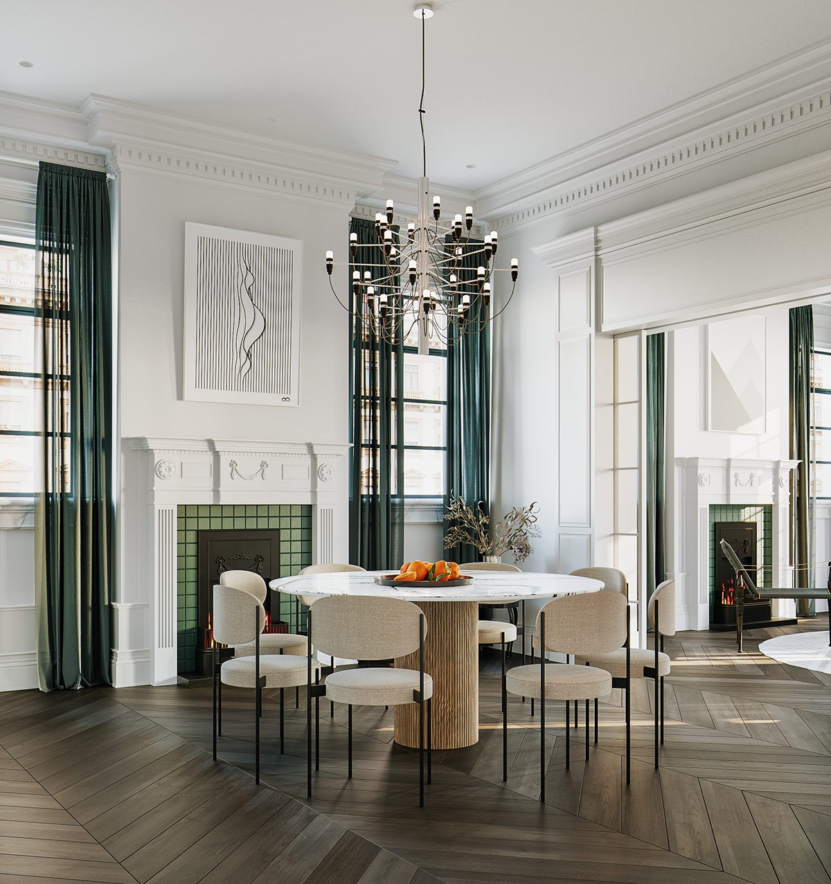
Designed by Gino Sarfatti, this modern chandelier is a wonderful example of how Hollywood regency uses neoclassical influences without committing to any single era – its sophisticated traditional profile upgraded with up-to-date construction and glamorous materials.
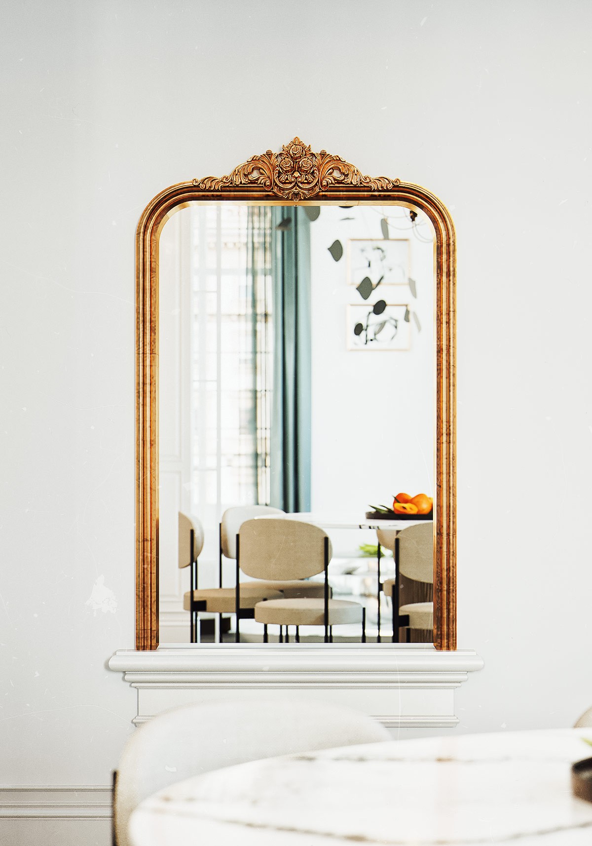
Other traditional elements dot the home, sometimes serving as bold focal points. The coppery metal finish on this mirror stands out from the green accents elsewhere.
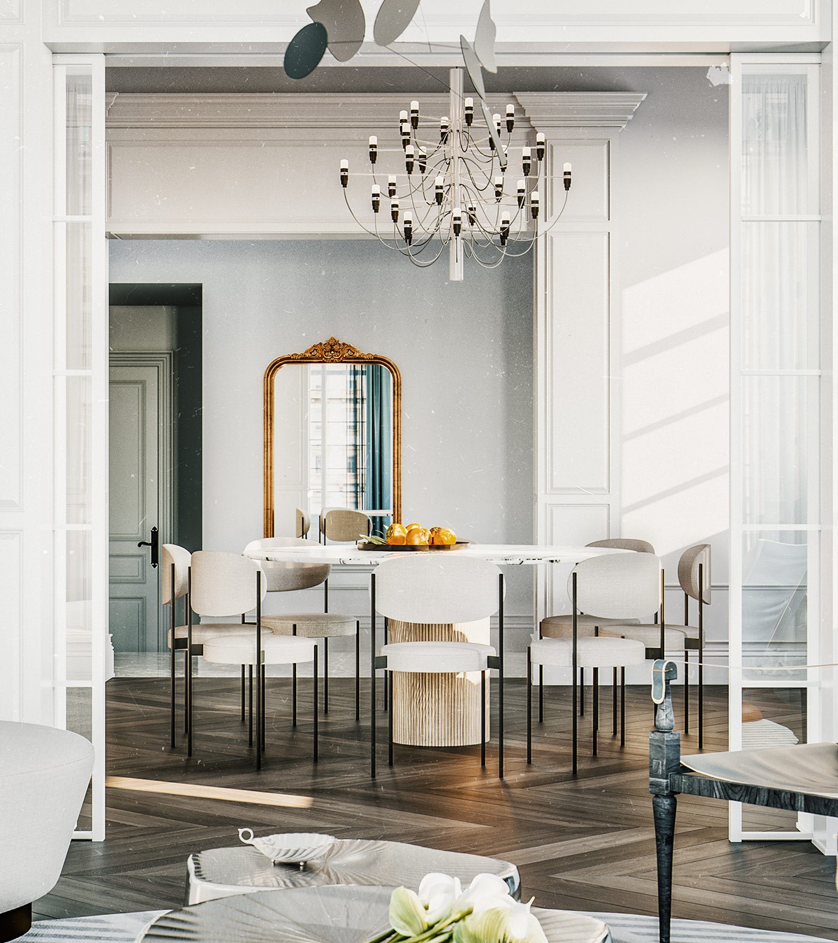
Open circulation makes this home perfect for entertaining – much like the jetsetter homes that inspired the Hollywood recency style.
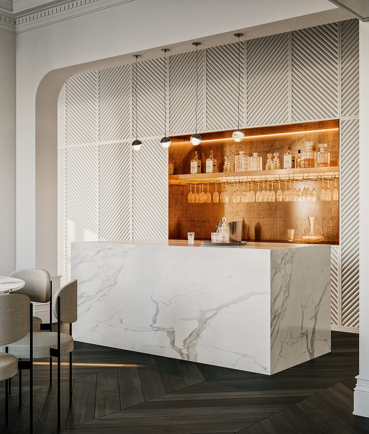
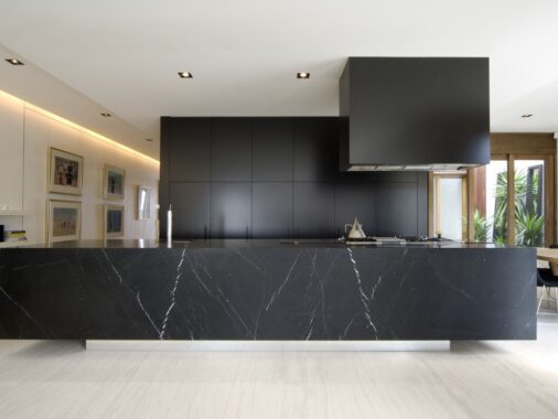
Sharp luxury defines the kitchen. The bold kitchen island makes a strong first impression with its marble veining, the surrounding cabinetry hidden by modern diagonal paneling.
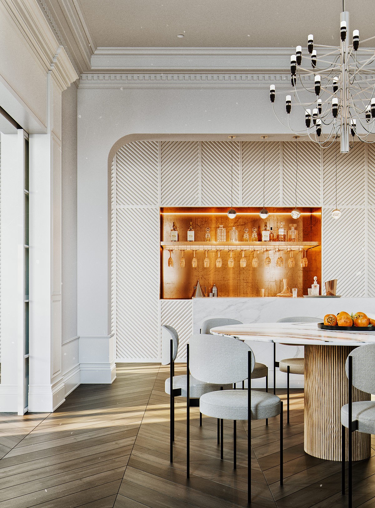
Rows of transparent wine glasses and carafes only highlight the radiance of the illuminated copper bar backsplash behind them.
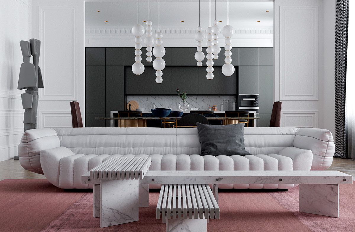
This next interior continues with the neoclassical theme, going even further on the modern side. While the wall treatments embrace a fully traditional look – bold paneling, prominent crown molding – the furnishings and decoration feel like products of tomorrow. This blend is well-suited to the Hollywood regency style as well, a theme not married to any specific era.
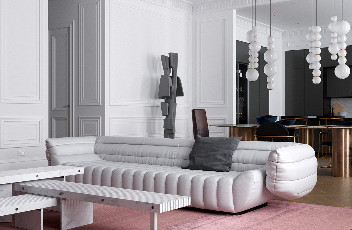
Sophisticated neutrals are a staple of neoclassical interior design, but this space steps in a more contemporary direction by adding vivid pinks.
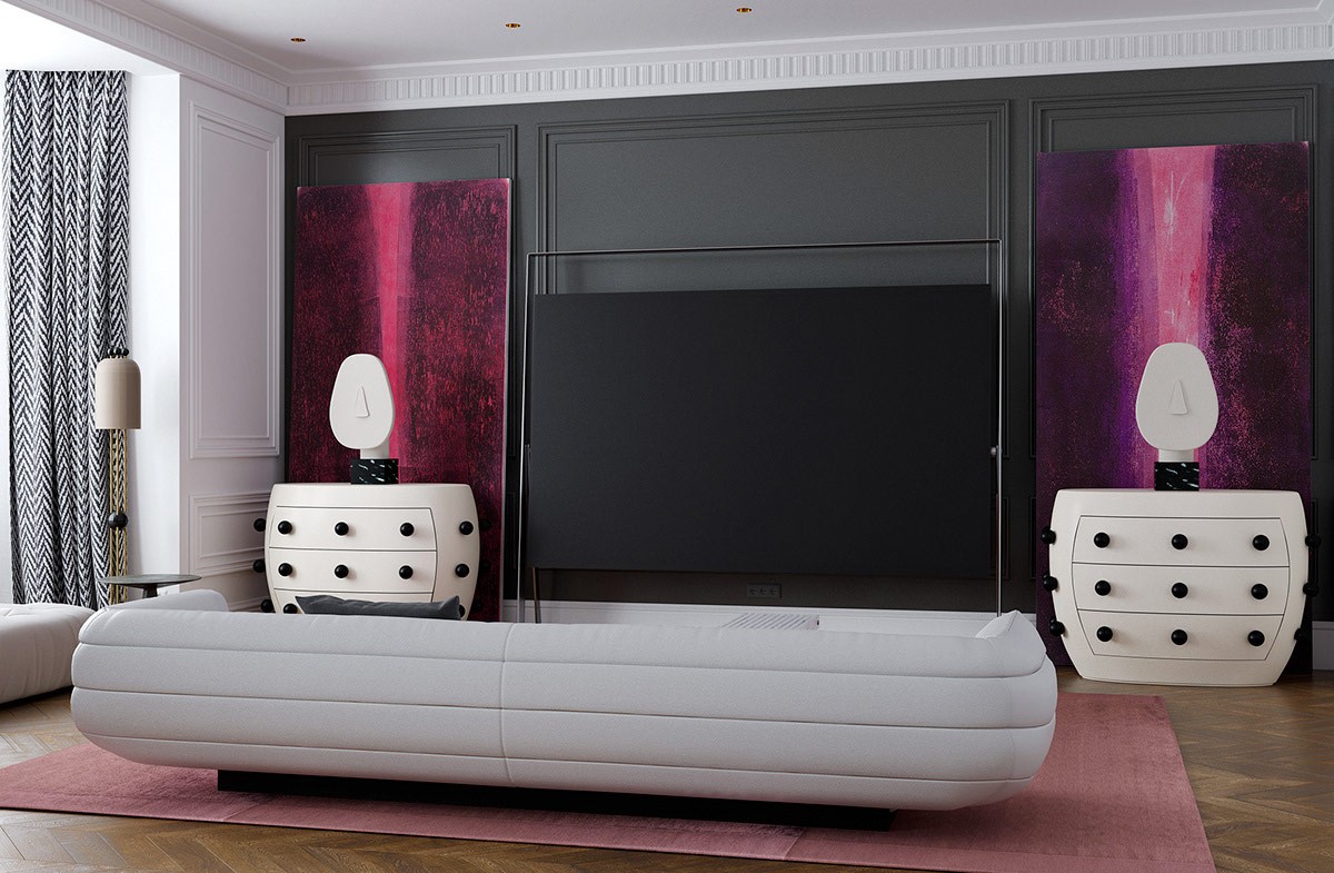
More bold magenta brings drama to the charcoal accent wall, drawing attention away from the television and toward the stunning drawers and sculptural accents.
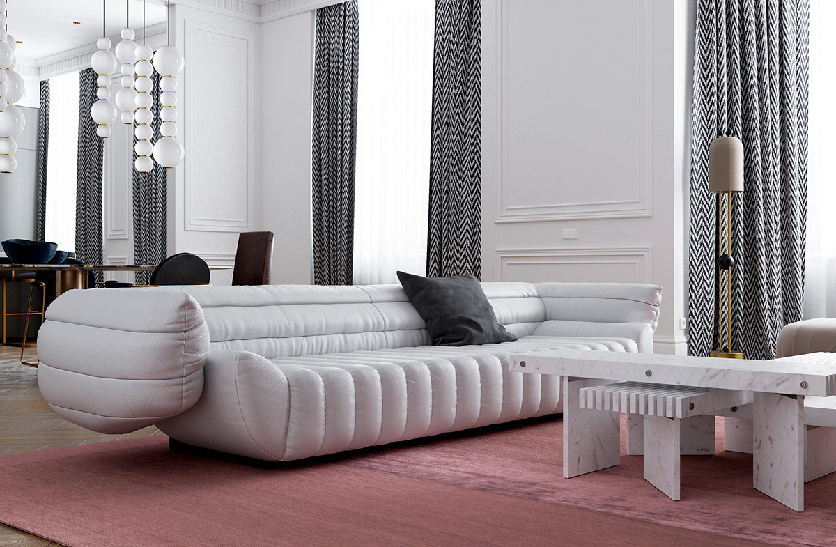
Both the modern sofa and nesting coffee tables stand out as especially daring additions. These pieces set the living room apart from the typical neoclassical motif.
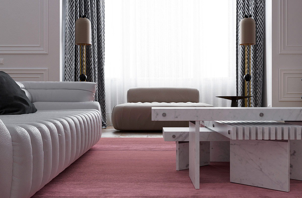
Zig-zag fabrics are nearly universal in the world of Hollywood regency interior design. They look right at home here.
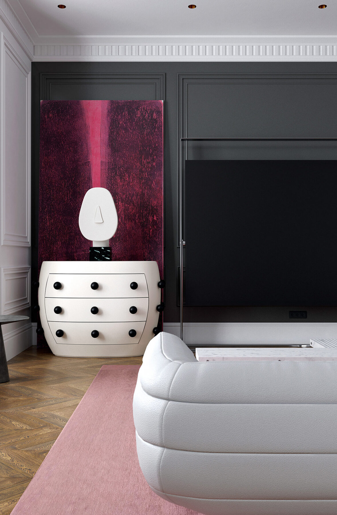
The decorations at either side of the television seem to resemble the blank faces of Cycladic sculptures.
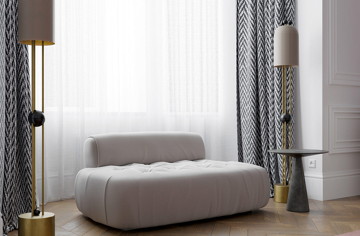
With the distinctive shapes and brassy finish, the floor lamps almost embody a slight art deco vibe.
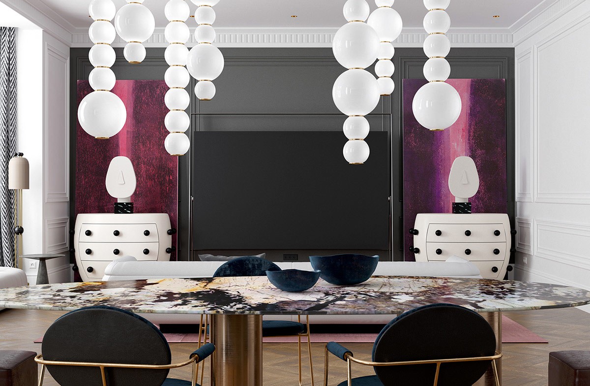
These luxurious dining pendant lights are from the Pearls collection by Benjamin Hopf.
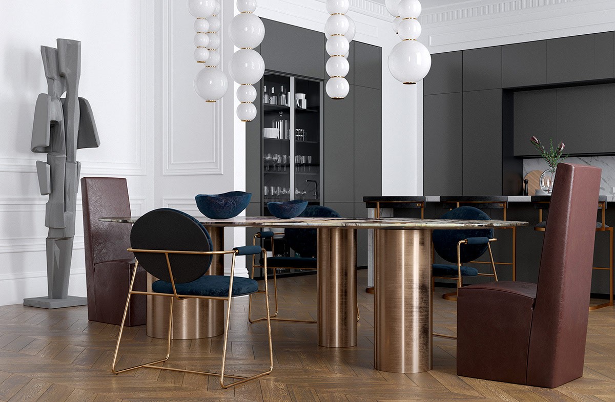
Blue velvet upholstery over brass bases gives the dining set an exceptionally opulent touch. Reddish high-back leather end chairs complete the look.
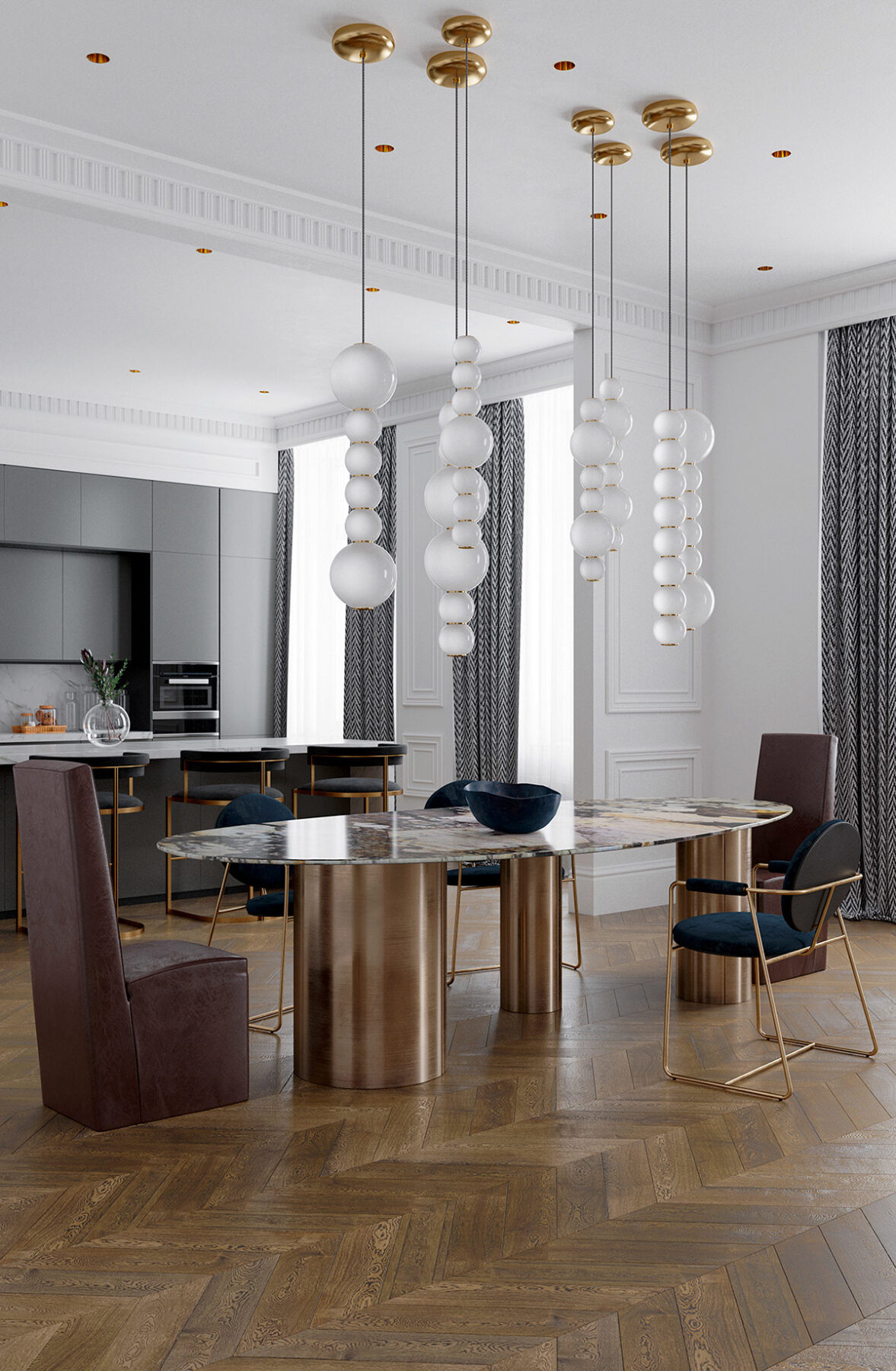
Everything comes together for a look that feels fresh but maintains an underlying sense of classic elegance. This is not your ordinary neoclassical space.
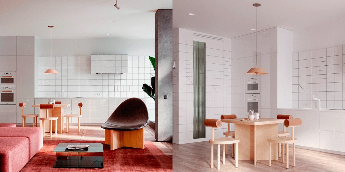
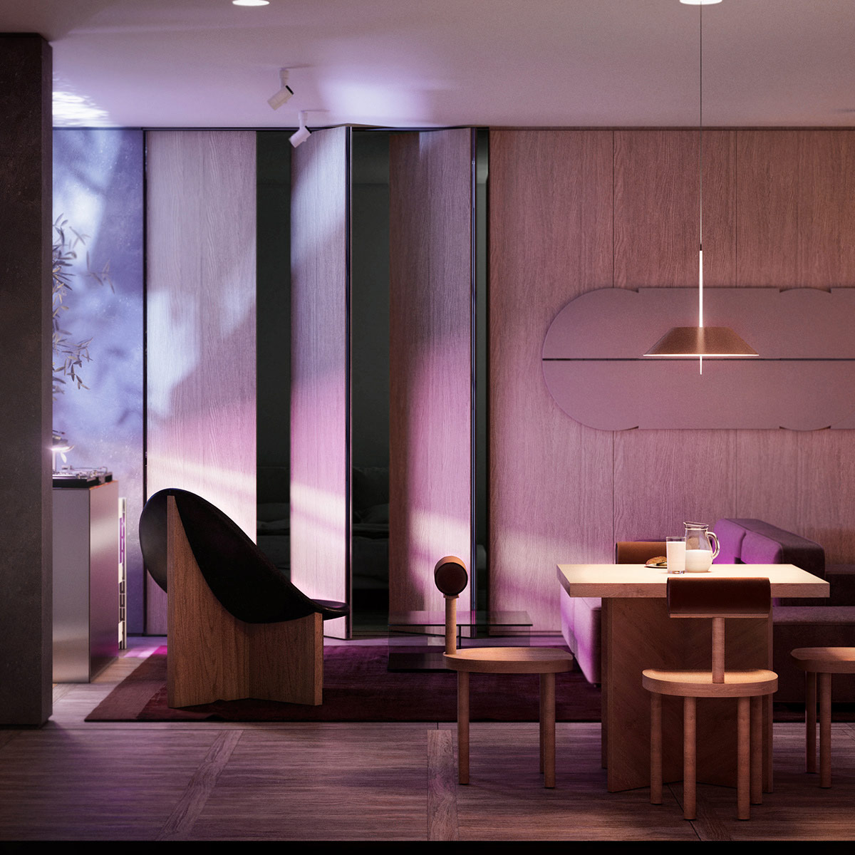
This final home takes a radical departure from the others featured here. Taken as a whole, it looks artistically contemporary. But looking closer at each individual element, you can see hints of vintage design shine through – even a few choices inspired by neoclassical design and Hollywood regency.
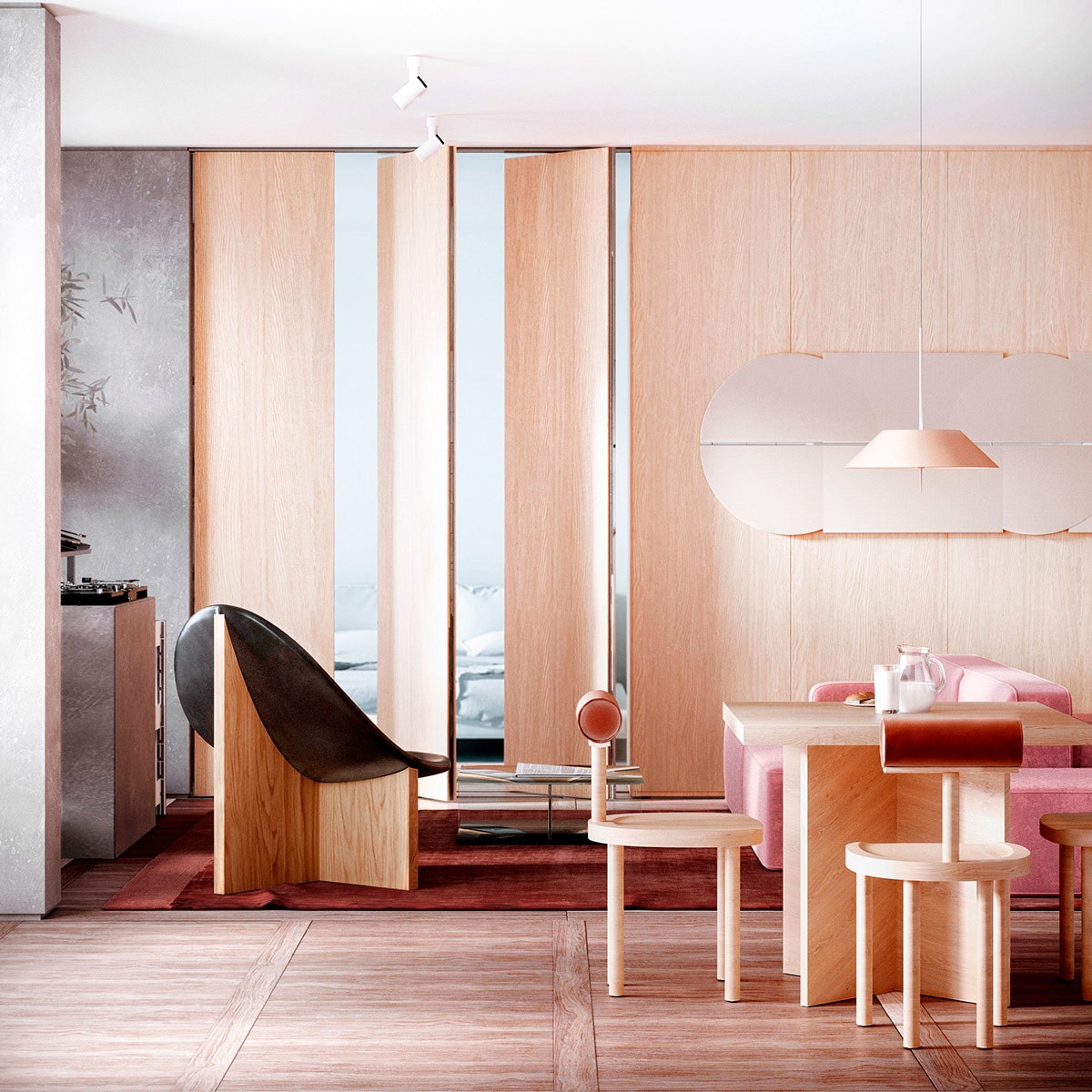
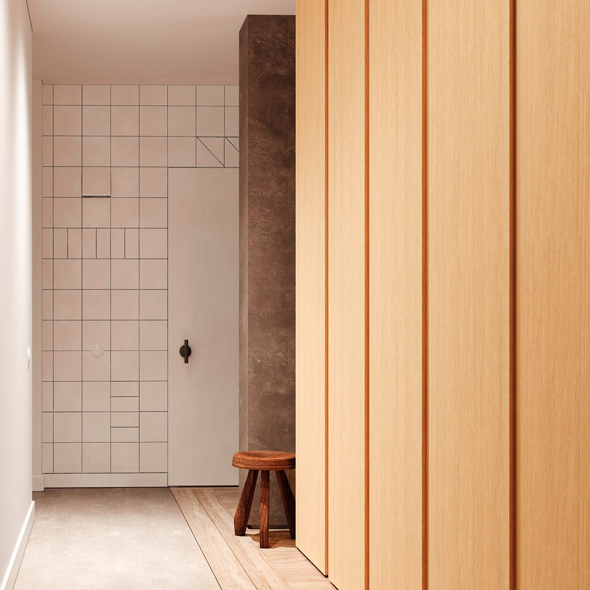
First, the color theme immediately catches attention. It takes the traditional colors of neoclassical design and turns them on their head – cream becomes light wood, grey becomes concrete. Red remains – as a unifying feature rather than an occasional accent.
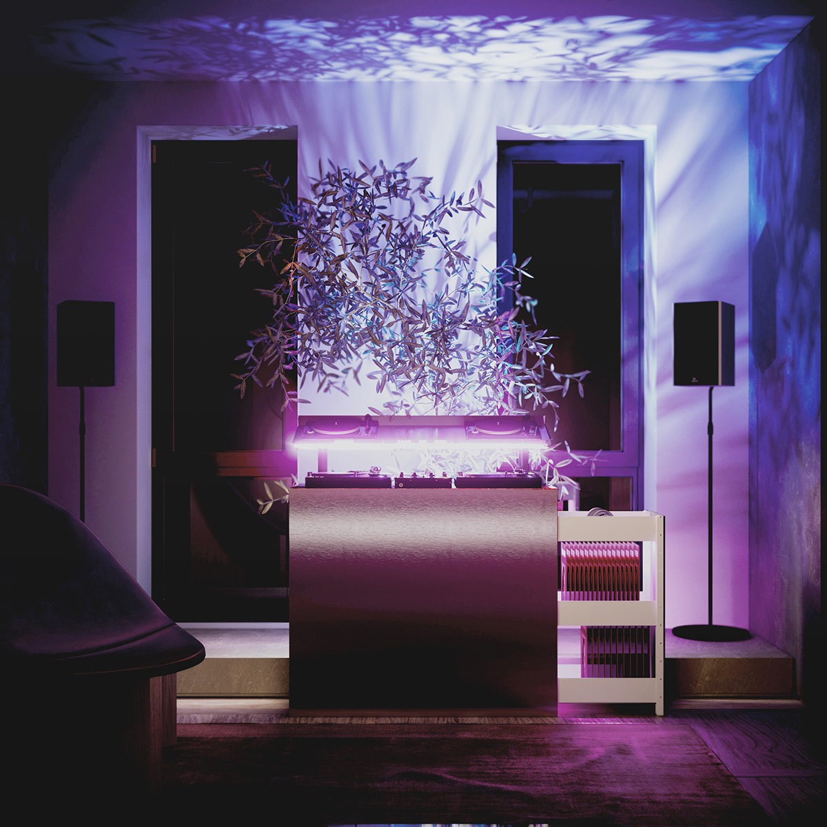
Here, for example, lighting near the DJ stand filters through foliage to cast dramatic natural shadows across the wall for a dynamic and relaxing effect.
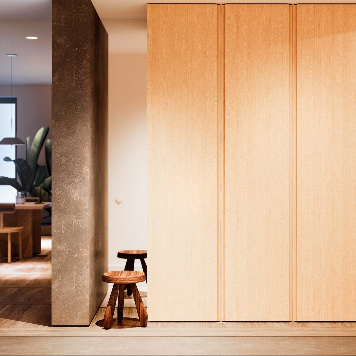
Much of this home seems to focus entirely on simplicity – in many ways, a direct contrast to neoclassical and Hollywood regency styles.
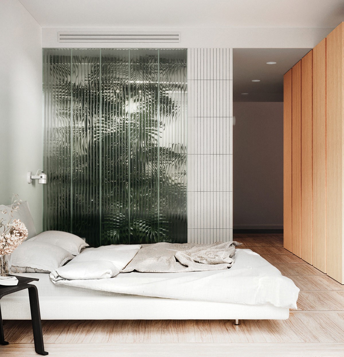
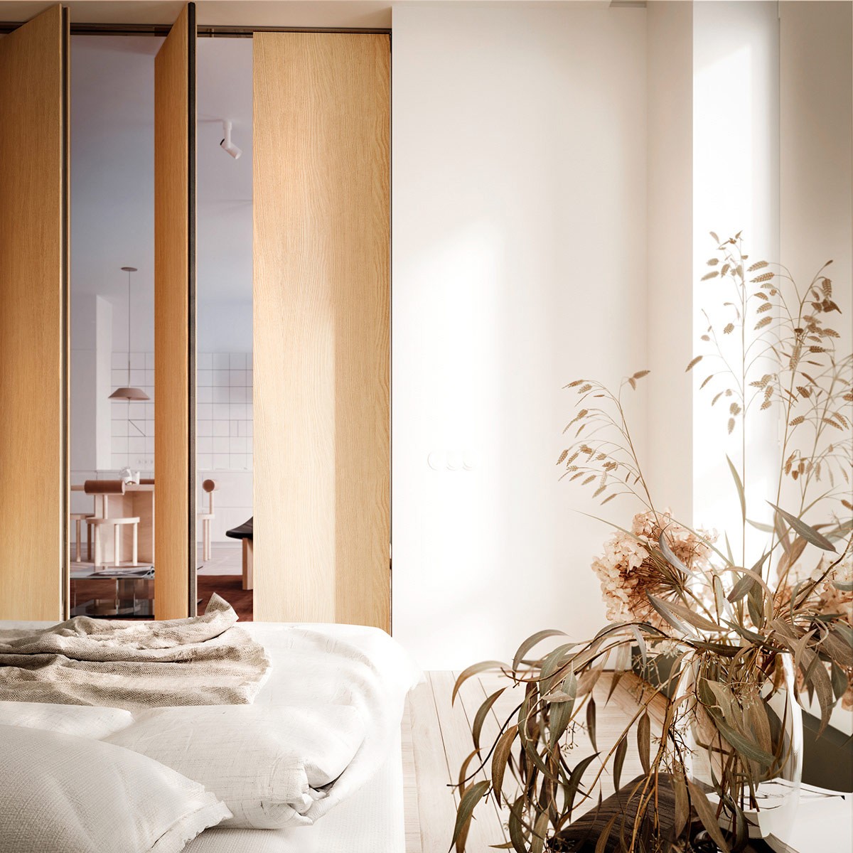
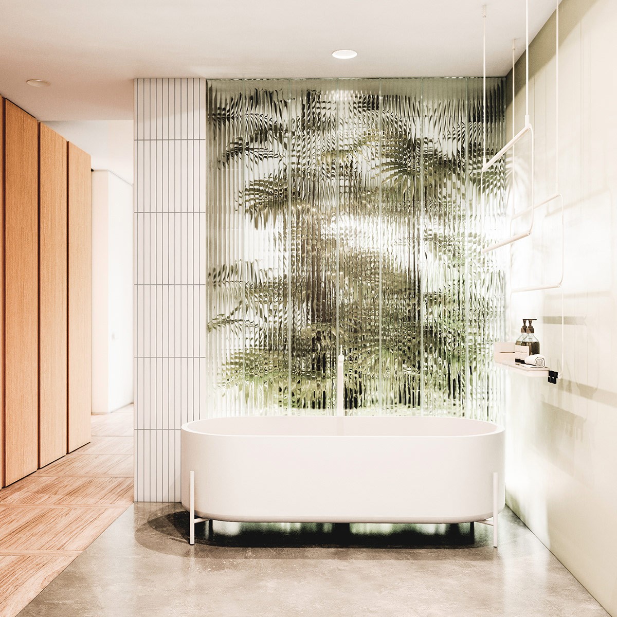
In the bedroom, you can see an especially unique feature - a glass wall that reveals the silhouettes of large plants.
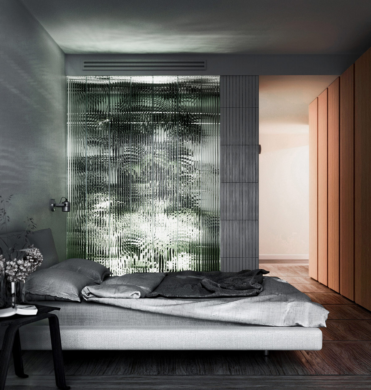
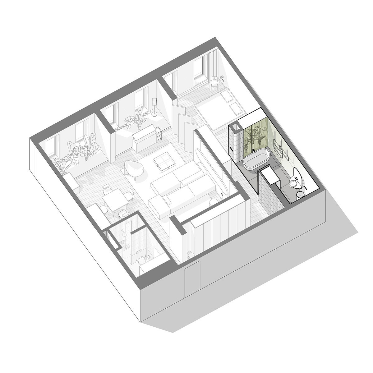
This wall serves to separate the ensuite bathroom from the sleeping space. It allows the passage of natural light while providing a touch of visual privacy.
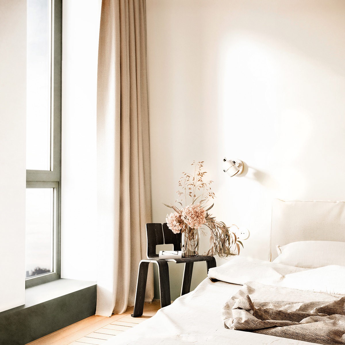
A lovely arrangement sits in a glass vase, drawing out the light pinks and creams used throughout the interior theme.
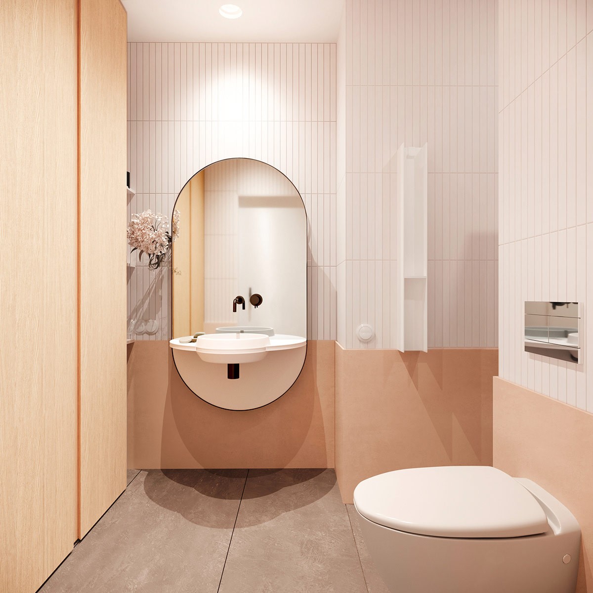
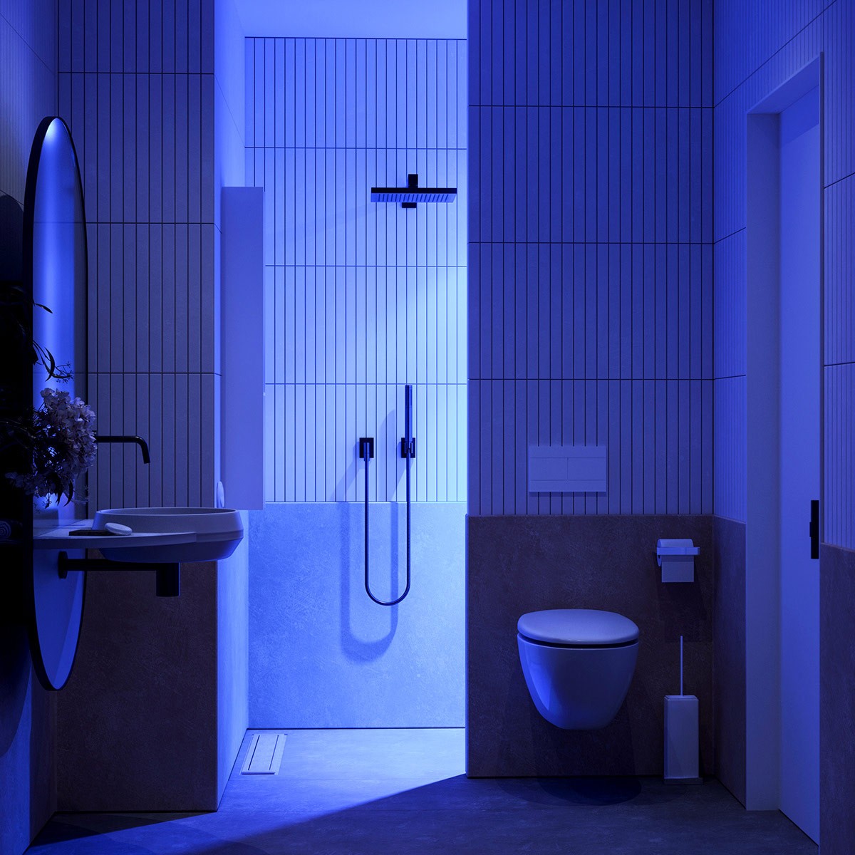
Rounded elements define the bathroom, a soft touch compared to the straight lines of the floor, walls, and shelving.
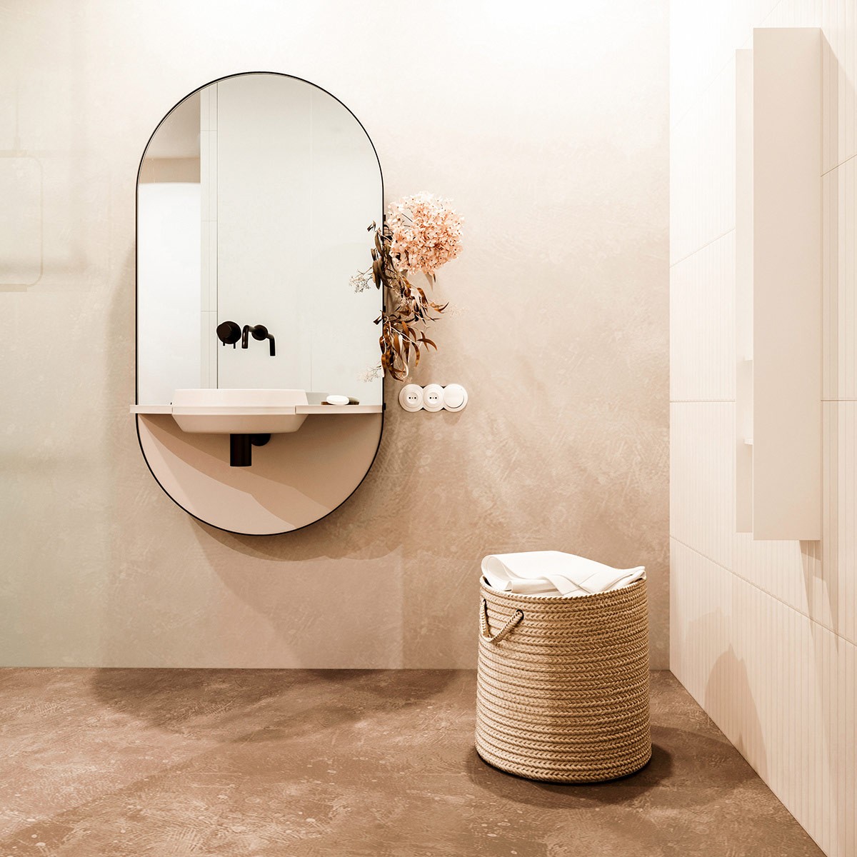
Subtle natural elements work wonders to make this bathroom feel warm and inviting - the stone floors, unique laundry basket, and small flower arrangement.

