A former piano studio in Taipei, Taiwan has undergone a complete overhaul, at the hands of creative team A Little Design. The space has been transformed into a 17.6 square metre micro flat that features an interior filled entirely with bespoke built-in furniture. With a ceiling height of 3.4 metres and a concrete beam that runs widthways through the apartment, the layout was heavily restricted "Although the owner does not need a big flat, before it was redesigned, the 17.6 square metre unit was too small to fit both a queen-size bed, living space and sufficient storage" said lead architect Szumin Wang. Read on to see how the tight restrictive space became a cosy comfortable home.
The homeowner of this micro flat has a busy career that requires her to travel frequently, and occasionally live abroad for short periods of time. When here in Taipei, she values a short commute over a larger living space. Despite its small size, this place has been reconfigured to include all of the essentials in practical proportions. The decor scheme helps the small space to flow well too, with a calming cohesive palette of smooth wood effect furniture and floors, fresh white walls and storage facias, and smart light grey accent pieces.
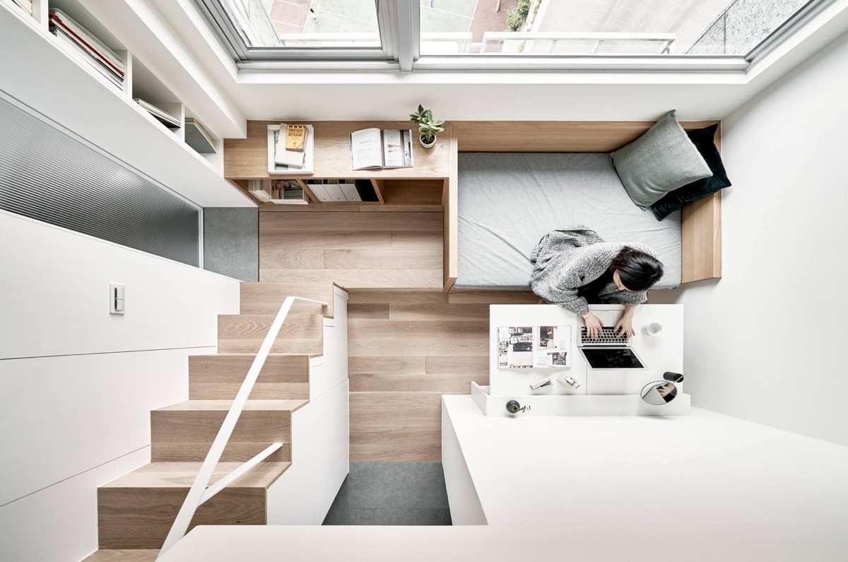
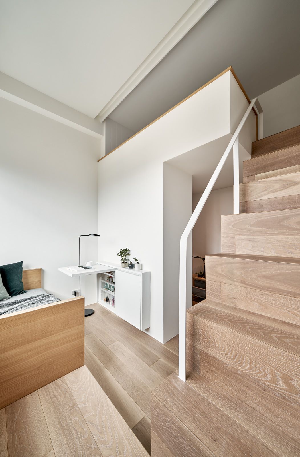
The sofa area in the compact lounge also doubles up as a minimalist workspace. A well proportioned desktop folds out from the opposite wall, large enough to comfortably hold a laptop, reference material and a strong black coffee. Inside the wall cabinet, beneath the fold-out desktop, there hides a couple of shoe storage volumes.
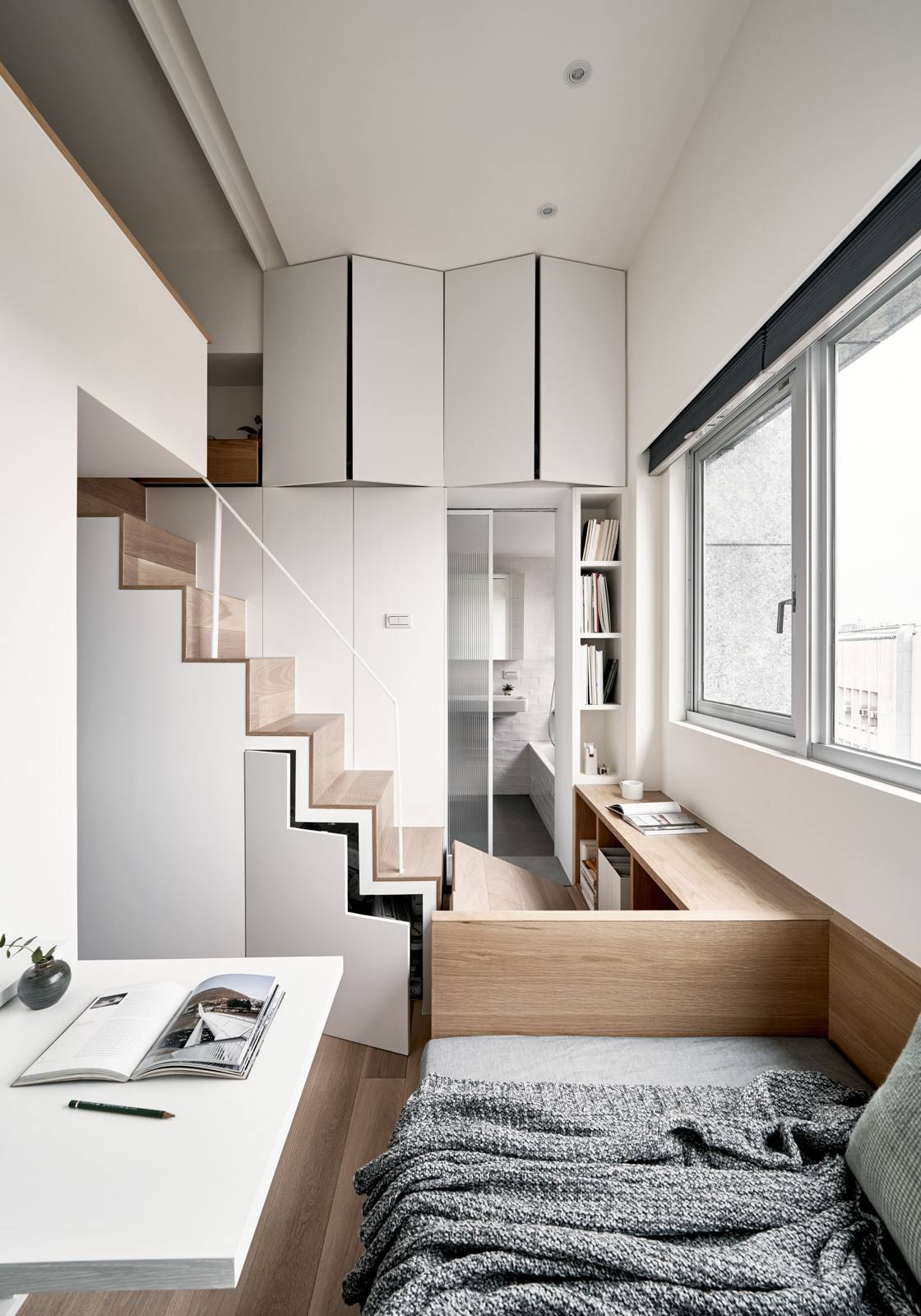
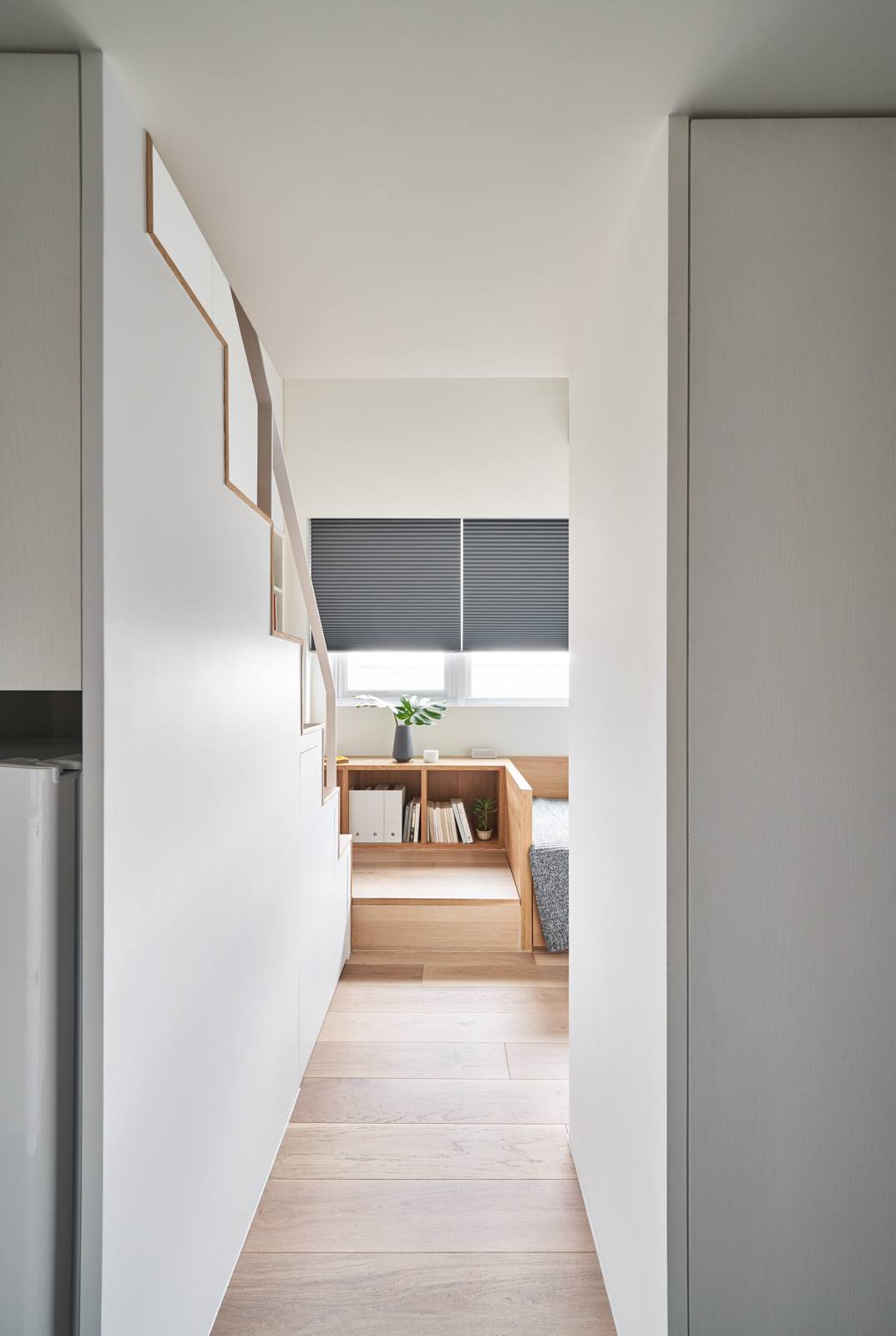
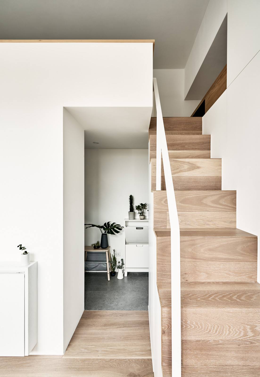
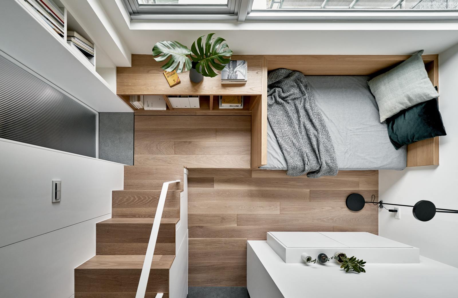
The closet is integrated into the entryway of the apartment, since there is no standing height up in the mezzanine bedroom. Other storage cabinets make use of every inch of space under the stairs and above the bathroom door. The white volume you see below these wall cupboards is accessed from the bathroom on the opposite side. A glass bathroom door helps to prevent the small living room from feeling claustrophobic, and lets in a greater amount of natural light.
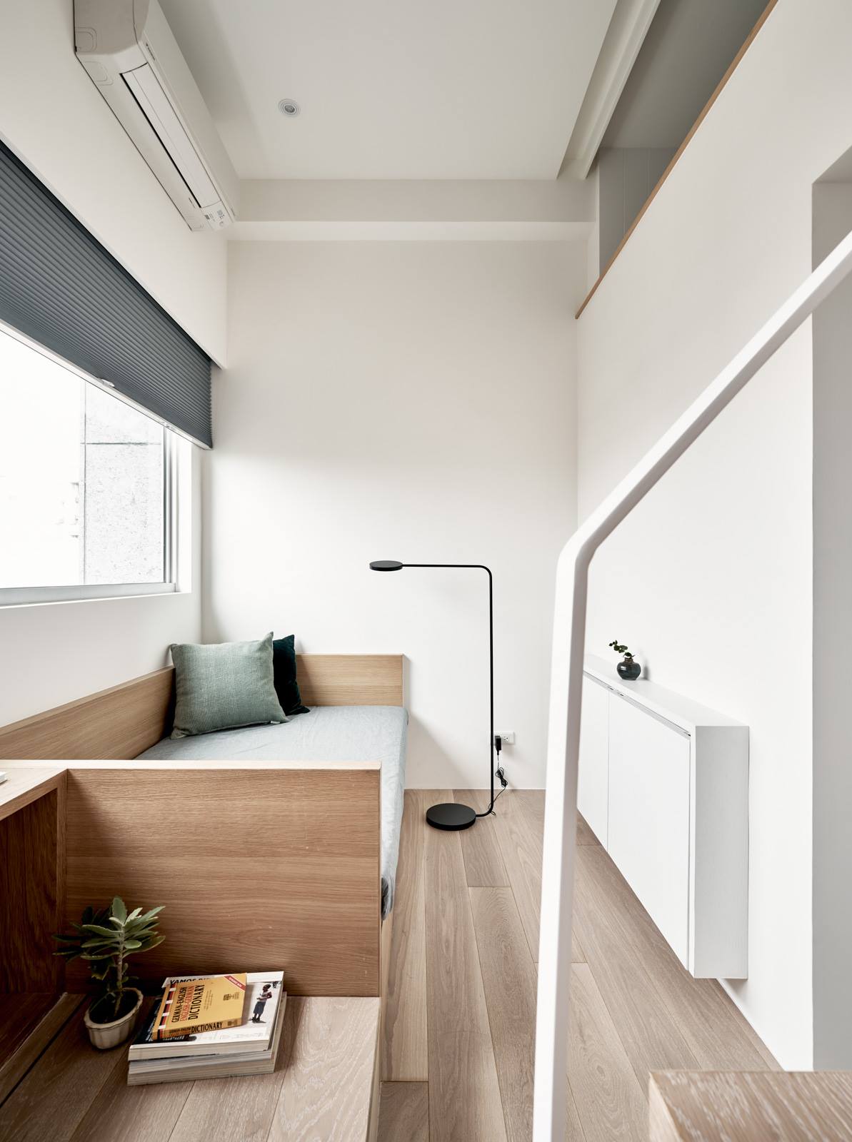
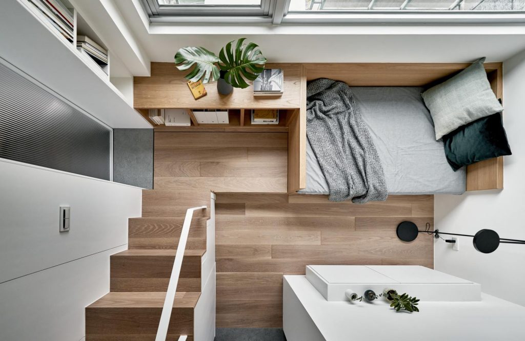
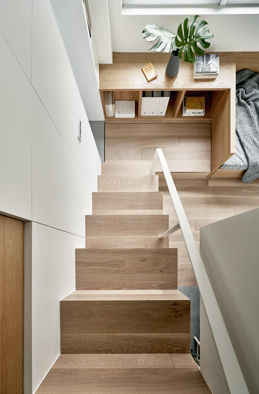
When the fold-out desk/shoe cabinet is closed, the tiny lounge appears more spacious and airy. A neat floor reading lamp is on hand to provide task lighting by the sofa/day bed. The narrowness of the main living space is combated by having the doorway open to the entryway, plus the view of the open sided staircase, and the peekaboo reveal up on the mezzanine platform.
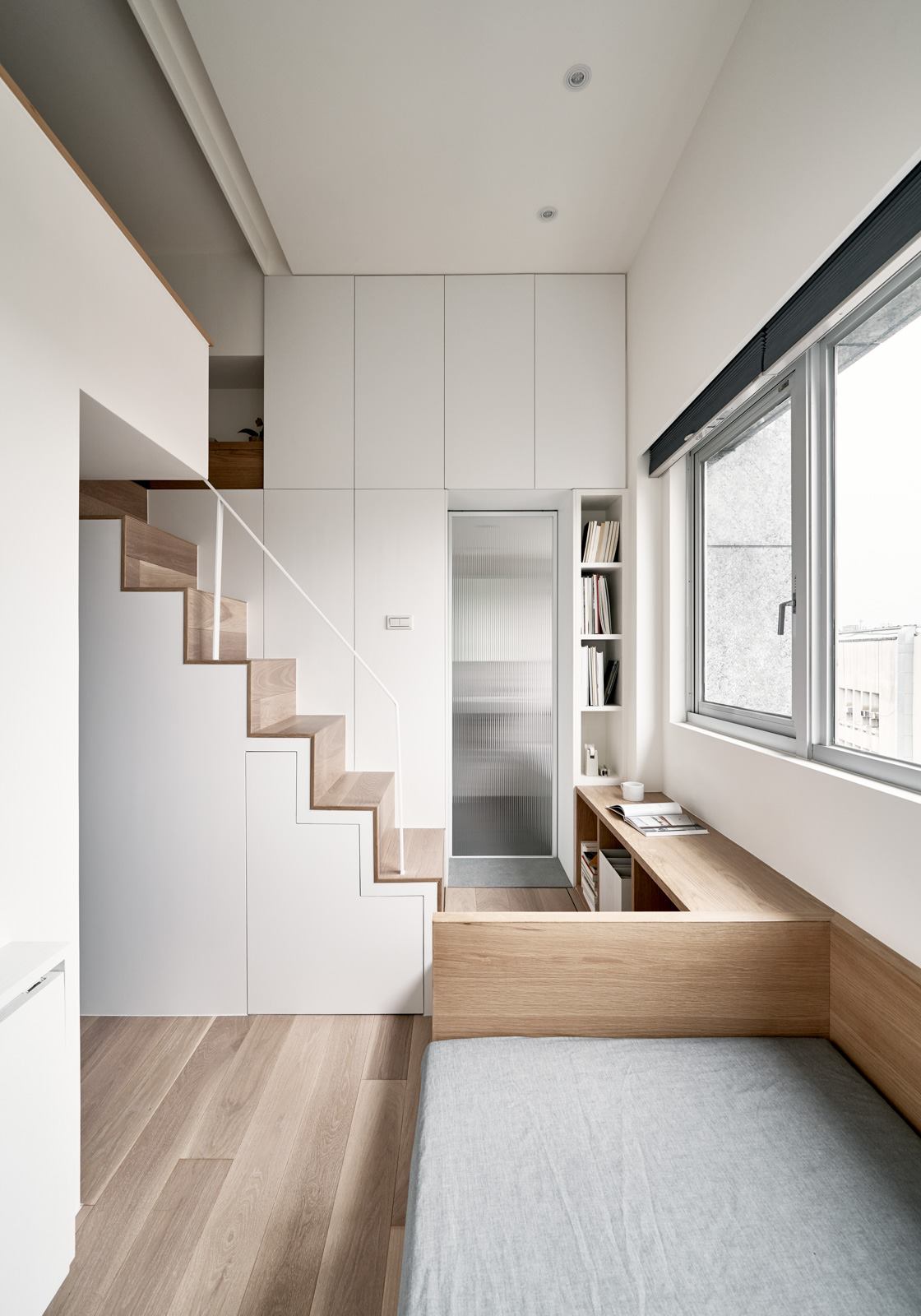
A step up to the bathroom door causes a change in floor level. The platform is integrated as part of the wood effect sofa frame and adjoined bookcase, and it also hides storage space under its lid. A second bookcase climbs one side of the bathroom door as a slimline white tower unit.
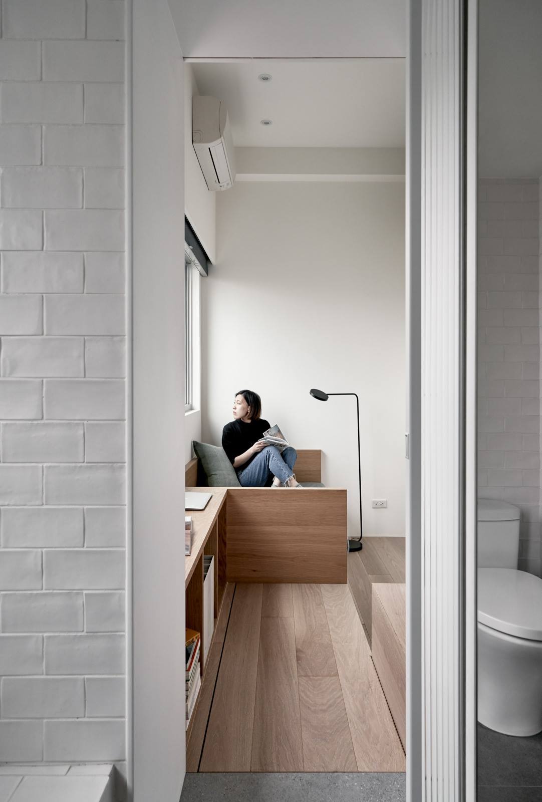
The bathroom door slides away so as not to encroach on the floor space. The design team switched the positions of the bathroom and kitchen during the project: "the bathroom was relatively big compared to the small square footage of the whole space, and the kitchen lacked practicability - it was even too small to fit a fridge."
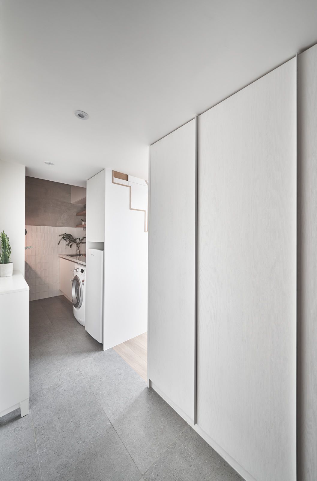
With the new kitchen position, there is now space for a fridge, washing machine, and an electric stove arranged along two walls.
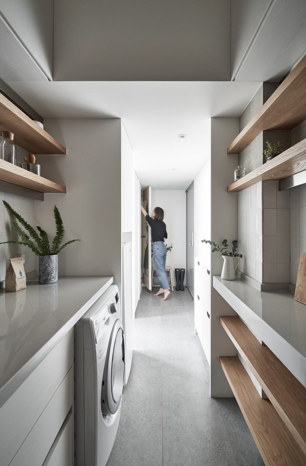
A relatively generous amount of kitchen work surface was achieved in the tiny galley kitchen, which also features ample storage shelves mounted above and below countertop height.
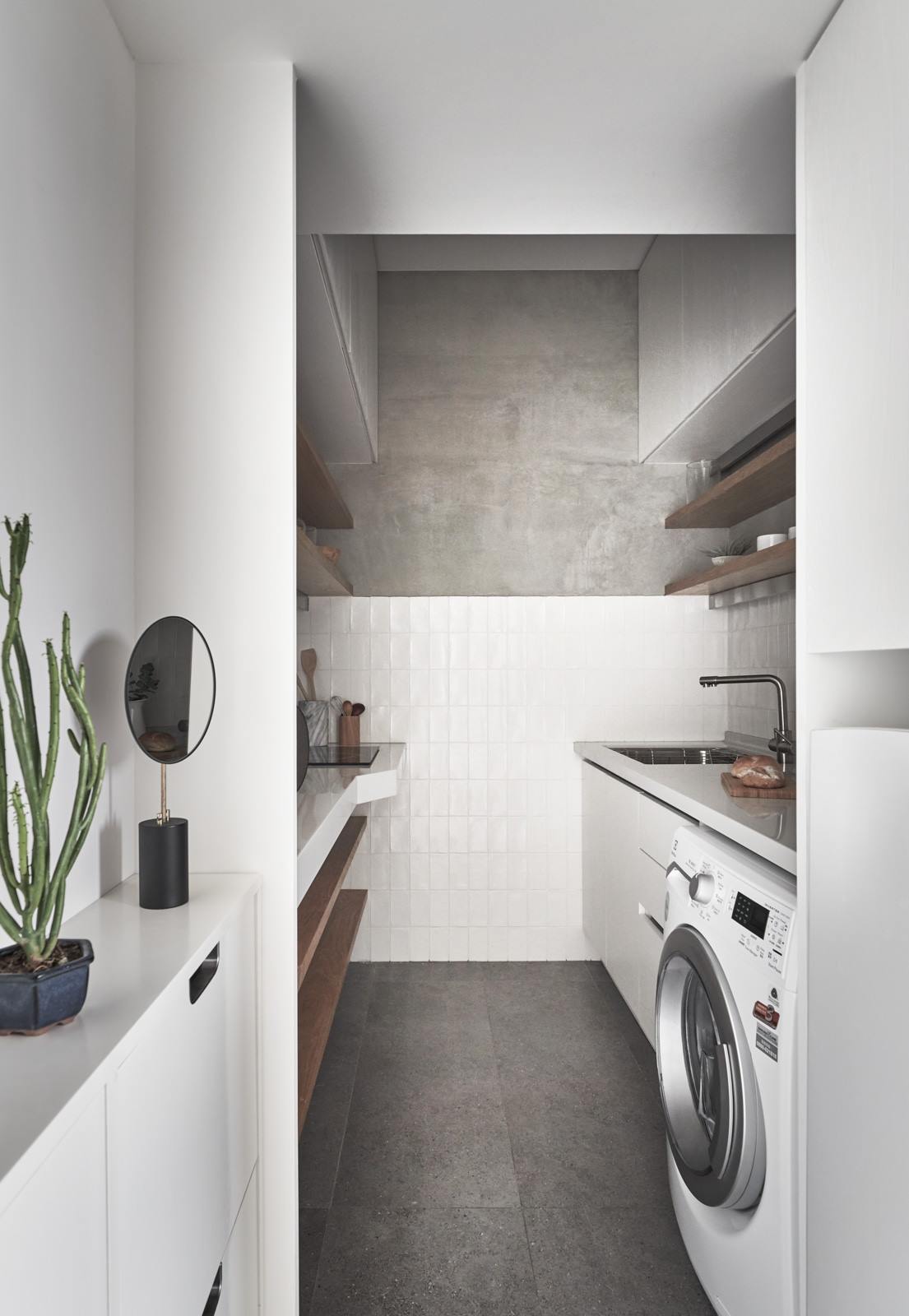
The wooden open kitchen shelving warms the look of pale grey and white kitchen decor.
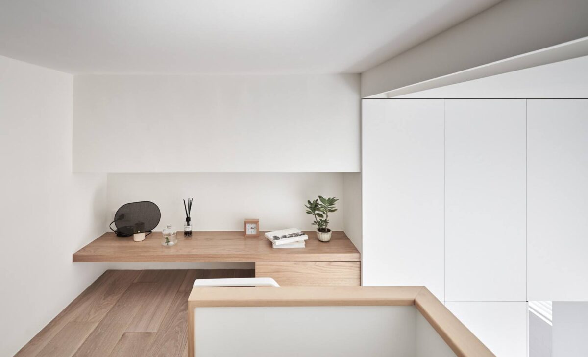
A tabletop and drawer are located under the concrete beam that runs widthways through the apartment. A small indoor plant and a desk clock pleasantly decorate the surface.
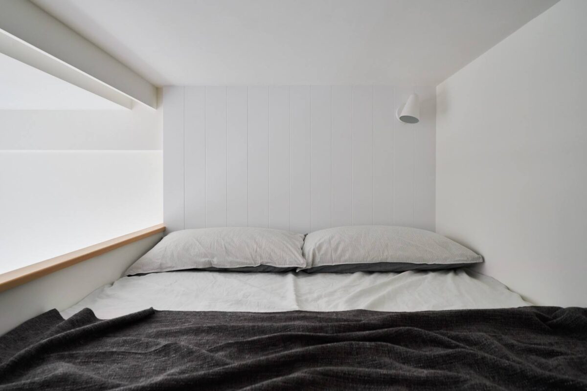
The queen-size mattress fits edge to edge in the width of the white bedroom. With lack of space for a bedside, a modern wall sconce provides reading light. "The prevalence of micro flats is not our answer for the high-housing-price issue in Taipei City but is the result of living issue's long-term evolution and the task the clients bring to us," commented lead architect Szumin Wang, whose studio has designed other micro spaces in the city. "We hope the attempt of design could provide some schemes and possibility for this living type."
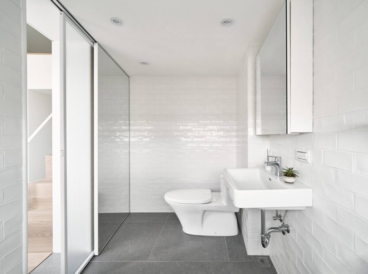
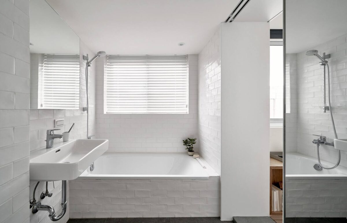
After the team swapped the old bathrooms location with the kitchen, its arrangement was of a slightly smaller scale. However, the new grey and white bathroom now benefits from natural sunlight and better ventilation. A tall sliding mirrored door across a cupboard makes the bathroom look even brighter and gives the illusion of more space.
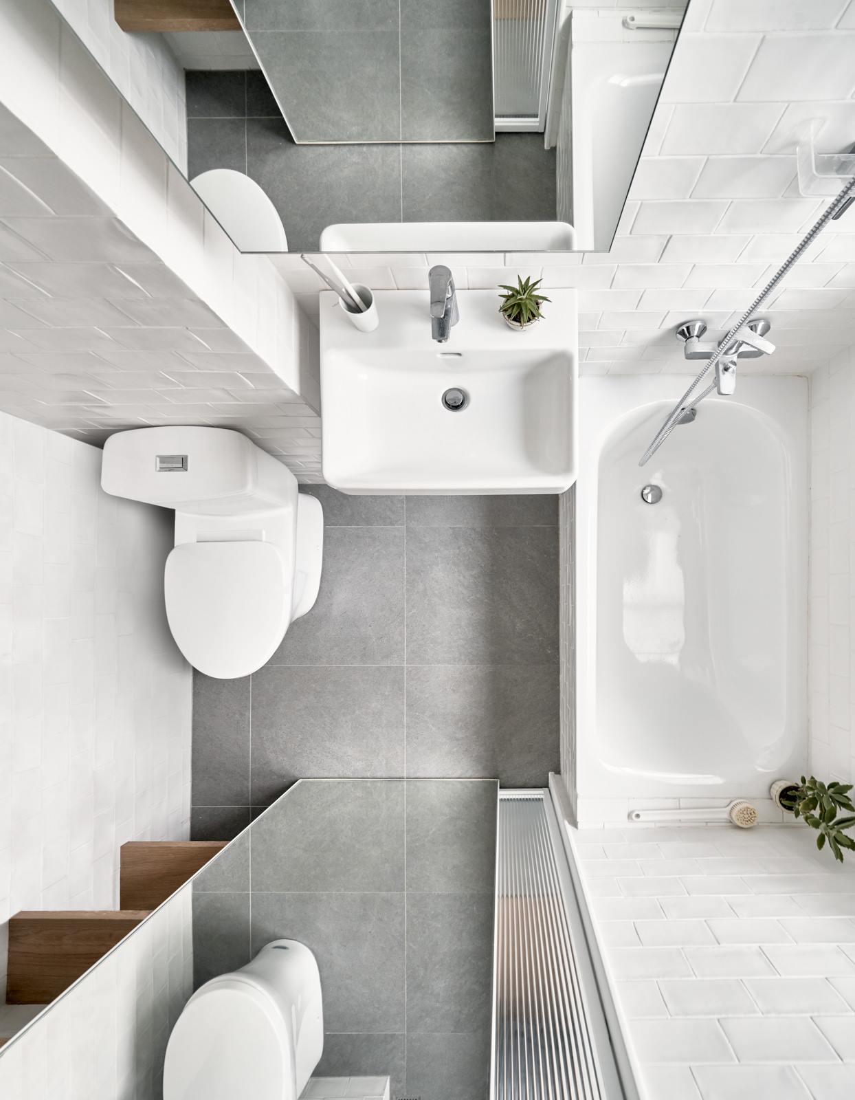
Behind the mirrored door, a narrow recess has been fitted out with handy shelving for towels and toiletries. The door also provides extra privacy when positioned in front of the ribbed glass bathroom door.
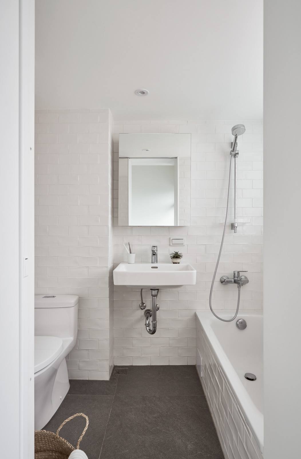
A white basin is wall hung beneath a simple cabinet with vanity mirror. Chrome pipework and faucets give the pale bathroom scheme a little sheen.
