Many modern house remodels are a bit reserved in the colour department, but not these two by A Lentil Design. Despite the small size of these Taiwanese homes - each being under 100 square metres - the homeowners have not shied away from piling in the colourful accents. Balance is achieved by throwing plenty of white and wood tone into the mix, so that the brights do not become a headache. Furniture is neat and belongings are kept organised so as not to overwhelm the limited space. The pared back approach leaves room for the homeowners to stretch out and live life in joyous surroundings, instead of being lost in the debris of it all.
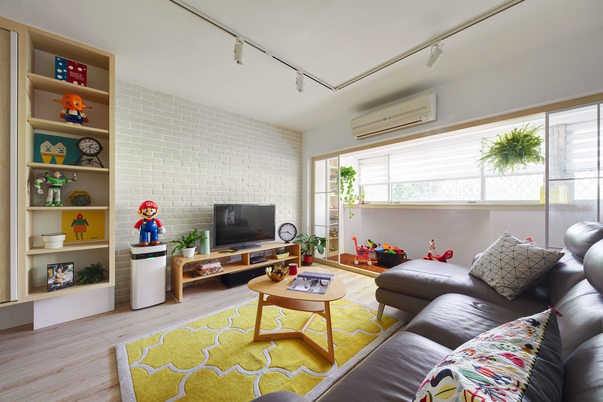
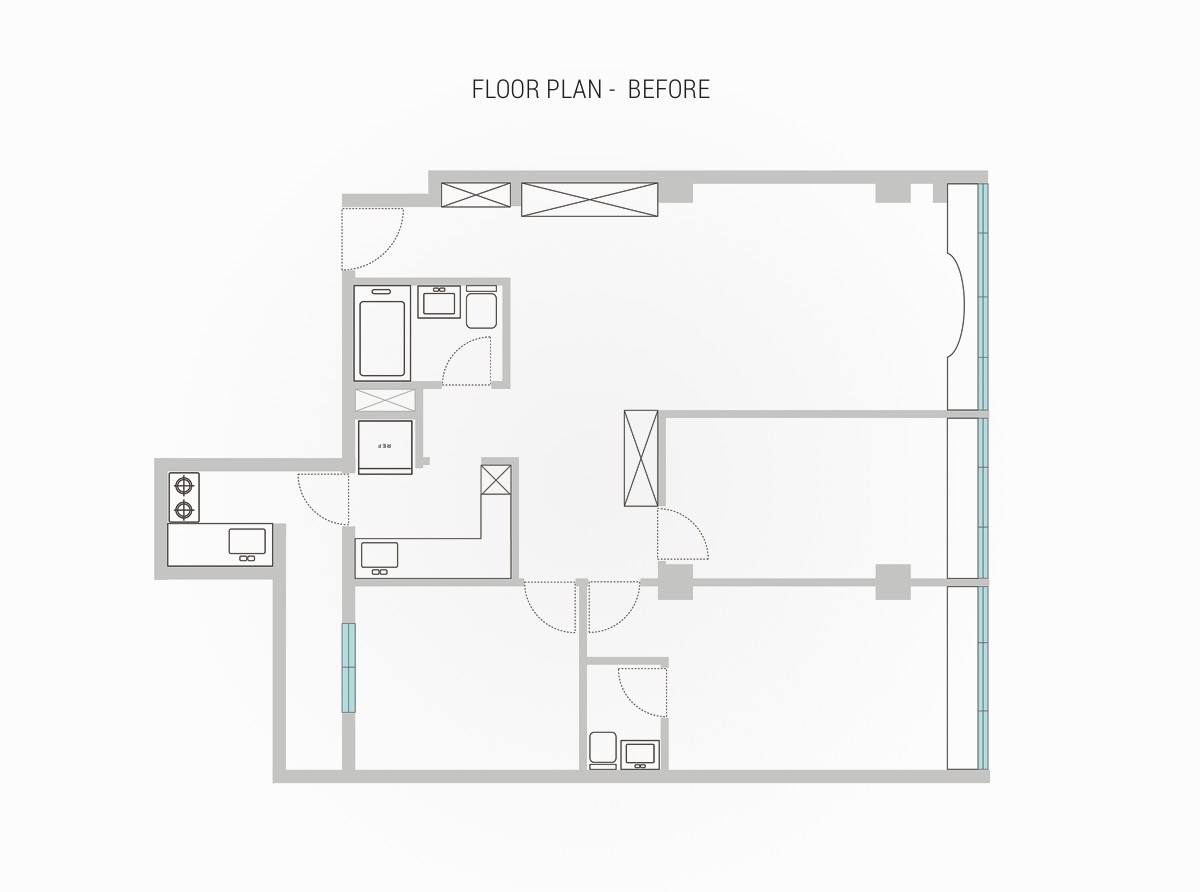
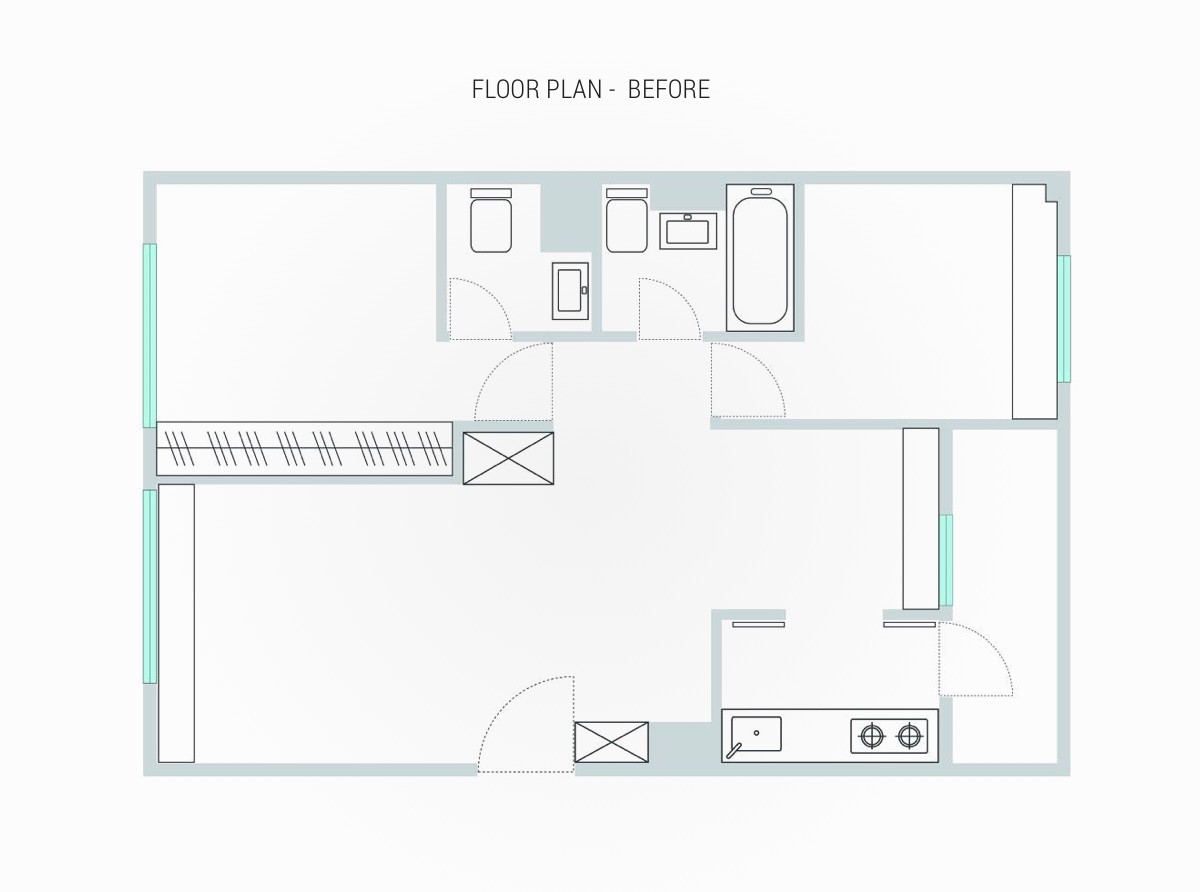
The first colourful remodel is a 40 year old family home, located in one of Taipei’s most expensive districts. The 92.68 square meter home had been renovated just a few years earlier by family elders but the original house had a poor layout that did not meet the needs of its newest generation.
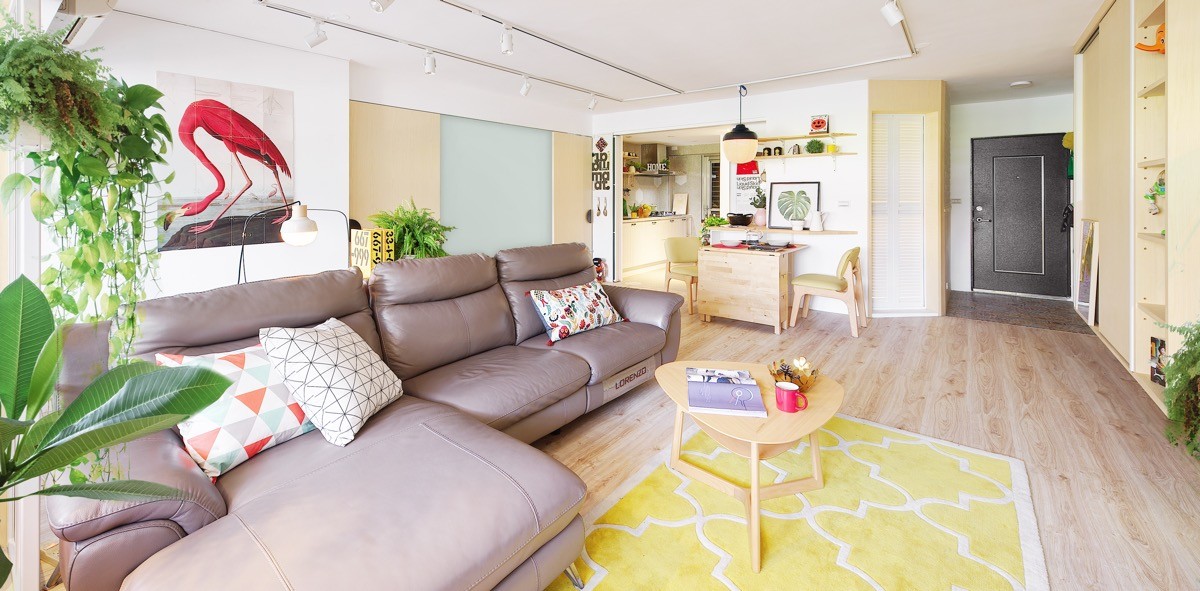
The couple felt that the layout was not conducive to their family life with a young son. Small rooms and dim lighting made living troublesome and inconvenient. The designer took down the walls of an existing study in order to blend the square footage with the main living area. This created a spacious open plan environment, which was then filled with colourful accessories and green indoor plants.
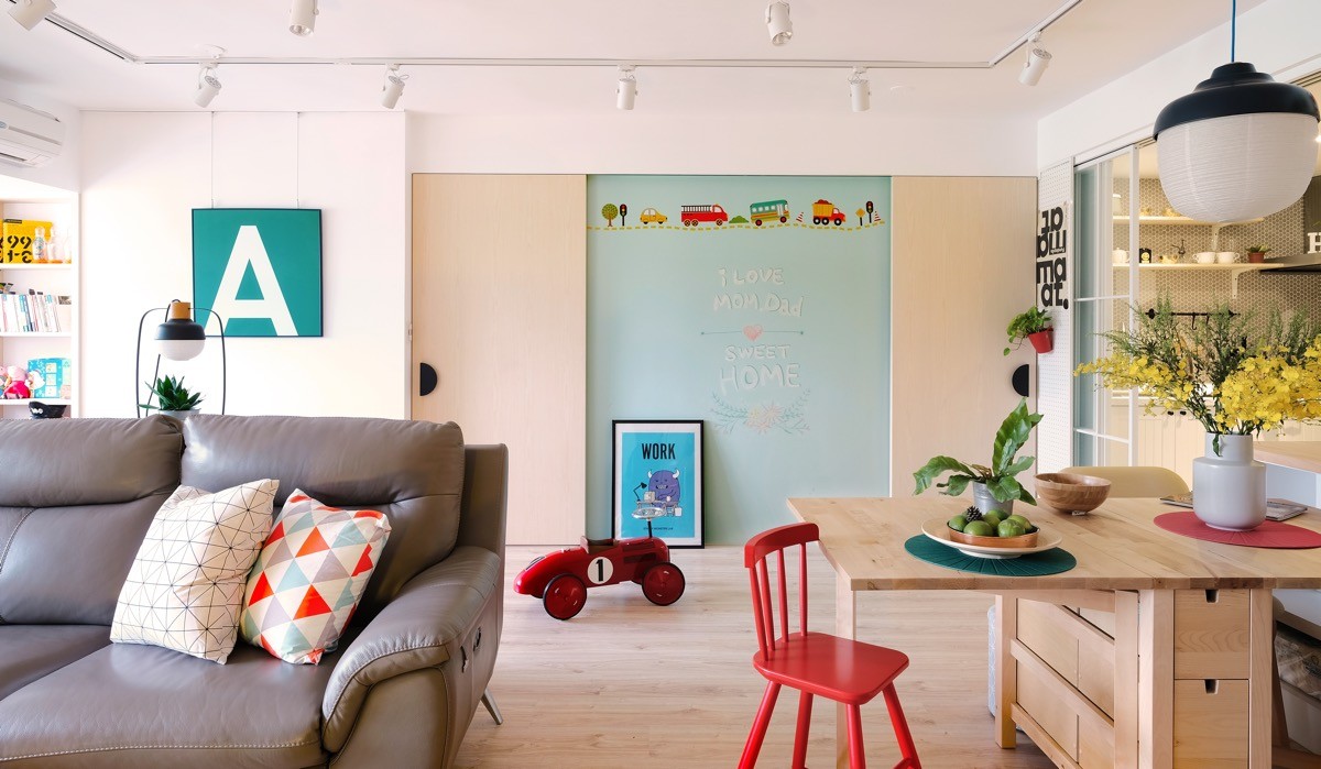
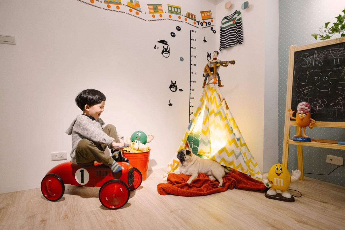
Ultra-wear-resistant wooden floors have been brought in to handle busy family life. A fold out dining table means that more space can be made for play when needed. A mint blackboard wall in the living room encourages the child to showcase his creativity.
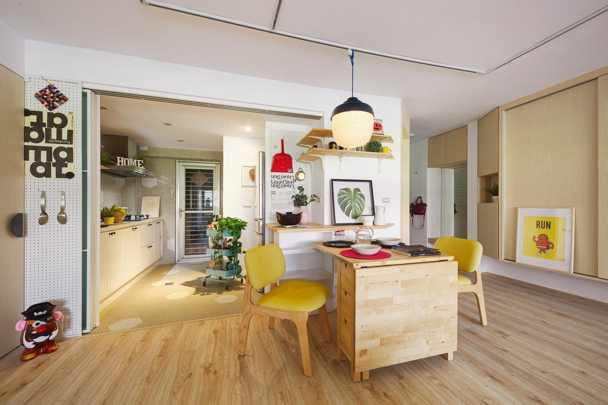
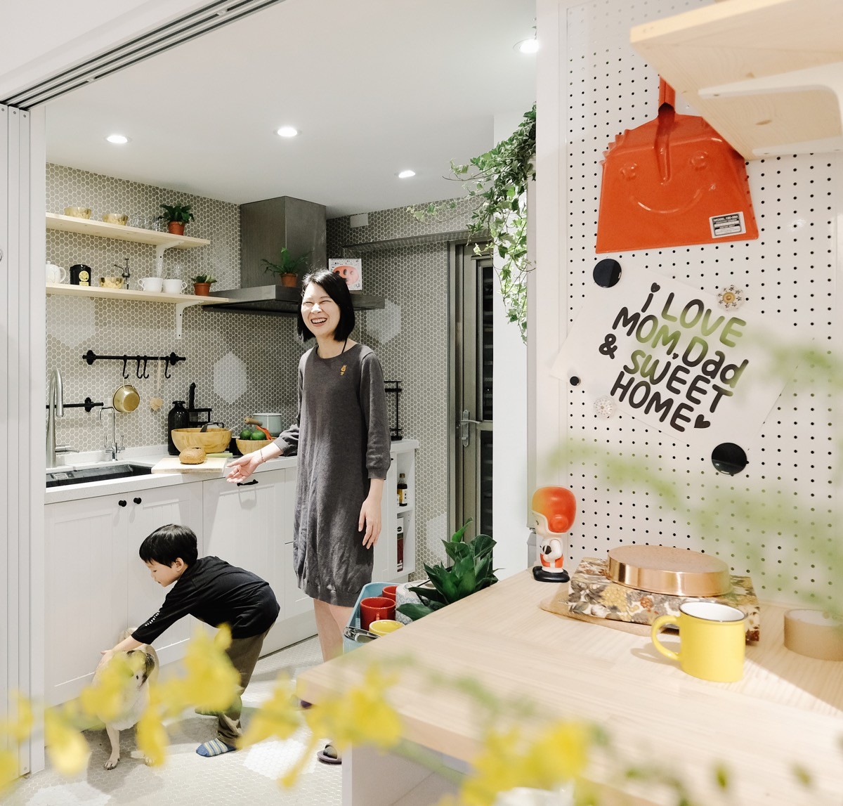
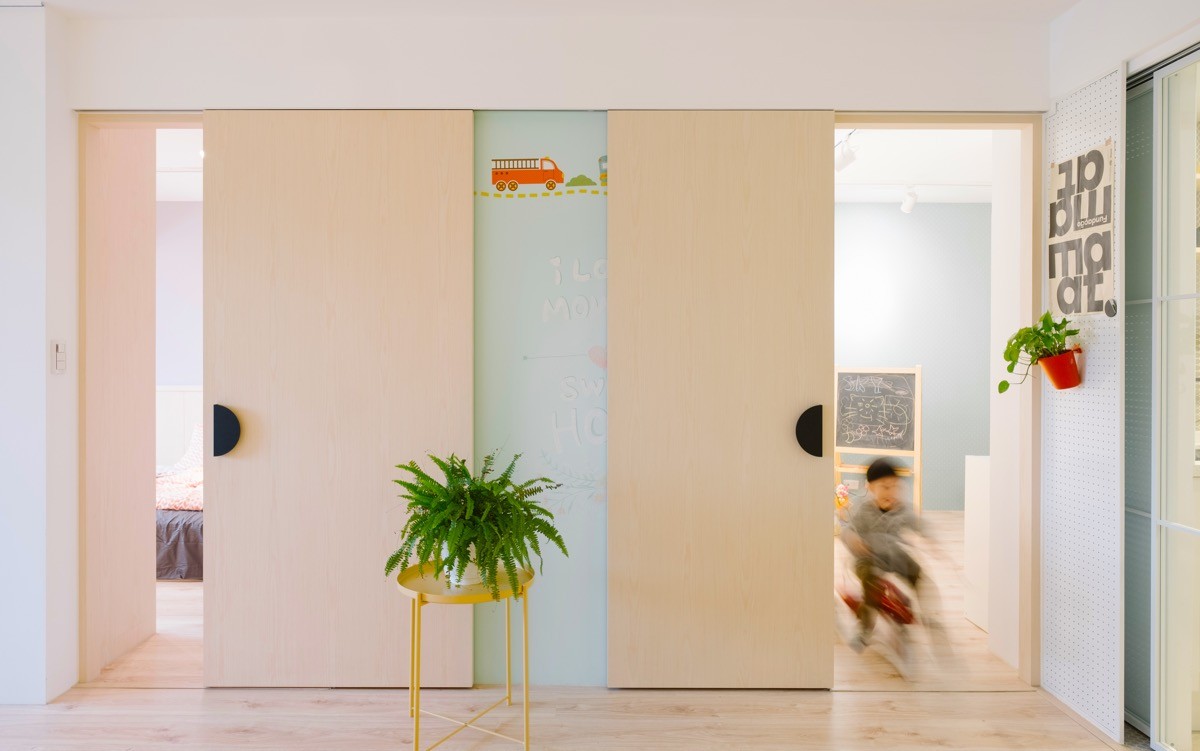
A large dining pendant light helps the little dining spot to appear more substantial. The original walls of the dimly lit kitchen are gone and replaced with sliding glass doors. This welcomes in additional light even whilst sealing in cooking smells. It also enables the parents to see what their young child is up to in the lounge whilst they are busy cooking.
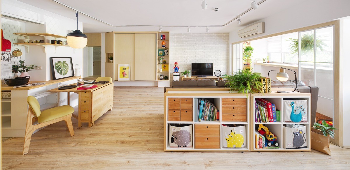
Continuous windows were added to make the most of the views and natural light. This bright free-flowing room has became the perfect space for laid-back family life. Various portable storage furniture has been positioned around the room to comfortably catch the clutter, and provide flexibility.
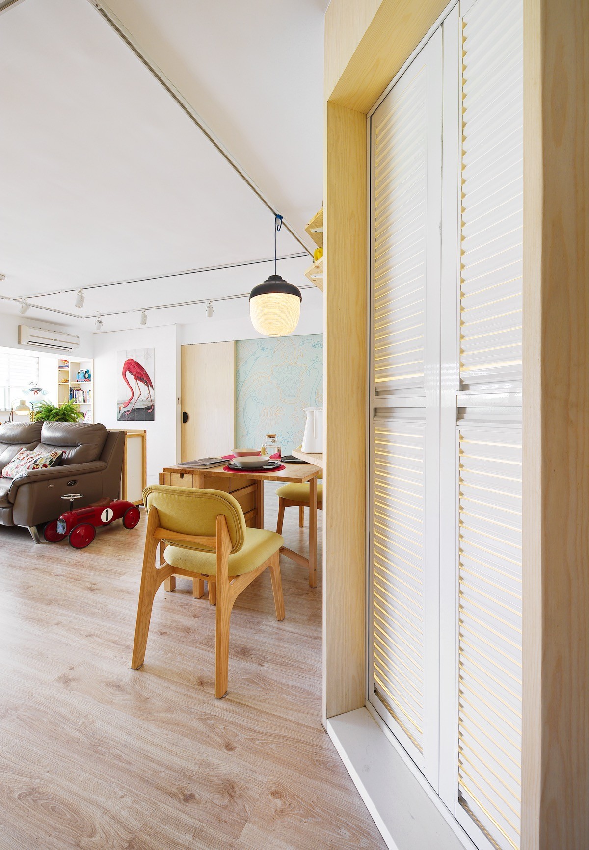
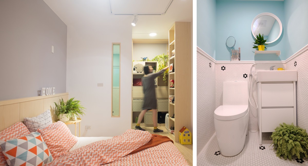
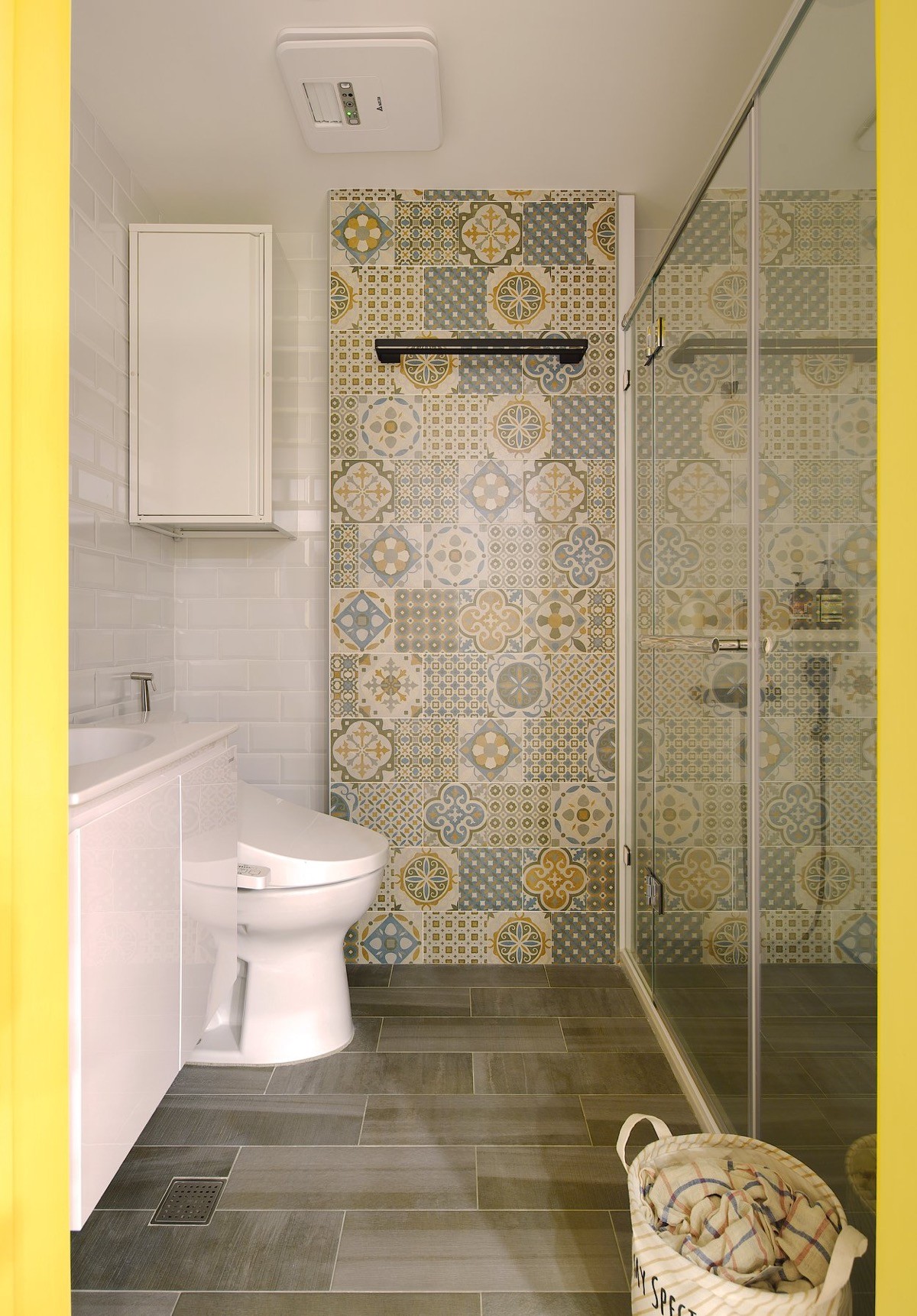
An angled doorway leads into the bathroom at the junction between the living room and the entryway. The door has been relocated from the opposite side where it was adjoined to the kitchen. The new door location also improves family traffic flow. Lemon paintwork and floral motif mosaic tiles infuse the small bathroom with a sense of brightness and energy.
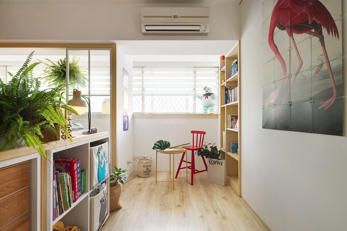
The storage units positioned behind the living room sofa act as a room divider. The space behind is utilised as a cosy reading nook. A designer table lamp straddles the two spaces, providing soft ambient light to both sides.
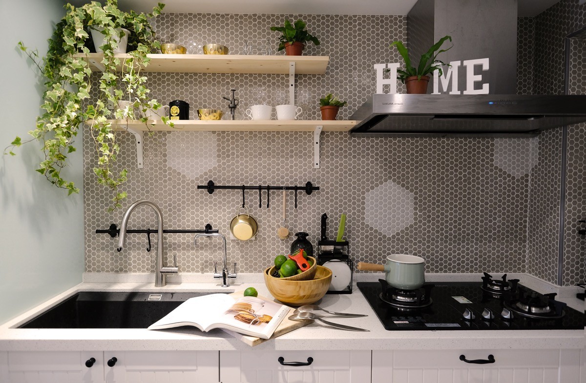
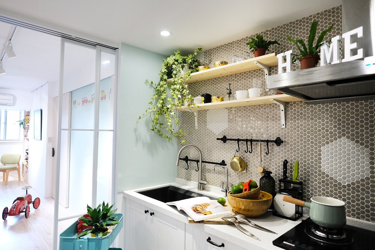
Tiny grey tiles cover the small kitchen backsplash. A plethora of young plants bring in some green.
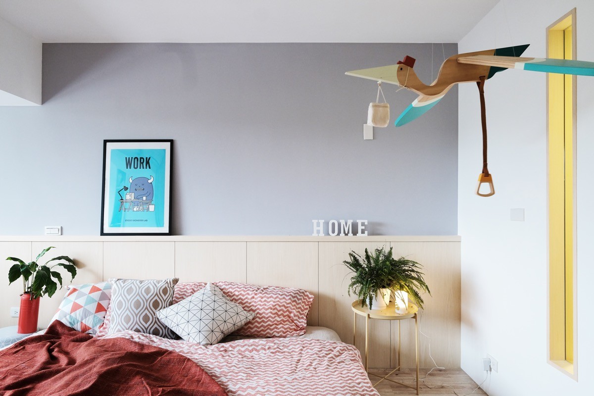
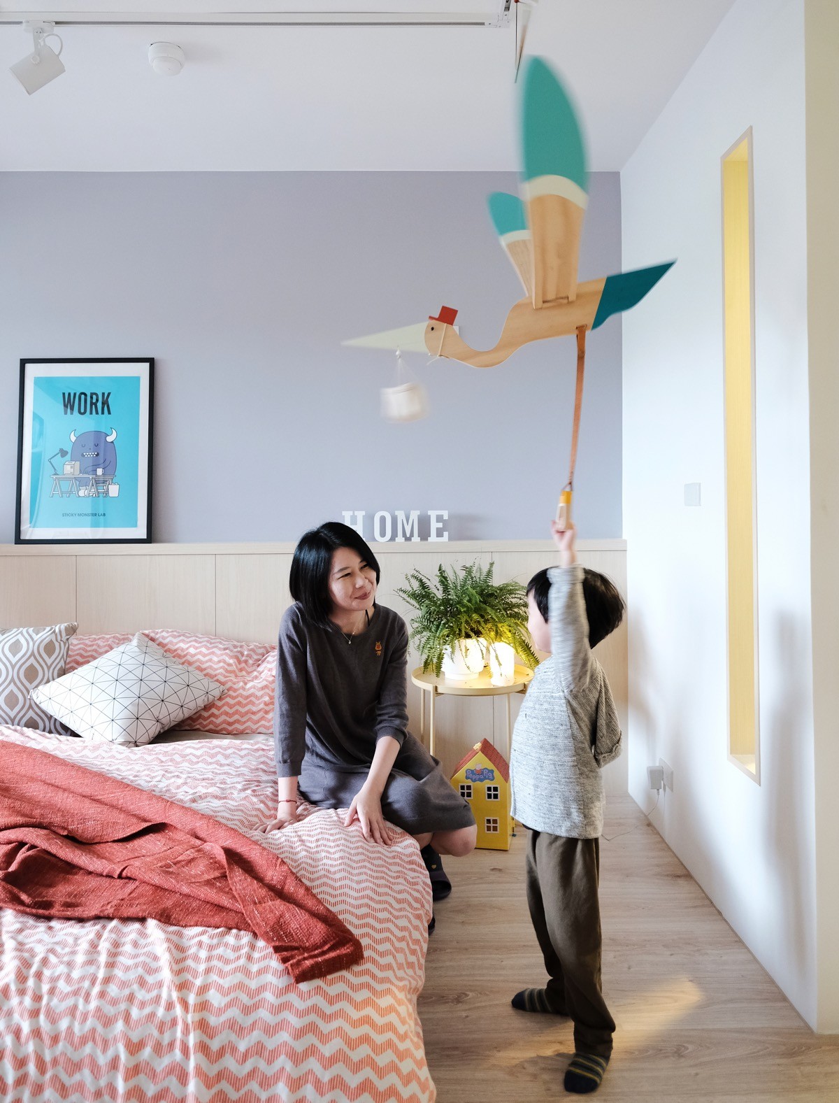
The master suite has a cozy bedroom scheme, painted in a soft blue-grey and accessorised with warm orange bedding. The bedroom partition wall was pushed out 60cm, to run flush with the outer edge of two support pillars. This marginal change allowed the designer to incorporate built-in closets. The ensuite bathroom door was also repositioned to no longer face the bed.
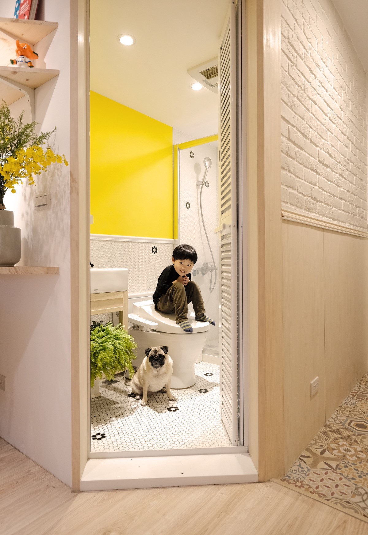
A yellow accent wall brightens the small bathroom space. Patterned floor tiles mark the home entryway.
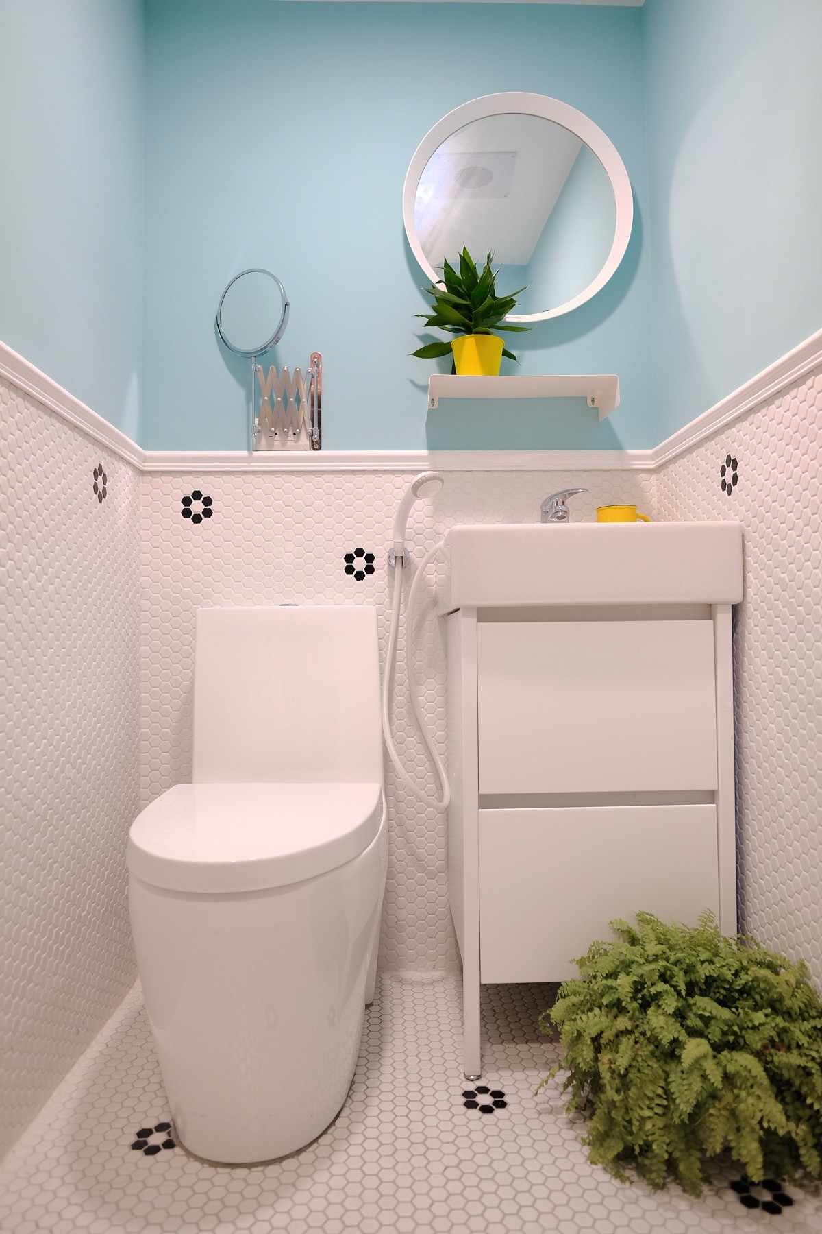
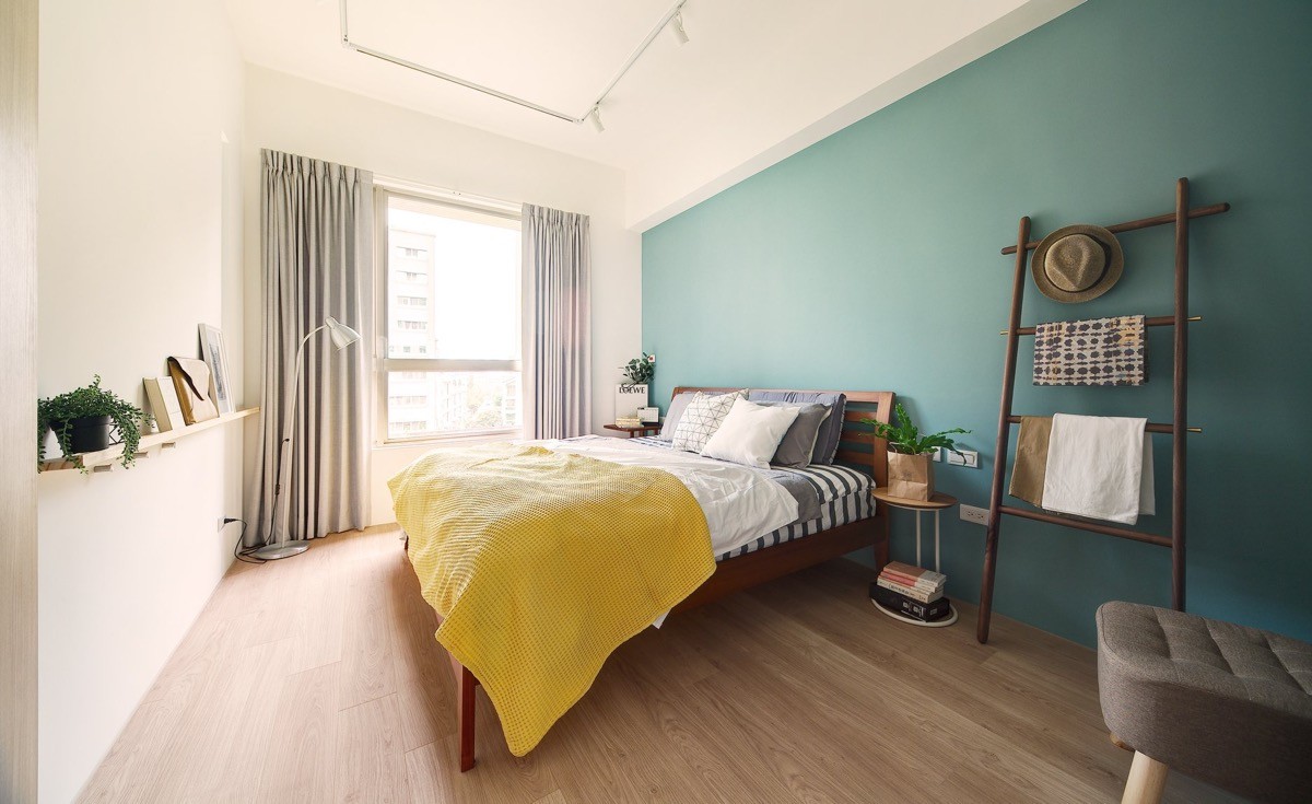
The compact room is decorated in a fun breezy style, with sky blue walls and sunny yellow accessories.
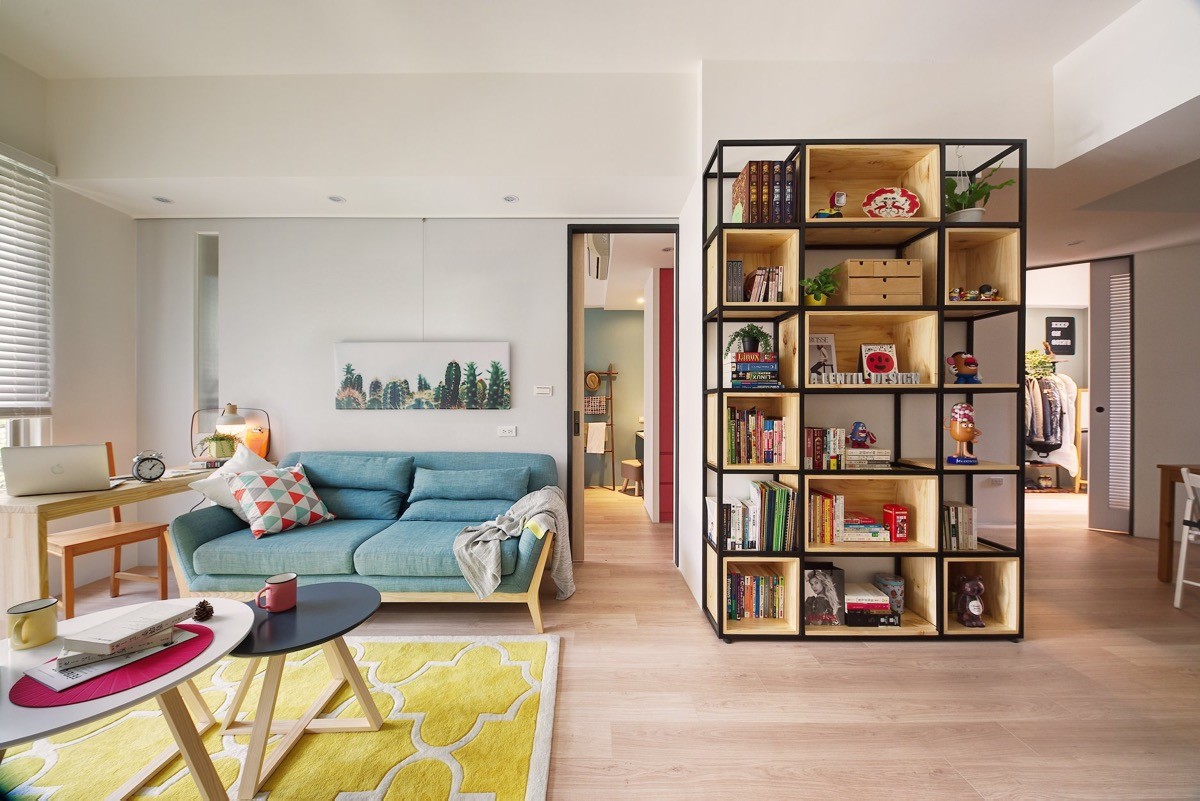
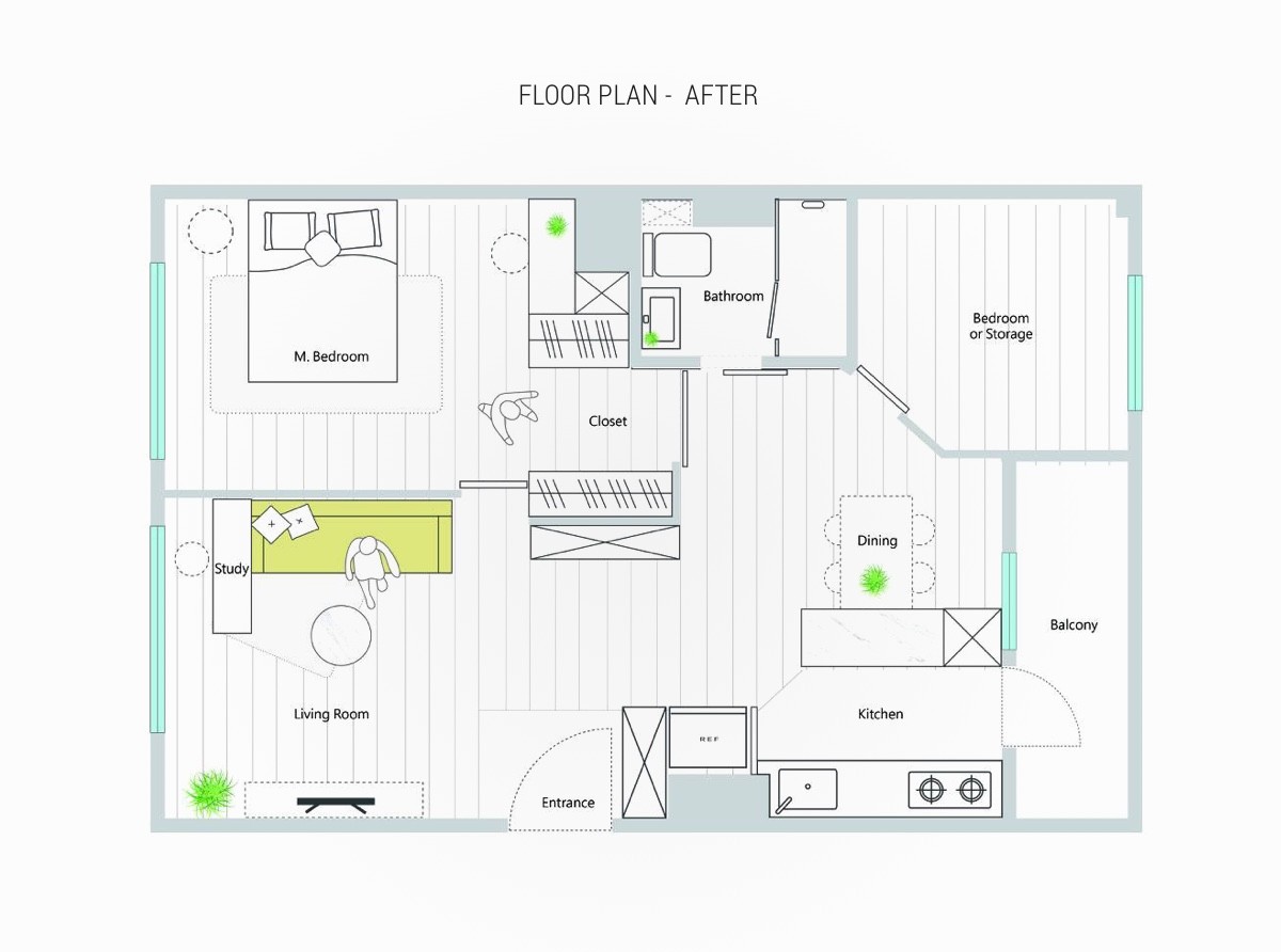
Home design number two is a 62.8 square meter space, located in Taipei Neihu District. It is a 10 year old house owned by a child-free couple.
“It bores me to tears if I live in an all white house.” laughed Cathy, the homeowner. From the first discussion, the design team found Cathy and her husband had bold ideas in terms of color combination. So a colorful, energetic - yet harmonious - interior was fashioned to fit their character.
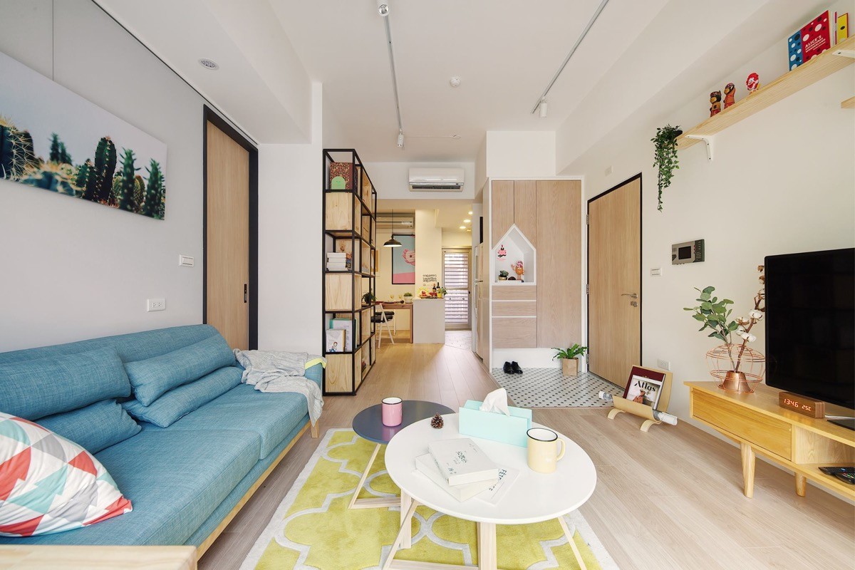
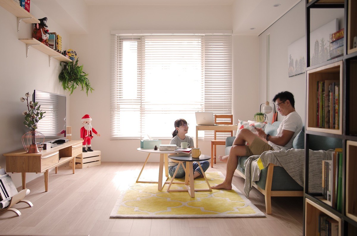
An acid yellow area rug contrasts with an aqua blue sofa and red scatter cushions. A colourful coffee mug set rests on nesting coffee tables.
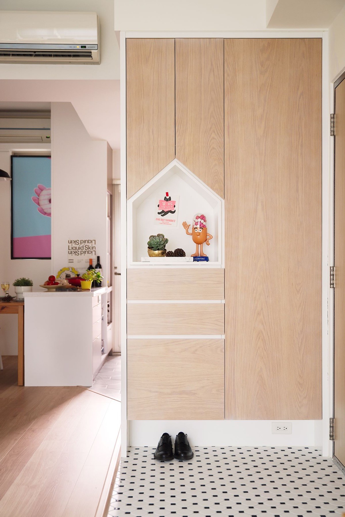
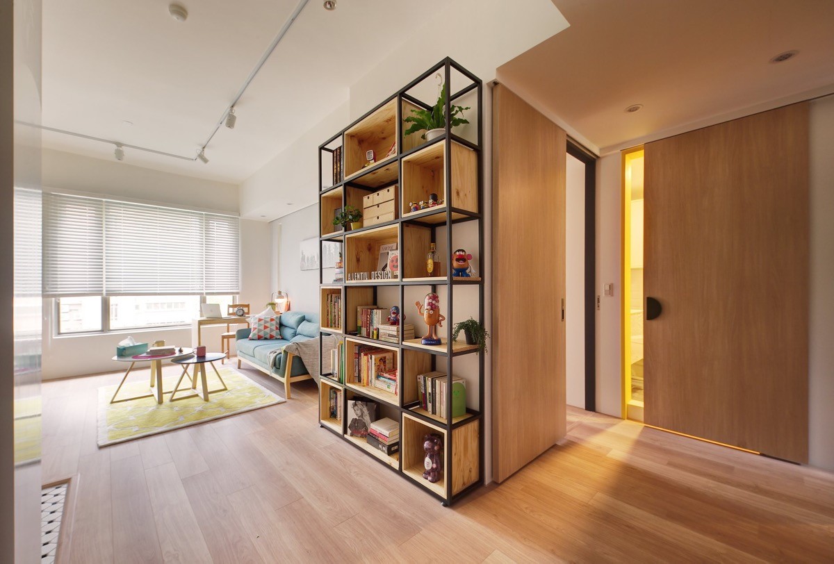
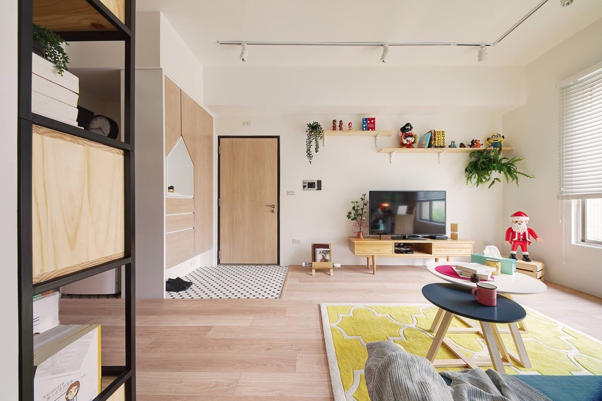
A house shaped cutaway breaks up a wooden storage volume in the entryway. Kitsch items add personality to the display.
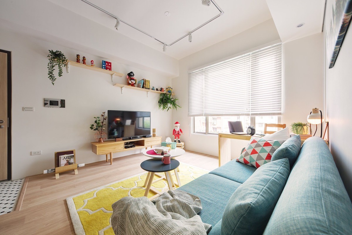
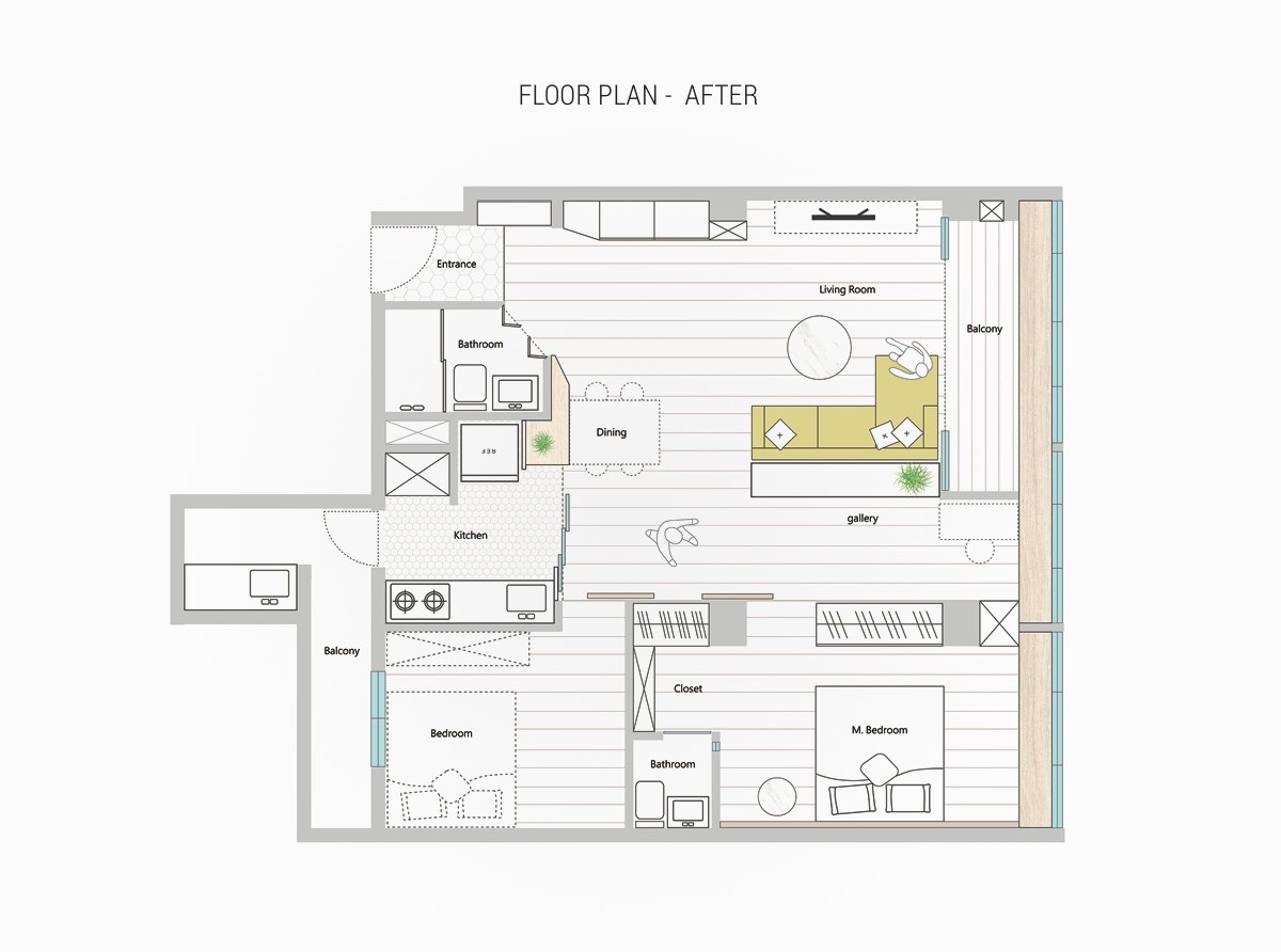
The home plan originally consisted of two bedrooms, two living rooms and two bathrooms. The rooms were reconfigured by the design team to better suit the homeowners living habits, which meant combining the two living rooms as one free-flowing open plan space. The lounge area is simply furnished with wooden pieces, including a slimline console unit and matching wall shelves.
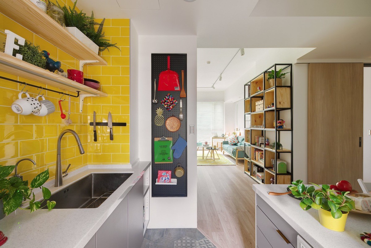
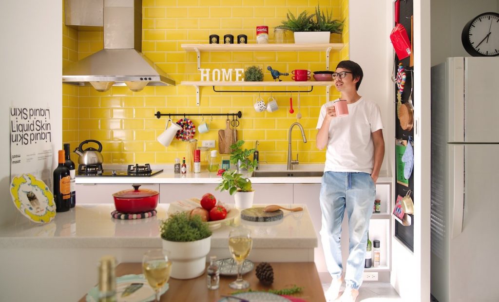
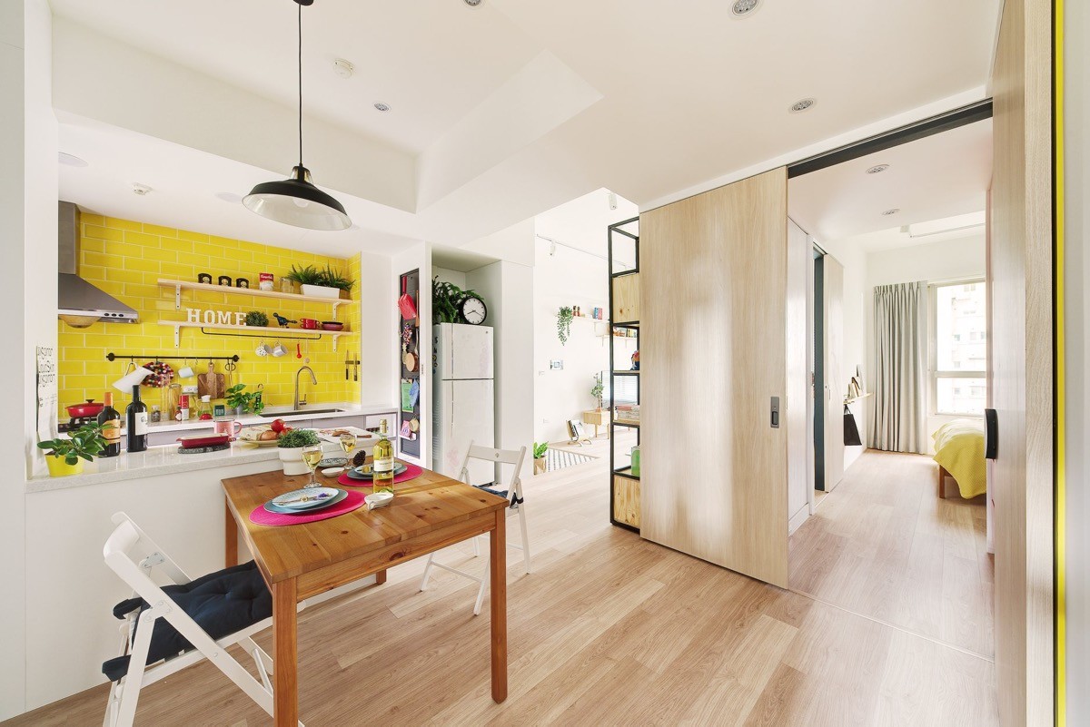
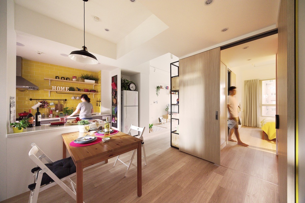
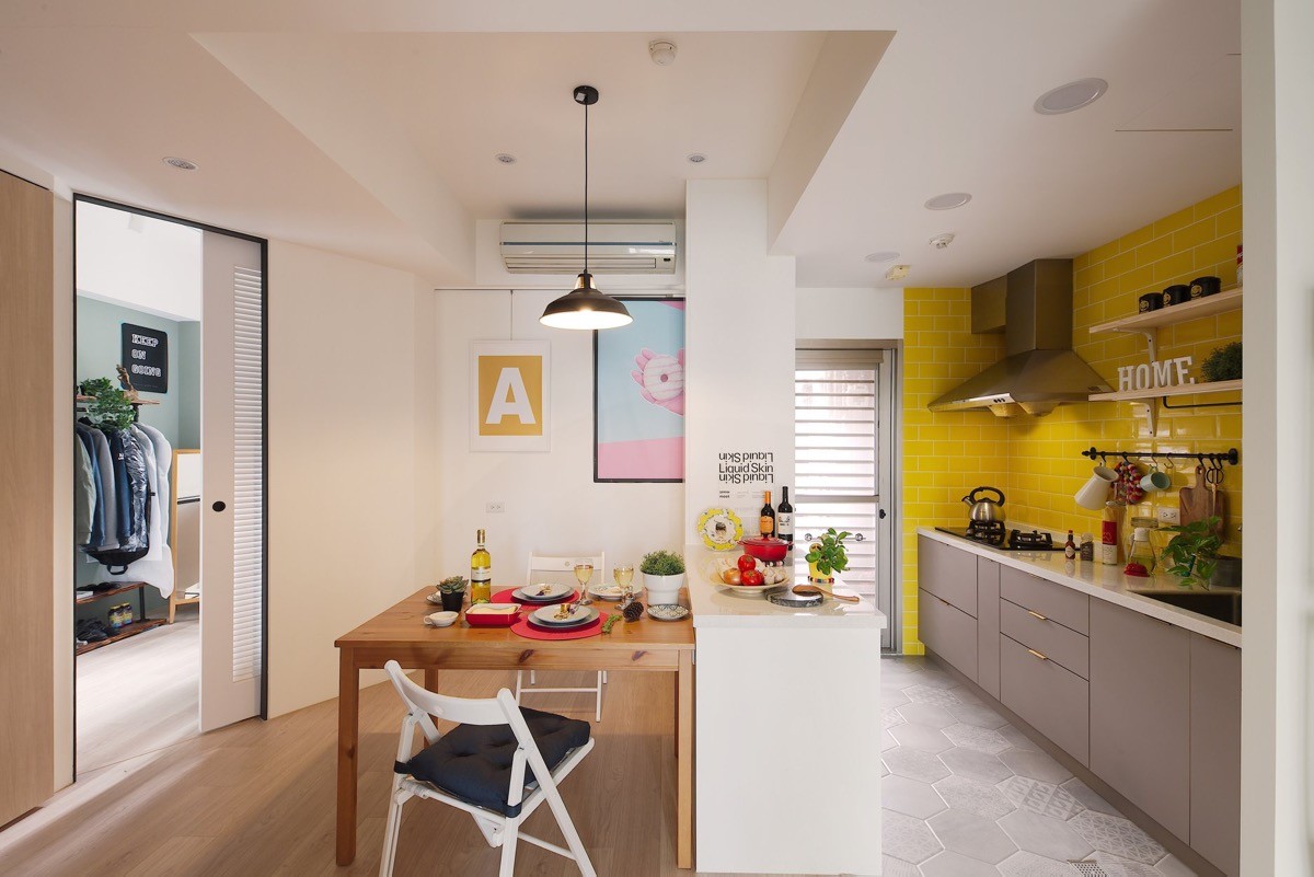
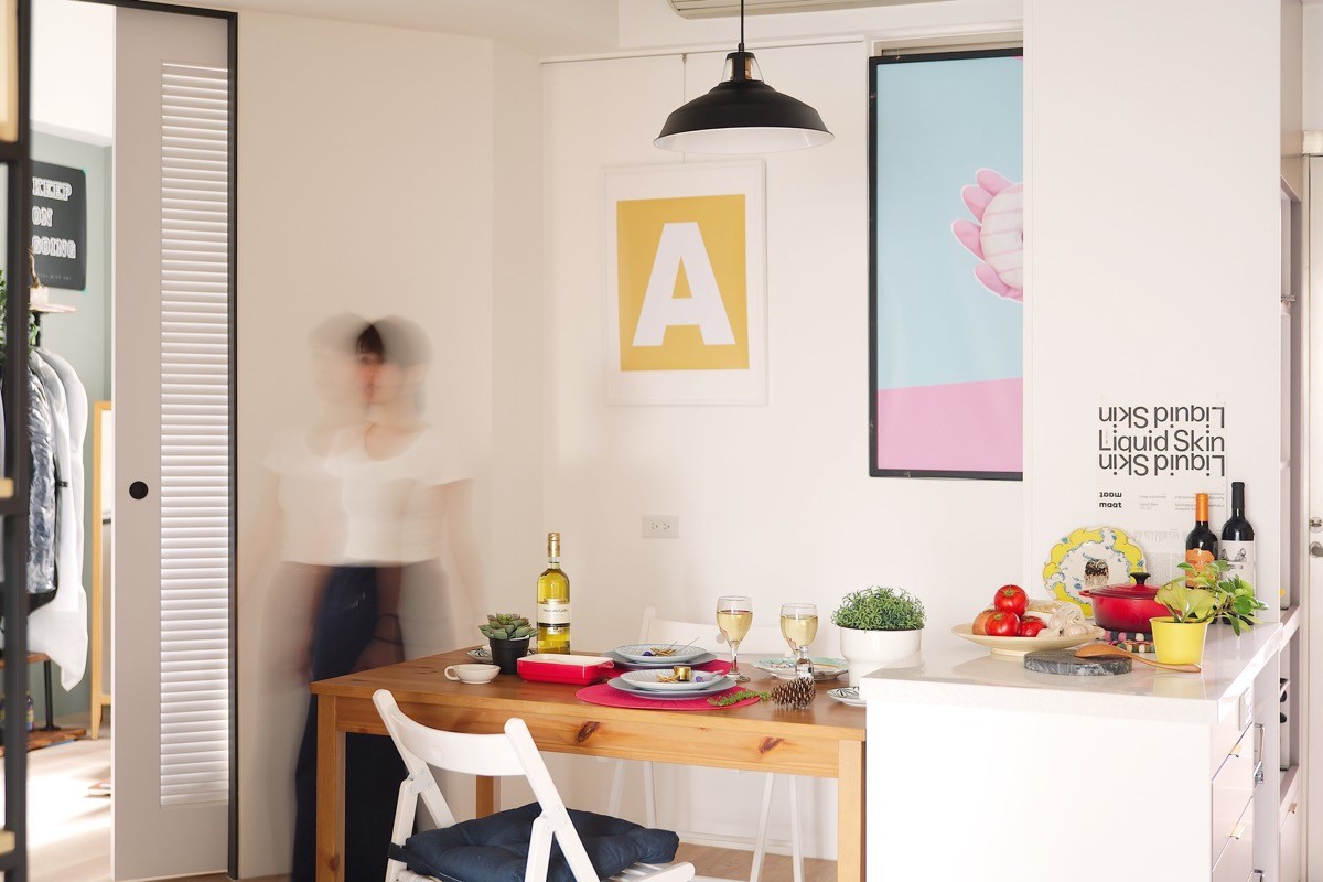
Opening up the kitchen to the dining room created an airy space, and allowed the addition of a new kitchen peninsula.
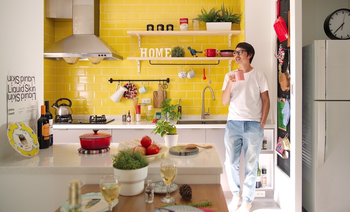
Open shelves provide easy access storage, and create casual wall decoration in the yellow kitchen.
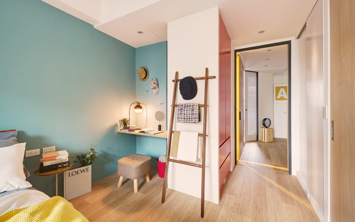
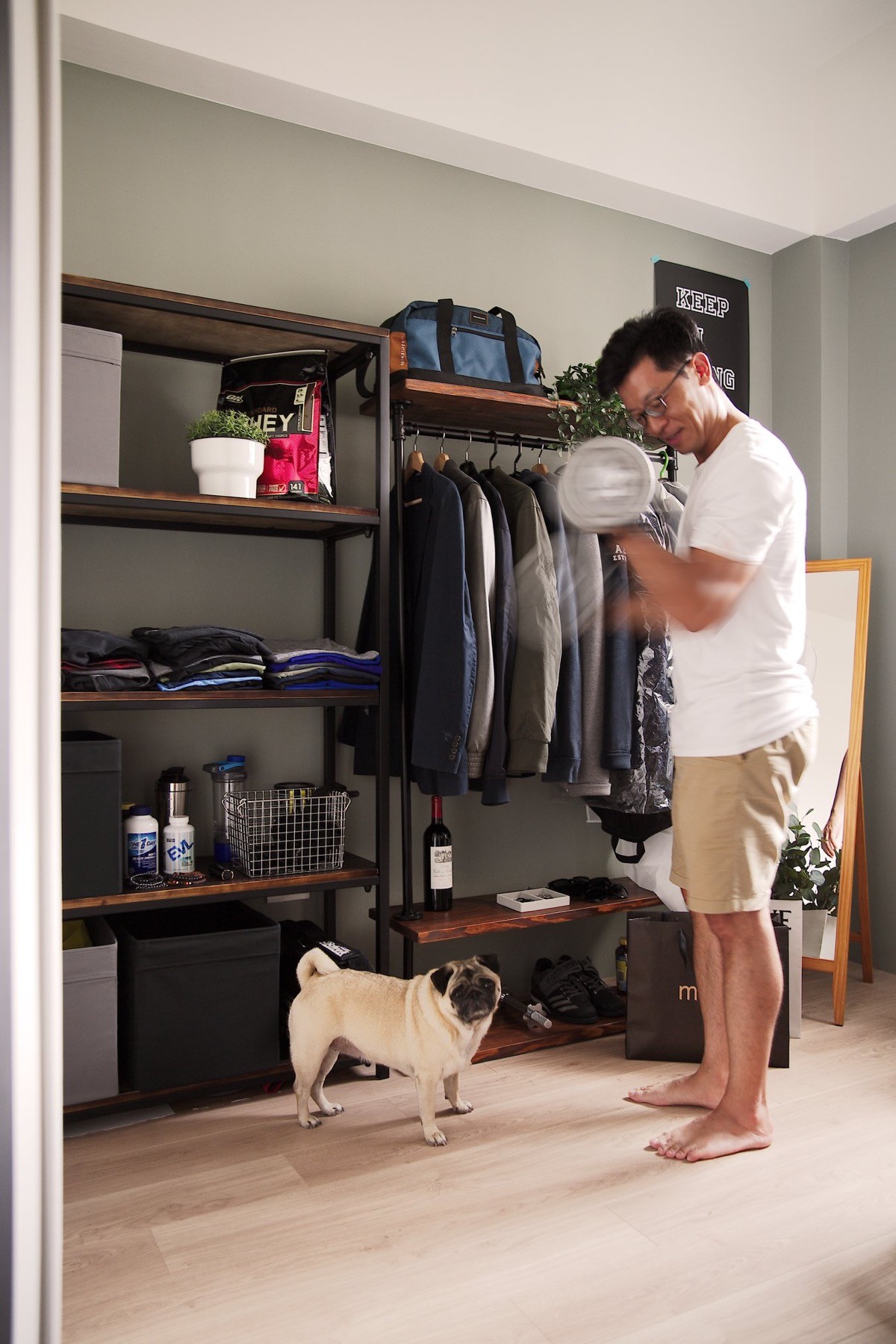
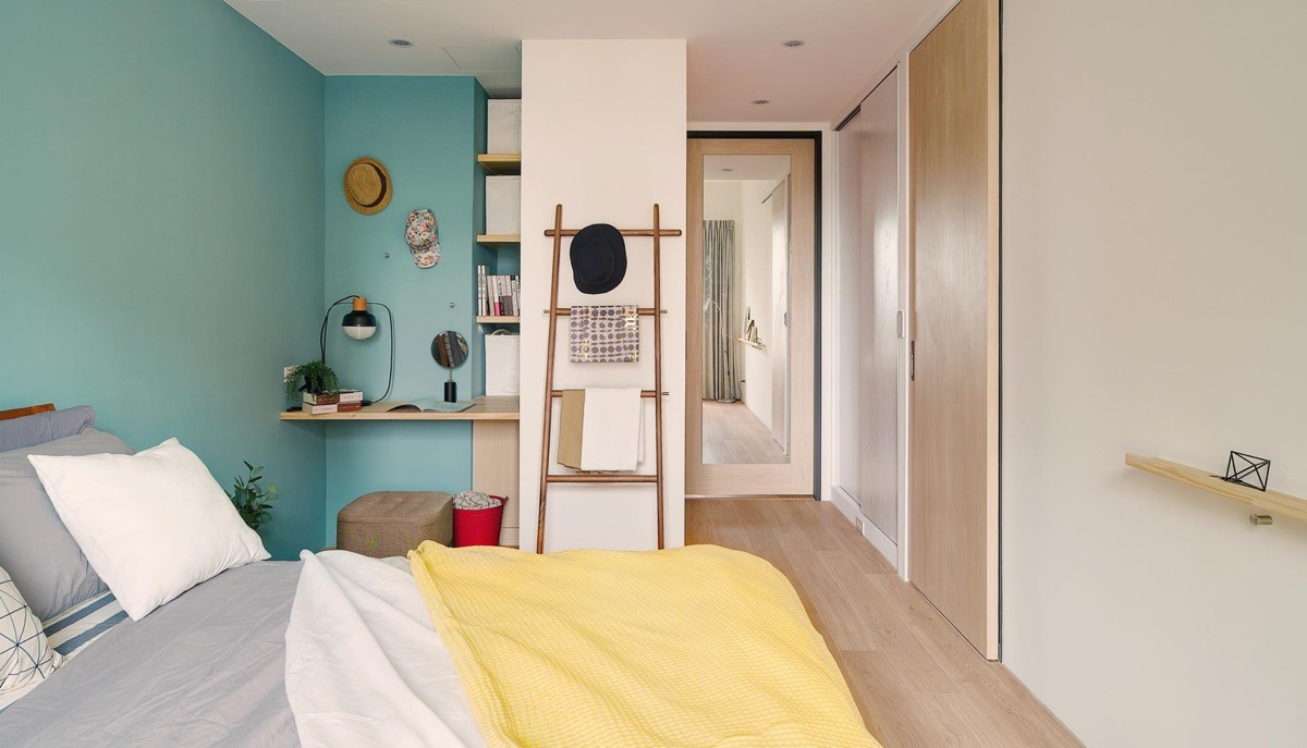
The new dressing aisle in the bedroom is a point of fluid movement in the home, with one exit leading straight towards the dining area, and another door exiting right to the lounge. There is also a small home office area in the bedroom, accessorised with a unique table lamp.
