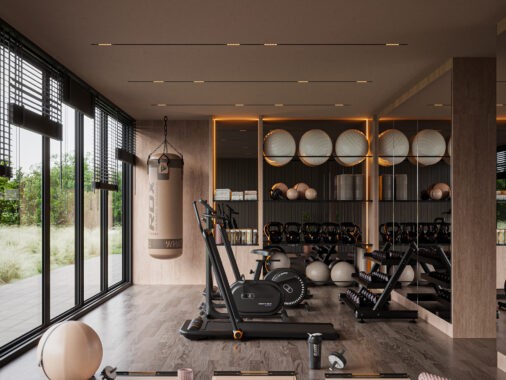
Young people take a lot of pride in the way they set up their room. Though grown-ups often feel that a child's space should feed and nurture their creativity, curiosity, and ability to focus, the space usually ends up as one that shows off the child's passions. As each has their own unique tastes and needs, it would be rare to find two that are alike. In this set of young workspaces we focus on a few that sport a special creative flair. The first five images are designs by Turkish interior designer, Akcalar and the last five are by Barcelona designer, Sergi Mengot.
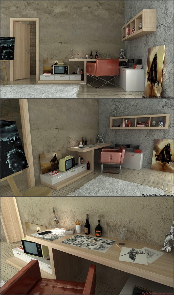
Here, Akcalar strips down the rustic design style to end up with a simple yet rugged artist's workspace.
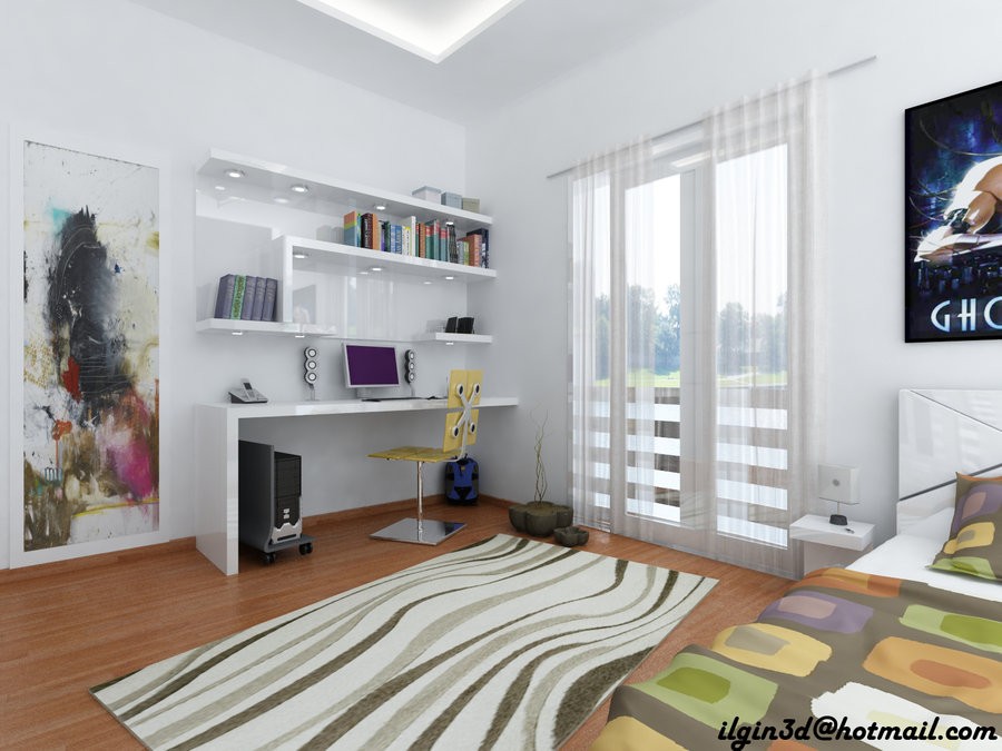
Another corner is designated in this room for the computer space and workspace, with bookshelves installed into the wall above.
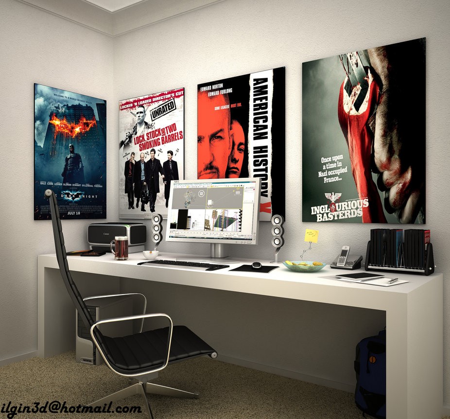
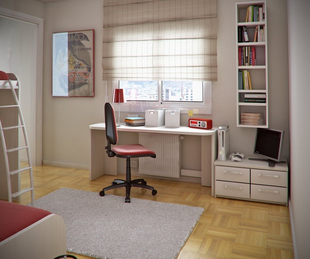
And here is Akcalar's vision of what a young, future producer's or film-maker's office space would look like--simple desk and chair, lots of color and inspiration on the walls. The next designer is Mengot, from Barcelona.
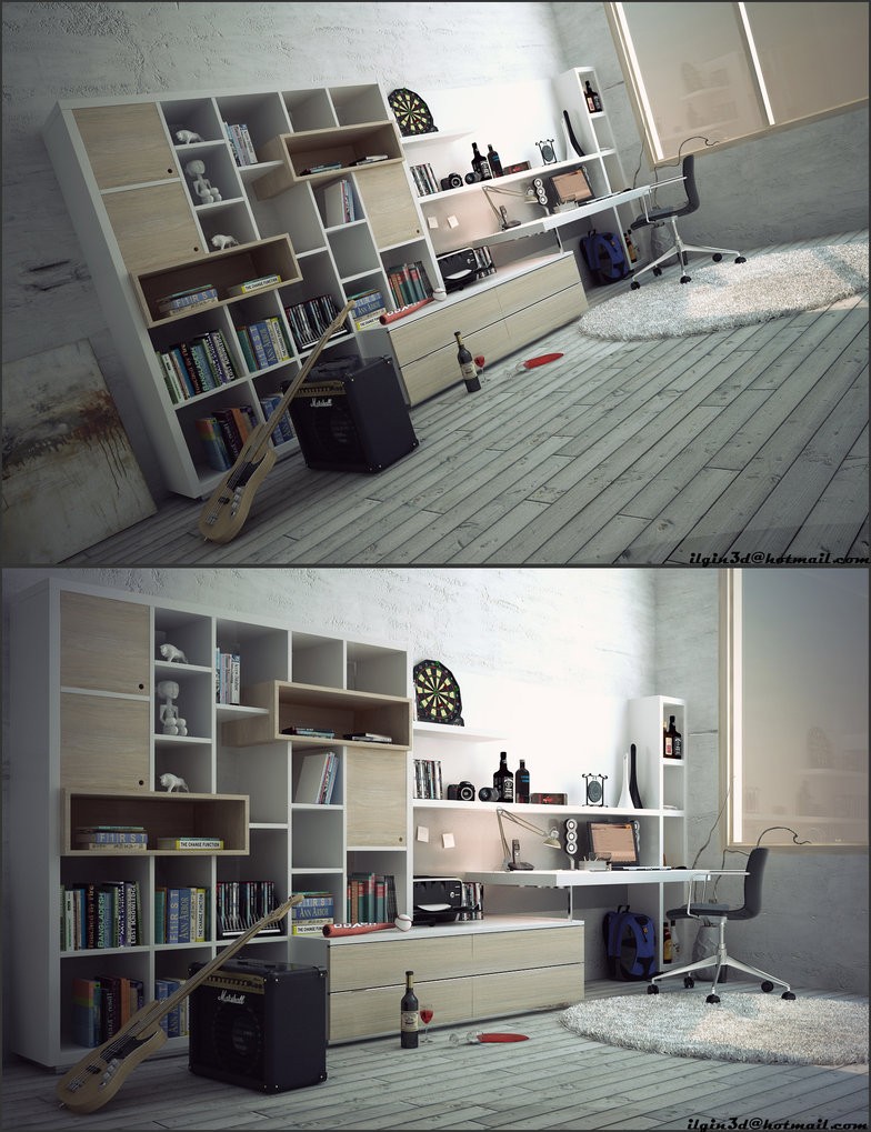
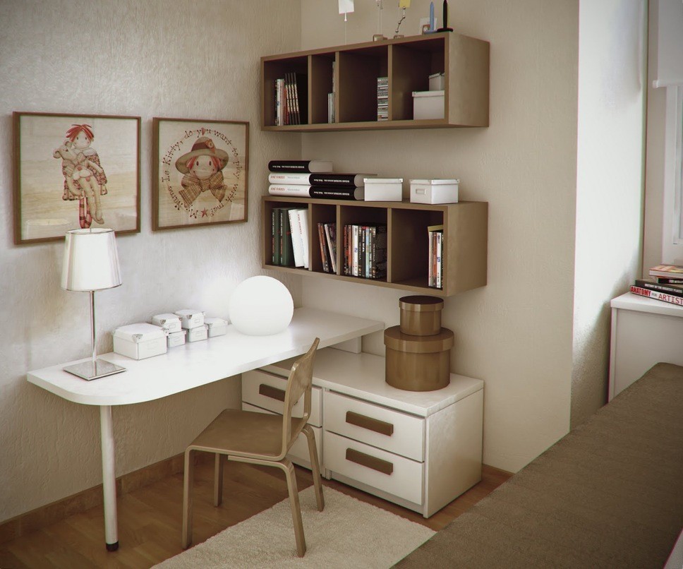
This workspace rendering by Mengot is similar to Akcalar's first rendering, with a rustic vibe, wooden floors, and grey walls. Once again it is assumed to be an artist's workspace (musician's).
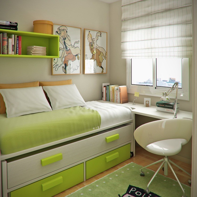
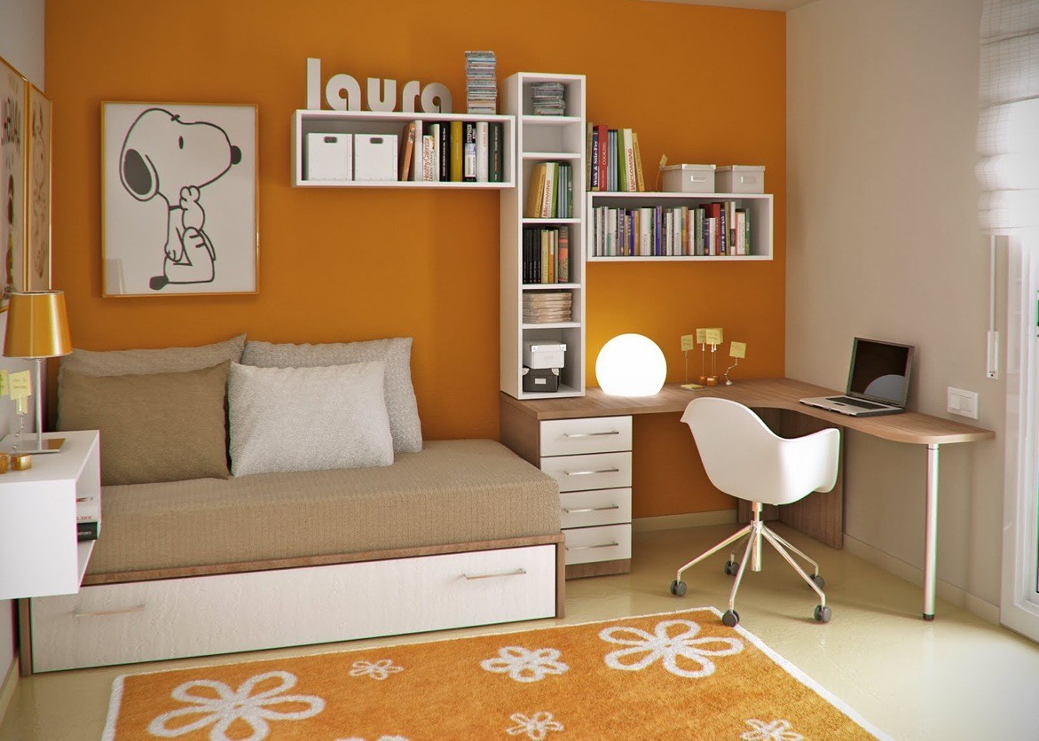
This kid's room maximizes space by attaching the desk to the bed area. The vibrant colors, perhaps an influence of Mengot's colorful city of residence, and natural light from the window, make it an encouraging and vibrant place for young minds to work.
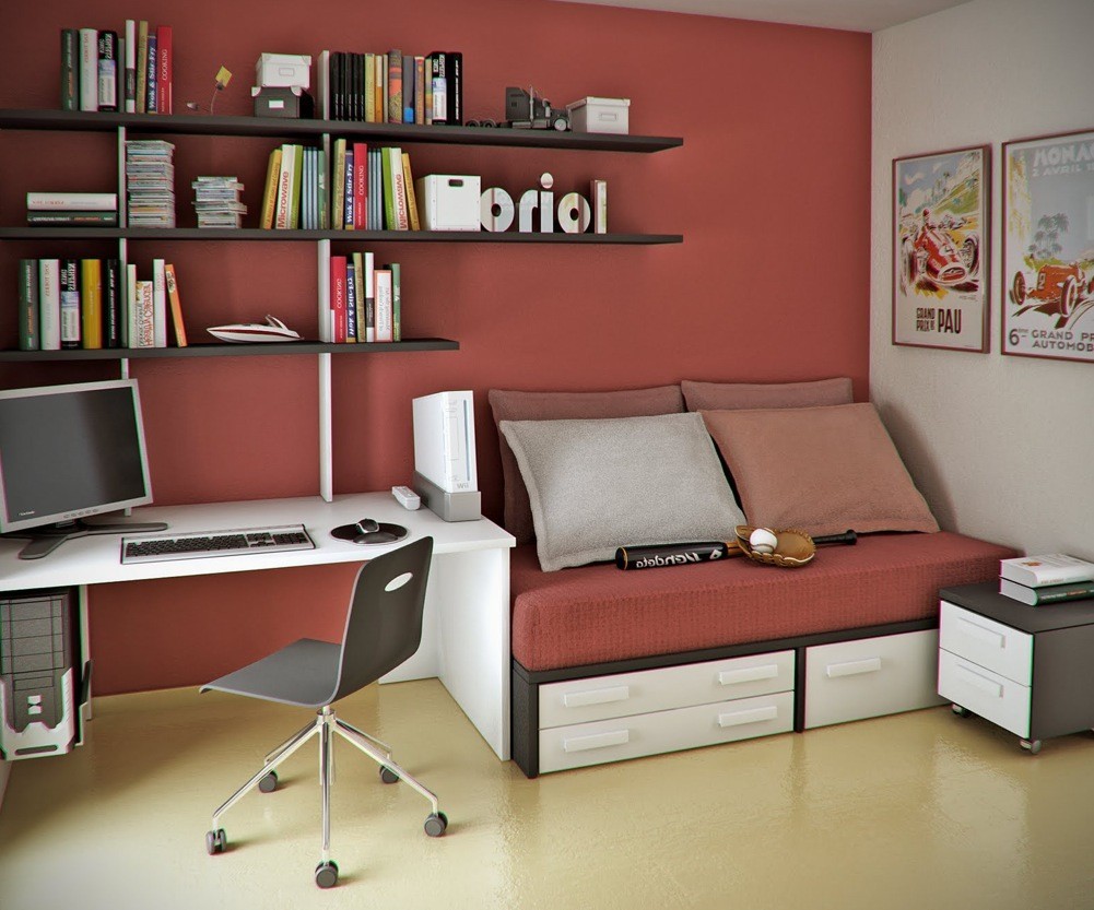
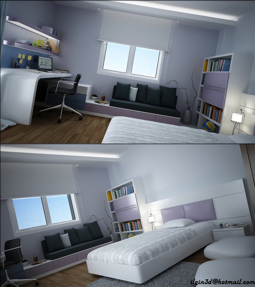
This mauve (appropriate color for boys and girls) workspace helps one calm down enough to focus on their work.
