Those familiar and enamoured with the De Stijl artistic movement will admire this joyous block colour home tour, designed and visualised by Rustem Urazmetov. Infact, anyone who enjoys a vibrant home scheme can draw ideas from a Piet Mondrian inspired interior design like this, with its fearless use of primary colour and bold black outlines. Neoplasticism might have been born back in 1917 but the aesthetic still looks bang up to date in a contemporary styled apartment, with plenty of white space to let it breathe. Geometric furniture designs and rug prints work well with the hard lines of De Stijl, and bring it bang on current trend.
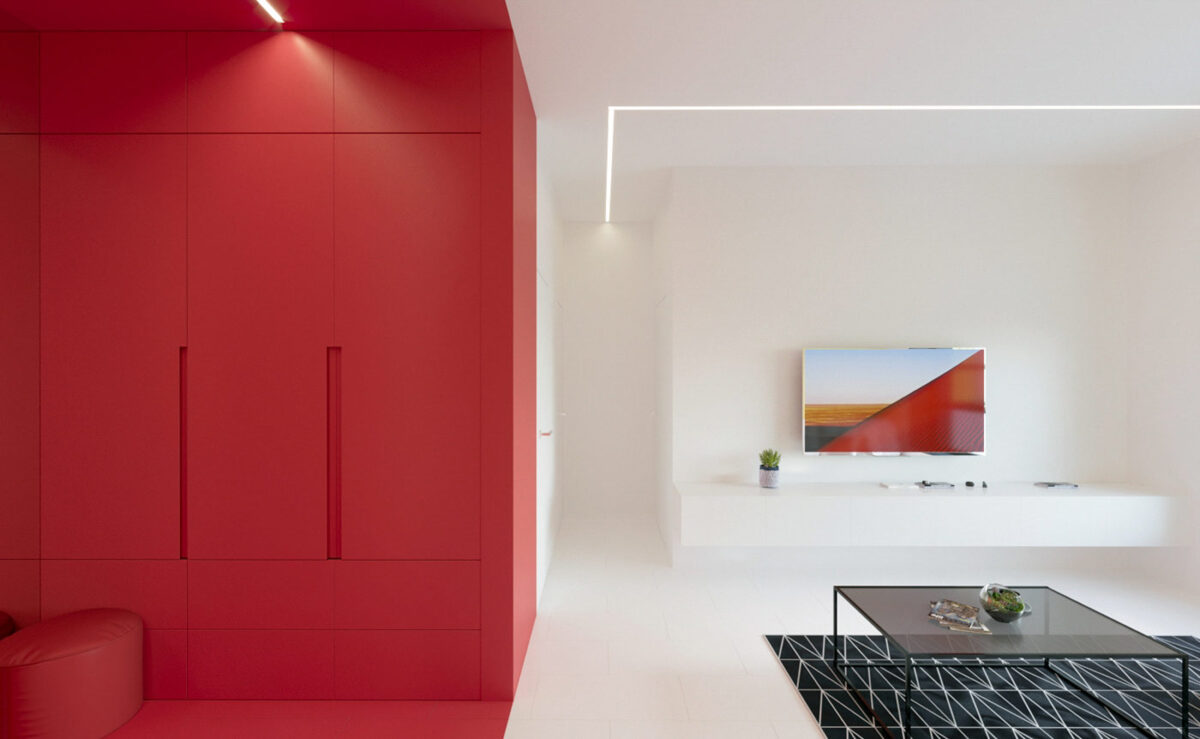
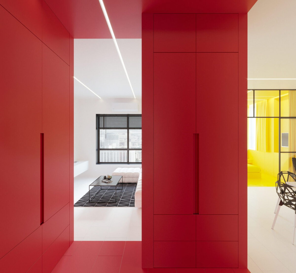
A small red stool is almost camouflaged against vivid strawberry red closets that lead from the home entryway to the living room. The living room contains a decor scheme of predominantly white walls to provide a little breathing space before the next wave of colour crashes in. LED light strips cut through the black canvas, and draw an outline of light around the shape of the room.
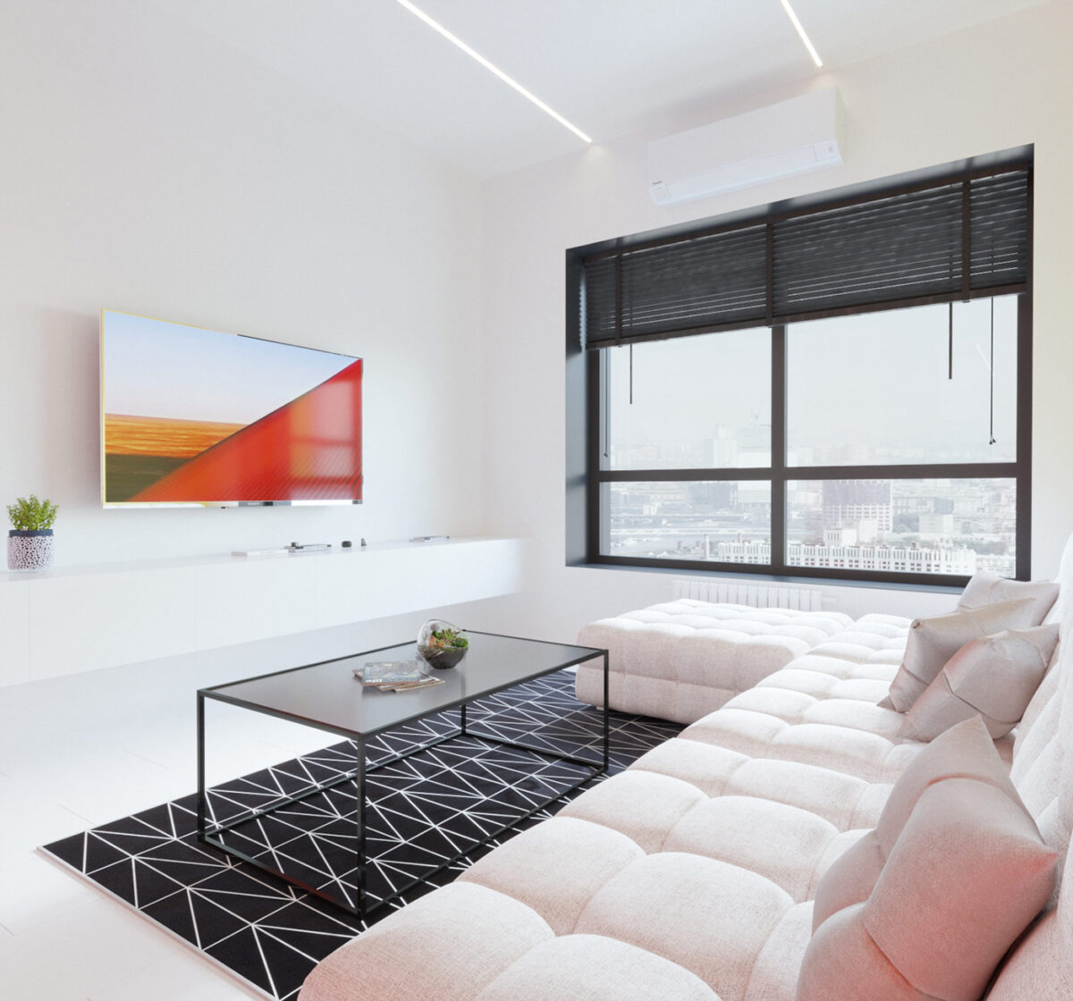
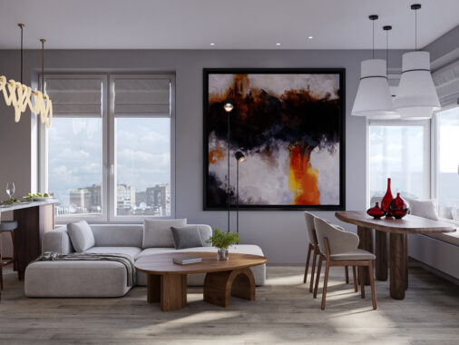
A white wall mounted console unit blends with its backdrop beneath a flat screen tv. A light coloured sofa draws an L-shape around the other side of the lounge, standing on top of a black geometric design rug. The coffee table and window treatment bring in black outlines that are synonymous with Mondrian’s work and De Stijl.
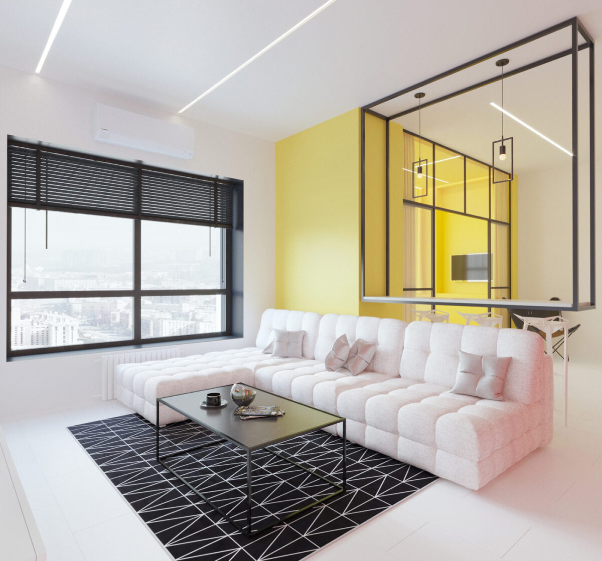
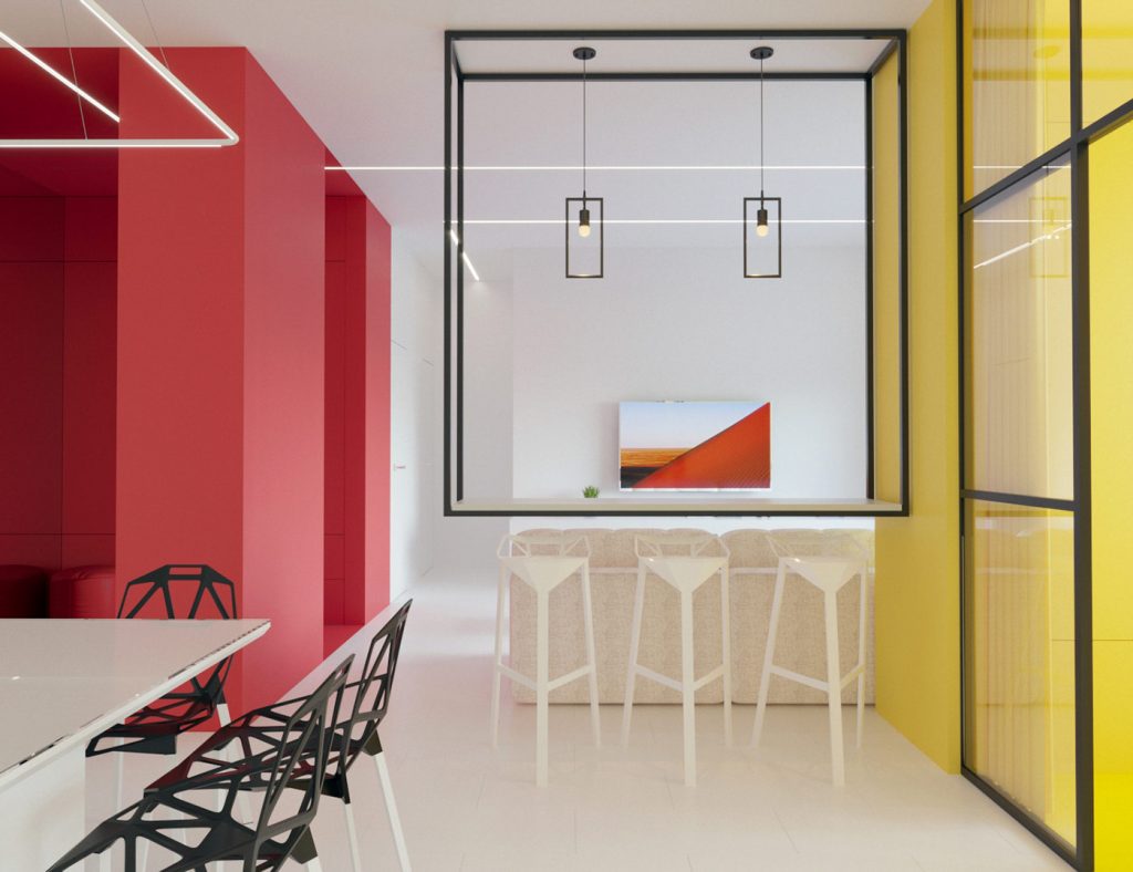
More black framework is suspended from the ceiling, and around two pendant lights behind the sofa. The installation is a bar for casual dining whilst watching the tv over on the other side of the lounge.
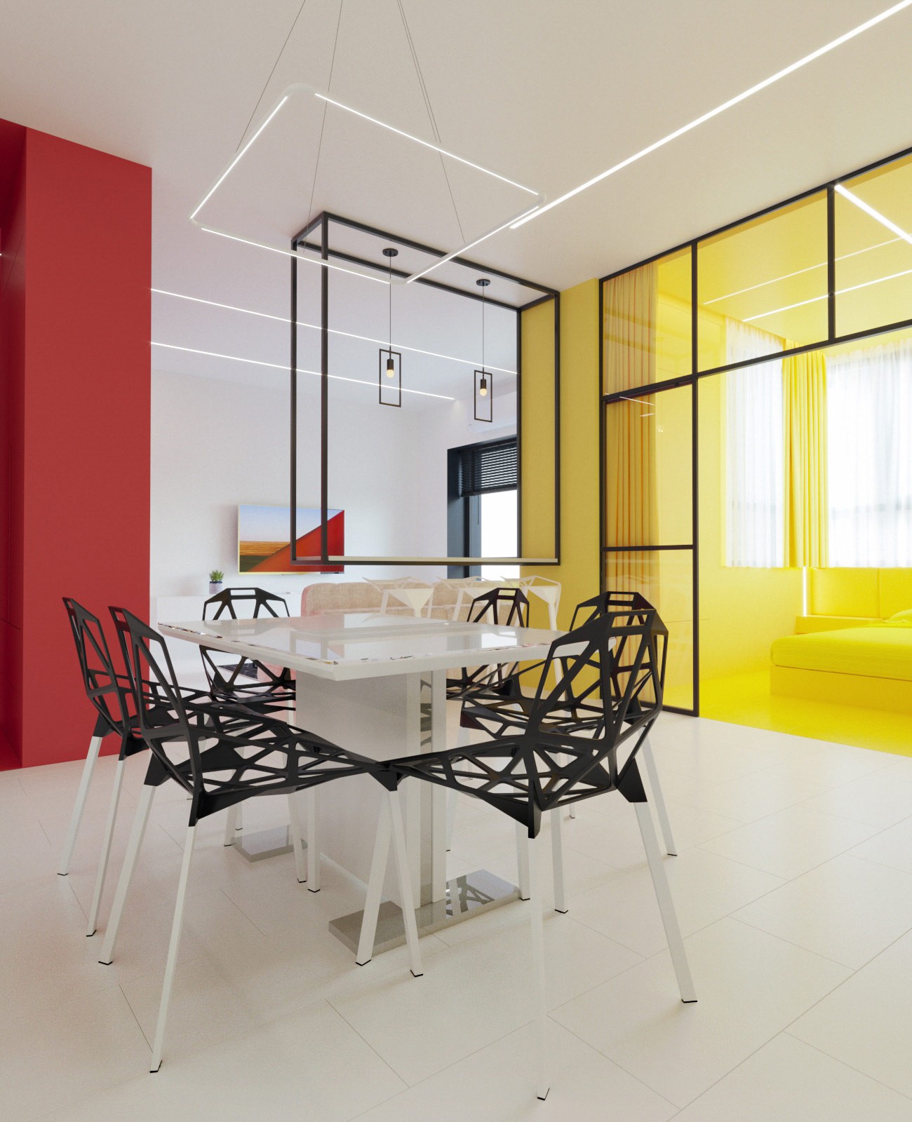
A more formal dining area sits right by the dining bar, made up with a sharp edged gloss white table and the Magis Chair One. Cheaper replicas are available on Amazon.
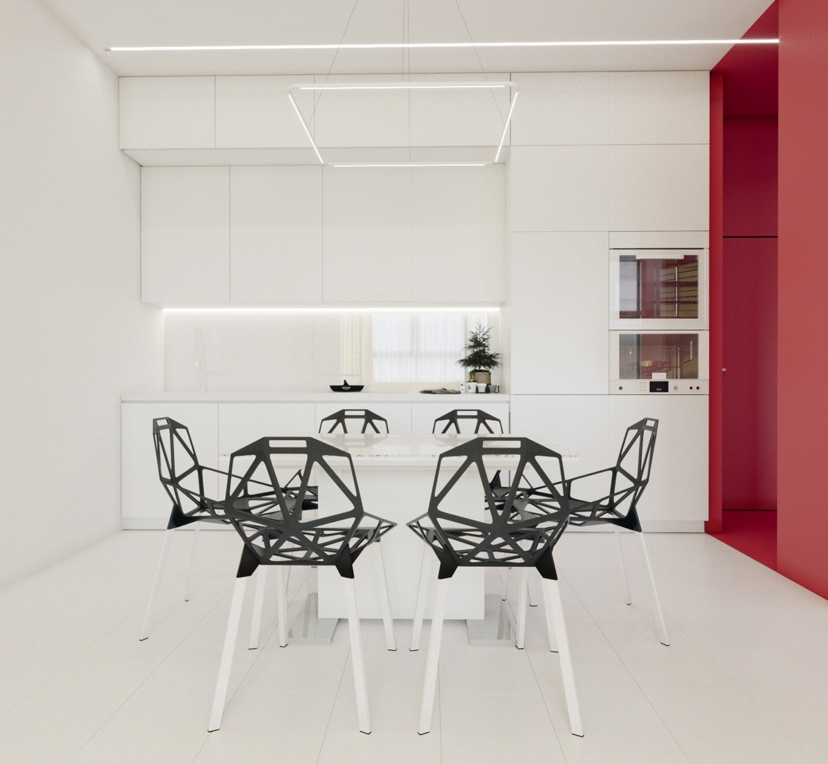
The monochrome dining set neighbours an all white kitchen, with white integrated appliances.
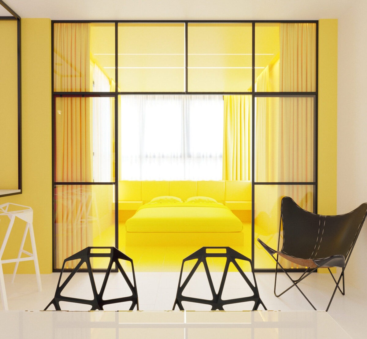
Across from the kitchen, on the other side of the monochrome dining area, we’re met with an all encompassing yellow interior design.
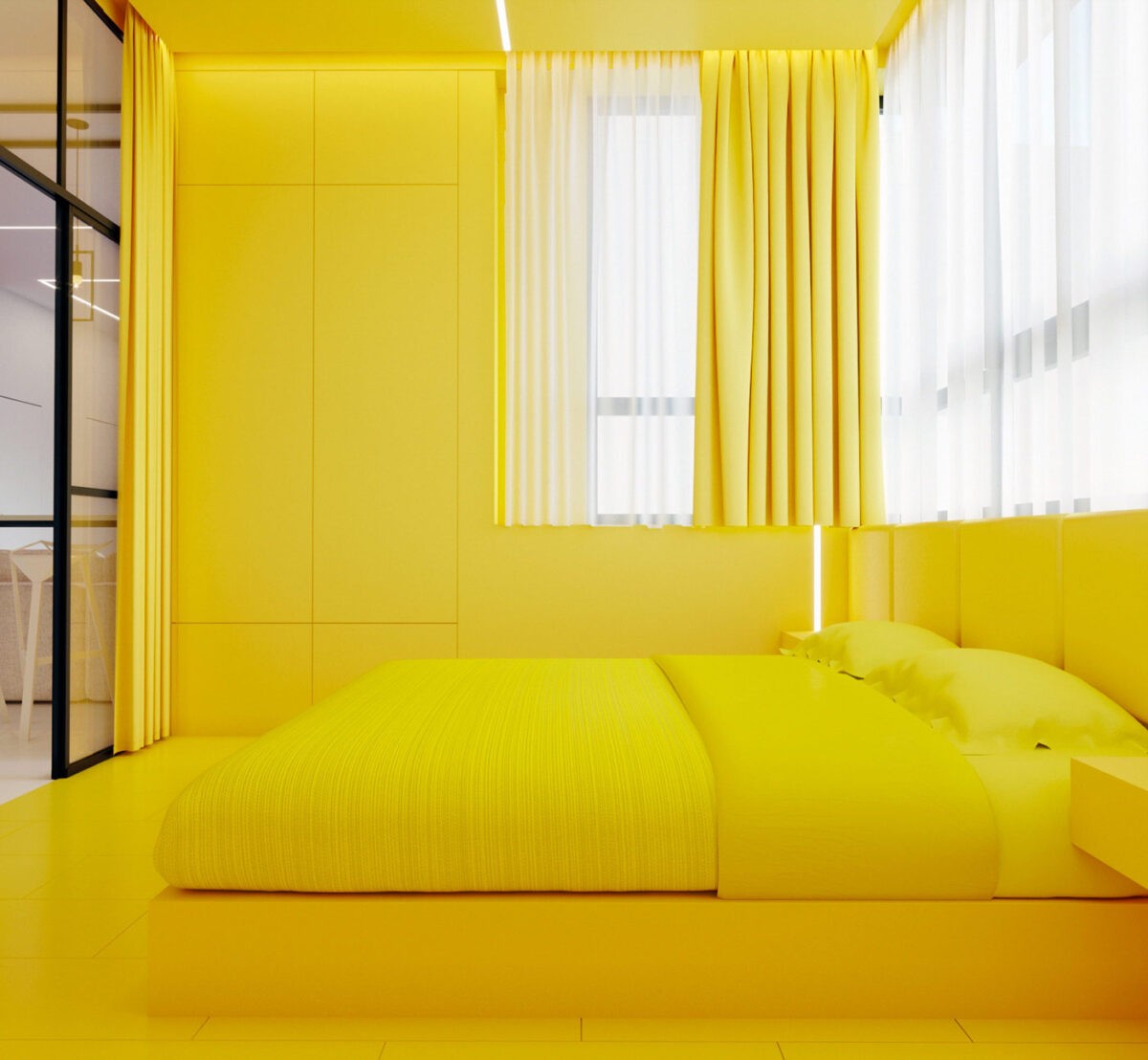
The yellow interior design scheme is splashed all over the bedroom. The exact same shade of yellow covers the walls, floor, ceiling, closets, curtains, and every bit of the bed.
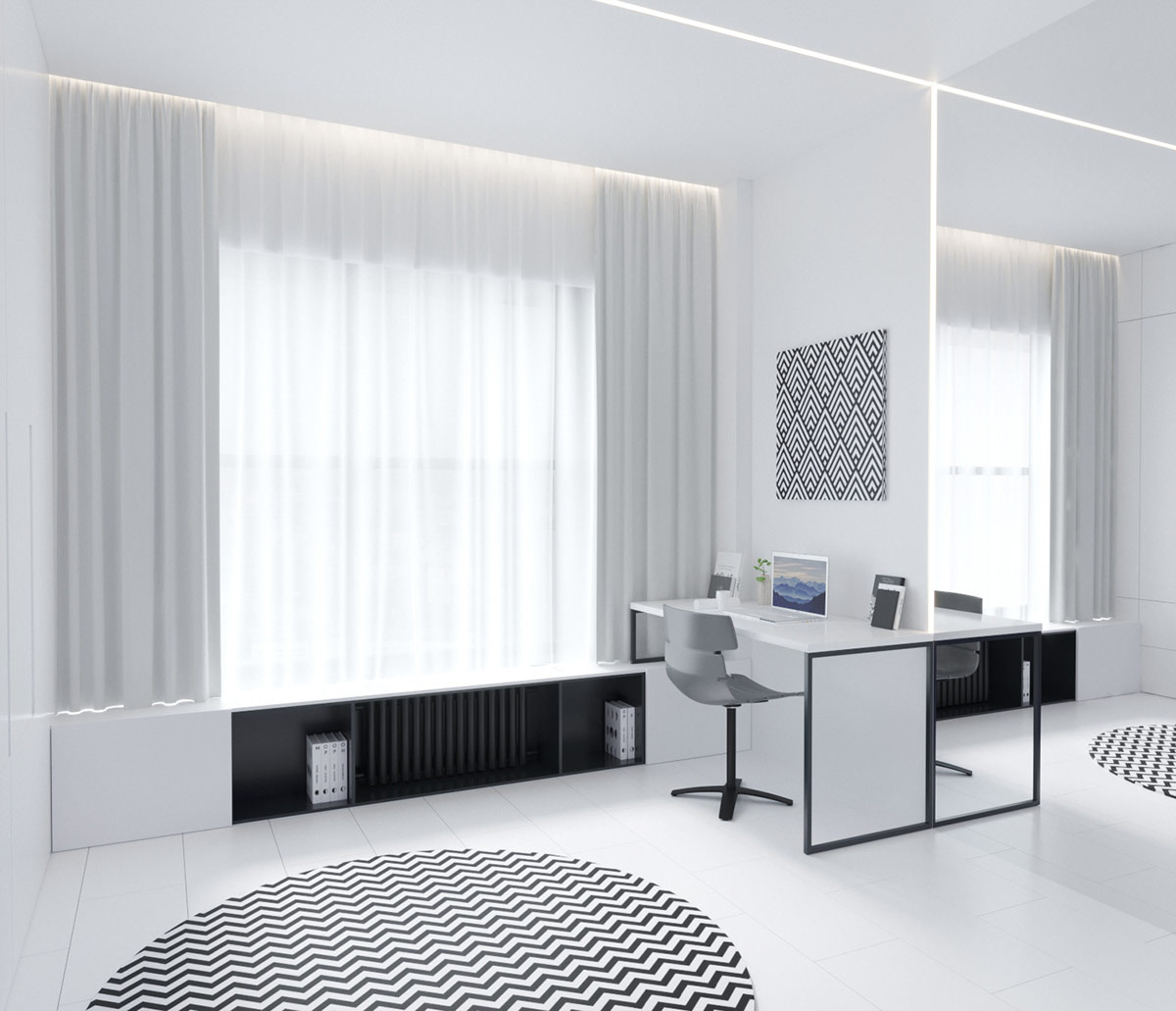
The home office is an altogether less colourful affair, decorated in monochrome. Black and white storage closets run beneath the window sills and a black and white chevron design area rug dominates the floor.
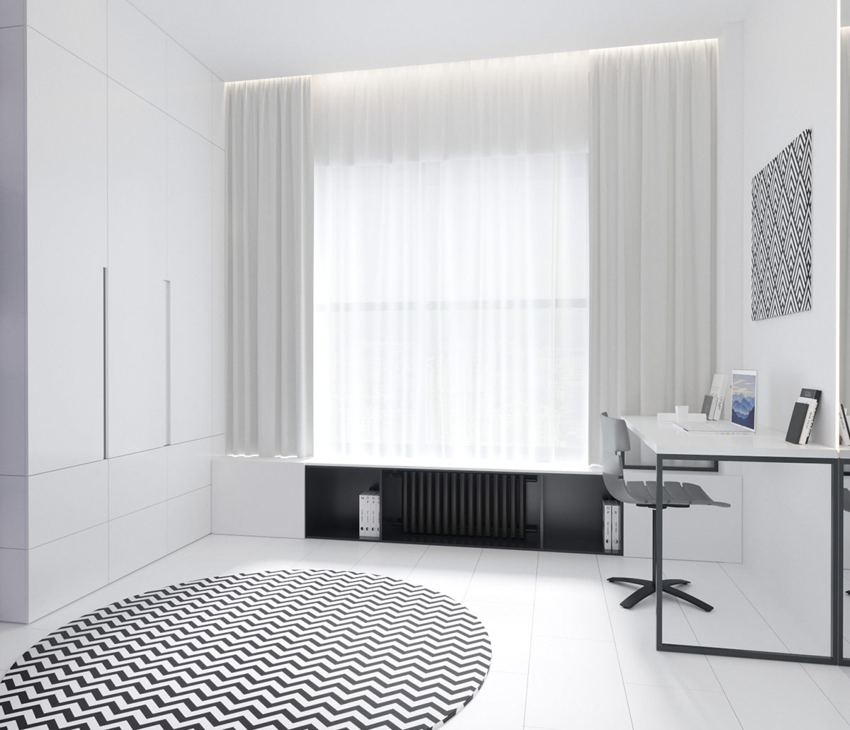
White closets blend quietly with the plain walls in this room, and white curtains and voiles keep the window light and bright.
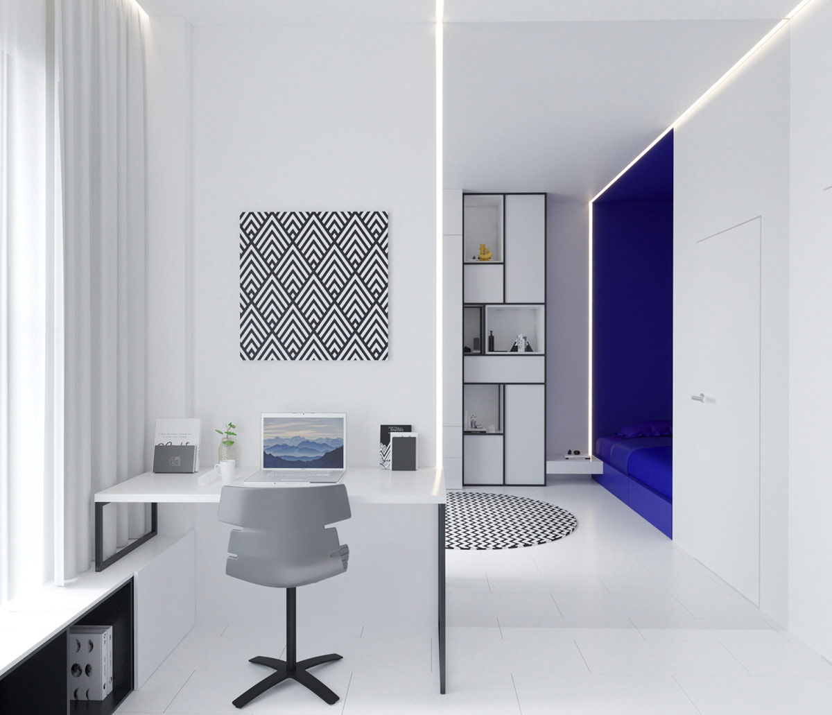
The minimalist home office desk is a simple white top that is supported on black metal frame legs; on one side the leg frame is shorter so that is may perch upon the storage volume below the window line. The black frame of the desk chair complements the desk frame, whilst the seat upholstery brings in a shade of grey to break up the black and white monotony. Geometric artwork decorates the wall space above the desk.
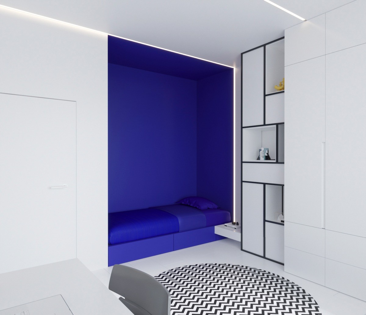
Opposite the home office we find that this room has not escaped the primary colour treatment after all, but actually contains a striking blue bed space. The sleeping nook has been picked out in a ridgid cubist fashion, with not one speck of blue escaping a strict outline.
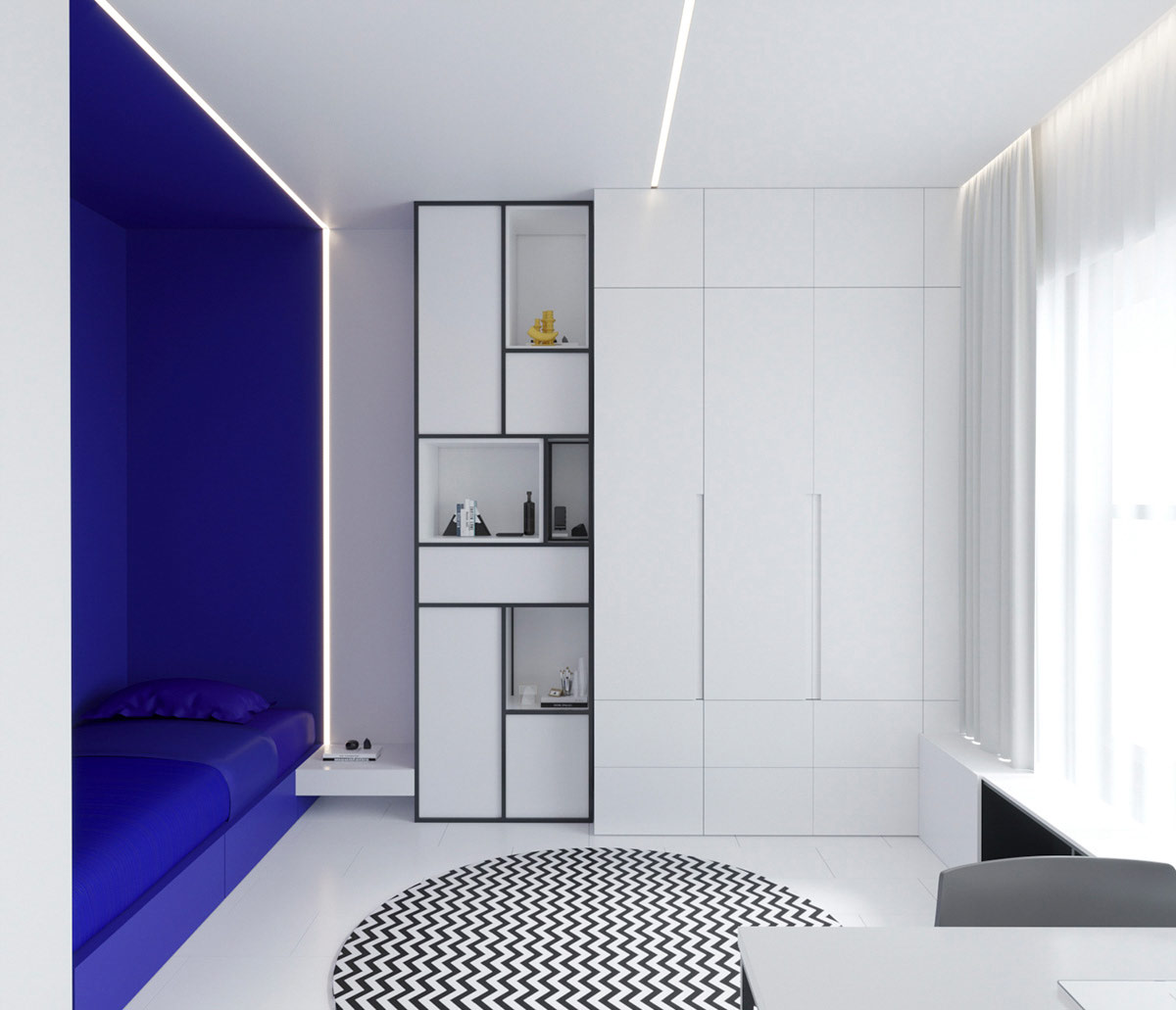
A small white floating shelf serves as a bedside table beside the blue single bed nook. A tower of shelving and storage nooks has been outlined in the signature thick black outlines of the Mondrian style.
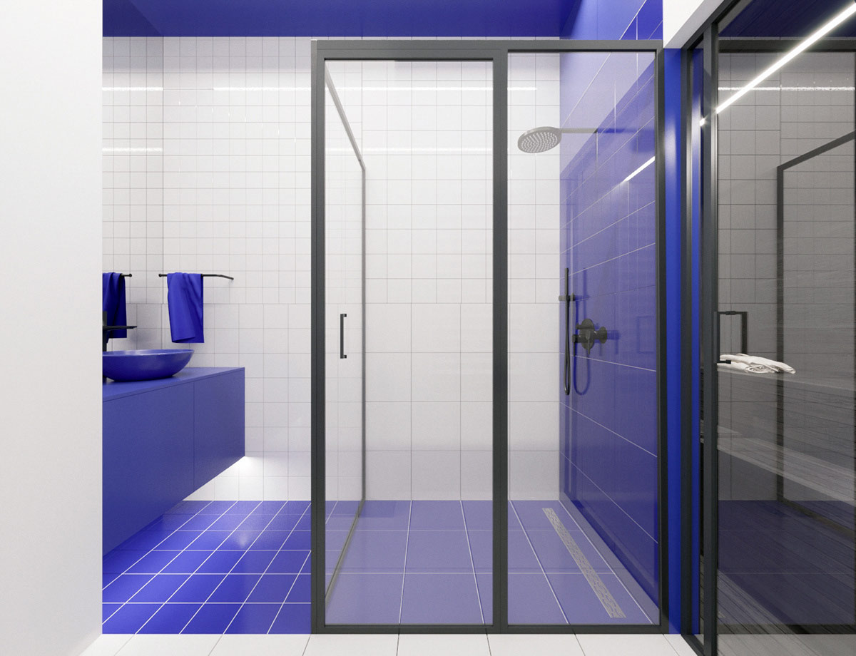
Carrying on from the blue bedroom with home office, we move into an energised blue and white shower room design. Blue tiles cover the floor and the back of the shower enclosure, and the ceiling has been painted in an identical shade of blue to match. The shower enclosure itself is outline with a thick black frame.
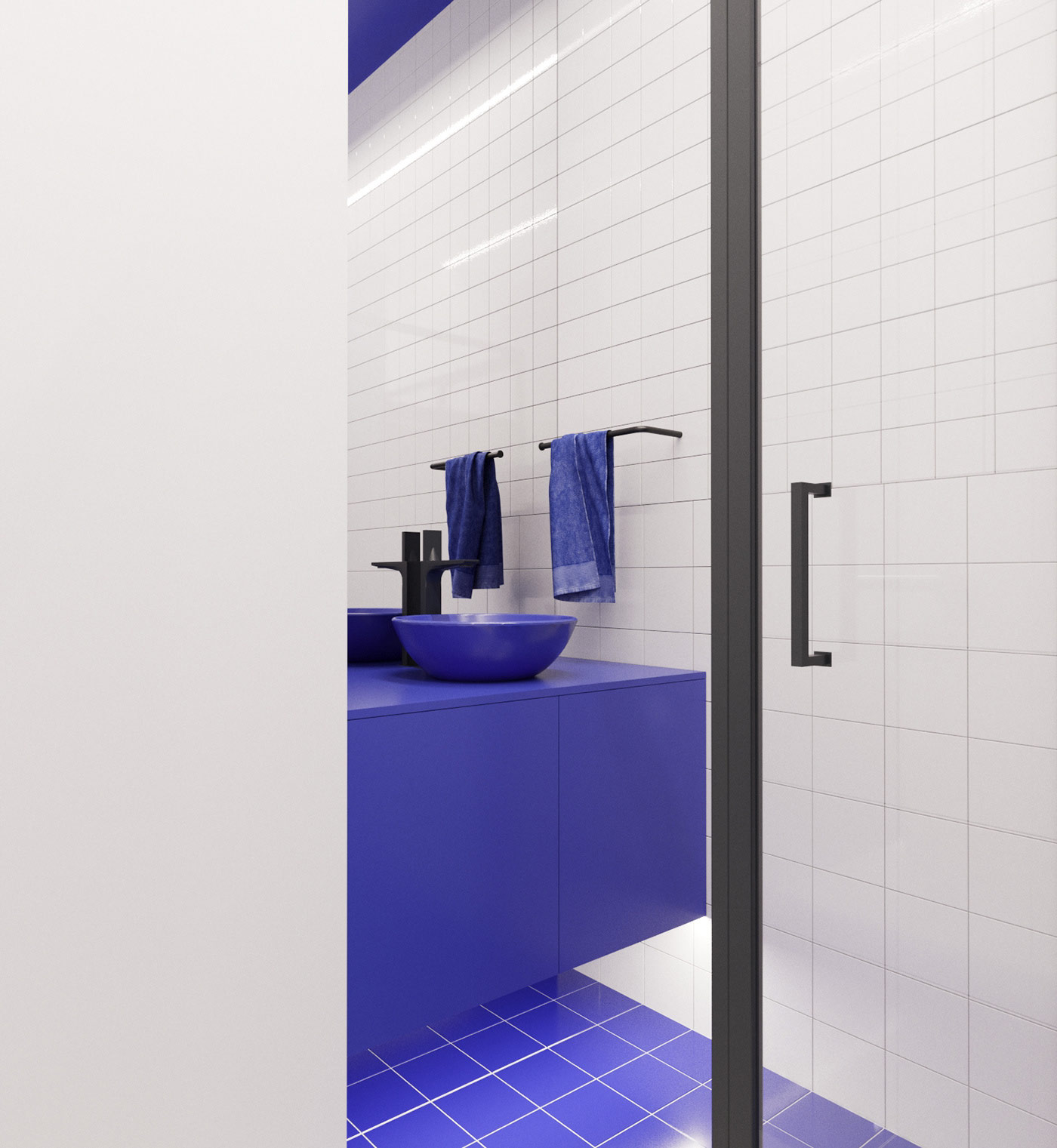
Opposite the glass shower enclosure there is a unique blue vanity unit and blue vessel sink combo. A blue hand towel hangs on a rail by the vanity in a perfectly matching hue. The towel rail and faucet are finished in black to match the frame of the shower cubicle.
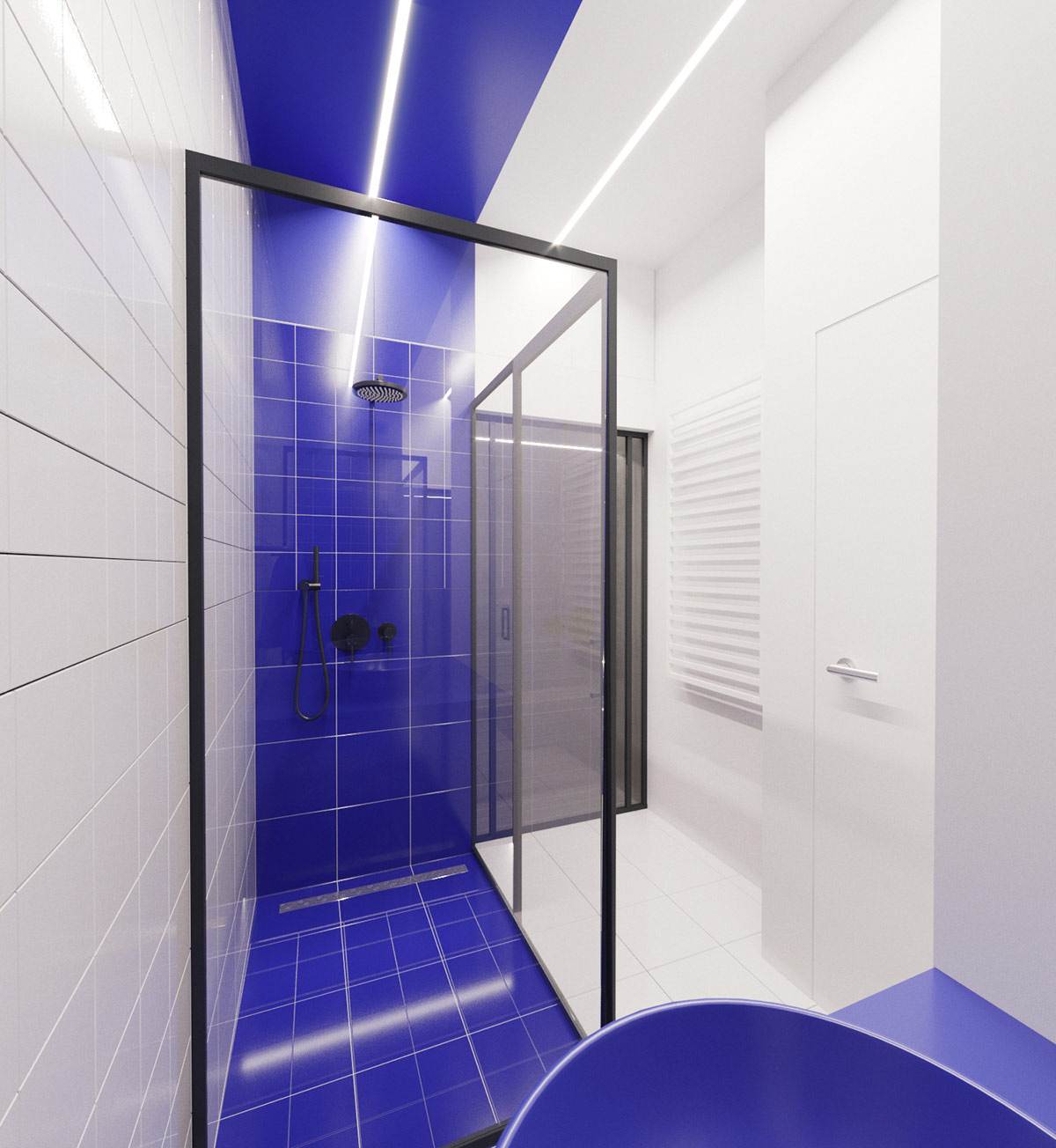
Recessed LED strip lights cut cleanly through the blue striped bathroom ceiling. The toilet is situated in an entirely separate room, outside of the shower room. The glass doors we can see by the shower cubicle is in fact the entryway to a sauna room.
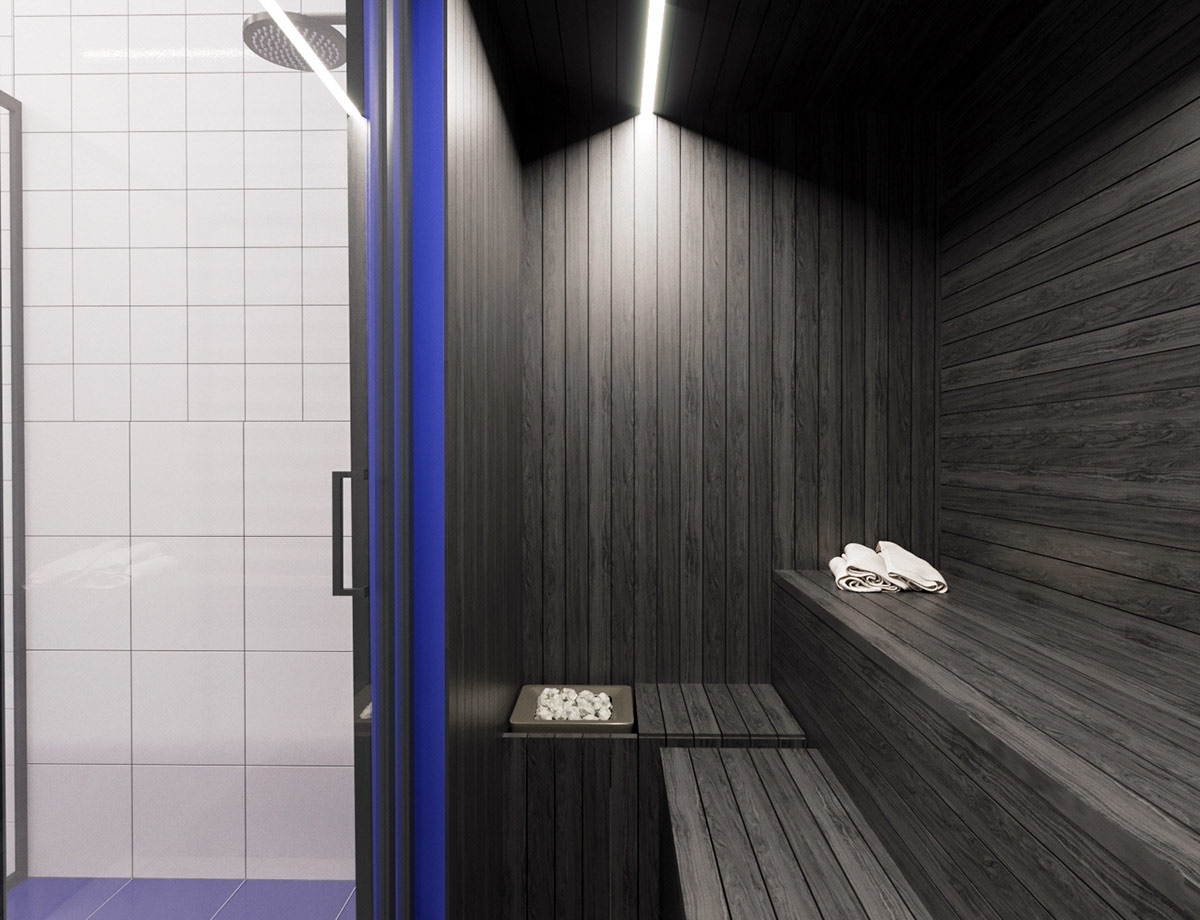
Inside the sauna room the wood cladding is dark to contrast with, and differentiate it from, the light and bright shower room outside of the glass.
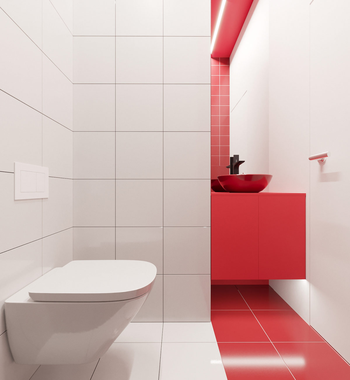
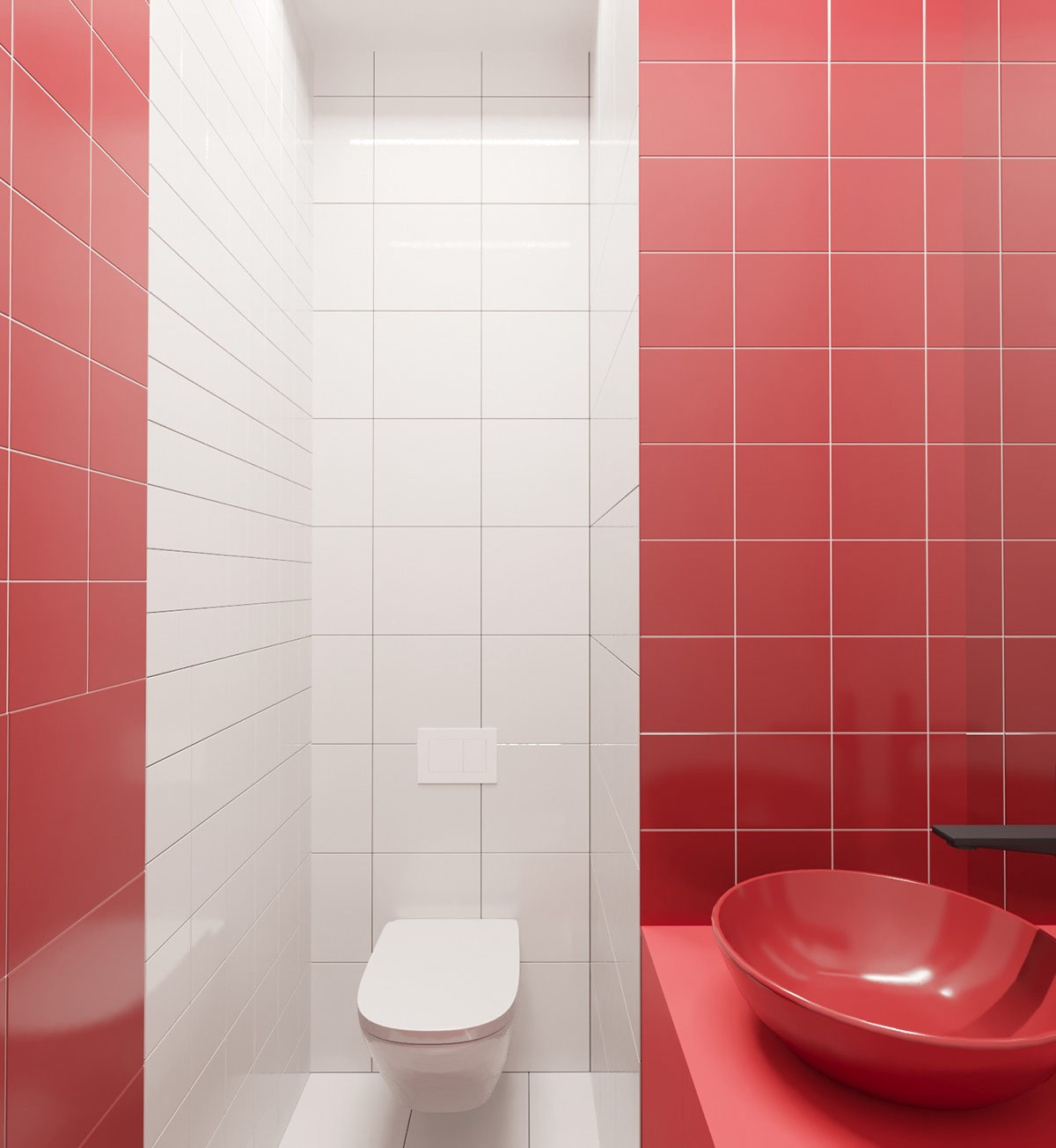
A red vanity with matching red vessel basin nestles in a small nook, making the best use of the available space.
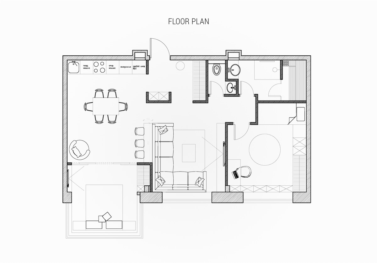
The floor plan better shows the layout of the red hallway storage cupboards, which line one long wall of the hall and one short structural column that helps define and divide the space between the entryway, the lounge and the spacious kitchen diner. We can also see the positioning of the WC in relation to the separate shower room with sauna.
