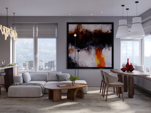
Fans of the pop art movement will love this home tour that takes inspiration from the 1970s trend. Designed by Raz Melamed and visualised by The Craft, this pop art style interior is filled with bold colour characteristically framed by thick black line. Moshe Tzur Architects completed an open plan living space within R57, a Penthouse on the 48th floor that looks out over far reaching views of a changing landscape. The backdrop to the theme stands in crisp gallery white. Wood floor covering and wooden furniture pieces warm the look of the white scheme, along with rich red rugs and a flowing exhibition of overblown comic canvases throughout.
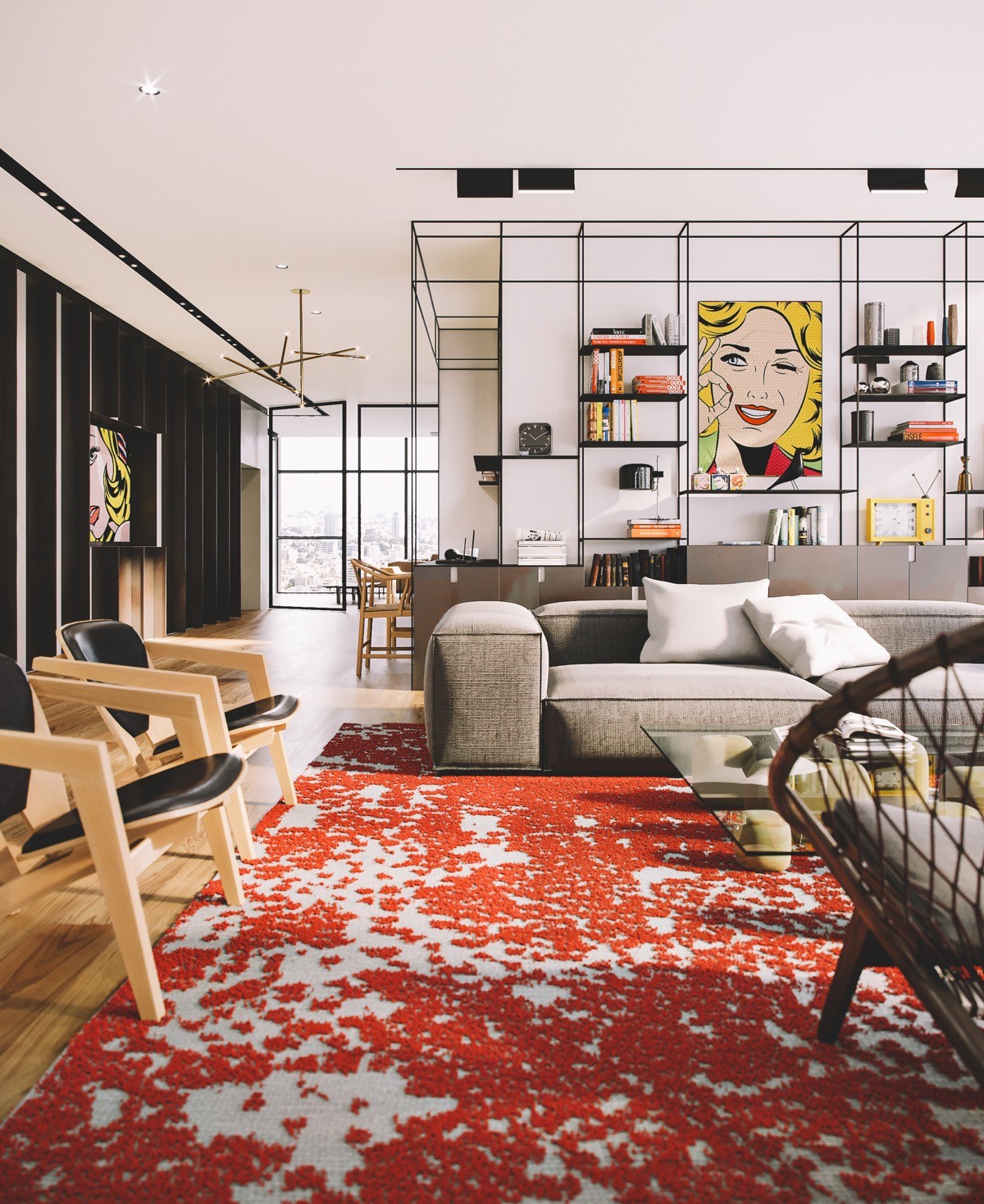
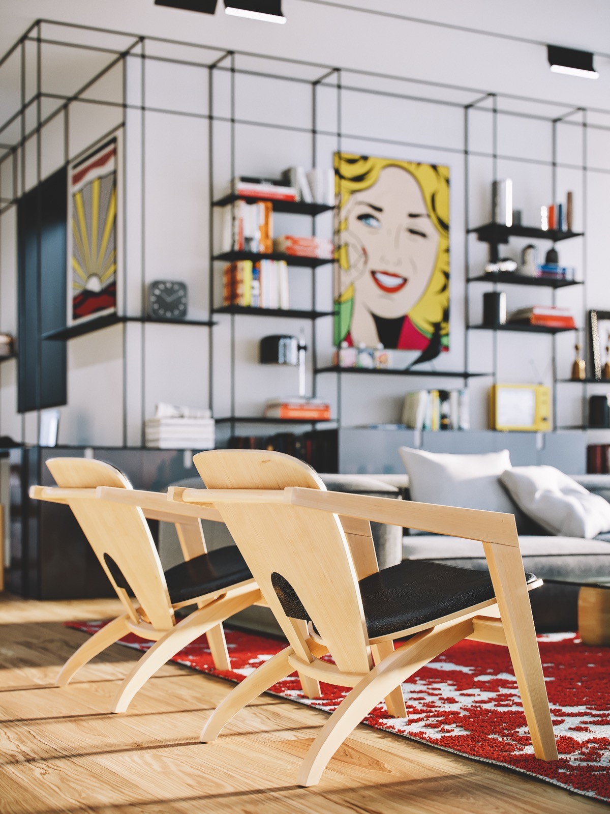
A black metal framed bookcase wraps around two plains of wall, stretching all the way from floor to ceiling with concealed storage cabinets around the base. The frame creates a number of cuboid volumes, where a small library of books is stored along with random decorative items on display, such as retro clocks, lamps and colourful vases. An Eames bird stands in the centre space of the shelving, and a large comic book canvas cements the pop art theme.
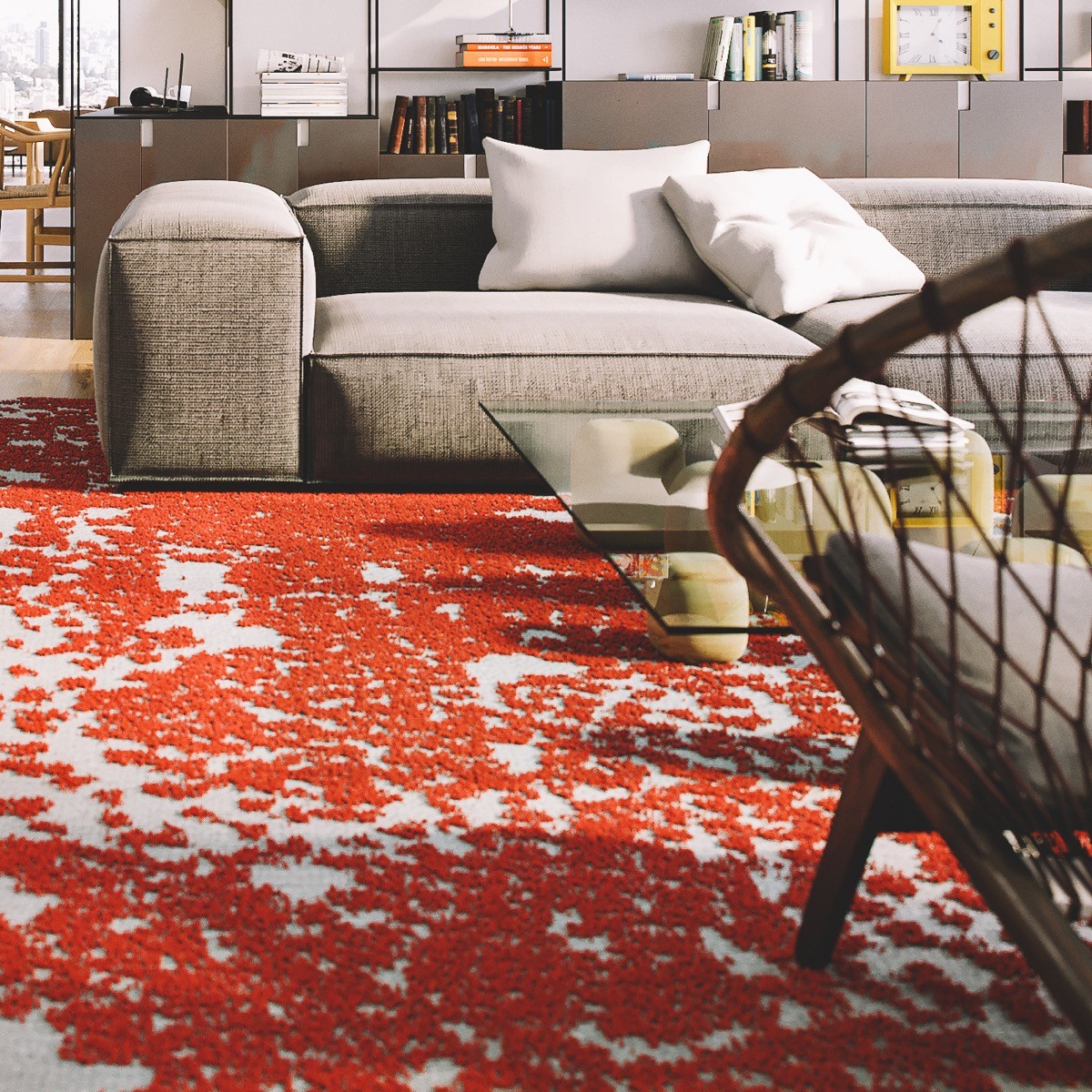
Combining the retro orange rug with a low-profile mid century modern sofa style is a clever way to embrace the pop art era aesthetic without losing any contemporary edge.
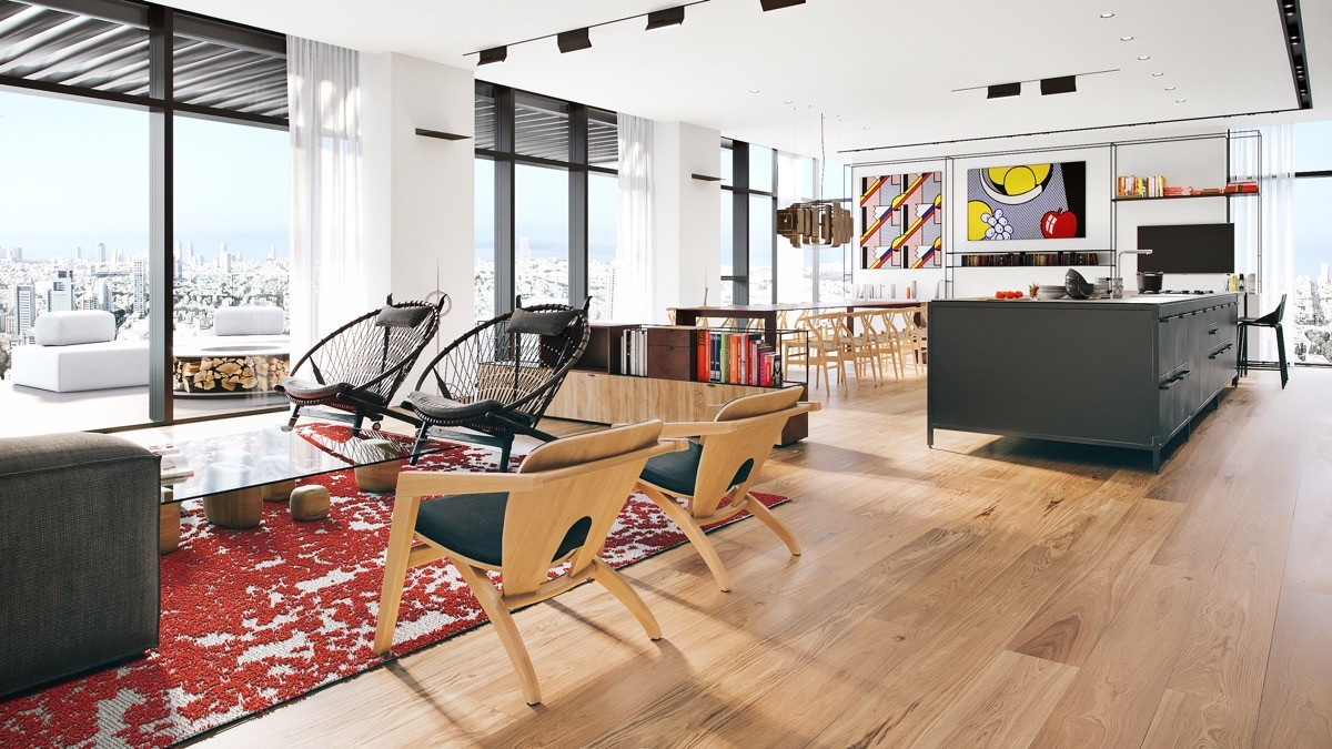
The red and grey area rug serves as an island around which to anchor a couple of wooden accent chairs and a duo of dark basket seat chairs. All of the seating is situated to enable enjoyment of the panoramic city view beyond an enormous expanse of black framed windows.
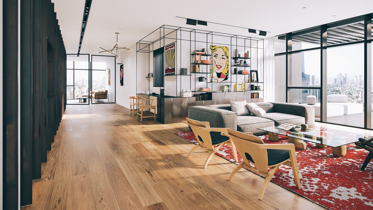
A mid century modern coffee table with a glass top sits at the centre of the living room area, reflecting the natural light from the windows. Two pure white scatter cushions on the sofa keep the look sharp and unfussy.

It’s the small collections and artistic curations in this home interior that bring in all of the colour and interest.
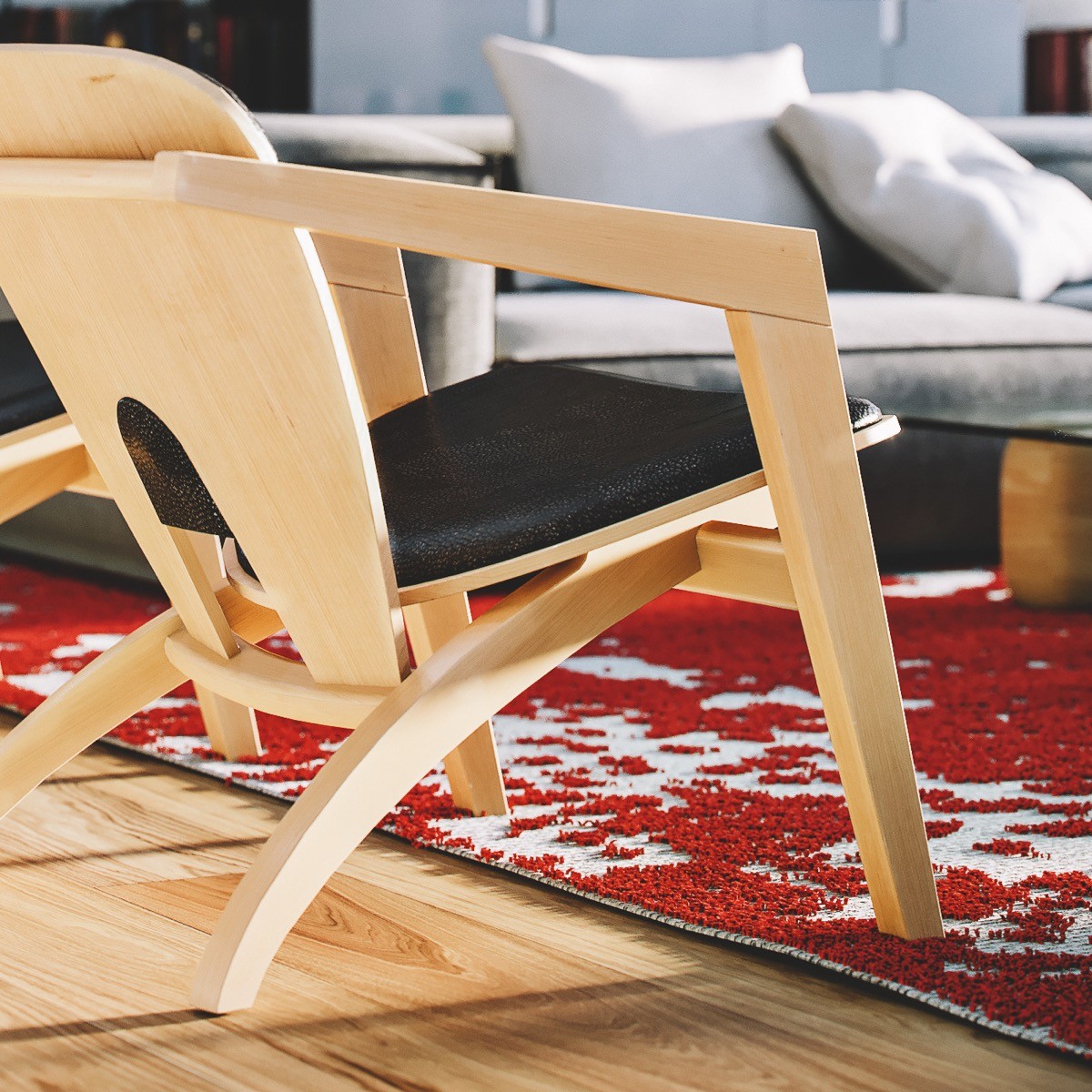
Black leather seat cushions tie the lounge chairs in with the rest of the base coloured accent pieces.
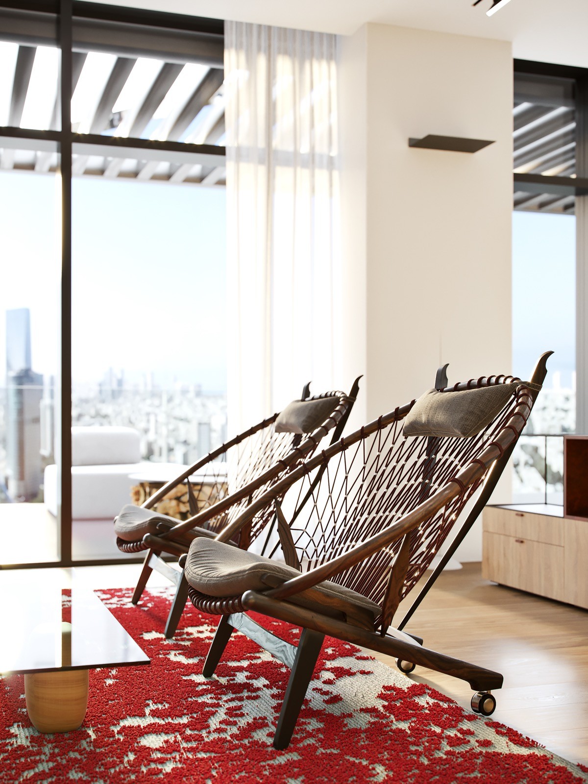
The dark stained sculptural chair duo have a cane frame with taupe fabric seat and headrest cushions. Their back feet are fixed on castors to allow for easier repositioning - perhaps to push up closer to the view. These are the Hans Wegner Circle Chair, you can get a replica here.
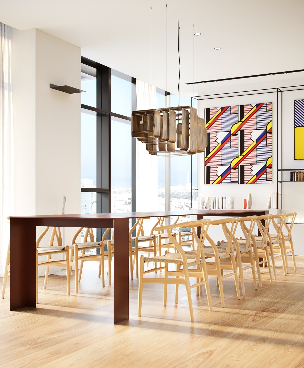
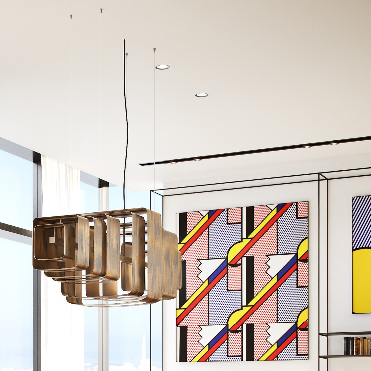
An enormous dining table is long enough to seat 12 people on just two sides, and more if utilising the head and foot of the table. An unusual dining table pendant light is formed by several layers of extruded squares, which suits the pop art comic cell paintings perfectly.
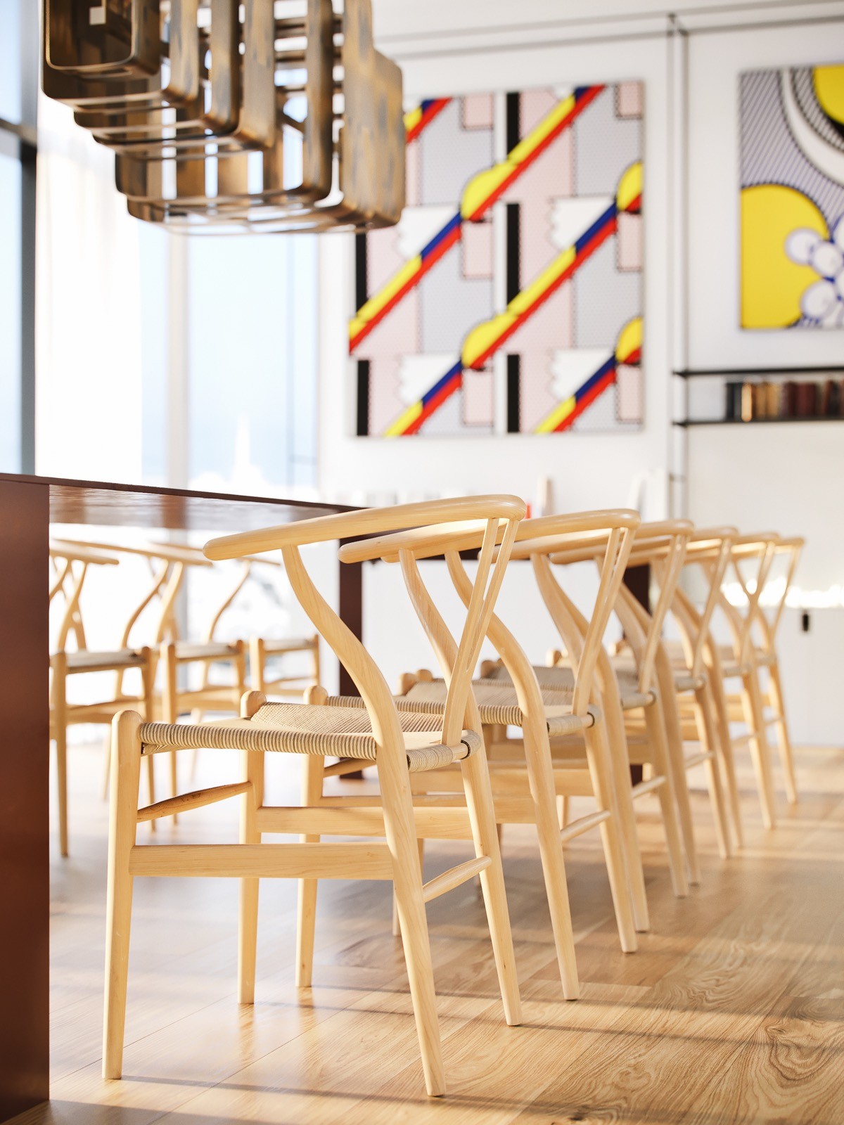
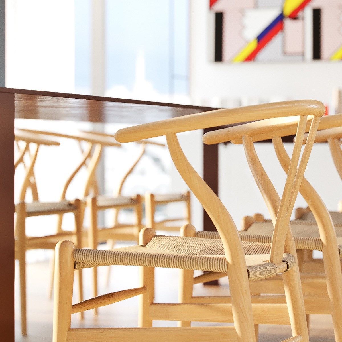
The dining chairs are the Wegner style Wishbone Chair. They are a much lighter colour than the dining table at which they sit.
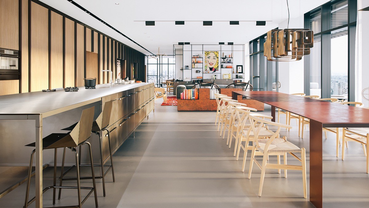
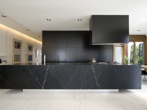
A kitchen island runs the full length of the extensive dining table, and even longer. Black geometrically formed bar stools create yet more dining seating at one end of the prep bench.
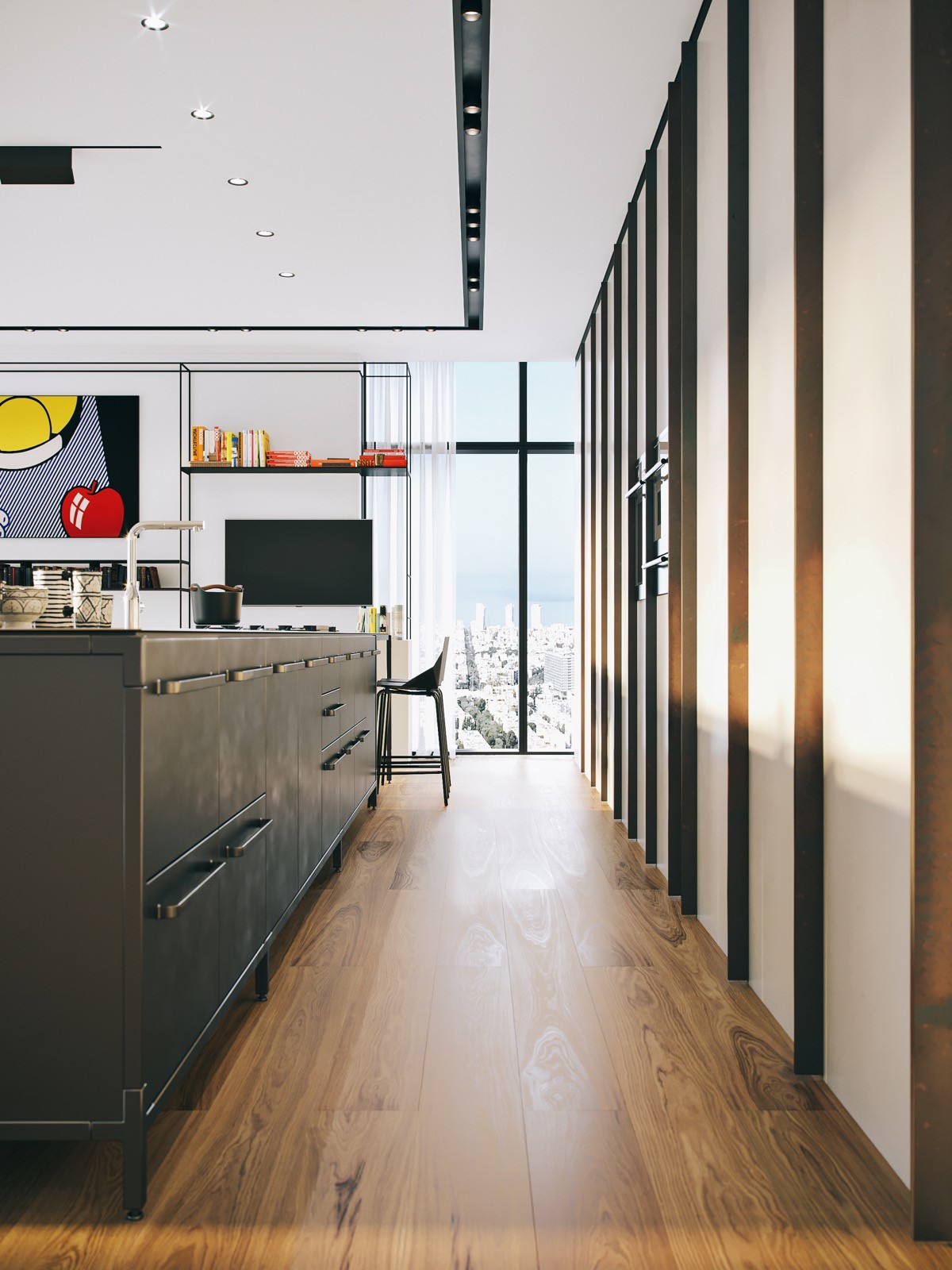
The combination of units that make up the central kitchen island are set within a metal frame, on exposed metal feet. The unit materials give the kitchen an edgy industrial style. More of the backless, black framed display shelving can be found at this end of the open plan living space. More of the curation of pop art and collections of books are displayed here, along with a flat screen television next to the dining end of the bench.
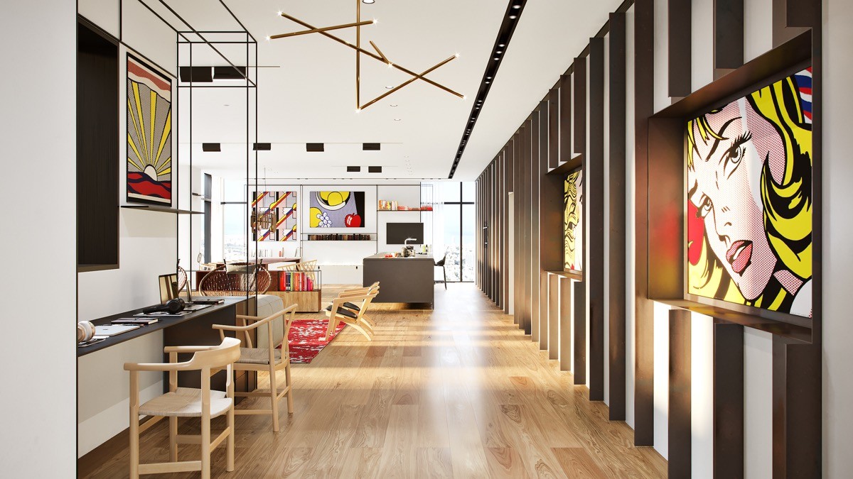
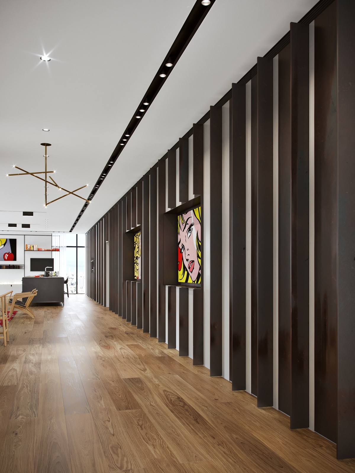
A number of lighting solutions illuminate the gallery home. From recessed spots and track lighting to modern pendant lights. A stream of decorative wall beams break only to display more treasured pop art paintings in pride of place.
A desk is fitted into the return of the black framed bookcase that wraps the wall of the lounge, with enough space for two people to sit at it.
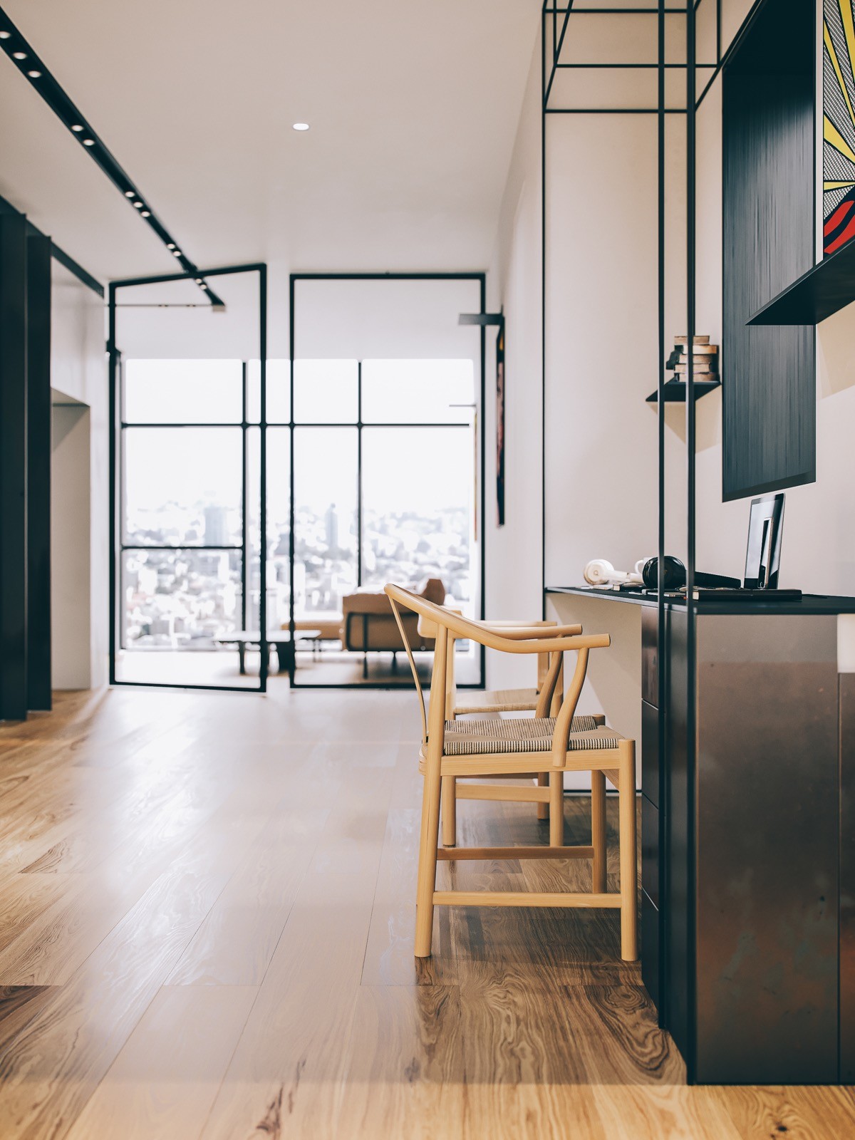
Two towering bespoke glass doors separate off a small relaxation zone that offers a spot for surveying a different aspect of the city view.
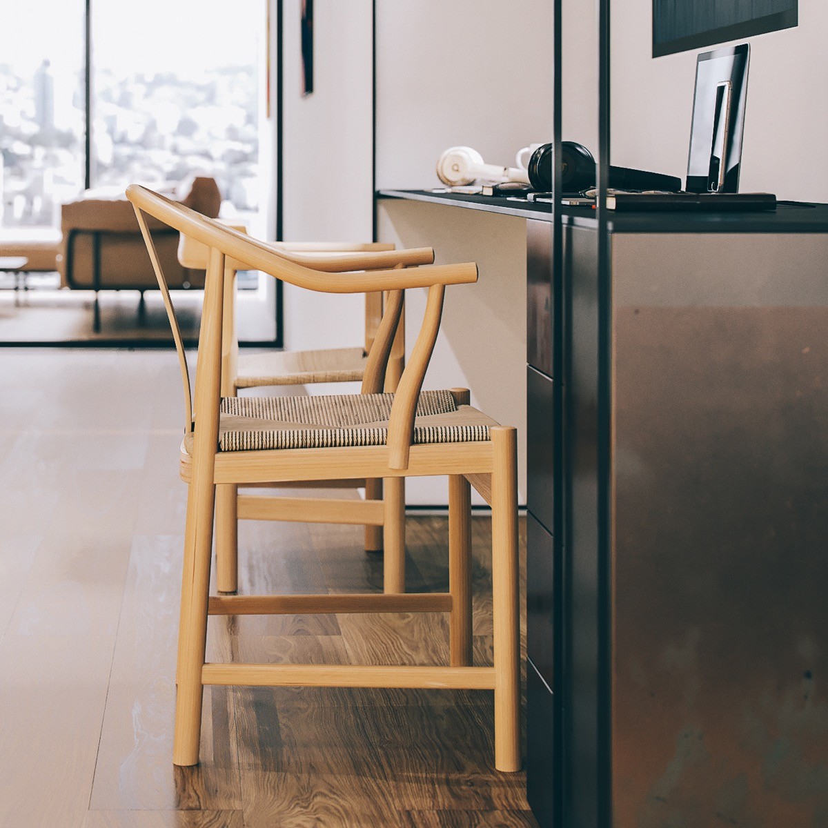
The home office setup has in industrial look that matches the style of the kitchen. One of the desk chairs is the same design as the dining table chairs, the other a slightly smaller wooden design.
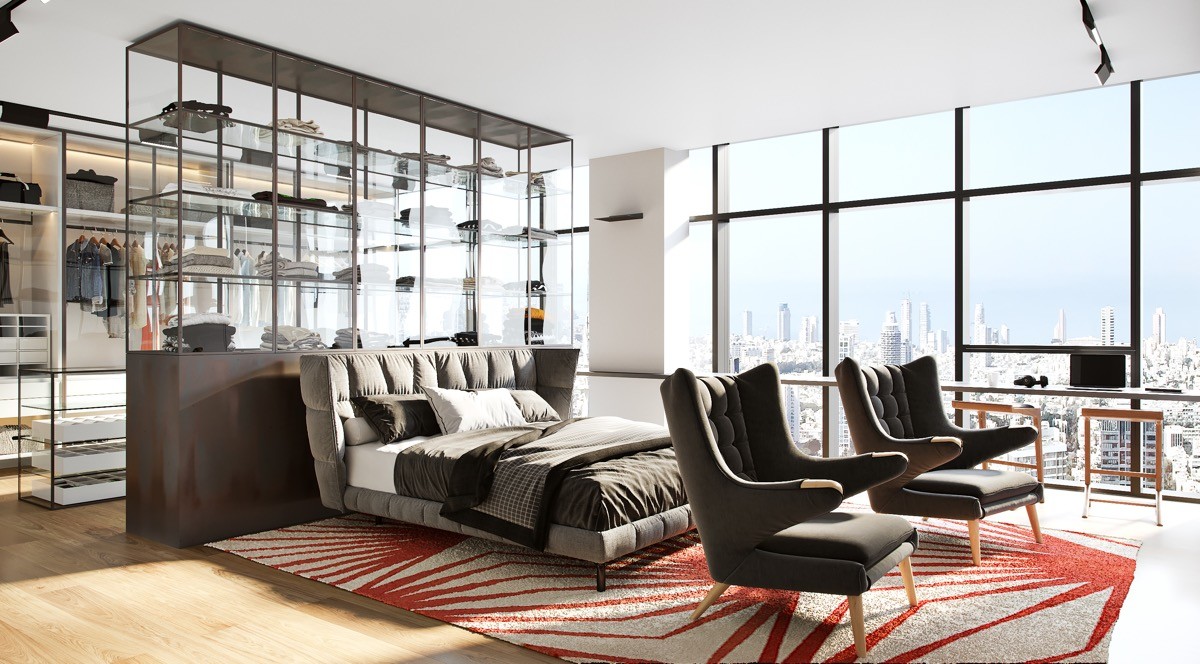
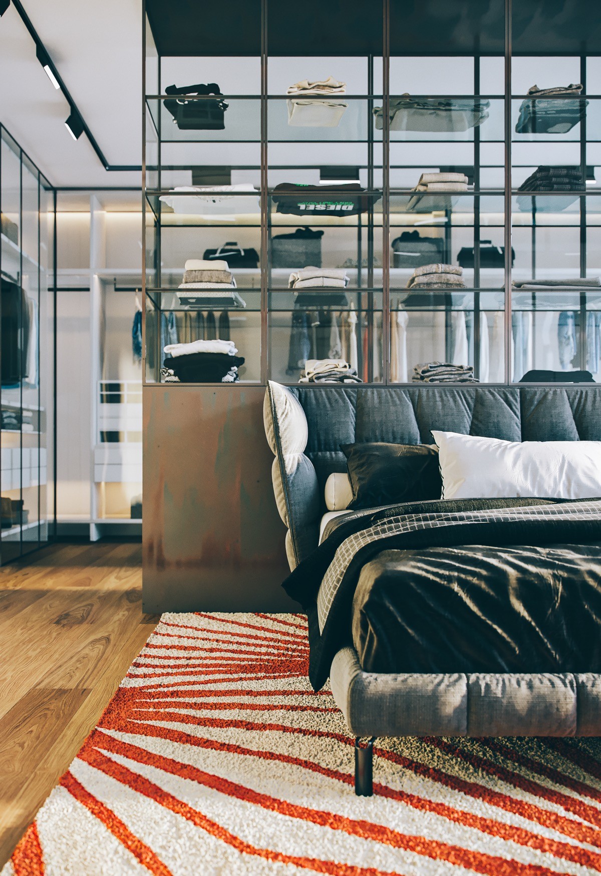
The open plan theme continues into the master bedroom where a large space has been split into three separate uses. The first zone is a generous walk-in closet/dressing room with a comprehensive selection of rails, drawers and shelving units. The second zone is the actual sleeping area where the bed stands. The third section is a small sitting zone marked by two comfortable armchairs, presumably facing toward a TV wall or perhaps a wrap-around picture window.

