Apartments have their virtues, being easy to access, compact, and close to the city. What they often lack is adequate space for great interior design. These five apartments from around the world showcase ways to use small space to your benefit – not your detriment. Cleverly combining several rooms, they make the tight seem cosy, not cluttered. Mirroring walls and light panels create room where none was before, while pops of colour and large panelling give the illusion of a larger space. Pair these features with quirky pop art and unique layouts, and you are left with five designs that create joy in jam-packed spaces.
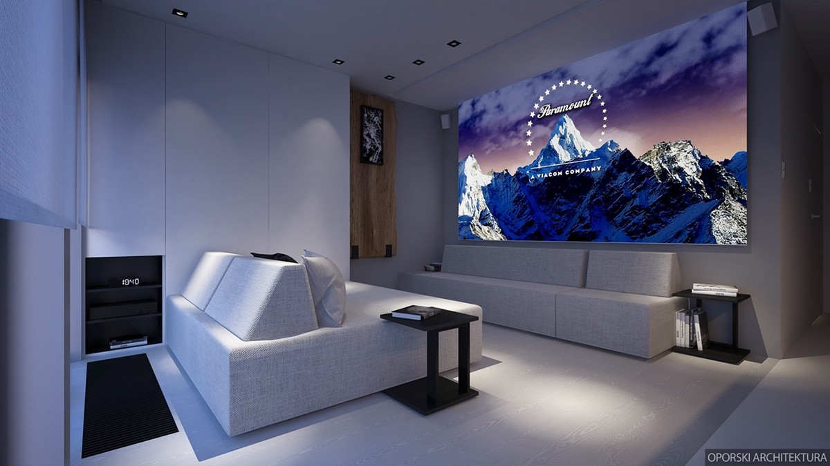
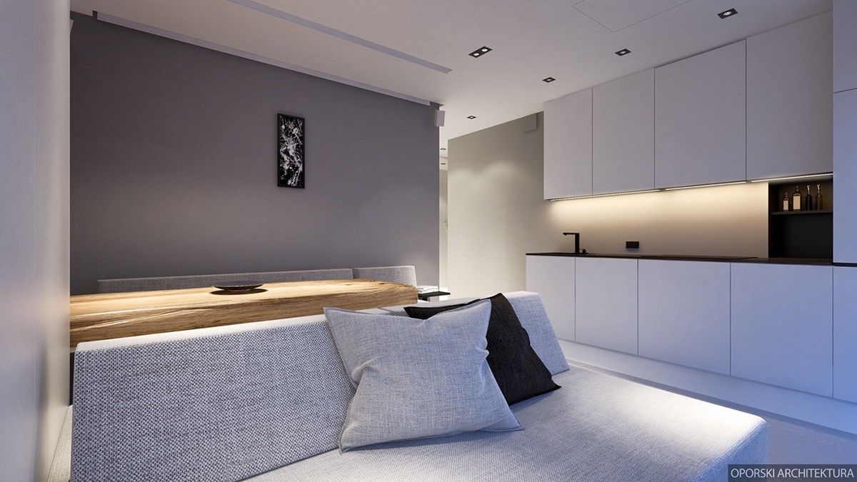
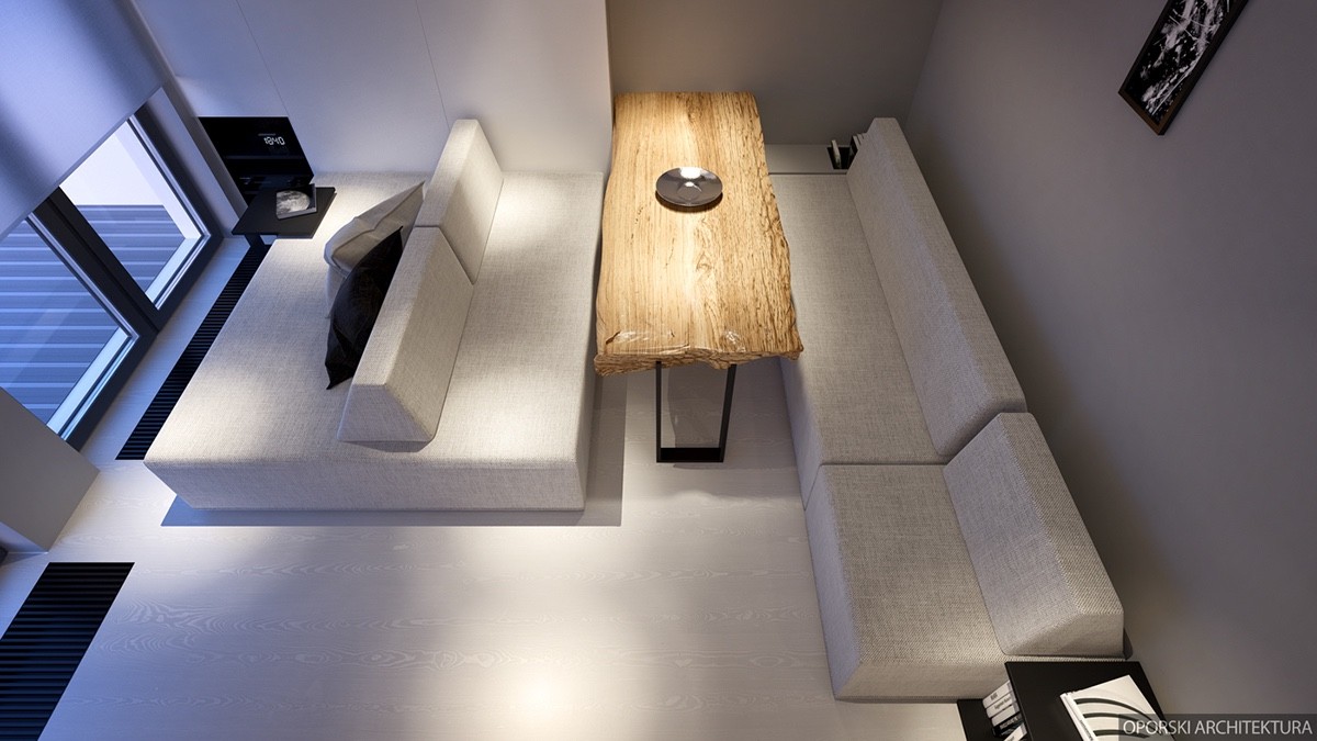
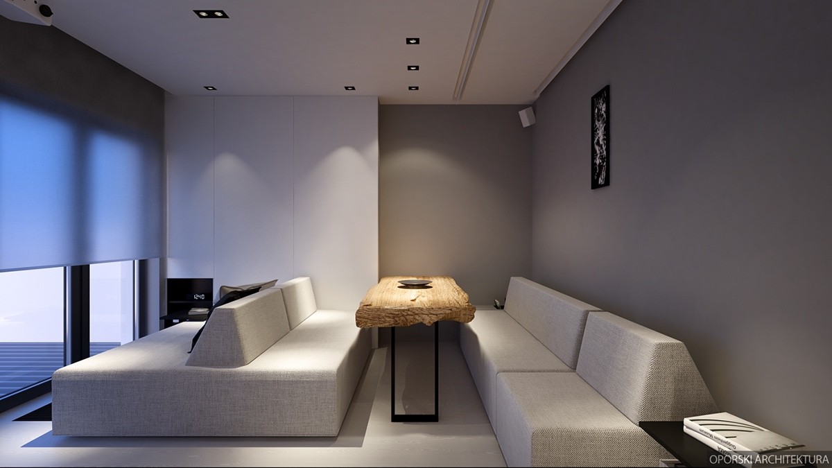
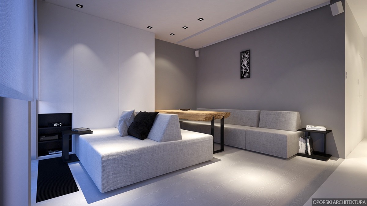
Measuring just 37sqm, our first apartment in Warsaw, Poland, is an example of space used well. Utilising a common kitchen, dining and lounge area to full effect, the space lies neutral in grey, bringing in the bold with a unique rough-shod wooden table. Mirroring the table, an art piece holds a black-and-white ethnic print, offering character. Small black side tables offer comfort, while a hidden black cabinet and high grey cabinetry offer storage. A projected TV screen saves space and adds sophistication.
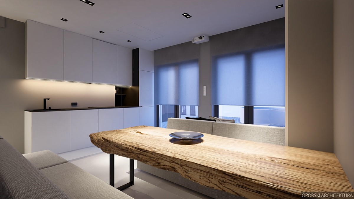
Towards the kitchen, smaller features stand out – small black Lego lights on the ceiling; block-shaped taps; sheer Roman blinds. The table legs reflect the theme in chunky cast iron squares.
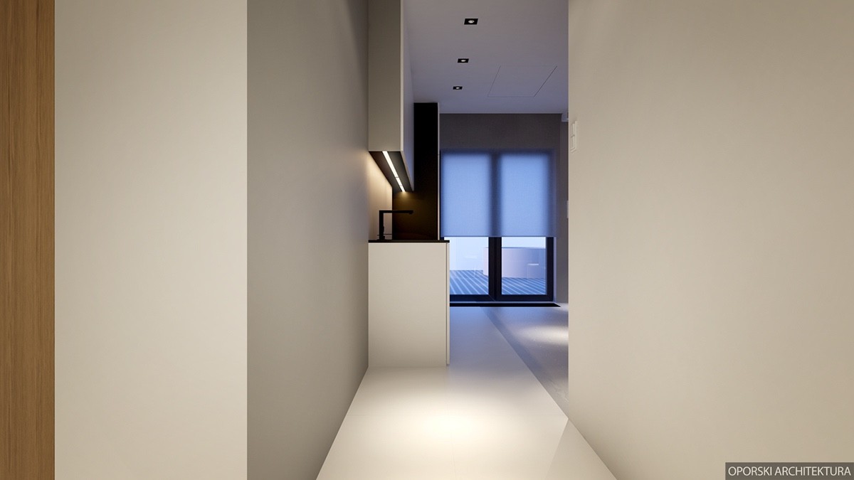
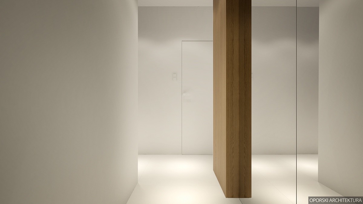
The hallway leads the way with an LED light strip, hiding neatly under kitchen cabinetry. White walls framed by long wooden panels hark back to the table, while a mirrored corridor creates more space.
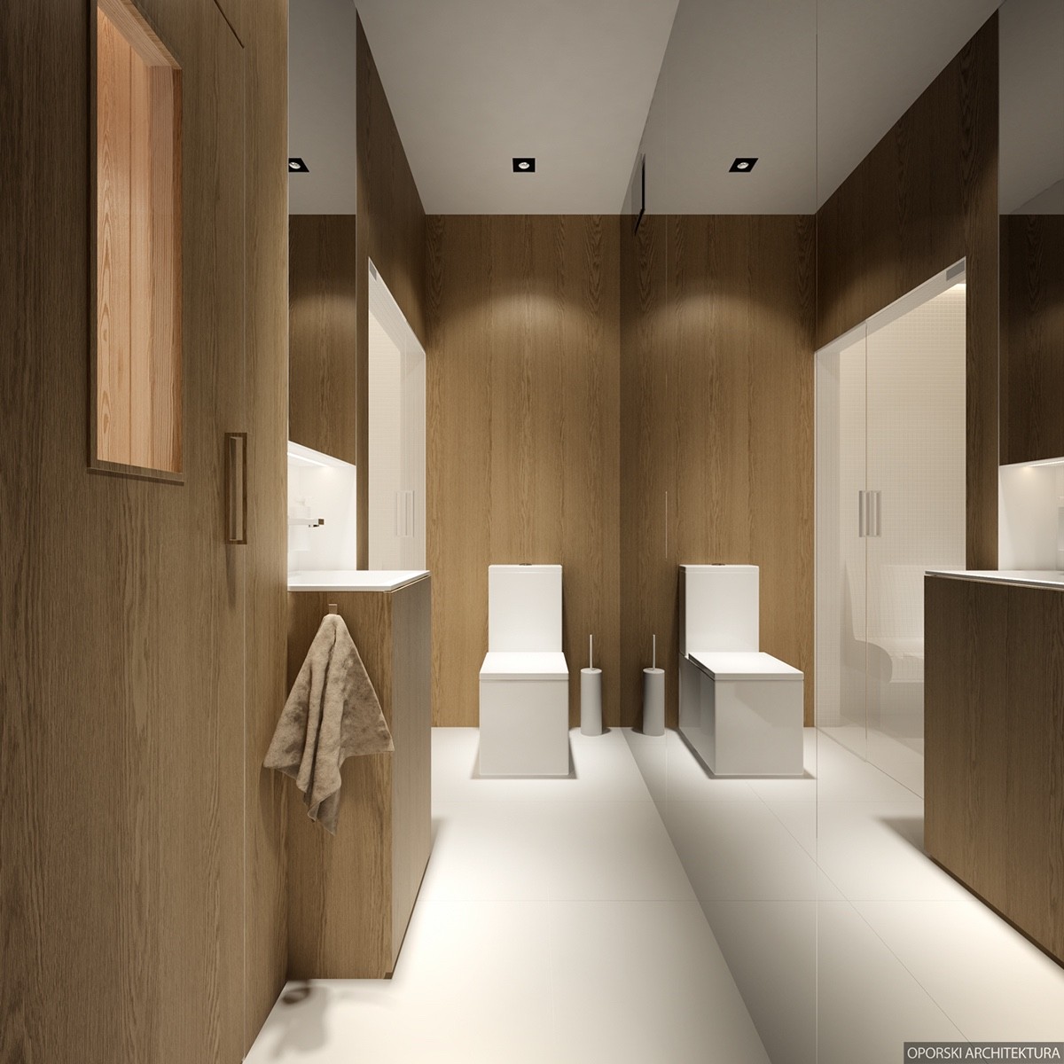
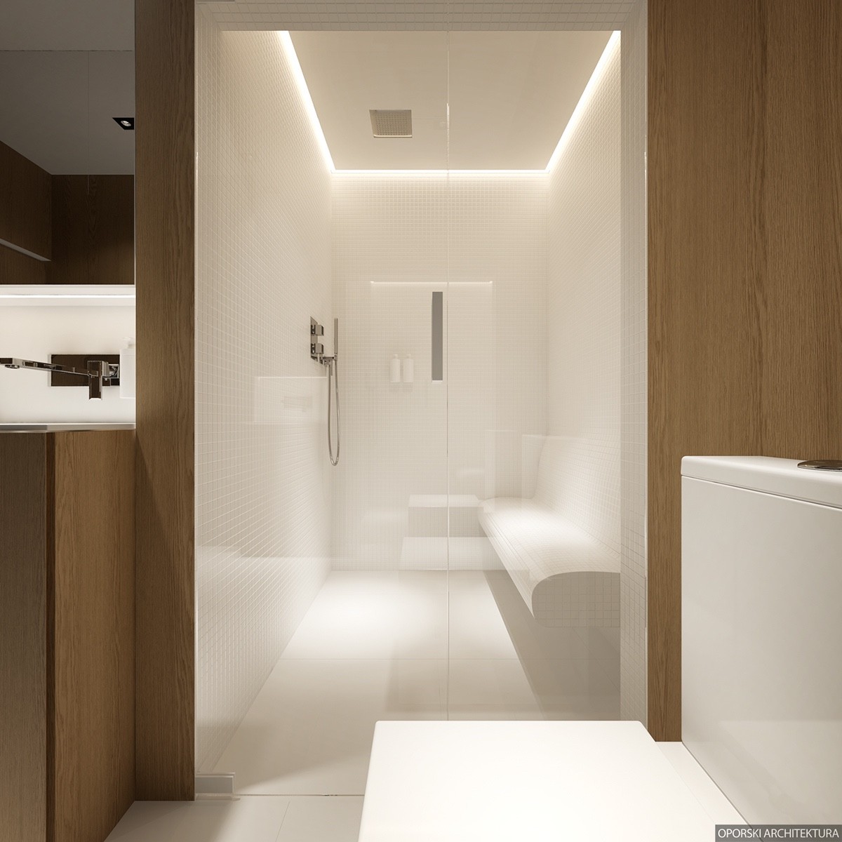
More mirrors make the most of the bathroom, almost Scandinavian in their dominant white and wooden fixtures. Subtle LED lighting steals the show around the ceiling of the shower, while simple block shapes in the shower, bathroom and sink allude to the living room.
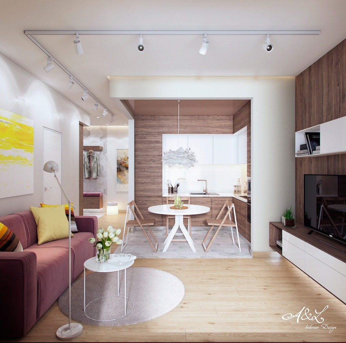
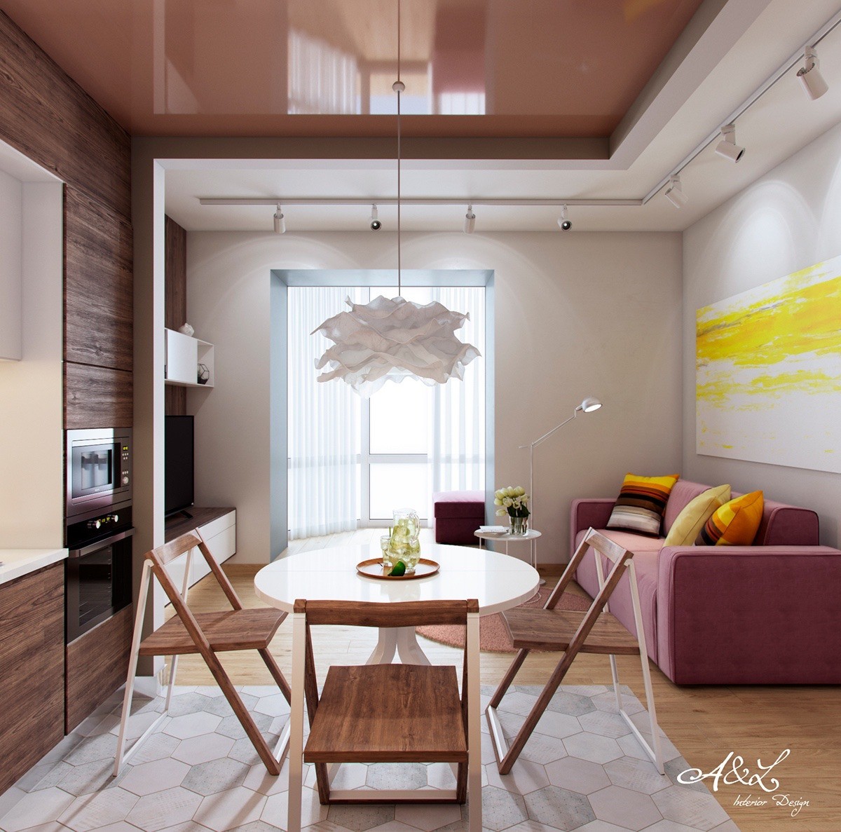
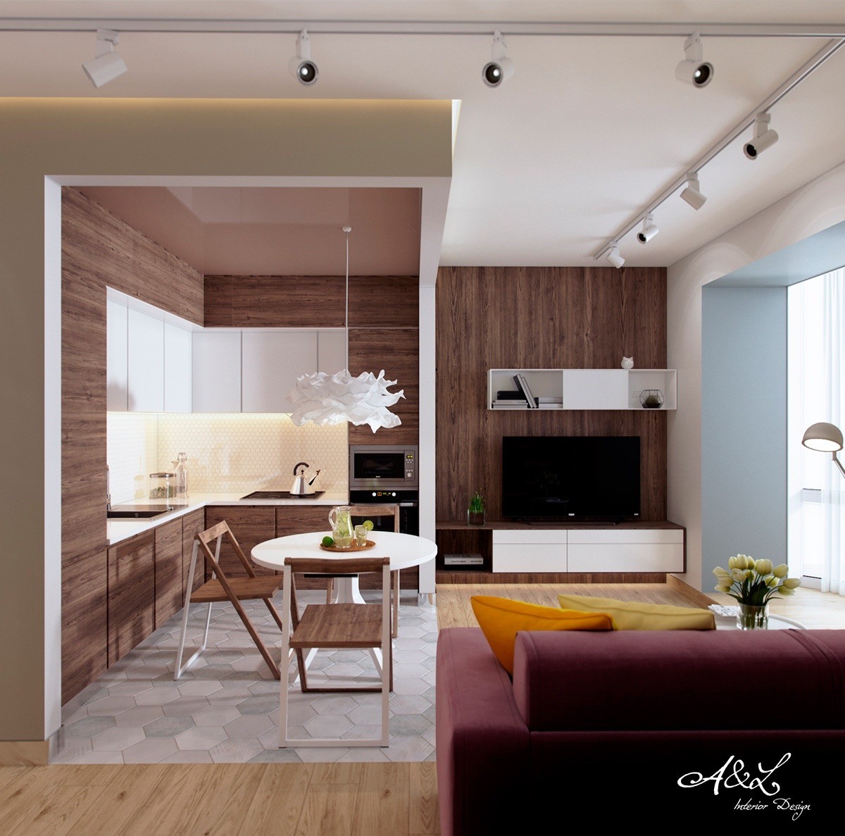
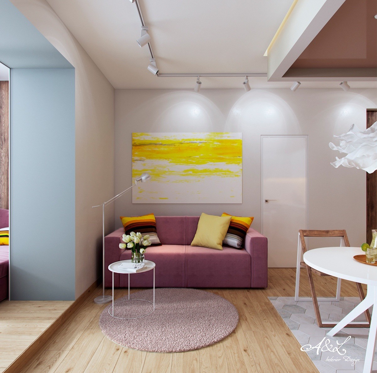
For those after a busier living space, this small design packs a punch in berry and sunflower tones. Using a clean wooden palette, a multitude of rounded and triangular shapes play off one another in the living room, also doubling as a kitchen area. White elements in a papier mache chandelier, standing lights and side tables act as a group. Pops of berry, yellow and powder blue frame different sections for different uses. A terrcotta-lacquered ceiling and striped couch cushions tie the themes together.
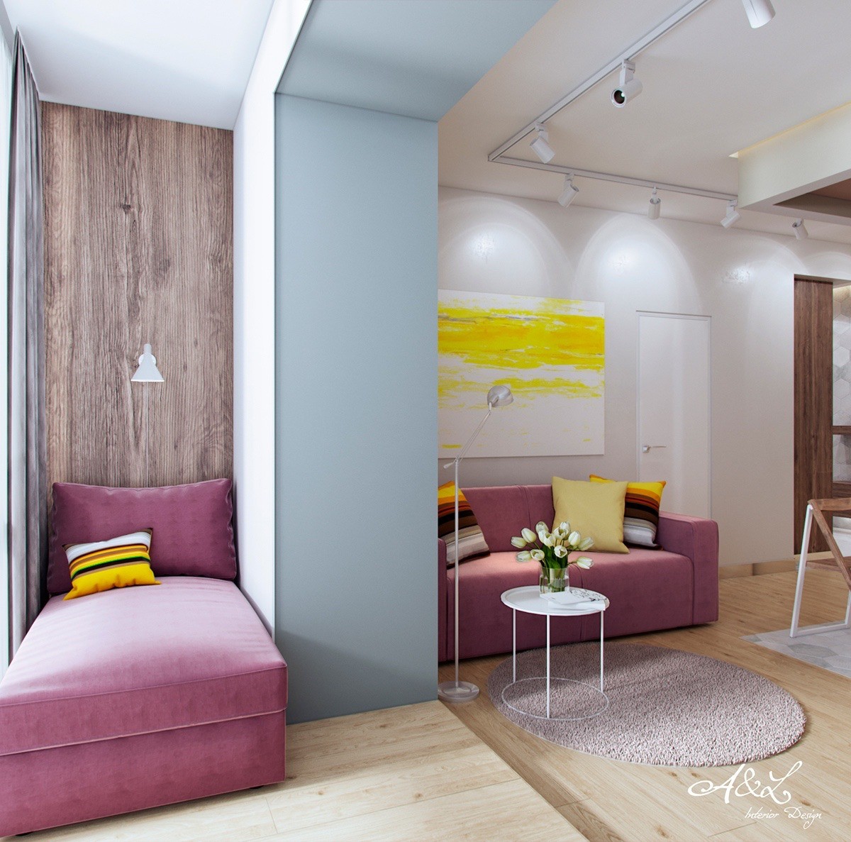
A clever, quiet space is created from a powder-blue wall partition, letting light in from a sliding door. Using wood panelling from the kitchen, the inlet both matches and separates from the couch area’s colourful elements.
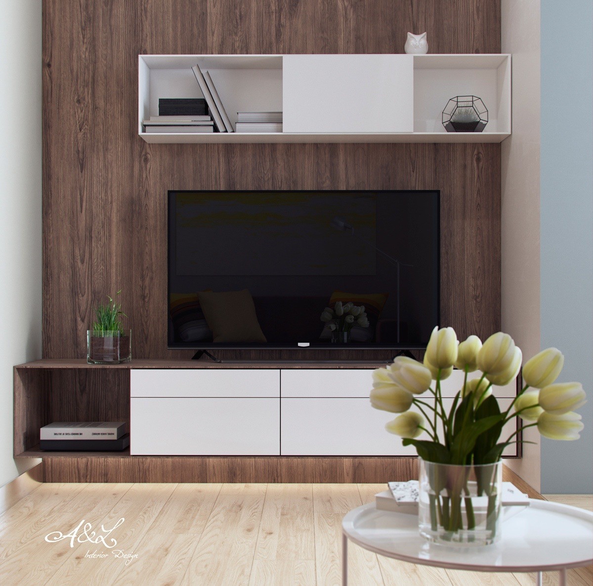
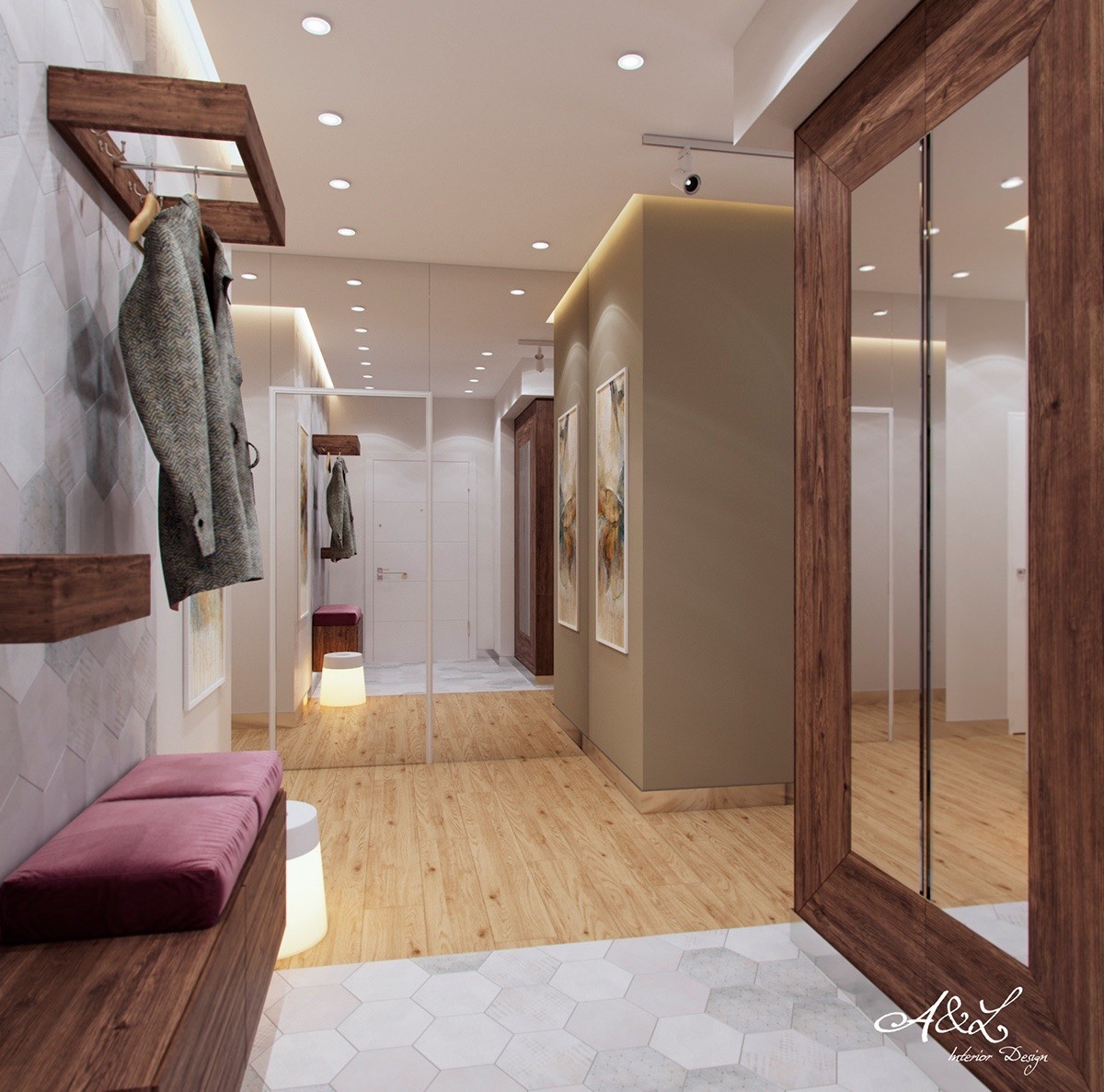
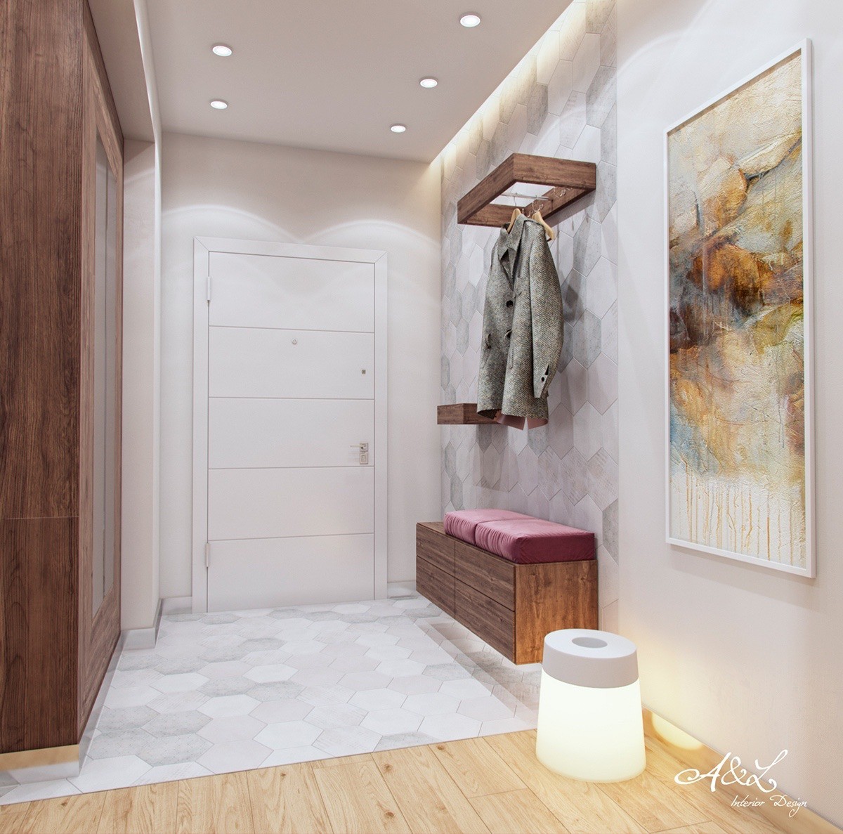
Wood panelling is a main feature in the TV and entrance areas. A television cabinet, shrouded in darker wood, lets a black screen remain focal. In the entrance, grey kitchen tiling allows a wooden armoire to stand tall and mirror room.
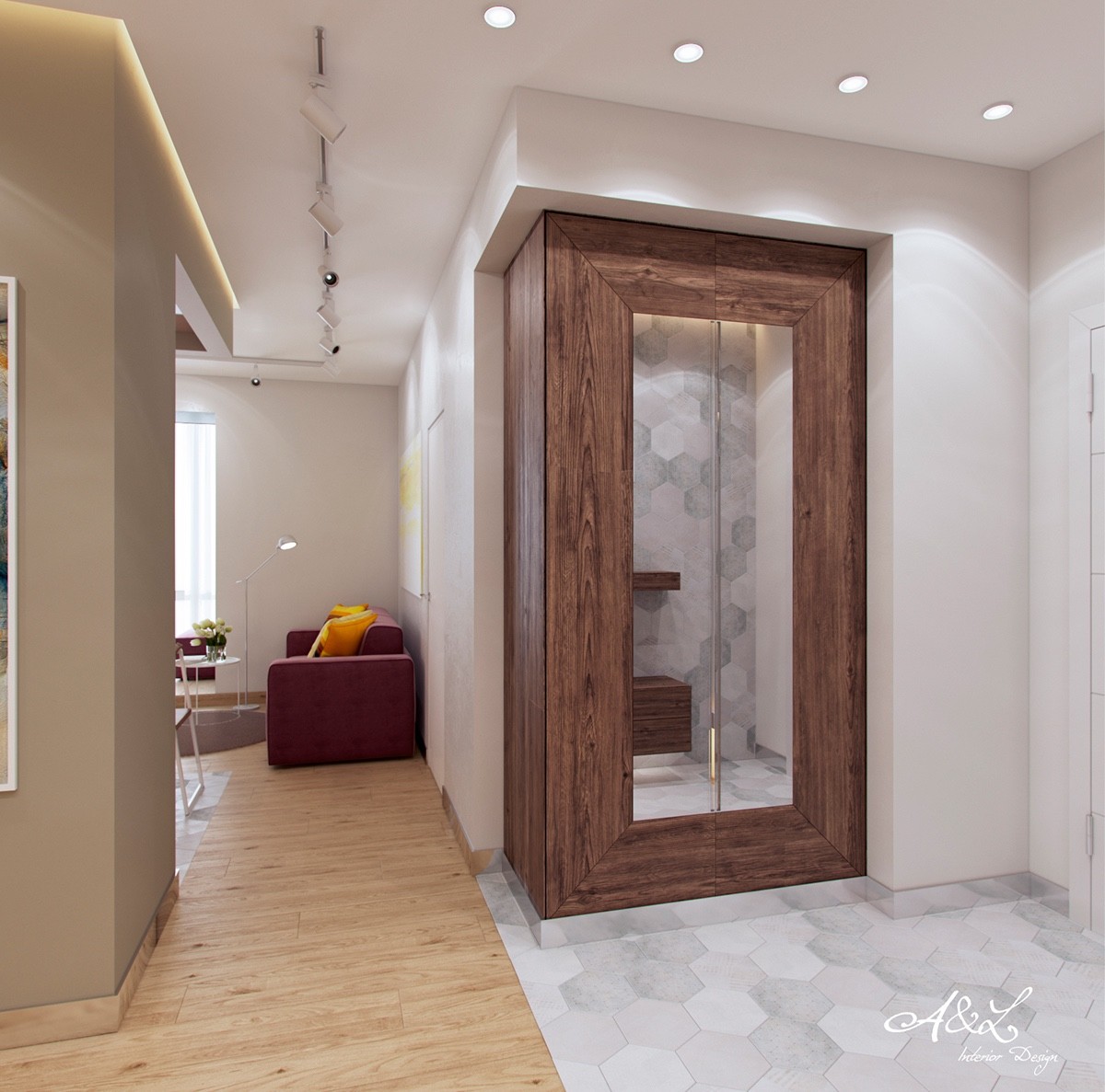
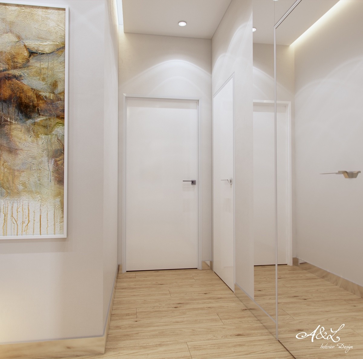
Towards the dressing room, features are mirrored upon mirrors. More mirrors face towards the kitchen, extending the room. Coat hangers in framed box shapes mirror the armoire. Berry cushions match the sofa chairs in the living space, while kitchen tiling covers both wall and floor. Only an abstract wall painting breaks the space.
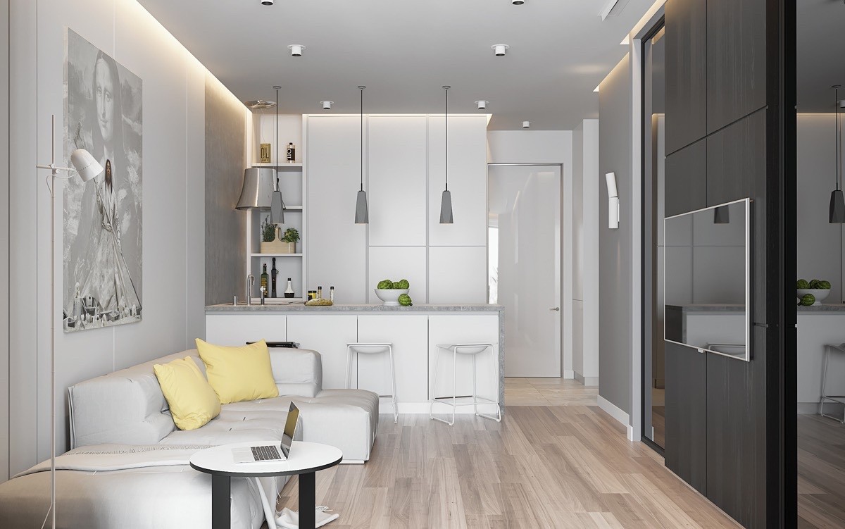
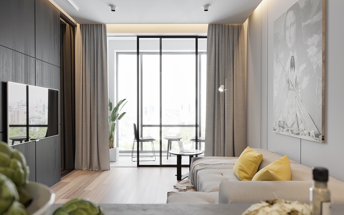
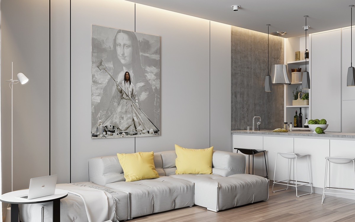
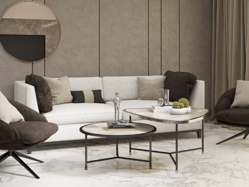
Our third space brings character to minimalism, in all of 40sqm. Designed for a recent graduate, this space proffers the illusion of room without possessing it. Using glass as a staple, the living room space foregrounds the kitchen, resplendent in shades of white. Muted greys play in couches and hanging cylindrical lights, while an Art Nouveau Mona Lisa fades behind. Black TV feature walls, curtains, kitchen stools and sliding door frames add focus, while yellow cushions pop colour. Light wooden floors ground the design.
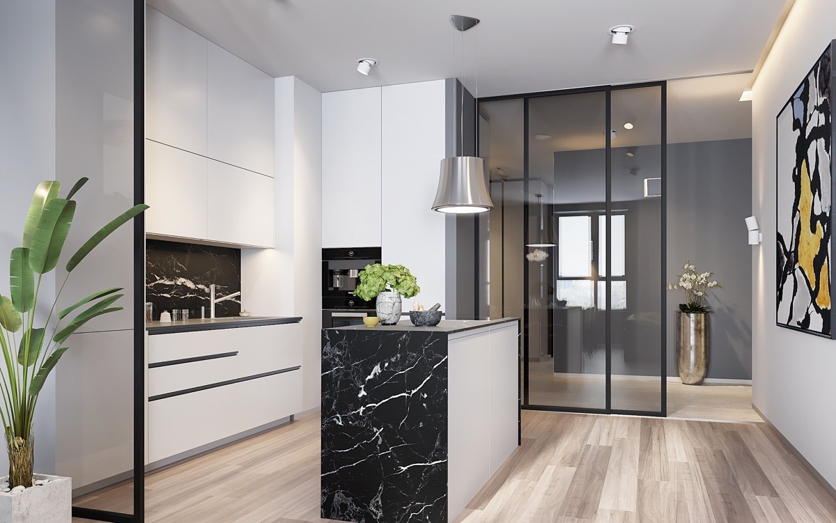
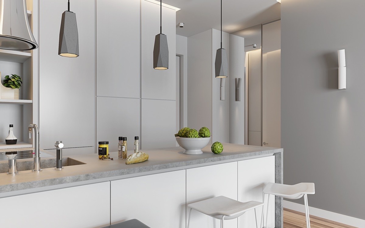
The two angles of the kitchen stand in contrast. Looking towards the lounge, the design is a bold monochromatic, with daring marbled panels and inlets beside a black and yellow feature piece. A view from the couch tells a softer story, where muted greys are elevated by shiny chrome.
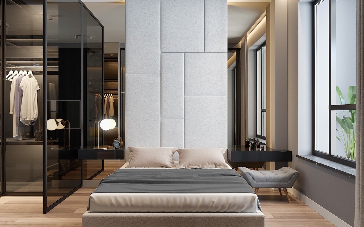
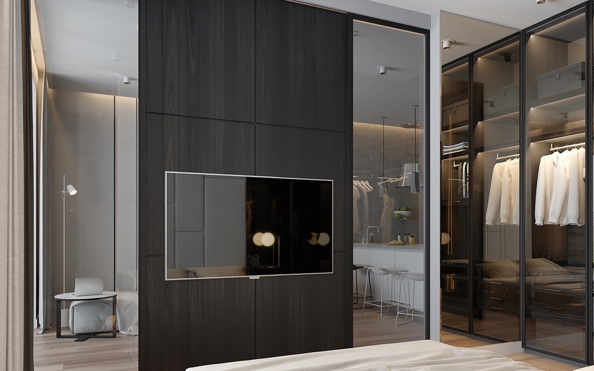
The bedroom uses mirrors to elongate. Mirrors on either side of two feature panels make the space appear open plan. Adding height, the white feature wall mimics square elements in its textures, reflected again in the dark wooden TV panel. Adding length from either side, copper sliding doors let in light from the walk-in wardrobe, while muted bedding offers a rest.
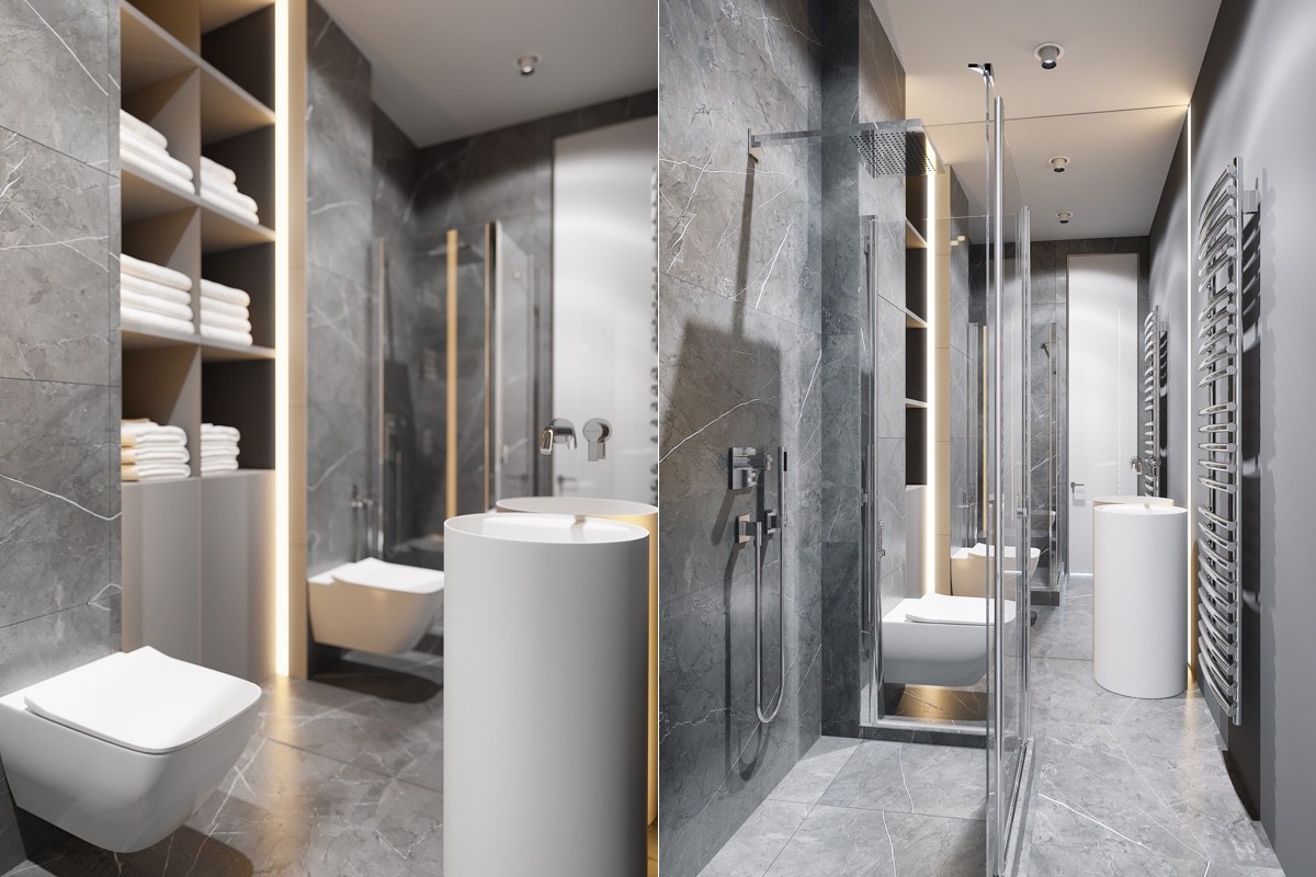
Shades of top-to-toe marble become a light grey in the bathroom. Clean, boxed designs reflect the space’s, while kitchen chrome lurks in the shower fixtures.
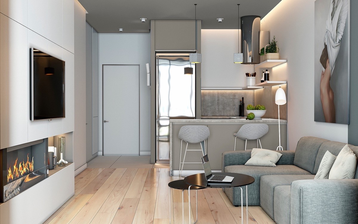
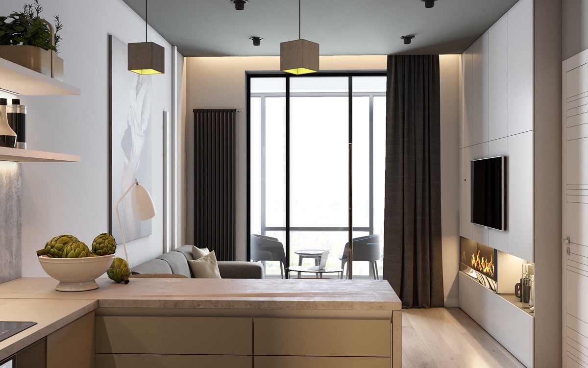
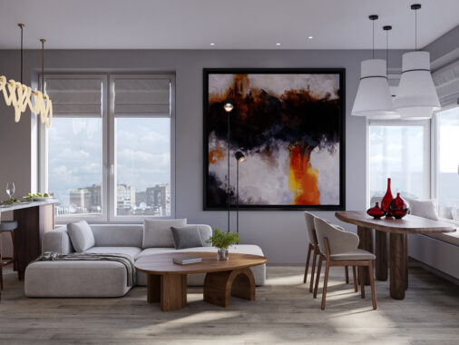
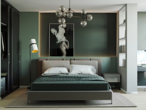
Another tight space, this Level 20 apartment forwent separate spaces in favour of one large, mixed-use room. Using an interesting shade of protolok green-grey, the space feels calm and roomy without being boring. In the living room, the signature shade dominates couches, stools and kitchen cabinetry. A white wall presents a panel for a roaring fire; a chrome fridge a mirror to extend the space. A feature canvas of Amy Judd Wings makes a mark, allowed by simple charcoal curtain framing and background wooden elements.
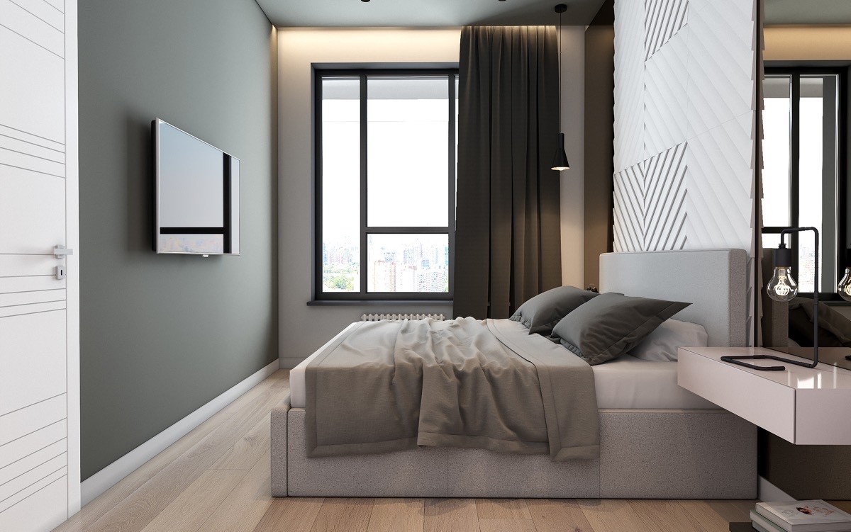
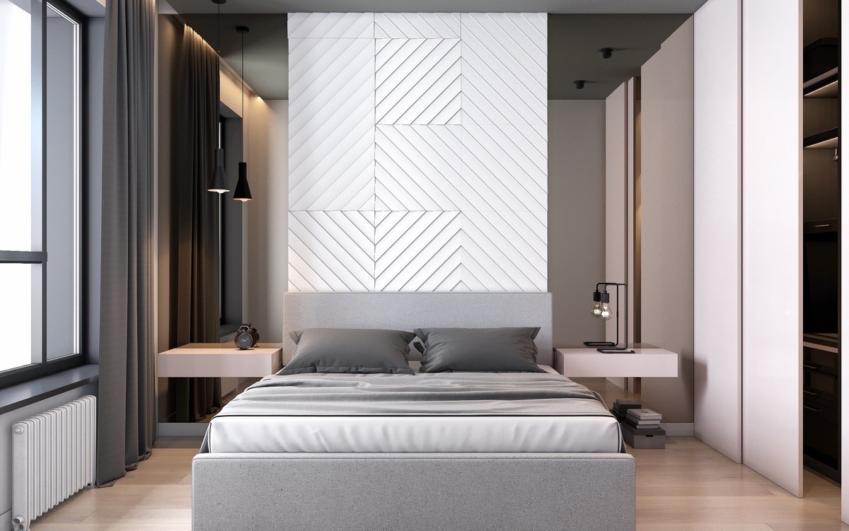
Framed by black curtains and window framing, the bedroom presents relaxation within fixed borders. Protolok green-grey affixes to walls, complemented by bedding shades. A hero plaster wall creates textures amidst twin floor-to-ceiling mirrors, which extend and elongate the space.
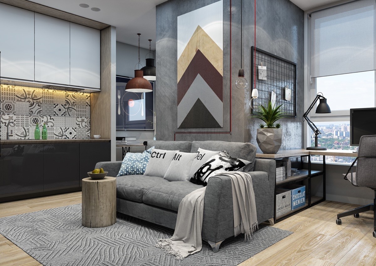
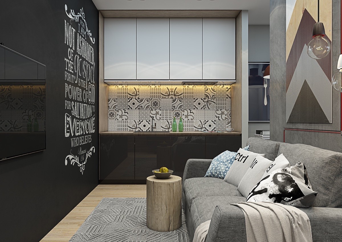
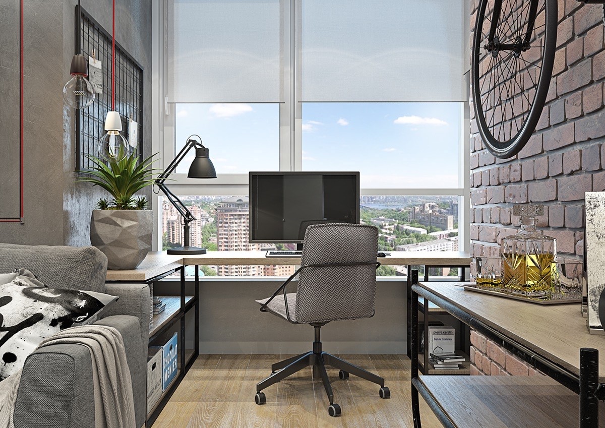
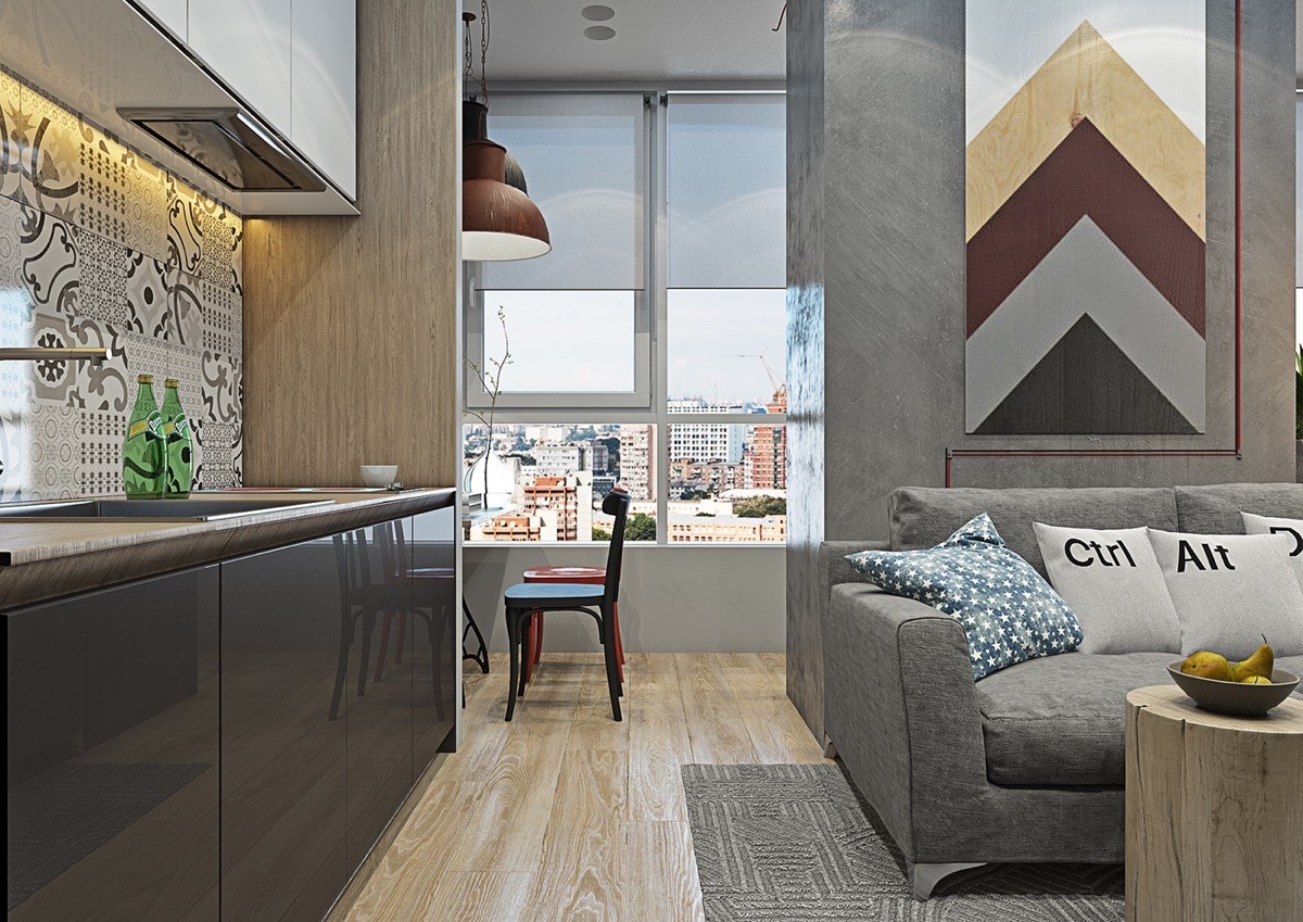
Our last apartment in Kiev, Ukraine expertly mixes a myriad of textures and patterns to create an interesting, modern space. Combining a kitchen, living room and study in the one area, a range of details represent each other amongst Scandinavian wooden backgrounds. In the living room, a warm art piece in a speedy design is reflected in a triangulated grey rug. An inspirational wall quote in the kitchen is replicated in multi-patterned tiles and Ctrl Alt Del pillows. Black stencil elements in the study mirror the bike’s wheel spokes, a wall note-grate, and bent desk lamp. Light tones of grey set the background.
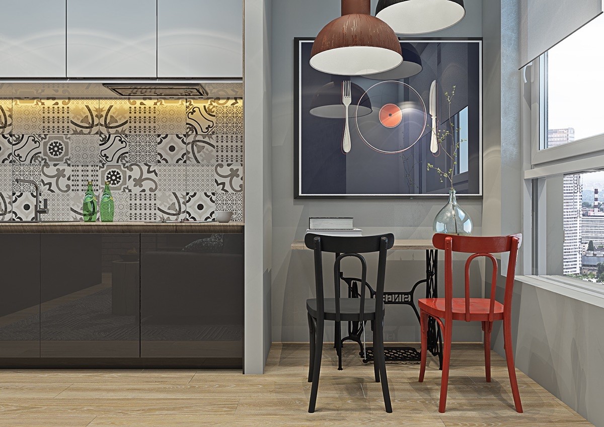
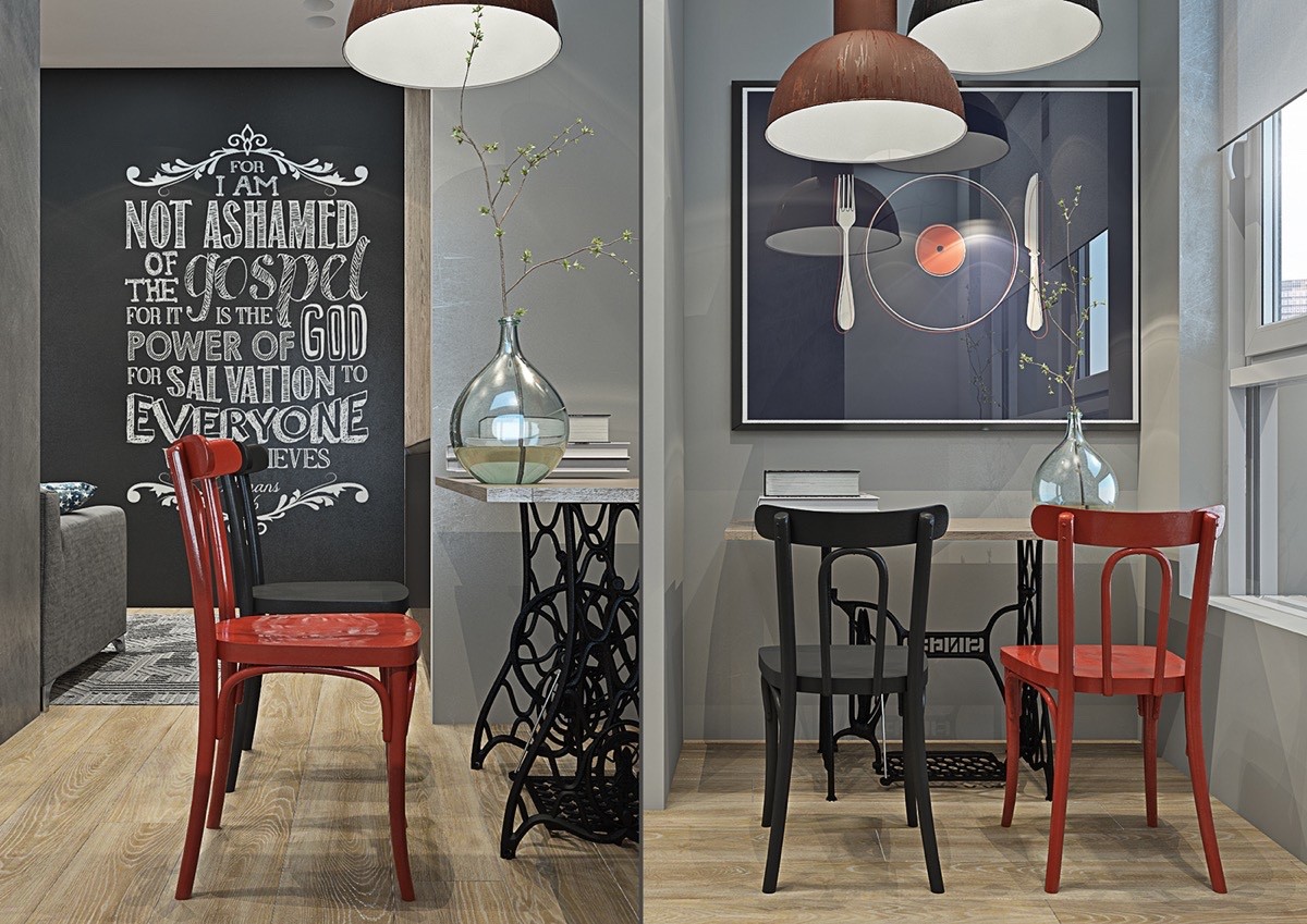
From the kitchen, a wall partition creates space for a dining room. Lit by industrial copper lighting, perfectly mis-matching red and black chairs work with a dinner-plate vinyl, shadowed by the inspirational quote to the side. A glass bauble vase mimics the living room light, a stencilled table-bottom the study.
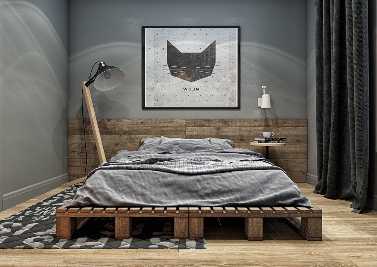
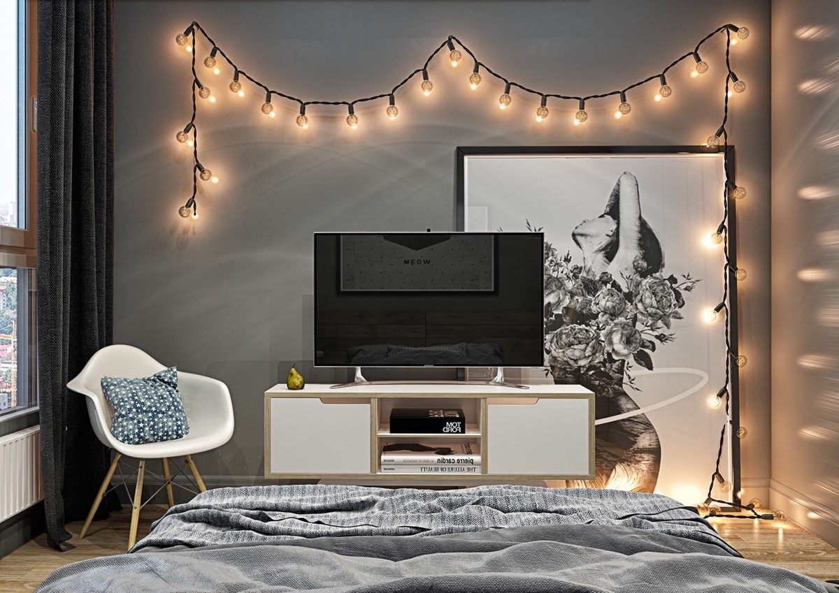
The cat-themed bedroom offers industrial with a rustic twist. Framed by floor-to-ceiling drapes and a black cat frame, a string of lightbulbs brings a party into the interior. Full-width wooden headboards matched by a low-lying wooden bed brings in calm, while feature art beside the TV brings exaggeration. Spotty cushions and a word-heavy rug tie the two.

