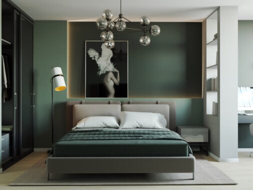
Deciding how to handle the sleeping situation is one of the most challenging aspects of designing a studio apartment, requiring a lot of forethought to match the lifestyle preferences of the resident while working around any architectural or floor plan obstacles that can limit the available options. And that's even before taking decor into consideration! This post looks at four compact studio apartments, each one taking a different creative approach – both in terms of bedroom design and overall aesthetics. A few of them even include floor plans for your own apartment layout inspiration.
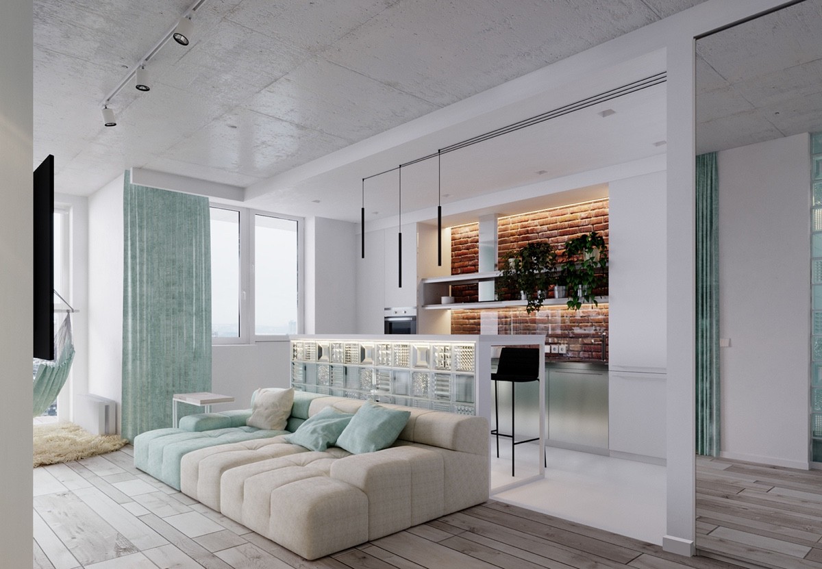
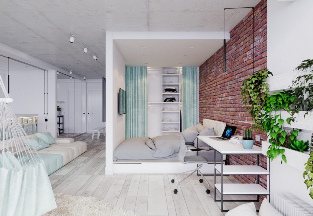
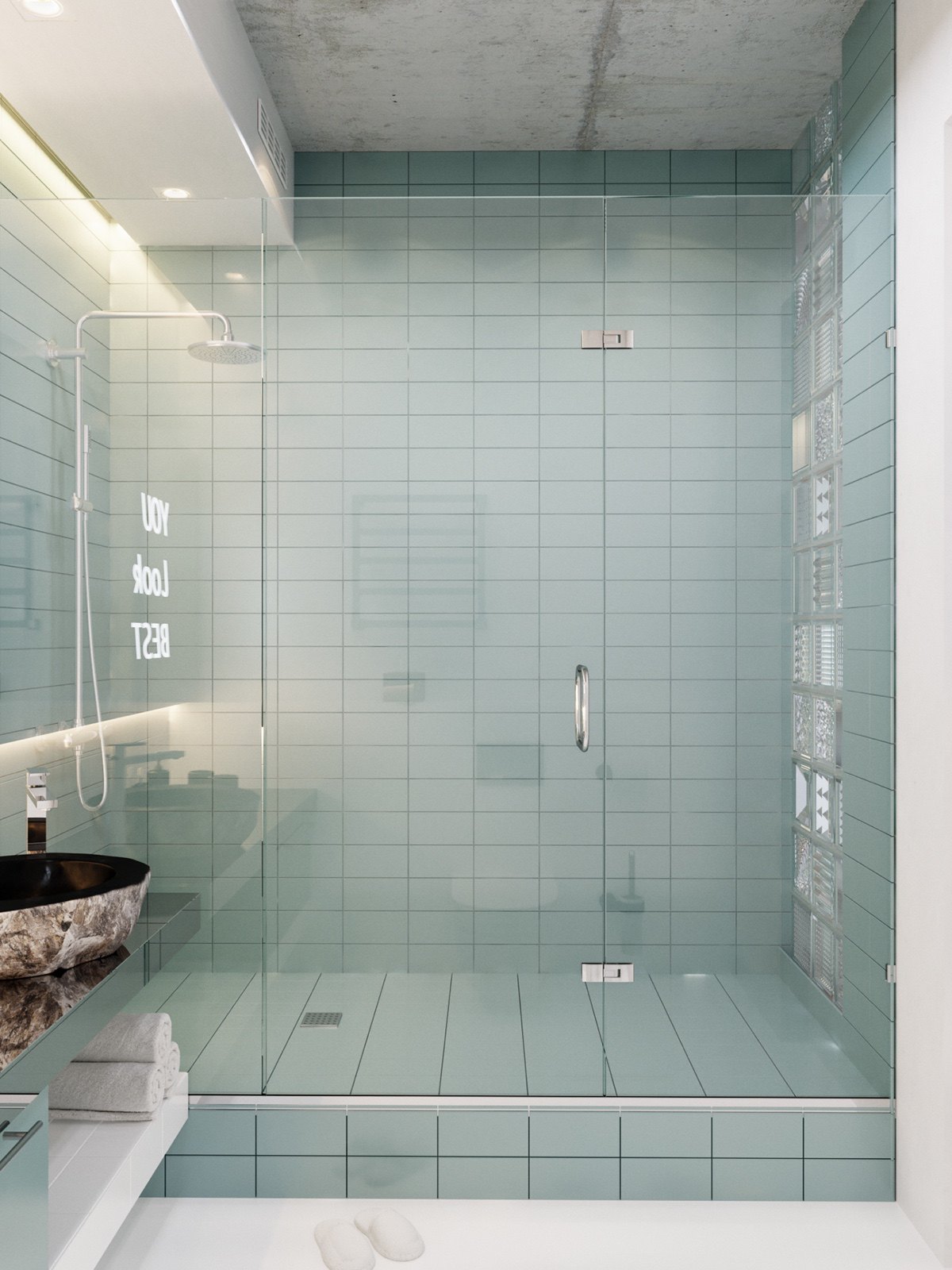
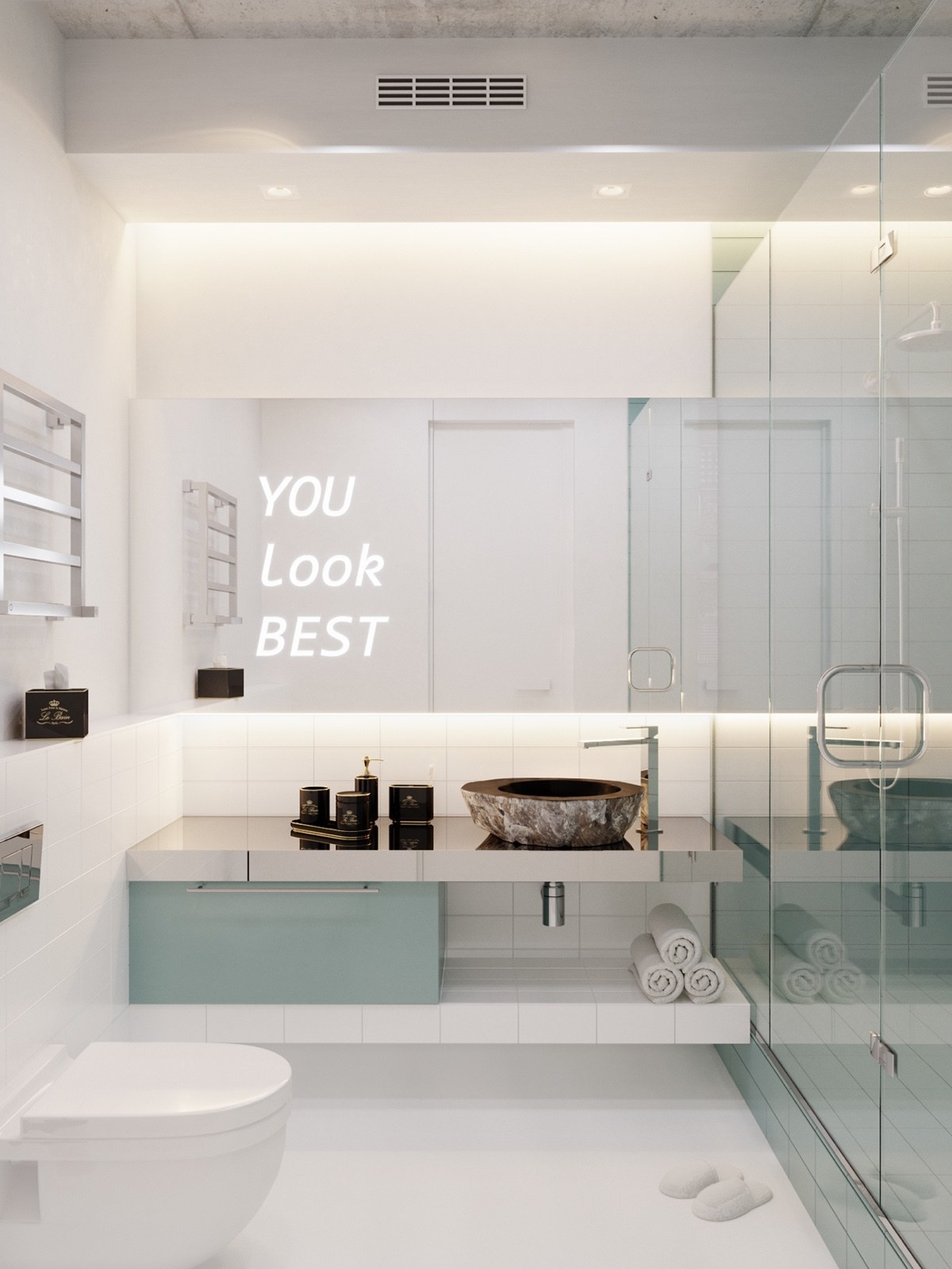
Let's start with a fun compact studio with a color scheme based around a Pantone palette of minty turquoise. Like the fresh springtime hues used within, the apartment's layout fosters a breezy atmosphere that at once relaxes and energizes.
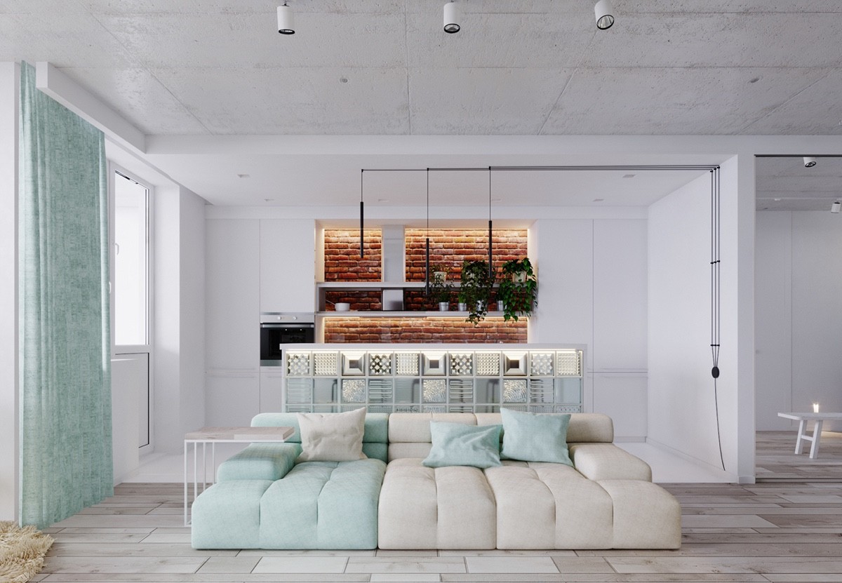
The open layout begins with a combination living room and office, separated from the dining and kitchen area by a breakfast bar clad in translucent glass blocks.
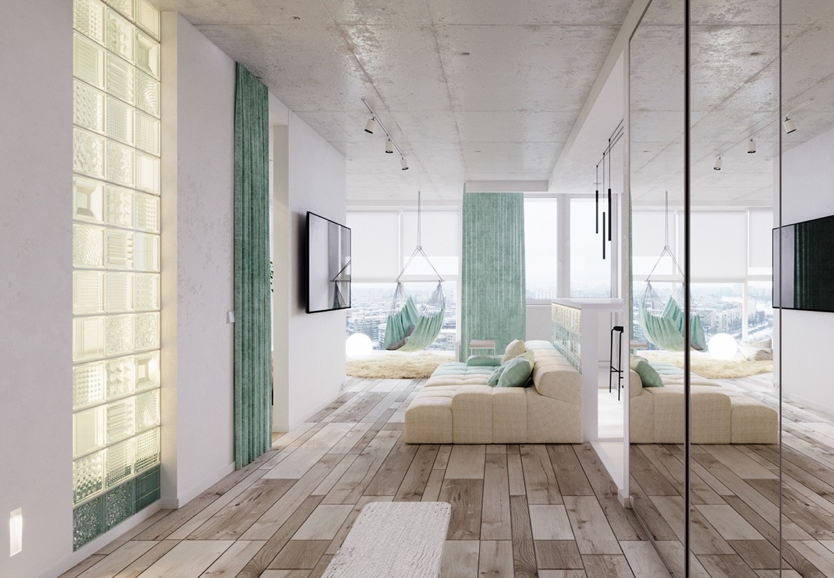
Glass elements play a tremendous role in this design. Mirrors, blocks, and windows work together to bathe the interior with light and erase the boundaries between functional spaces.
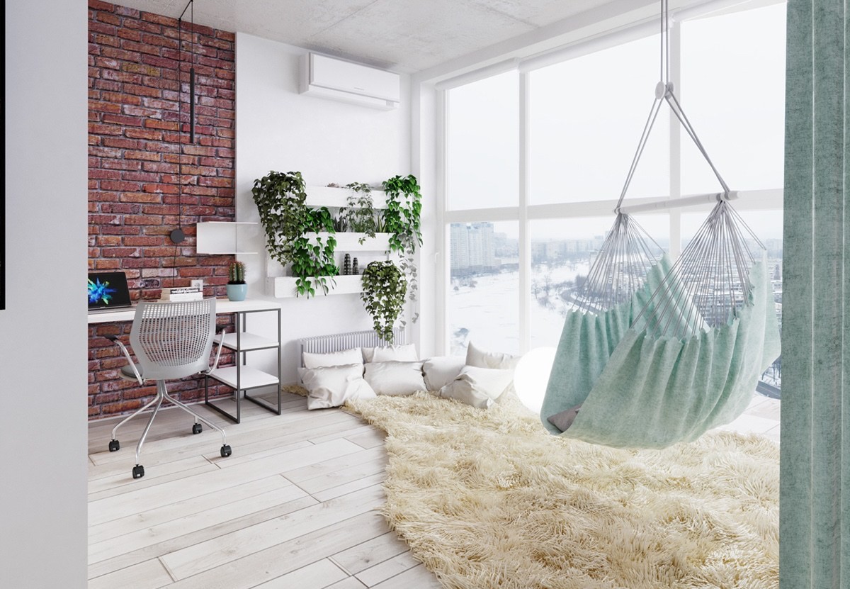
In the corner, a cozy lounge space offers respite from a long day of work. The hammock is an especially enviable addition, soaking up the skyline view from the impressive floor-to-ceiling windows.
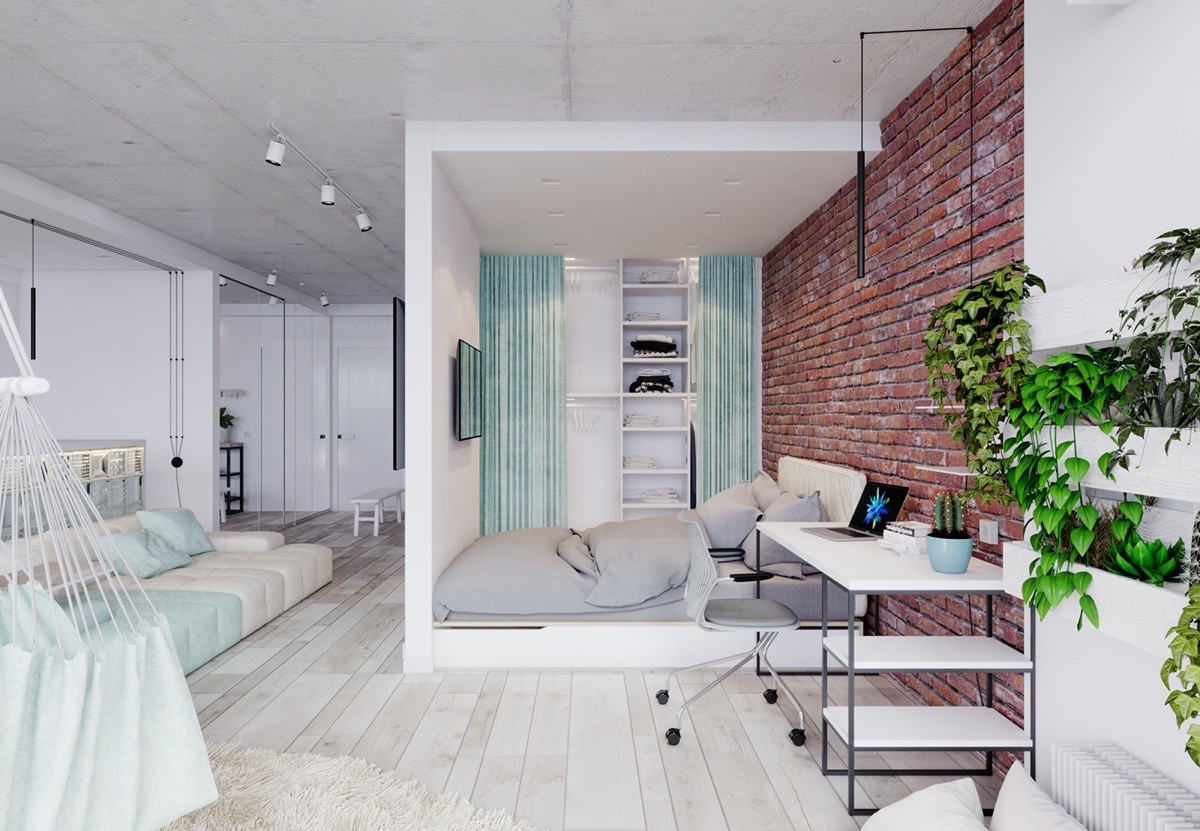
Rather than hiding away in some corner, the bed actually occupies a central volume in the center of the living space, shielded from the sofa by a wall with televisions mounted on either side.
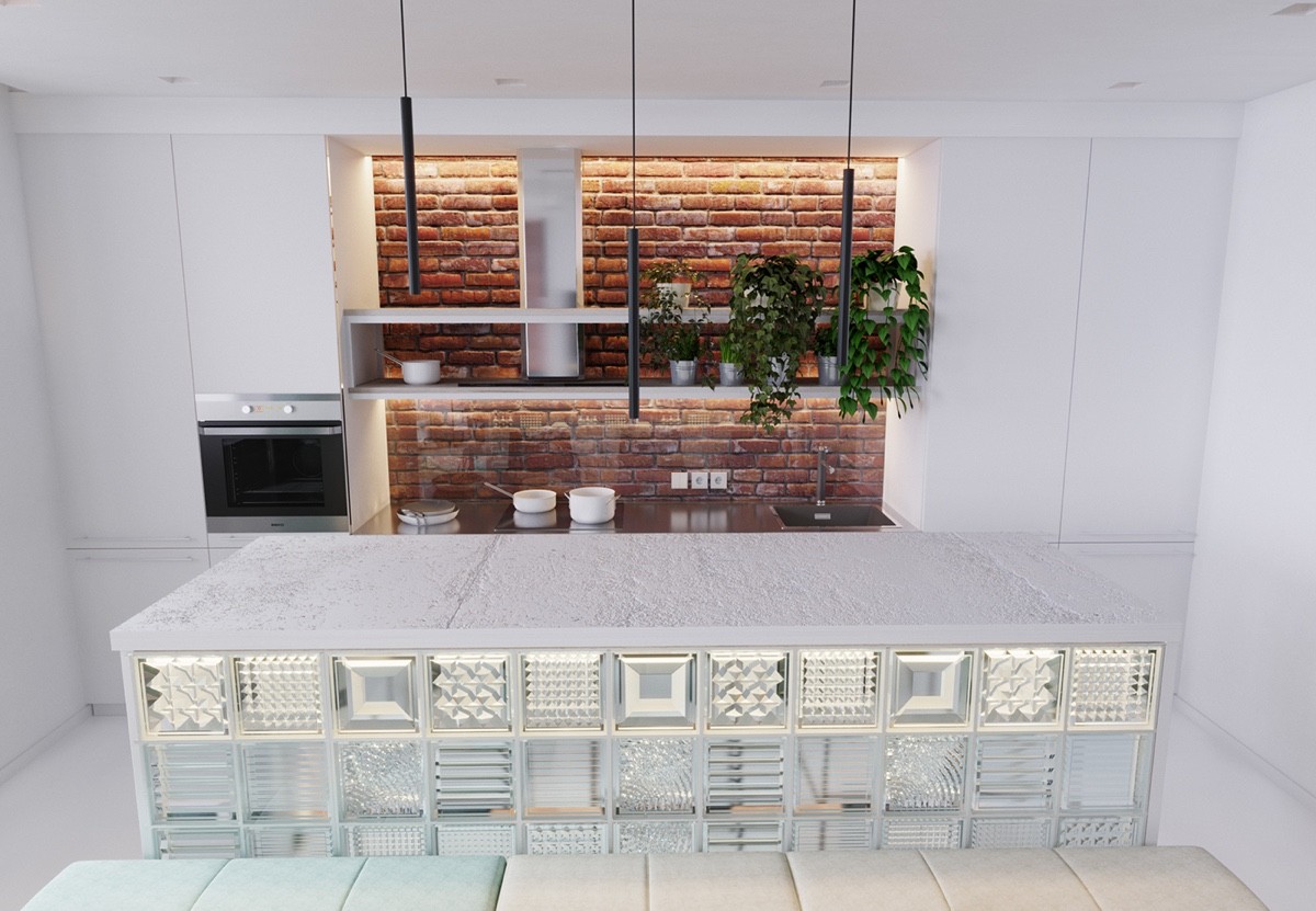
The kitchen's use of glass blocks and white surfaces helps balance the heaviness of the brick accent wall. A layer of transparent glass catches splatters from the sink and stove to make cleanup a breeze.
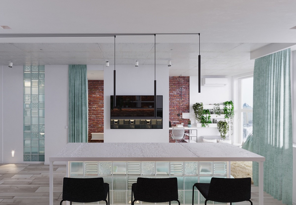
A series of three simple kitchen pendant lights trace sharp lines across the ceiling thanks to the precise decorative routing of their cords – a contemporary touch.
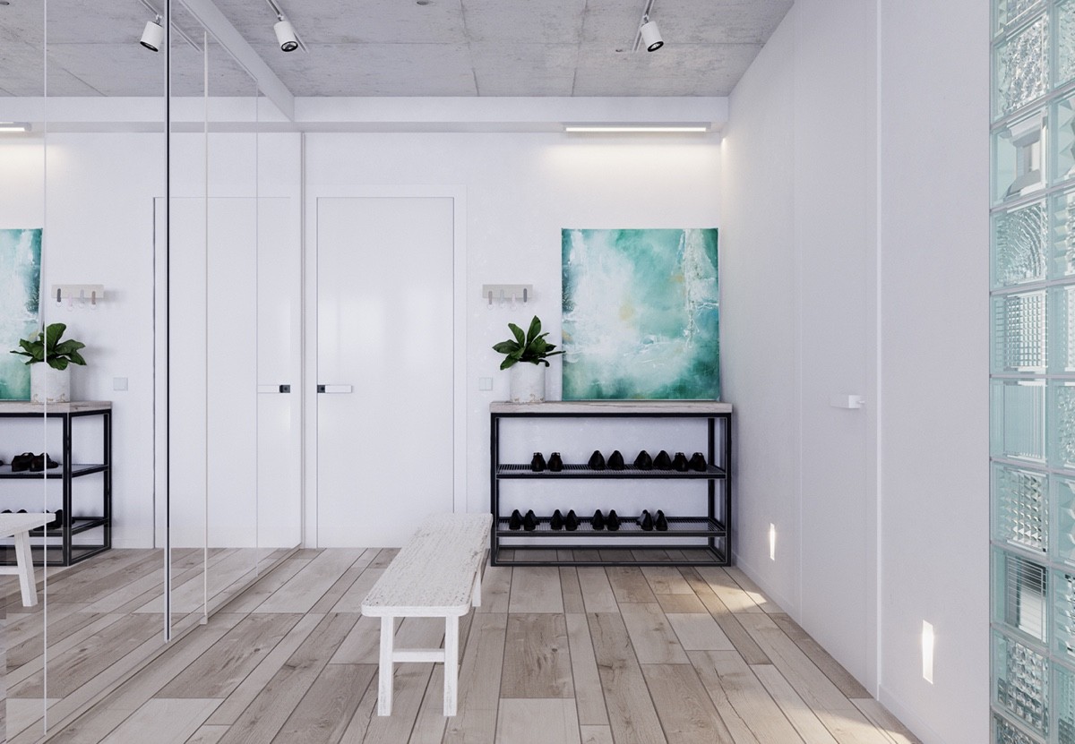
The entryway balances comfort and functionality, taking advantage of its roomy proportions with a handy bench and tidy shoe rack.
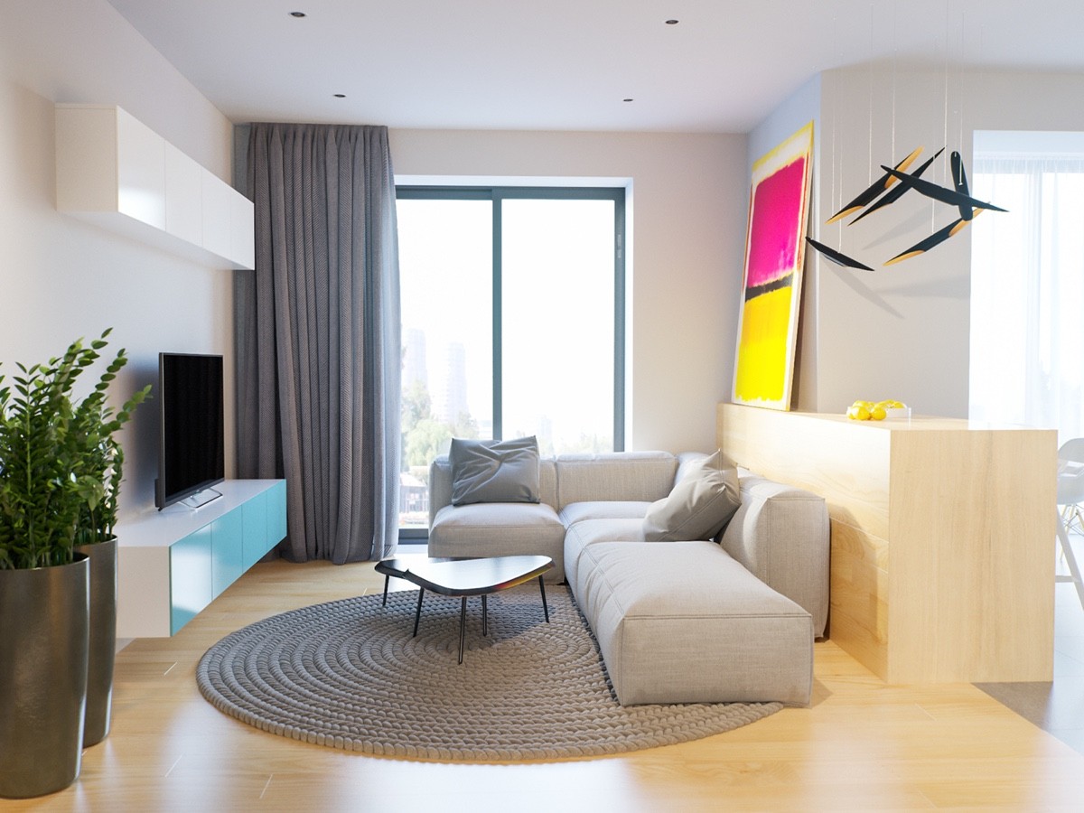
At 45 square meters in size, this studio apartment makes fantastic use of its limited floor plan without sacrificing the individuality of each functional area. Each area feels like its own little "room" but doesn't feel too closed off from the rest of the home thanks to the low-profile furniture and partial walls.
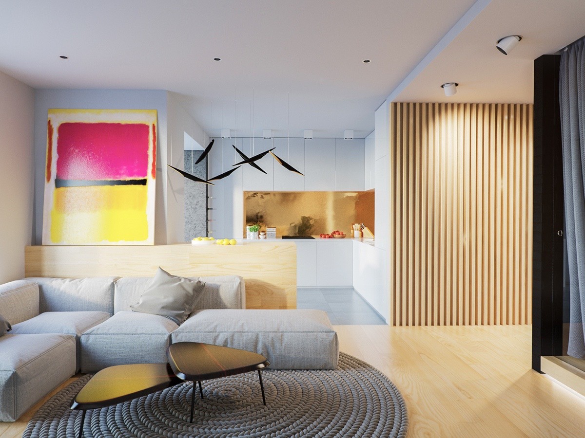
The designers chose Scandinavian influence as the overall unifying theme, but each room features its own unique flavor. For example, the living room glows with bright neon accents while the kitchen feels sophisticated in gold.
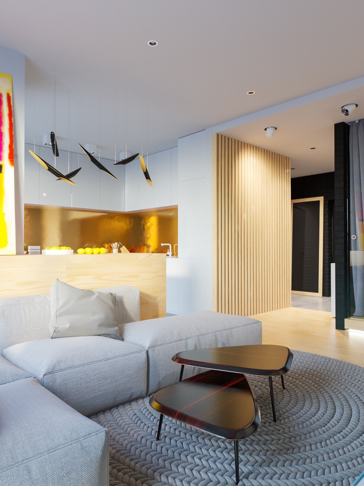
Named for the bouncy rhythms of jazz musician John Coltrane, the Coltrane Suspension Lamp series adds a sense of life and movement above the kitchen island. Many dining pendant lights have just the right form to use above counter tops.
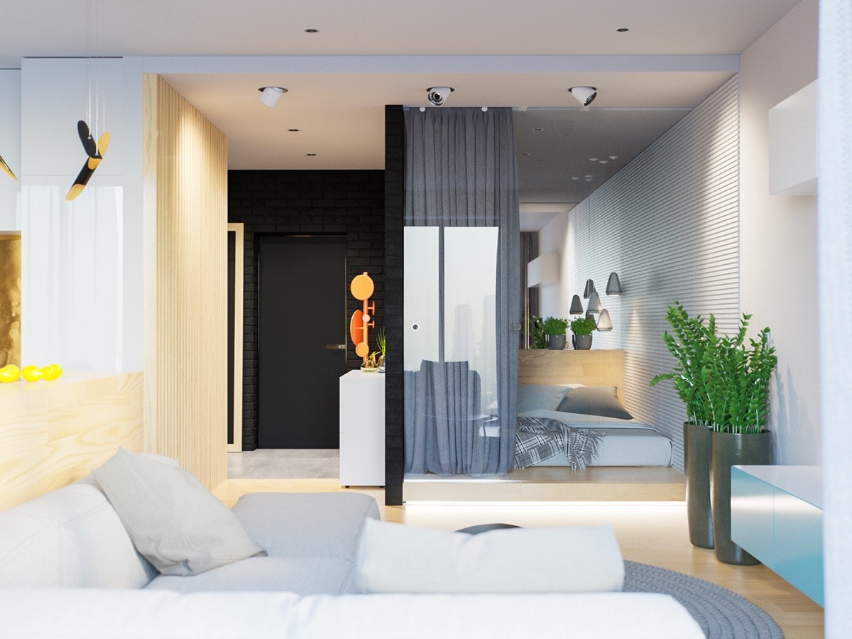
A touch of greenery in the living room and bedroom help to bring the outdoors in. The plants in the taller pots are the ZZ plant, or Zamioculcas zamiifolia, also known as the "eternity plant" because of its reputation as one of the easiest indoor house plants to care for.
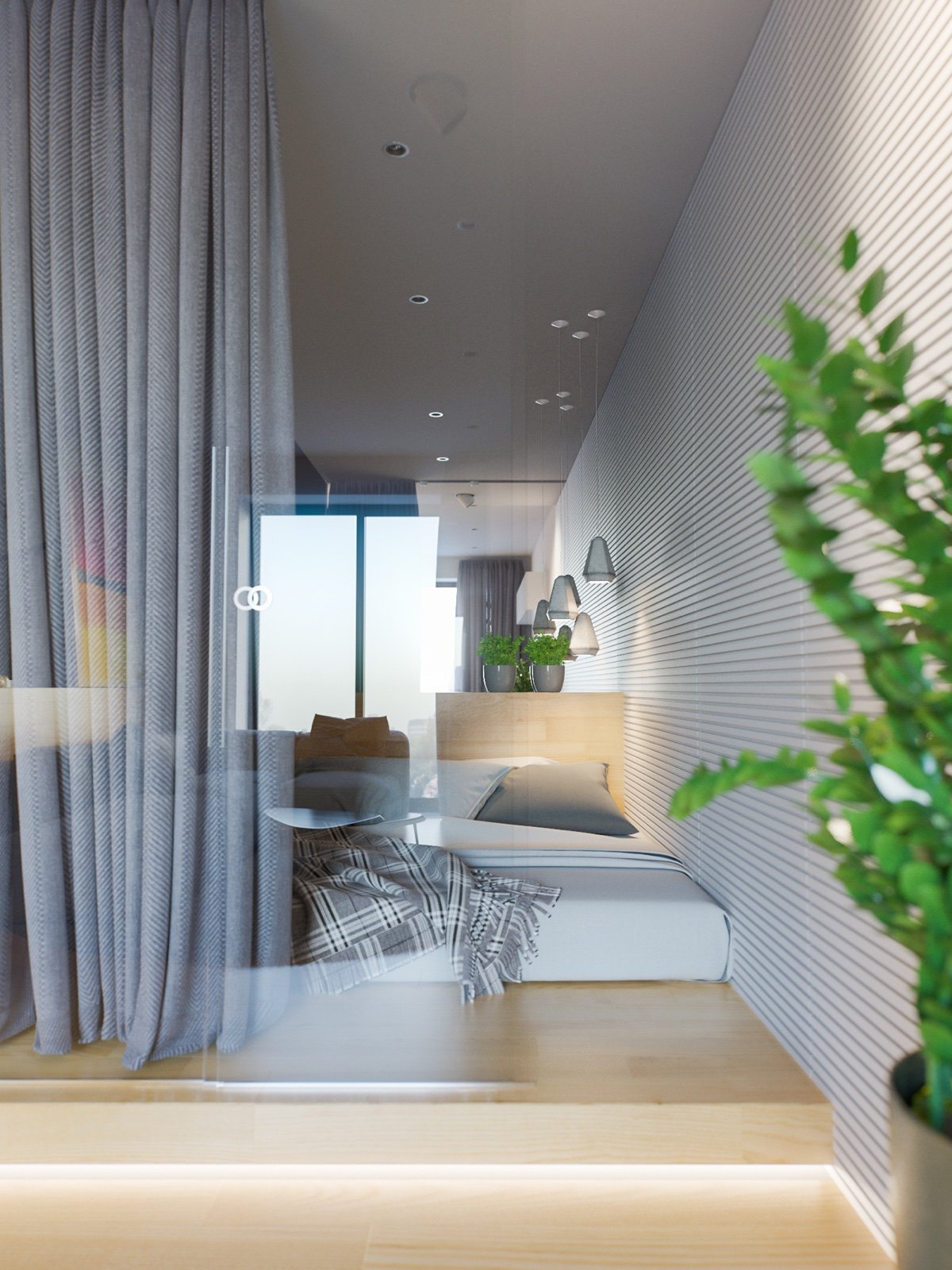
The bedroom enjoys an open visual plane while preserving insulation from sound thanks to its glass boundary. Sliding curtains offer privacy when needed.
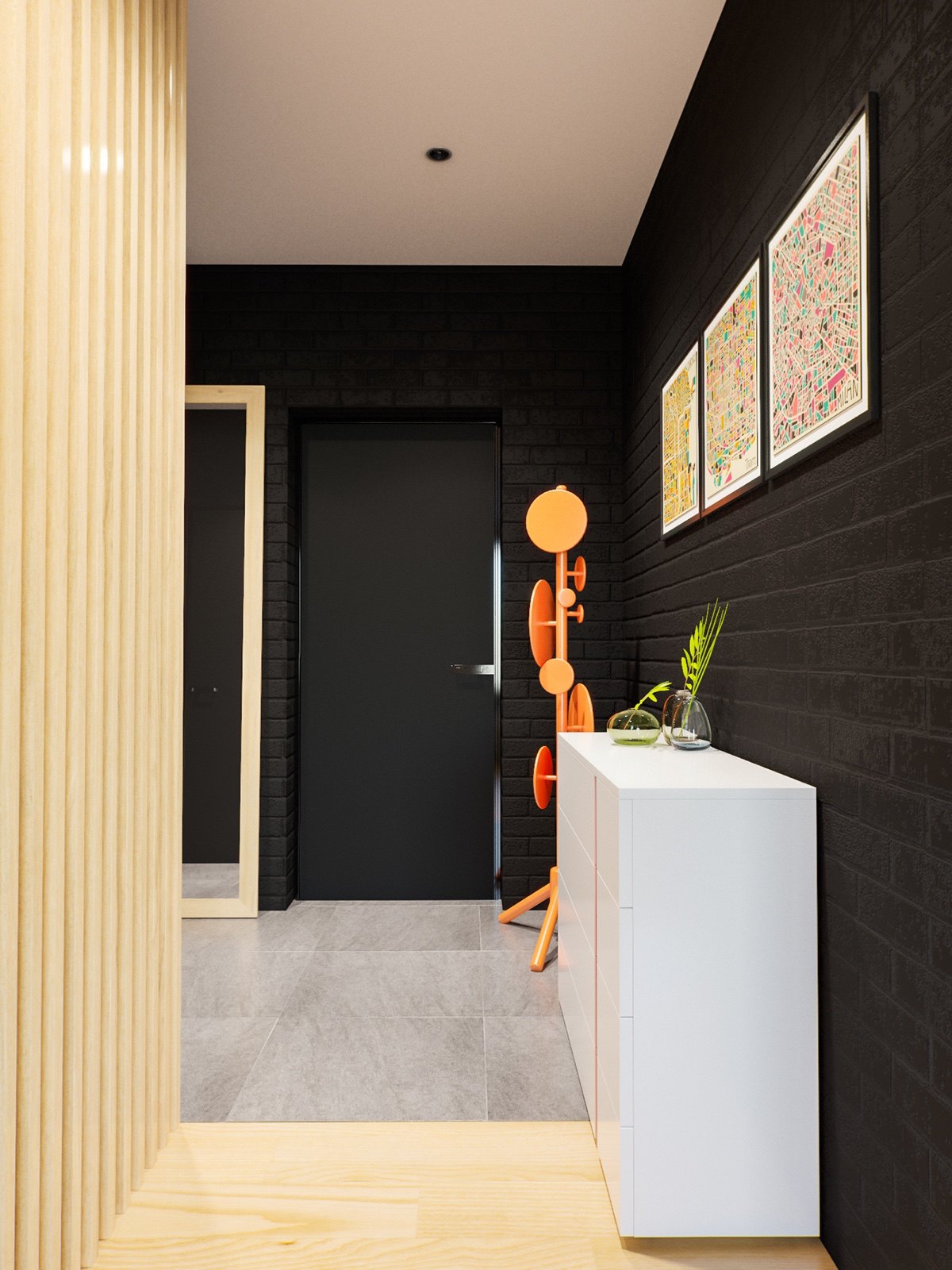
While the rest of the interior is bright white and airy, the area around the front door makes for a dark and dramatic entrance.
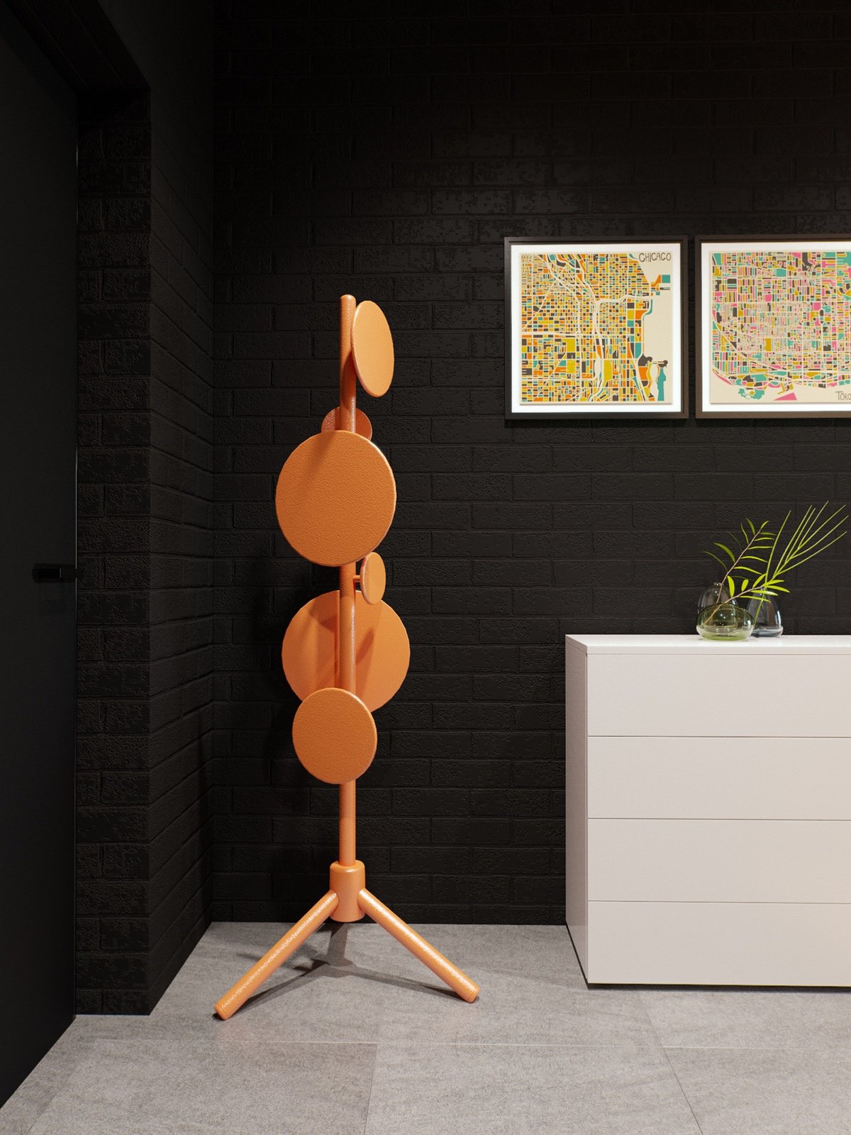
Designed by Tom Dixon, these large coat pegs are easier on clothing compared to small hooks that can stretch or deform delicate fabrics.
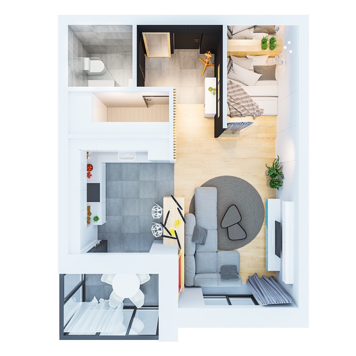
Here's a look at the apartment from a bird's eye view. If you enjoy getting inspiration from 3D layouts like these, make sure to check out our compilation of 50 studio apartment floor plans for even more ideas.
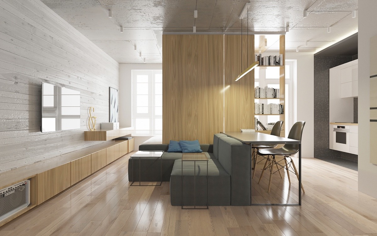
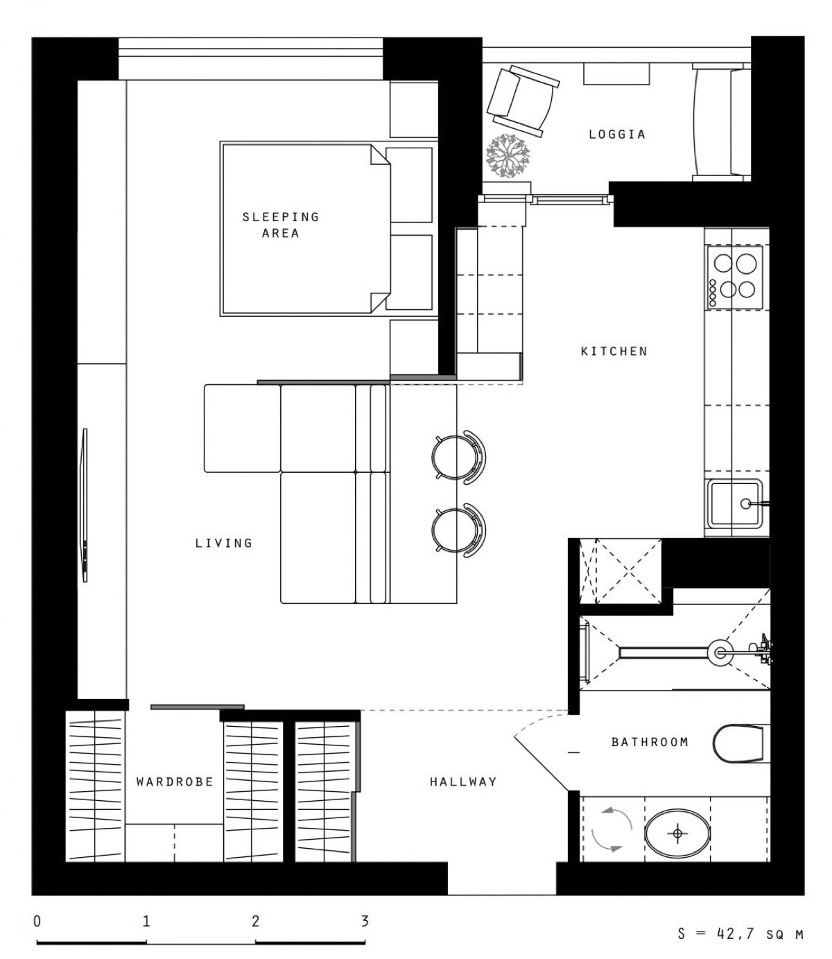
A little different from the previous two homes, this apartment occupies 42 square meters in Kiev, a clean and simple interior that uses natural elements to foster a sense of relaxation and comfort. Because the apartment was designed with a young couple in mind, most furniture remains in the middle of the floor plan to accommodate a freer flow of foot traffic.
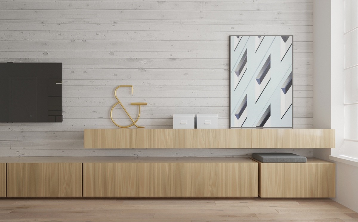
Decor remains spare. The few accents that adorn the home remain minimalist and modern just like the interior.
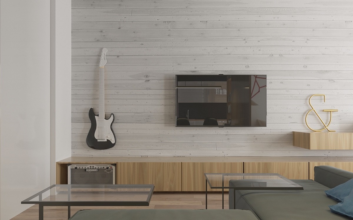
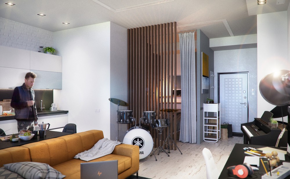
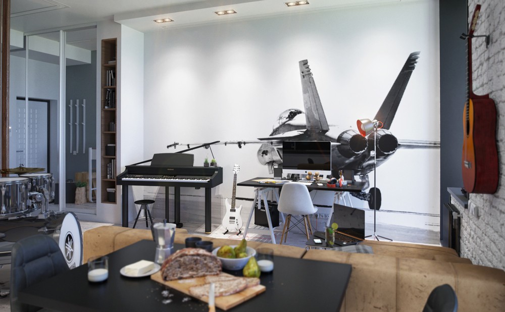
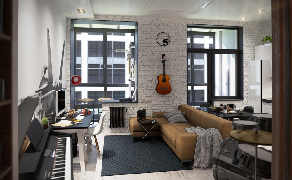
While instruments and their peripherals can often add clutter to smaller homes, this interior puts them on display and turns them into music themed decor.
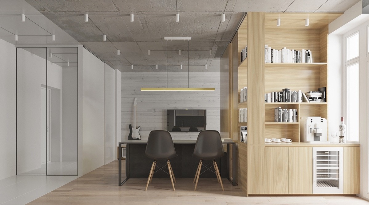
Dining and storage separate the kitchen from the living room. The espresso station is a nice touch, making it easier to grab a quick cup while working or playing at the table.
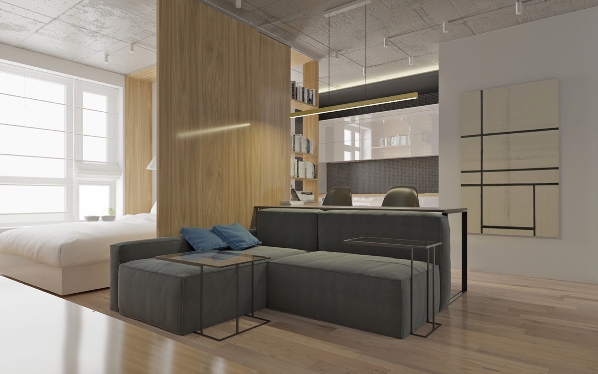
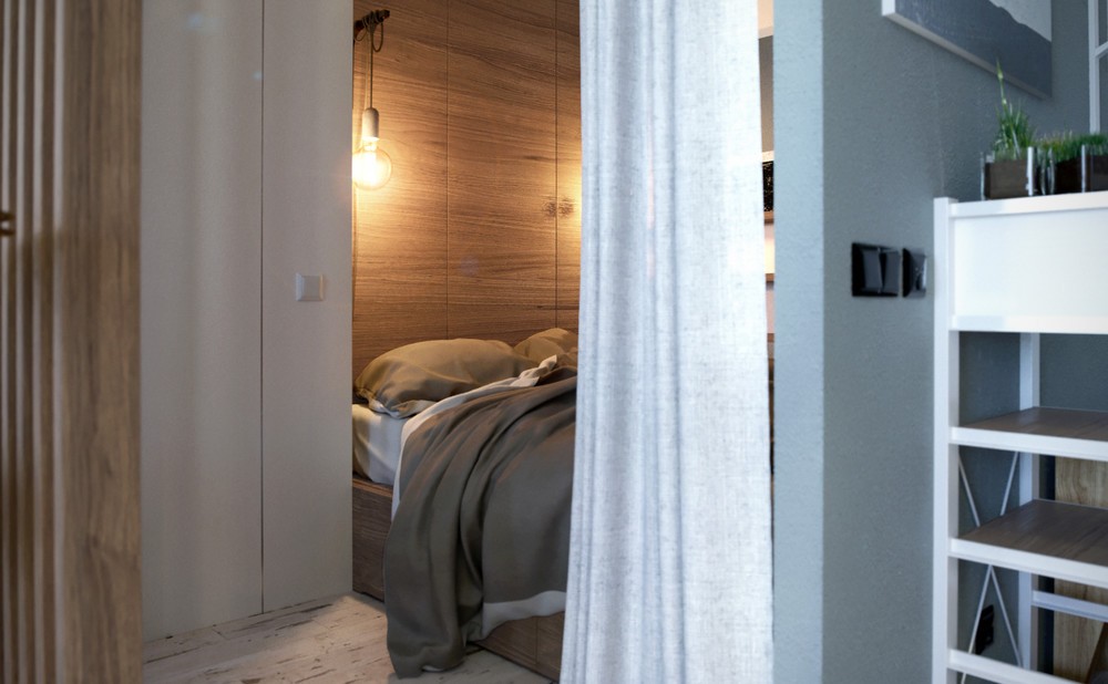
A wooden accent wall with built-in shelves helps protect the bedroom's privacy without cutting off the living space from the window's generous flood of sunlight.
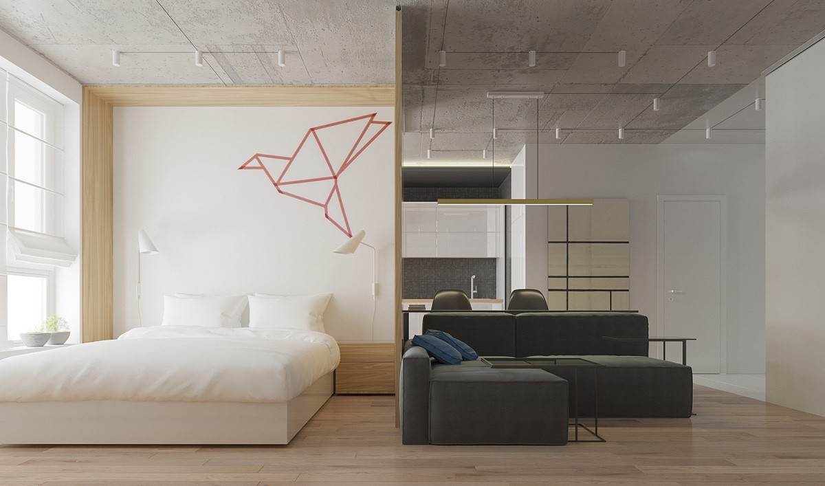
Geometric decor seems to be a popular motif for minimalist bedrooms. This origami-inspired crane would be easy to recreate with a small roll of colorful painter's tape.
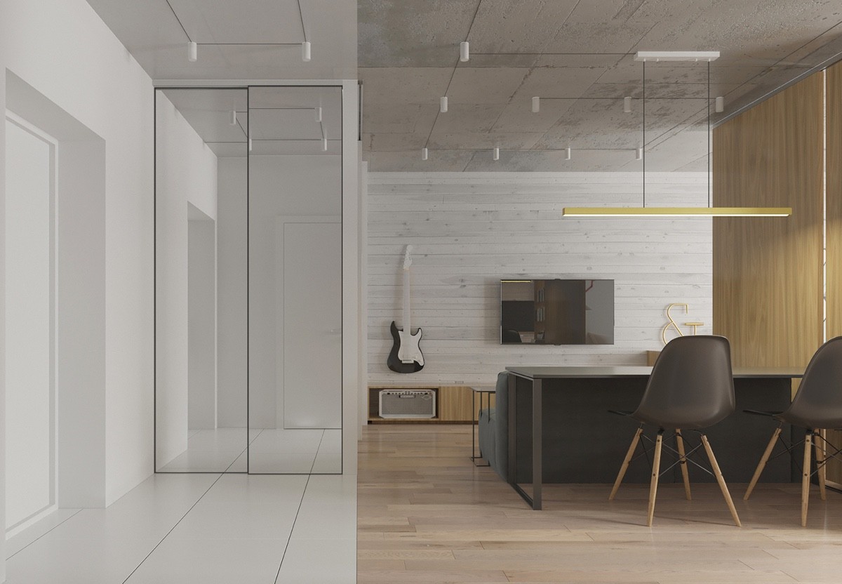
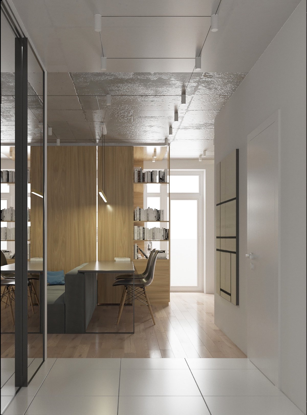
Check out this boundary between the entrance and the rest of the home! A sharp transition from wood to white-on-white brightens the space despite its distance from any windows.
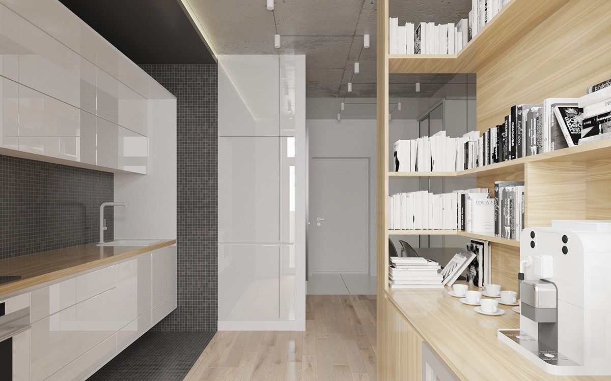
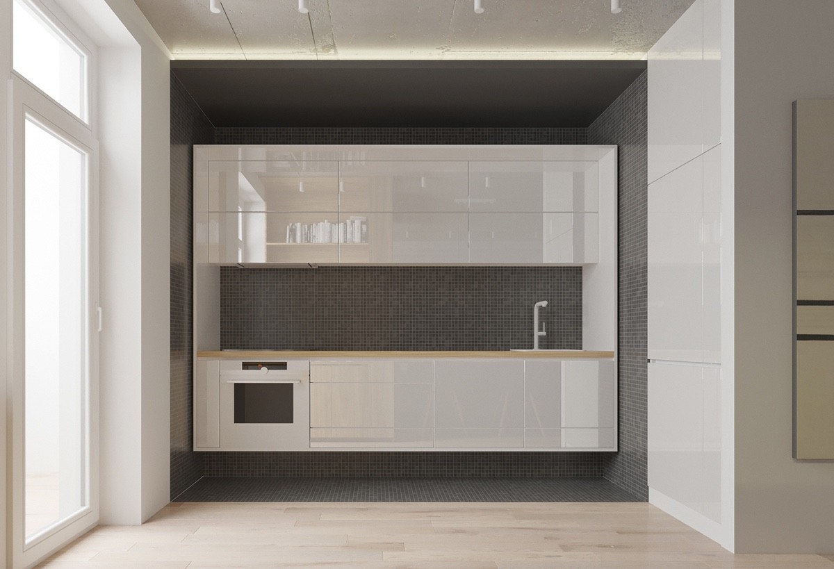
The kitchen mostly follows the wood and white theme, but also adds a border of gray tiles for contrast.
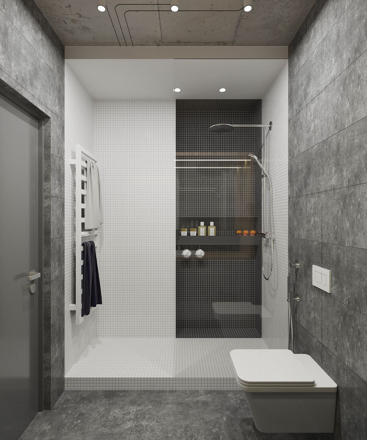
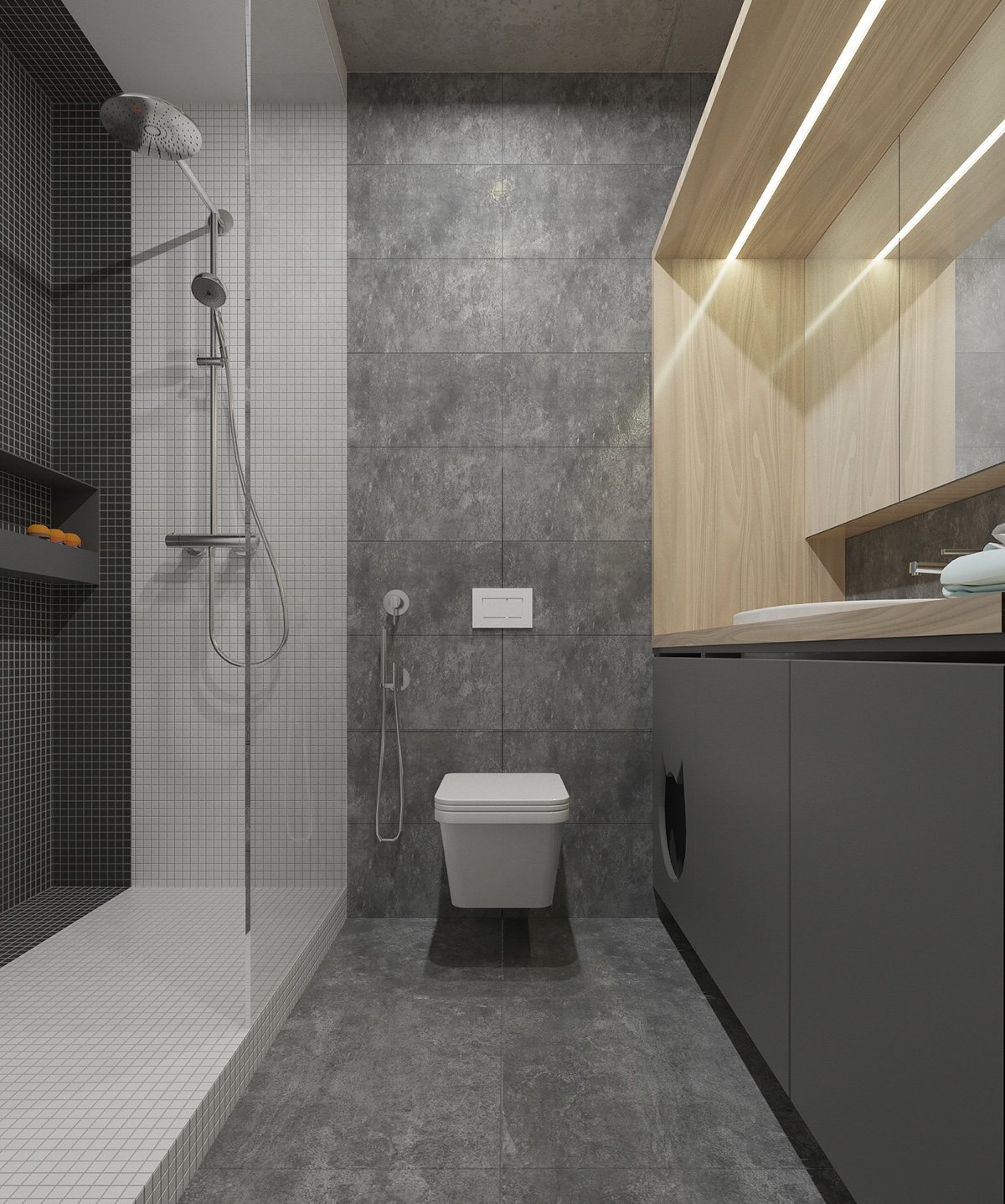
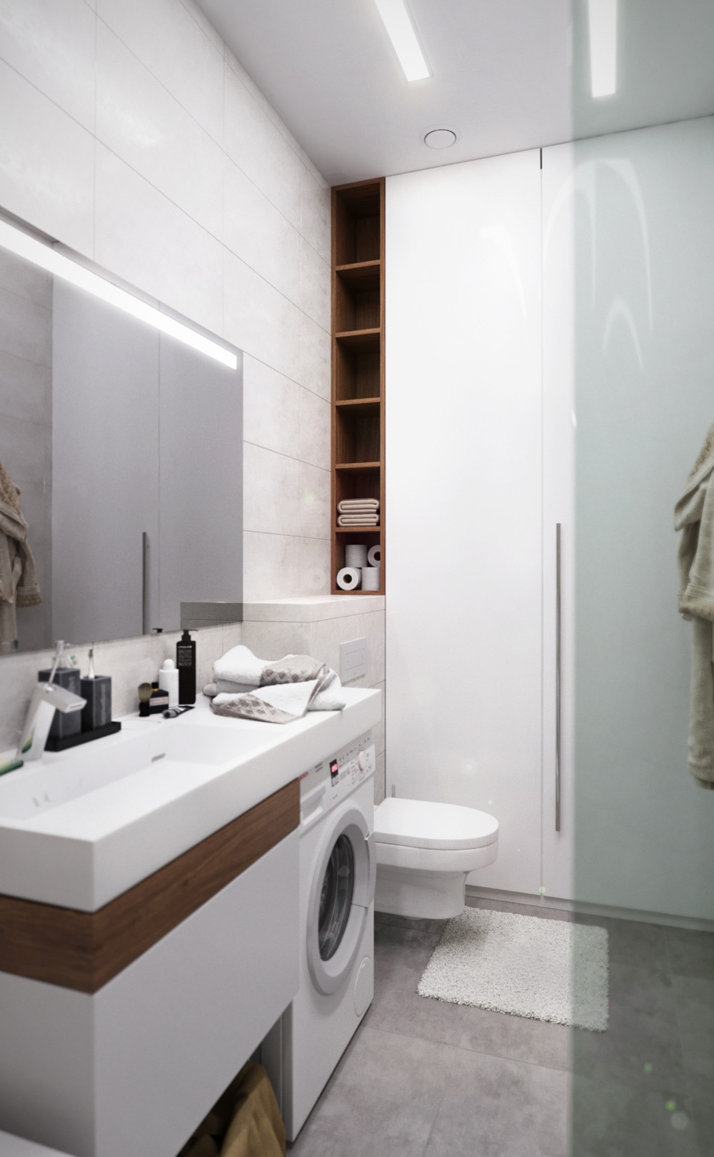
Using the same tiles as the kitchen, the bathroom also keeps things simple and dramatic with a grayscale theme.
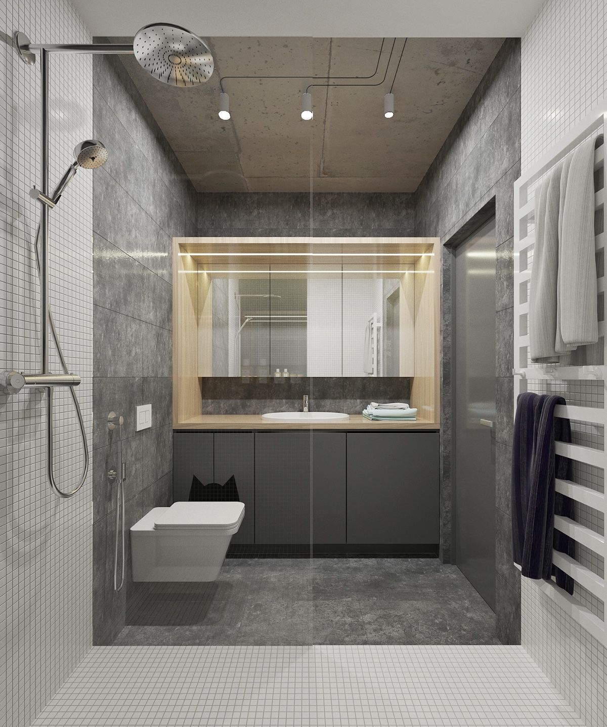
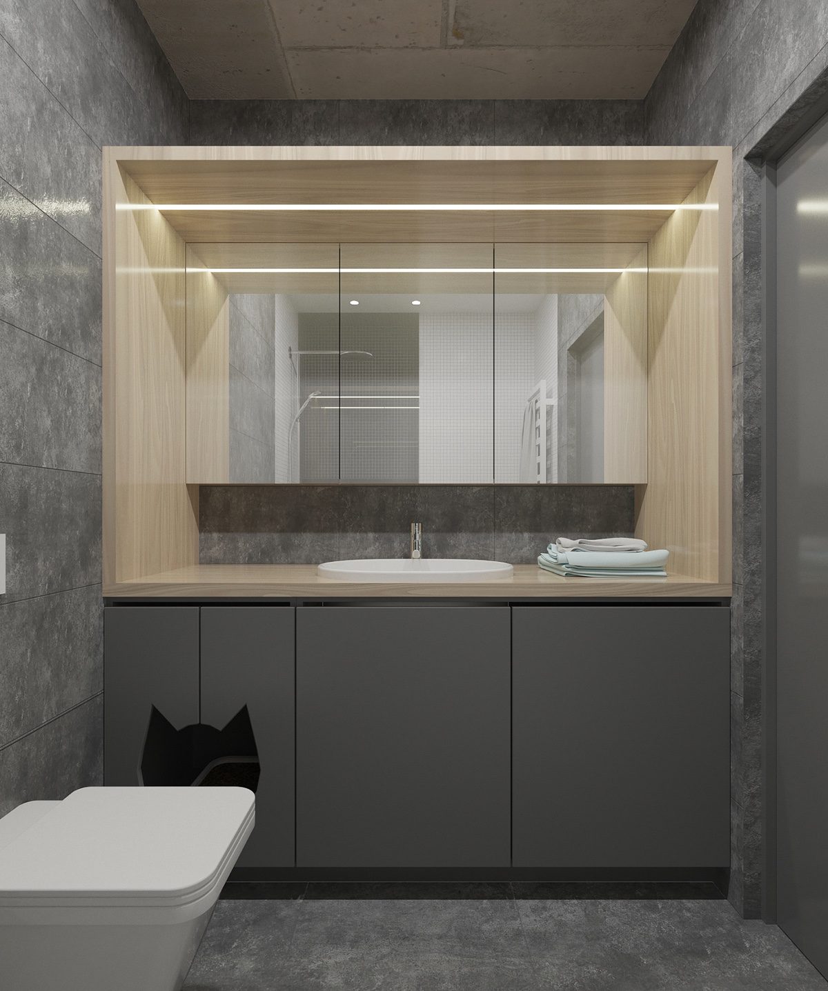
The vanity is enclosed by the same light wood found elsewhere in the home. A bar of recessed lighting keeps things bright.
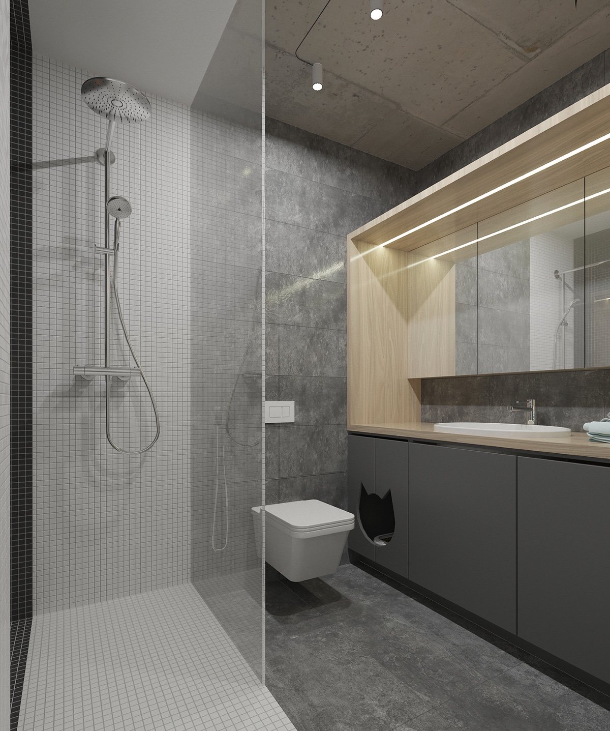
What an adorable litter box niche! With a hole shaped like a cat's head, it helps hide the box while remaining easy to open and clean.
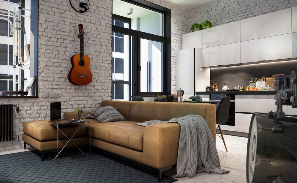
And finally, a compact apartment that bucks the trend of minimalism and embraces a comfortable homey aesthetic that showcases the personality of the resident. Numerous instruments serve as music themed home decor, just as fun to use as they are to look at.
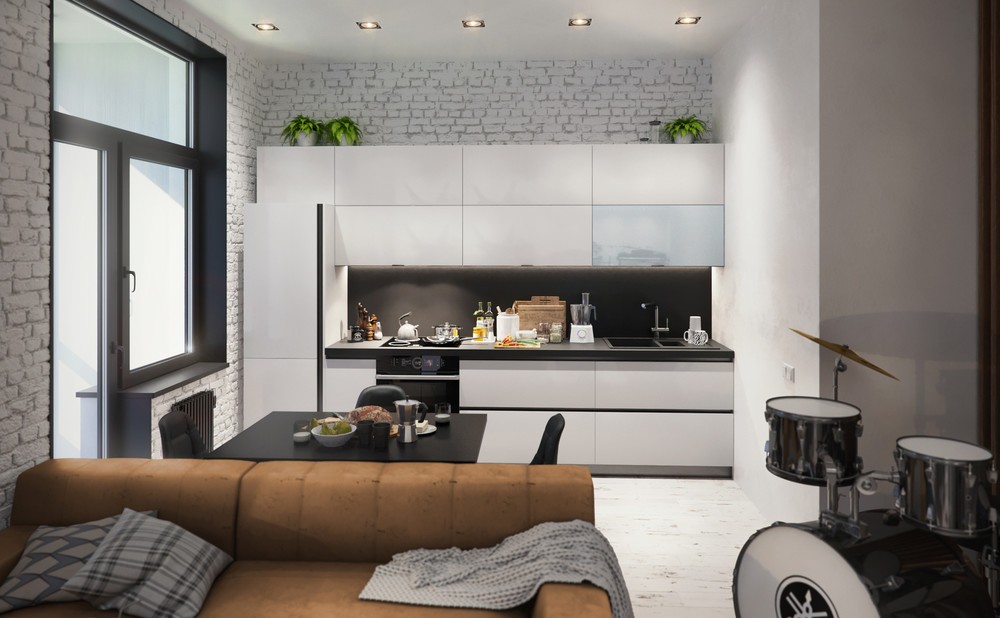
One room that does remain relatively minimalistic is the kitchen – aside from a few plants atop the counters, most of the contents is purely functional.
