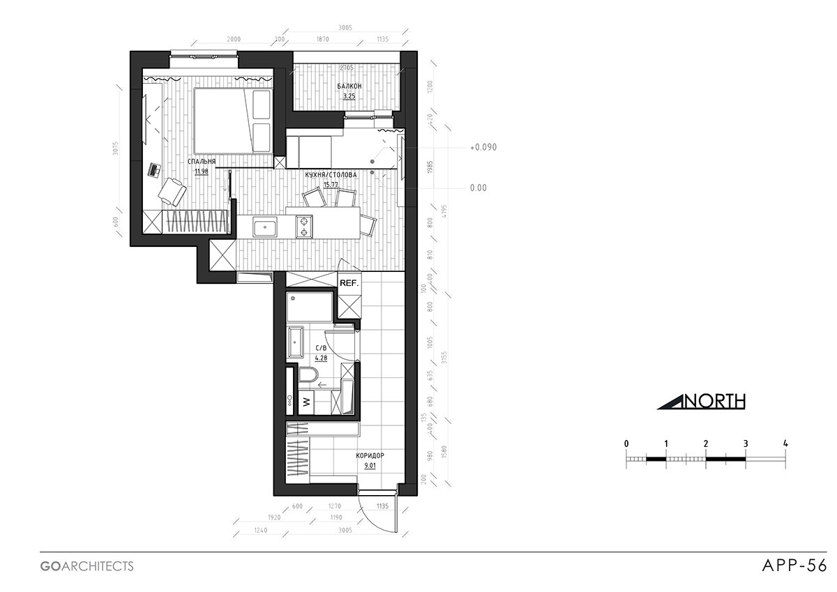
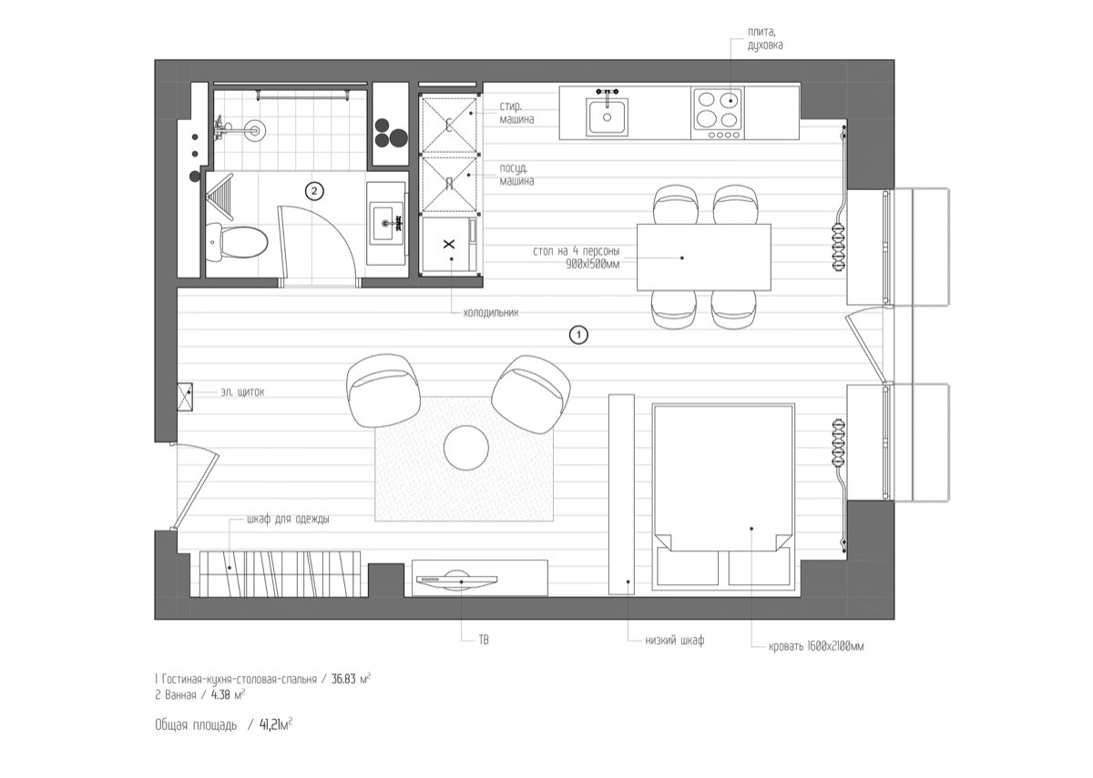
To make it big, living close to the city is often a must. Big cities hold big jobs – and the networking culture to support them. Many young couples move to further their careers, sacrificing a larger home space in the process. These three studio apartments under 50sqm show that living and working in style need not be mutually-exclusive terms. Designing with sleek, contemporary materials to create rather than use up space, these three interiors show how a little room can be designed to look much larger. Take a peek at their designs and floor plans to make the most of your apartment or rental space.
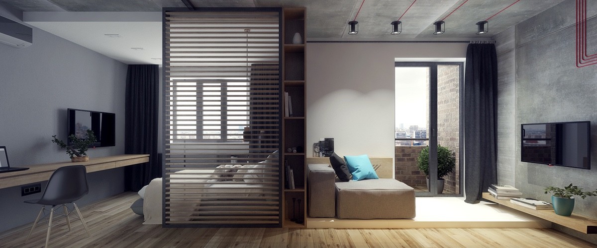
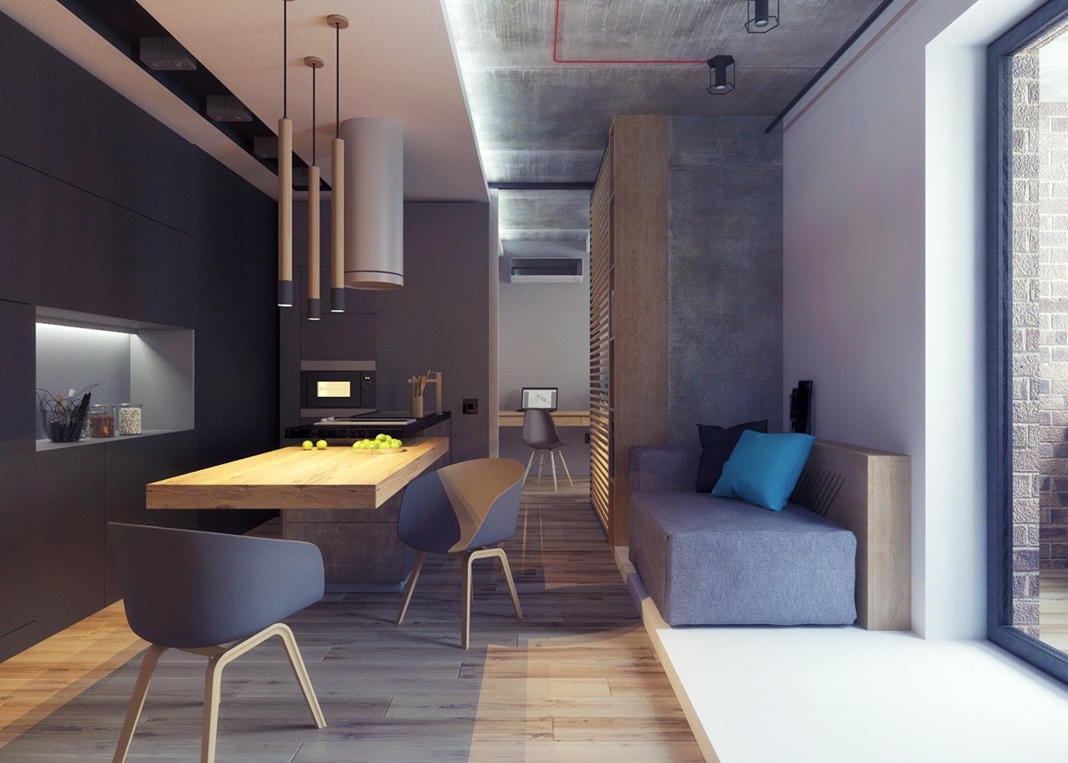
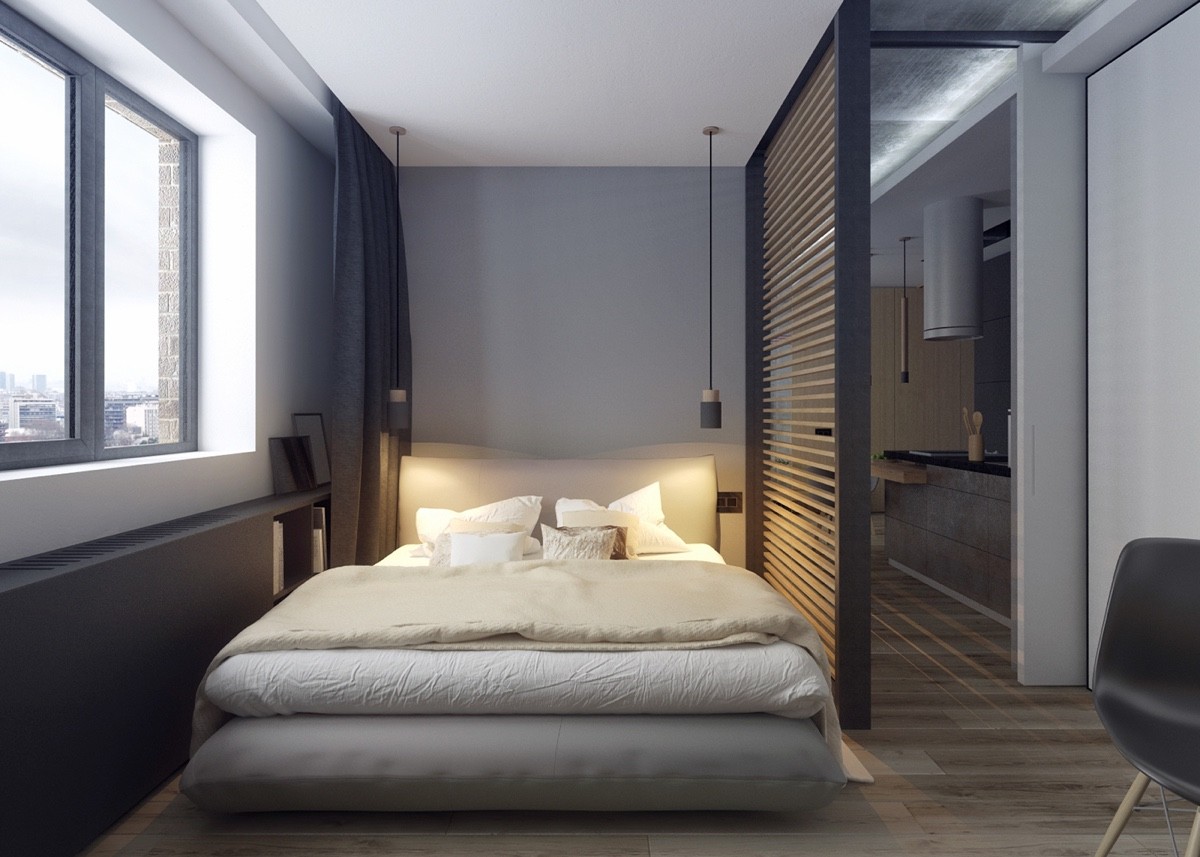
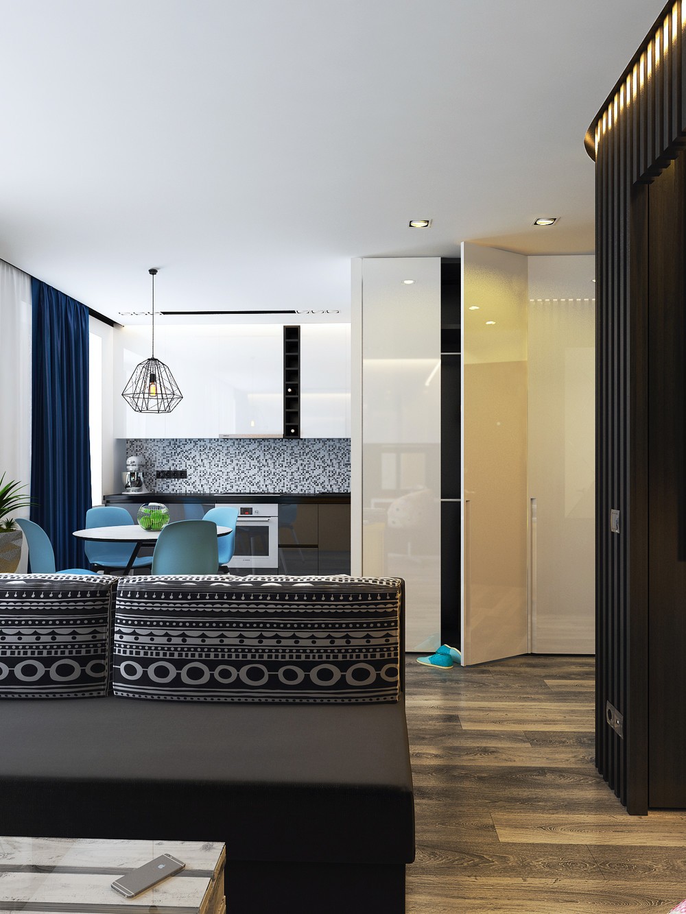
Designed around a central pivot, this studio in Kiev, Ukraine, makes 44.3sqm look intelligently industrial. The living room and bedroom show this best in a wide-paned view without solid walls. As lacquered wood extends the space, grey walls on either side – one painted, one in concrete – create unity with enough difference to separate the spaces. A slatted bedroom partition creates privacy without shutting out the light.

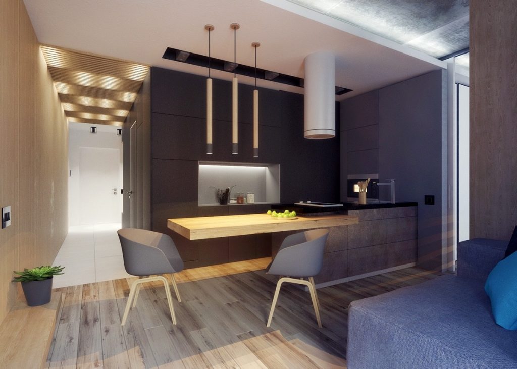
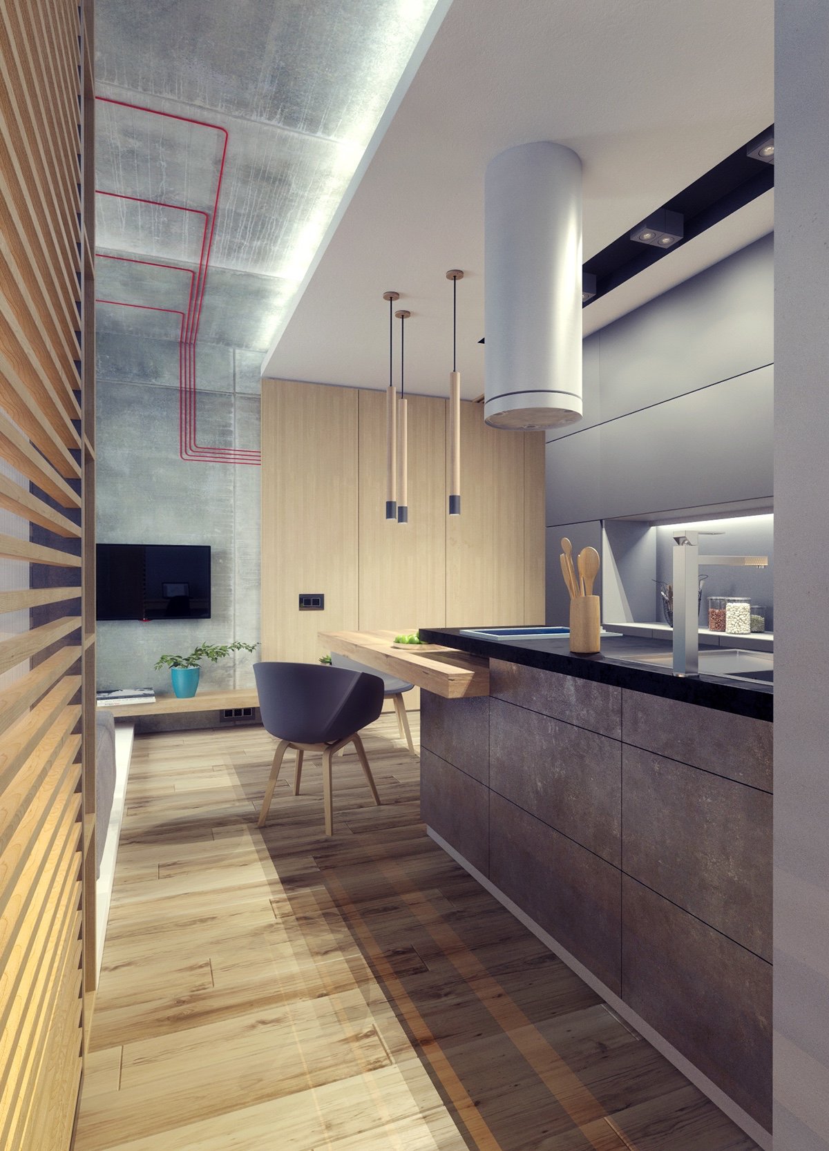
Walking around the central point, several rooms reveal themselves. From the lounge, an industrial kitchen fills a wall, drawing in the eye with a lit central panel. A wooden island juts out as a bench, allowing free space around its edges. Grey cabinetry becomes concrete in a ceiling and wall panel, while a block seat offers a rest. Industrial features in a red racing track, wind chime lighting and a feature extractor fan make a statement – from a height unobtrusive to the space. A lit, wooden-panelled hallway directs the gaze from dark corners and into the wider interior.
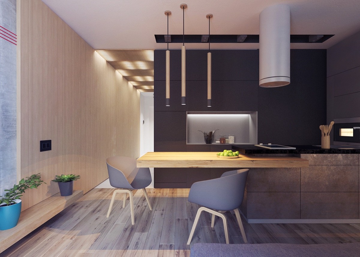
The gorgeous scandinavian style chairs are from Hee Welling for Hay. You can get them here.
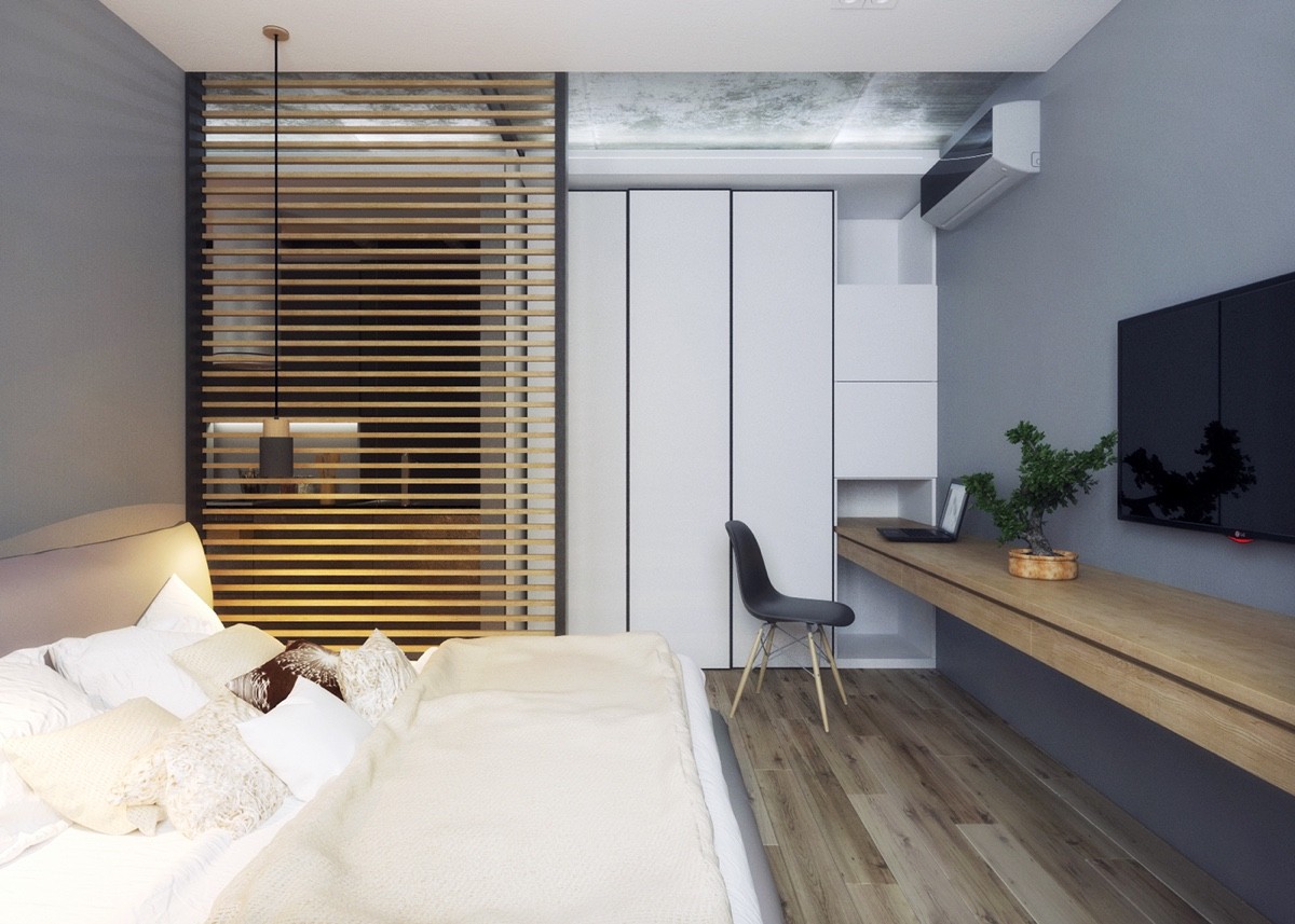
From the kitchen, the bedroom hides behind a slatted wooden panel. Using the wood from the floor and hallway, it provides a TV, ledge for accessories and sleeping space within a compact room. A low futon bed with light bedding allows room for two drop lights to add subtle complexity.
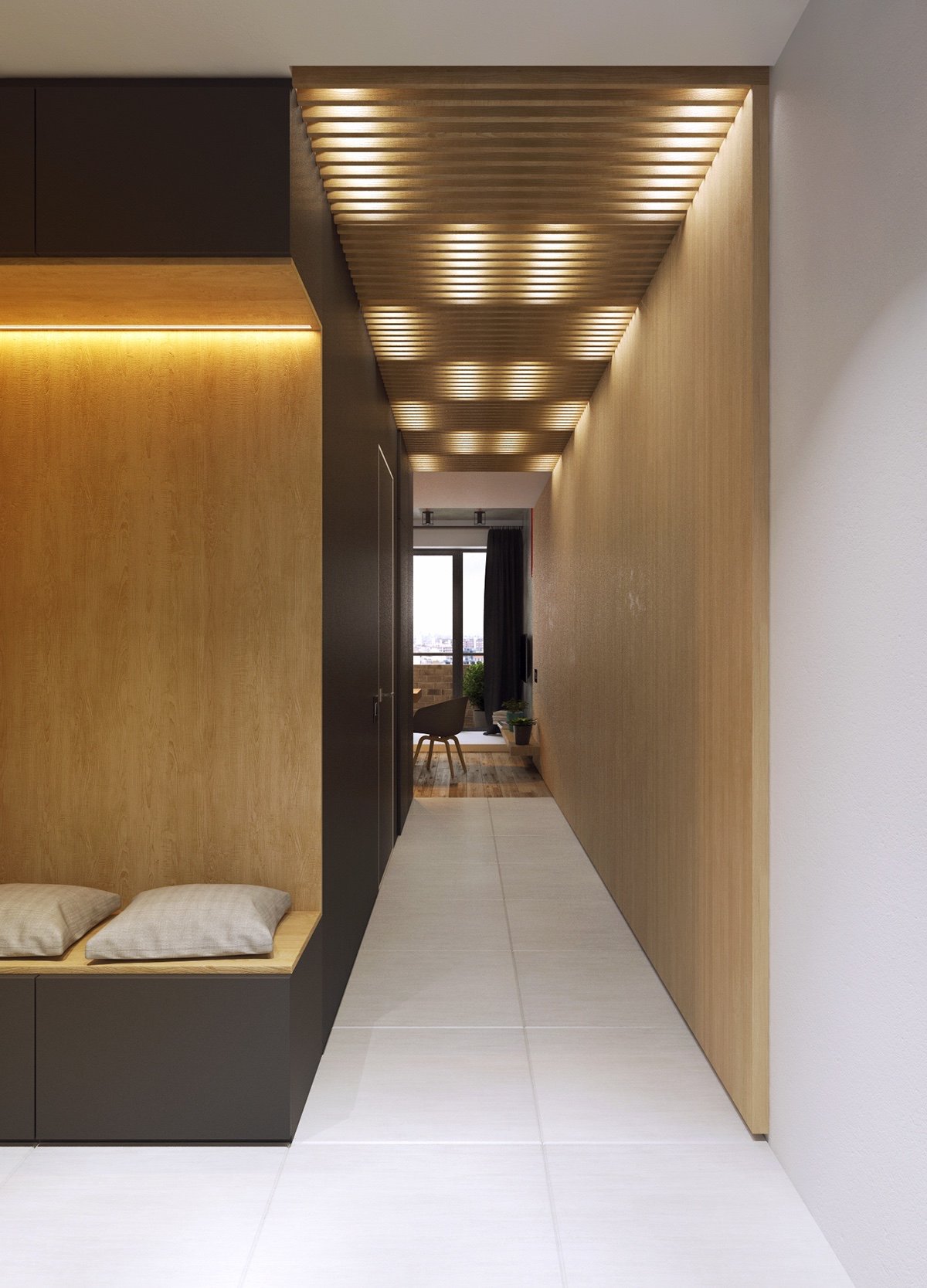
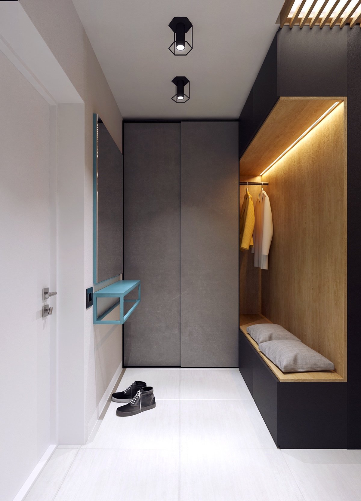
The hallway mimics the bedroom’s partition, with a slatted feature lined with LEDs. Its light, breezy frame is a perfect segue to a lit seated area. A white door and flooring open it up, while a grey storage cabinet hides away.
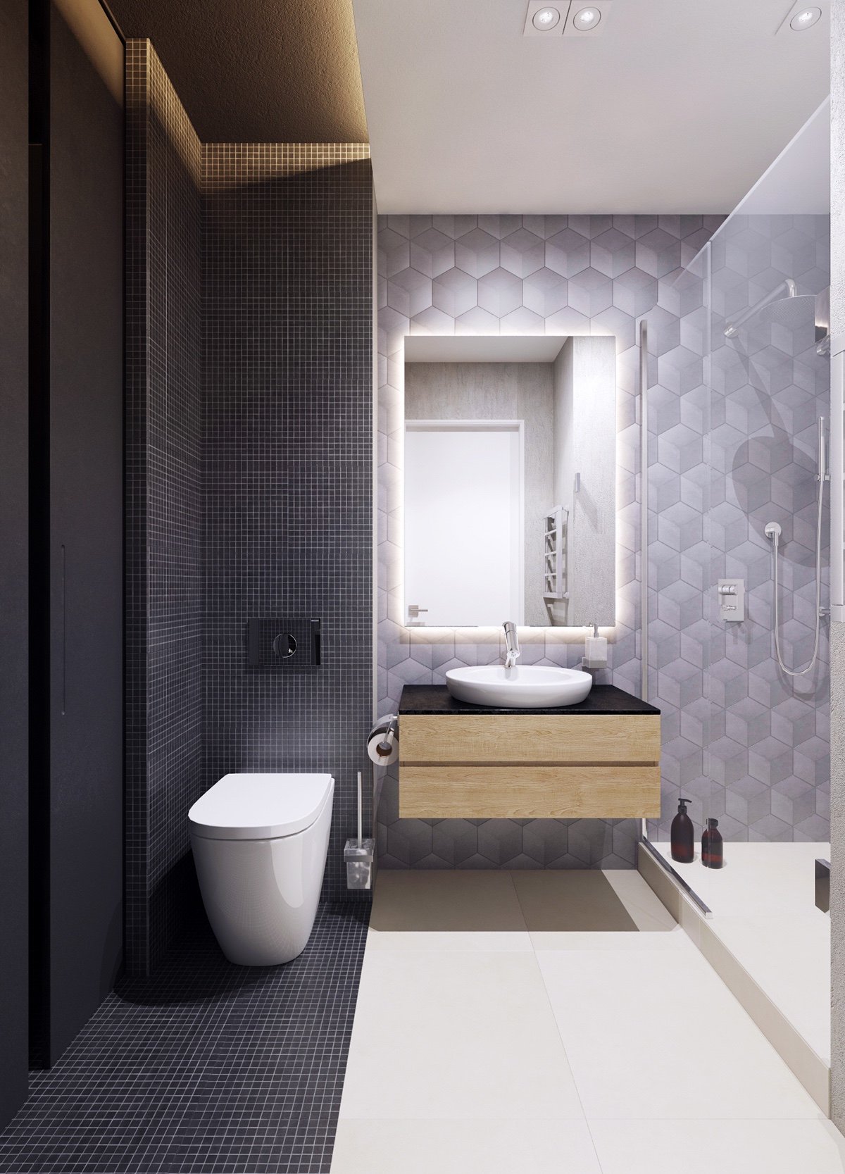
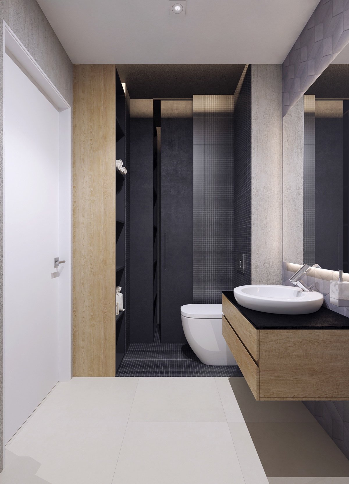
Clever bathroom panelling makes its corridor space seem larger. Split into charcoal, light grey and white, honeycomb and pin-prick texturing with dashes of wood accentuate wide walls and distract from close-quarter amenities. Wide format tiling towards the door creates a large square of space, further lightened by wooden accents.
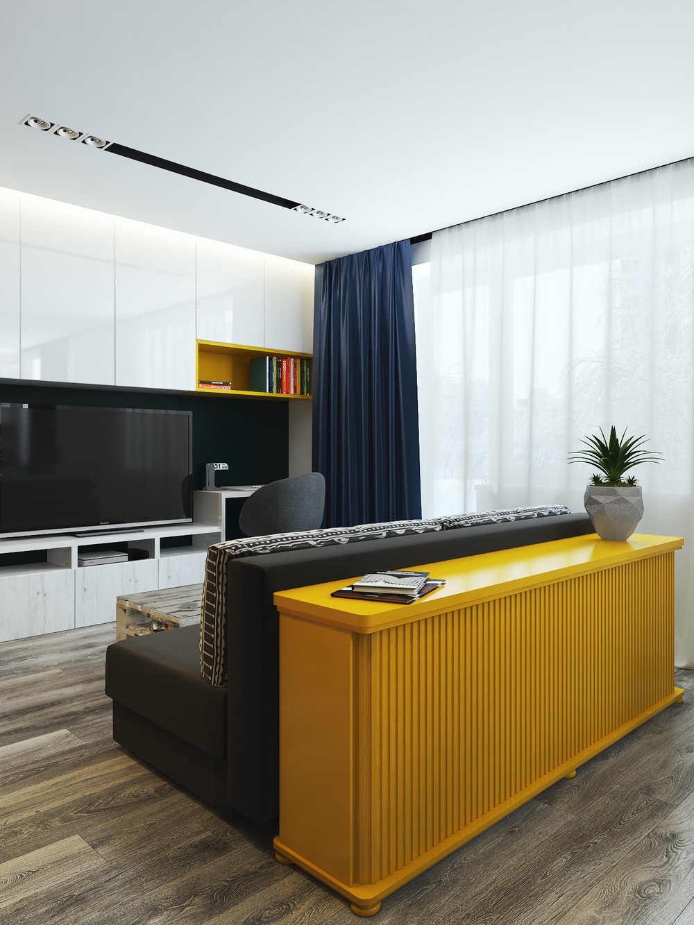
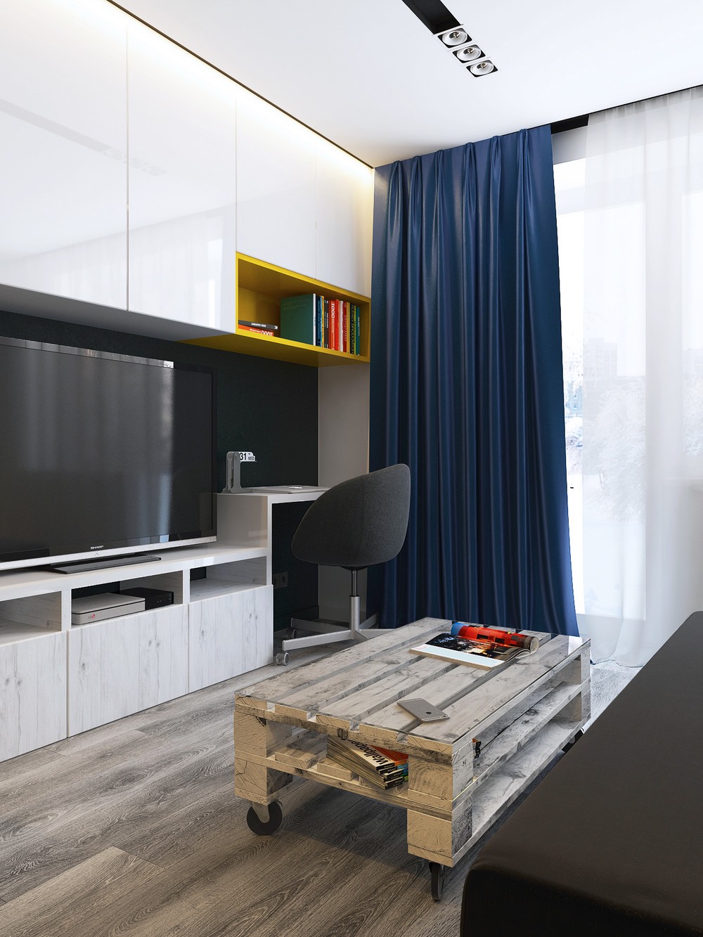
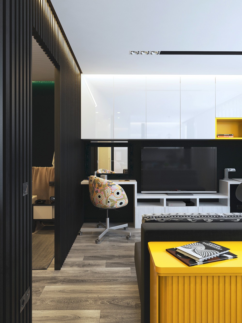
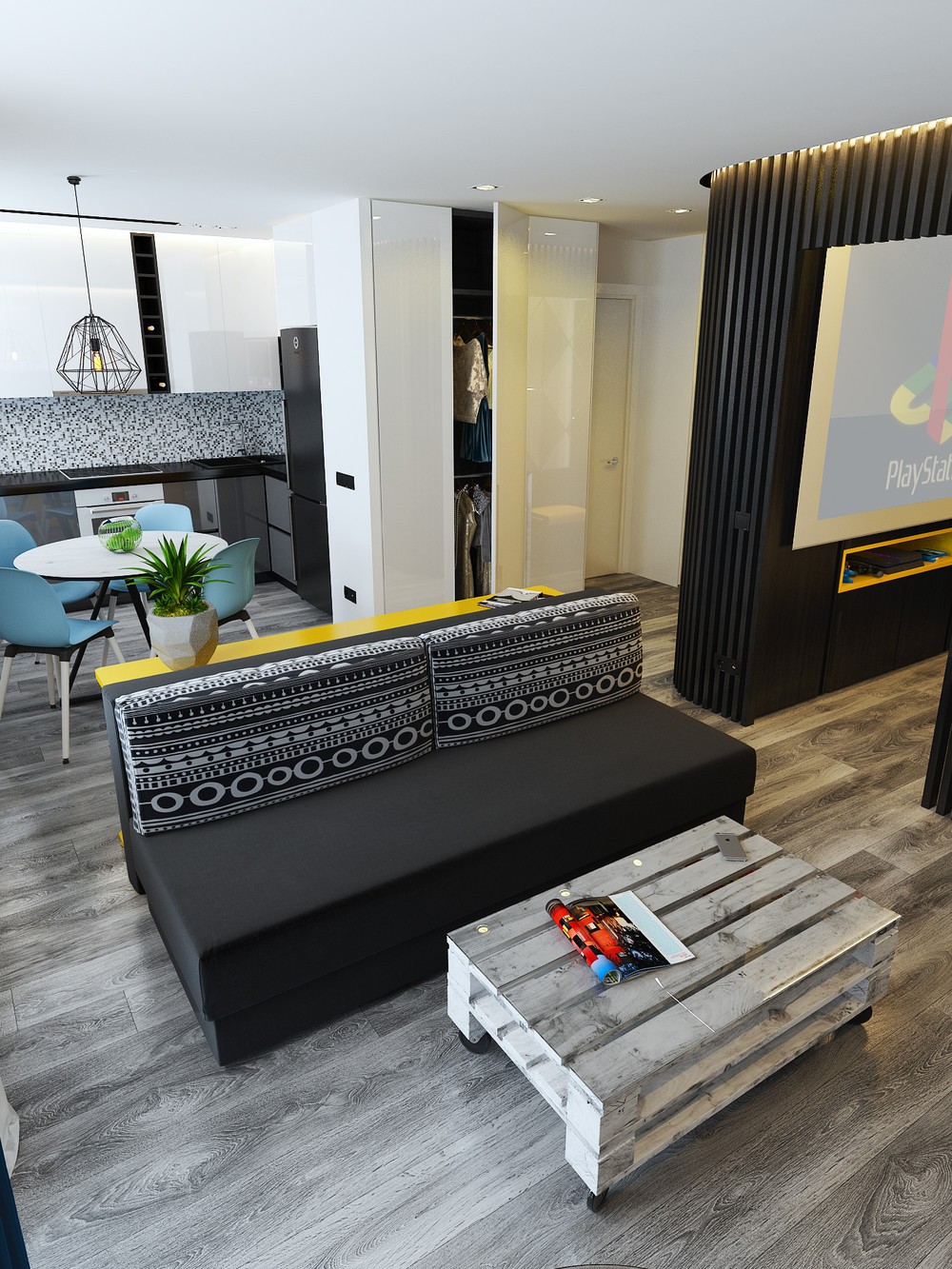
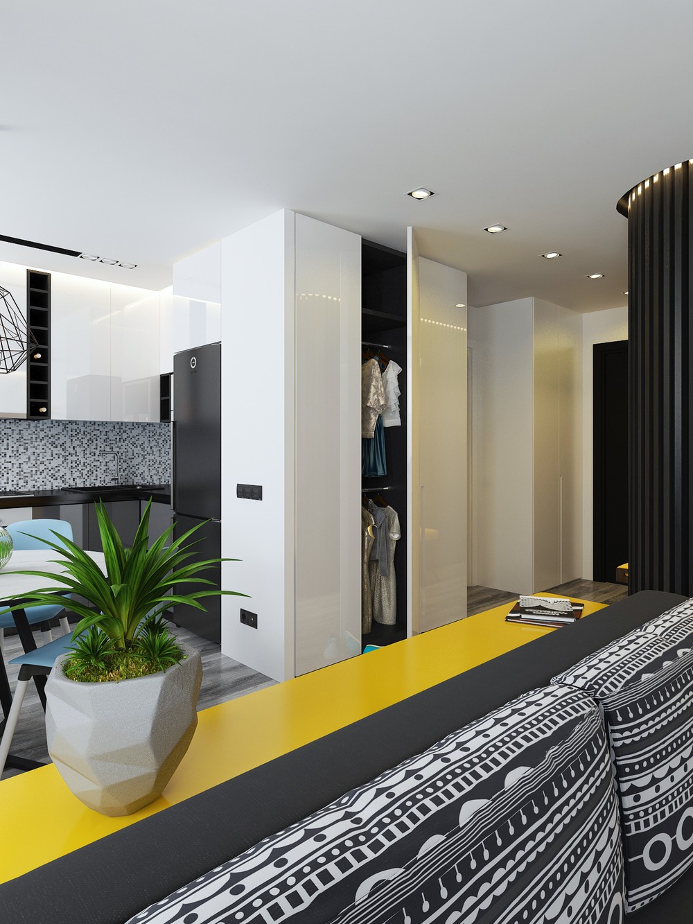
A young couple commissioned our next studio space, a tad smaller at 40sqm. Briefed to be comfortable, ergonomic and stylish, its creative industry owners were pleased with the two-bedroom result. A striking black and yellow design sets the stage in the living room, as a corrugated storage space becomes a feature. Set on recycled wooden flooring, a white TV cabinet and two desks hold storage and afford clear space. A roll-away distressed wooden crate and bookshelf in matching yellow complete the look.
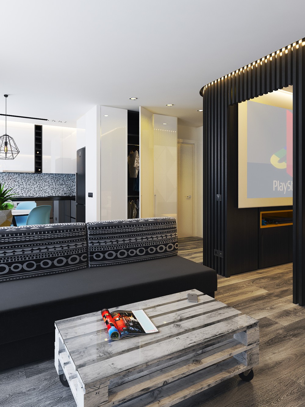
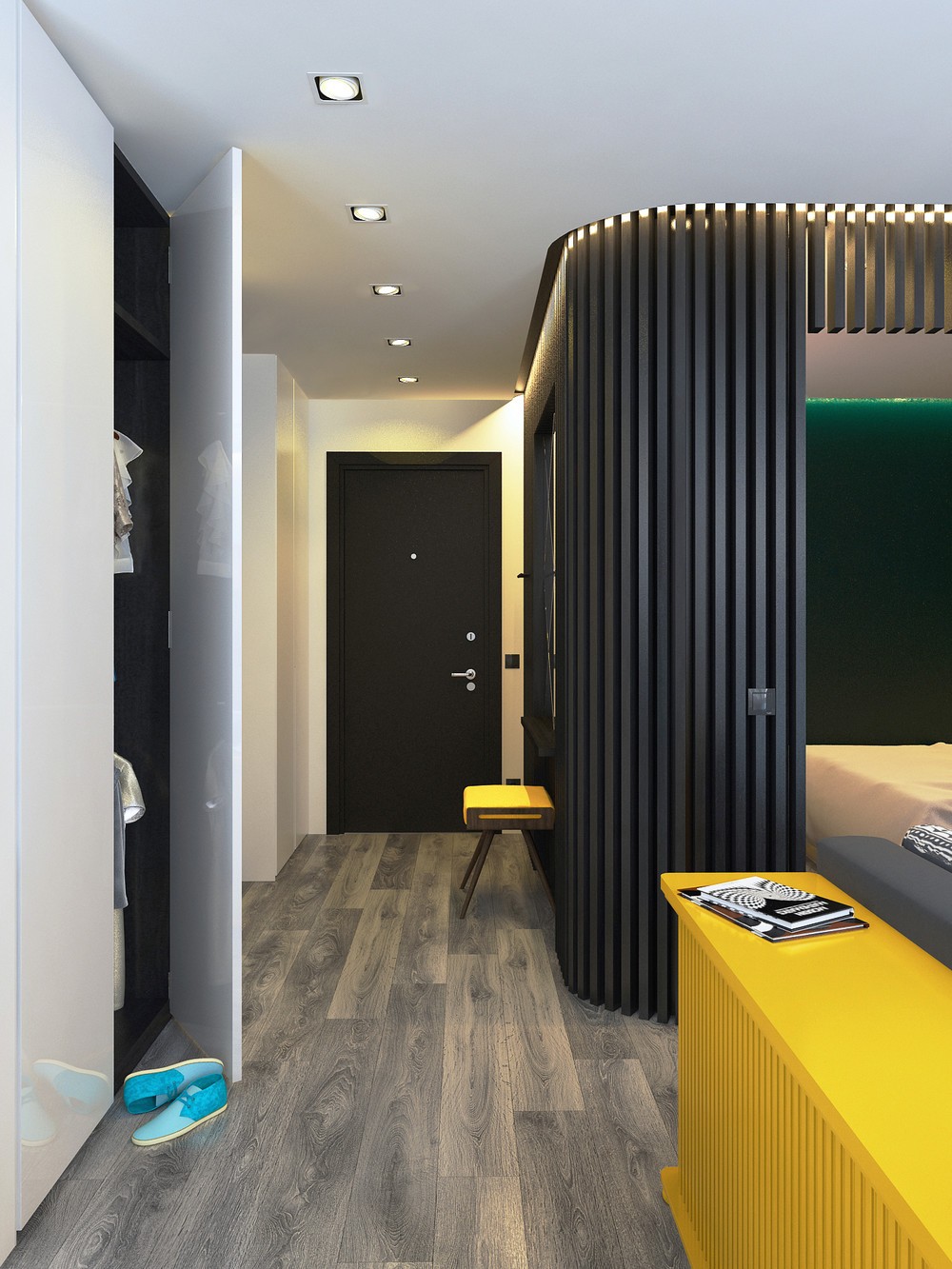
From the lounge, the space opens to other rooms. A bedroom frame in black slatted timber adds privacy and good design. White kitchen cabinetry, a wardrobe and hallway act as a white wall, while hiding the necessities. A swift wraparound of the bedroom wall reveals a bright sunshine bench to match the lounge’s compartment. The elements work together, and separately, to allude to a larger space.
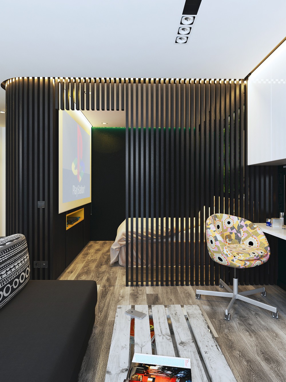
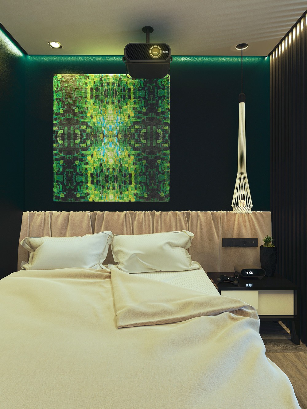
The slats of the master bedroom give a glimpse of avid gamers. Black painted walls allow the Playstation to project, while a bright yellow insert makes a feature of the handsets. A dominant green wall with data-driven artwork alludes to digital love; soft beige bedding to a space for it. LED-lighting adds a snazzy touch.
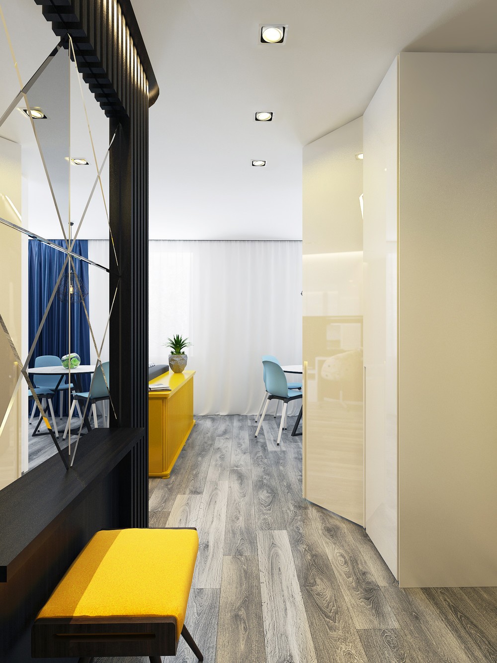
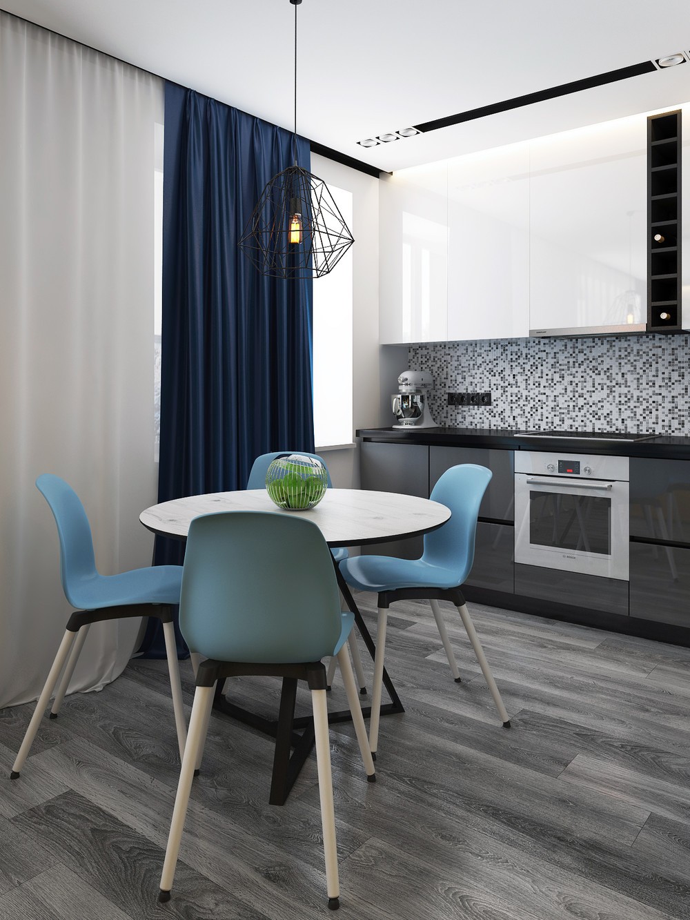
A mirrored walk from the main entrance leads to the kitchen. Set on the same wooden flooring, it makes its mark in teal school chairs, tame in comparison to the lounge’s bolder yellows. A stencil chandelier mimics the bedroom’s slats; a white marble table the TV cabinet behind.
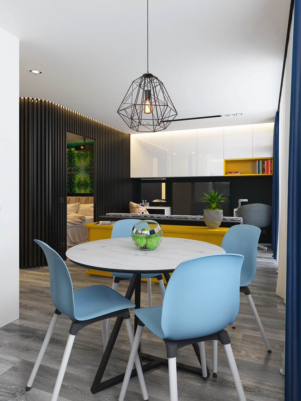
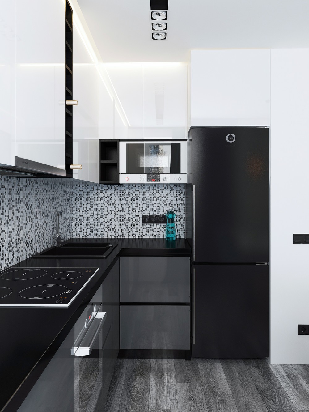
As kitchen chairs back onto cabinetry, the kitchen swathes itself in white and grey. A wall of white atop the counters creates more head space, while a speckled tiled inlet catches attention. Appliances in black and white blend into its assembly, softened to the side by a curtain in blue.
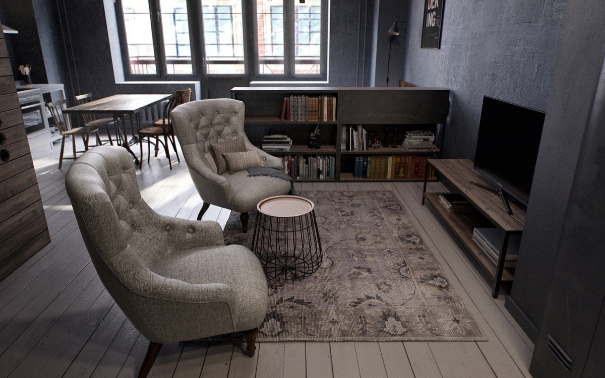
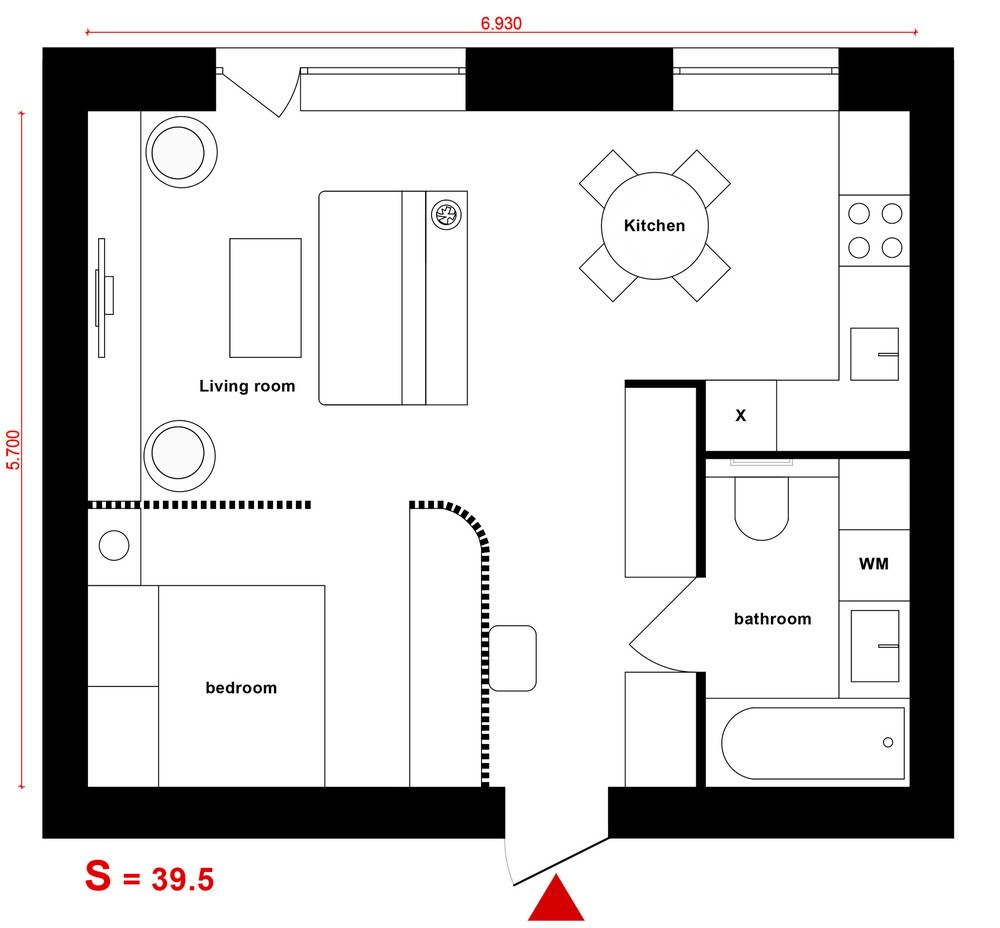
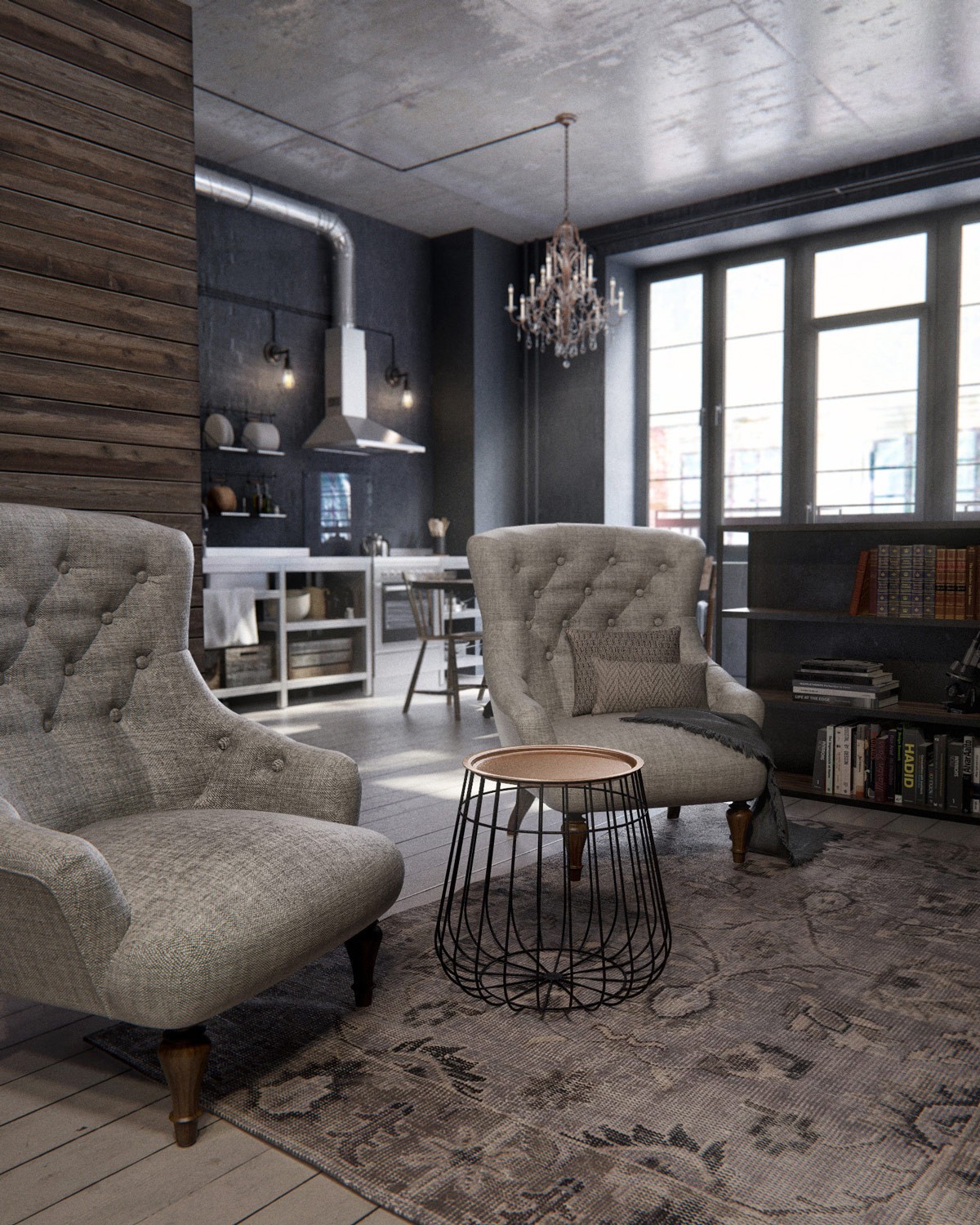
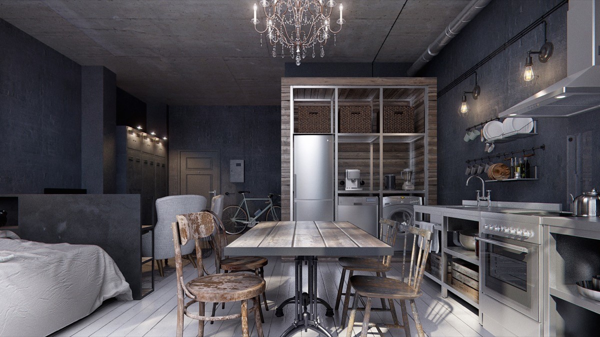
Our final space in Moscow, Russia, is an interior done on a budget. Another 40sqm wonder, it was designed for the rental market on a tight, flea market-sourced timeframe. Its edgy look starts in the lounge, where a mixture of charcoal and grey adorn two chairs, walls and floor. Painted decking boards proffer a grey Turkish rug and metal-bottomed table, while an antique chandelier adds flair from the ceiling. A warmer wood panel and concrete ceiling are lit up from a wide-ranging window.
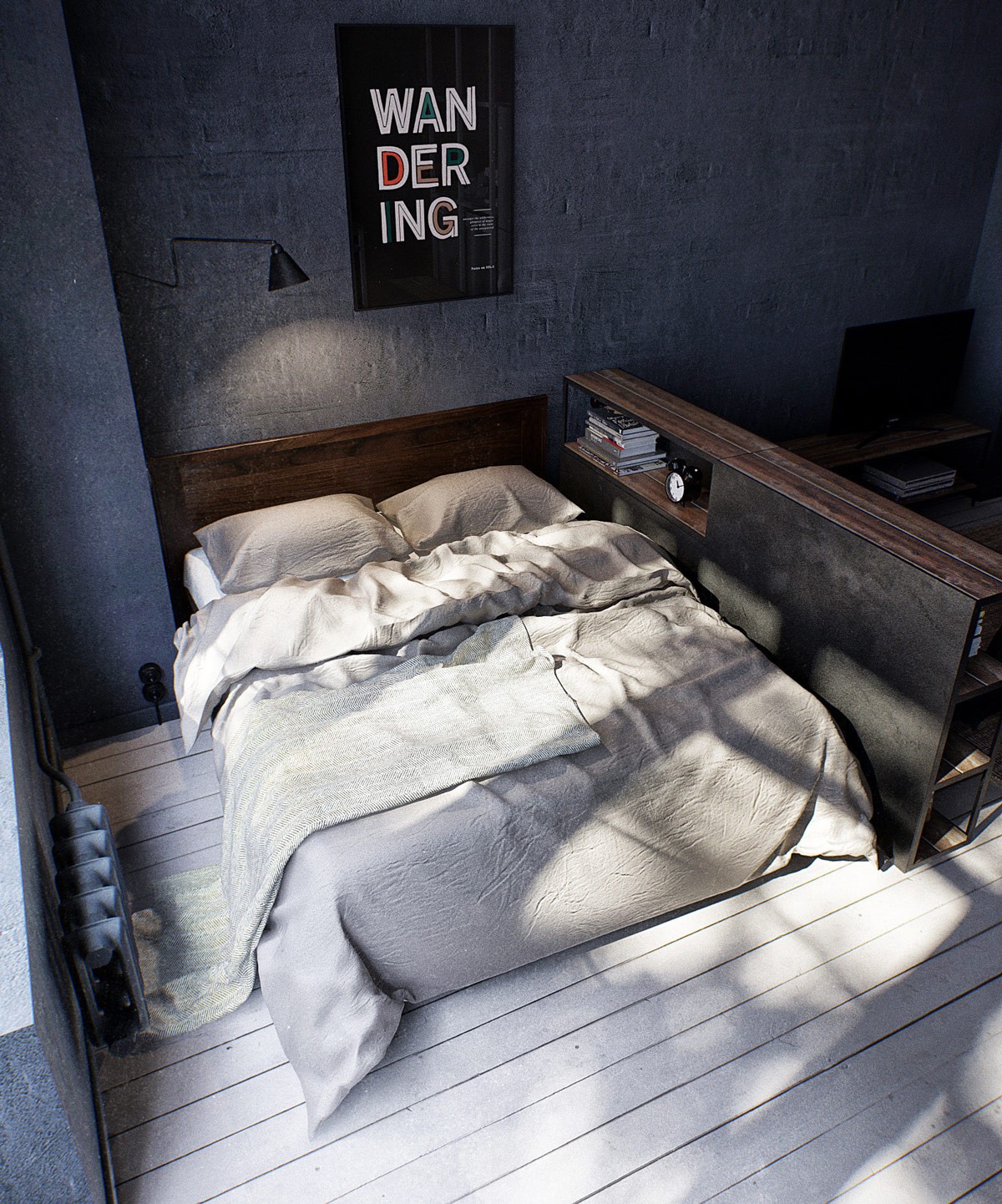
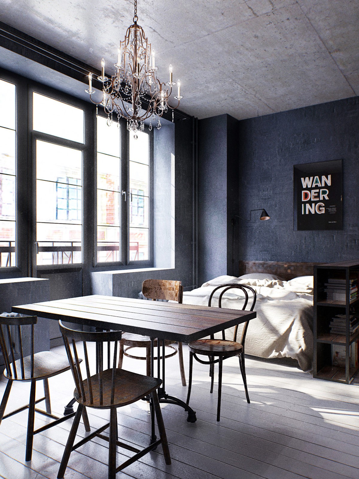
Beside the lounge, the bedroom exudes its own vibe with a copy-based artwork. The wooden frames of the bookcase act as a sideboard, complemented by the bed’s matching headboard. Simple grey bedding blends to the floor and makes the small space appear luxuriously larger.
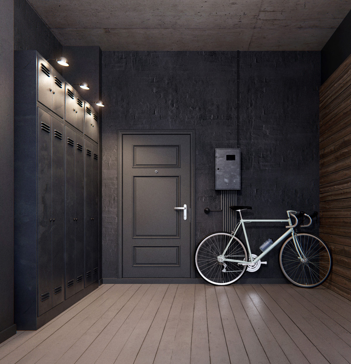
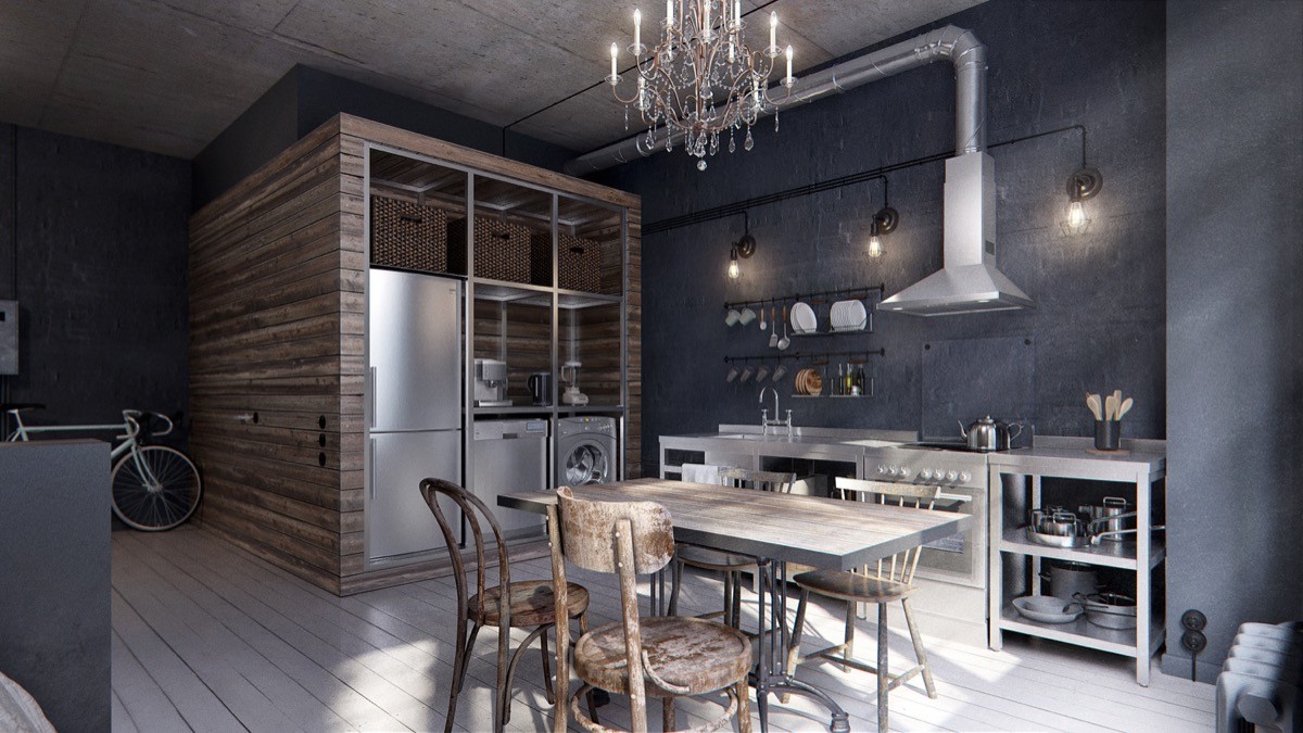
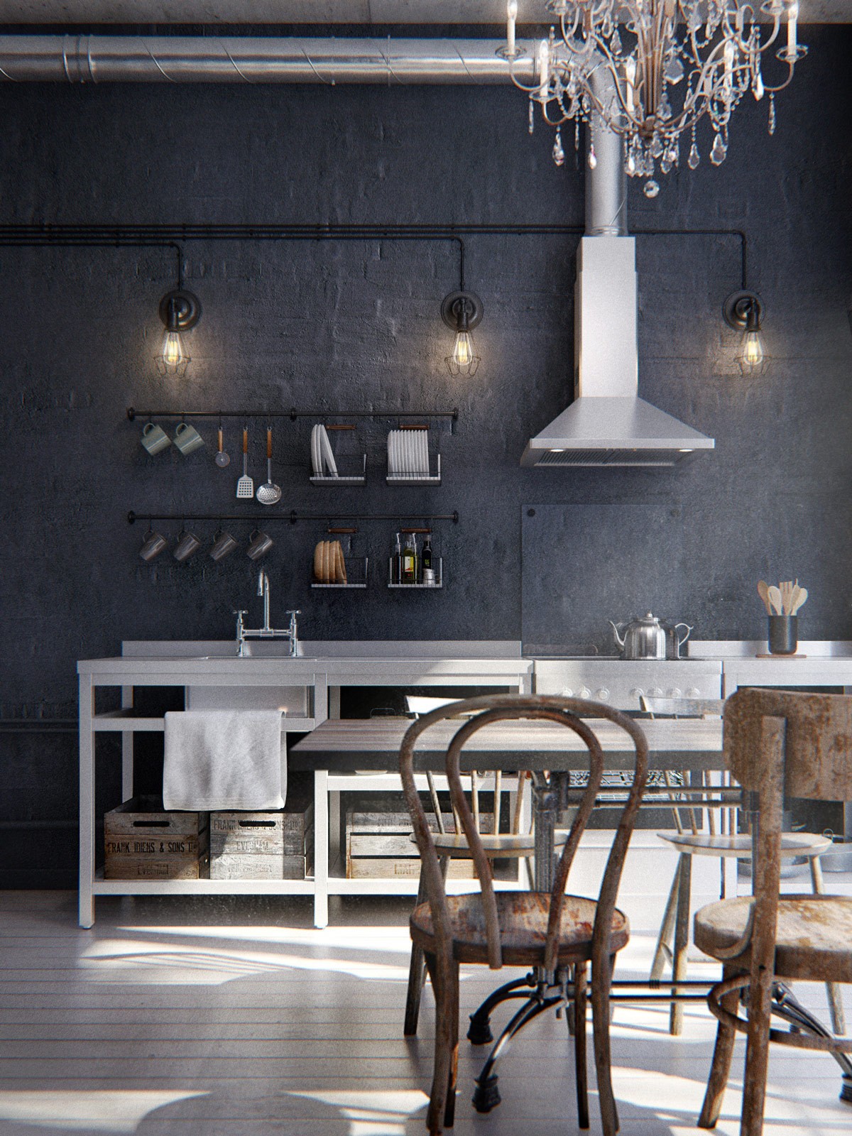
A line back to a black hallway makes an interesting entrance for the interior. Forming a larger square space, black-painted school lockers provide storage beside a bicycle. The trend is carried through in the wider kitchen space, featuring industrial-looking appliances, an extractor fan and white chef benching. Distressed wood frames the units and walls, as a dining set in the same material continues on the theme. Smaller features in black painted piping and utensil racks keep the costs down while remaining true to the look.
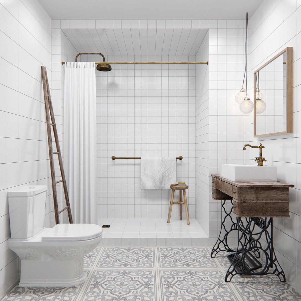
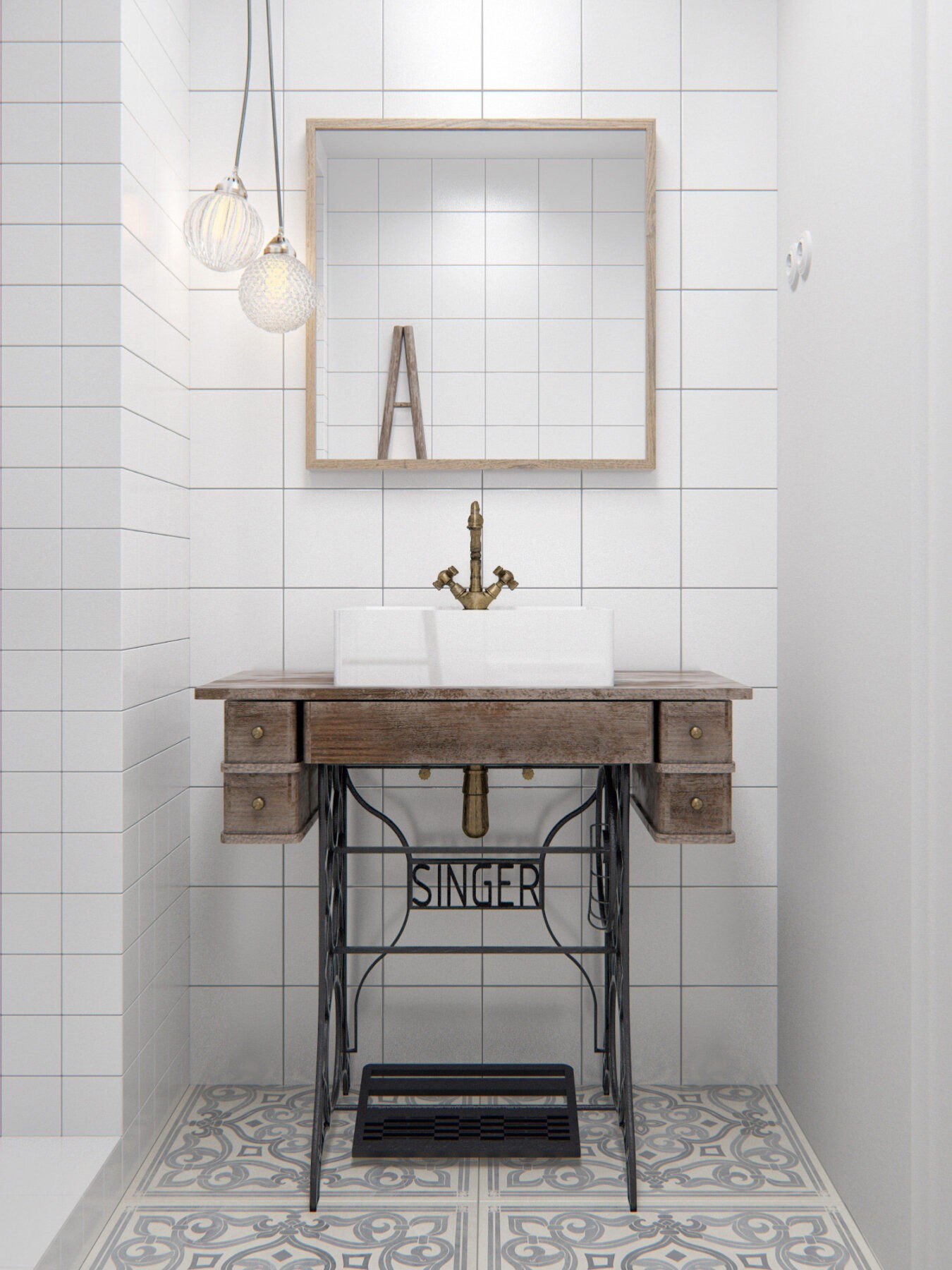
The bathroom shocks in pure white with a subtle floor pattern. Peppered with antique wooden furniture, a ladder hangs towels while a wooden bench holds a sink. Pops of copper adorn the amenities, an unusual mix of market finds atop an old Singer sewing machine. Two bauble lights hang down to punctuate.
