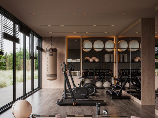
Compact living spaces offer significant challenges when it comes to color planning, especially in the case of studios and open concept layouts. An open line of sight means that every accent interacts with the next – at once a restriction and a catalyst for creativity. Popular options include solid-color blocking, tertiary arrangements, thematic palettes, and of course, the always-reliable greyscale approach. Not only do these amazing apartments offer color palette inspiration in hard-to-find themes, the designers behind these spaces included helpful floor plans to help style seekers visualize the relationship between each room.

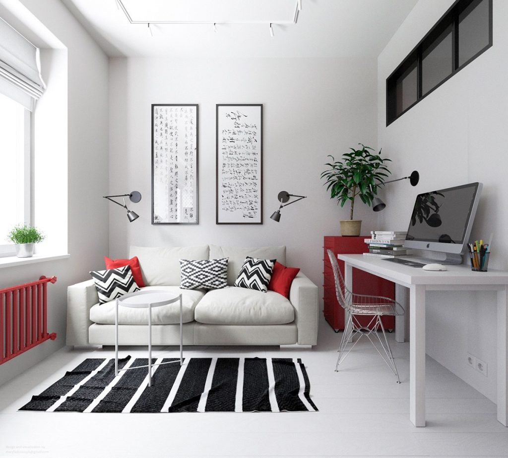
At just 30 square meters, this lovely little apartment boasts a huge personality with its super bold color theme. Bright red accents play across a pristine canvas of white walls and floors for a look that balances the best of simplicity and incredible energy. Black details add a touch of formality to the scene, sometimes even serving as a way to center the eye with its heavier visual weight.
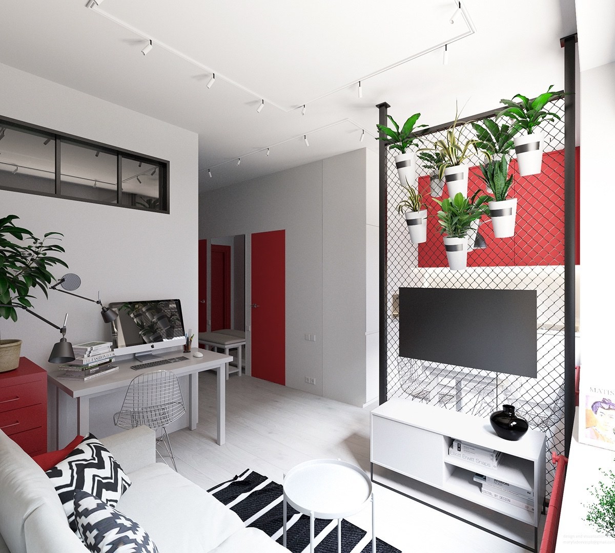
The style itself is an interesting take on industrial – chic patterns bring a sense of playfulness to the strong urban elements that adorn the apartment.
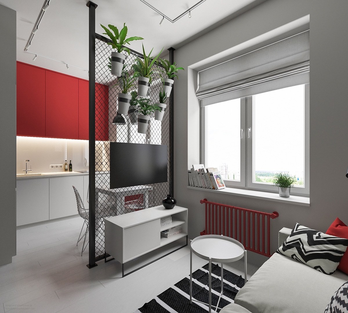
And the planters are just too adorable! Chain link fence is a surprisingly durable medium in interior design, able to serve as a replacement for pegboards or corkboard for modular arrangements like this one.
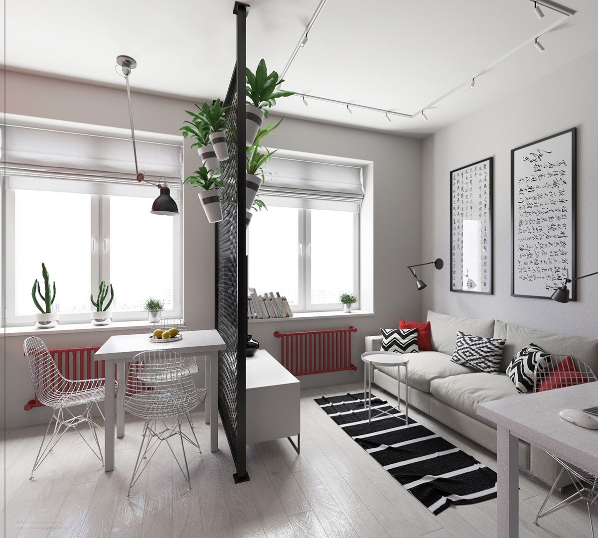
Eames Wire Chairs serve as a wonderful compliment to the black metal fencing. They have an industrial attitude but they're lightweight and subtle. Plus, their streamlined bodies allow sunlight to filter right past.
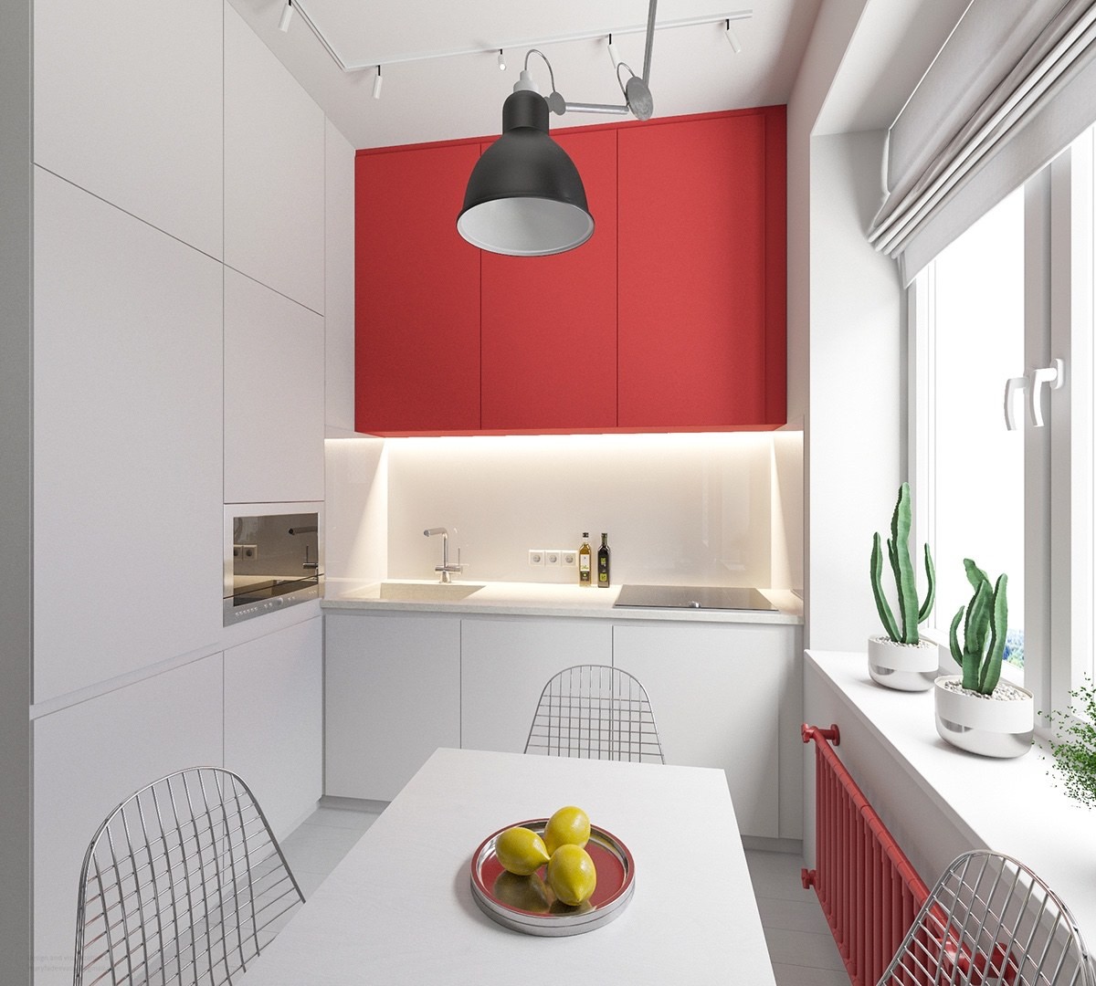
The kitchen is compact but extra cute. Red upper cabinets continue the color scheme without dominating the small space, while the rest of the kitchen remains white for a clean and open aesthetic.
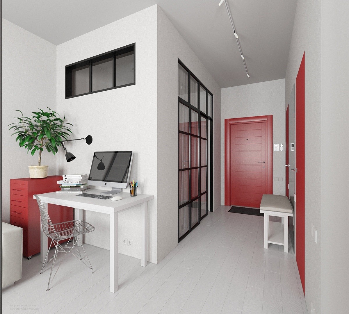
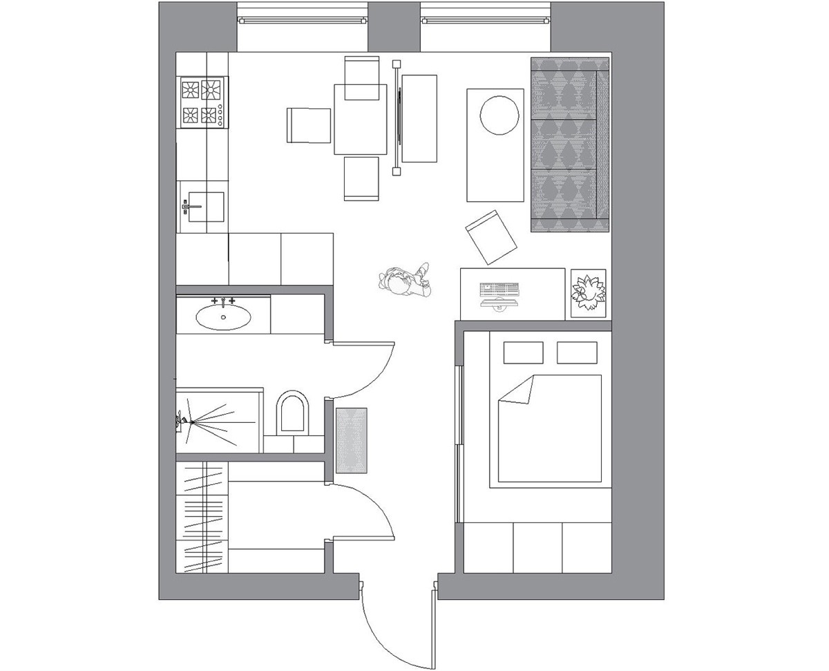
While the designer could have taken a studio layout approach, the bedroom instead occupies a corner room outfitted with plenty of interior windows for sunlight. The other doors lead to a bathroom and closet.
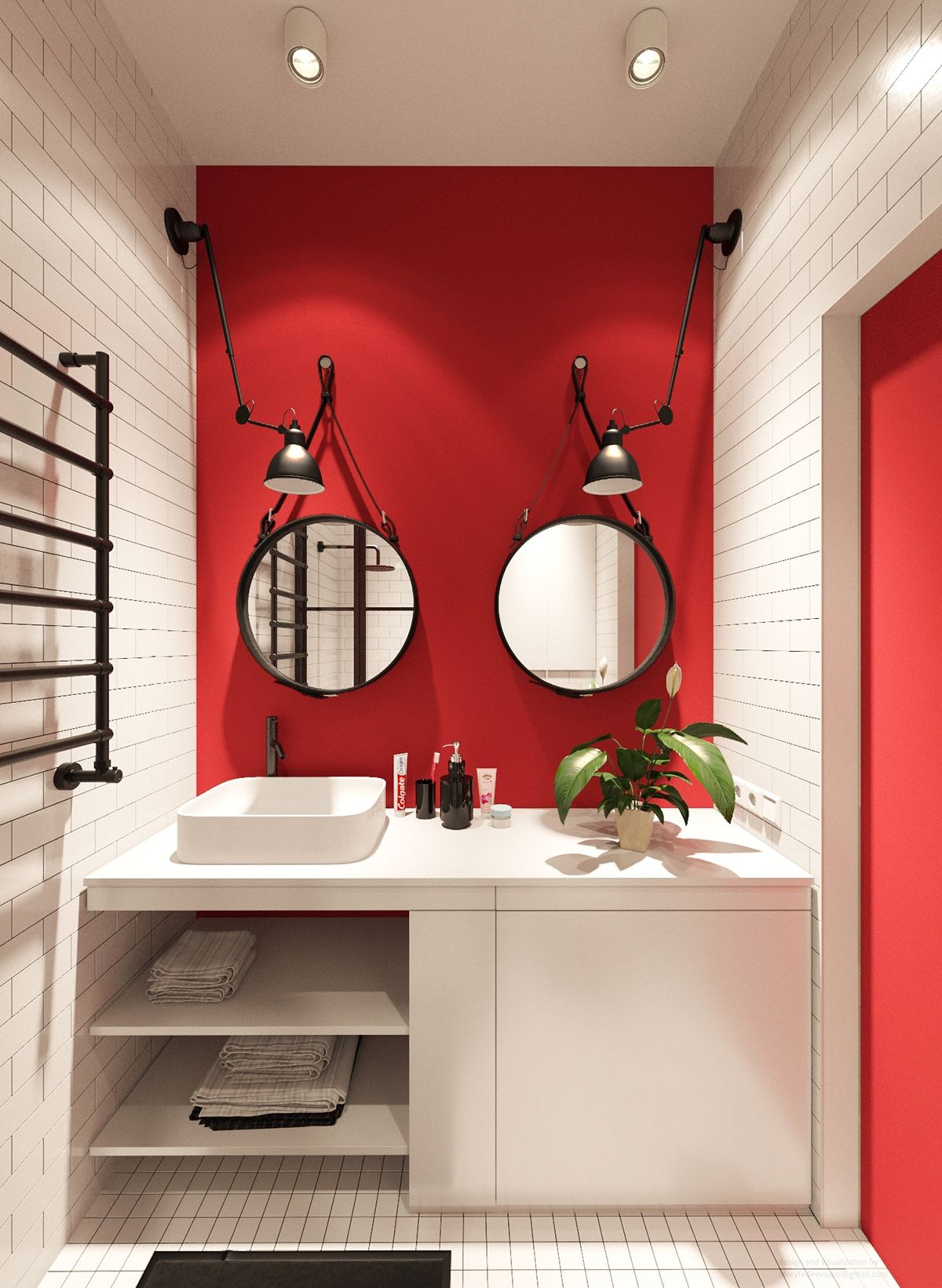
This pair of Adnet mirrors certainly makes a statement against the colorful accent wall. Flat white tiles offer a modern yet neutral backdrop to unify the rest of the bathroom.
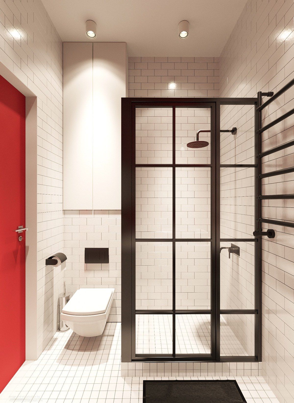
Paned glass tiles offer a unique take on the typical enclosed shower, embodying the urban/industrial apartment theme so well.
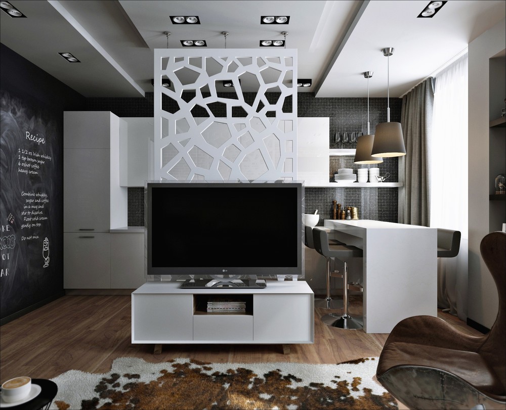
Dark and classic colors are an unconventional choice for small apartments. The general idea is that light neutrals and saturated accents make spaces feel larger, but sometimes residents would prefer for their compact space to look just as intimate and cozy as it feels.
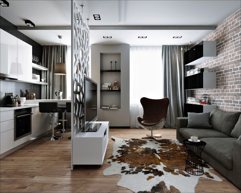
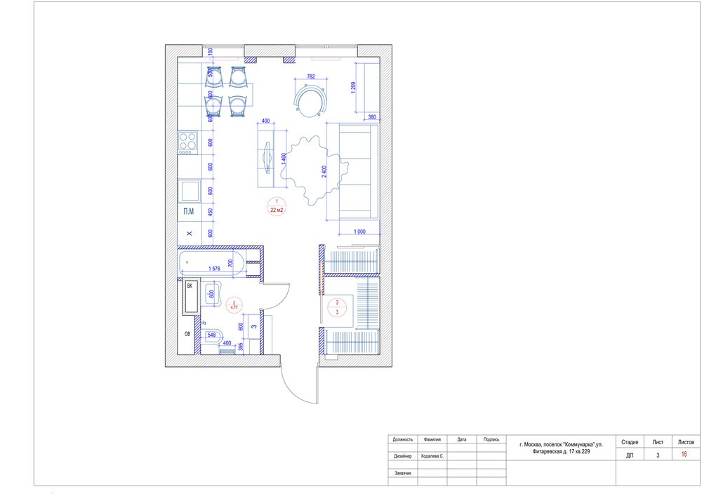
This home combines the best of modern and traditional elements, straddling the line between rural and urban aesthetics. The geometric dividing wall between the living and kitchen anchors one side of the stylistic influence, with the large skin rug contributing its huge character in turn.
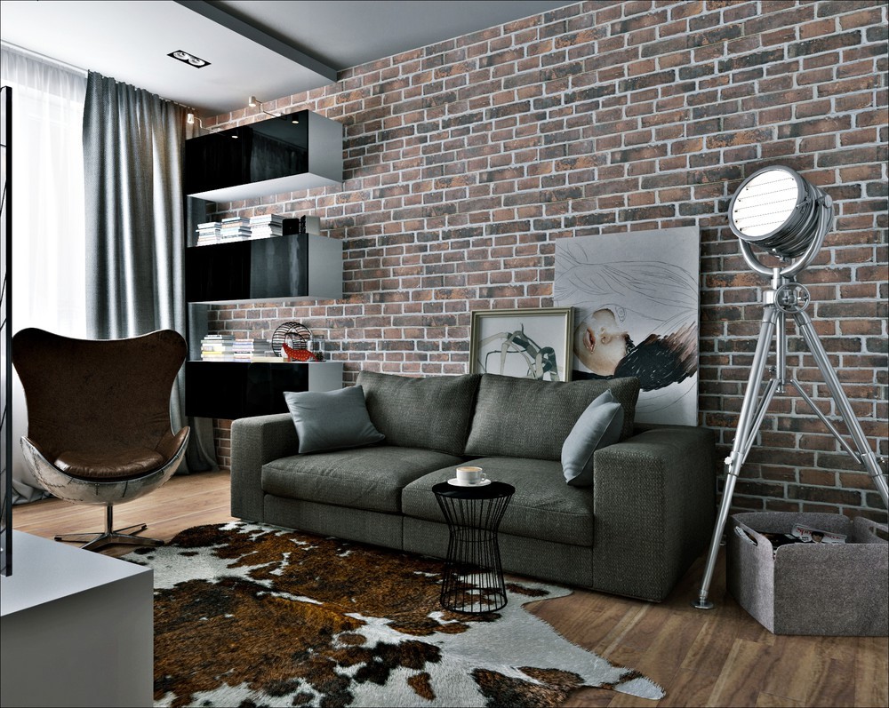
Even the statement chair draws in the best of both worlds. It's a tribute to the Arne Jacobsen Egg Chair, with rustic leather and an industrial riveted metal shell.
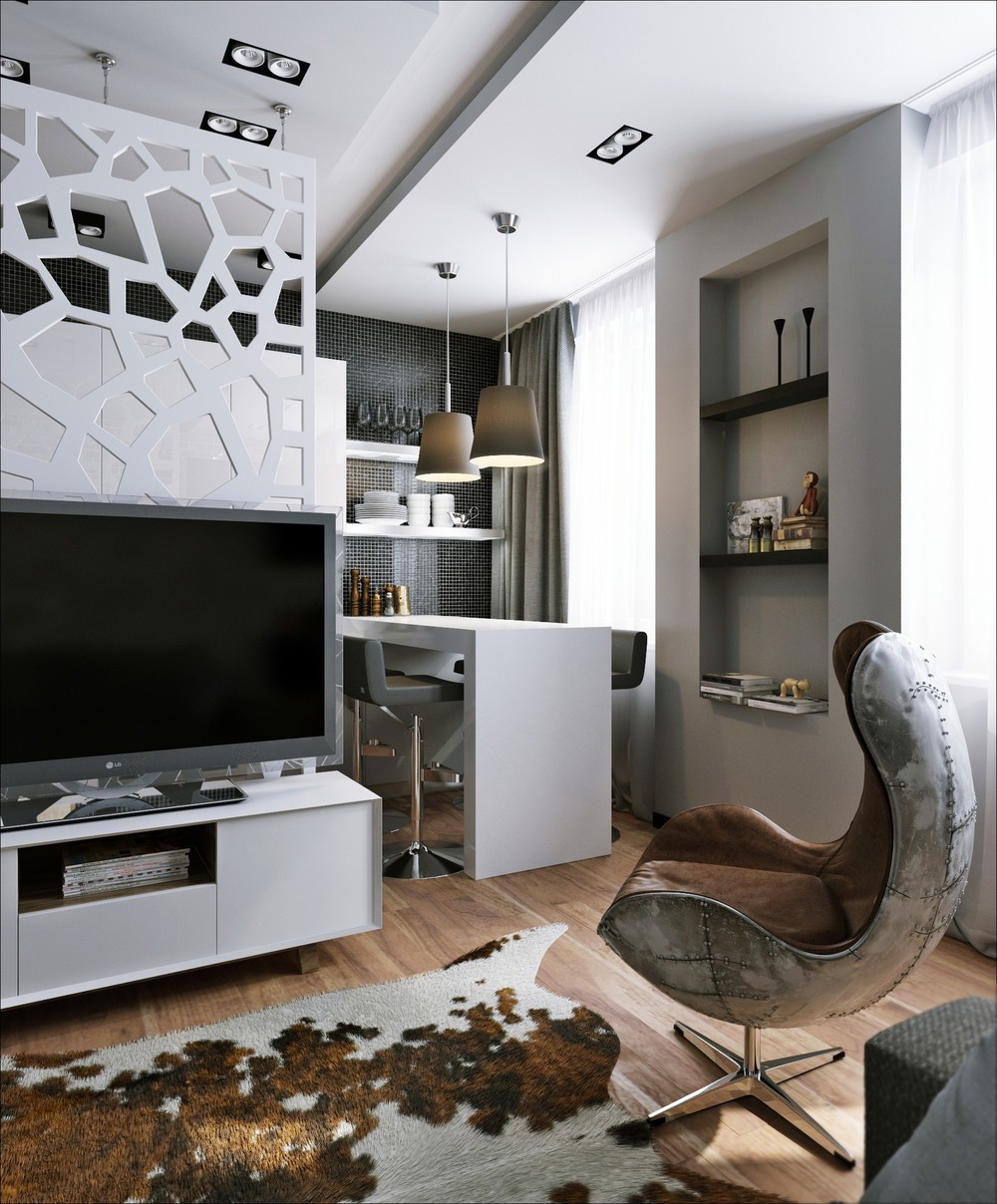
The kitchen and dining room peek around just on the other side of the freestanding divider. This allows someone having coffee at the breakfast table to chat with a partner watching the morning news from the sofa.
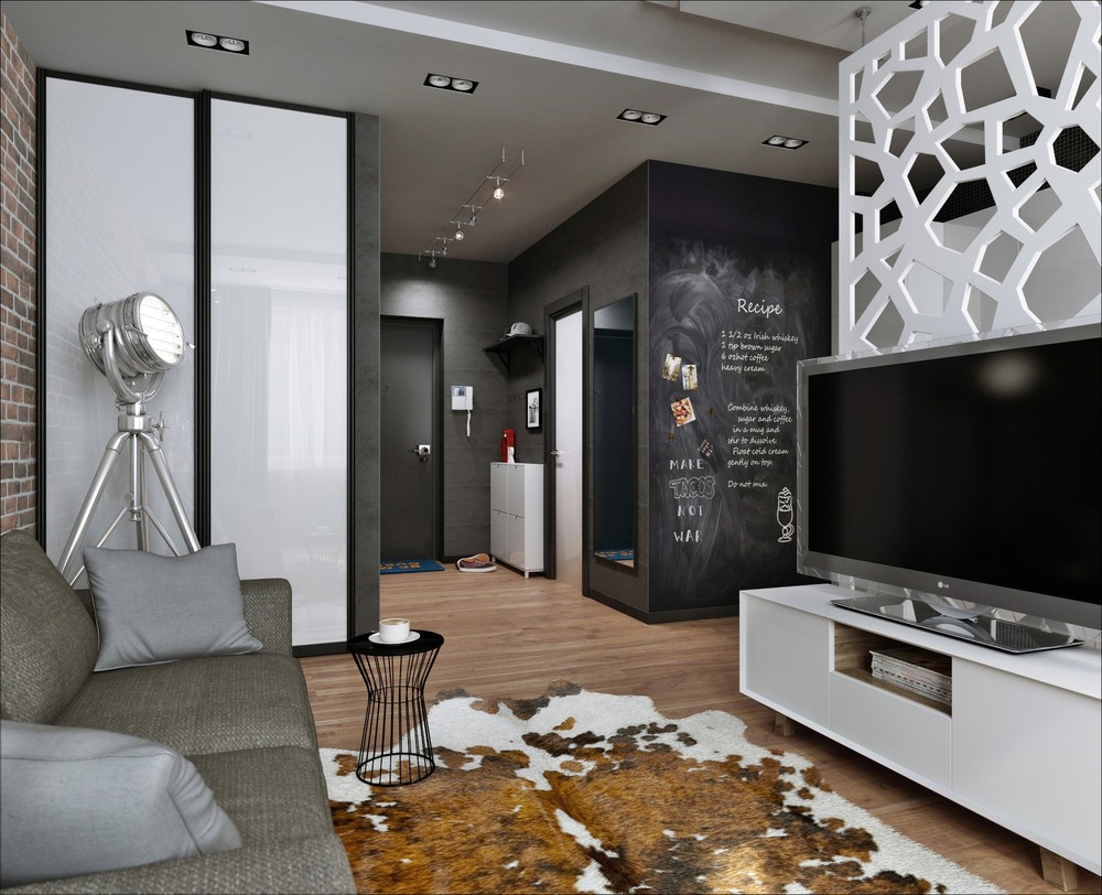
Around the corner from the entryway and running alongside the kitchen, the chalkboard wall is great for both "before you leave" reminders and ongoing grocery lists.
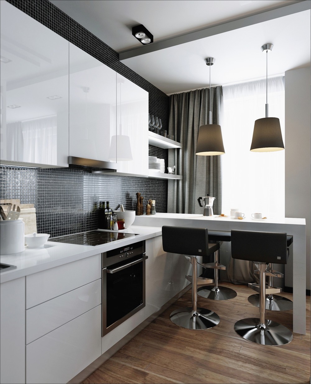
Despite its small size, the kitchen fits in a surprising amount of workspace. Removing two of the dining chairs extends that useful surface area even further.
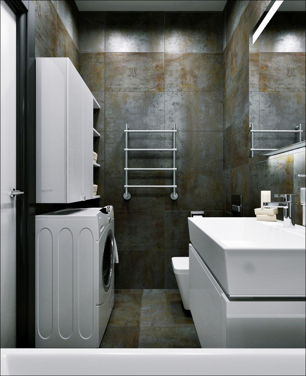
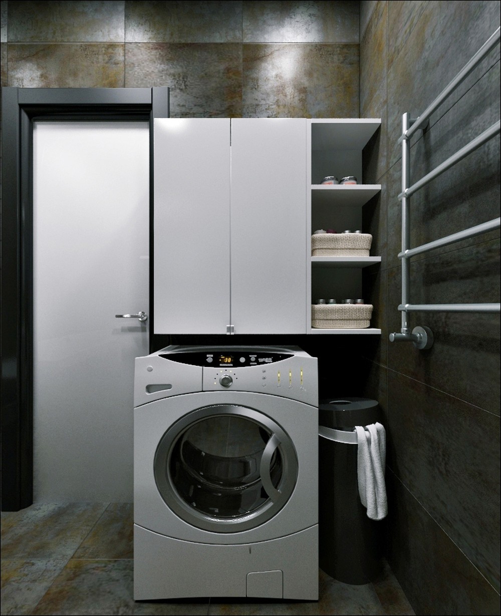
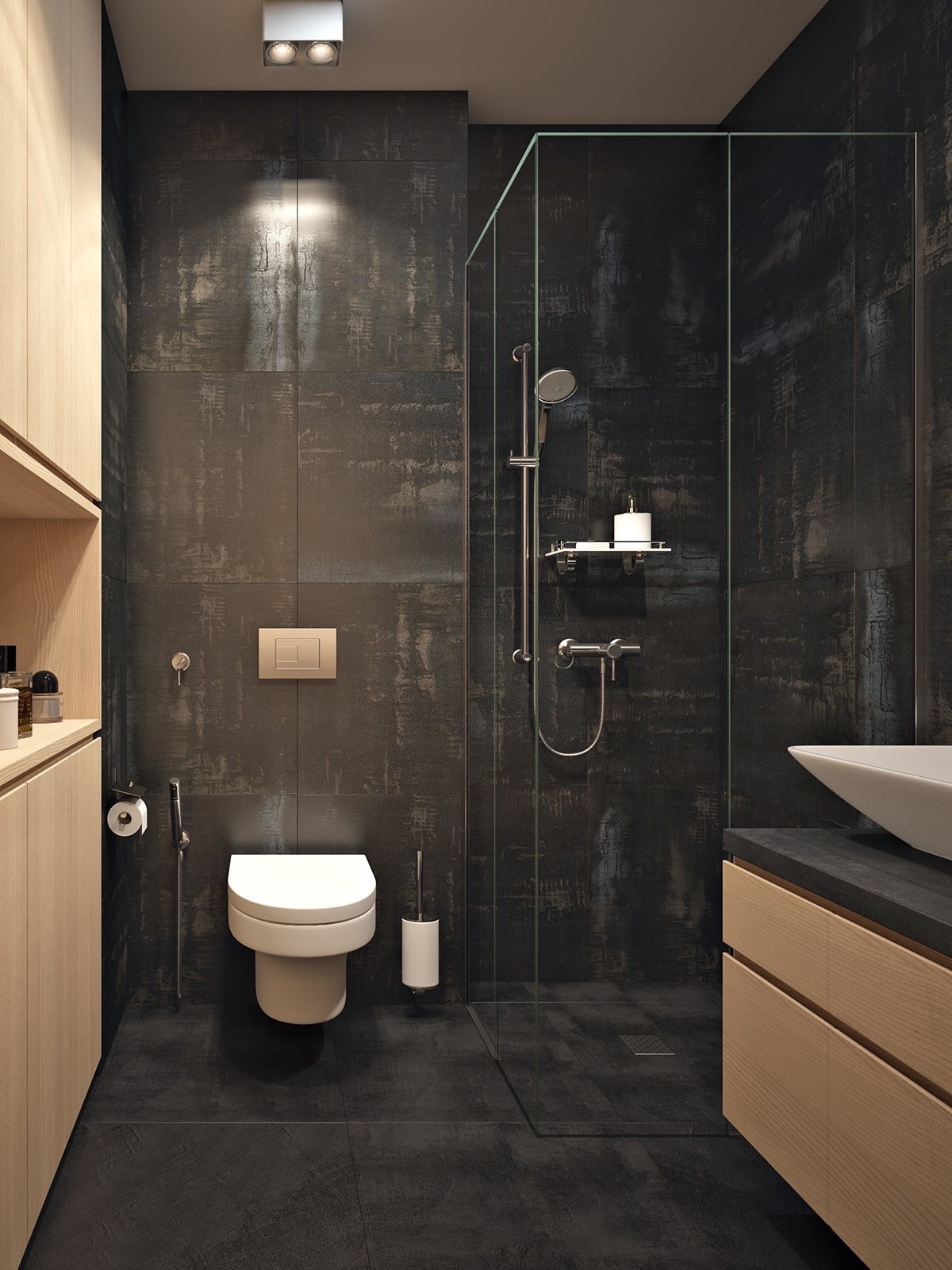
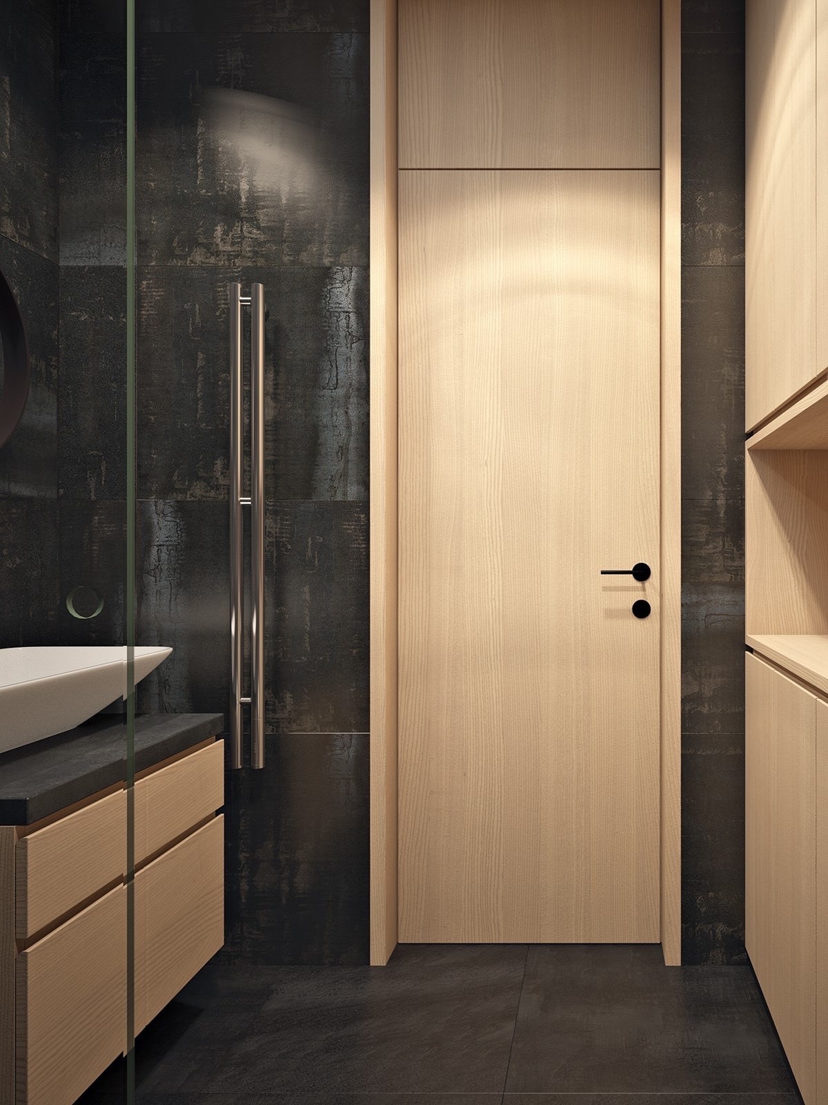
The bathroom is another great example of modern and rustic influences. The tiles almost look like corroded metal, gorgeous and colorful without tying themselves to any specific theme.
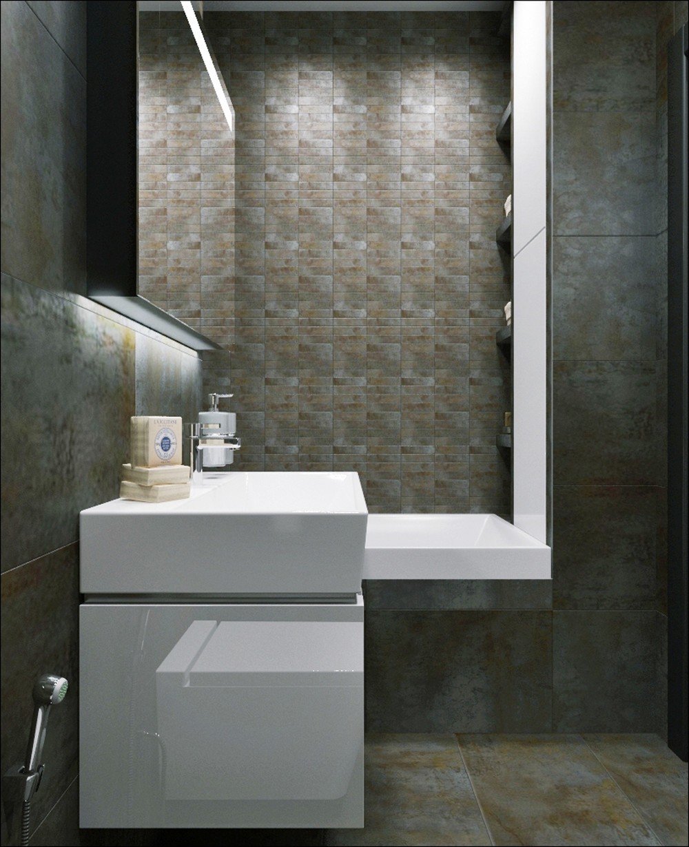
The bathtub backsplash wall uses small rectangular tiles in brick-like shades to reference the materials used in the living room.
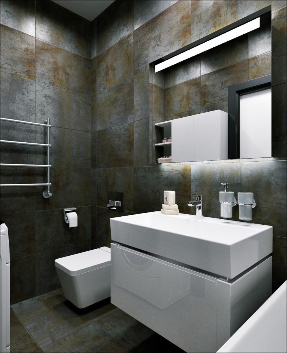
Everything else remains sleek and ultra-modern. These white fixtures easily stand out against their dark background.
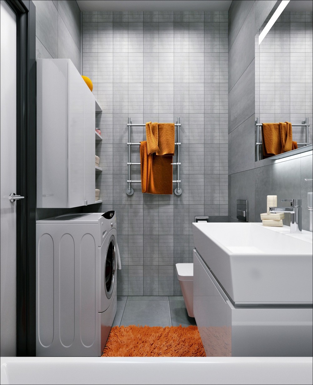
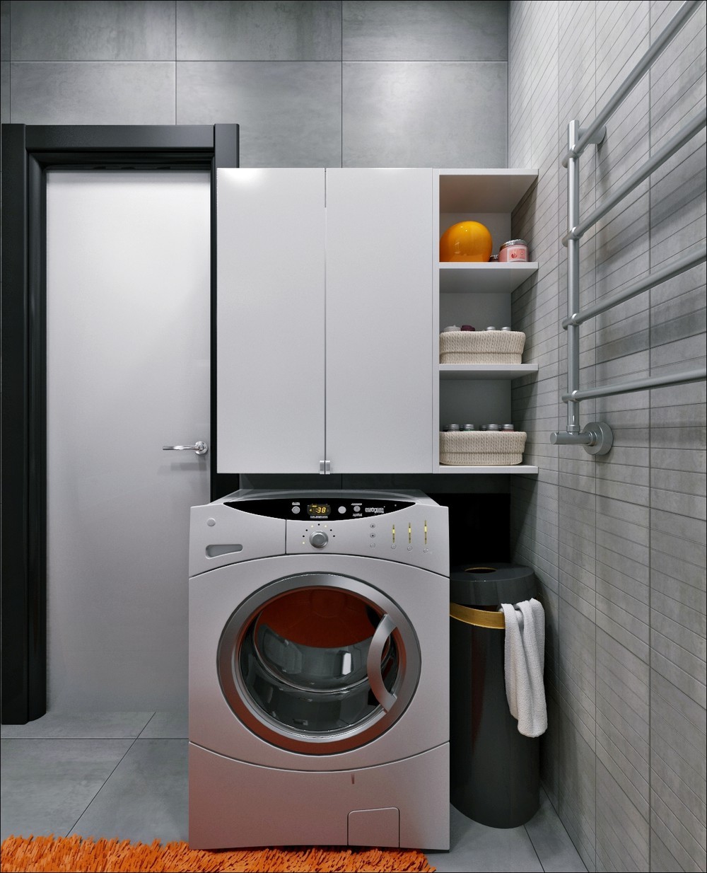
There's actually only space for one bathroom in the apartment, but the designer included another style to demonstrate how flexible even the smallest spaces can be.
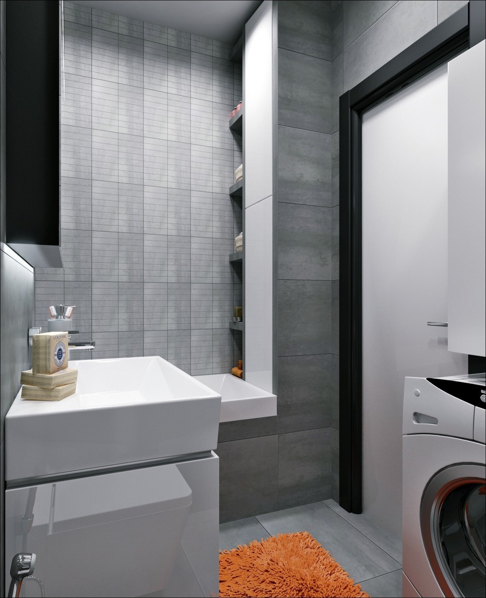
This one maintains the same rugged industrial look but adopts a lighter greyscale palette with accents in bright orange. It feels larger, but loses some of the drama the darker scheme offered.
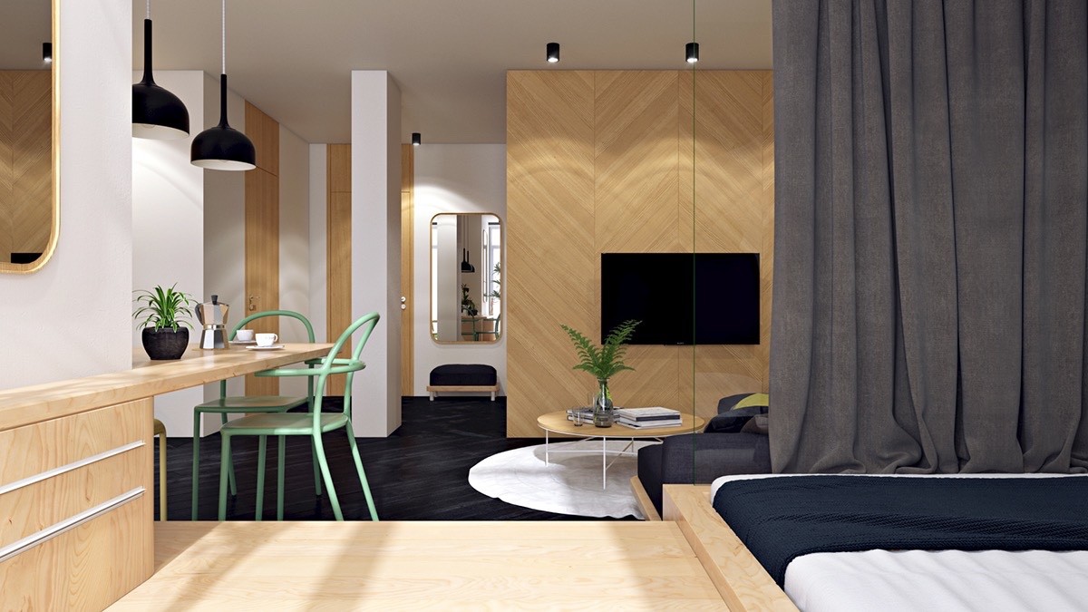
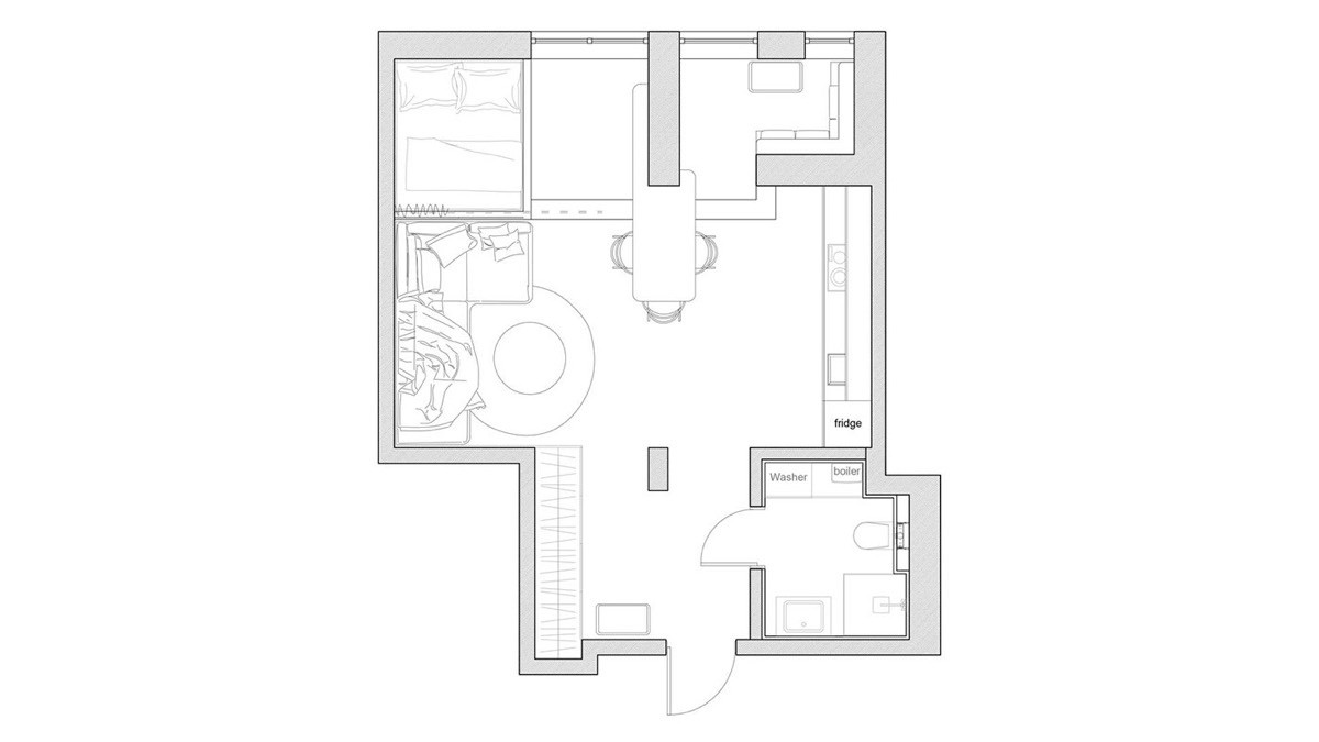
Unlike many apartments its size, this 40 square meter apartment uses interior walls to separate functional spaces. To avoid seeming cramped or overwhelmed, the designers chose sleek natural materials to foster a fresh and cheerful environment. Houseplants provide vibrant pops of green but the dining chairs serve as the only permanent source of decorative color, a pastel seafoam that seems like a perfect match for the light wood that surrounds.
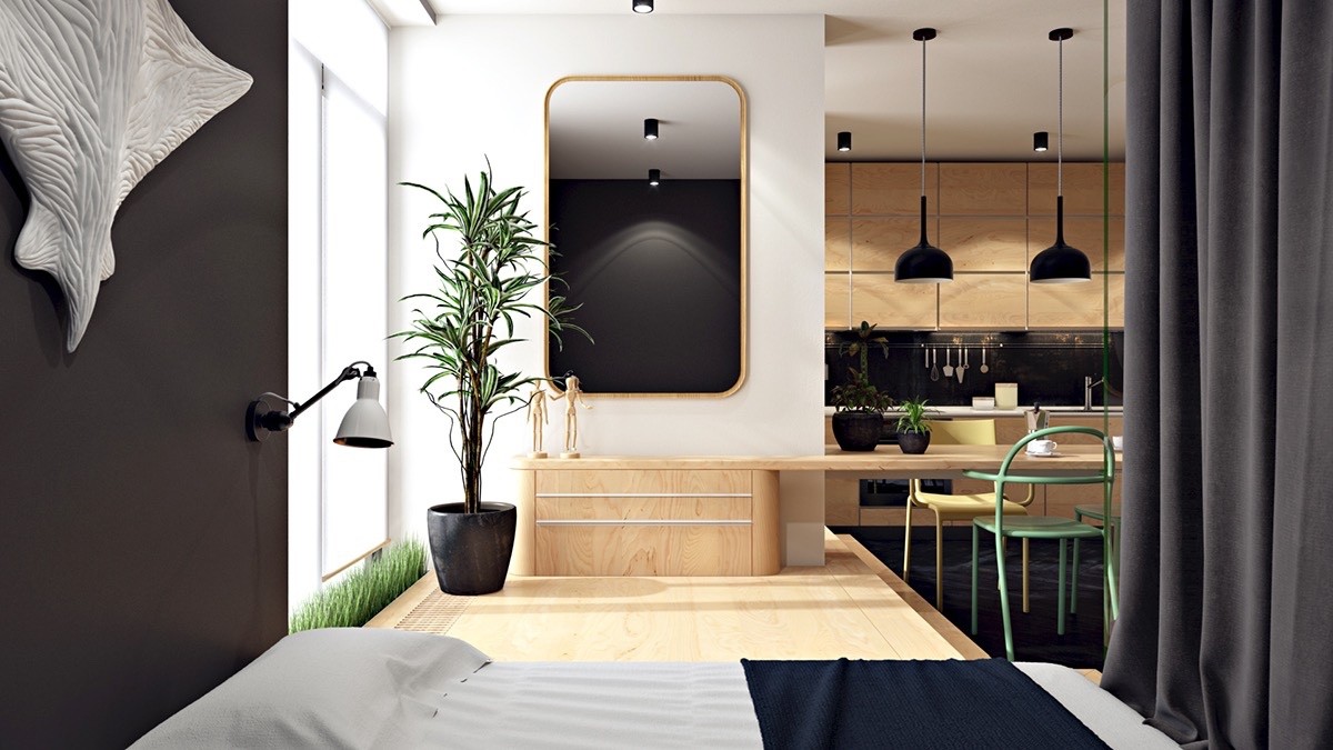
The rooms and living spaces are staggered for privacy yet maintain an open line of sight where it benefits the residents most.
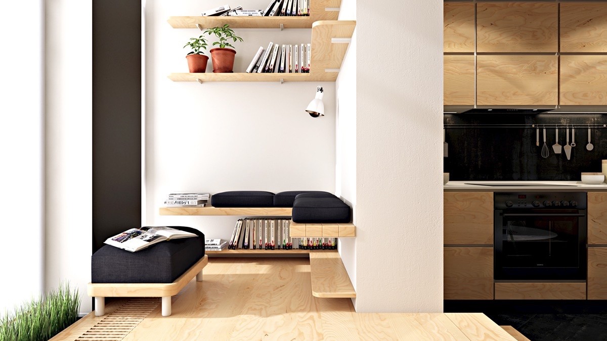
For example, this little reading nook occupies a hidden niche around the corner from the kitchen. It soaks up the sunlight but still feels guarded and cozy.
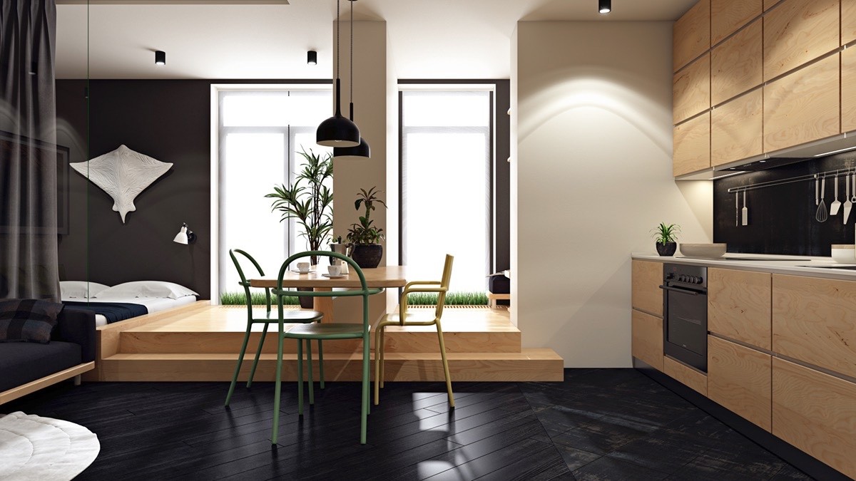
The kitchen and dining room serve as the heart of this unique home layout. They're located away from the windows and disguise any cast shadows with dark herringbone floors.
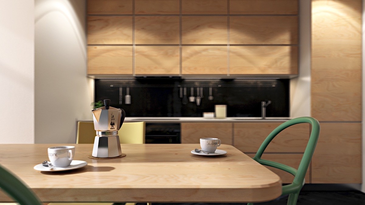
Its central position allows the dining table to remain awash in warm sunlight. Smart recessed fixtures ensure the kitchen stays bright even without direct sun.
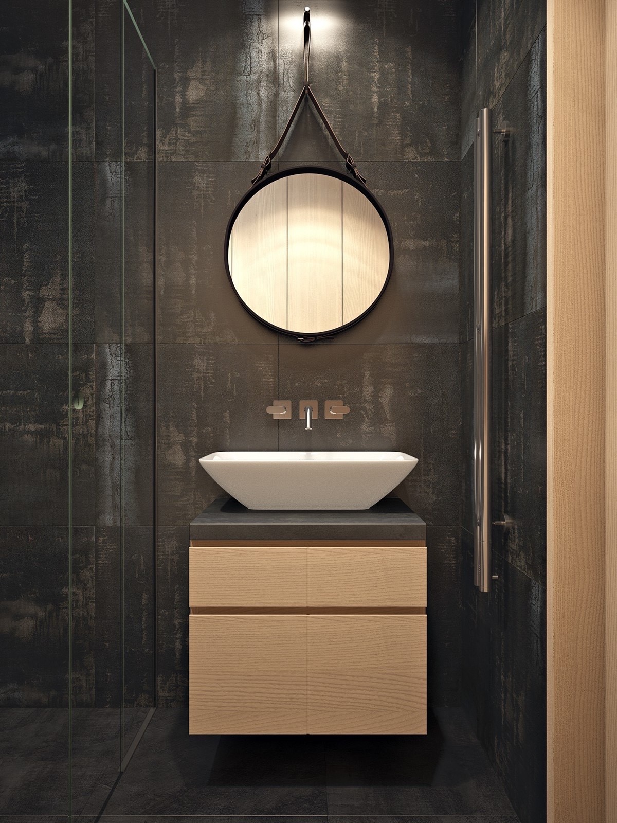
On the other hand, the bathroom revels in its moody atmosphere. Dark matte tiles come to life under directional lighting.
