“Don’t be afraid of the white page” is an adage that speaks to creatives across the world. White pages represent the beginning of the thinking process, of spaces full of possibility. Don't be afraid - white walls in interior design sing a song of their own. These three interiors lean heavily on white space to create a feeling of calm and understated style. Use white walls to make high black glass look prominent, reflecting it back in mirrors. Use white as a natural canvas for mid-wooden shelving. Use white to look modern, clean and classic – in your own personal style.

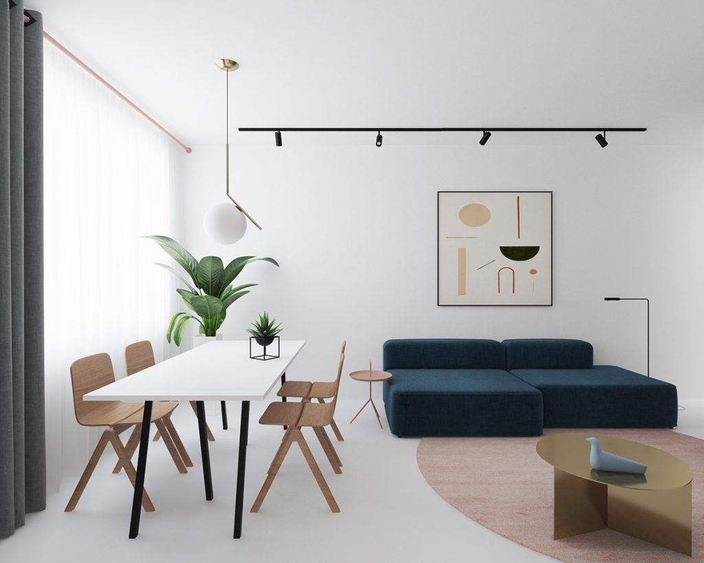
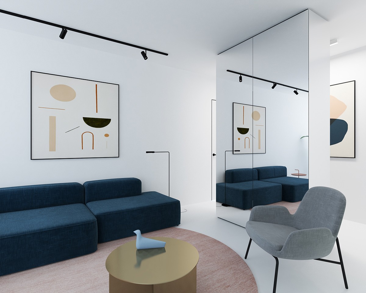
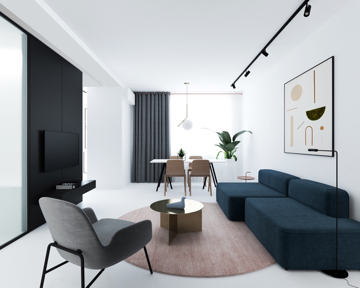
Measuring 72sqm, our first apartment in Moscow, Russia, uses block-colours on white to create a simple yet eye-catching aesthetic. The living and dining spaces evidence this white-space thinking, as a navy block couch lies its short back against the wall. Met on either side by a white-and-wooden dining table, Michael Anastassiades’ IC S Pendant Light and space-enhancing mirror, the lounge carves its own centre using concentric circles in the bronzed coffee table, pale red rug and lines in the art piece above. Grey linen offers a seat to take it in, while a glossy black TV cabinet, stark black lighting panel and unique floor lamps sketch a frame.
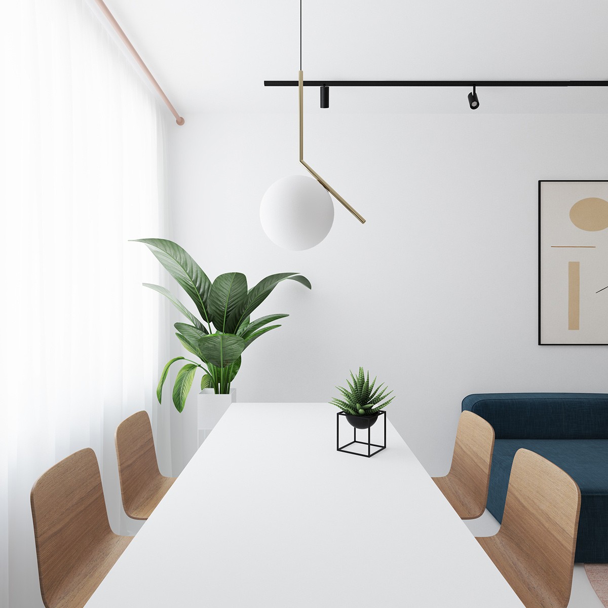
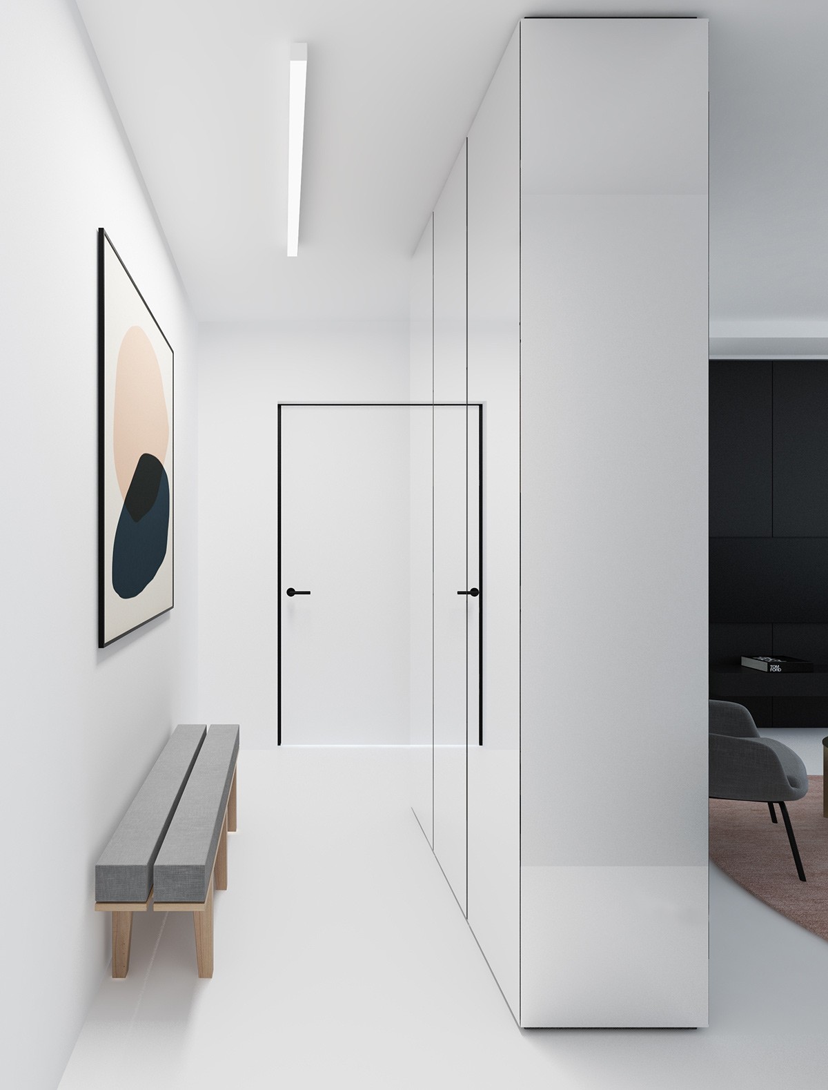
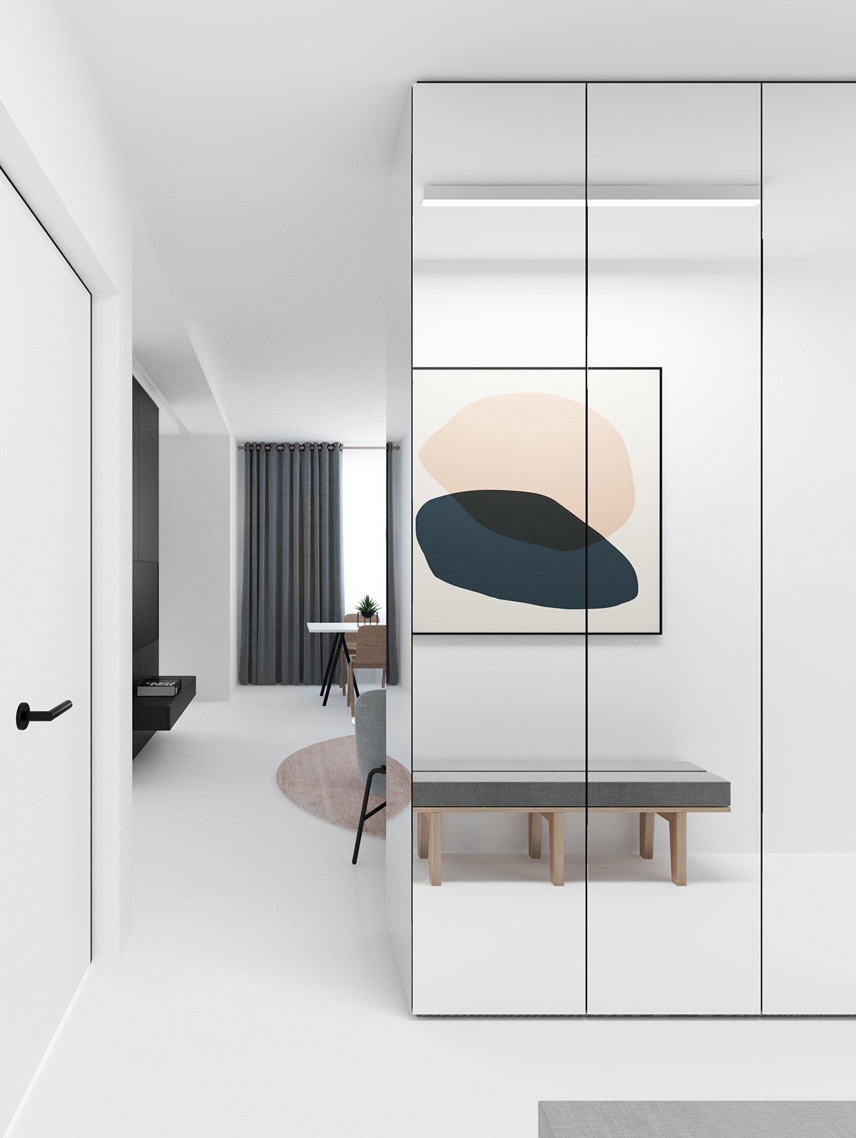
Drawing in to the dining table, green dots the space in unique plant stands in stencil. Lit by a chiffon-curtained window and IC S Pendant Light, a plain white table surrounded by smooth wooden chairs make the space serene, leaving enough white for the shape-heavy lounge. The forms follow through to a hallway in white, re-shaping into a pink and navy circle painting. The framed white-and-black door and relaxed grey bench complete the reference to the living room.
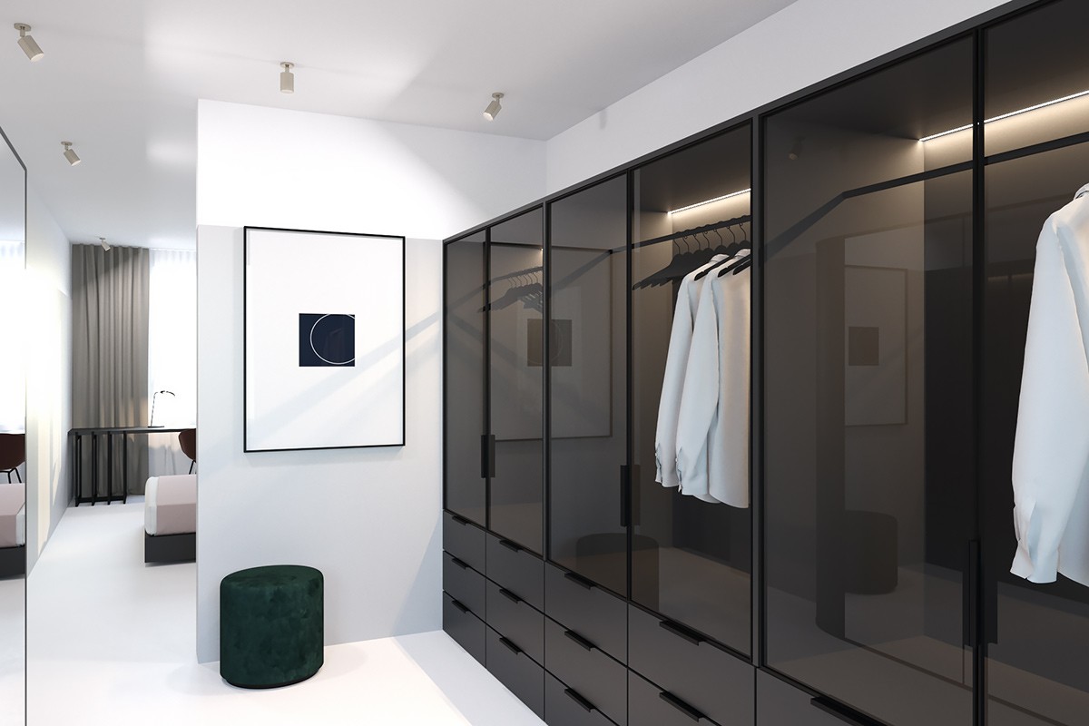
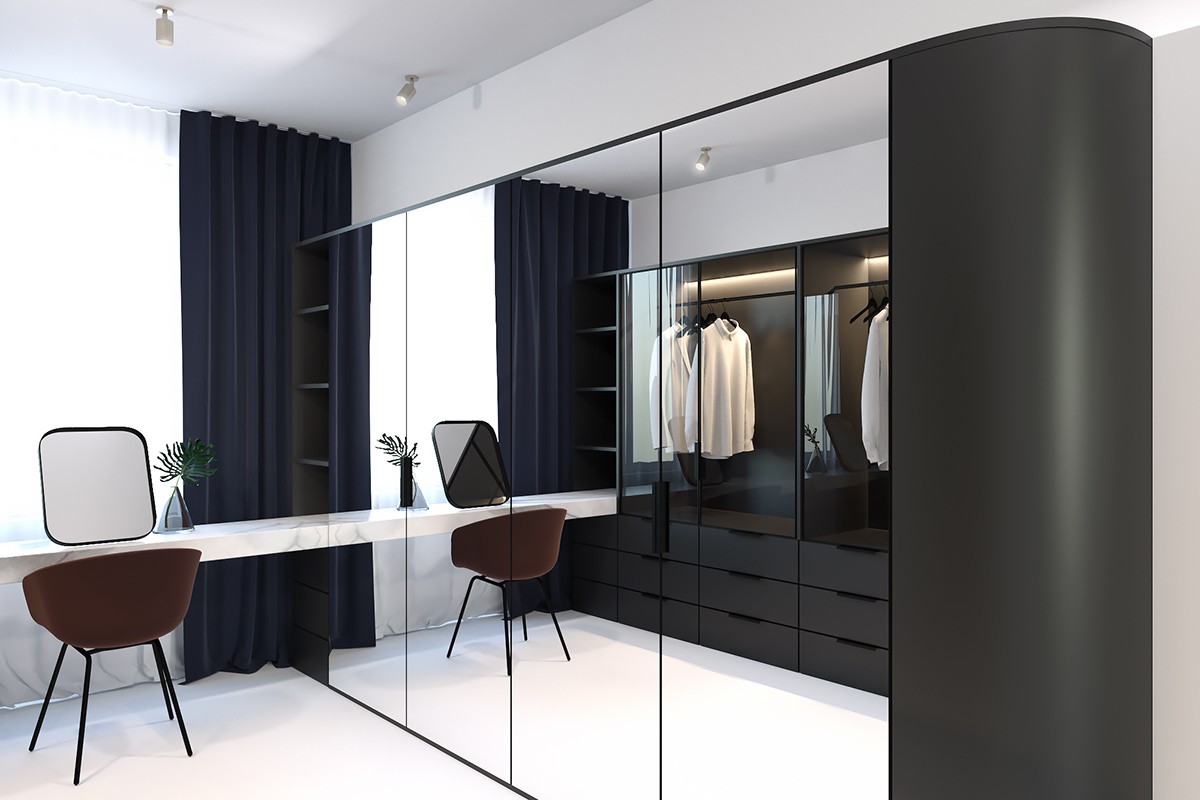
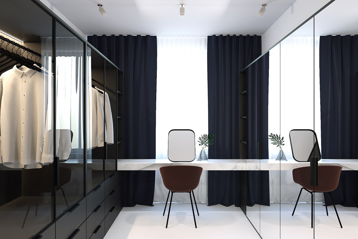
Surrounded by white, the apartment’s walk-in wardrobe has room to shine. Darkened glass doors and drawers line one wall, where shirts and jackets hang as display pieces under LED strips inside. Met by a full wall of mirrors on its opposing side, darker features in a mahogany booth seat, forest green ottoman and monochrome artwork balance out the contrast. A special place to view the outside world and the owner’s visage is provided in a rectangular mirror on a bench-style marble table. A white corridor cheekily mirrors the lounge on the way out.
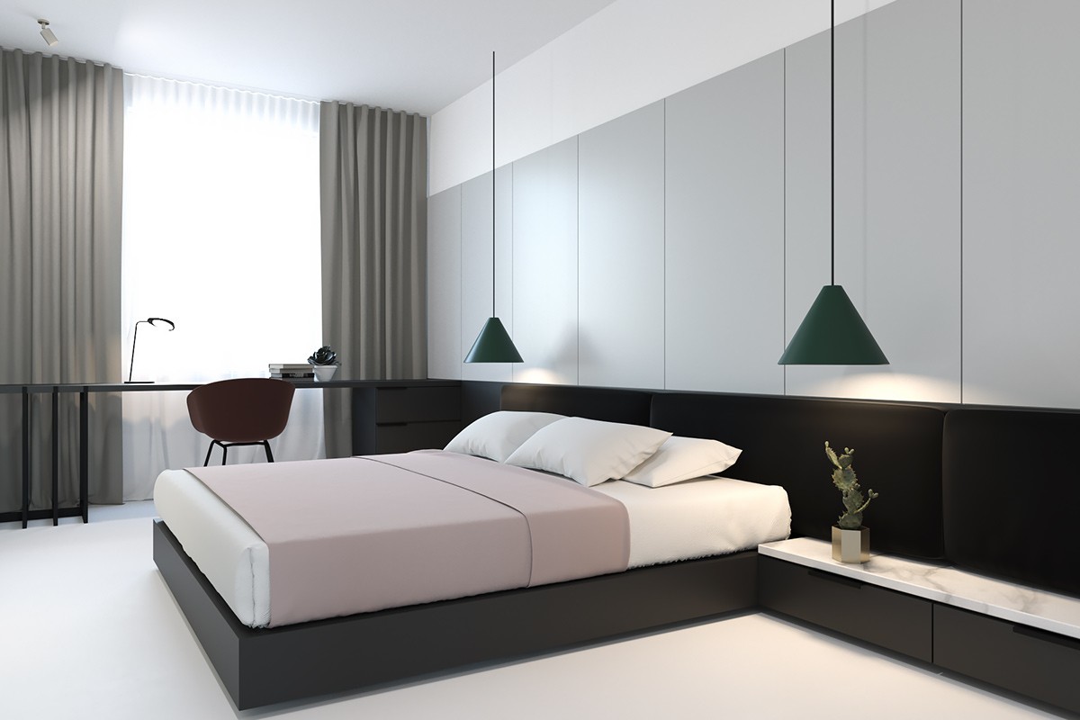
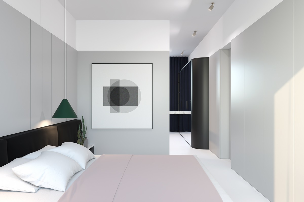
Echoing the wardrobe’s sentiments, the bedroom sets the scene with dark, French level skirting winding round to a desk. Bedroom pendant lights in the same forest green and another mahogany chair replicate the colour scheme, while a dusky pink throw creates a place for sleeping. Marked by the same white floor and ceiling throughout, a mini potted cactus and greyscale print add further thoughts.
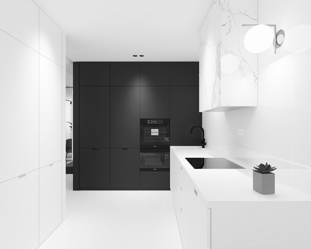
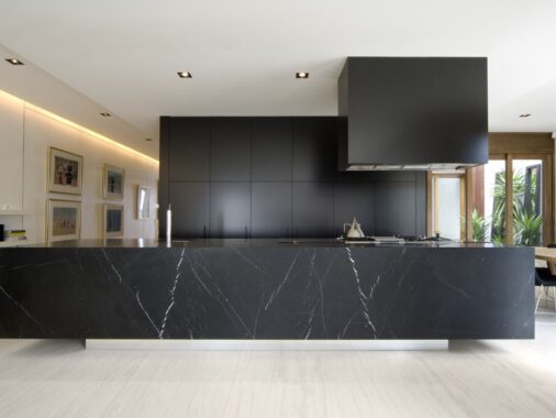
In another section of the apartment, the boldest of black and white kitchens greet the eye. Taking on the theme of the walk-in wardrobe, a solid black wall takes dominance, holding kitchen cabinets, a fridge and sleek feature oven. A black stove-top, thick kitchen tap and marble extractor help bridge the colour gap, while a lamp and potted succulent eference the soon-to-be-served dining room.
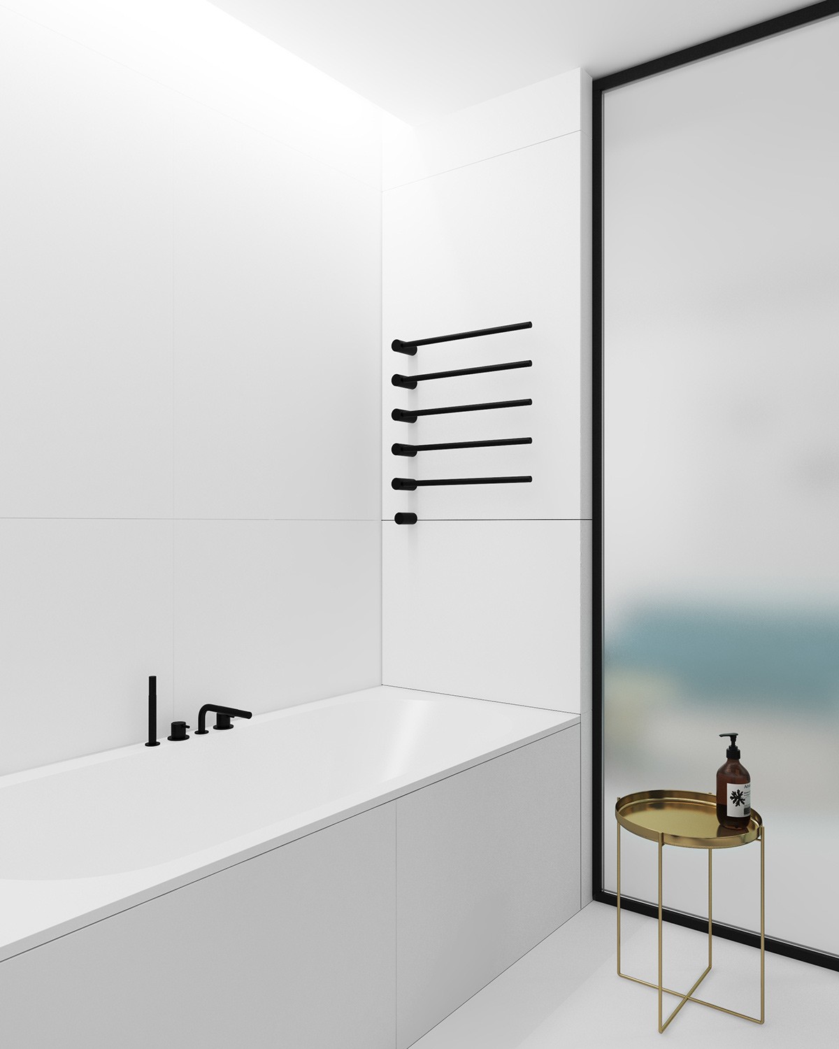
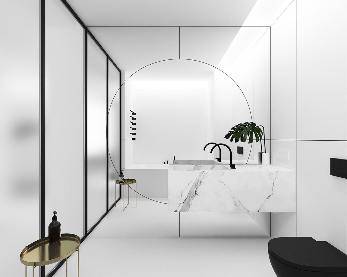
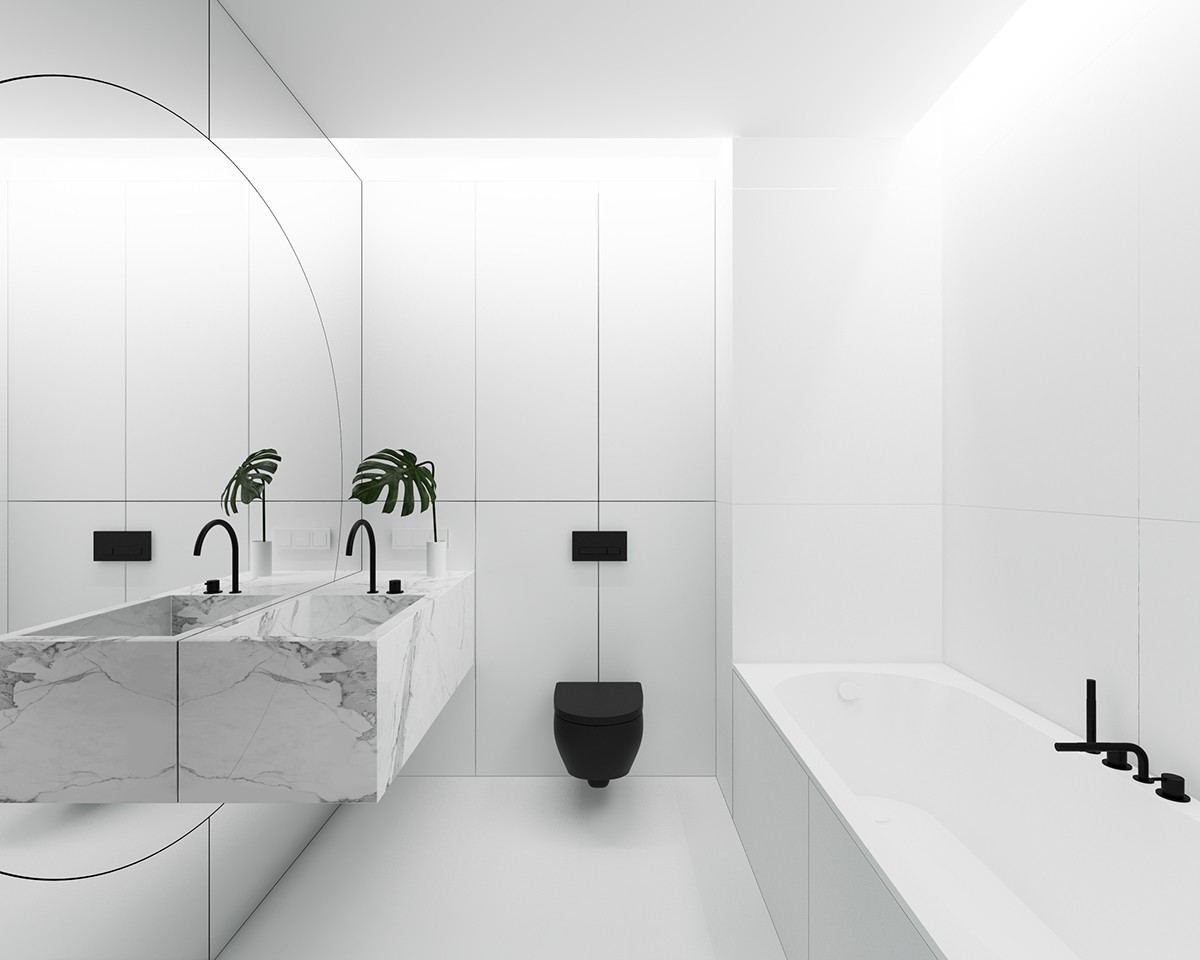
Another dominant black and white space, the bathroom highlights its utilities in the boldest of blacks. A thick towel rail hangs beside the bath, while black-framed opaque doors close off the world outside. Tying into the walk-in wardrobe, a mirrored wall with a focused circle makes a picture frame beside a marble bathroom sink reminiscent of the kitchen. Punctuated by a stark black toilet and golden stand, a fern adds the final touch to a bathroom elegant in its simplicity.
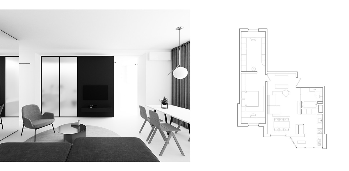
Faded back to black and white, the final view shows the apartment’s focal point. See the plan for its wider segmentation.
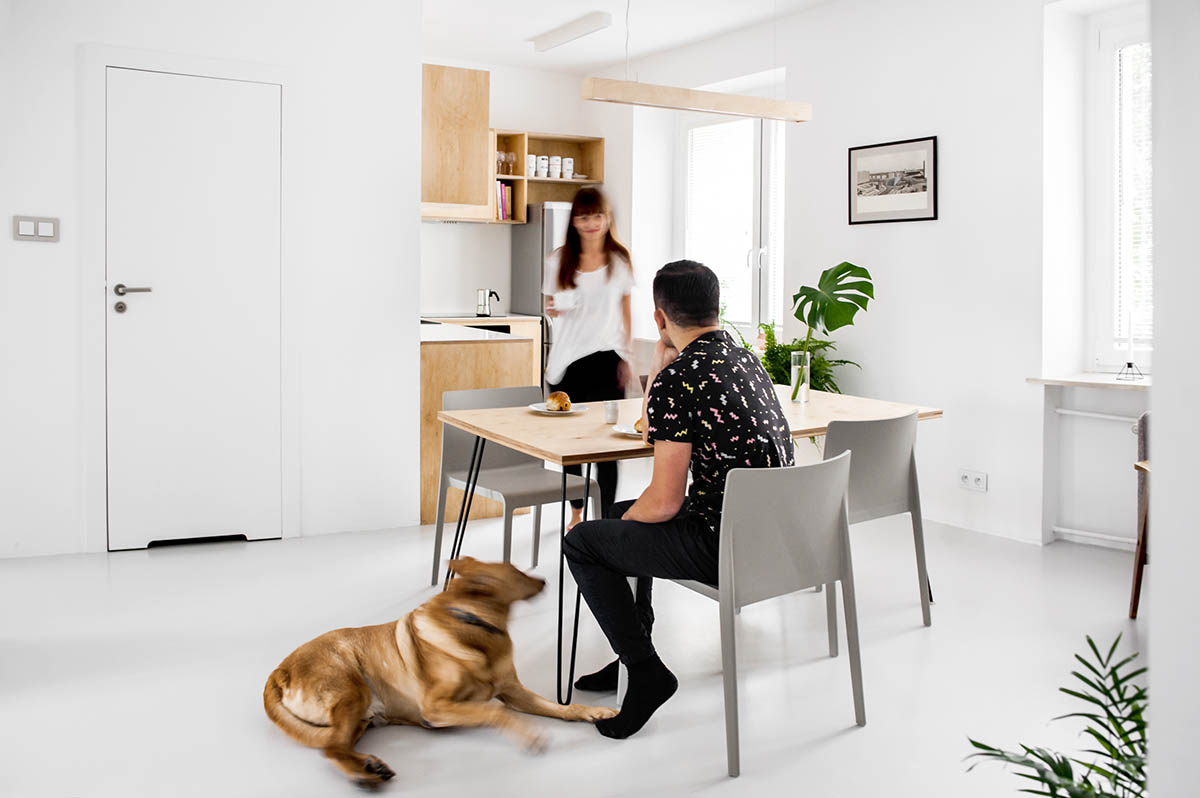
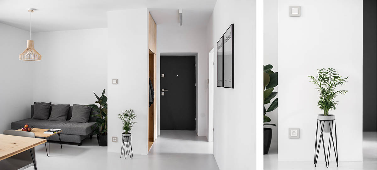
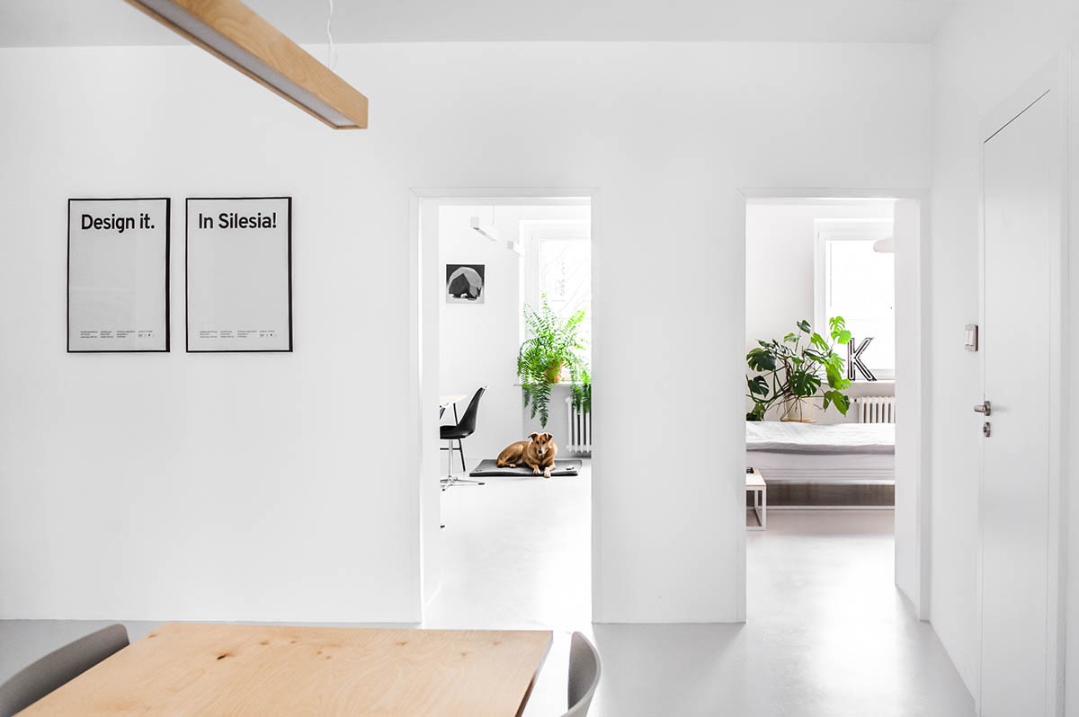
Decorated in white with elements of light wood and grey, our next apartment in Katowice, Poland, creates space by removing it’s 60’s partition walls. Set on light-grey floors, key kitchen, dining and lounge areas are headed by light wooden planks and pendant lights, while monochrome prints and standing ferns mark the corners and walls. The rest of the apartment appears dreamily open, twisting and turning amidst grey seating and the occasional black door.
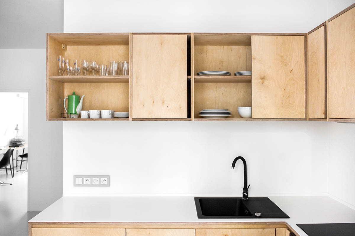
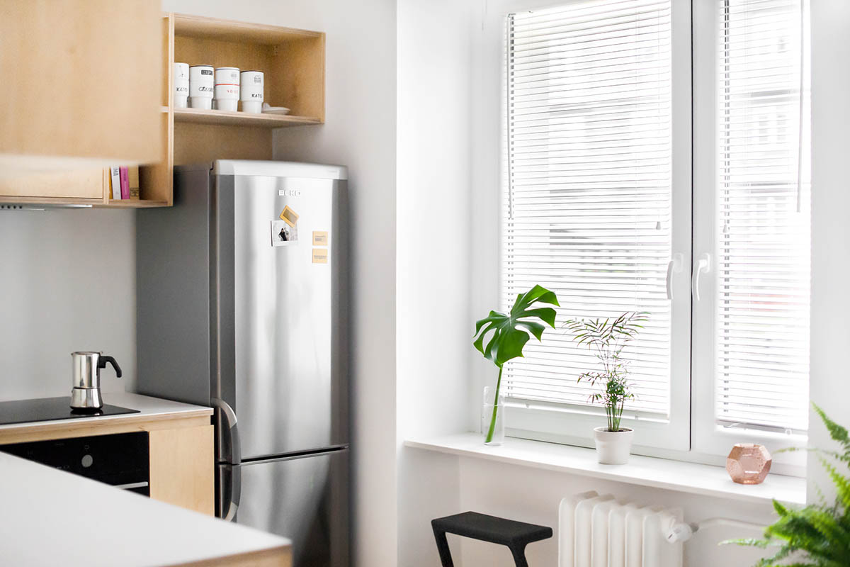
Functionally and aesthetically simple, the kitchen uses unpolished plywood to furnish the basics. Winding wooden cabinetry supplies the cabinets and bench, while a thick black sink, stovetop and stools offer modernism. A chrome fridge works in well in the corner, as a range of artificial tropical leaves stretch towards the sun.
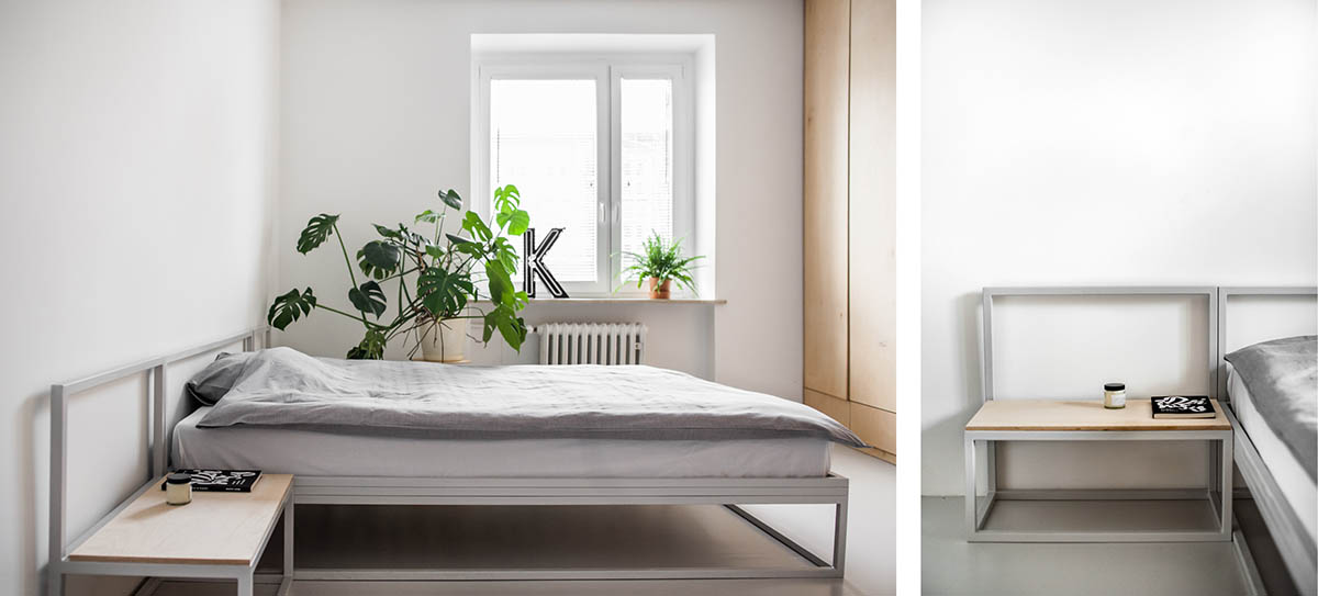
The bedroom, continuing the theme, finds a mast in a tall wooden wardrobe and high window. As a Swiss cheese plant drapes over the bed, the bed clothes itself in muted grey. A grey stencil design in kitchen-fridge chrome links the bed and small side table.
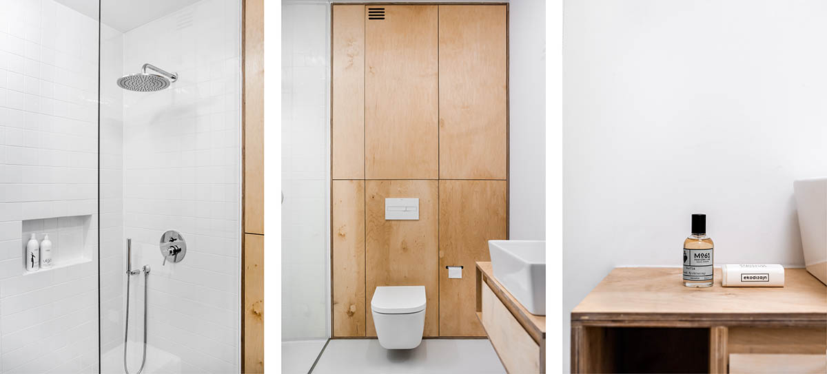
The bathroom lets itself be known in another cabinet doubling as a feature wall. A small space is made large with a simple sheet of glass and all-white tiling. Block porcelain amenities offer functionality, while a cavity in the shower wall provides a stylish way to store the basics.
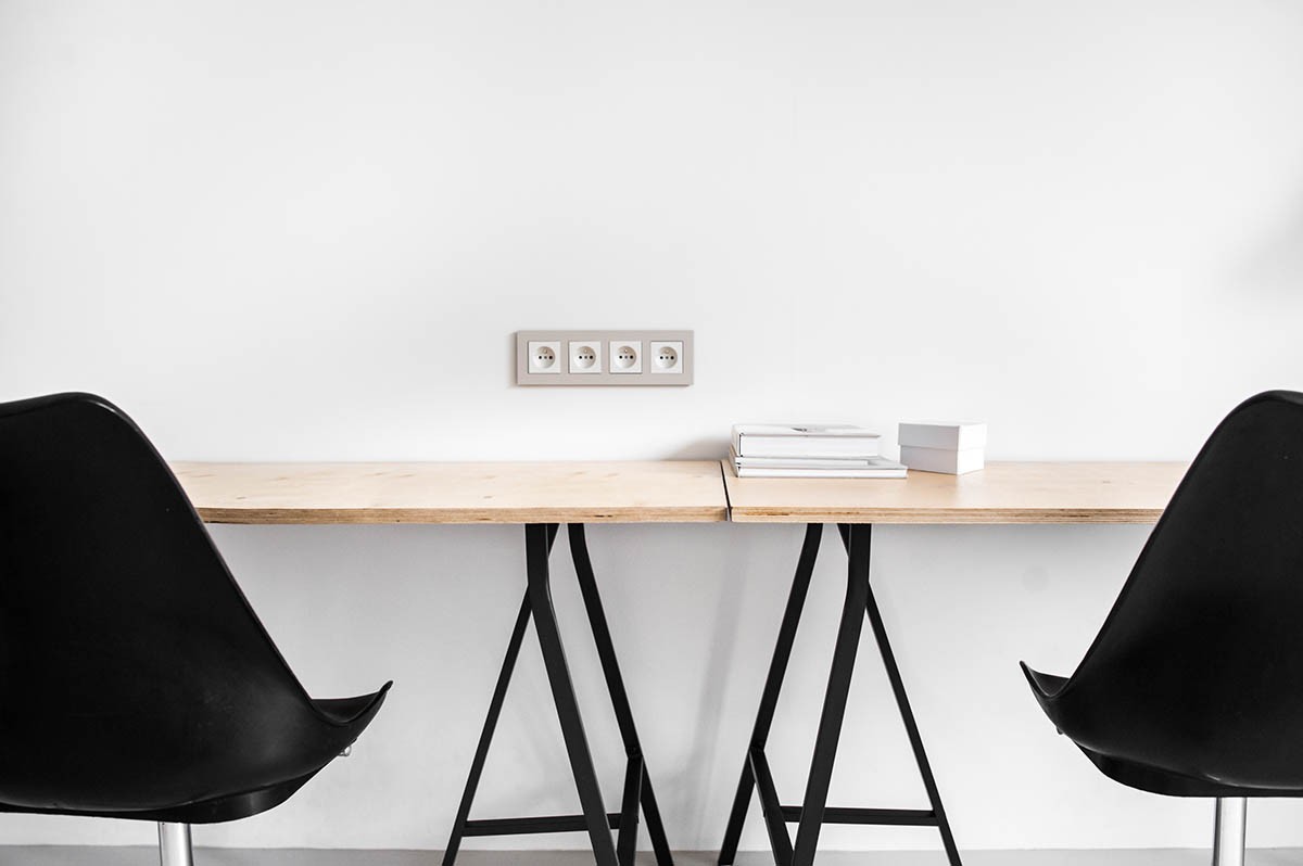
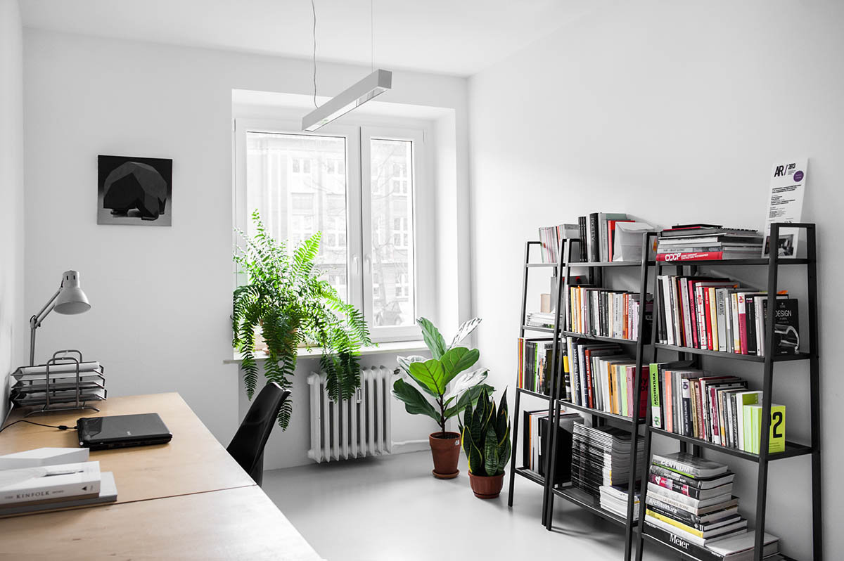
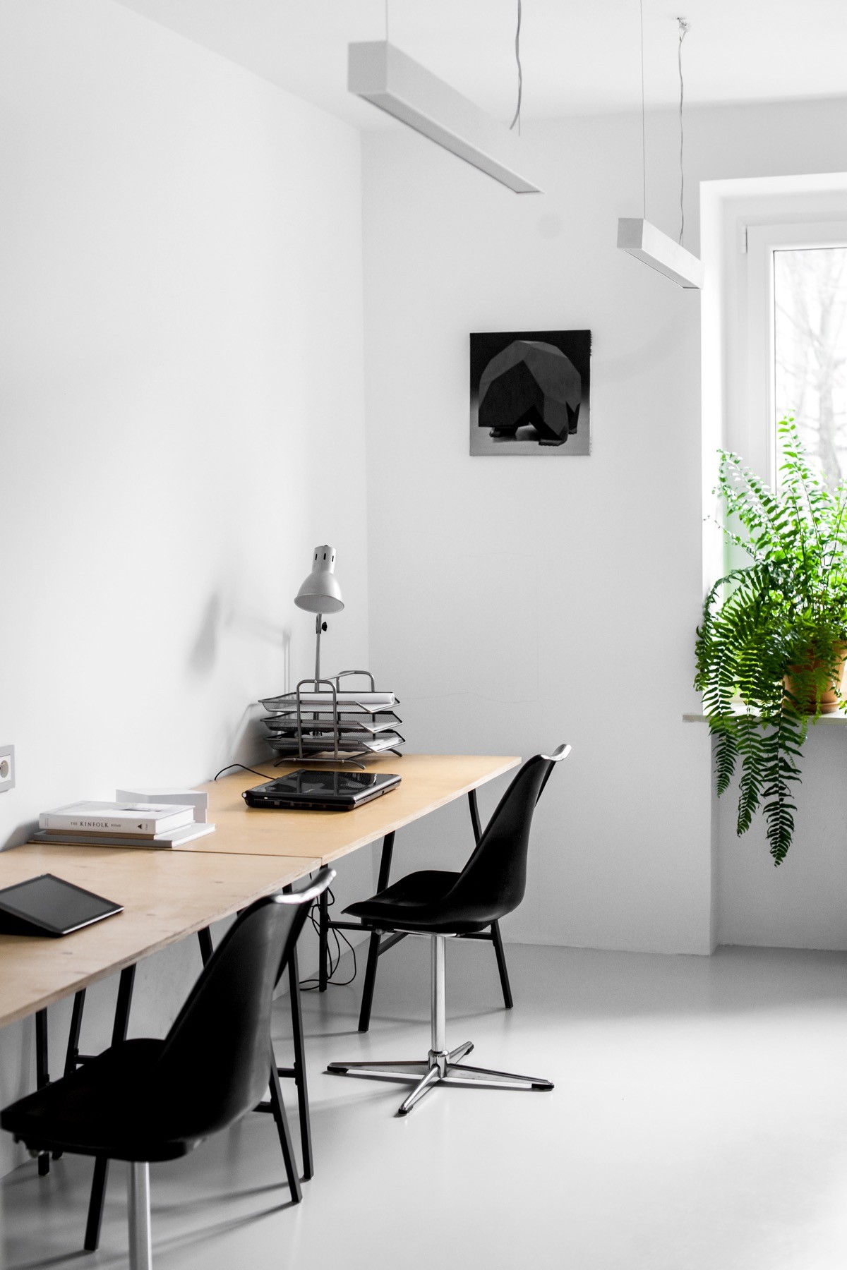
The office offers 2 person workstations ruthlessly pared back. White walls and a high window scale to black-leg wooden benches beside school chairs. A thick black bookcase reflects the scene, as indoor house plants drape off windowsills or stand quietly. A grayscale print and metal lamp finish off the look.
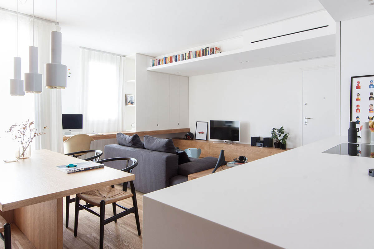
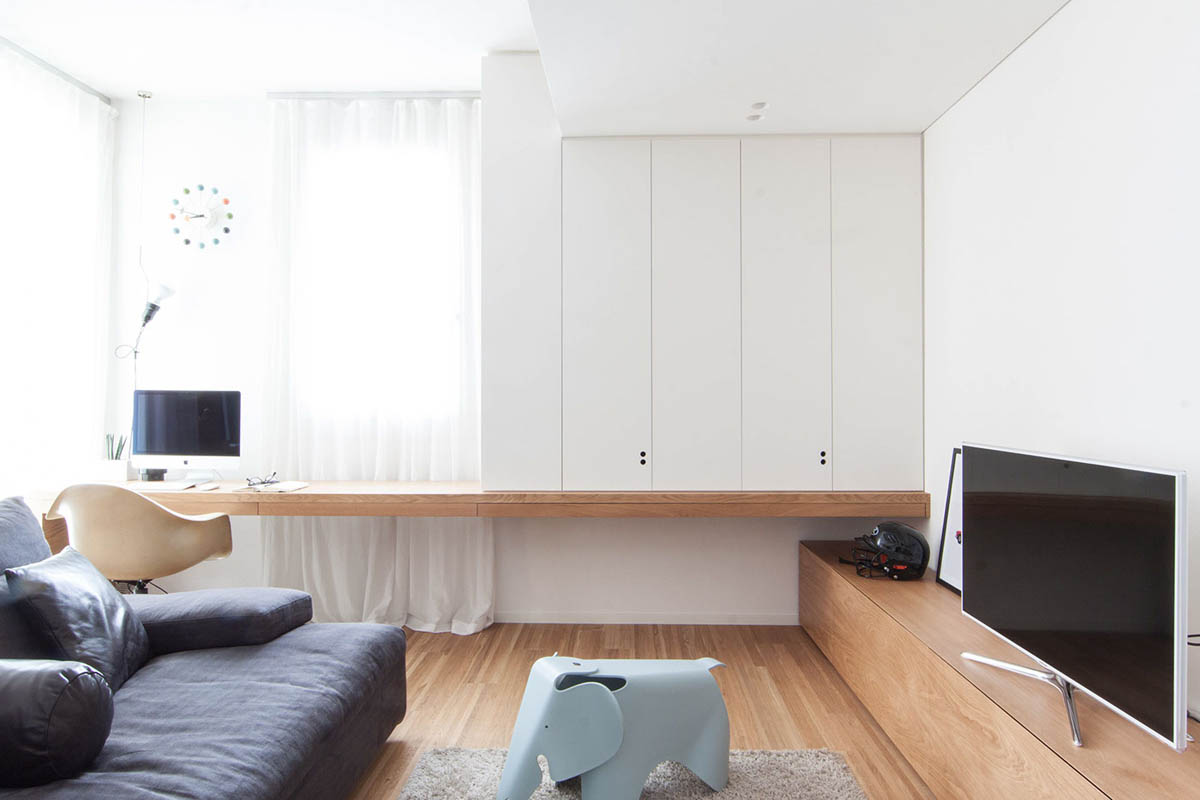
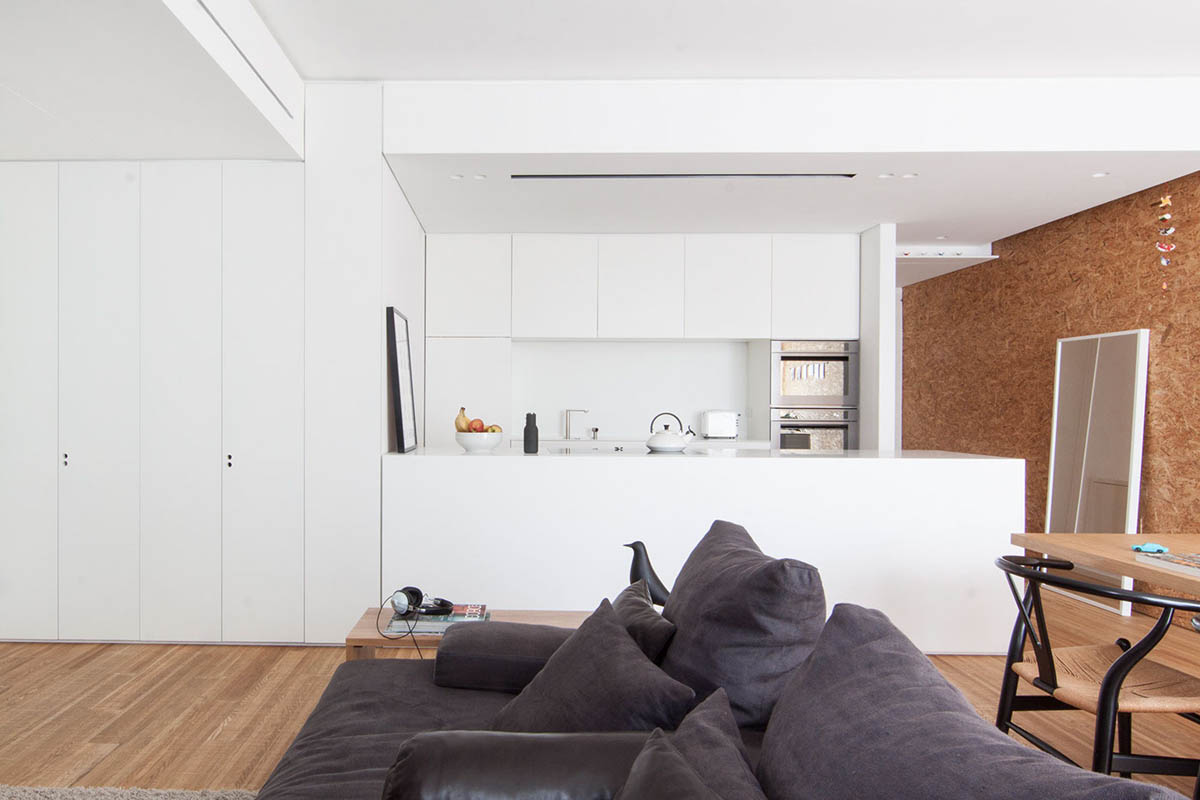
Our last white space uses Eastern minimalism to create a cool, collected calm. Based in Italy’s historic Castelfranco Veneto, its 80sqm became spacious by eliminating corridors and using custom-made furniture. The lounge shows this focus by lying a few centimetres below the rest of the room. Using white walls, high cupboards and ceilings upon a mid-wooden floor, the sofa and coffee table lie low under rafters of colourful books. Framed by wooden ledgers, a soft grey couch and rug sit beside a subtle study space and Eames Elephant stool.
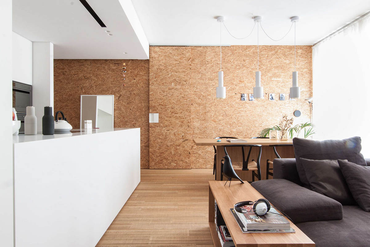
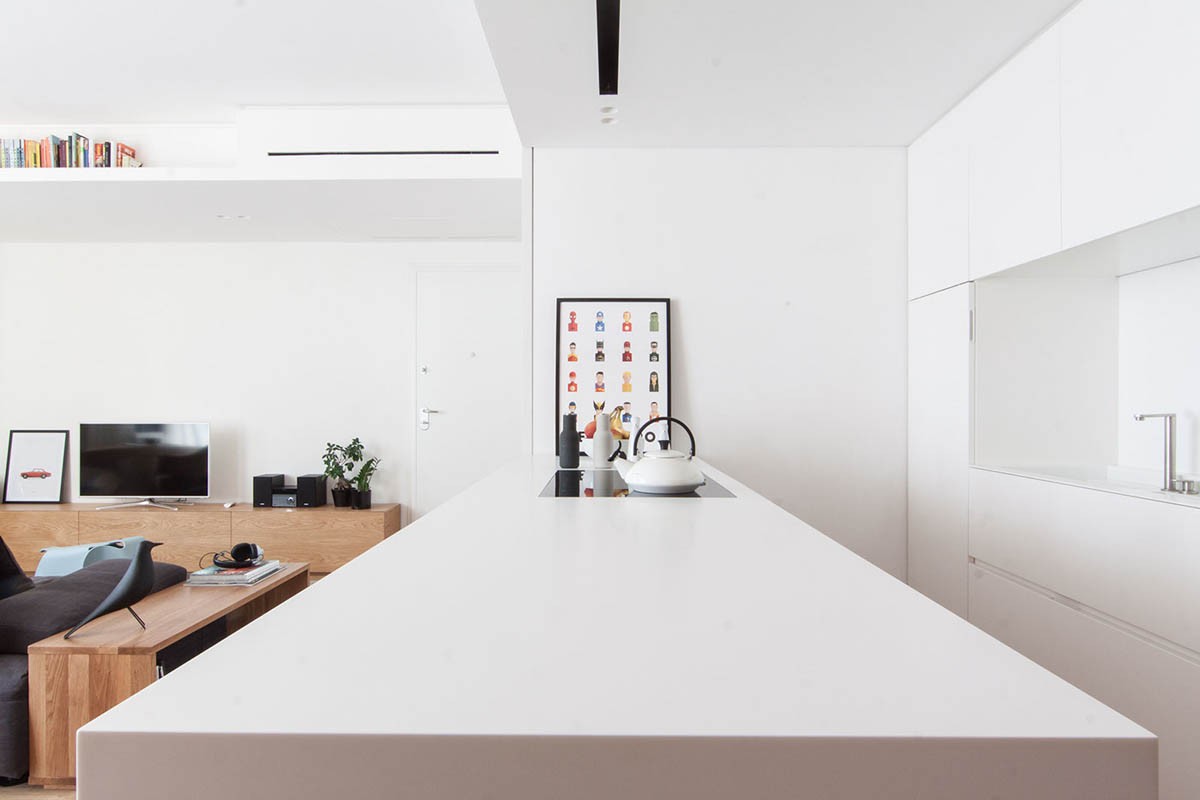
An Eames Bird replica guides us towards the kitchen, a glossy white affair backed by a wall of cork. Framed by acrylic blocks above and below the working space, its only marker is a leaning cartoon print fit for a superhero home décor home. Menu bottle grinders, a squat kettle and enclave sink punctuate this minimalist style.
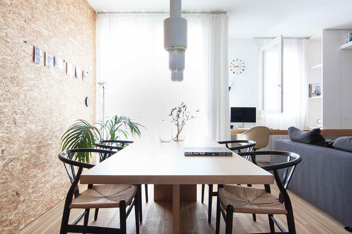
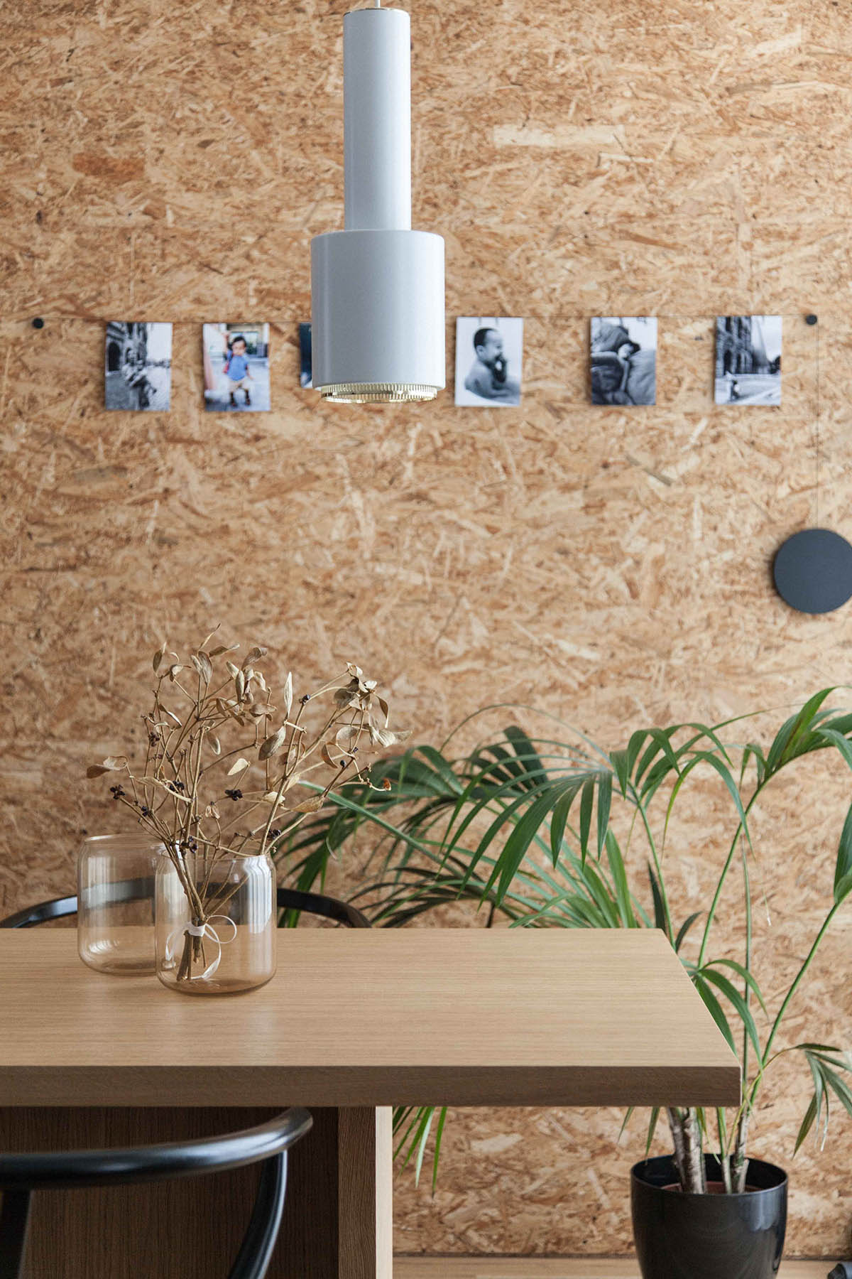
Running along the cork wall, the dining area presents us with Scandinavian-style chairs and unique dining room pendants in the interior’s characteristic white. Woven chair seats hark back to the resident’s past in South East Asia; the black frames around them the modern world they are used to. A row of printed photographs amidst the greenery provide softer memories.
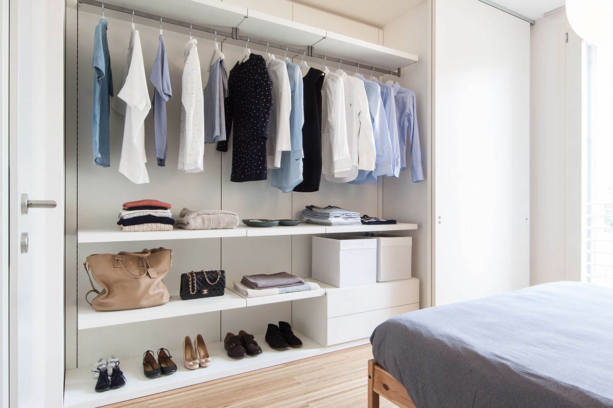
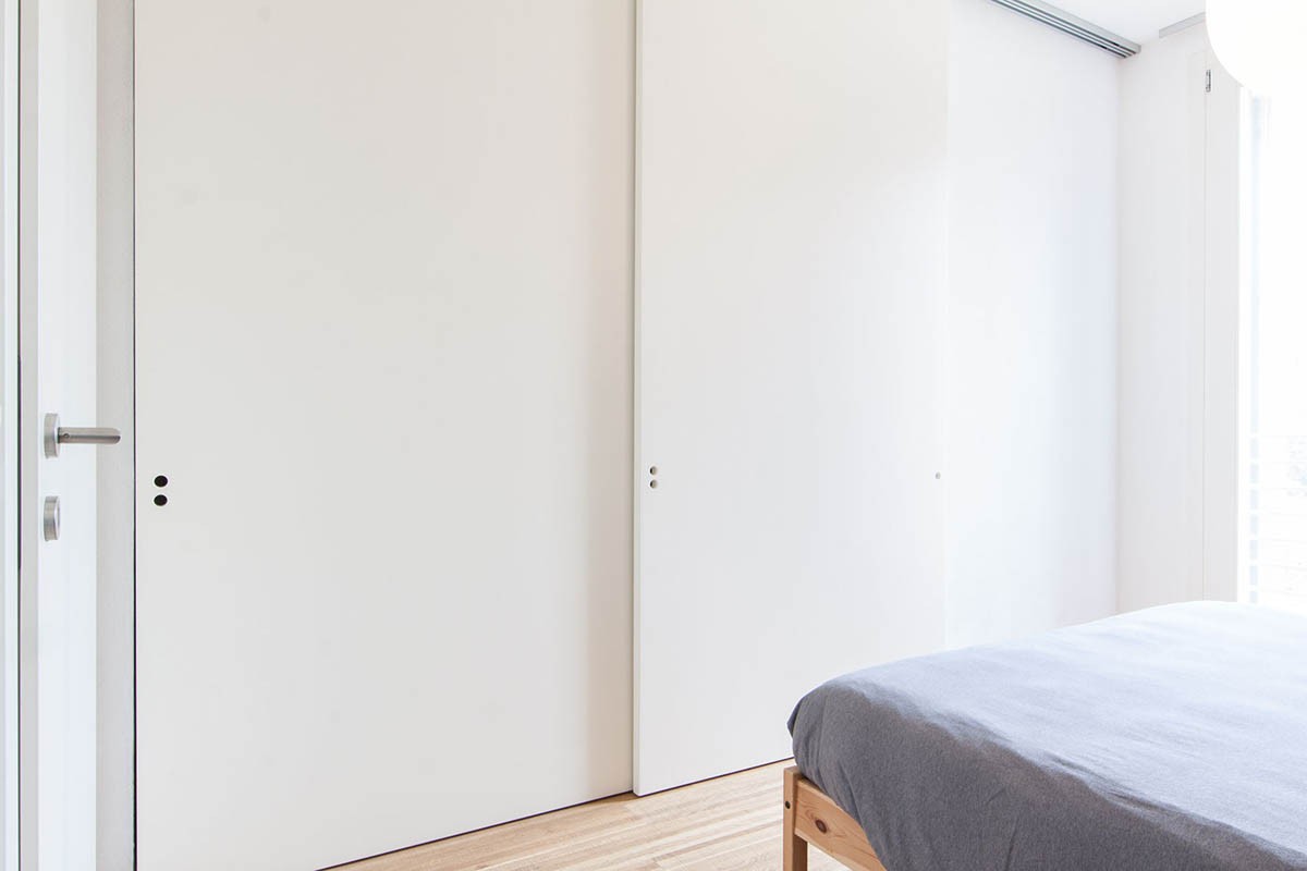
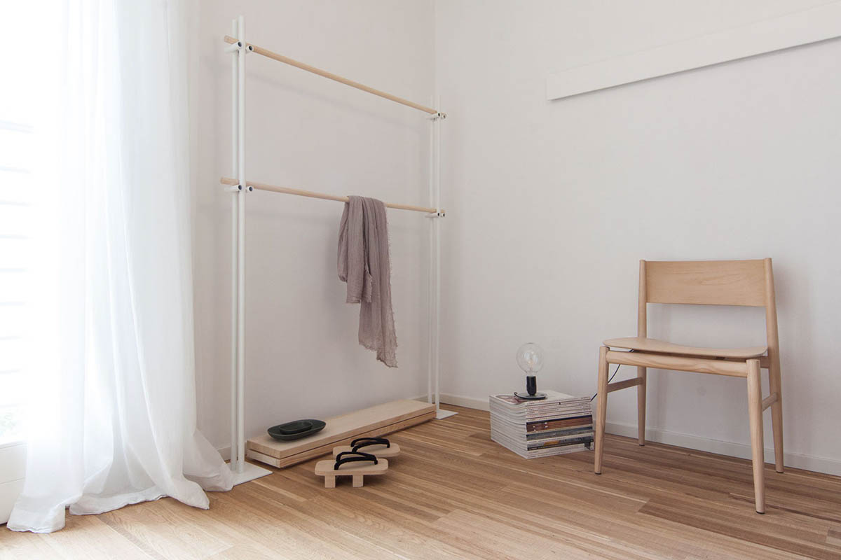
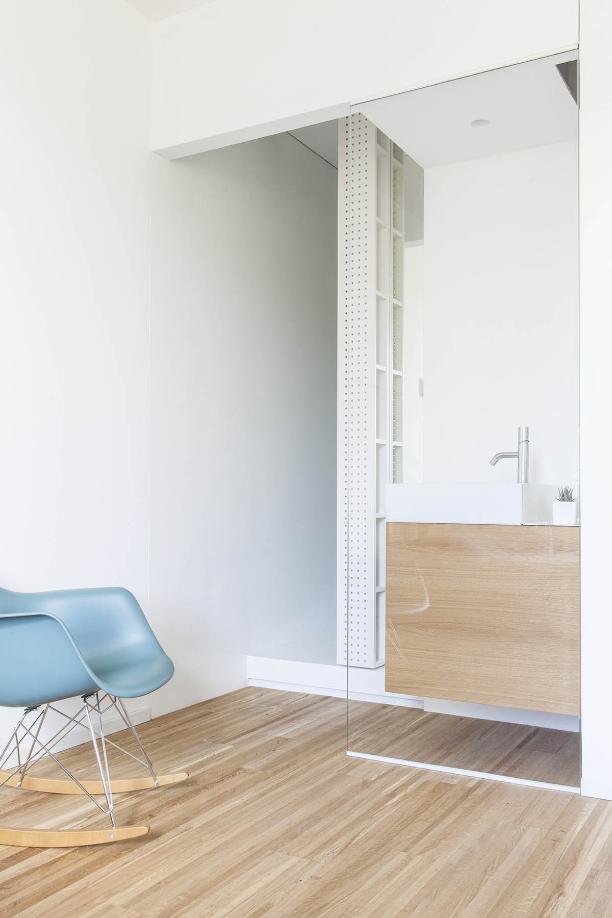
A step inside the bedroom reveals another white space for display – or for hiding. Rows of Scandinavian-style shelving hold shoes, accessories, and a minimalist sliding door with hole-drilled handles. Asian influences appear in a pair of Japanese slippers, bamboo towel rail and wide-set wooden chair. A shiny teal rocking chair and bedroom sink frame the other corner, an space ideal for nursing.
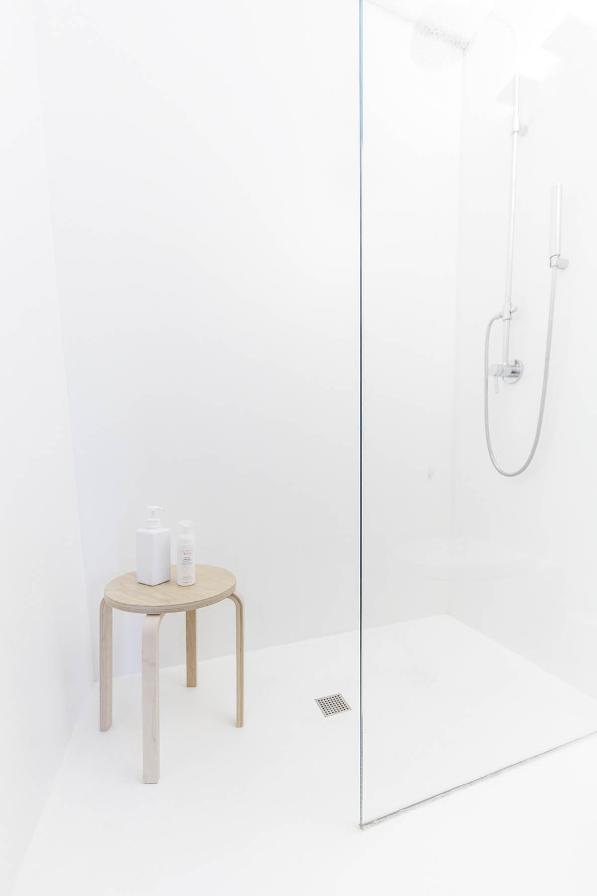
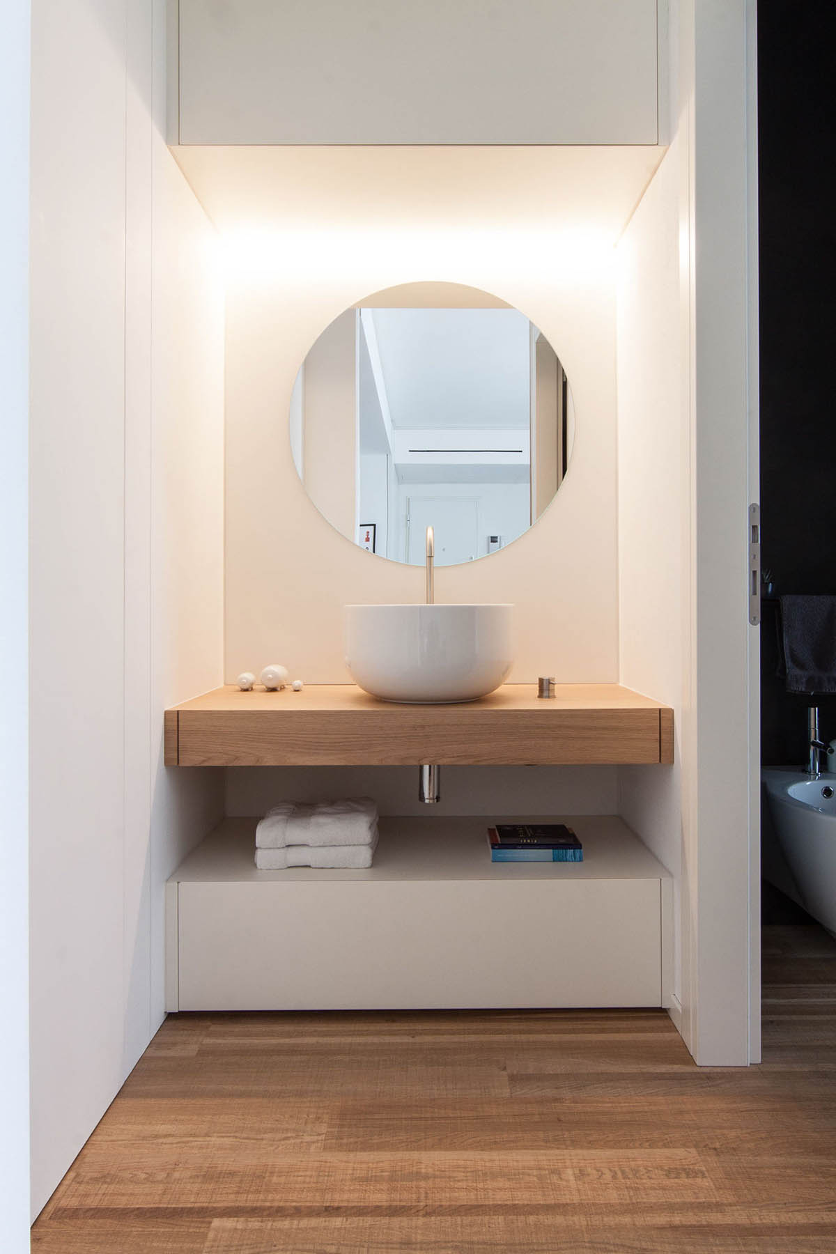
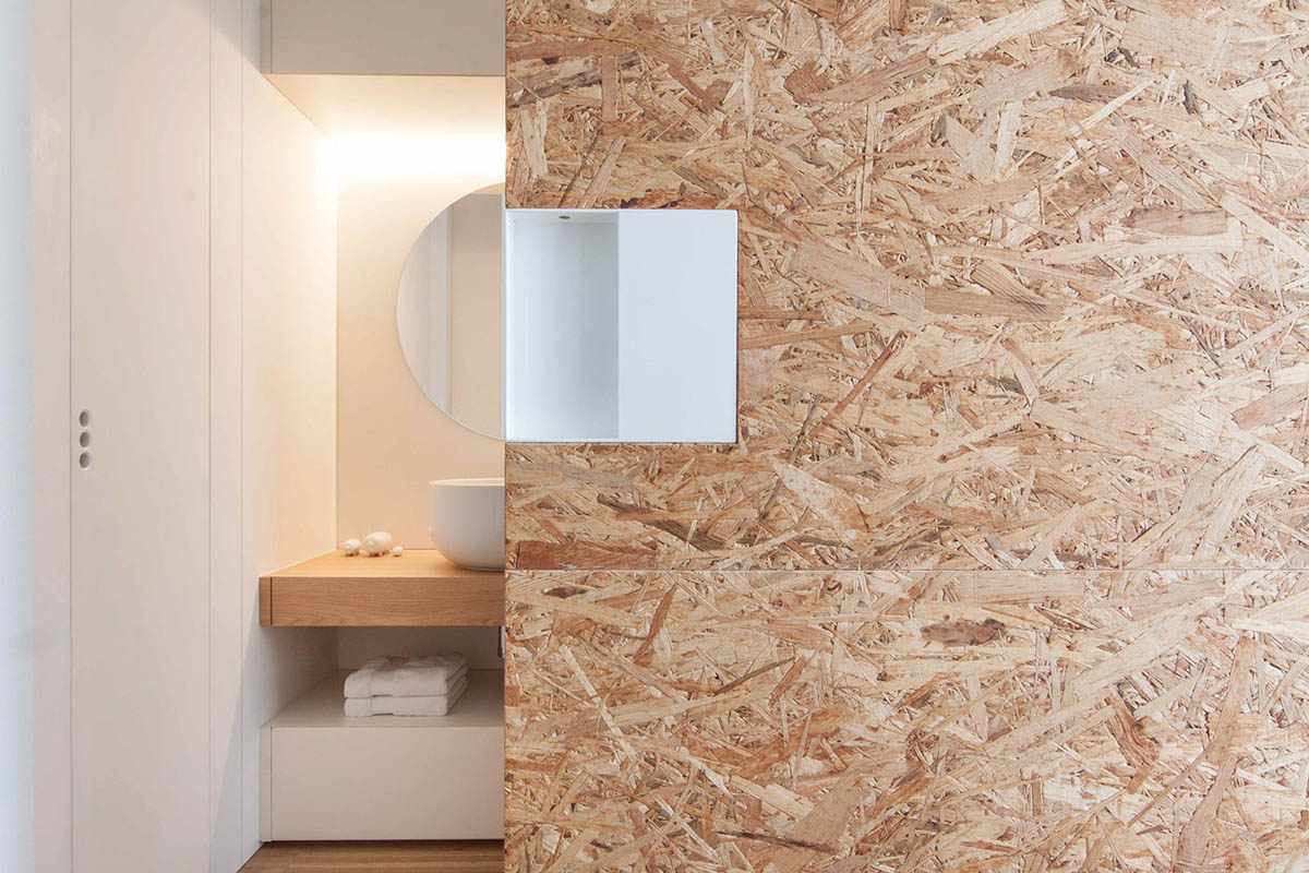
A peek behind another cork wall reveals a bathroom advantaged by wood. A shower drenched in white features a South-East Asian showering chair, this one in the form of an IKEA Frosta Stool. Minimalist plumbing in the shower leads to a simple and classic sink area, complete with circular mirror, standing sink and golden tap. A cork separating wall mirrors back the shower.
