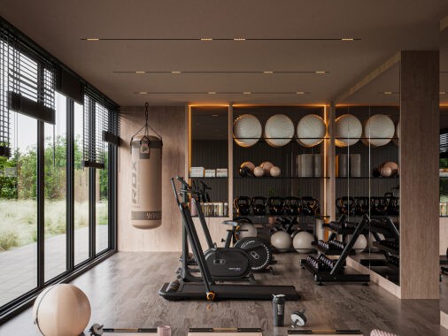
Concrete, an open floor plan, and lots of space define these three gorgeous spaces and they prove lofts don't always have to be cold and dreary. The first home featured uses chalkboard paint to highlight the raw feel of the space. Large windows and piped lighting make loft number two the perfect combination of modern and contemporary. Lastly, the third loft is a 3D design and is darker than the others. This home has large circular lighting and leather furniture.
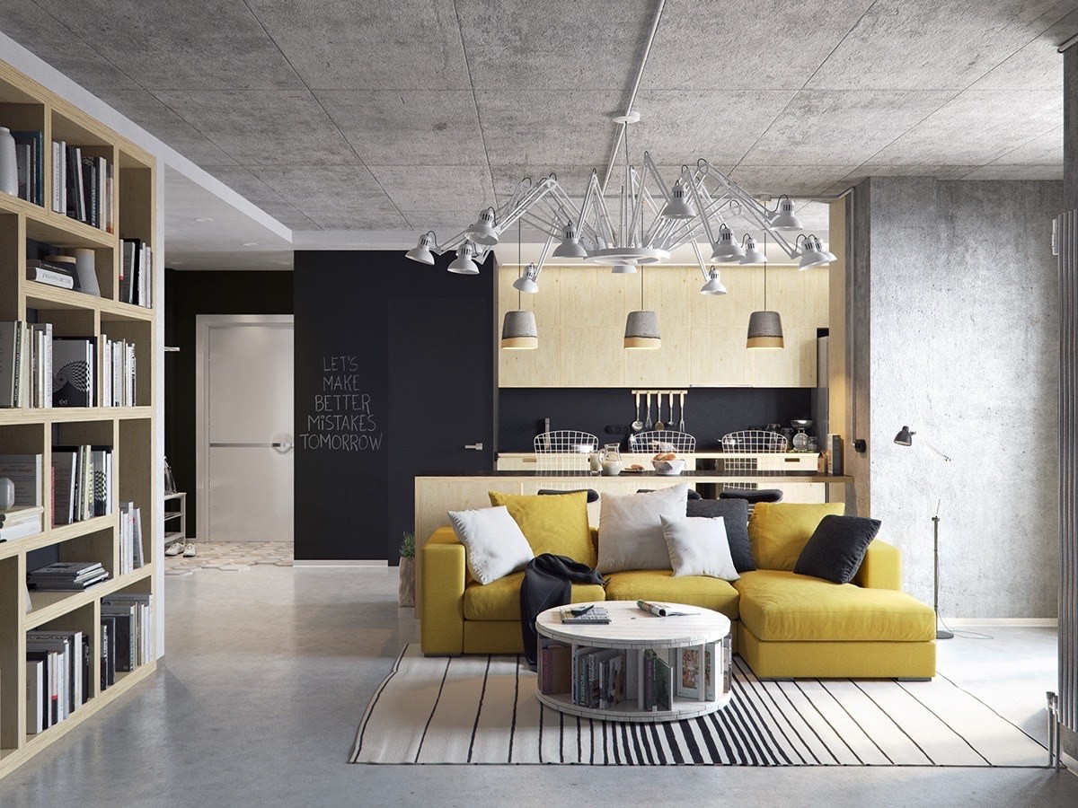
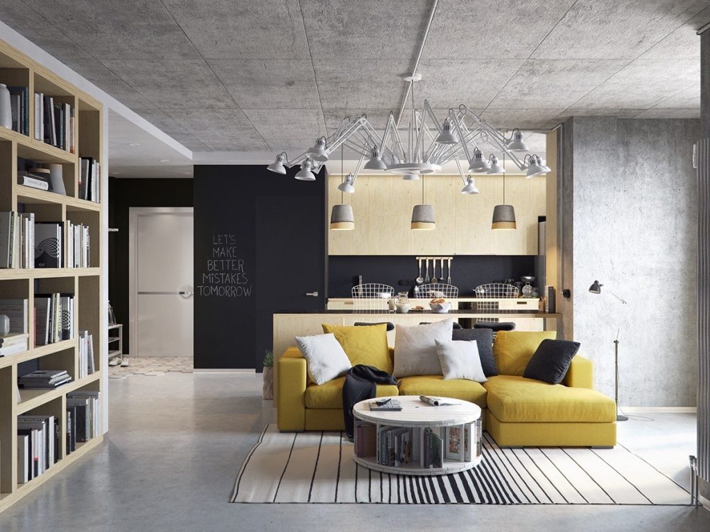
Visualized by Denis Bespalov, this loft uses sunny yellow to add a pop of color to the space. Concrete walls and floors are warmed up by natural wood cabinets in the kitchen and bookshelves.
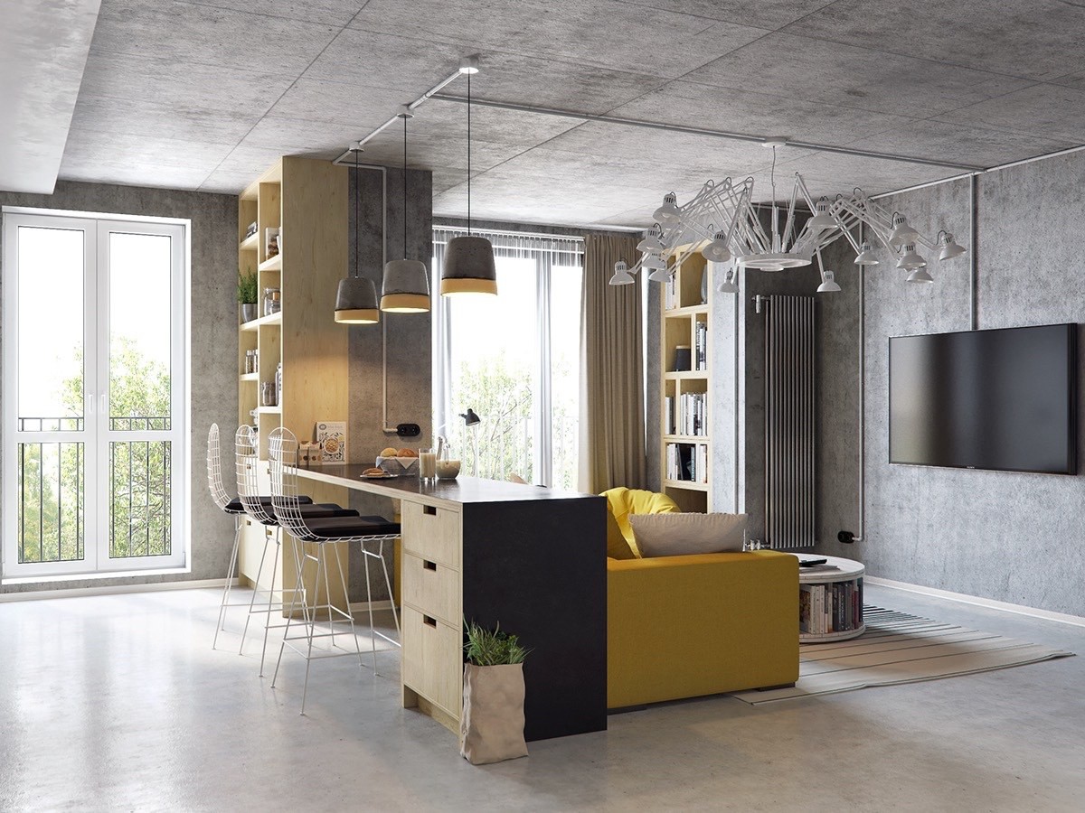
The kitchen bar sits perfectly behind the yellow couch. This makes watching TV while grabbing breakfast an easy task. A design like this also designates different living zones in a large space.
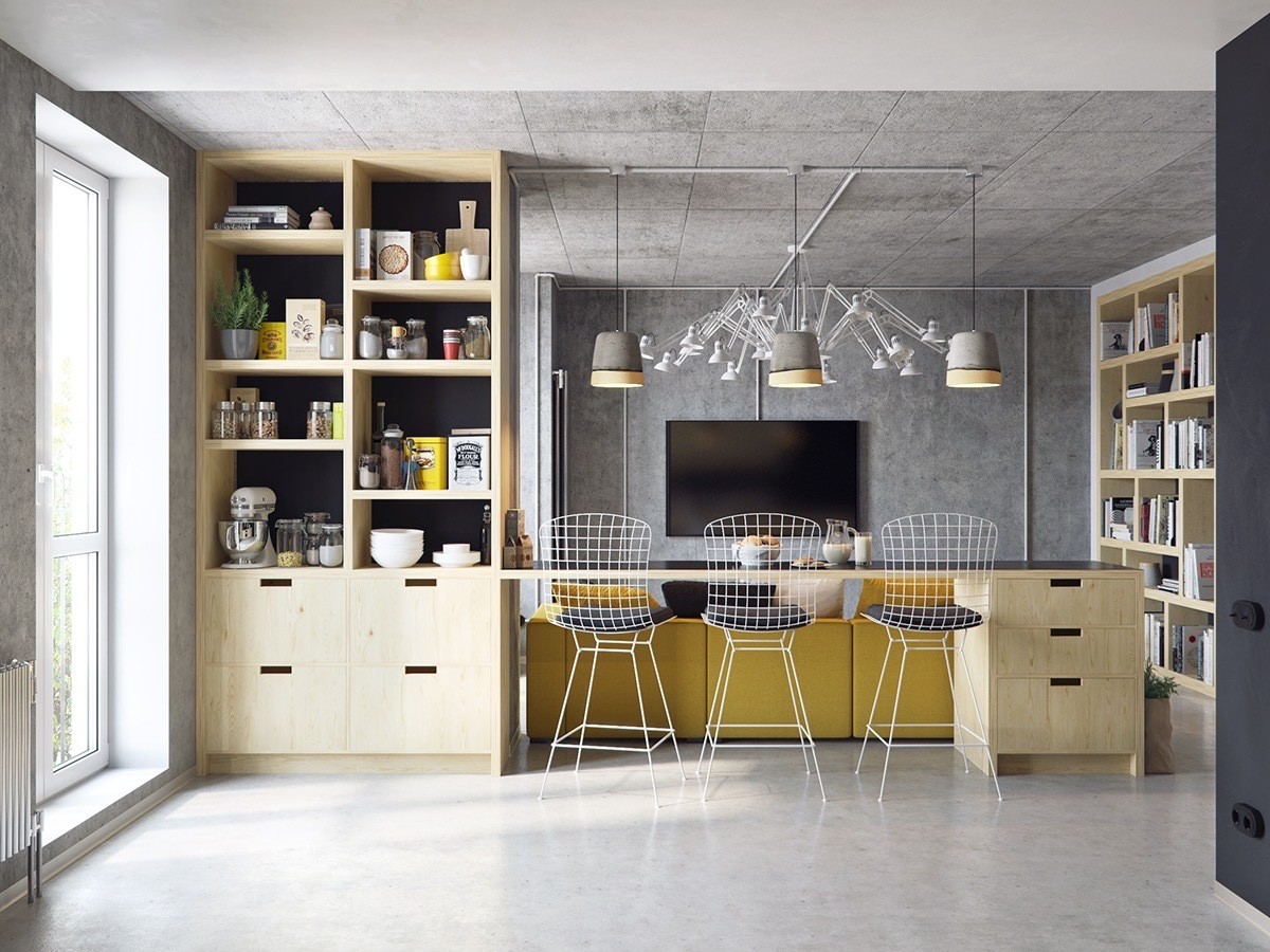
Keeping things wide and open, the kitchen shelving is designed without cabinet doors. You can see the different items artfully displayed. The designer carefully made sure that there was pops of yellow mixed in. The back side of the cabinet is also painted black to match the rest of the loft.
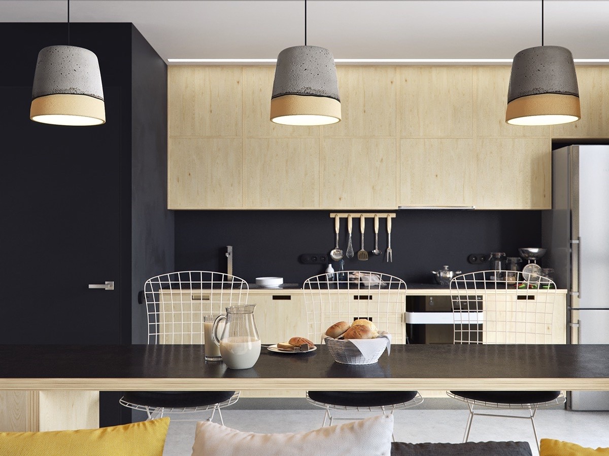
Black painted walls can sometimes be too dramatic and dark. In this home, the homeowners have the luxury of chalk paint! This fun accent adds life to the dark walls while still looking industrial chic.
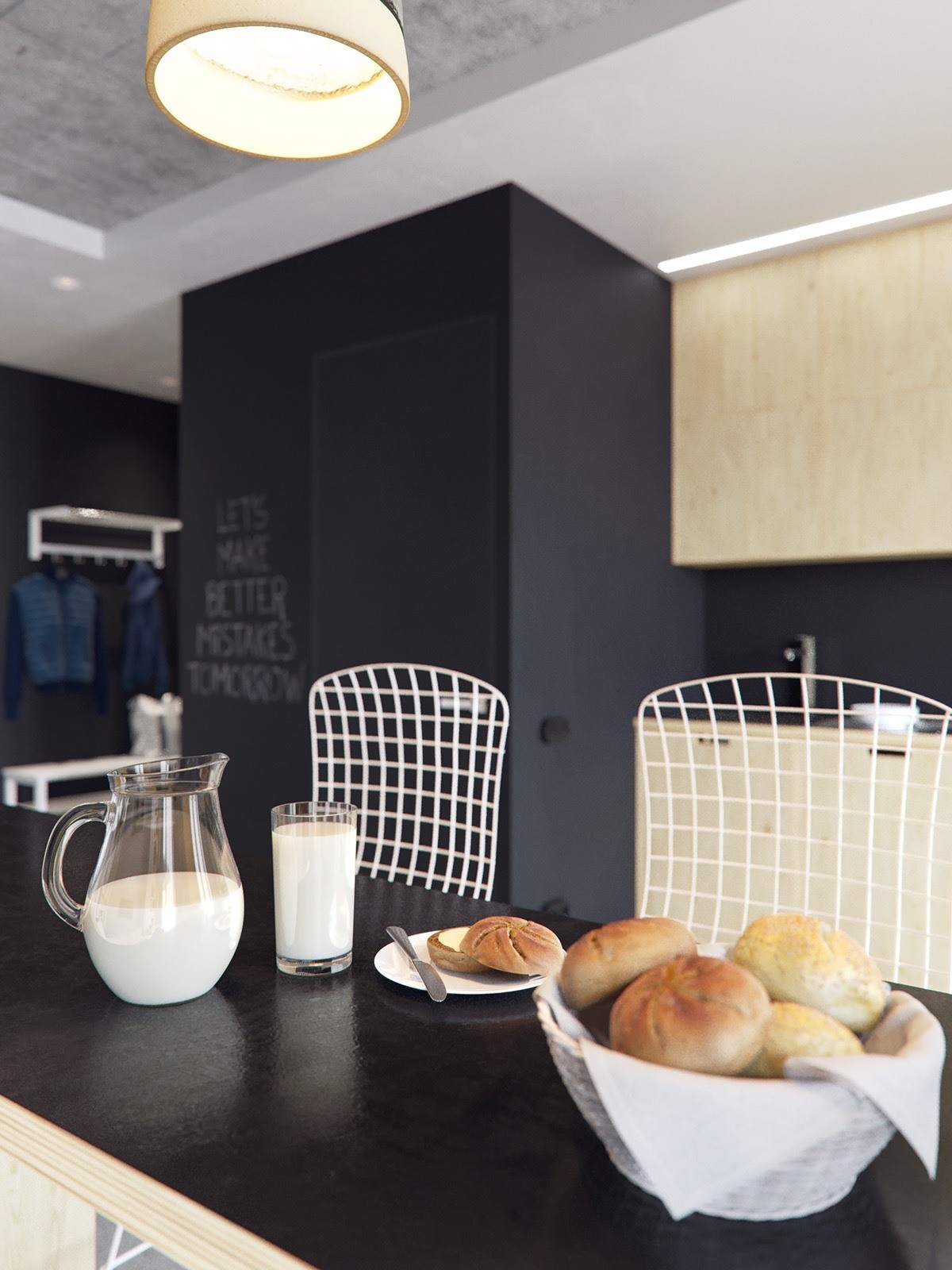
The white metal barstools lighten up the room and are perfect against the black walls. A yummy breakfast is ready to be enjoyed on this floating bar. In the background you can see the chalkboard being used.
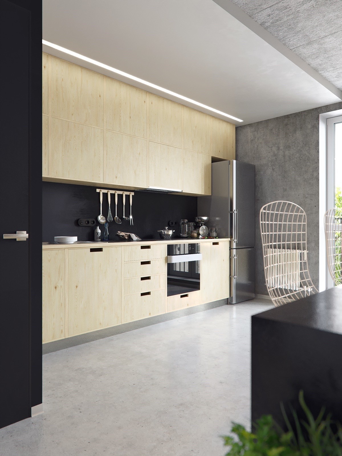
A large window in the kitchen lets in lots of natural light. The light wood of the cabinets looks organic and matches the rest of the raw feel of the space. A few stainless steel accents are kept out for visual interest.
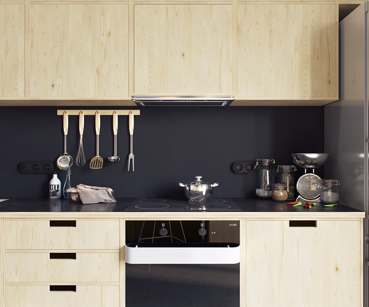
To not break up the darkness of the walls the outlets have been painted completely. This makes them hard to notice and does't interrupt the design.
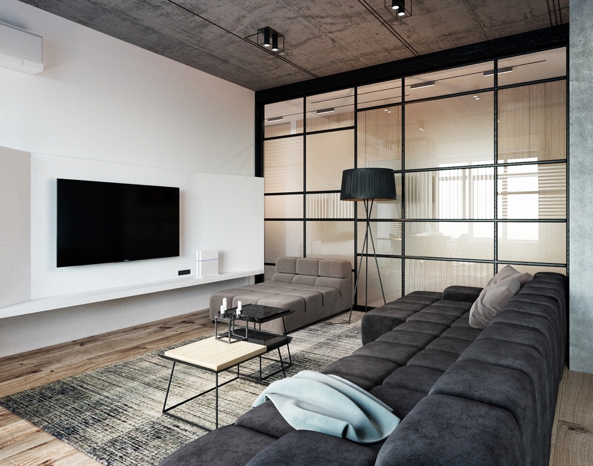
This loft is a bachelor's best friend. White walls marry wooden floors and concrete ceilings.
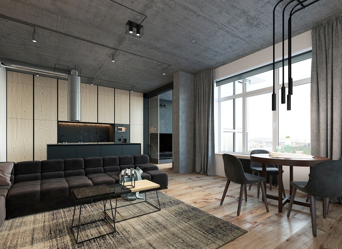
One of the most one-of-a-kind accents in this loft is the tubular light fixture above the table and chairs. Blending in, yet standing out, this light works well in this space.
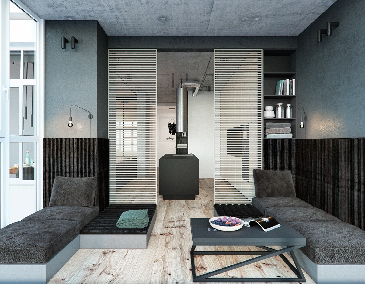
A sunroom off the kitchen welcomes natural light but stays within the same color scheme as the rest of the home. By not closing this space off, more light can flood the large living area.
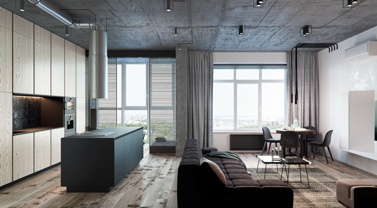
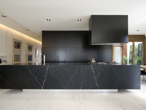
The kitchen island works in contrast with the rest of the cabinets. The cooktop is modern and the industrial exhaust makes a statement in the home. Gray oversized window treatments make the loft feel more lived-in.
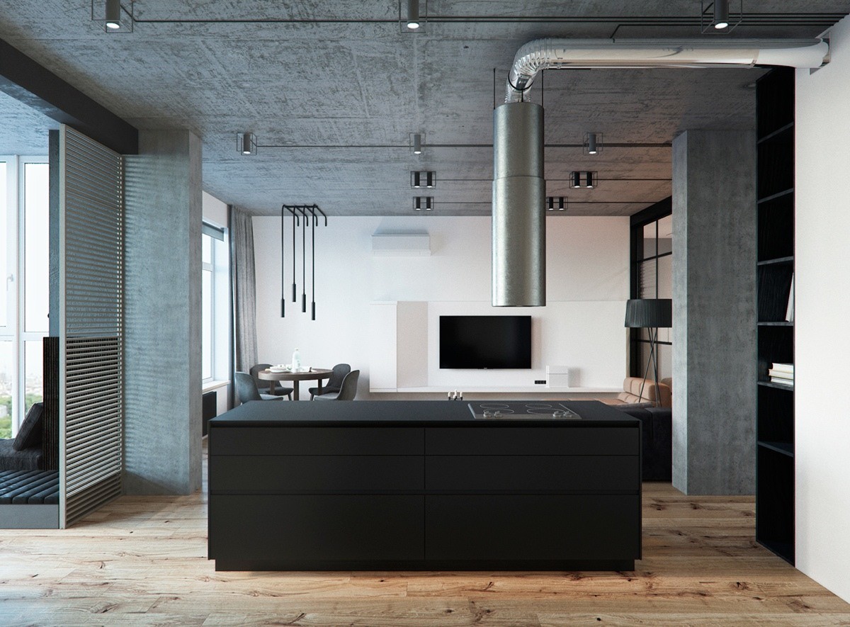
From this angle in the kitchen looking toward the dining space and living room, the exhaust lines up with the TV. This makes a play on lines and visually brings the room together in an interesting way.
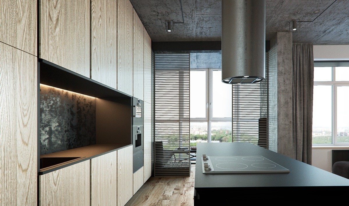
A textured backsplash in this loft breaks up the monotony of the wood grain cabinets. The under mount lighting makes it even more noticeable.
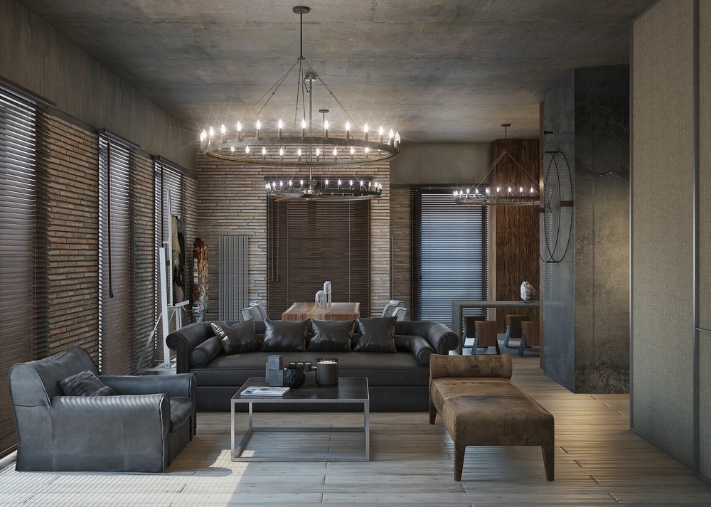
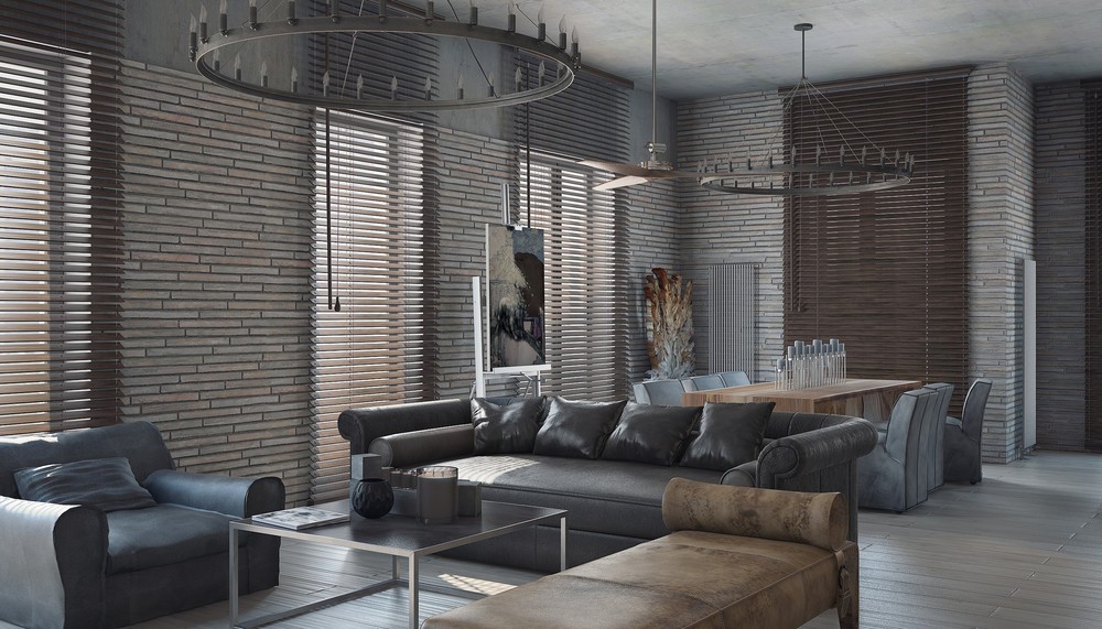
This dramatic home has special accents that make it custom for the homeowners. Instead of using traditional sized brick for the exposed walls, the brick is elongated. This adds an interesting texture to the living room.
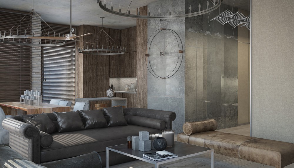
Round hanging lights give the dark loft an circular element. This shape is then repeated in the mounted clock on the wall. Each wall is adorned differently.
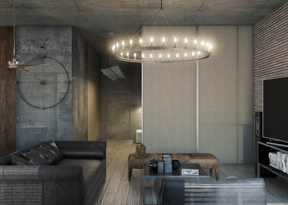
The rounded light fixture resembles a candelabra.Of course, the light can now be turned on with a flip of a switch. No need to light each "candle."
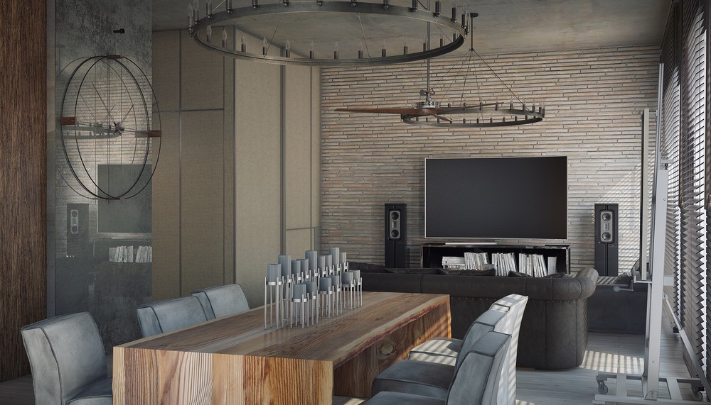
The wooden table is a natural element invited into this otherwise industrial loft. The table is simple, yet contemporary. Gray upholstered chairs and a candle centerpiece bring it together.
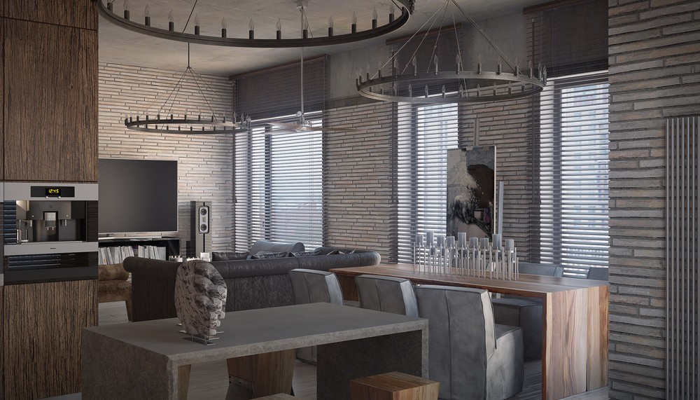
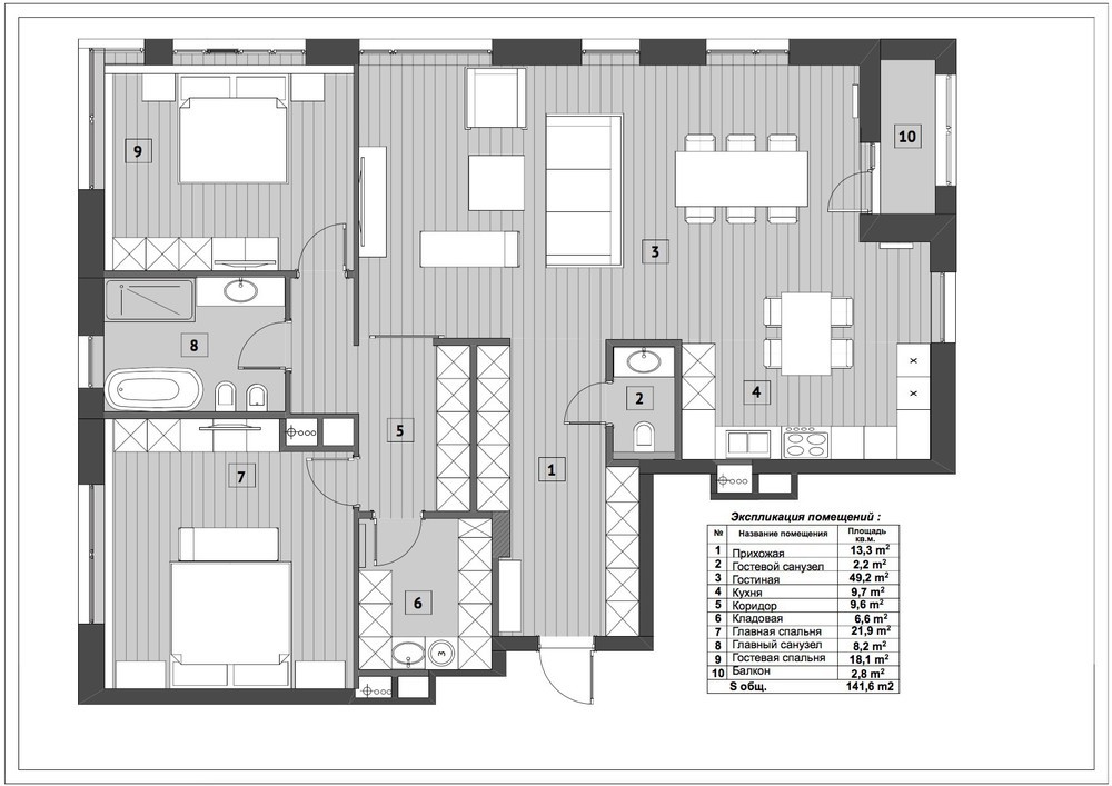
Different seating options help define the different living areas in this open loft. The couches are where the living space can be, the dining table sets the dining space apart, and the kitchen island lets you know you're now entering the space to prepare food.
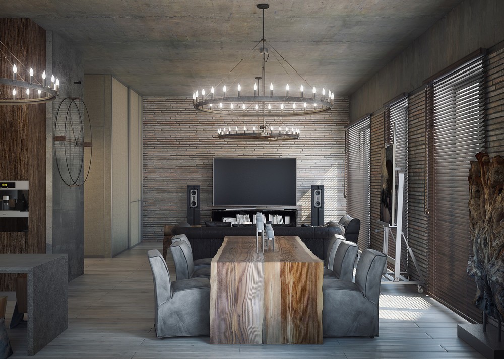
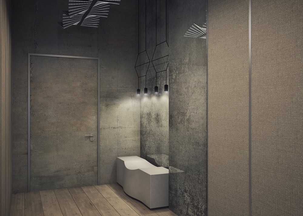
The lights reflecting off of the hanging chandeliers draw your eyes upward. The reflection of the light on the concrete adds more texture to the room.
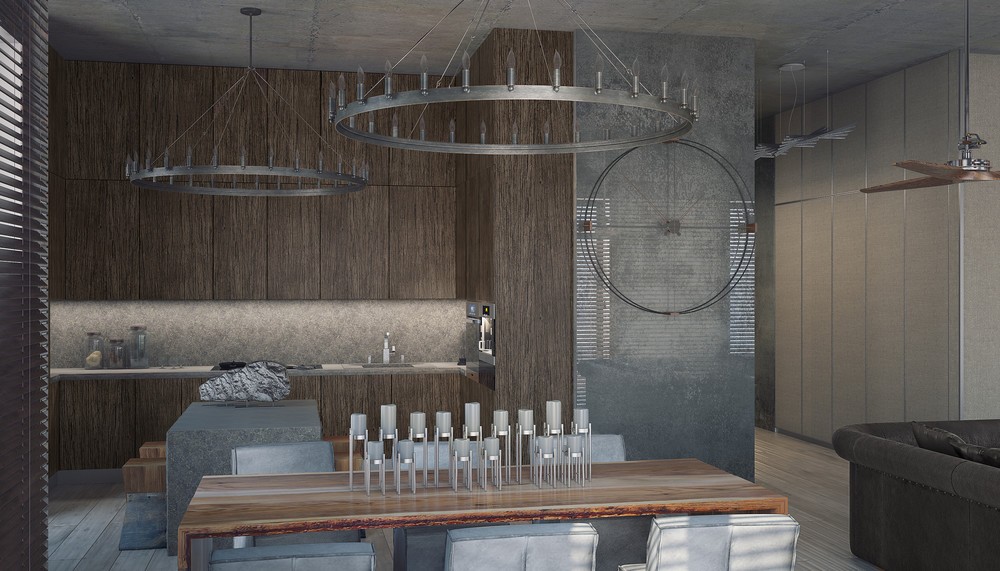
The kitchen is well appointed with lots of cabinet space and counter space. Instead of being bare, the designer left out three jars filled with food ingredients. This makes the space feel more inviting.
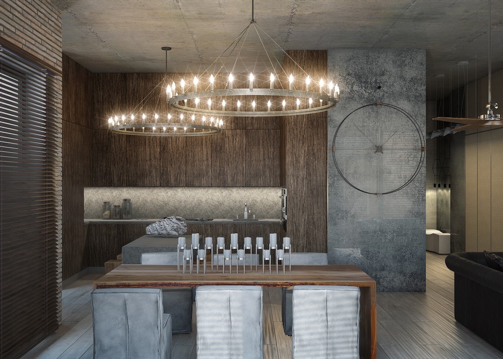
Candelabras are an interesting idea in this space. This lighting reflects an older time and then contrasts with the modernity of the reclaimed loft space.
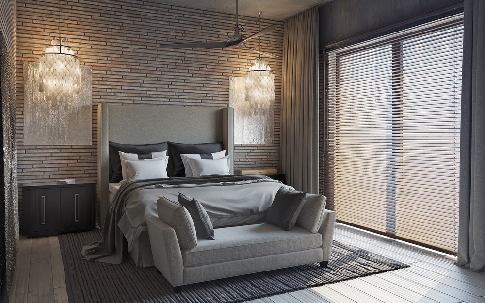
One of our favorite rooms in all 3 lofts, this bedroom is the perfect blend of masculine and feminine. The chandeliers are light and elegant while the elongated exposed brick feels more rustic.
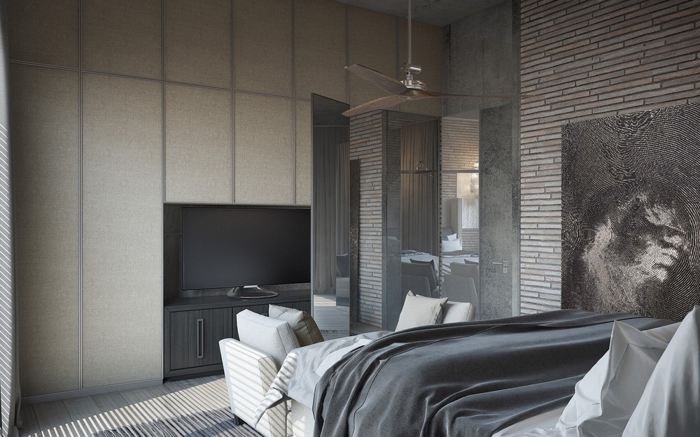
A soft loveseat is placed at the end of the bed for additional seating. The TV is builtin while closet space surrounds it.
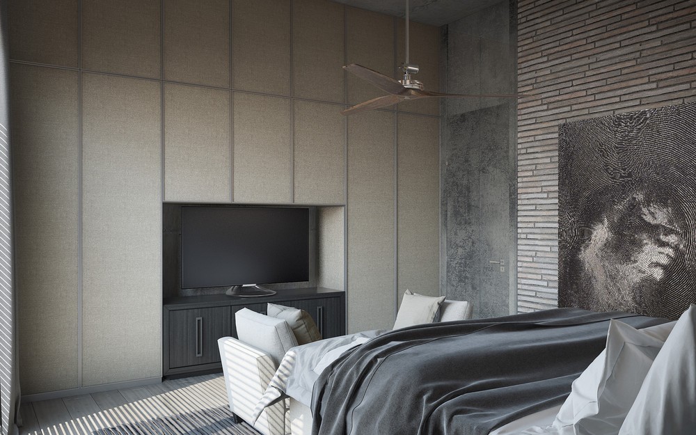
Scanning out a little further in this image, you can see there is a painting added to the right wall. This breaks up the brick design and adds more shape to the room.
