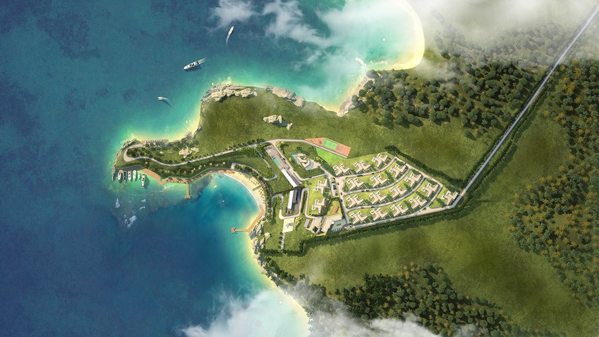
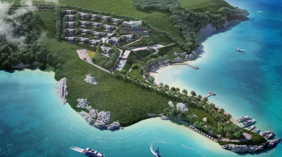
The creatives at Piril Kugu Architects have conceptualized an incredible resort development consisting of 72 villas, a hotel, and a number of luxury facilities together with the interior designers of Quark Studio. The development occupies a small peninsula overlooking the Aegean Sea, where playful boats dance across a backdrop of mist-enveloped hills and unbelievable sunsets weave an atmosphere of relaxation. A location like this deserves architecture that pays homage to every detail – and that's where this project excels. This post explores the interior of a small selection of villas, just a taste of the finest views this resort concept has to offer.
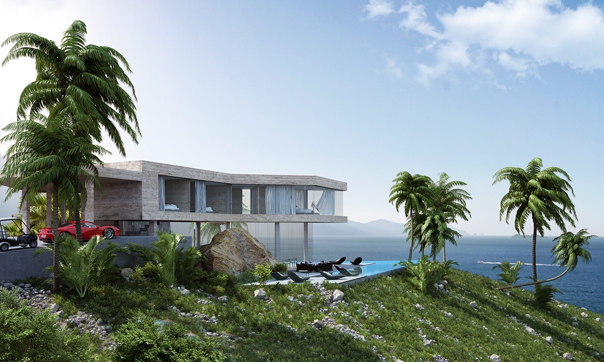
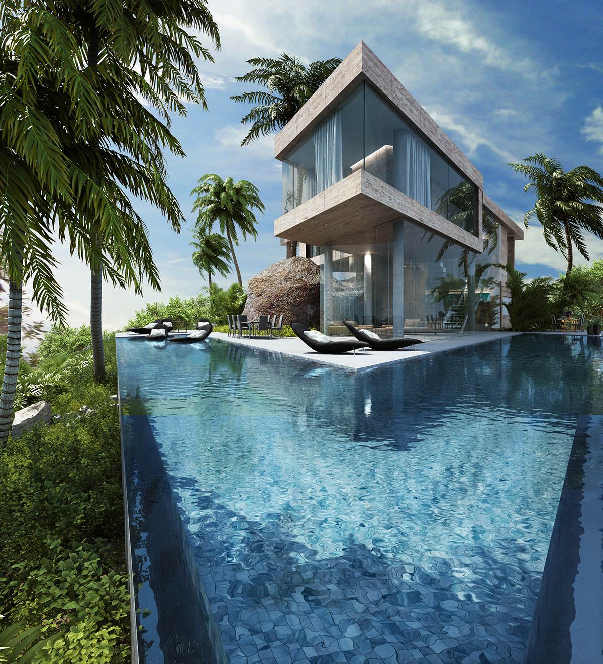
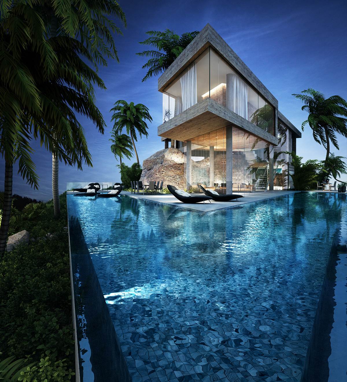
Let's start with one of the bigger standalone villas, a fine example of a building that embraces its environment without losing its own modern identity. A folded main volume feels impossibly light despite its concrete cladding, defying gravity thanks to the structural pillars that stud the glass-encased ground level.
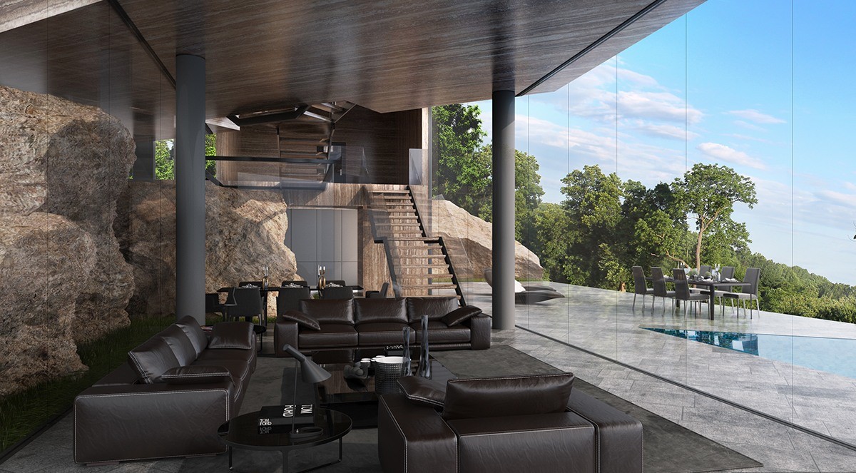
The entire villa wraps itself around an existing rock formation, fully explored by the winding layout and internal glass walls.
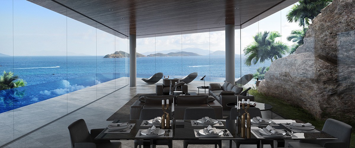
Relaxing here is almost like being outdoors with every element fully integrated into the property's aesthetic. A perimeter infinity pool even draws the clouds into the interior.
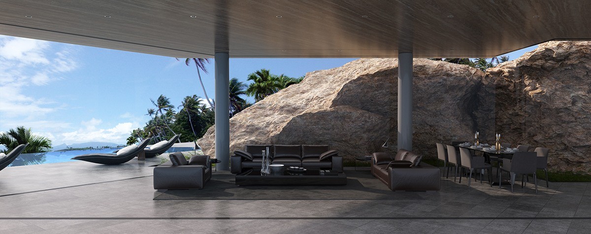
Shade is important in a Mediterranean climate like this one. The ceiling juts forward to cool the interior from one direction while the rock formations block direct sunlight from the other.
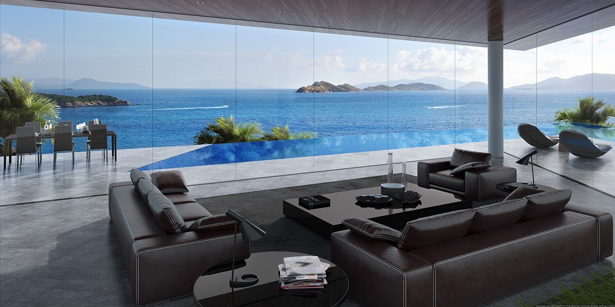
In regard to the luxuriously-appointed interior decor, every functional area embraces the landscape to the fullest – this casual social area enjoys a panoramic view.
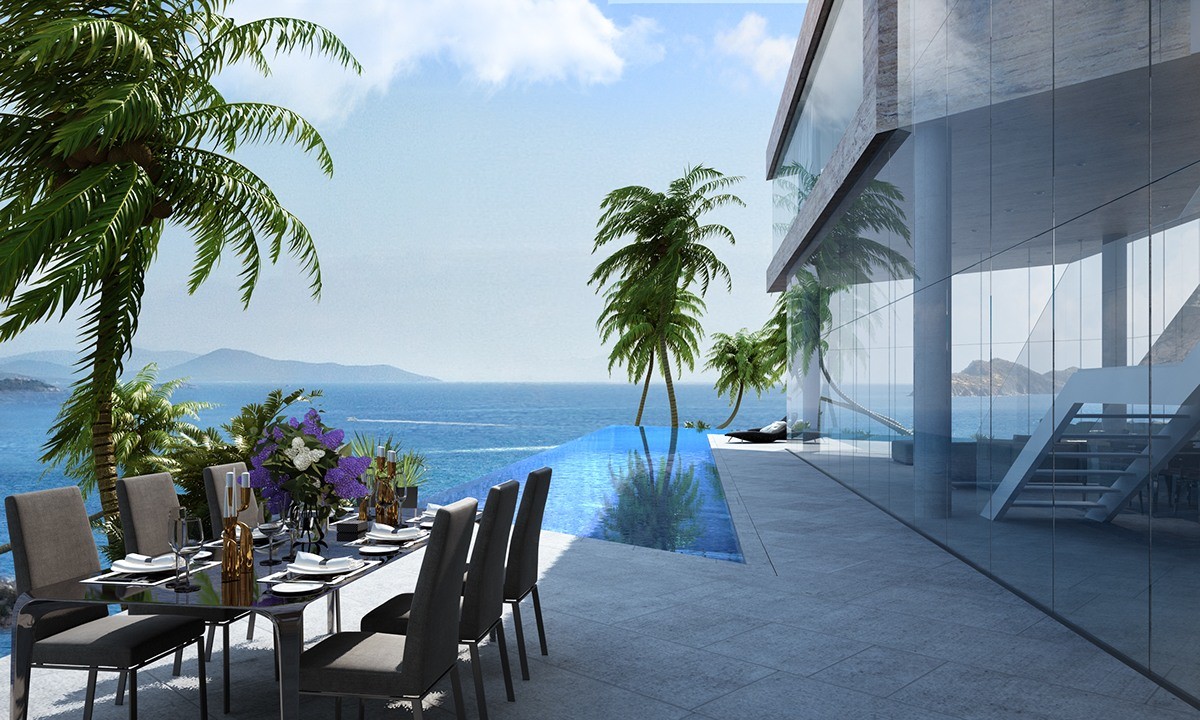
Outdoor spaces were meticulously planned as well. This dining area has a definite "on the edge of the earth" vibe.
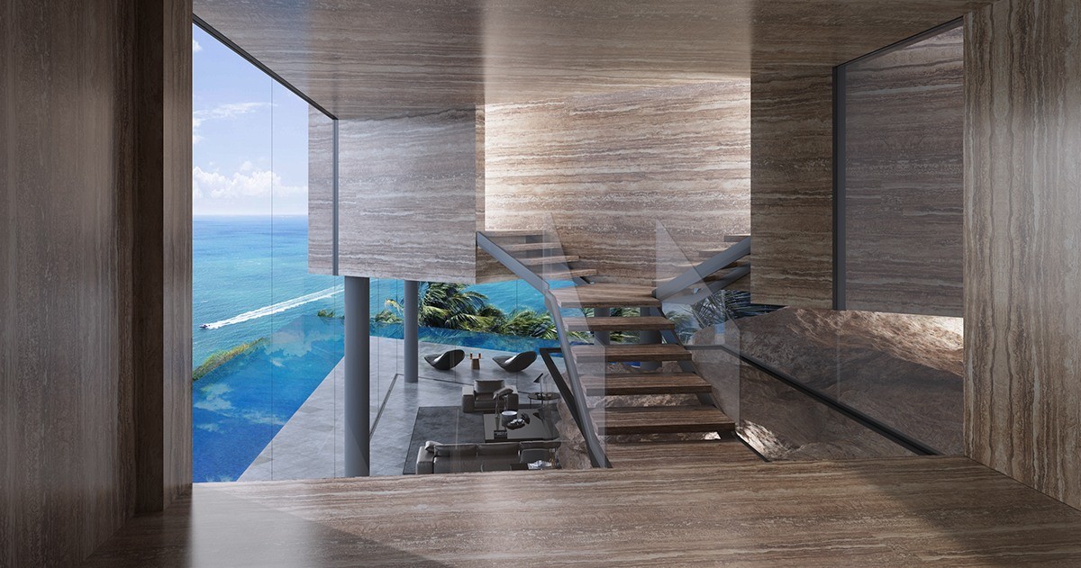
Valuable landscape features owe their preservation to the distinctive winding layout. Here, elevated stairs overlook a massive bounder below.
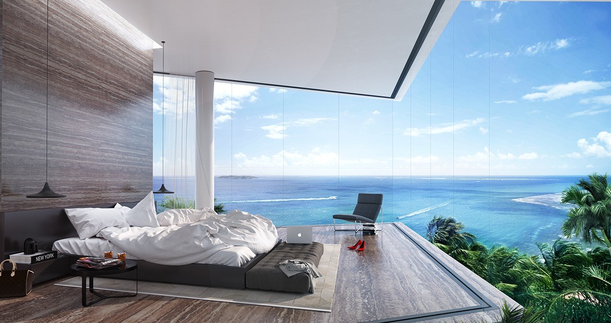
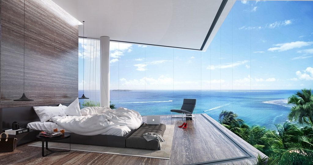
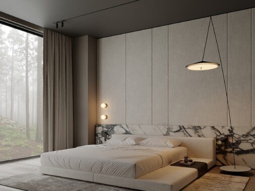
Of course, the bedrooms soak up the views as well. This one is surrounded on all sides by tall glass walls, with a freestanding headboard wall serving as the only exception.
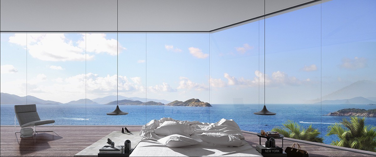
Low-profile furniture stays out of the way. While the lower level felt literally "down to earth" thanks to the rock formations, these upper stories are all about the coastal skyline.
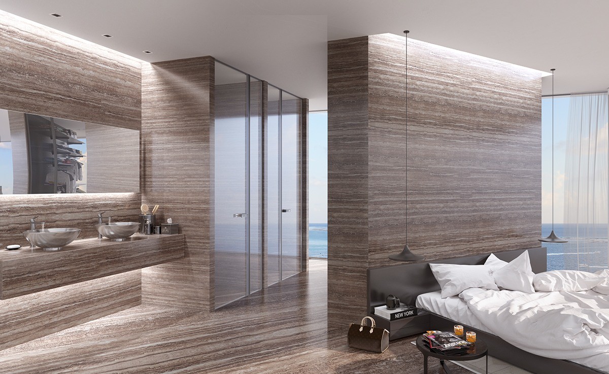
Behind the freestanding headboard wall, an open bathroom area transitions directly into a wardrobe. It's easy to see how this arrangement could make morning preparation even easier.
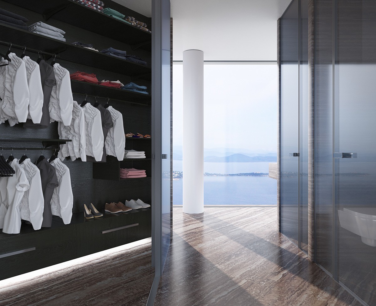
Even more storage space occupies the rear side of the headboard wall. Even this private nook looks out onto the Aegean Sea.
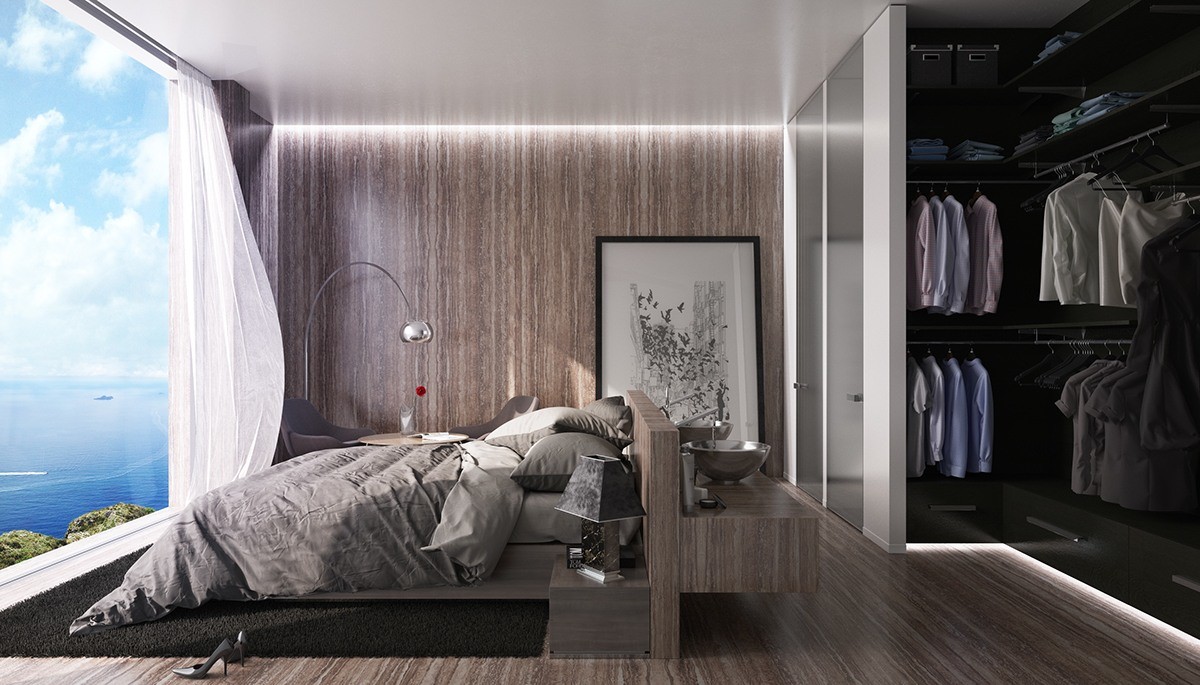
This additional bedroom adopts many features from the previous space, but smaller and more compact. A pair of sinks makes use of the space on the opposite side of the headboard.
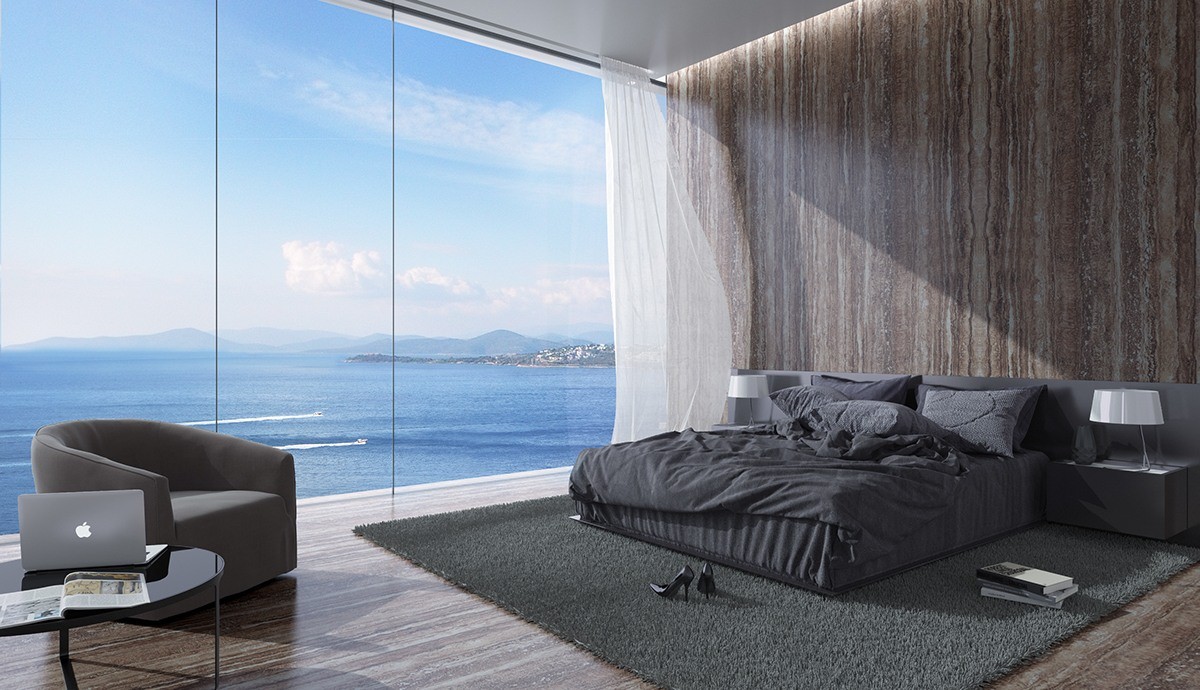
Greyscale furniture allows the sea to take center stage in this final bedroom of the first villa's tour.
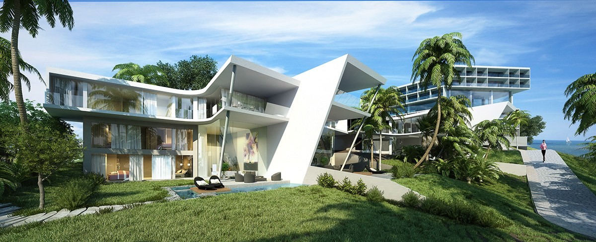
While the previous villa featured a very simplistic form, this one makes a big impact with sharp angles and unexpected curves. Each structure houses multiple units contained within offset L-shaped volumes, one volume slightly taller than the other.
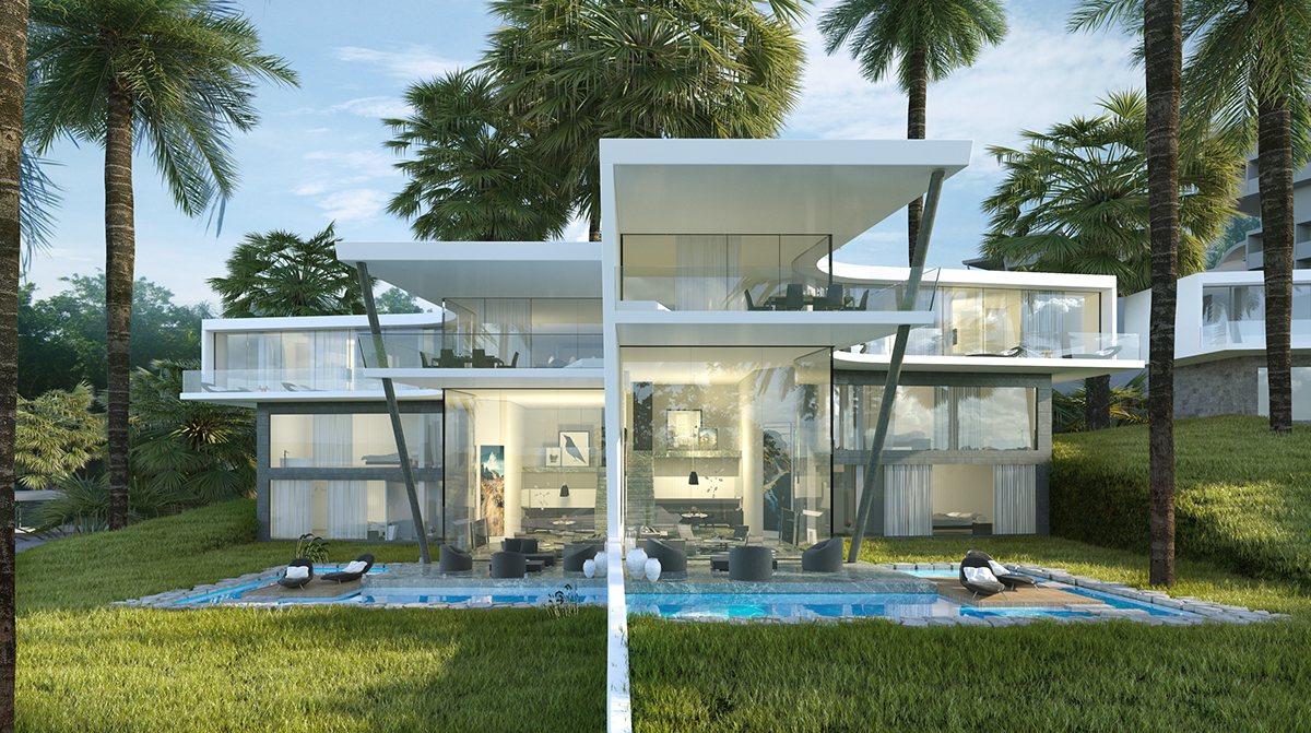
Each half of the villa occupies a different plane, clearly split down the middle. The dividing wall actually continues through the yard to enhance privacy between each pool.
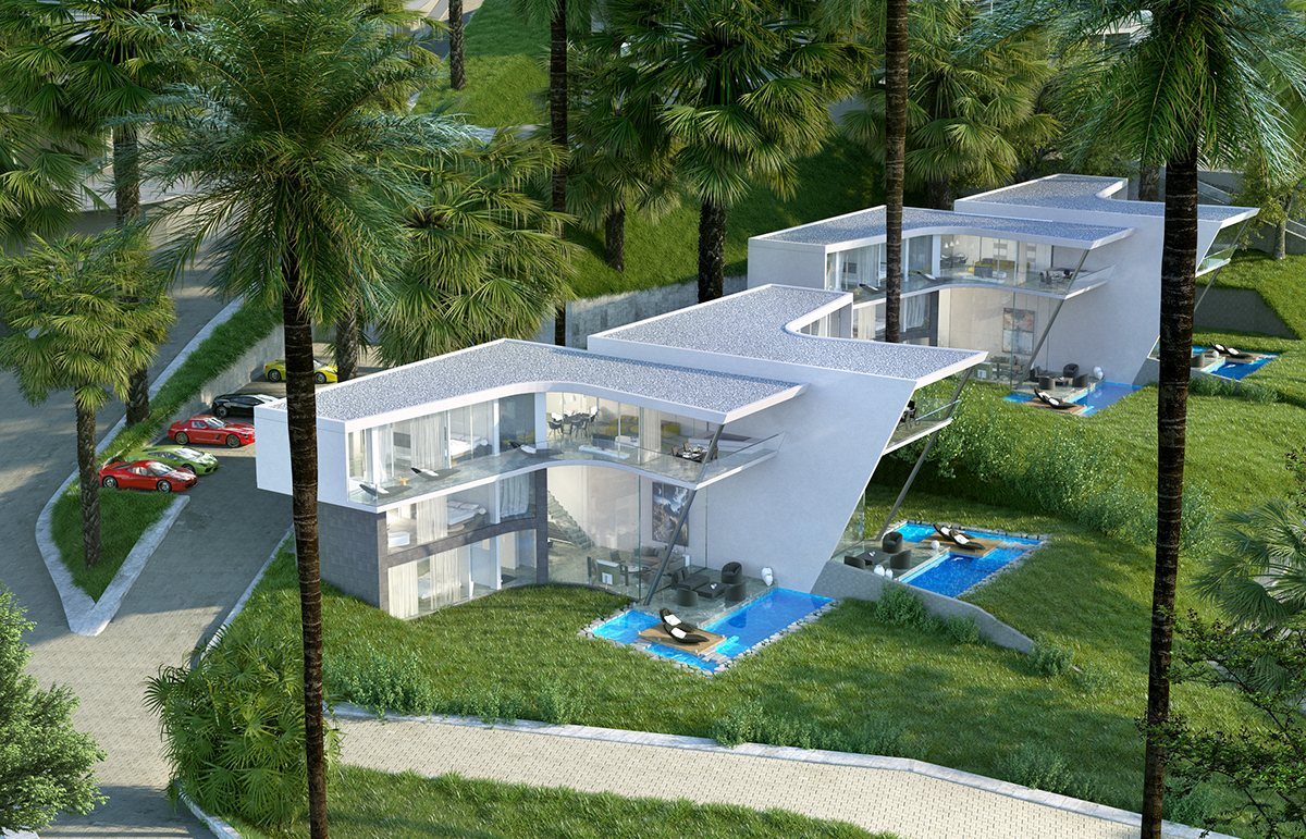
These structures are not quite as private as the standalone retreat featured earlier. Public areas face directly toward the path outside but private areas have the benefit of a more shielded angle and curtained walls.
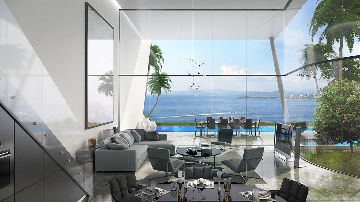
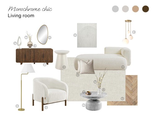
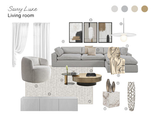
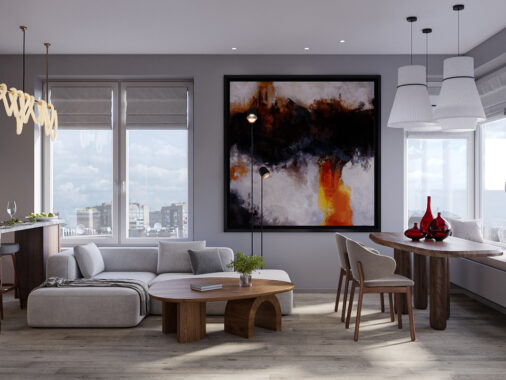
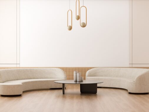
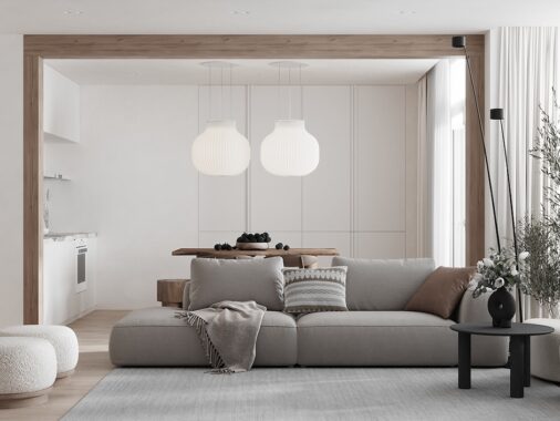
Each interior uses a different decor theme, mostly tending toward neutral colors and tasteful modern furniture.
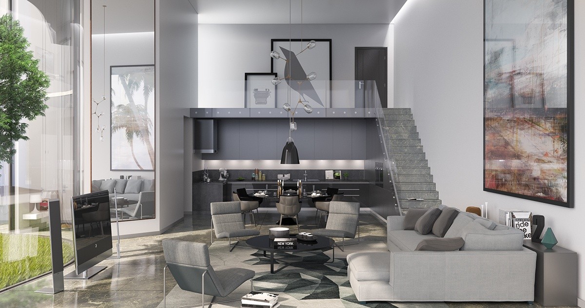
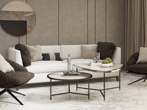
Furniture echoes the shape of the architecture. In this interior, the furniture adopts crisp angles and strong vertical lines.
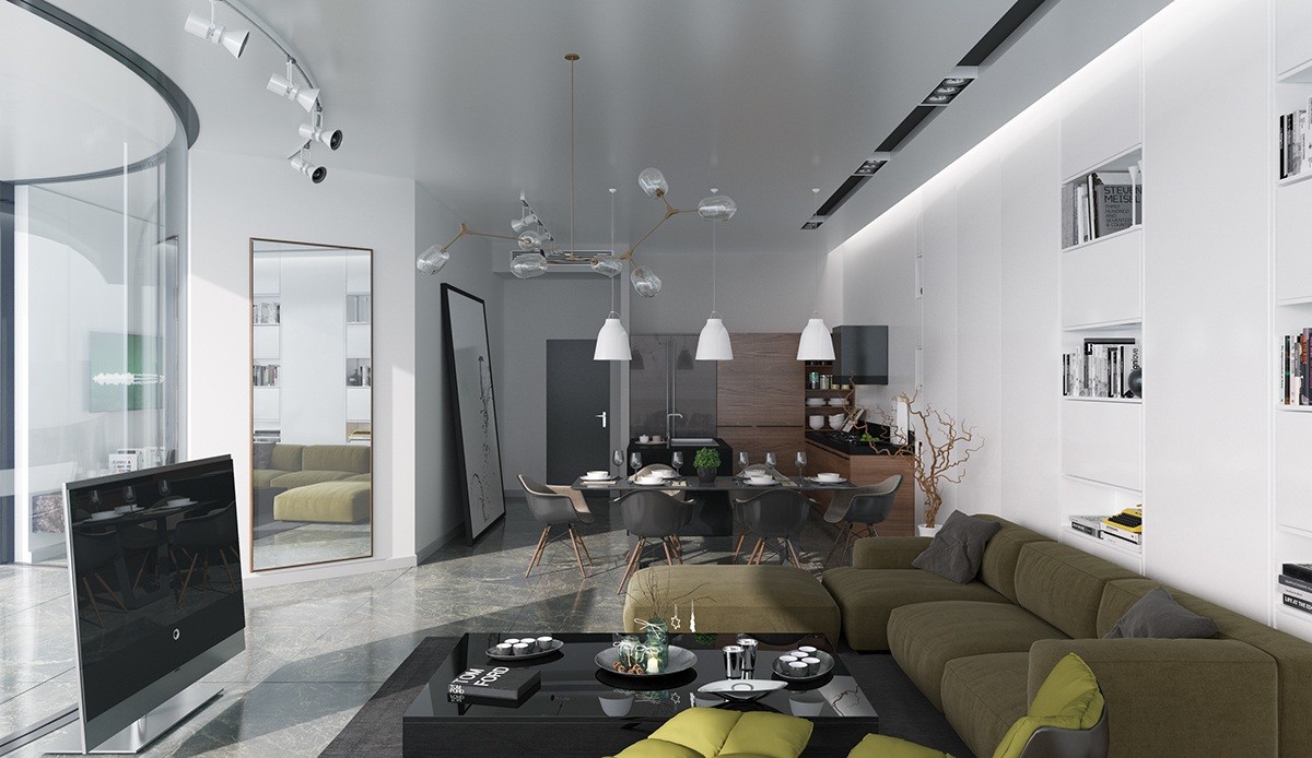
This one utilizes rounded forms to bring out the distinctive curvature of the large glass window. Eames chairs, a Lindsey Adelman chandelier, and a plush overstuffed sofa all forward the theme.
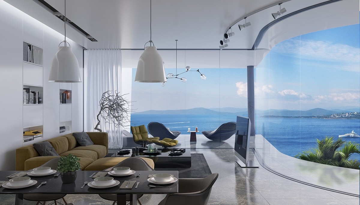
Curvaceous balcony lounge chairs appear to look out onto eternity. Imagine enjoying a morning smoothie as the boats drift past!
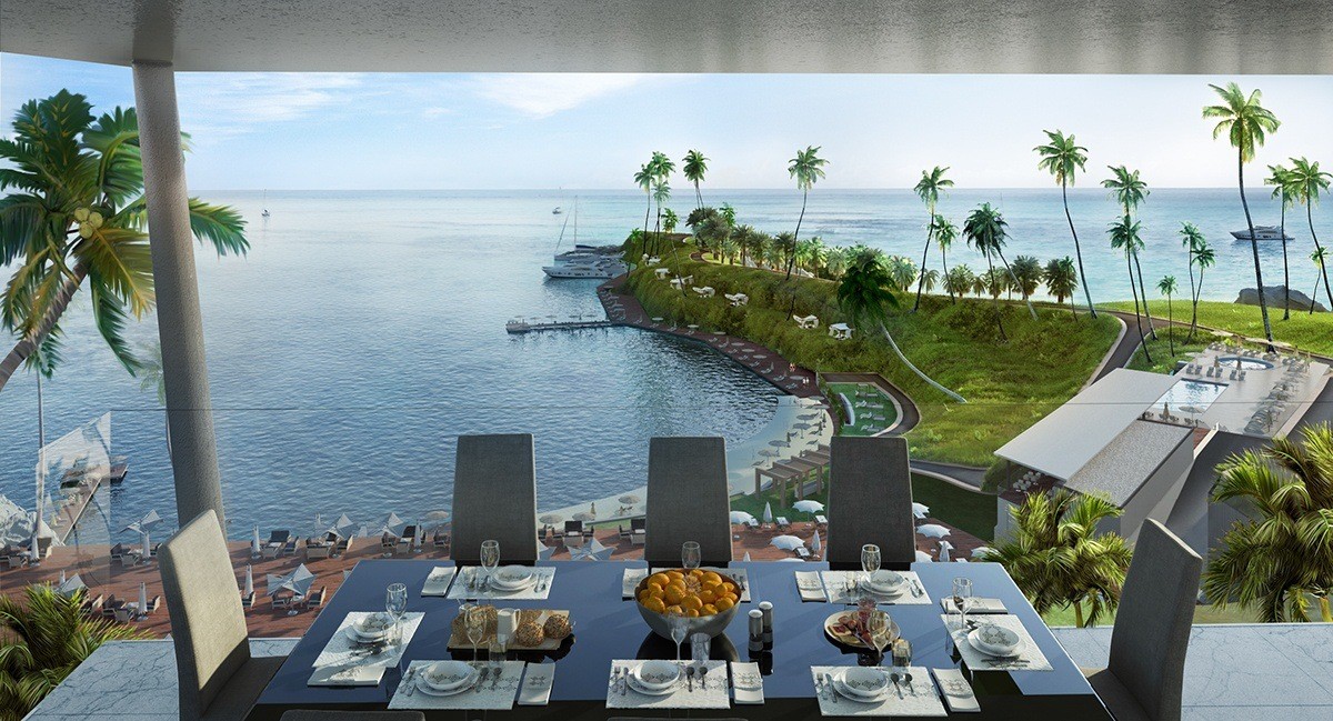
From the balcony dining tables, it's possible to watch the other resort guests as they go about their day. It's surely an energizing scene.
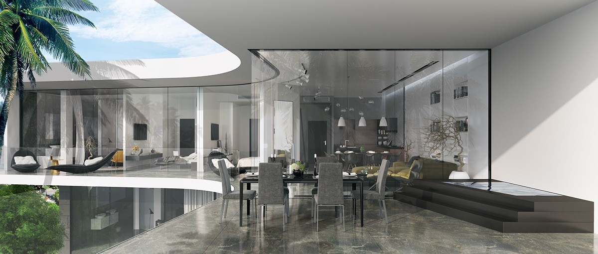
Nothing beats spending time in a completely unrestricted interior (especially one with such a nice view) but sometimes privacy is preferred. Every room is outfitted with a curtain.
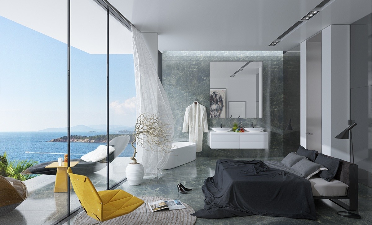
Although these bedrooms are more compact than the ones in the larger villa, they're no less luxurious. Sleek stone surfaces feel cool on the eye and even seem to adopt some of the sea's blue aura.
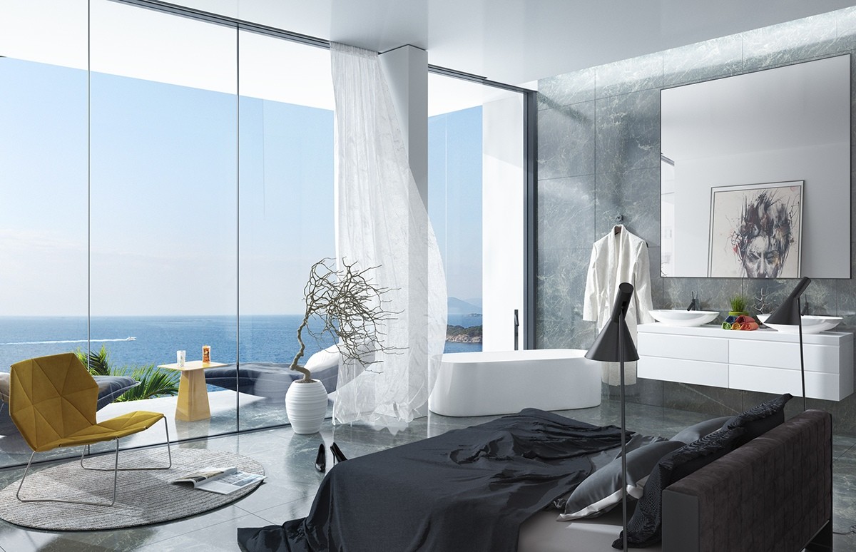
Near the window, a freestanding tub grants endless daydreams without necessitating a trip outside of the suite. The oversized mirror makes cleaning up for a night on the town even easier but also expands the perceived size of the room.
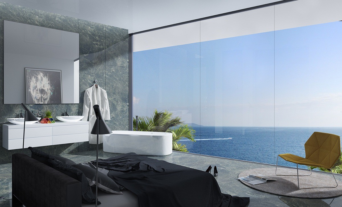
Here's another take on the same design but without the pillar. Even the painting in the mirror has been inverted for darker appeal – both concepts look fabulous.
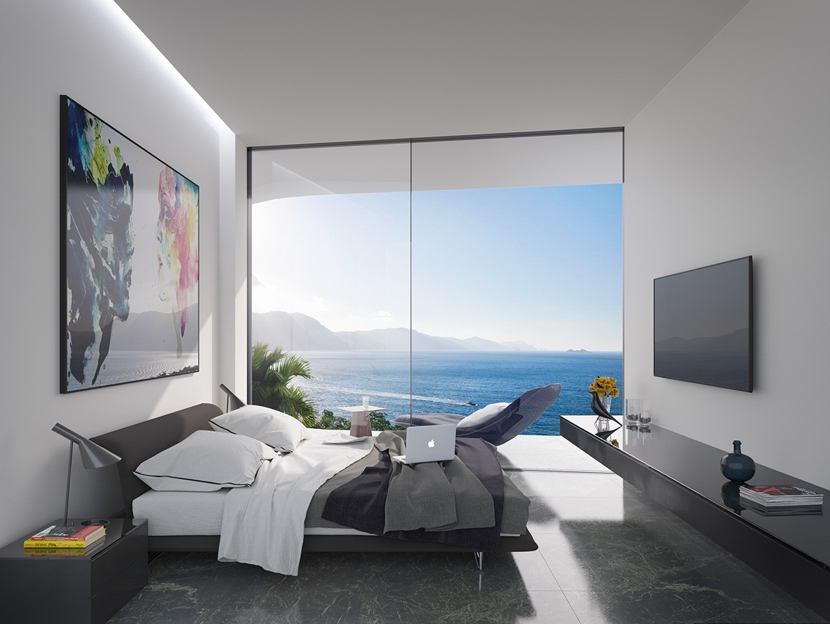
Unlike the first property featured in this post, these bedrooms don't have the luxury of a panoramic view. Instead, the designers created visual interest with artwork in complement and contrast of the world outside.
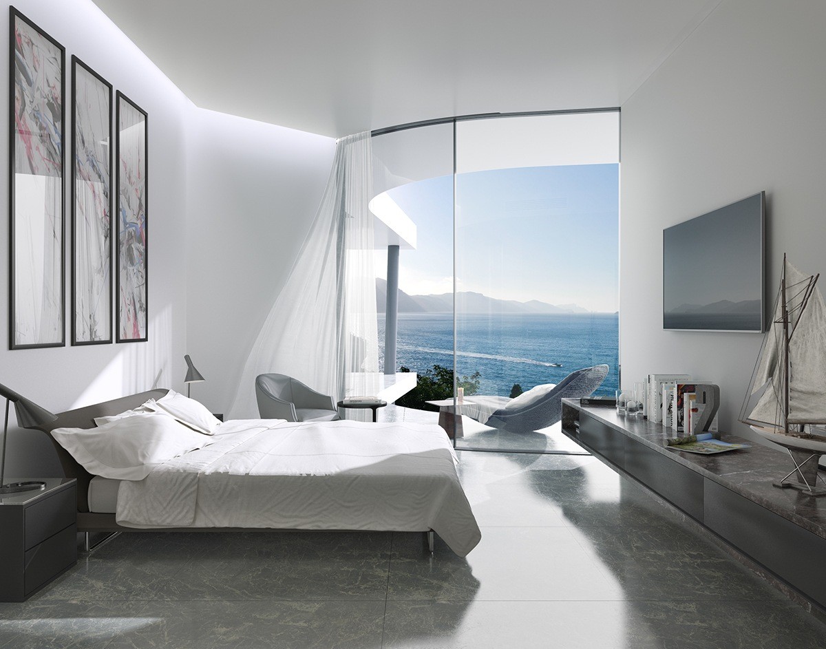
Notice the difference in architecture. The previous room used straight lines whereas this room slightly angles toward its beautiful curved window.
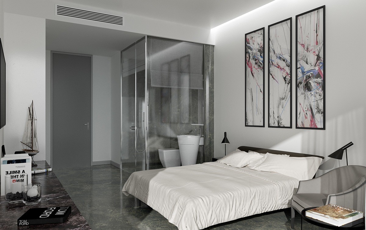
Rather than a freestanding tub, the smaller rooms feature a glass-enclosed shower that still offers a little bit of a view through the window across the room.
