Sometimes when you have children it can be difficult to design a stylish home that's accommodating. This beautiful three bedroom and two bathroom house doesn't skimp on chic! Designed by Iryna Sotnikava from Minsk, Belarus, this home utilizes grays, whites, and yellows. After you look through these exciting images of the home, you'll learn that you only need one bright accent color to bring excitement to a space. Why not make that color a vibrant yellow? From the living room with a yellow banana throw pillow, to the master bedroom which has a yellow painted closet door, you'll find sunny surprises at the turn of every corner!

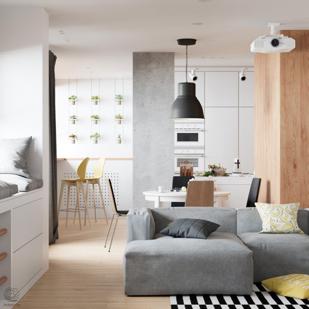
Throughout this gorgeous home the main colors used are gray, yellow, white, and black. Occasionally in the children's rooms other colors will be utilized. In this photo, you can see the wall art in the kitchen. Potted plants hang in lines and give the space another color, green!
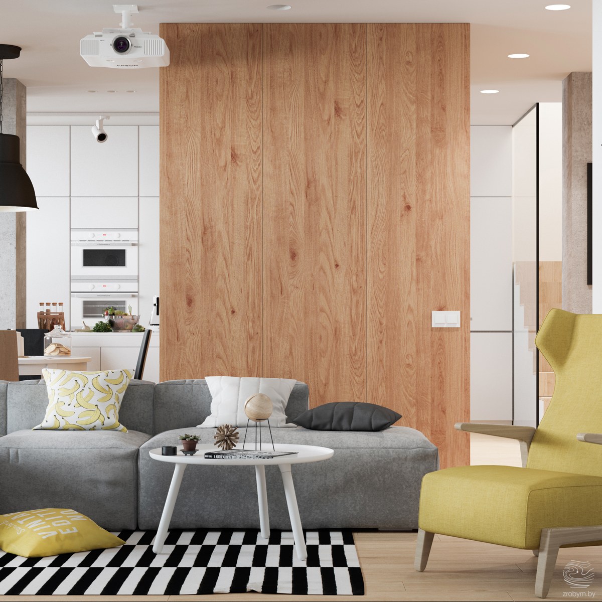
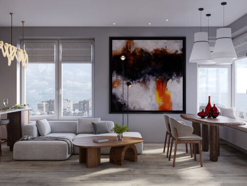
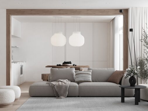
This living room is open to the kitchen and allows the whole family to be in one space. The more serious use of colors, like grey, and black, is lightened up by the yellow accents. The bright yellow armchair compliments the gray couch well. Also, the banana throw pillow adds even more charm!
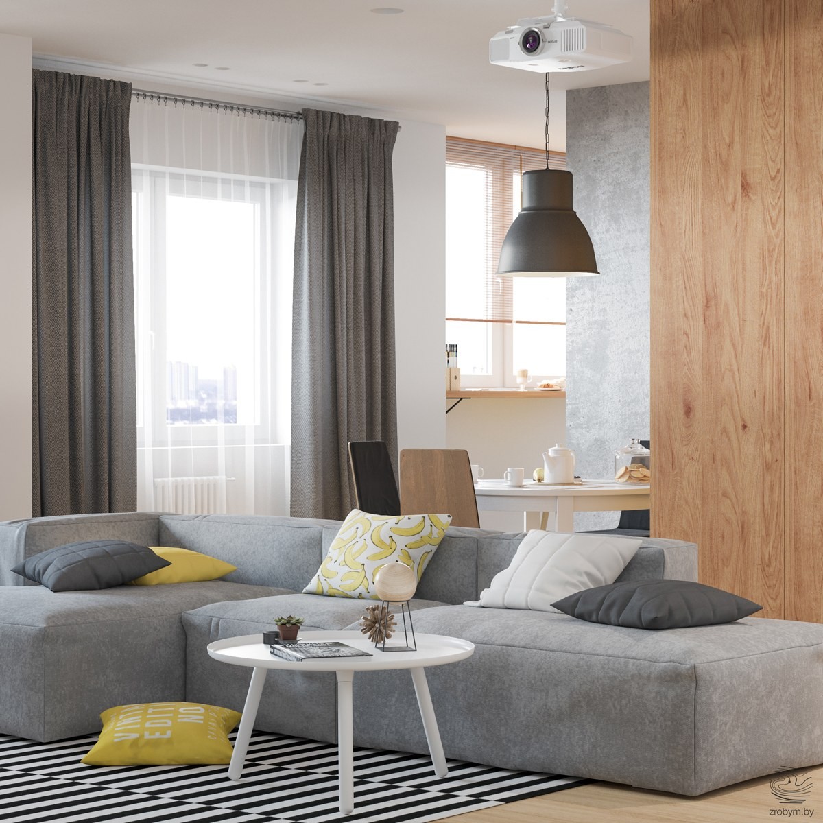
The low-back couch makes it easy to see into the kitchen and keeps the space from feeling stuffy. The design of the couch allows for several people to be sitting or two sleeping on it. Using throw pillows which are a darker hue than the color of the couch adds depth to the space.
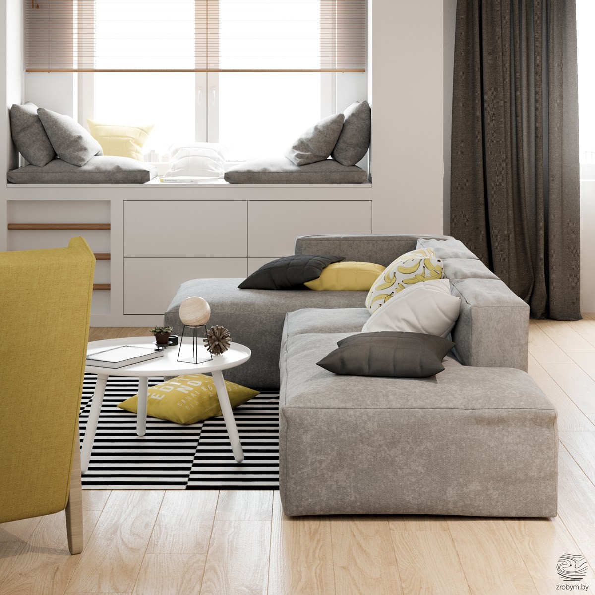
The built-in window seat is a fun way to get the kids involved in the home decor (or yourself!) Wooden bars allow you to climb to the top and cuddle up with your favorite book. It also adds extra seating if you're planning a big event or movie night. Keeping the window seat the same as the couch in terms of color make the room cohesive.
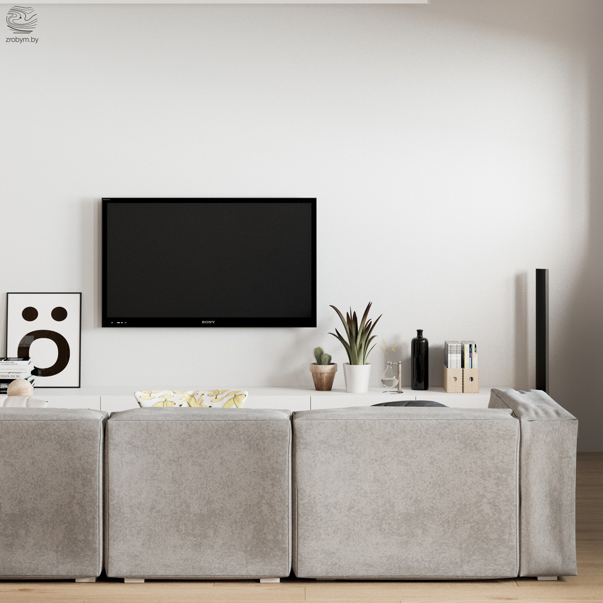
There's not a lot of fluff above the flat screen T.V. A simple art piece in black and white and a few trinkets laid out on the media console is all you need. When in doubt, think less is more.
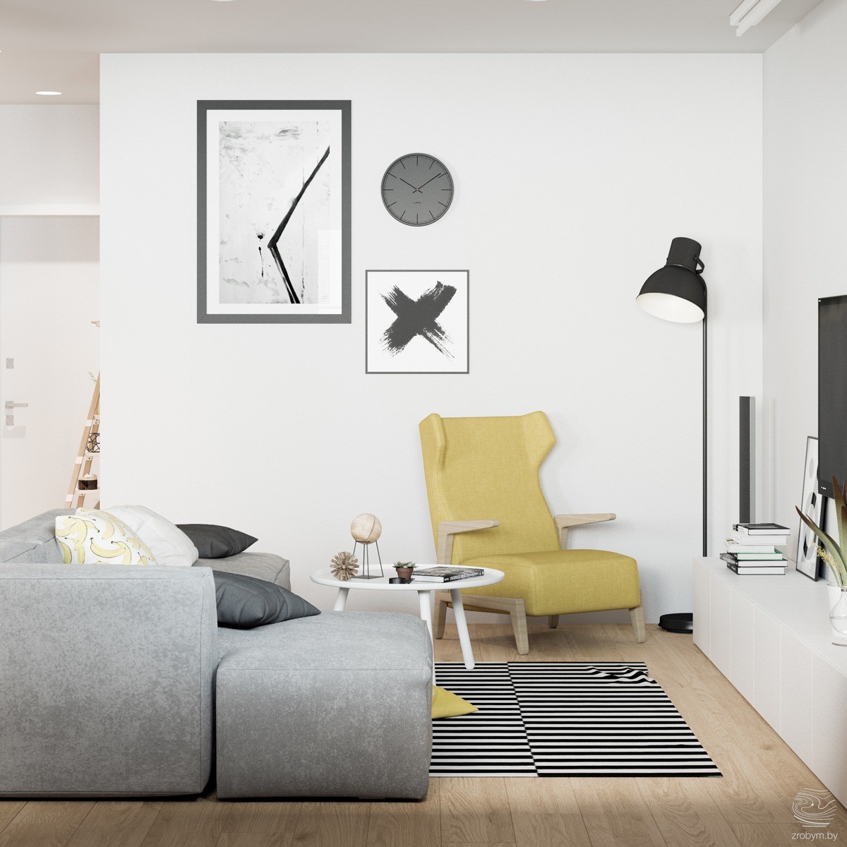
How do you design around a yellow armchair? Very simply. This living room feels bright because the colors are balanced. Instead of using busy prints or colored artwork, the designer has chosen to embrace the monochromatic look. By limiting the artwork, the yellow armchair is able to steal the show.
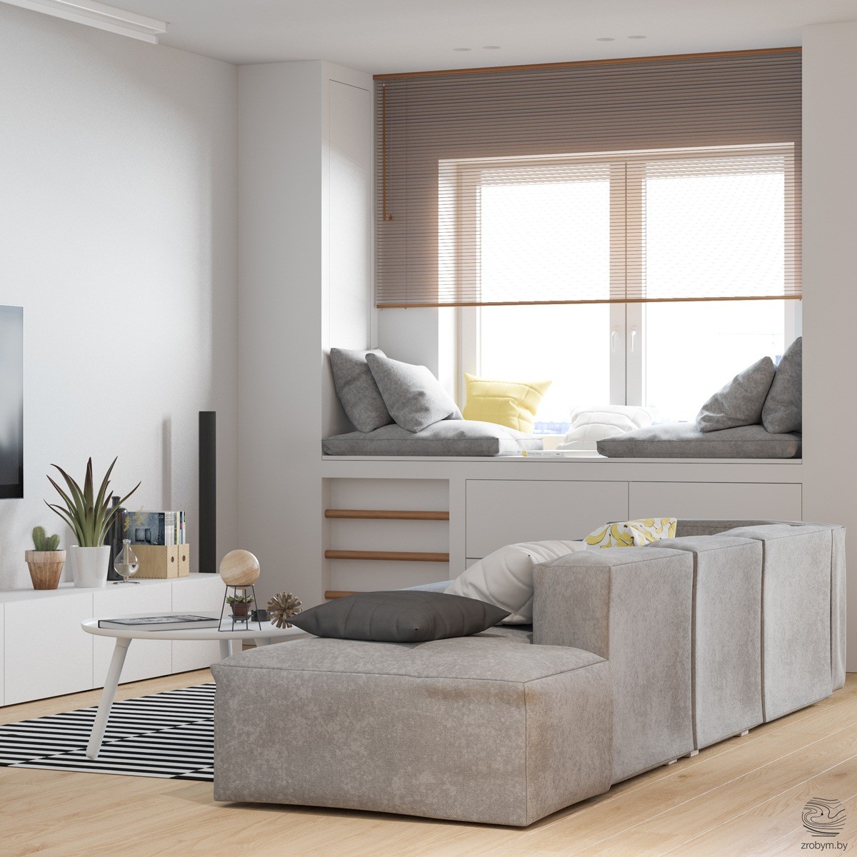
There isn't too much need for additional lighting during the day when you have stunning windows like in this living room! Make the most of them by covering them with large curtains. This light brown shade is the perfect way to keep out too much light. It doesn't overpower the space like a colored curtain may.
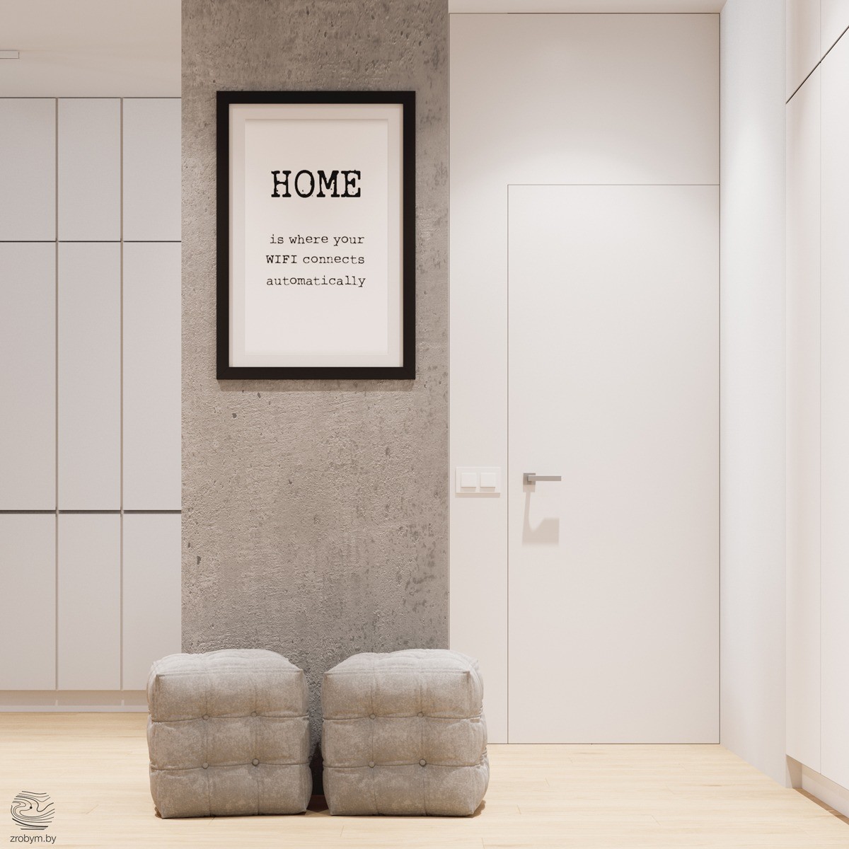
Simple text artwork is a trend that isn't going away any time soon! Use a black frame to house one of your favorite quotes or a family motto. This home takes a fun approach and has hung an art piece that says "Home is where your WIFI connects automatically." Two small cushion ottomans add texture and extra space in the room.
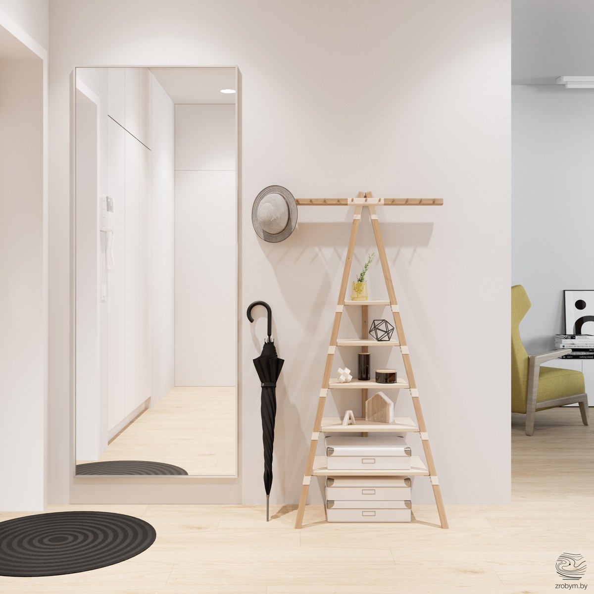
Get rid of boring shelves! Instead, opt for a fun interpretation of a shelf. This ladder holds different accents and looks like it belongs in an art gallery. Keep items hidden that you need by the door in white storage boxes. It's extra helpful if you label them for easy finding!
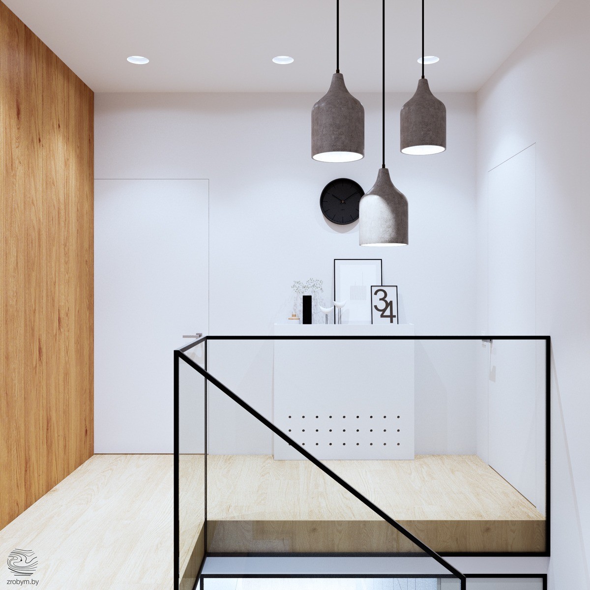
One of the coolest aspects of this home is the staircase. Wrapped in glass, you can see through it and it makes a statement. To play up its transparency in the design, a table with art can be seen behind it. When using art in a space like this, it's important that it doesn't compete with the architectural piece.
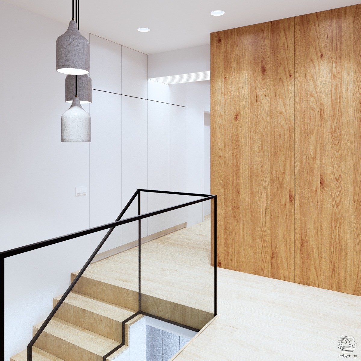
Three tiered pendents hanging from the ceiling illuminate the glass staircase. This makes the feature feel like it's in a gallery and is lit up for viewers. The pendents are simple, but since they are grouped together they make more of an aesthetic impact.
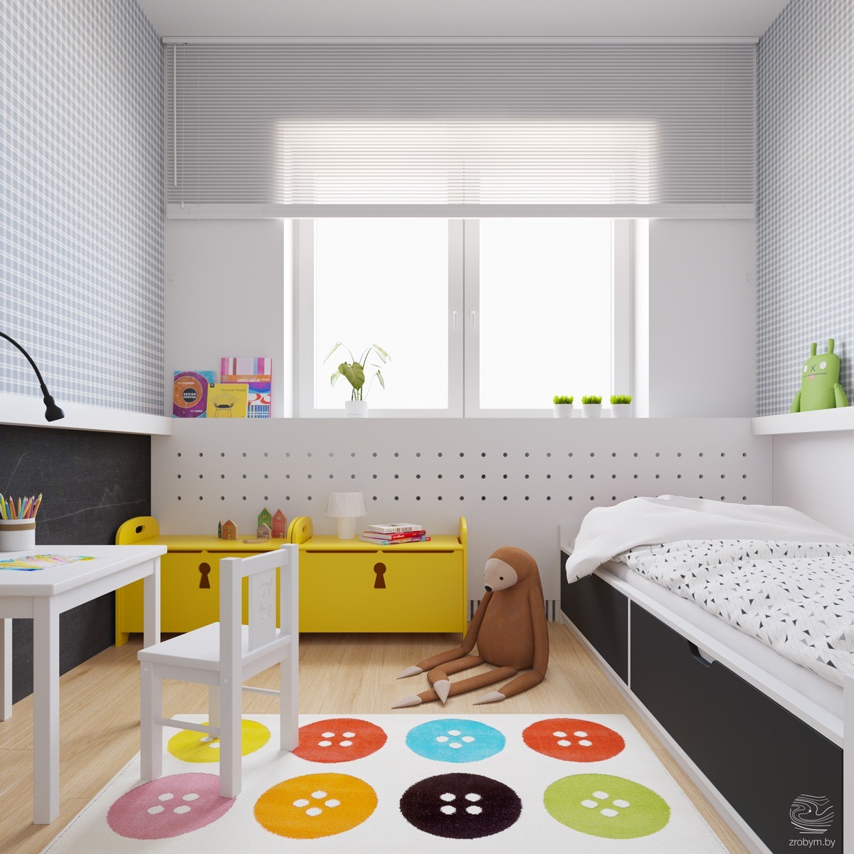
The children's rooms in this home coordinate with the overall color scheme of grays, whites, blacks, and yellows, but add a little bit more. Your eye immediately goes toward the bright yellow trunk which houses toys. Other items in the room that catch your attention are the multi-colored button rug. This gives the room a sense of whimsy.
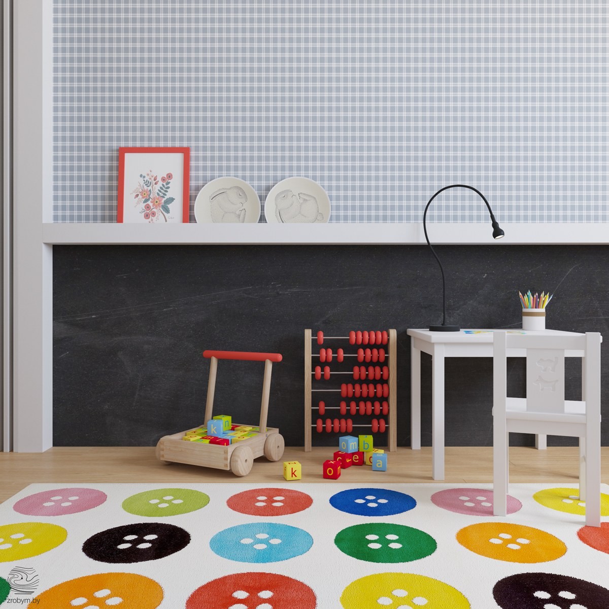
Black isn't too dark of a color in a kid's room if you balance it with lighter shades. Above this black wall, which could be a chalkboard wall, is a fun gray plaid wallpaper. Since it's only on one wall, it fits in perfectly and doesn't make the space feel small.
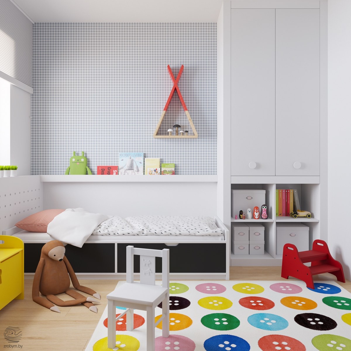
With kids, every bit of storage helps. This room utilizes storage every inch you look. From under the bed to the built-in cabinets, there are plenty of places to hide art supplies and baby dolls. When using a brightly colored rug like this, you can use many more colors throughout the room as long as they match the rug.
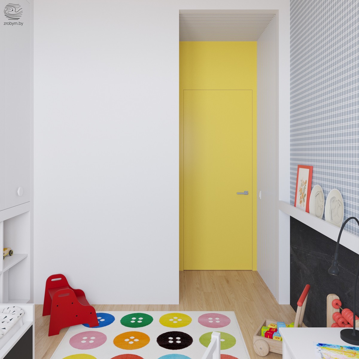
There's another yellow accent hidden in this child's room! Once inside you may be pleasantly surprised to see a yellow painted door. This adds even more fun to the room and keeps it light.
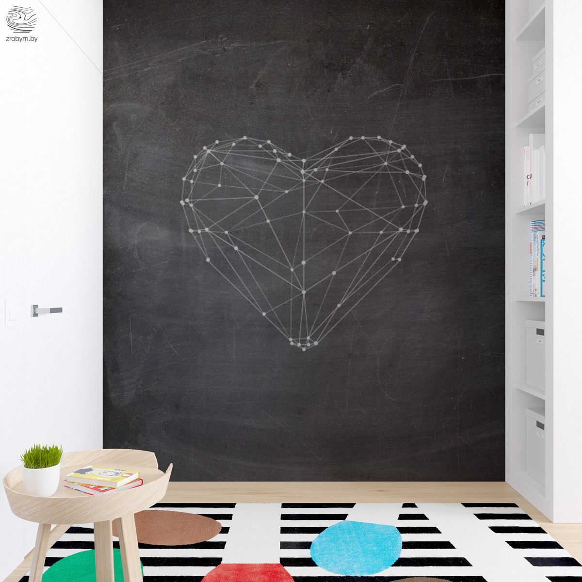
Another child's room appears to be for a pre-teen. This impactful constellation heart art brings a sense of fun. A black and white rug is lightened up by splashes of color.
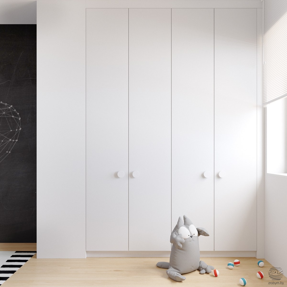
A wall of closets keep all the loose articles of clothing hidden and organized. When white is taking up this much space in a room, any other color used will dominate. The light bounces off the closets and gives the room a bright and airy feel.
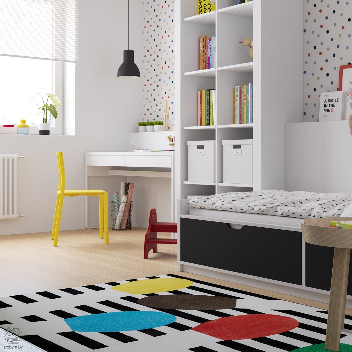
A fun bed allows this pre-teen the space underneath to hide her diary and socks. White shelves allow for storage while not looking too dark and dreary. The darkest accent in the room is the black pendent, which draws the eye to the unique wallpaper.
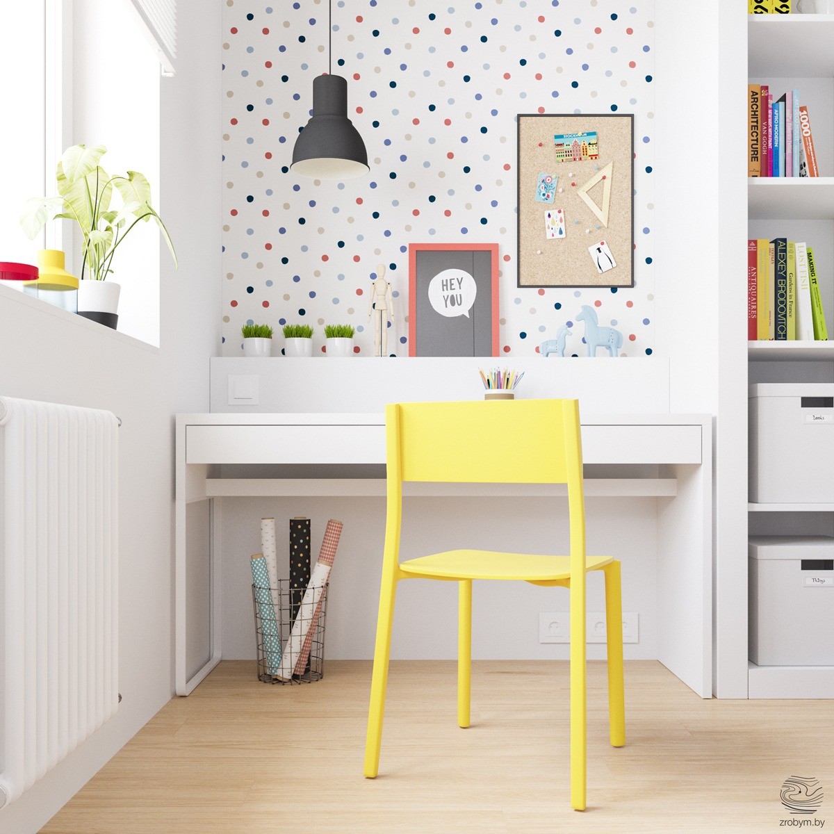
Just like the other child's room, this older child's room has used wallpaper to accent the walls. Above the built-in desk is a fun polka-dot paper. A black pendent stands out against the print and helps illuminate the desk for late-night reading. As with the rest of the home, the bedroom has a yellow accent, the chair!
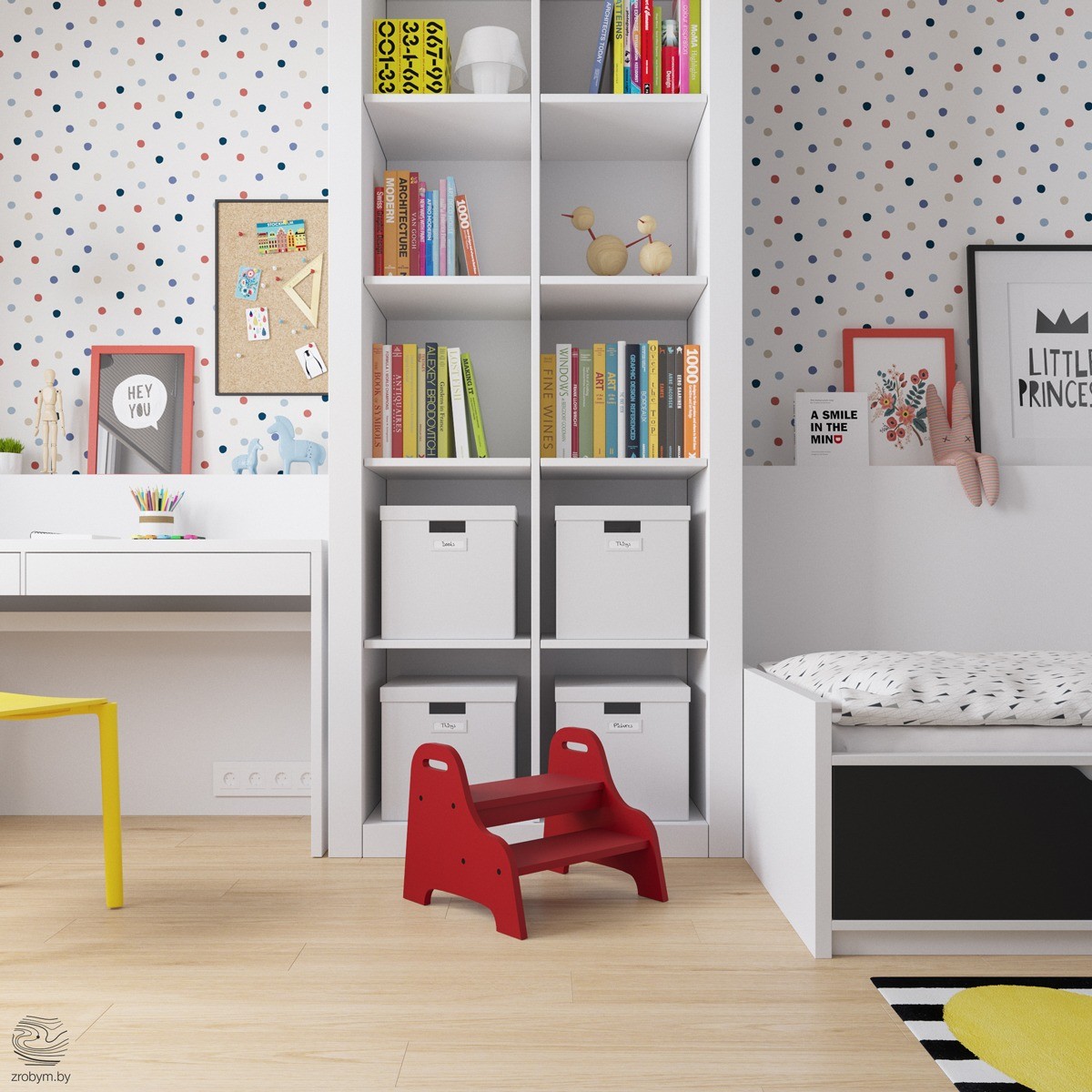
Don't be afraid of color! This shelving unit in the pre-teen room is filled with all different colors that make a rainbow. Try to keep like-shaped books together and arrange them to be varied in color. White boxes in the bottom of the shelf allow for some items to be hidden out of sight.
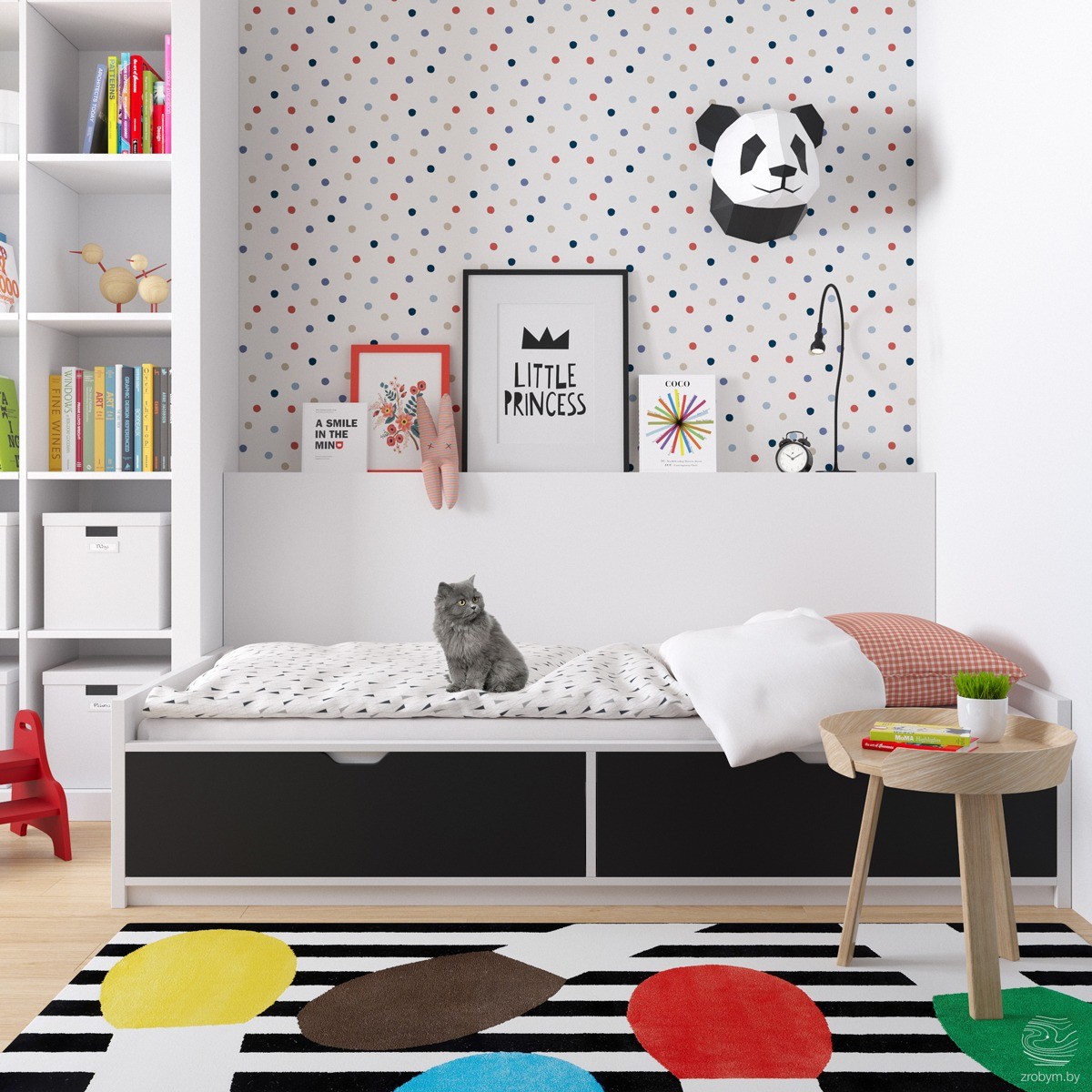
Hanging animal heads is all the rage right now. For a child's room, instead of mounting a brightly colored deer head, add a panda bear instead! This panda, which may be made out of folded paper, adds a silly feel to the room. It works really well paired with other printed art pieces. Keep art simple and child-like. Even better, allow your little one to create their own art and frame it!
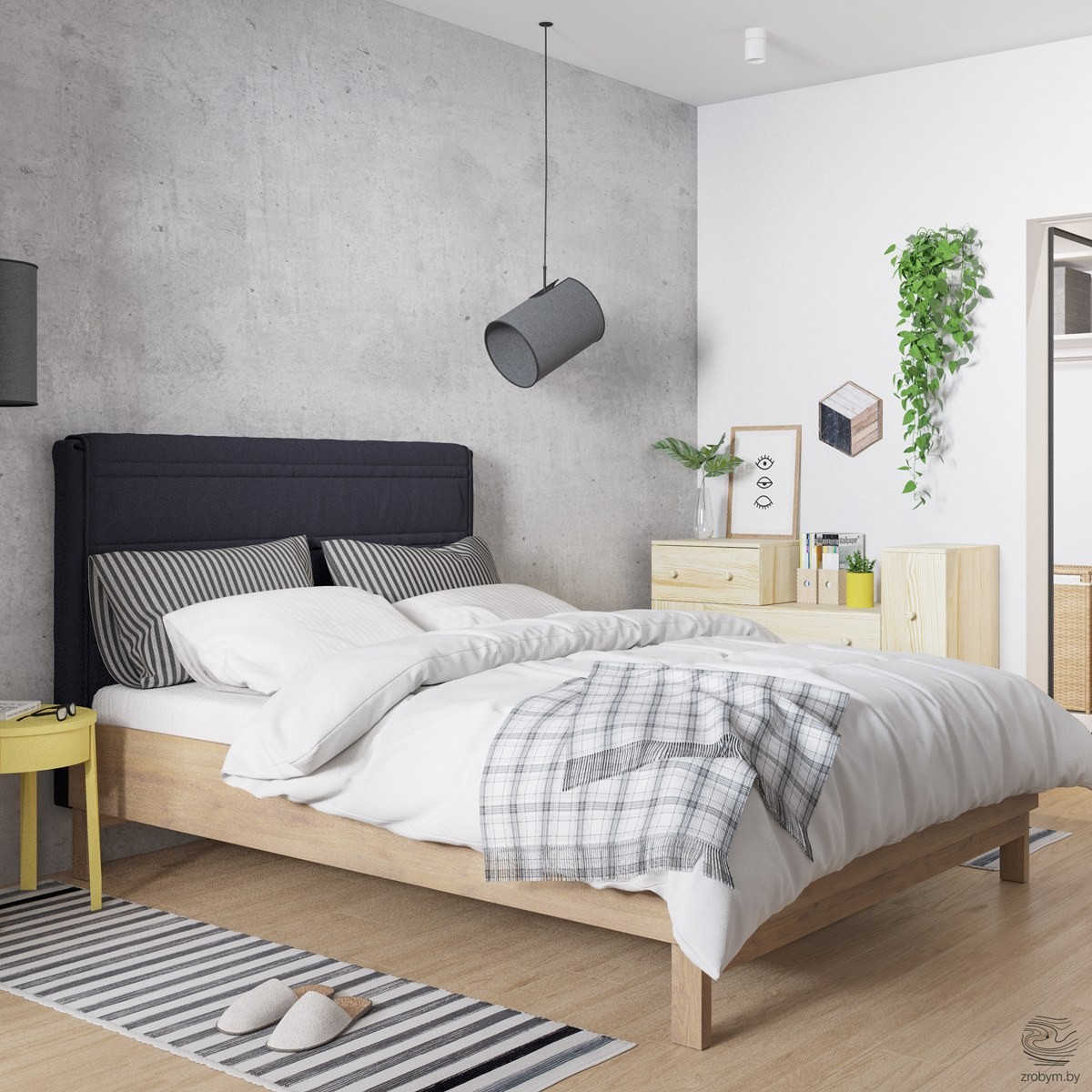
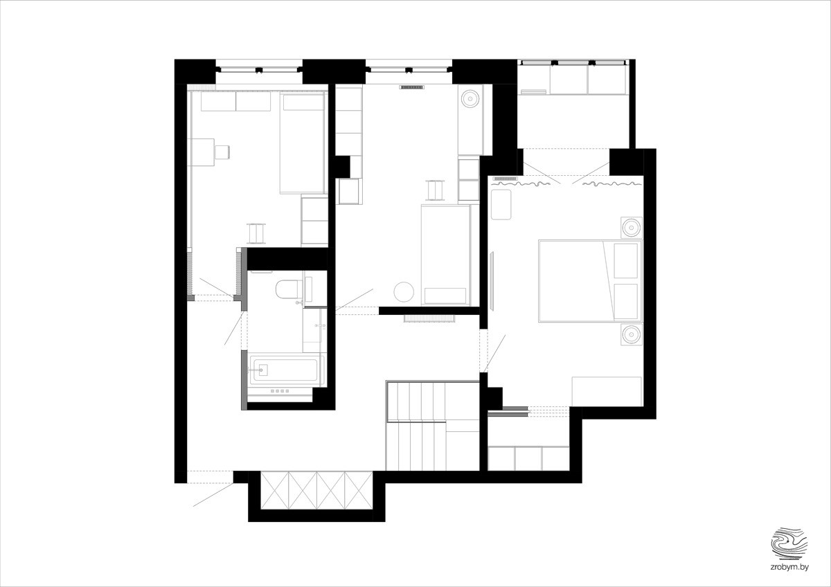
The master bedroom in this home is exactly as we expected it to be. Using the main colors throughout the home, this space is a refuge for relaxation and down-time. Instead of teetering on the edge of boring, this bedroom has added interesting accents, like the hanging spotlights, to keep it causal.
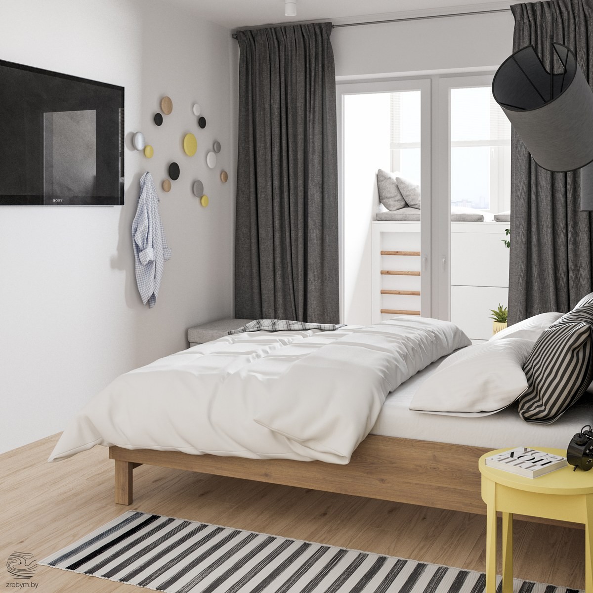
Another lofted window seat is added to the master bedroom. This can be accessed through the sliding glass doors. A space like this is perfect for star gazing or drinking your cup of coffee in the morning. Rounded hooks keep robes off the floor and also add color to the walls.
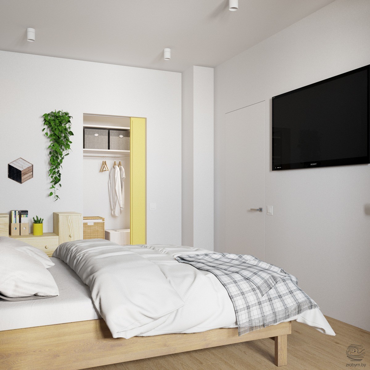
I bet you thought the only yellow accent in this room was the nightstand! Nope! From the other angle you can see the closet door is painted yellow! This is a fun way to brighten up the room without going overboard on color.
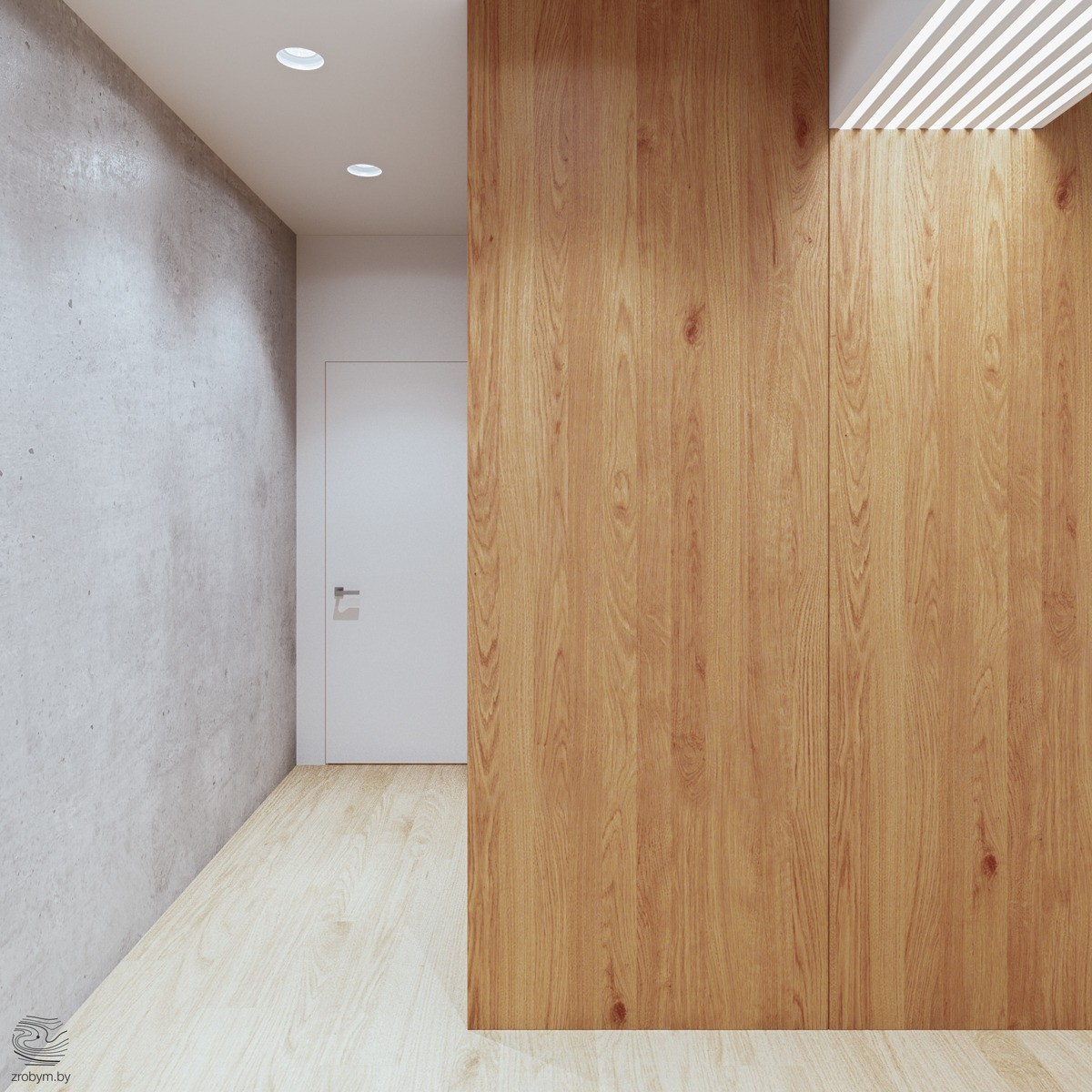
The walkway here is kept simple and sleek. The neutral elements work together to create a cohesive space that has clean lines.
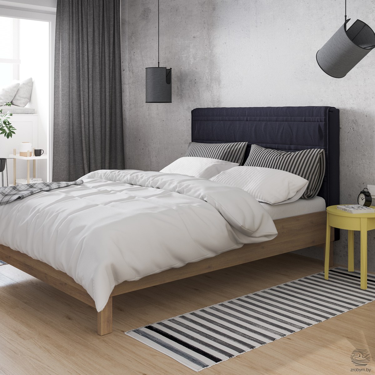
The hanging matching lights above the bed can be moved to illuminate different parts of the room. These dark lights give the room a sculptural element. A black striped rug, pillows, a black headboard, and black alarm clock all make the room feel masculine.
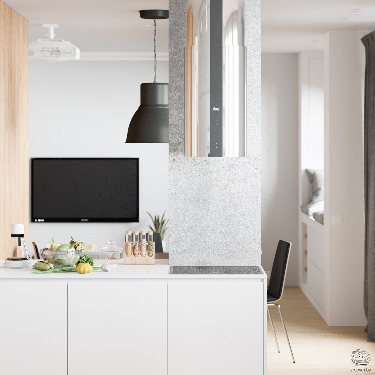
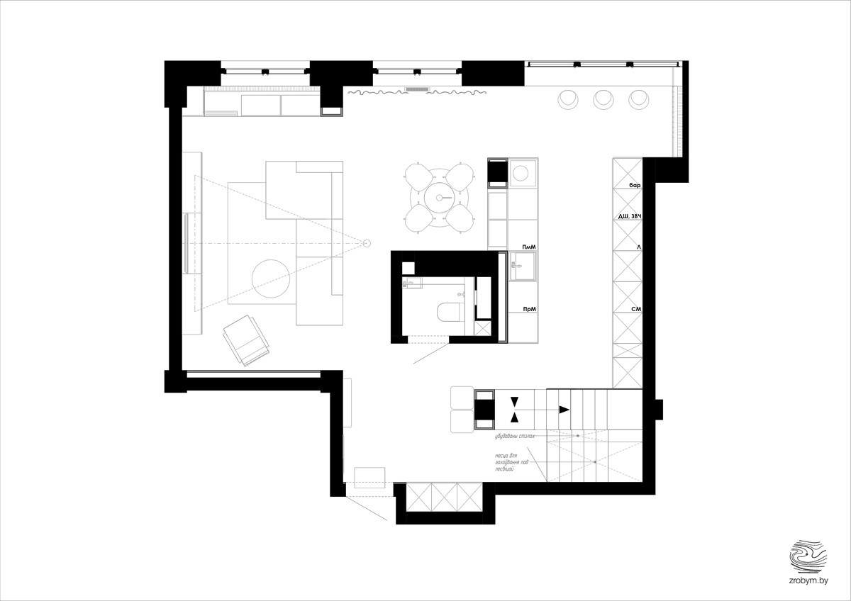
With this convenient kitchen you can watch the kids and the T.V. while preparing dinner. The simple kitchen is open to the living room and the cabinets are low enough that you can see the T.V. perfectly.
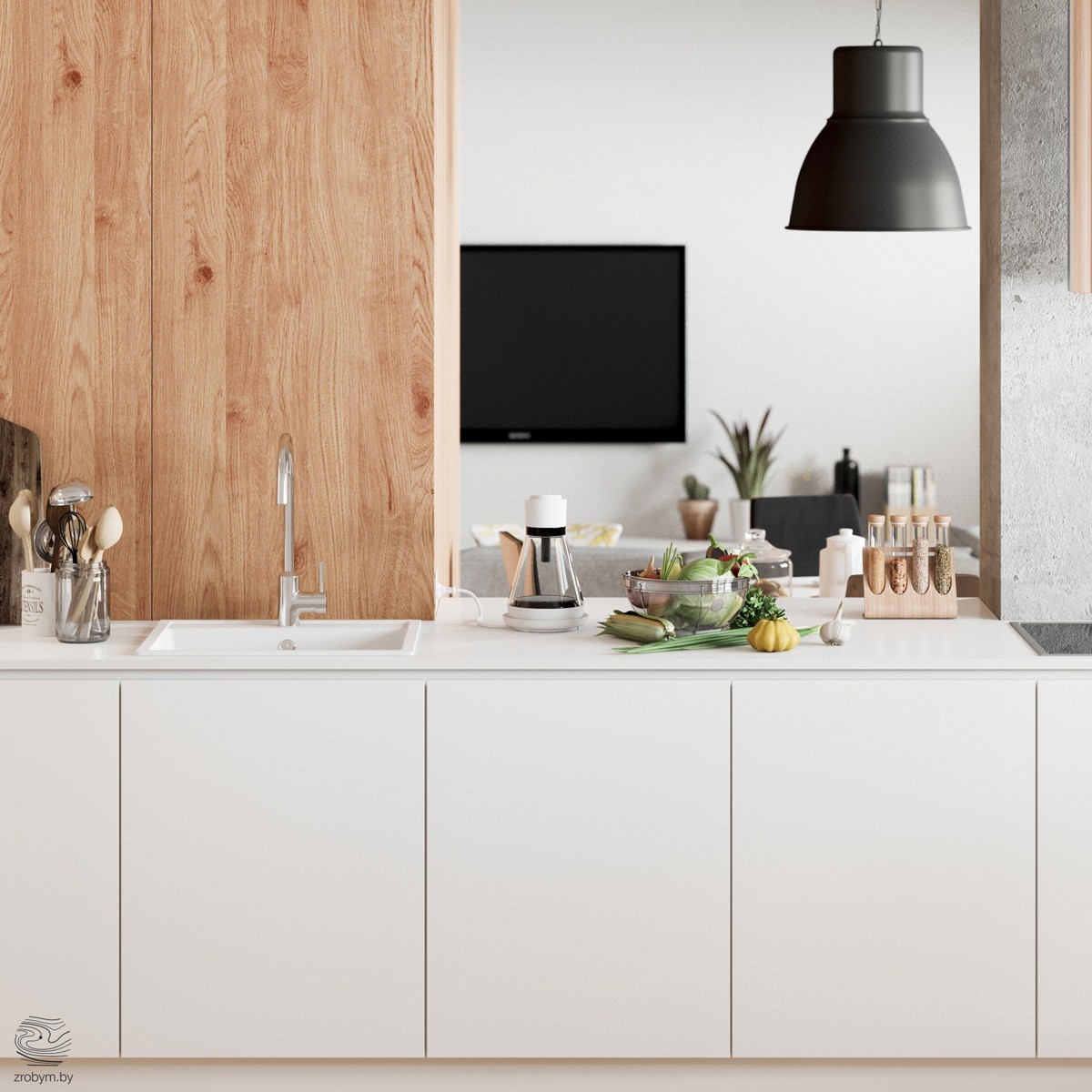
White cabinets without hardware look sleek and modern in this home's kitchen. The wood offsets the whit and the stainless steel sink faucet adds another shade to the mix.
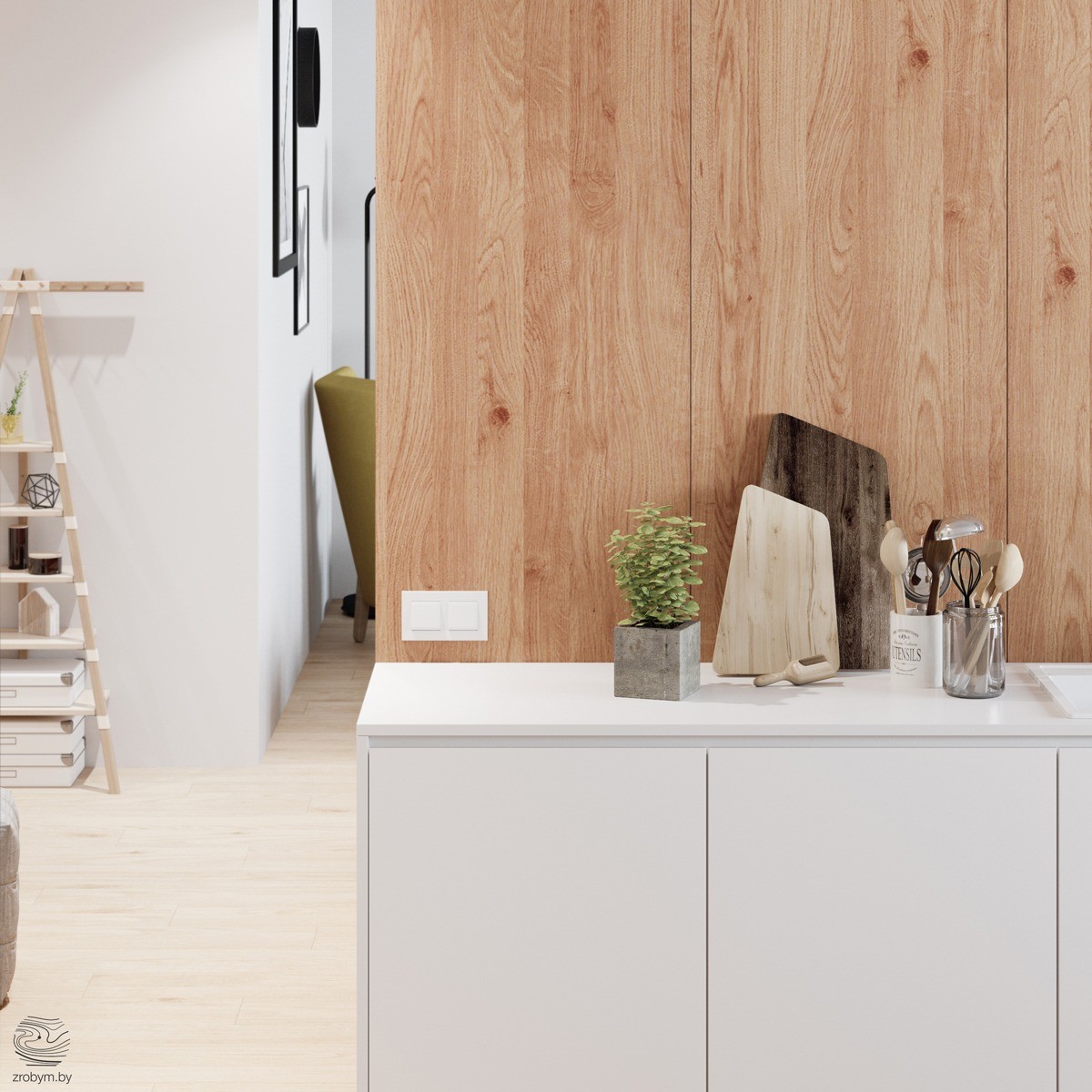
The designer made sure to set out only accents that coordinate with the style and color theme. Different shaded wooden cutting boards look perfect beside a green plant.
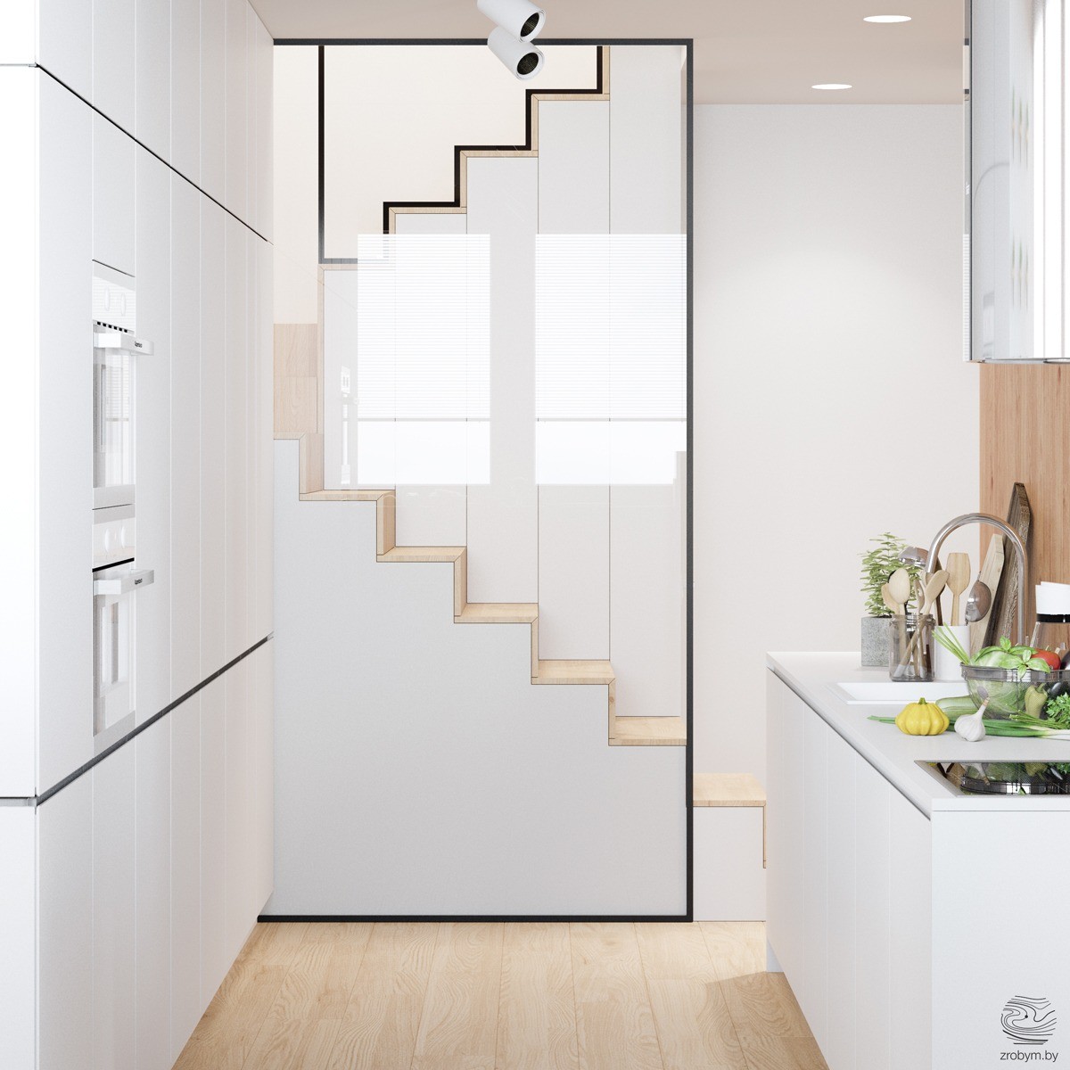
The glass staircase in this home is surely one of it's most impressive features. This view from the kitchen is inspiring. Two different colors on top of the stairs marry in the middle and still match the colors throughout the home perfectly.
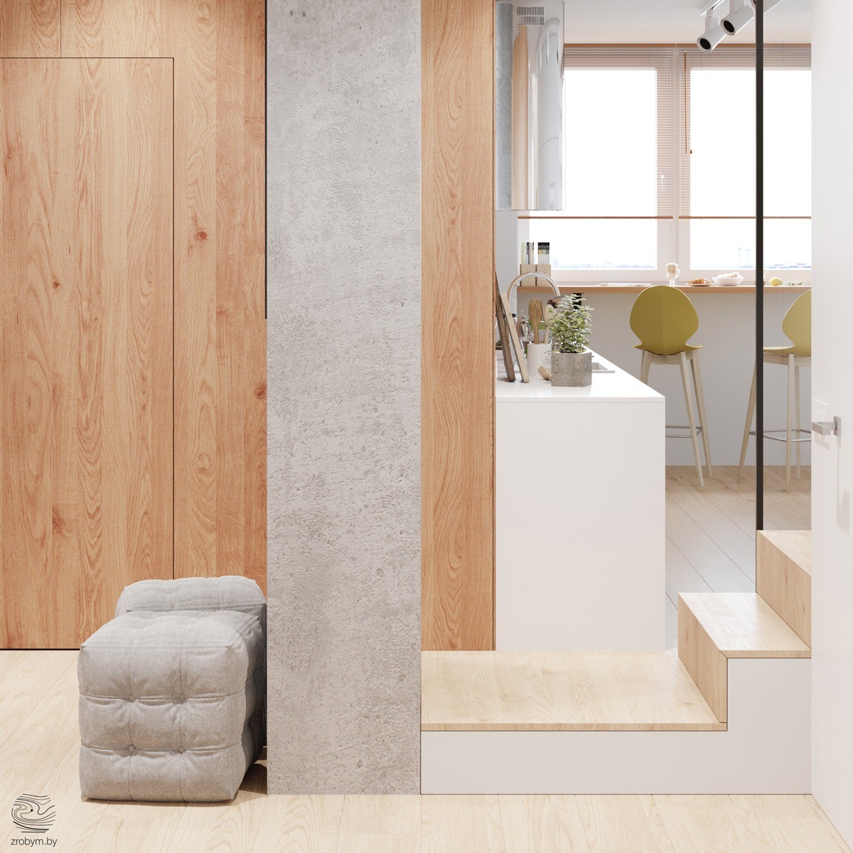
This image shows into the entryway and the kitchen. You can see there is a bar running alongside under the window. Yellow barstools make the perfect color statement.
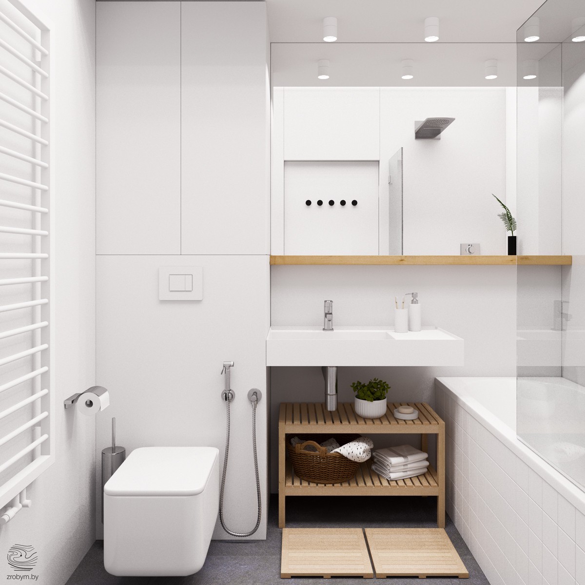
A white bathroom is anything but boring! The textures and finishes in this luxurious bathroom make it special. The tiled tub is deep enough for soaking.
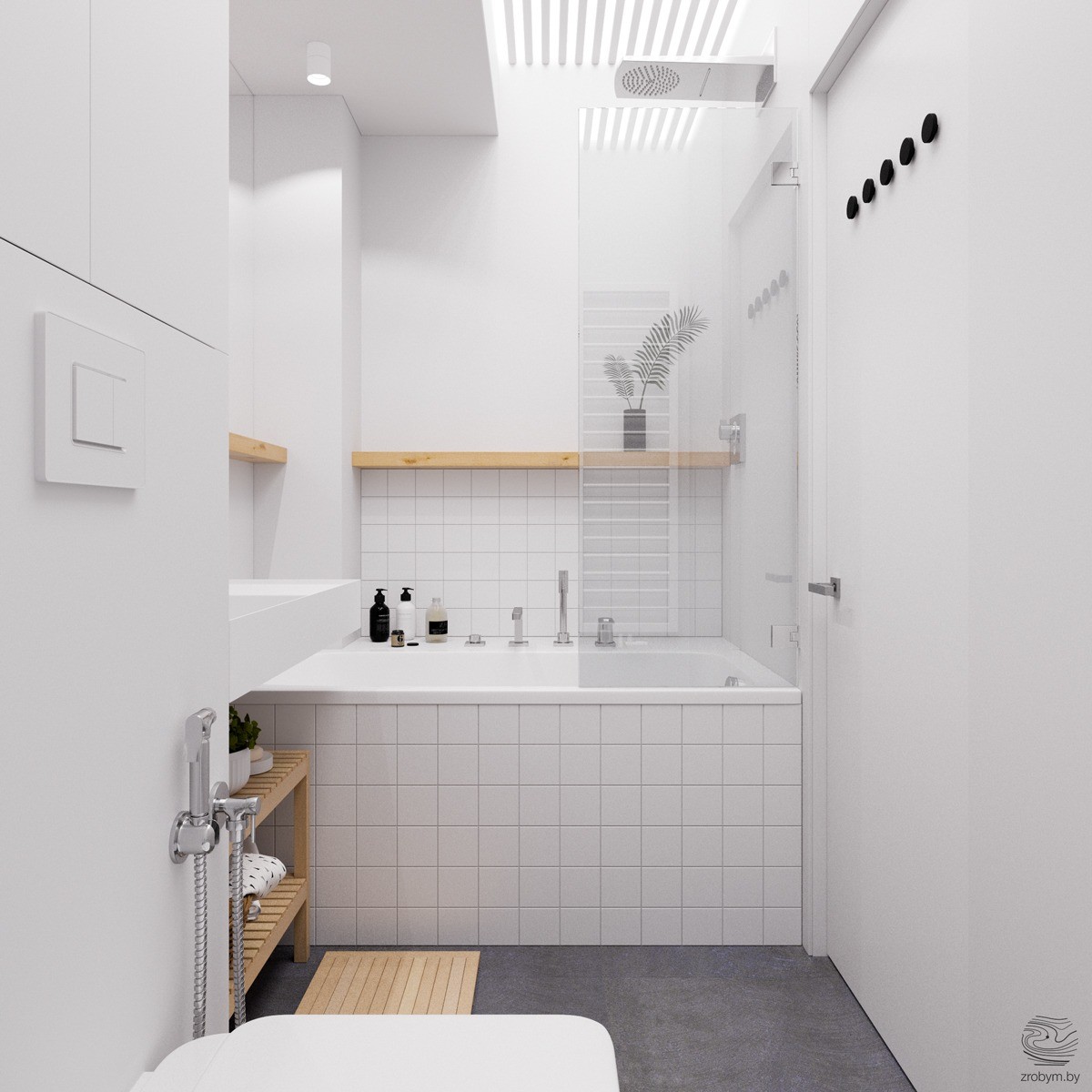
A wooden shelf situated within the shower adds an architectural feature. You always have a place to put shampoo and the color breaks up the white of the room.
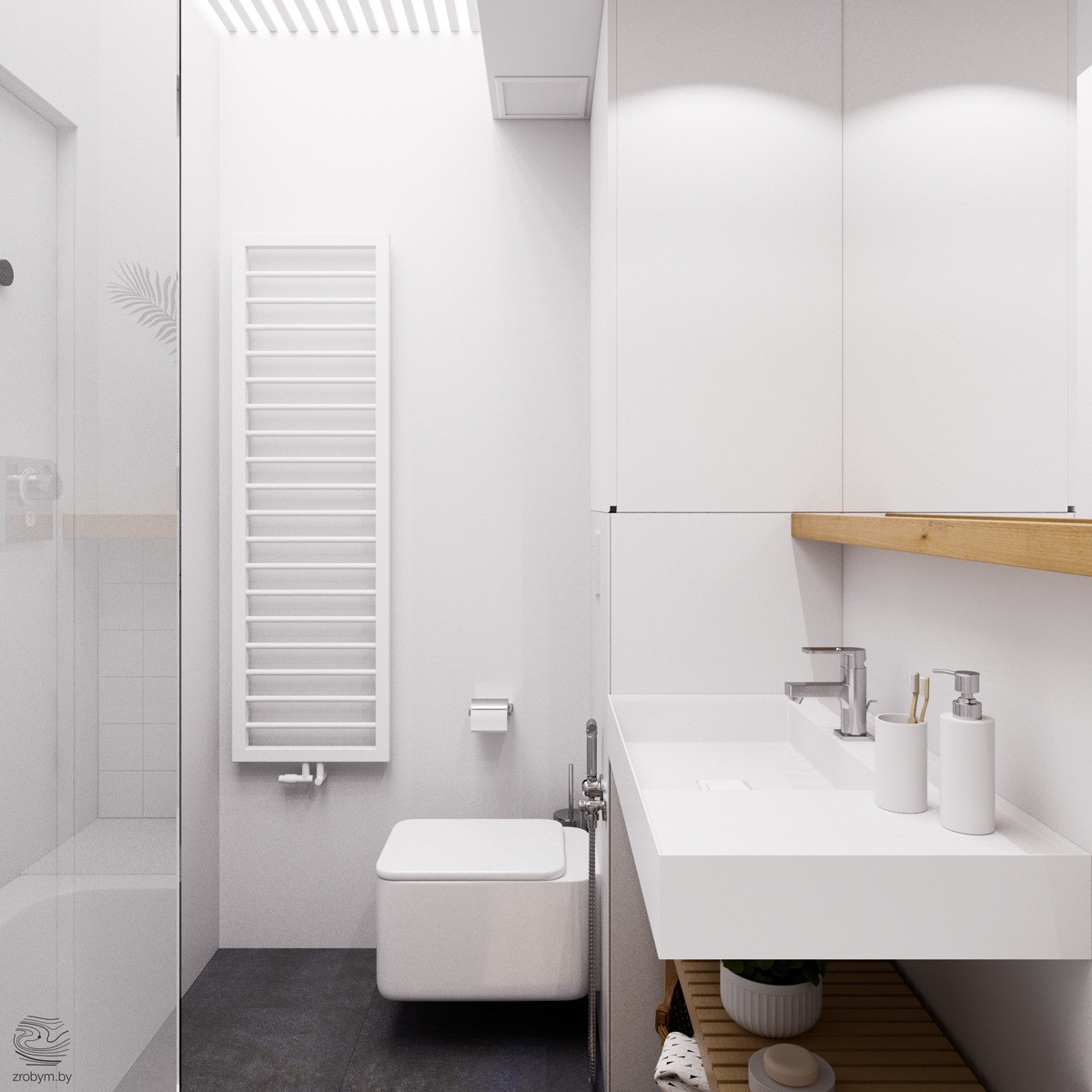
A long towel warmer blends into the wall because it is white. Once you jump out of the shower you can grab a perfectly warm towel and feel as if you're in a spa.
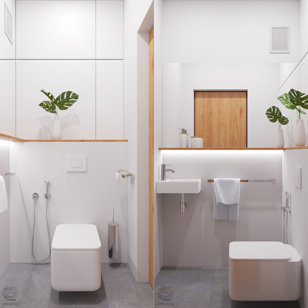
The other bathroom in this home is smaller, but still just as trendy. The small sink is all you need when guests come over to freshen up. Under-the-shelf lighting makes this smaller space feel modern.
