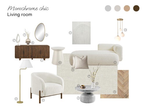
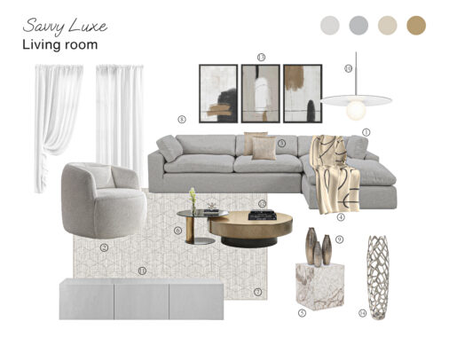
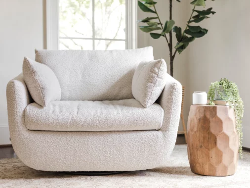
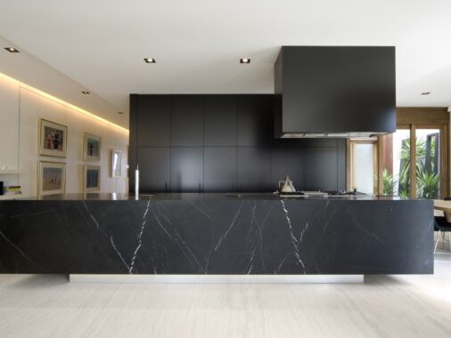
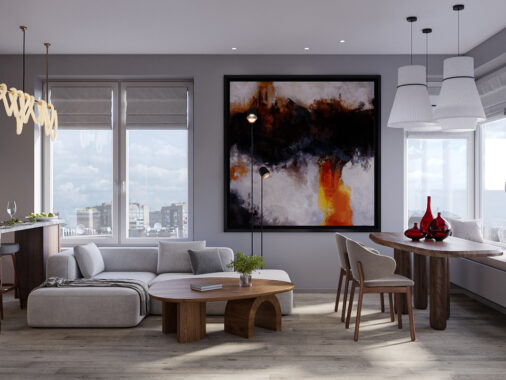
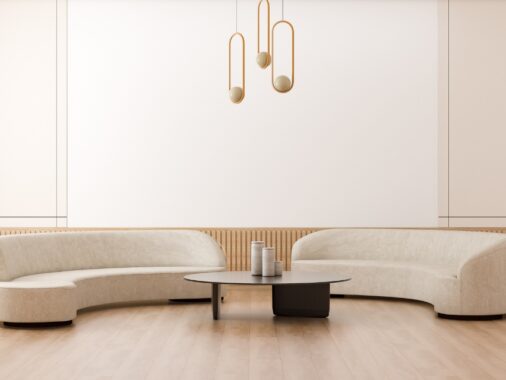
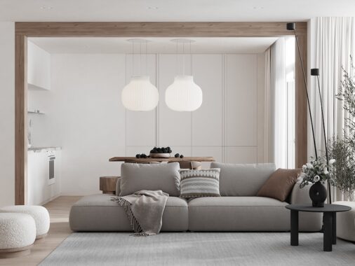
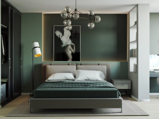
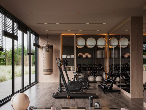
What do white, cream, natural wood, and grey all have in common? They are all color hues included in these two homes from M3 Architectural & Construction Group and Mihail Vasin. In this article you can see both seem similar in their style. Breezy, airy, and open, you'll want to lounge all day on the couch in the first home from M3. The large windows invite the sun in and make the space feel even bigger than it is! The second space from Mihail Vasin has punches of bright colors and a kids room that any child would love to call home. Learn how to incorporate a pop of contrasting color and add life to a neutral home.
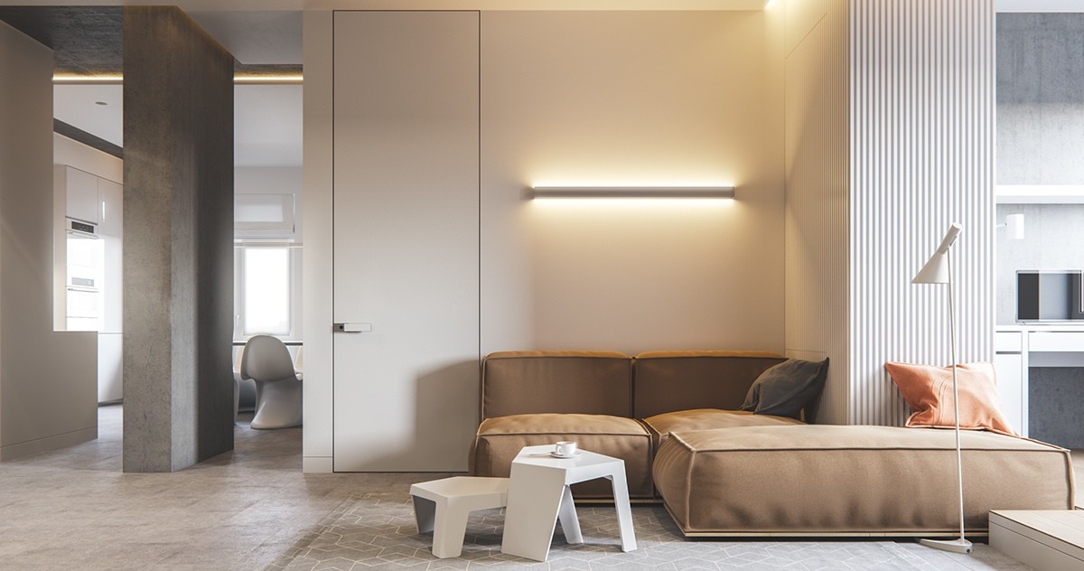
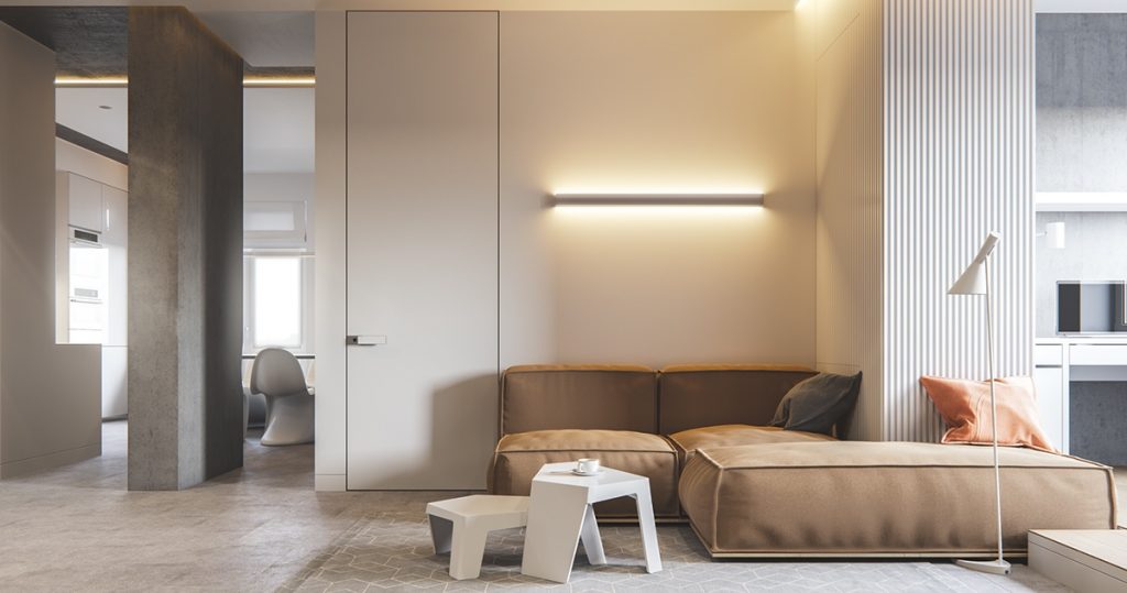
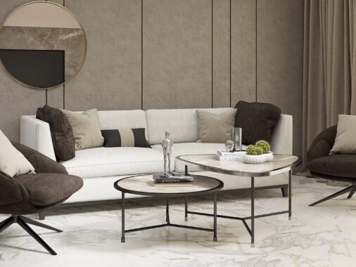
This neutral couch fits perfectly in this home designed by M3 Architectural & Construction Group. The side table is able to nest, which gives you extra space to place items.
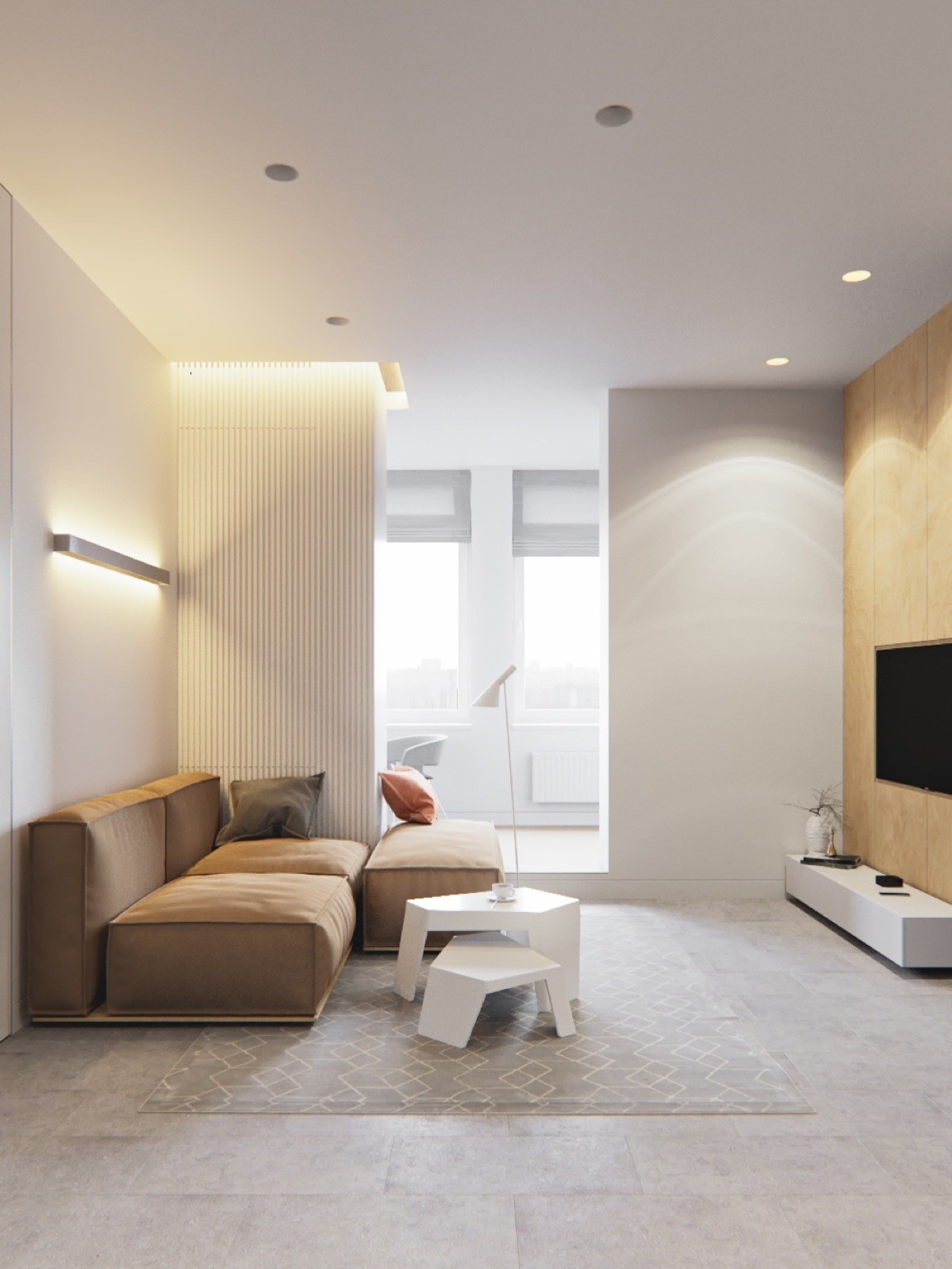
Extra large windows allow natural light in which makes the room appear larger. A flatscreen T.V. mounted on the wall instead of sitting on a table creates more space.
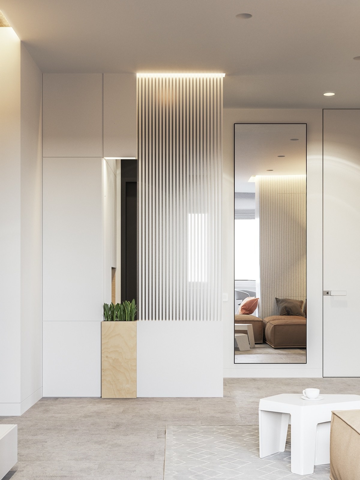
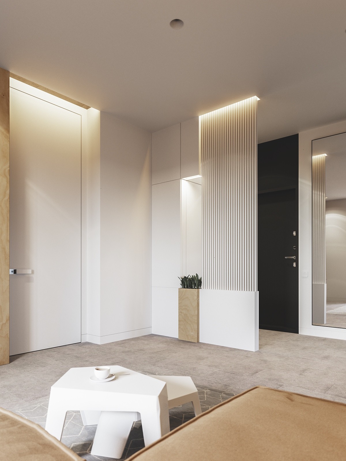
There's no reason you can't add living things even in a sleek space like this! Instead of going overboard, keep greens to one or two per room like in this image.
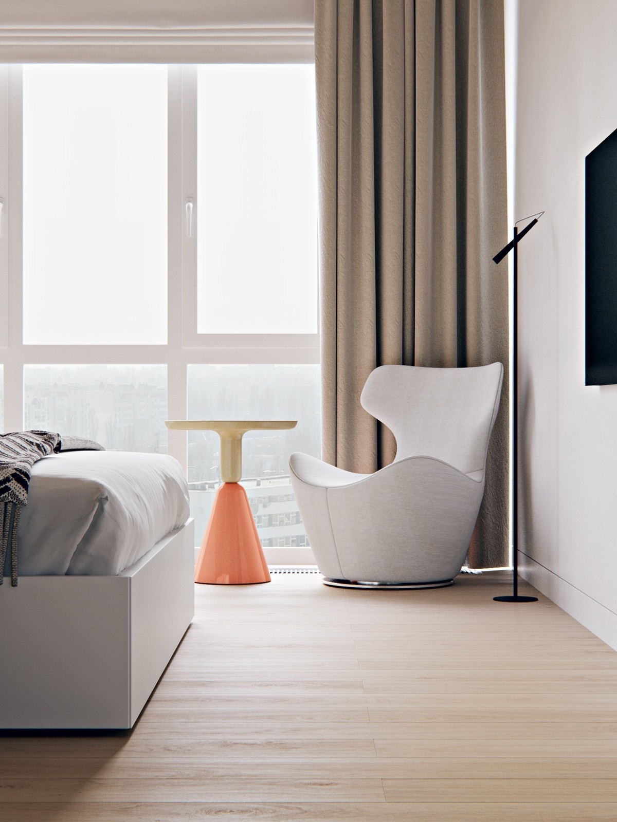
Even when embracing greys and whites you can add a pop of color for interest. The bottom of the side table is dipped in a orange color.
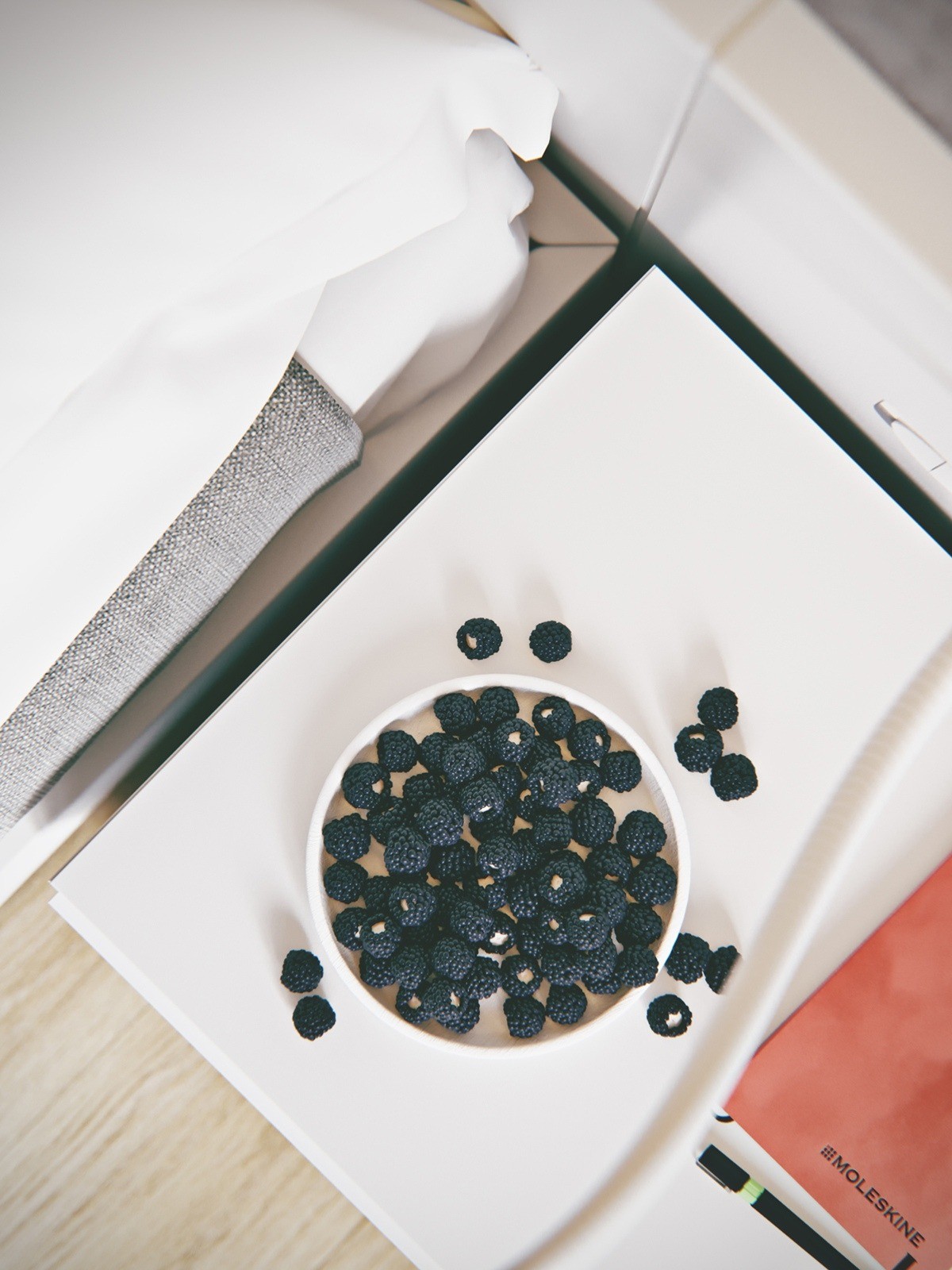
With such neutral hues in this home, anything adds vibrancy against it. This breakfast beside the bed looks delicious.
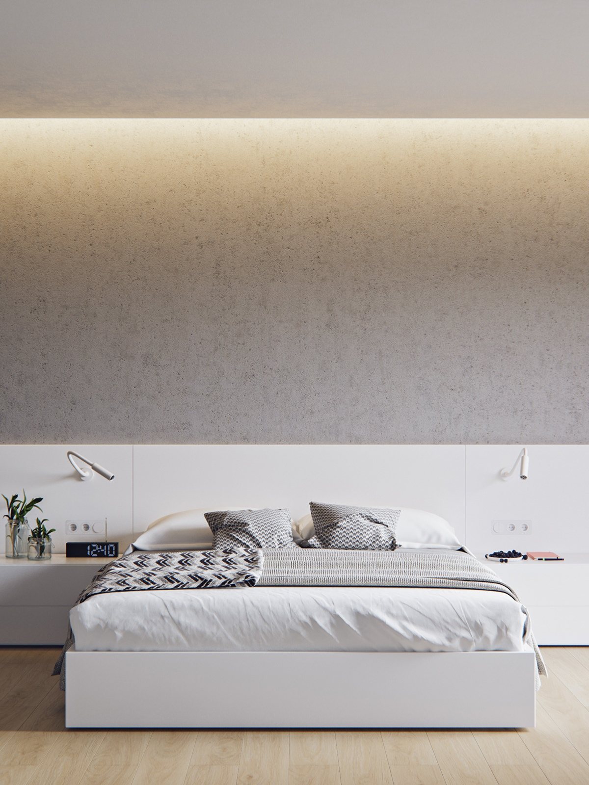
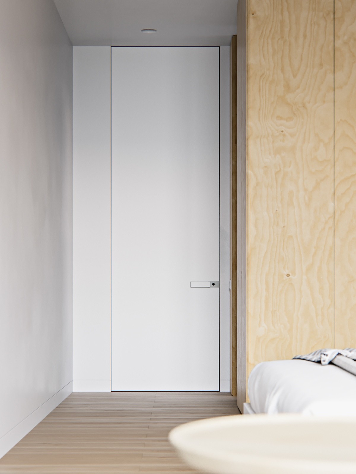
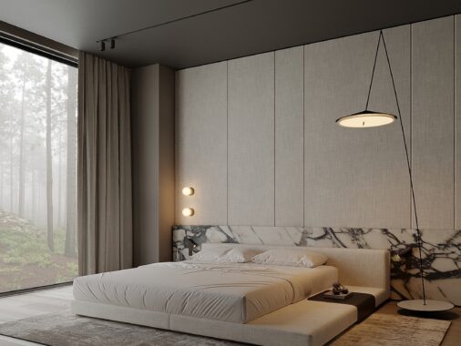
No need for a headboard when you have custom built-ins. The white furniture piece in the back serves as a head board and a night stand.
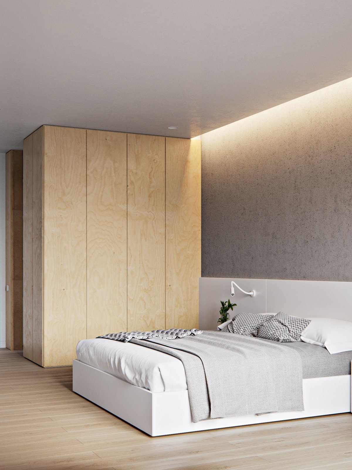
Even though the room has plenty of natural light, added light at the top of the ceiling gives the room dimension. A large natural wood closet also allows clutter to be hidden.
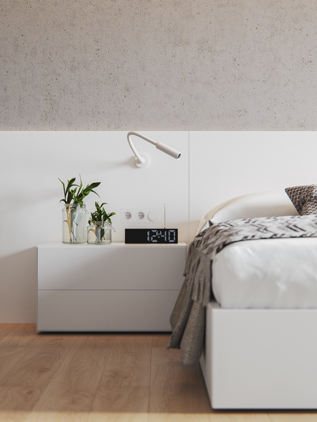
Greenery adds a natural vibe to the room and gives some contrasting color. Keep with the theme and choose clear, airy glasses to place greens in.
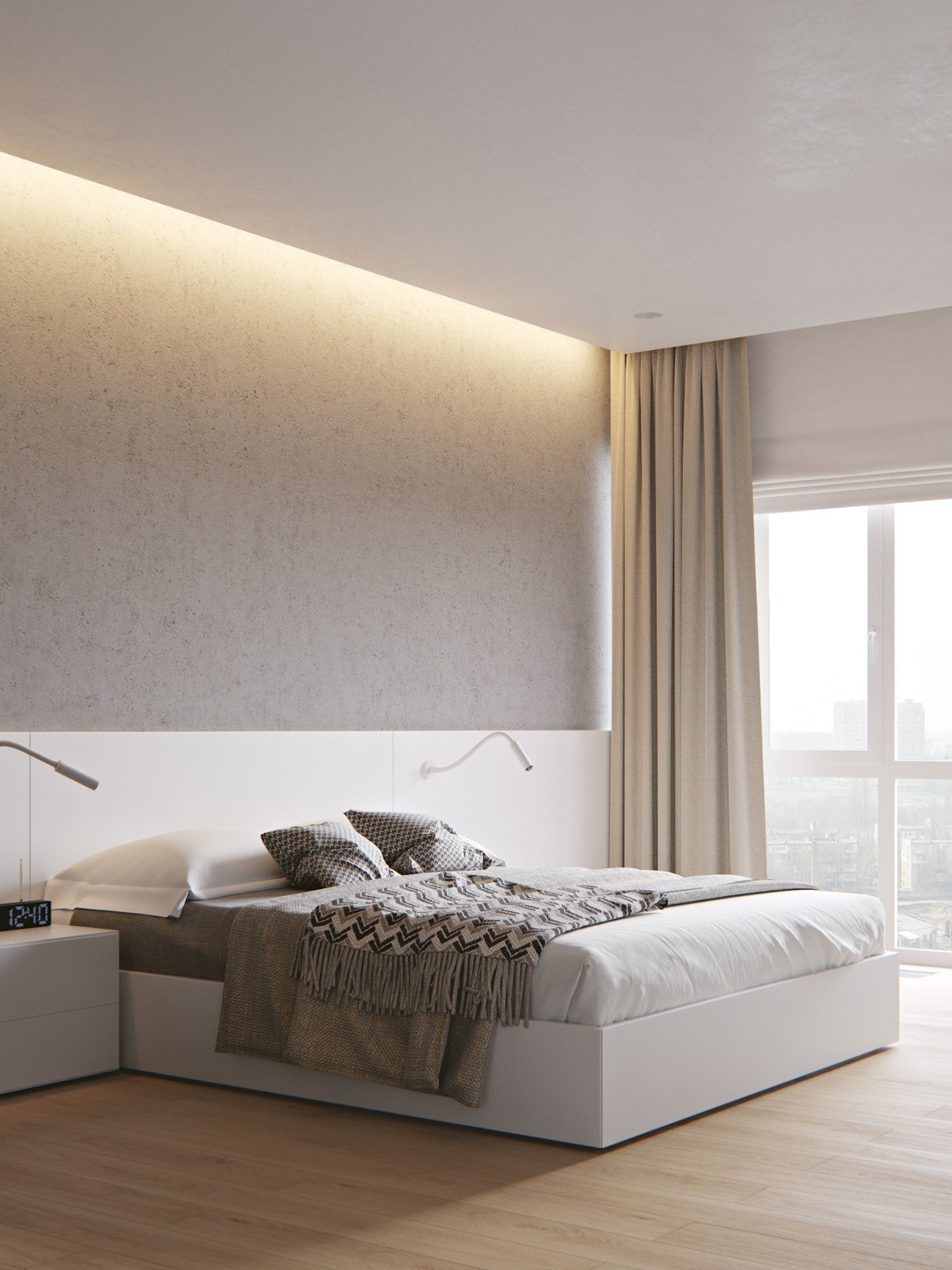
Large curtains make the ceilings look even bigger! Take linens to the top of the ceiling instead of making them fit the window.
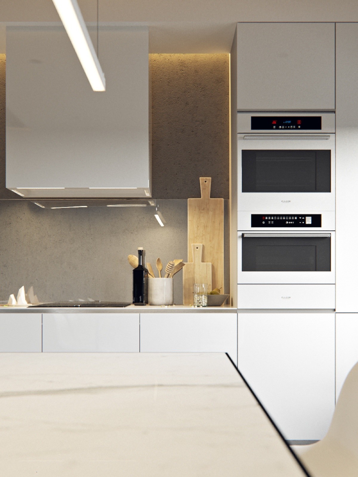
Keep with the natural feel of the space by placing bamboo cutting boards on display. Avoid too many items out on the counters to keep with the simple lines.
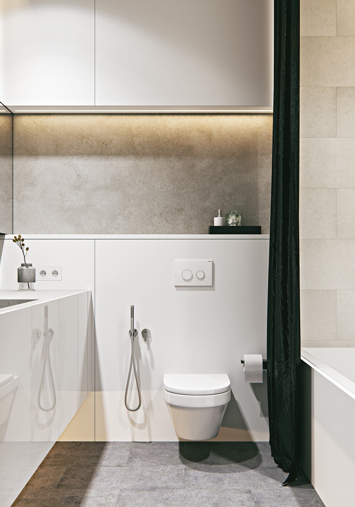
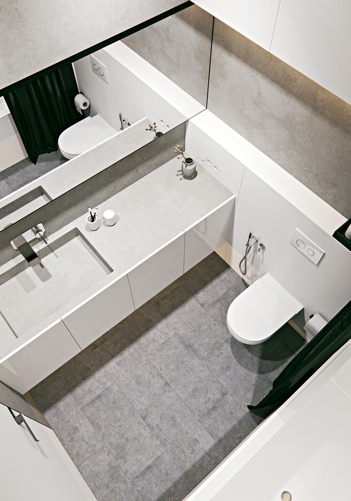
Even though there are only two black items in this room, they make a statement! The black shower curtain and black tray which holds the toiletries are enough to add contrast to this bath.
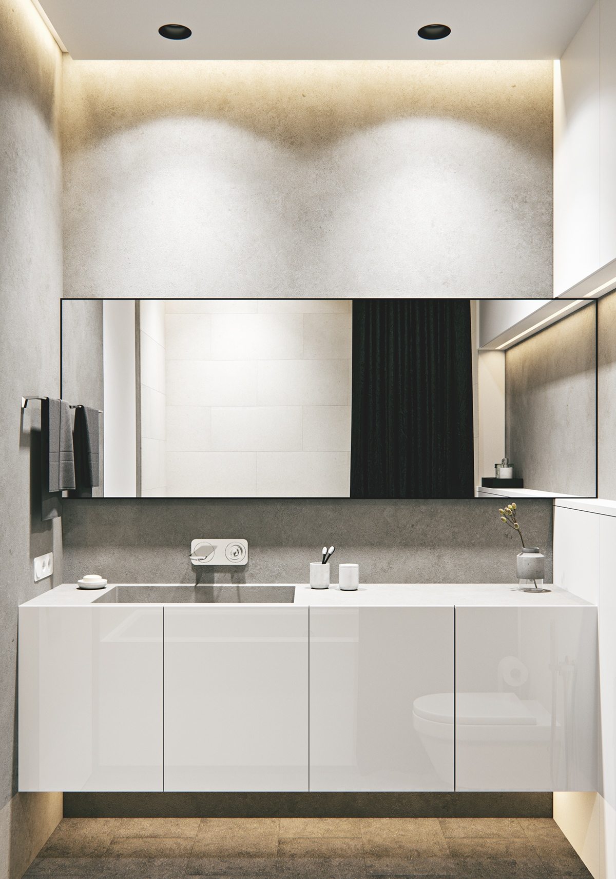
This bathroom is designed so that ugly shampoo bottles and unnecessary bathroom items have a place to hide. The end result? A bathroom that looks clean 24/7.
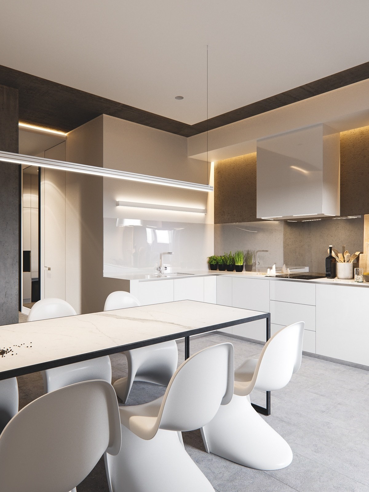
The dining room is an extension of the kitchen. By keeping the counter top color the same as the table top, the space seems to go on and on.
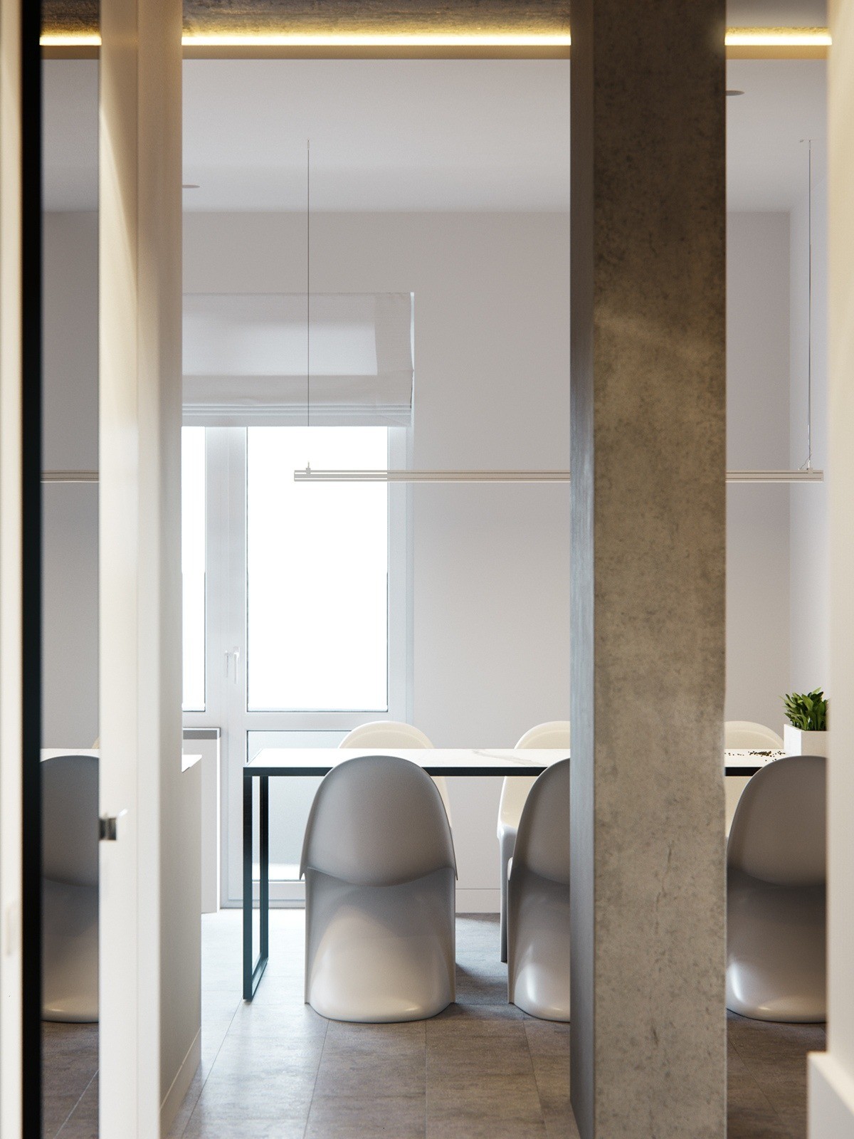
Concrete isn't too cold when you're dealing with a space that embraces neutrals. Just a few pillars add an industrial feel.
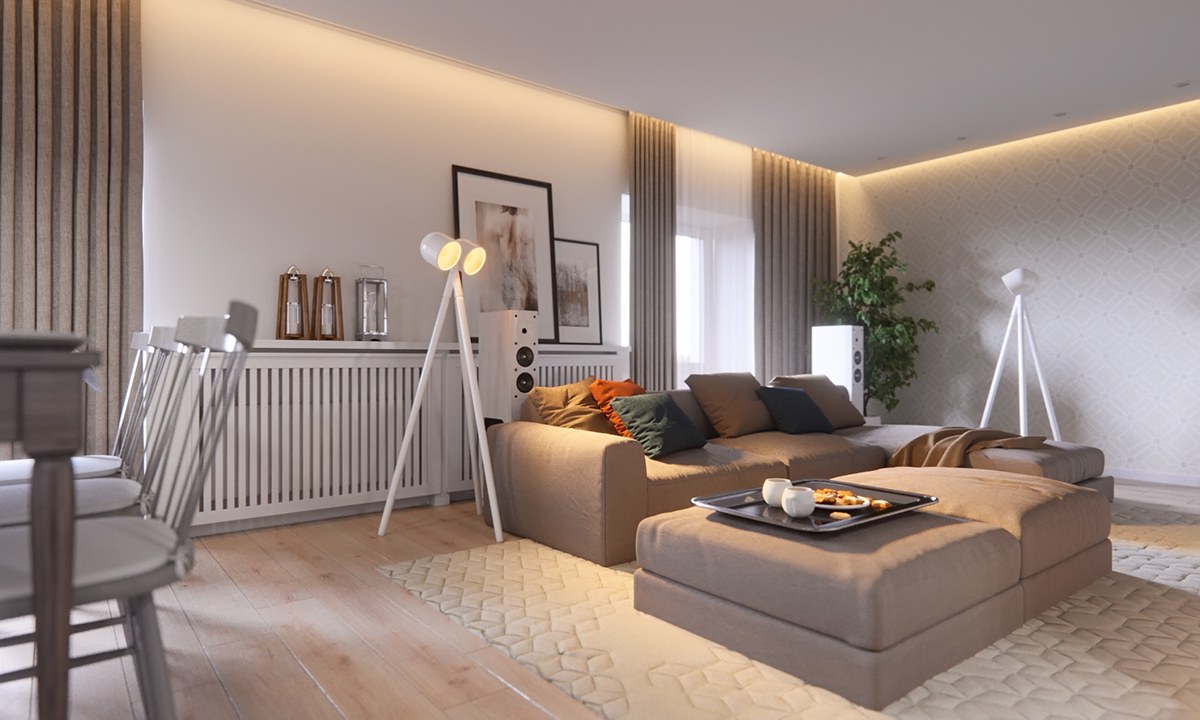
The second home, which shares the same hues is designed by Mihali Vasin. It's hard to tell the two living spaces apart unless you're looking very closely!
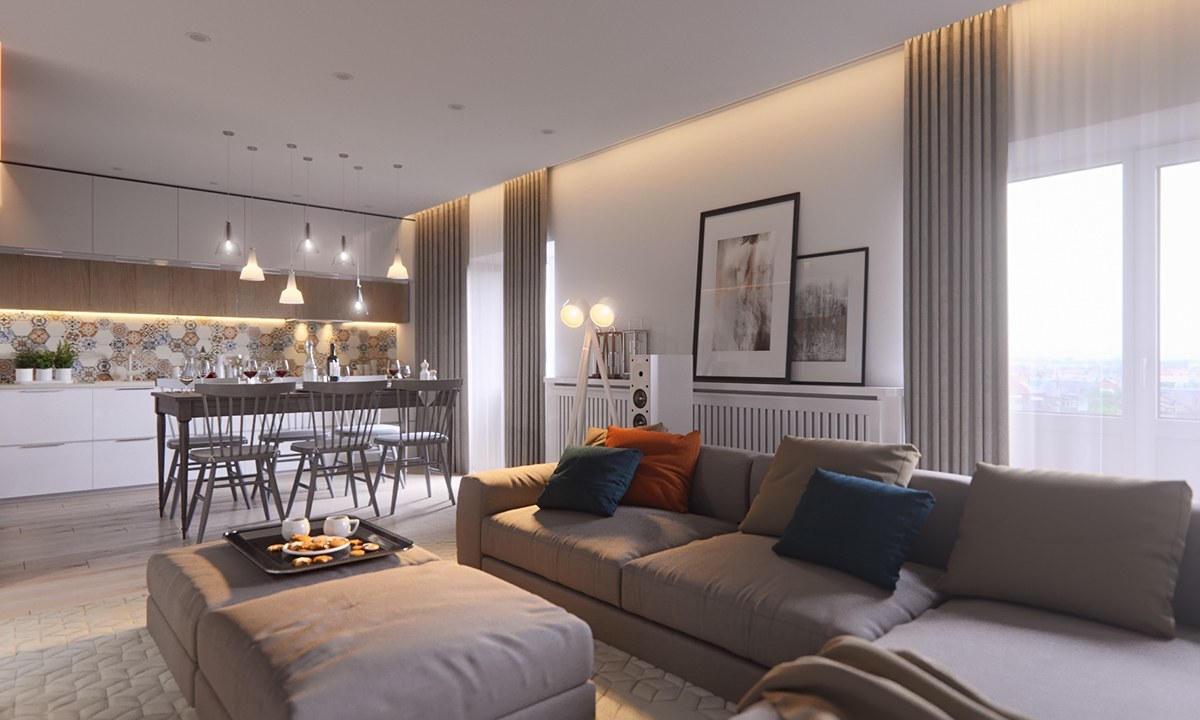
Even though both homes share color hues, they also share design inspirations. In this home, the window treatments are raised to the ceiling like the first home by M3. This draws attention to the tall ceilings.
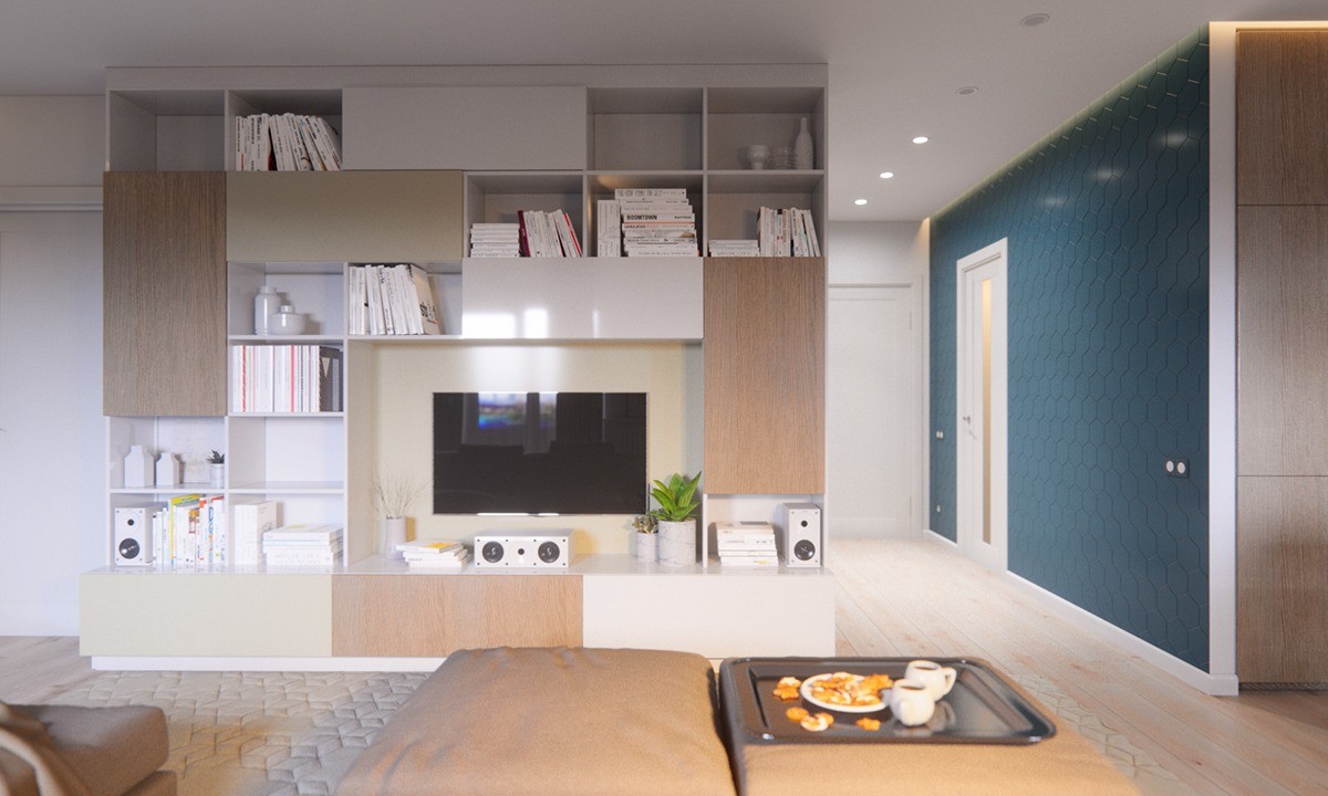
A media wall holding a flat screen T.V. is the perfect way to lay out a color scheme for a home. If you look closely, you'll notice all the colors on this wall are carried out throughout the home.
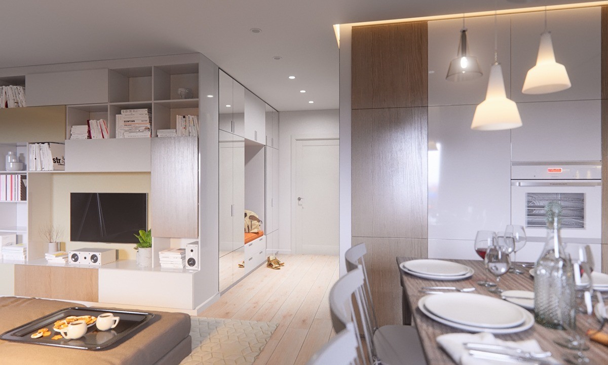
Large built-in storage solutions customize the space and keep ugly clutter out of the way. The point is to enjoy the simplicity and airy-ness of the room.
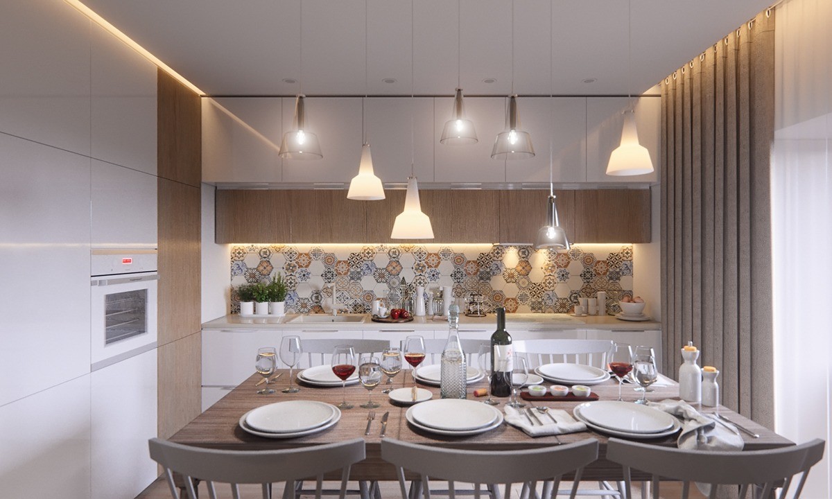
Different pendents hanging in the kitchen and dining room give the space contrast. The colors are different on the countertops and table top, but the hues are all similar. A backsplash is perfect in this setting because it isn't too visually busy.
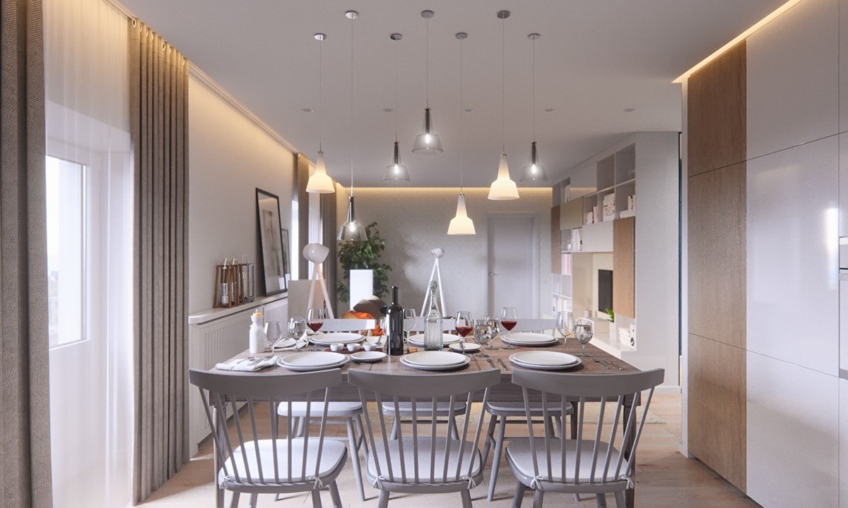
Looking back into the living room, you'll notice the same lights are mimicked in there as the kitchen. These warm up the white walls and neutral colors.
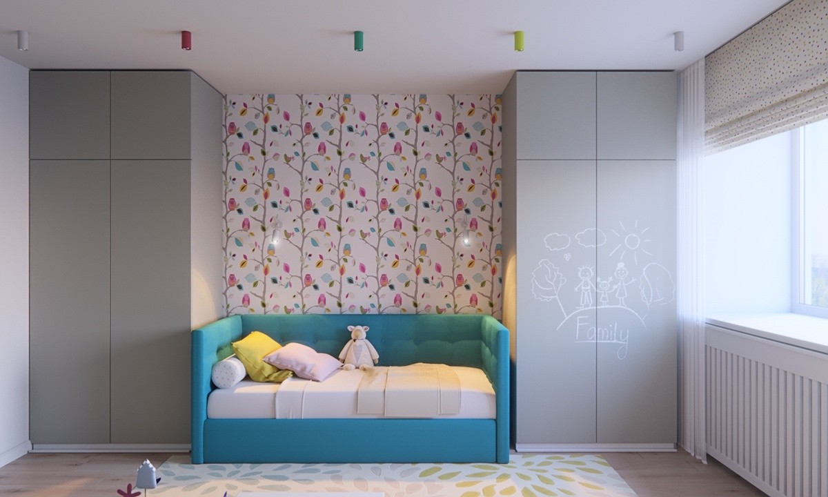
A child's room can be modern while still being playful. This room embraces neutrals but also adds a bright bed and a statement wallpapered wall. The best part about only using a few colors to make the room stand out is the fact the space will mature with the child. As they get older, you can switch different things out, like the floral wallpaper.
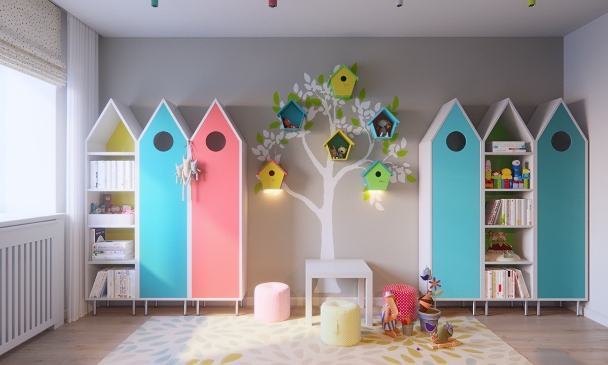
A unique set of shelves make this child's room the perfect place to play. Instead of keeping every bird house closed, two have open shelves. This gives the child a chance to display their favorite trophies, stuffed animals, and toys. The other closed closets can house clothing and other items.
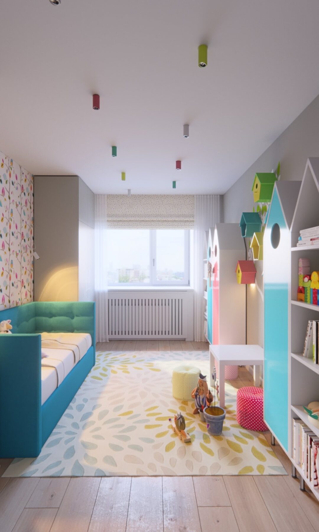
Along with adding color through furniture, Vasin added color by adding a rug and ceiling decor. Even though the room is narrow, the designer added a bed that fits in the room while making it feel roomy.
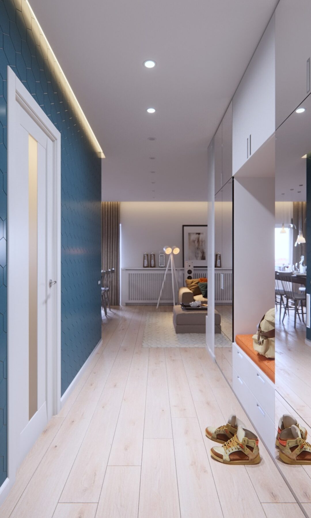
It's easy to forget the hallway when designing a space. In this "room," Mihali Vasin choose to paint a wall a fun color. This is subtle enough not to overpower the home, but is bold enough to add character.
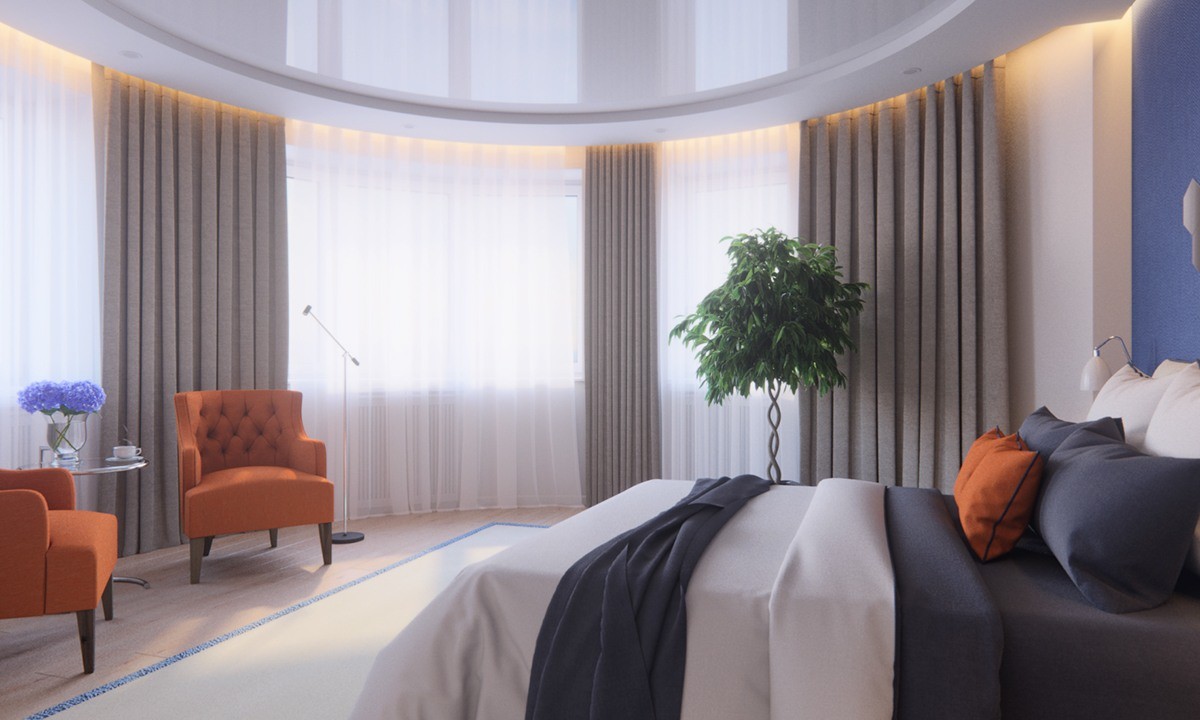
Who wouldn't want to relax at the end of a long day in this master? Although it uses similar colors as the M3 space, it has a new color: orange! The orange chairs and pillow make this room stand out from the other. You can create this style too by using a neutral color palette then adding one bright color as an accent.
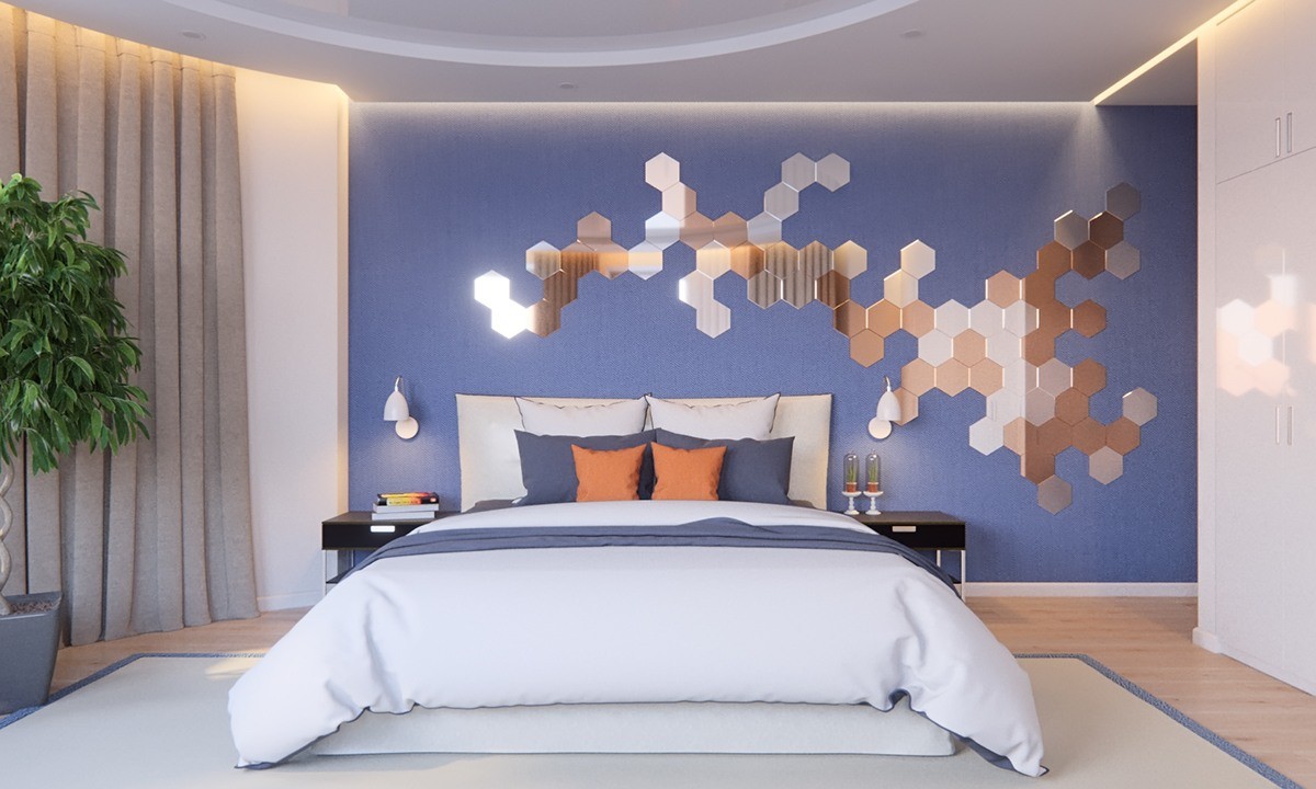
When in doubt, add mirrored accents! Above this bed is a blue painted wall. The color is carried out though the throw pillows. Another way to add a simple decor element is to create a free-form art piece with mirrors! The honeycomb shape is modern and still inviting.
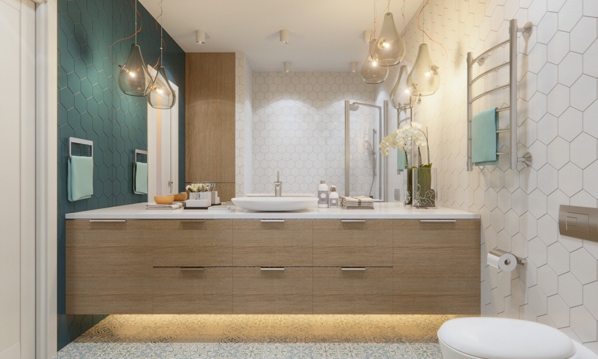
There are a few design elements taken from the master bedroom into this bathroom. To begin, the teal on the wall connects the two aesthetically. Another way the bathroom is connected is through the honeycomb tile.
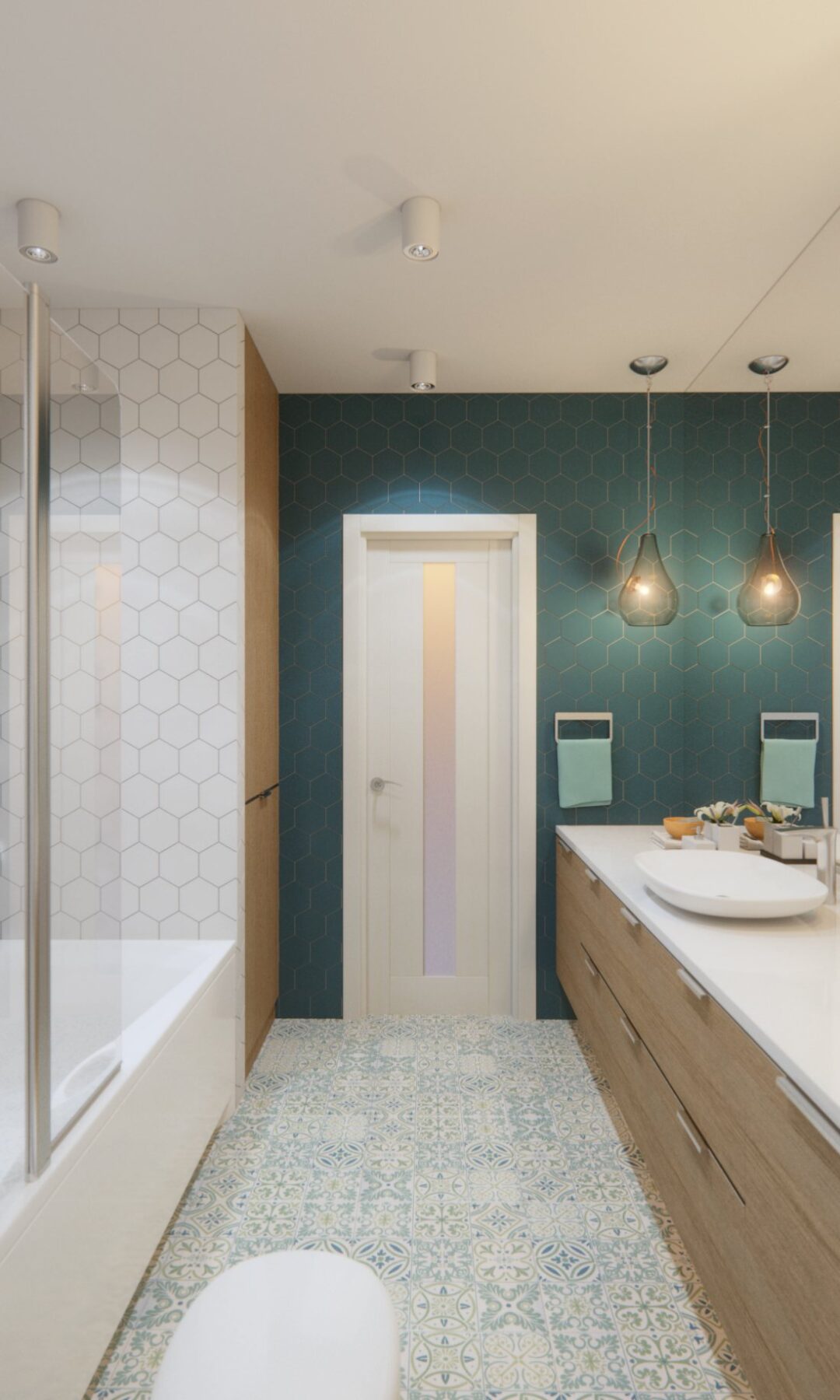
Although this master bath has teal walls, it is still similar in hue with the master bath in the design created by M3 Architectural & Construction Group. Natural wood, white, and silver hardware connect the two designs.
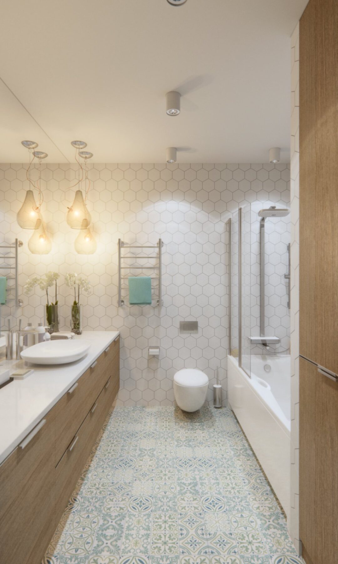
When looking at the room from this angle, you may not realize the teal accent wall behind you. From here, the space is simple and under-stated. If you turn around you get the unexpected punch of color. Hidden storage and the use of rectangular shapes bring this bathroom together with the one from M3.
