It's always a shame to cover up traditional features during a renovation – but the allure of fresh modern design is hard to pass up. This post looks at two attractive interiors that embrace the best of both worlds by preserving classic architectural details while decorating with stylish modern furniture and lighting features. The color themes and materials transcend eras for a totally integrated style that pays homage to the history of the buildings in which they reside. Both interiors are the result of collaboration between architects Slava Balbek & Artem Zavarzin.
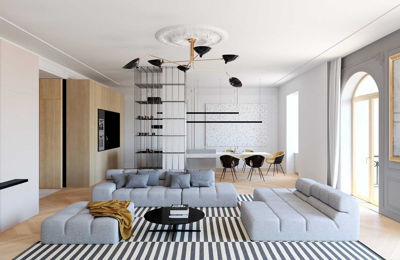
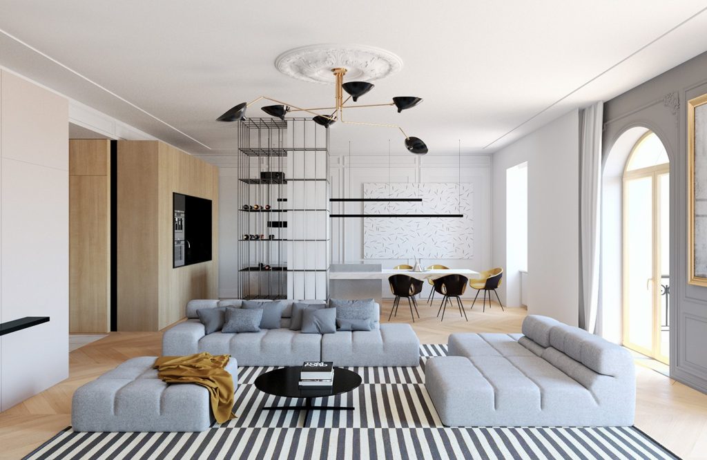
This living room is a fine example of modern decor within a subtly classic interior. Many of the traditional elements have been updated to suit the home's new aesthetic – for example, the ceiling medallion is painted white, and the wall paneling is only preserved in select places (the grey wall to the extreme right, for example).
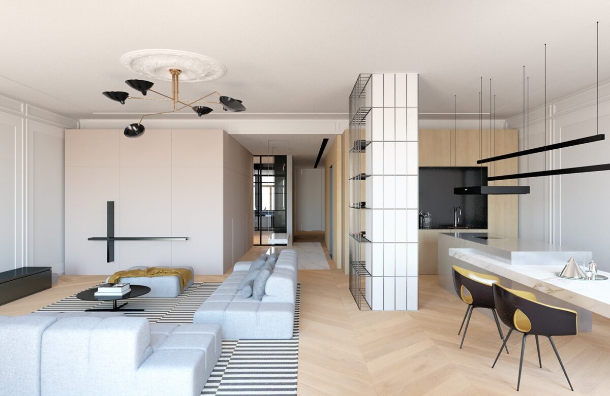
Even the floors are a crossover: the chevron arrangement is a timeless throwback, but light coloration and wide boards bring it right back up to speed. The chandelier is a midcentury design by Serge Mouille.
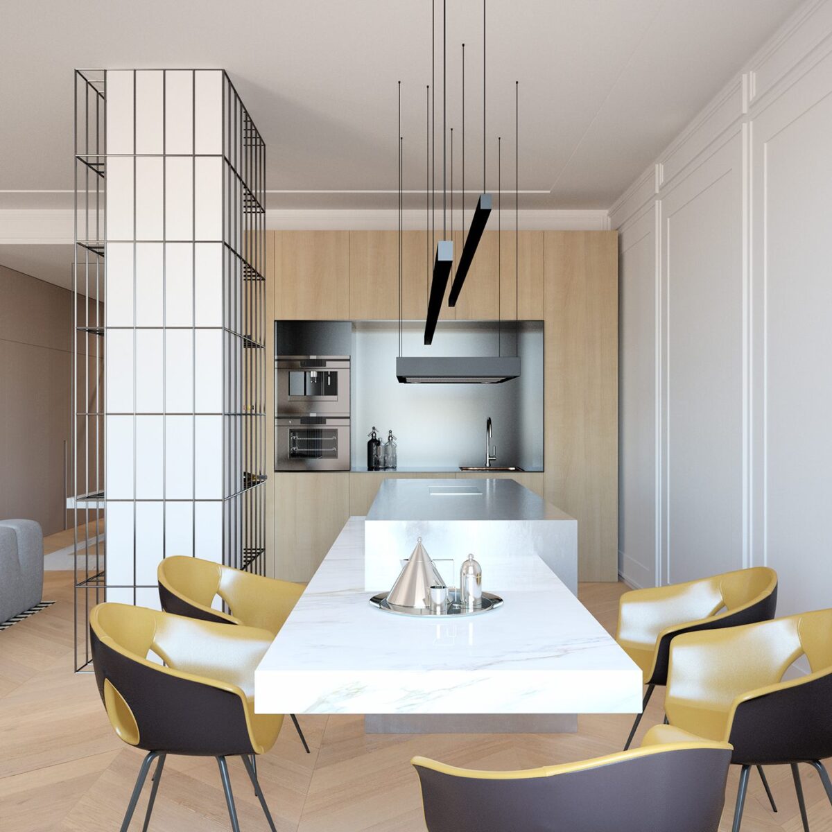
Harvest gold enjoyed its height of popularity in the 60s and 70s, but this modern kitchen demonstrates its potential staying power. It's hard for any color to feel "outdated" within such a creative contemporary interior.
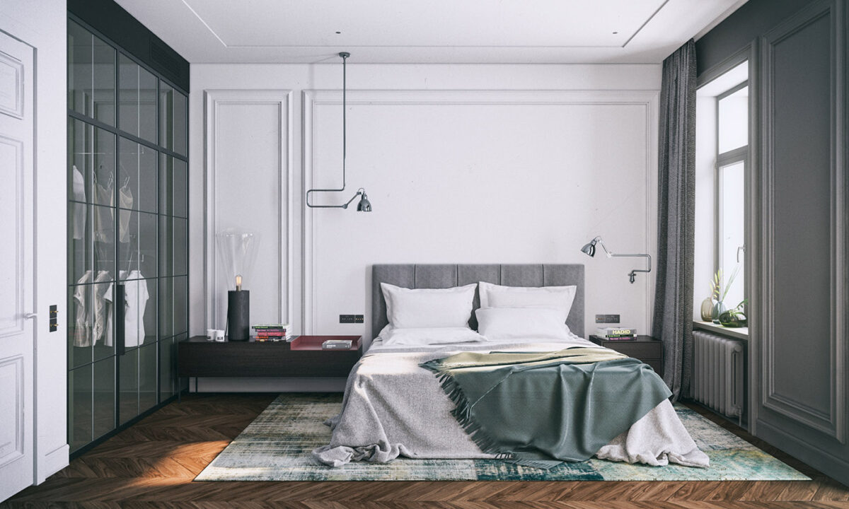
Desaturated artichoke green offers a cool contrast to the darker wood floor in the bedroom. This space also makes good use of traditional wall paneling, this time combined with industrial-inspired decor.
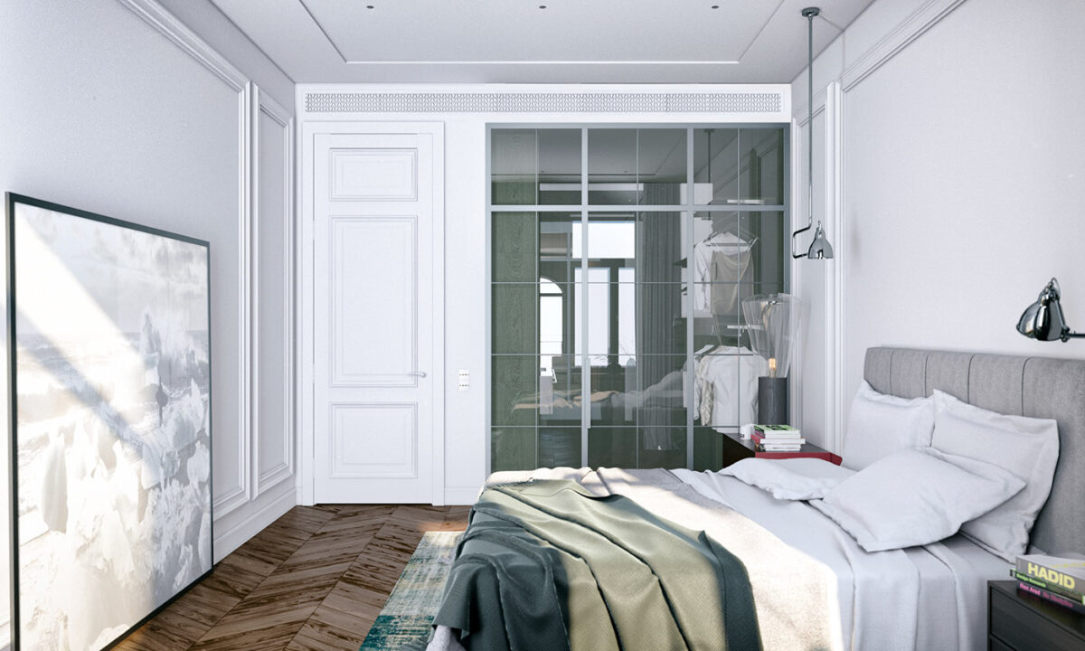
Glass panes integrate strong structural beams reminiscent of skyscraper windows, perfectly in line with this gentle approach to industrial appeal as embodied by the metallic wall lamps.
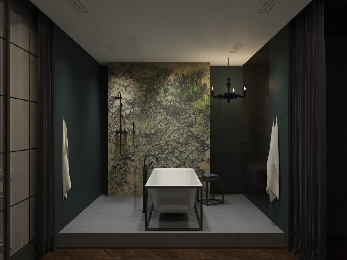
Just out of sight, beyond the glass panes, a freestanding tub awaits to wash away the worries of the day. The print imitates the ever-popular vertical garden effect. The pitch-black chandelier is easy to overlook but adds incredible ambiance.
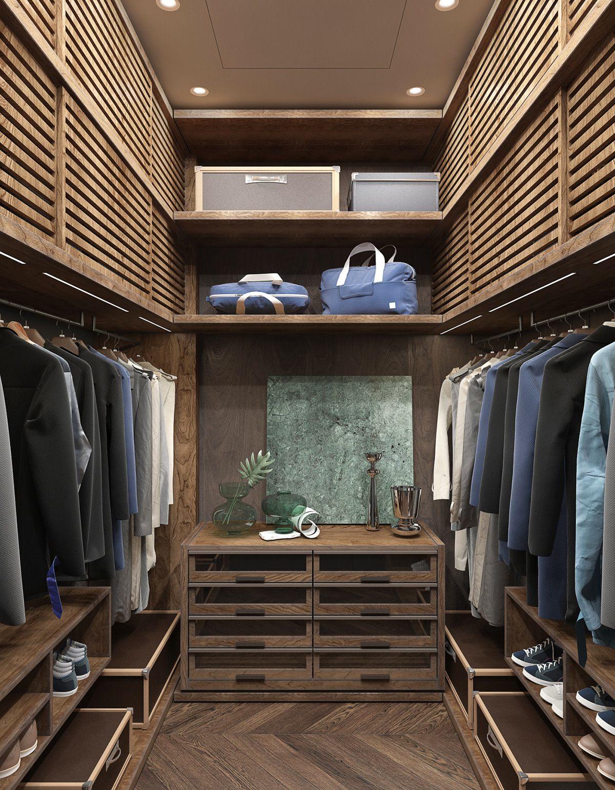
Dark wood, luggage-style boxes, and gorgeous green glass add vintage charm to this beautiful walk-in. The chest of drawers is actually a more convenient alternative to deeper drawers when it comes to organizing accessories.
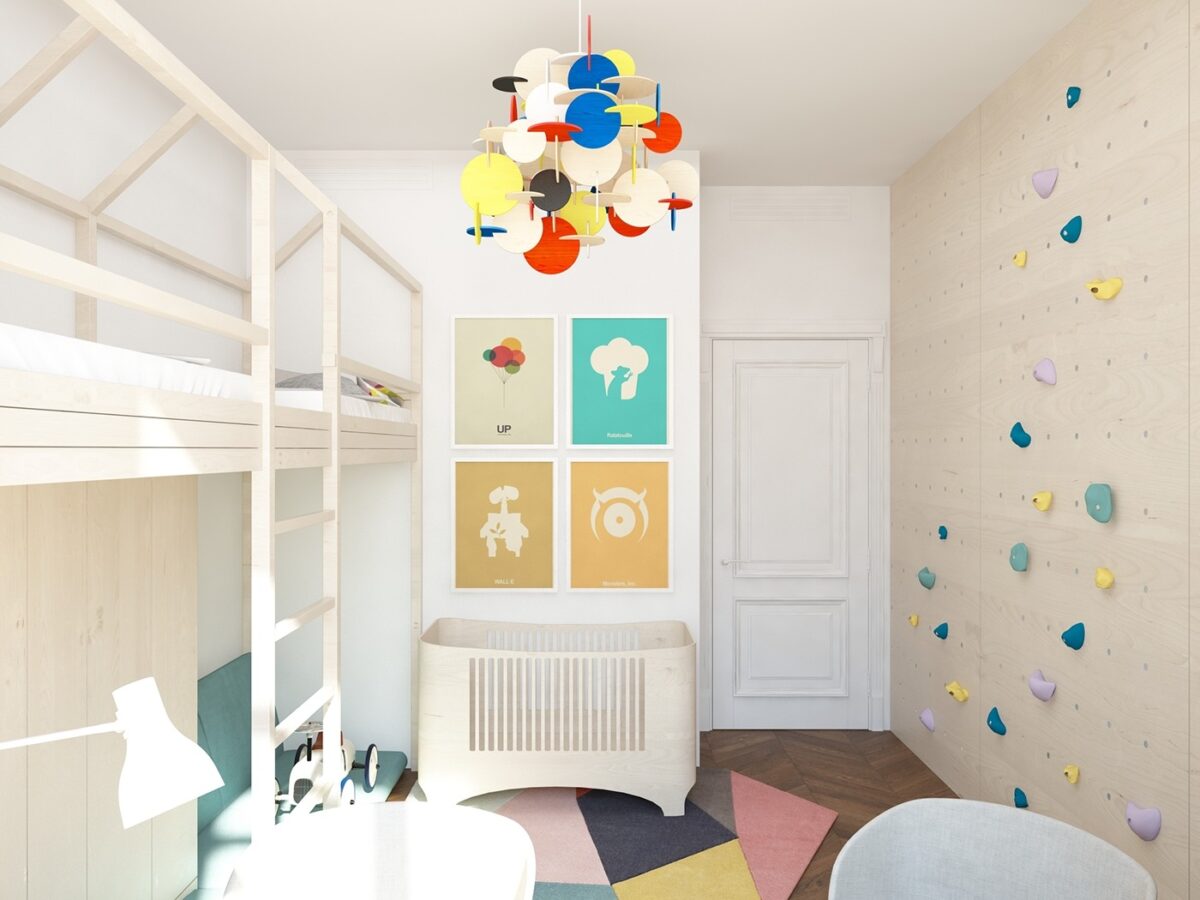
What an adorable bedroom! This is perhaps the most up-to-date room of them all; the paneled door is the only remaining hint of traditional interior architecture.
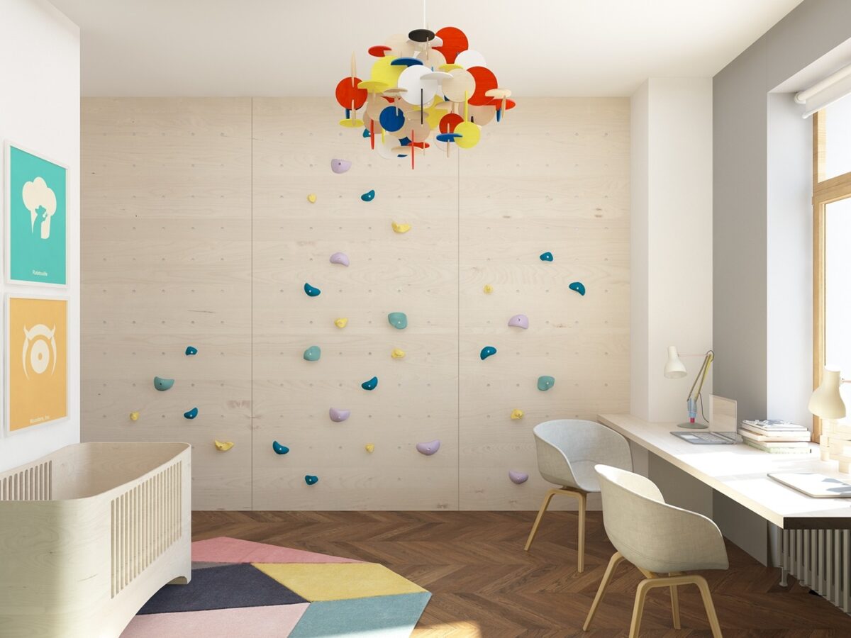
The cute modern chandelier, on the other hand, is a playful take on the early 1900s De Stijl color theme popularized by Piet Mondrian – except this design uses circles rather than Mondrian's iconic squares.
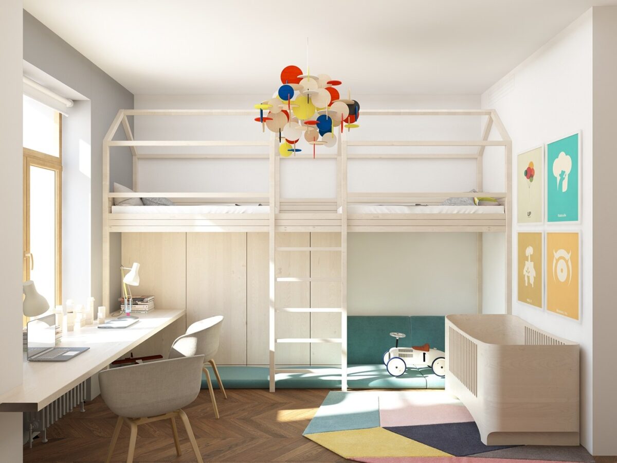
Simple framing transforms an ordinary bunkbed design into an adorable little house with storage and room to play on the ground floor. Two beds occupy the first floor, and a bassinet keeps baby cozy near the wall.
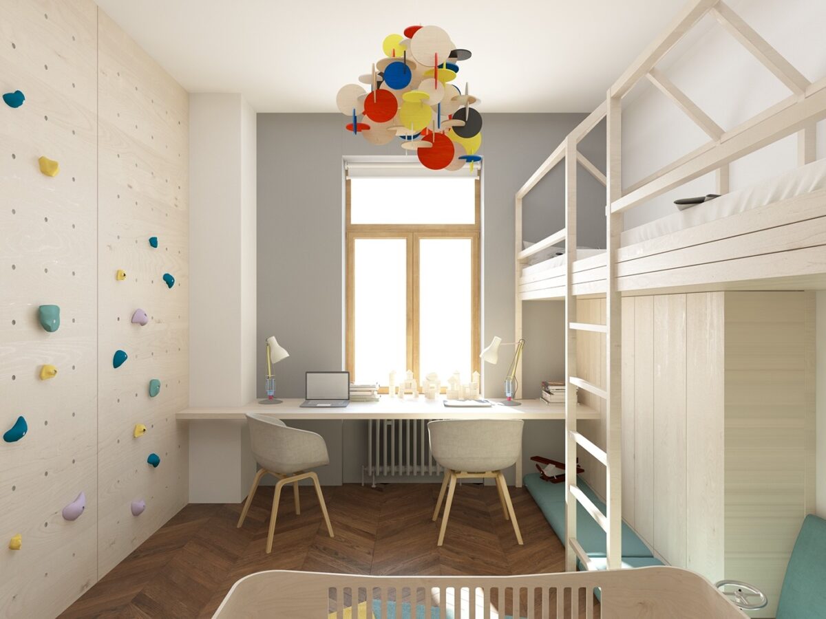
The neat climbing wall must be a fantastic motivation for the young ones to finish homework so they can play and exercise. It's an adorable room all around, and uses space so efficiently it's hard not to take note of the layout.
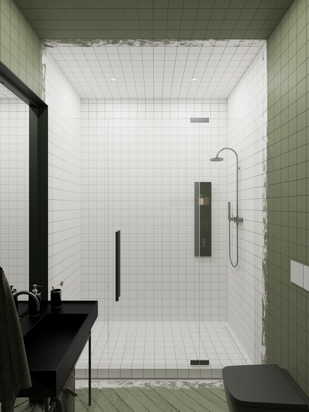
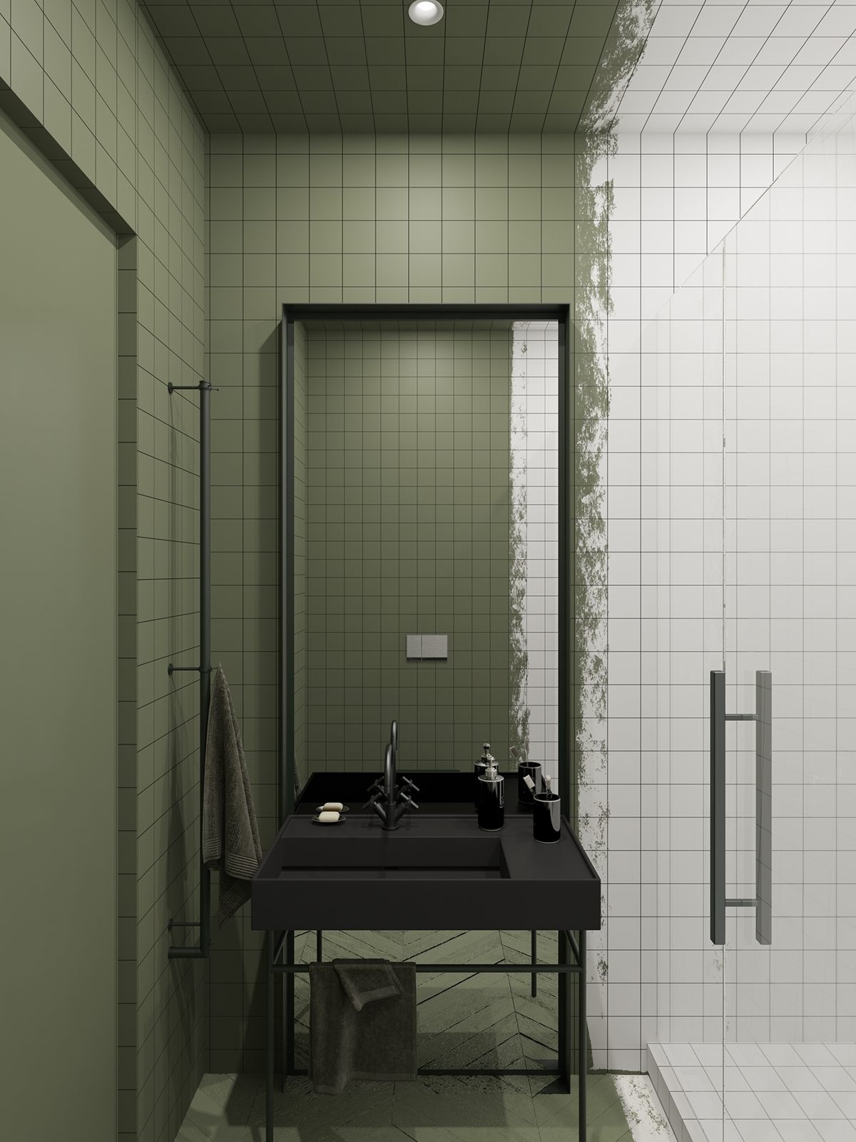
Here's a peek at the unique and stylish family bathroom. The shower and bathroom are distinguished by the transition from white to olive green, blurred by a rough strip where the colors mesh.
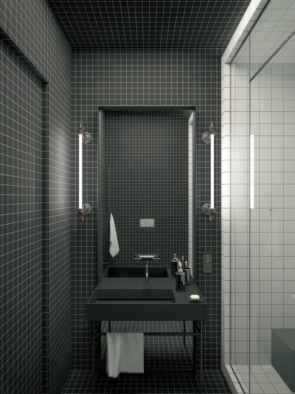
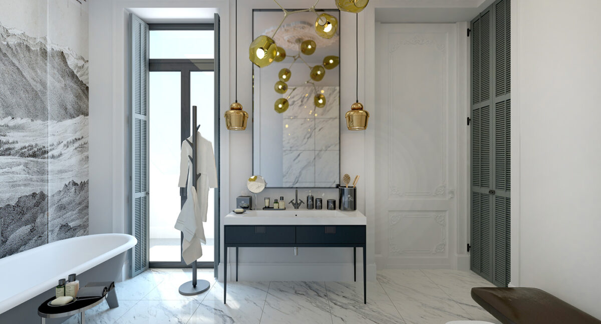
The same black fixtures appear in the other bathroom as well. It has the same exact layout – in fact, this image could be an alternate design for the first bathroom.
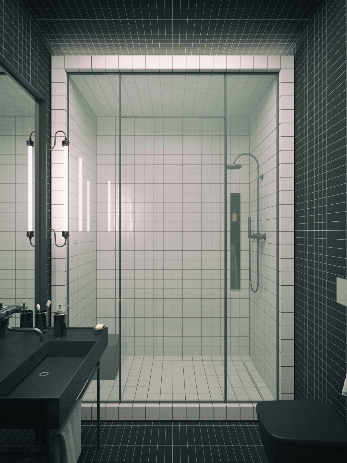
It's interesting to see how much of a difference a simple material and color swap can make. Almost everything else remains precisely the same.
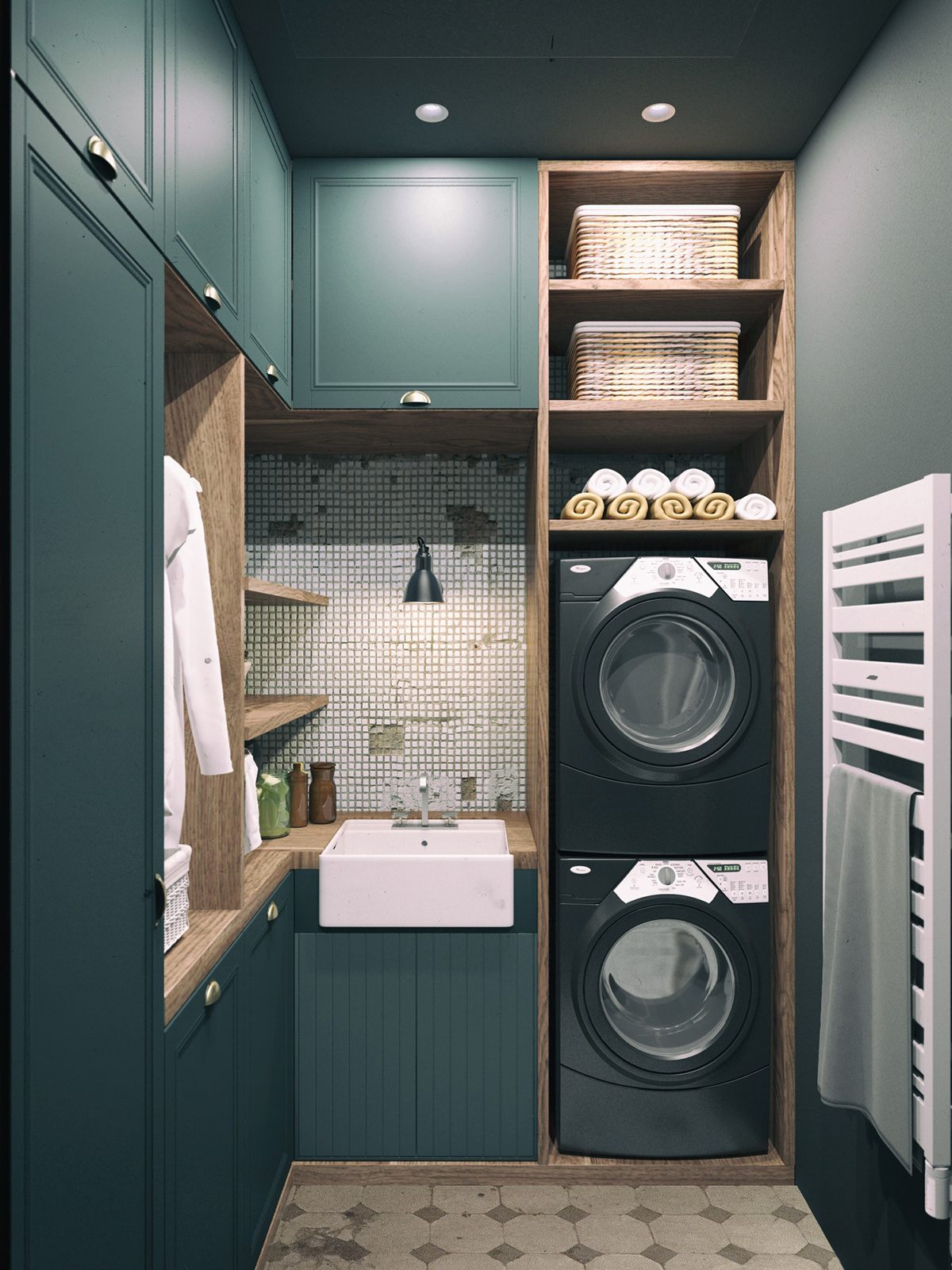
Finally, the first tour ends with a look at the stylish laundry room. Broken tiles serve as a fascinating counter to the pristine new surfaces.
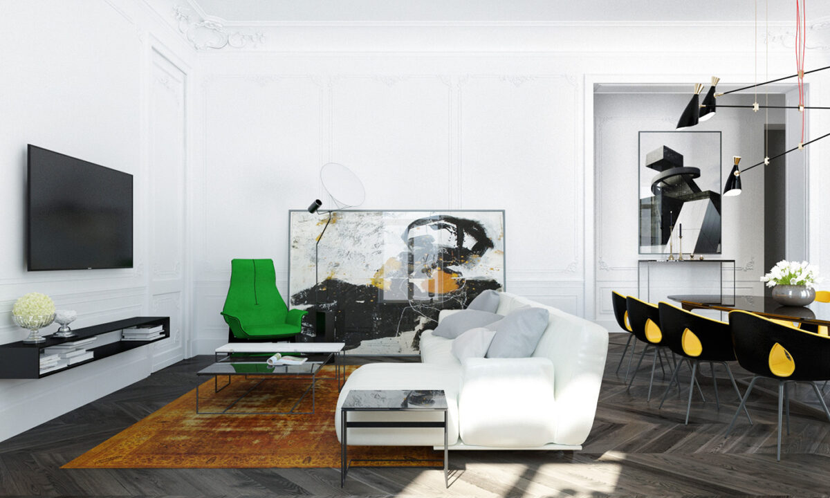
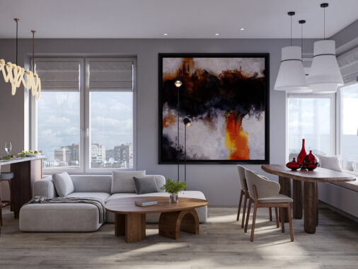
Classic wall paneling plays an even more important role in this otherwise contemporary interior. Decorative corners add just the right amount of ornament while colorful modern furniture really steals the show. Dramatic light fixtures are another recurring theme – here, the Full Moon Lamp by Cedric Ragot occupies a space in front of the large abstract print propped against the wall.
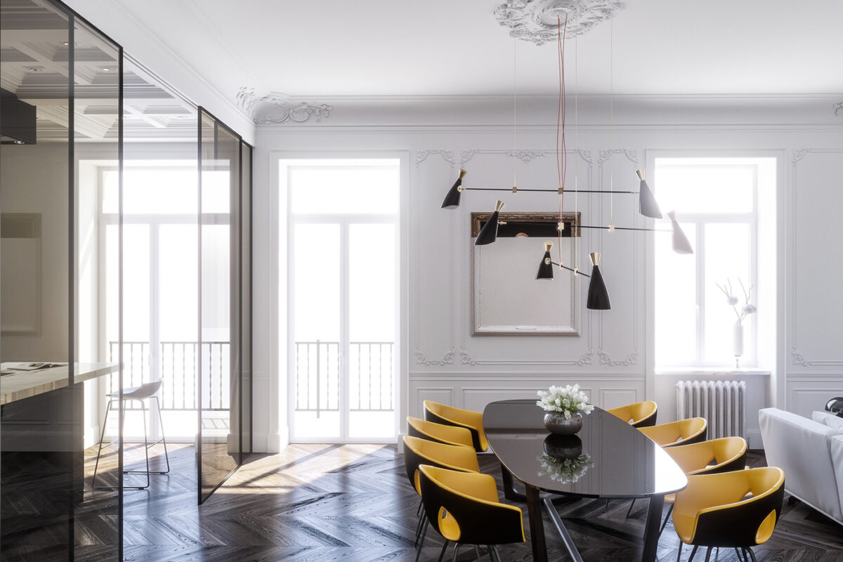
Curved shapes soften the bright and modern dining arrangement. The chairs are from the Ginger Ale collection by Roberto Lazzeroni, the same design from the first home featured in this post.
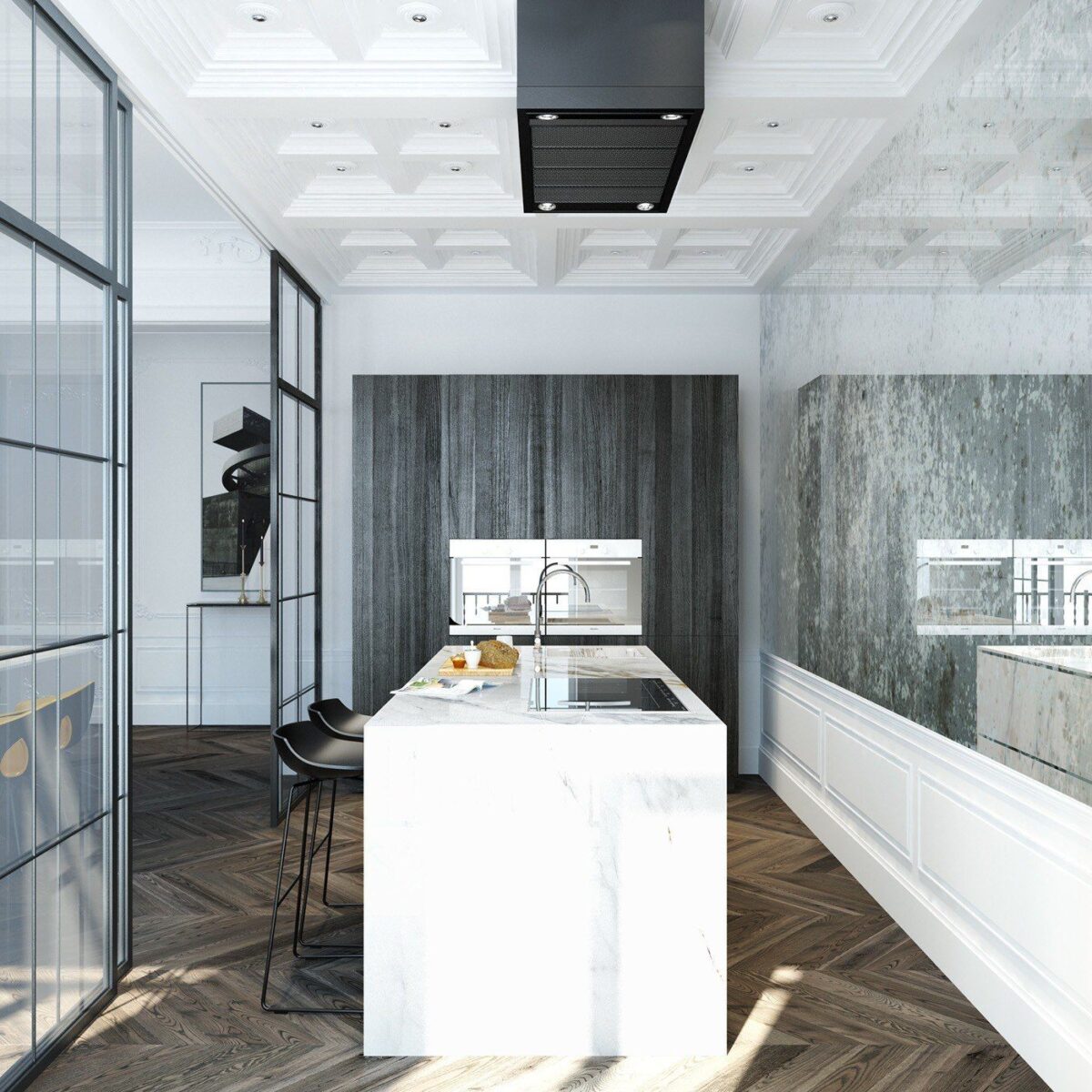
Glass doors and highly polished stone wall cladding flood the kitchen with light. It's interesting to see how the classic elements like the chevron floor and paneled ceiling grasp more attention than the more restrained modern furniture.
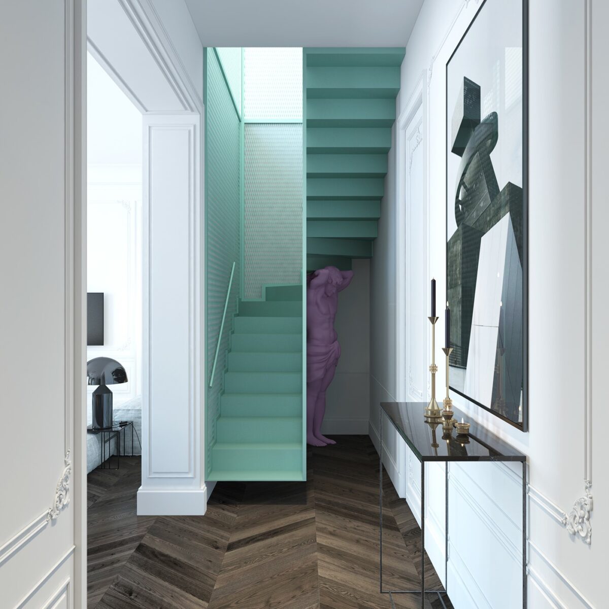
Quirky colors and unique design bring this staircase to the next level. Held up by an Atlas-style statue, it follows the current themes popular in the alternative Aesthetic movement.
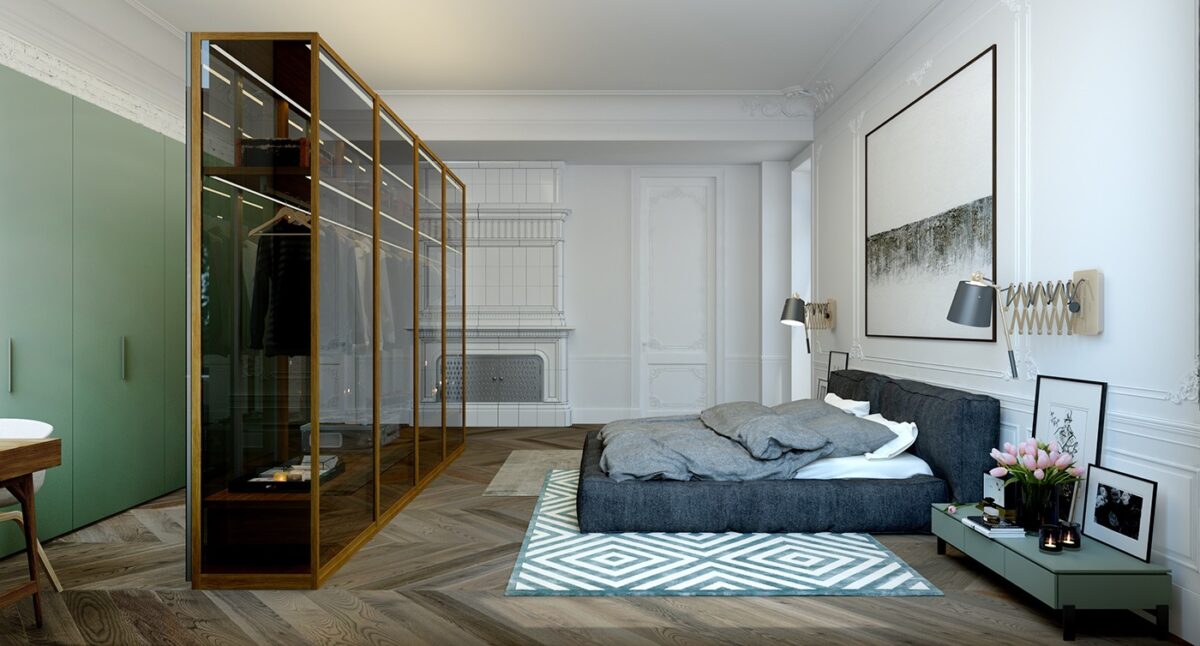
The interplay between tradition and contemporary design is strongest in the bedroom. The tiled fireplace almost blends into the white walls but holds its own as a stunning if subtle focal point.
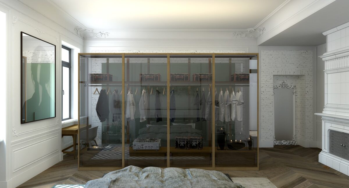
A freestanding wardrobe conceals storage cabinets and provides a little privacy for the small office to the left. Encased by glass on all sides, it remains transparent enough to avoid casting excessive shadows.
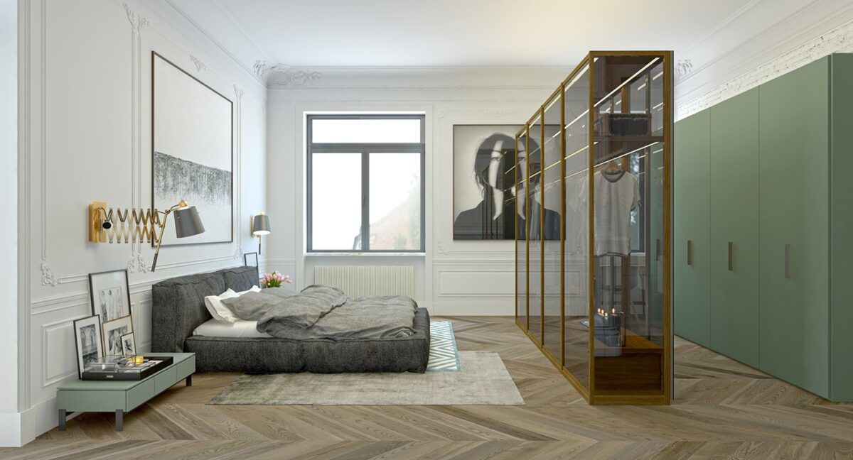
The wall lamps continue the brass accent theme. The scissor arm is a classic touch, and makes it easy to adjust the direction for reading before bed.
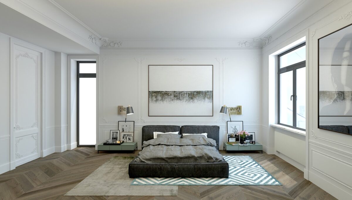
Careful proportion is an important part of this interior decor composition. The off-balanced rugs, the perfectly sized artwork, and the low bed and side tables all work together beautifully.
