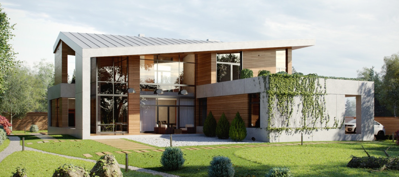
Adventurous decorators can find endless inspiration in dark color schemes, a choice that comes with more creative constrictions than lighter or more conventional palettes. Making a dark home design feel comfortable and accessible requires careful attention to lighting, composition, and contrast – without these considerations even the most well-intentioned black walls or grey floors could quickly become overbearing. The six luxury homes profiled in this post demonstrate dark interior design done right. If you're ready to embrace dark hues within your own home, these inspiring spaces should help you get started.
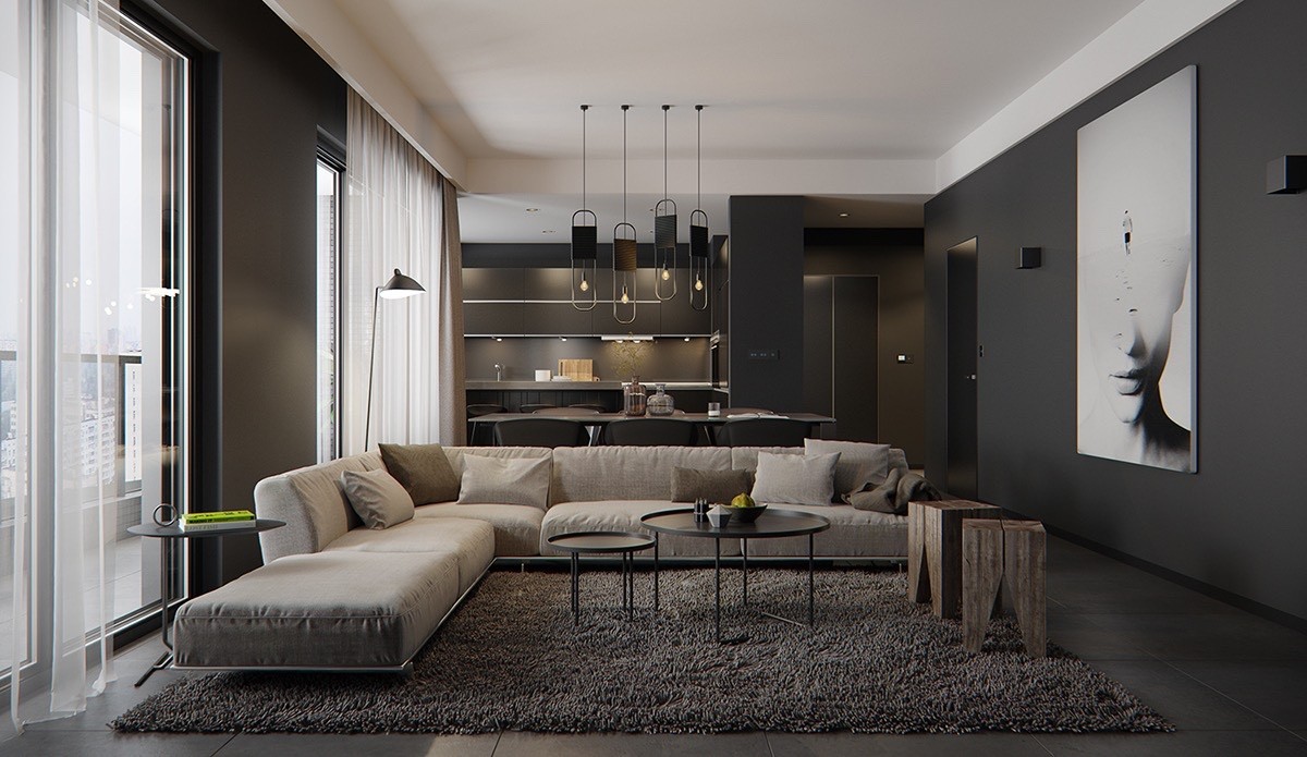
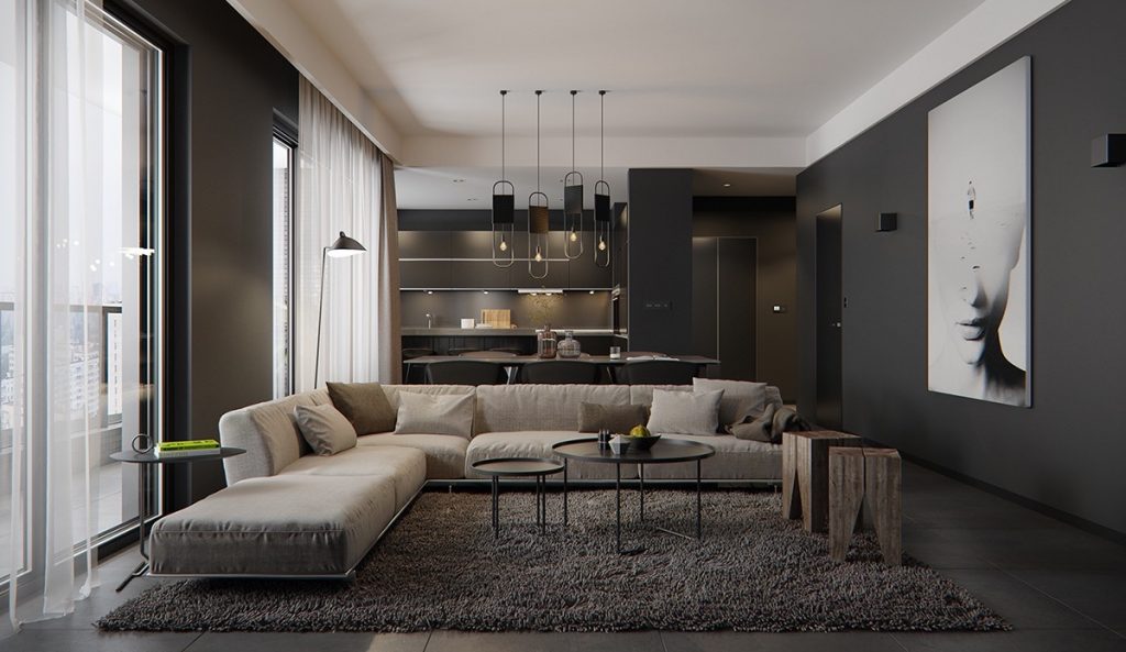
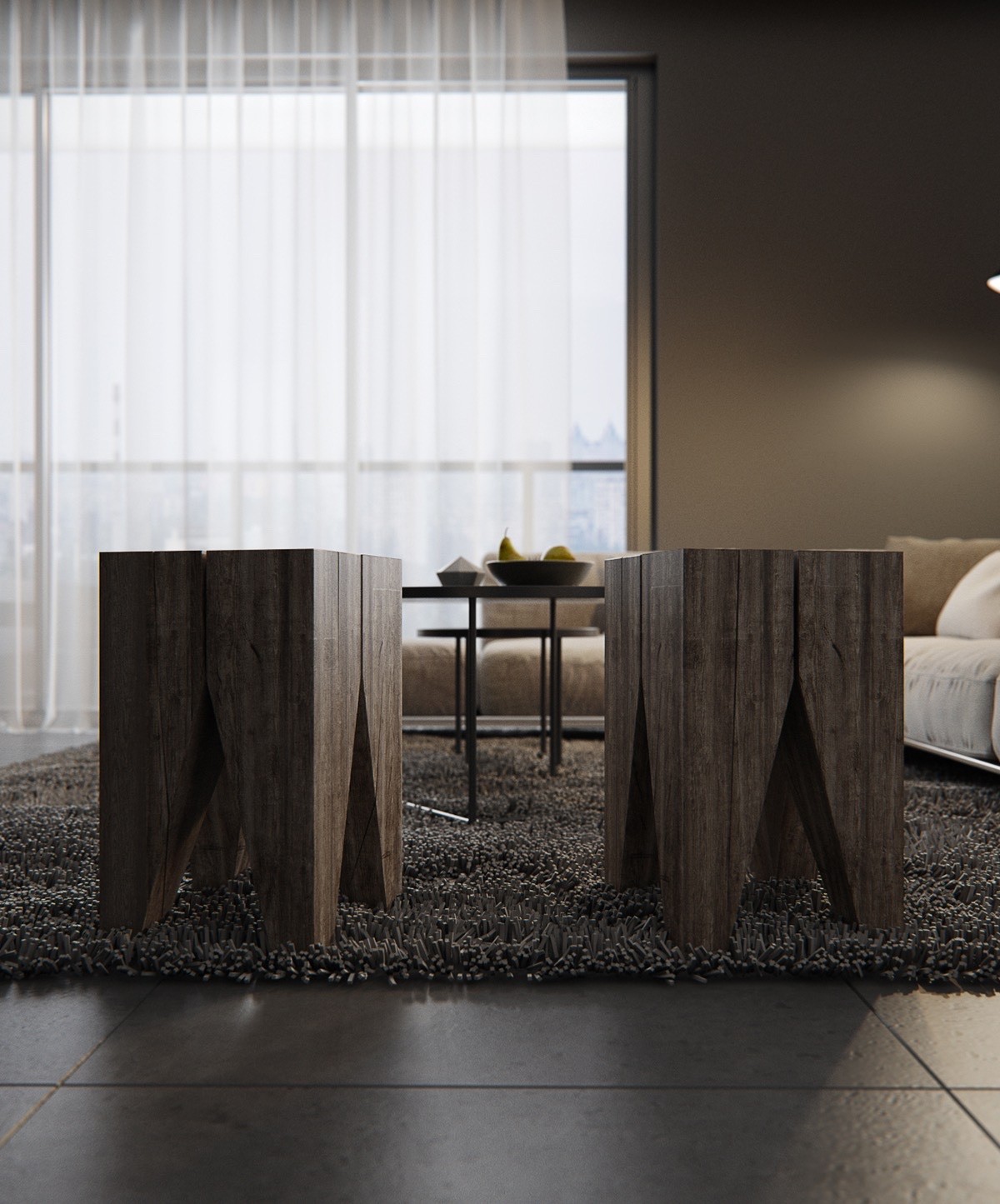
Let's start with a nice casual style. Matte black walls feel powerful but don't drown out the more subtle brown tones used throughout, making for a nice comfortable place to relax with friends and family.
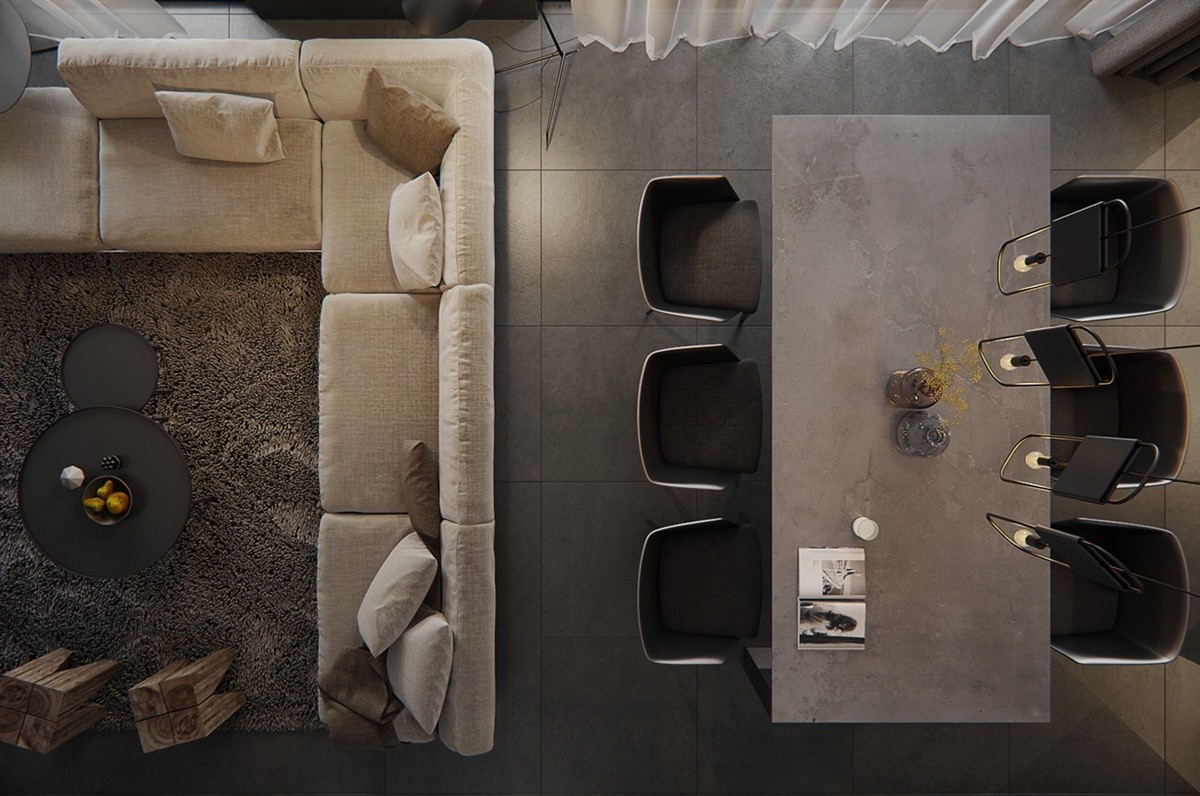
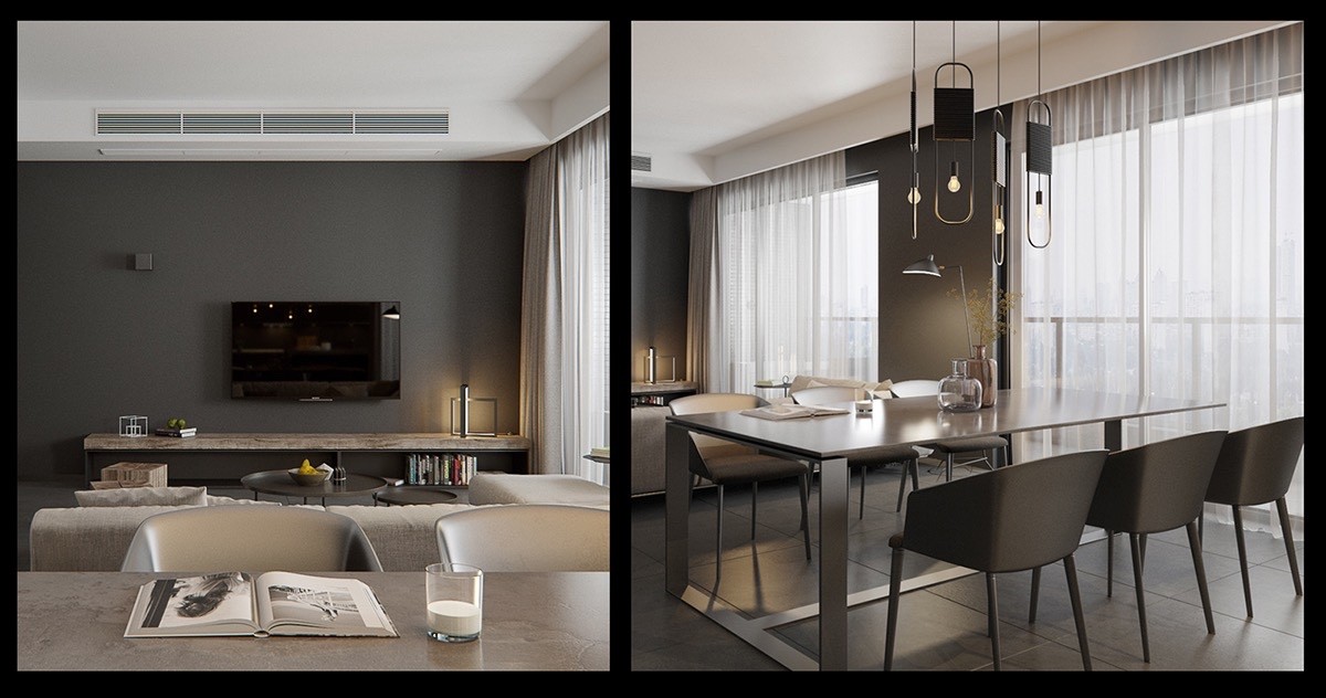
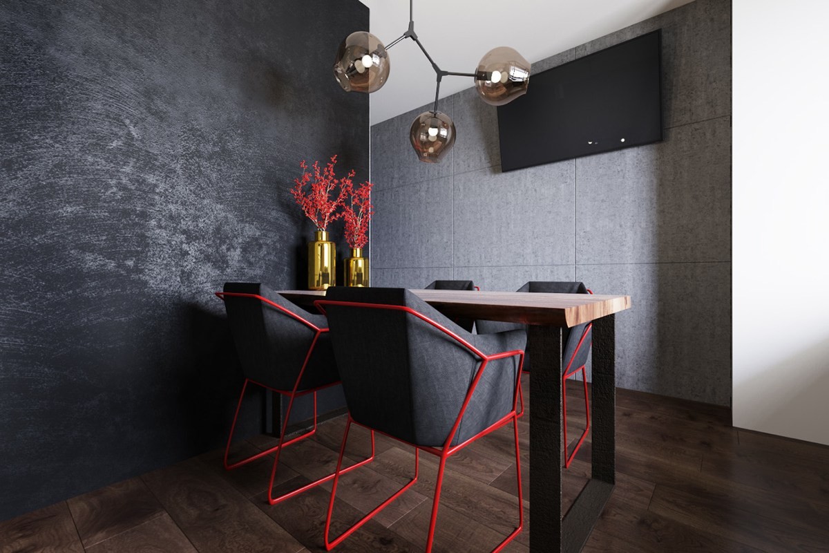
Soft neutrals define the sofa and sitting area, whereas the attached dining room takes a risk with stark industrial accents.
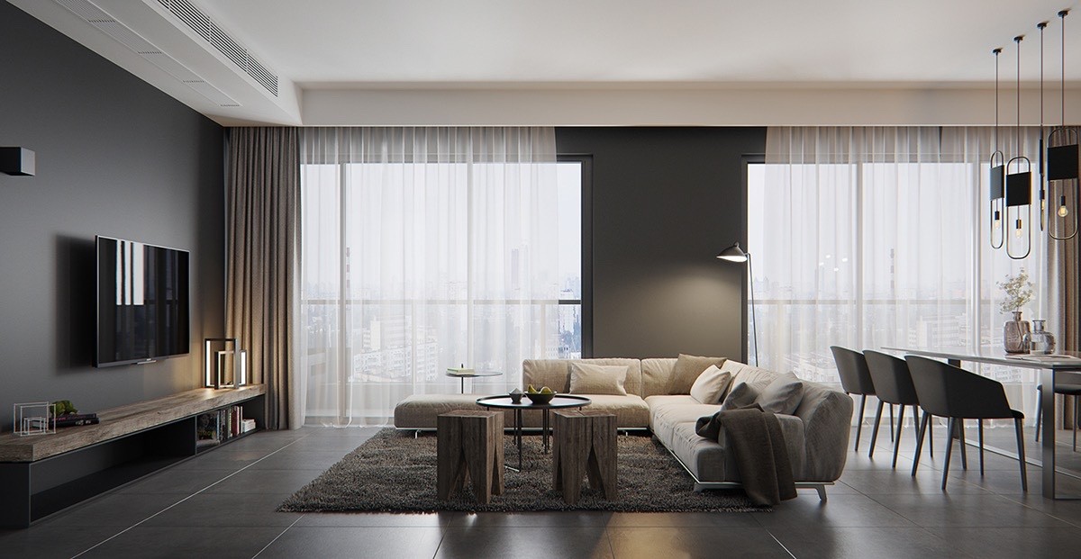
Dark colors work well in wide-open layouts like this one. Large rooms still allow light to traverse the interior, whereas smaller spaces can feel suffocated by the sheer "bulk" of dark walls.
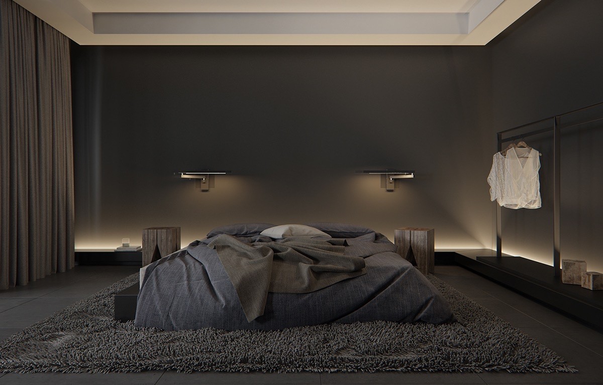
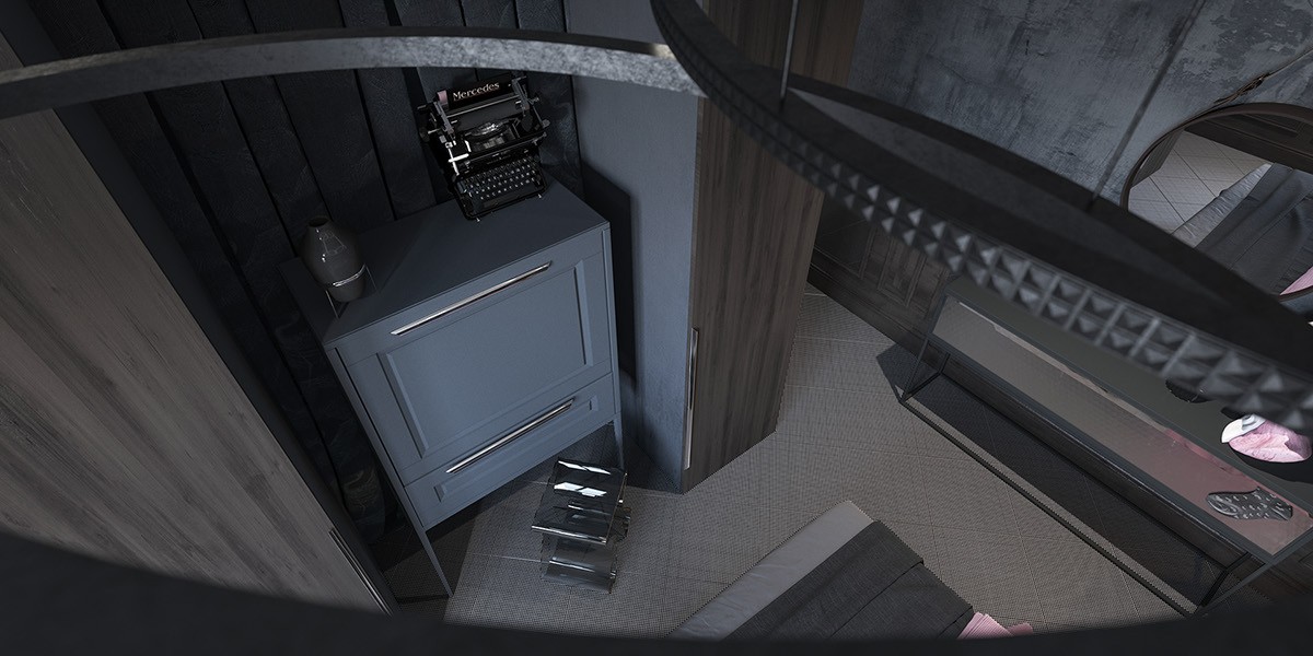
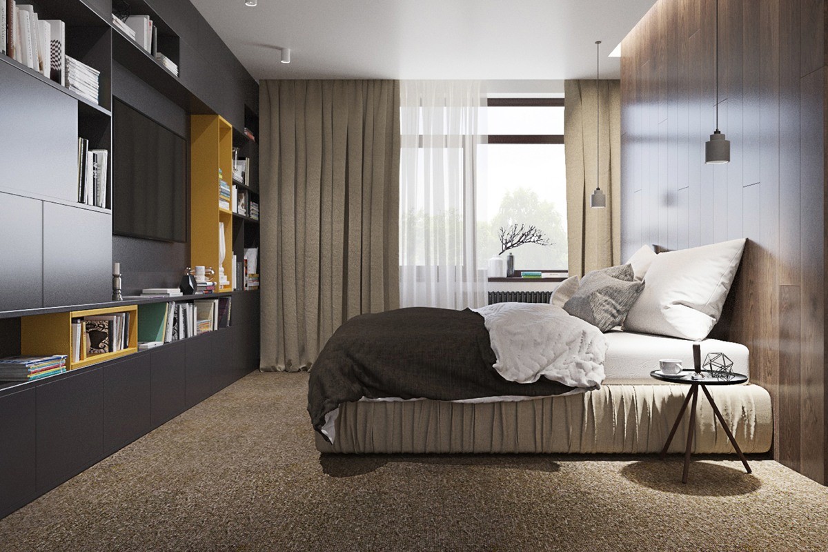
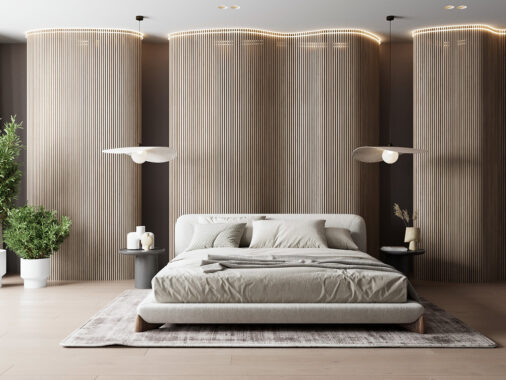
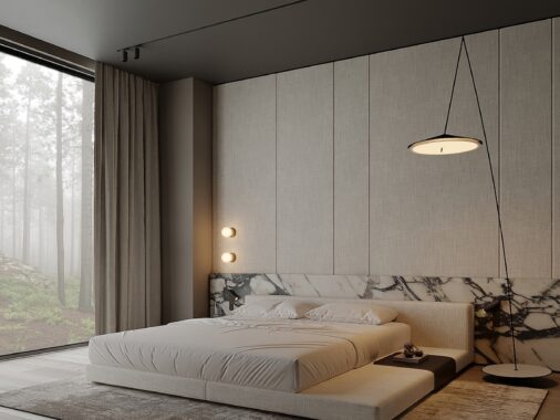
Mood takes priority in the bedroom. Black-on-black fabrics ensure the textural experience is just as powerful as the visual one.
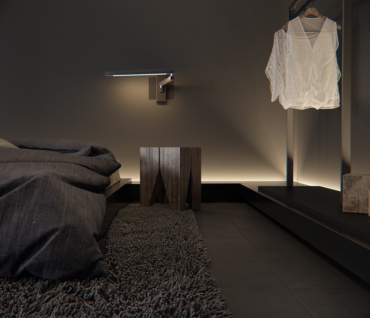
Indirect lighting adds yet another layer of aesthetic complexity, casting complicated gradients across the silken black walls.
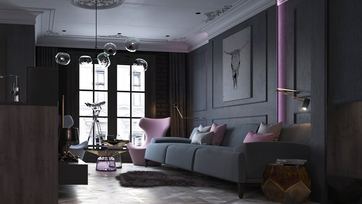
Designed for a competition coordinated by the Keramin tile and ceramic company, the decorator started with a generic Minsk apartment and created this soothing black and lilac wonderland.
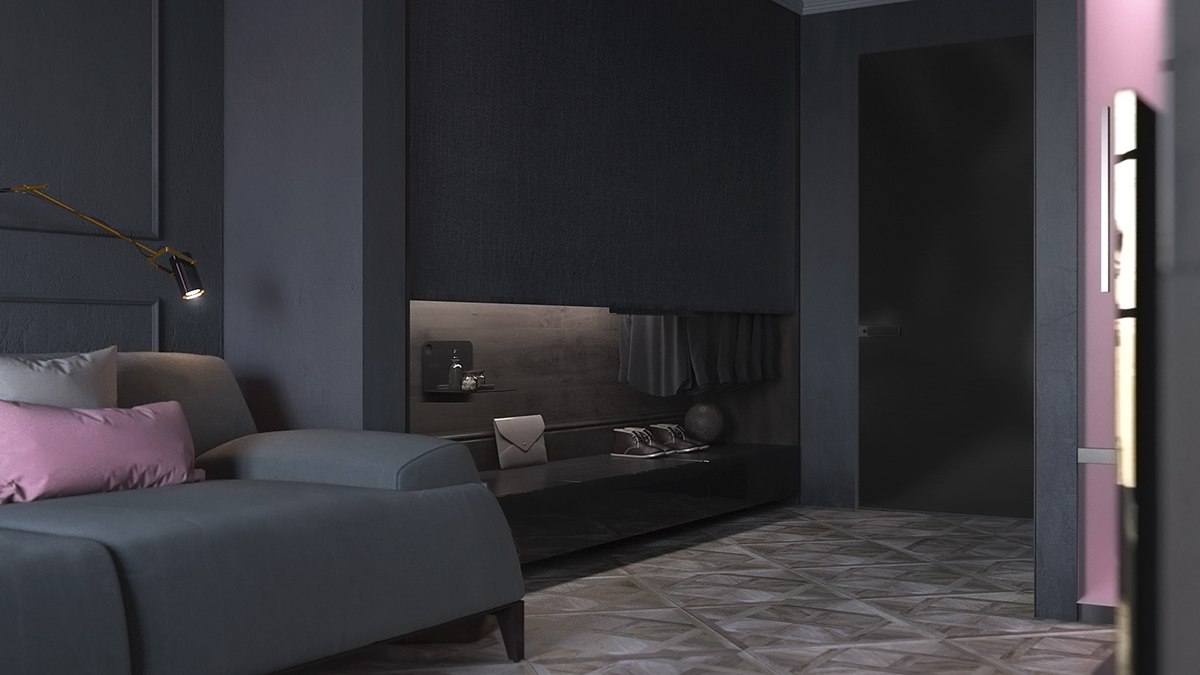
It's dark, but definitely not dull. Furniture alternates between cutting clean lines and embracing mysterious curves. The result offers a different visual experience from every angle.
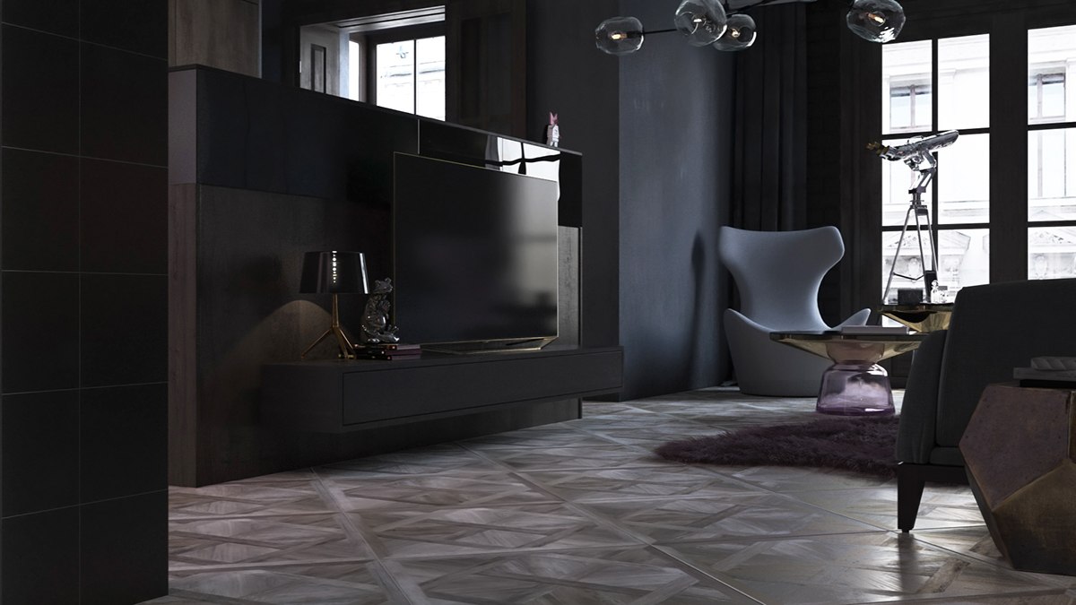
Many details blur the lines between classic and contemporary. Good examples include the charming parquet floors and the blown glass Lindsey Adelman chandelier above.
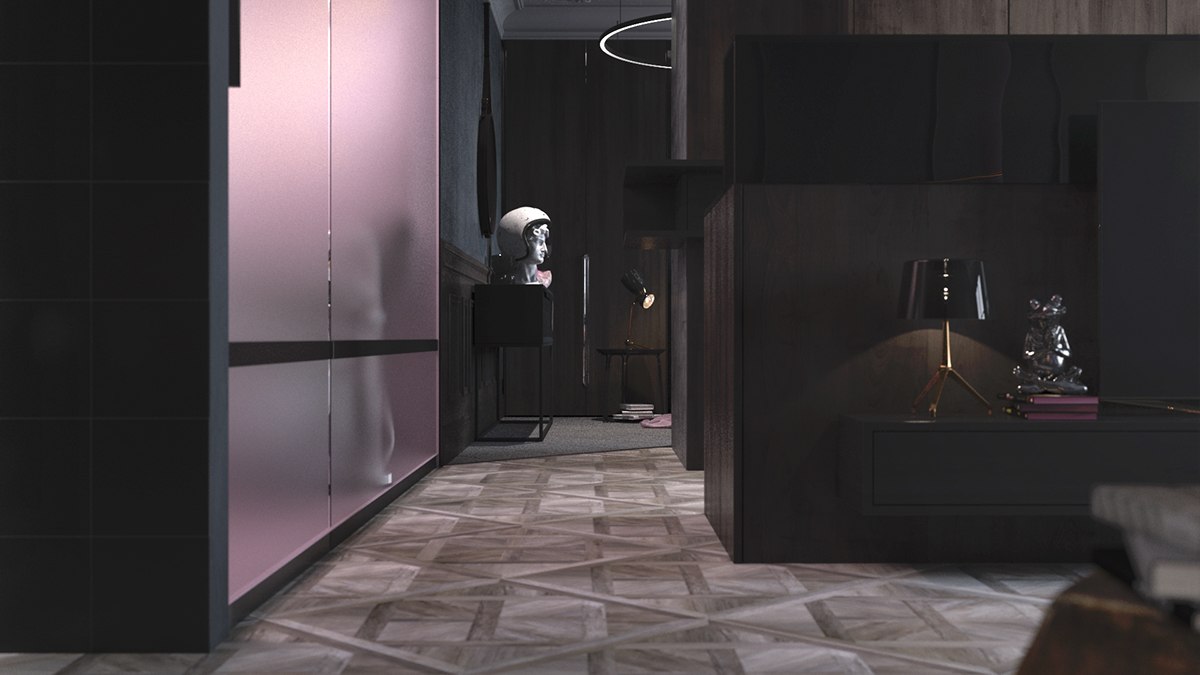
In the hallway, frosted glass glows with purple backlighting – a clever way to transform an everyday storage feature into an unmissable focal point.
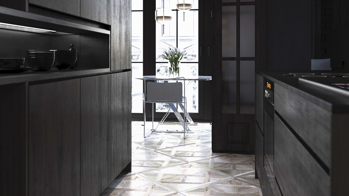
Essential areas remain simple. This kitchen cuts straight to the point and doesn't clutter the design with unnecessary decor.
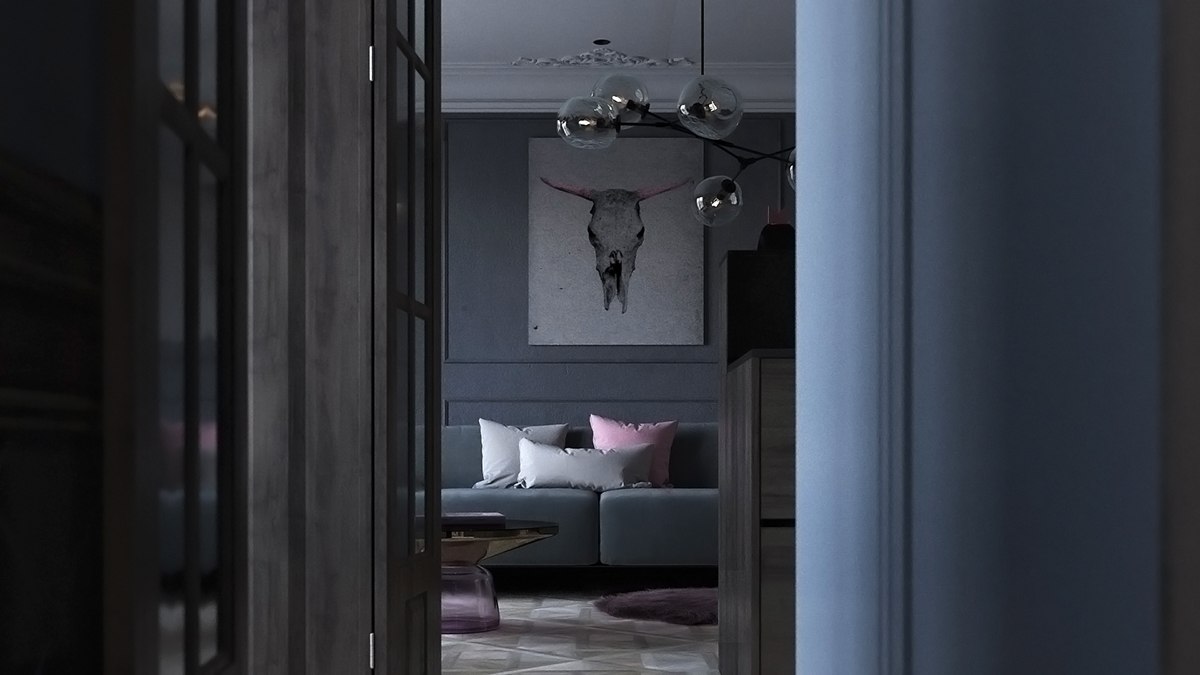
Even the skull painting ties back into the soothing color theme. Those soft pink horns are a visual and conceptual contrast to the image.

"KEPAMEH" is a transliteration of the KERAMEN brand, from Russian. This cute little mascot is just part of the scenery for the contest.
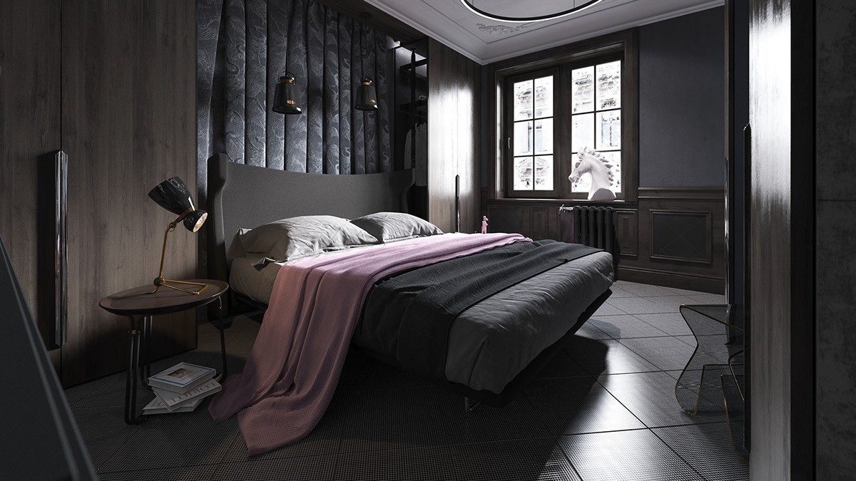
Moving onto the bedroom reveals a dark and soothing retreat, luxuriously appointed for a relaxing evening with a book or a movie.
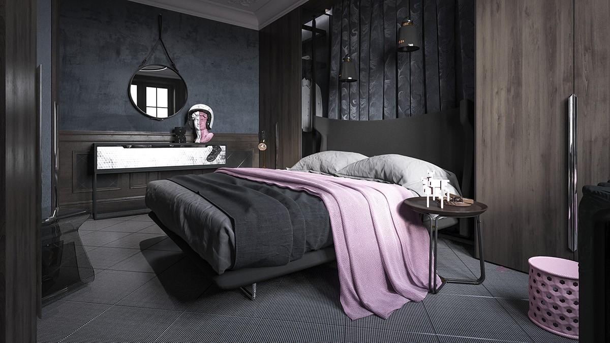
Layers of texture make this space special: the variety encompasses a distressed matte wall, silky wood paneling, sharp floor tiles, and the plush headboard.
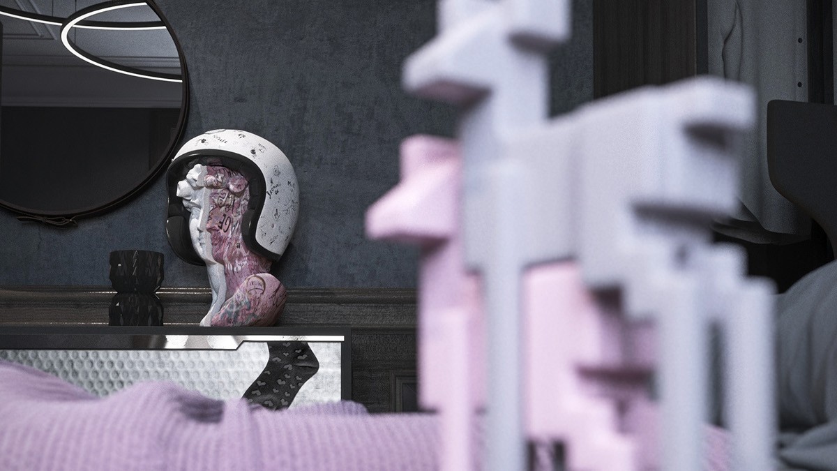
Vaporwave is a contemporary music genre that spawned its own art movement. Lavender is a popular color, and classical busts a common motif.
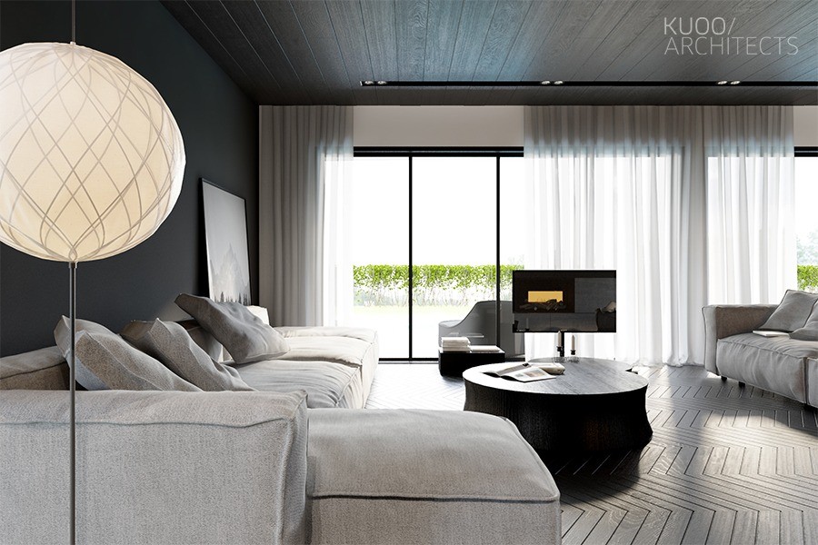
Dark and light tones set the stage for a dramatic interior full of contrast and change. Silky grey floors reflect every ounce of sunlight that filters through the floor-to-ceiling sliding doors, while gauzy curtains maintain the atmosphere even when drawn.
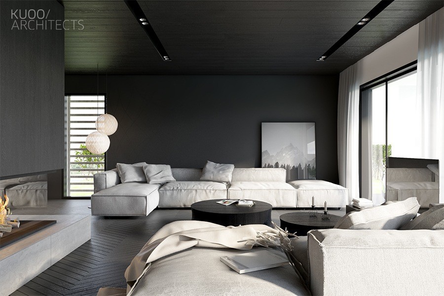
Ample seating can accommodate a large number of guests. The doors slide open to reveal additional recreation space outdoors.
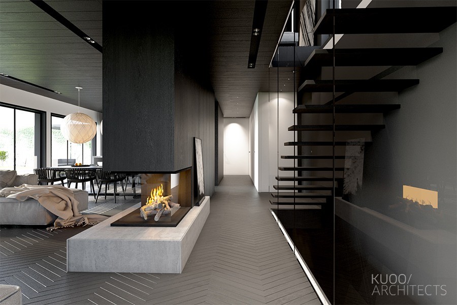
Here, a central fireplace divides the primary living space from the private areas like the theater. The rest of the home takes advantage of lighter flooring for a brighter but more cheerful look.
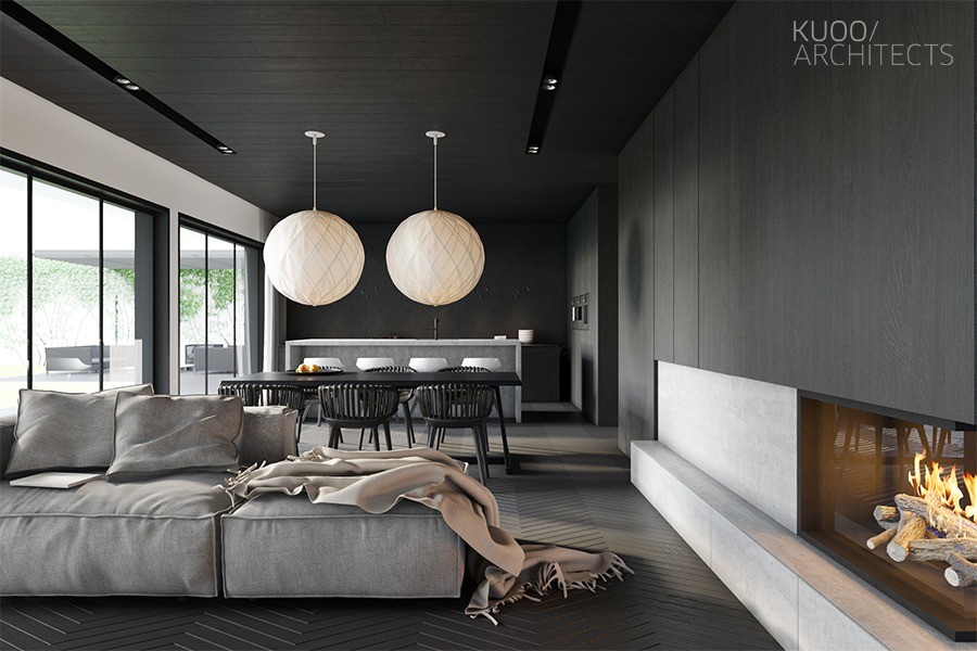
With the dividing wall to the right, the open dining and kitchen areas feel cozier but still enjoy the convenience of a doorway to the hall.
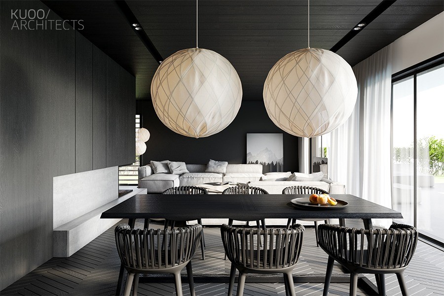
Black rules the dining room as well. Two white pendant lights punctuate the dark theme – it's hard to ignore the oversized beacons of white among an otherwise monochromatic interior.
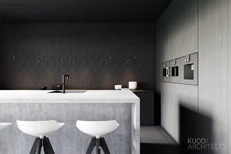
Shade variation continues to shrink at the end of the room, where the kitchen terminates in a geometric black accent wall.
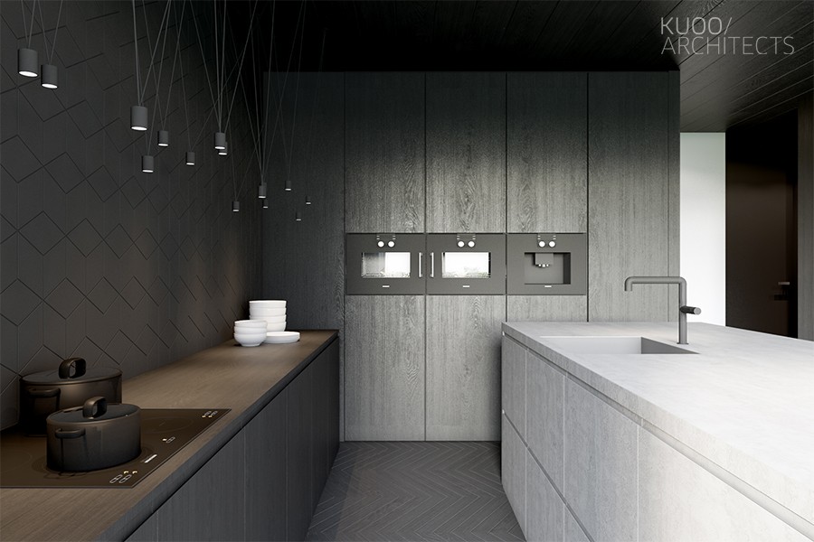
The array of pendant lights crisscrossed over the countertop is from the MATCH collection by Jordi Vilardell & Meritxell Vidal.
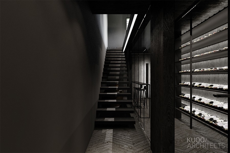
Downstairs, just a short walk from the kitchen, guests will surely find this area to be one of the most exciting rooms in the home.
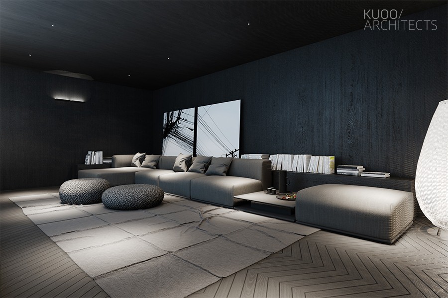
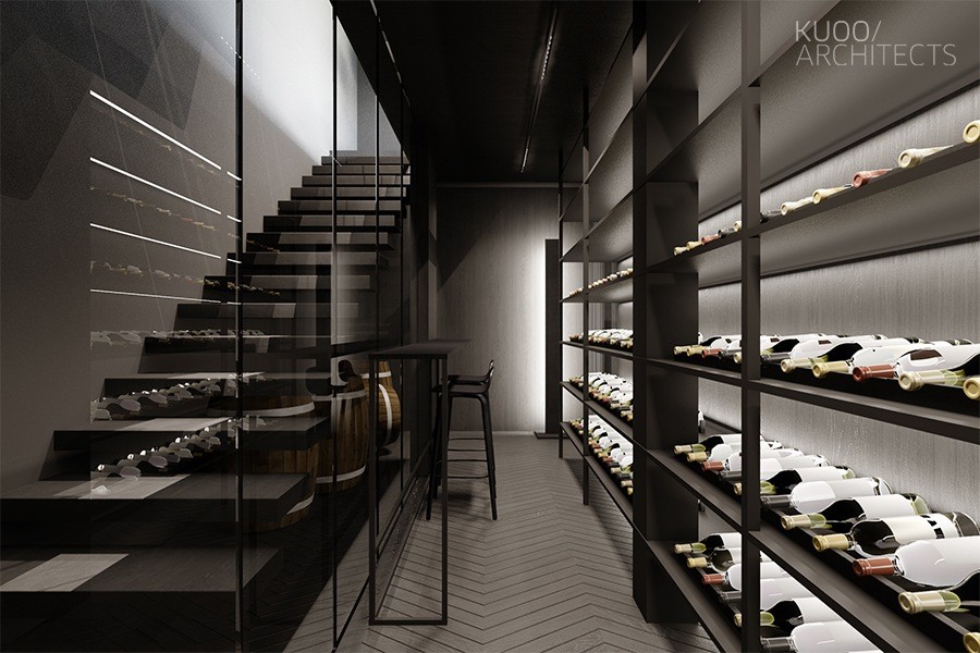
A good movie is a good companion for a glass of wine with friends. This darkened room contains the home theater. Curvaceous furniture looks comfortable and appealing for long screenings.
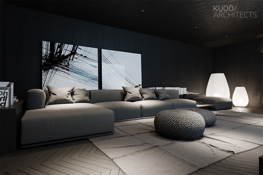
Soft mood lighting illuminates the grey furniture yet the black walls fade into the background to give the illusion of a spacious theater.
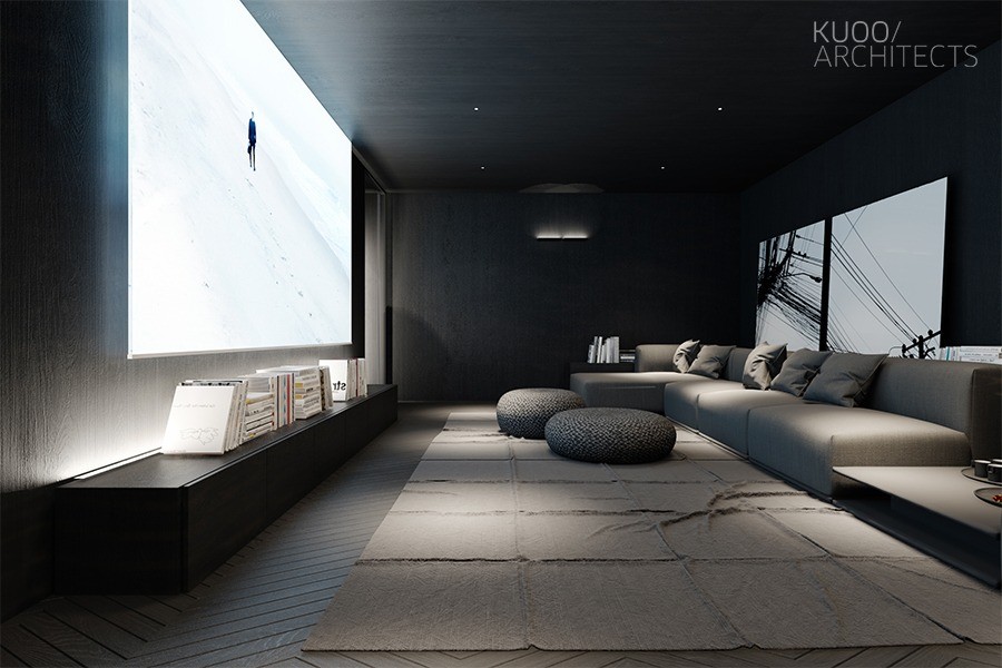
Check out the size of this projector screen – ideal for full immersion. It retracts into the ceiling to transform the room back into a social area or small personal library.
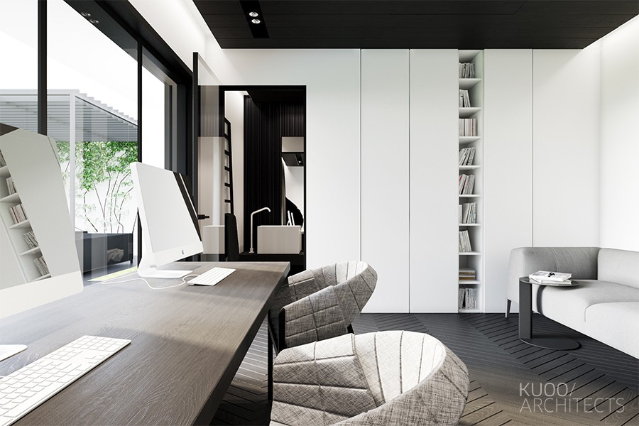
If only life consisted of nothing but leisure. But when it's time to get to work, this office has enough room for two. Co-working is great motivation.
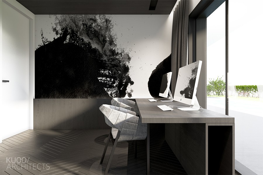
An abstract mural provides some decoration, its fluid shapes pleasing but not distracting to the eye.
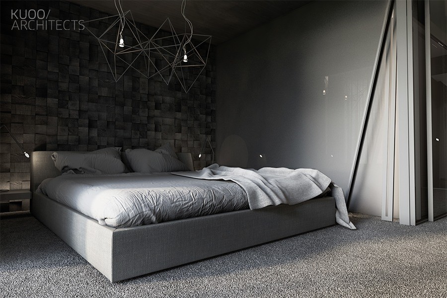
Natural sunlight doesn't play nearly as important a role in the bedroom as it did in the living room. Although light is limited, the glossy accent wall attempts to reflect as much as possible.
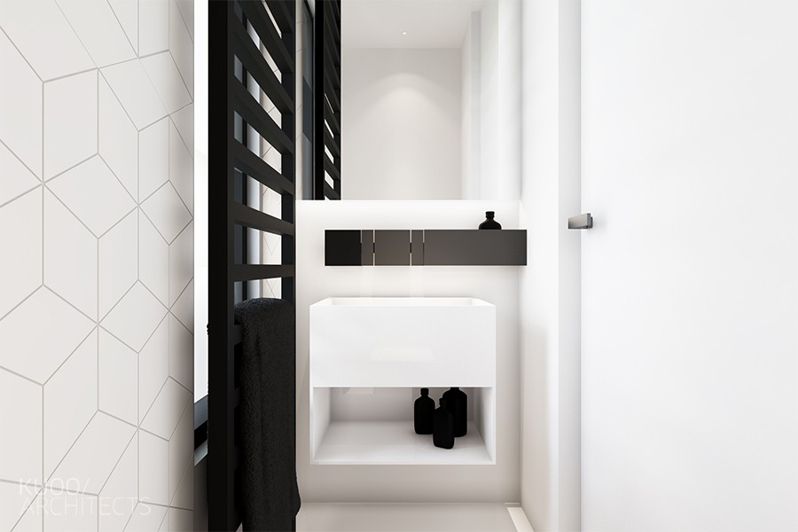
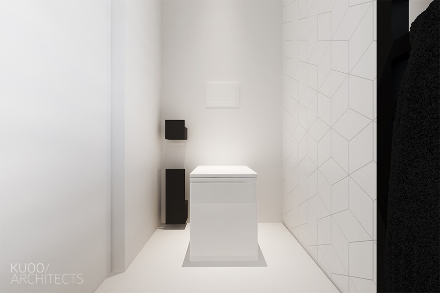
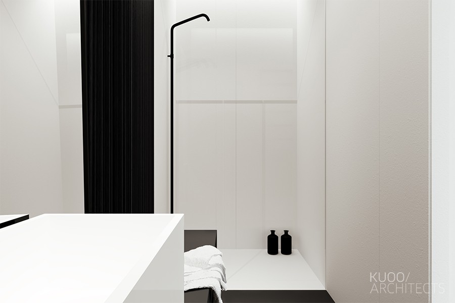
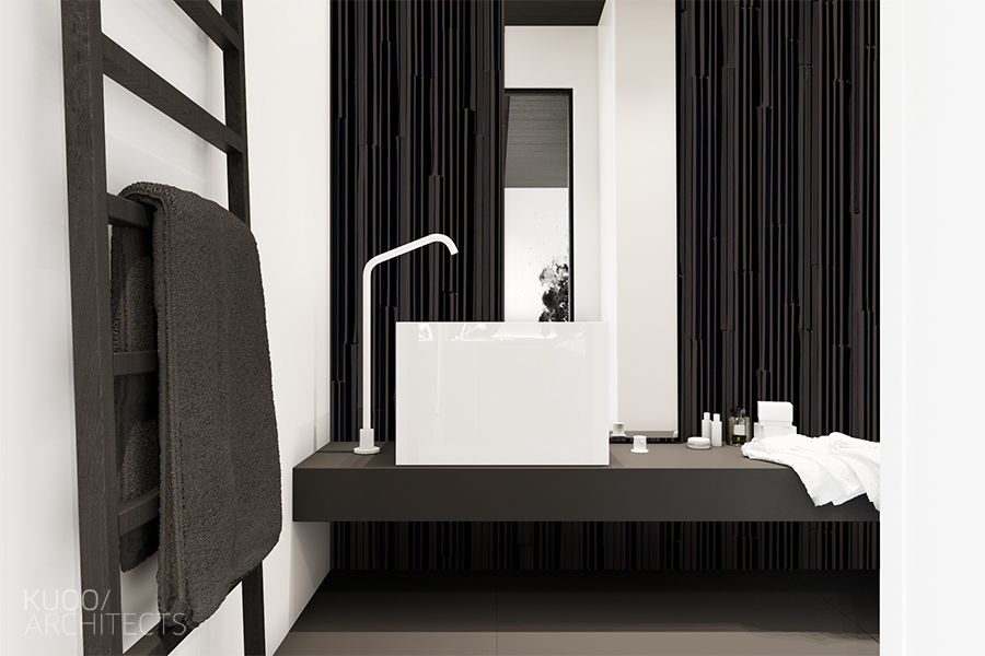
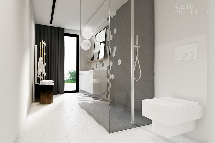
Each bathroom is a little different from the others despite sharing a similar color theme. Geometric tiles and sharp fixtures keep things fresh.
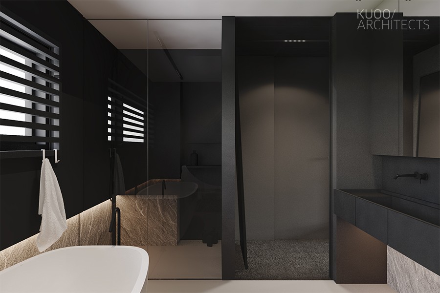
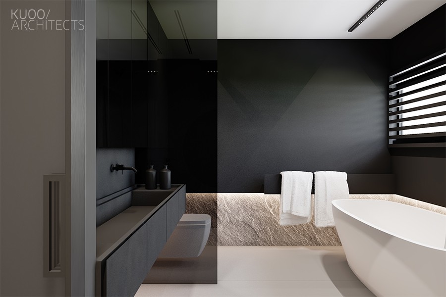
Stone accents and glossy surfaces make this bathroom a little more welcoming, more conducive to a relaxing bath.
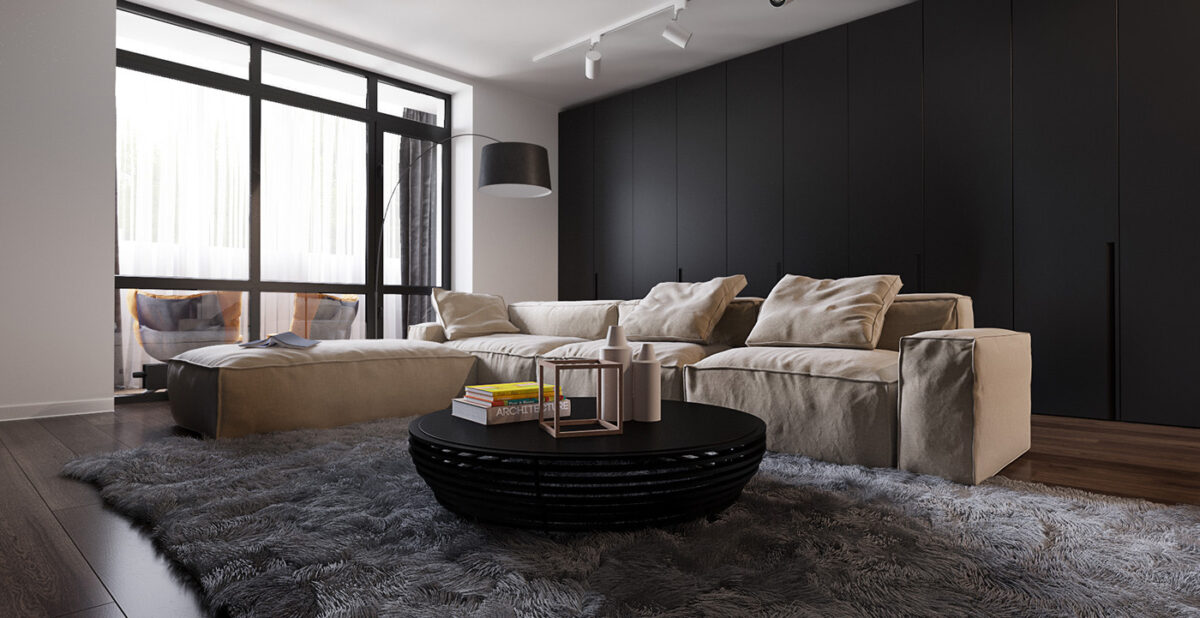
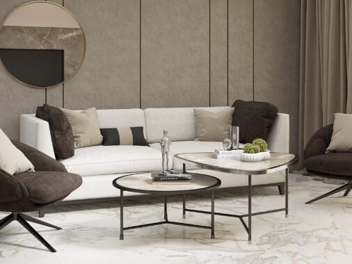
So simple! So warm! This black and white interior meets in the middle with a grey rug and beige sofa. Dark interiors don't have to be severe.
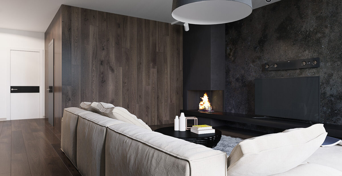
Black walls always make a nice backdrop for a television. The screen blends right in when off, and doesn't distract the viewer during movie time.
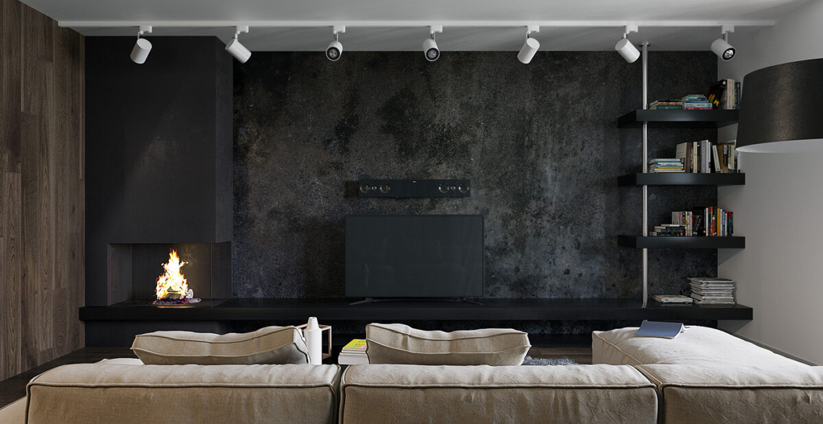
A fireplace warms the room from the left, and a corner library offers entertainment for quiet evenings.
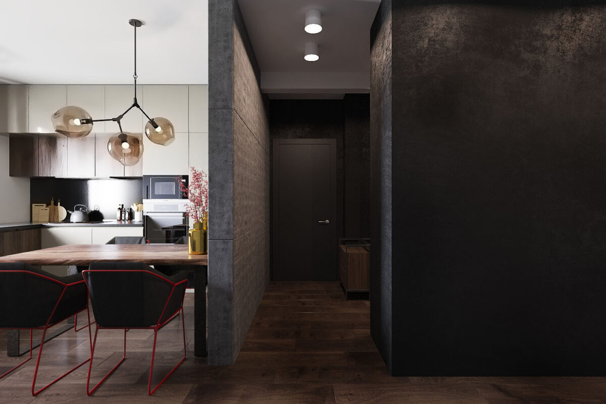
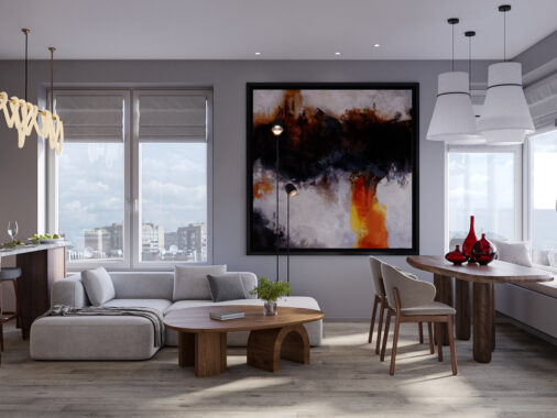
Pop art influences bring the kitchen to life. Bright color accents can completely change the effect of a neutral interior palette.
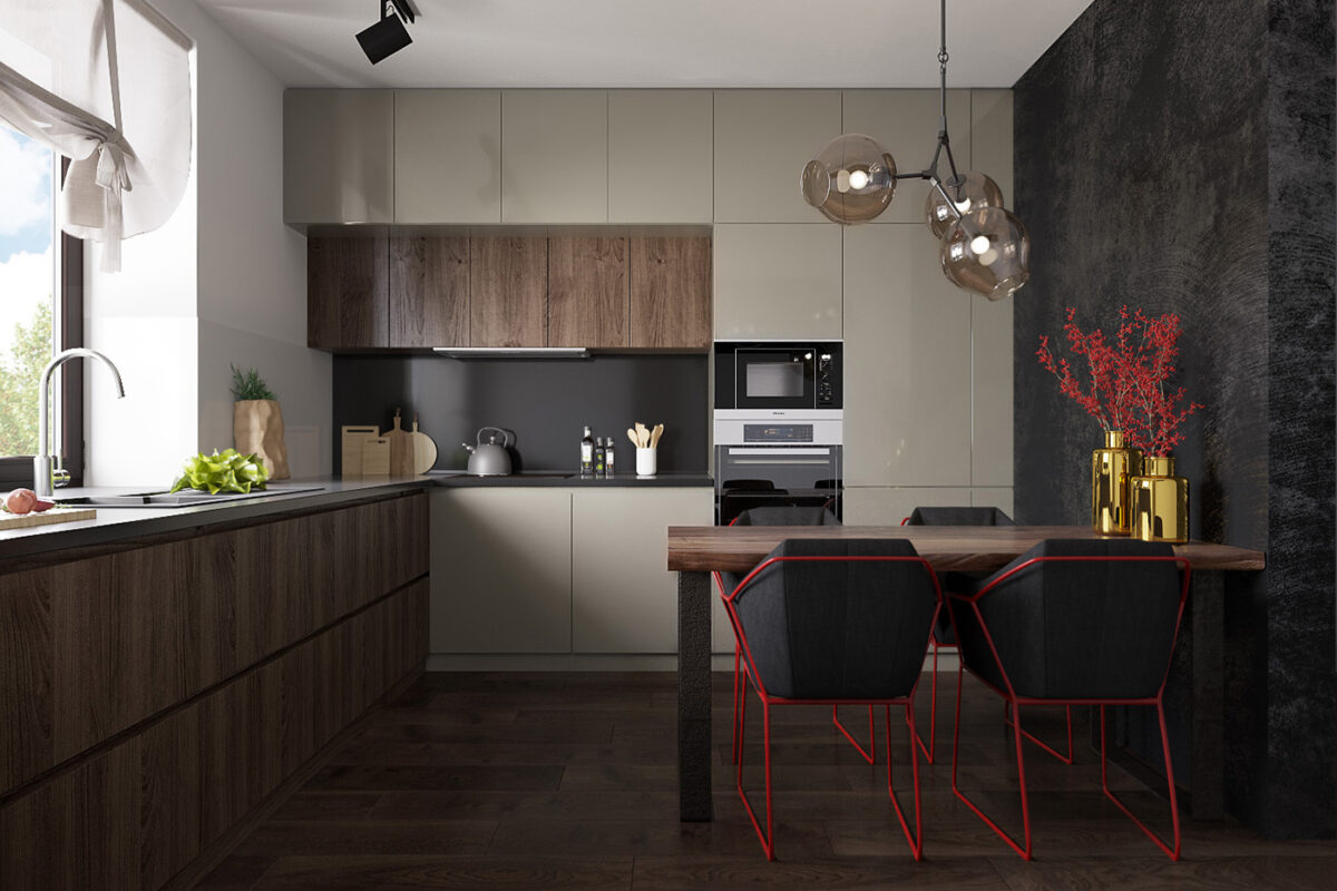
Cabinetry remains on the natural neutral side, with the white cabinets picking up a tinted reflection of the wood floors.
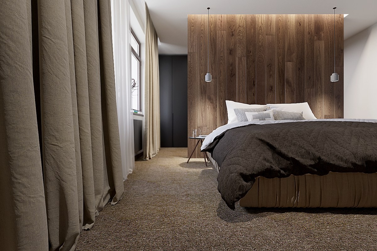
Dark brown color schemes are a little easier to work with than the black and white examples that dominate this post. This room is accessible, beautiful, and still very creative.
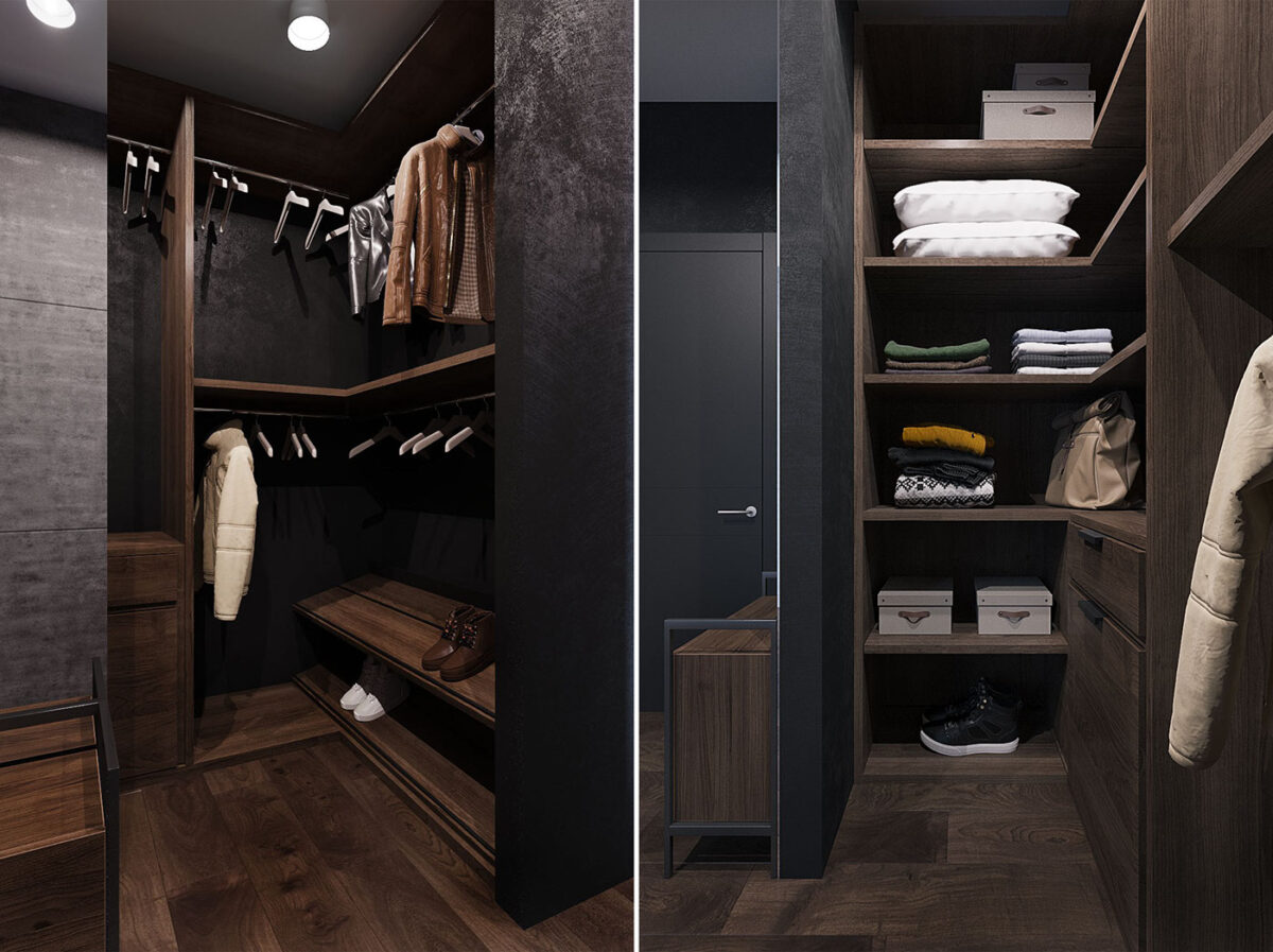
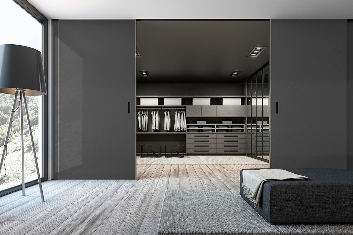
Walk-in closets are an art of their own. Wood gives each one a sophisticated personality of its own.
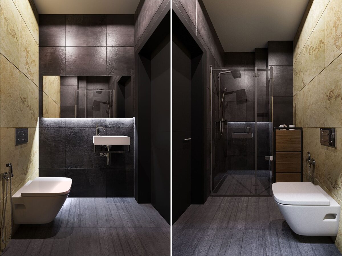
The tour includes two bathrooms. This one is decorated in rich coffee hues for a warm and inviting atmosphere.
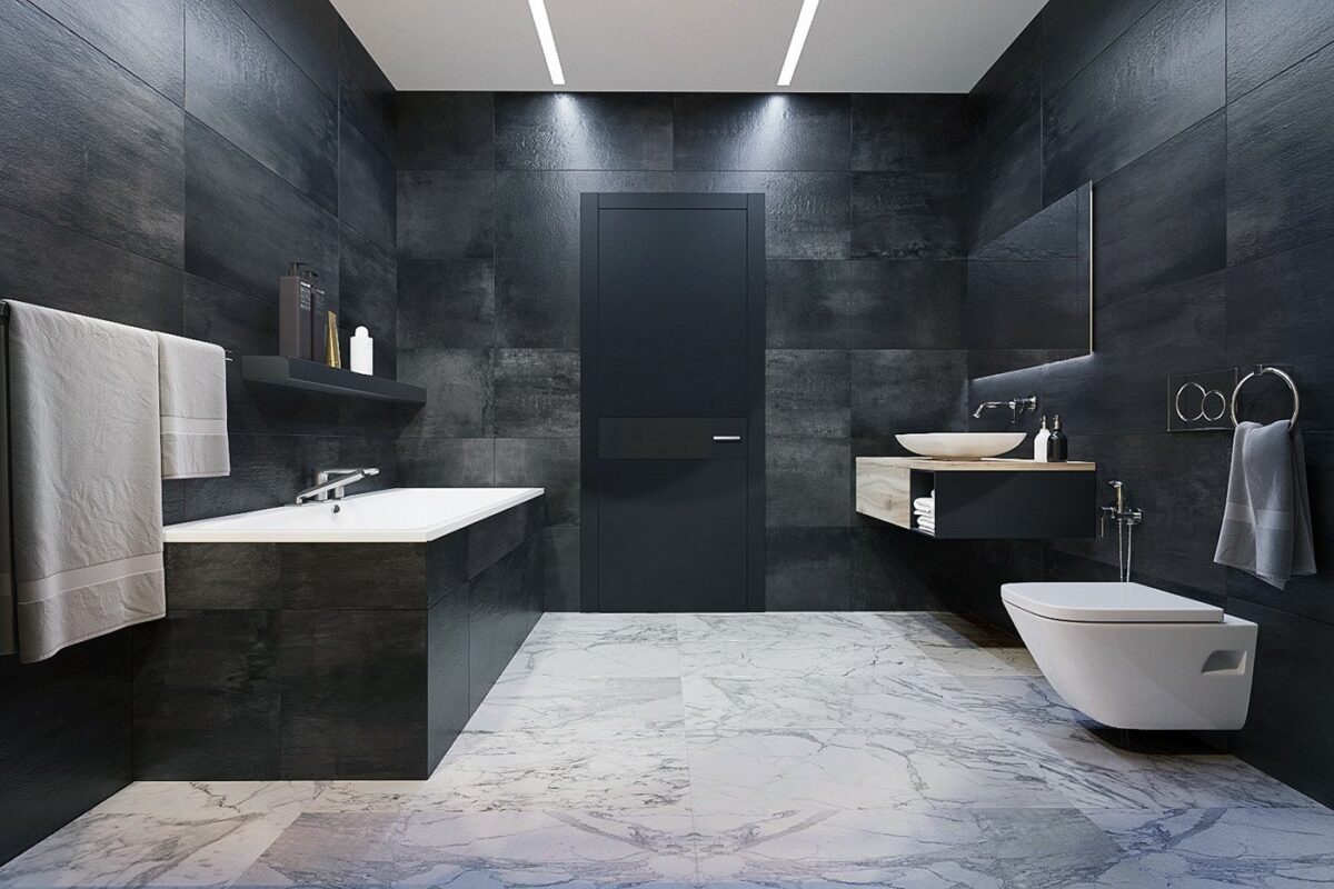
The second bathroom is a little more luxurious. Marble floors and stone tile walls offer invaluable texture.
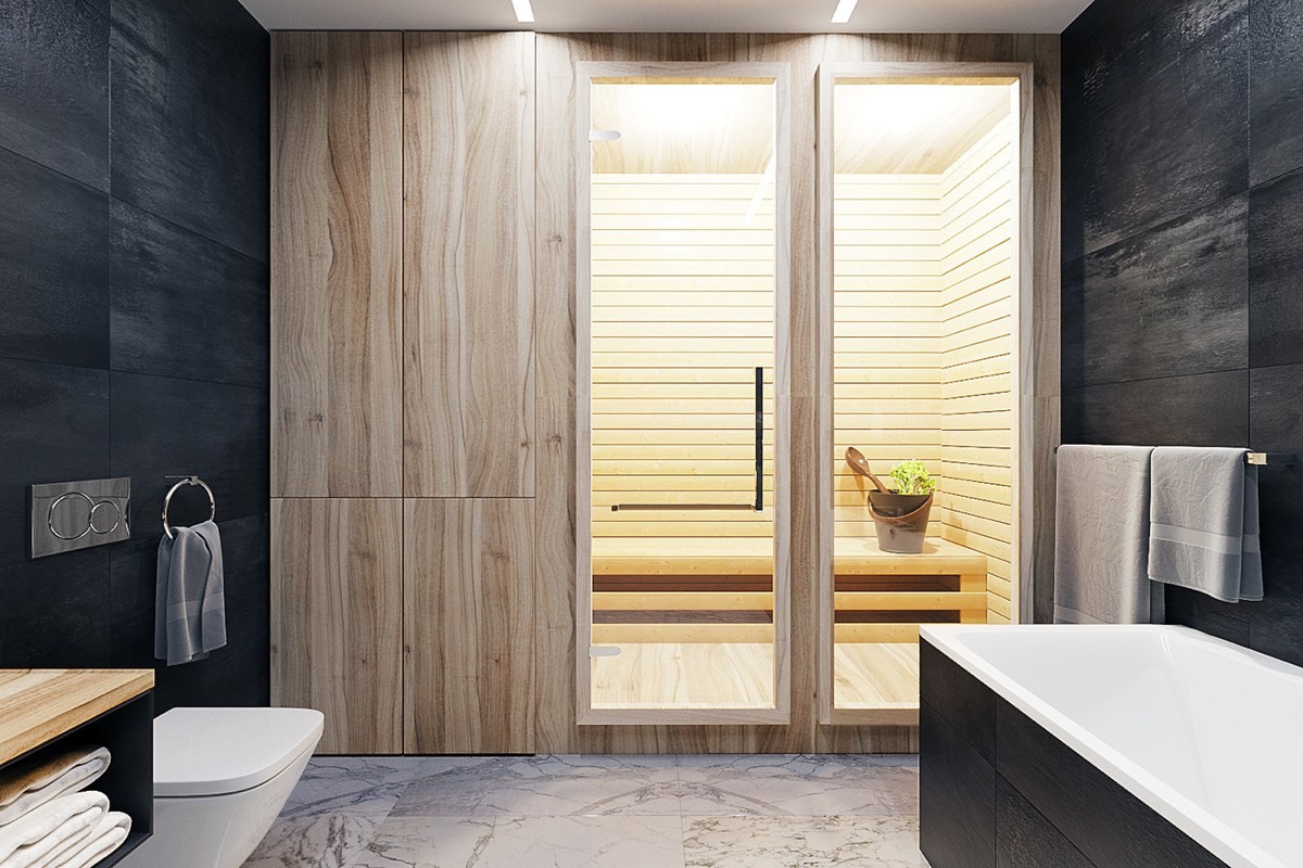
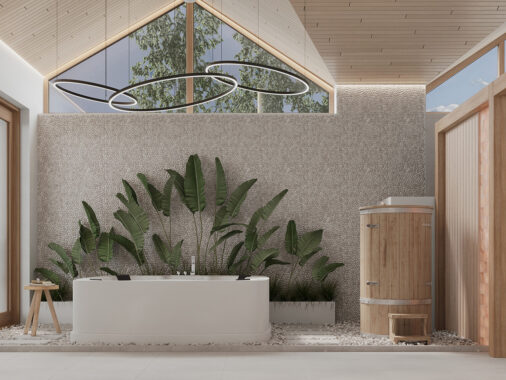
The steam room looks incredible. What a fantastic way to wind down after a stressful day! Its bright wood cladding certainly stands out from its black and white surroundings.
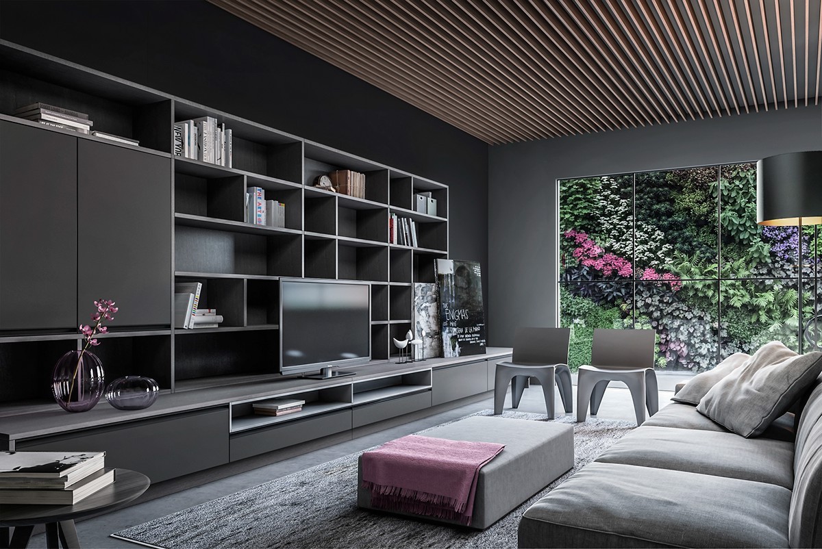
Can you believe the breathtaking floral beauty just outside this living room? With such an expertly tended vertical garden, it makes sense to keep the interior palette as simple as possible. It does borrow select accent colors from the verdant wall to enhance the effect, but very sparingly.

The open layout ensures that the wall remains a primary focal point that energizes the spirit throughout the day.
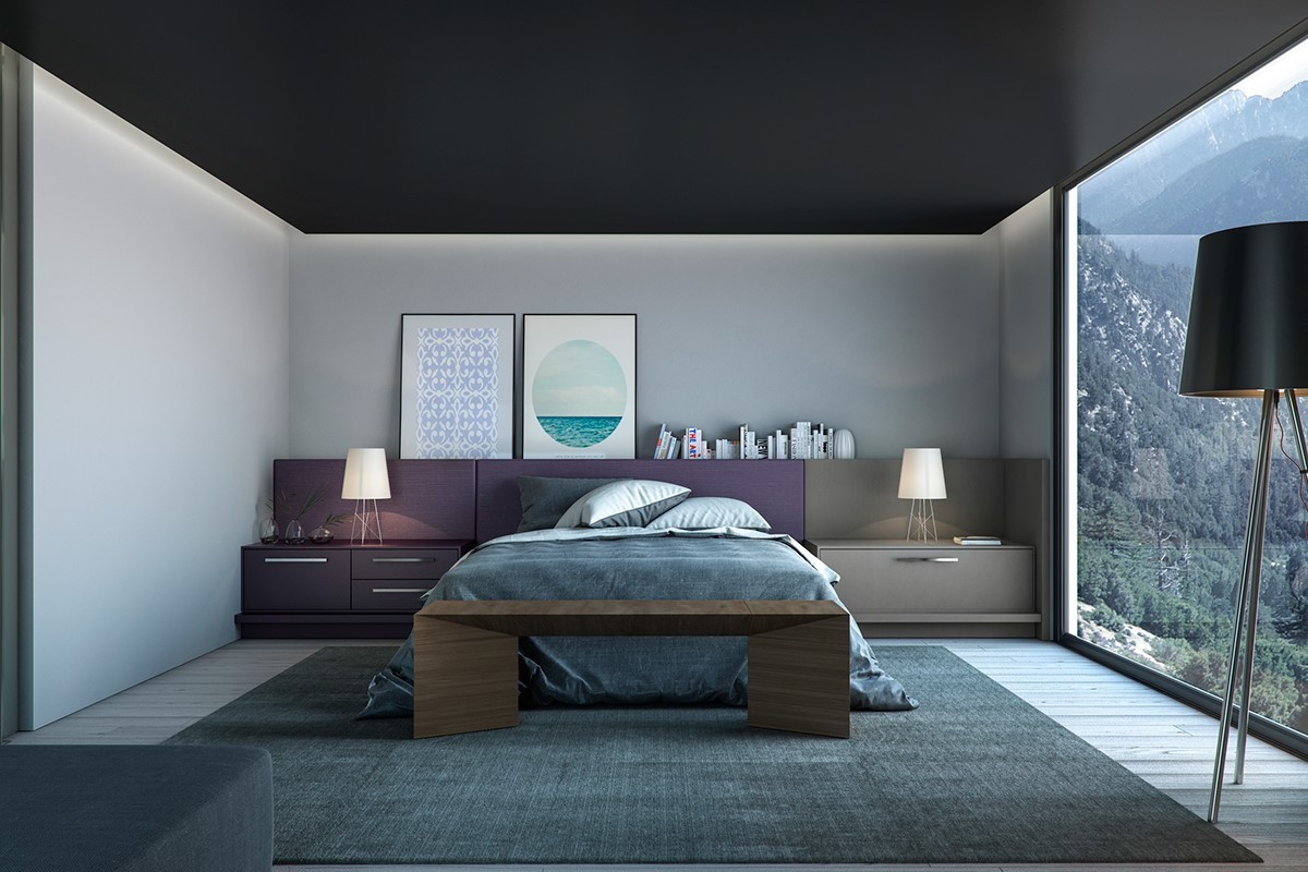
Violet and teal make up the bedroom's sultry color palette. Like the living room theme, these deep colors reflect the view outside.
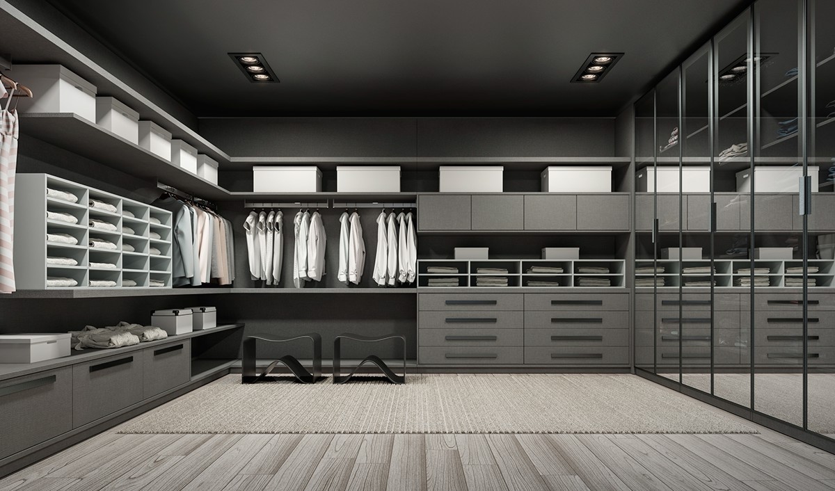
Enviable walk-in closets are a great place to find organization inspiration. This greyscale closet is certainly no different – everything has its place.
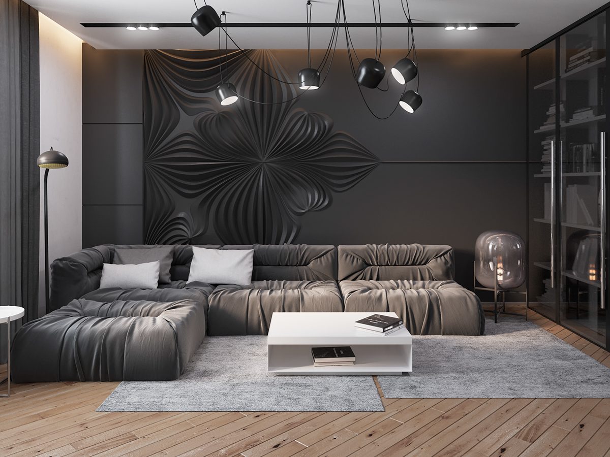
Textural wall panels can transform flat black into a playground of light and shadow. This panel definitely draws the eye despite its subtlety. It's an artful addition to an otherwise subdued home design.
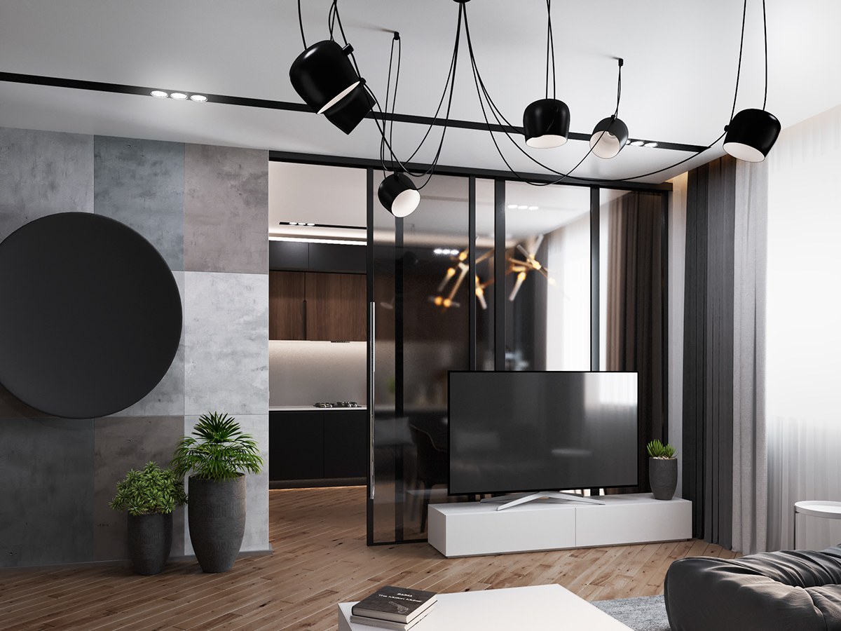
A hazy glass door separates the kitchen from the living area, minimizing visual distraction in both spaces.
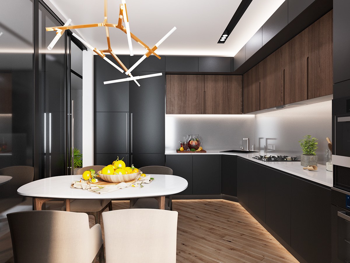
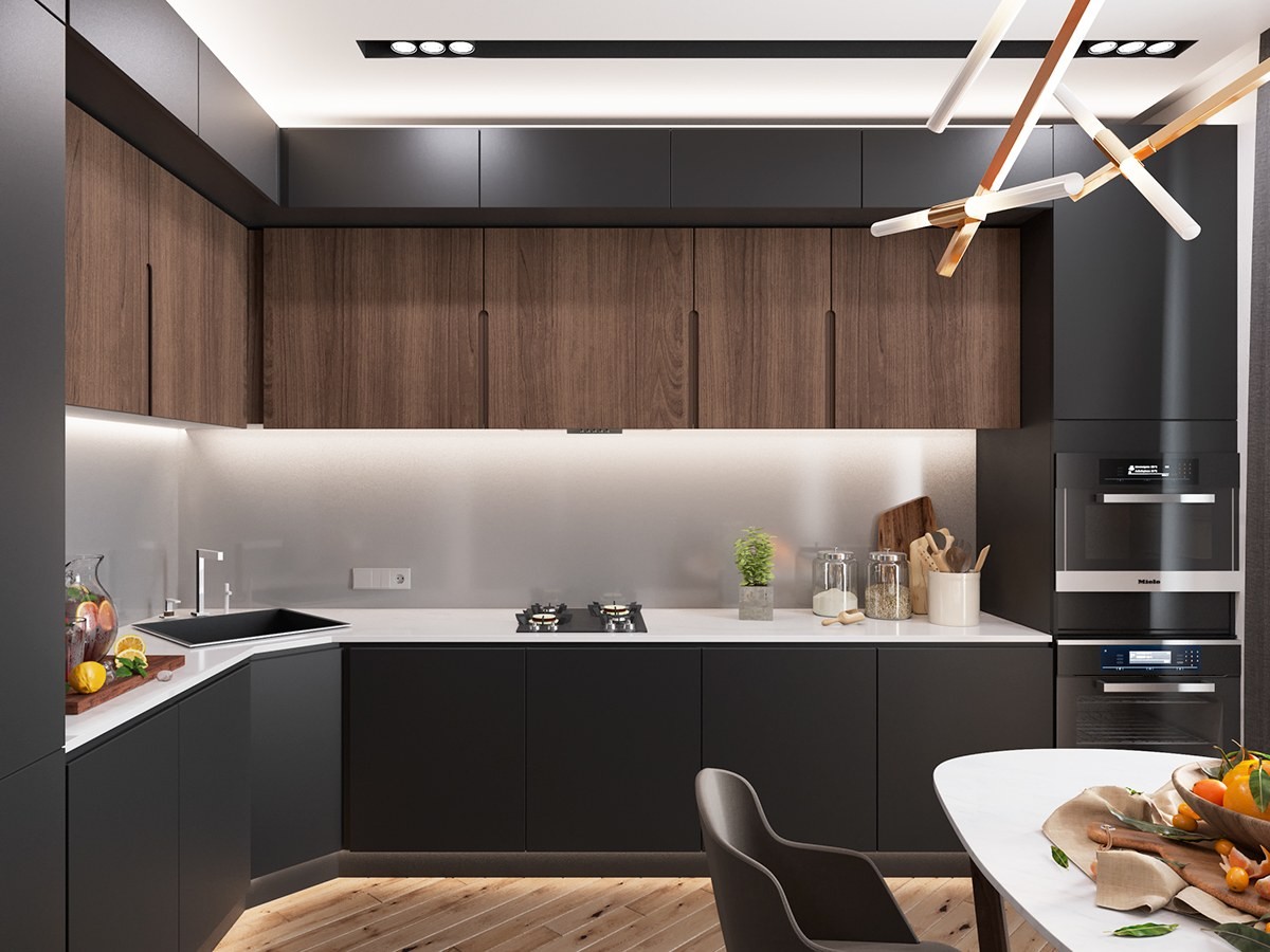
Clever lighting makes the kitchen look sharp and bright despite its dark cabinetry. The chandelier above the table is poised to impress.
