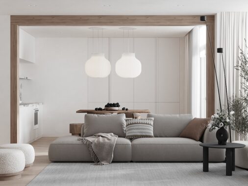
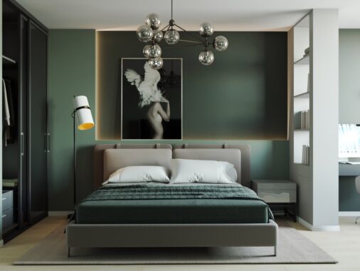
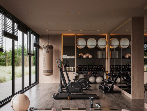
Although more common in small studio apartments, even sprawling interiors can benefit from the sense of freedom an open plan layout allows. Hosts can prepare drinks while keeping up with the card game raging at the coffee table, parents can catch up on their favorite television shows while keeping an eye on kids doing homework at the desk. It's great! But total openness does have drawbacks: lack of space to hang artwork, fewer walls for shelves, and even increased ambient noise. These stunning luxury homes offer a smart compromise with dividers and creative layouts – solutions that work for smaller homes too.
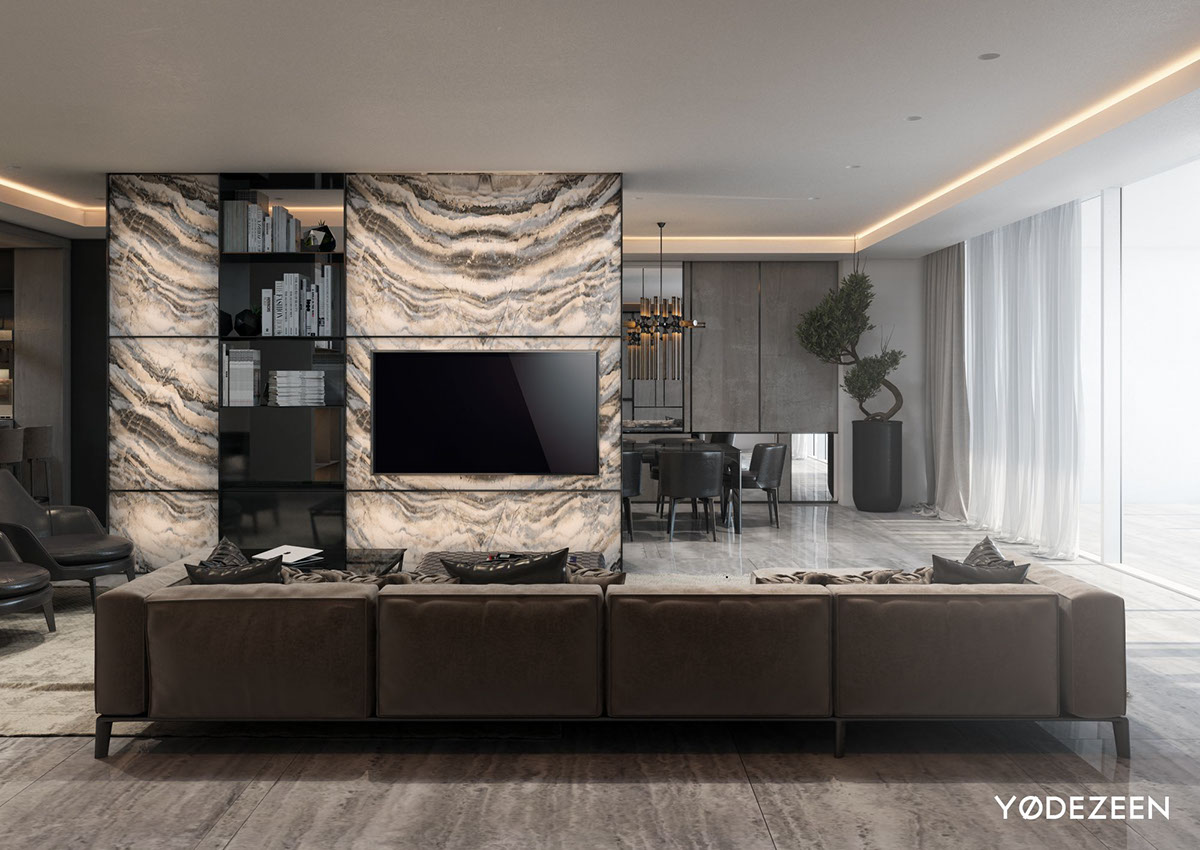
This gorgeous stone-clad interior features a circular layout that revolves around a spectacular onyx wall that contains a bookcase and offers a mounting point for the television. This bookshelf, and other bookshelves throughout the living room, helps to compartmentalize the interior without fully isolating any functional area.
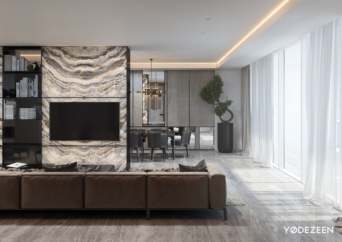
While the original plan would have resulted in a typical minimalist interior, the designers decided to up the ante with luxurious details with just a touch of jazzy Art Deco flair.
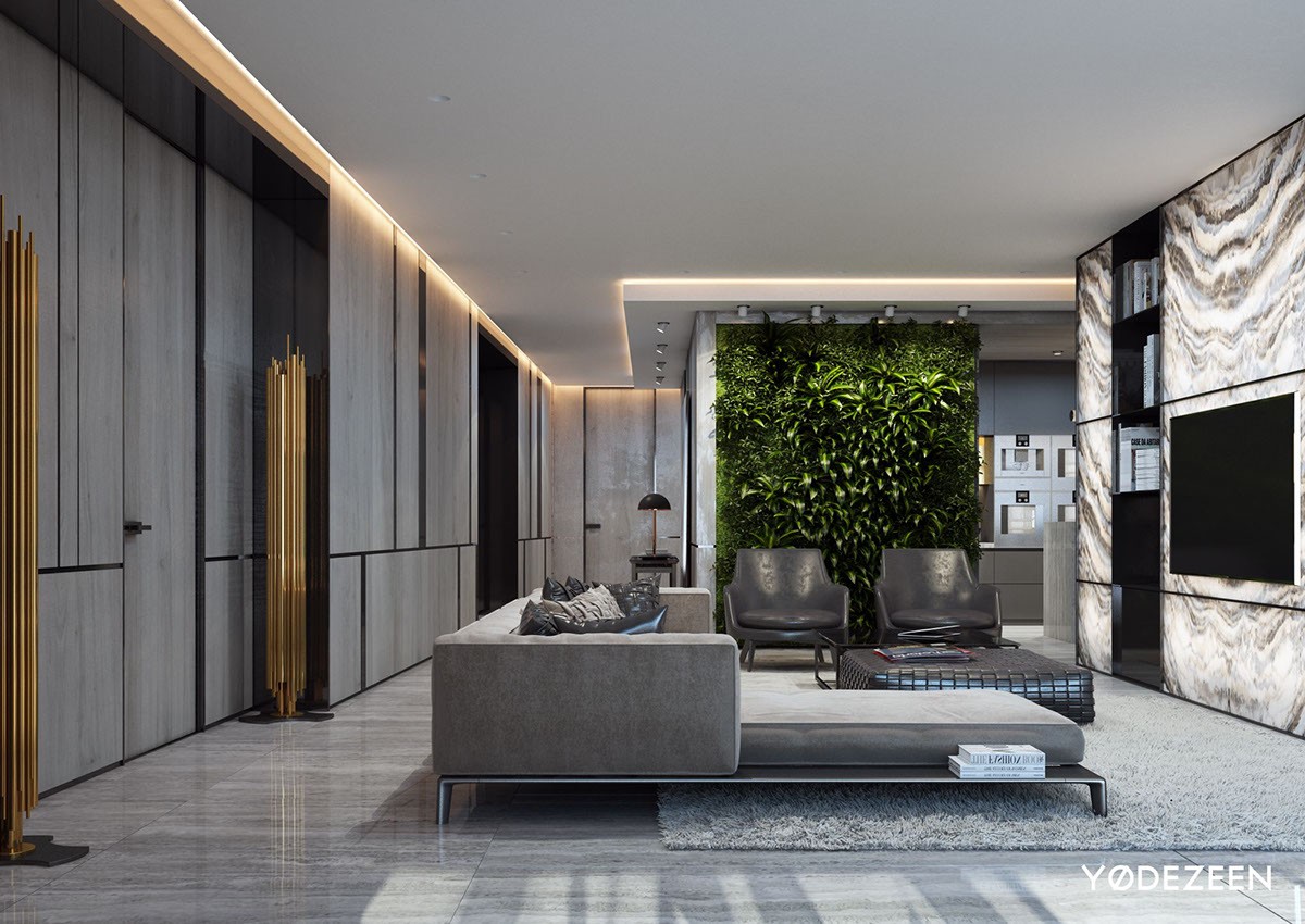
Lighting features include LED strips in the ceiling, a pair of impressive Brubeck floor lamps in brass – and most impressive of all – lighting sandwiched between the translucent onyx panels in the bookshelf.
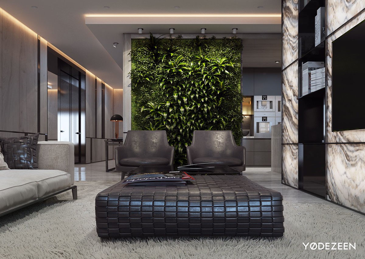
Separating the living room from the kitchen is another breathtaking dividing wall covered in a lush vertical garden.
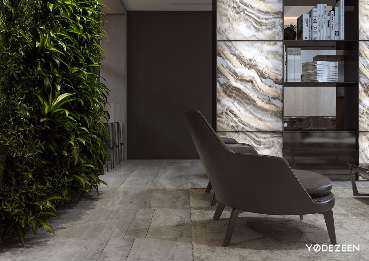
Together, these natural features make the home feel like an exotic hidden cove, a piece of modern living carved into the stone.
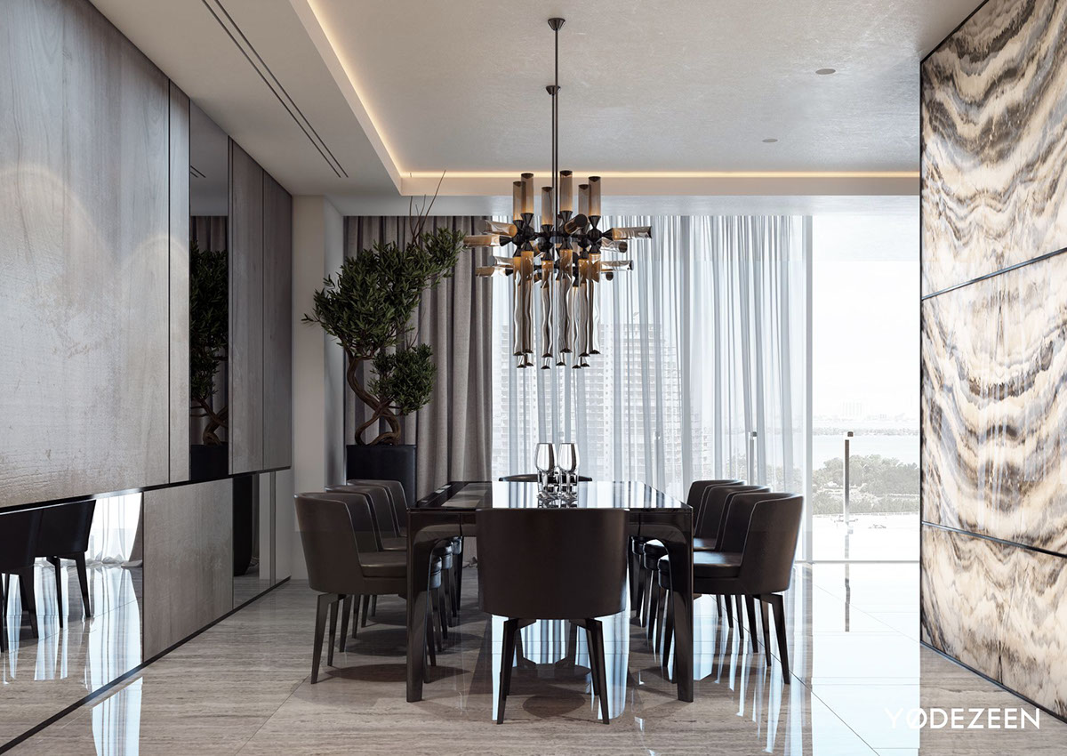
A formal dining room occupies the space behind the onyx wall. Its combination of reflective and matte materials brings the otherwise subdued furniture to life.
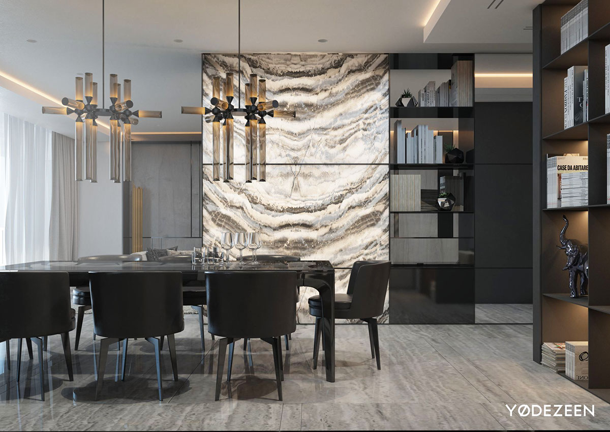
Storage surrounds the table on all sides, providing artistic accents to admire and a library of design books for guests to flip through over a glass of wine.
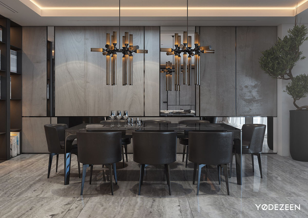
The chandeliers are from the Castle collection by Jason Miller, named for the orthogonal movements of the chess piece.
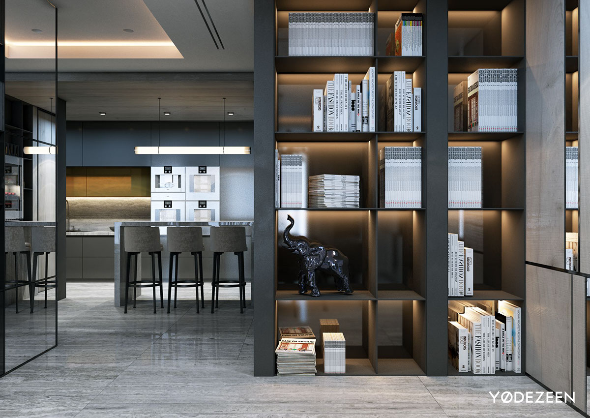
Continuing the circular path around the open plan layout, the kitchen peeks out from behind a wall of open shelving. Smoky backing obscures without feeling heavy-handed.
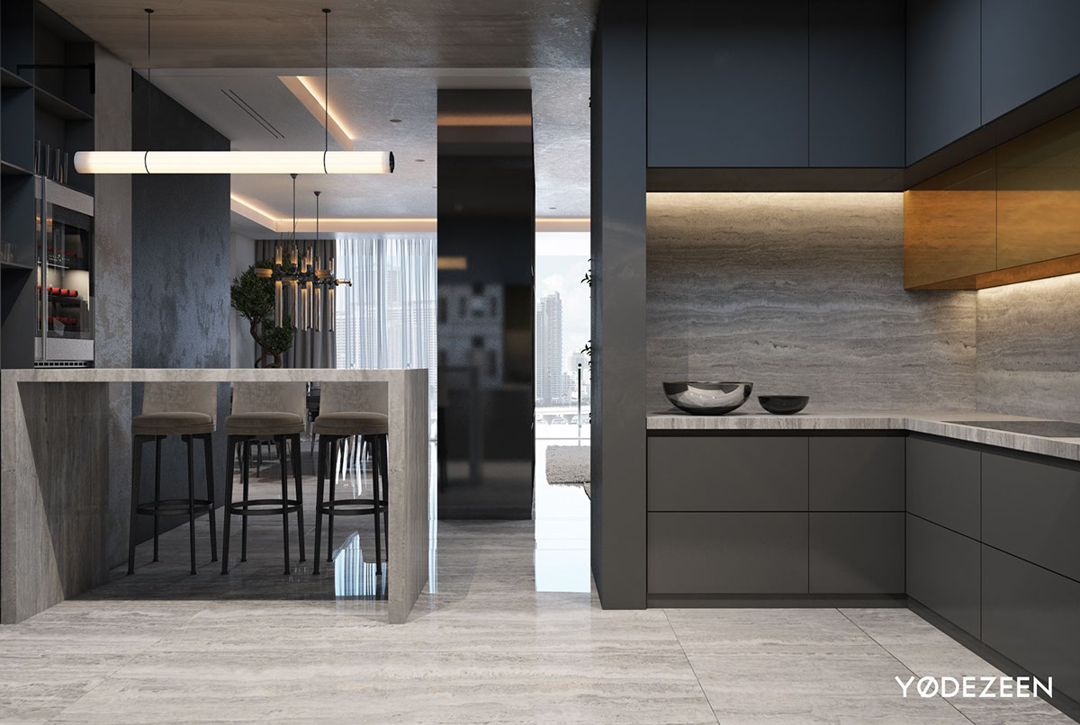
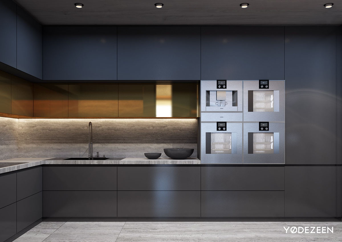
Grey travertine covers the kitchen in soothing ripples that flow along the backsplash, floor, and charming breakfast island.
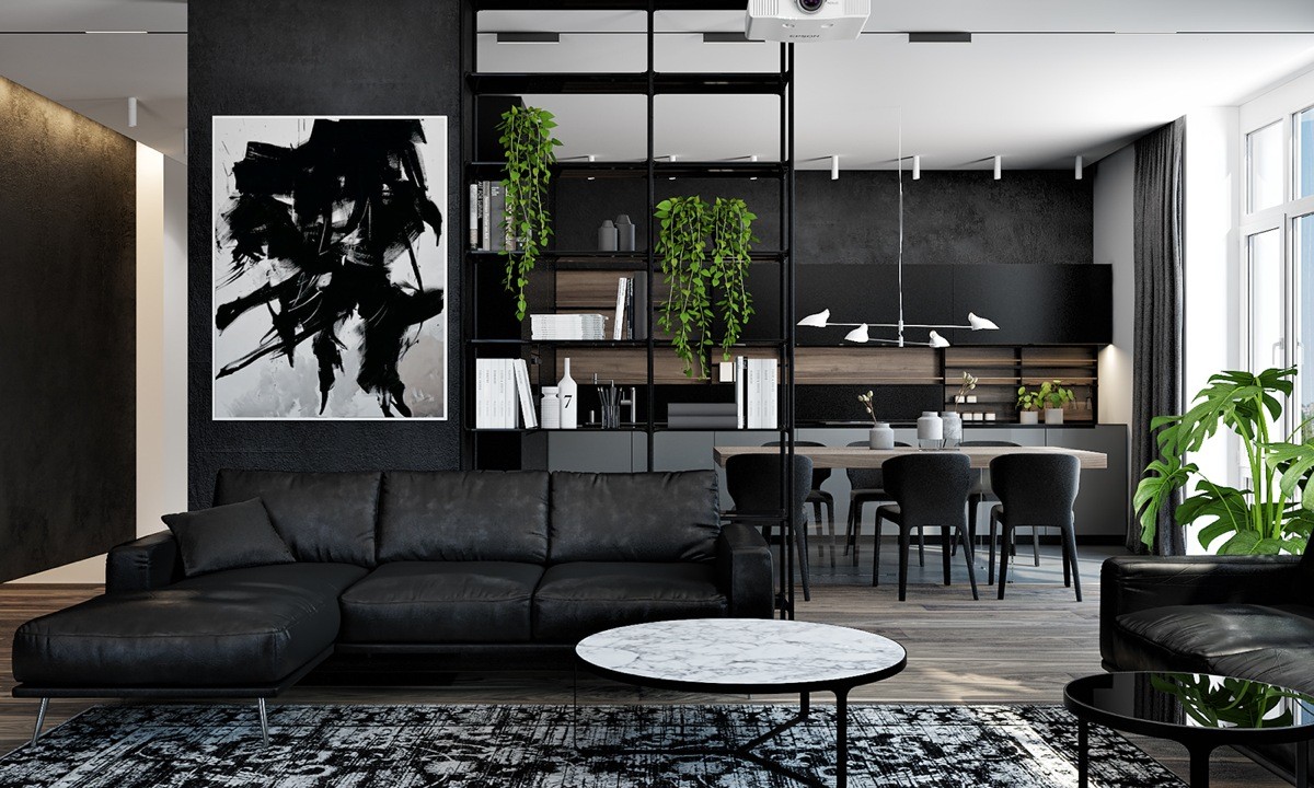
This home also makes fantastic use of a central bookshelf for subtle division and convenient organization – and it conveniently solves the question of where to hang artwork in such a spacious open plan interior. The bookshelf portion is open to the other side of the room but uses potted plants as a clever shield.
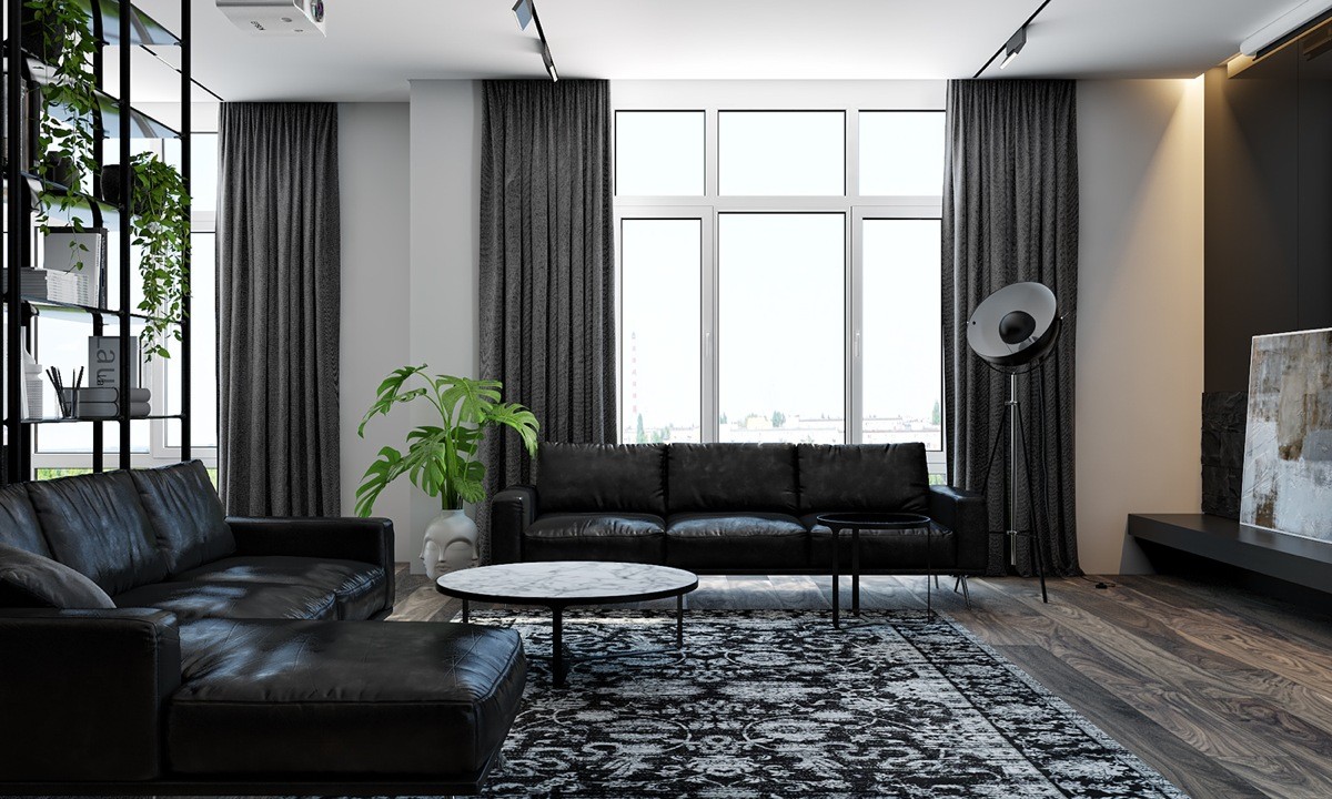
Its high-contrast color theme isn't flashy, but quality materials and decor exudes luxury. Vibrant plants stand out even more effectively against the black and white palette and capture attention without effort.
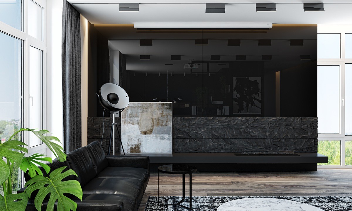
Surrounded by floor-to-ceiling windows, this home appears bright and cheerful despite its moody palette.
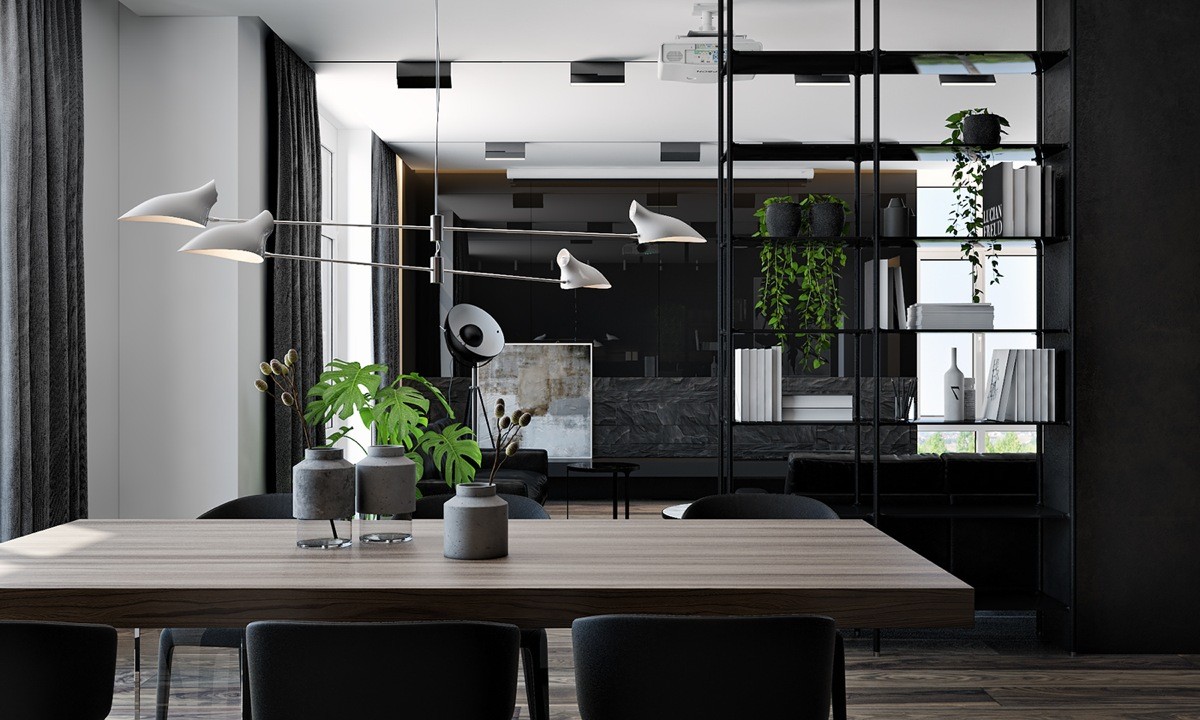
The dining room is elegant and well-composed, sharing decorative details with the living room thanks to the open shelving.
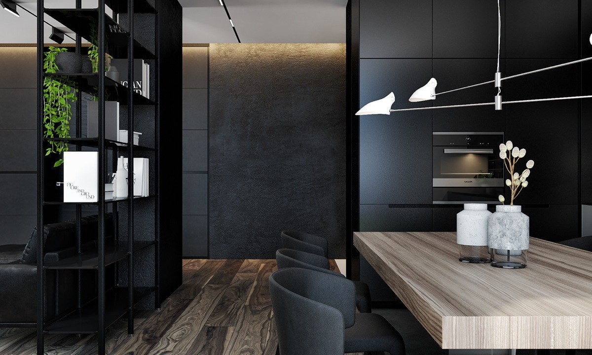
Carefully curated materials serve as their own form of ornamentation. Rich wood grain, textured concrete, and small marble details capture the eye as well as any sculpture or painting.
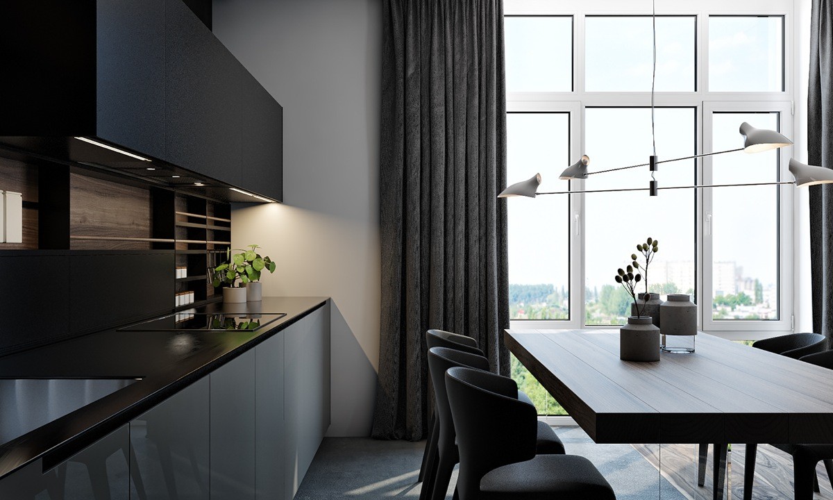
It's not an extraordinarily large room by any means, leaving a narrow but workable path between the chairs and kitchen. The view more than makes up for the compact layout!
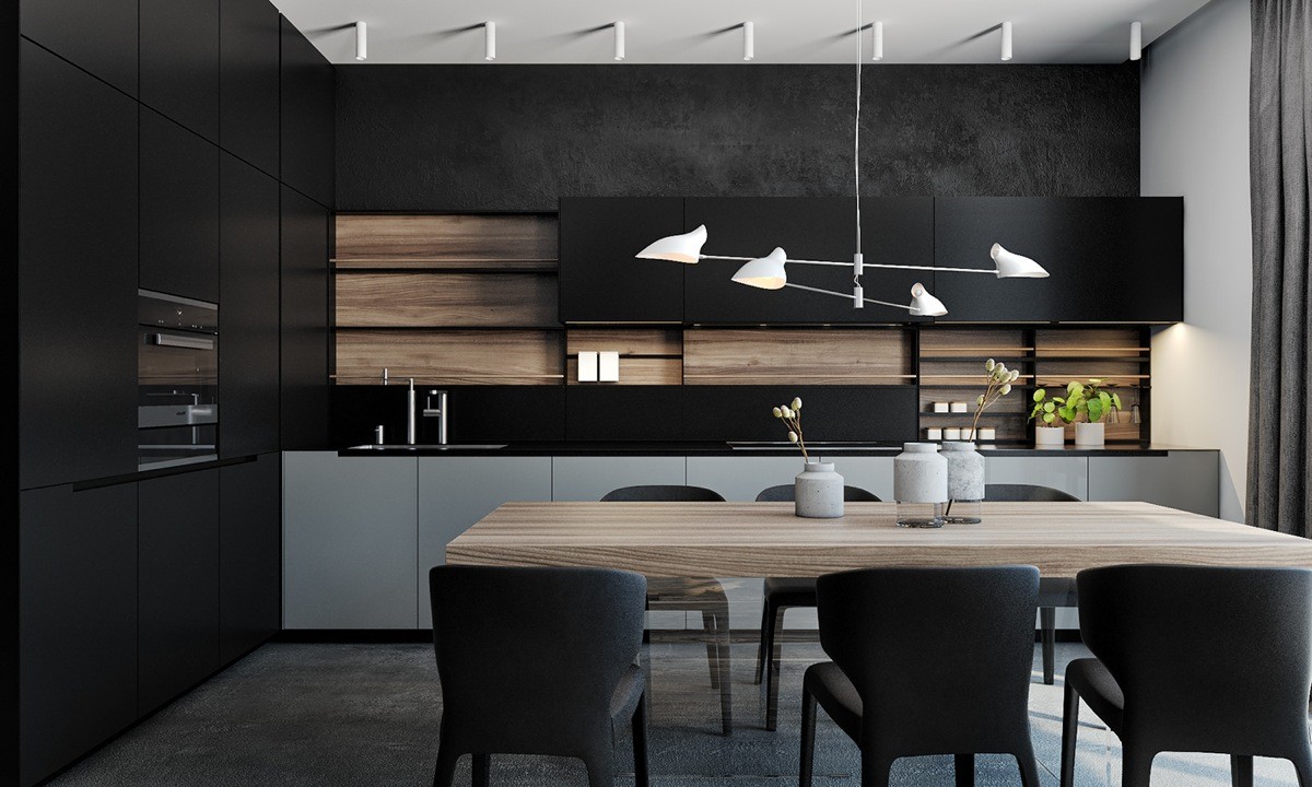
Creative cabinetry and shelves can really make the kitchen. This design flips the expected upside down with black cabinet faces and wooden backing.
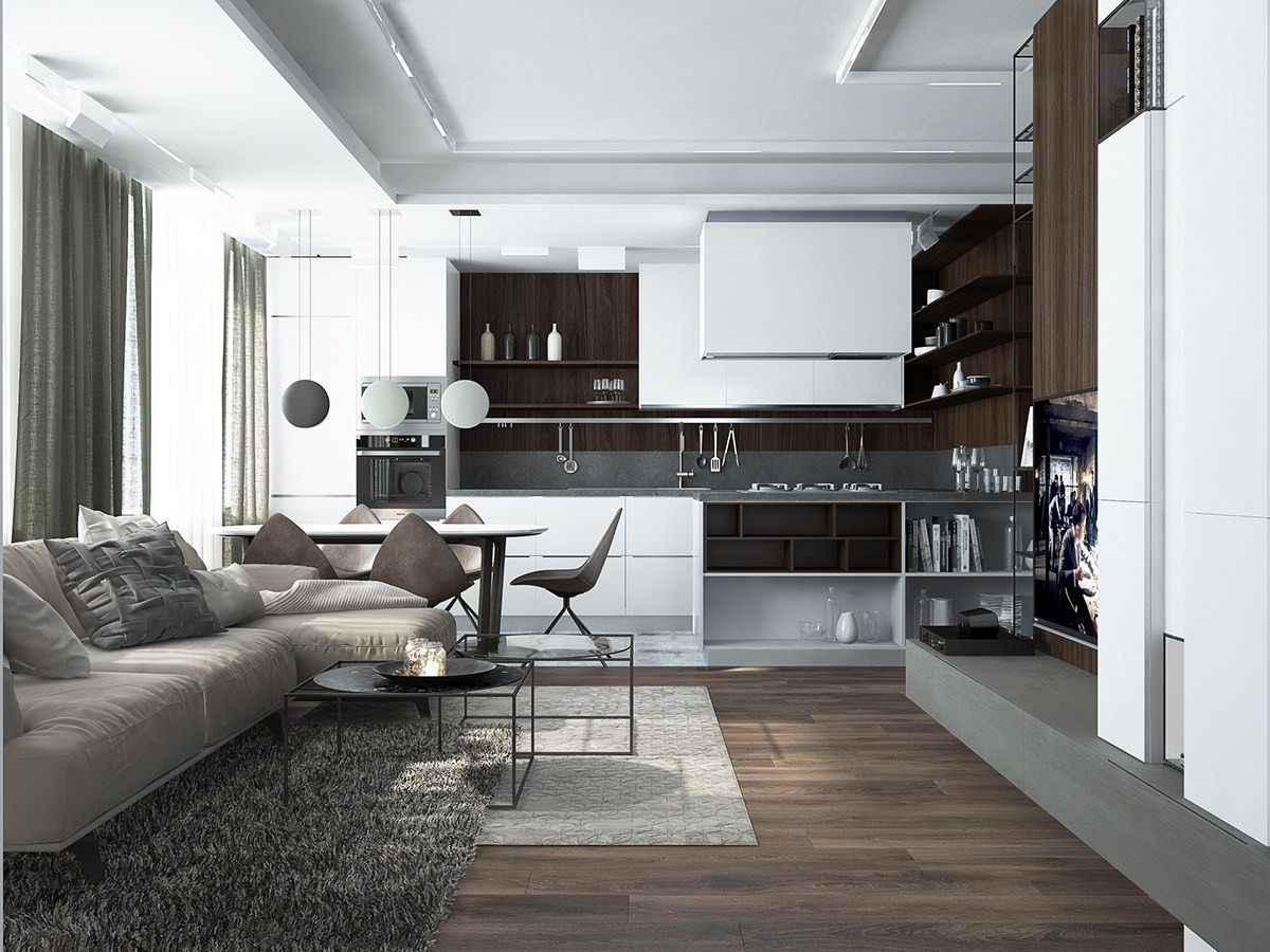
Occupying a long and somewhat narrow floor plan shaped like a "U", this open living room had to take a very careful and calculated approach to its layout. The sofa and media area occupies the middle of the room, with a kitchen at one end and a small office at the other.
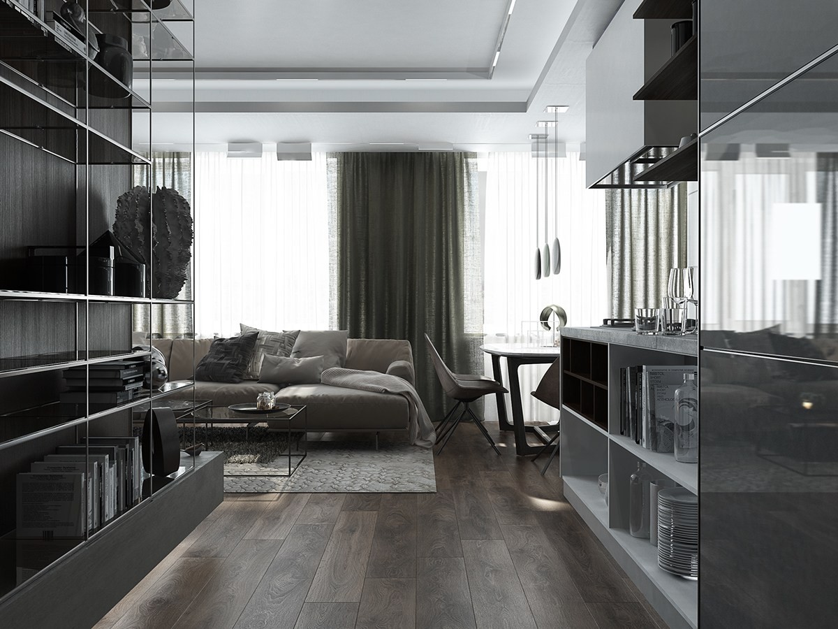
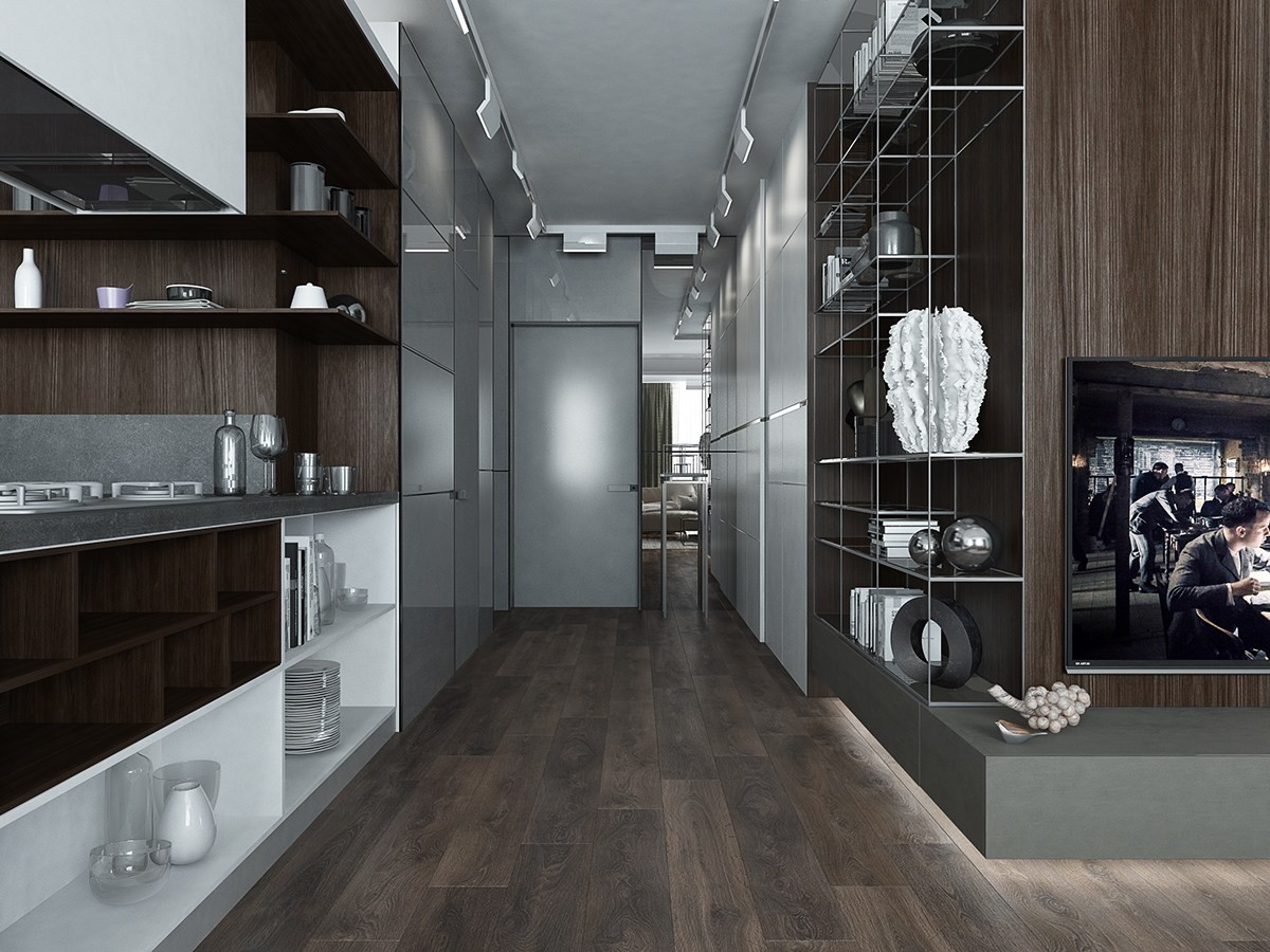
The central volume that makes up the "U" shape (on the left) allows extra room for useful storage space. The kitchen island (on the right) takes a similar approach by integrating extra shelves on its outward facing side.
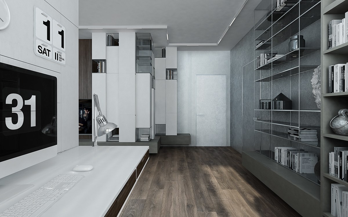
For items that aren't suitable for display, like linens and clothing, there is plenty of storage in the hallway as well.
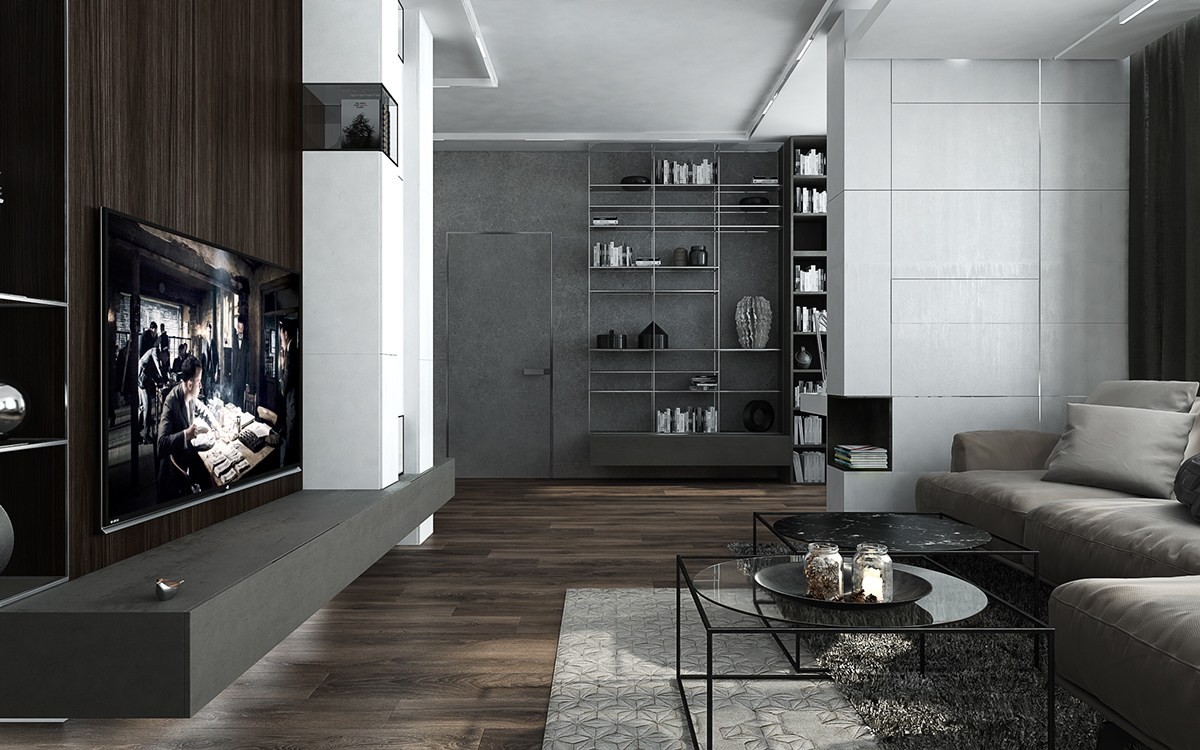
Even more shelves adorn the wall on the opposite side of the living room. The little corner niche on the white dividing wall is an especially creative touch.
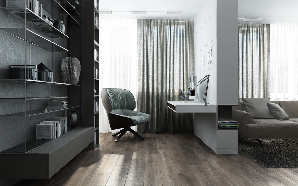
The wall itself shields the small office from the rest of the room, and even provides the desk! The comfy-looking chair is called "Tabano" by designer Patricia Urquiola.
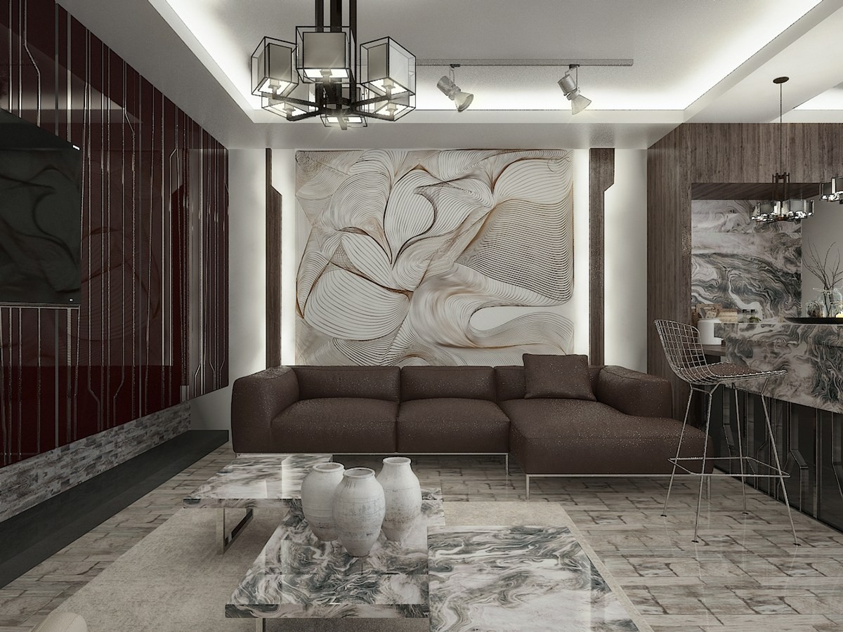
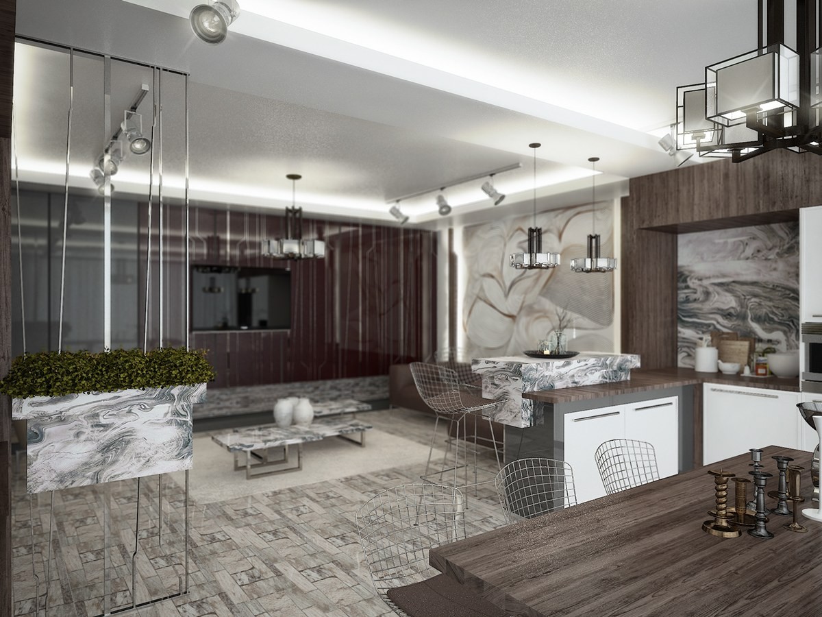
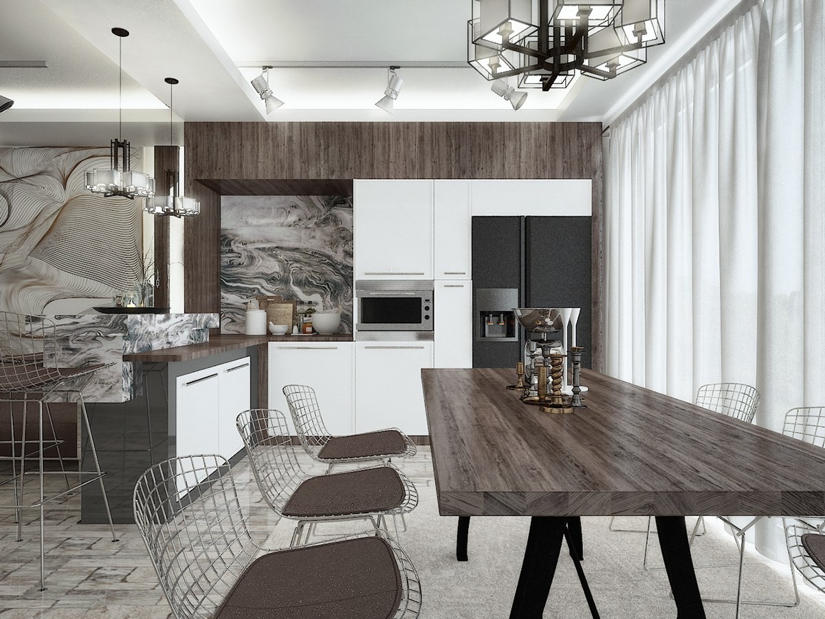
This extravagant interior makes an unforgettable first impression with swirling marble tables, stone tile floors, and spectacular wall cladding. Its layout is simple and straightforward, but uses a dividing wall technique much different from the other homes featured in this post.
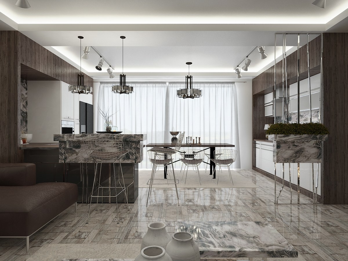
Rather than using partial walls to divide, this one uses them more like a frame. The island on the left serves as one part of the frame, with the artfully suspended planter serving as its counterpart.
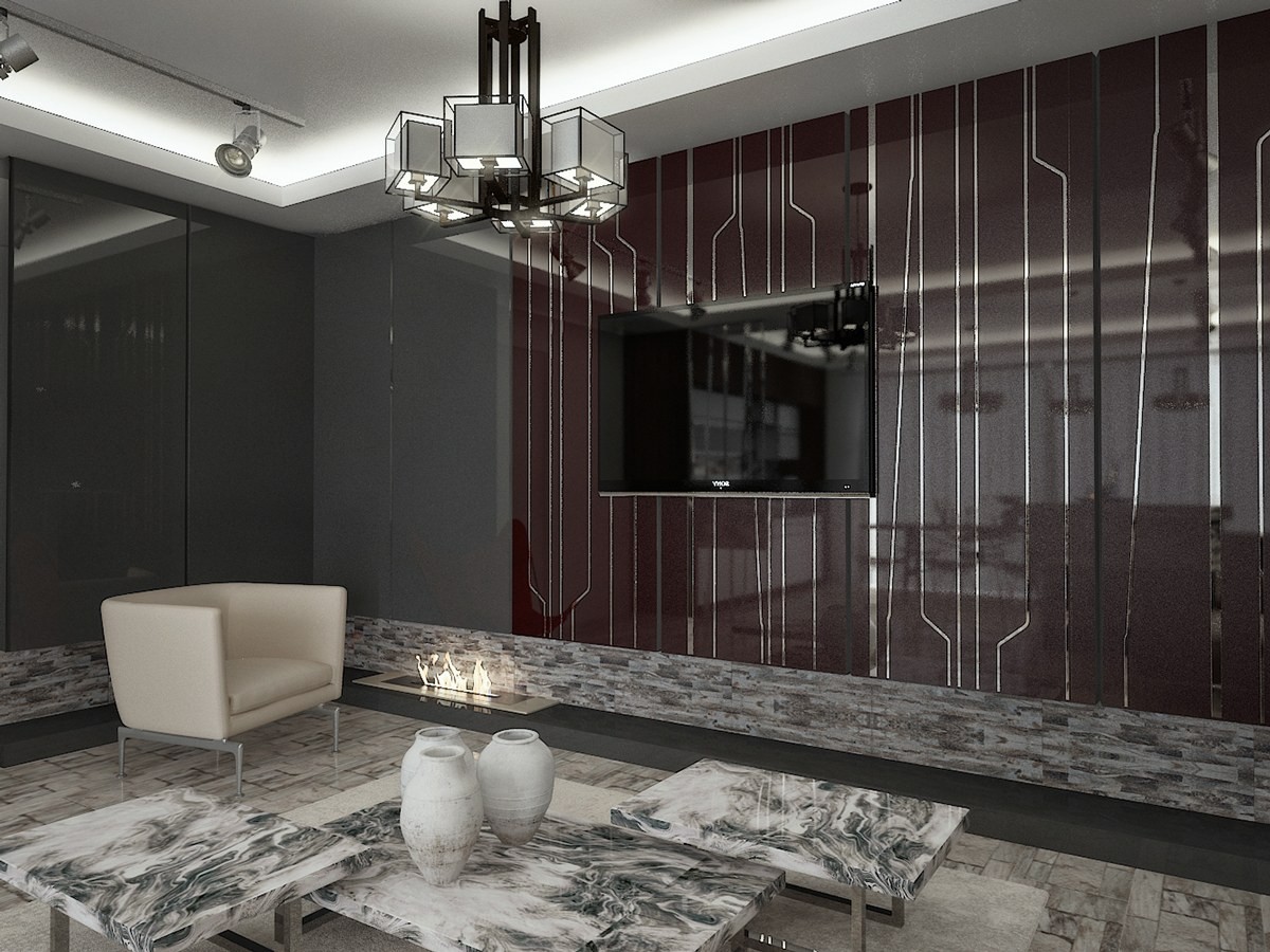
The unique pattern that makes up the bars on the planter show up again on this dramatic feature wall, but this time the polished metal is set into a rich brownish red backdrop.

