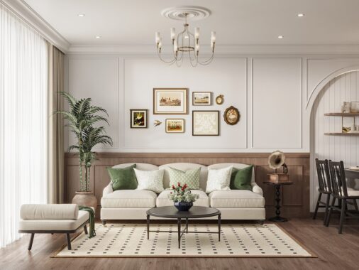
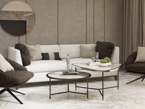
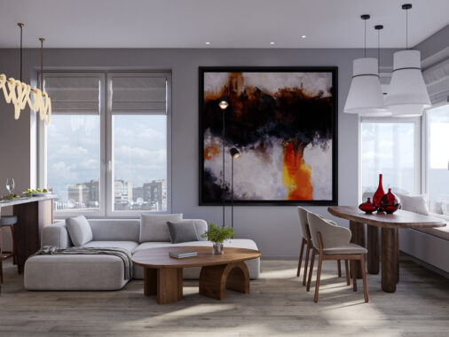
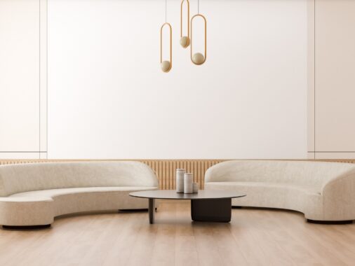
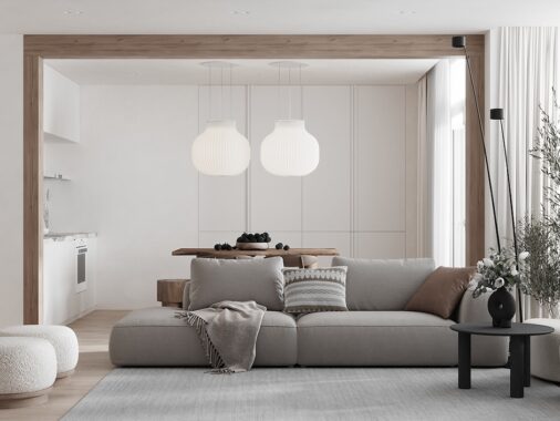
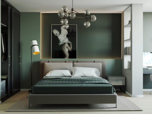
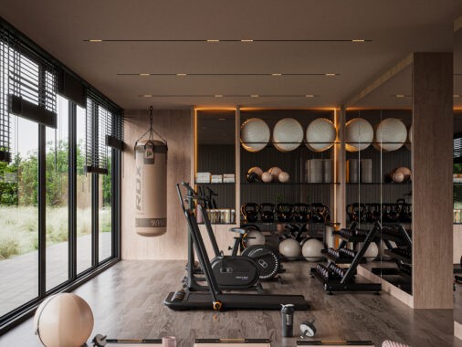
Bridging the gap between modern minimalism and comfortable traditional design, these open-plan living rooms offer a practical and accessible style for just about any taste. All four of these interiors are the work of Architektura Design and share the same approachable aesthetic, but each one has something different to offer – this post contains inspiration for spaces small and large, with light accents or dark, using themes that are ornate or streamlined in turn. We hope these subtle (but important!) differences will help you find ways to incorporate this pleasant style within your own unique environment!

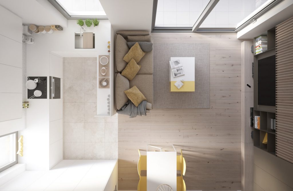
The first featured living room is an exceptionally compact design, but the smart layout of the home allows for a comfortable and spacious-feeling atmosphere. It's a bright and cheerful interior, made even more endearing by its careful application of pale yellow accents.
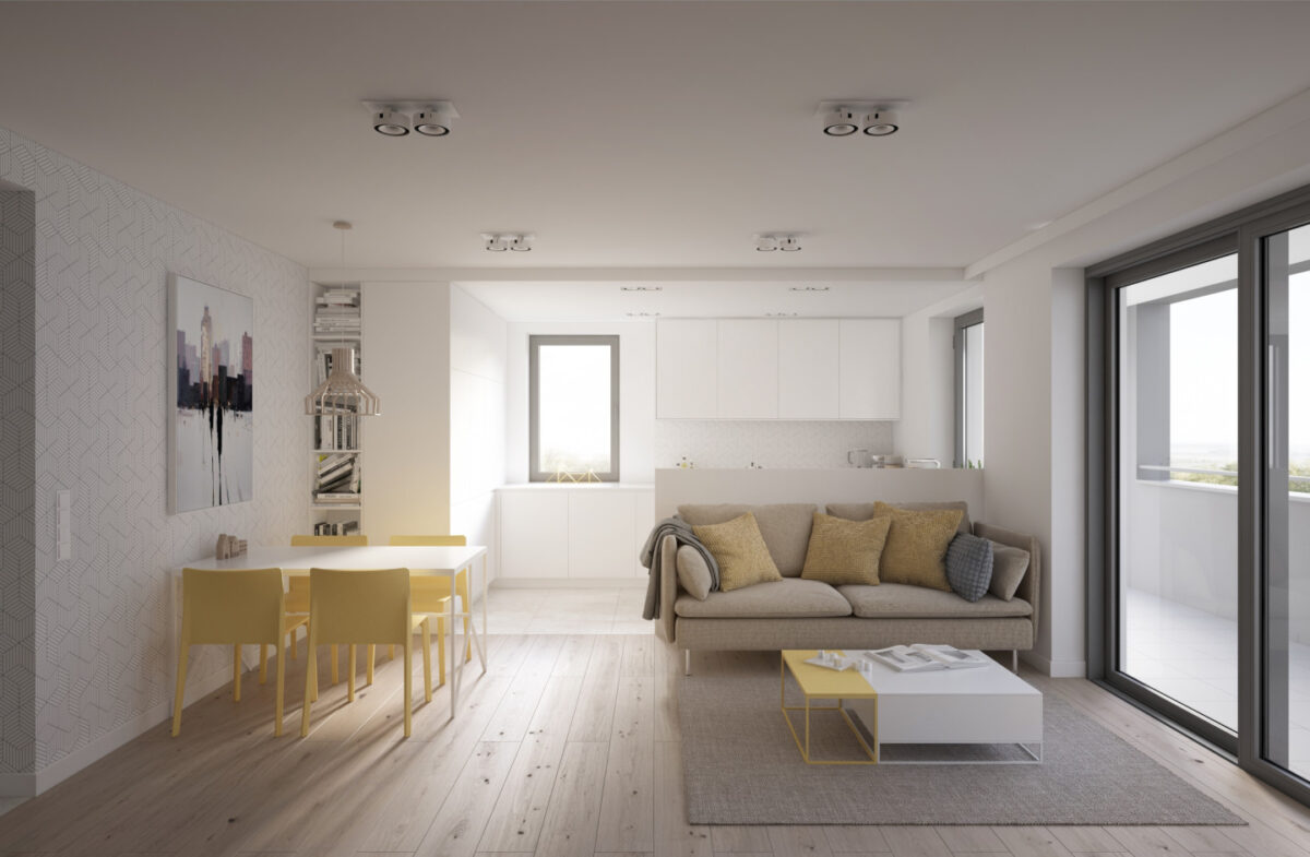
Even the grey tones harbor a secret hint of warmth, a classic match for its more colorful focal points. Most of the decor remains simple, but the colors make them stand out with incredible character.
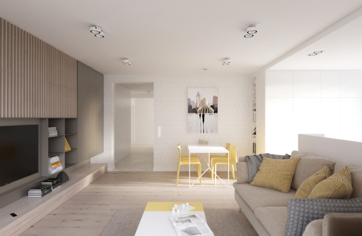
Are you surprised to see a spacious hallway in a home with such a compact living room? This efficient design likely saves quite a few spare feet that went toward the private areas like bedrooms and baths.
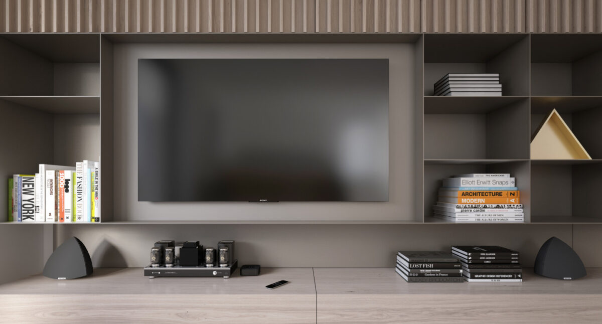
Creative storage helps keep the interior looking tidy while still feeling like home. This media center includes overhead cabinets, open shelves, and low table to hold speakers and electronic equipment.
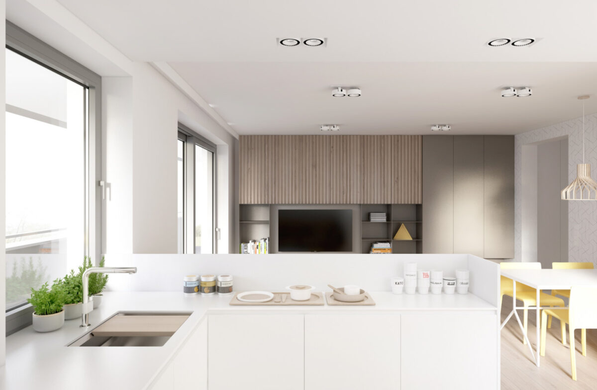
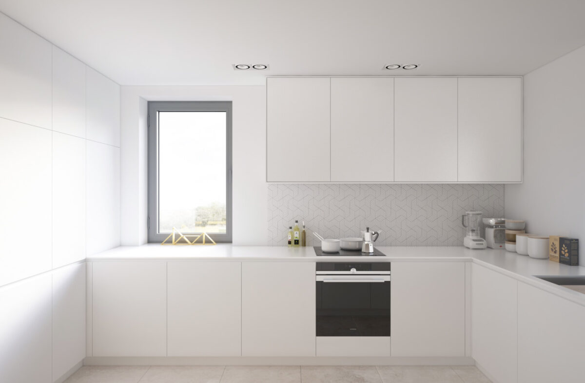
The kitchen layout is extremely charming, and makes it easy to feel connected with the rest of the living room – an important feature for any family that frequently entertains guests.
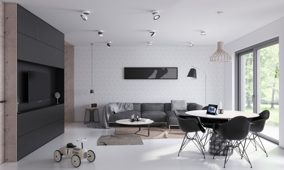
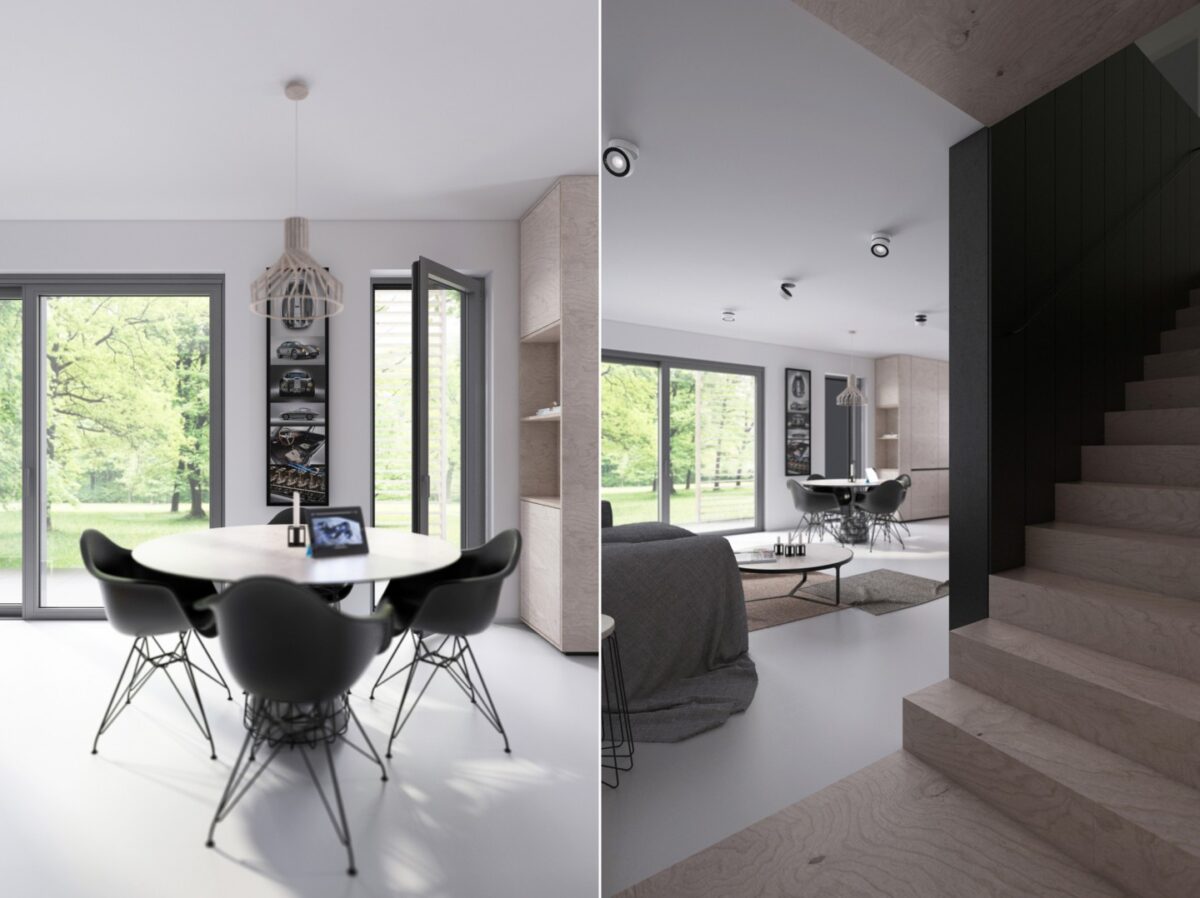
Intricate, but not overworked – this interior makes good use of geometric forms, especially by employing furniture that could easily double as sculptural artwork. Contrast is an important theme even beyond the color palette. For example, the weight shifts between the light base of the Eames dining chairs compared to their substantial seat.
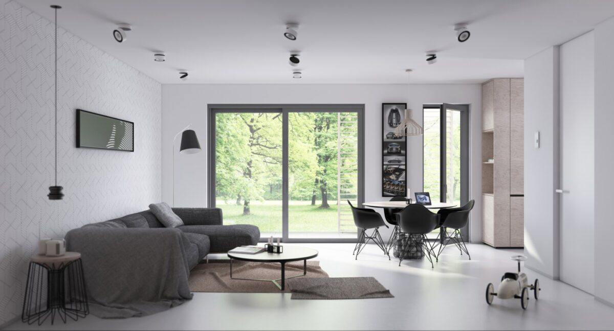
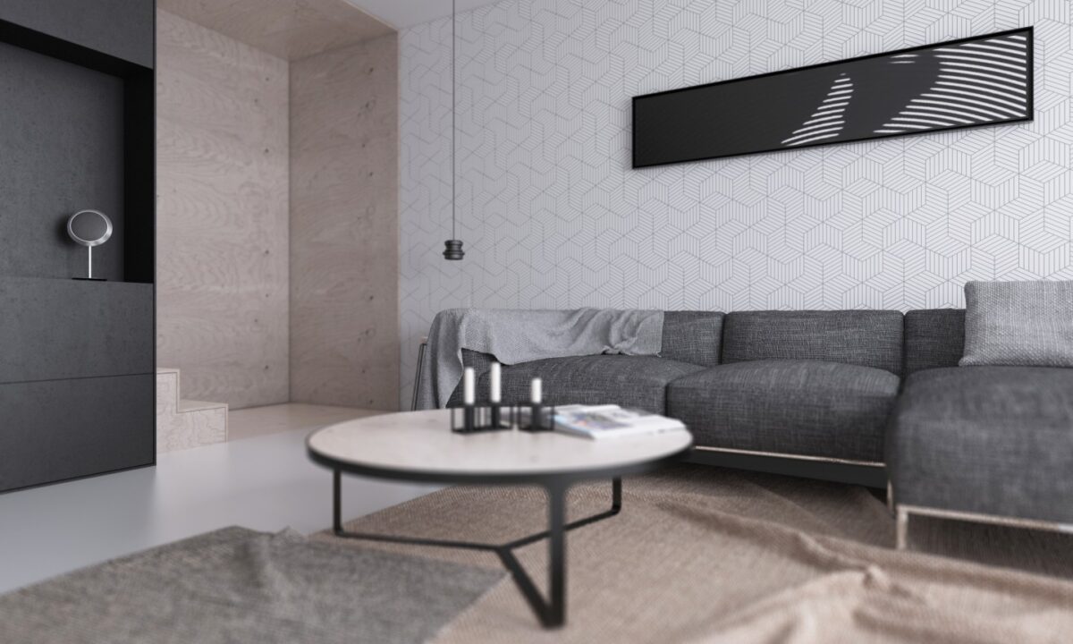
When you're hanging a perfect piece of artwork, a simple frame is the best option. This home remains streamlined and refined to give this amazing garden view the emphasis it deserves.
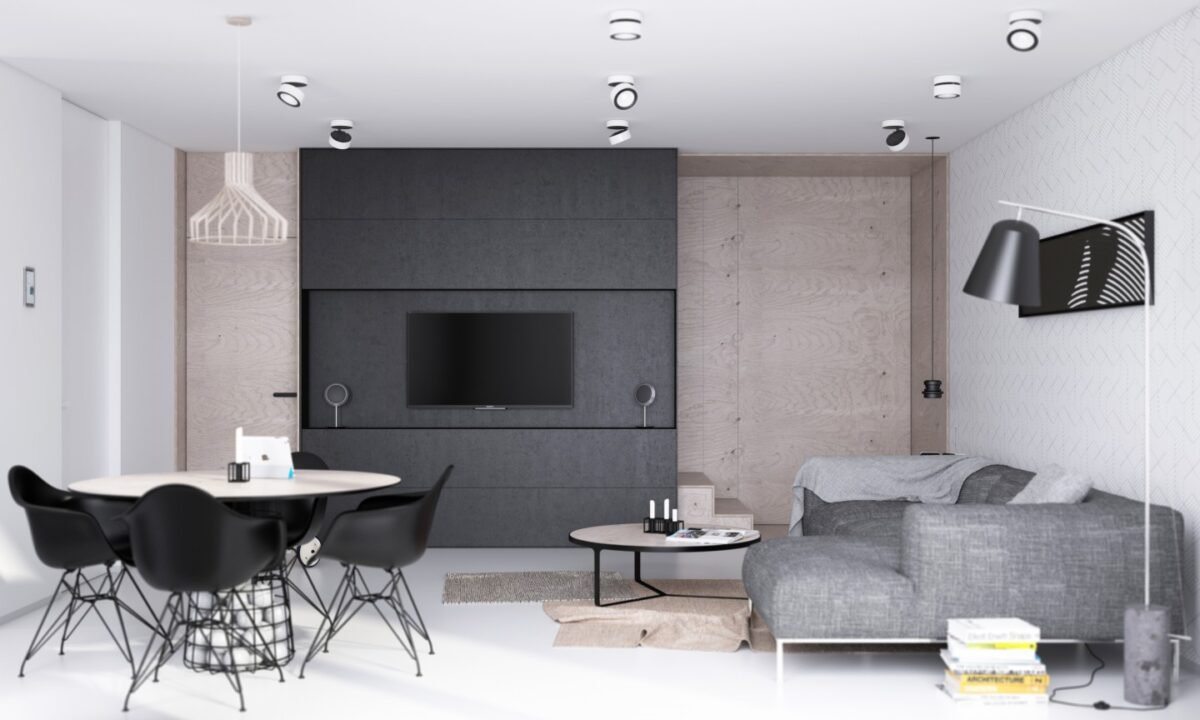
Industrial influences shape the material choices: plywood walls, wire furniture details, and a dash of concrete (the base of the Line One lamp). This living room demonstrates the warmer side of industrial-style decor.
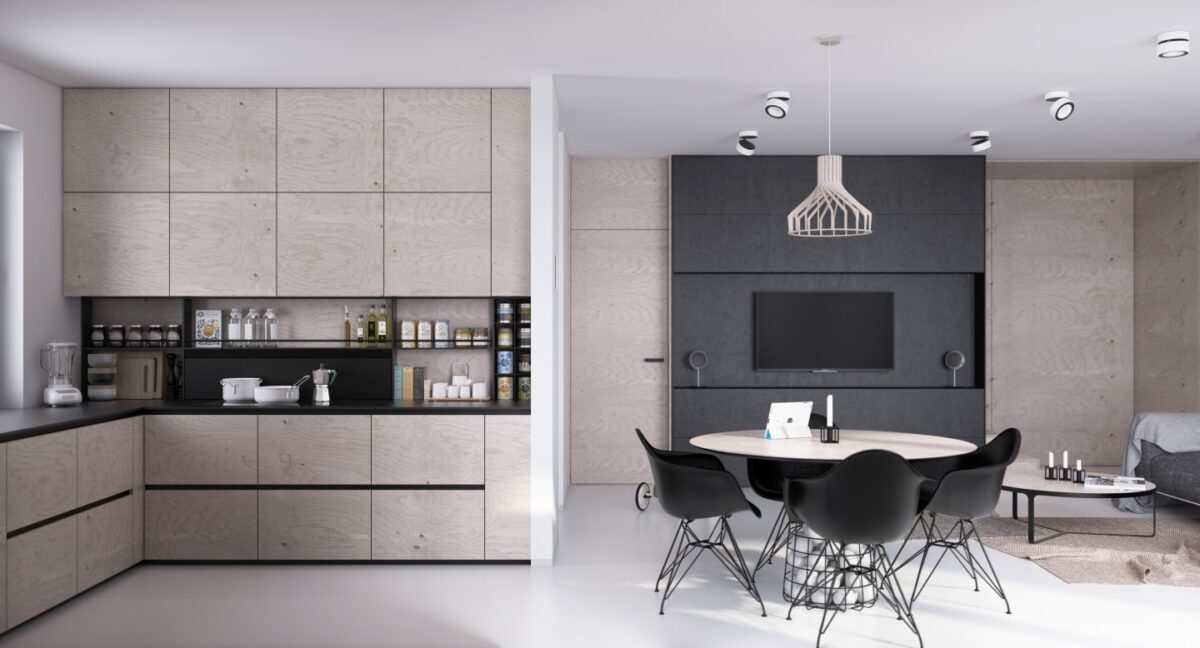
And the kitchen! This cabinet arrangement looks gorgeous, with a stripe of open shelves neatly displaying the most commonly-used spice so they're just within reach.
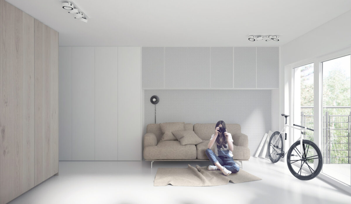
This space is seriously small. Such a compact apartment almost requires an extremely minimalist approach. Here, the designer decided to forgo decoration in favor of lots of light, clean surfaces, and bountiful open space.
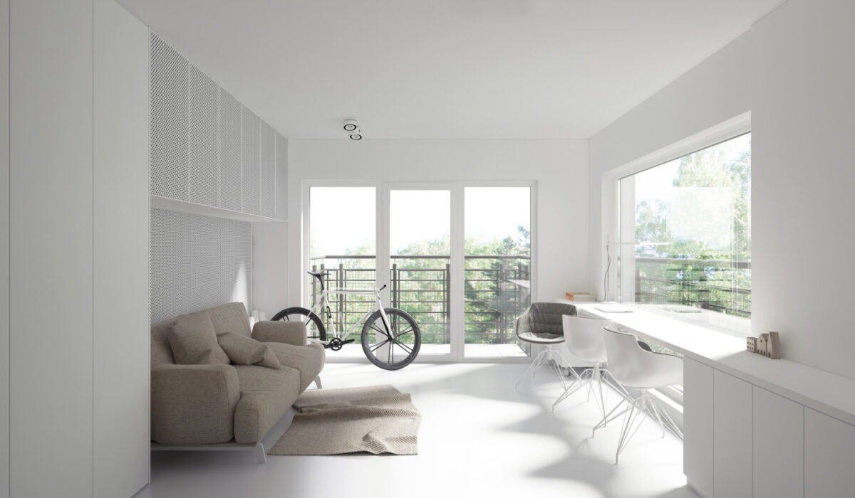
The desk looks like it can accommodate some serious work – but it also doubles as a dining table. The next photo demonstrates why!
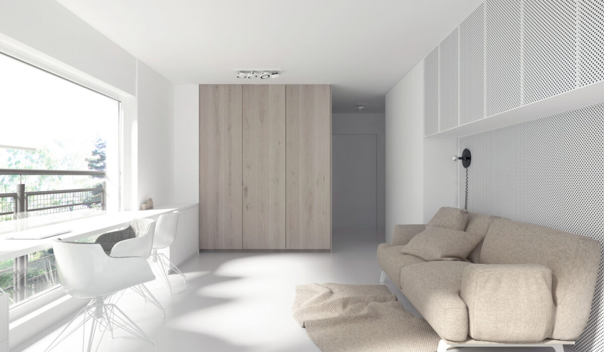
Even the patterns and textures remain smooth and simple. The only hint of pattern comes from the polka dots or perforations on the feature wall and upper cabinets behind the sofa.
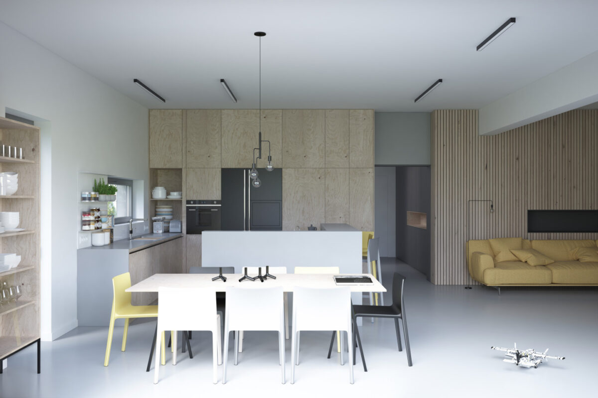
Here's one of the most decorative homes in this series. Despite the lack of art or knick-knacks, the delightful combination of textures helps to weave a strong personality and warm character. Pale yellow furniture dots the interior with focal points to anchor the eye.
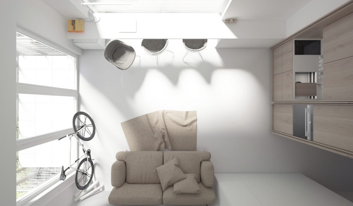
Do you notice anything different about the wooden volume on the right? Cabinets open to reveal an adorable tiny kitchen. Being able to conceal this area makes the rest of the room look slightly larger.
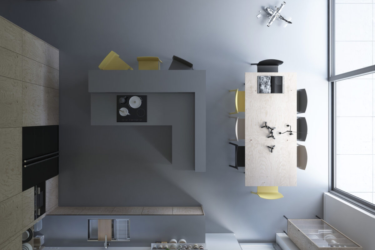
Residents can easily serve food directly from the range to the breakfast bar – perfect for entertaining guests.
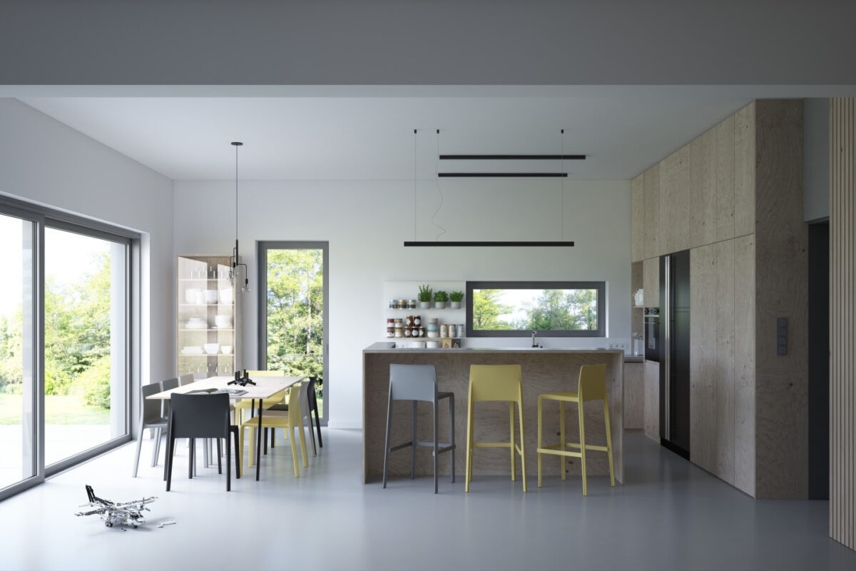
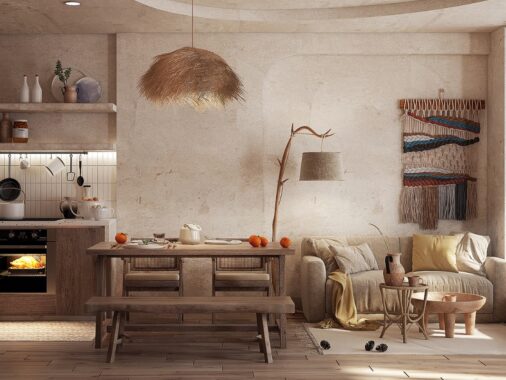
The kitchen and dining are spacious and bright. Stylish coordinated jars on the open shelves ensure everything is within reach and looks tidy, and the potted herbs are a nice addition as well. In the kitchen, it's important to balance aesthetics and function very carefully.
