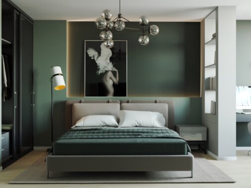
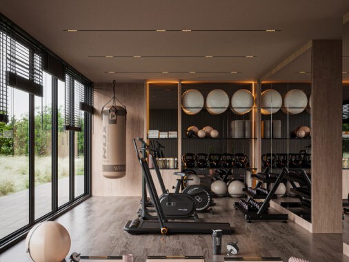
Beyond construction, wood walls and ceilings have a long and colorful history in home decor. Wood panels began as a way to insulate and hide flaws before grand boiserie began to decorate the finest castles and mansions, eventually refined to the elegance of the Rococo style and the gentle touch of the Victorian era. And it's hard to forget the chunky vertical boards that graced midcentury homes alongside shag rugs and fringed upholstery! Today's wooden interior trends take on a more minimalistic style by favoring flat smooth panels, horizontal alignment, and light finishes that highlight rich grain. The appeal remains.
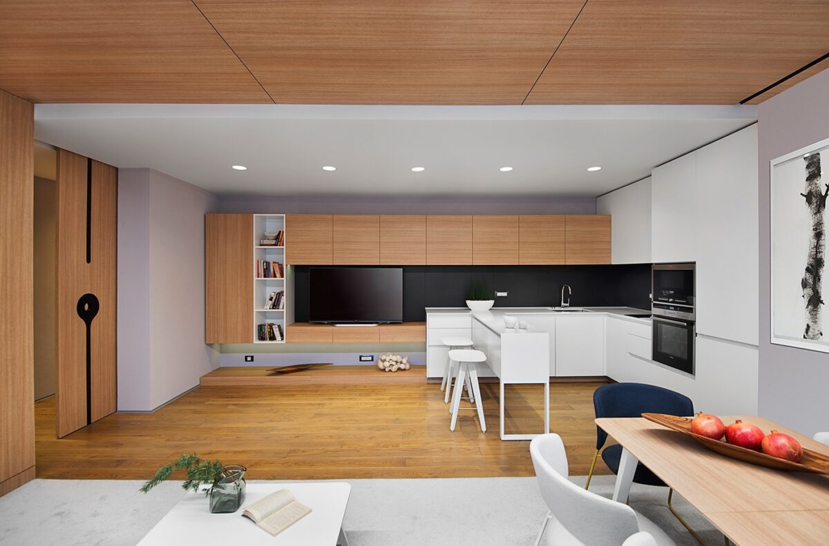
Designed for a client in Sofia, Bulgaria, this home uses multiple wood varieties in a number of creative ways. Here, wood serves as more than just a background material and instead makes itself an indispensable part of the interior design. It graces cabinetry, ceilings, doors, floors, furniture, and so much more.
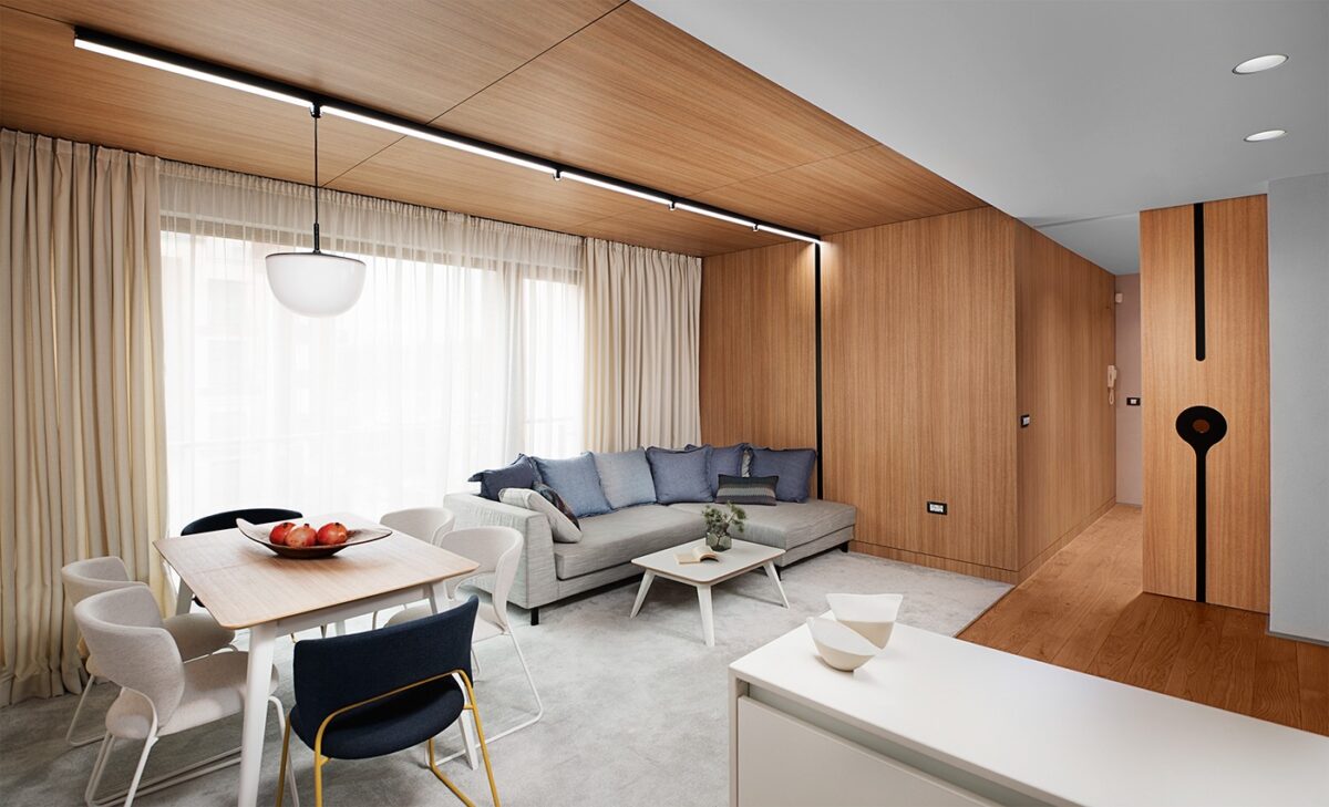
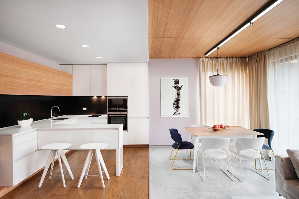
Wood visually divides the open living room and kitchen, clarifying the purpose of each area without the need for interior walls.

Notice how the ceiling and floor colors swap positions at the boundary between the living room and kitchen – quite a breathtaking effect from this angle.
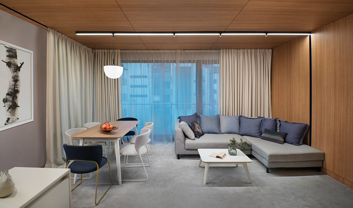
Gray was a smart choice for a modern interior as compact as this one, yet it may have felt too cold without the addition of the warm organic materials.
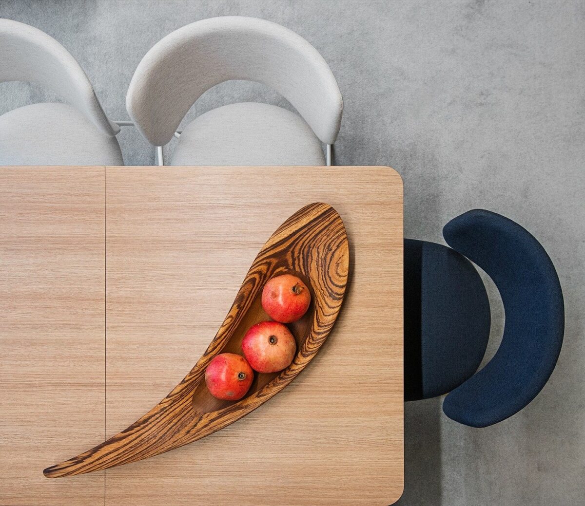
This home is a good example of how light, medium, and exotic woods can work together within the same space especially with a background of neutral tones.
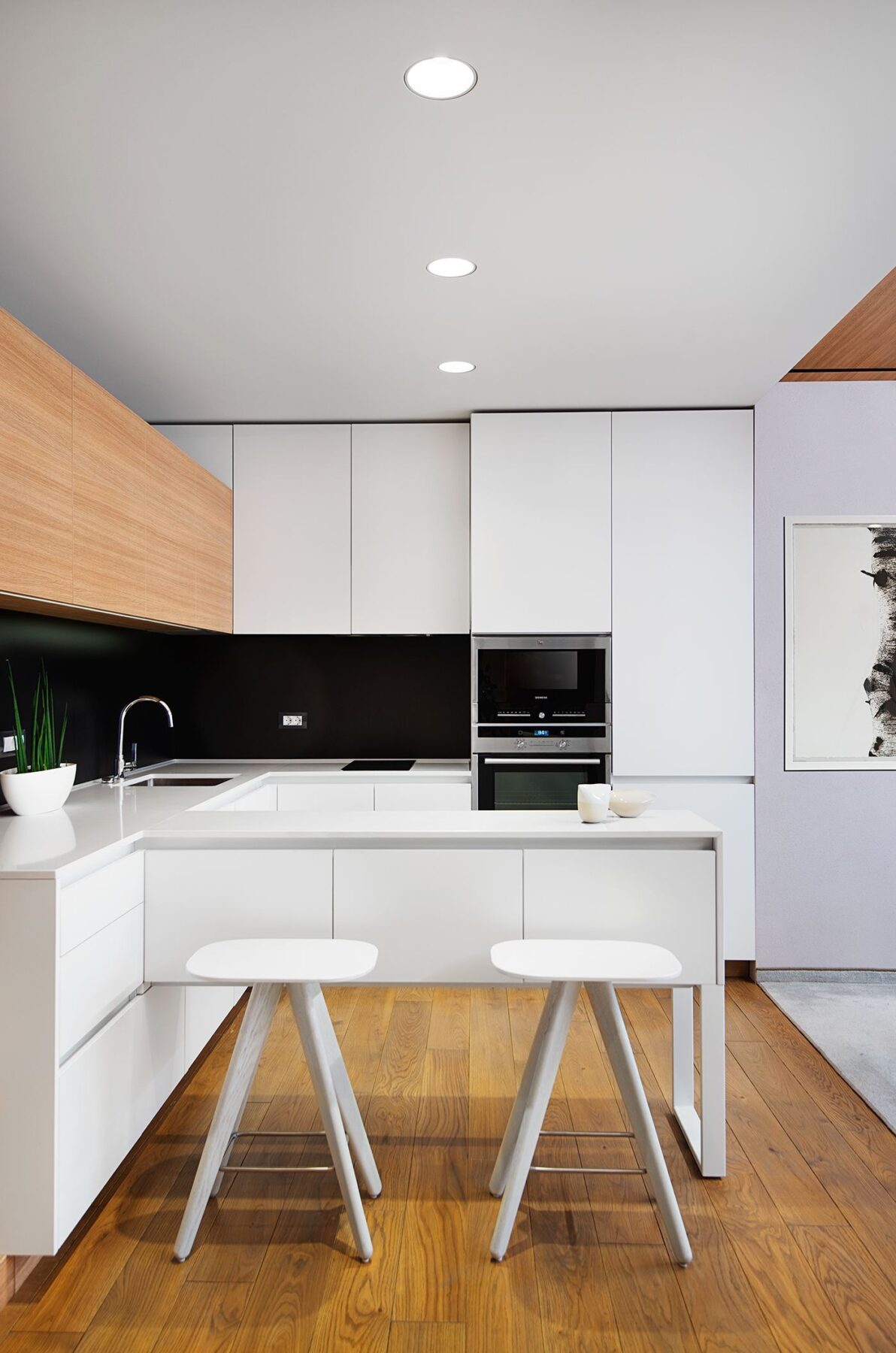
White workspaces maintain a clean and smooth aesthetic ideal for the kitchen, yet the floors and cabinetry reintroduce an essential classic element.
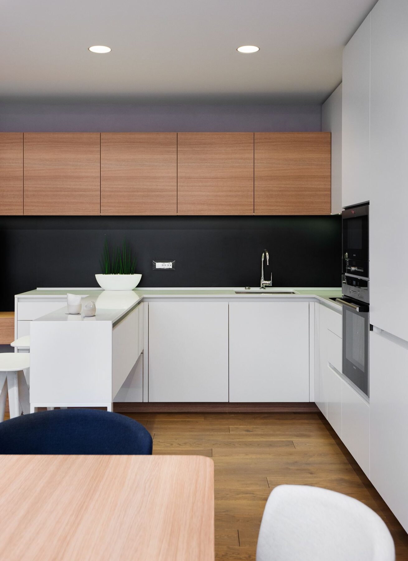
Matte black backsplashes are an uncommon choice. This one cuts a striking line that guides the eye through the kitchen.
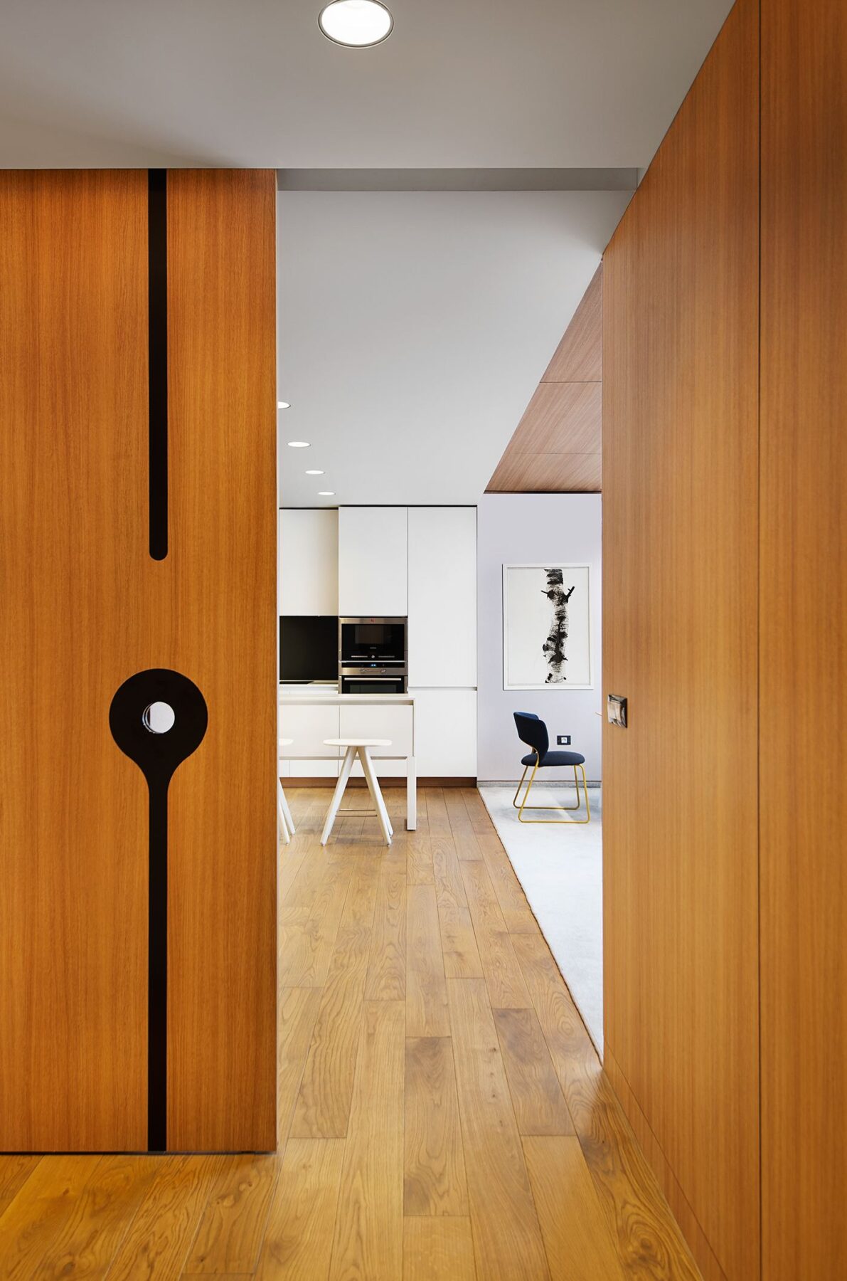
Thanks to the wood and the sparing yet smart use of colorful accents, the interior feels lively and vibrant despite leaning toward the minimalist side of modernism.
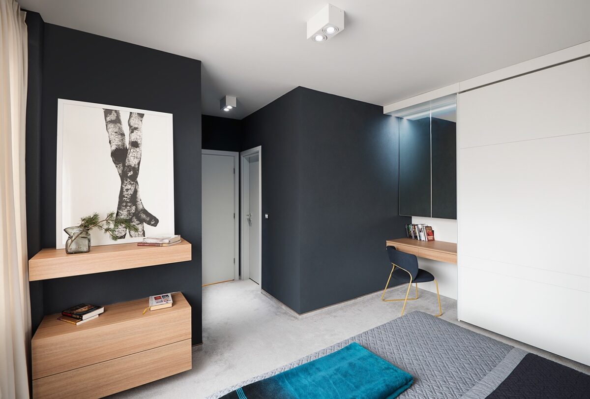
Wood reappears in the bedroom, but only as an accent. It helps the drawers and writing desk stand out from the matte black walls.
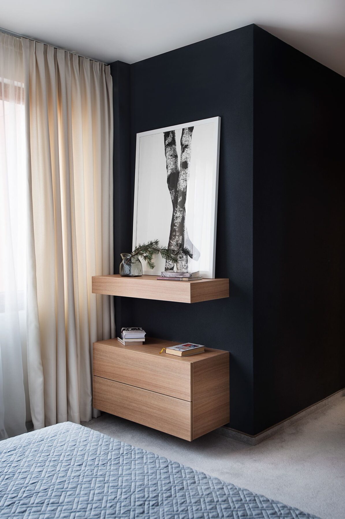
The wall print echoes the material theme of the rest of the home, honoring the source of all the beautiful lumber used throughout.
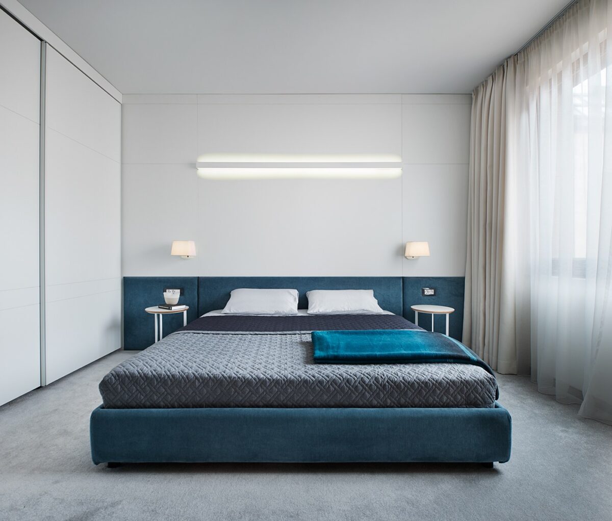
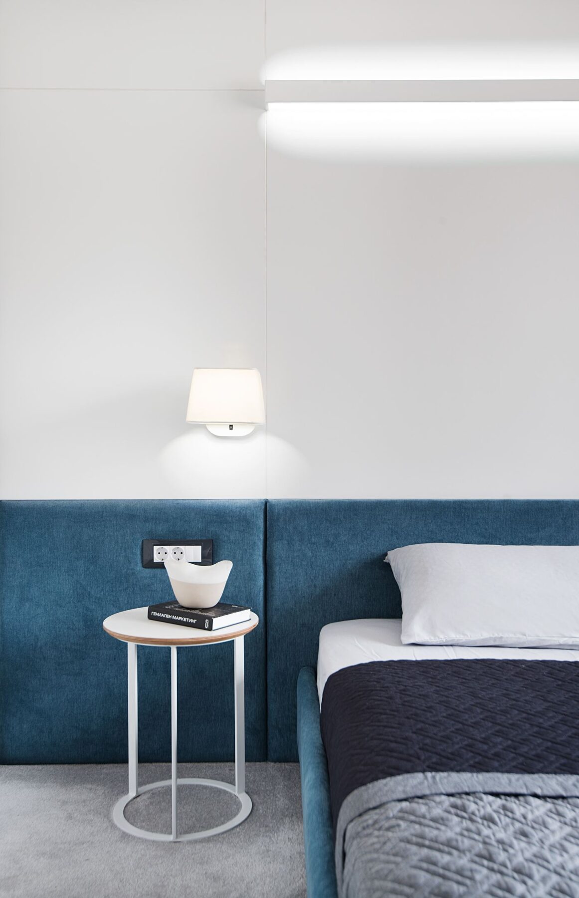
Decorated with shades of cerulean blue, this space is sure to look relaxing under the subdued sconces and lighting bar.
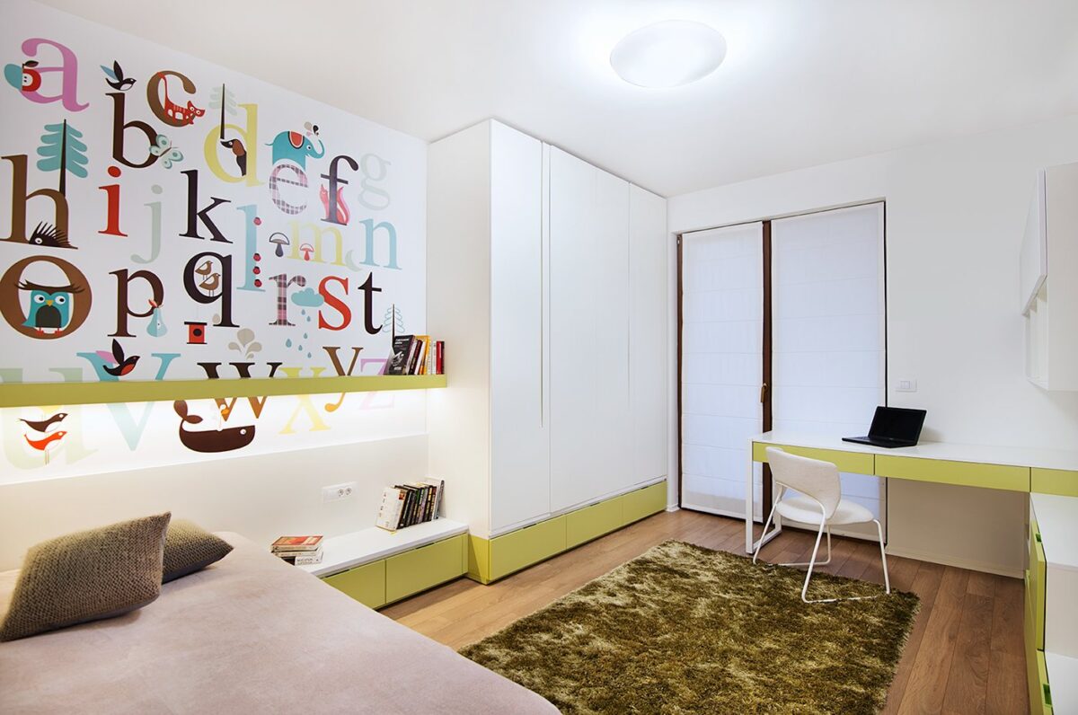
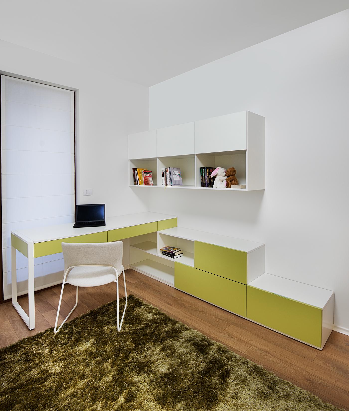
A colorful children's bedroom has a fun theme based around the whimsical side of nature, with a cute and educational alphabet mural above the bed.
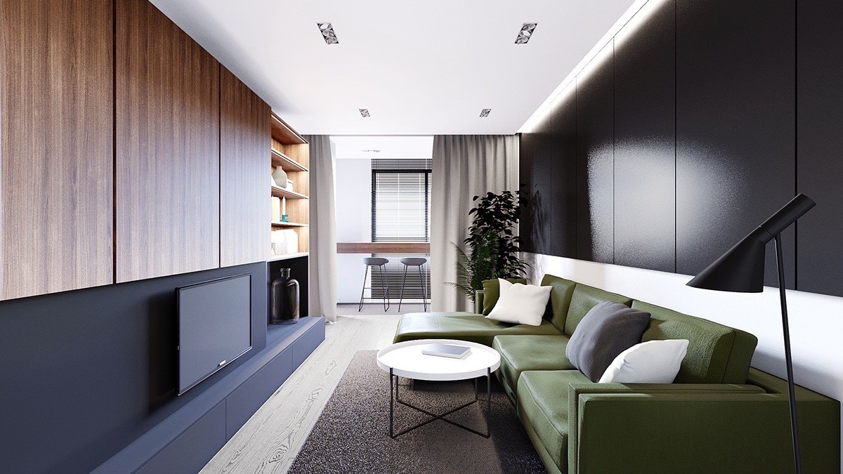
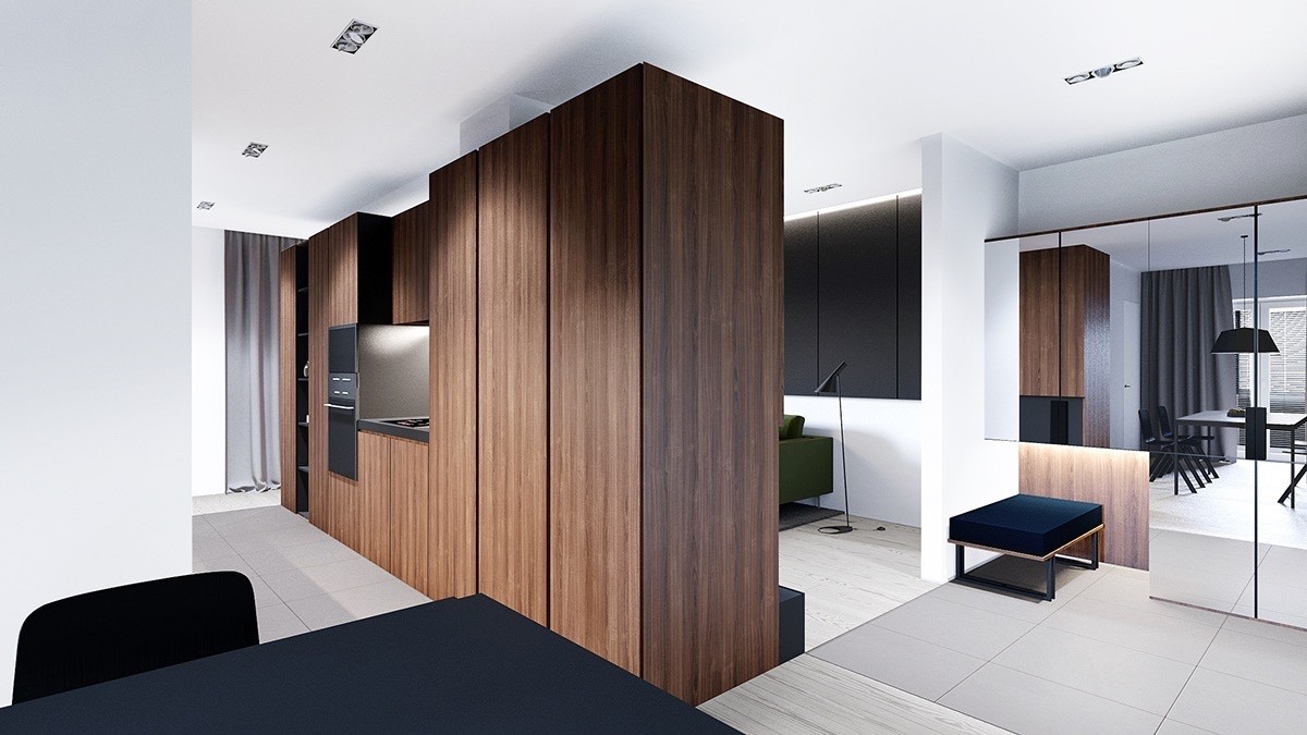
This balanced and symmetric home occupies a modest 80 square meters, taking a creative approach to open layout design. It gains division between rooms with the help of an incredible freestanding storage and media wall clad in smooth medium-tone wood. Each side offers unique functionality.
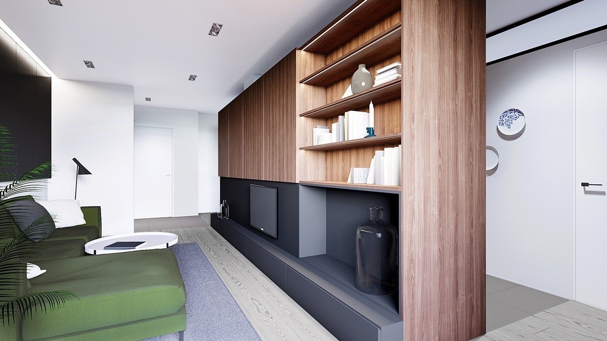
Paired with the forest green sofa, the freestanding wood wall takes on an especially natural and organic appeal – yet charcoal accents ensure the living room remains firmly rooted in modern design.
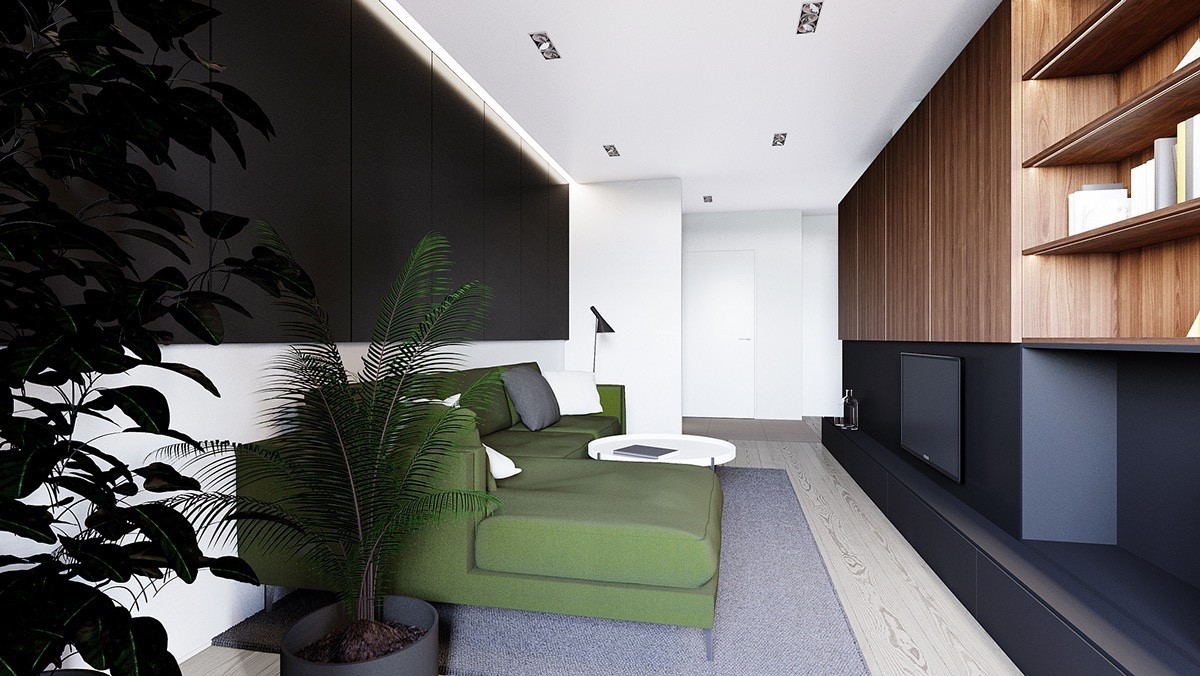
Plants further reinforce the natural aesthetic so important in making a minimalistic home feel more calm and welcoming.
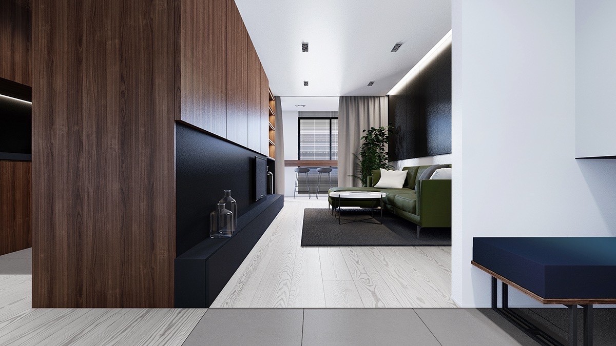
Note how the flooring material changes from one space to the next to clearly mark the functional boundaries in an otherwise open layout.
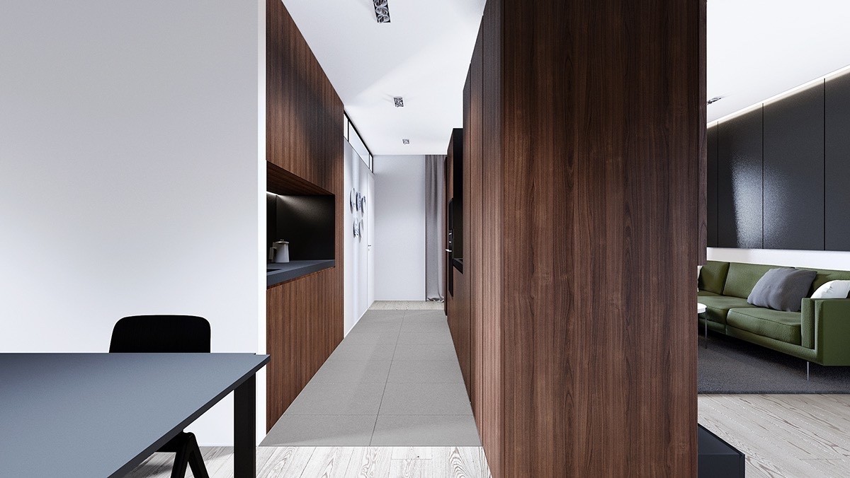
Finally, a good look at the functionality that exists on the opposite side of the wall unit – a fully equipped galley kitchen.
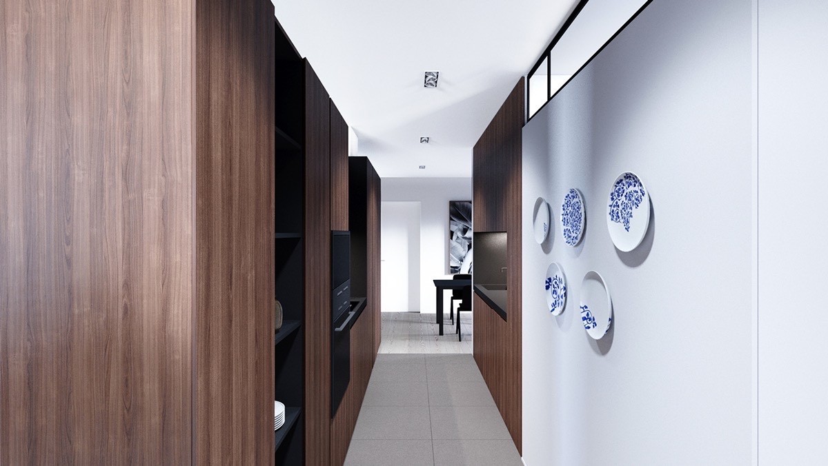
The compact kitchen makes room for classic decor themes for a touch of tradition, namely the ceramic display on the wall.
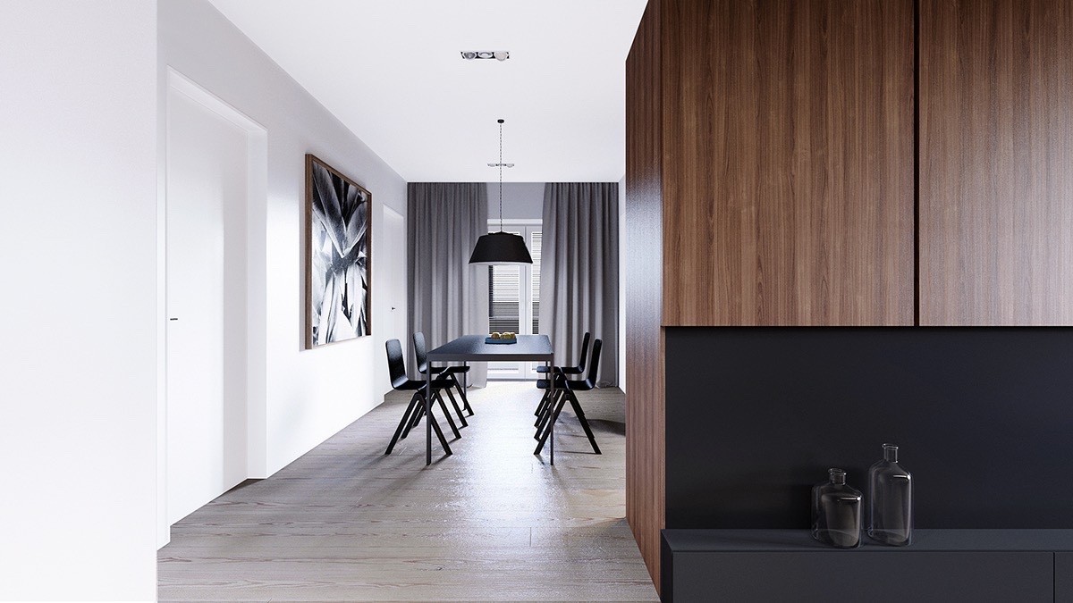
A bright dining room peers out from behind the divider. It offers the most spacious area in the home – a great choice for a resident that loves to entertain.
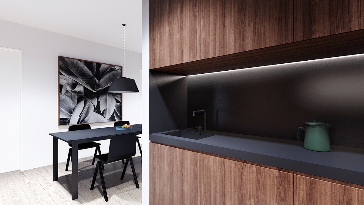
The dining furniture itself uses the same matte black theme as the kitchen for a sense of continuity. The artwork in the background underscores the natural colors and motifs present in the living room.
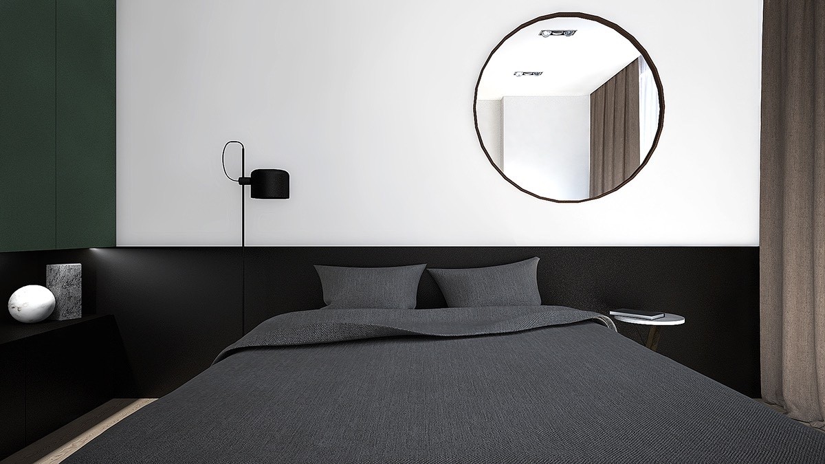
Just as minimalistic as the rest of the home, the bedroom makes a bold impression with high contrast colors and round accents.
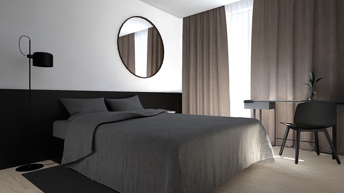
Because the floor is the only surface with natural wood, brown curtains help reintroduce natural neutral accents.
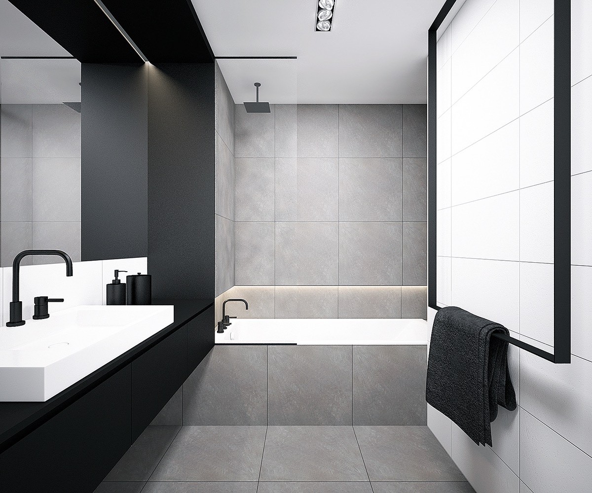
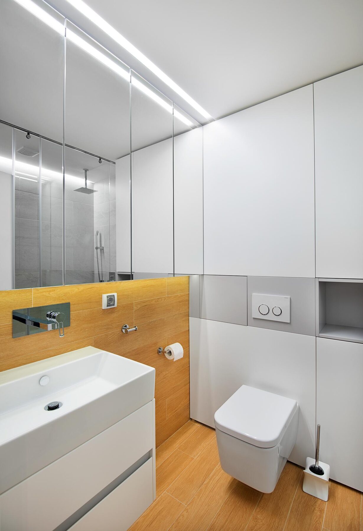
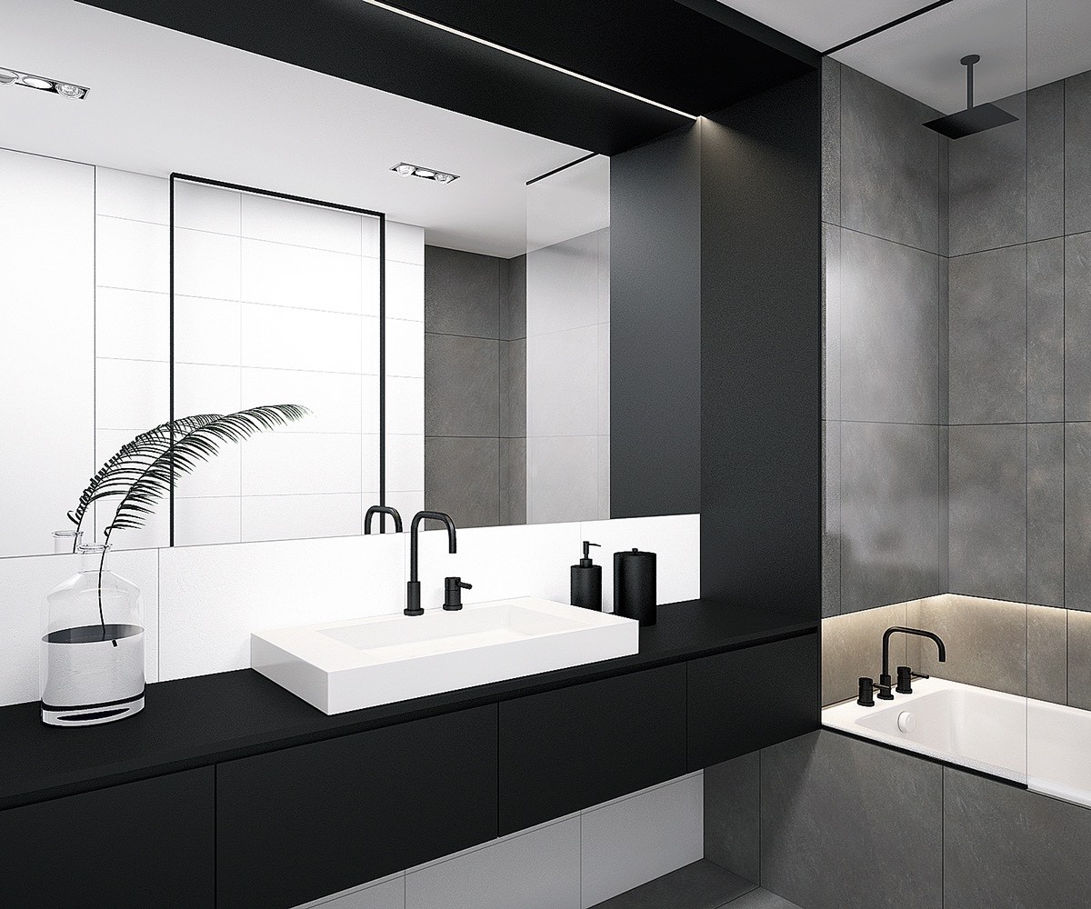
And finally, a look at the bathroom – high contrast and middle grays continue the overarching neutral theme quite nicely.
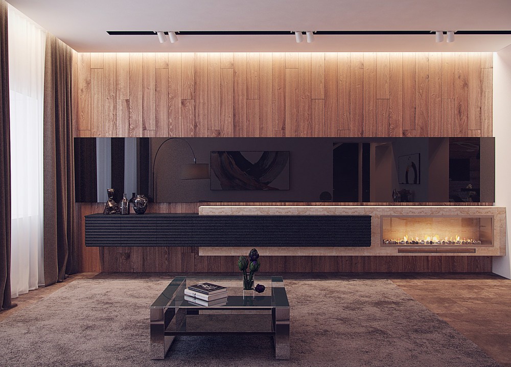
The third and final home takes the strongest approach to wood accents and organic colors. A nice range of wood varieties meshes with other natural materials like stone for a soft, warm, and welcoming effect. The modern style says luxury all the way – but the result is quite humble and comfortable.
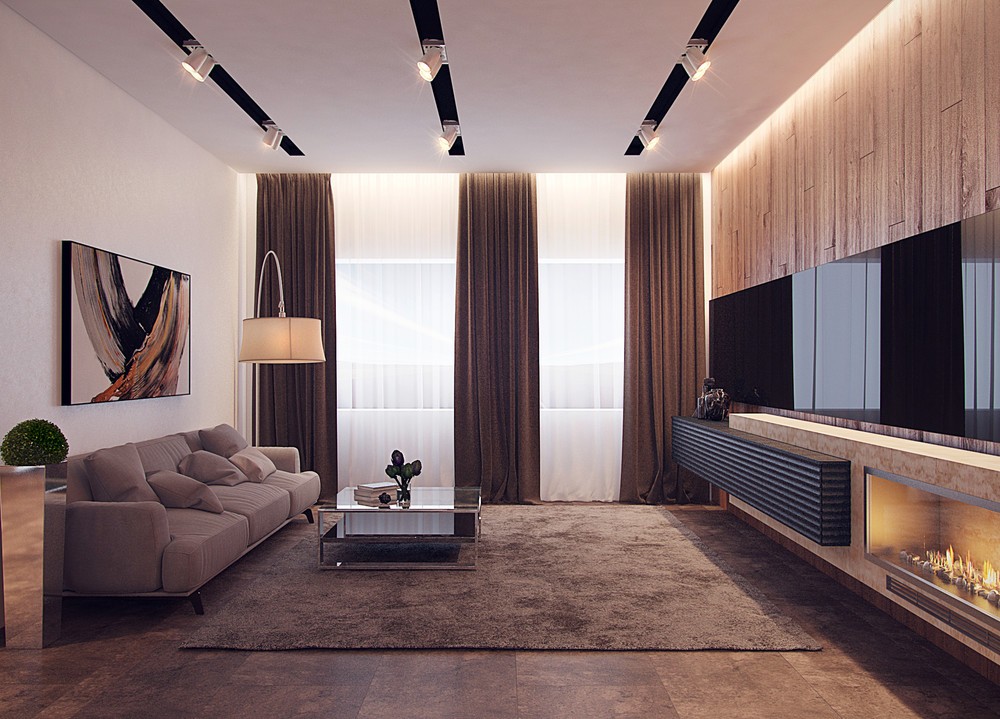
Simple track lighting keeps the eyes drawn to the center and lower portions of the room, with indirect lighting placing a special emphasis on the wood-clad feature wall.
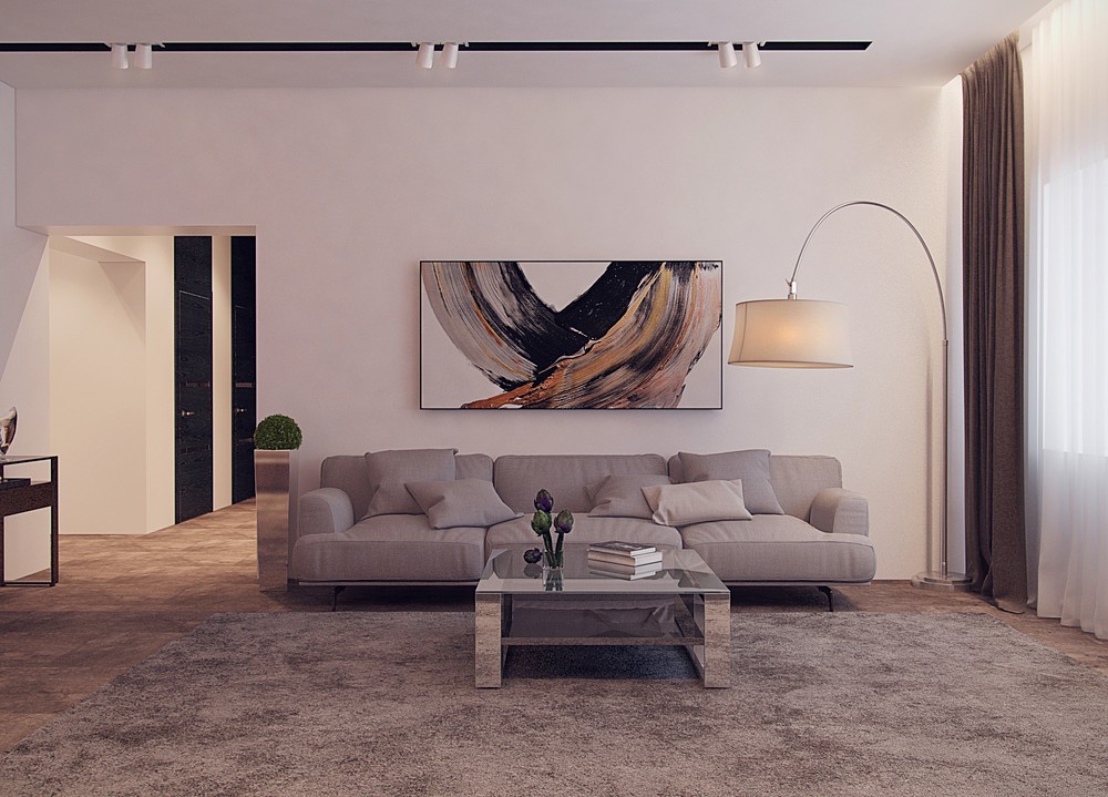
Artwork punctuates select walls, usually above a functional area like this sofa. The colors echo the range of warm tones found throughout while adding a few exciting secondary accents.
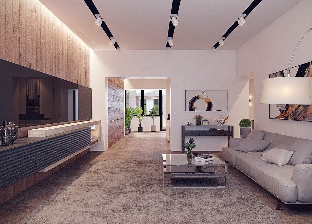
The living room and the one after it both use wood cladding. One wall orients the boards vertically while the other lengthens the space with horizontal lines.
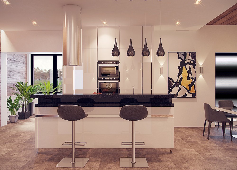
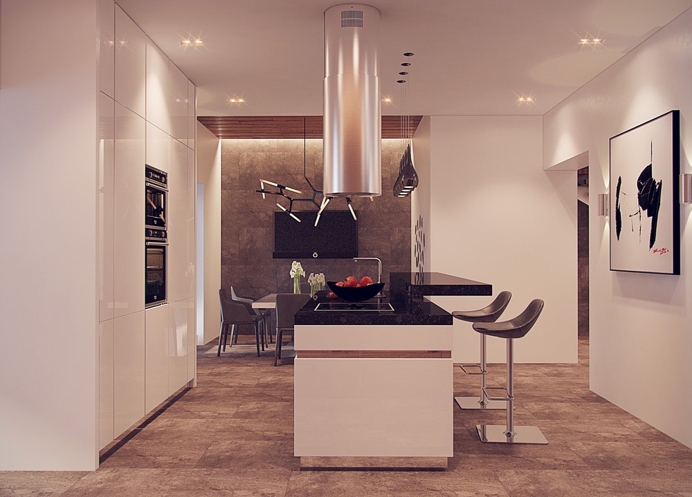
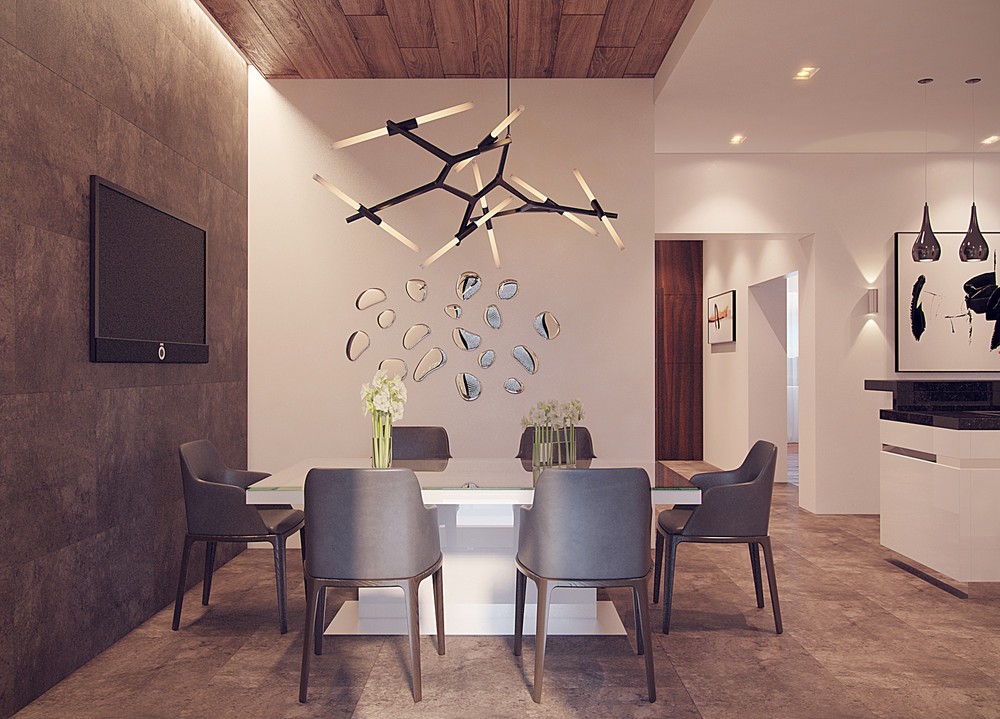
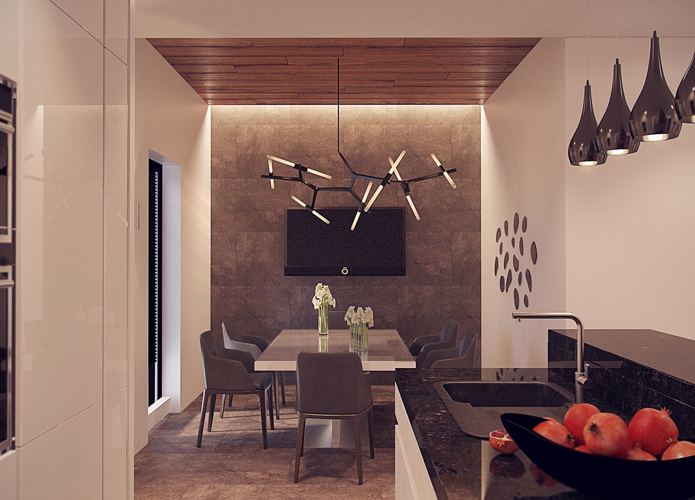
Glossy white cabinets and black worktops replace the wood emphasis in the kitchen and dining room. Metallic details and smooth furniture combine the best of practicality and visual drama.
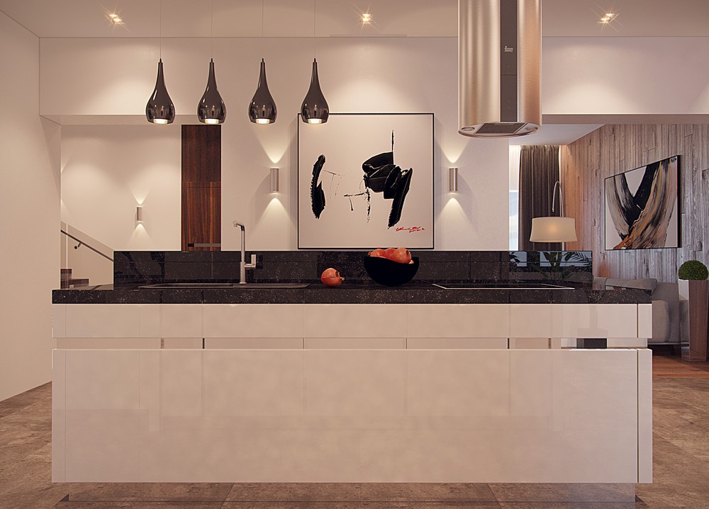
Clear visibility toward the living room makes it easier to converse with guests while the host is cooking or putting together snacks.
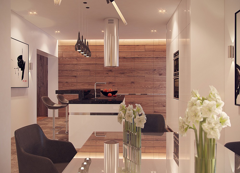
Mirrored dining tables are rather uncommon – but with such beautiful surroundings, who wouldn't want to double up the effect?
