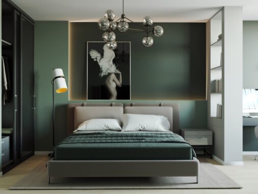
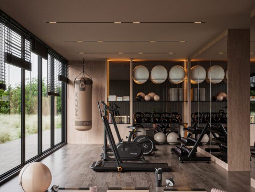
What was once the home of a famous Hungarian painter is now a chic loft in downtown Budapest. The contemporary space plays on the familiar elements of a loft with exposed beams, brick walls, and large factory-like windows while still adding elements of surprise. Whether it's color, texture, or stunning lighting, this loft comes alive as you discover all of it's nooks, crannies, and characteristics. So take a tour of this space and see for yourself.
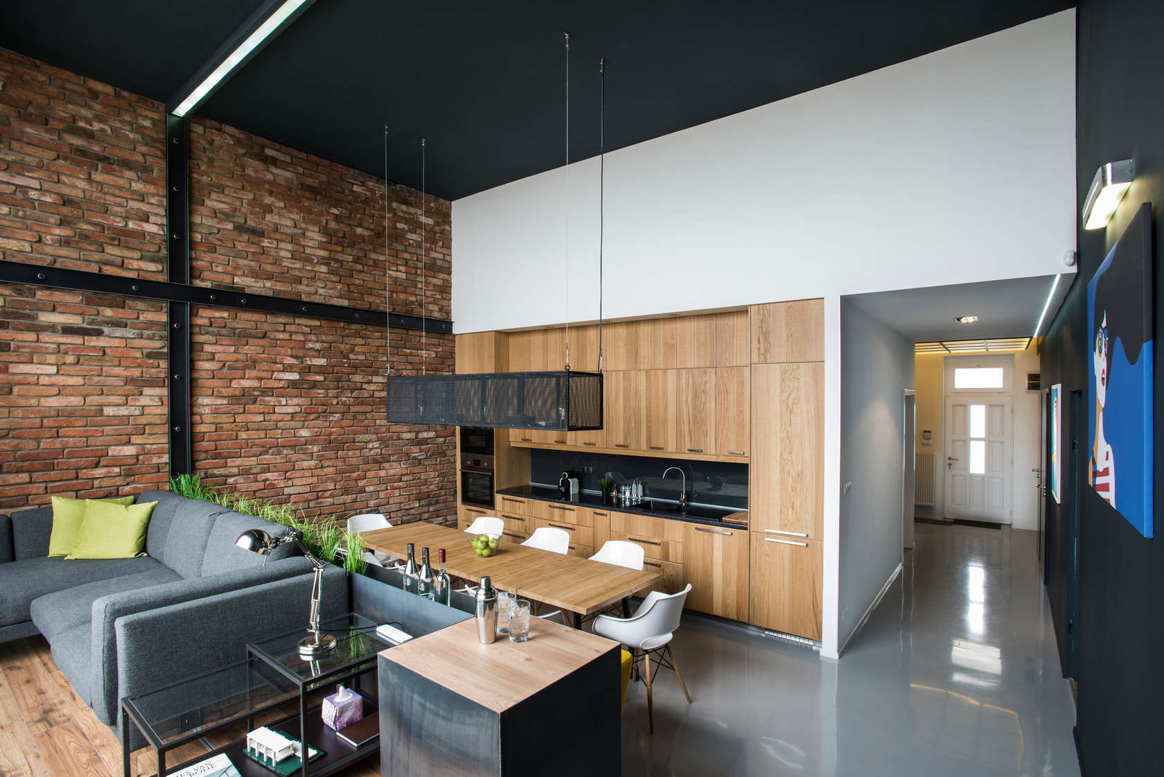
This space blends the industrial with the organic seamlessly, and you can see that here in the open kitchen living space. The brick wall is quintessential for an industrial space, but mixed with the warm wood cabinets and the scattered plants, this space is infused with a bit of nature.
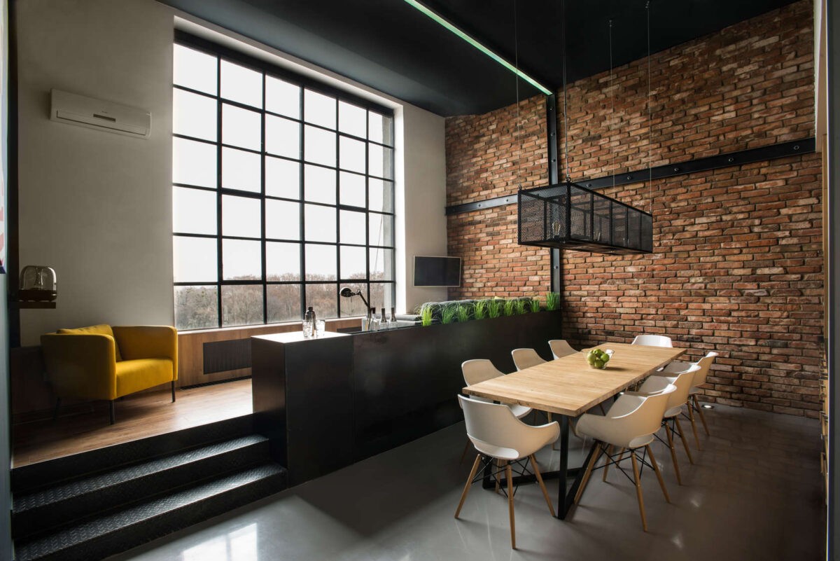
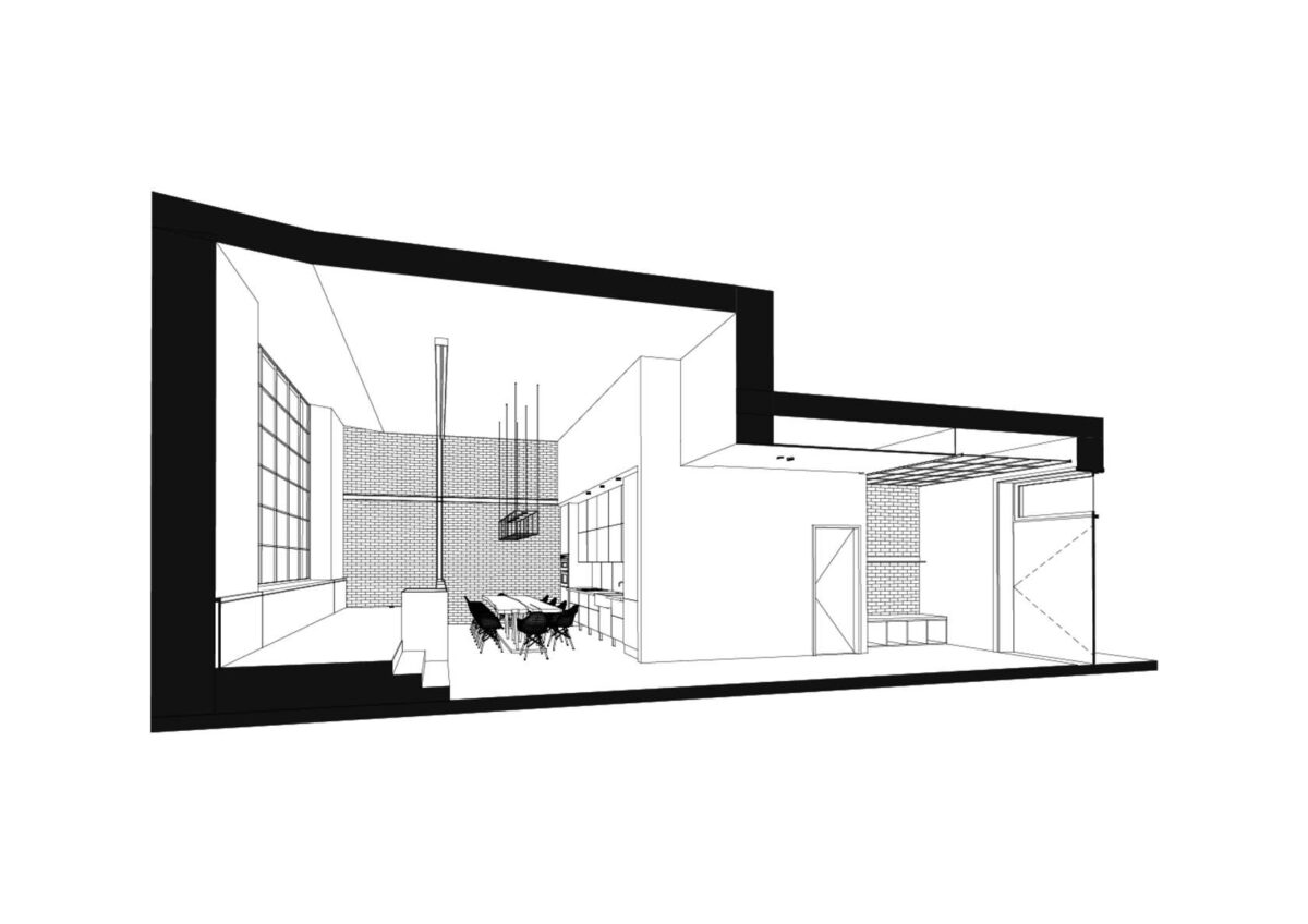
You can see the awesome industrial elements front and center here: the brick wall, steel beams, and those giant leaded windows that look straight out of a factory.
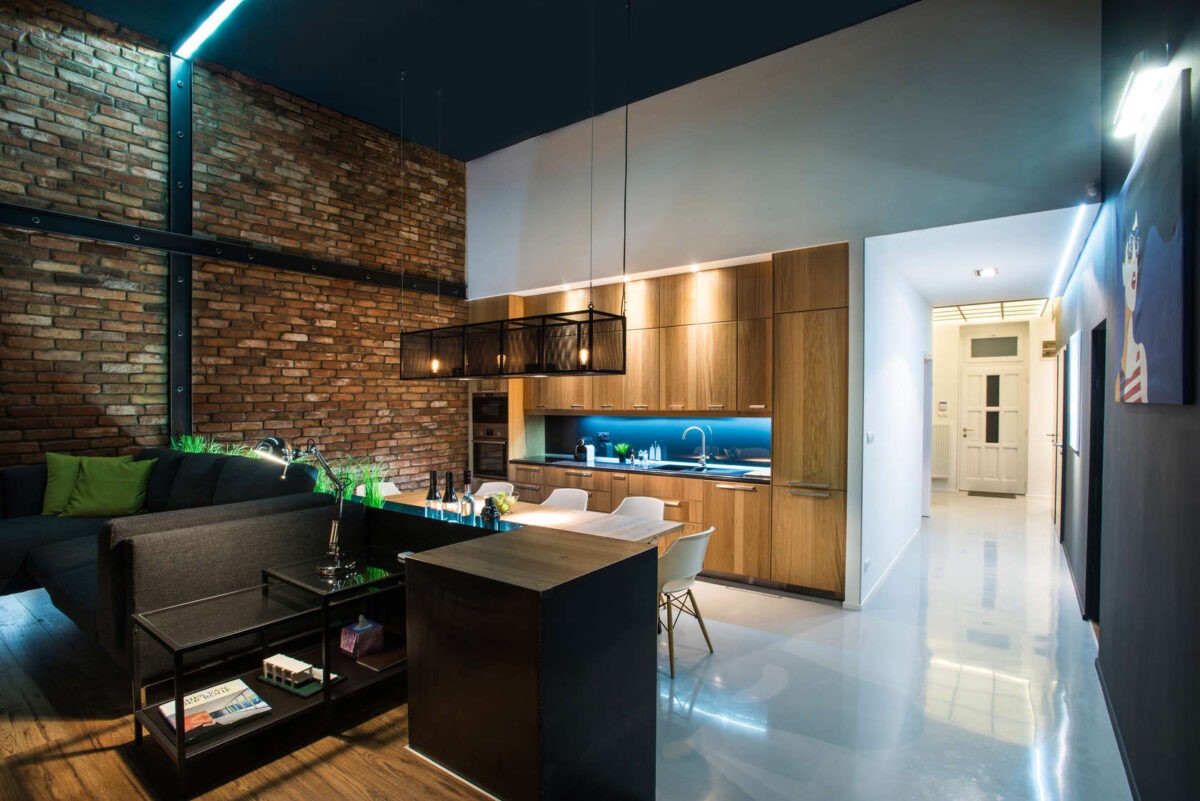
This space is anything but dark and boring at night, they’ve created a wonderfully lit space that bounces off of the different surfaces.
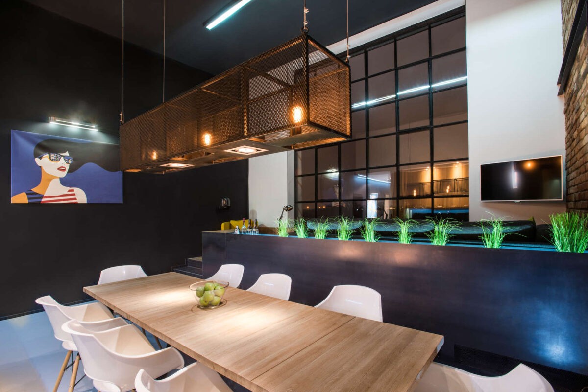
We love this chandelier over the dining table. It’s industrial, rusty, and the shape mirrors the rest of the rectangular space.
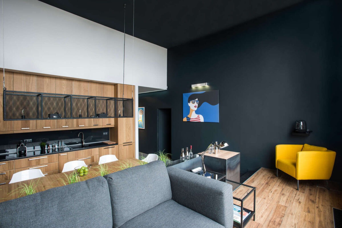
Black walls are a bold move, but it works better than ever in this industrial space. Part of why it works so well is obviously that giant window, but the light and organic color and design of the rest of the space also tones down the harshness of the big black accent wall.
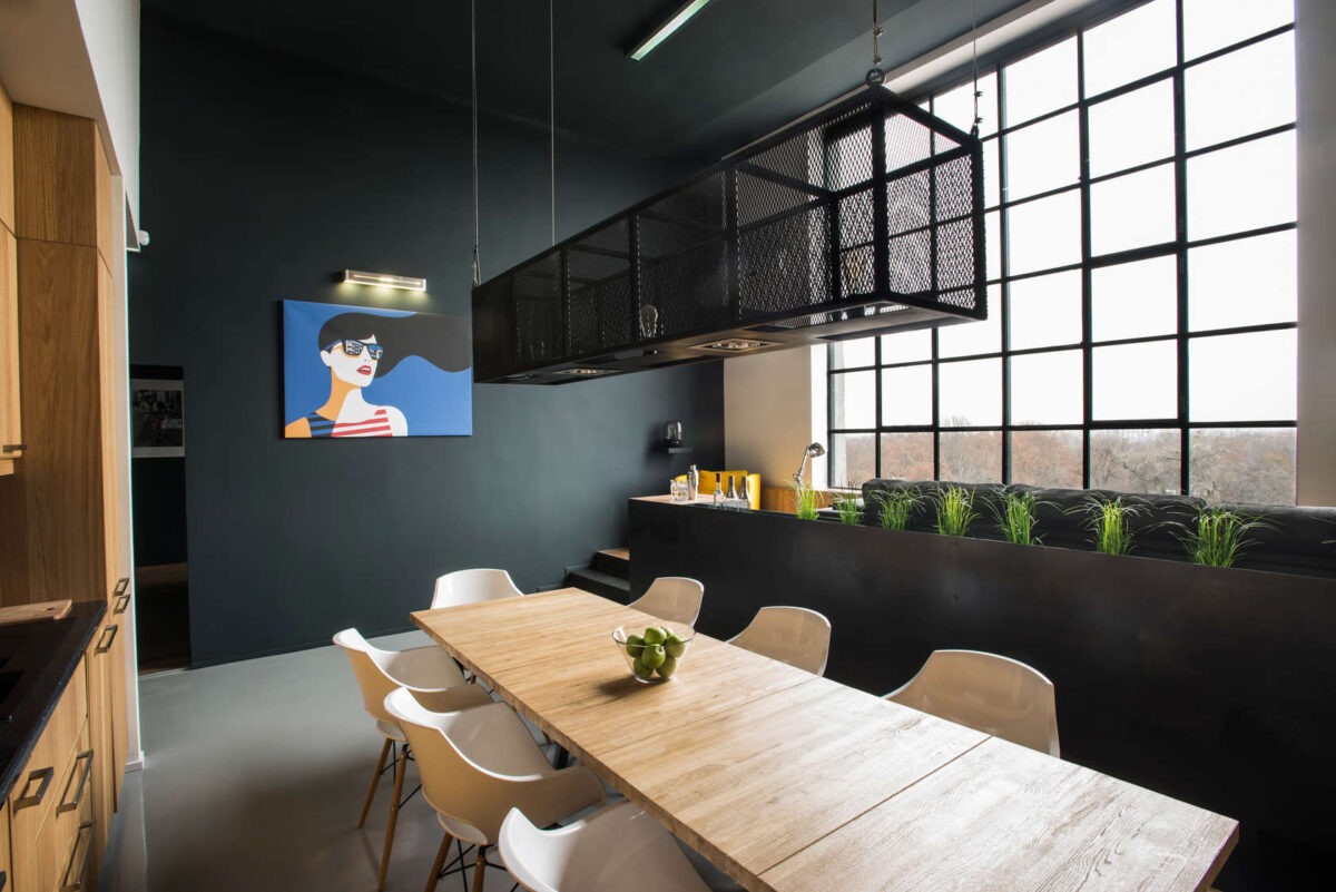
A split level space can sometimes feel disjointed, or even dated. But this super modern design makes this layout super stylish and functional.
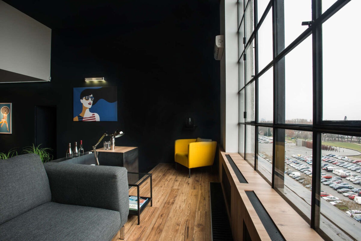
The vaulted living area takes advantage of that view. From here you can see the car park, but just beyond that is the park district of Budapest. We also adore that yellow chair in the color, it pops in that dark little corner.
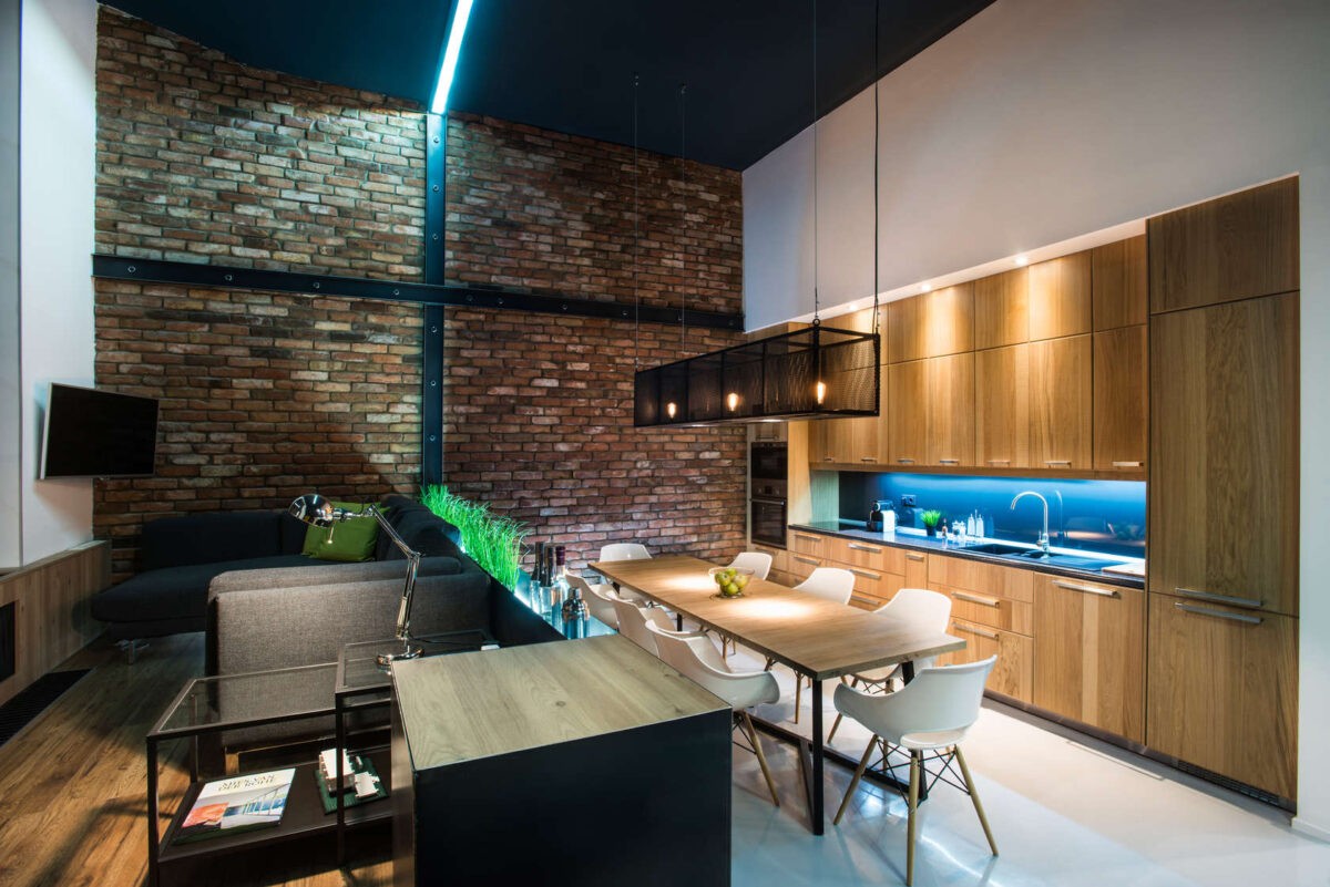
The neon light that splits the room in half is super chic. It adds a bit of whimsy to the space which could easily fall into the pile of other modern lofts with big windows and brick walls. Adding show stopping details like this are what makes spaces unique.
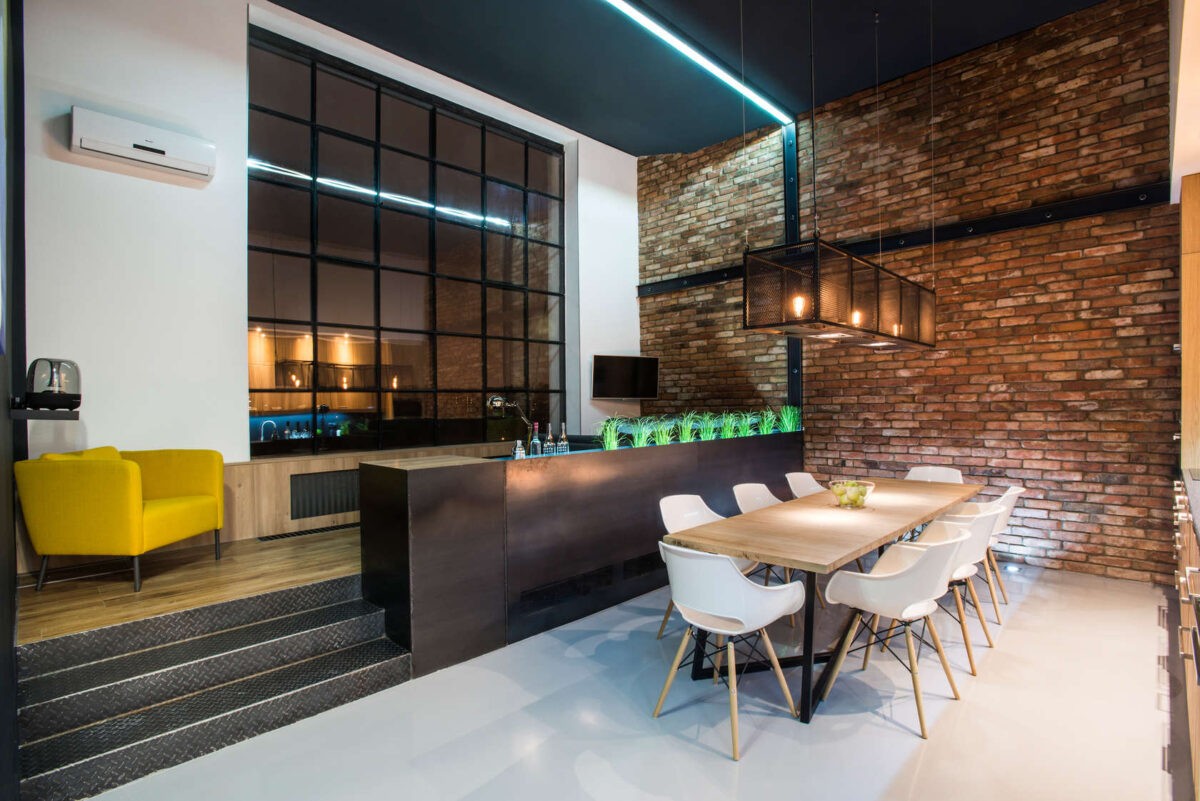
The bright lights shine wonderfully off that stark white floor, and make this not so big living area feel pretty spacious.
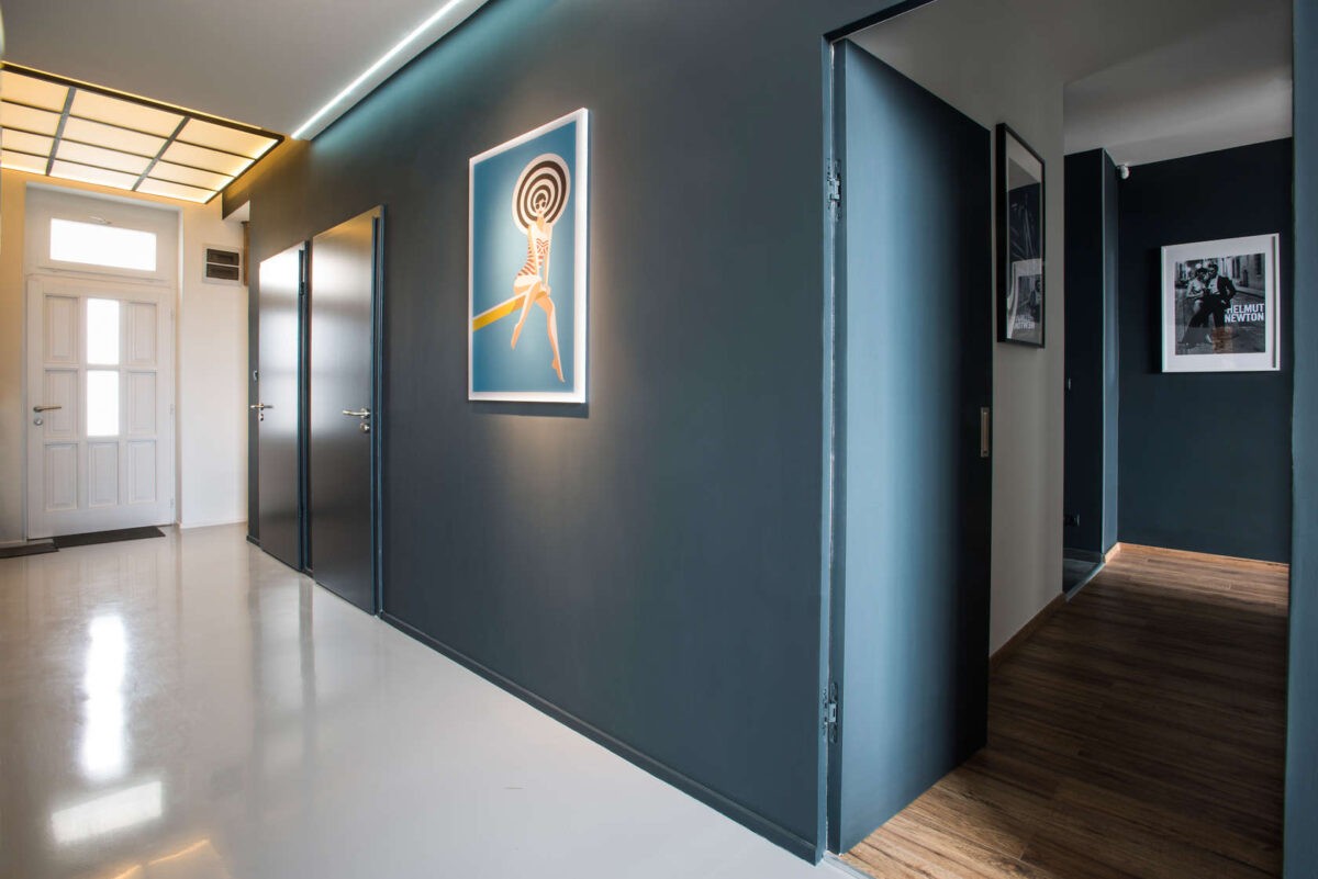
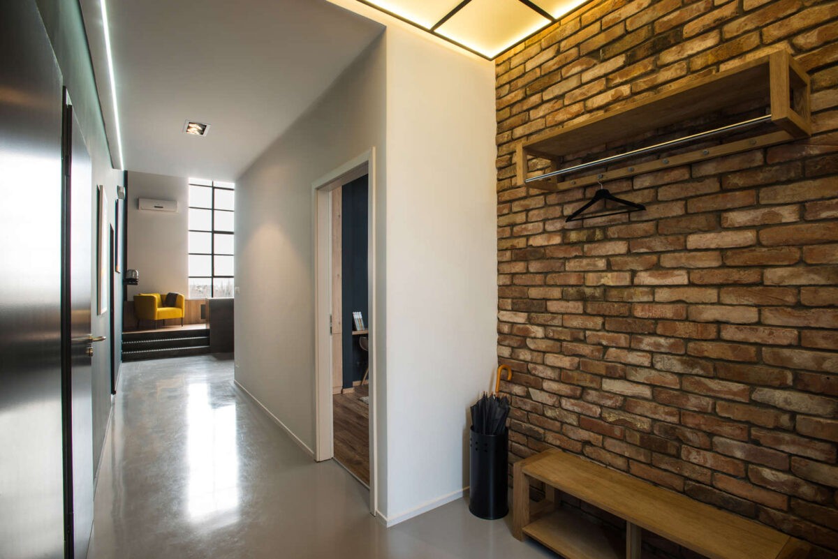
They’ve carried the neon light concept into the hallway, which needs it because it’s much darker. We also like how they’ve split up the common space with the bedrooms by separating them with wood and white floors.
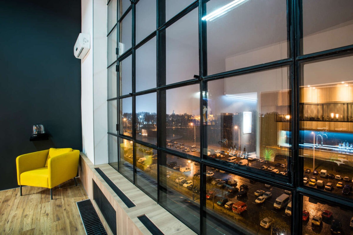
Take a look at this radiator — what could be an eyesore they’ve smartly designed around it with this nice light wood tone. The wood pops against the windows and flows well into the hard wood floors in the area.
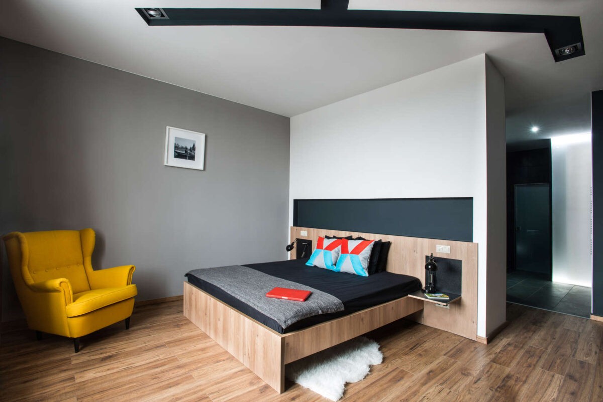
Another yellow chair, and we love it. The pops of color are a lot of fun in this space, and are a timeless way to add some dimension to a neutral room.
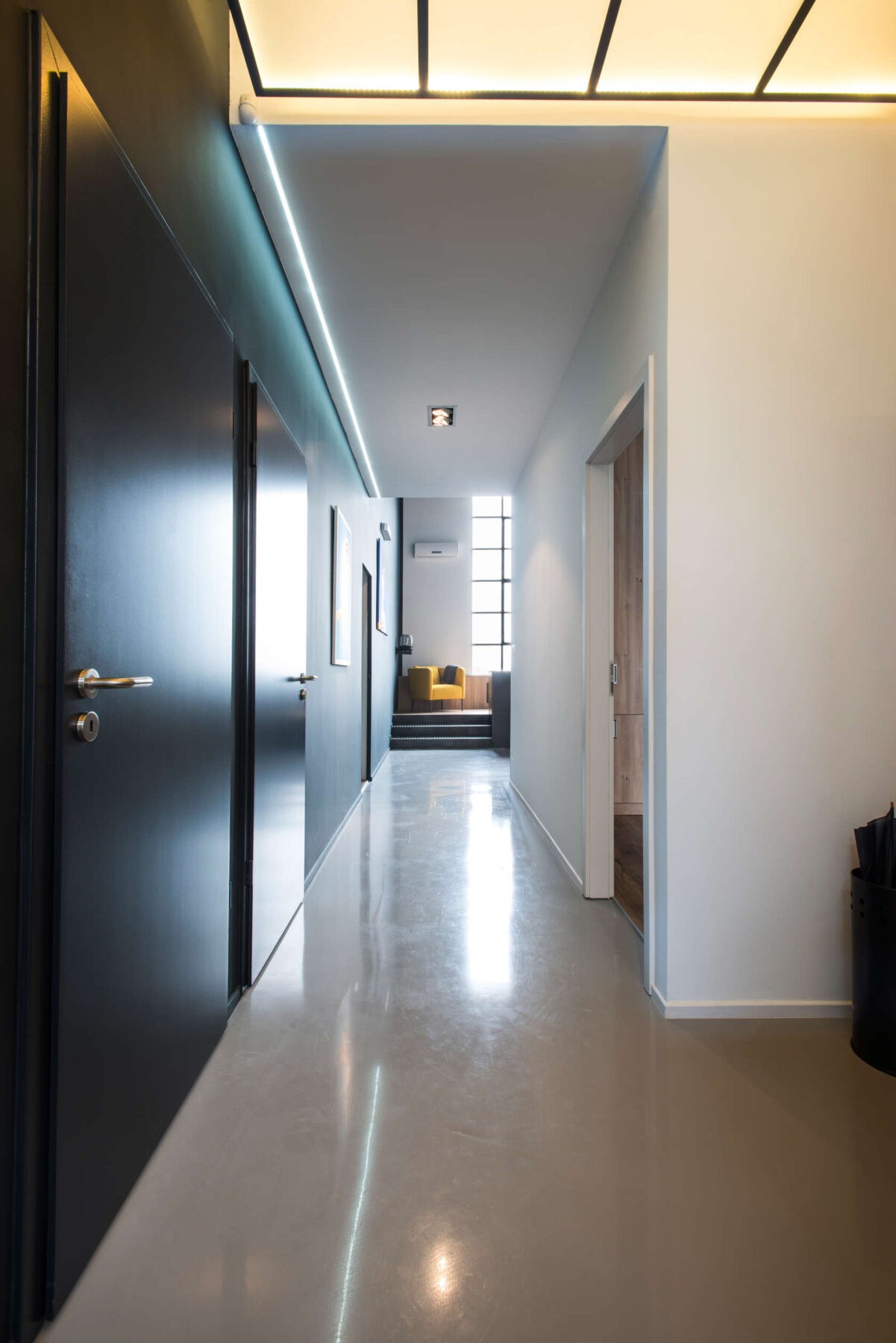
What could be a dark, long, hallway has been illuminated with bright lights and light colored floors to keep you flowing right into the living space.
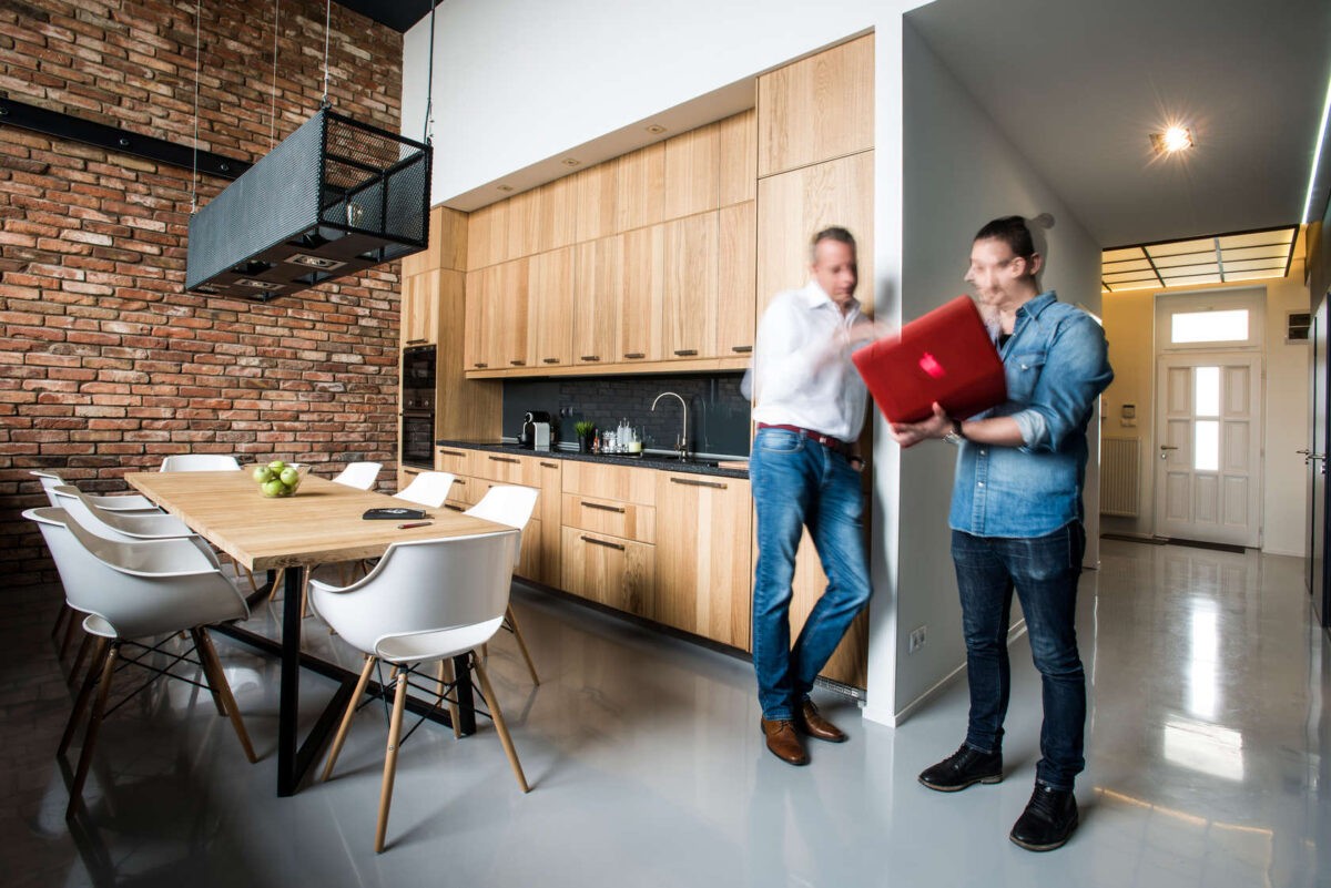
Check out those chairs. We love how the design is swooping and curvy because it’s different than all the harsh, straight lines in the rest of the home. Plus, the white and the wood match the rest of the design beautifully.
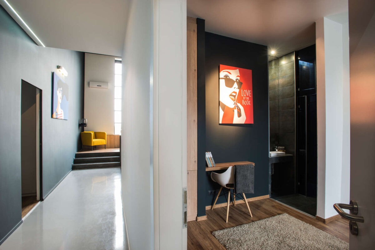
This small desk design is a great way to maximize space. By simply fixing up a floating shelf and parking your favorite chair next to it you can achieve the same look.
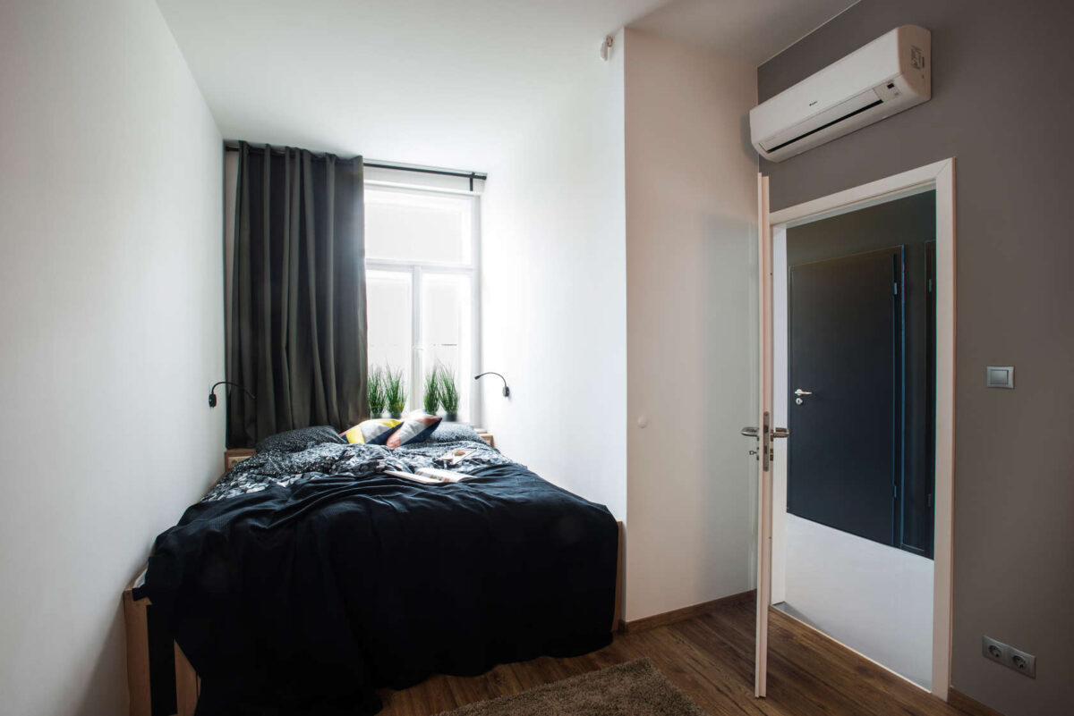
The bed is neatly tucked in the corner right by another pair of giant windows. We love how the bedding is black because it mirrors the rest of the space and pops against the stark white walls and wood floors.
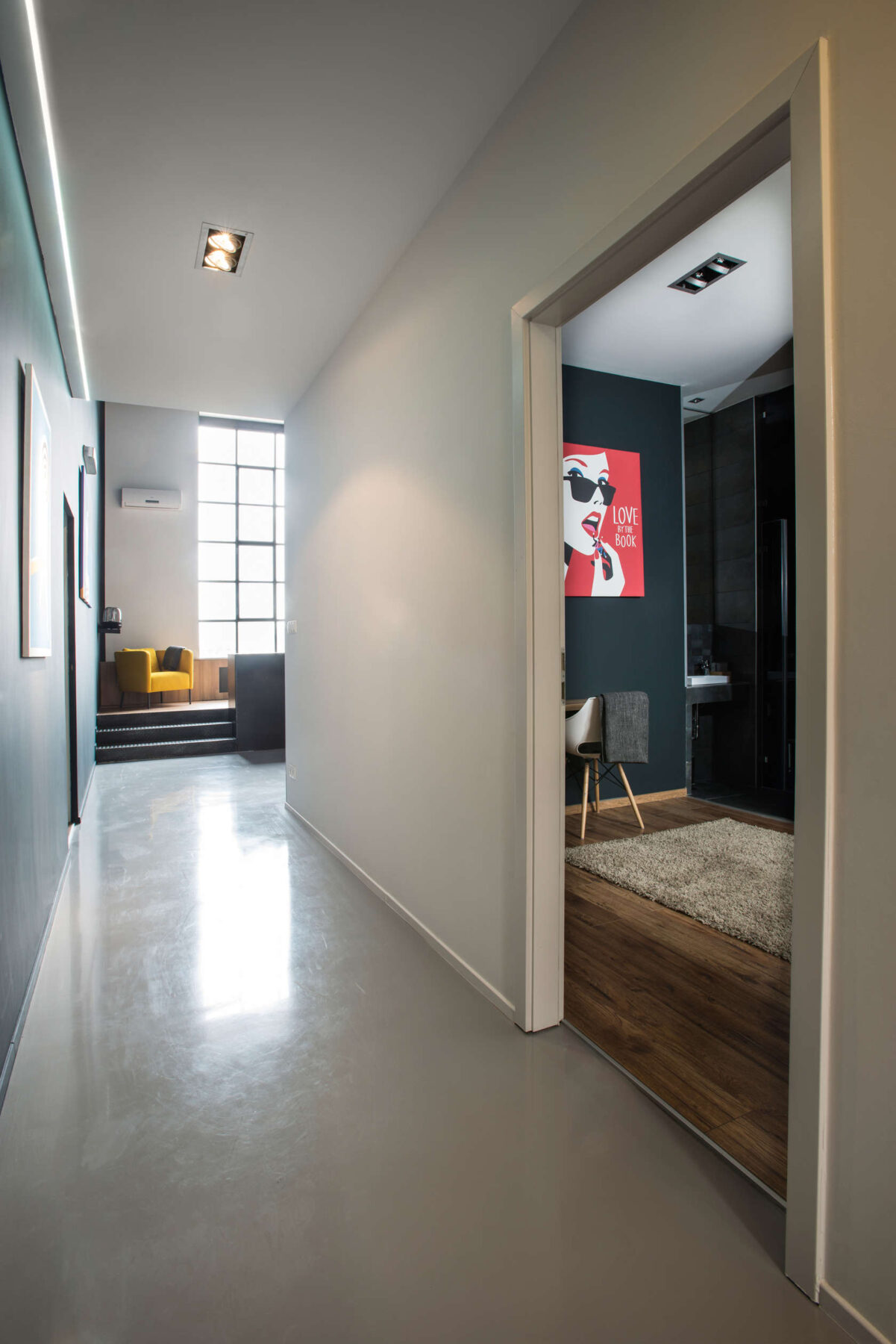
Having glossy floors that the natural light can reflect off of really amplifies the feeling of spaciousness.
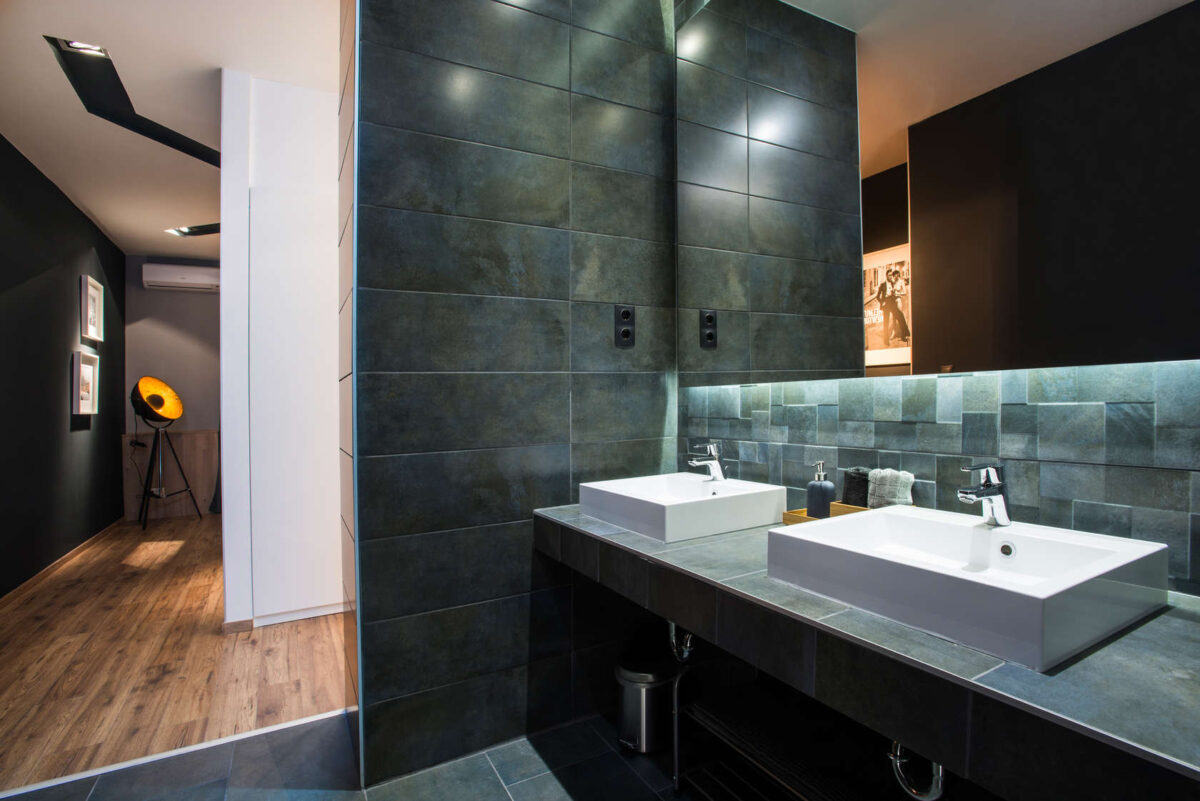
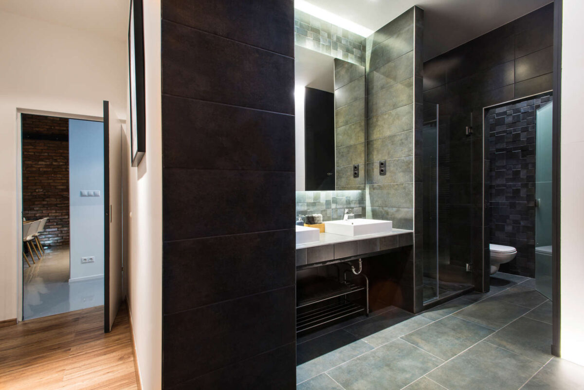
The incredible slate used in this bathroom once again plays on that modern-organic feel. The green, blue, gray color is stunning and the different cuts of tiles on the walls and backsplash add some more dimension.
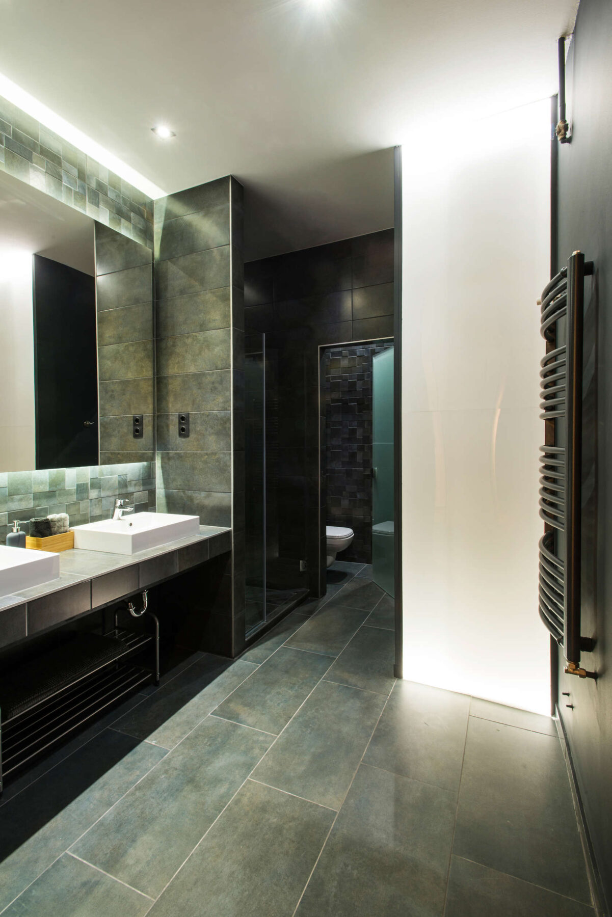
Carrying slate through the entire space— from the walls to the backsplash, and floor — really works in this space because they’ve kept it bright with good lighting.
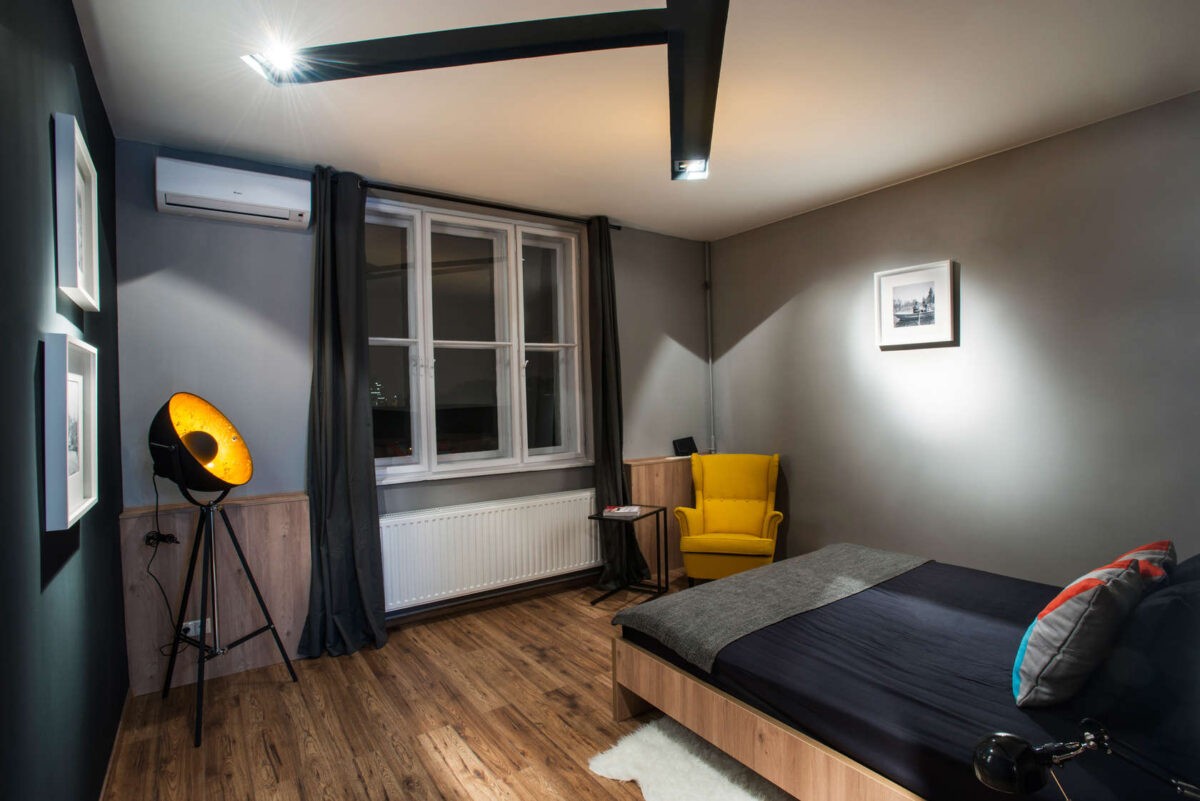
The creative lighting continues here with these bold black cut outs in the ceiling, and that antiqued spot light placed in the corner.
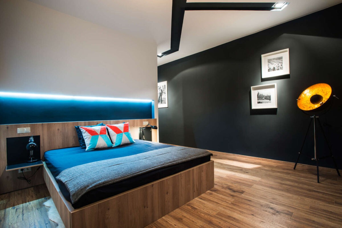
You can see more of it here over the bed with the continuation of the neon light. The blue reflects beautifully off the dark bedding, and really pops against that black accent wall to the right.
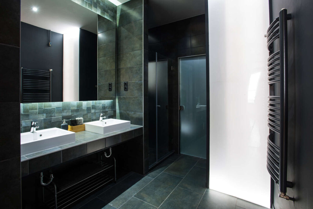
We also love the sinks in this bathroom. The way the white porcelain sits up on top of the slate lets some of that gorgeous color illuminate the sides.
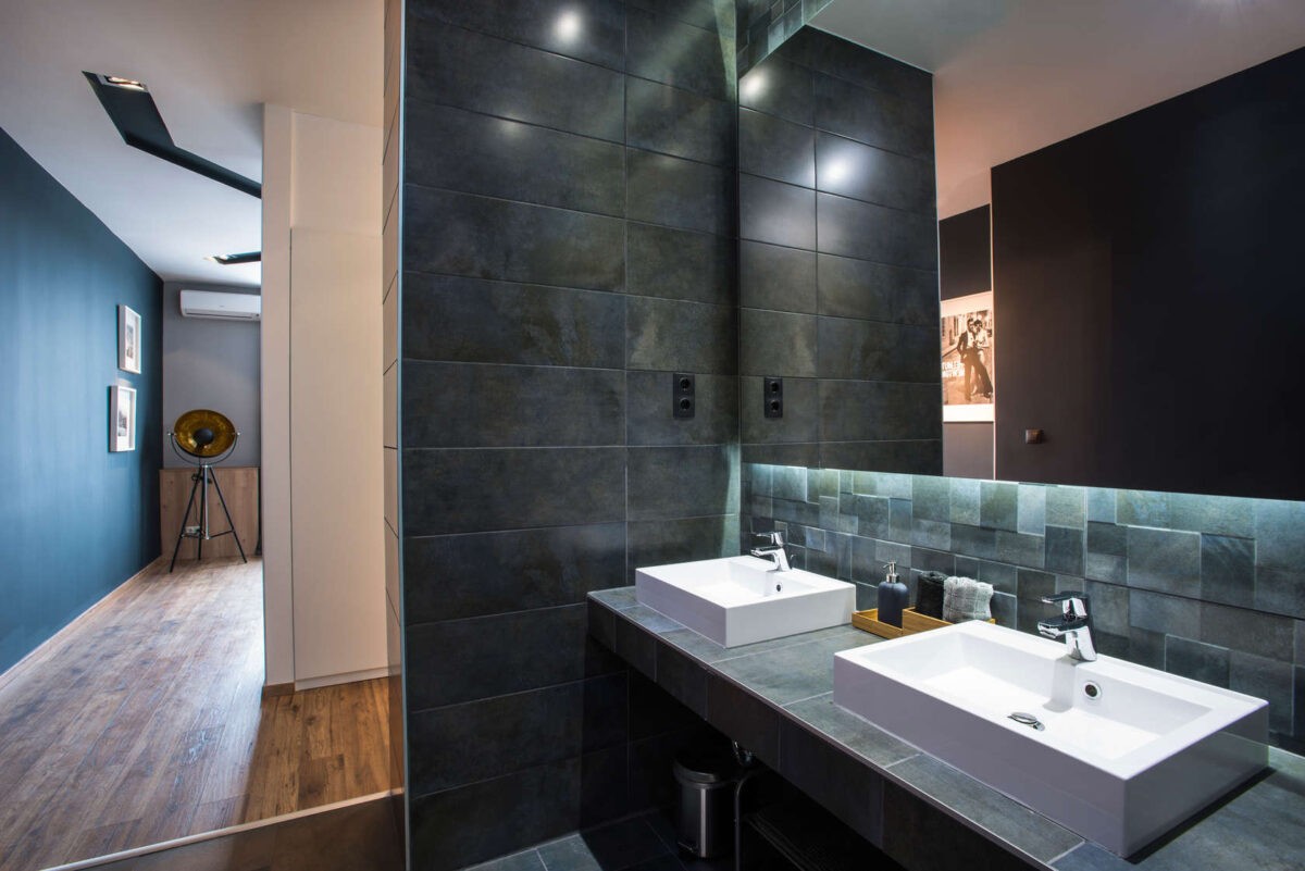
Always consider how color changes in different light. From here you can see how the black wall looks very dark — as reflected in the mirror — and how when under bright natural light it shines with a blue hue. That hue looks great against the slate tiles by the way.

