An artful home doesn't require many standalone decorations – in this post, four incredible interiors demonstrate that everyday necessities can serve as beautiful accents with the ability to stand on their own. Turning the utilitarian "must-haves" into attractive decor is a convenient way to maintain a more minimalist appeal without sacrificing character or opportunities for self-expression. Whether you're looking for creative lighting inspiration or want some cool new ideas for your walls, these homes are sure to deliver. Each one looks elegant and upscale yet provides actionable techniques that would enhance any residential environment.
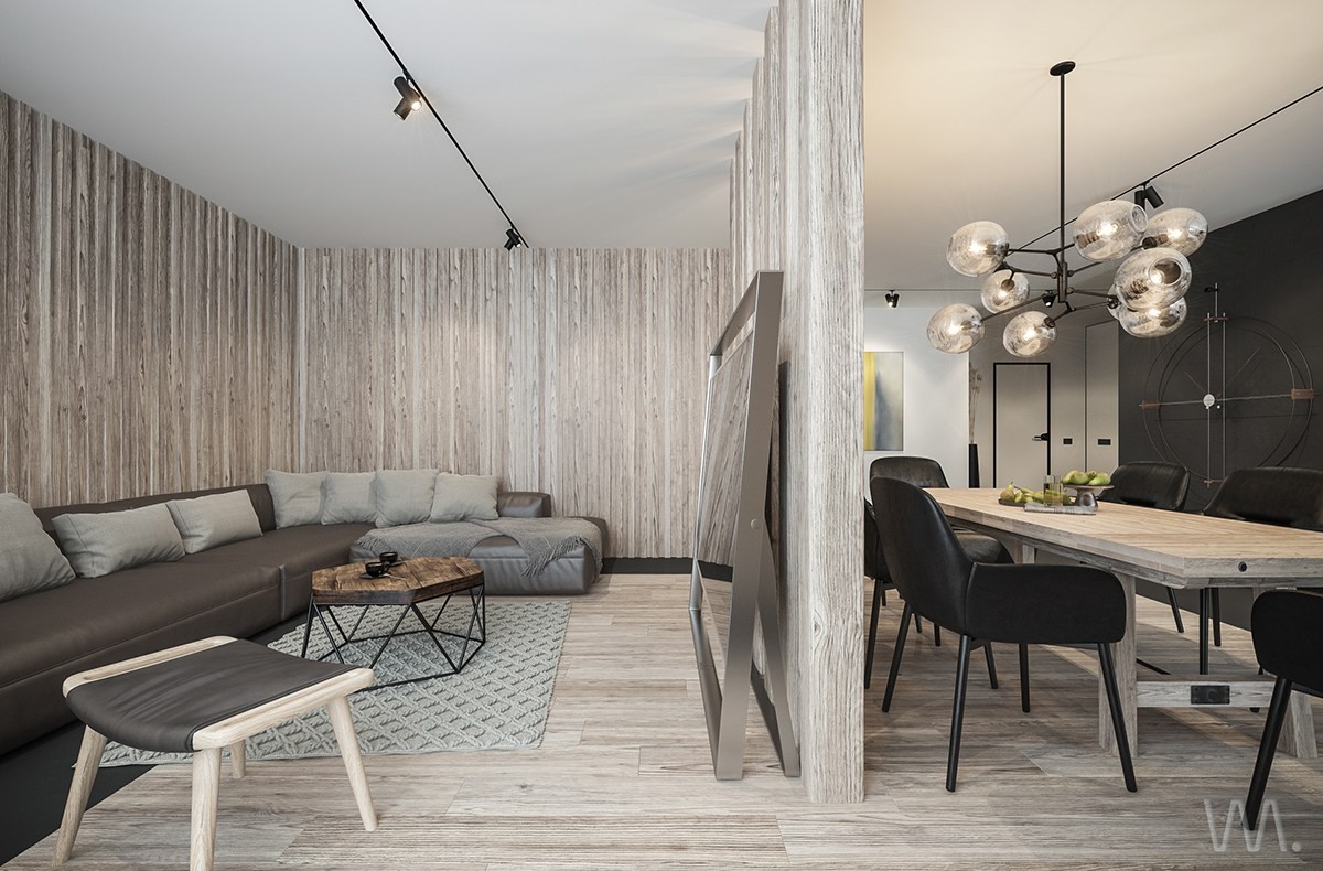
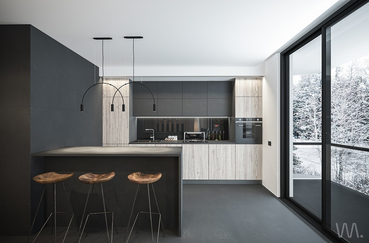
Unfinished wood walls give this home a rustic atmosphere – casual and comfortable. Yet the modern furniture and decorative lighting sway the perception toward refined luxury. This interior belongs to a cottage in Kiev, Ukraine, and makes its slightly limited floorplan feel larger than life. This interior combines the best of classic design with sumptuous detail.
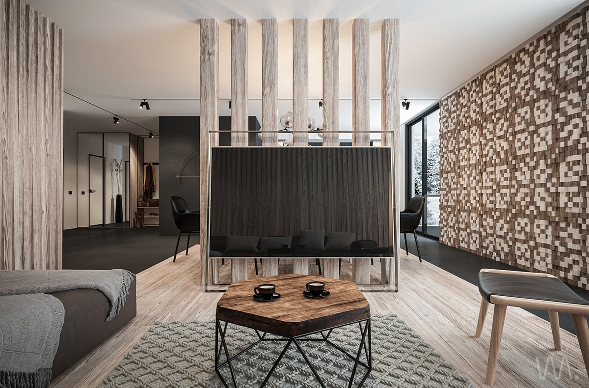
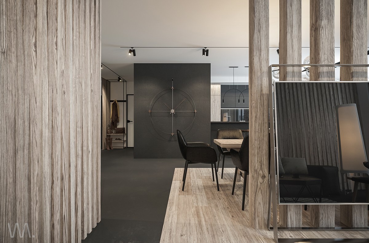
And check out these accent walls! Seven thick wooden beams support the leaning television in the center, and individual blocks of finished wood make a huge impression to the left.
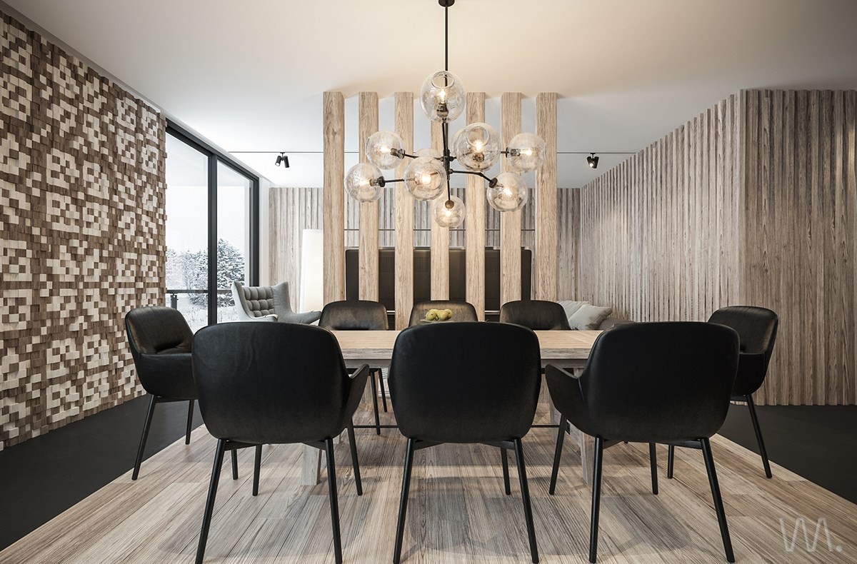
Those seven wooden beams are more than just attractive: they serve as a low-key divider between the living room and the dining area, and double as a backdrop for the inspired modern chandelier.
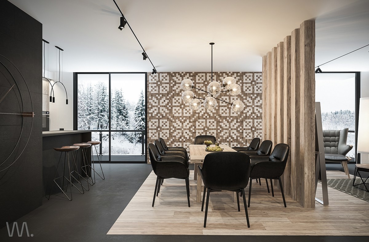
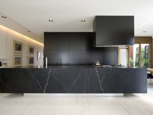
Changes in floor material can help create an abstract boundary between functional areas as well. Here, you'll see wooden flooring in the casual social areas with matte black in the kitchen.
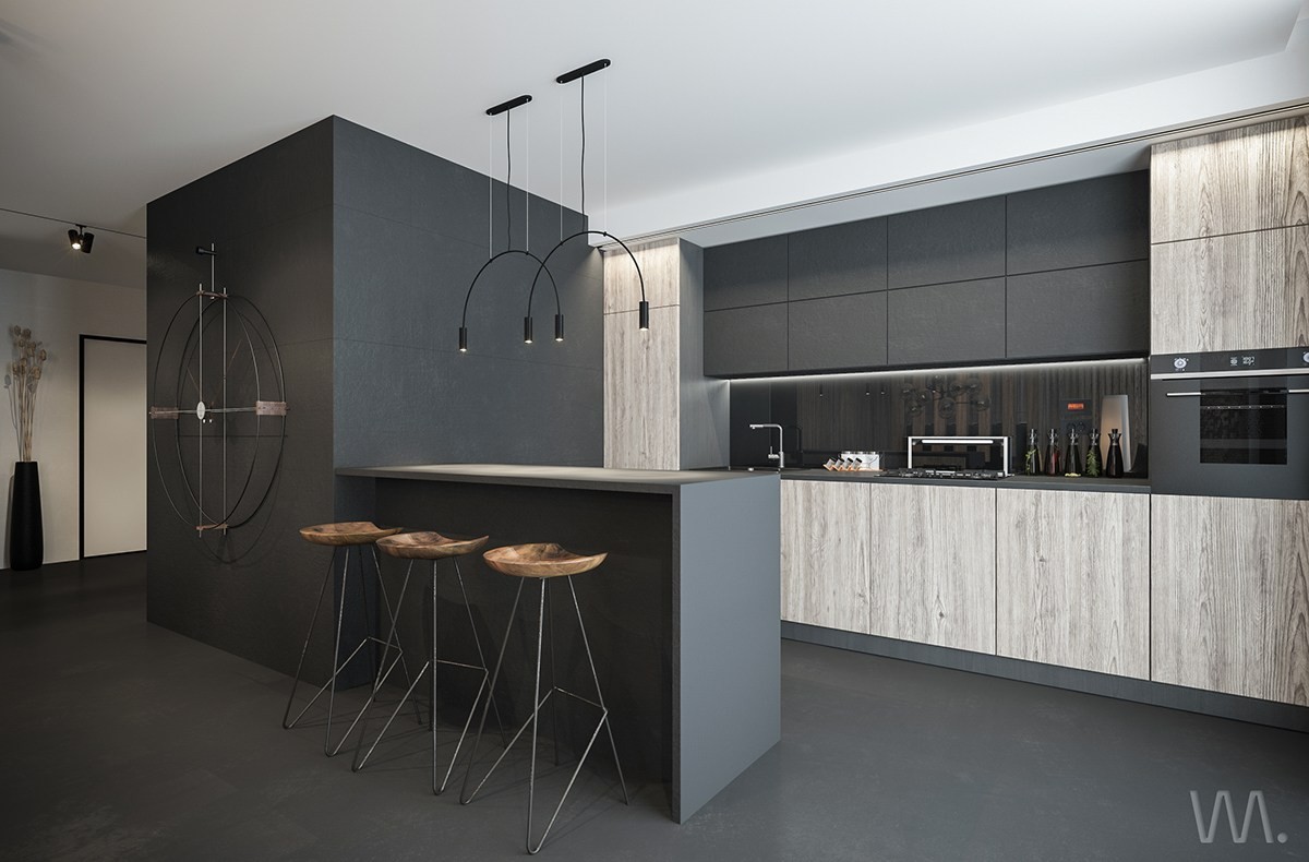
The kitchen cabinetry adopts an unfinished look similar to the wall cladding in the living room, but the wide panels somehow feel even more natural, especially paired with the matte black floors and walls.
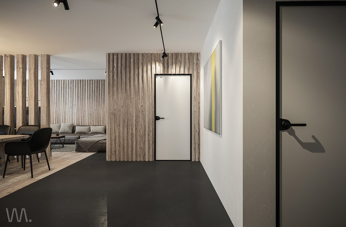
Where feature lighting isn't necessary, track lights take the reins. Track lights are an attractive and efficient choice that highlights whichever features a resident wants to emphasize.
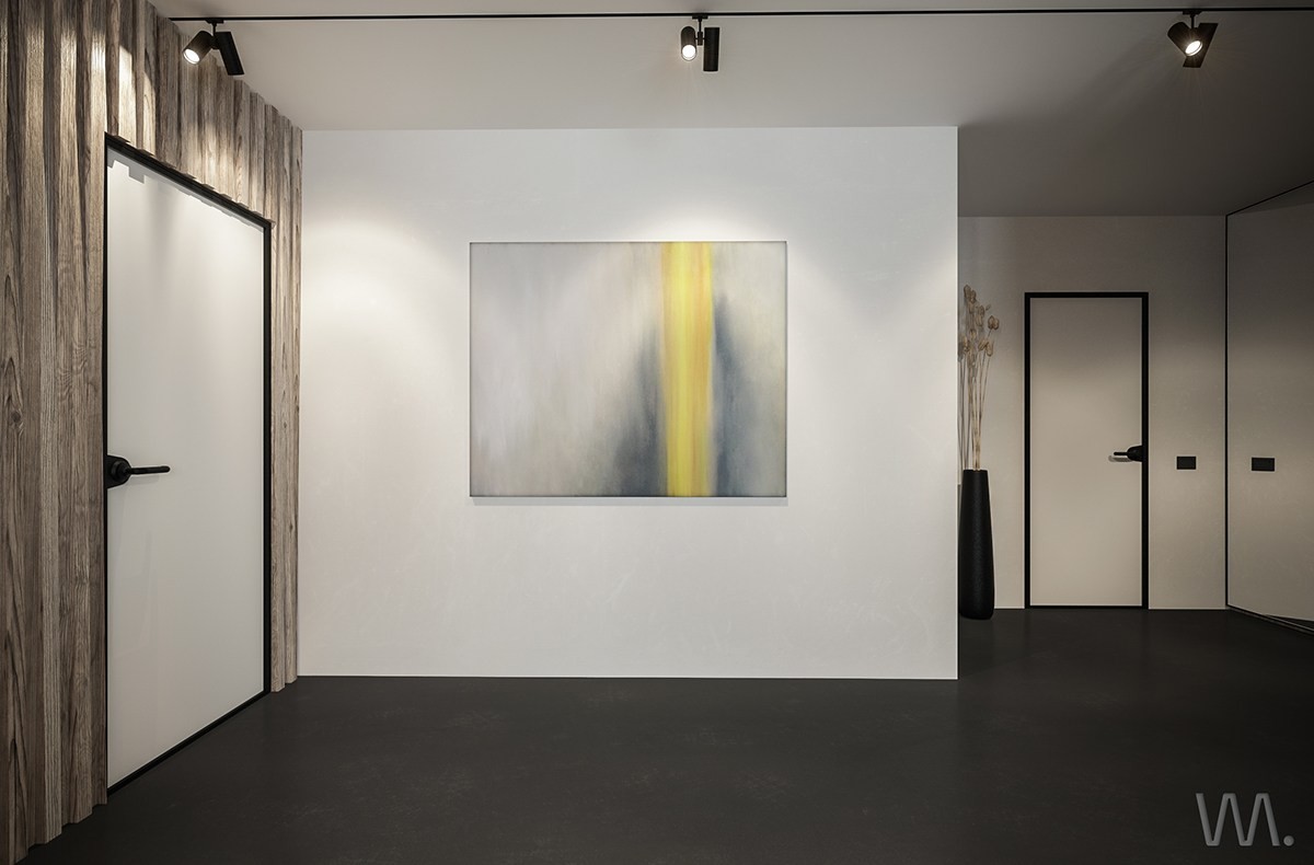
Color comes by way of artwork and accessories. While the natural and neutral theme is sufficient for many homes, this space wanted to make a more distinct impression.
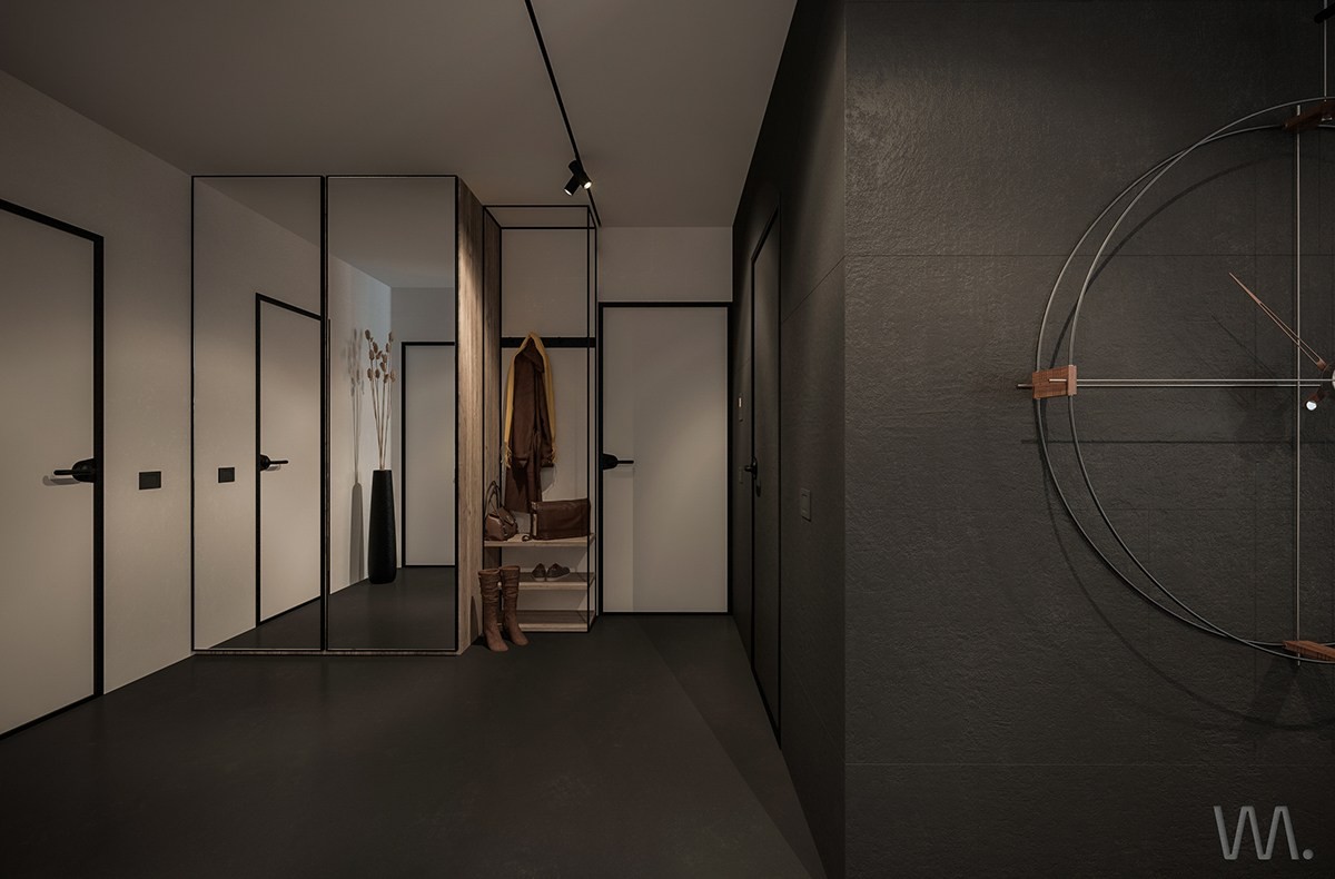
The gorgeous piece to the right is a design by José María Reina - a contemporary design with the elegance of a mid century modern clock. Its oversized stature makes it a textbook example of functionality meeting aesthetic expression.
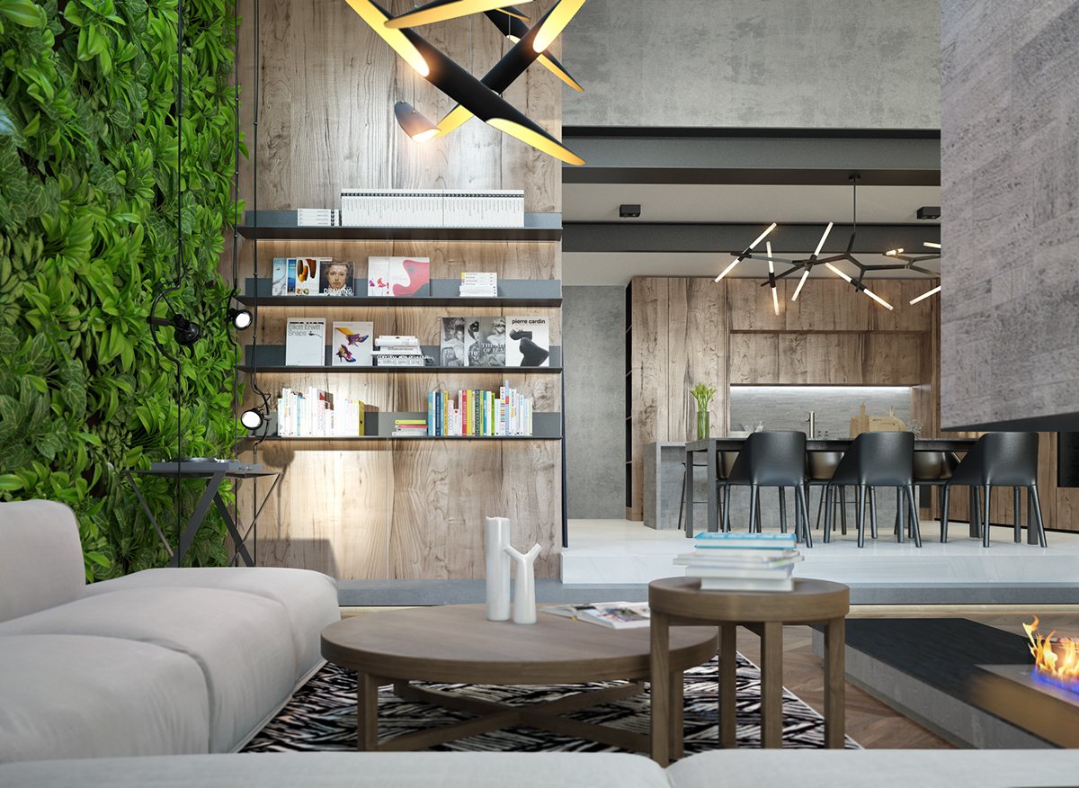
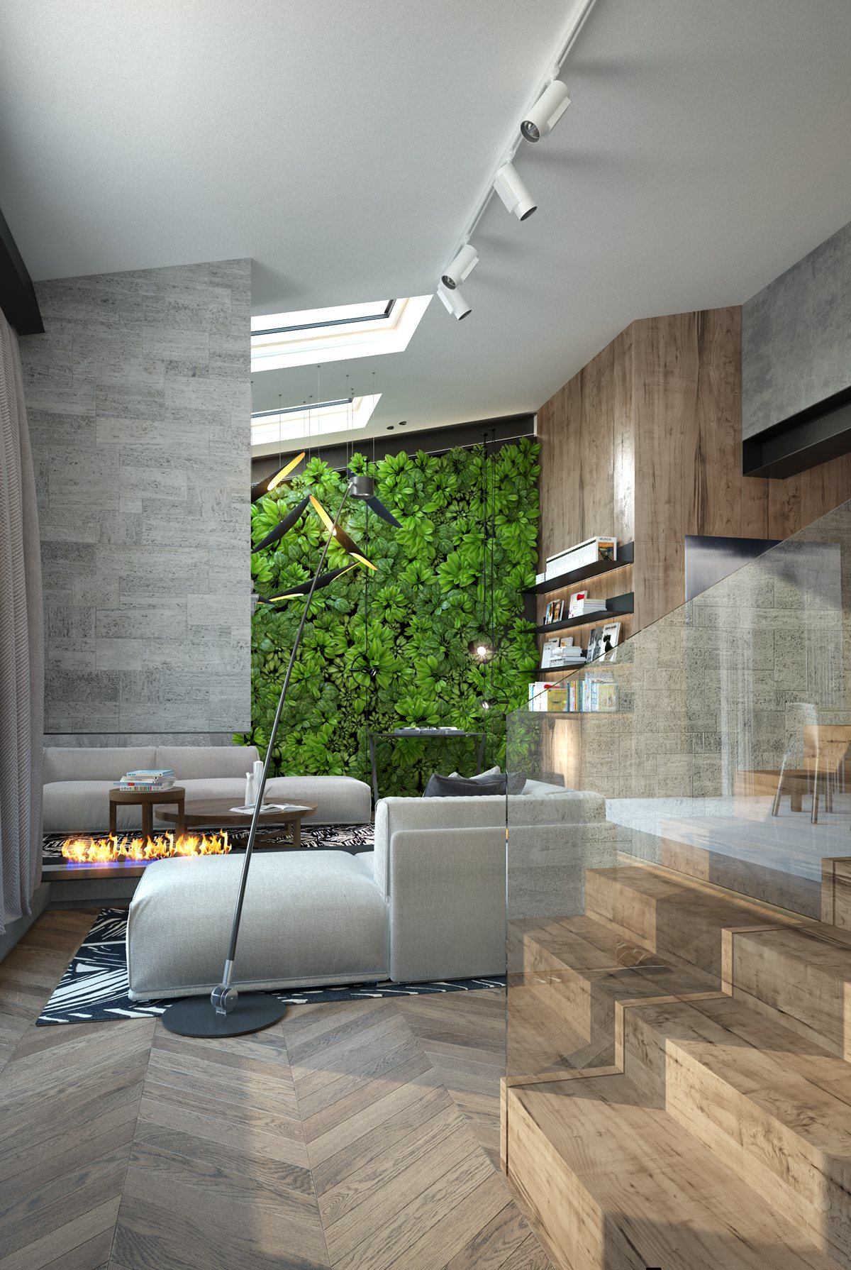
This next home makes a dramatic impact right from the beginning, with a verdant vertical garden and lovely wood panels behind integrated storage solutions. Natural materials and concrete walls create a thematic contrast that engages the eye right from the beginning. If you're looking for design inspiration for a small yet luxuriously appointed apartment, it's hard to find an interior more on-point than this one.
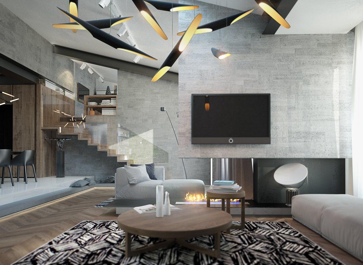
These lights are from the Coltrane collection from the designers at Delightfull, its brass interior delivering incredible contrast to the verdant background as well as the concrete background, depending on viewing angle.
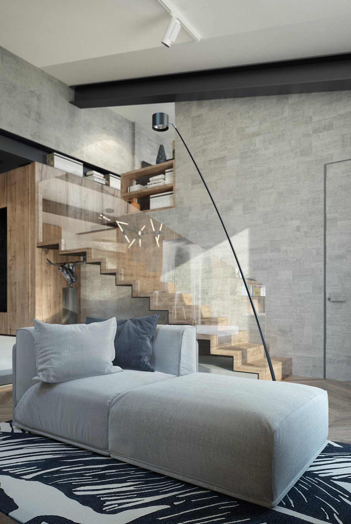
Furniture remains minimalistic, perhaps to allow the other decorative features more room to shine. Minimalist furniture allows greater flexibility for changes in the future.
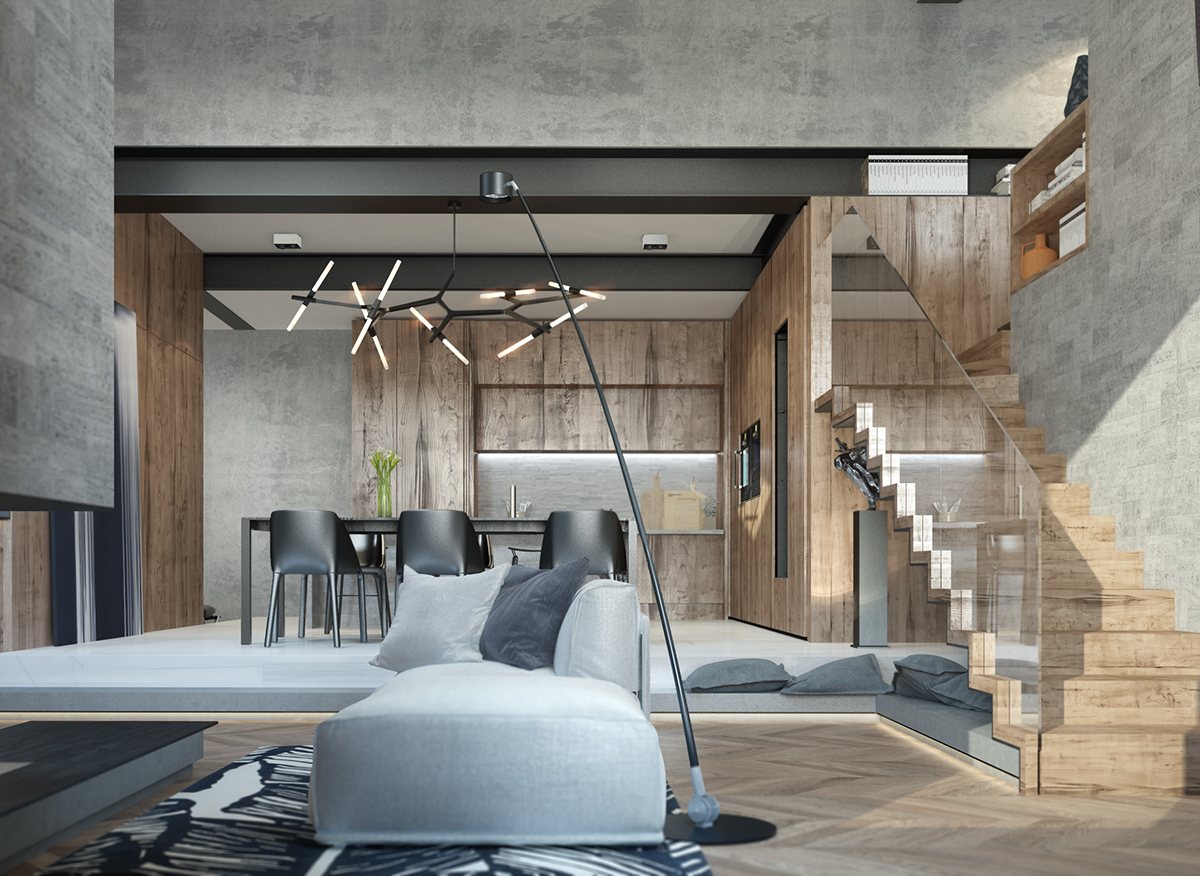
The chandelier overhanging the dining room is the Agnes model by Lindsey Adelman. Branched lights put a modern spin on the organic materials used throughout the interior.
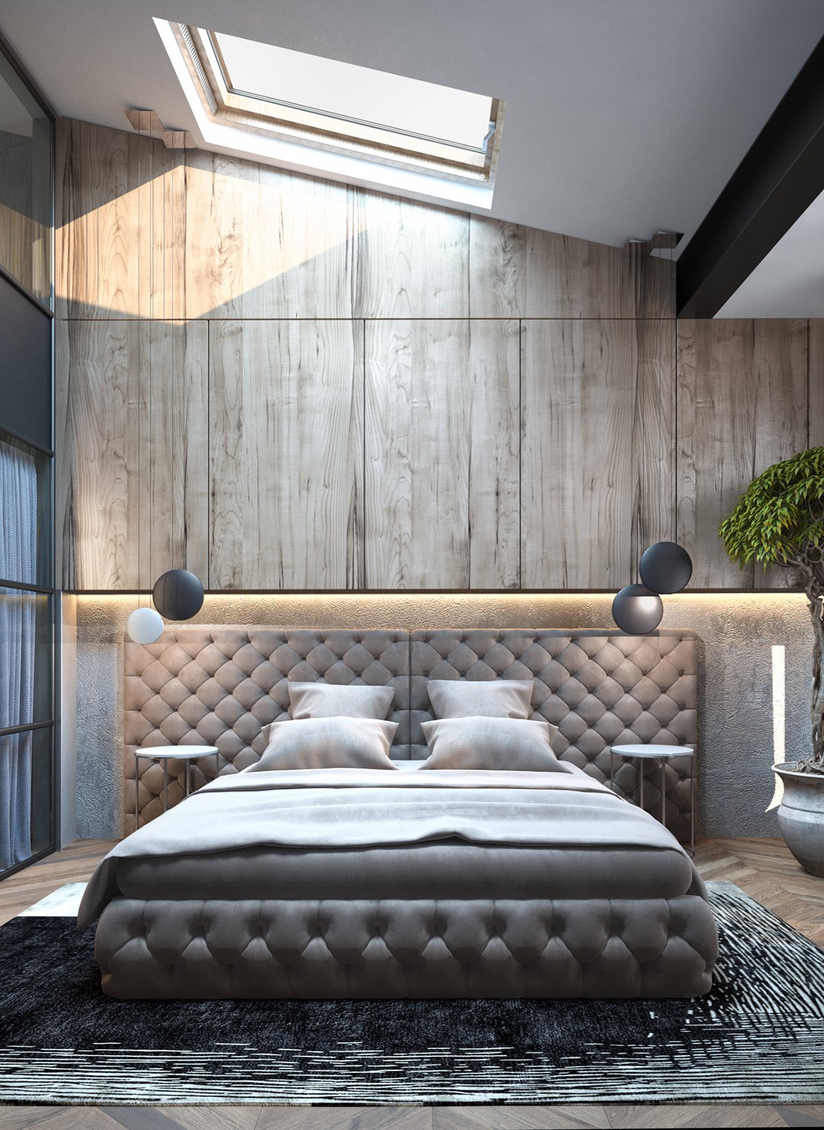
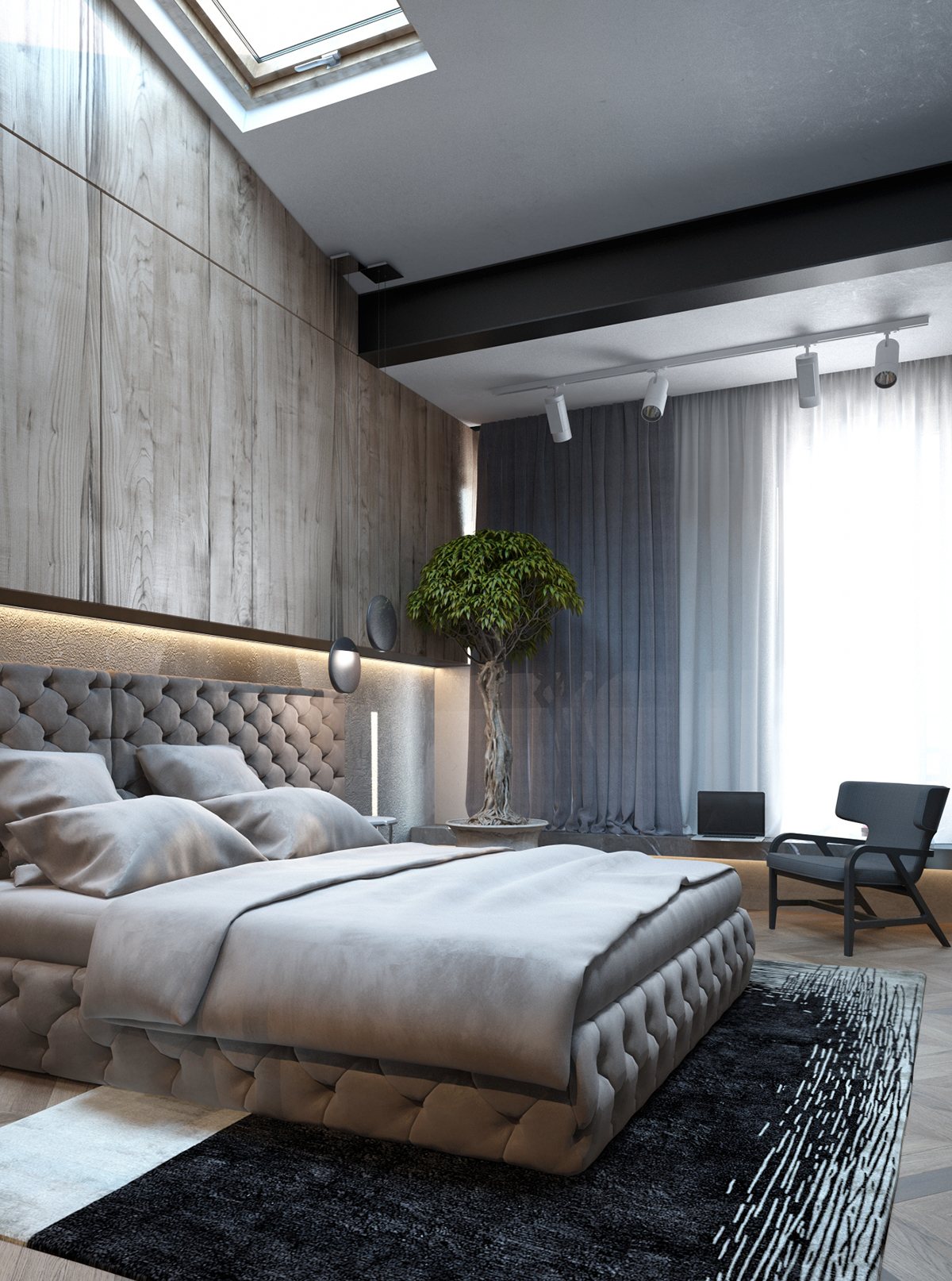
In the bedroom, extra-deep tufting enhances the soft aesthetic of the bed. The oversized headboard enjoys the contrast of rugged concrete before the wall transitions to wood panels that stretch up toward the skylight.
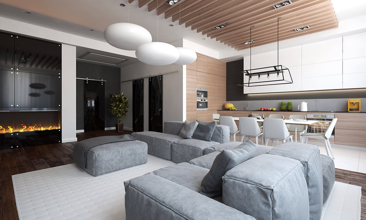
Spacious, open, and creative – this home uses different styles throughout each room for a more dynamic interior experience, even taking advantage of different combinations in each individual space so that every perspective feels unique. The living room opens with smooth natural materials and white walls that transition to sharp modern panels near the fireplace and entryway.
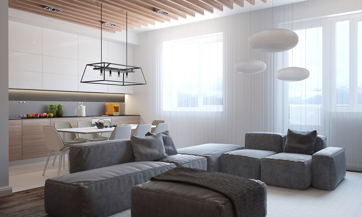
And look at that wall of curtains! With mounting gear hidden in the ceiling, the resident can enjoy the clean and simple look of a continuous wall of lightweight fabric that absolutely glows with sunlight.
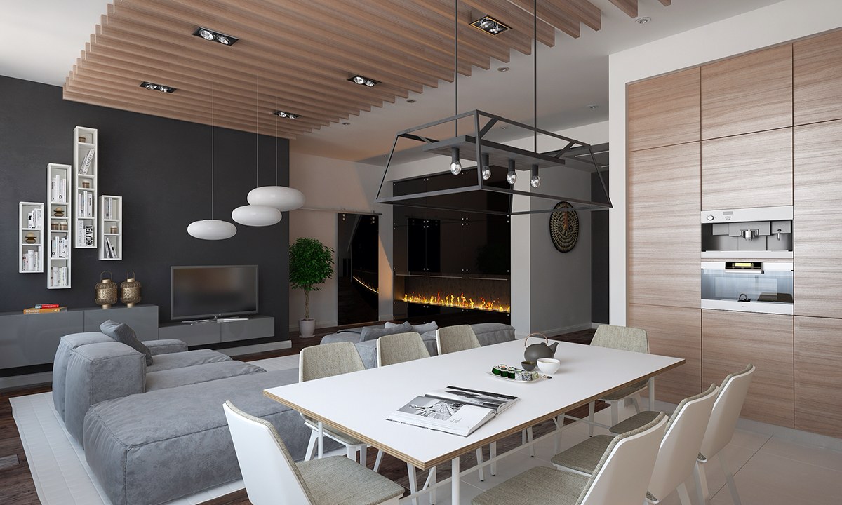
Darker tones make up the other side of the room, with white bookshelves and white pendant lights cutting a striking profile against the matte black media wall.
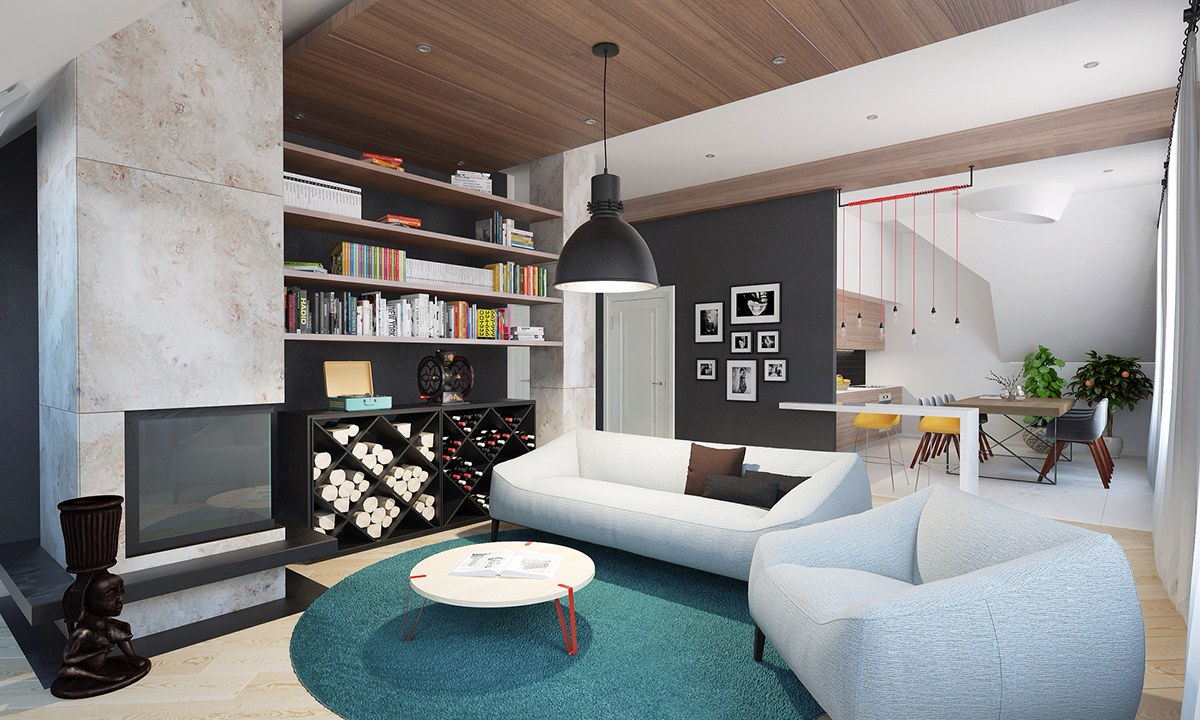
A secondary living space offers all of the comforts of home for long-term guests or housemates. The interior is fresh and simple, but a little smaller than the main portion of the house.
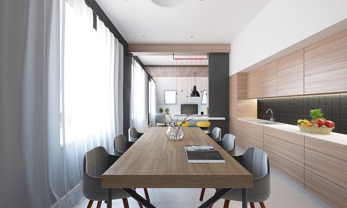
It even boasts its own kitchen and dining room! Here, the orientation of the wood grain draws the eye back out toward the living room.
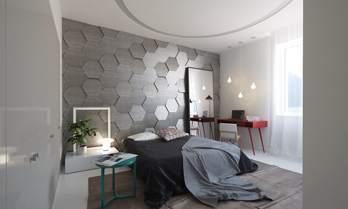
This bedroom is fantastic, and features one of the most interesting walls in this post so far. Tilted hexagons play with the light from the window to great effect.
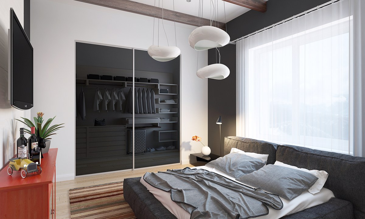
Here's another bedroom, a little simpler than the one before it. A group of pendant lights offers an artistic touch thanks to their sculptural and dynamic surfaces.
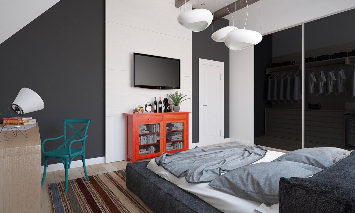
Colorful furniture adds another decorative dimension. The chair exhibits a few features commonly found in famous designs by Thonet.
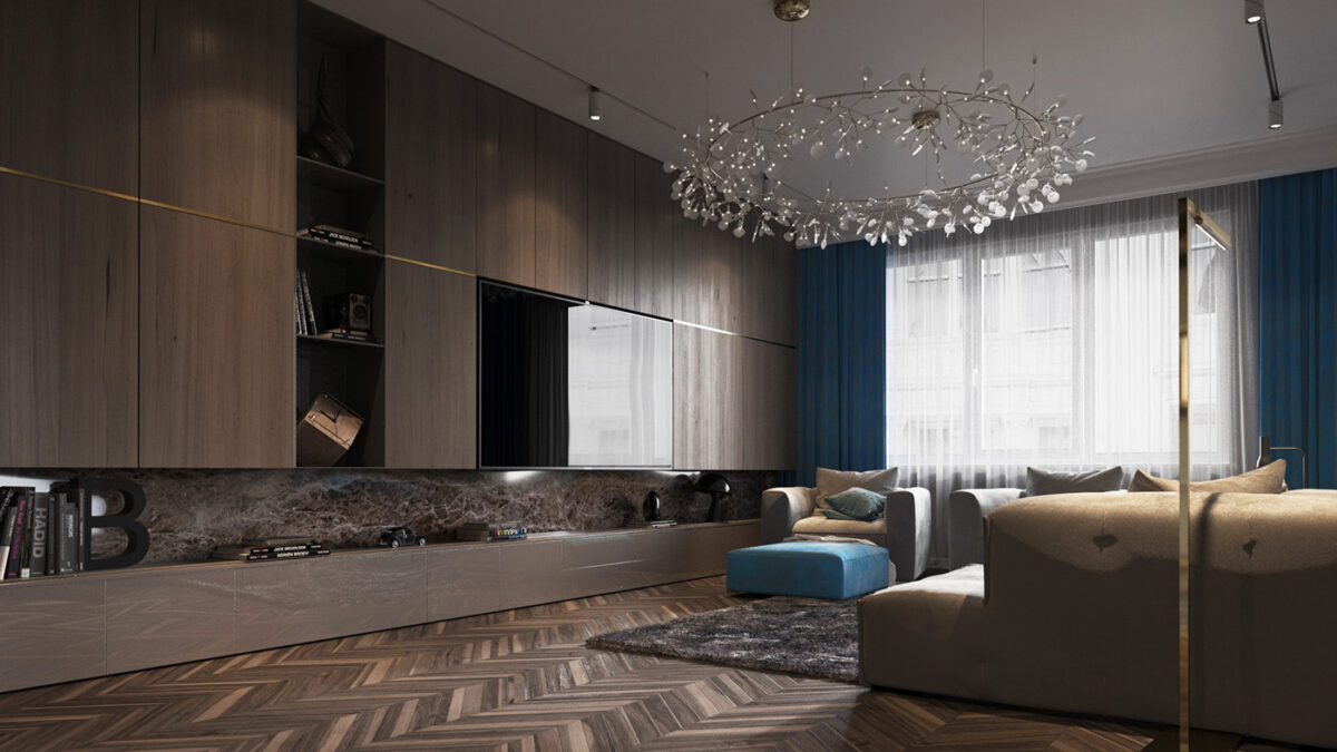
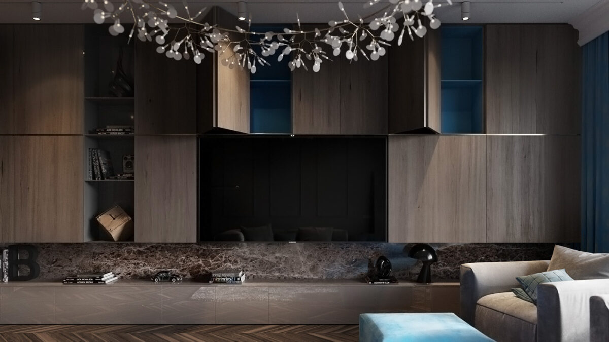
Here's an even bolder take on unique walls and lighting! This home has a dark and sophisticated look, with luxury materials and rich woods warming the space while providing a source of natural decoration. In the living space, a wall of storage – both cabinets and shelves – line the wall above a subtle sideboard that stretches across the room. Above this sideboard, brown marble draws the eye vertically in alignment with is white veining.
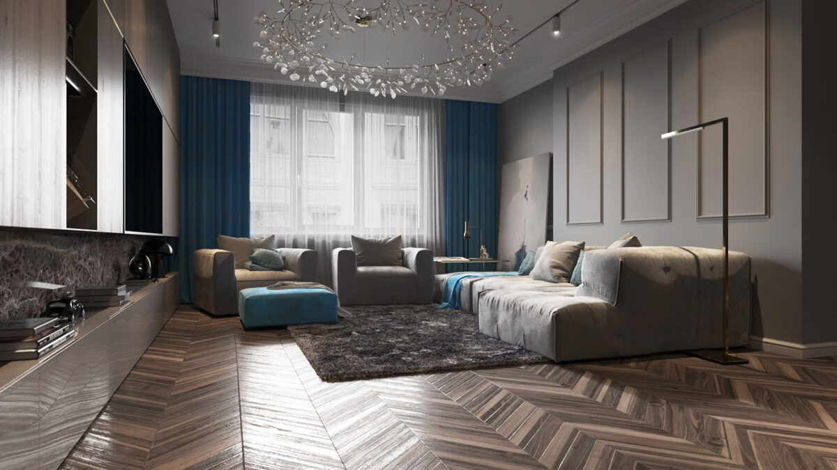
The spectacular circular lamp is from the Heracleum collection by Bertjan Pot & Marcel Wanders. Its delicate look helps to soften the entire room.
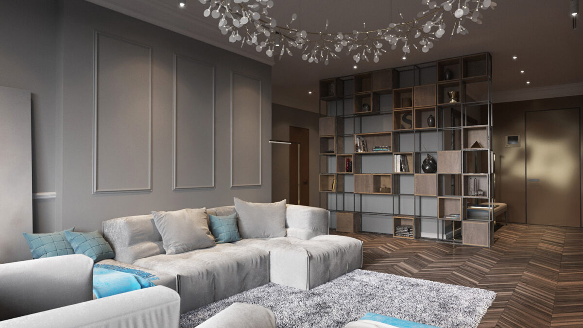
Blue accents lighten the mood of the living room in a big way. The upside to choosing throw pillows and blankets is an easier transition to other colors if the tastes of the resident changes in the future.
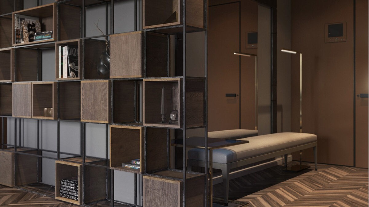
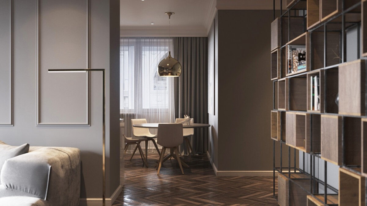
More unique cabinetry extends out from a smaller wall, extending the division between the entryway and the living room proper.
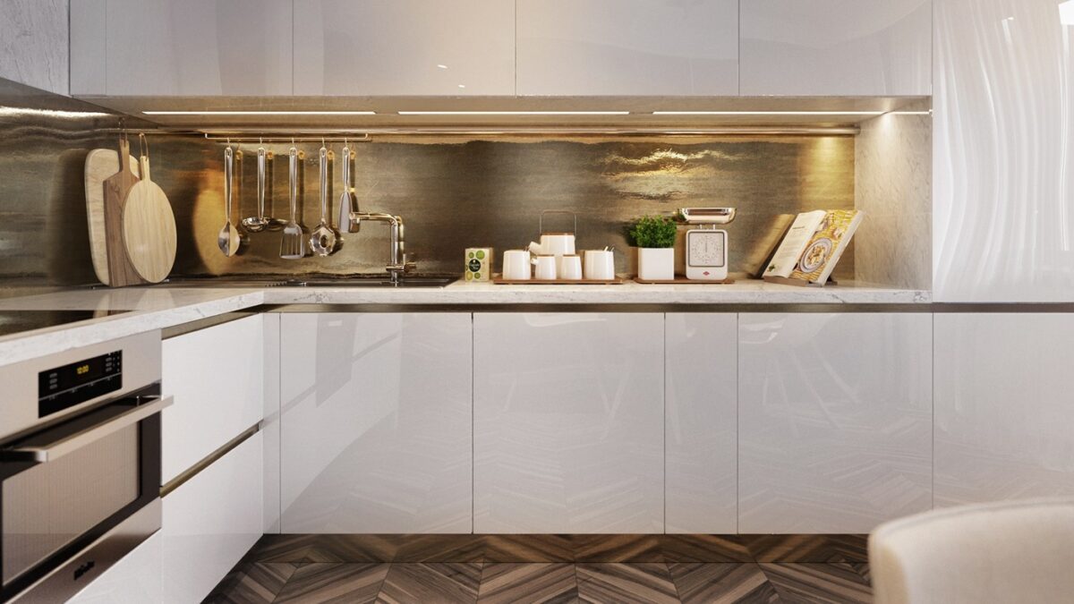
Hammered gold-colored metal on the backsplash and marble on the countertops brings undeniable luxury to the kitchen.
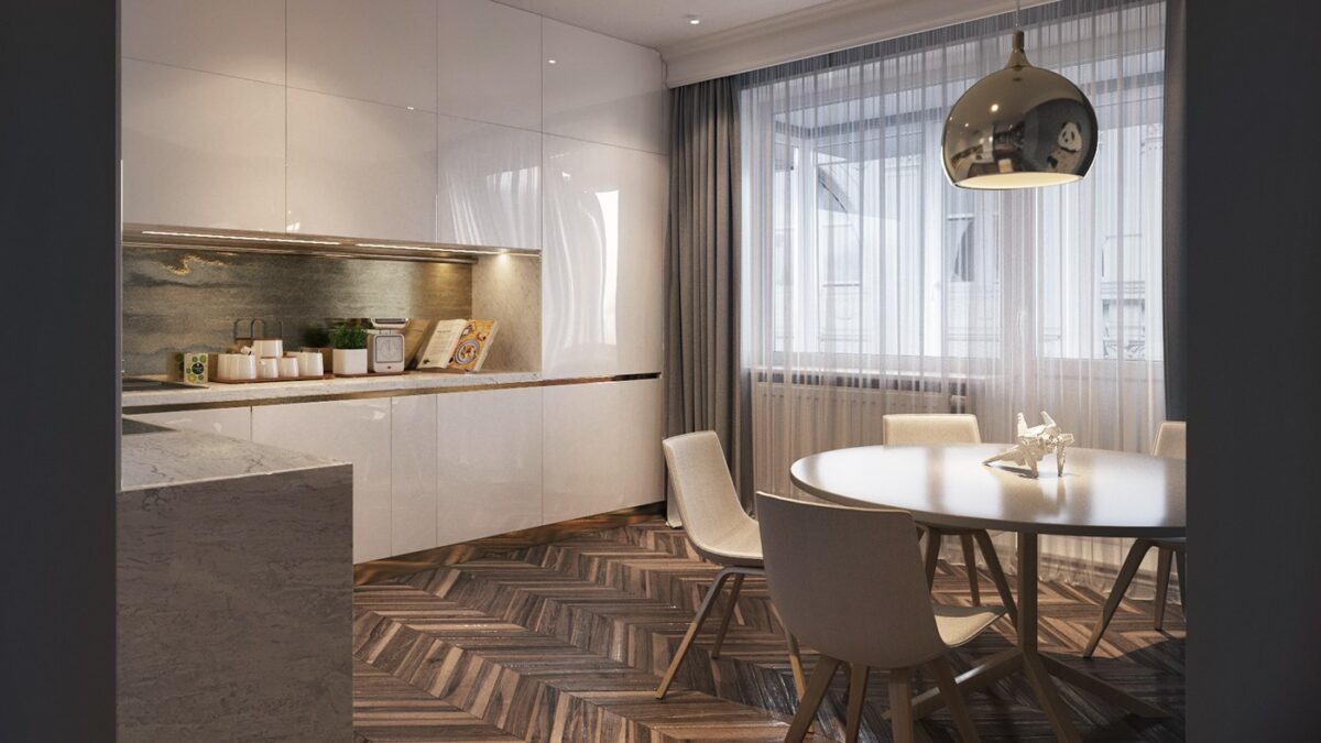
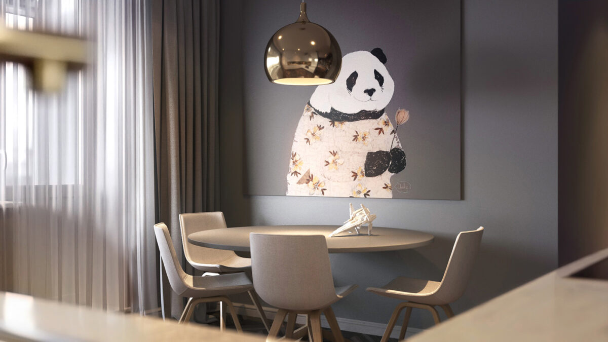
Of course, the single dining pendant light and wall of curtains enhance the window's effect.

