have combined the ultra modern with the organic by incorporating indoor plants in creative ways throughout the spaces. You'll see how these are no ordinary potted plants: vines creep up walls, and pop up out of built in storage to perfectly counteract the modern finishes and amenities of these spaces. The architects note that the plants do more than add a design element to the space, they provide a positive impact on human health, like filtering the air we breathe and acting like a humidifier. So, wander through these spaces and find some inspiration to incorporate plants into your own home.
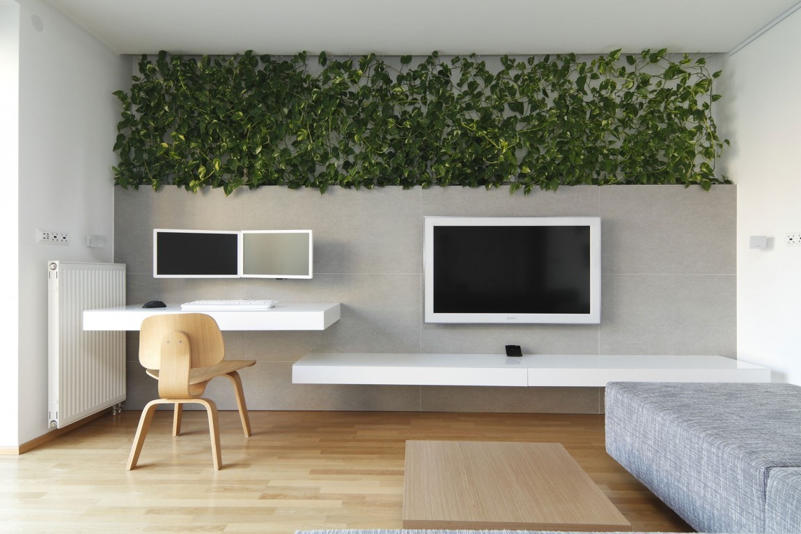
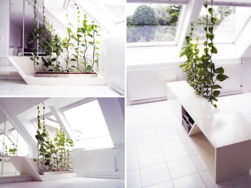
You’re probably familiar with vines creating up the side of a home, but it’s typically on the outside. Here though, the designer has brought the vines inside to add not only a pop of color to the space but dimension.
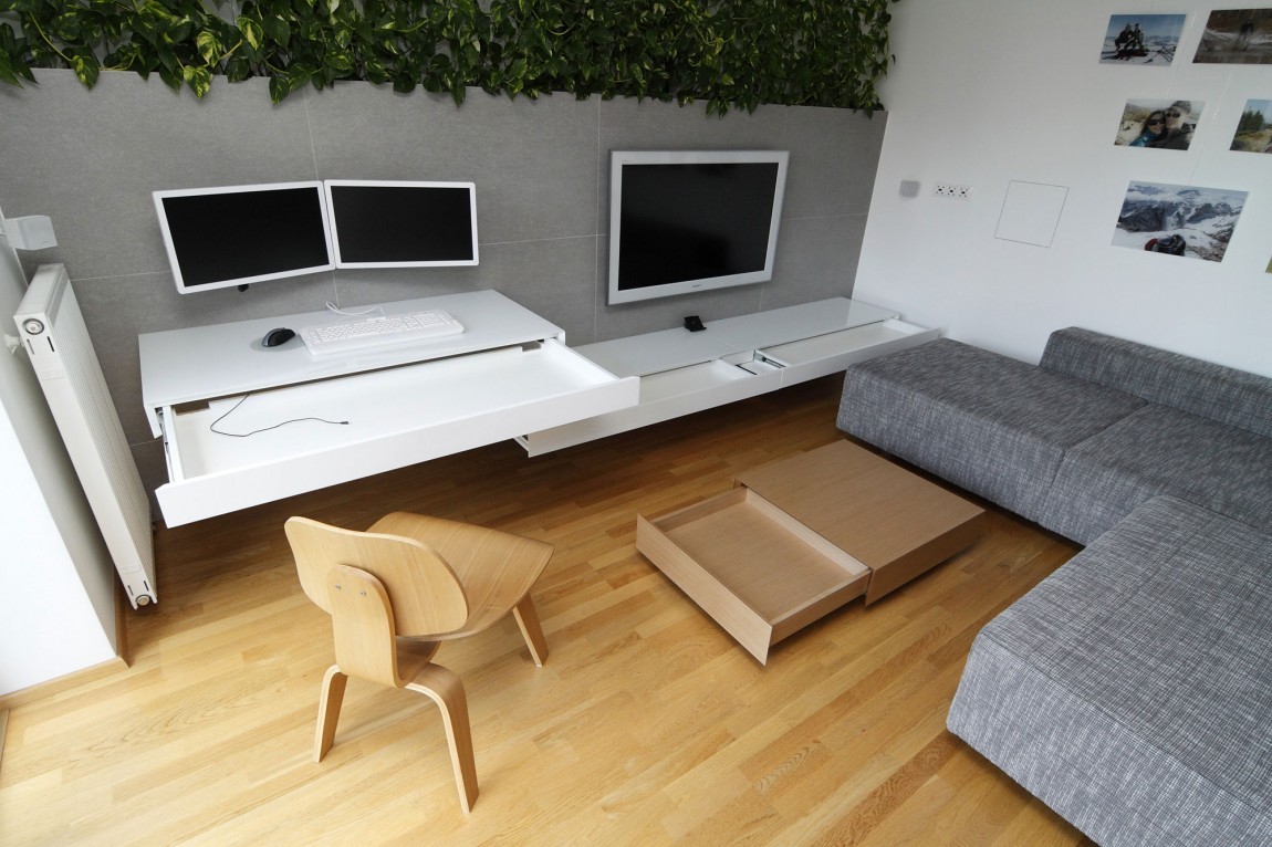
By adding the vines to the office space it adds some whimsy and organic-ness to an otherwise bland space.
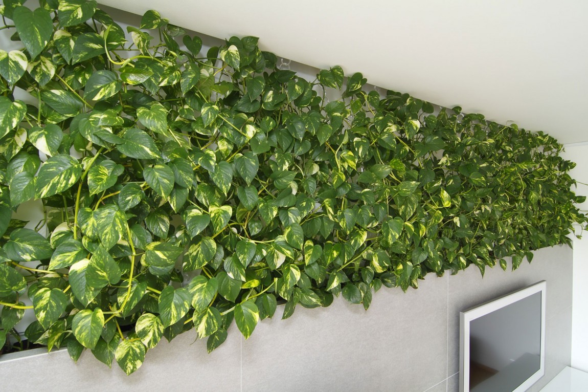
You can see all the lovely color and dimension the vines bring into the space, especially against the gray tiles.
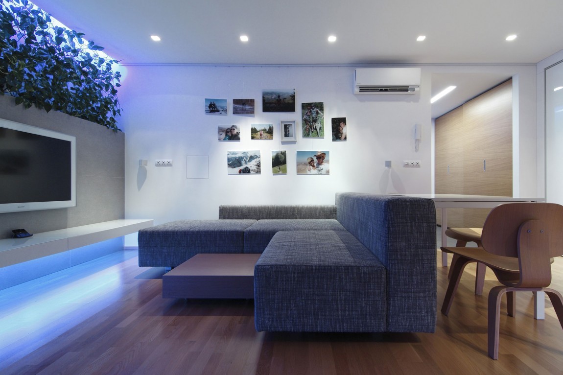
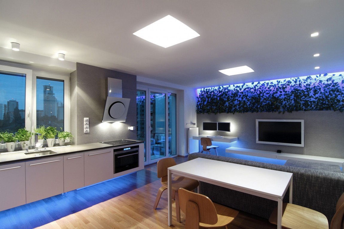
Then, just with a little lighting, the vines are transformed into a seemingly out-of-this-world art piece.The light is also reflected below the tv unit, casting the entire wall in a deep blue hue.
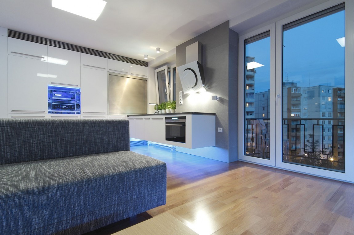
The colorful lighting is carrier into the kitchen under-mounted below the cabinets and reflecting the deep blue of the sky outside those massive windows.
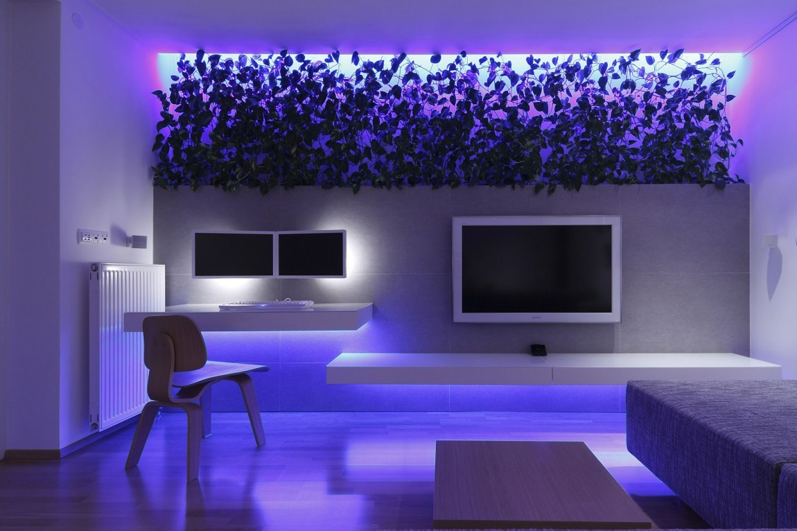
From here you can see how the blue changes color, into this rich royal purple. The mood lighting is a wonderful surprise to this otherwise stark space during the day.
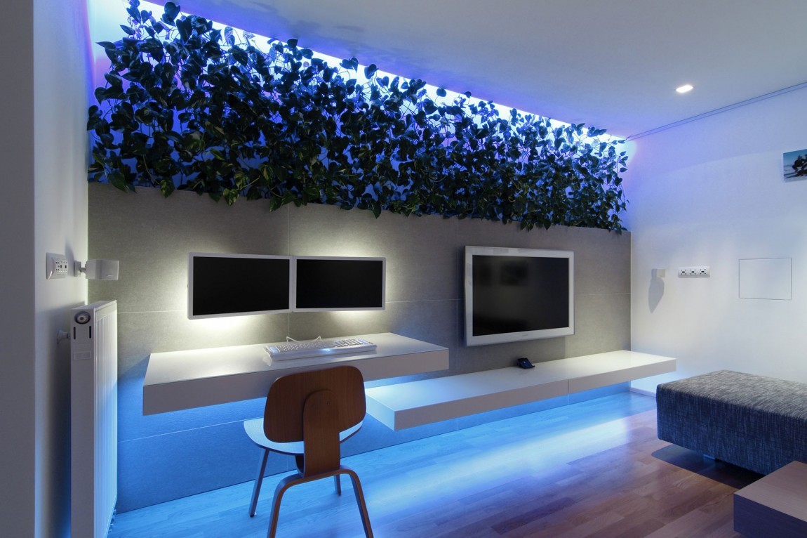
The creative mix of the desk space and the tv unit is highlighted here. By separating the levels, but keeping them with the same floating shelves there’s a cohesiveness in their differences.
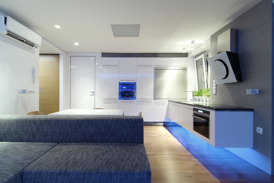
The glossy cabinets are a smart design choice because they reflect all the beautiful mood lighting throughout the space.
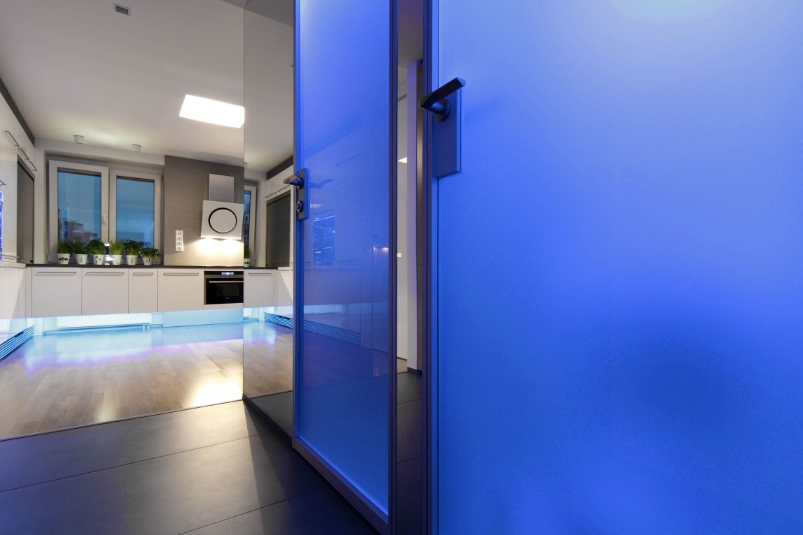
Blue doors? Nope, just some more creative lighting that really brings this apartment to life in the night.
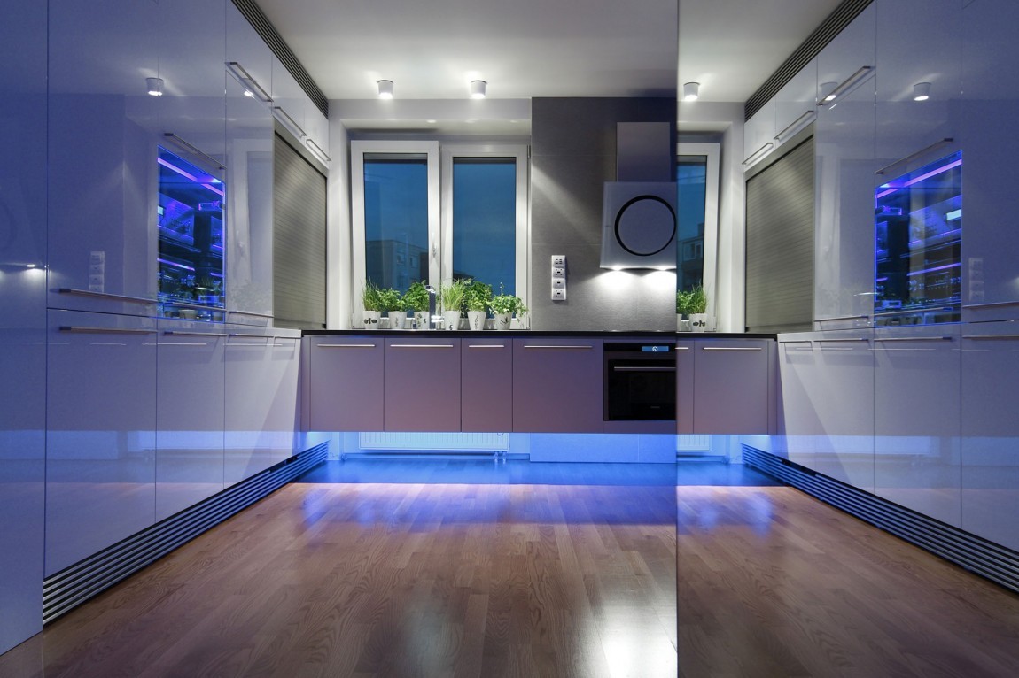
The blue lighting not only reflects off of the white shiny cabinets, but the glossy wood floors and mirrored walls. All the materials of this space were carefully chosen for this reason.
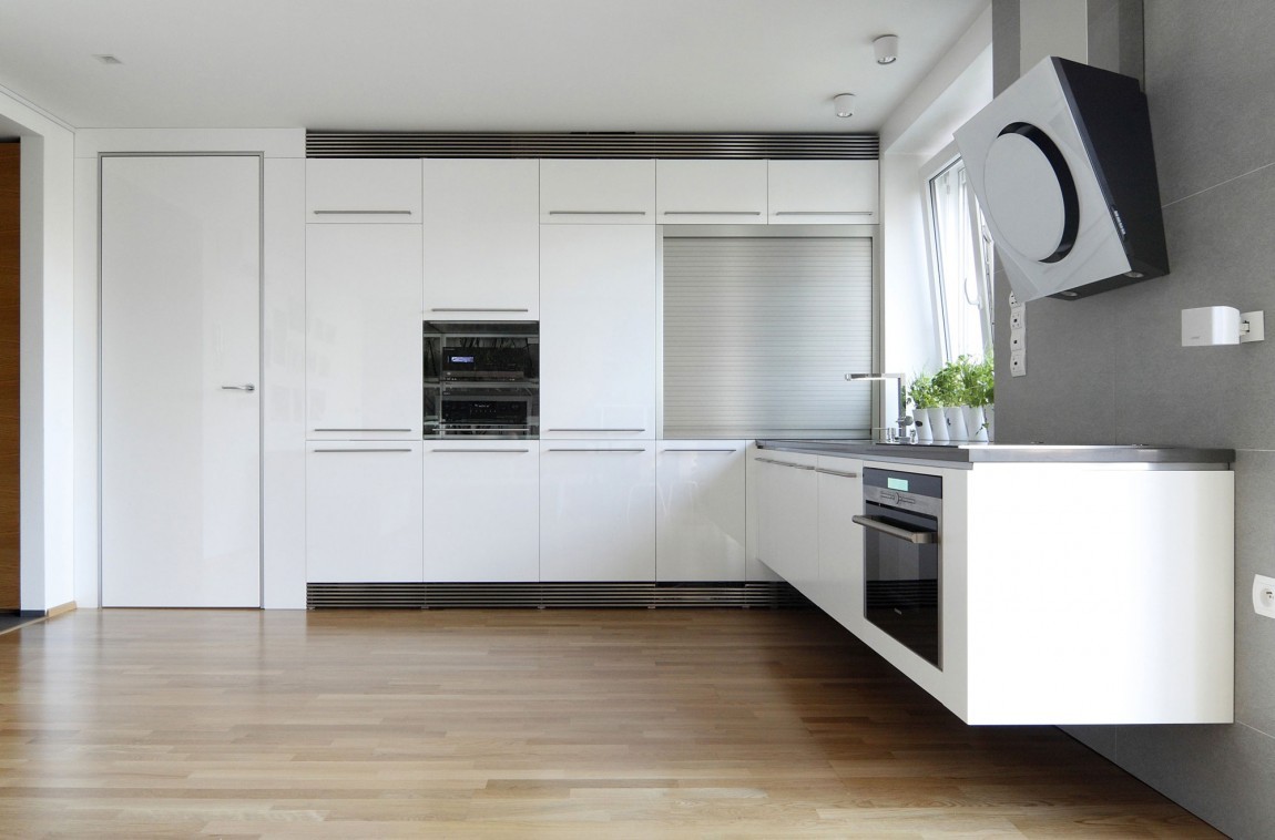
The difference in this space between day and night is extraordinary. By day this is a refined chefs kitchen. Featuring not only state of the art appliances, but cabinets and counter tops.
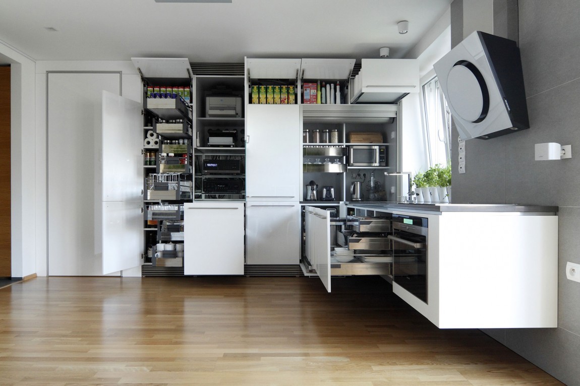
And if you weren’t already drooling, look at everything you can fit inside those cabinets! The kitchen isn’t particularly big, but they’ve really figured out how to keep everything out of sight and in it’s own place.
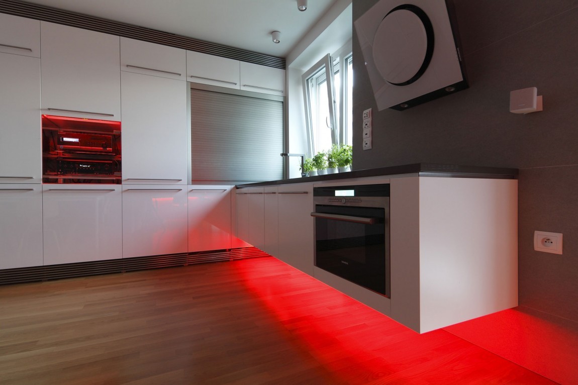
Don’t worry though, if you miss some of the whimsy the kitchen brings at night, you can always switch on the lights for the daytime too.
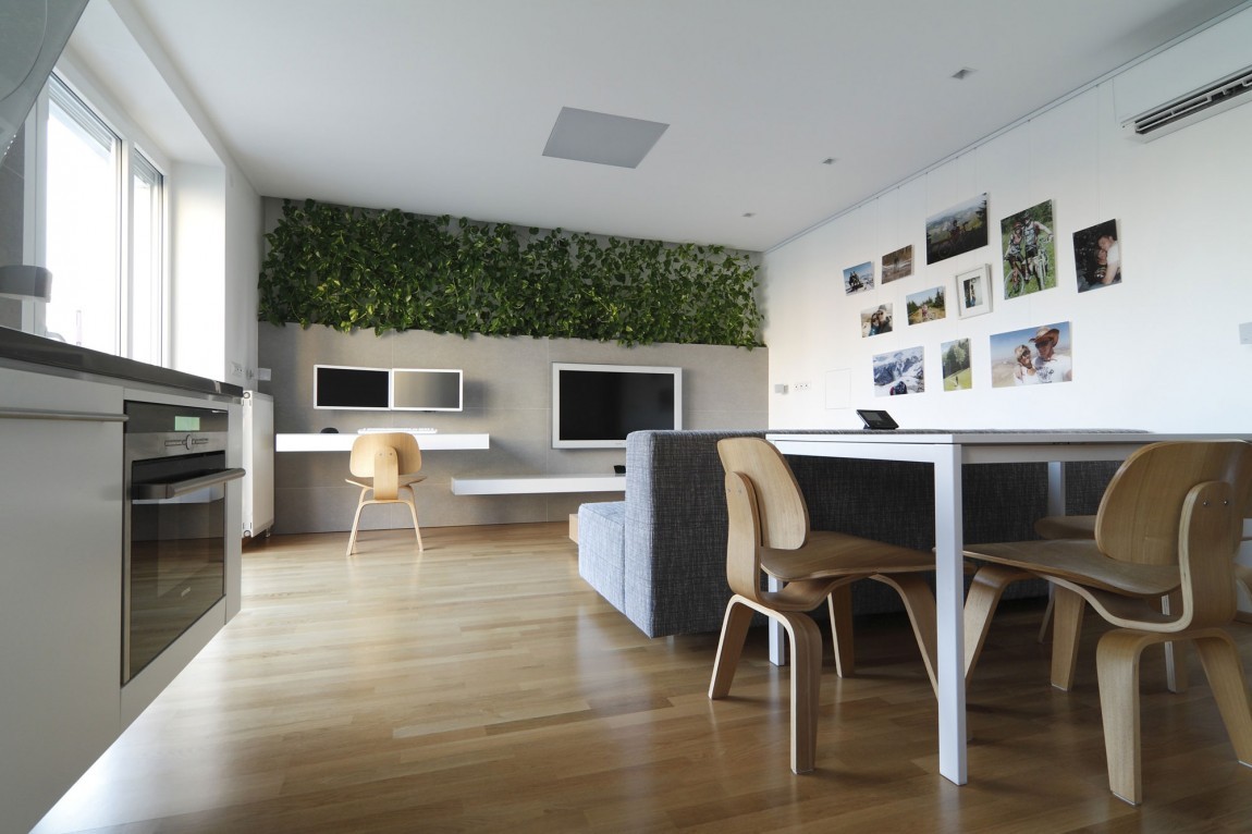
From here you can see how condensed this space really is, the kitchen, living, and dining space are all together as one. And while they’re all combined in this open space, each is properly defined yet flows with the next.
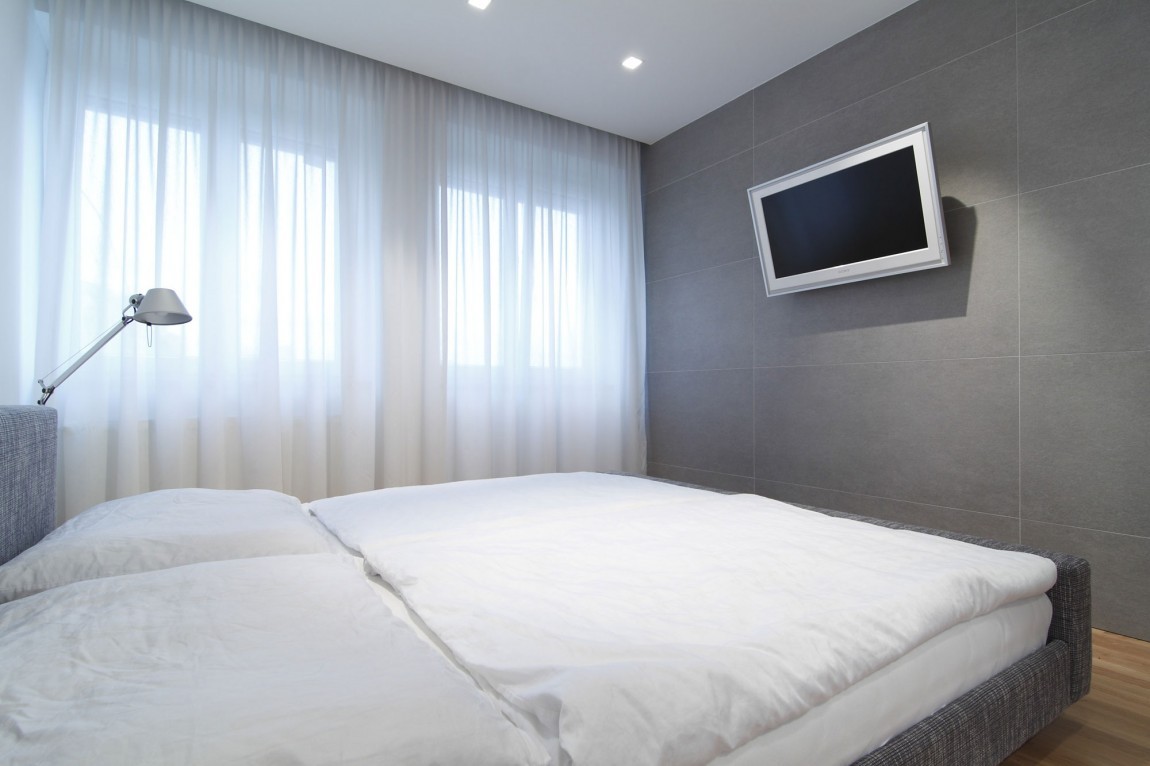
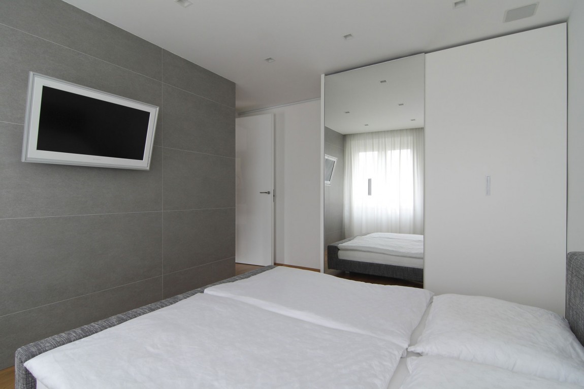
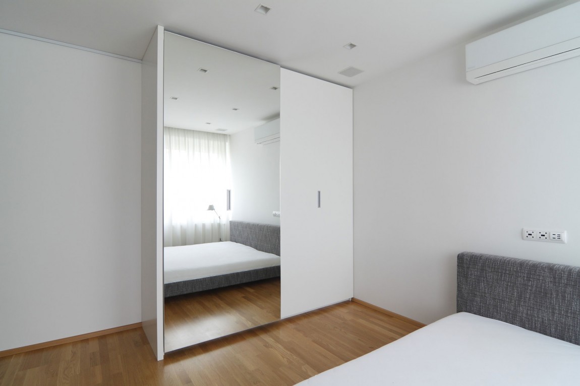
The bedroom is ultra modern like the rest of the space, boasting the cool color pallet and sleek design.
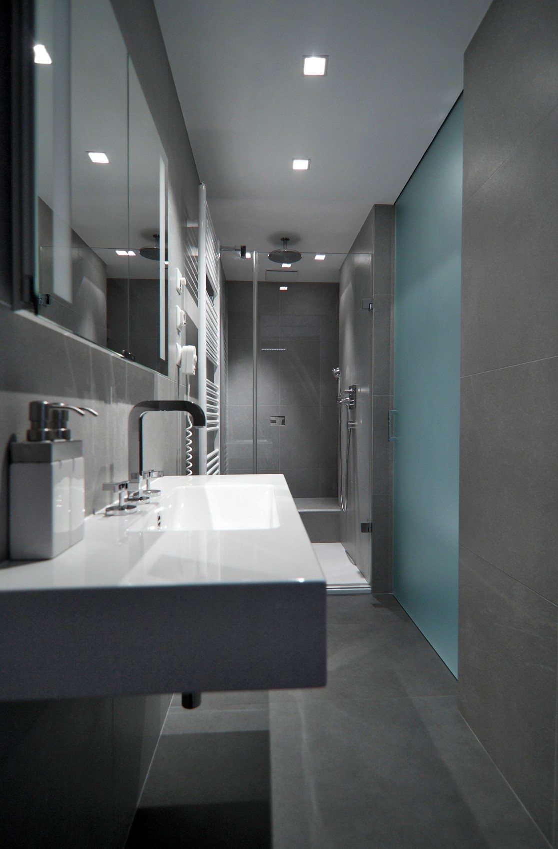
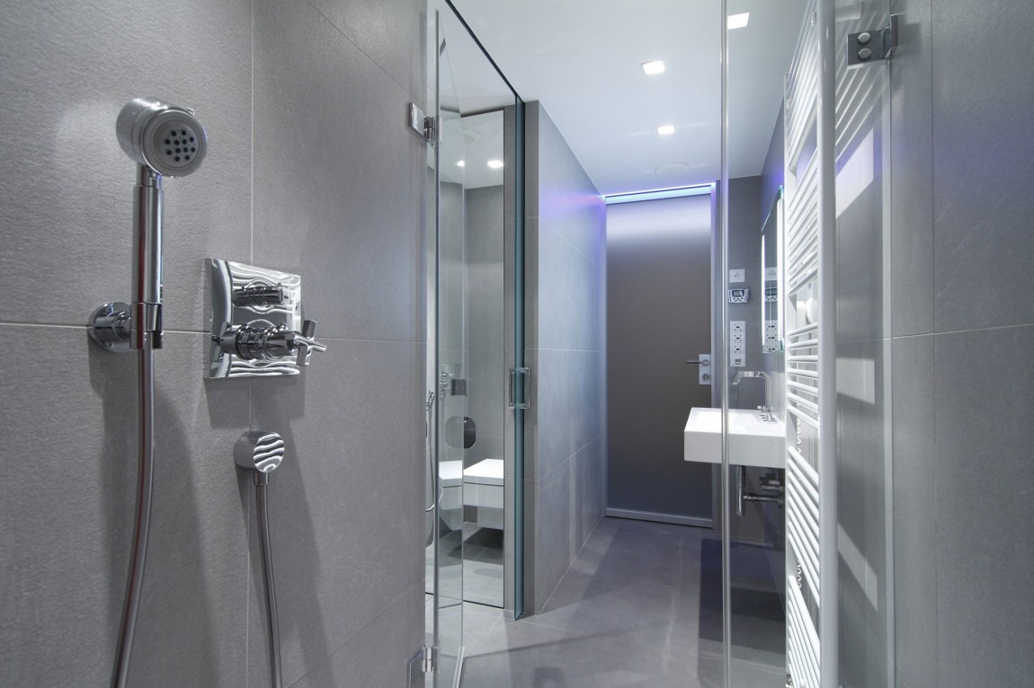
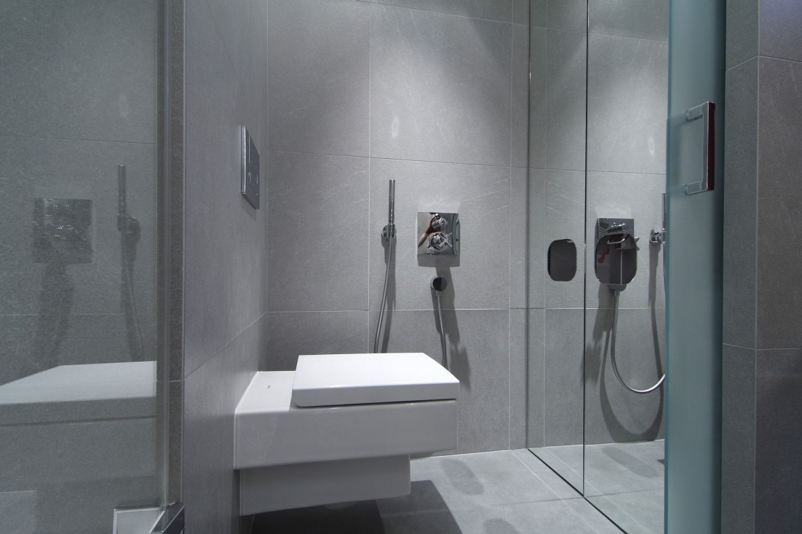
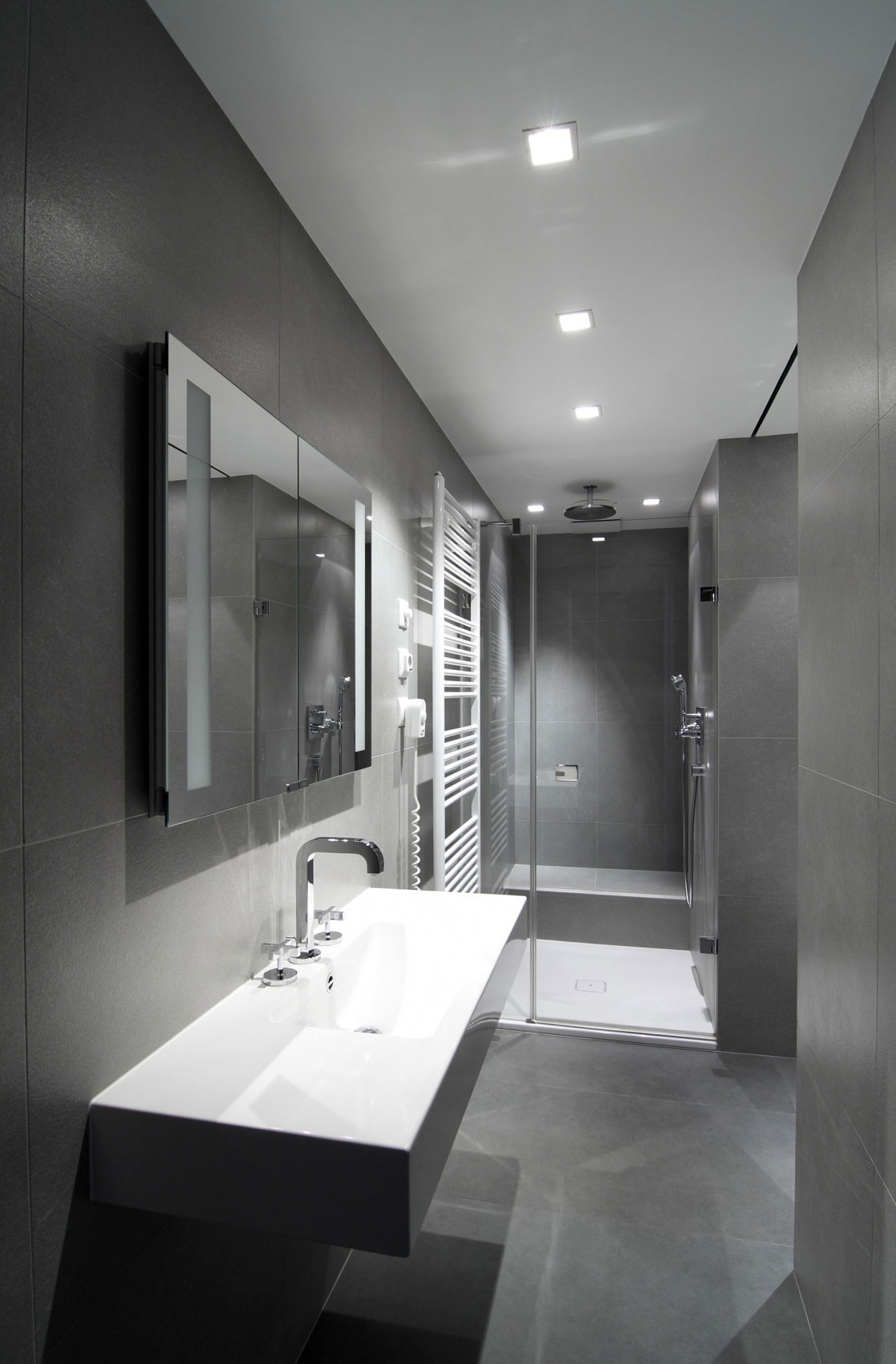
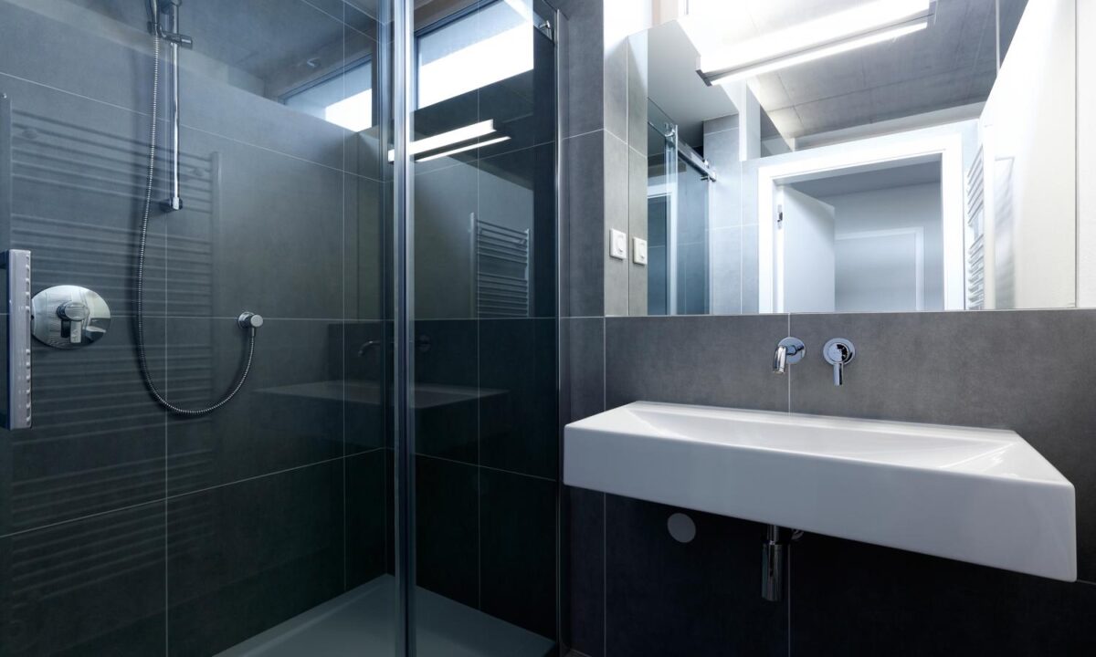
The bathroom is also like the living space: ultra modern with harsh lines. The gray color pallet is cool and neutral and gives off an air of luxury with it’s stunning fixtures.
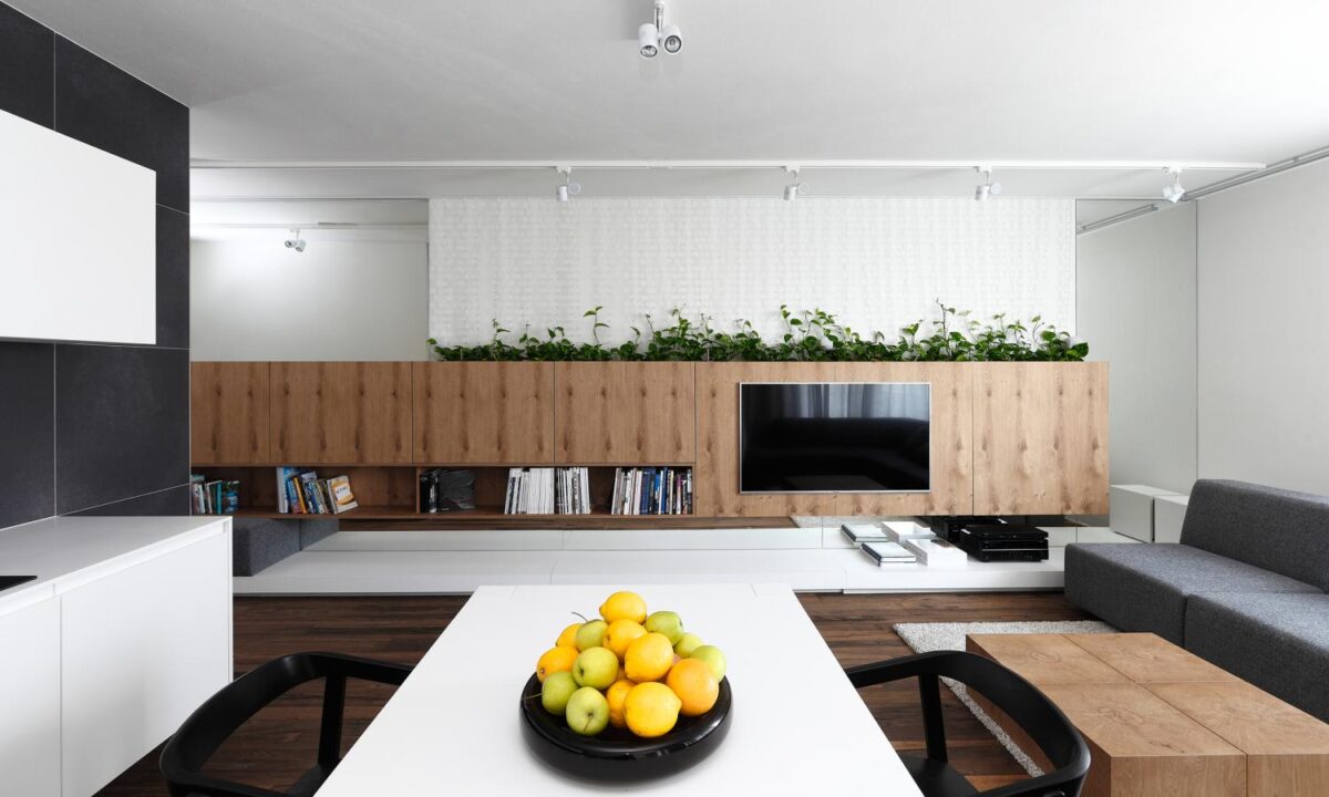
This space is ultra modern, yet organic with pops of color, a giant plant box, and beautiful ashy yet warm wood tones.
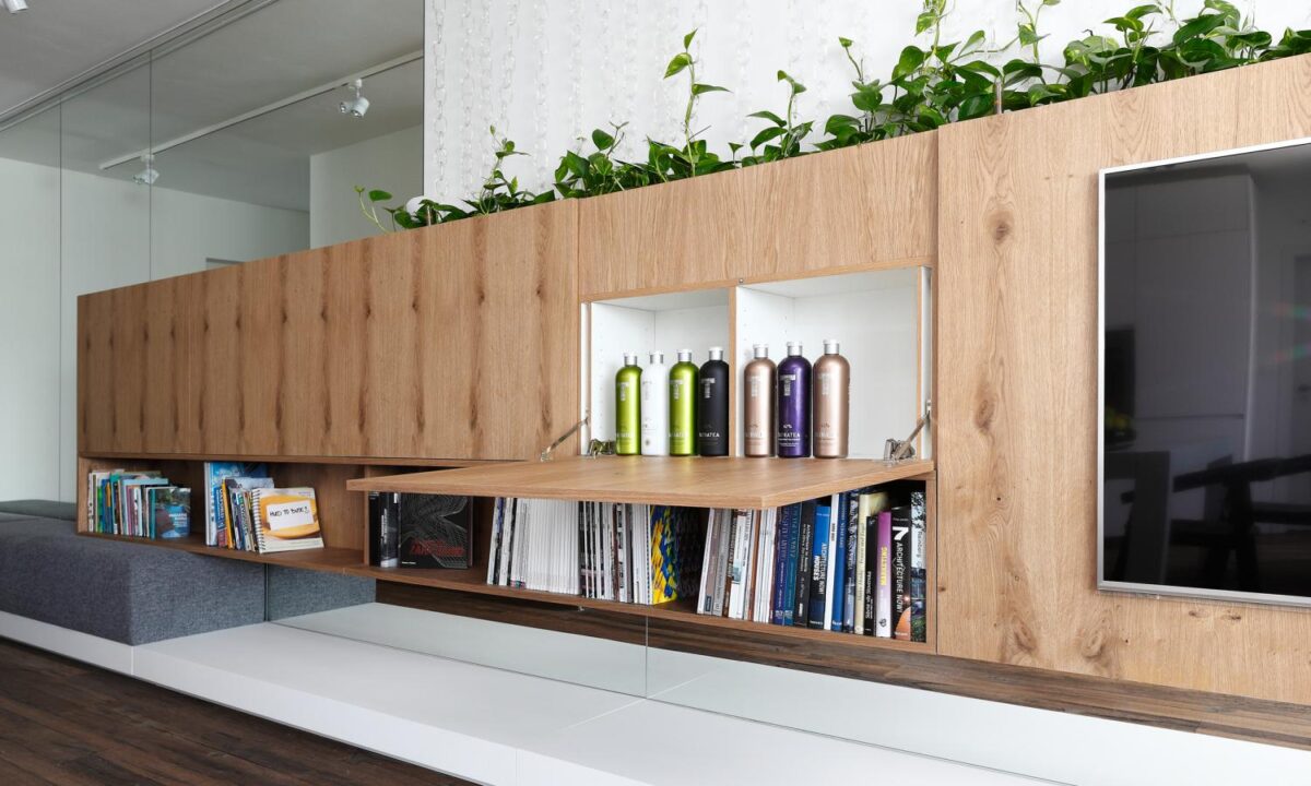
Talk about multifunctional! The cabinets in the living room act as a workplace, bar, flower pots hydroponic plants and a TV cabinet.
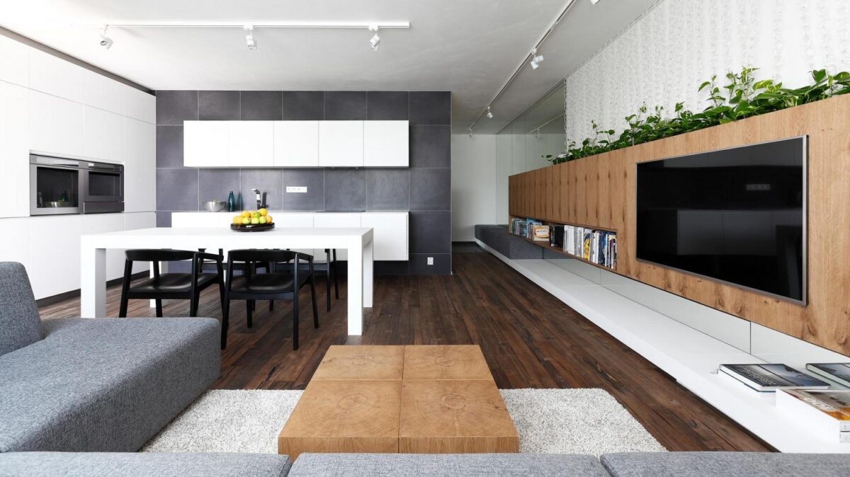
The living space was designed to optically link to the hall to the room to act as a single, harmonious, modern unit.
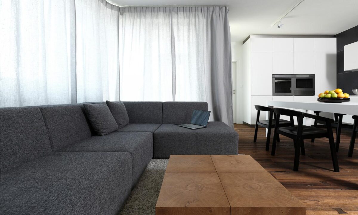
For the living space, they chose a proven combination of quality materials. It was created as a pleasant and cozy interior with a timeless modern design.
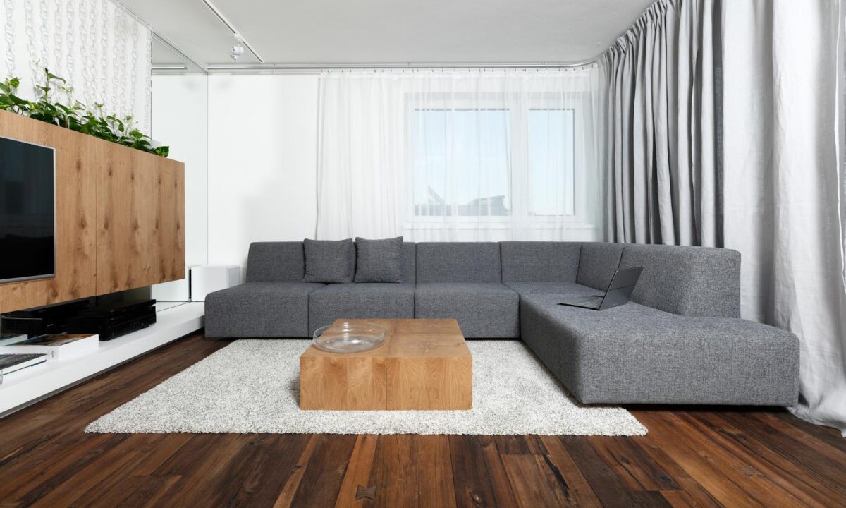
The material composition of the space consists of gray furniture and curtains, white matt lacquer, wood and vivid green plant.
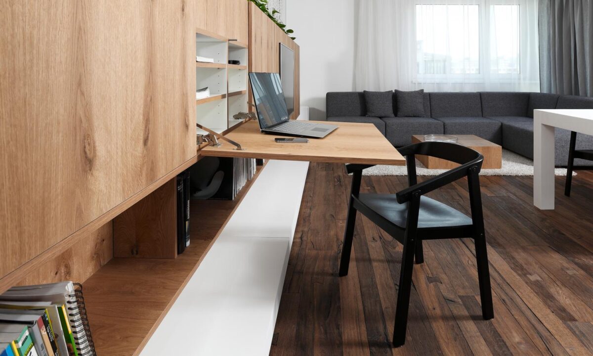
This murphy-desk is a great solution for someone who sometimes needs a work space. It’s not a big desk, but it’s there when you need it and it’s got it’s own storage space.
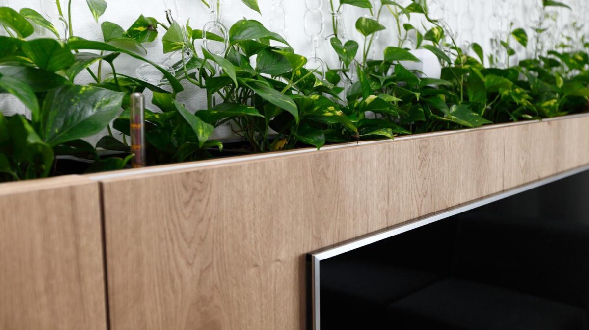
The plants in the top part of the cabinet add a wonderful organic feel to the entire space. It makes it all feel less stark, more inviting, and plays on the rooms cozy nature.
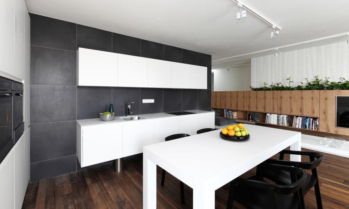
Wow! Look at that table pop! The big, stark, white table is incredible against those dark wood floors. It’s a great anchor to the room and once again plays on the modern elements of the room.
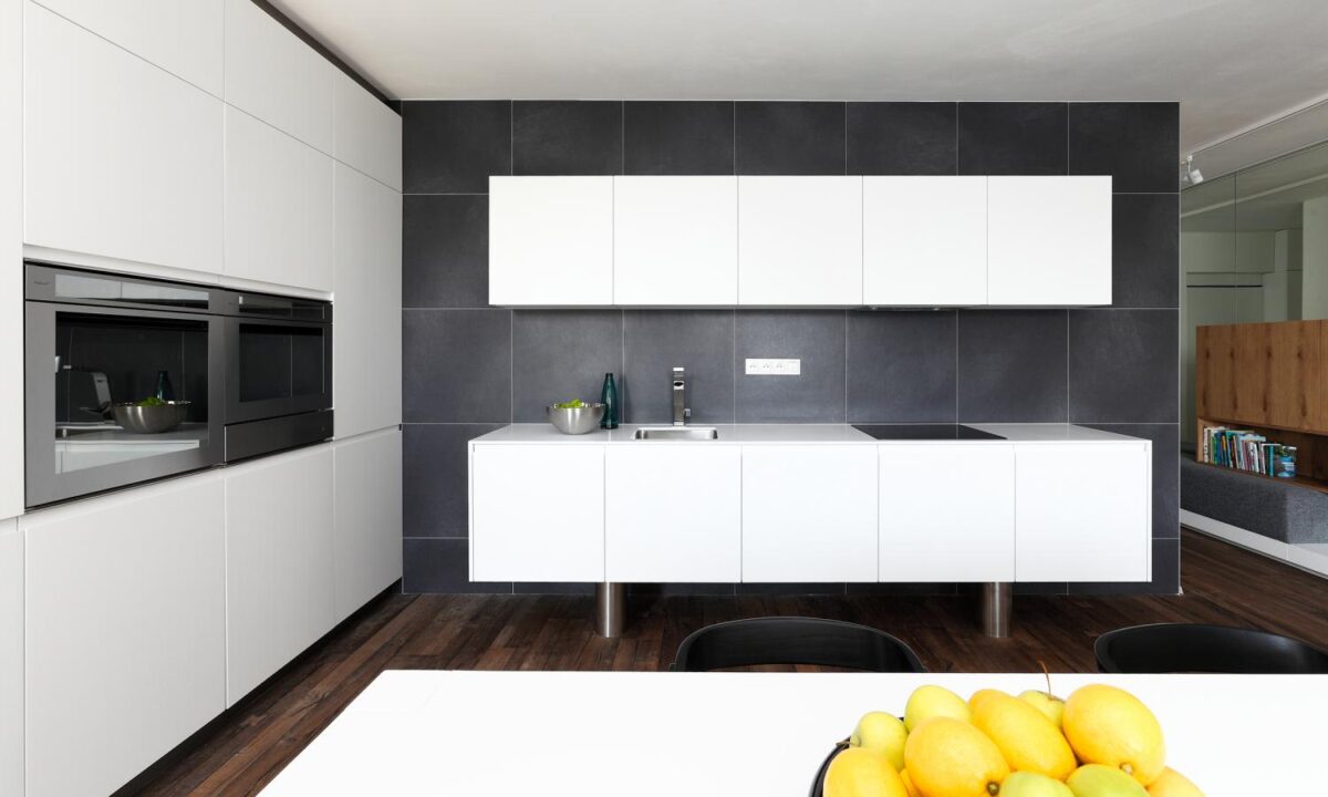
The cabinets of the kitchen play on the same element of starkness up against those big, gray tiles. Plus, the wall of slick white cabinets ties both the table and the kitchen space together.
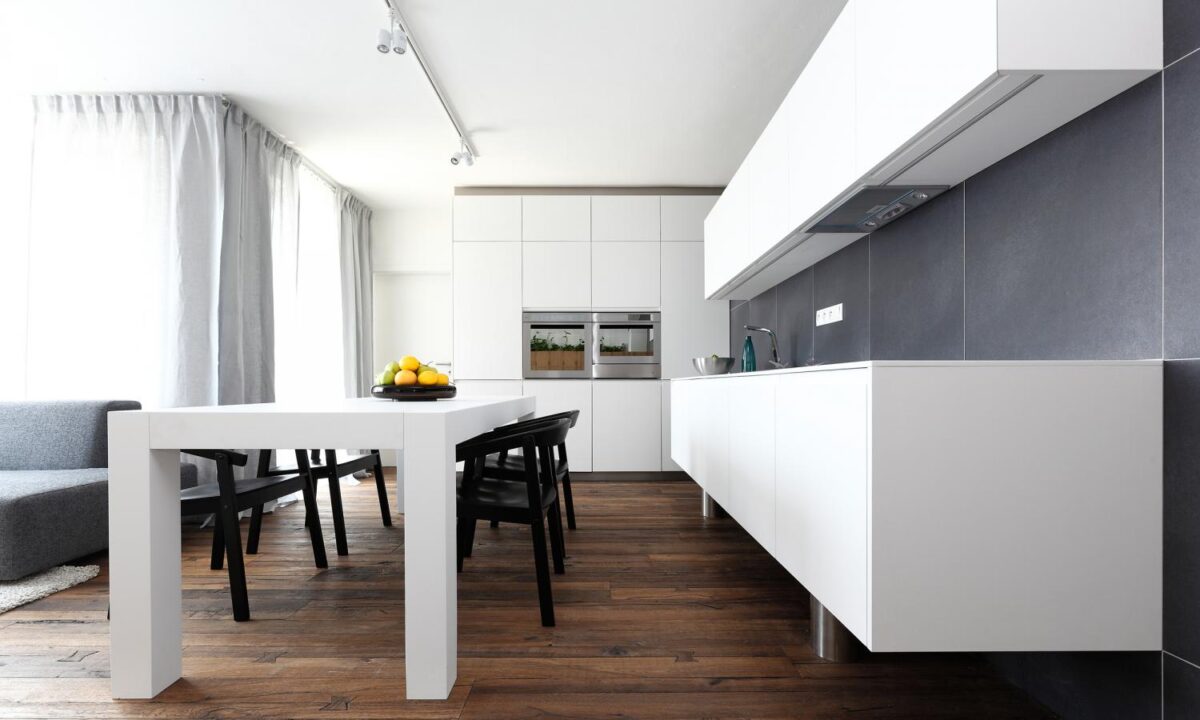
What’s great about this big sturdy kitchen table is that since it’s almost the same height as the cabinets it can also act as a kitchen island for prepping.
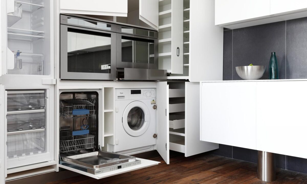
OK, as if these cabinets weren’t already cool enough, when you open them up you find out that they hold just about everything. From spices and food, to a big hidden fridge, dishwasher, and even a washing machine! Pure cabinet magic.
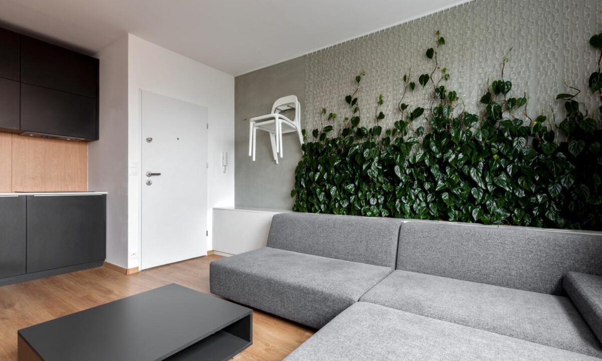
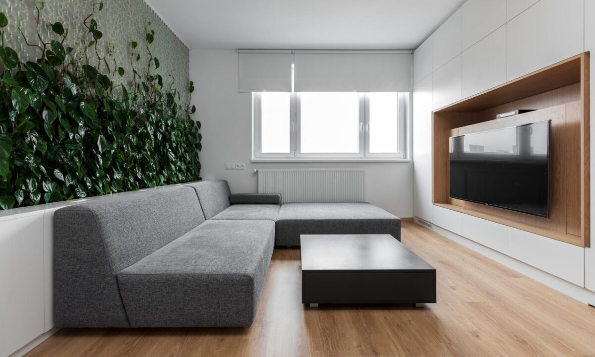
The plants incorporated in this space are so creative, and visually stunning. The vines are given little hooks to weave themselves in and out of as they climb this big gray wall.
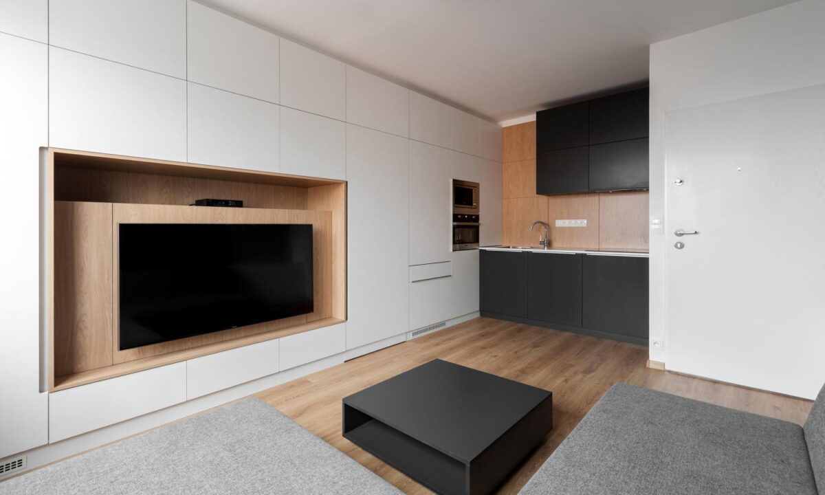
From here you can see this stunning wood that’s all over the room. The way they’ve incorporated the wood from the floors into the backsplash, and this multidimensional tv cabinet really tie the rest of the modern stark space together.
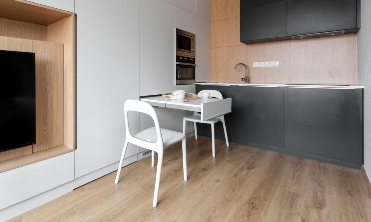
Small but functional: this awesome little table pops right out from the wall! And those chairs? You may remember seeing them hanging on the living room wall in the first photo. Creative design is the name of the game for this little flat.
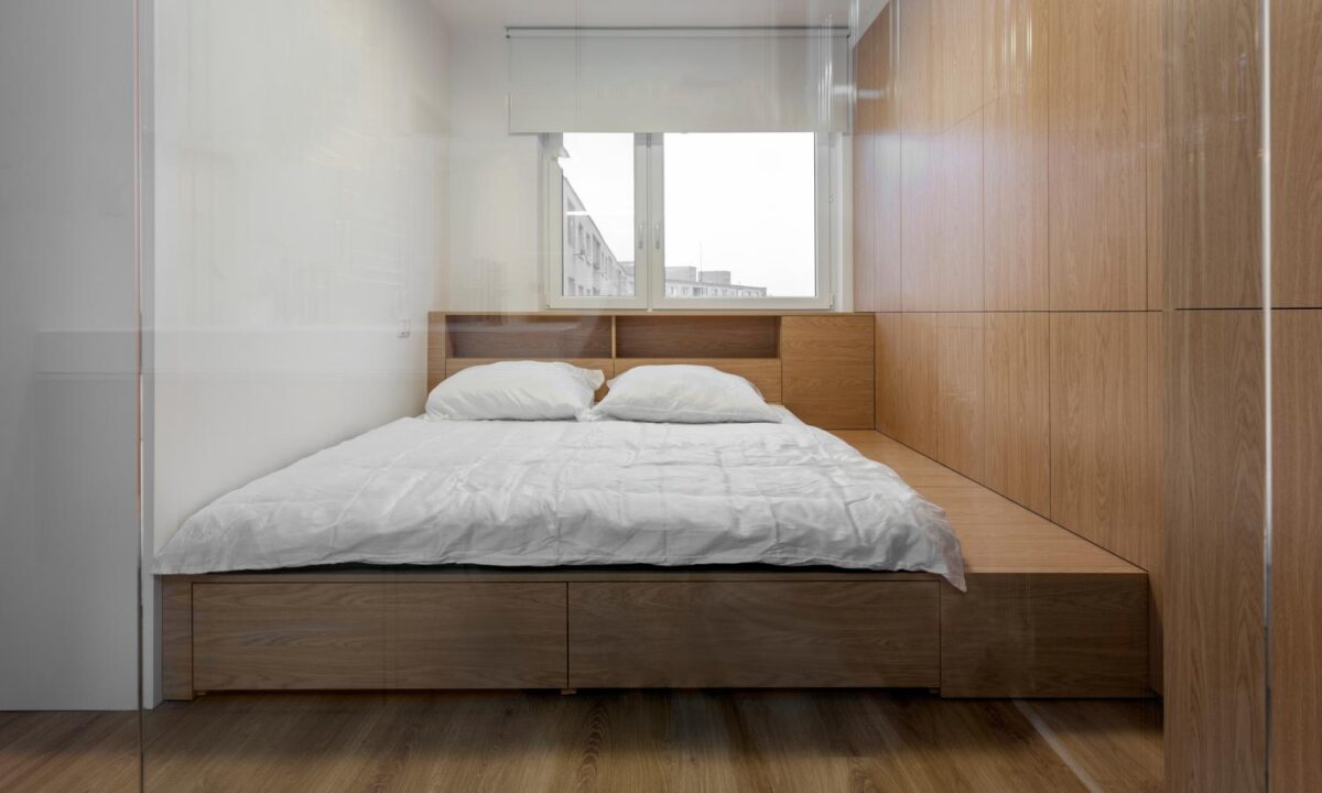
The wonderful wood is carried through to the bedroom in this stunning bed frame that’s both storage, a headboard, and bedside table. Creative and stunning.
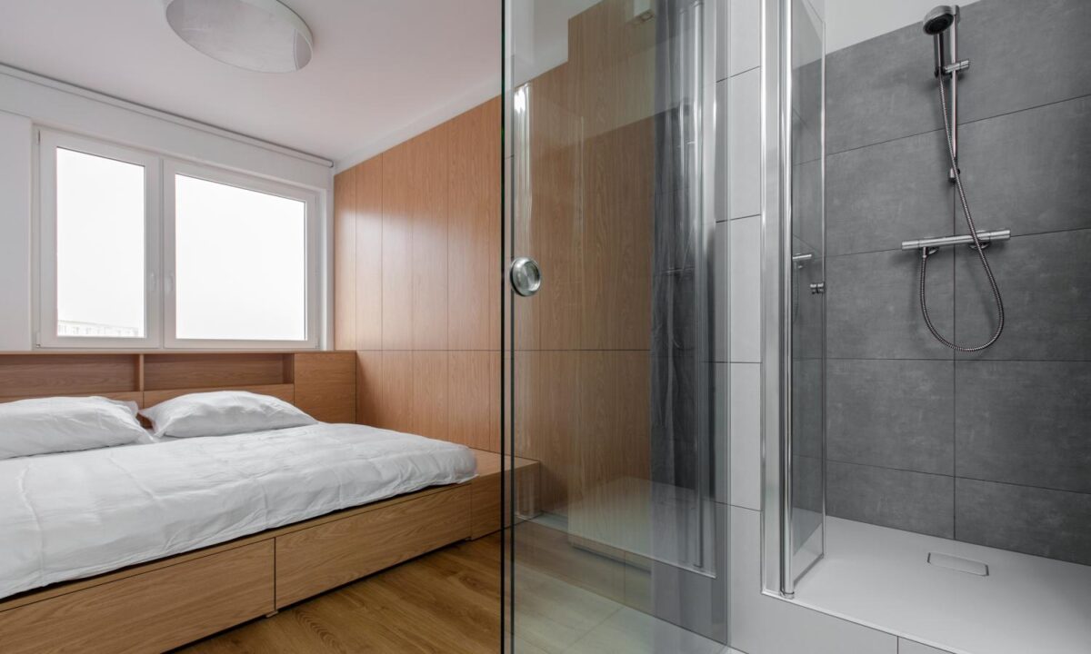
This big glass shower is the perfect place to steam, and it’s high end finishes and glossy walls mean it fits in perfectly against all the wood from the bedroom.
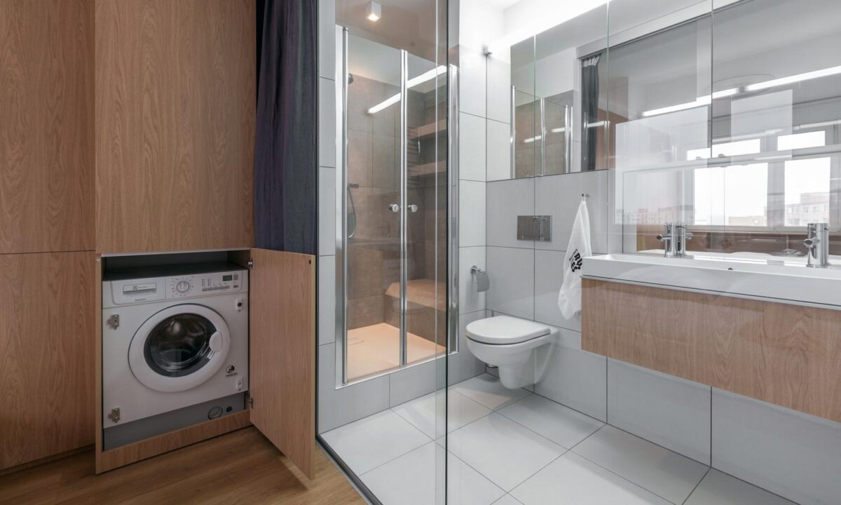
Creative storage continues into the bedroom, giving the tenants access to the laundry right from their bedroom and bathroom.
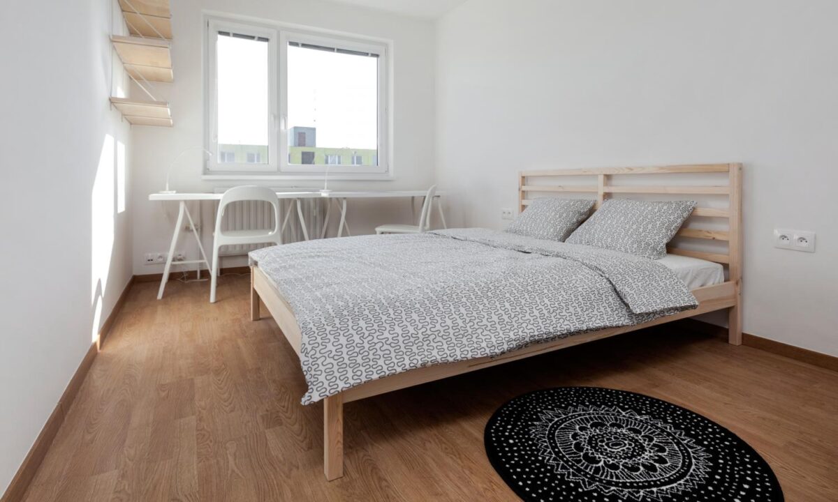
This bedroom boasts a bit more space, and a more traditional bedroom layout. The floating shelves and the white desk both help take up less space both visually and physically.
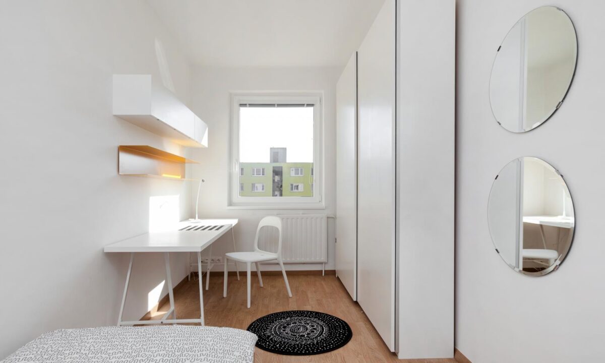
This smaller space plays on the same elements of the other, with floating shelves, a white table, and some tall but skinny storage for the wall.
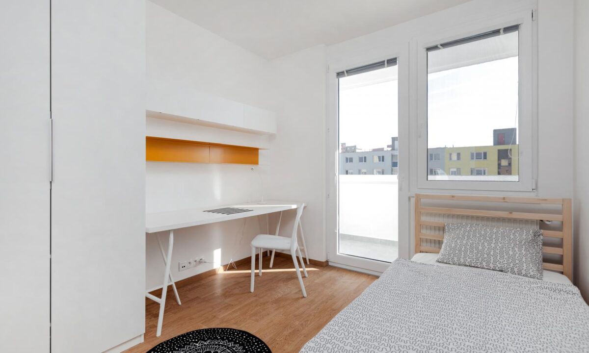
Simple is key when designing a small space. Keep it clean and minimal to maximize the visual and physical space available.
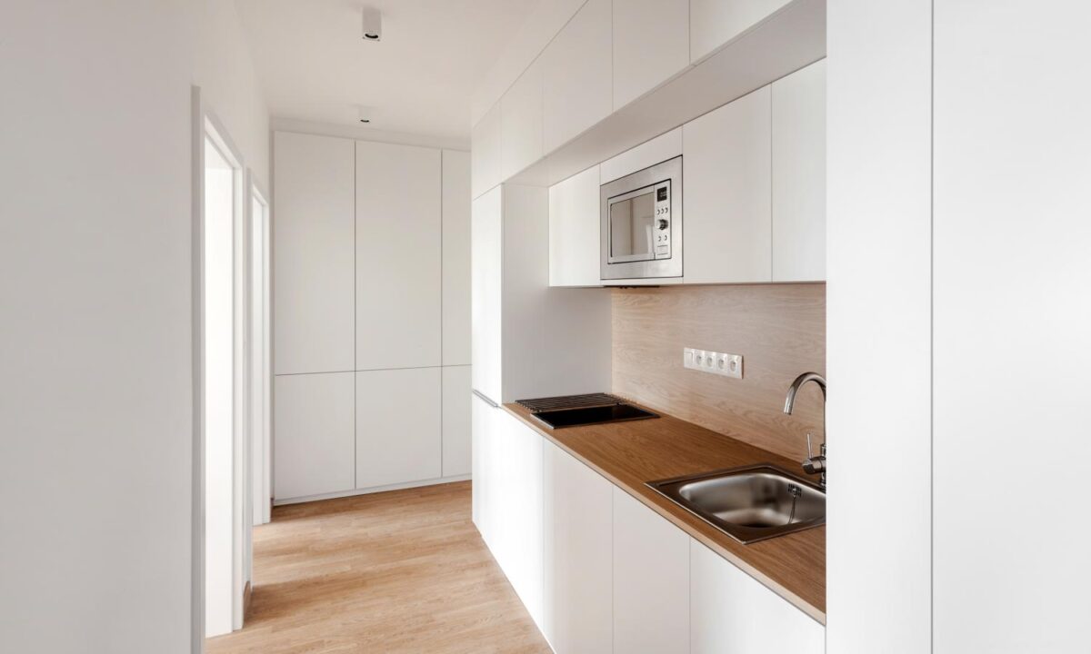
These smaller rooms share this unit kitchen, which despite being quite simple is practical and good looking.
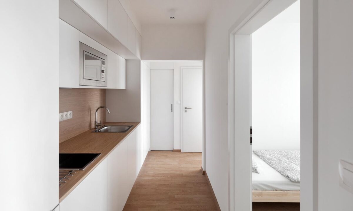
Here you can see how the kitchen connects to the other three units in this middle hallway. The stunning wood floors tie the spaces together.
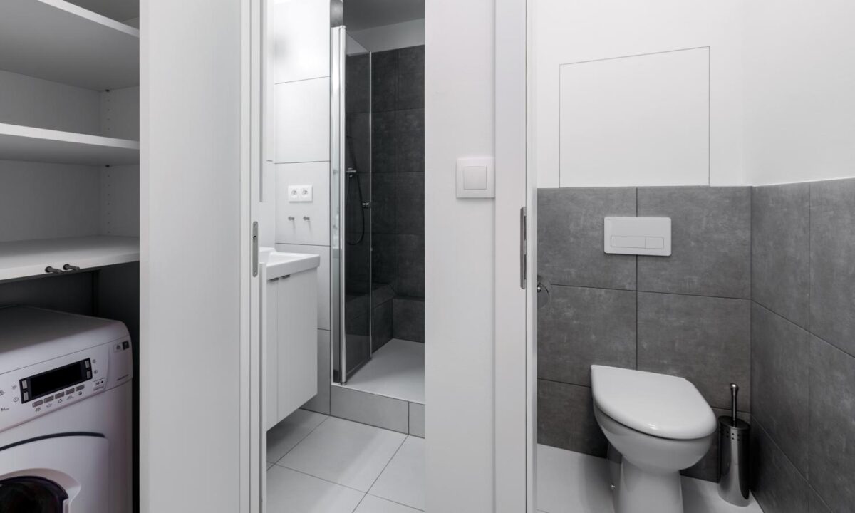
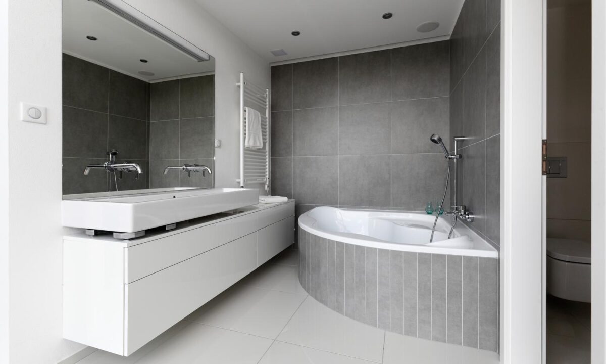
The bathroom is simple, but designed well. The gray tiles and modern fixtures give it a high end feel.
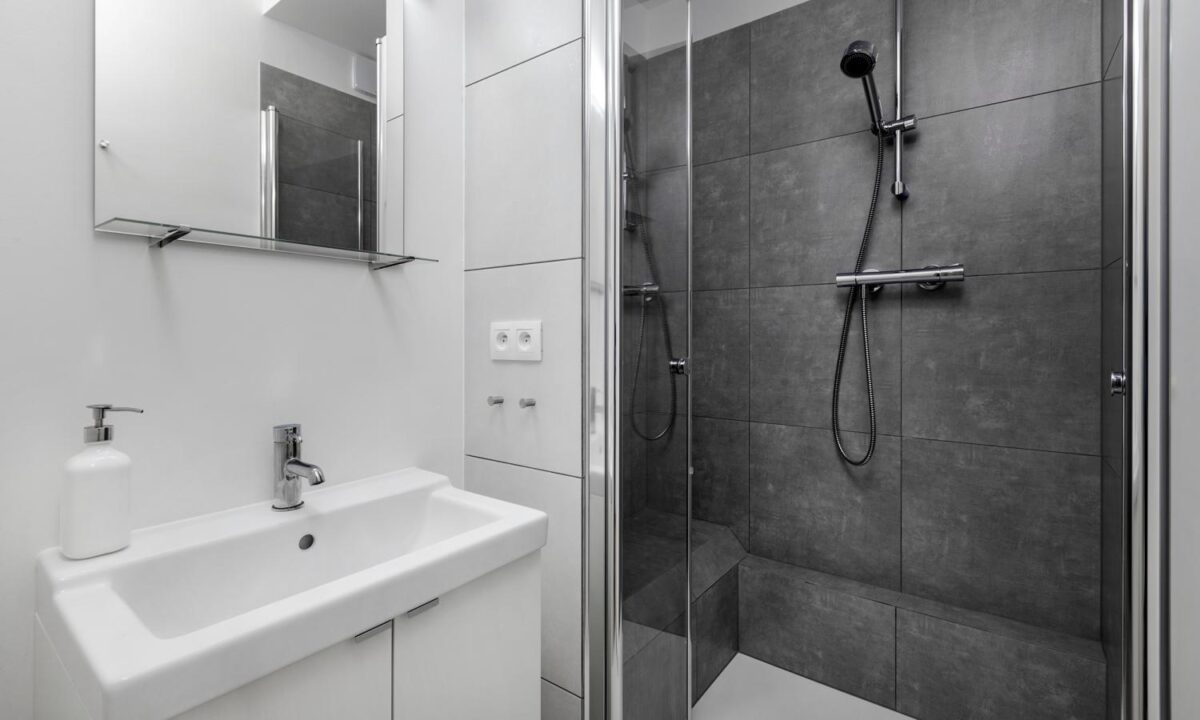
Glass shower doors always add a bit of a luxurious feel to a bathroom. It can be a simple solution to make your bathroom space stand out.
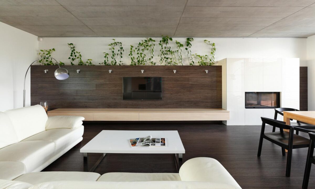
This final property is a big wide open space that is bringing the nature right inside. The giant windows bring it tons of natural light that illuminated the crisp whites beautifully, and makes those green plants pop.
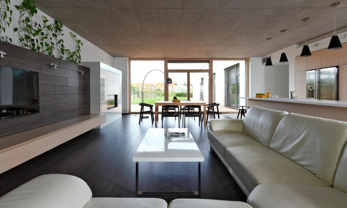
The green garden feels like it’s part of the living space thanks to those big windows. The dark wood floors, tv panel, and the vines also add to the organic feel of the space.
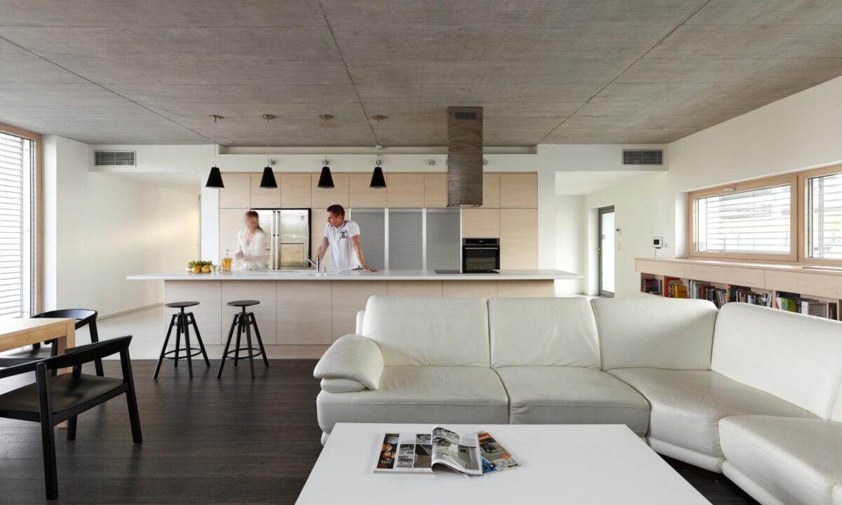
We love the furniture in this space. The stools are reminiscent of something you’d find in an old warehouse, yet the dining chairs are oversized and curvy — plus, the couch is like a big white leather cloud you just want to curl up on with a magazine.
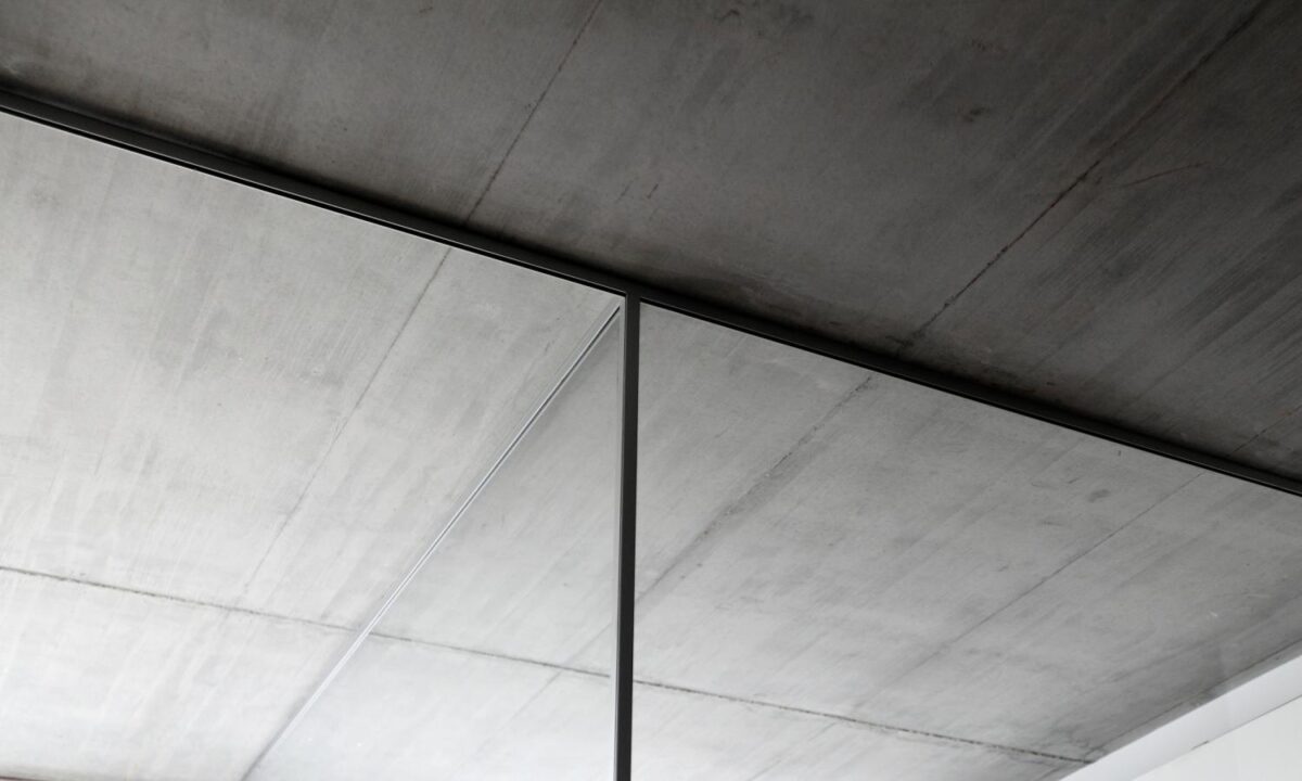
Another feature that seems to bring the outside in are these gray ceilings that looks like concrete. The simple touch adds more dimension to the space, and really draws your eyes up.
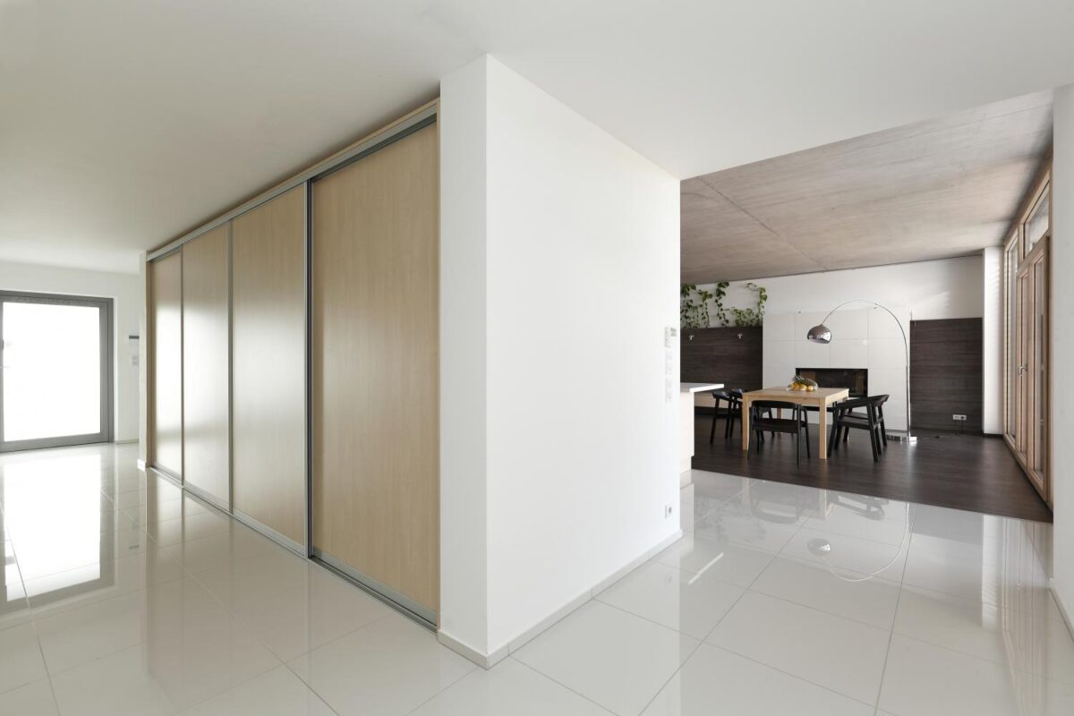
To separate the living space from the rest of the home the designers have used these glossy white tiles. It really opens up the rest of the space.
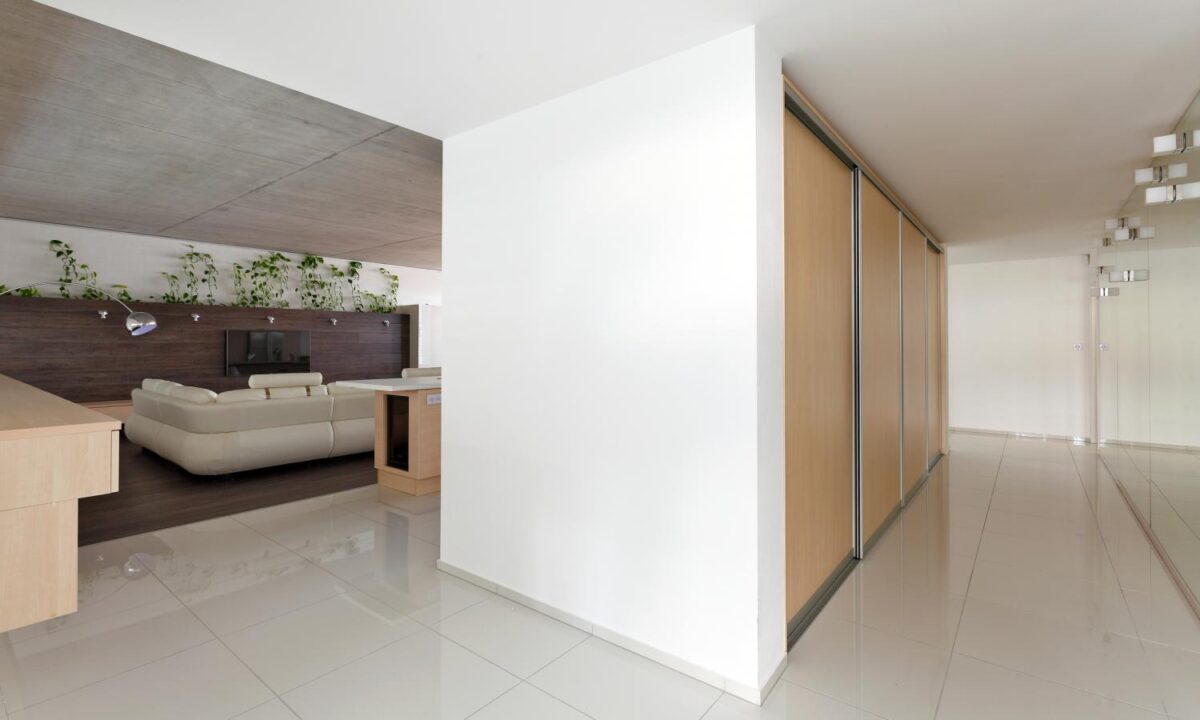
From here you can see how the white tiles flow into the kitchen as well. The tiles then prove as a nice way to separate spaces, yet bring them together.
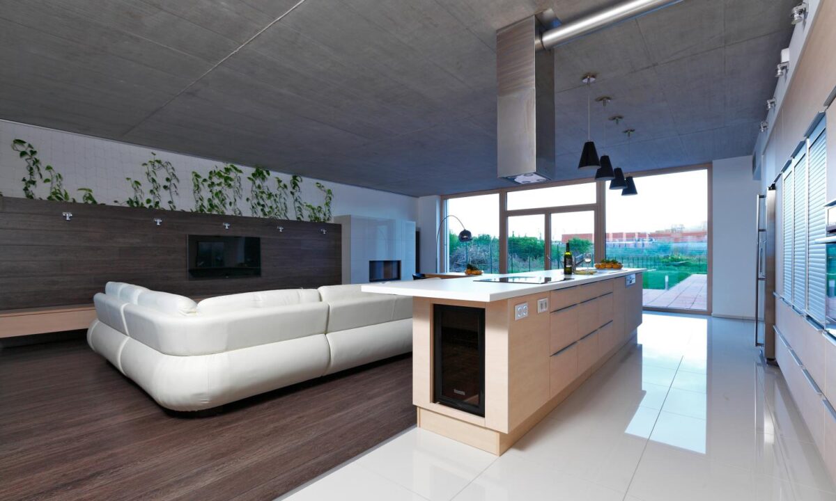
The wide open kitchen is airy, and state of the art. It’s sleek and industrial feel is a bit of a contrast to the rest of the space, but it all works together. Opposites do attract!
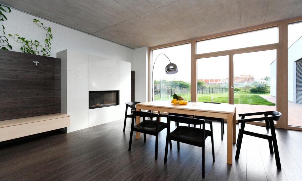
You can really admire the chairs from here, the big oversized seats mean they not only look great — but they’re comfy. What we love so much about this corner of the room too is the fireplace that’s in the dining room. Not a feature you typically see, but really makes the space feel cozier.
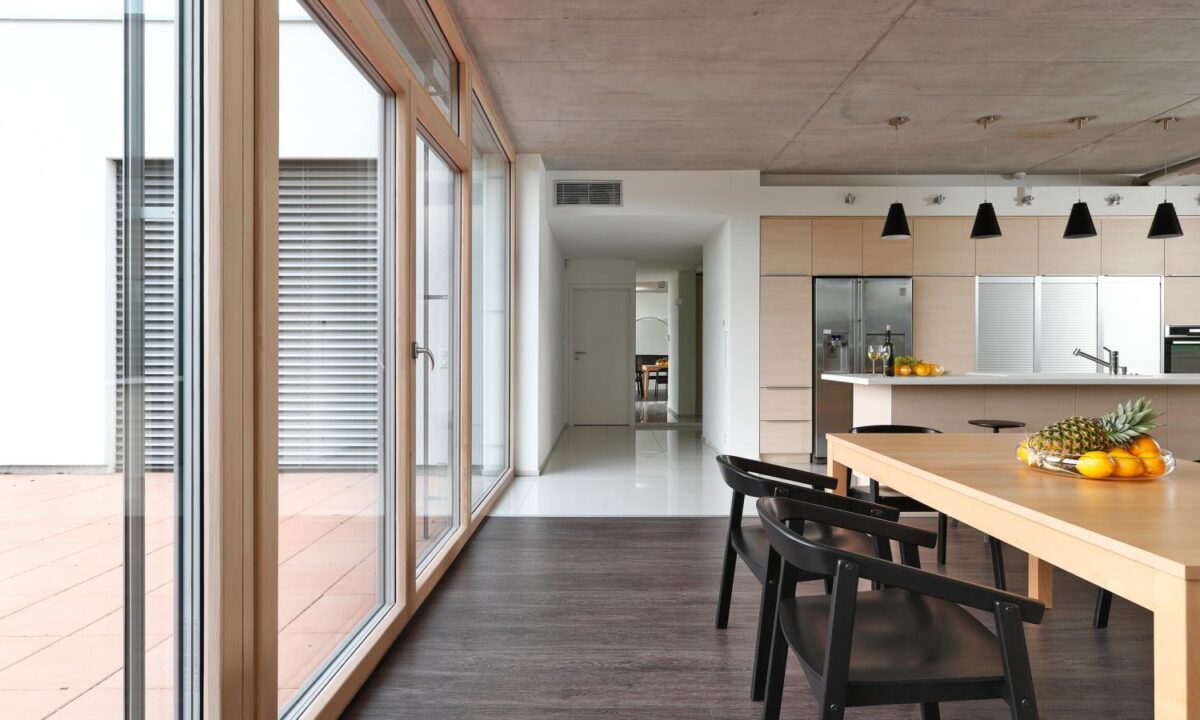
To tie the kitchen and dining space, the designers have used the same wood tones as the cabinets in the table. Simple ideas like this can add real cohesiveness to the space.
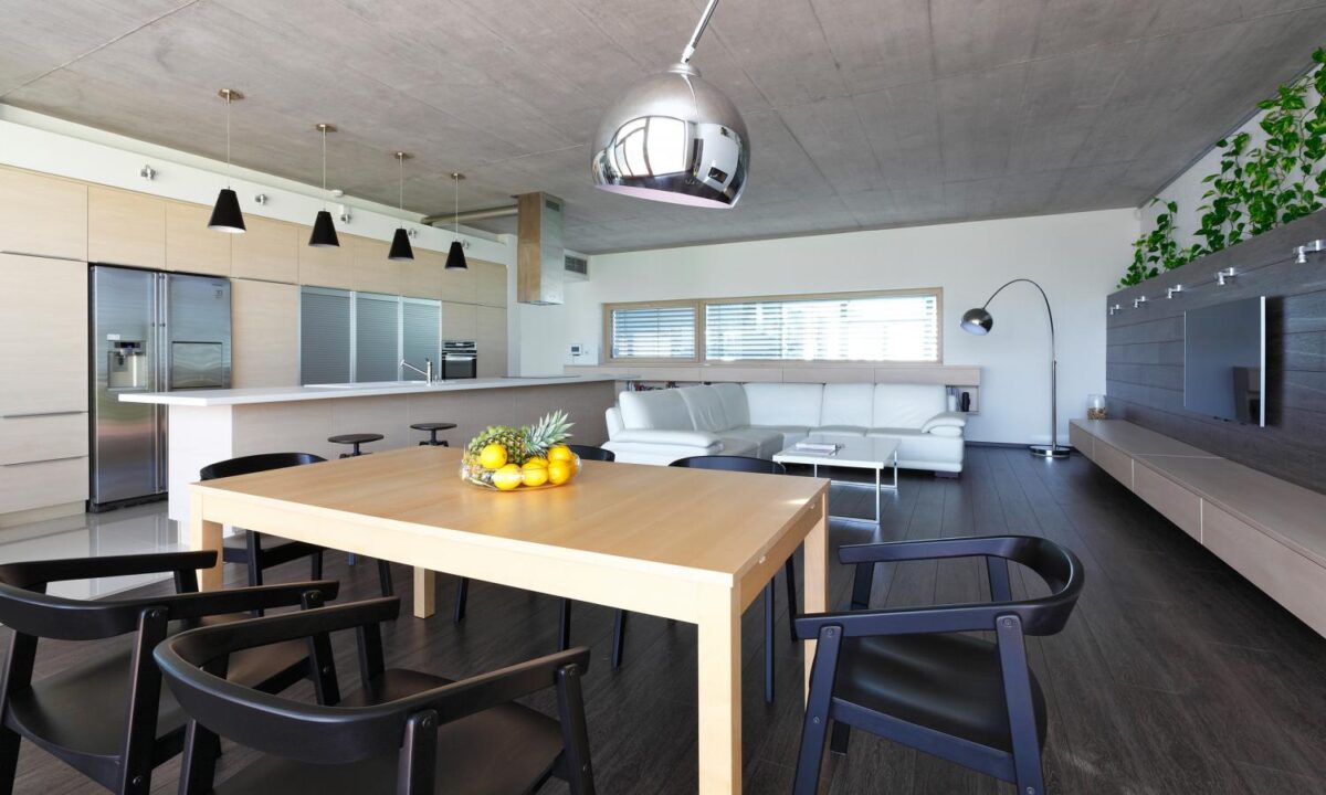
Even a room with this much natural lights needs to address lighting — for evenings and rainy days of course! They’ve added these mirrored arching lamps in both the living and dining space, which add a funky modern feel and when not in use reflect the natural light coming in.
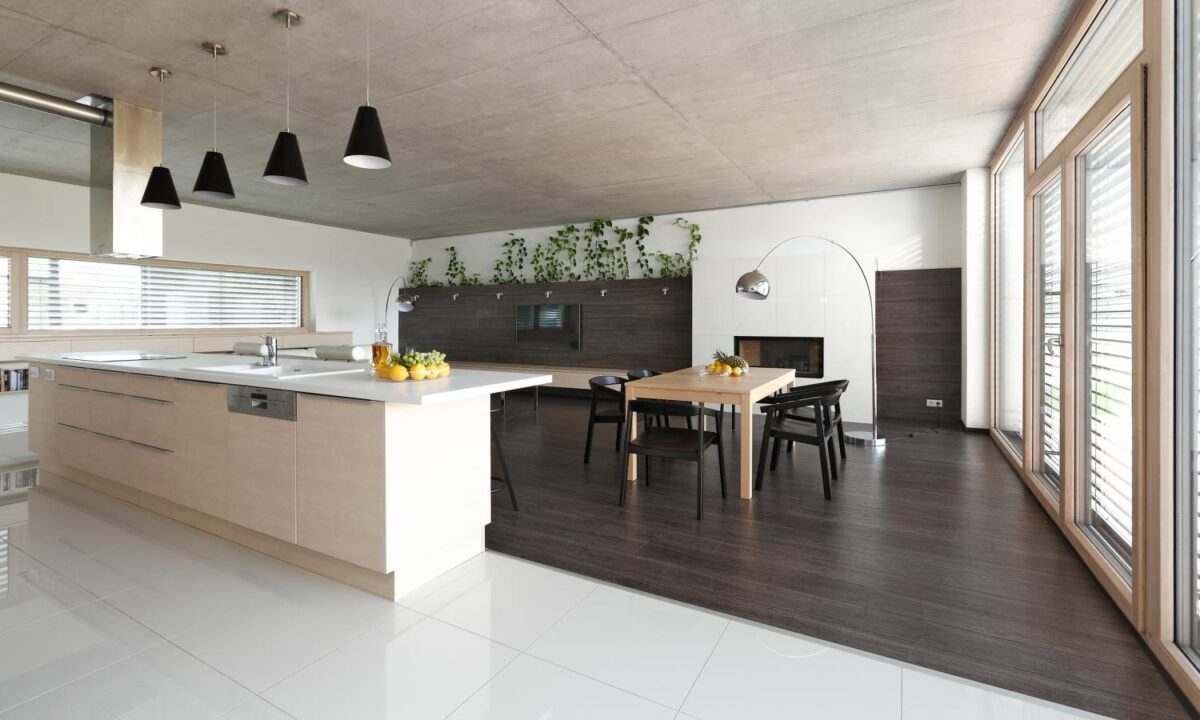
Seamlessly carrying the wood floors onto the back wall of the living space is a great way to warm up a big space like this one. We love the dark wood, and how everything in the room is designed to pop out from it.
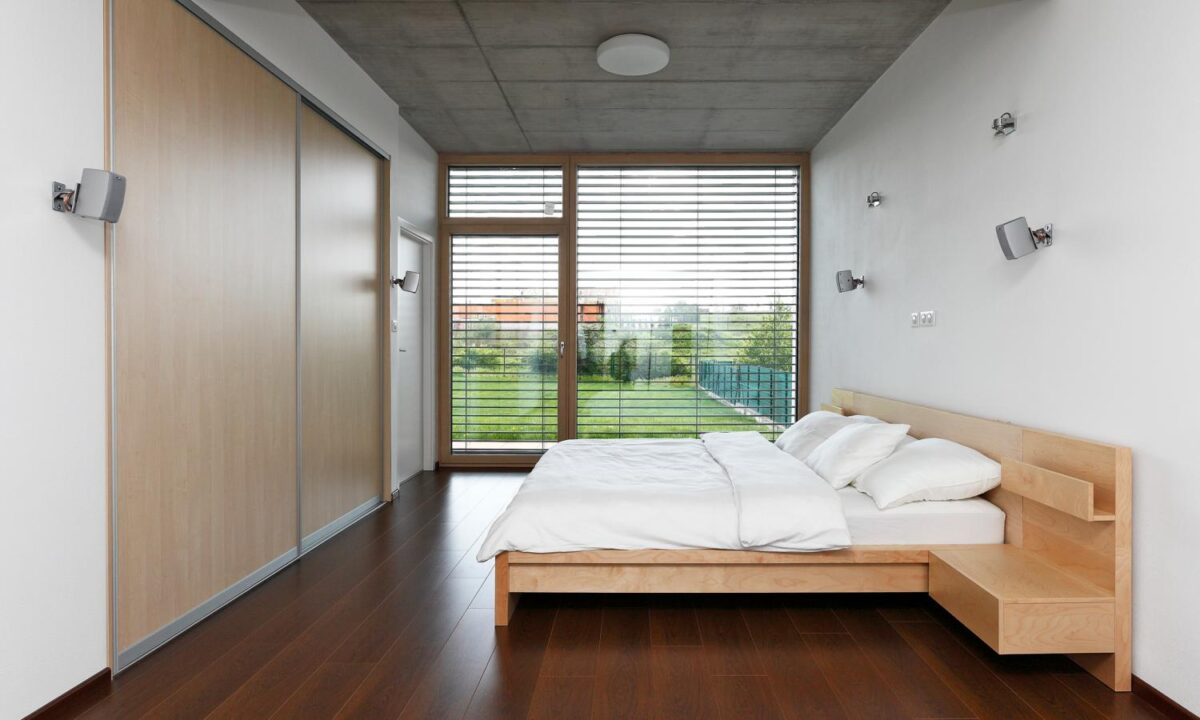
The bedroom takes advantage of those massive windows as well. The dark floors work here because the rest of the room is so airy, and we love how the bed frame matches the closet doors.
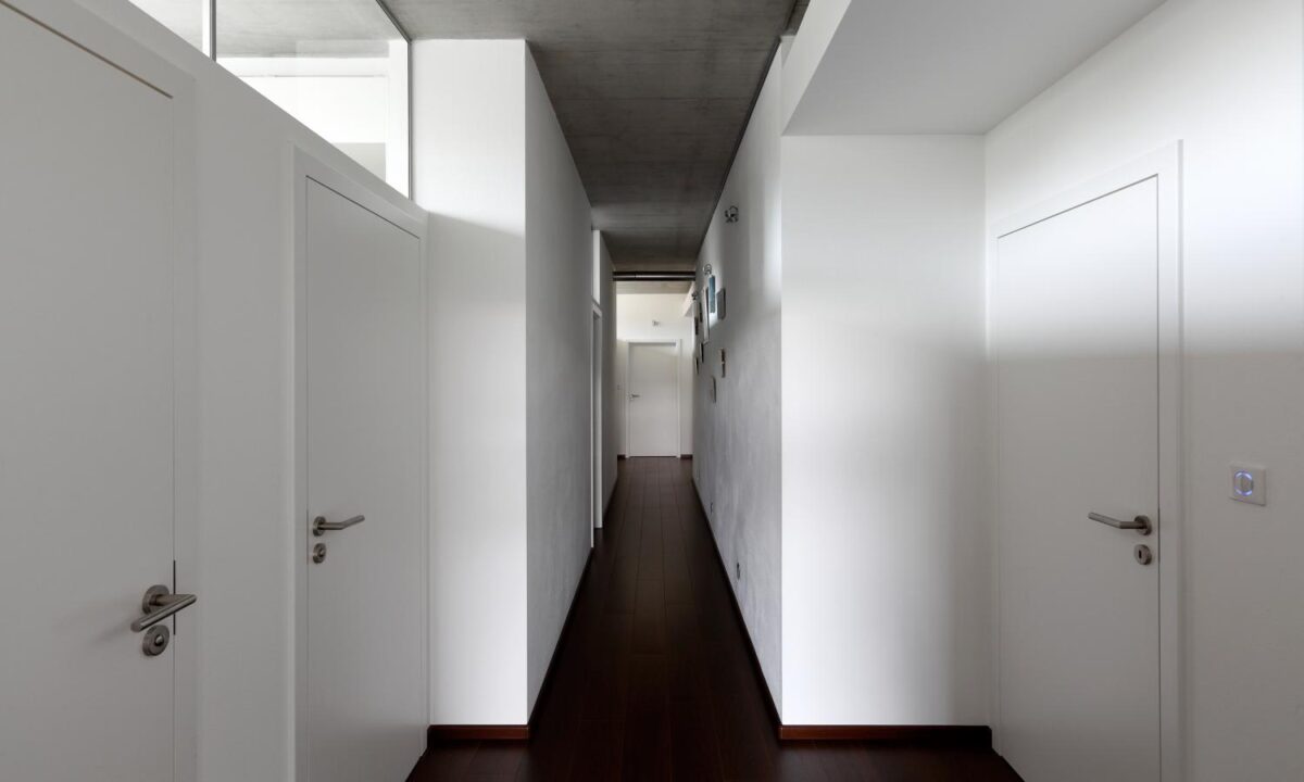
The corridor has an adjacent wall with exterior illumination that really brightens up this dark space.
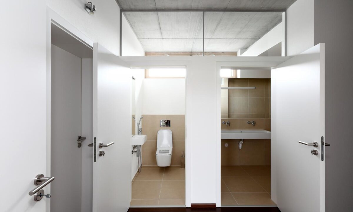
While the bathroom is compartmentalized, they keep it feeling airy and open by using the top windows here again — allowing lots of light to flow freely between the spaces.
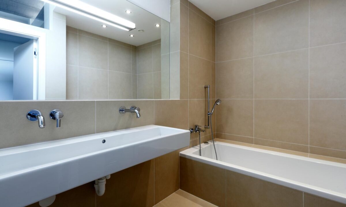
We love the modern troff sink here. It’s got nice clean liens and adds an element of surprise to an otherwise ordinary space.

