Smaller apartments don't have much room for decoration, so designers often look for functional objects that can lend their beauty to the living space. The two homes featured here fit all the necessities in their small floor plans and manage to incorporate plenty of decorative details at the same time. These compact apartments focus on shape and balance rather than a concrete theme, allowing for aesthetic flexibility even within a limited canvas. Each starts with a foundation of smooth clean lines like many other modern homes, but rounded furniture and accessories soften those edges for a comfortable appeal.
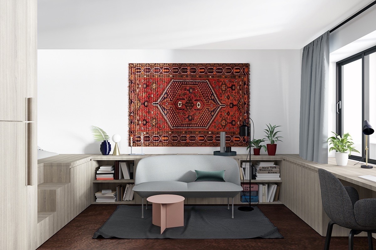
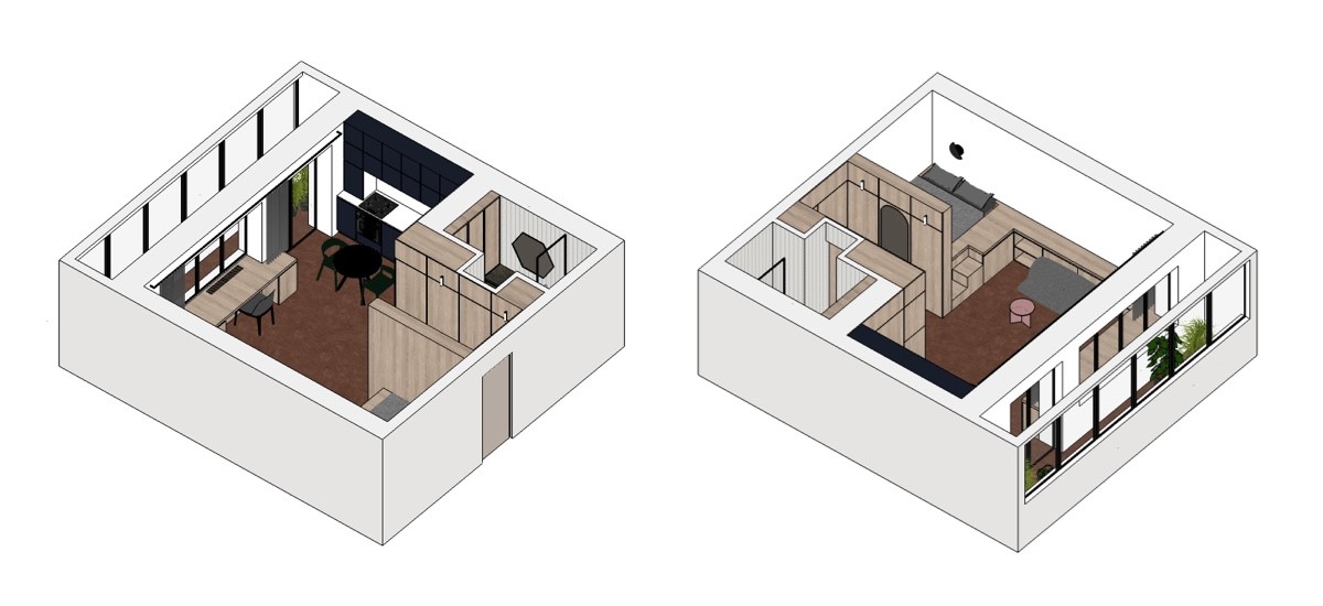
Let's start with a gorgeous apartment concept that emphasizes storage. Its floor plan occupies just 430 square feet (40 square meters) but built-in elements stretch its functionality to the maximum. Forest green and rusty orange make for an unusual yet inspiring color theme if you've been searching for creative palette ideas.
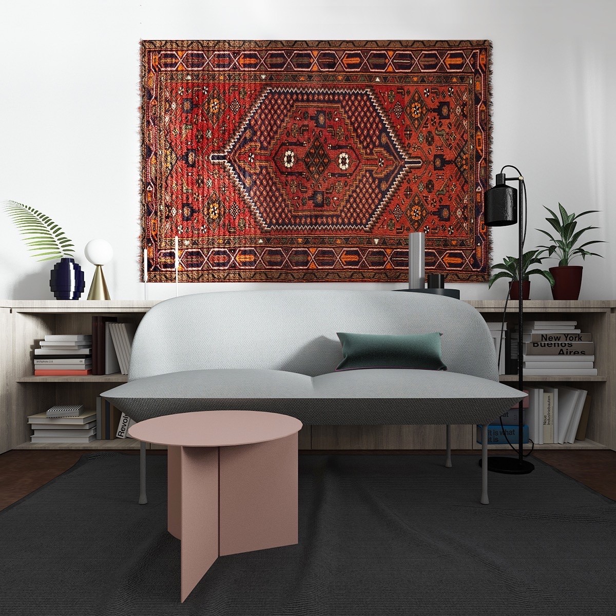
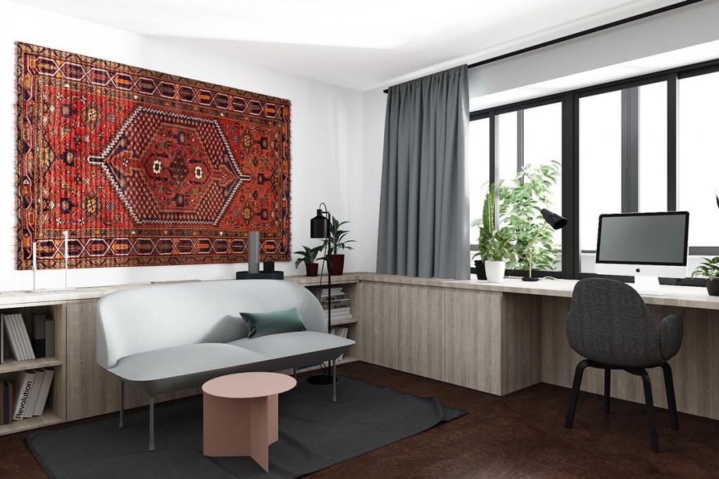
Interesting furniture makes an artistic statement in its own right. It's hard to imagine walking into this home for the first time and overlooking the sharp curves of the unique OSLO sofa by Anderssen & Voll.
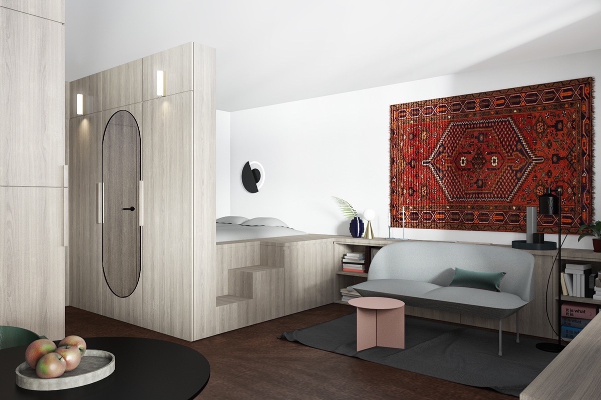
The bed carves out a niche on a raised platform accessible by a short series of stairs – the bottom stair alone would be fine for many adults, but the full set of three makes the bed suitable for younger family members who might visit for the weekend.
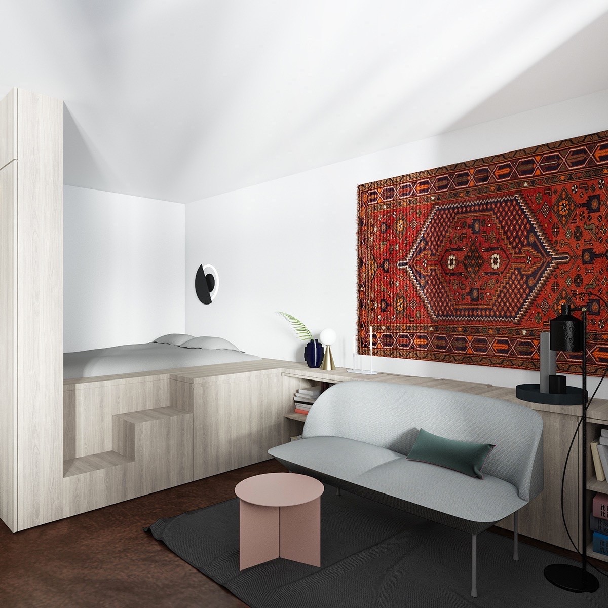
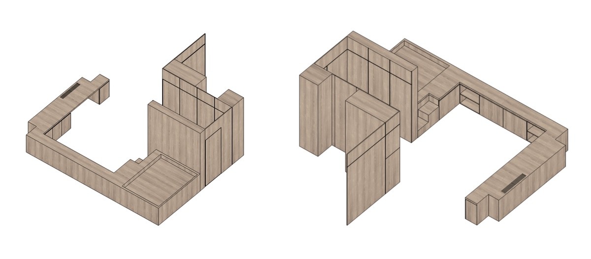
Cabinets take up every extra space within the bed platform and attached sideboard. The uppermost stair and the space behind the sofa make a huge difference in storage capacity.

A small home office space makes good use of the continued edge of the built-in wooden sideboard, occupying the coveted spot next to the window for an expanded view.
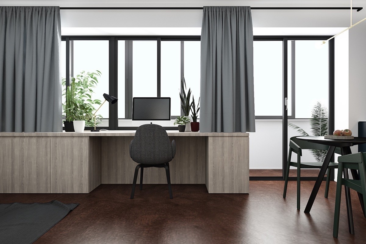
Here's where the built-in wooden features end. A quick walk around the desk leads to a bright white terrace where the residents can enjoy some fresh air.
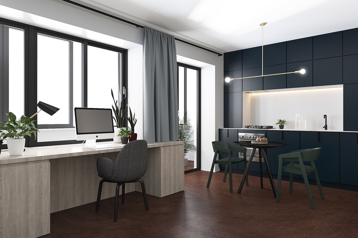
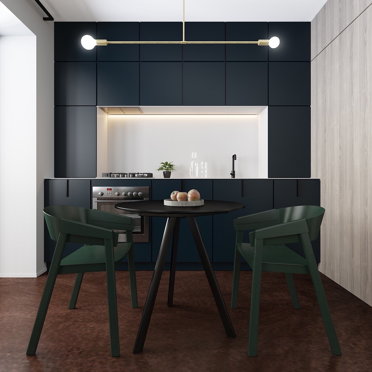
The kitchen and dining areas occupy the side of the room opposite the sofa. It continues the theme of rounded shapes with its circular table and curvaceous chairs.
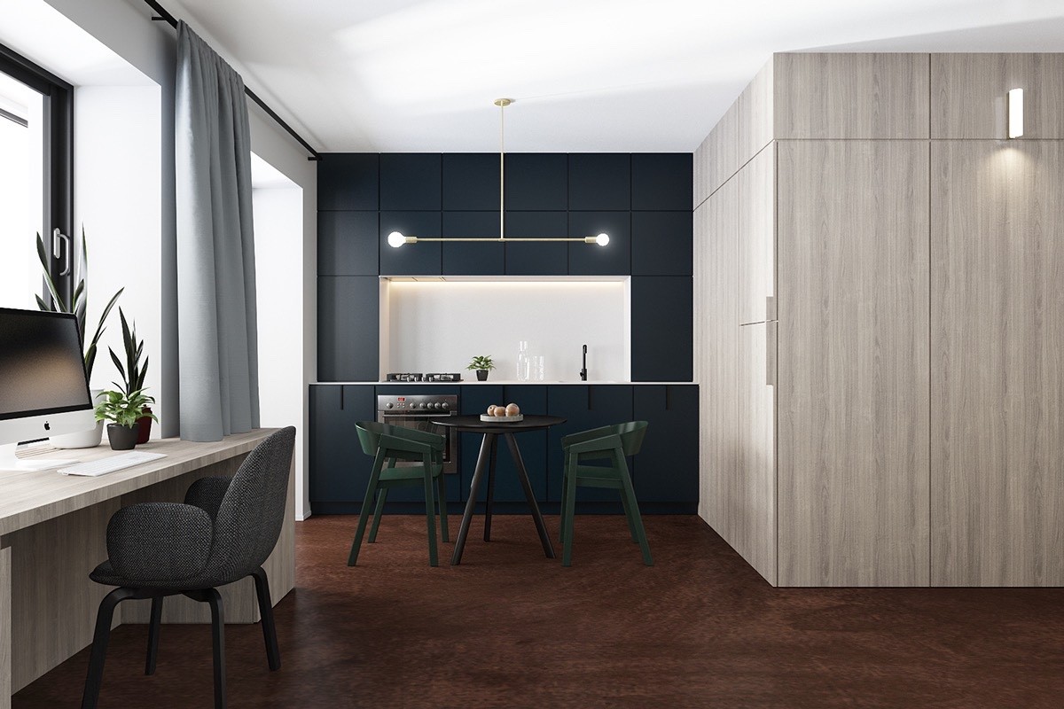
Even the suspension lamp reinforces the relationship between line and shape, splitting two spherical bulbs across a linear brass fixture.
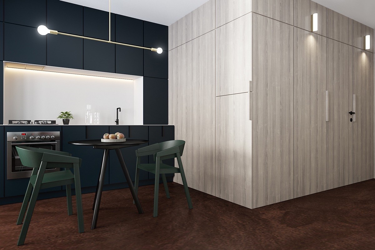
The chairs are from the Cover collection by Thomas Bentzen. Both the chairs and the table blend in with the dark kitchen background, the glossy white backsplash serving as the primary focal point.
An independent wooden volume conceals the bathroom on the inside and builds up surface area for more storage cabinets on the outside, the counterpart to the bed volume and wraparound sideboard.
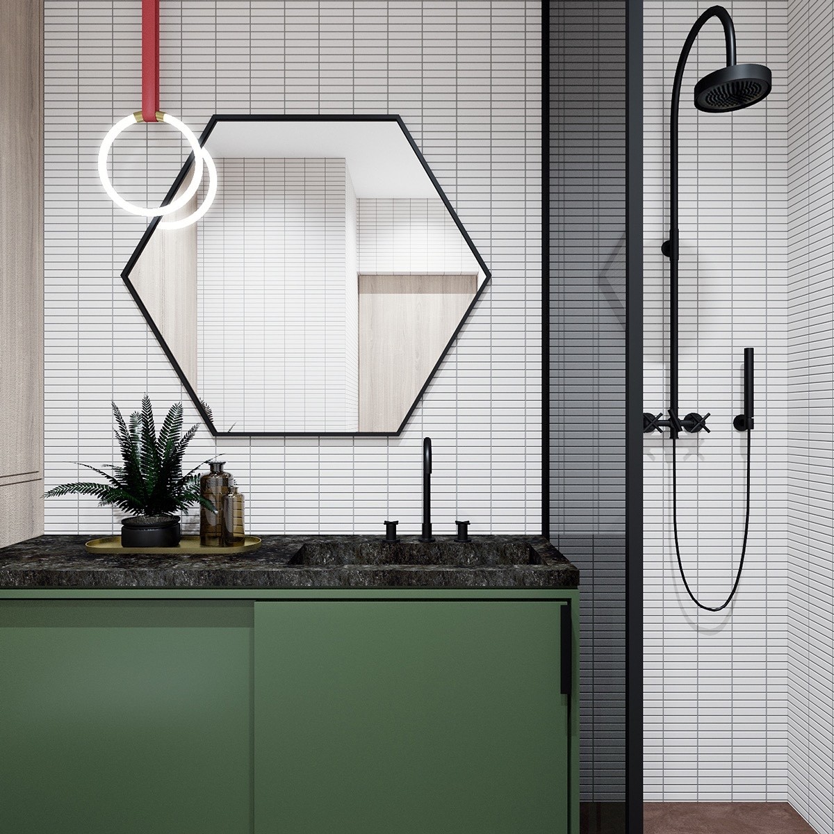
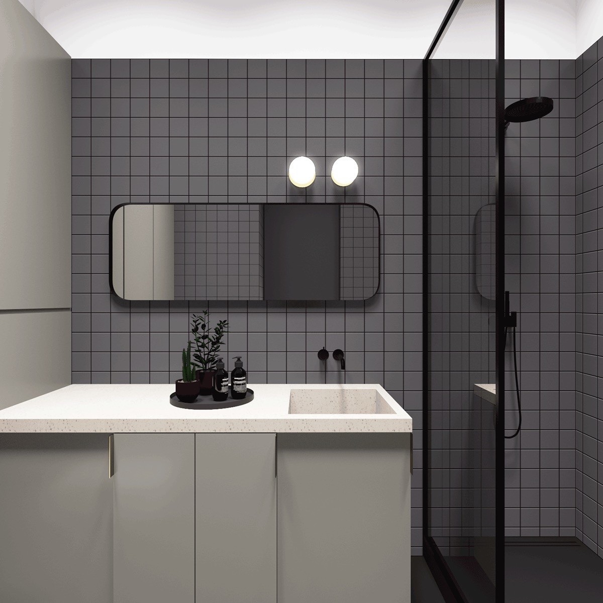
This hexagonal mirror is fabulous! It covers the middle ground between the ring-shaped light and the small rectangular tiles.
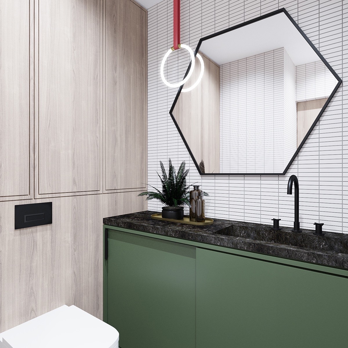
Lee Broom designed the pendant light to fuse classic and modern elements, appropriate for the era-defying bathroom theme.
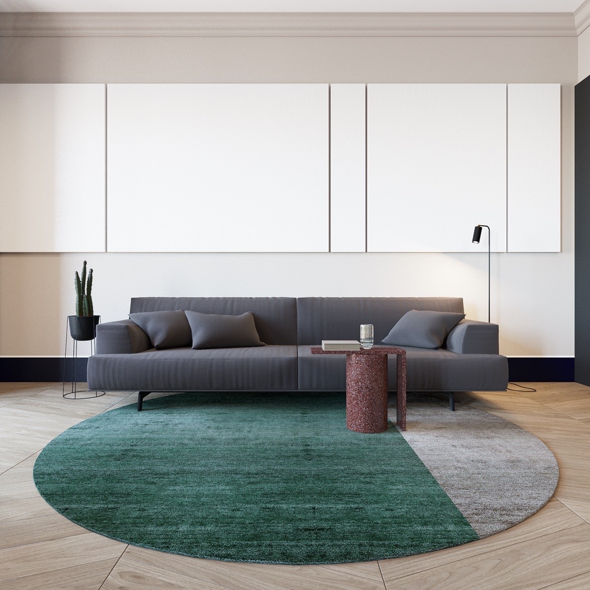
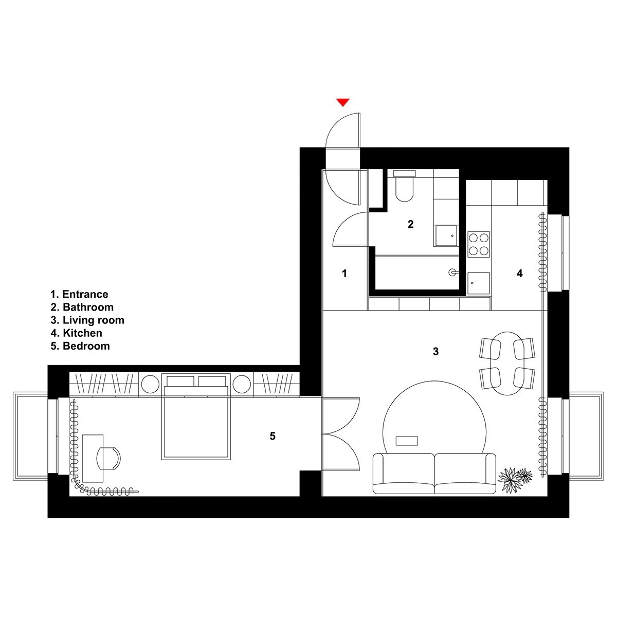
The second home in this tour uses circular accents in a much more overt way than the first home. At 55 square meters in size, it makes sense to open with decorative accents that make a big impact – there's not much room for extra furniture or artwork, so this home relies on artistic furniture for the best of both worlds.
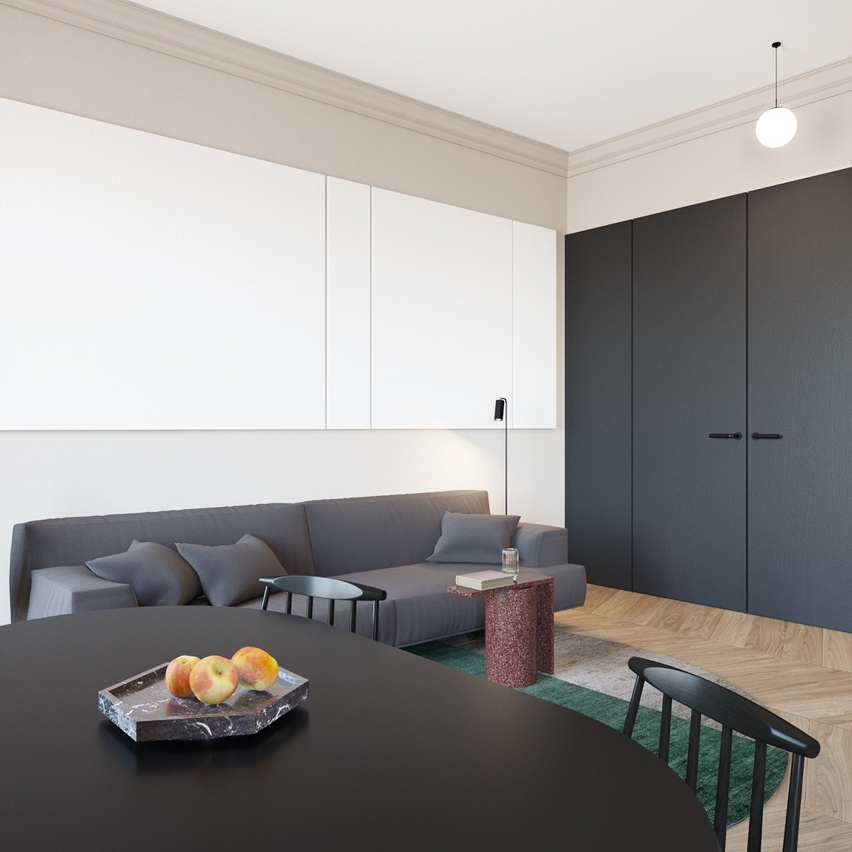
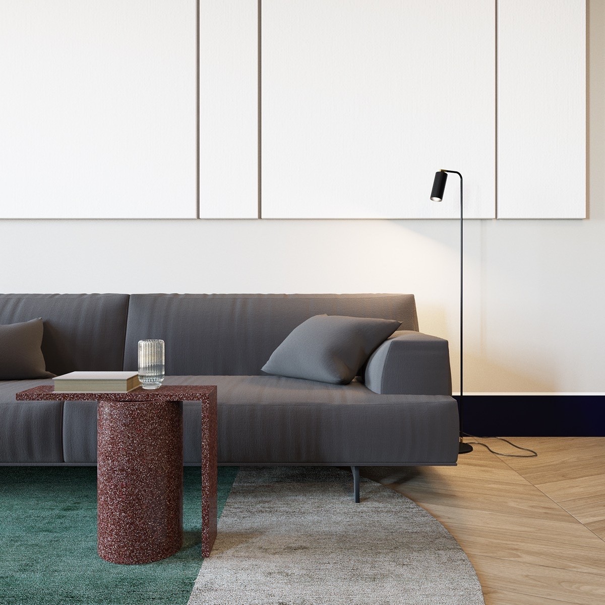
Other shapes help balance out the strong circular forms, like the irregular hexagon on the table and the clean rectangular lines of the panels in the background.
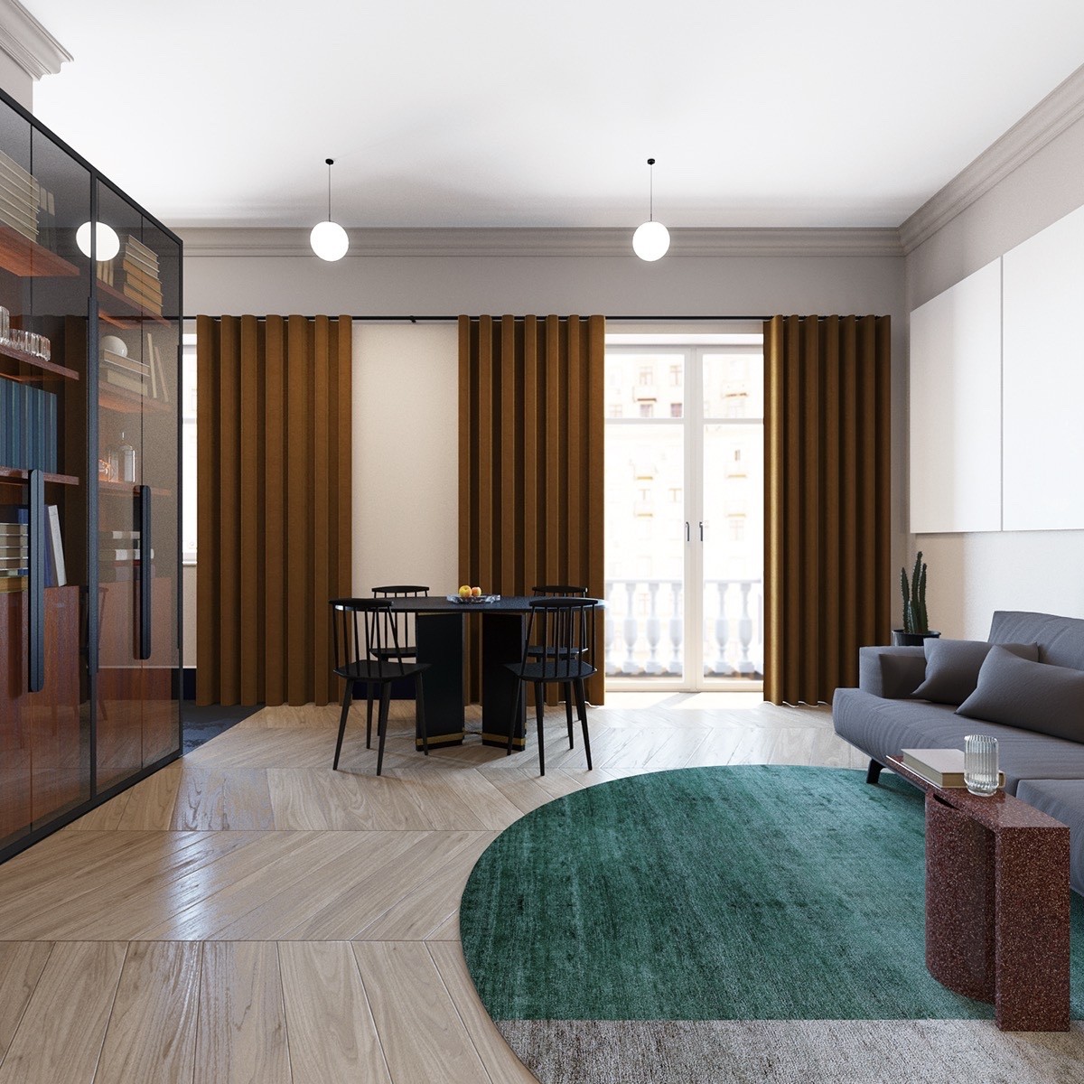
Even the curtains fold into perfect semi-circles to match the geometric theme throughout the rest of the room, while tying in to the reddish accents of the curtains and coffee table.
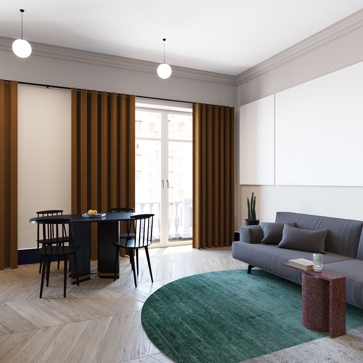
Living and dining areas coexist peacefully, neither getting in the way of the other nor blocking the exit to the terrace. Only visible as a faint outline, the classical-style balusters offer a stylish counterpoint to the modern interior.
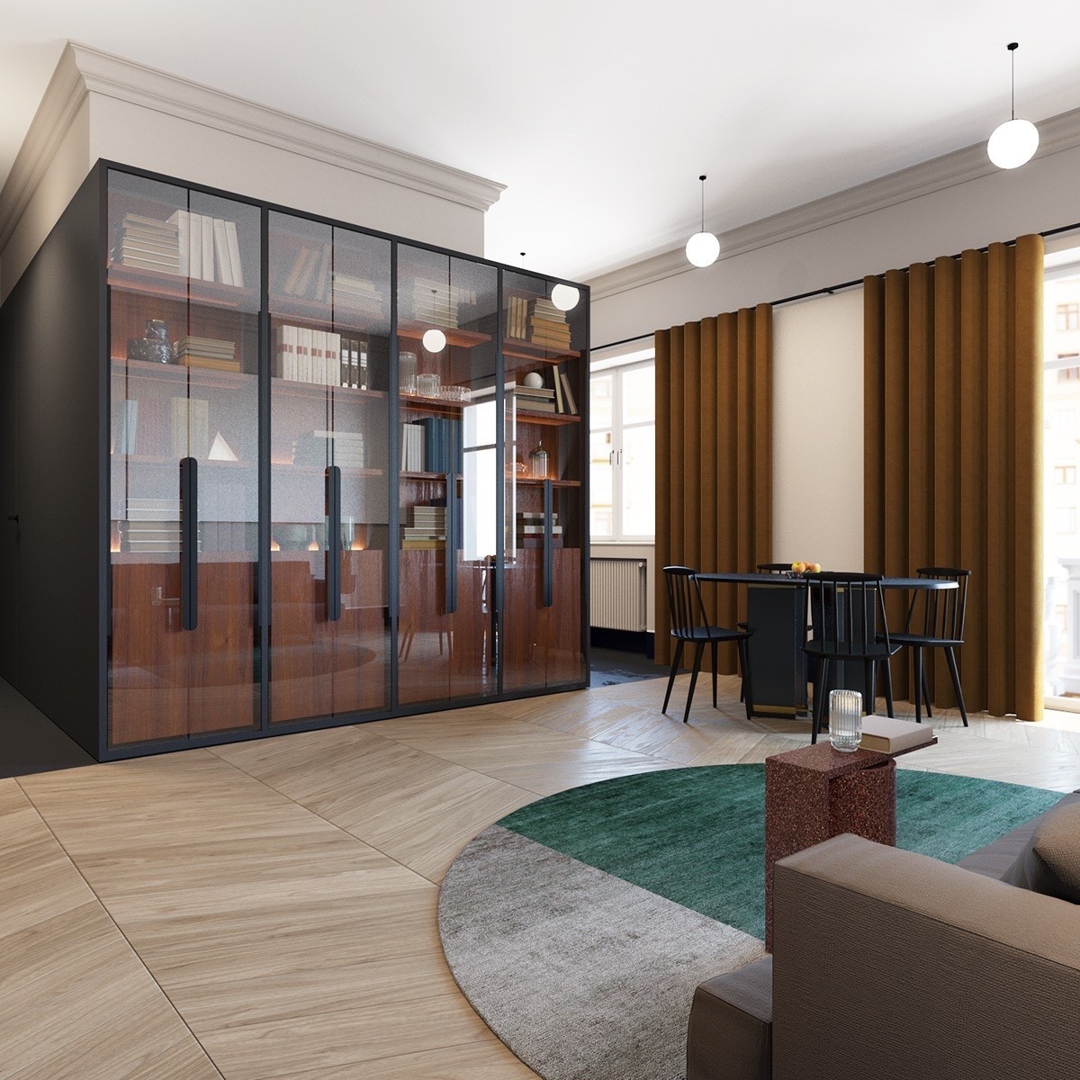
Many modernist homes attempt to hide storage space behind featureless white cabinets, these play up their purpose with glass doors and big bold handles.
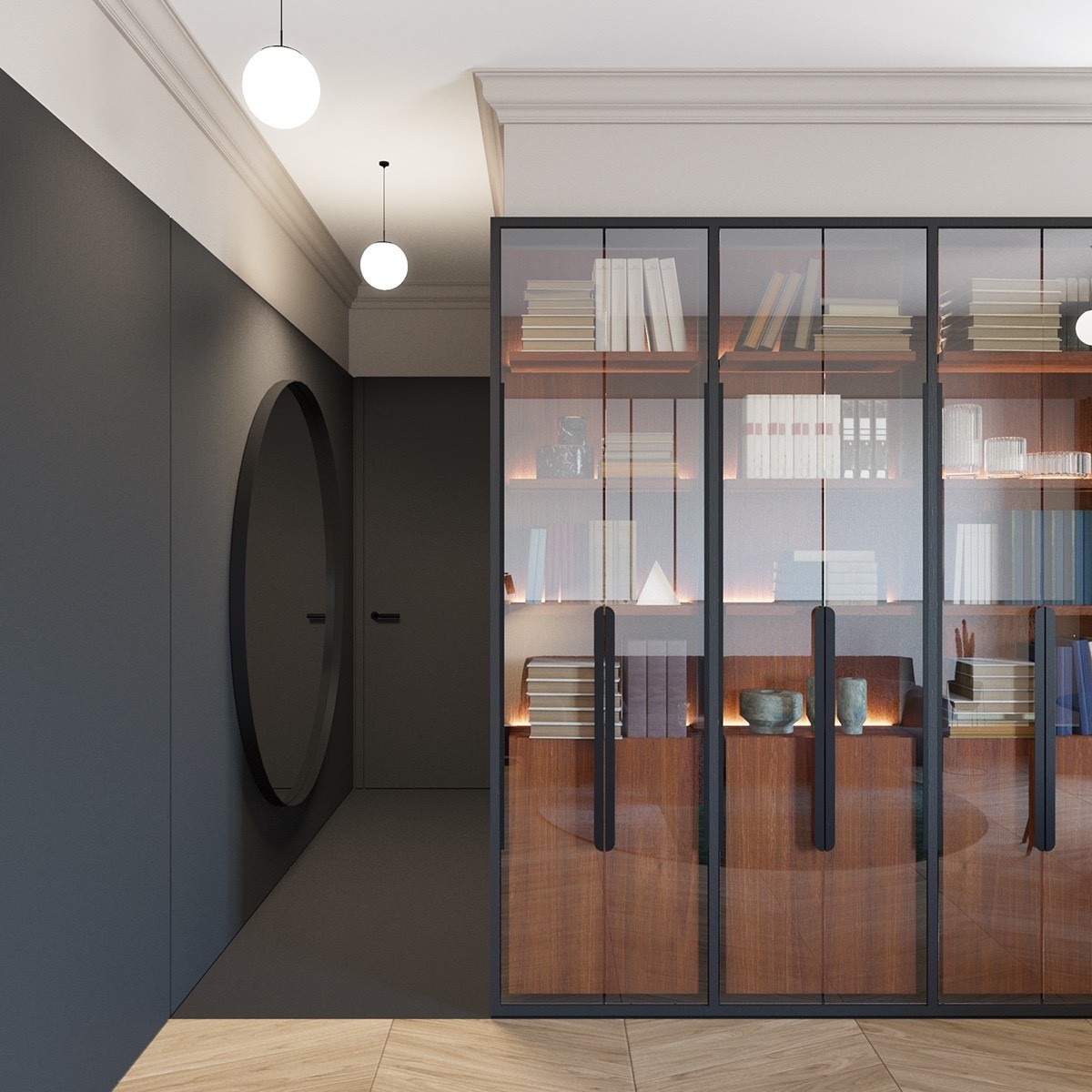
While the living room mixes classic features with smooth modern construction, other areas of the home – like this entrance – demonstrate a bravely artistic aesthetic.
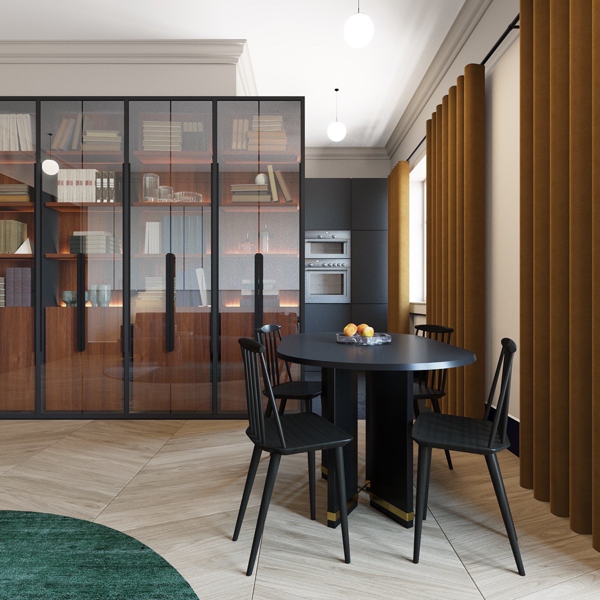
Sharing the same matte black theme used for the entryway, the gorgeous kitchen peeks out from behind the extended portion of the cabinetry. White crown molding cuts a sharp contrasting line near the ceiling.
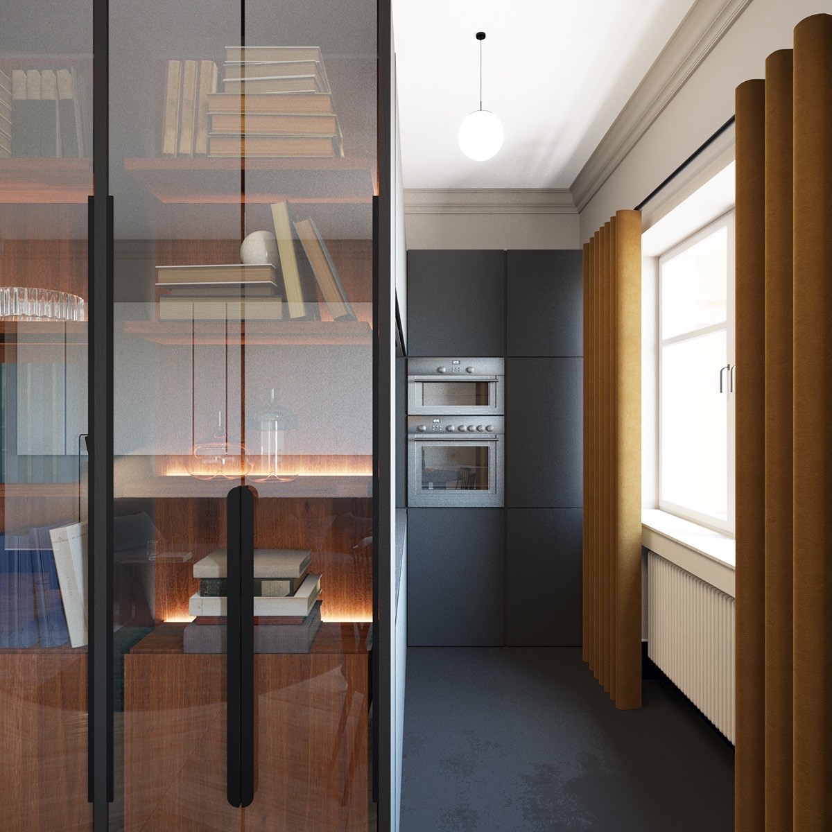
It has the same line-based layout as a galley kitchen, but terminates in a wall of appliances and cabinets rather than continuing through to another room.
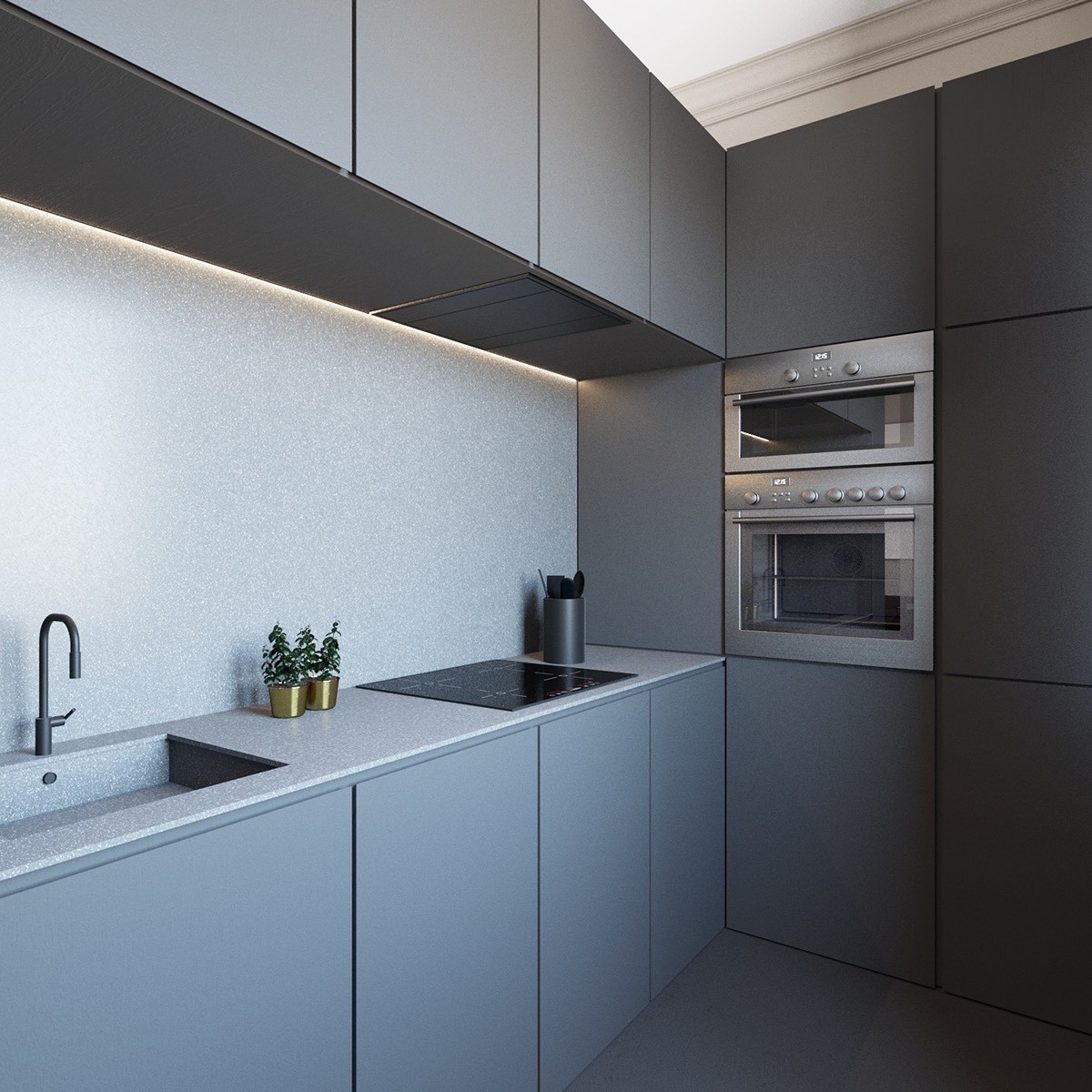
Sunlight is readily absorbed the matte surface – but instead of making the kitchen look too dark, it enhances the depth of the speckled backsplash and worktop textures.
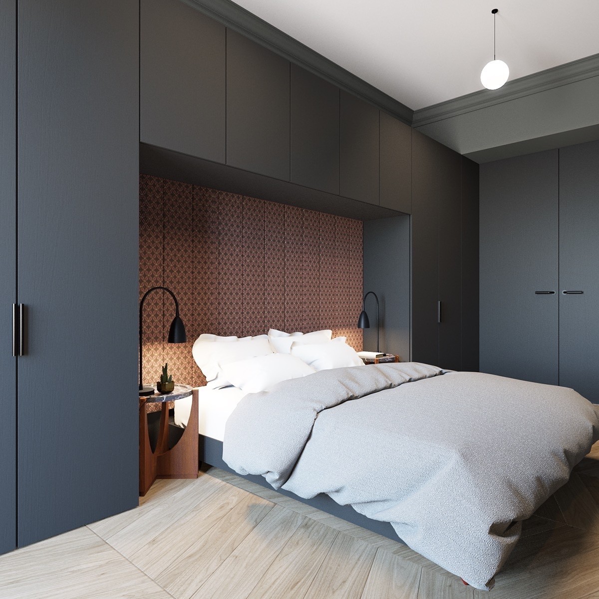
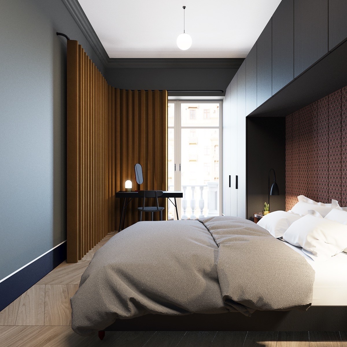
Finally, a look at the bedroom! The green secondary accent disappears, but retains the rusty orange color on the accent wall.
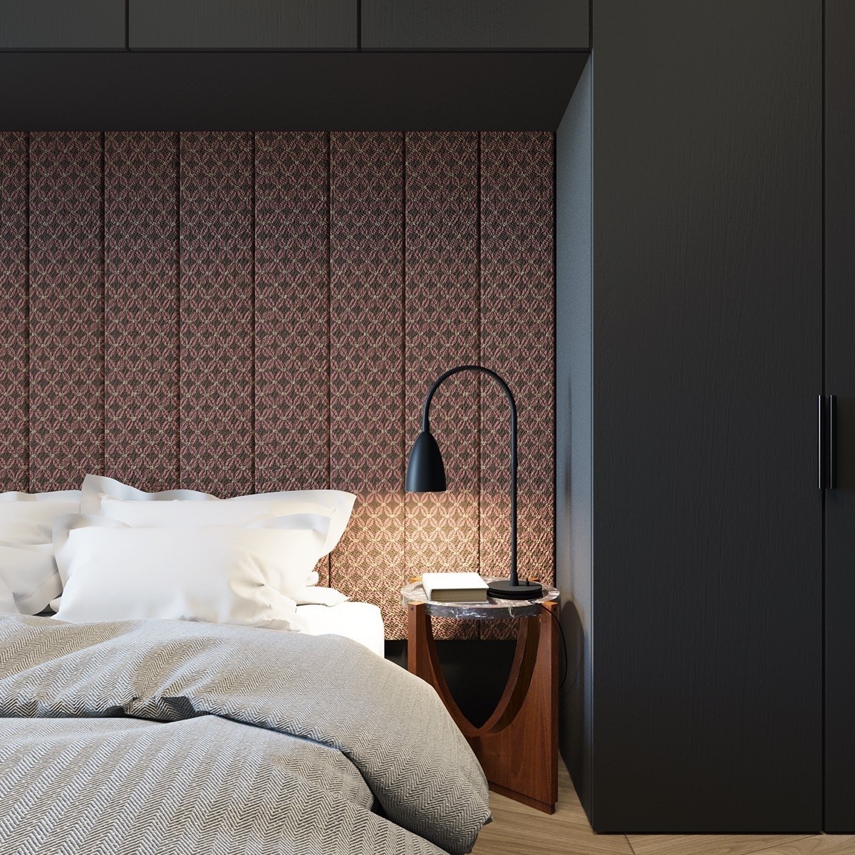
The half-circles formed by the side table and lamp serve as a subtle continuation of the curved living room furniture.
