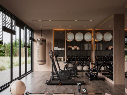
With a gorgeous plot on the Pacific coast in southwest Costa Rica, this 3000 square foot villa takes advantage of a gorgeous view through a tailored layout and smart furniture choices. Architect Tim Vordtriede and interior designer Angelina Alekseeva took full creative rein on this project at request of the Los Angeles based client – and the result is so fantastic we can only imagine the client is in love with the final product just as much as we are. Natural elements, sleek modern furniture, and innovative material applications offer plenty of inspiration for the aspirational minimalist: check out the full home tour below!
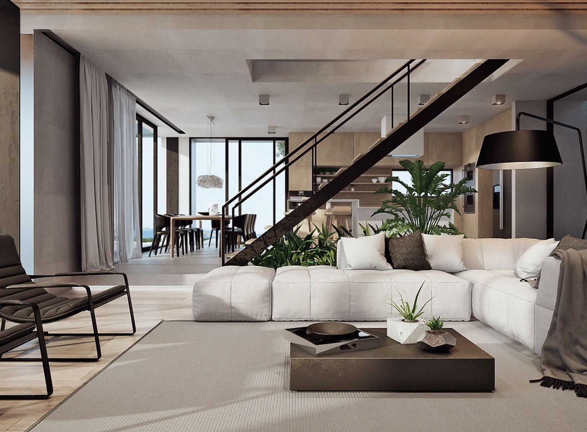
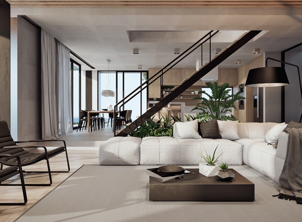
The interior maximizes its exposure to the gorgeous landscape with an open floor plan for the social areas, the kitchen and living room divided by a dramatic central staircase that ascends through a rectangular void in the concrete ceiling.
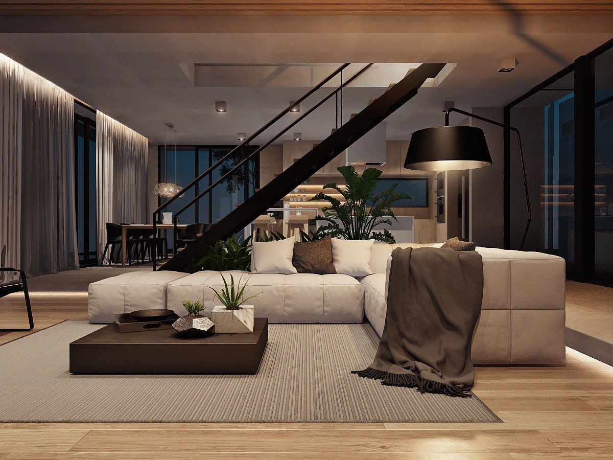
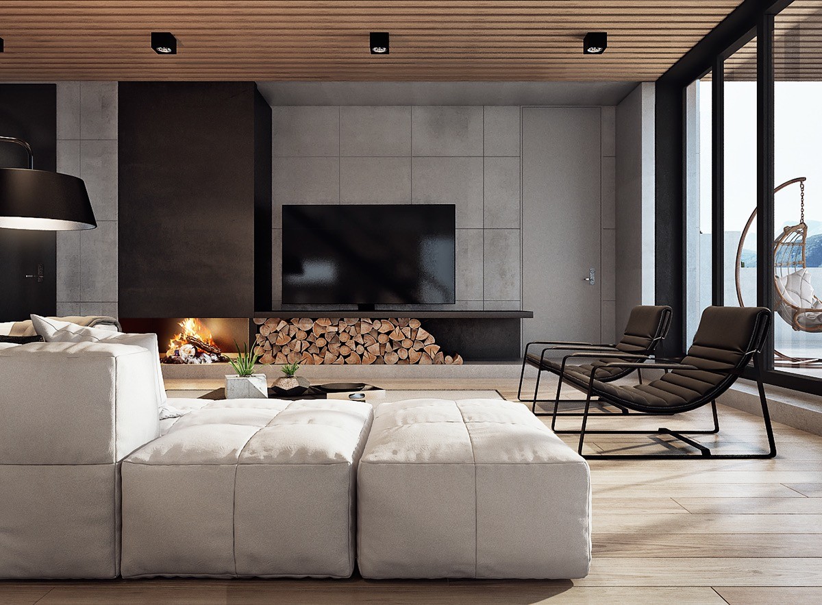
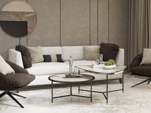
At night, curtains sweep closed and lights dim to foster an intimate and comfortable atmosphere. The brown accents seem neutral in the daytime but they come into their own under the warm lamp.
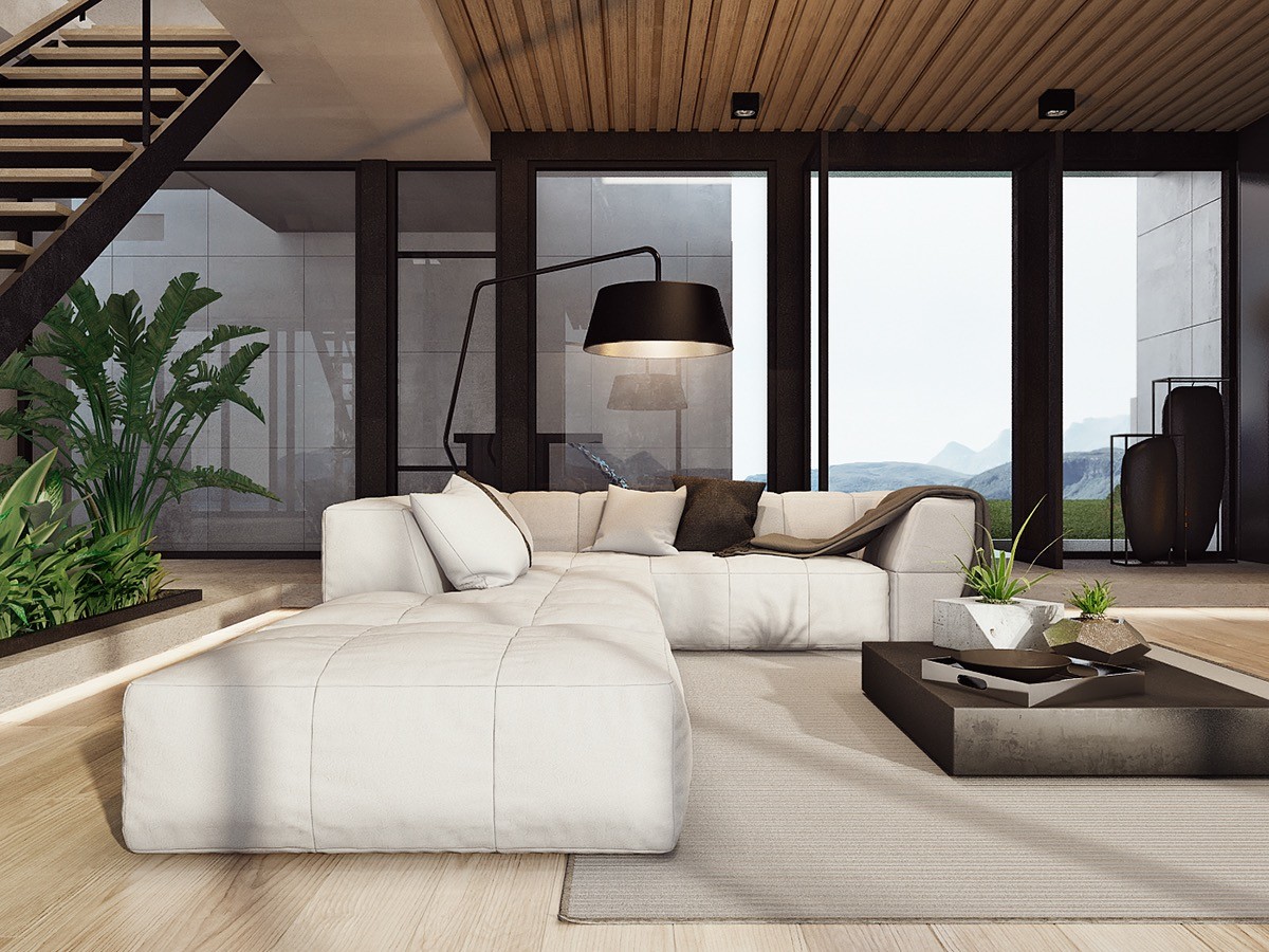
Natural materials play an important role throughout – wood floors and ceiling panels offset the minimalistic sofa and emphasize the amazing garden arrangement under the staircase.
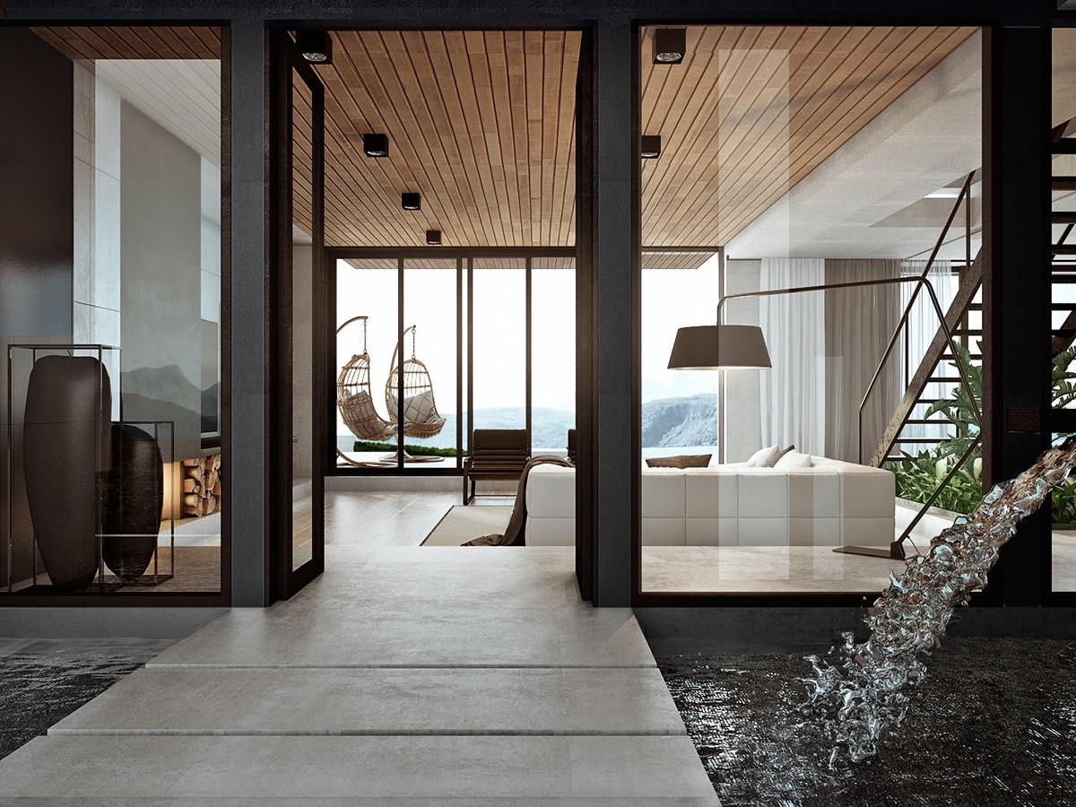
Enhancing its connection to the outdoors, the living room directly and indirectly integrates representation of the four elements: fire, air, earth, and water.
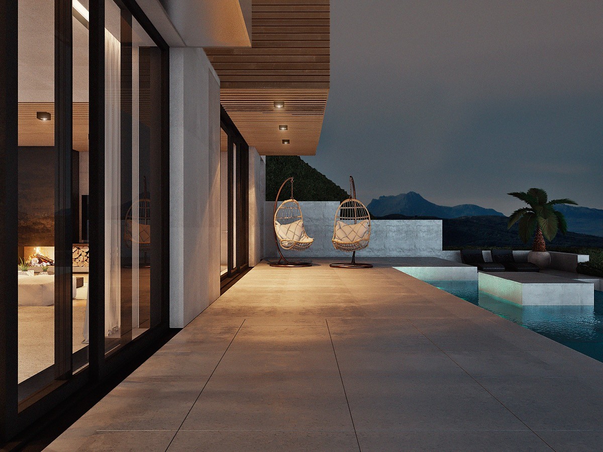
Want the hanging chair look but don't have a sturdy place to hang them? A stand does take up more space, but it's perfect for outdoor applications like this one.
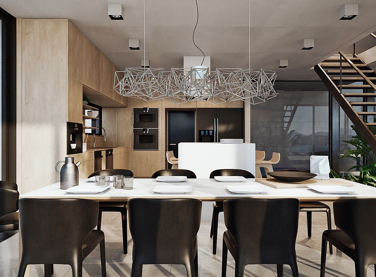
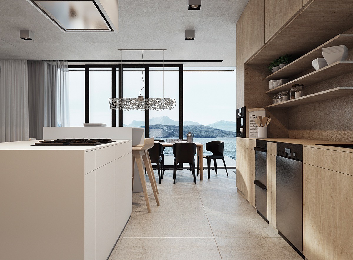
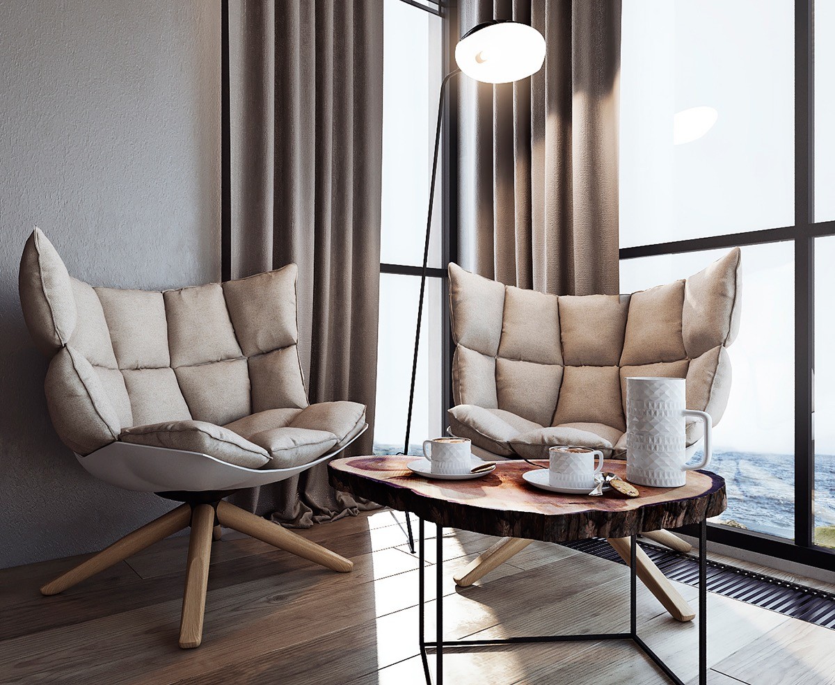
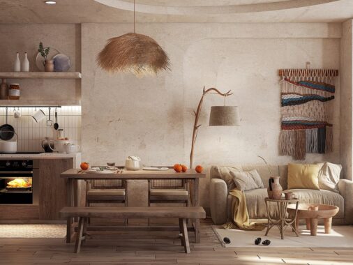
Back in the dining room, winged chairs offer a classic form wrapped in chic modern materials. Overhead, a tangled metal suspension lamp stands in contrast to the wood kitchen cladding in the background.
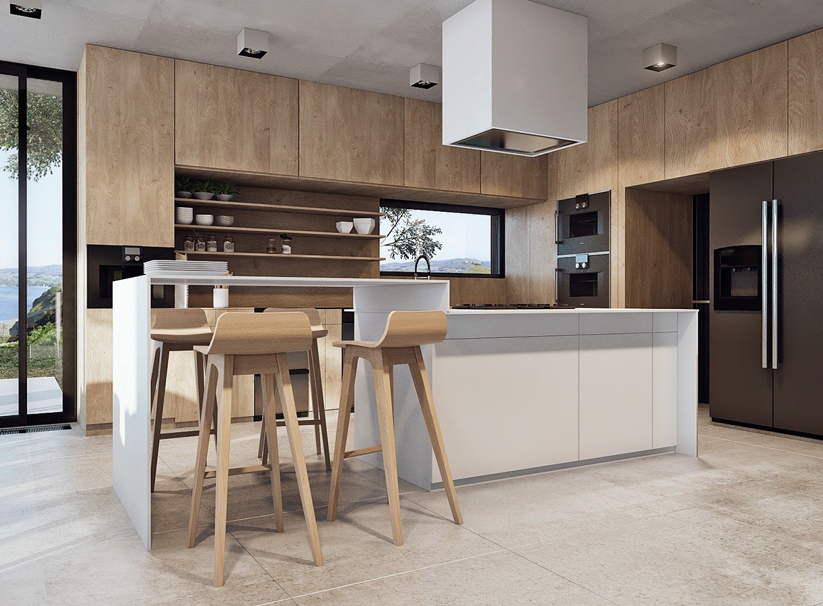
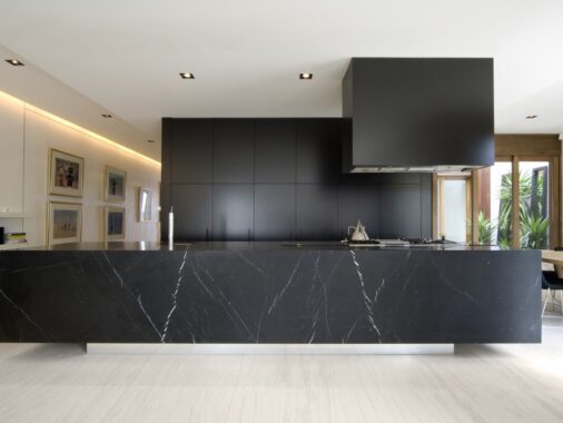
The kitchen utilizes creative expressions of popular design trends. The breakfast bar is exceptionally tall, no doubt to provide a better look over the formal dining arrangement out of frame to the left.
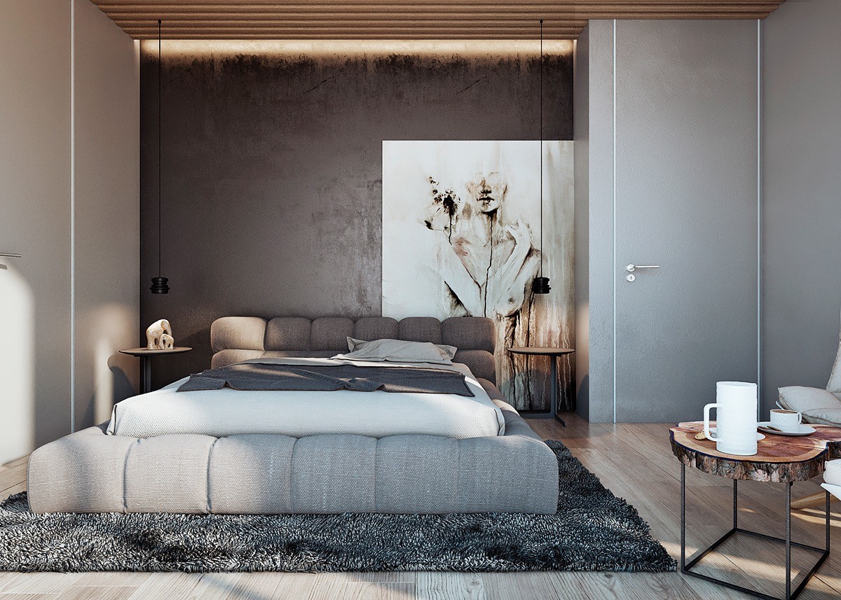
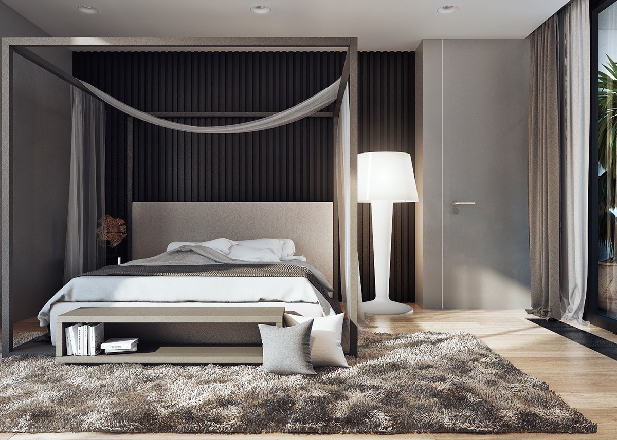
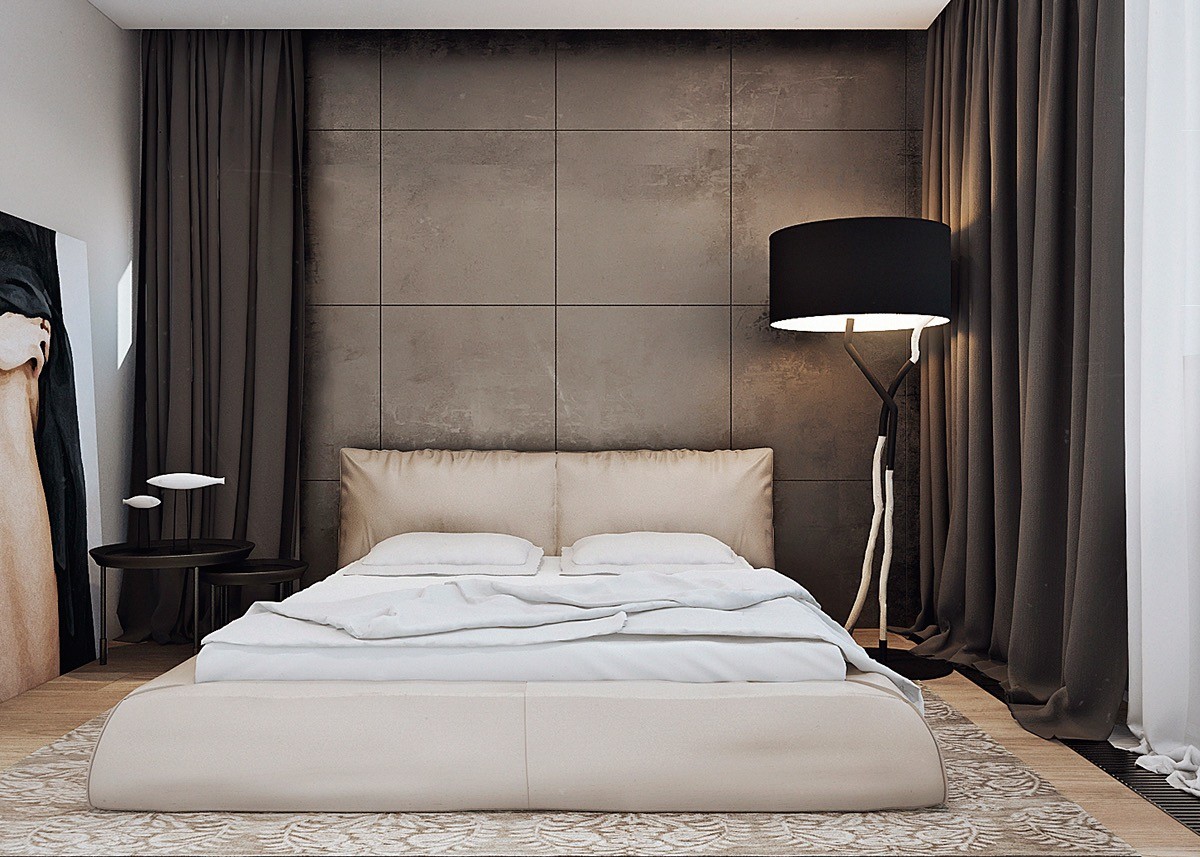
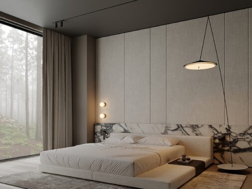
A darker palette fosters a peaceful environment in the bedroom. The materials remain similar to those used elsewhere in the house, but they see a bolder application here.
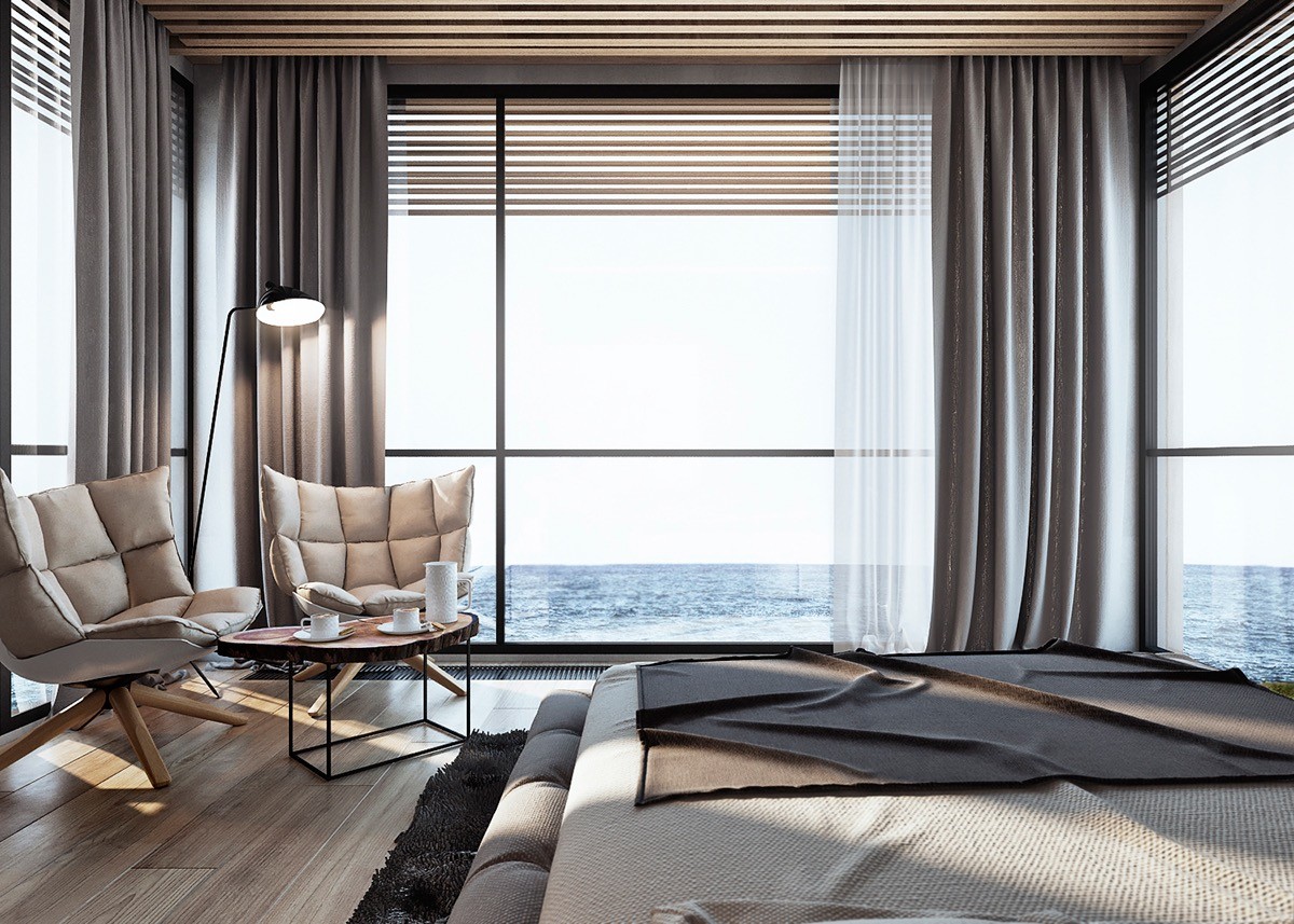
We just can't get enough of the fabulous setting, but this bedroom absolutely relishes it. Positioned between two corner windows, it almost appears to float above the Pacific waves.
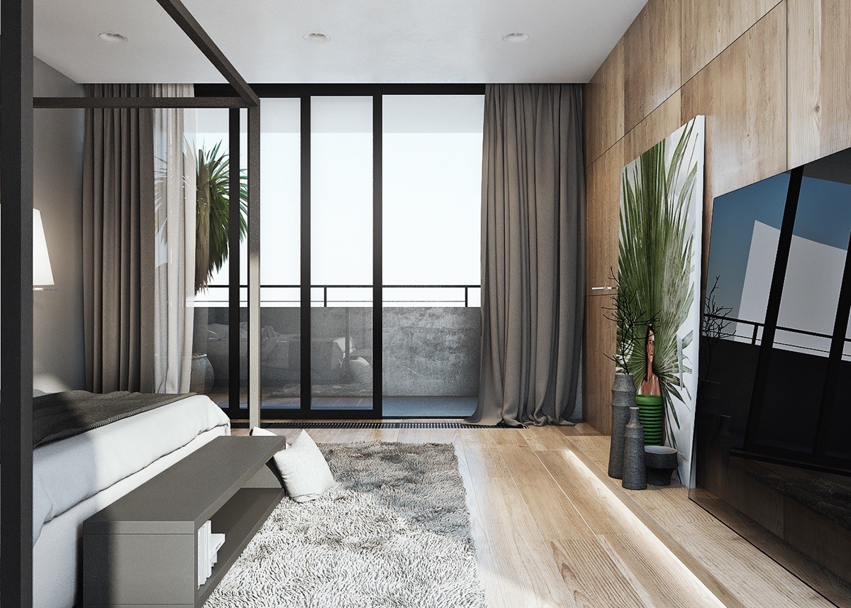
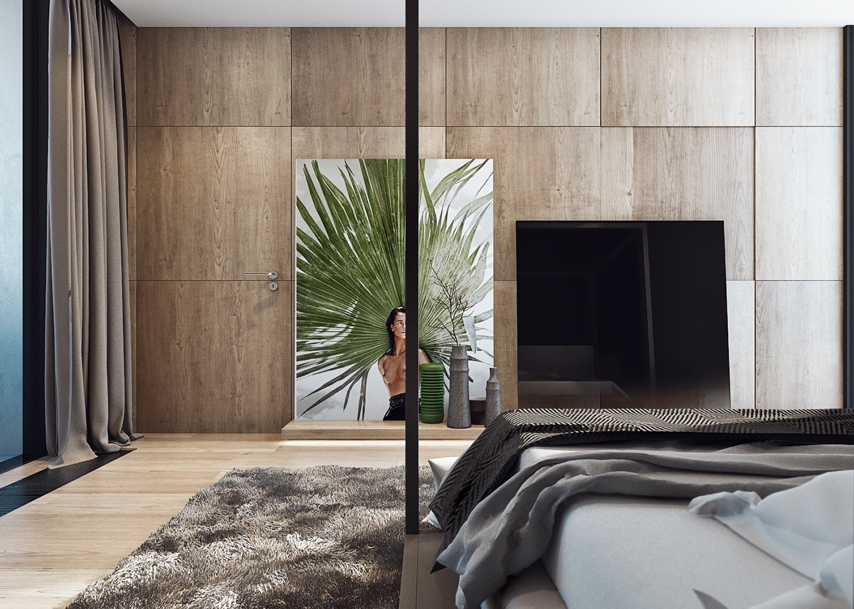
The bed faces a media center and artwork rather than the window because the view is partially obscured by a concrete balcony wall.
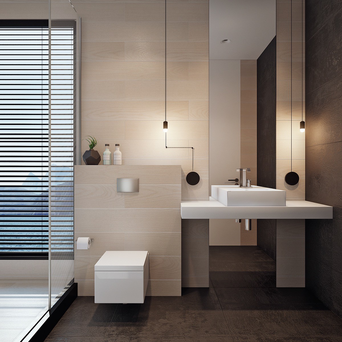
During a home tour, everyone wants to see the bathroom – bathrooms are difficult to decorate, and their level of privacy means there are fewer visual examples to draw from.
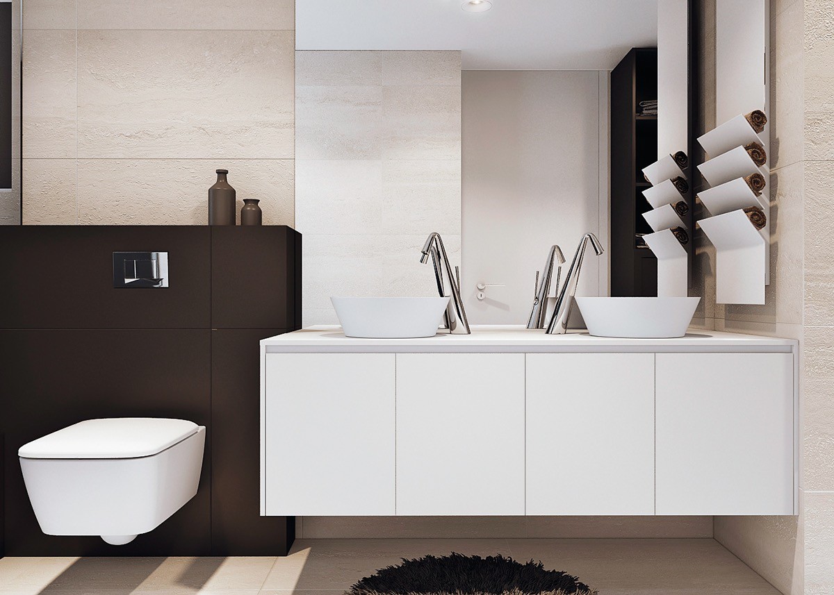
Each of the bathrooms use similar color palettes but the end results are all quite different. This one uses matte black and white paneling for a sleek modern look, yet retains a natural aesthetic with textural stone cladding.
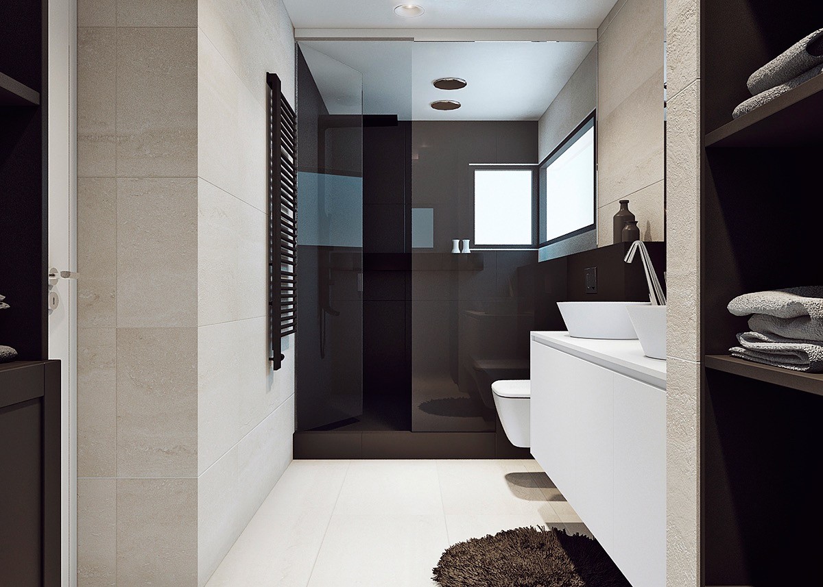
Matte black tiles appear in the glass-enclosed shower as well, focusing all attention on the view outside the windows.
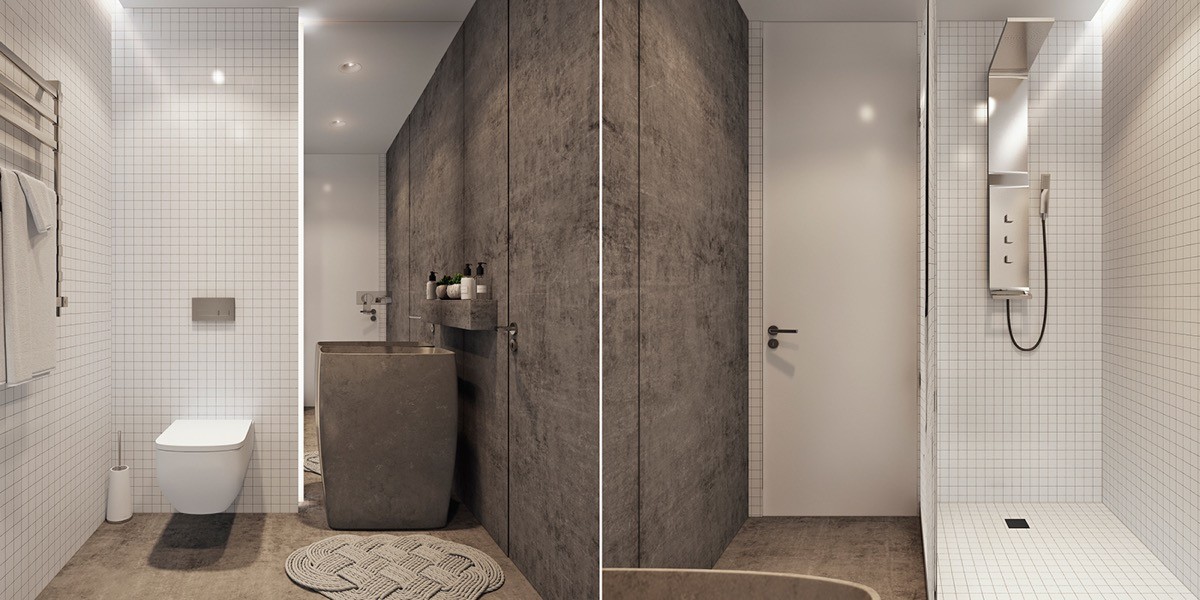
This bathroom includes a distinctive combination of materials: classic white tile and modern brushed concrete.
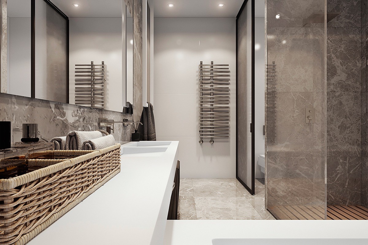
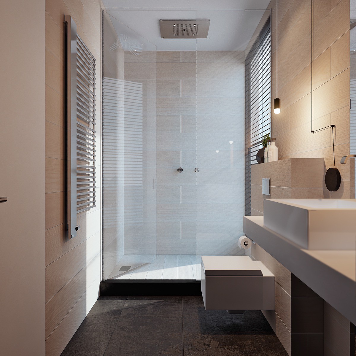
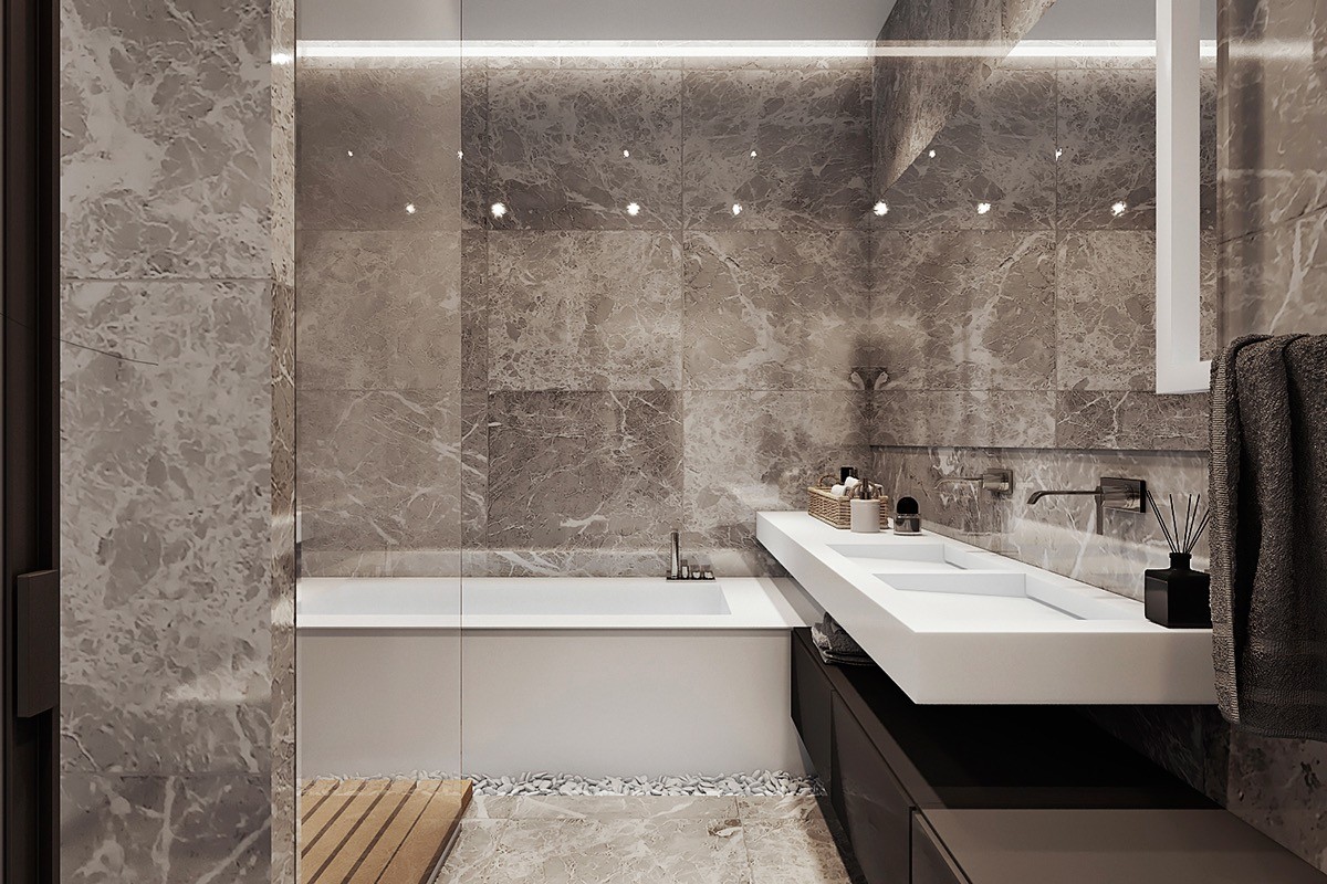
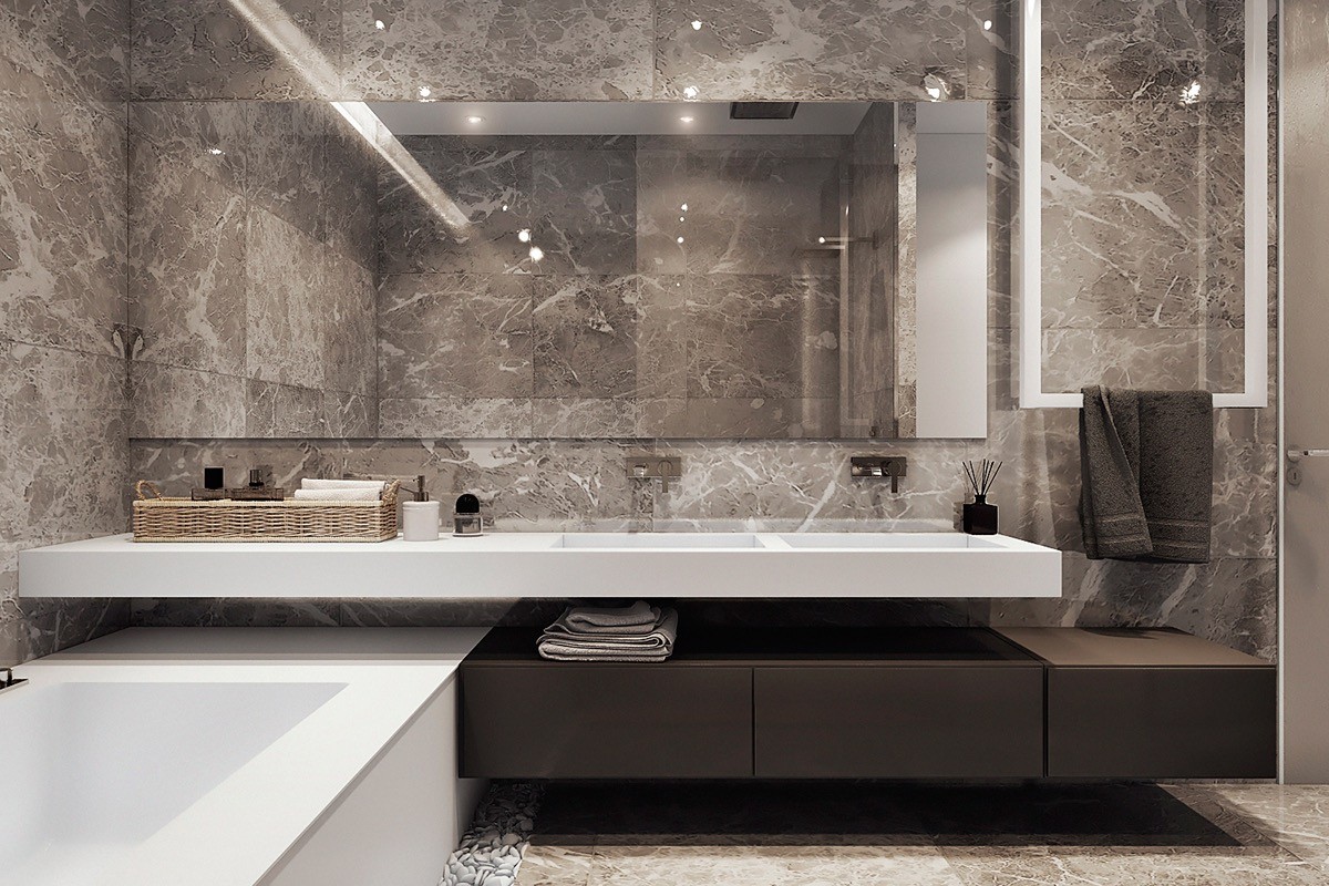
The final bathroom offers a strong contrast between humble and luxurious natural materials: richly veined stone, a wood shower floor, and wicker organizers.
