From material to lighting to layouts, interior design trends move in and out of style at an amazing pace. This post features five living rooms that embrace current best practices but in ways that will likely remain appealing for years to come. Some of these spaces are subdued and subtle, sparking interest without overwhelming the eye. Others take a bolder approach yet reduce risk by anchoring their designs around traditional features or palettes. Most importantly, these living rooms explore the ideas most popular in contemporary design without blending into one homogeneous group – each has its own distinctive personality.
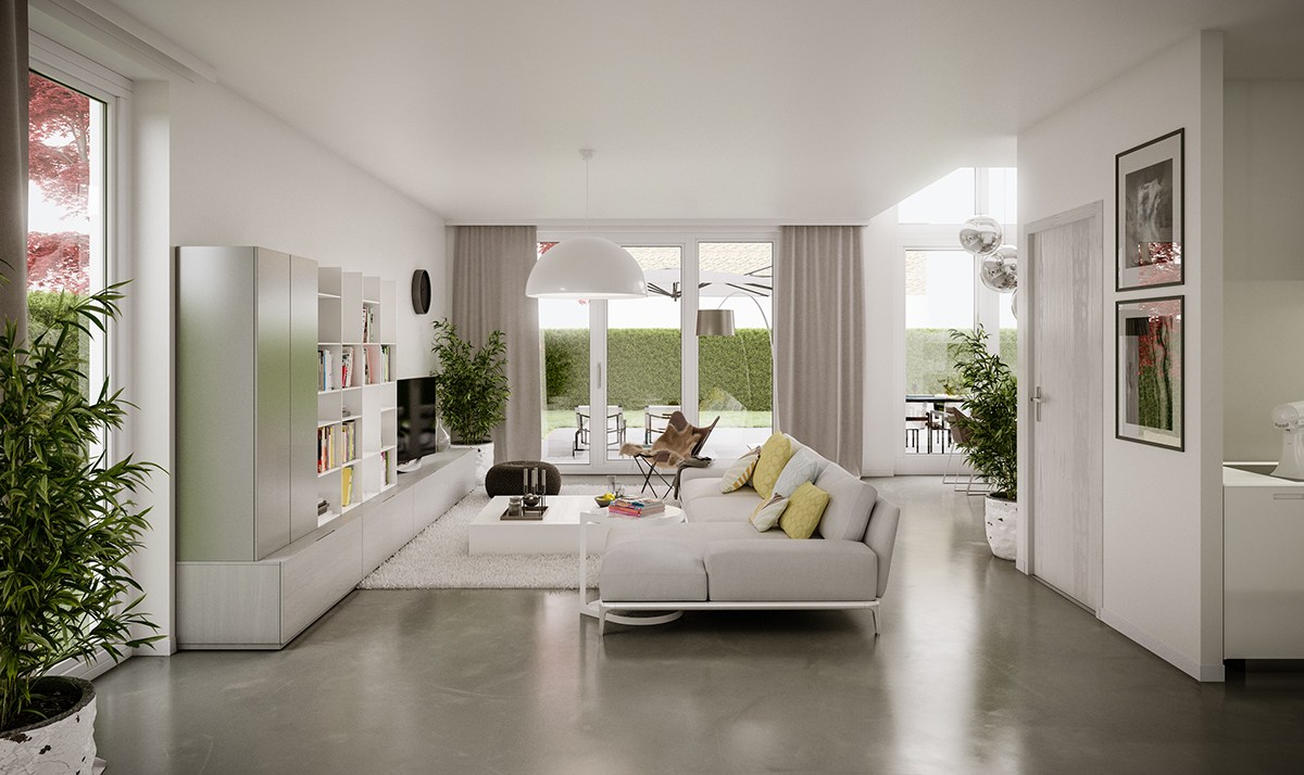
Let's start with an uplifting pastel design. This cheerful white living room uses pale yellow as a primary accent, with many colors of the rainbow appearing throughout. The layout is open but wraps around a central volume in an L-shape for better division. Abundant windows don't sacrifice any privacy at all thanks to the huge hedges outside.
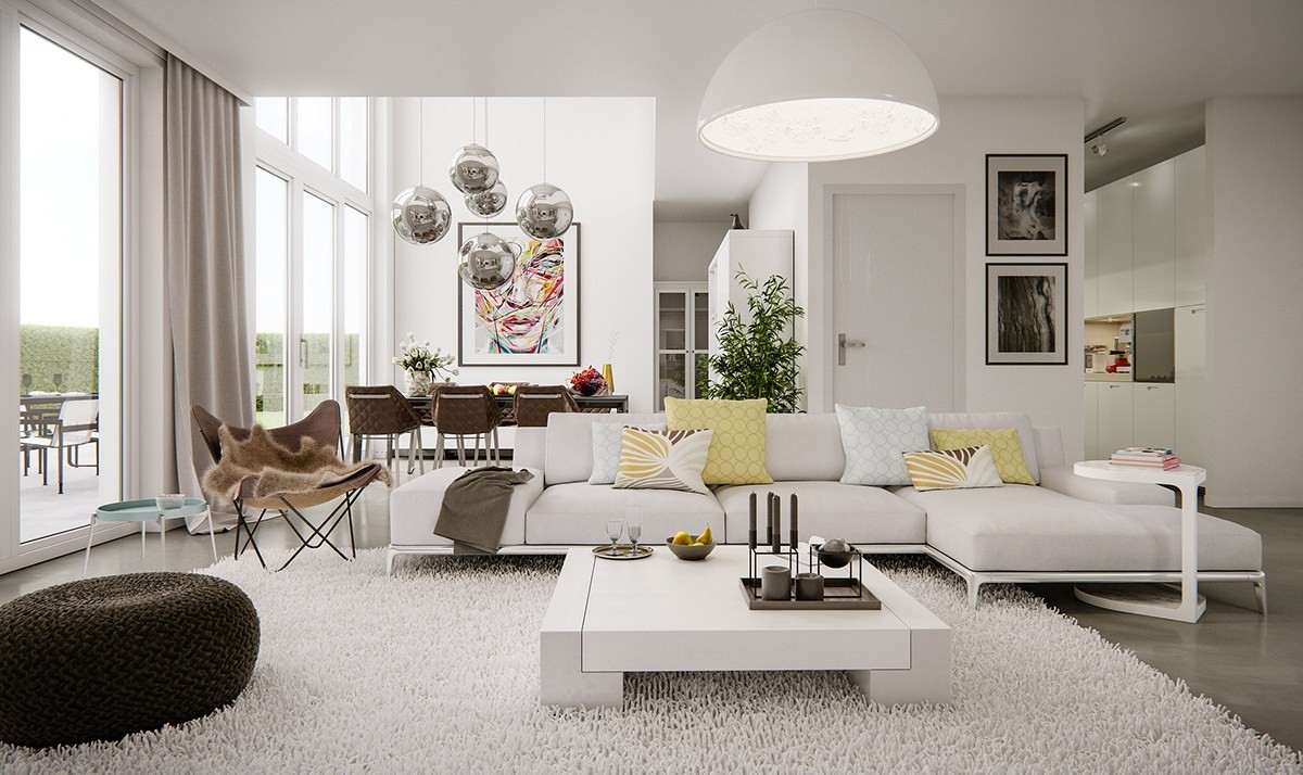
Stunning feature lighting guides the eye from one functional area to the next. Here, the sofa arrangement basks in the light of the Skygarden lamp by Marcel Wanders. Artwork behind the dining table incorporates some of the colors found in the living room.
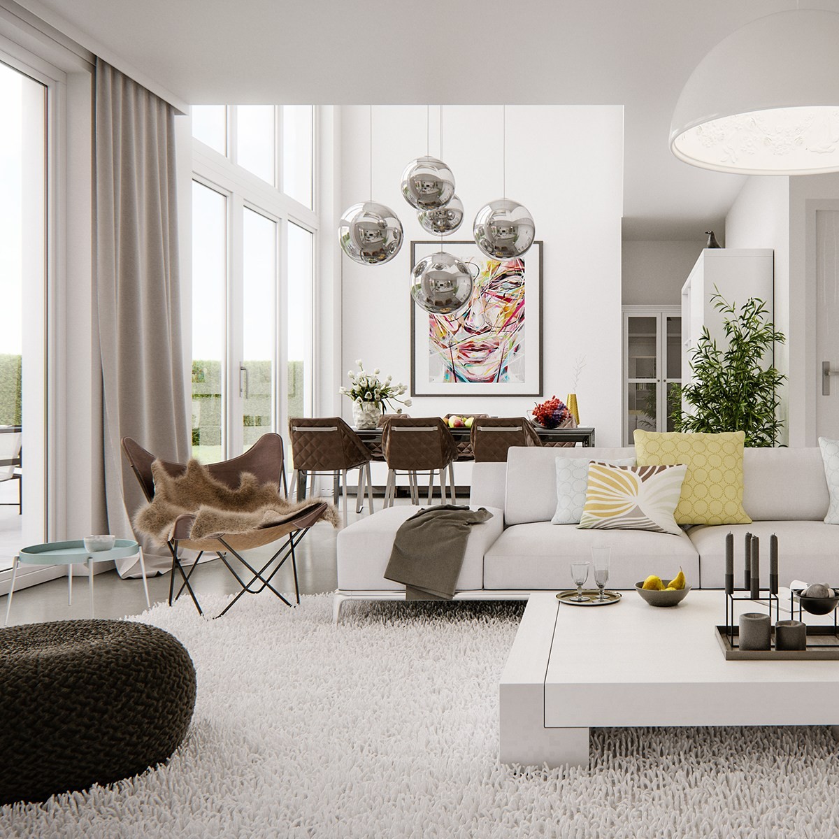
Plants and earthy furniture unite the interior with the unobscured view of the outdoors. The dining room has an especially amazing position: a double-height wall of windows gives a full view of sky and landscape. Floor poufs add to the comfiness as well.
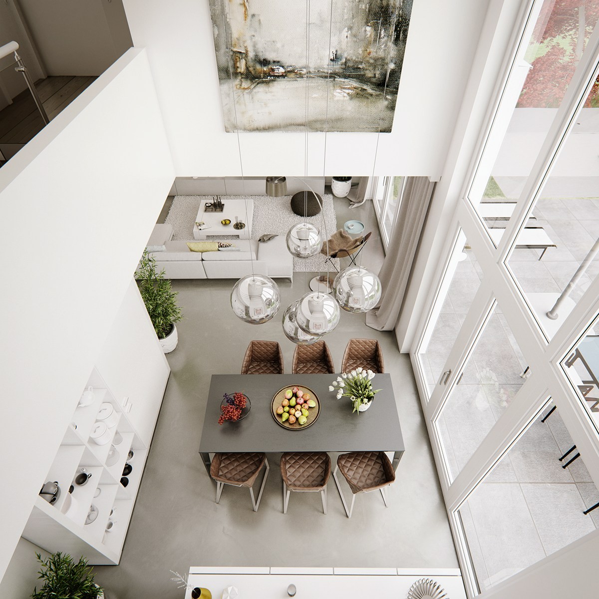
It's not easy to find artwork to suit the scale of a wide-open atrium wall like this one. This painting flawlessly integrates the natural colors used throughout the dining and living spaces.
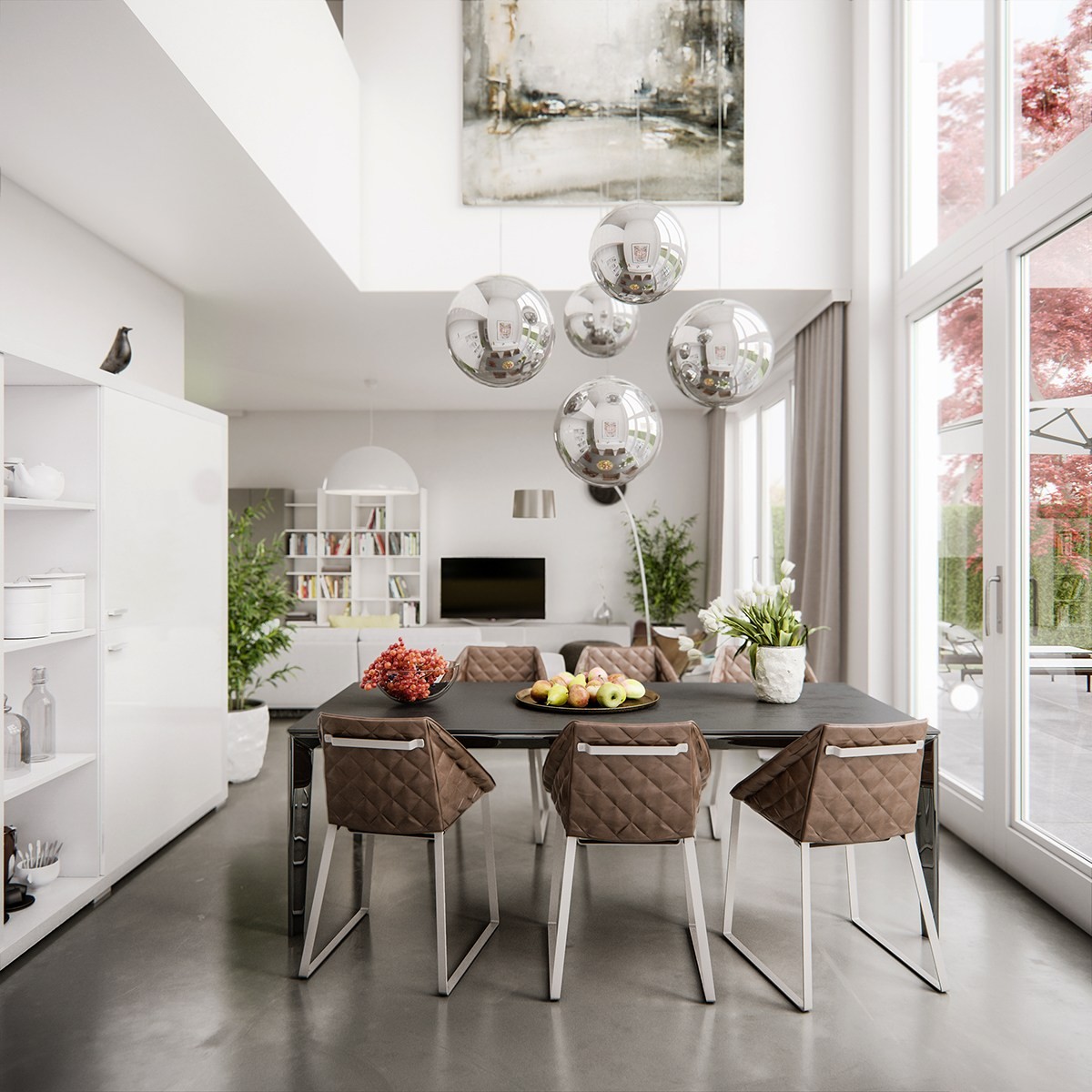
Diamond upholstery, chrome spherical lighting, and playfully angled chair legs all come together for an interesting geometric aesthetic in the dining room.
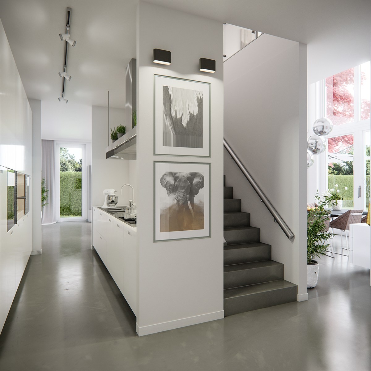
Just around the corner from the living room, a compact galley kitchen occupies a tiny hallway created by the stairway enclosure.
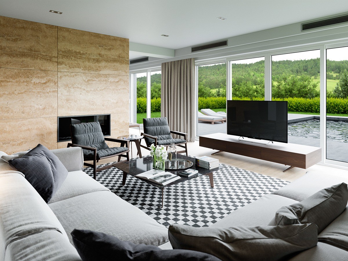
Here's another space that brings the outdoors in! This modern living room relishes its unique configuration, with its seating area looking out over the pool and toward the gorgeous landscape beyond. Contemporary furniture inspired by midcentury designs offers a touch of classic simplicity and maintains a low profile to preserve the view - making it possible to enjoy media while maintaining a reasonable line of sight over the TV stand. A glass vase with fresh flowers brings the verdant surroundings into the interior.
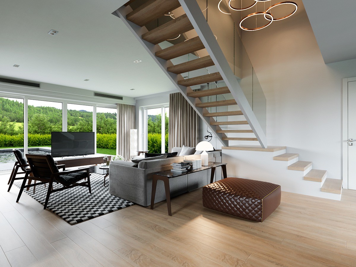
A central staircase punctuates the middle of the room. Ring lamps hang in the open void of the atrium above, with a pouf and table making good use of the space beneath.
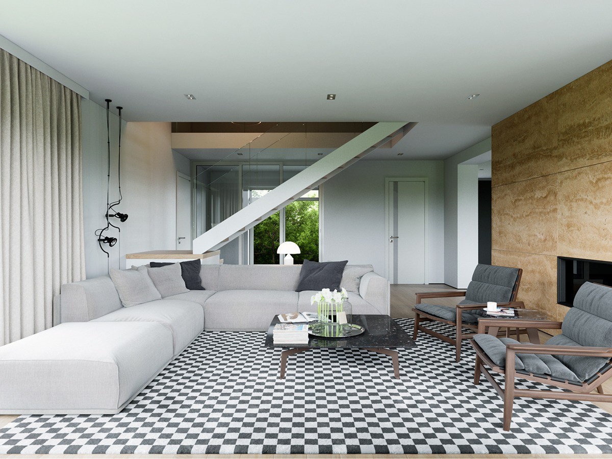
Jean-Marie Massaud's IPANEMA armchairs and the square-topped Tribeca table make a fabulous combination. The checkered black and white rug is a very creative choice, eliminating the need for prints or patterns elsewhere.
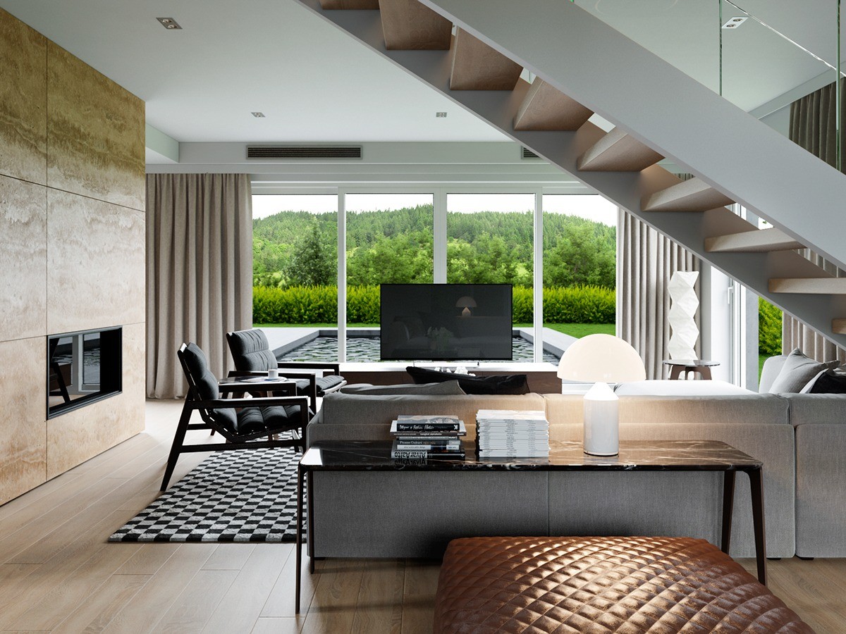
These little behind-the-sofa tables are a great way to prevent a central sofa from looking too plain from behind, and serve as a handy place to store books out of the way. This one is lit by the Atollo Lamp by Vico Magistretti.
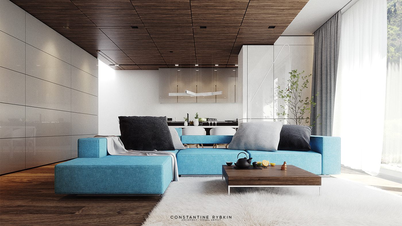
This home design in Lugano, Switzerland, offers a cheerful approach to a minimalistic and natural interior. The bright blue sofa with oversized gray pillows definitely makes a bold first impression. It's the only non-neutral piece used throughout the entire living room, yet this block of color more than invigorates the room.
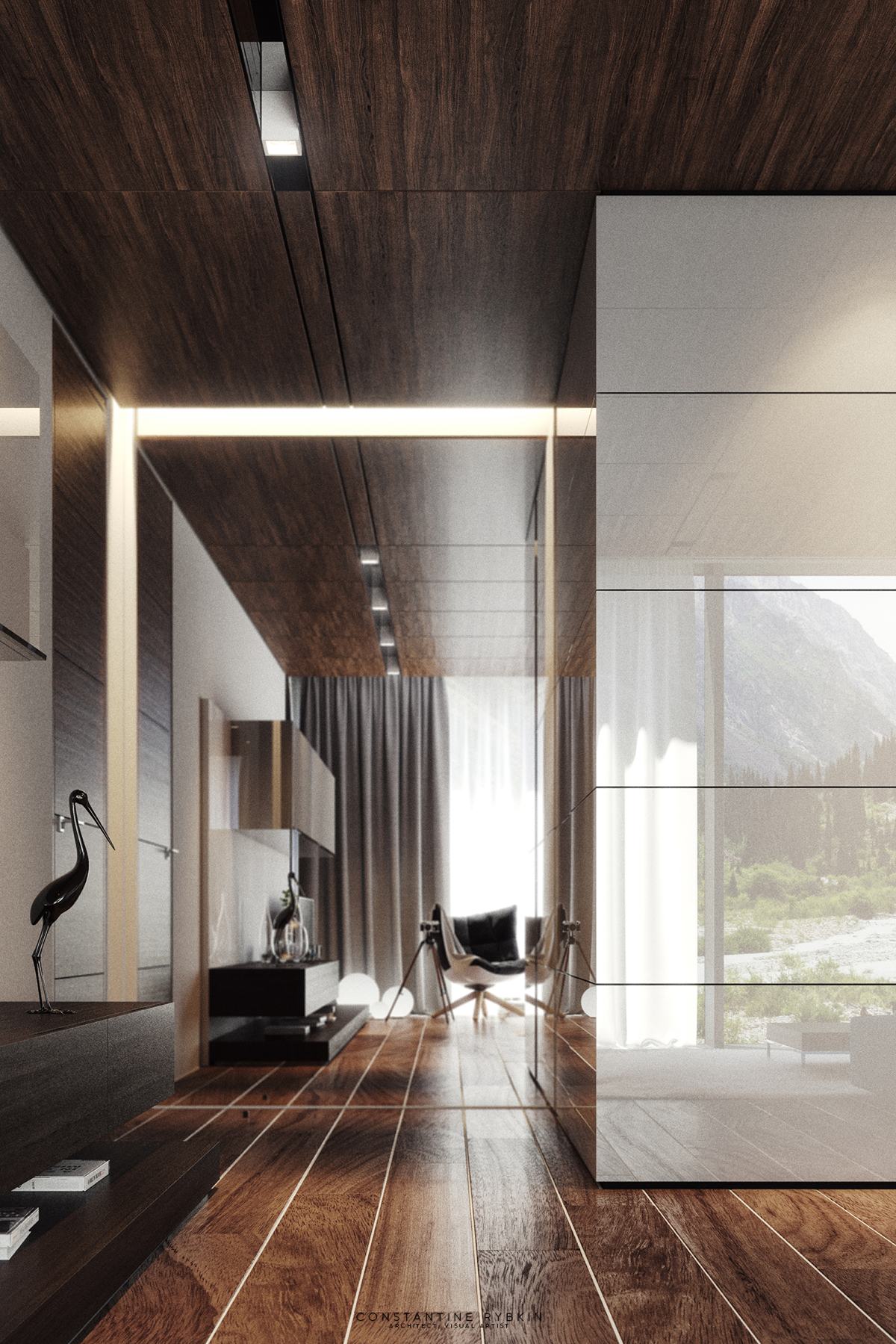
While decoration remains spare throughout the rest of the house, the rich layered textures and geometric arrangements provide all the ornament this luxurious design requires.
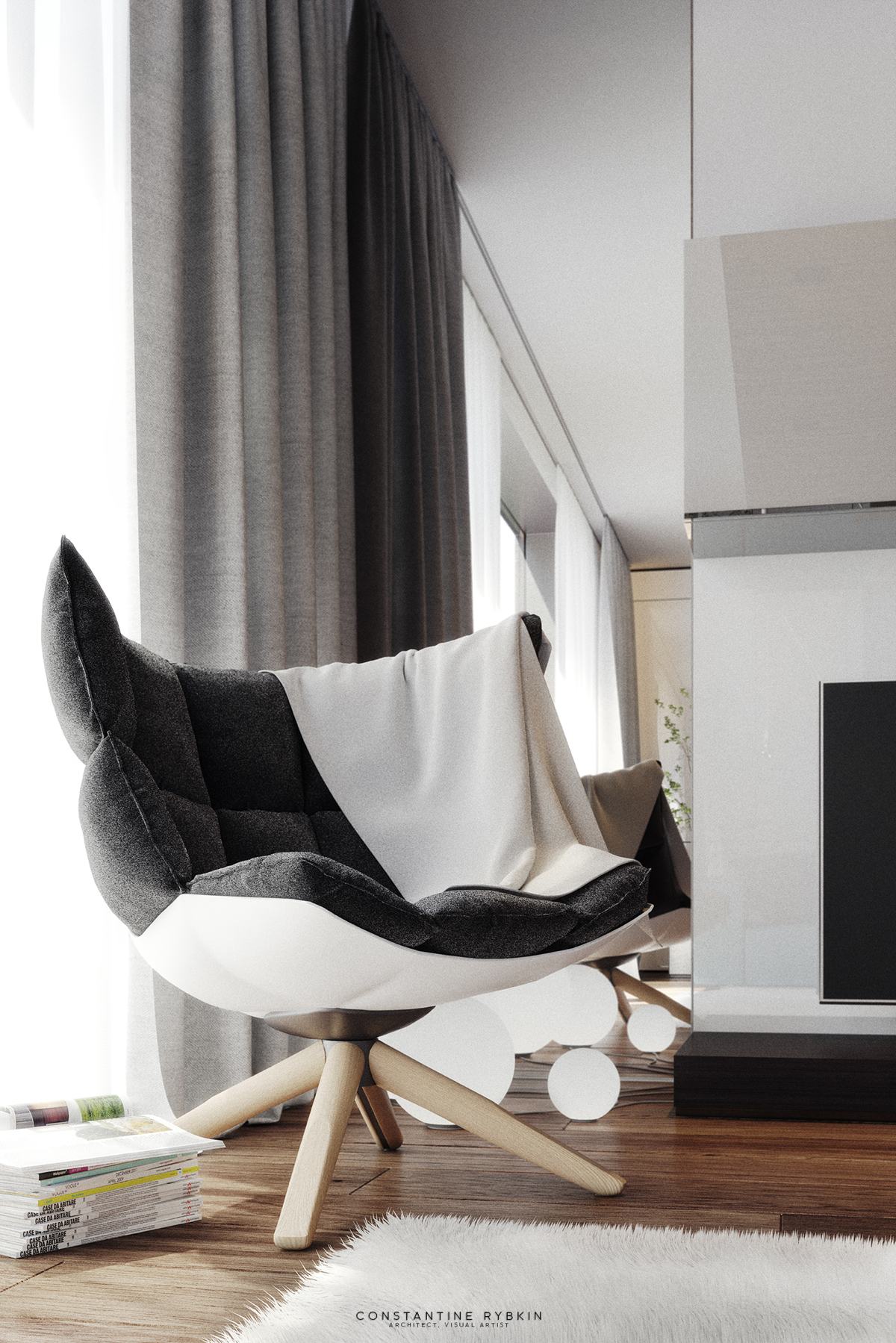
Iconic furniture like the Husk Chair adds another layer of quality and style. Other decor objects enjoy unique applications, like the Dioscuri table lamp on the floor in front of the mirror.
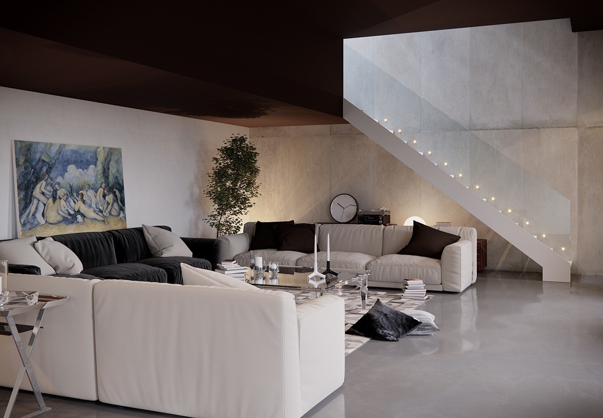
What a comfortable and relaxing space! This living room uses low lighting and bold contrast to foster an atmosphere of wonder and intimacy. Natural sunlight filters down from the top of the staircase and indirect fixtures cast a warm glow over the concrete walls and polished floors.
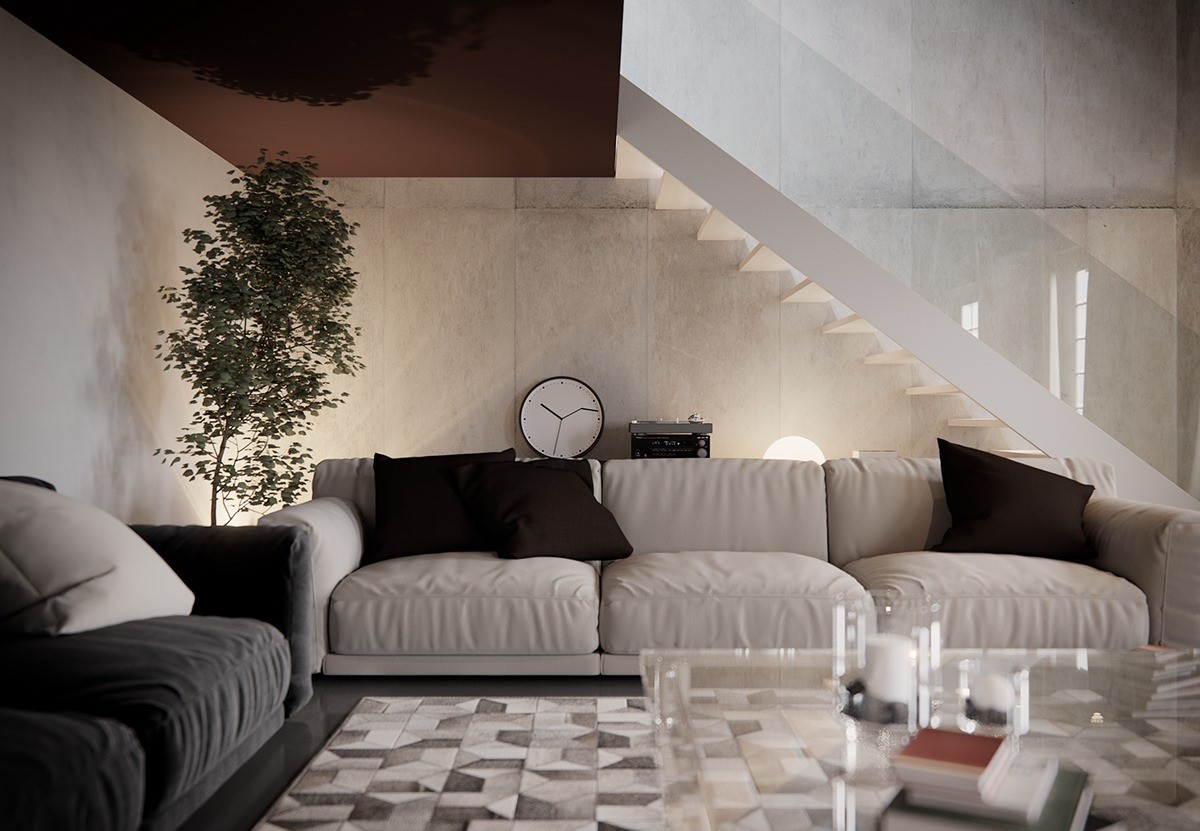
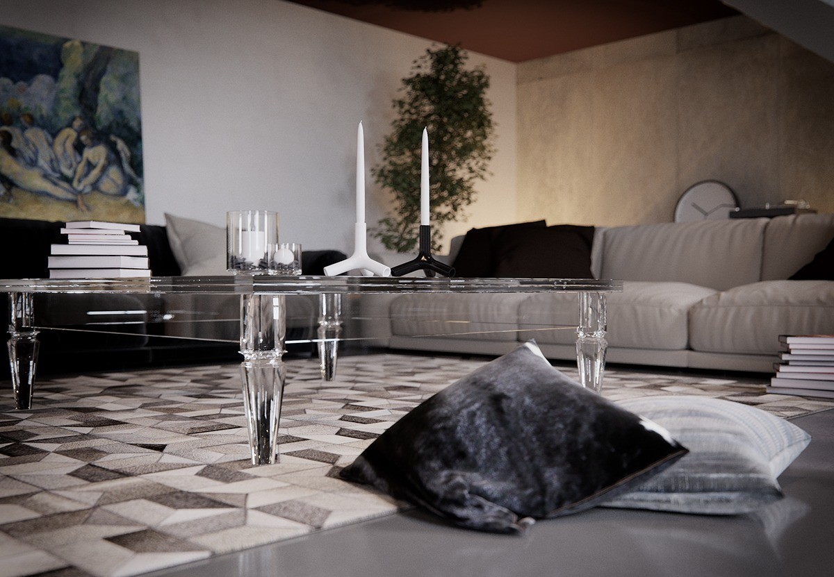
Black and white accents find middle ground with the grayscale rug in the center of the seating arrangement. Transparent furniture and bannisters demonstrate the lighter side of industrial design.
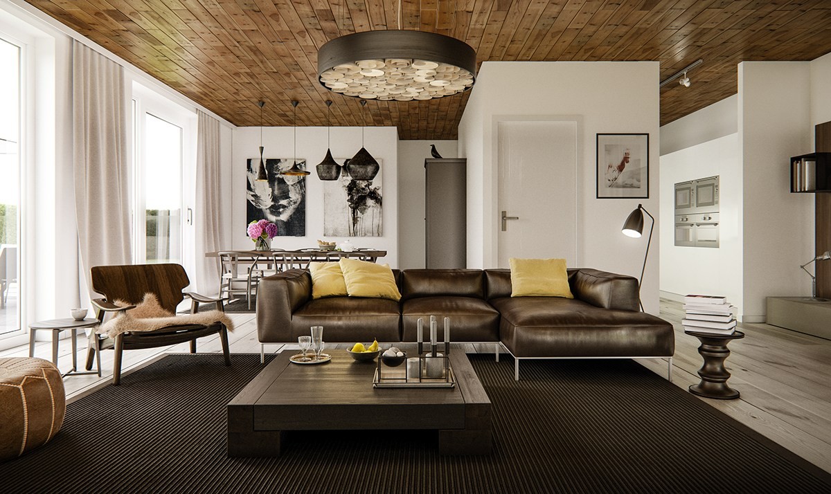
Warm, natural, and classic – this living room uses dark colors for functional areas between its pure white walls. The ceiling makes an especially bold statement with its small knotty boards and deep bezels, reversing the expectation set by the lighter wood floor. The mid century lounge chair and the Arne Jacobsen floor lamp completes the room.
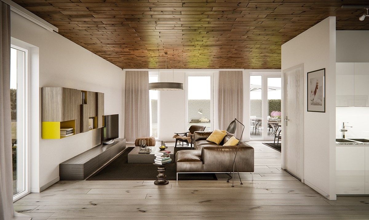
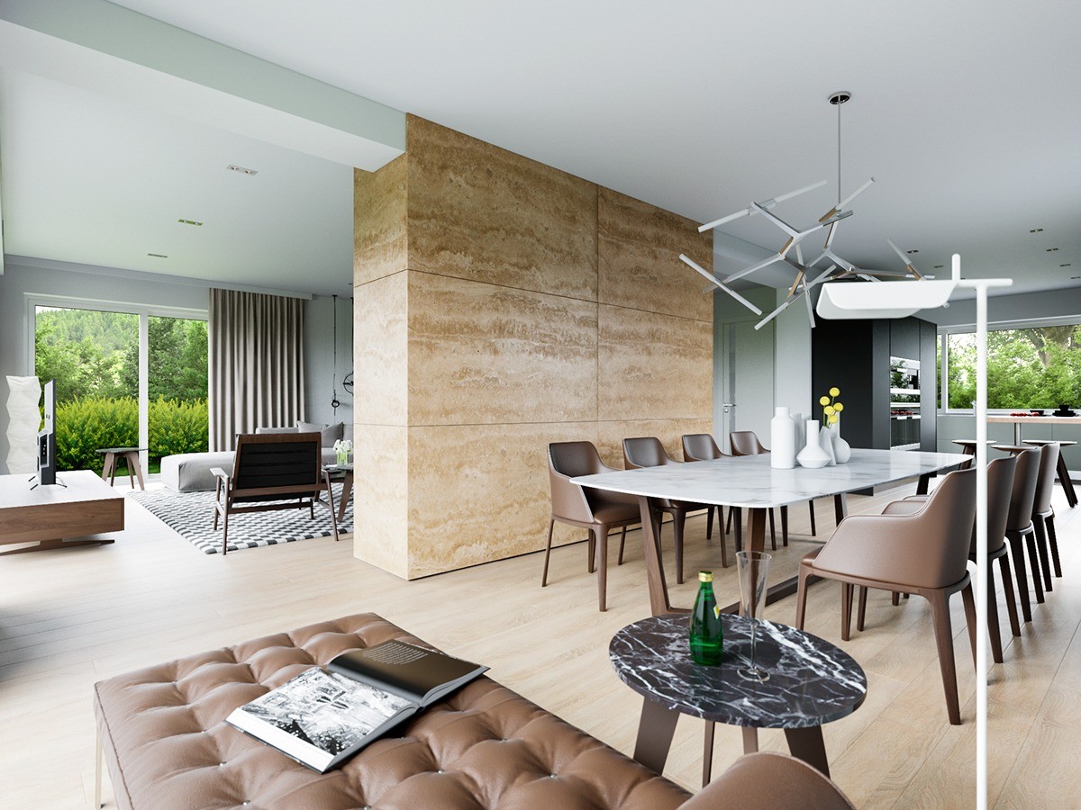
Like a handful of the other living rooms featured in this post, this one uses an L-shaped layout to divide between the entertainment area and the dining room around the corner.
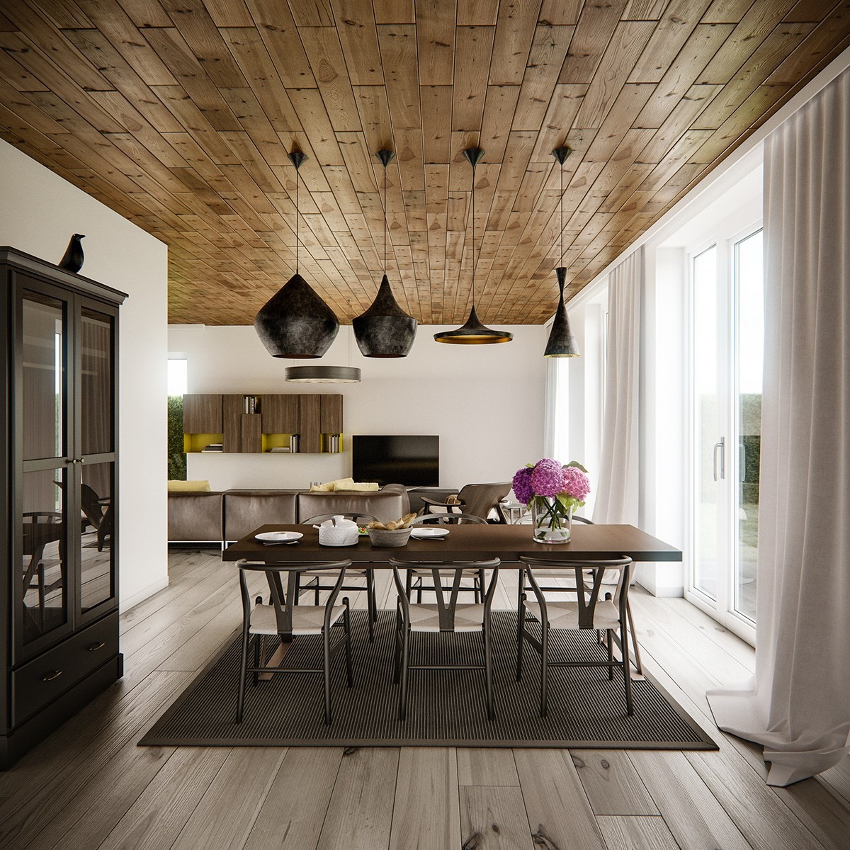
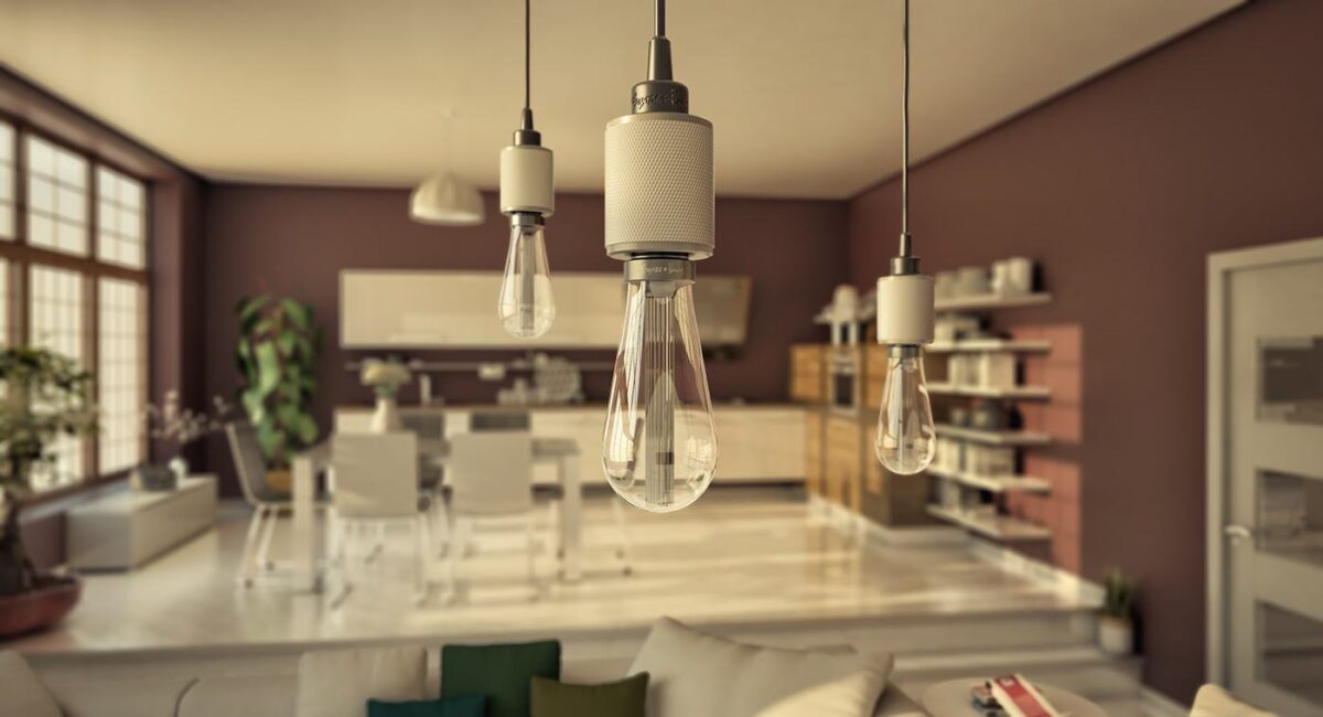
Beat lamps are a popular choice for dining rooms, but most decorators use repetition in their arrangement. Here, the uncommon distribution of weight explores a unique approach.
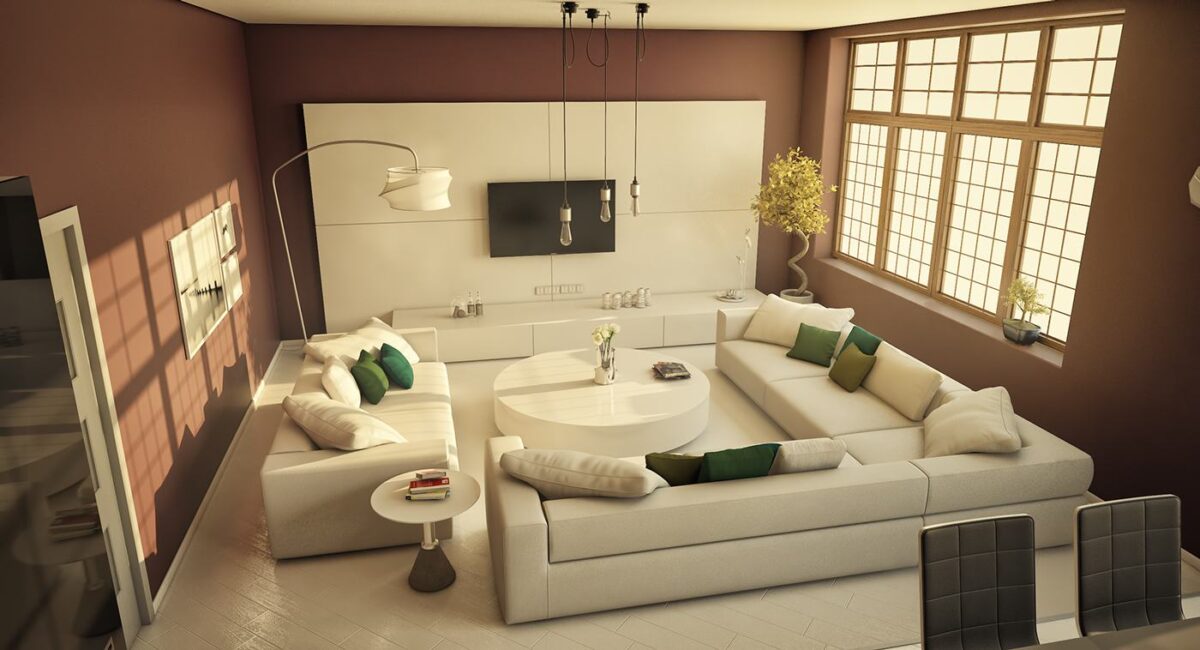
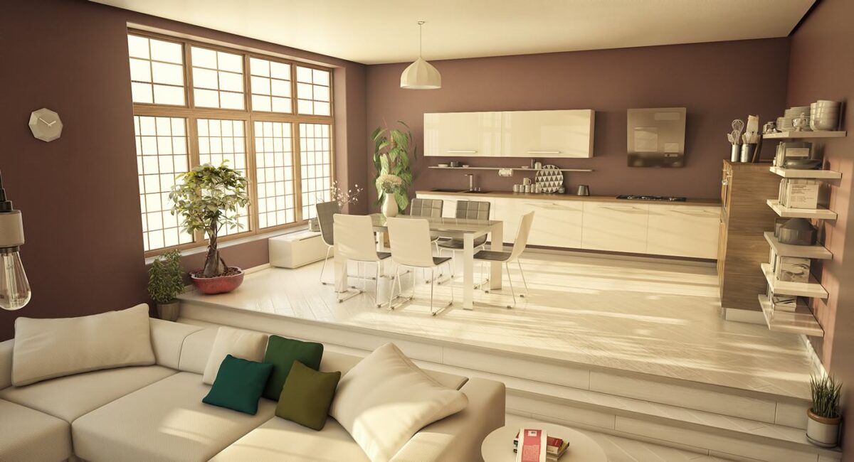
Clay-colored walls and gem-tone accents cast a warm glow on this otherwise minimalistic living room. The arrangement of straightforward forms sets this space apart, the sharp lines of the furniture squaring up against the perfect angles of the layout. In the center, a circular table breaks the mold.
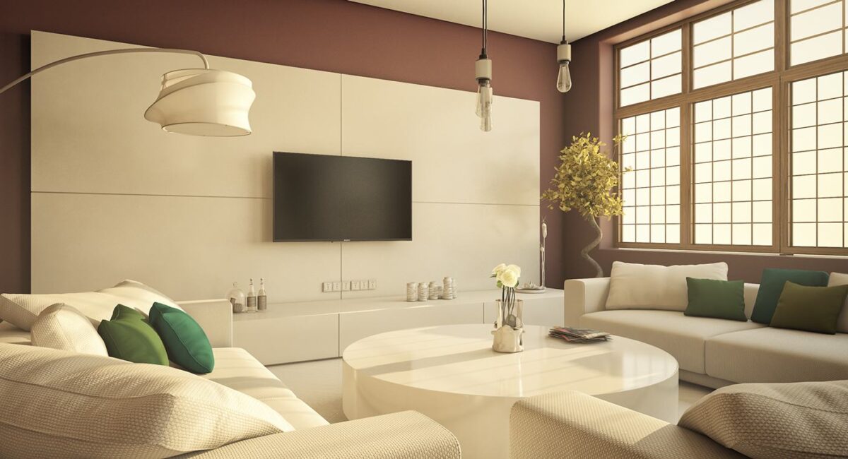
Four accent panels brighten the far wall, with a television placed directly at the point of intersection. Those lines help draw the eye toward the screen for a distraction-free viewing experience.
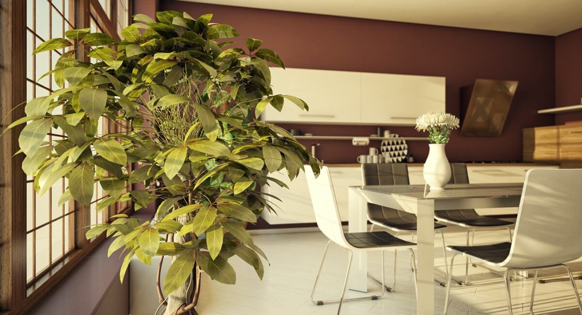
The same color theme continues into the dining room. Darker accents at the dining table help set it apart from the all-white theme in the living room.

