Choosing an accent color for a compact apartment is no easy task. It has to be a color you love, a shade with a little flexibility for future additions and embellishments, a tone that looks good in any room at any time of day. These four apartments show that a blue theme is a wonderfully workable choice! These spaces have very limited floor plans – you can stand in one corner and see the entire interior – so it makes sense that so much work went into the color choices. If you've been feeling a little blue about coordinated palettes, these interiors might help inspire your next big redesign.

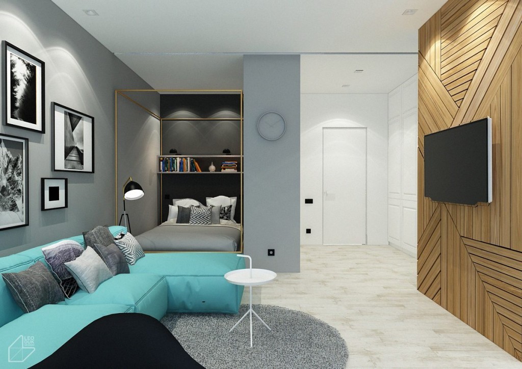
This home tour begins with a colorful and stylish apartment for a couple in Lviv, Ukraine. It's a compact space measuring in at just 43 square meters yet manages to create a spacious and comfortable environment with all the amenities. A neutral palette and refined accessories demonstrate that even compact homes can look sophisticated.
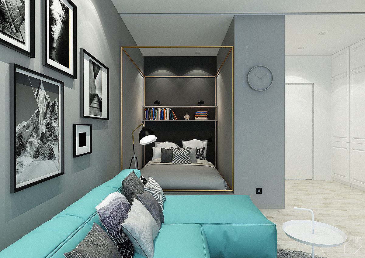
It's open but restrained. For example, the bed tucks away behind a thick wall for separation from the entrance. Simple shelves house bedtime reading material with a nest of varied pillows below.
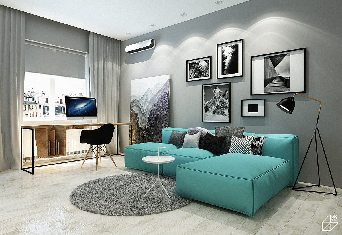
Thomas Bentzen designed the little table shown here, its smart design including a convenient handle for portability. The unique floor lamp you see here is the work of Jenny Bäck for Örsjö Belysning.
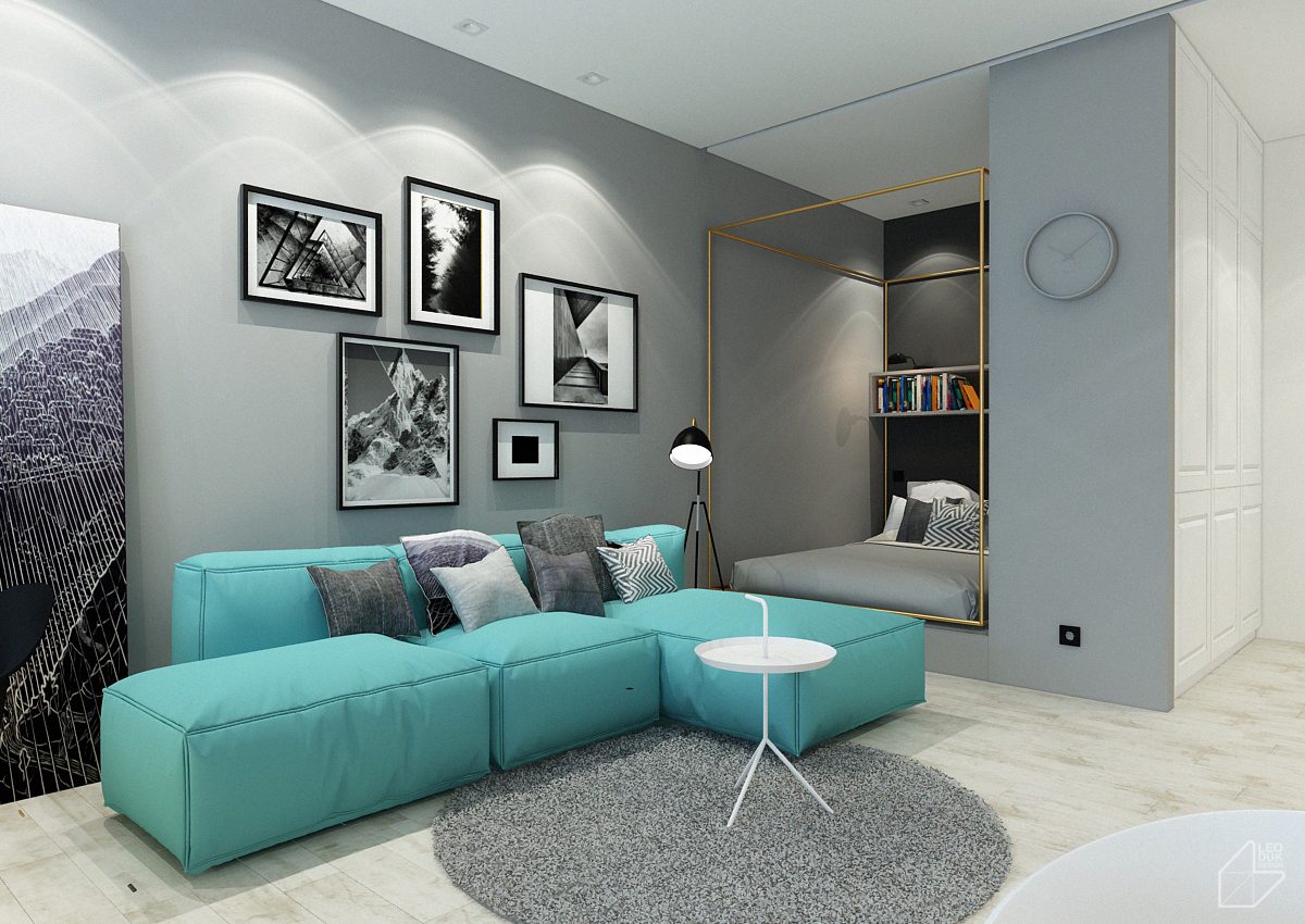
Artwork featuring mountains and open skies reinforce the airy atmosphere of the apartment, no matter how compact.
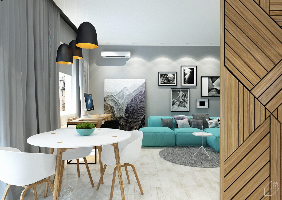
Simple chairs by Hee Welling match the decorative wall panel and desk. Natural materials are used sparingly and with purpose.
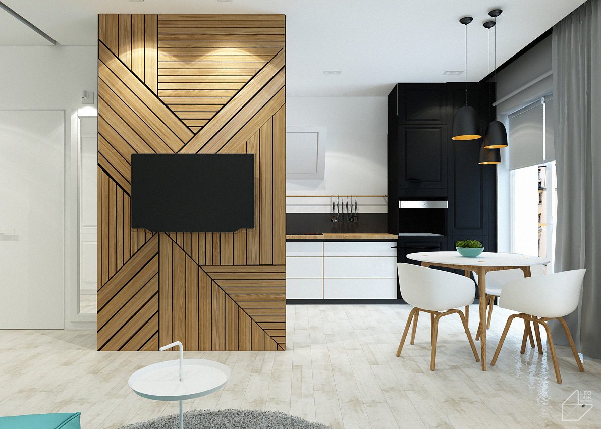
Here's a good look at the kitchen in all of its minimalistic appeal. Forethought shines through with the copper pendant interiors showing smart contrast against the matte black cabinets in the background.
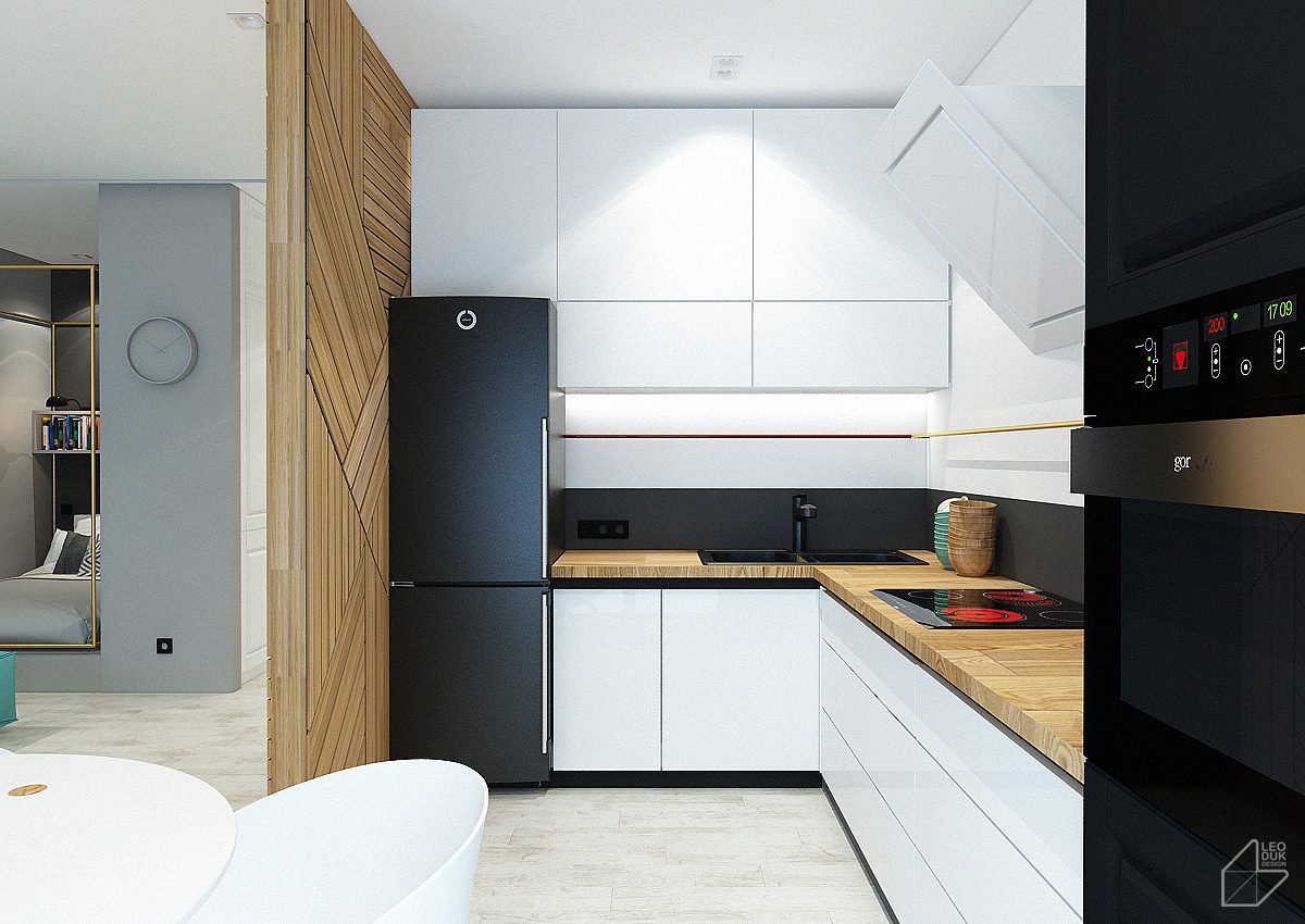
The kitchen, as compact as it is, uses smart organization techniques to keep things tidy. Notice how the brass towel rod continues all the way around the work surface.
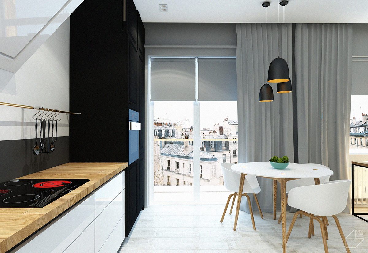
Versatile and natural, the chopping block countertop makes a tremendous statement when paired next to the organic curves of the dining set.
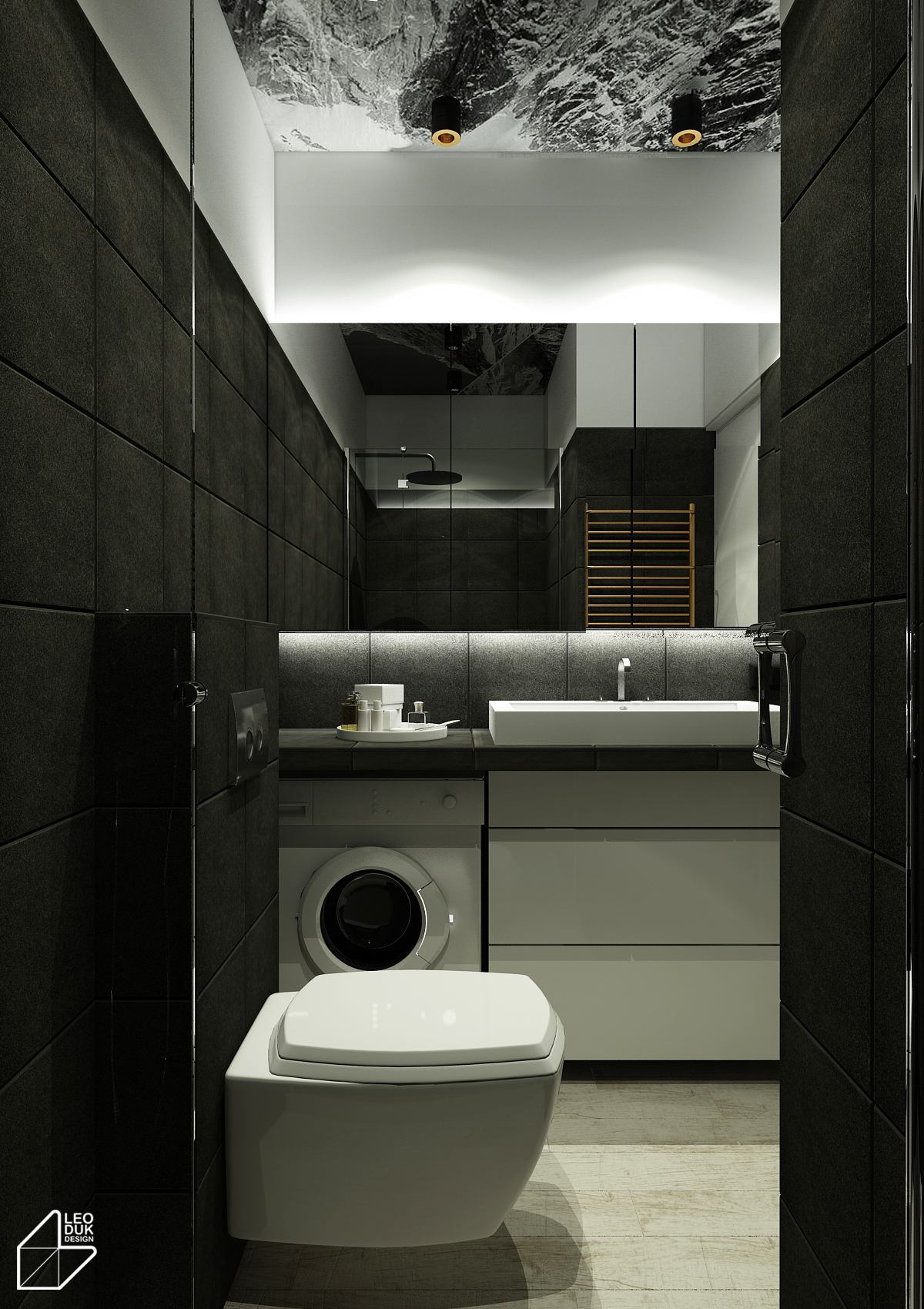
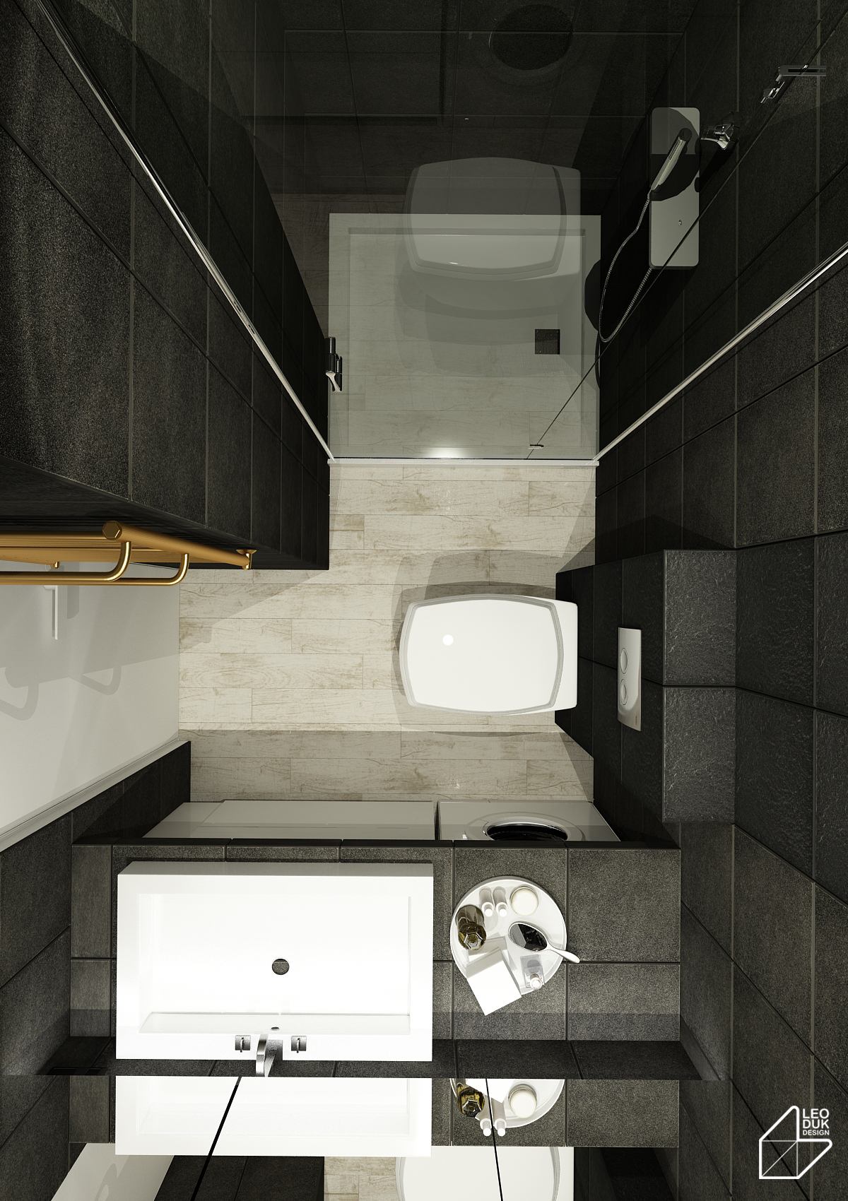
What an inspiring dark bathroom! Flat black surfaces seem to absorb the indirect lighting on contact. Functional objects remain in traditional white, easier to find in the early hours of the morning.
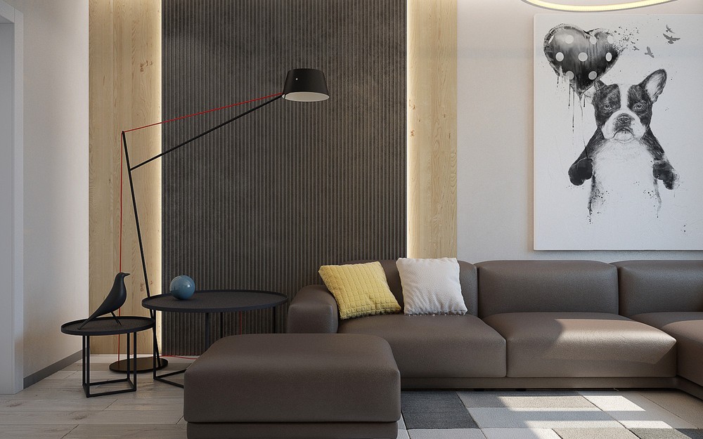
The clients for this apartment design desired shared spaces but also craved a degree of individuality. Ideally, the interior would feel quiet and welcoming, pleasing to the eye with its timeless style – achieved by using neutral colors and outstanding iconic furniture throughout.
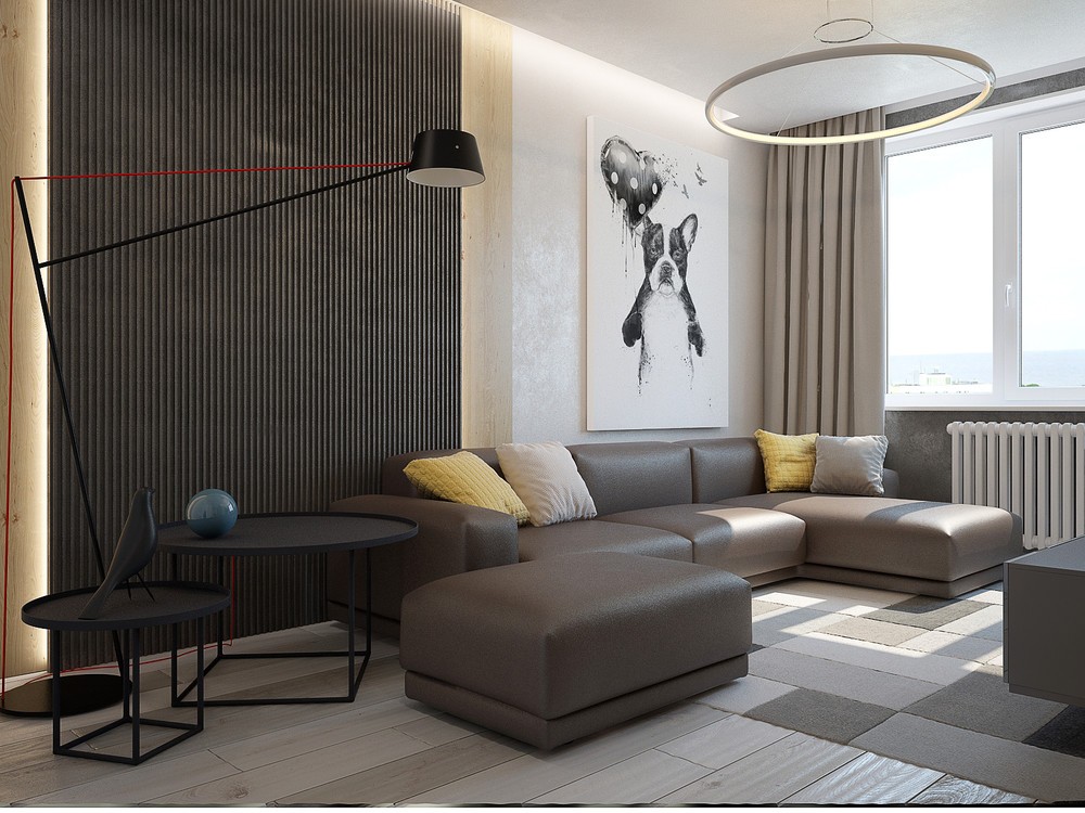
Comfortable seating comes by way of the Place Sofa by Jasper Morrison, and the modern Spar floor lamp is the work of Jamie McLellan.
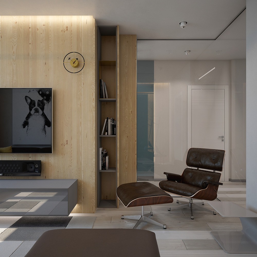
Other eye-catching furniture selections include the famous Eames lounge – when you have to pare down your furniture selections for a space this compact, it pays to invest in quality showpieces.
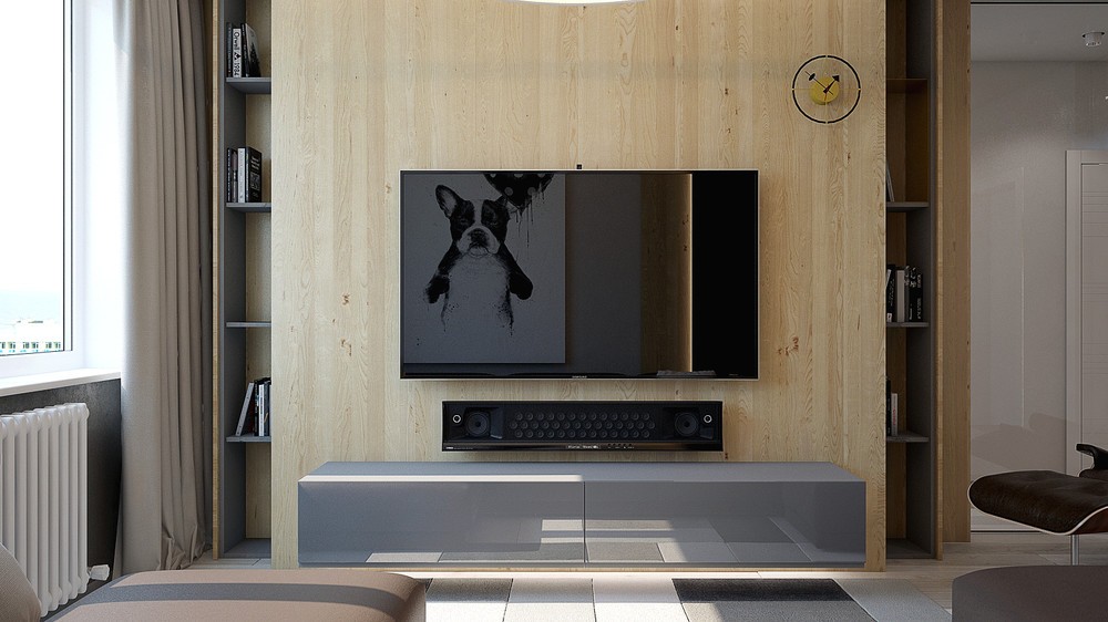
These compact vertical shelves are a popular storage solution these days, while the George Nelson mid century modern clock on the wall is an enduring icon.
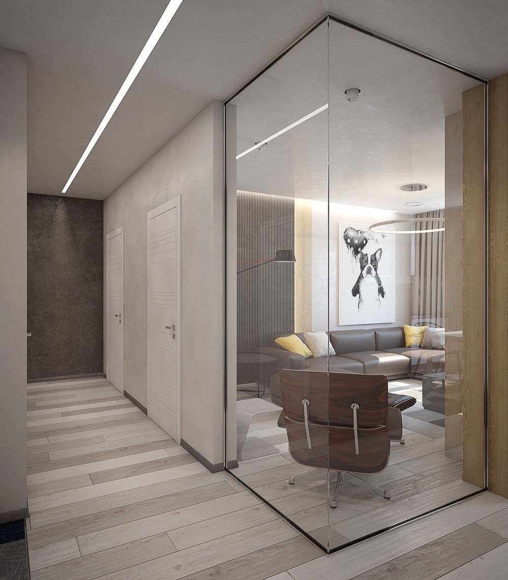
Glass interior walls help shield residents from the sounds and bustle going on around the home – the residents can utilize the restricted floor plan without feeling cramped in together.
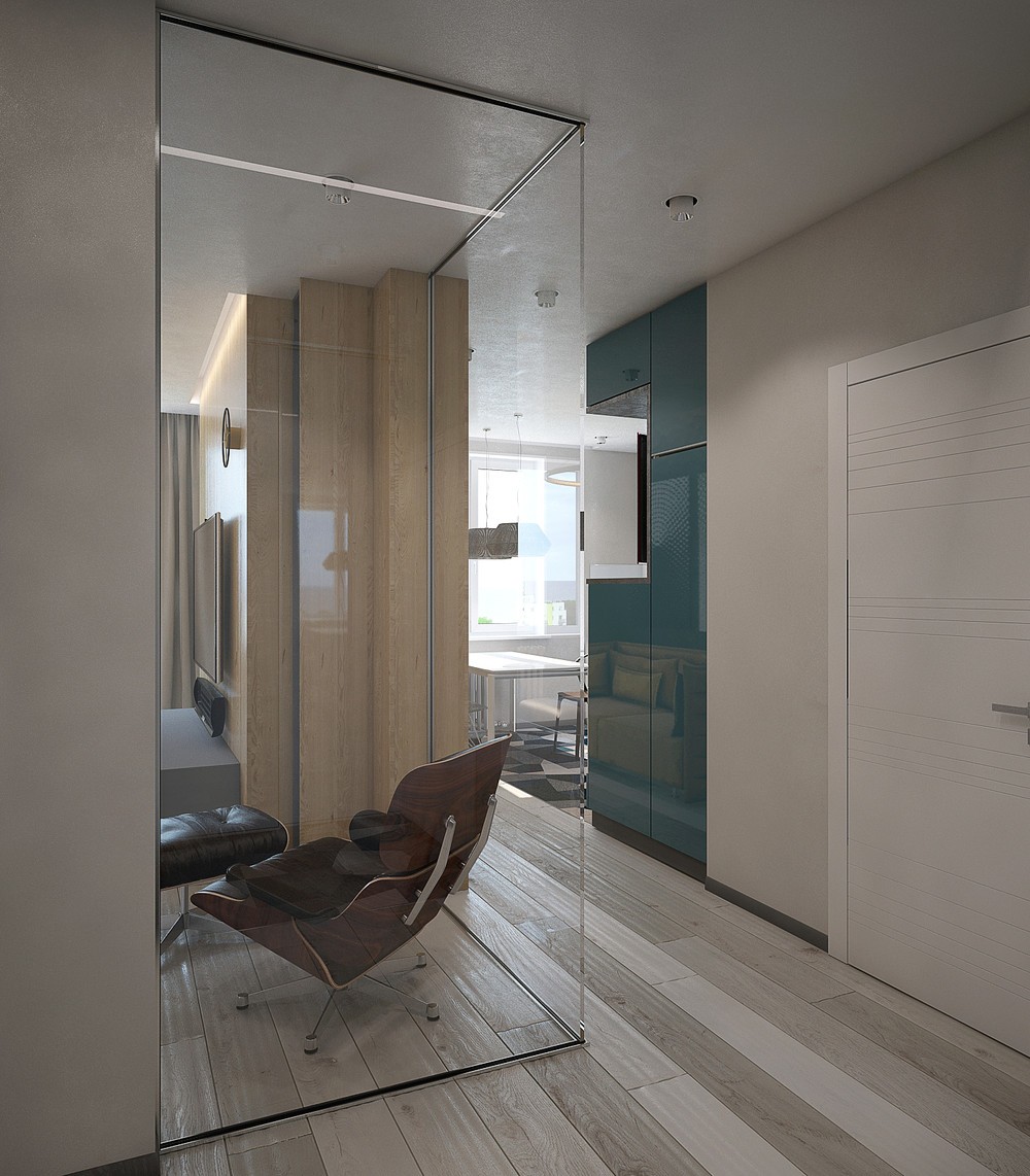
It also allows for a clear view around the corner, and brings some of the kitchen's natural light into the hallway.
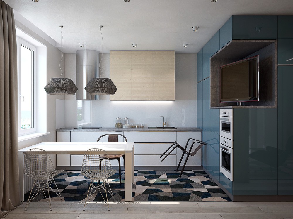
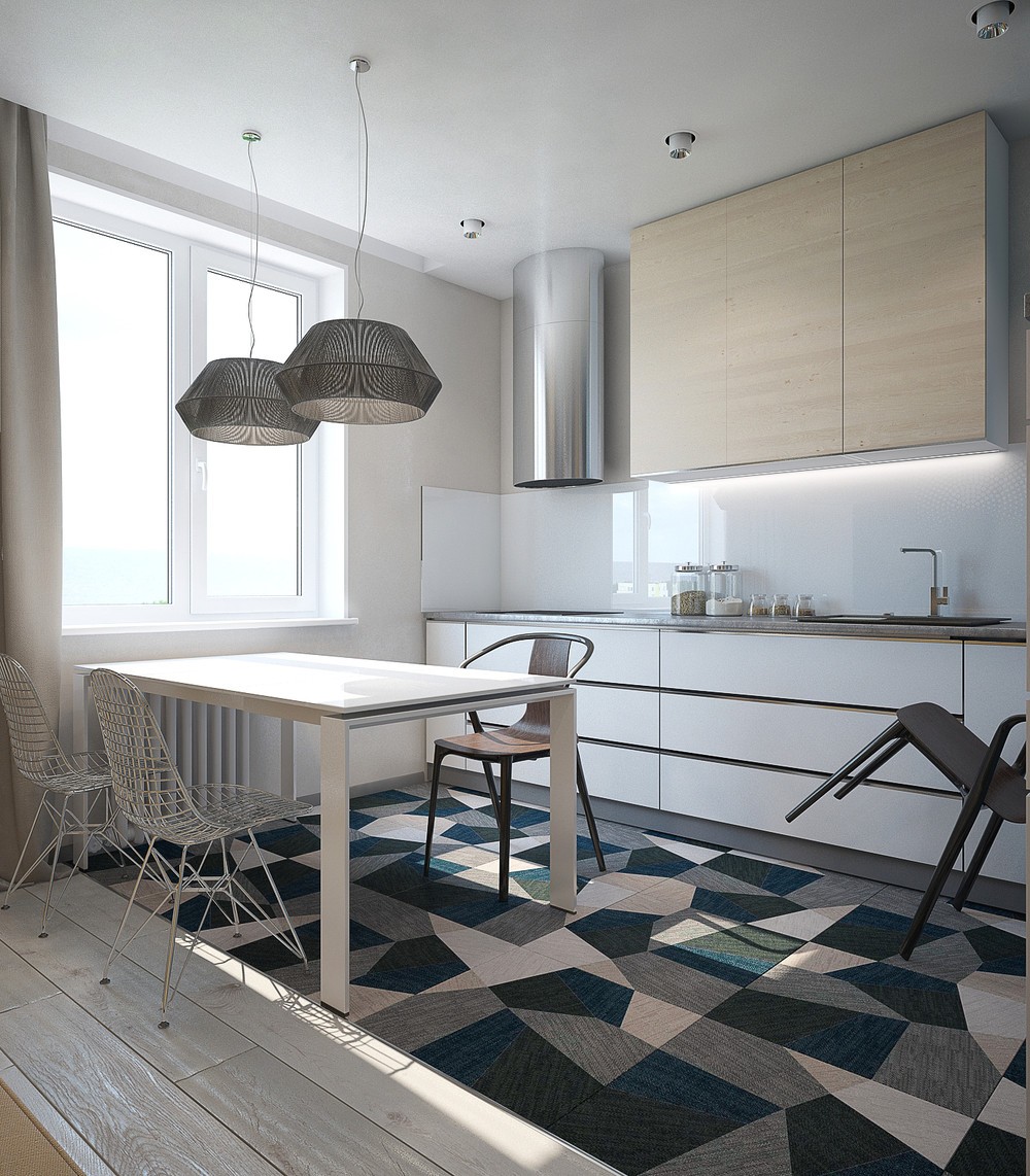
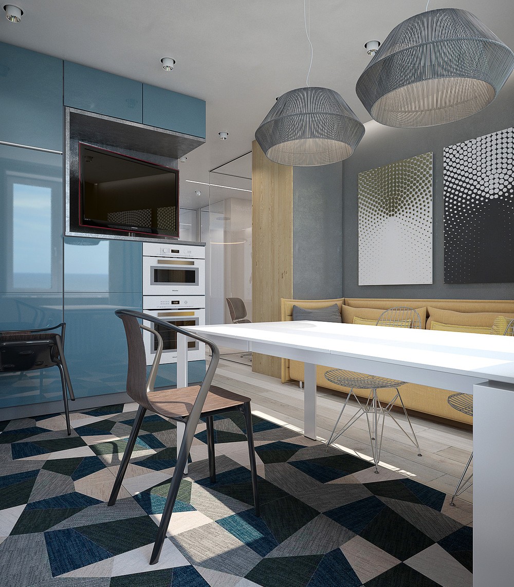
Chairs include the 2015 Belleville Chair by Ronan & Erwan Bouroullec and the classic 1951 Wire Chair by Charles & Ray Eames.
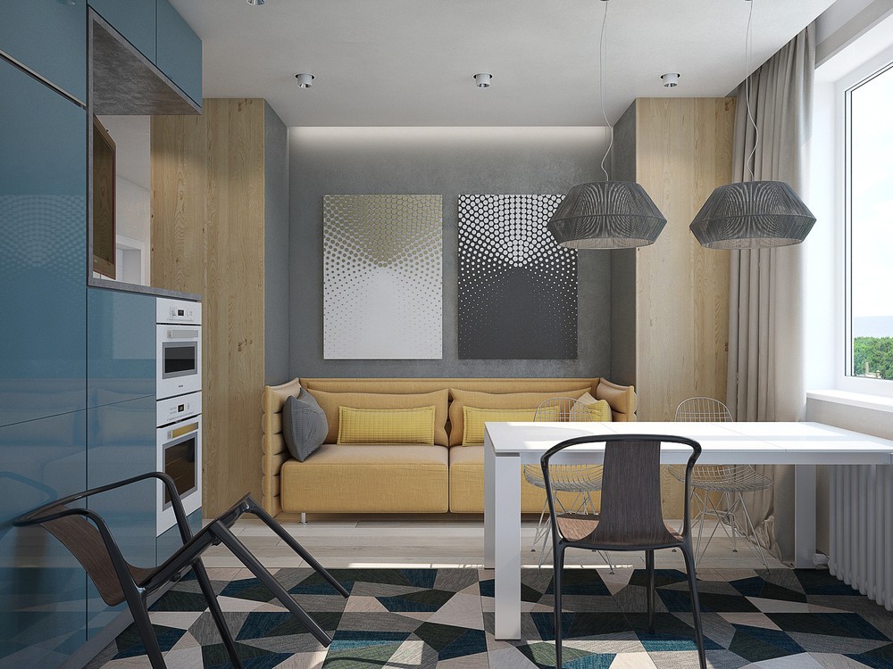
But what's all this about a sofa in the kitchen? This was a special request from the clients, who enjoy spending time together in this hub of family life.
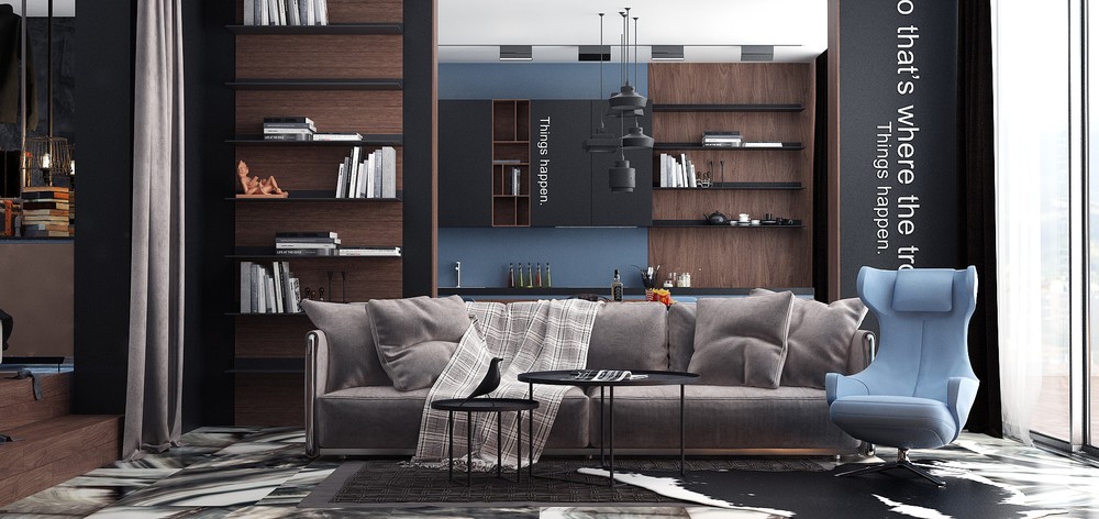
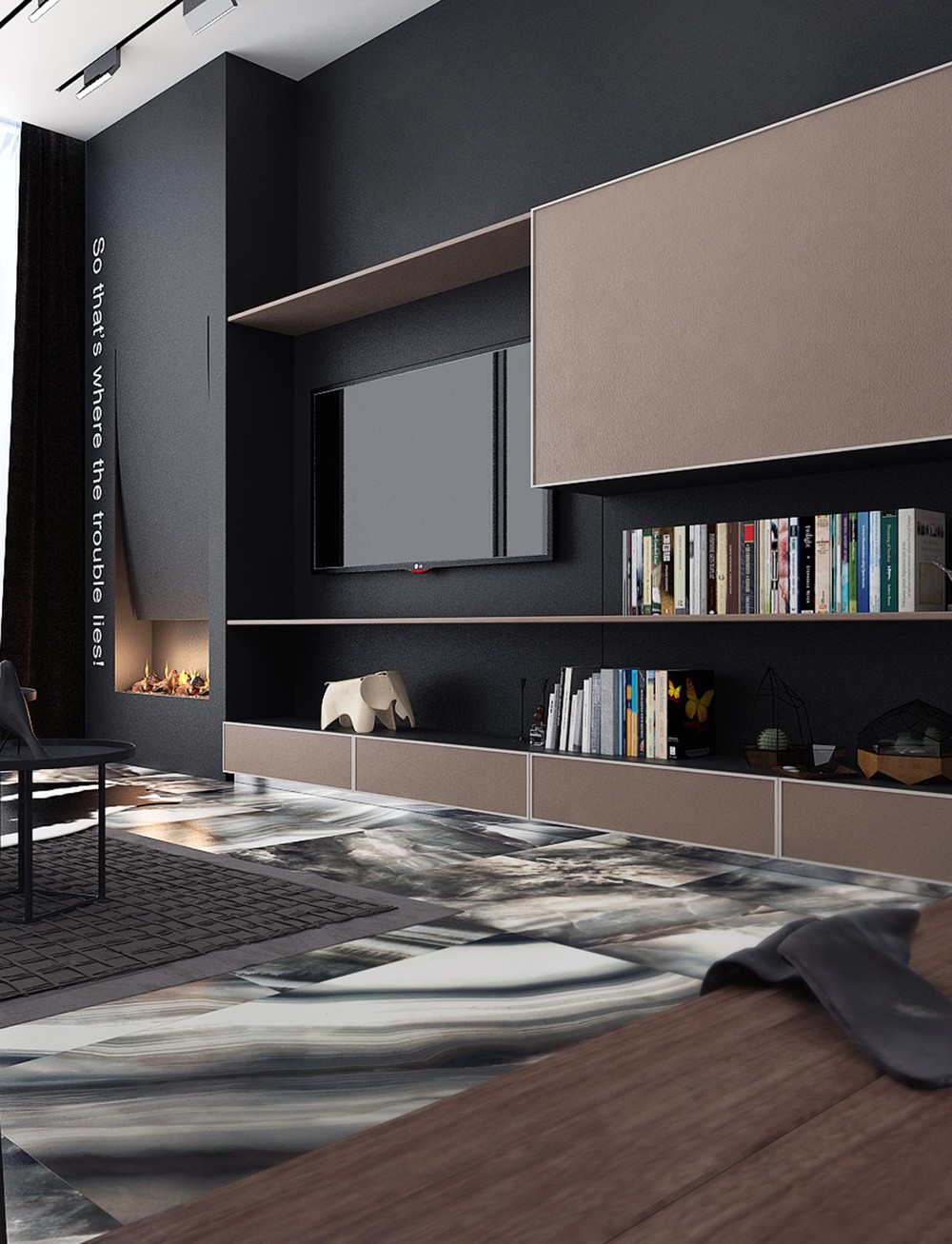
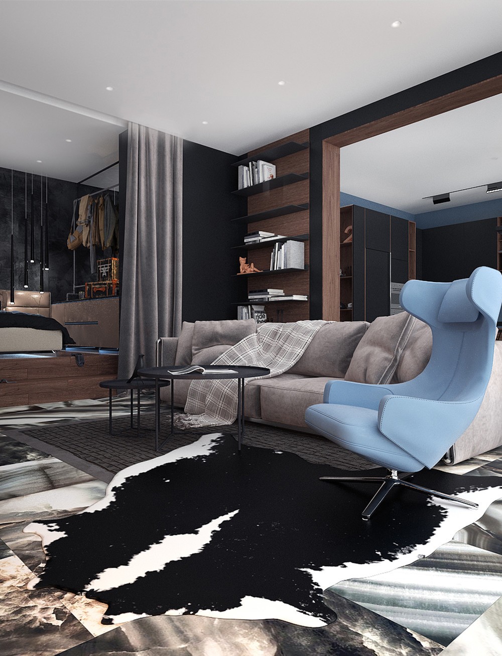
Designed for a young doctor with confident tastes, this apartment adopts an interior style that feels serious and playful at the same time. Dark materials lean toward the sophisticated side while typographic decorations express a modern edge. The layout balances privacy with freedom to roam.
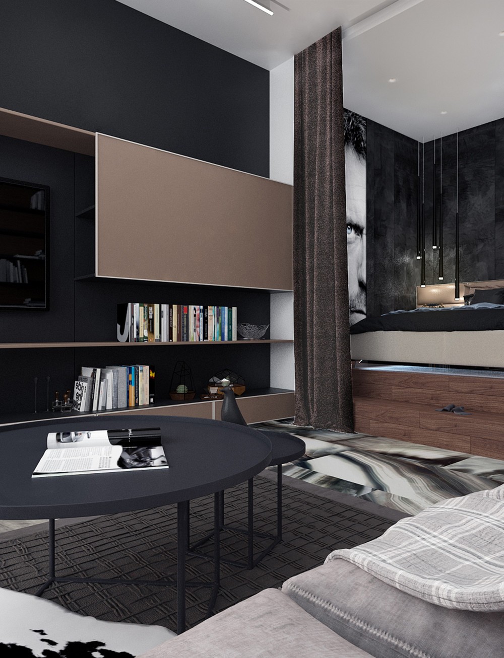
Many of the furniture items come from the Vitra catalogue, with the stage perfectly set by the Eames House Bird peeking over the ledge of the nesting tables.
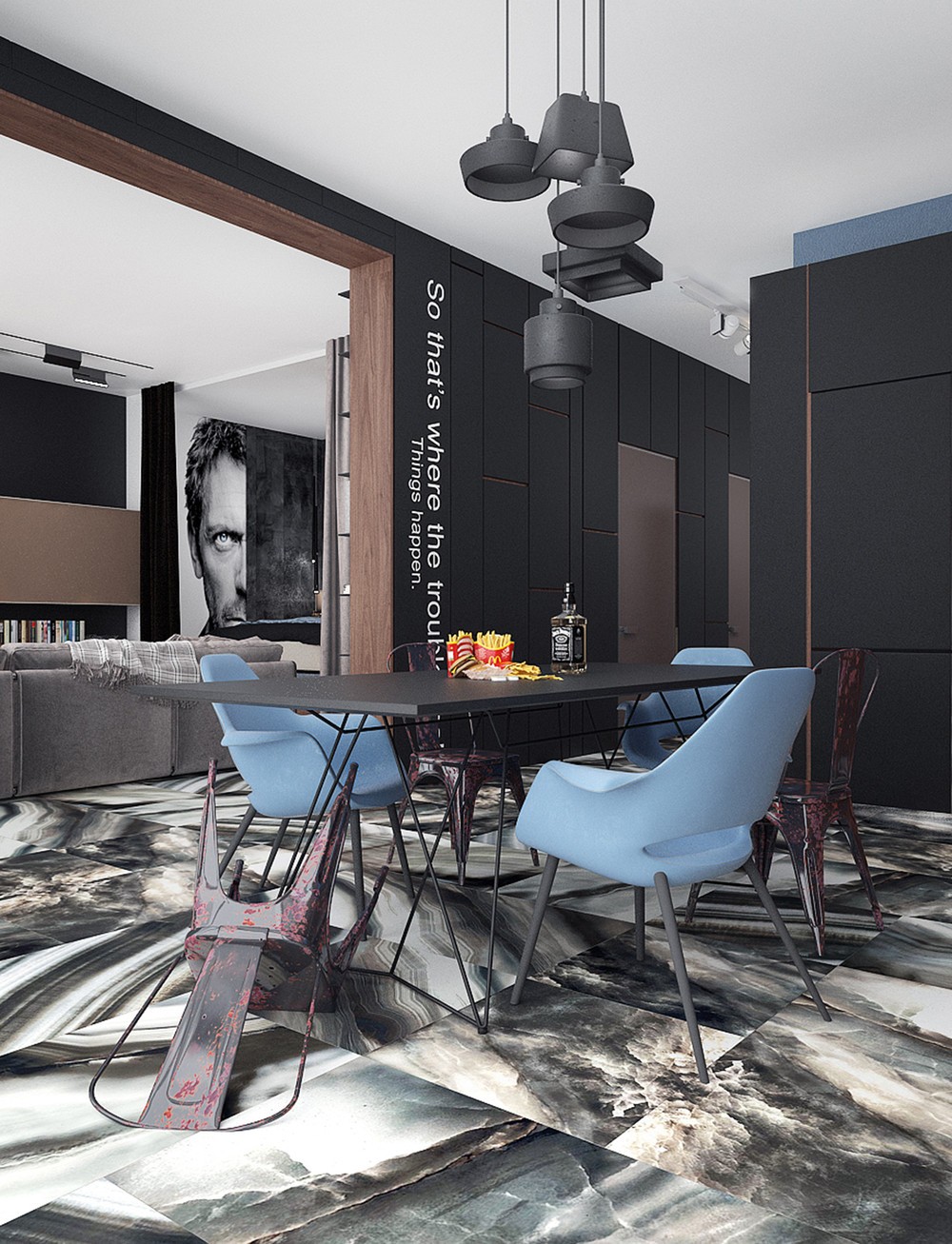
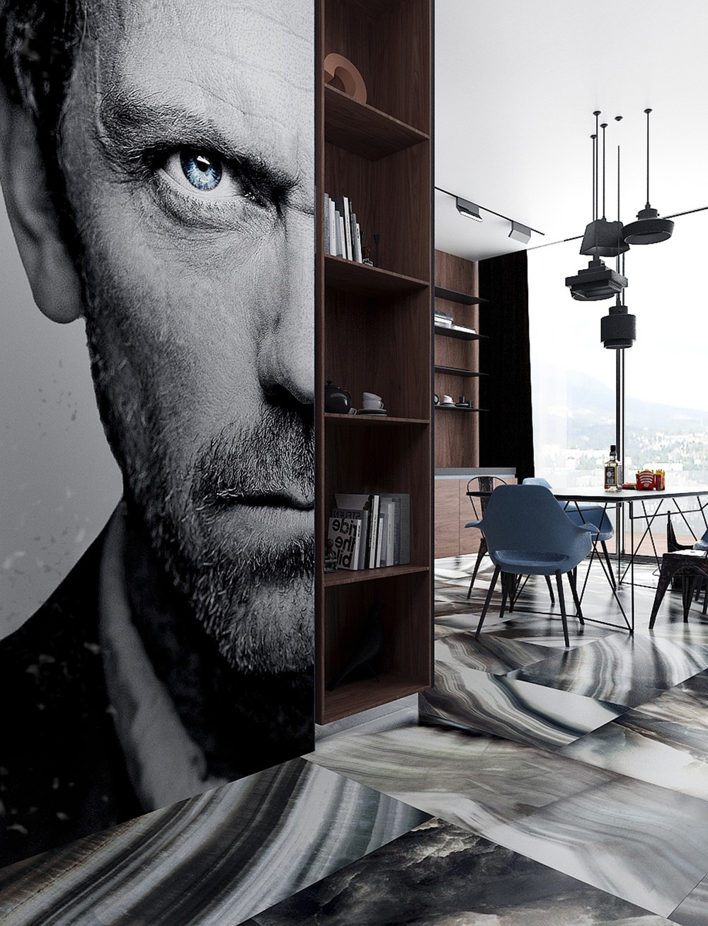
The kitchen combines contemporary and mid-century themes, like Tom Dixon's Lustre pendant lights and the 40s-era armchairs by Charles Eames and Eero Saarinen.
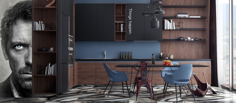
Of course, the Dr. House decal might seem a little "on the nose" in a house for a young doctor, but what fan could resist that steely gaze and no-nonsense expression?
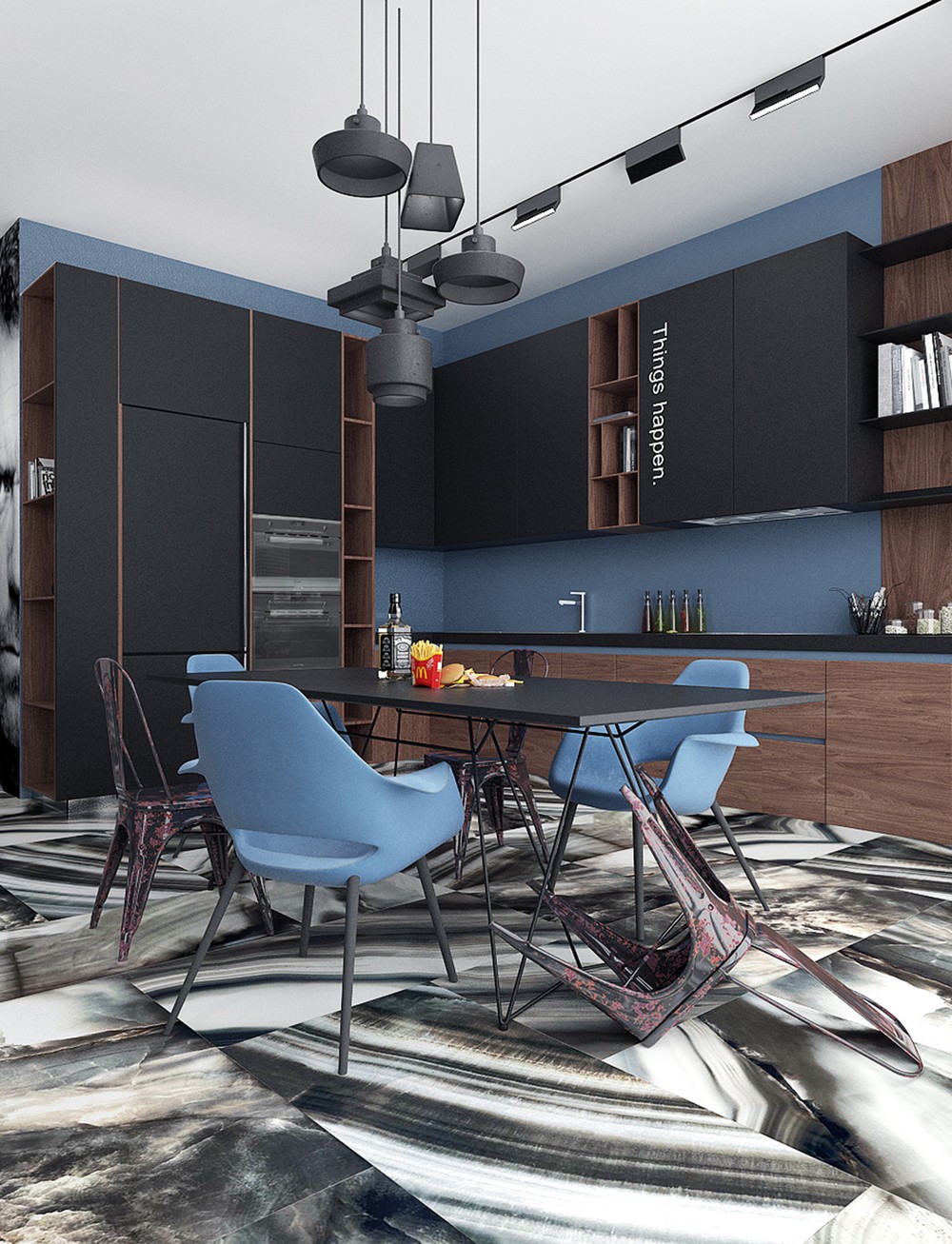
"Things happen" is a great inspirational phrase for a kitchen, where improvisation and delightful discoveries are part of the process.
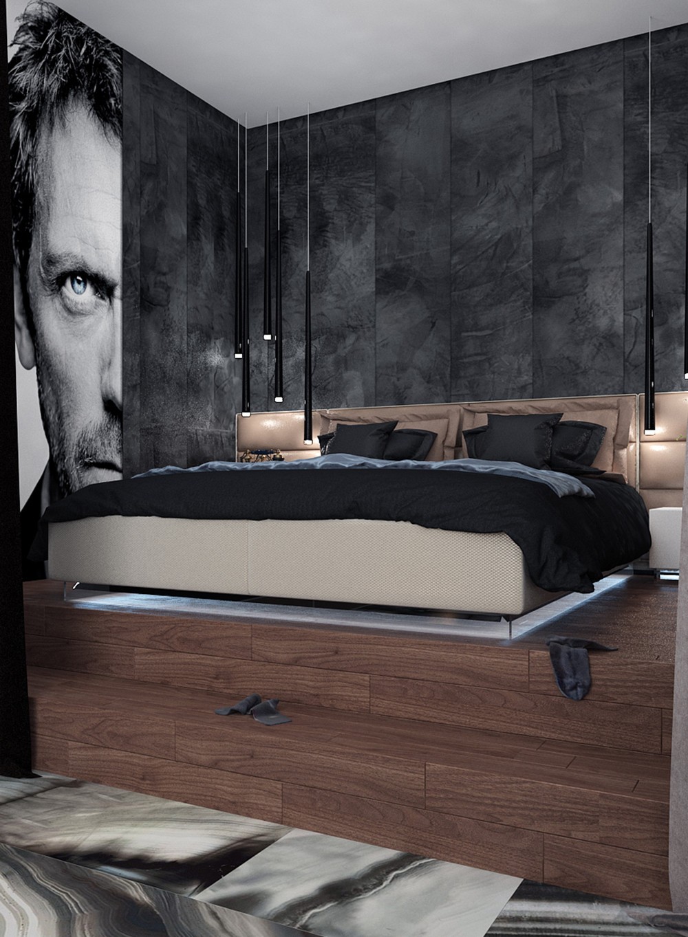
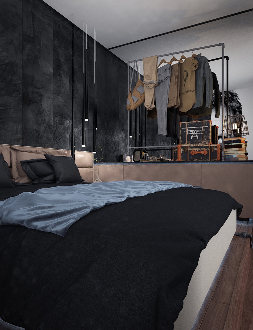
The bedroom pendant lights by Jordi Vilardell seem to drip down the wall. Cool white light radiates from beneath the raised bed platform.
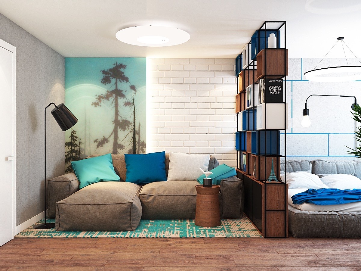
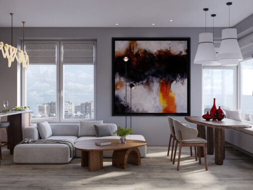
Wrapping up the apartment tour is a fun blue design for a young couple. Bright colors provide for energetic days and soothing nights. Natural materials, plants, and vivid prints help lead the mind away from the city and into a more peaceful place, perhaps a forest overlooking fresh blue waters.
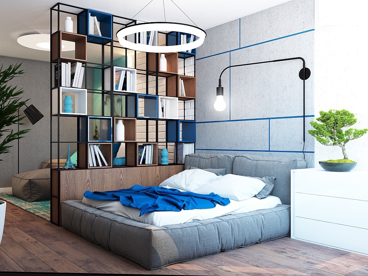
Decorative shelves separate the bed and sofa spaces. When the young couple needs some time to pursue individual interests, they can stake out their own territory without feeling completely closed off.
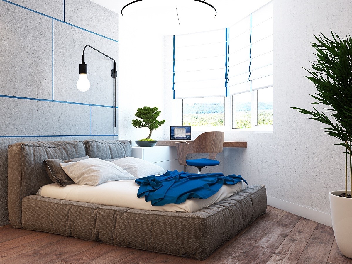
This desk couldn't have a better location. When the sunlight from the bay window begins to fade, the Tribeca lamp by Søren Rose Studio can illuminate the desk or swing over to shine on the bed.
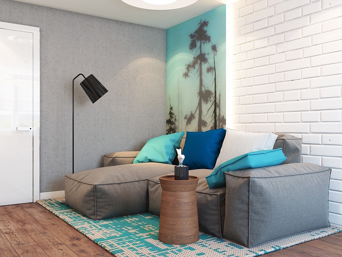
Back in the living room, the artwork is always among the first details to catch the eye. Layered glass panels give it a complicated and dimensional aesthetic – impossible to ignore.
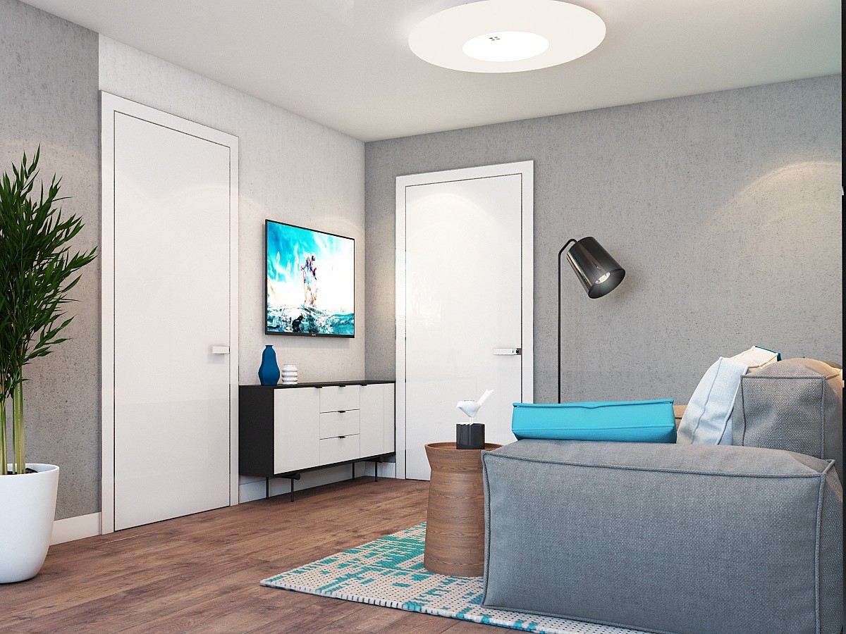
Throughout the home, round accents help break up the boxy forms: the lamp shade, the planter, the side table, and vases all contribute toward a sense of balance.
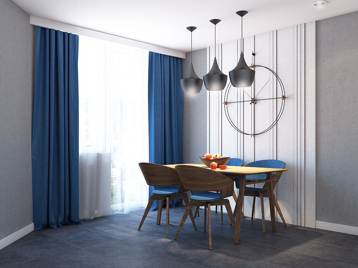
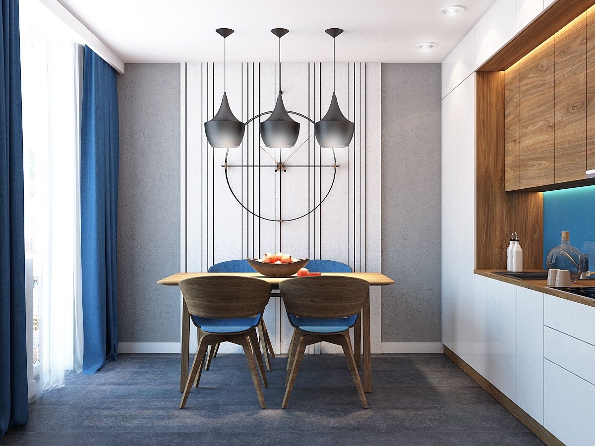
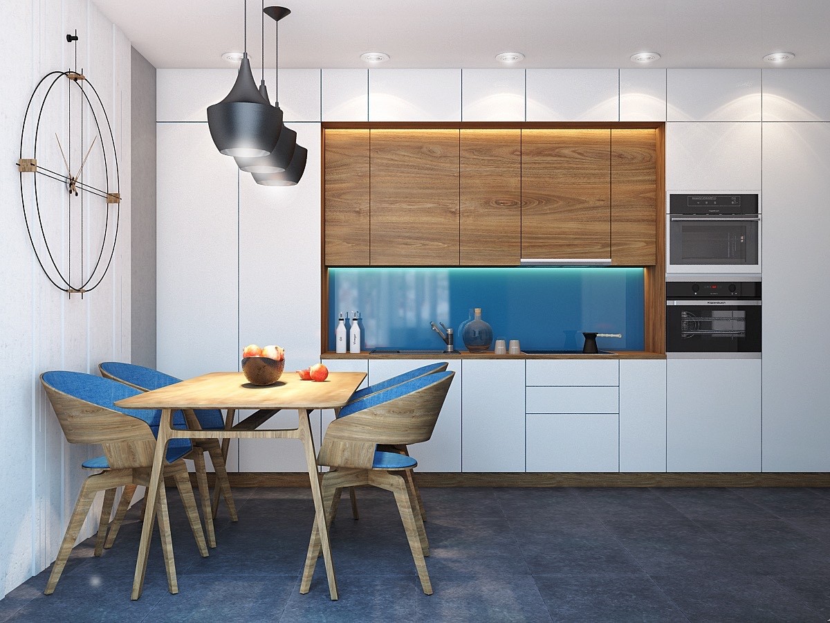
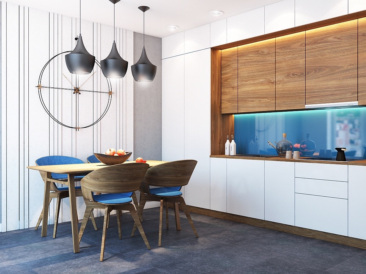
Dining takes place in a relatively secluded cove shared with the kitchen. It's nice to have somewhere to slip away from the main gathering.
