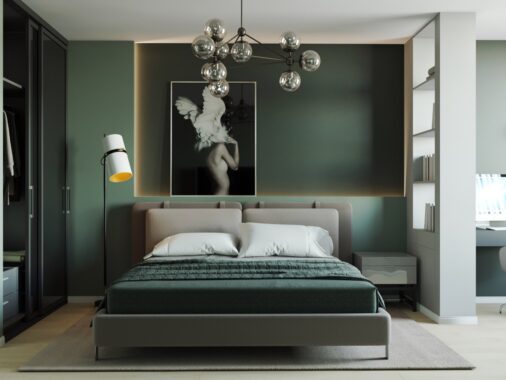
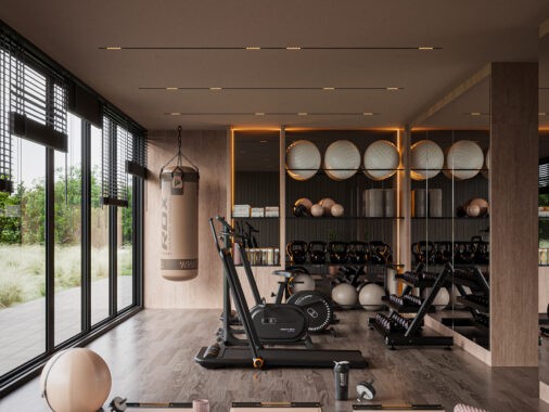
With so much emphasis on sleek modern spaces, it's nice to enjoy a little extravagant inspiration from time to time. The two homes explored below share many features with neoclassical design, an elegant and intricate style that appeared in the mid-1700s and retained its popularity until the early 1800s. Neoclassicism arose in direct response to the perceived busyness and frivolity of the rococo style – making it the minimalism of its time. Neoclassicism was a revival of Greek Classicism, and interestingly enough, Art Deco was too – both styles share roots despite having opposite intentions.
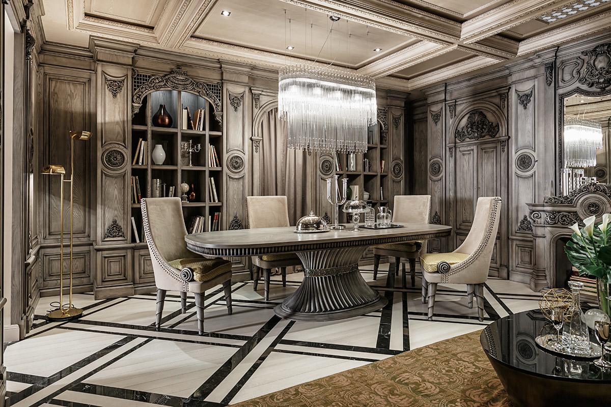
The entire dining arrangement would fit wonderfully into an art deco home, but they're not specifically neoclassical by any means. The dining chairs take an interesting approach to the neoclassical tradition of fluted-leg chairs, using a cool spiral structure that catches the eye immediately.
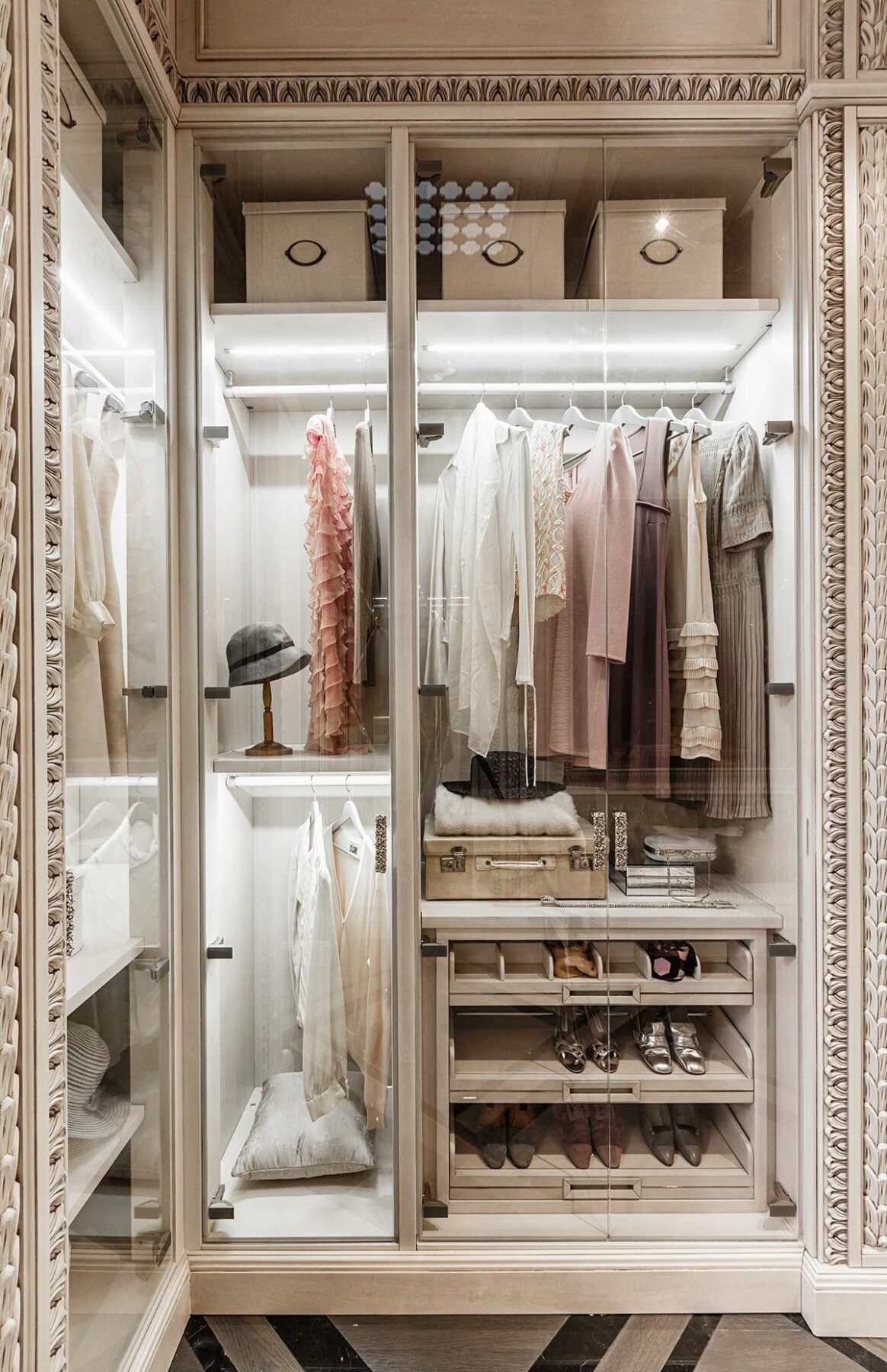
The clothing is almost as fascinating as the interior architecture. These dresses are classic flapper attire, yet it might be interesting to note that neoclassical fashion wasn't all petticoats and skirt hoops – in fact, the trends of the day favored white fabrics and simple forms, so these aren't too far off track for that era either.
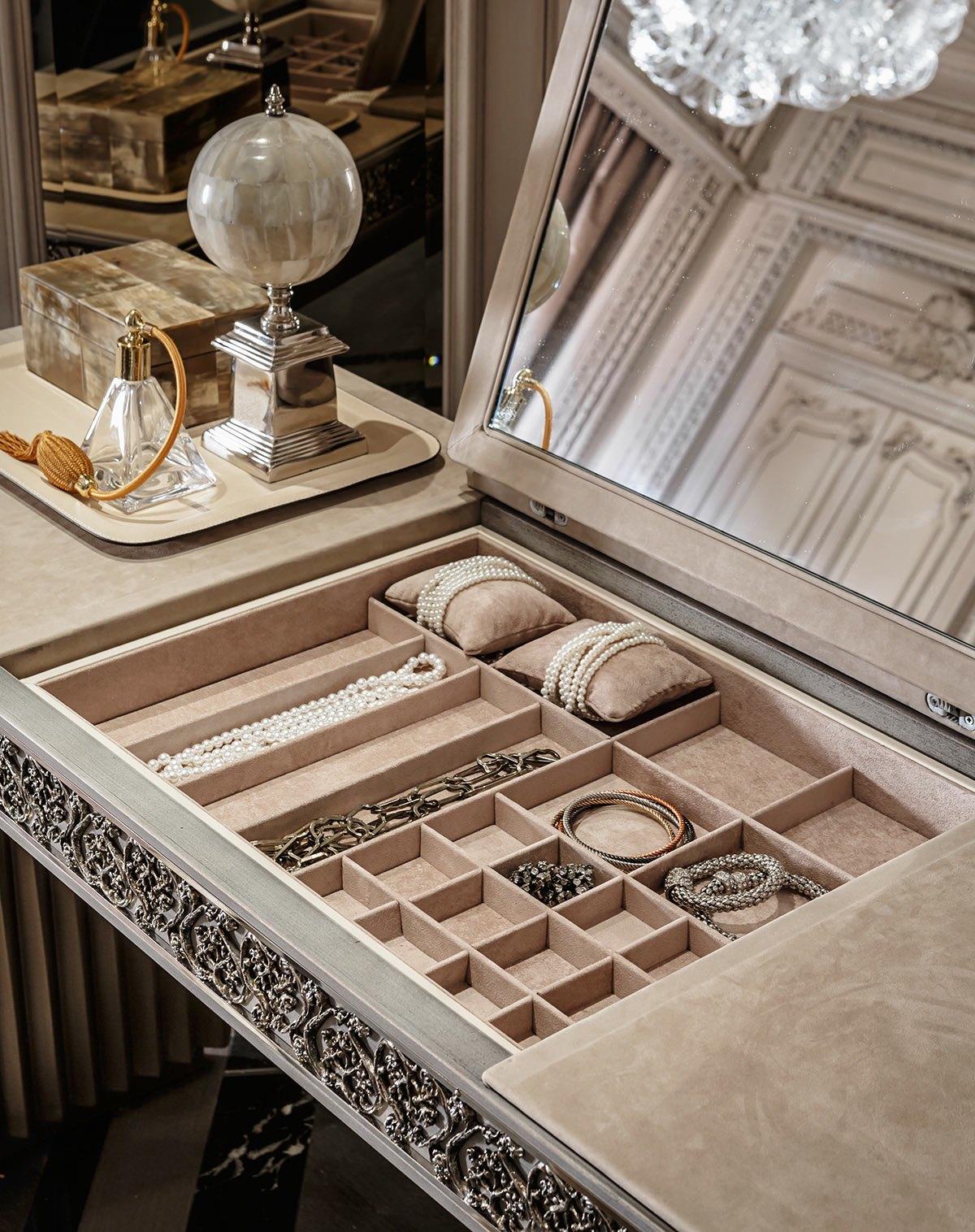
Brilliant strapwork enhances the edges of this jewelry box and vanity combination. The asymmetrical design is more reminiscent of the elaborate rococo era than neoclassical, but many neoclassical homeowners would have owned rococo antiques in addition to their contemporary styles so it fits perfectly and enhances the reaslism.
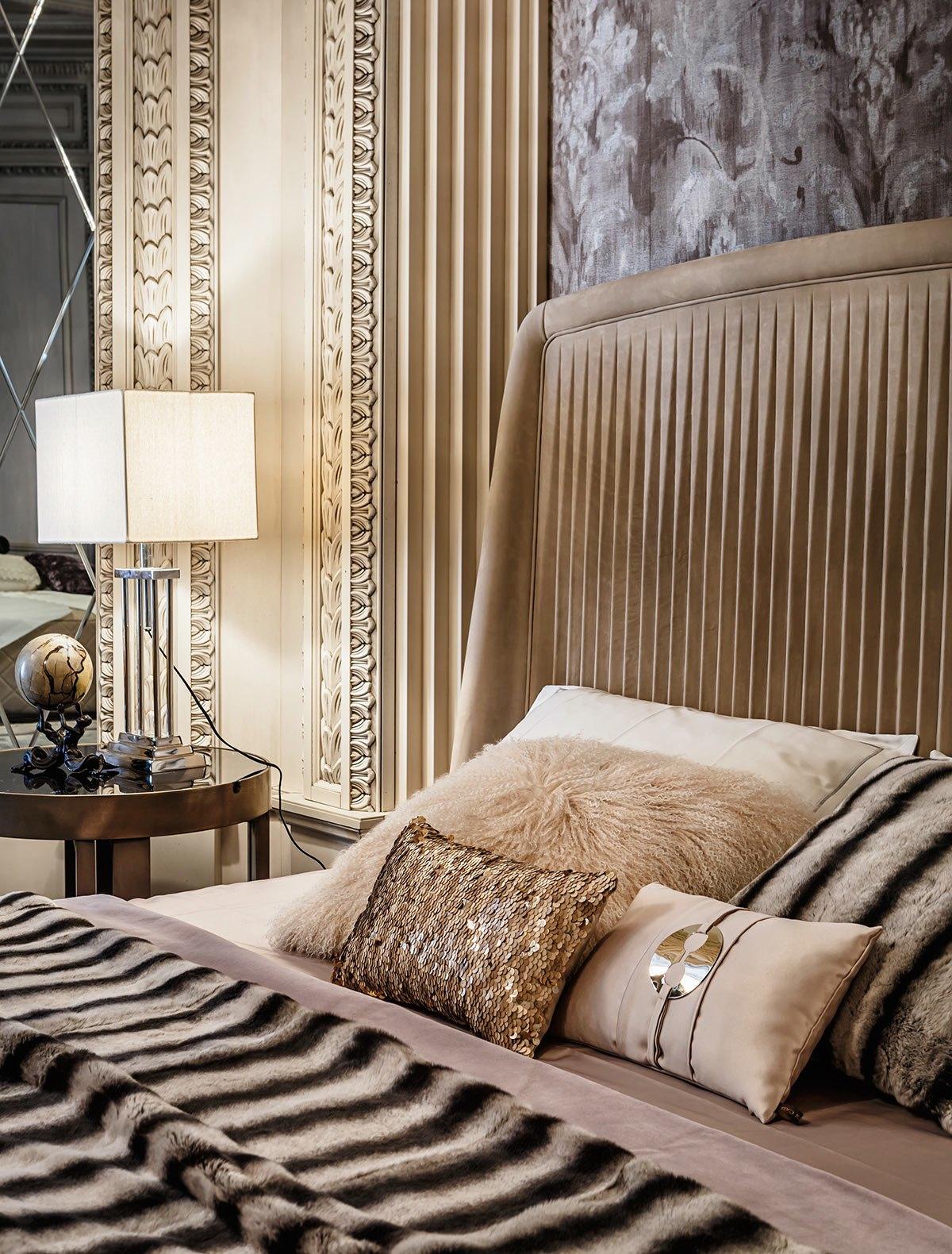
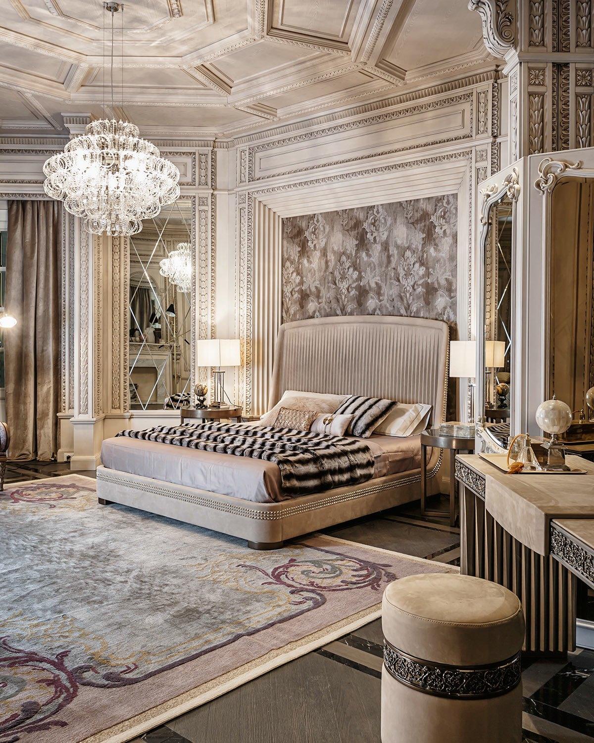
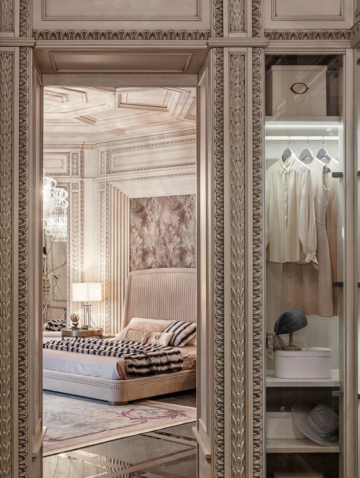
Opulent art deco bed accents pair with furs to channel The Great Gatsby in the most dramatic way possible.
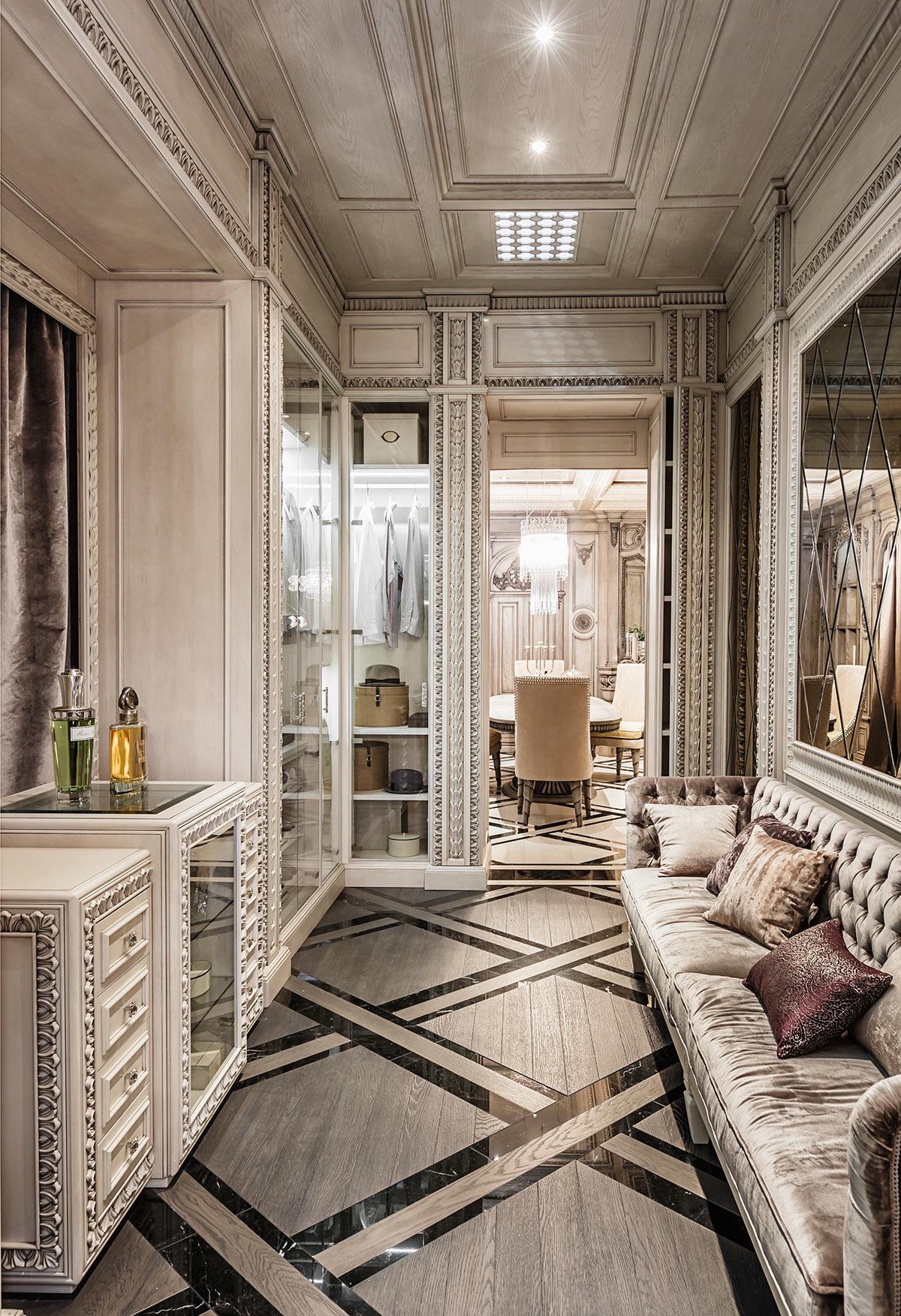
The inlaid floors are spectacular. Inlaid floors were common in neoclassical design, but this particular pattern is quite modern. The black marble boosts the luxury factor even further.
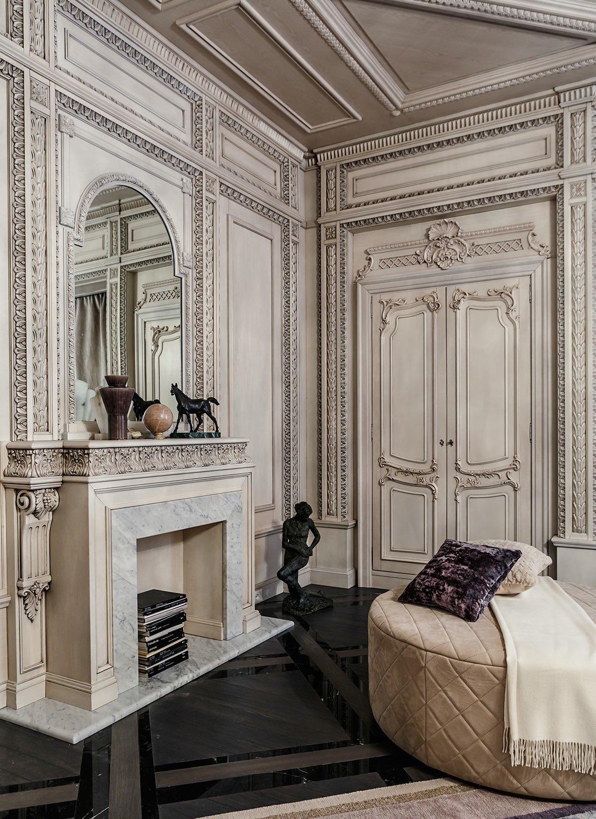
The egg-and-dart motif was extremely common in neoclassical architecture, seen here on the sides of the boiserie, with stylized acanthus or perhaps palm fan design in the middle. The paneling on the doors is quite impressive as well.
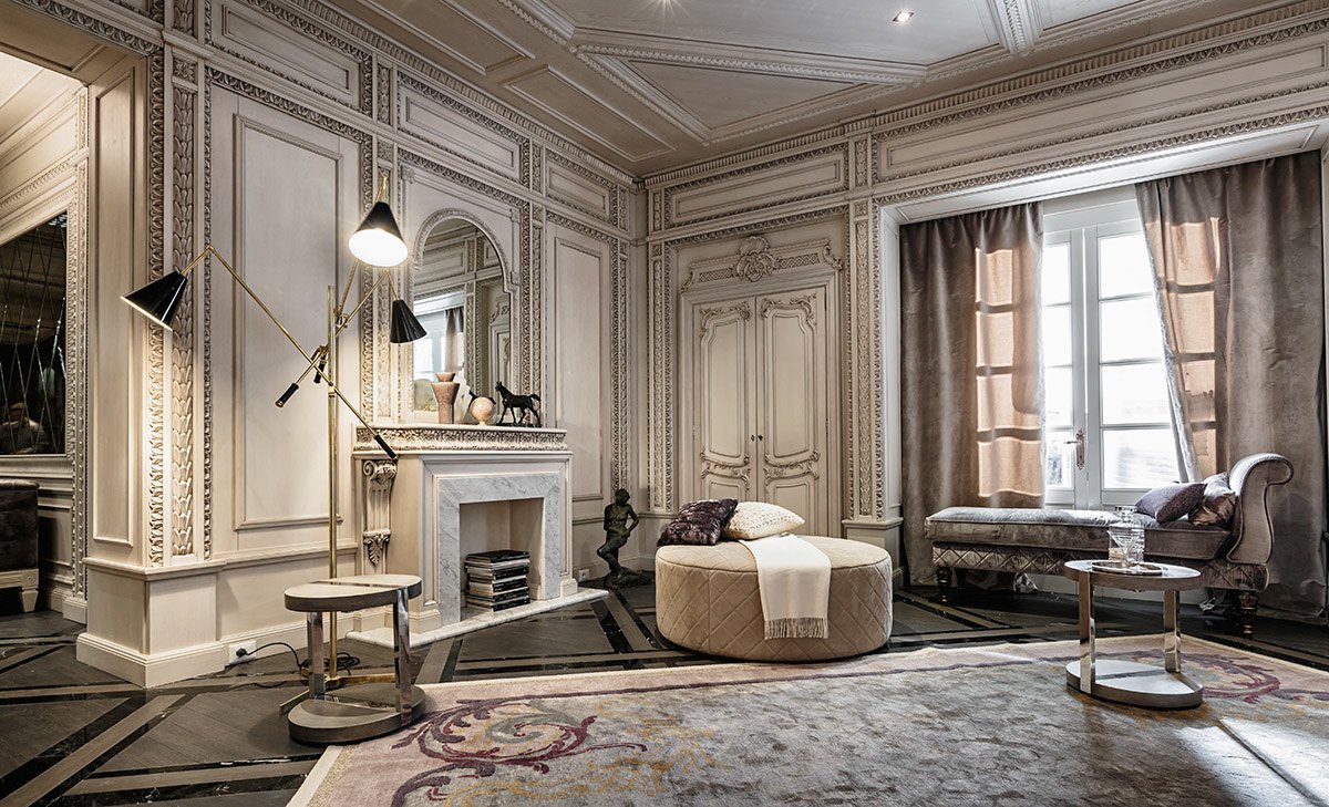
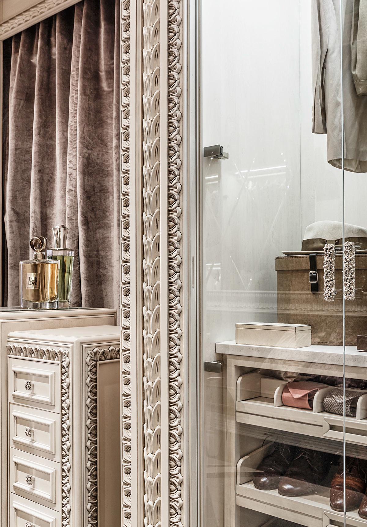
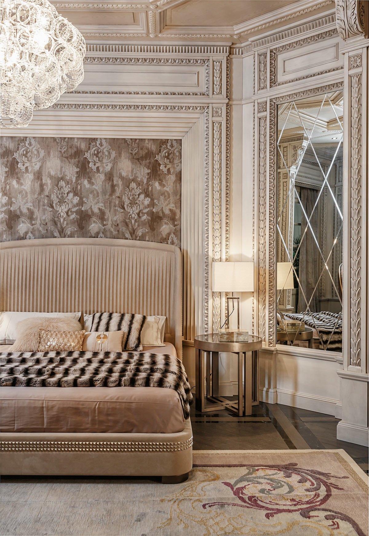
Here's where the neoclassical influences grow even stronger. Look at that fabulous trim! The boiserie is incredibly intricate, comprised of several popular neoclassical patterns. Even the most prominent members of society would rarely have anything so detailed in that era.
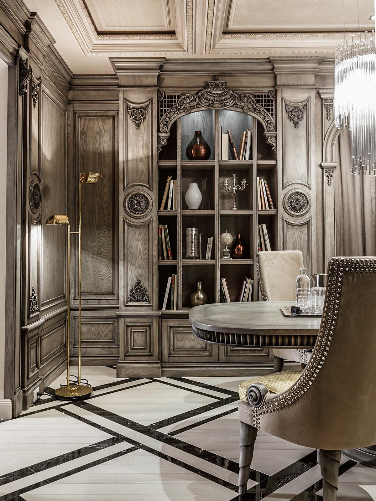
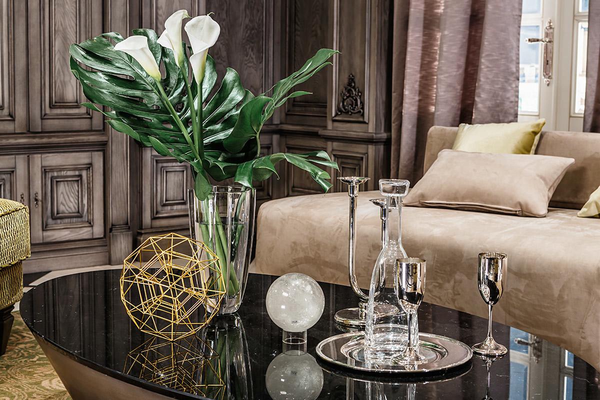
The modern vases on the shelf are a little more loyal to the theme, given that the entire neoclassical revolution was highly inspired by Greek classical design – they take classic Greek pottery shapes and balance them out with a neoclassical sense of symmetry. The top vase, for instance, could be an interpretation of the olpe while the bottom is more like an amphora.
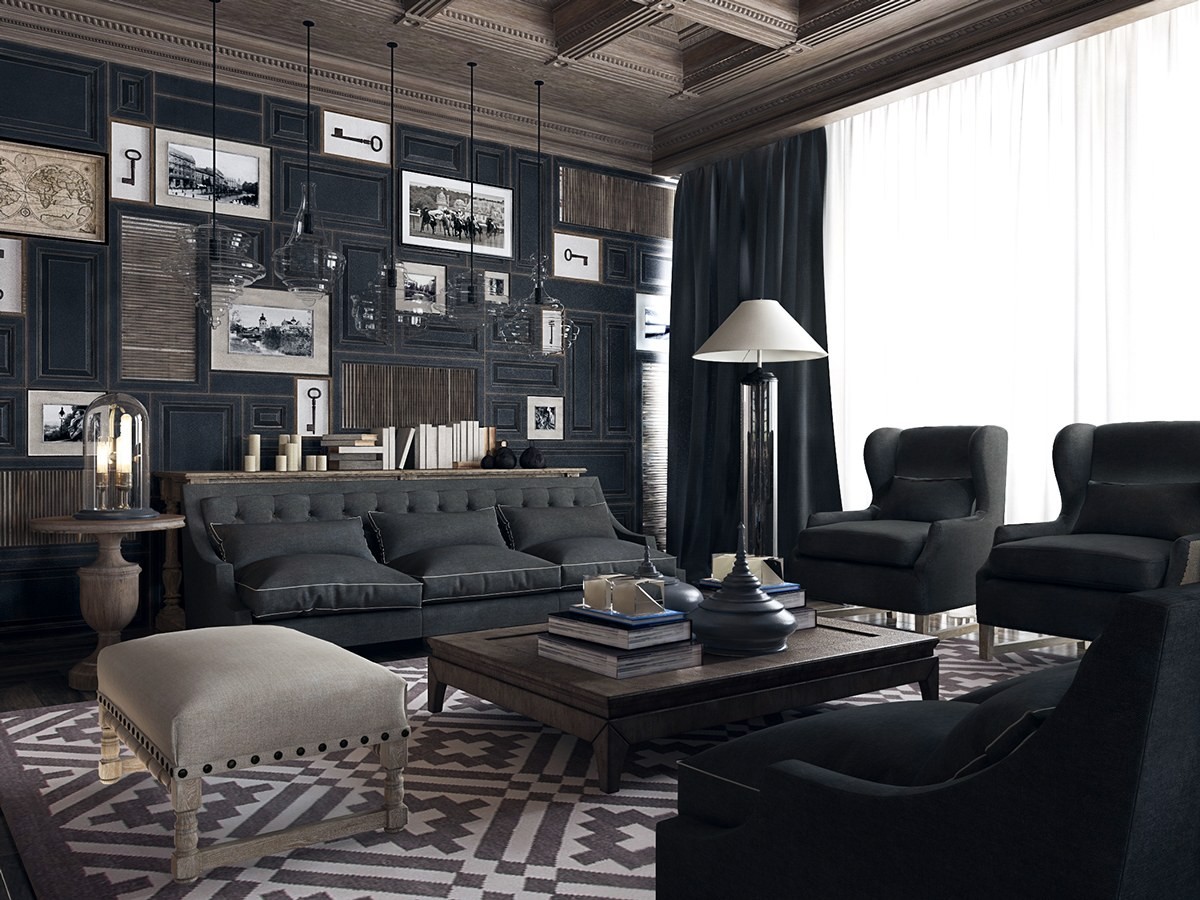
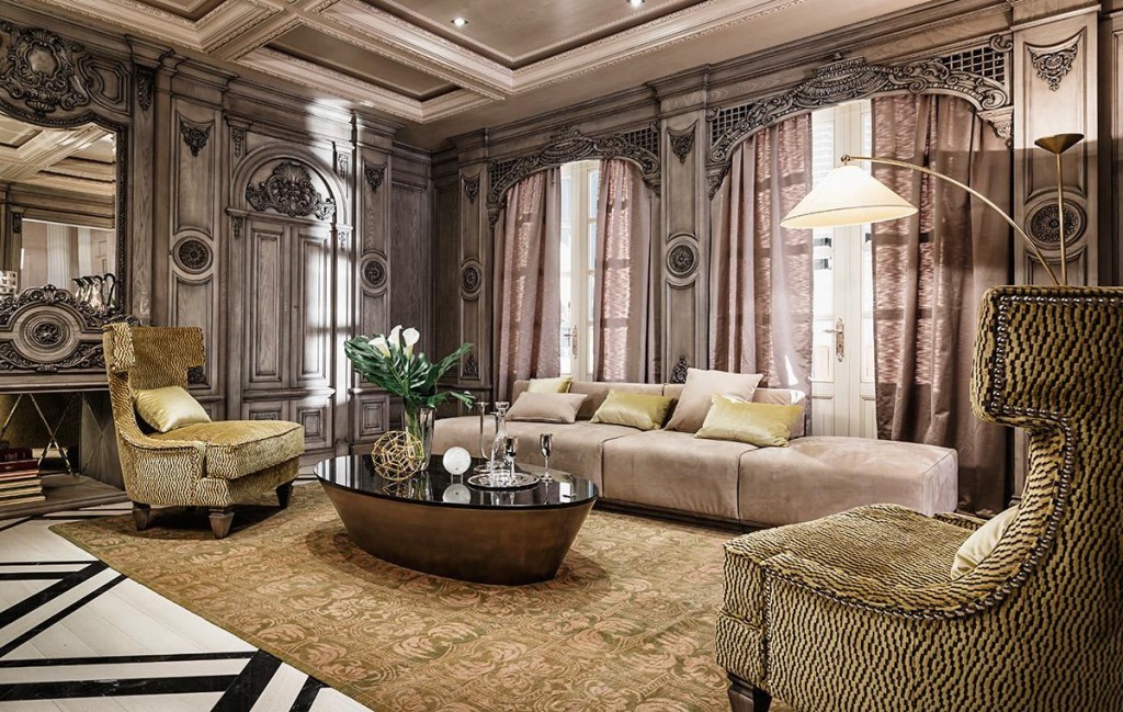
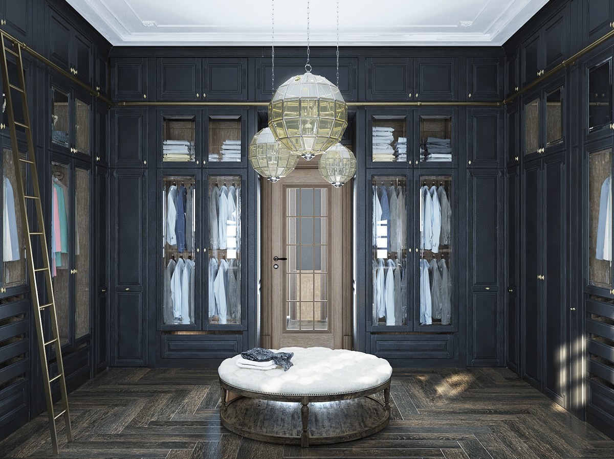
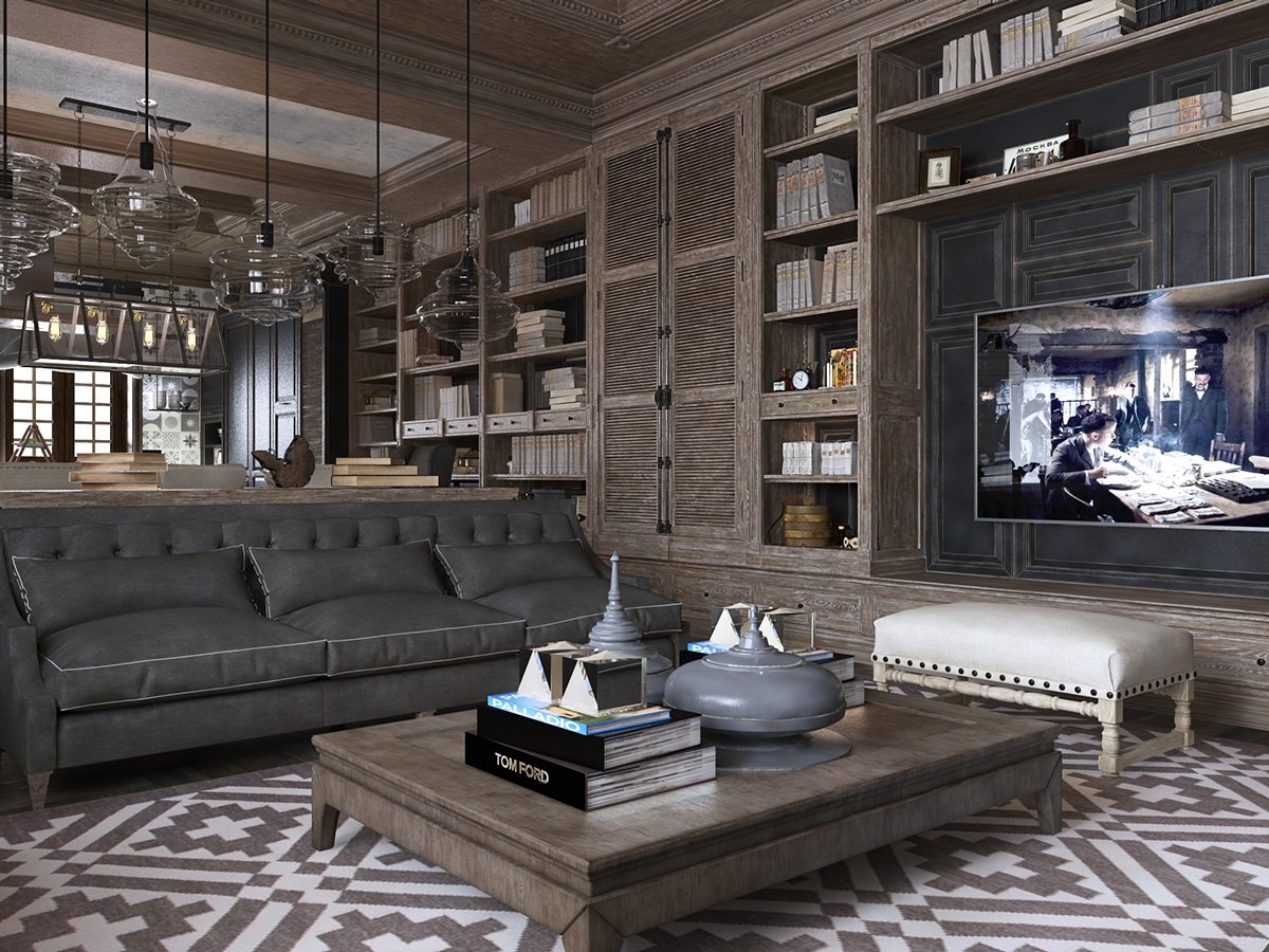
First, let's look at a space that takes an updated approach to the classic Louis XVI style, titled Chateau Margaux. It has a dark and comfortable theme yet avoids feeling imposing. In fact, the darker colors actually help the sophisticated space feel even more comfortable and intimate. It's a truly incredible take on neoclassical era design: not a reproduction but a very creative interpretation.
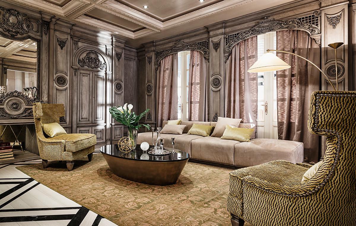
Our second tour examines a home that embraces a diverse range of styles surrounding the neoclassical period, decorated with plenty of modern furniture and accessories throughout. The woodwork concepts are especially interesting – at times imposing, and at other times brightening the room with a light touch.
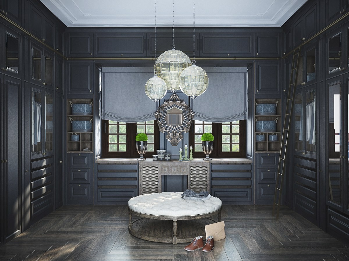
Art Deco was considered a type of neoclassical revival – and the art deco tones are definitely strong in this space. As an aside, it's rare to see a window in a dressing room but it really enhances the atmosphere of this one.
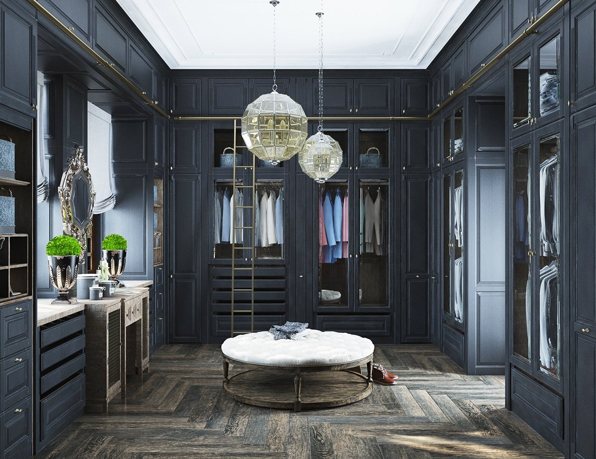
Who wouldn't want to get dressed up more often with a gorgeous dressing room like this one? It contains a stool large enough for two, a vanity table for freshening up, an incredible amount of storage.
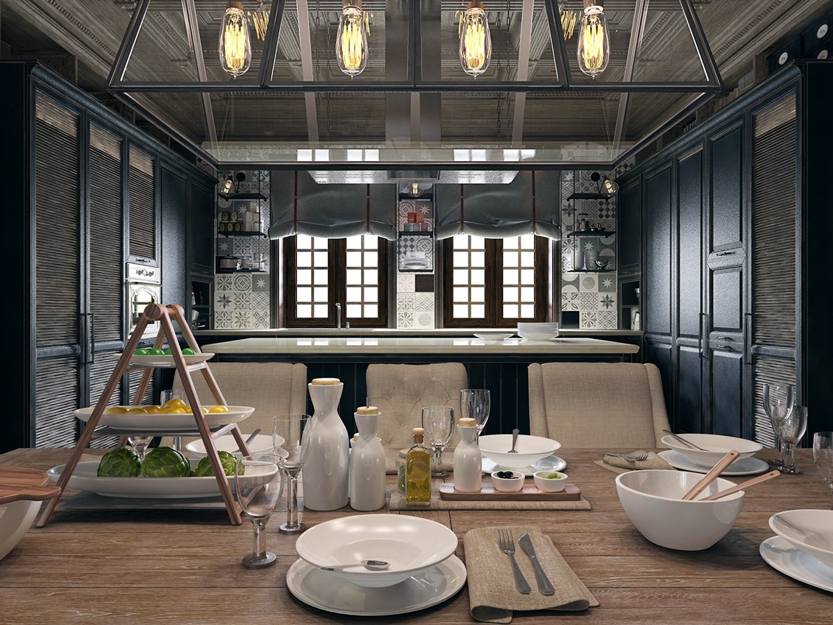
That fabulous window shade style is commonly referred to as 'Swedish blinds' and they're easy to make at home. The dinnerware is lovely and minimalistic, easily standing out from the rest of the decor.
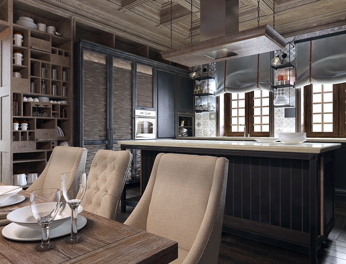
Back to black – the kitchen tones down the wood theme and reembraces the matte black theme. Here, you can see fabulous tiles taking up the spaces between the rural-style windows.
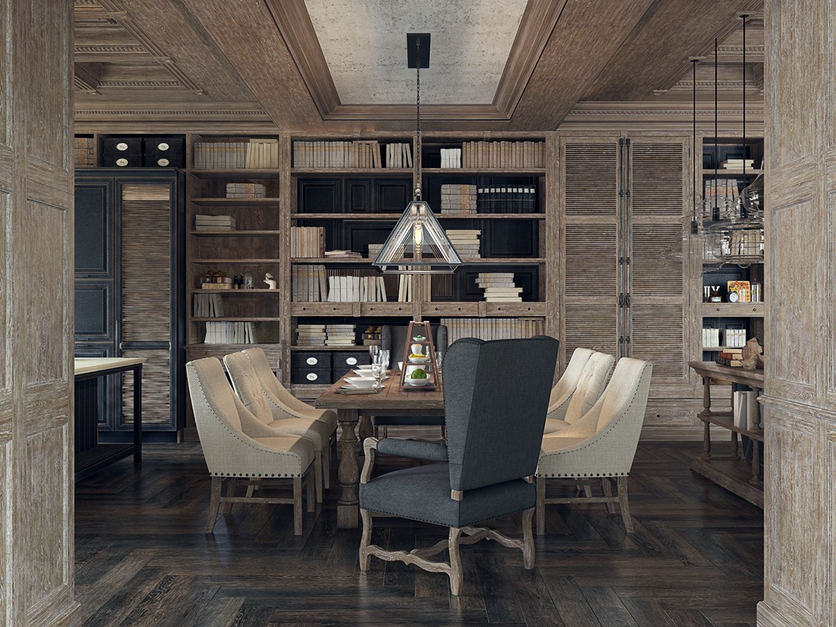
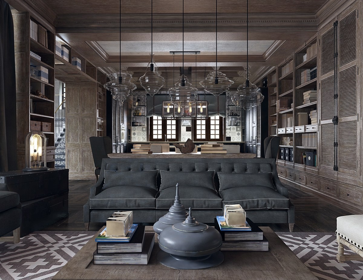
The dining arrangement is sophisticated and subdued, with strong rustic tones. Other features, like the interesting lighting feature, are purely modern (except for the Edison bulbs used within).
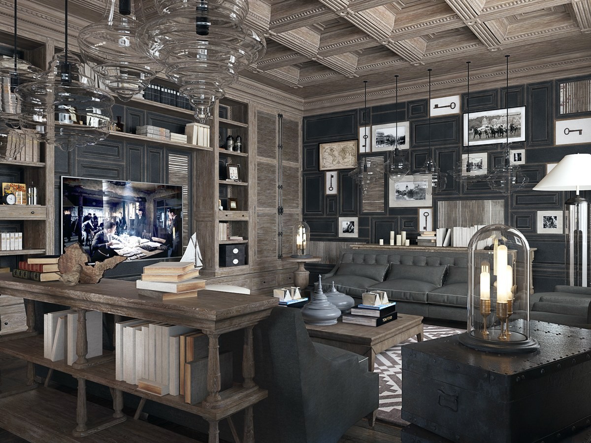
Bell jars were a popular way to protect valuable or delicate objects from dirt, dust, and other potential contaminants. Today, it's common to see Edison bulbs in bell jars a decorative statement but this one has been updated with efficient LEDs.
