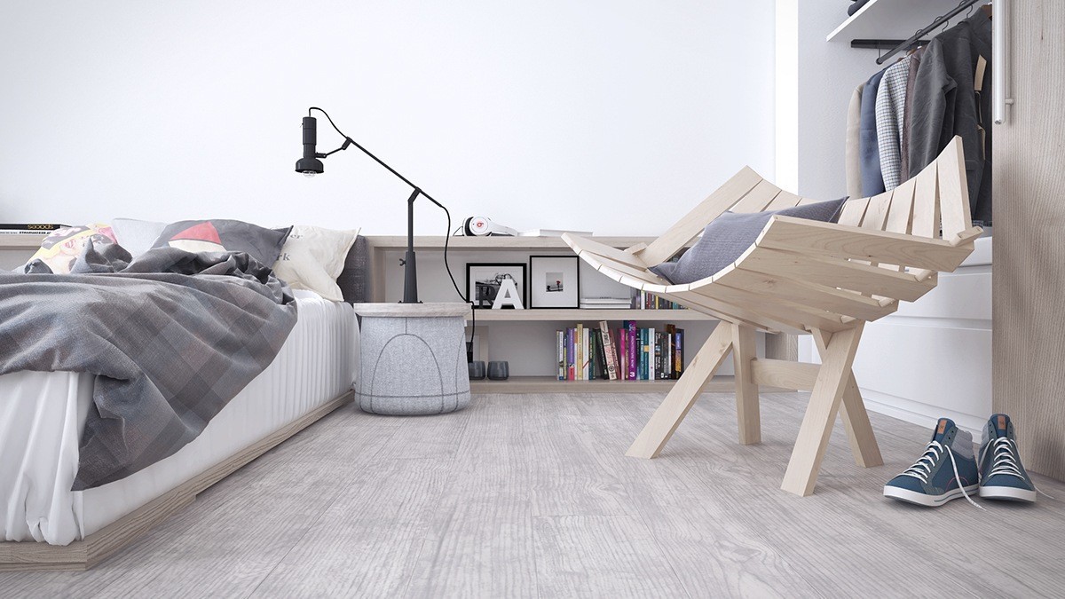
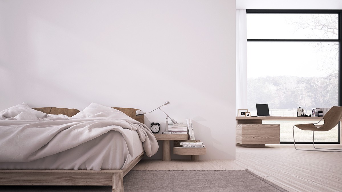
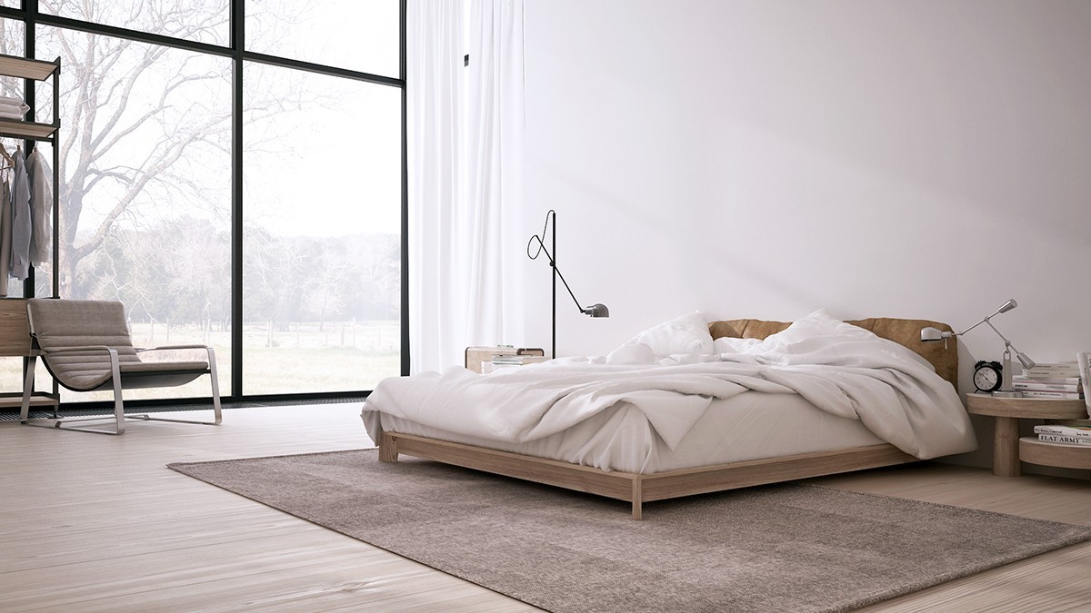
What would you do with a sprawling luxury home? Many people would start looking for design themes to make it feel fuller, pouring through fabric and paint swatches and eyeing the art auctions to fill the walls. These interiors take a different approach. Each minimalistic space remains perfectly sleek and spare, allowing the interior architecture and quality materials to take center stage. Nothing distracts from the beauty of form. Even the furniture features a super-low stature to maintain an unobstructed view – a look that is quite inspiring on its own. Each of the following homes were visualized by Maria Garkusha of Kyiv.
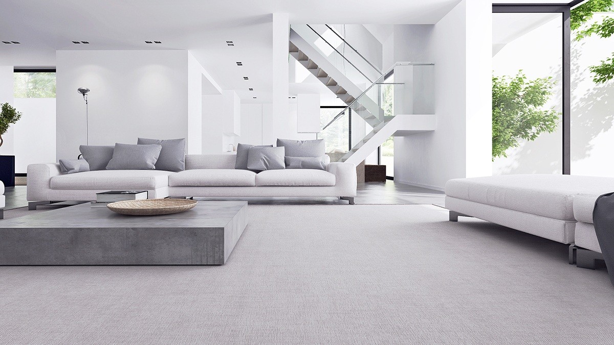
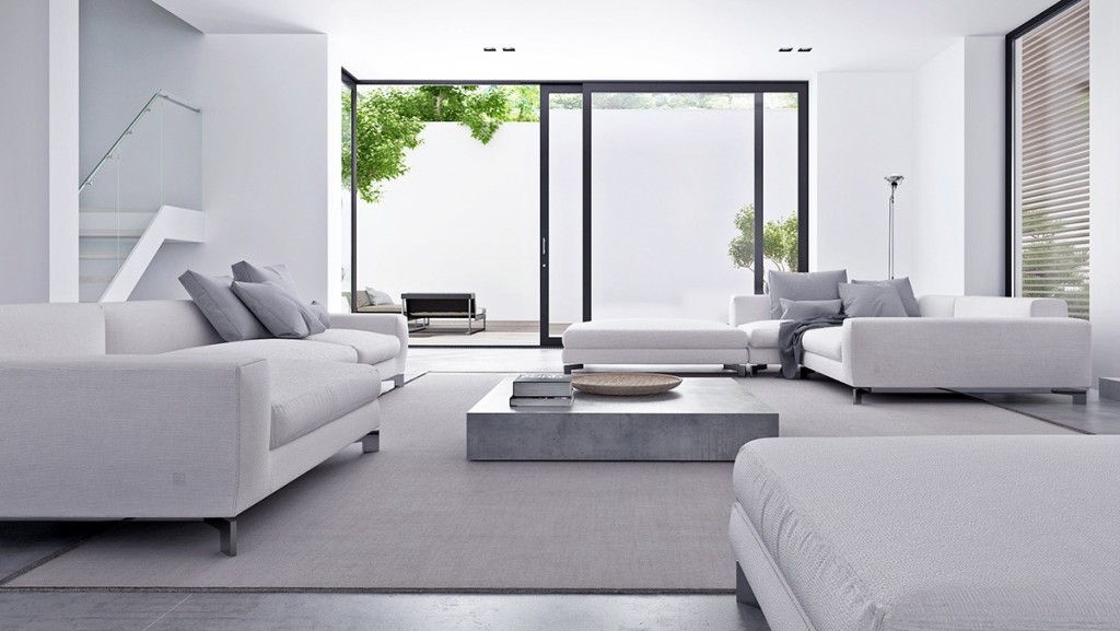
Our first beautiful home resides in a layered environment of folded white volumes, the walls painted with light and shadow. Here the low-profile furniture does a brilliant job of highlighting the glass-railed staircase as it winds its way through the tall and bright open living space.
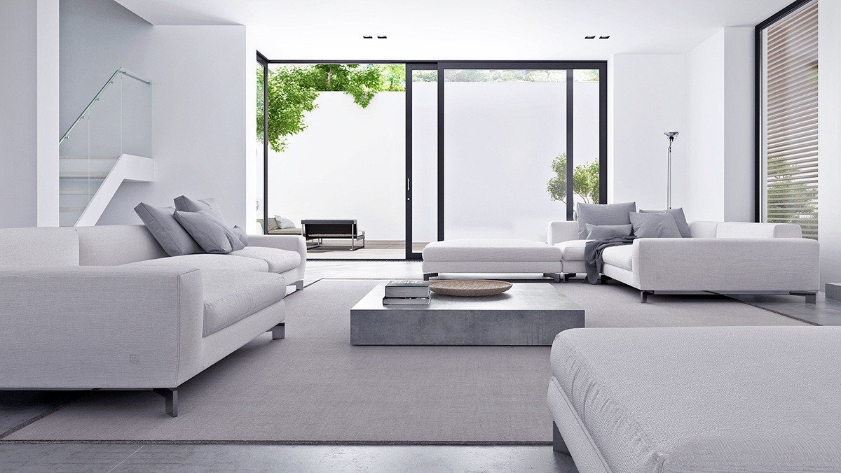
Concrete accents and sharp lines would make any other space feel too sterile, but the subtle range of grays does a wonderful job of softening the aesthetic.
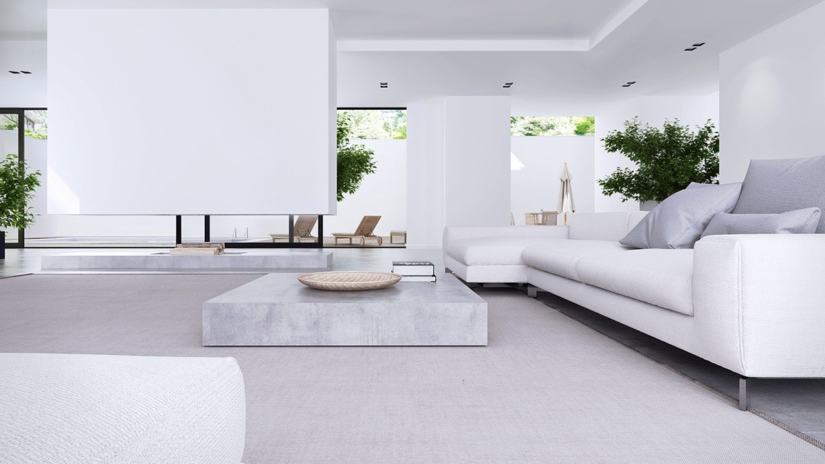
A peek across the room demonstrates a strong unification of indoors and out, with the outdoor furniture maintaining the same low profile as the sofas and tables inside.
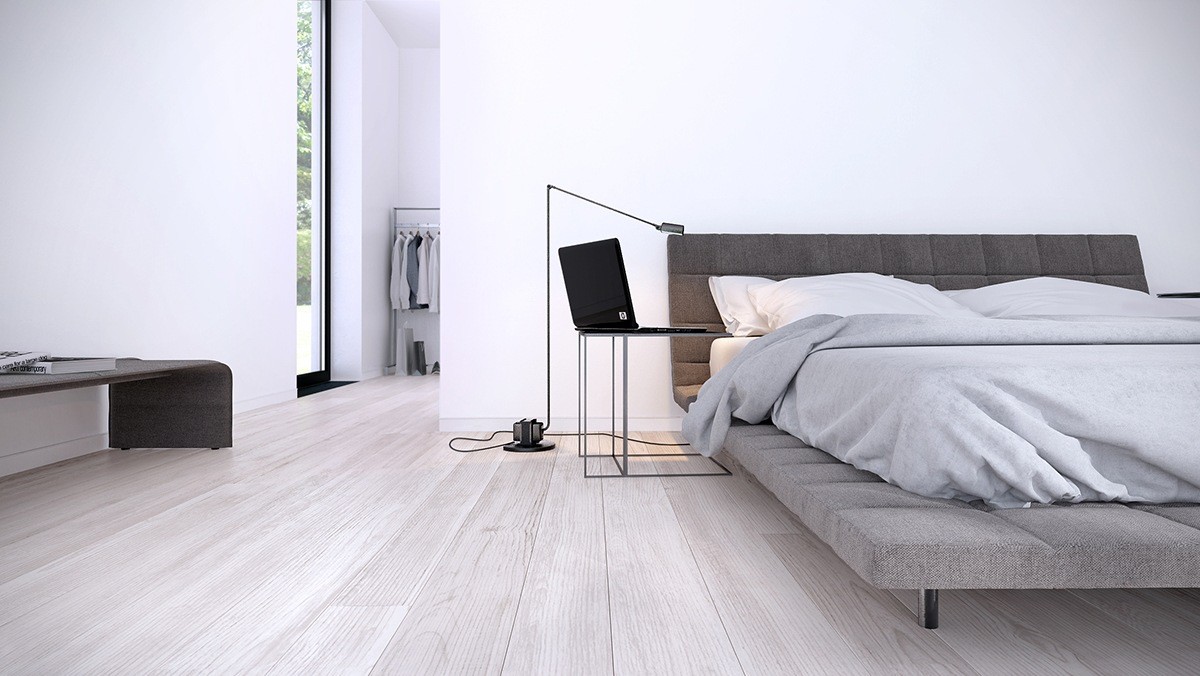
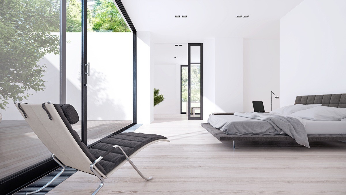
Uncomplicated by decor, this bedroom can remain light and free – a great environment in which to unwind after a hard day.
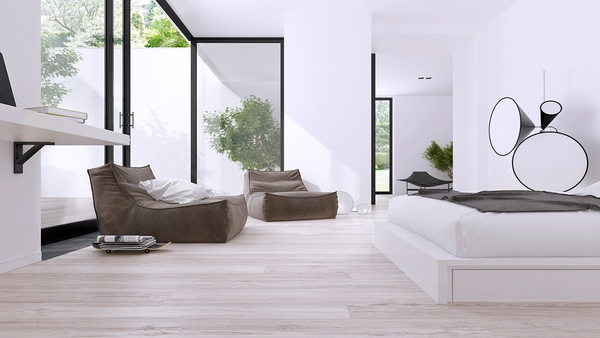
Here's another bedroom, also very low and natural, with modern accents like the interesting cone-shaped floor lamp by Tom Dixon.
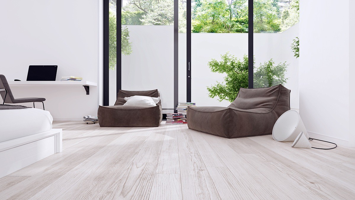
Nearly every room in the house has a view of the privacy wall. It's lovely how the greenery cuts such a crisp profile against its pristine backdrop.
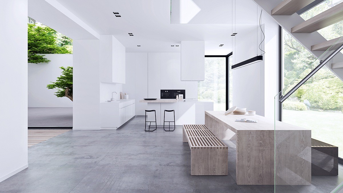
A return to the main living volume reveals a beautiful open kitchen surrounded by courtyards. The kitchen enjoys a clean white theme while the dining arrangement welcomes guests with warm wood furniture.
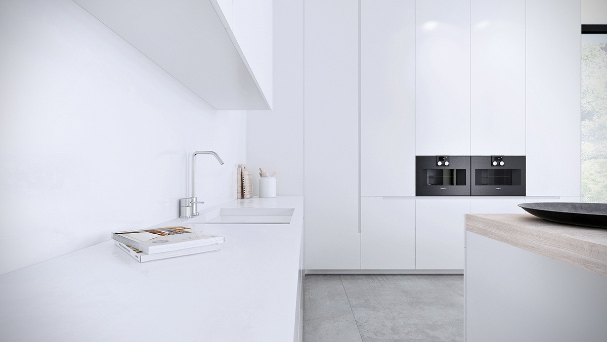
Simple surfaces, quality fixtures, and plenty of storage: this space has all the makings of a delicious minimalistic kitchen.
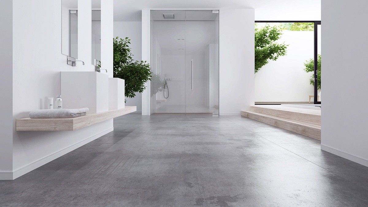
The bathroom is also in perfect communication with the rest of the home, the shower stall tucked away into a semi-private cove.
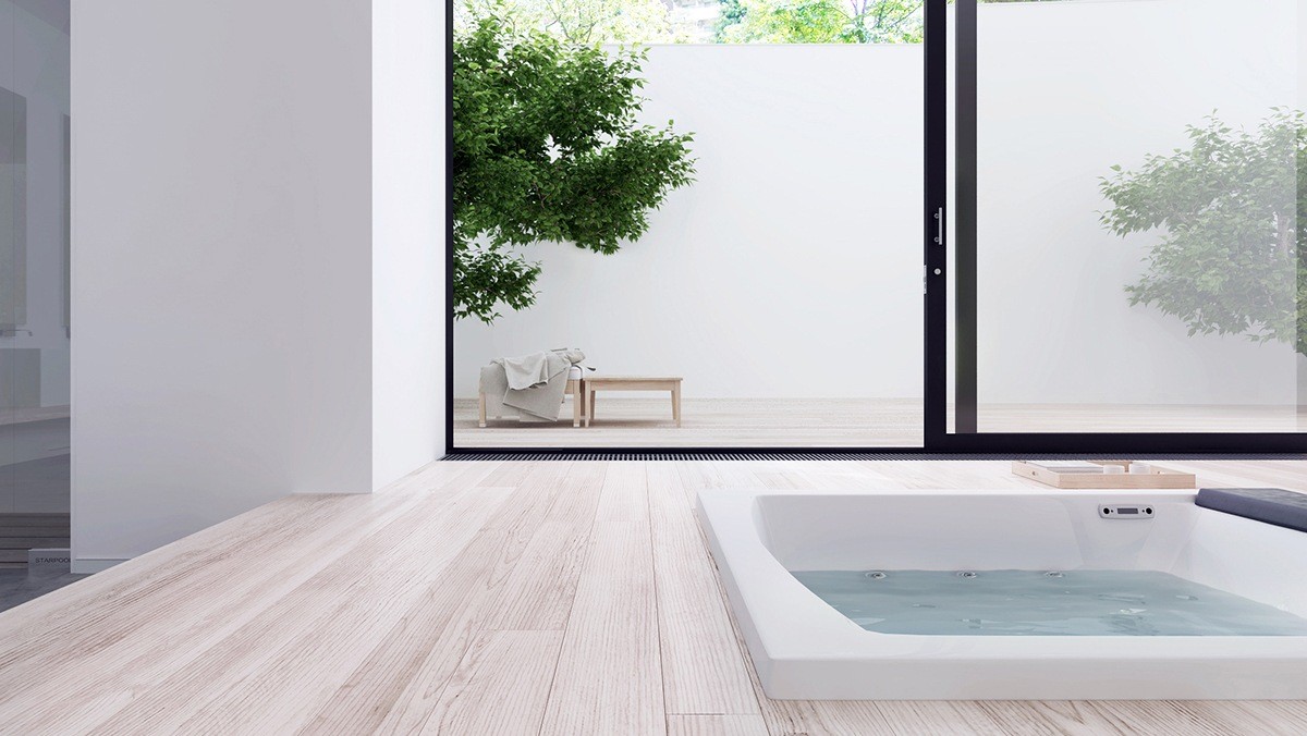
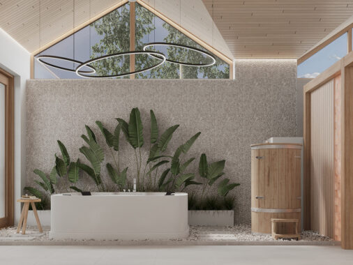
It's impossible to understate how important the surrounding wall is to the open layout design. Situated almost in the living room, this hot tub would have seemed far less comfortable without it.
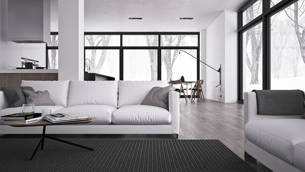
Our second tour is a little briefer, but it's so worthwhile! This home has a higher-contrast aesthetic for more visual drama, making the low furniture choices pop out from their surroundings. Stark white and matte black accents gain balance from a careful selection of gray mid-tones.
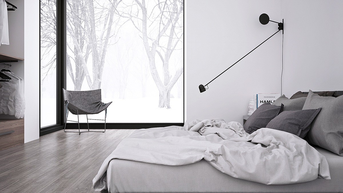
The bedroom continues the theme, and emphasizes low furniture as well. An elongated counterbalance lamp by Daniel Rybakken stands out like artwork.
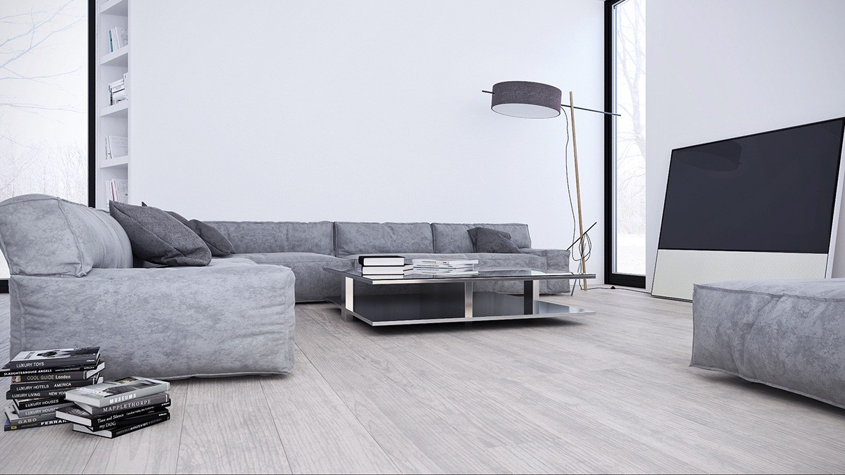
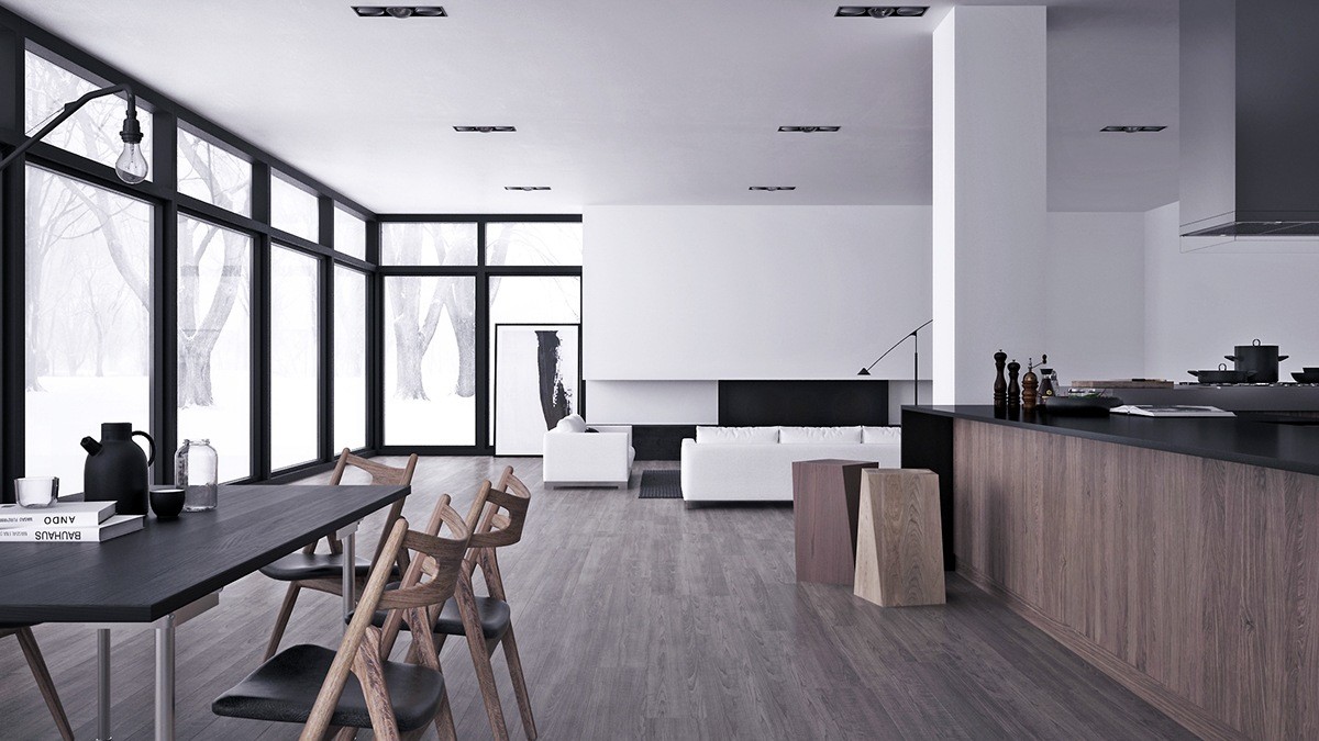
Next up is another home that takes advantage of tall glass windows to amplify the effect of a minimalistic interior. While the first home used light tones and the second home used a high contrast palette, this one seems to sit comfortably right in the middle.
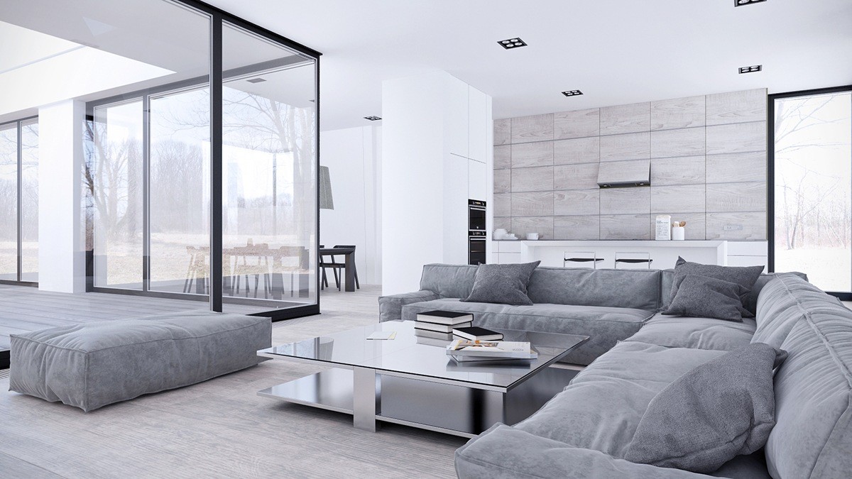
The layout is semi-open, using limited dividers and a smart layout to maintain communication from one space to the next.
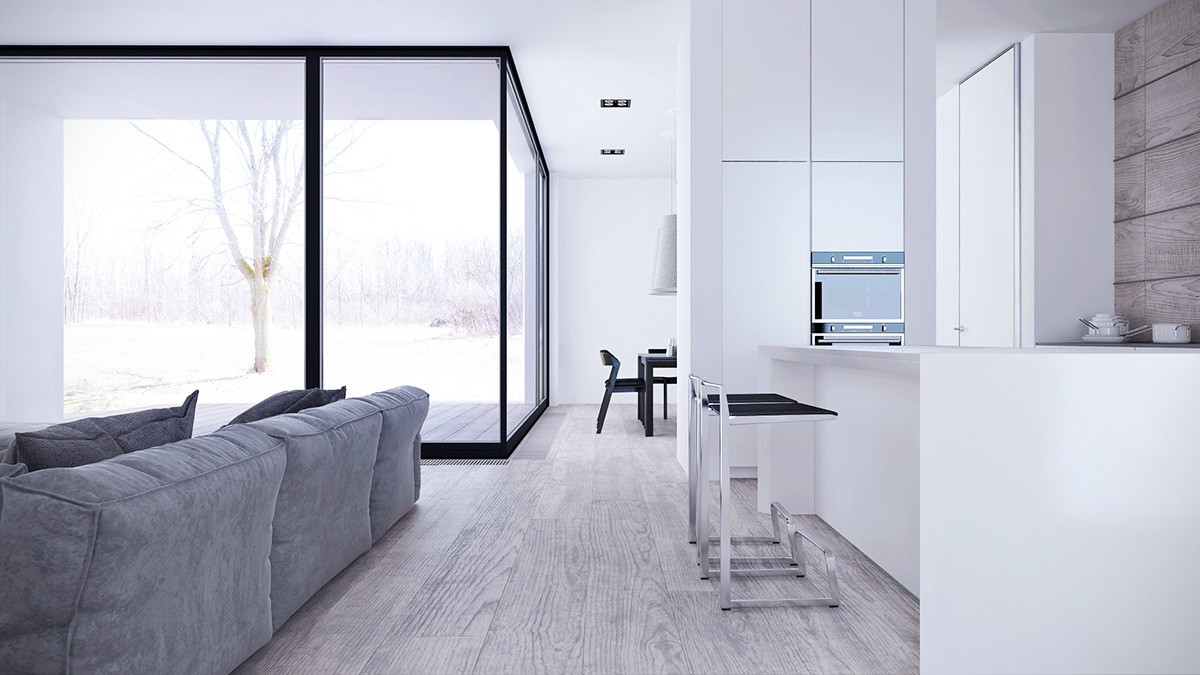
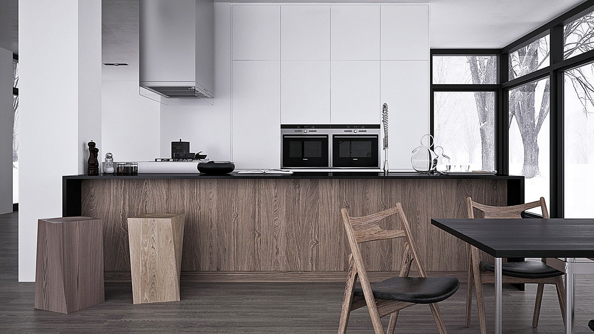
Behind the living room arrangement, a spacious yet compact kitchen includes a breakfast bar at the island and ceiling-height storage to keep things looking sharp.
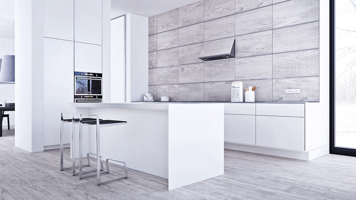
Check out this cool wall treatment! The range hood looks like it could close for a sleeker look when not in use.
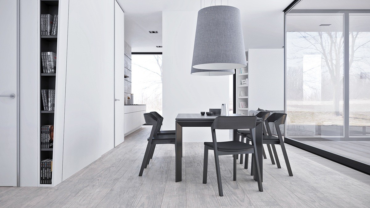
This view makes it easier to see the significance of the storage wall that divides the living and dining room. Without the reflection, the living space would be clearly visible through the glass walls to the right.
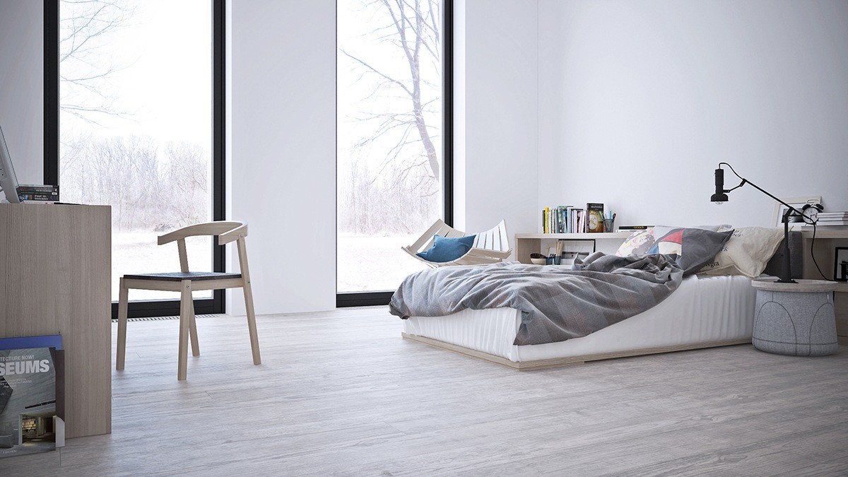
Compared to the previous homes, these bedrooms seem more decorative and personal. This one uses playful furniture and puts functional objects on display rather than hiding them.
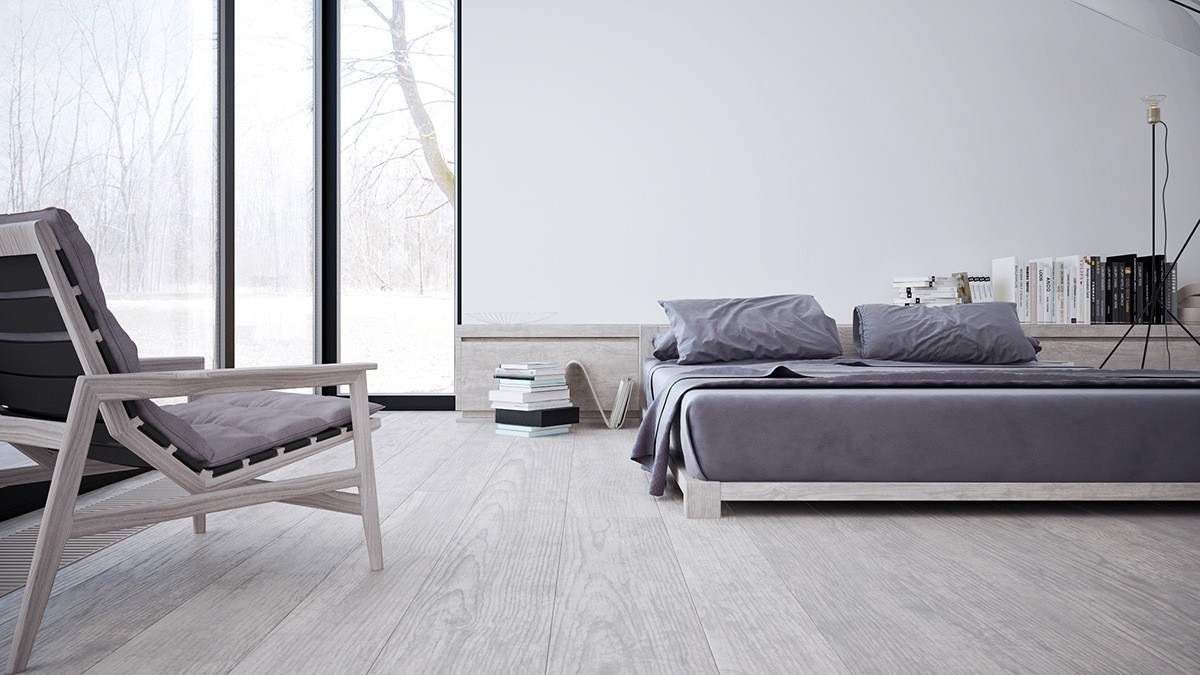
Here's a look at a second bedroom, outfitted with the same low-slung furniture as the rest of the home.
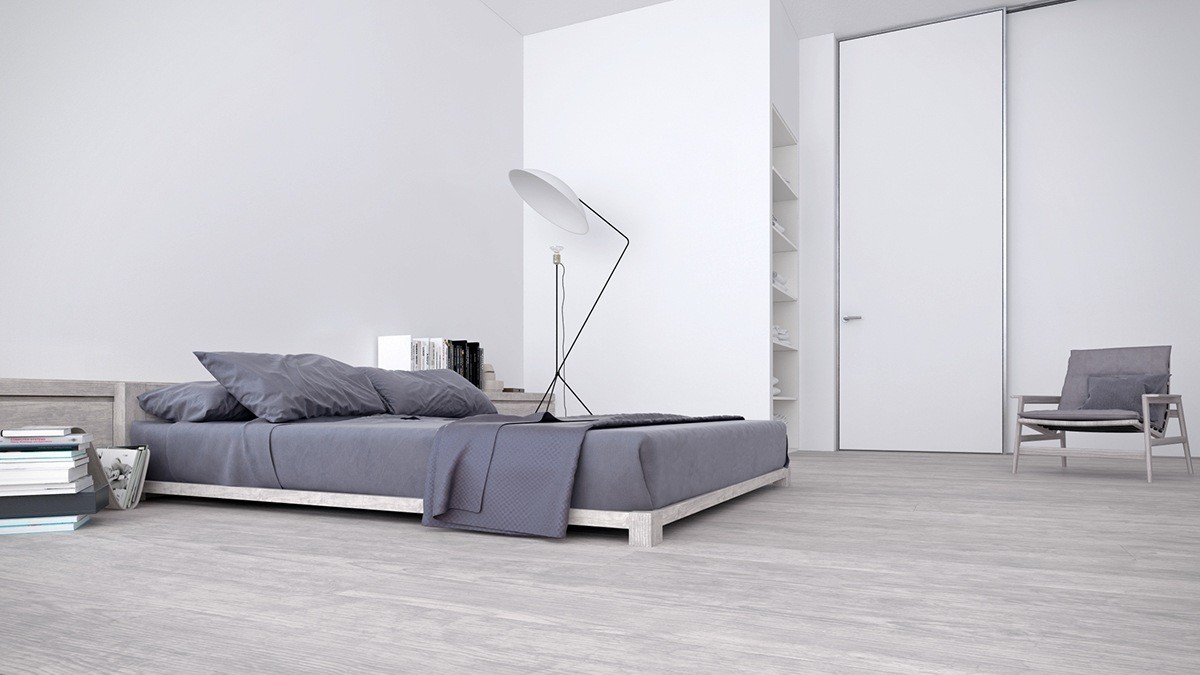
The distinctive floor lamp with reflector is the Solveig model by Avril de Pastre – solveig means "path of the sun" in Swedish.
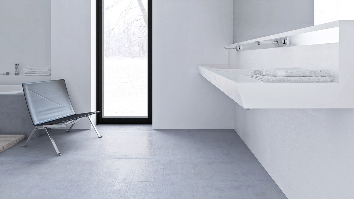
A return to raw minimalism, the bathroom gains its independent character from attractive angled features such as this cantilever vanity.
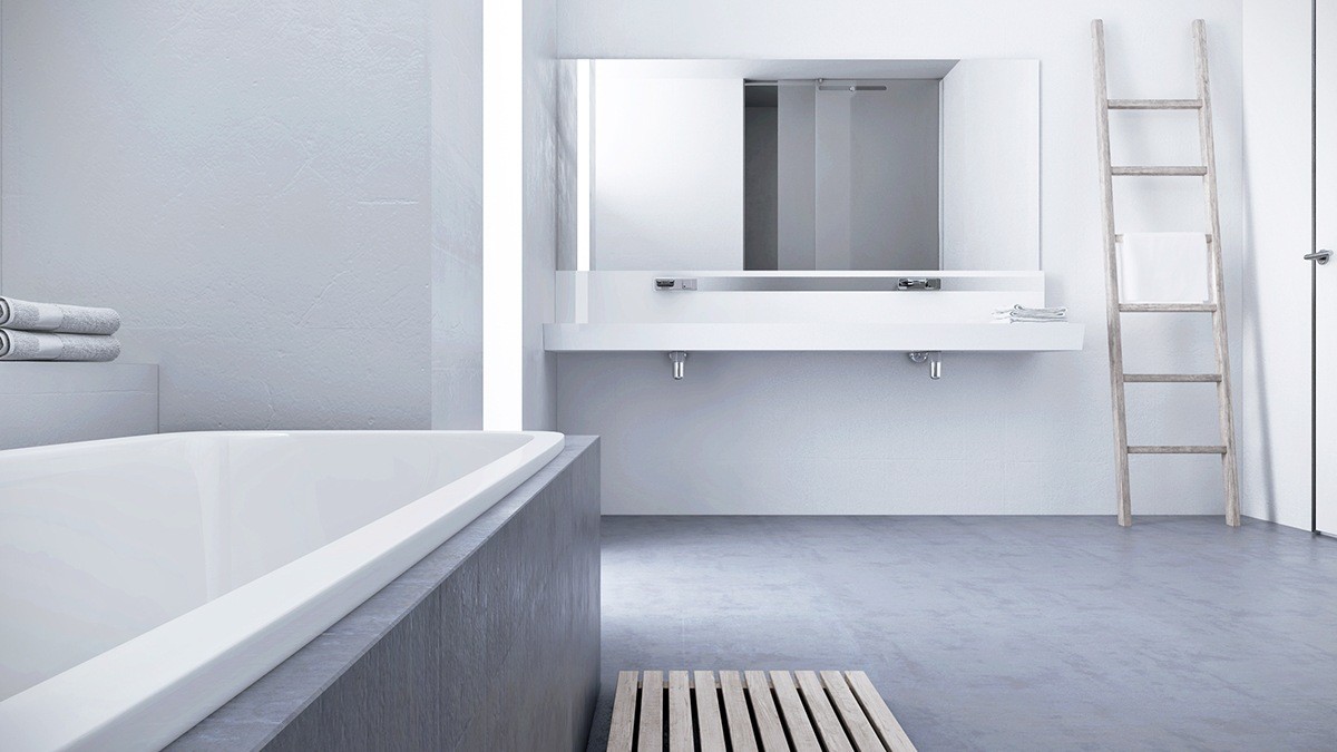
Simple wood accents add a functional touch. Both the palette floor mat and the ladder towel rack would serve as easy DIY projects for any home.
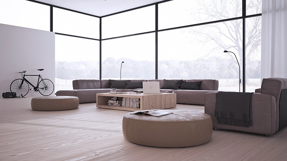
To round out the set, this final gorgeous home uses strong earthy tones rather than a straight grayscale theme. It still has the same incredible walls of windows and low furniture, but the organic palette and curved features bring out a completely different personality.
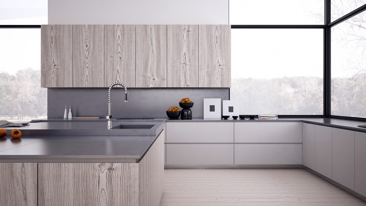
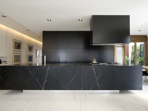
Strong lines play with the scale of the kitchen, making the countertops look low in accordance with the furniture theme throughout the rest of the home.
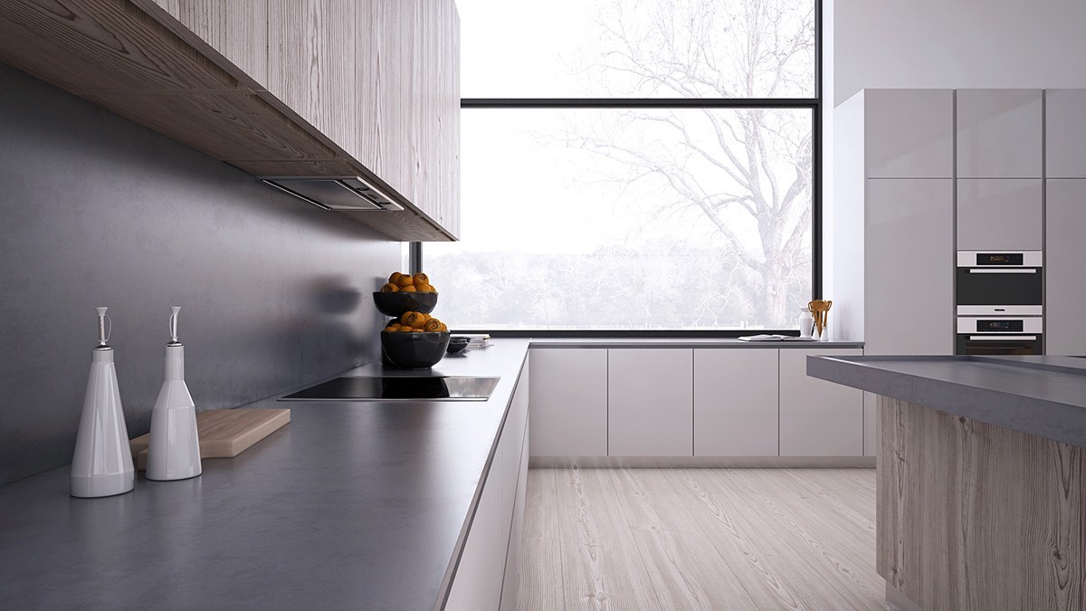
Because the countertops are relatively low, the ovens take up residence in the standing cabinetry to the right.
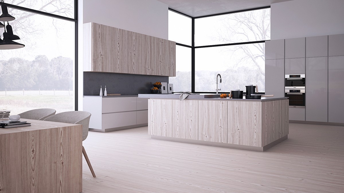
The sink, however, is part of a raised section of the countertop to make washing up a little easier.
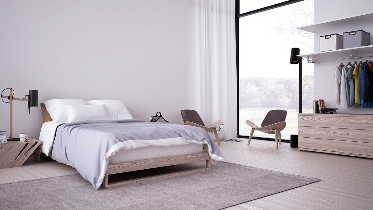
Both of the bedrooms feature a different iconic chair. Here you'll see Hans J. Wegner's famous Shell Chairs occupying a calming spot near the window beside a black floor reading lamp.
