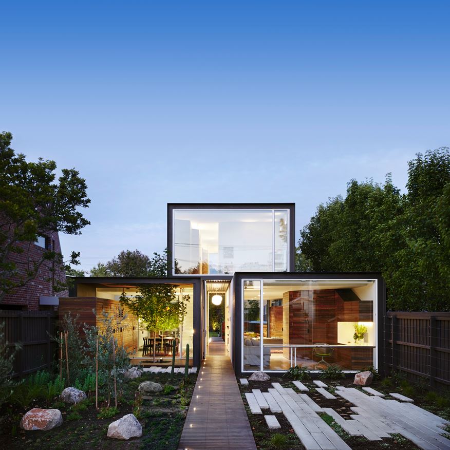
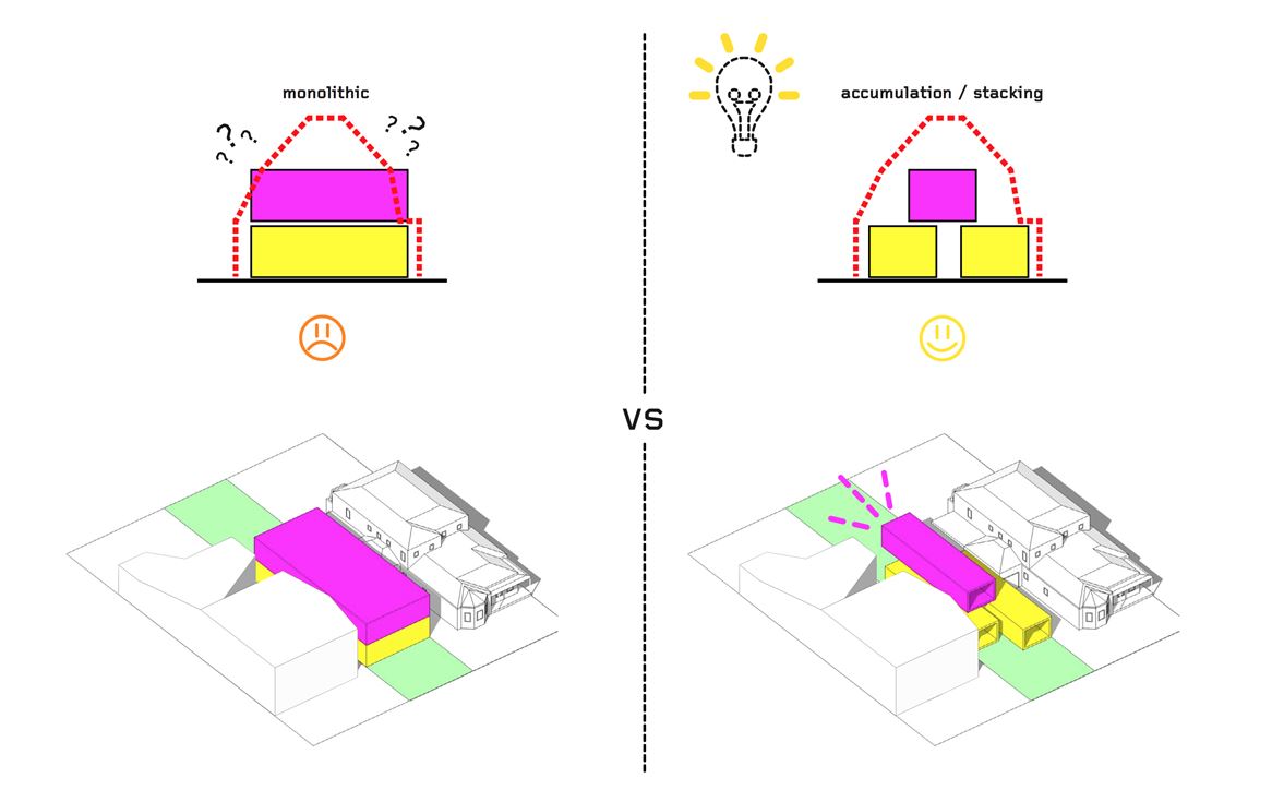
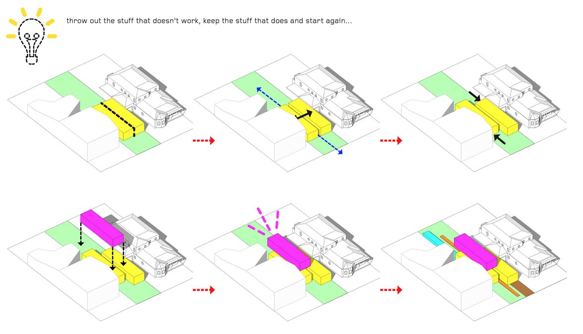
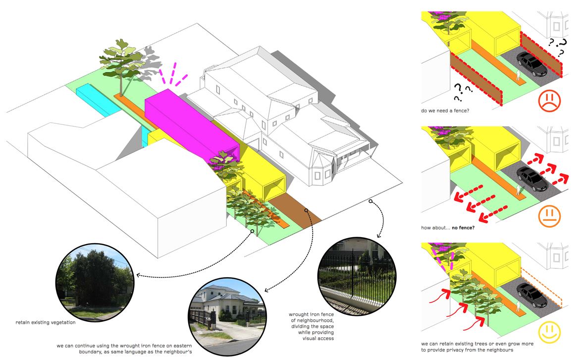
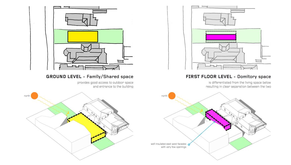
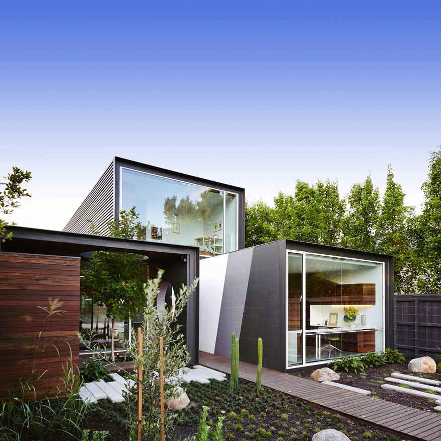
With the intent to create a home that fosters interaction not only between family members but also with the surrounding environment and community, Austin Maynard Architects drafted up a creative three-volume structure and outfitted it with an ingenious interior layout to match. It's only half the size of its neighbors - an attempt to avoid one of the causes of urban sprawl in Melbourne, where flat ground encourages builders to create larger homes than other settings can ordinarily accommodate. The result is a relatively compact open interior layout that maintains a strong communication with its gardens and courtyards.
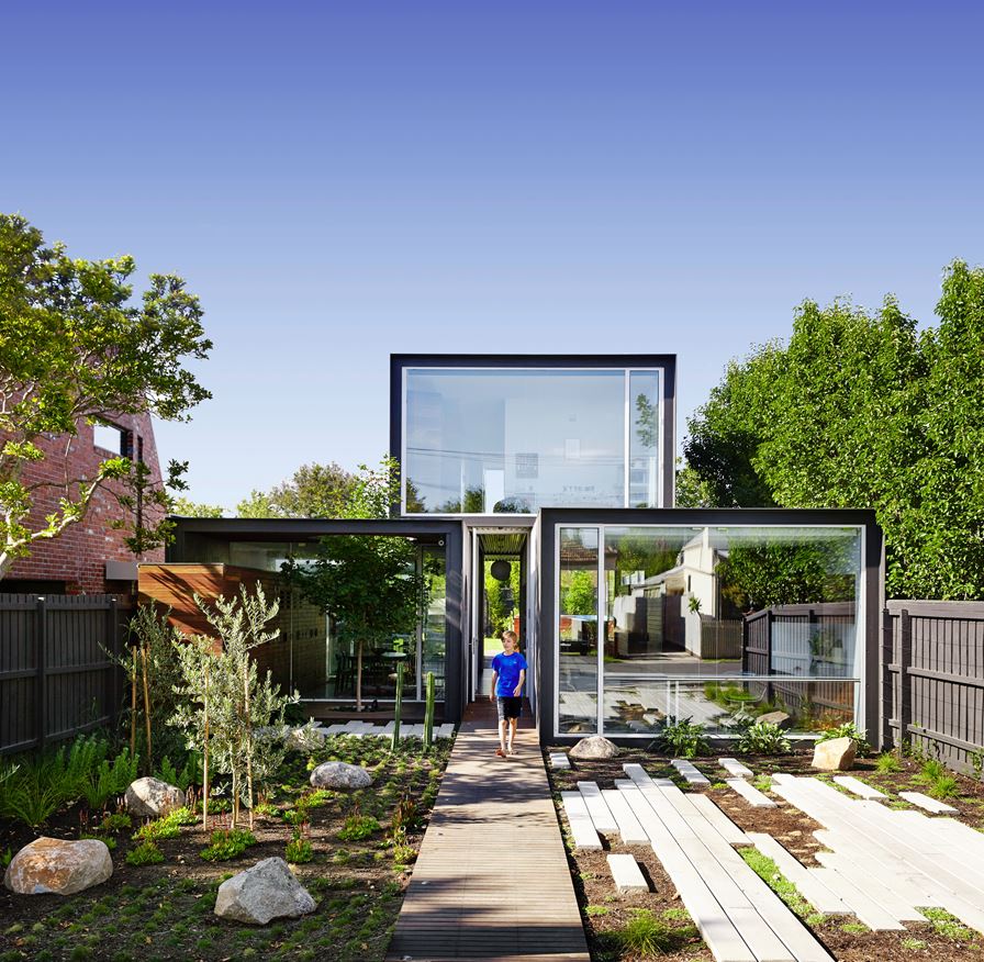
A hallway bisects the two lower volumes and continues in a straight line through the home, its ceiling formed by the upper volume.
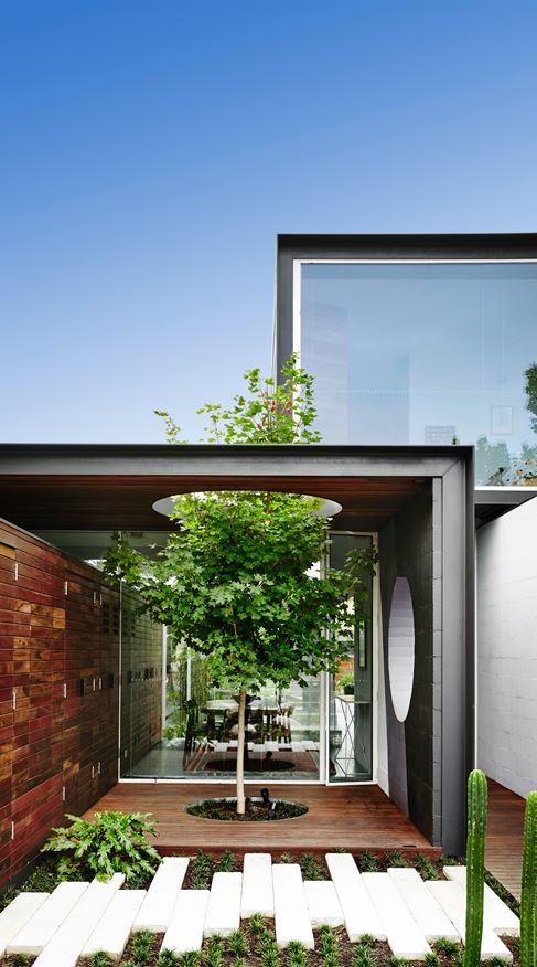
Interesting architectural features like this partially-enclosed patio serve to break down the boundaries between indoors and out.
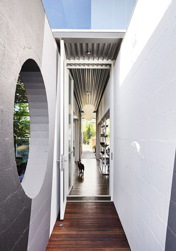
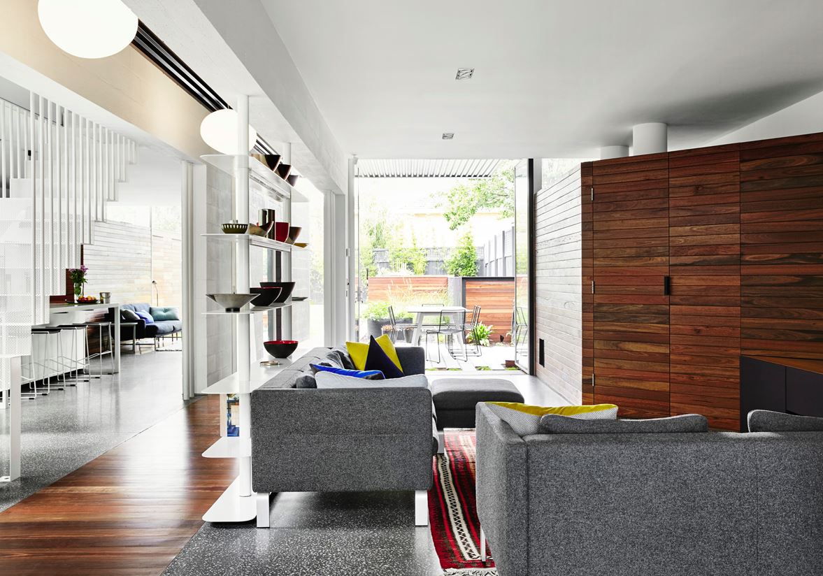
While it looks like an exposed passage from a head-on angle, the hallway is actually open to the social areas on either side.
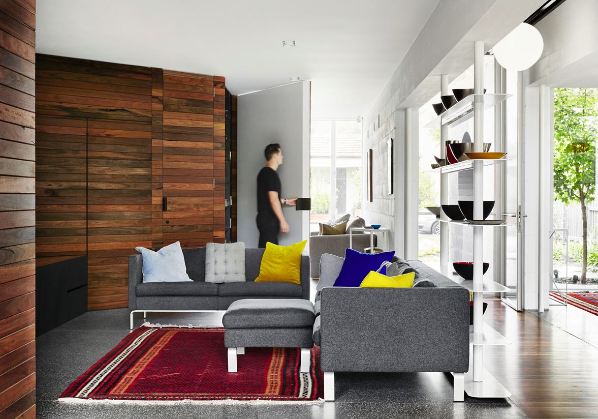
It gains a sense of division with a simple open shelving unit, displaying a gorgeous collection of decorative ceramics.
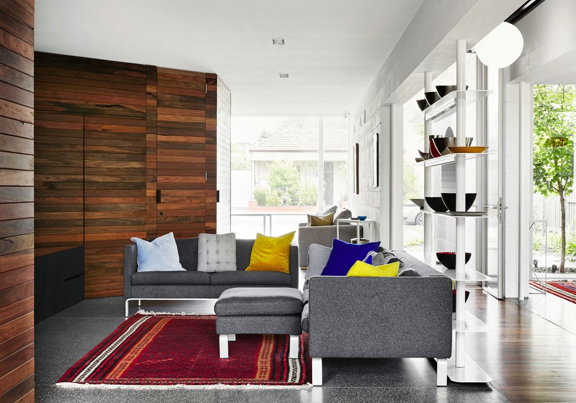
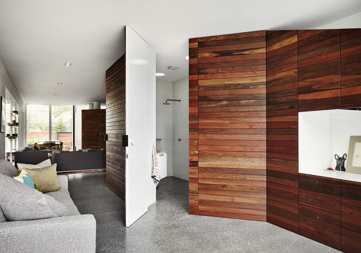
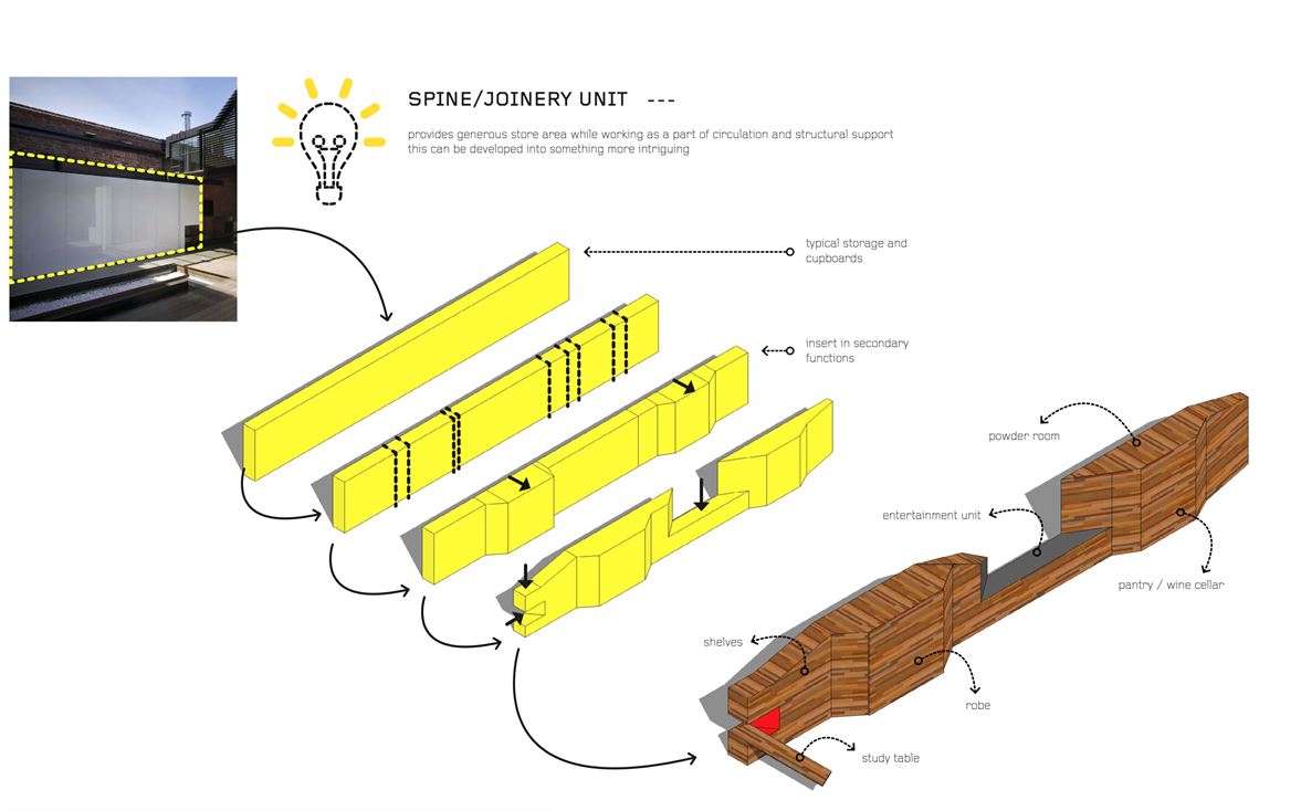
The wooden wall houses hidden rooms on either side, with a depression making space for the media center.
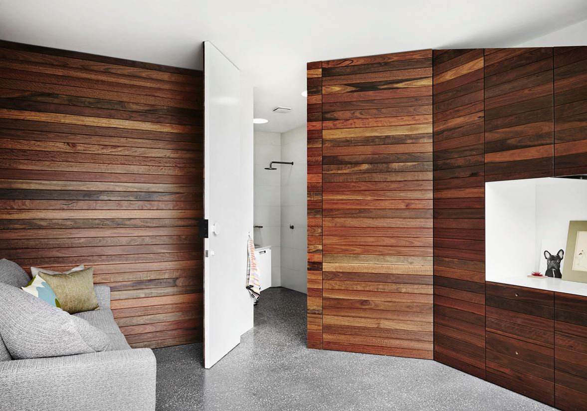
No, this isn't a different angle. A swinging wall provides privacy when needed. It completely changes the space!
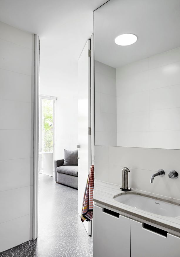
The bathroom remains minimalistic, sparing unnecessary details like a mirror frame in favor of a cleaner aesthetic. It does boast some innovative features such as the placement of the lower cabinet handles – they're located on top of the doors so residents won't have to stoop down to open them.
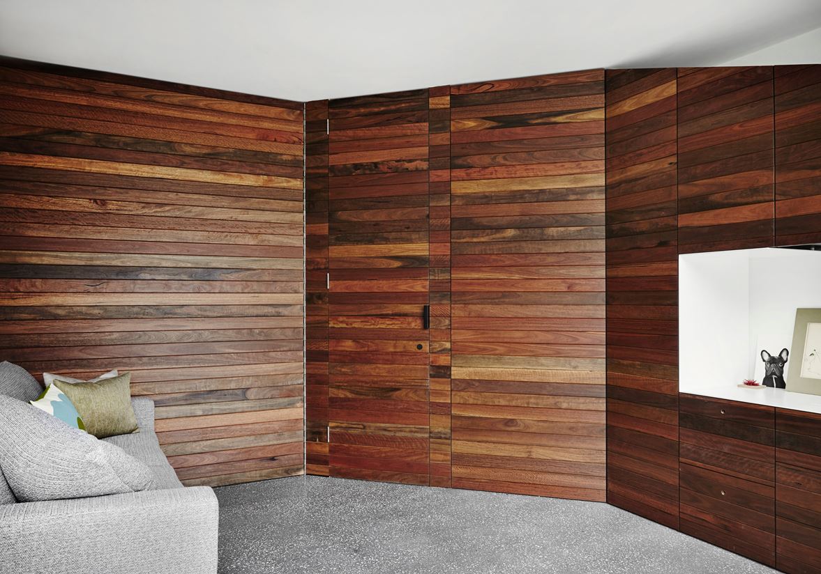
The doors would blend right into the background if it weren’t for the visible hinges and the distinction created where the horizontal panels don't line up.
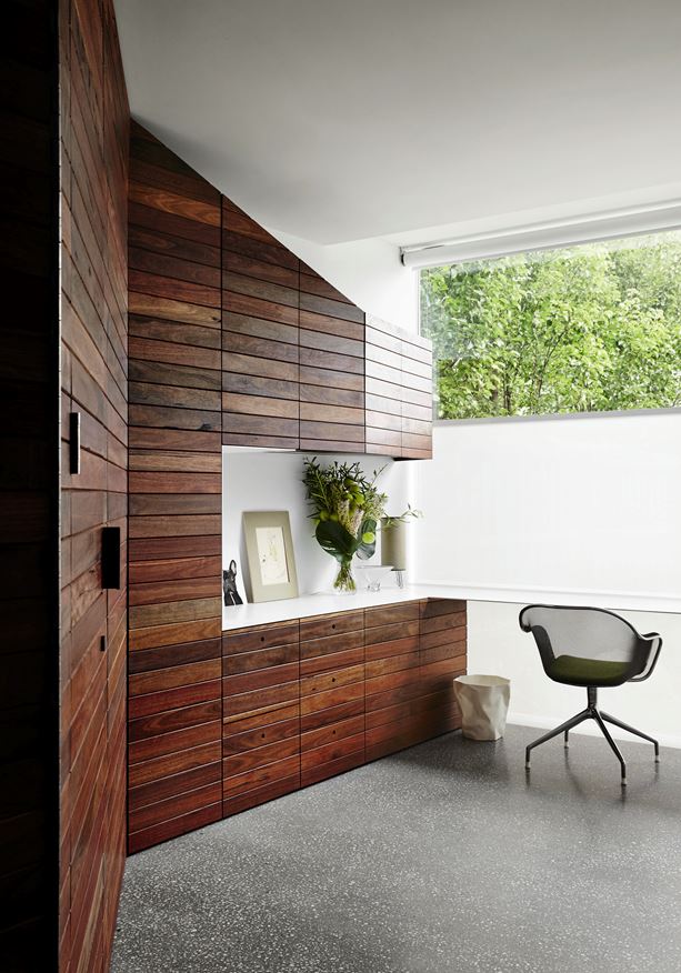
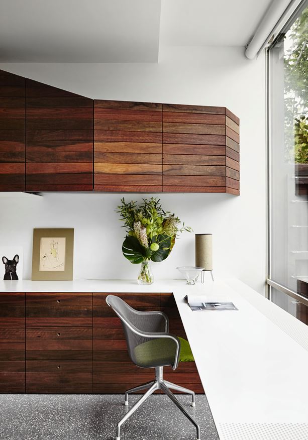
Optional privacy is especially important since this space houses the office. Shades that lift from the bottom up (used throughout the house) provide privacy from the neighbors without darkening the room.
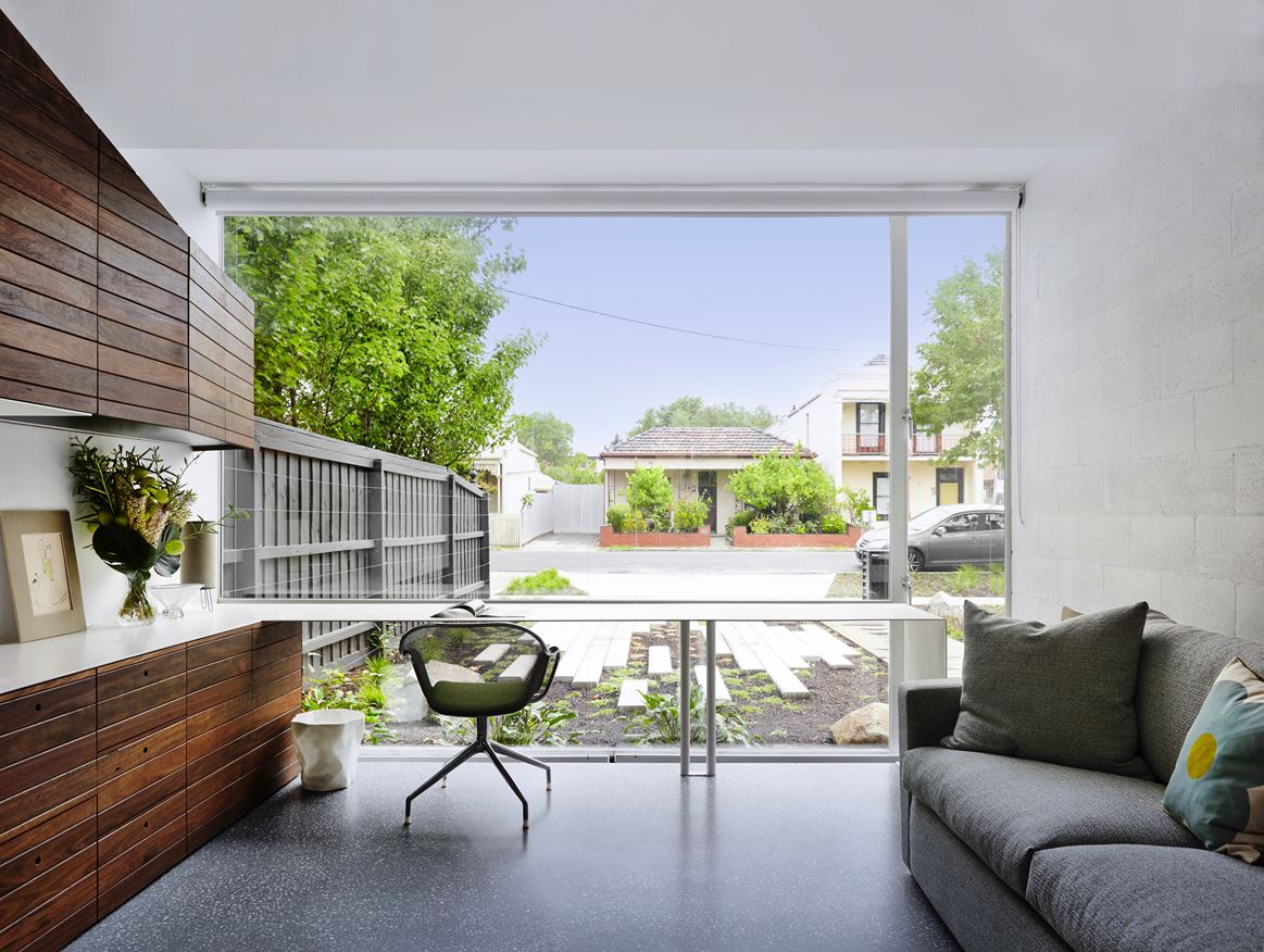
A mesh IUTA chair by Antonio Citterio pairs well with the super slim-desk, their sense of transparency preserving the view into the garden.
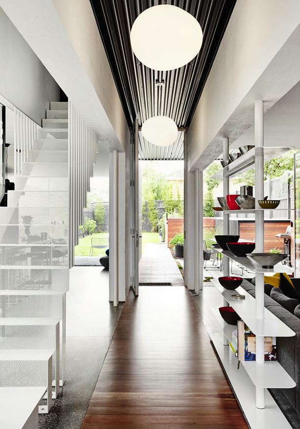
Back in the hallway, clever divider strategies help separate the kitchen to the left and the living room to the right.
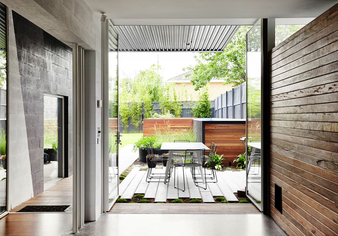
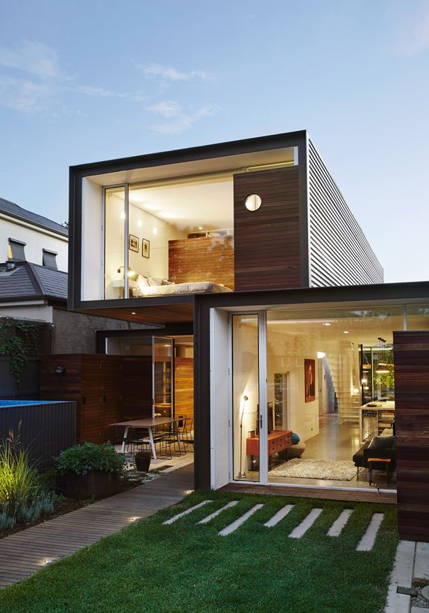
Looking out onto the rear patio, a small dining area offers yet another place for guests and family to gather and socialize.
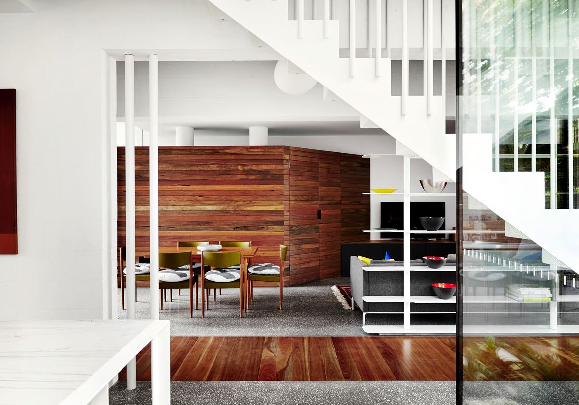
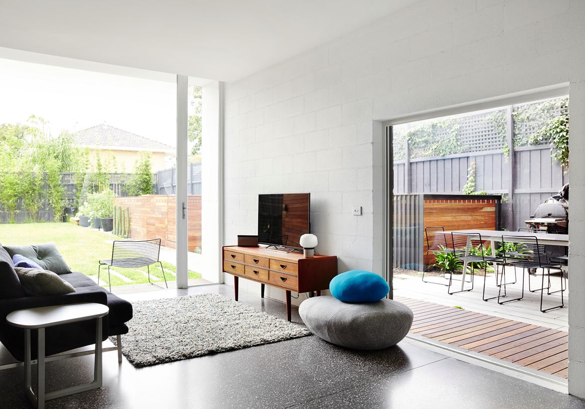
Here's a second dining room right off the media area. All told, there are a total of three dining tables in this house! Not bad for a home half the size of its neighbors.
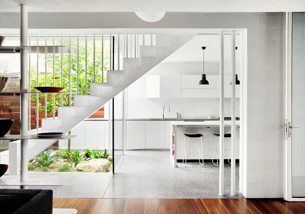
Minimalistic and attractive, the bright white kitchen uses angled surfaces as a play on the abundant light that filters through the atrium courtyard to the left.
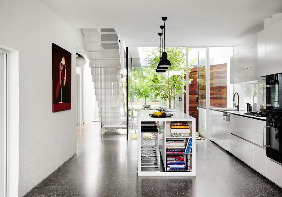
Check out the neat storage in the side of the kitchen island! Everybody needs a place to store cookbooks and morning reading.
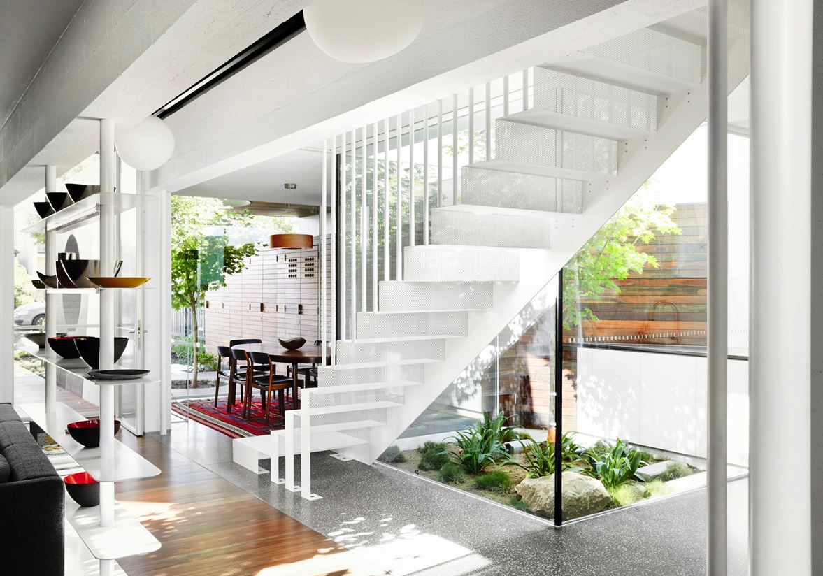
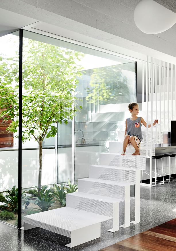
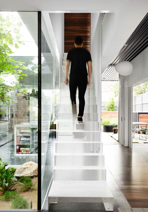
Mesh stairs preserve the view of the outdoors, with support beams continuing the implied boundary started by the open shelves in the living room.
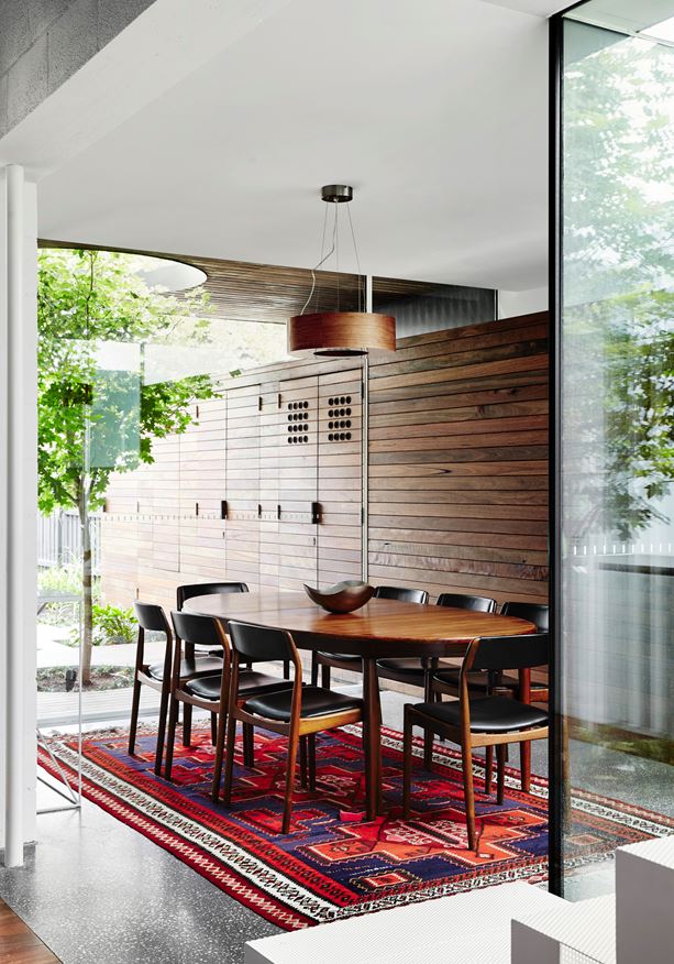
On the other side of the atrium, the third and most formal dining room embraces dark woods and bright colors.
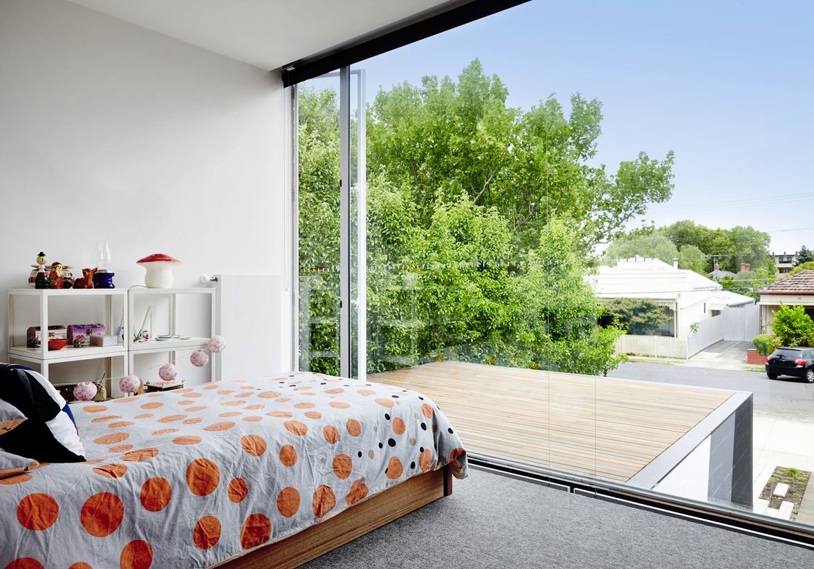
Let's start the bedroom tour with a little appreciation for this super-cute room! Modular shelves, a string of paper lanterns, a playful polka dot bedspread, and a stimulating view of the neighborhood are certainly enviable features any kid would envy. Parents can shield the room from the street using the bottom-up shades.
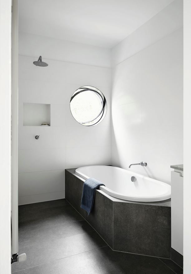
Anyone bathing in the gorgeous enclosed tub can enjoy a view of the sky from the distinctive circular window.
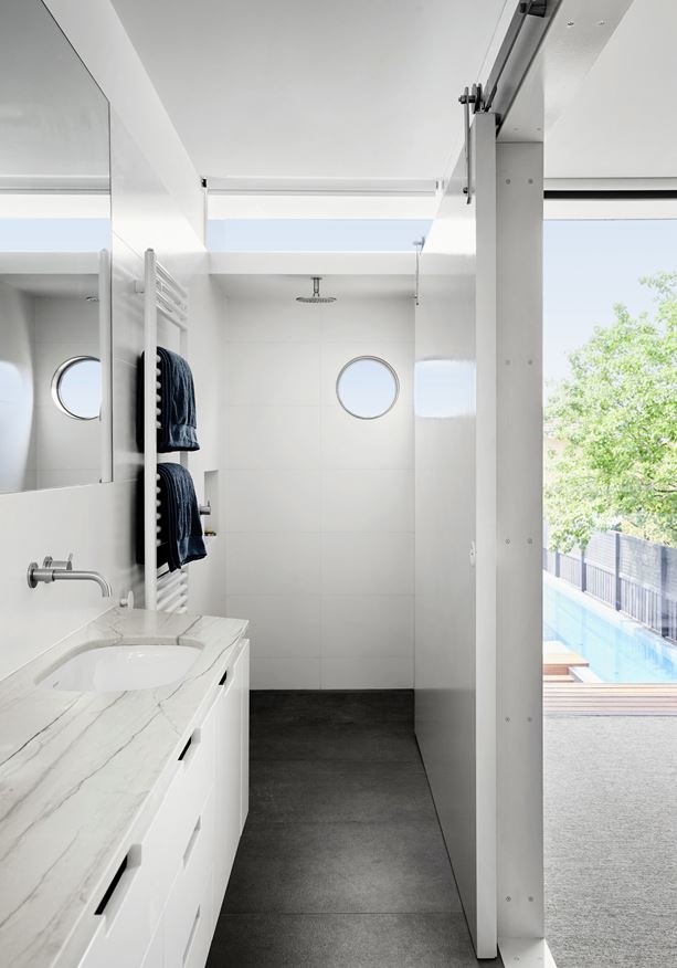
Another window near the ceiling brings even more light into the room. Notice the sliding door – a nice space saver.
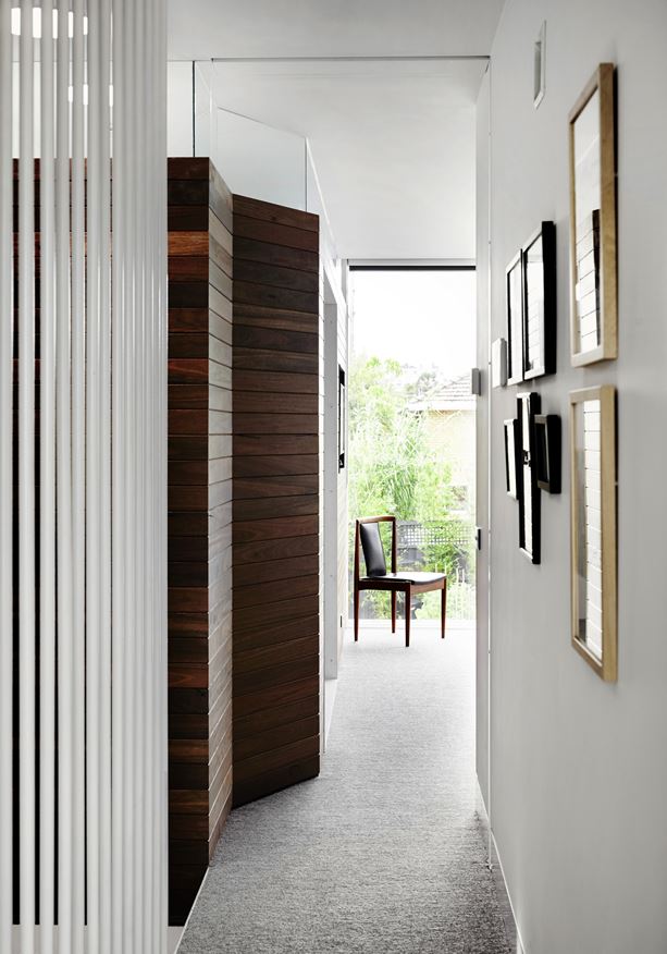
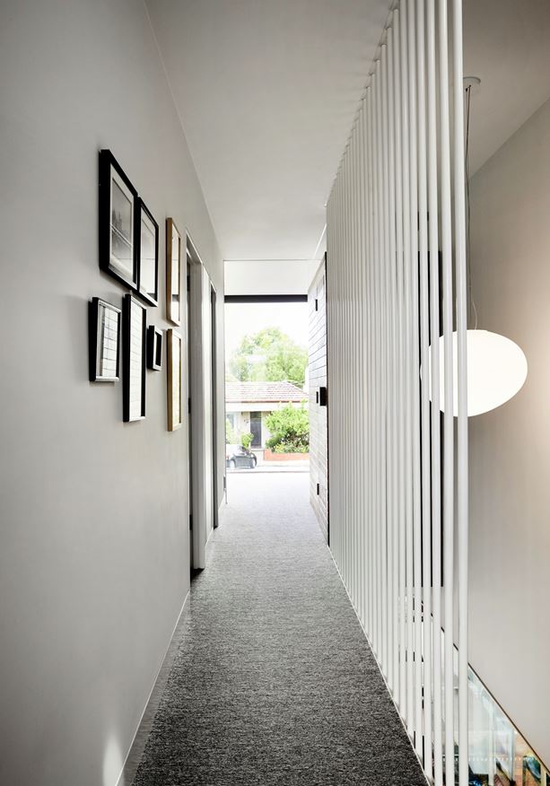
Like the main level, the upper hallway bisects the volume from end to end for a clear view through the middle.
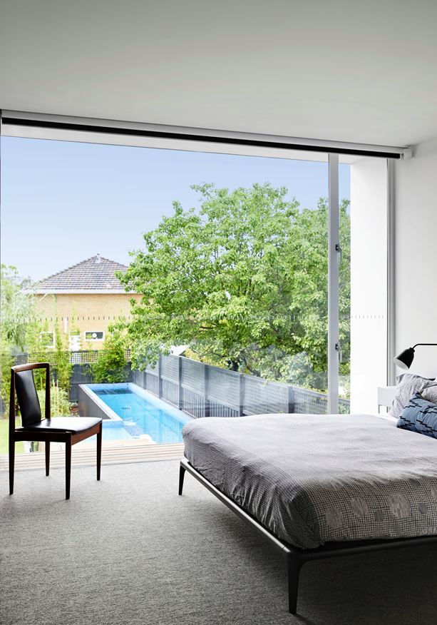
The adult bedroom is far more subdued than the child's room in terms of decor, but still features fun (yet subtle) polka dots on the blanket.
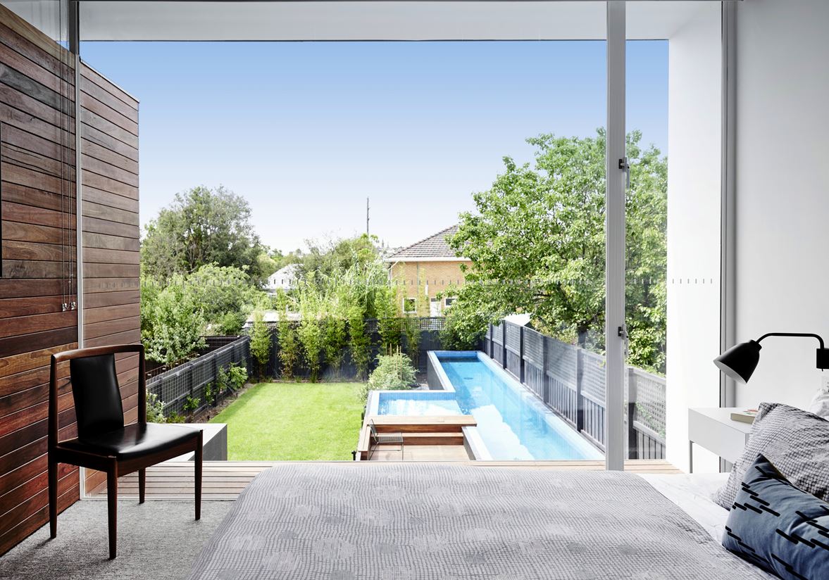
A wonderful view of the pool allows parents to keep an eye on the children as they play outdoors with friends.
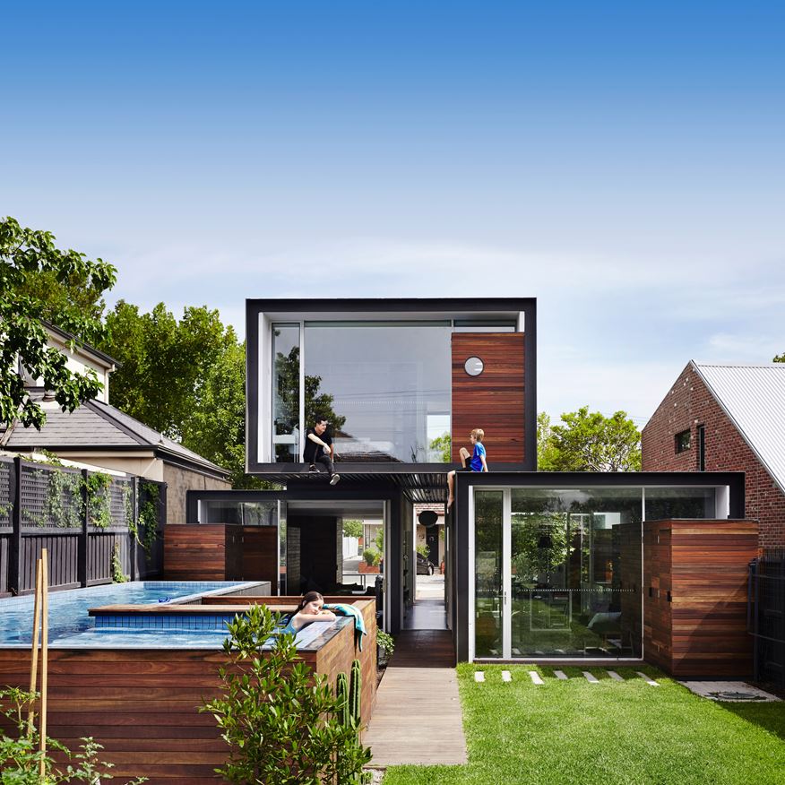
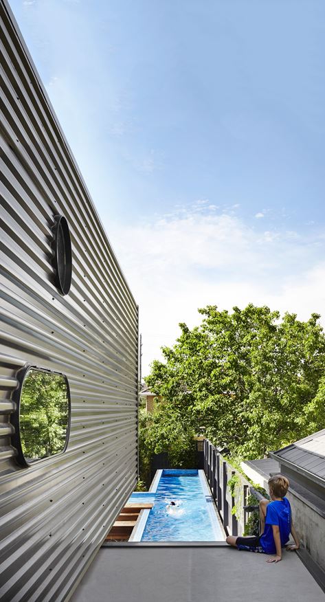
Even the pool utilizes a spacious yet space-conscious design, wrapping around the home in the shape of an L.
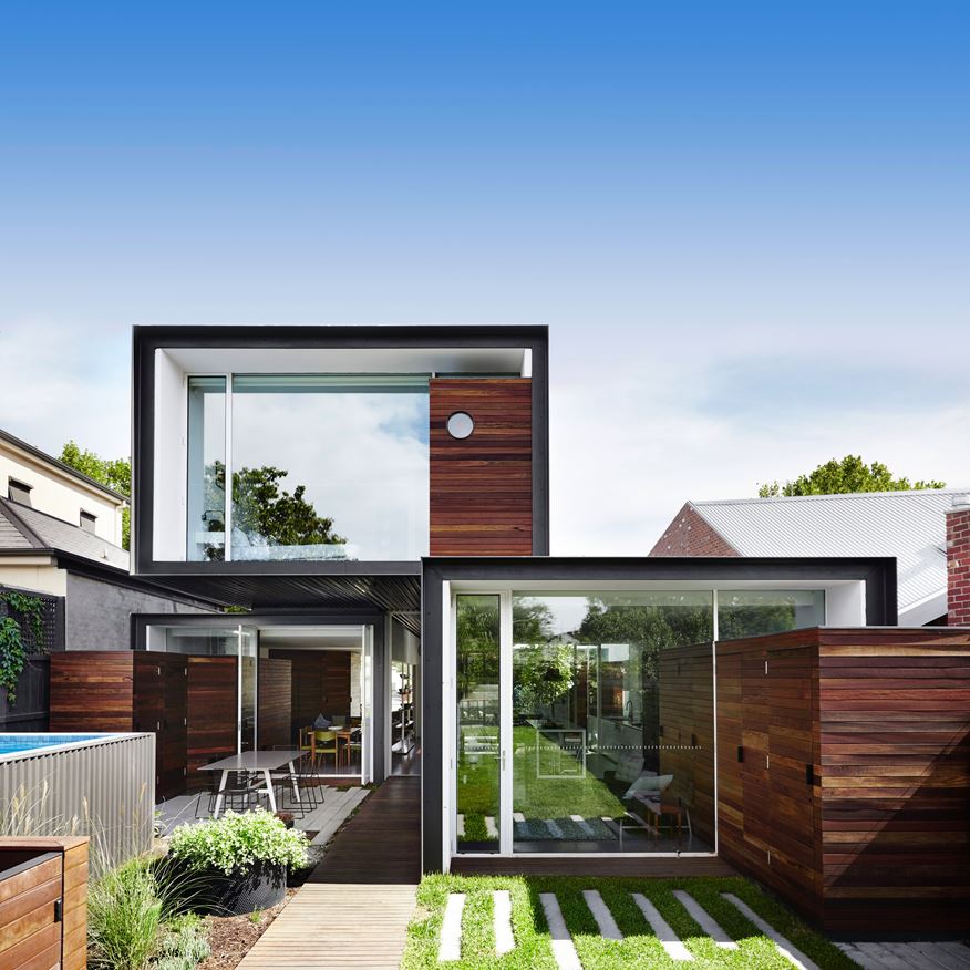
Wide stepping stones provide a convenient walking path across the yard but also continue the trajectory of the building shape.
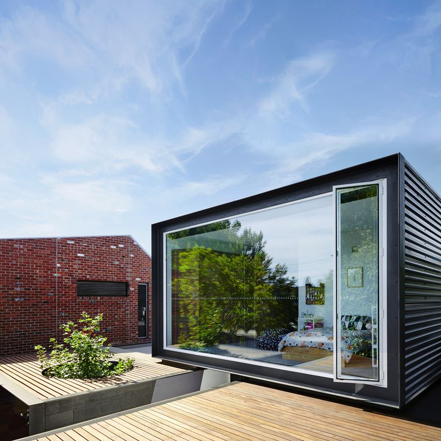
Tall doors allow access to the roof patio. The tree growing up through the lower patio contributes to the incredibly unique aesthetic.
The roof actually directs rainwater into an underground storage tank used to flush the toilets and water the garden. When the architects set out to combat the downsides of urban sprawl, they implemented features like this to further reduce the home's impact on the environment.
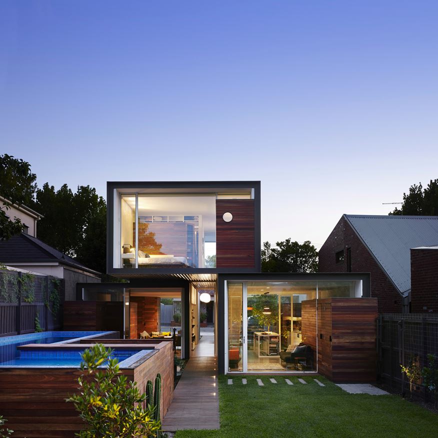
Another cool feature is the interior cabinetry that extends outward to serve as a storage shed for pool and garden supplies.
The architects went to great lengths to secure local trades, materials, and fittings for the construction of the home wherever possible.

