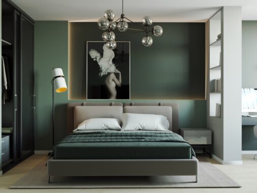
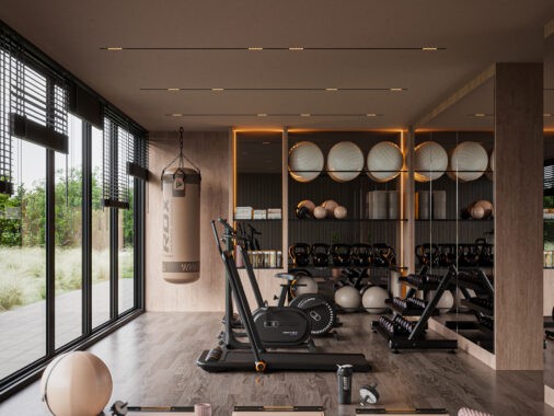
What happens when artwork takes center stage in a home? Rather than adding art as an afterthought, even a single favored piece can easily serve as a perfect anchor for the rest of the room. The following images explore a variety of ways to make home artwork serve as more than just a focal point, but as a unifying feature within an interior design. The techniques employed here are clever and diverse: some of these interior artwork ideas perfectly complement the color palette, others unify the design theme, and some enhance the character of the structure itself.
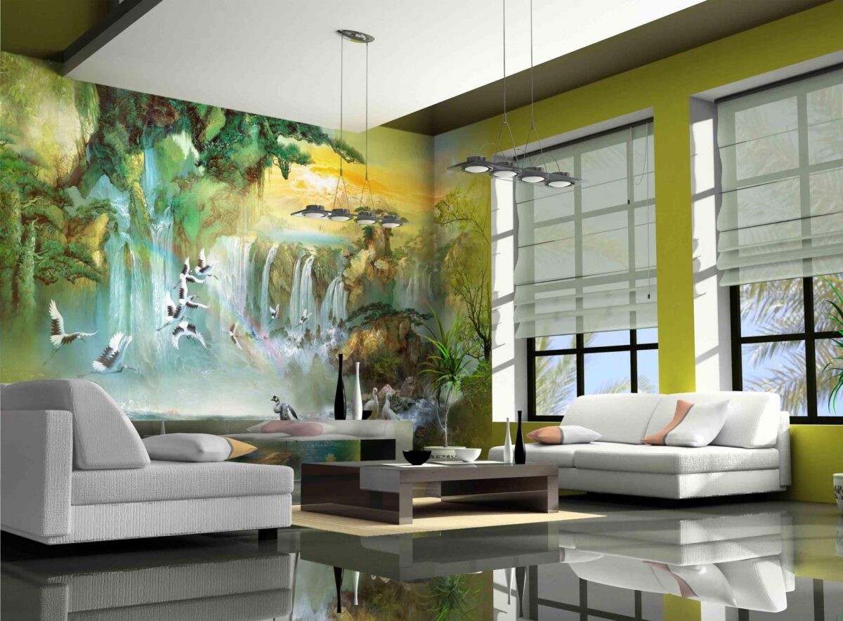
An unforgettable interior style – this living room pairs a full wall mural with a floor so polished it reflects its surroundings like glassy water on a calm day. This is a thematically comprehensive interior for those dedicated to art but who have a separate space to display individual pieces.
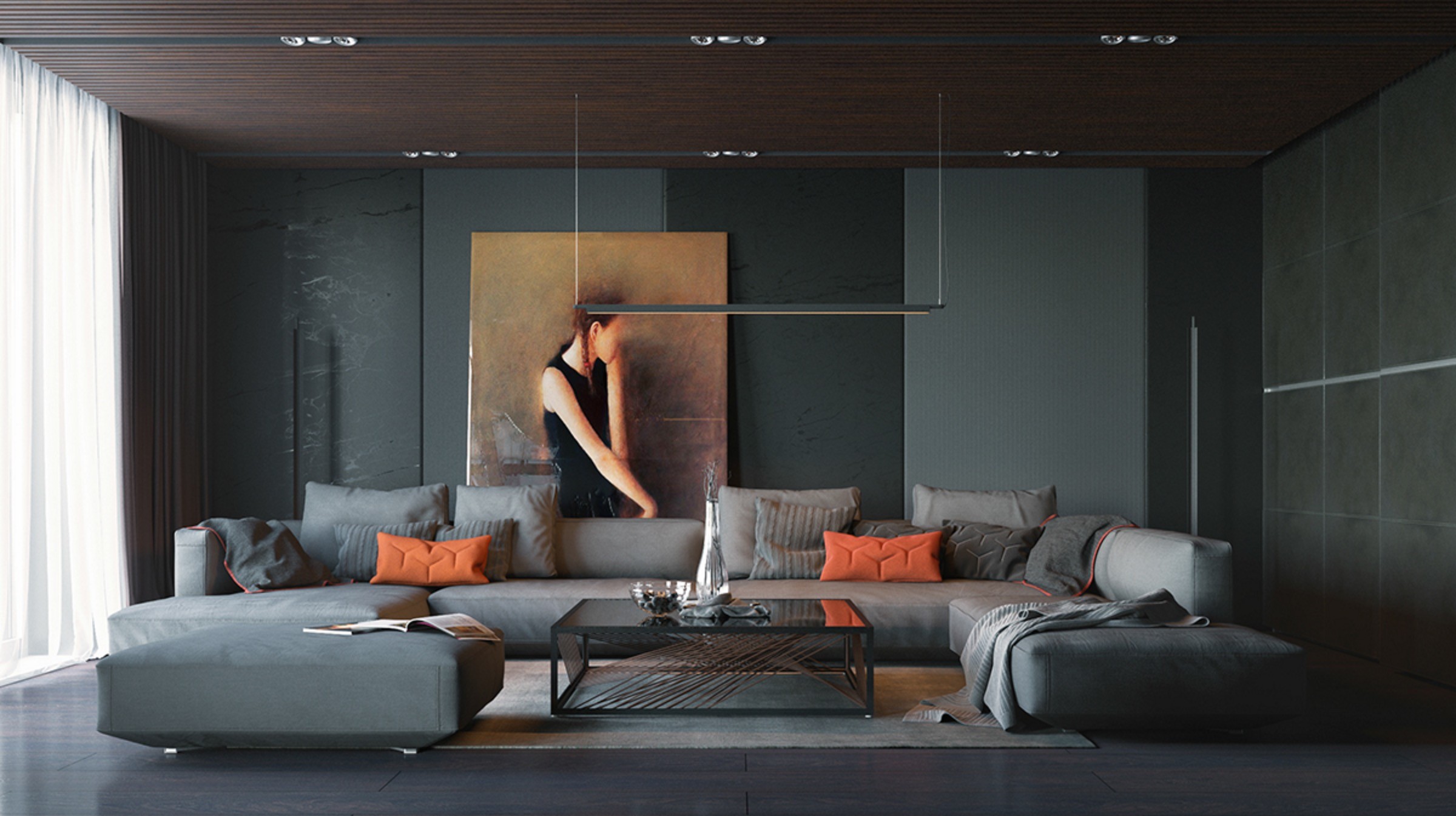
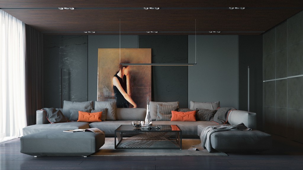
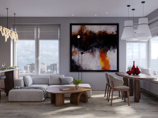
And a look at our last interior – this warm hued painting pops out among the cooler greenish-gray tones that make up this modernistic living room.
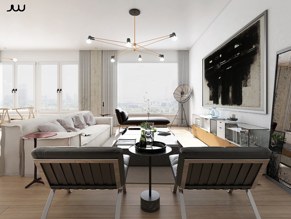
Where a television would normally stake out its territory, a dramatic black and gray painting makes its mark instead. Its weighty tone draws the eye immediately.
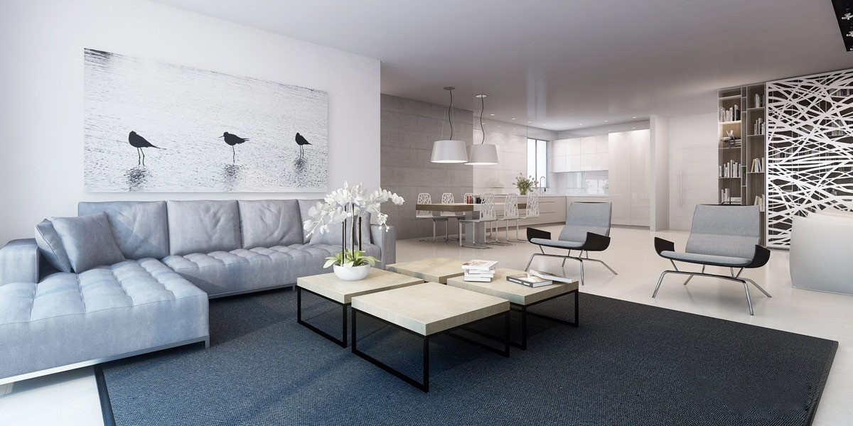
Dramatic, minimalistic, and perfectly coordinated – this large print does well to center the living space and blends seamlessly with the rest of the interior accents.
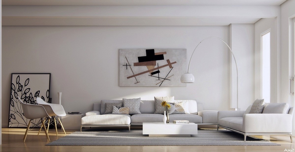
Although the painting centered above the sofa could certainly stand alone, its visual impact is enhanced by the natural wood tones and light brown accents used throughout the living room.
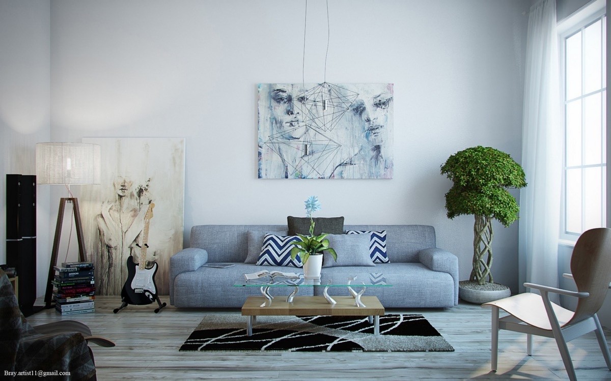
Portraits with fluid organic lines compliment the curved shapes found in the table, rug, and potted tree. Sharp geometric forms stand in contrast.
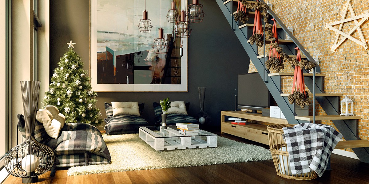
Such an interesting living room! The interior-themed artwork adds a layer of meta awareness that makes its presence quite novel.
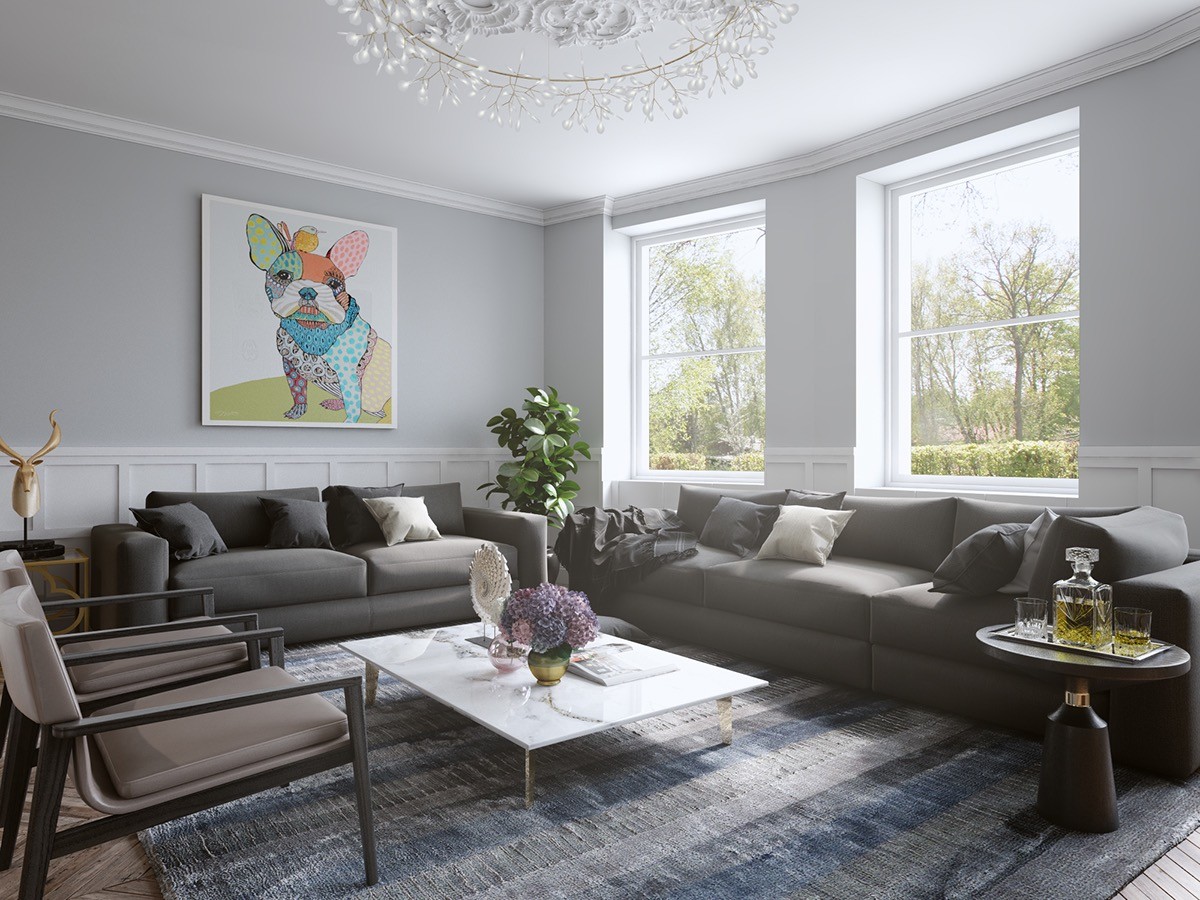
A patchwork miniature bulldog brings out all of the most delicate patterns used within this chic blue-toned interior. Even without the sparing accents, the artwork would still stand on its own as a charismatic focal point.
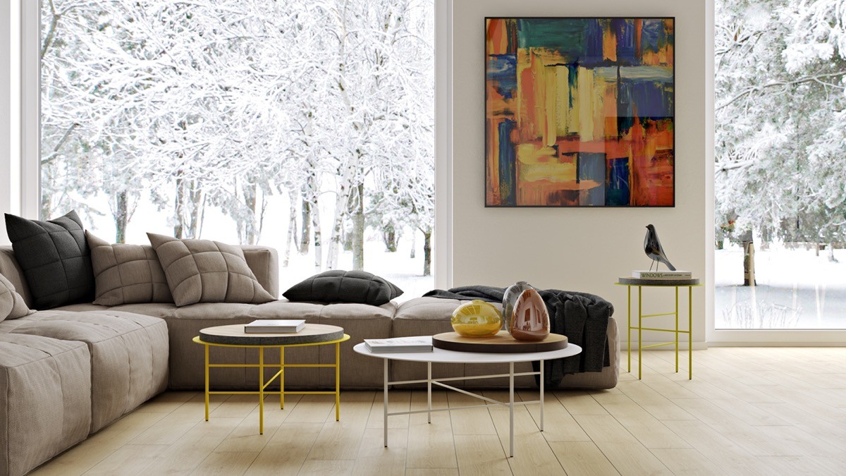
Primary colors aren't the easiest theme for a designer to adopt. This painting defines the overall theme while the bright furniture accentuates the yellow accents.
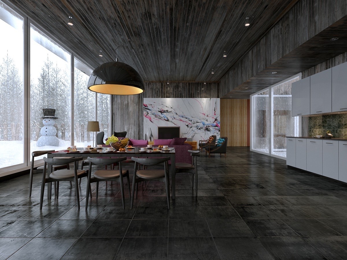
At the end of a long open floor plan, a colorful pink and blue painting gives the eye a place to rest and focus.
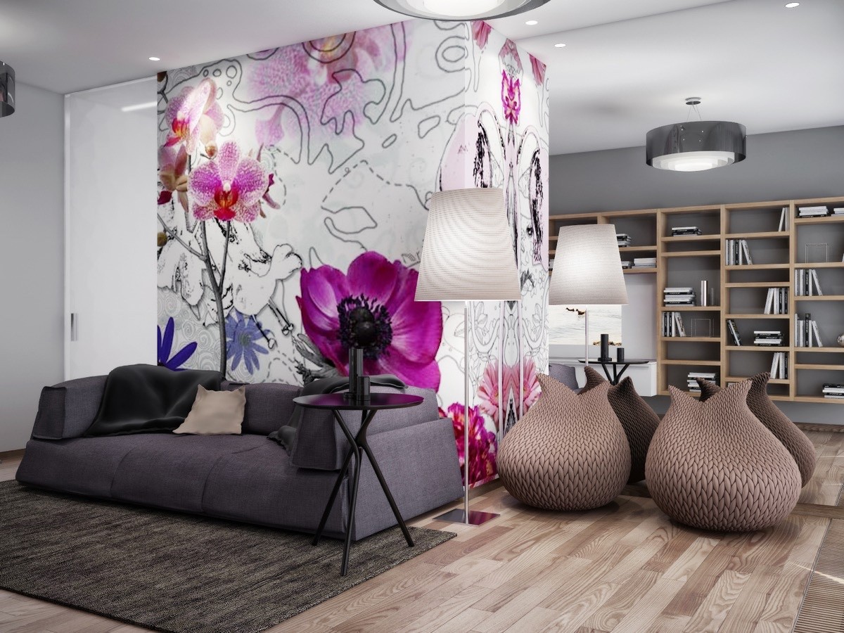
Bold and beautiful! The furniture continues the spectrum of color used in the floral wall art, rather than acting as a direct continuation. Thematically, the curvaceous furniture pairs well with the blossoms that thrive on the central volume.
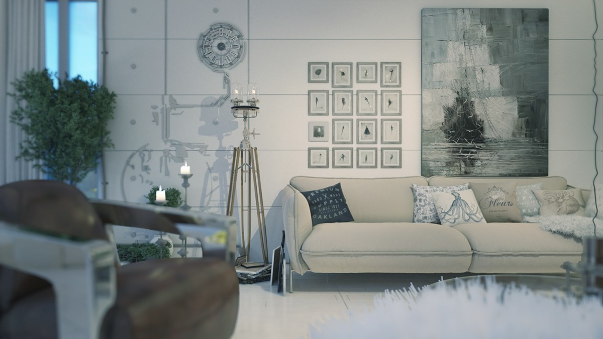
This living room does away with traditional conventions altogether. A dramatic impressionist ship joins a group of carefully arranged frames on the right, with functional wall art in the form of a clock to the left.
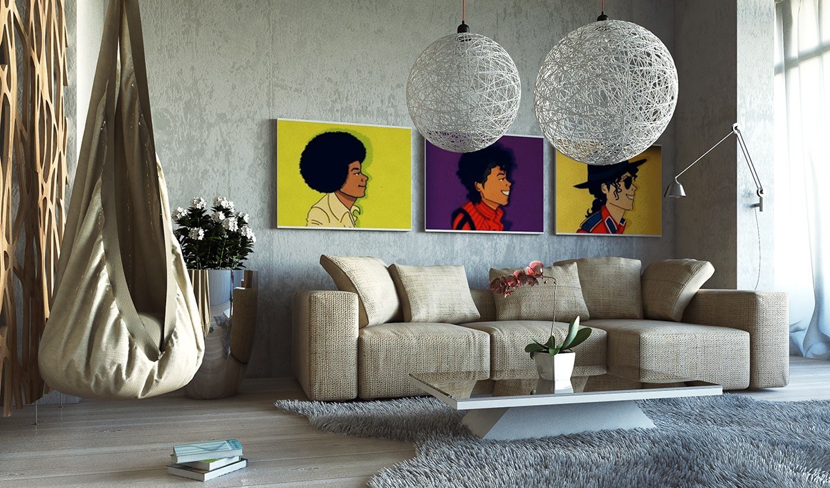
Playful pop art prints featuring Michael Jackson offer a charming response to this rustic-meets-industrial living room theme. The metallic chrome swing arm wall lamp adds a hint of luxury to the space as well.
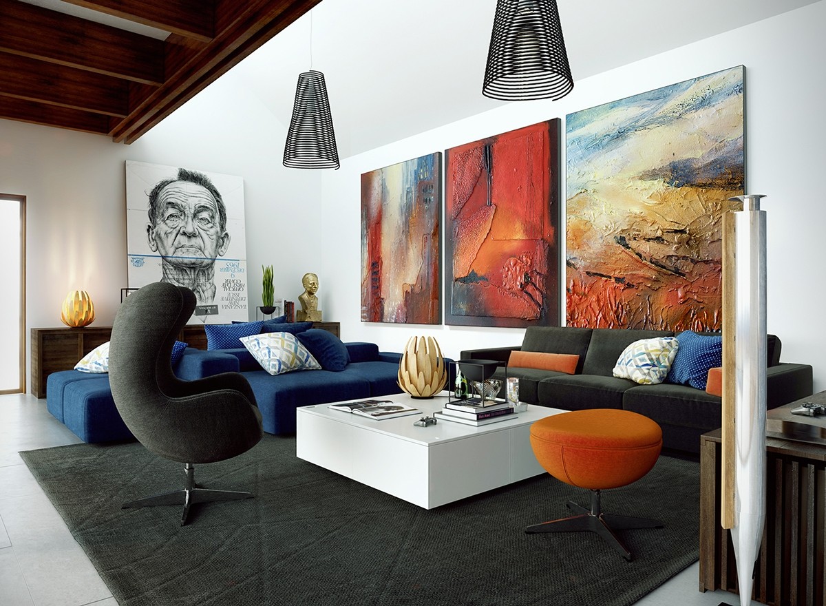
Ever wondered how to coordinate an interior around two very dissimilar art styles? This space provides welcome inspiration. It's an eclectic interior but pulls together around the ambiance of the artwork chosen.
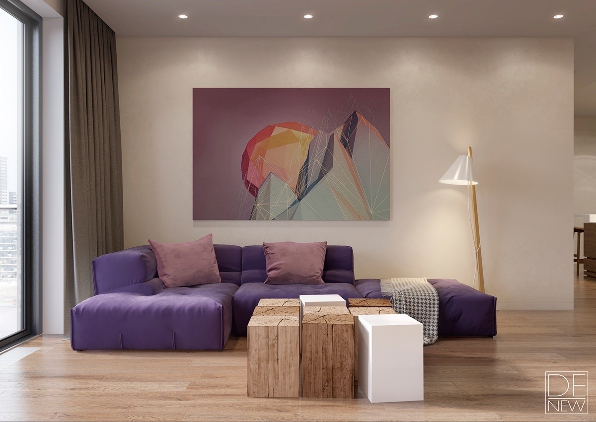
In this living room, the artwork makes the first impression without a doubt. Colorful furniture complements the print without completely emulating its style or color palette. The unique coffee table made of wooden blocks seals the look.
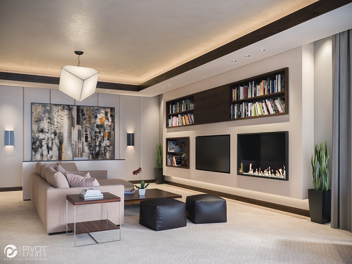
Striking but not overwhelming; this choice complements the aesthetic of the resident's book collection but stands alone as a fine piece to appreciate.
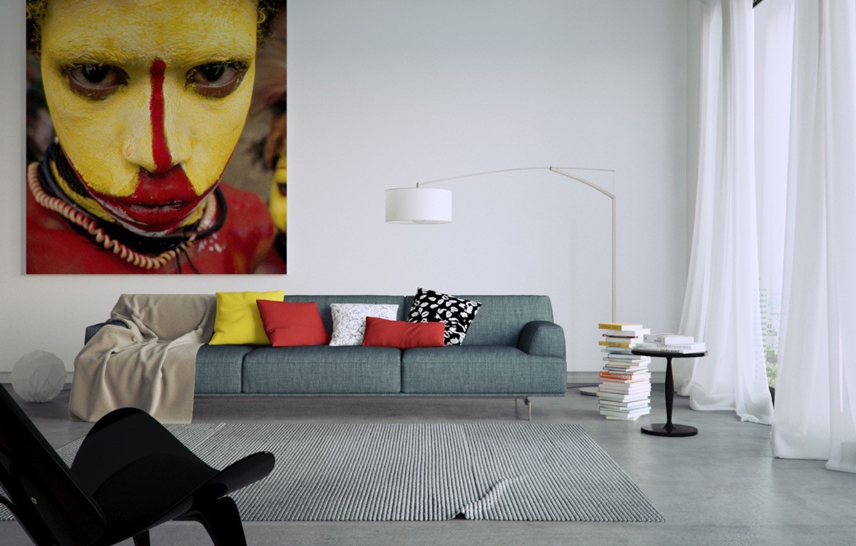
Color matching often proves to be the most straightforward way to incorporate artwork into the home. This space benefits from neutral basics, with the colorful accents easy to change out in case the artwork changes.
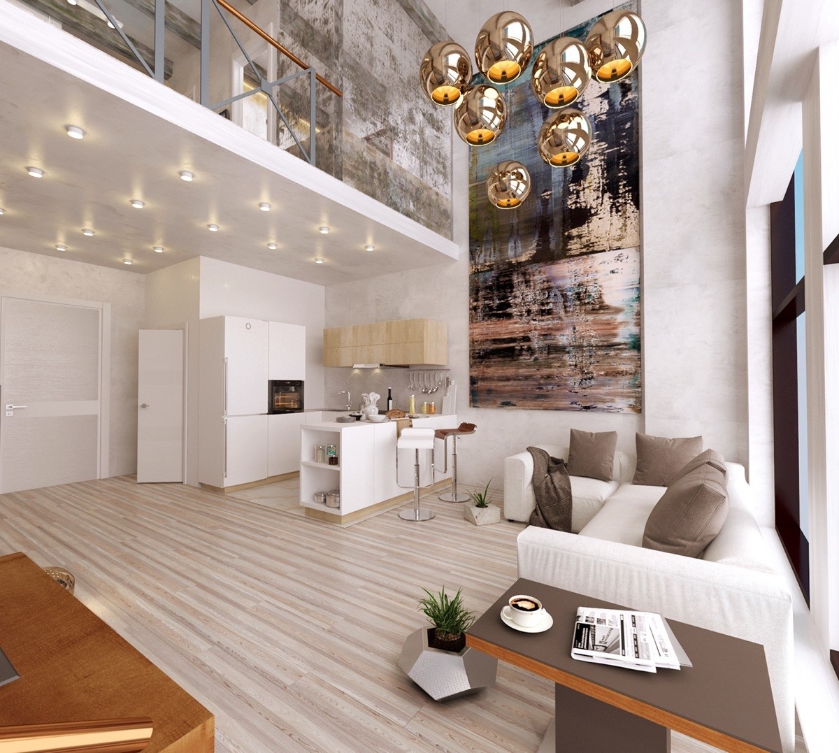
Decorating an atrium or other tall room is rather difficult. While procuring a large vertical painting might prove difficult, the result is well worth the search.
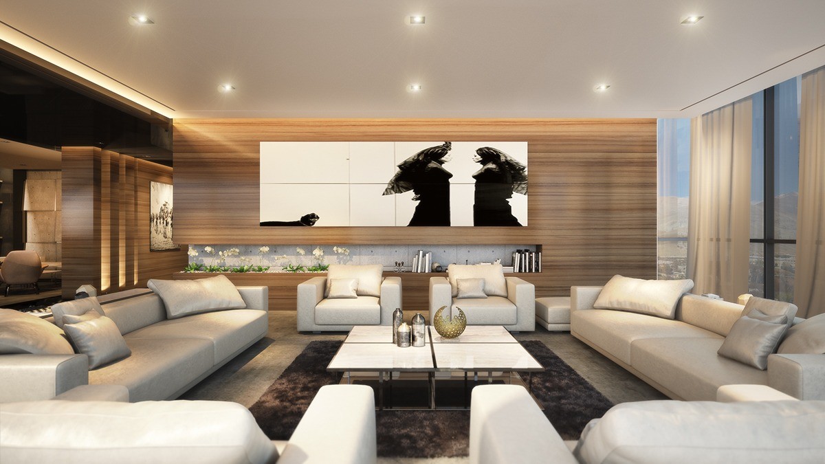
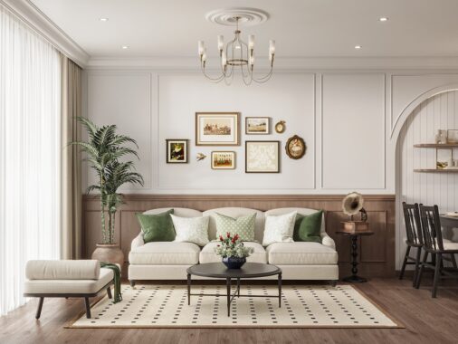
This formal living room switches up the common aesthetic of paneled walls and smooth artwork in favor of paneled artwork and smooth walls.
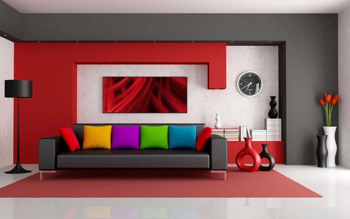
Although this living room has a solidly-defined color theme, the bright rainbow sofa pillows completely change the overall look.
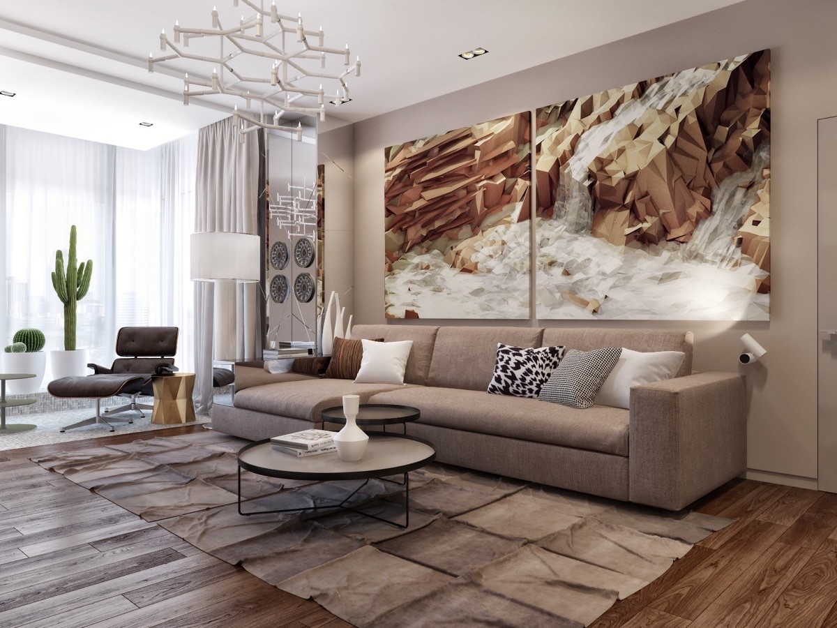
Gorgeous! Here, the light tones on the geometric prints stand out against their neutral backdrop. Rich furniture textures seem to complement the artwork rather than the other way around.
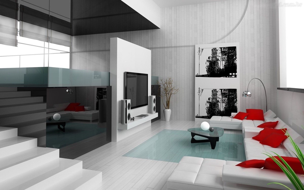
Gorgeous! Here, the light tones on the abstract prints stand out against their neutral backdrop. Rich furniture textures seem to complement the artwork rather than the other way around.
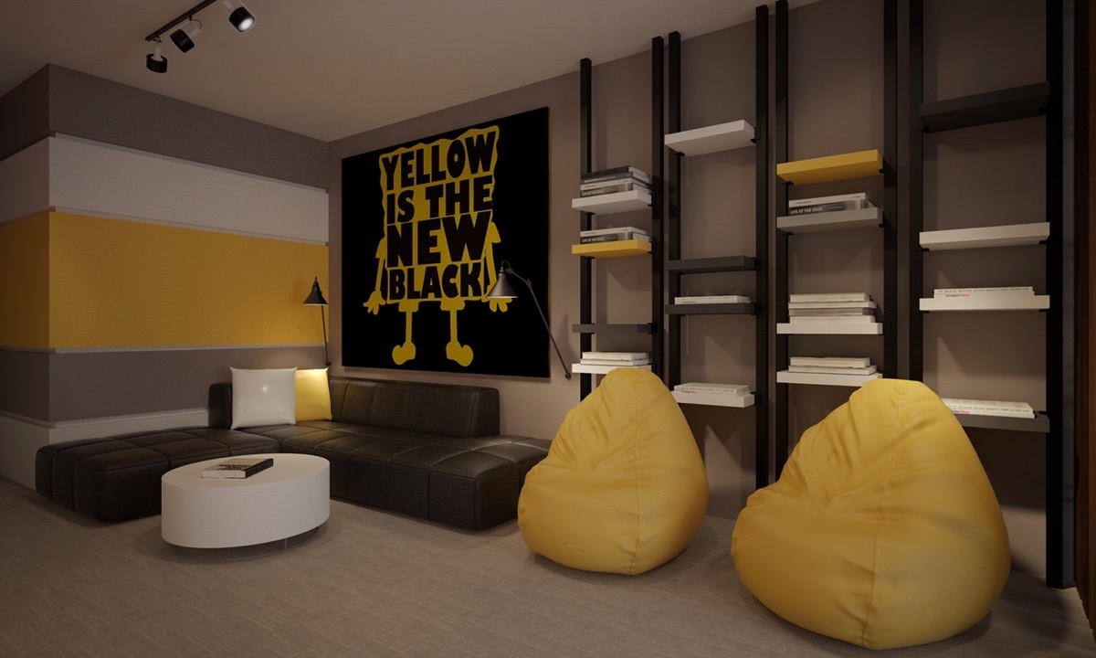
A great example of a print that matches both the aesthetic and the attitude of a room – it's youthful, fun, and playfully aware. Nobody can frown near a pop art likeness of SpongeBob, right?
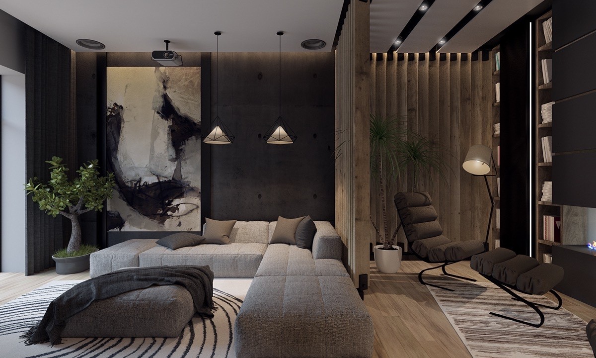
A great example of a print that matches both the aesthetic and the attitude of a room – it's youthful, fun, and playfully aware. Nobody can frown near a pop art likeness of SpongeBob, right? The shawl on the ottoman coffee table adds to the coziness. The black and white rug mirrors the color of the art piece.
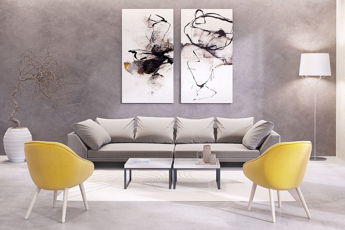
Grayscale themes allow the stark black-and-white artwork to pop out from the background. The tiny golden accent springs to life thanks to the pair of dandelion yellow accent chairs.
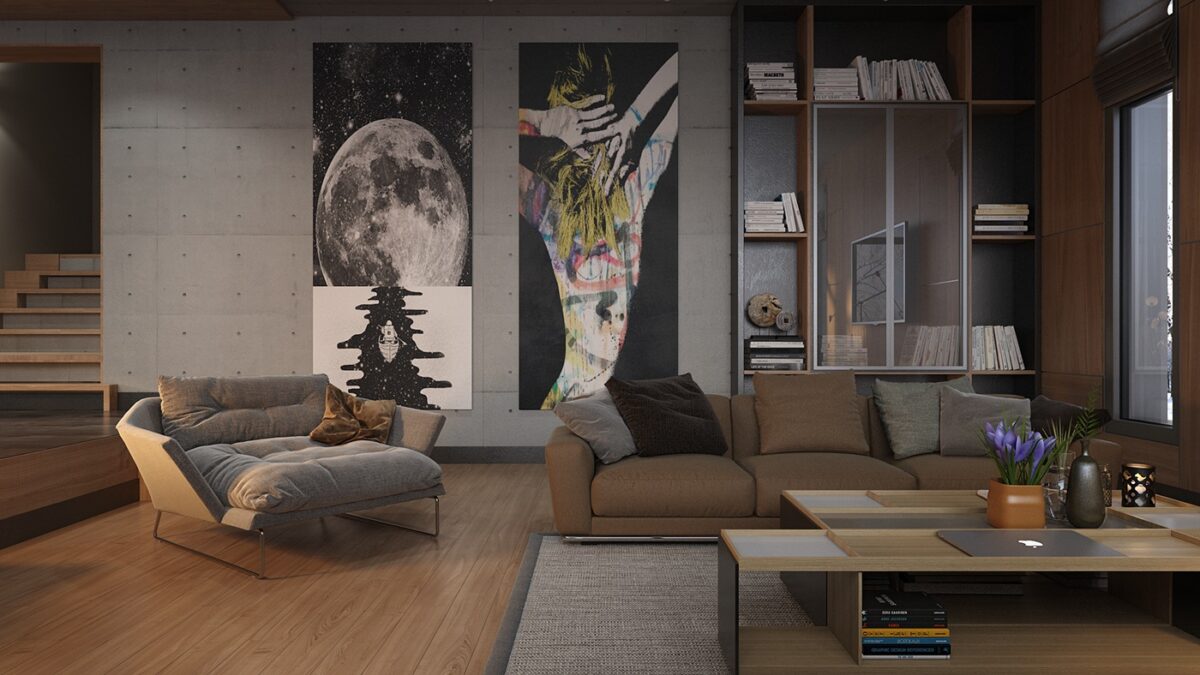
In this interior, classic materials and furniture play against a dramatic industrial background enhanced by modern pop art. Also, what a comfy lounge chair!
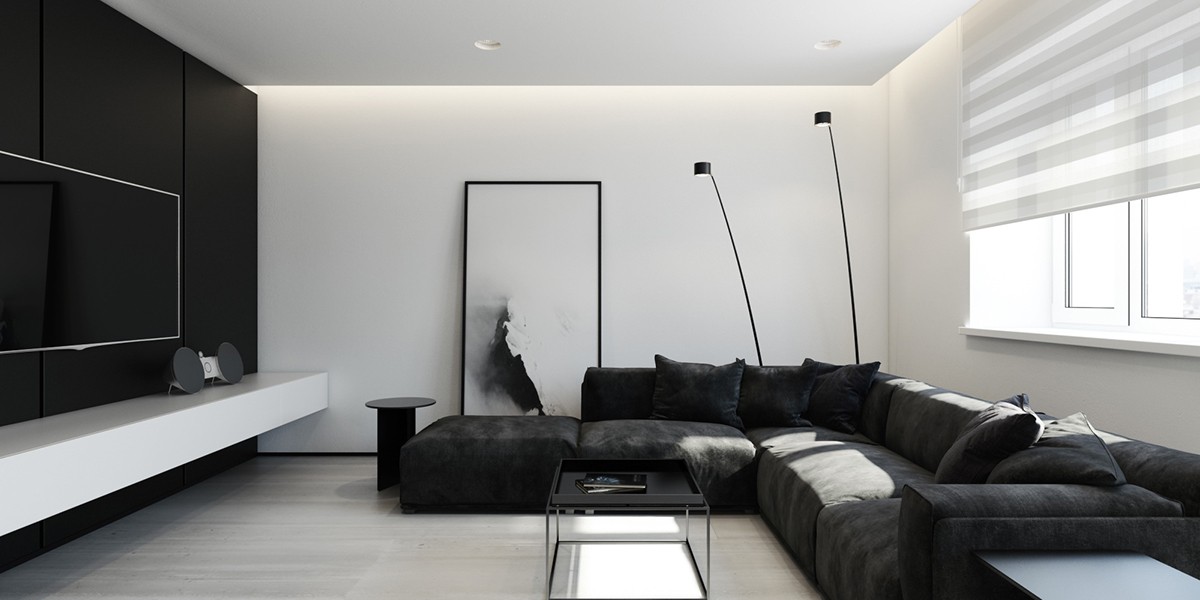
Light and shadow provide the overarching theme in this apartment living room – and the stunning artwork in the background enhances the effect. Even if the image weren't perfectly coordinated in terms of color, the theme itself would still help to carry the interior.
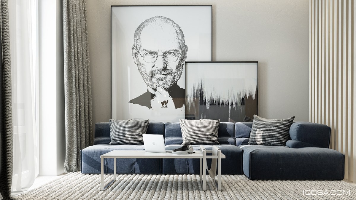
A sketch of Steve Jobs joins a stunning abstract ink print, both with organic influences to balance out the strict geometric theme used throughout this aesthetic living room.
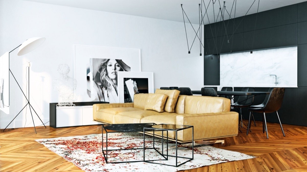
Photographic prints lend themselves well to this eclectic living room interior. A monochromatic art collection is less complicated to work with, easily adaptable to any style. The unique floor lamp you see here is Solveig by designer Avril de Pastre.
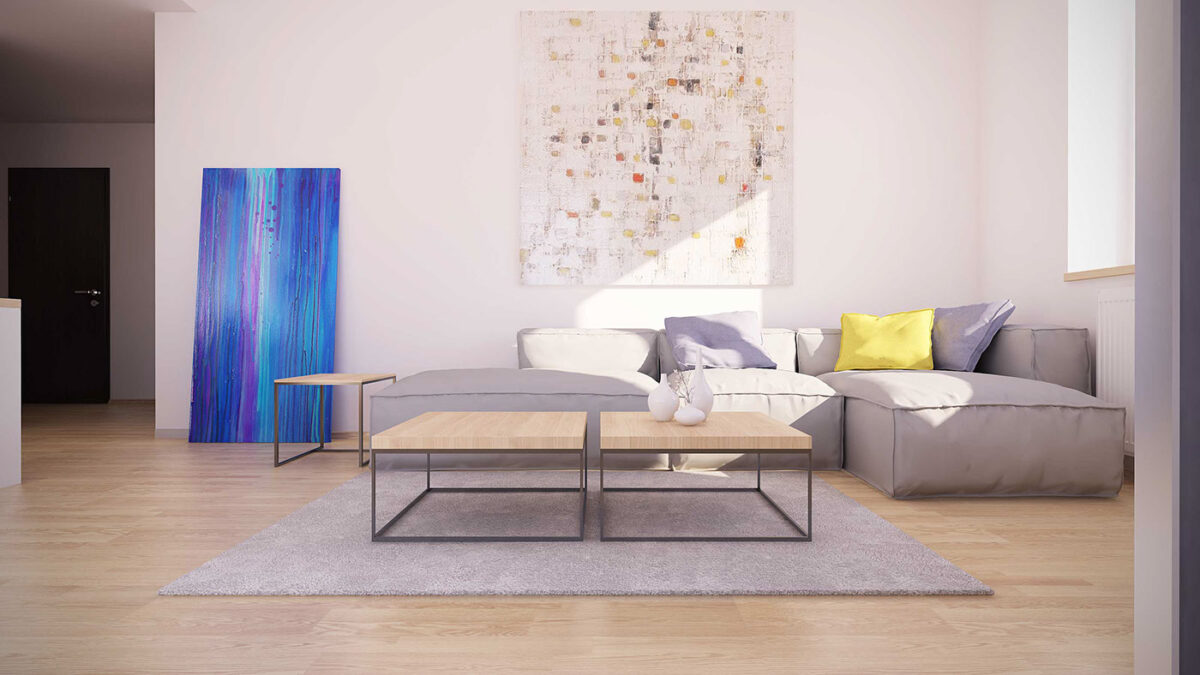
This home doesn't base its interior around the artwork, but instead remains relatively neutral – a sort of blank canvas that accommodates any style the residents want to achieve. The single yellow pillow ties back into the overall theme.
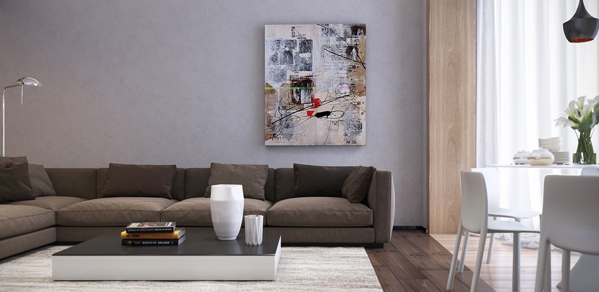
Here a mixed-media canvas plays into the structural interior features, like the transition between darker and lighter wood between the living room and kitchen. Gray highlights draw attention to the textured wall and deconstructed forms contrast against the straight lines of the furniture.
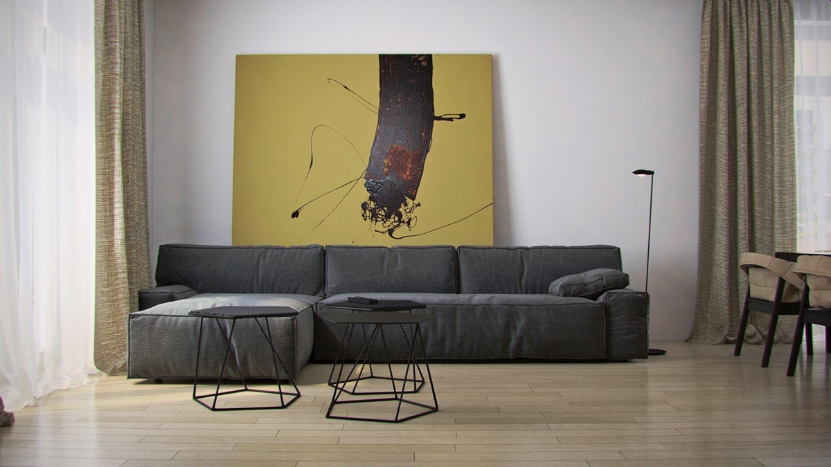
This bold painting stands in contrast with the sharp and precise angles of the nesting coffee tables to great effect.
