Vivid colors are an easy way to make an unforgettable impression within any interior. But using bold color schemes within a small space is a little more difficult – too much can overwhelm the eye and too little can make the theme look incidental. Add the extra challenge of coordinating bright accent colors across an open layout home and the project starts to require a sharp eye and a strong sense of creativity. This post examines three ultra-colorful small apartments that fit these requirements and more! If you're looking for neon color theme inspiration for your compact spaces, these homes are filled with ideas.
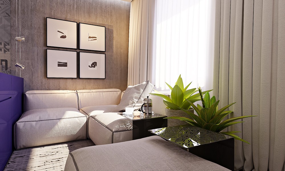
Compact, colorful, and comfortable! Interior designer Alena Fokina conceptualized this small 28 square meter apartment to suit the needs of a sophisticated young woman with energetic tastes. Here, the home tour begins with the cozy modular sofa set, easy to arrange to accommodate a variety of situations ranging from reading to watching movies or entertaining guests. Its vivid colors contribute to a playfully creative atmosphere that reflects an active lifestyle and a strong imagination.
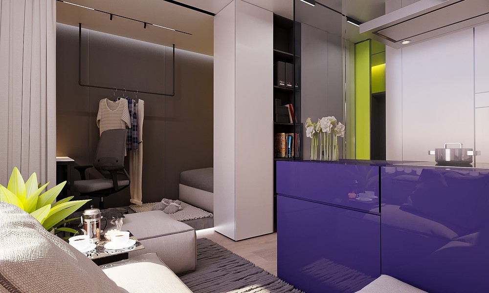
The open layout is the result of a renovation to make the home more spacious yet each functional area still feels neatly self-contained. Each zone uses a base color of relaxing dove gray, with individual focal points highlighted with bright bursts of purple and lime green.
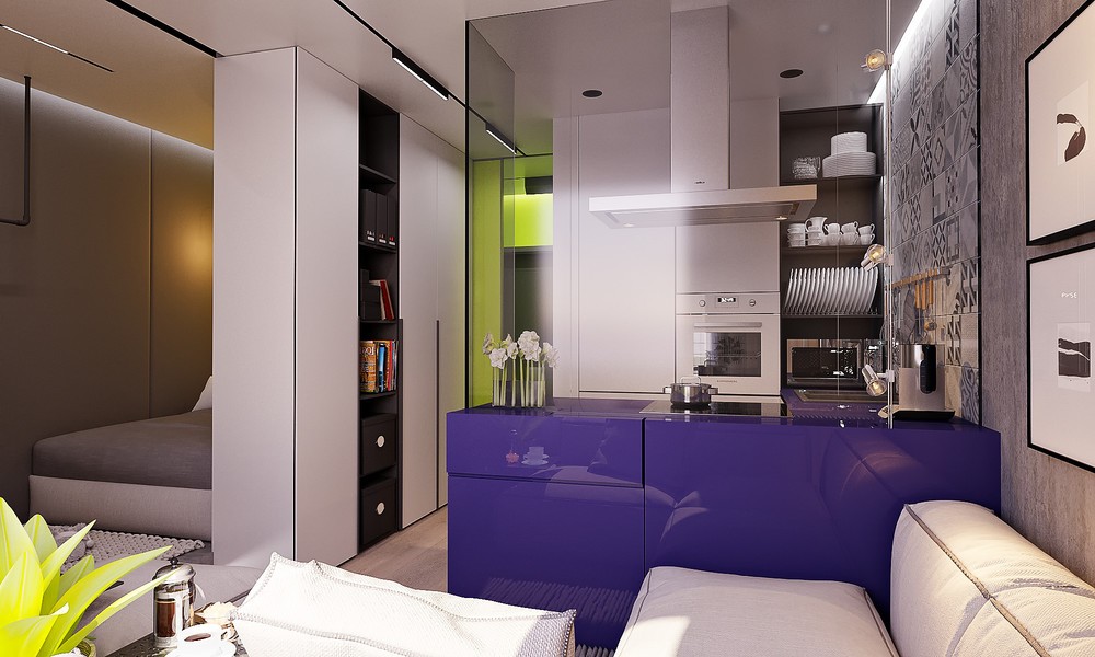
Each divider is useful and versatile. The purple volume is a kitchen countertop with cabinets in each side, and the wall between the kitchen and the bedroom serves as storage for clothes and features a handy bookshelf facing toward the social spaces.
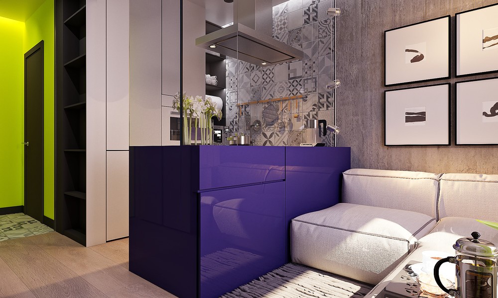
The kitchen makes a bold first impression with its distinctively colorful cabinetry in glossy purple, but the details are very cool too. Grayscale tiles in a wide variety of patterns help soften the transition from smooth white cabinetry to unfinished concrete walls.
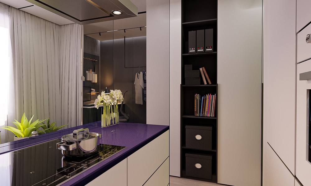
Inside of the compact kitchen area, white surfaces rule the day. Solid islands like this one can block the precious natural light in small apartments, but these white panels preserve whatever brightness they possibly can. Handle-free cabinetry keeps things uncomplicated.
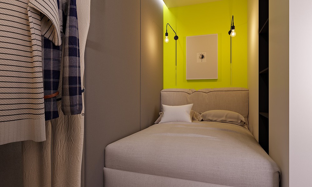
Darker wall panels create a cozy cocoon for the bed area, while the accent wall brightens the space back up. Just look at that shade of brilliant neon chartreuse! That plush headboard seems like a great place to cuddle up with a book or catch up with some texting before bed.
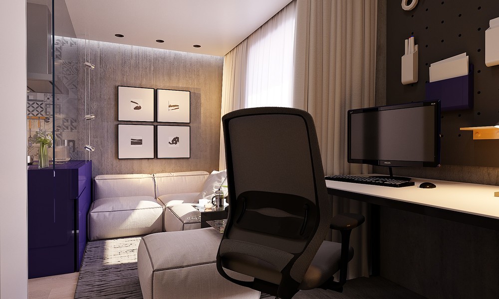
Also taking advantage of a darker palette, the compact office provides a relaxing and distraction-free zone for work or study. Its position looks out toward the living room and enjoys a slice of the window's landscape view.
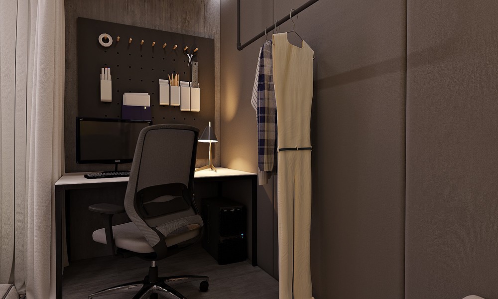
Check out the neat storage options! Clothing hangs from a matte black pipe, and the office makes spectacular use of a pegboard for organizing office supplies. The pegboard might make a fun DIY option for skilled crafters.
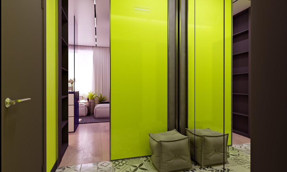
Mirrors, tiles, and lime green panels ensure that even the smallest spaces can express their own huge personalities. This hallway features a pouf so the resident can more easily slip into some house shoes upon entering.
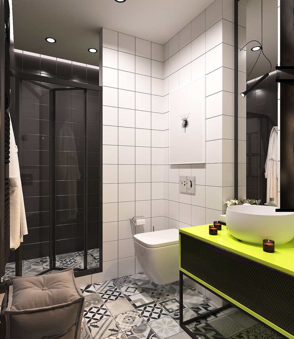
Black and white tile sets a neutral tone for the bathroom, perked up by the addition of the neon green vanity.
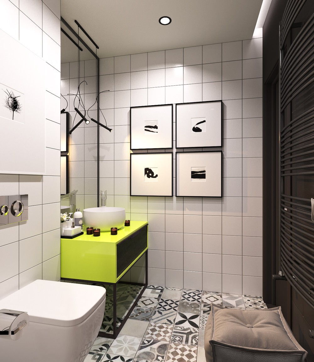
Small prints add some character to the far wall, taking advantage of their larger frames to make a bolder impression.
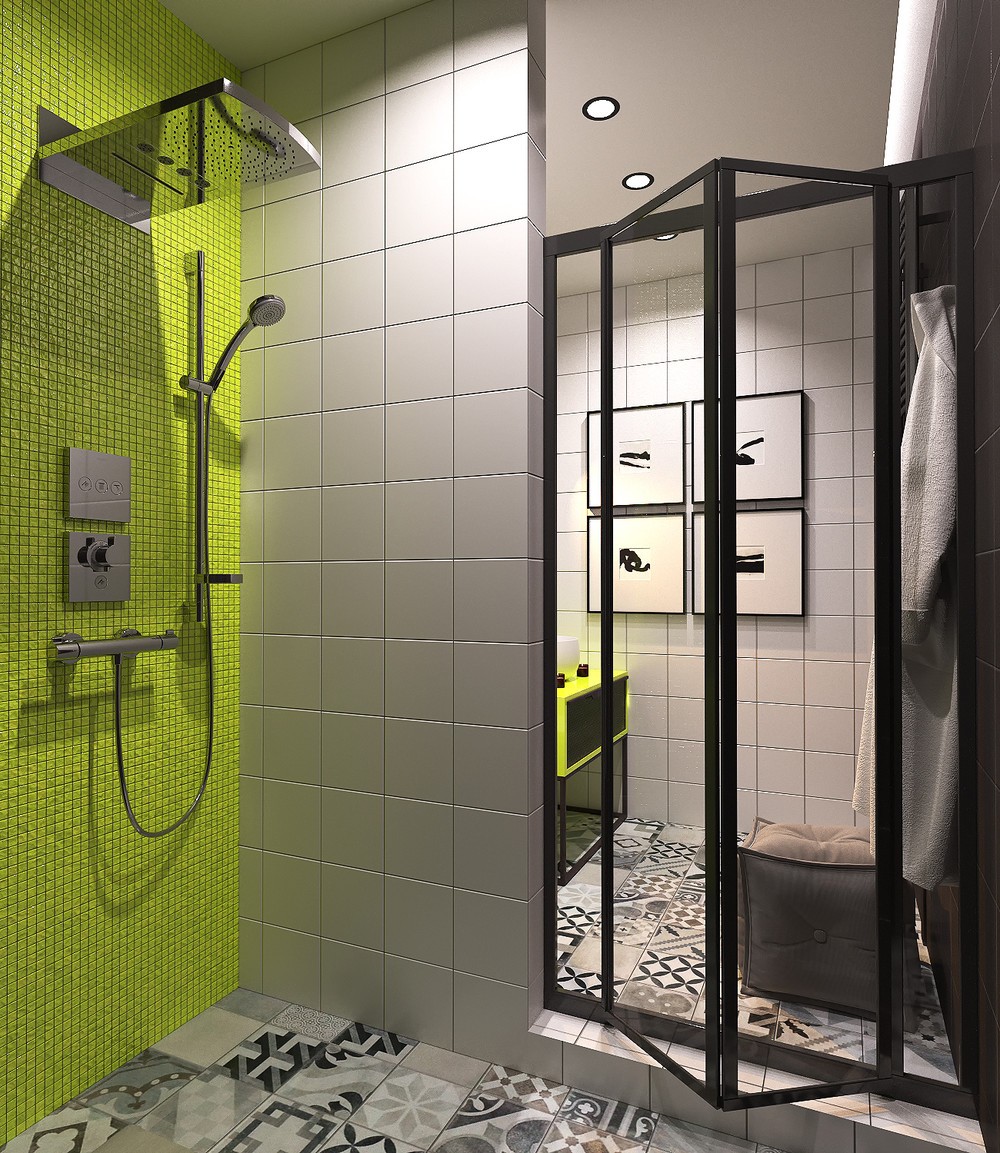
Folding glass doors lead to the shower. Check out those amazing green tiles! They're small and textural and almost seem to sparkle in the light.
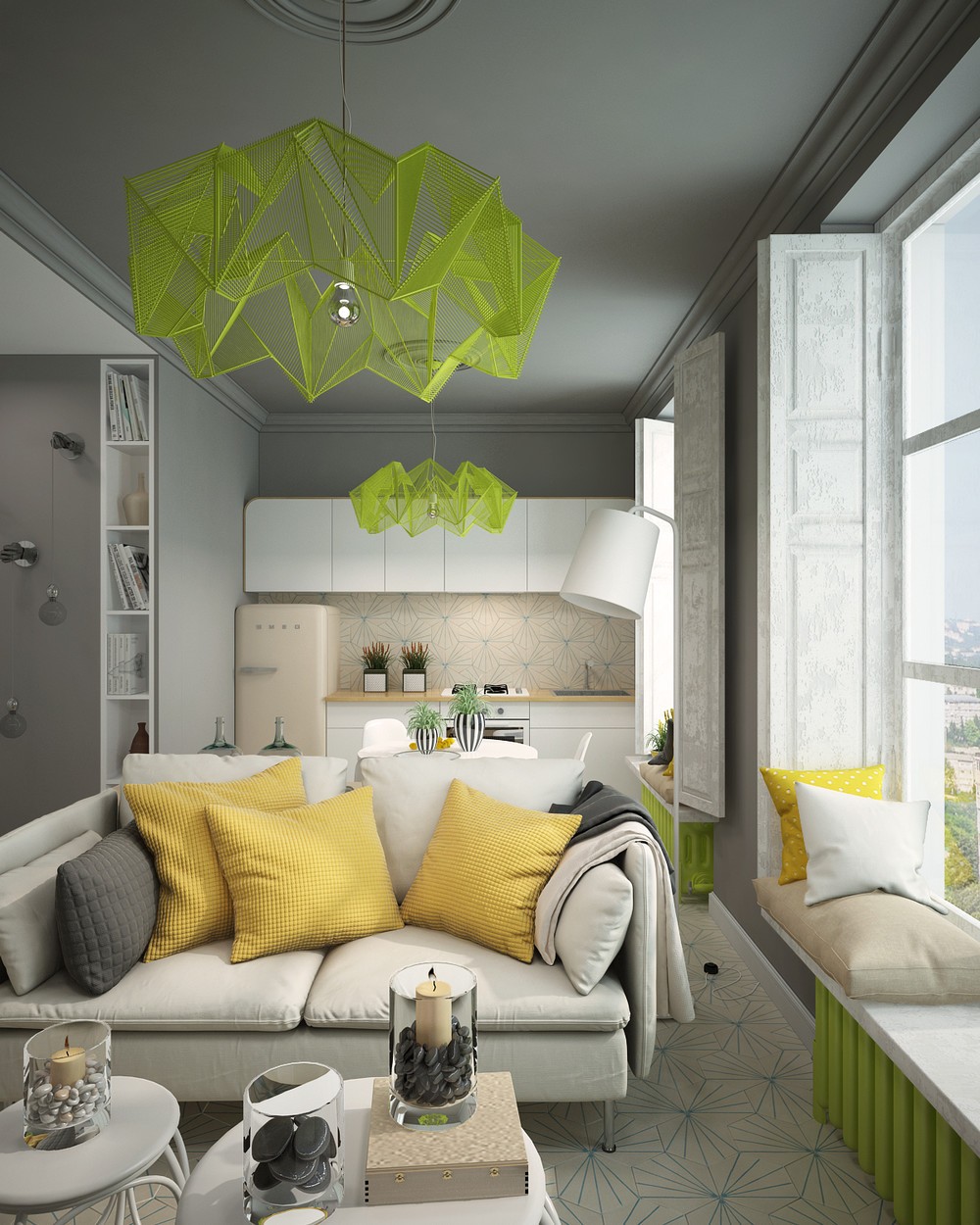
Up next is a comfortable yet compact apartment that takes up a modest footprint of only 28 square meters. Visualized by Irina Ovsyannikov, the layout is the result of a renovation intended to suit the summer recreational needs of young couples visiting for the spectacular coastal views. This reorganization included removing interior walls to enhance the sense of spaciousness and to make sure the perfectly framed landscape is visible from every angle. Vivid accent colors contribute to the welcoming and fun atmosphere that summertime guests are sure to remember.
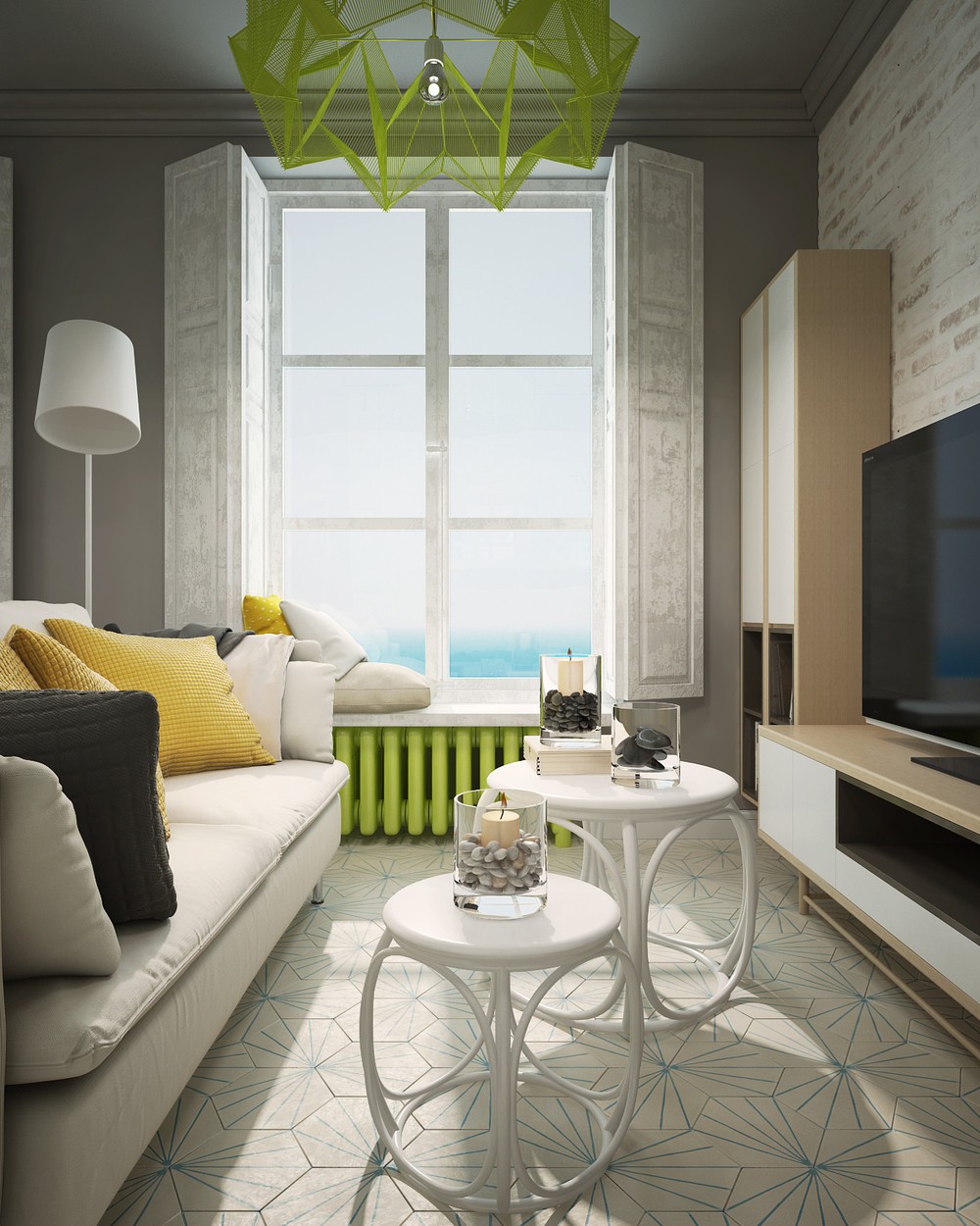
Most surfaces are themed around a calming dove gray palette, dotted with bright splashes of lemon yellow and neon lime green. Cerulean blue details complete the triad and give the energetic color combination a hint of tropical flavor.
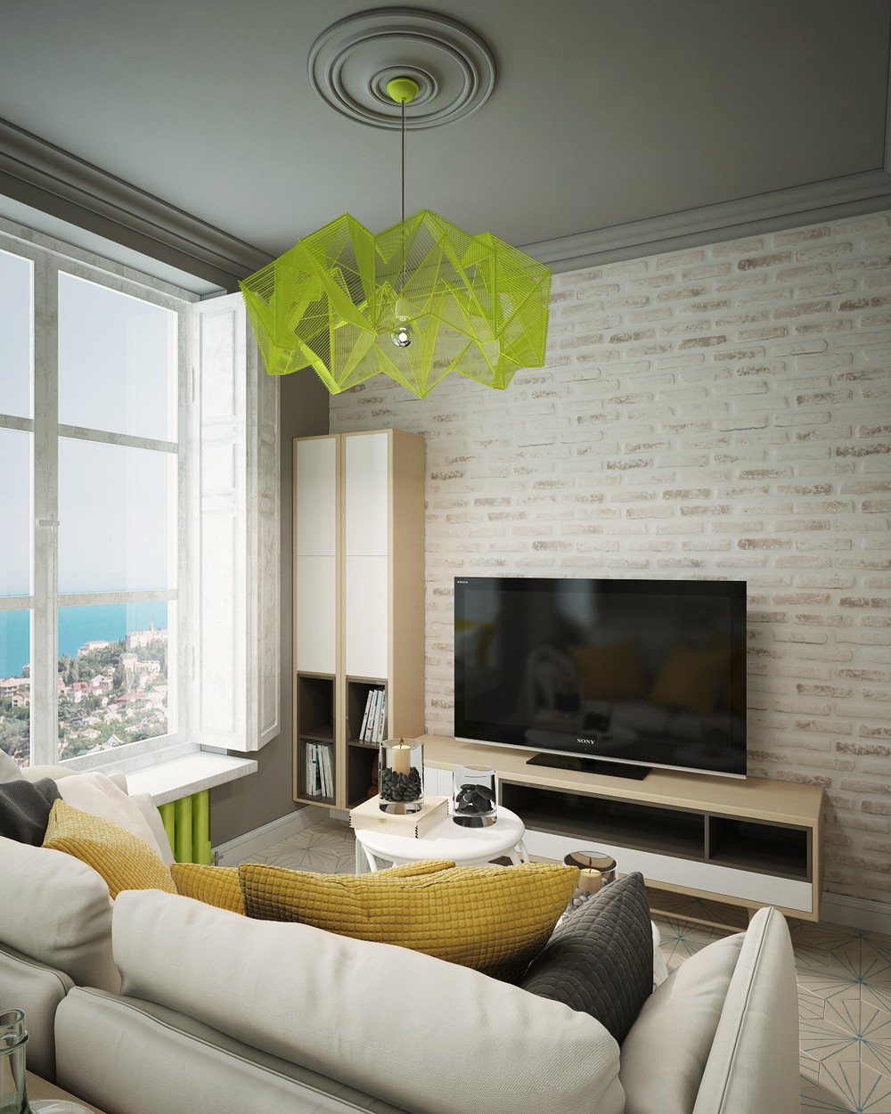
Yet playful colors aren't the only trend on display here - hexagonal floor tiles and cool faceted pendant lamps offer a light interpretation of the exceptionally popular geometric design theme.
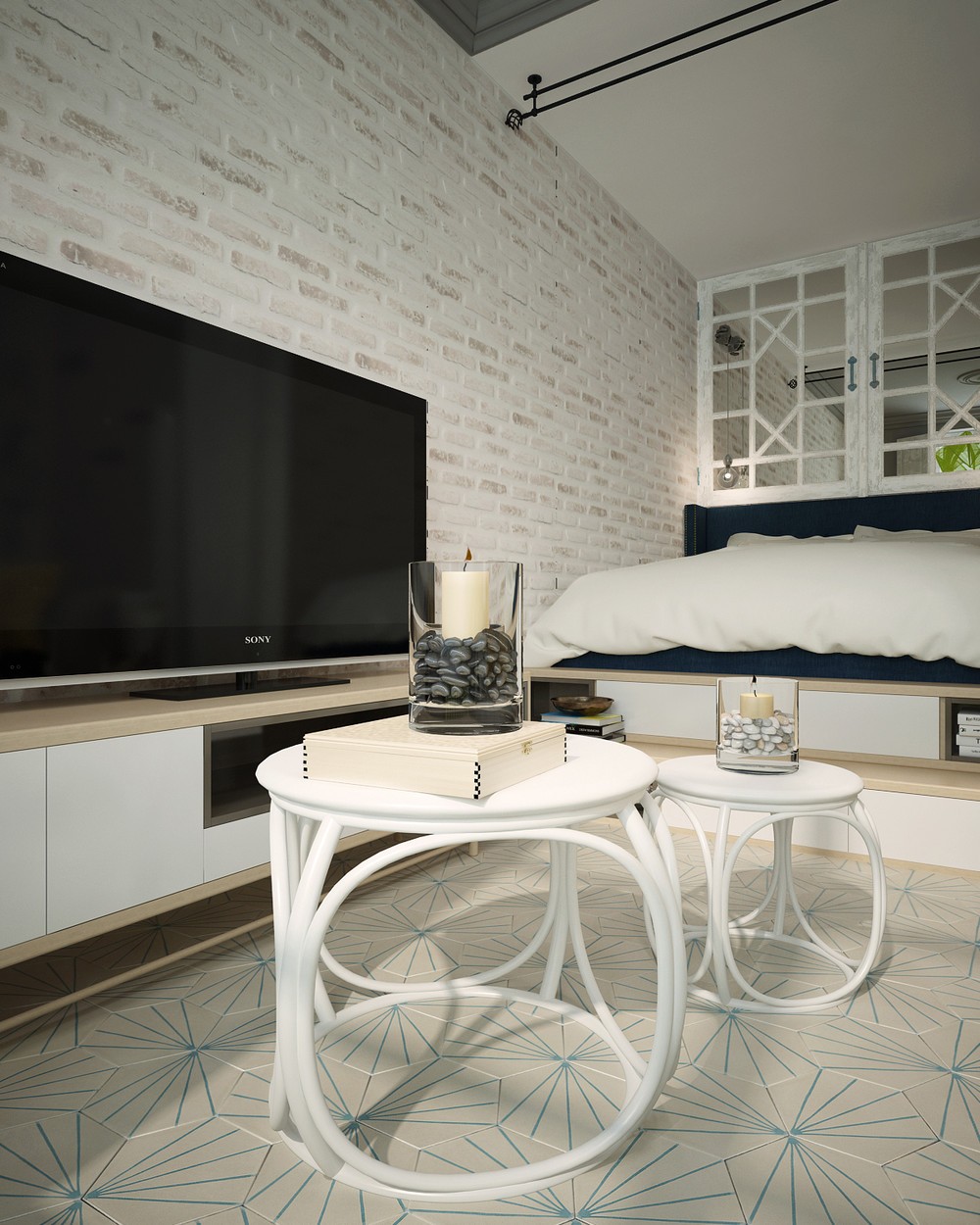
Decorations remain minimalistic and natural, like these gorgeous DIY candleholders and the light organic tables beneath them.
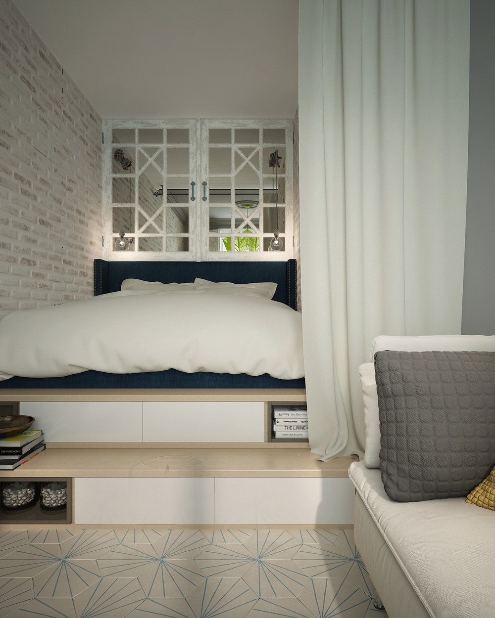
The raised bed offers a wealth of small space design ideas. Steps with convenient integrated storage lead to the bed platform, and cheerfully repurposed cabinet doors double up as a mirror. A privacy curtain easily shields the residents for privacy.
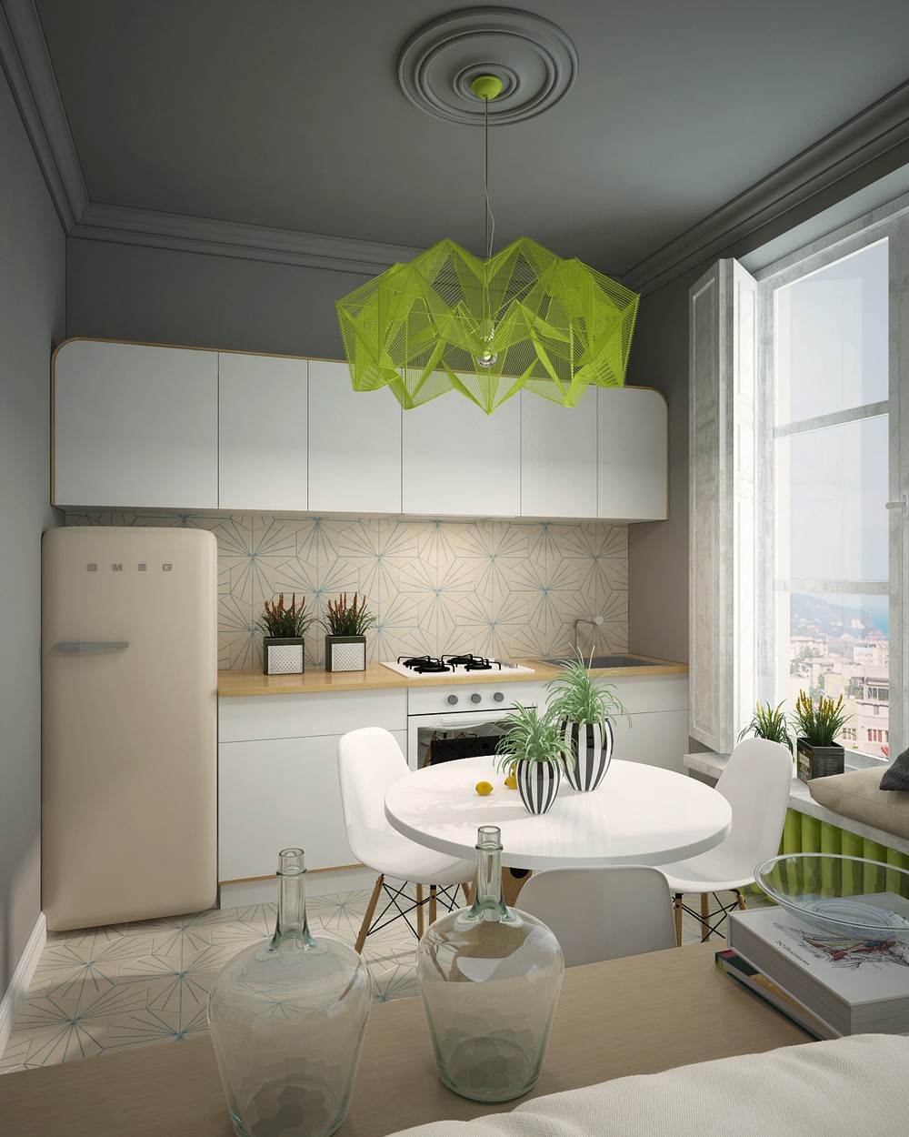
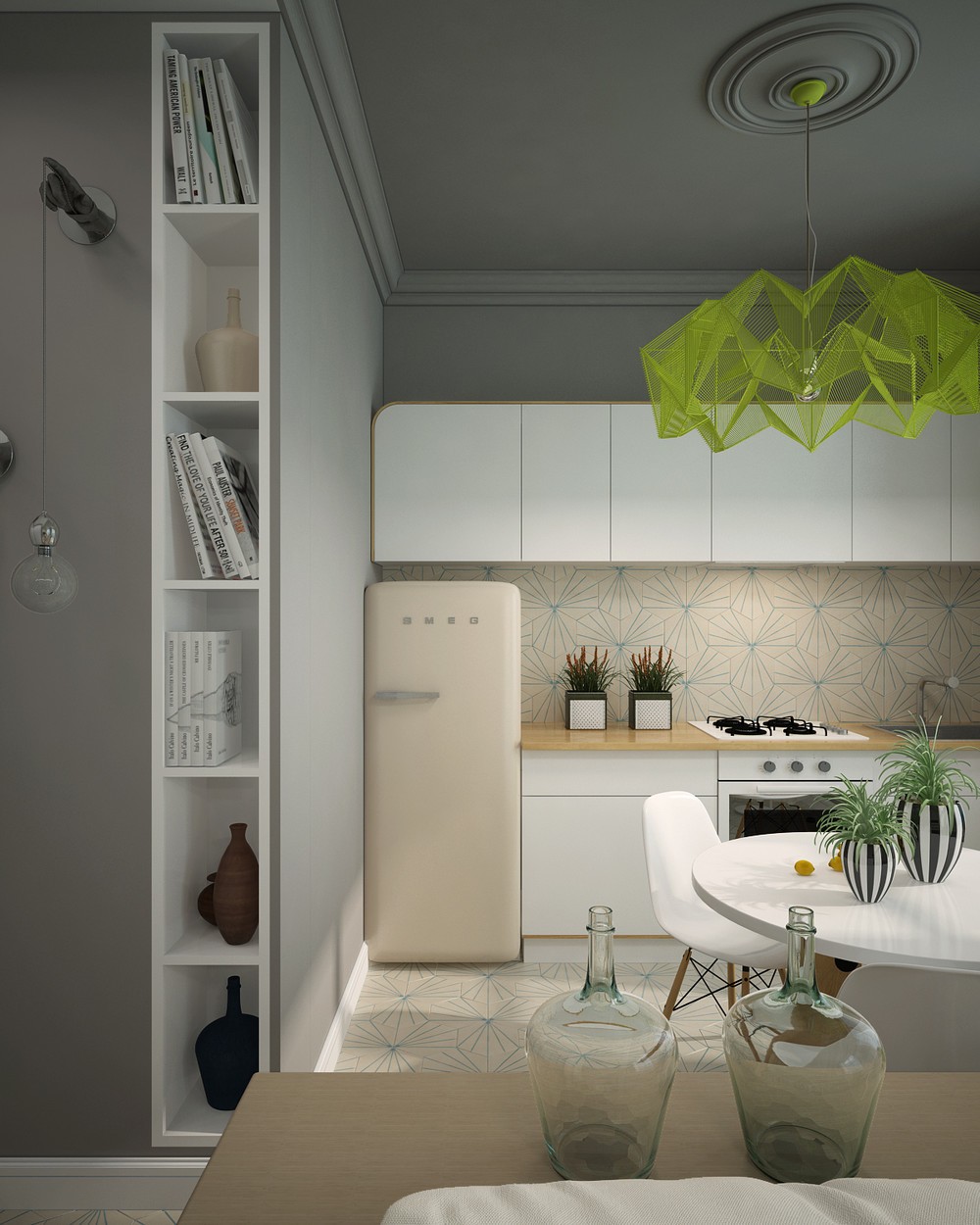
Don't you think this kitchen has a little bit of relaxed Scandinavian appeal? Light neutral colors, curved edges, and clean angular forms combine to create a bright theme that remains easy on the eyes.
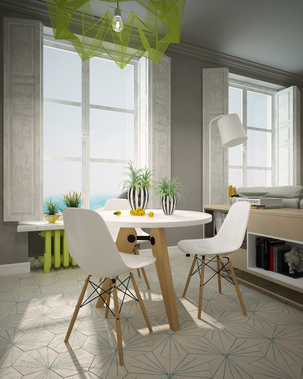
Here's a mid-century dining combination that can't go wrong! Classic eiffel-base Eames chairs pair so perfectly with the Guéridon Table by Jean Prouvé thanks to the matching wood and hardware.
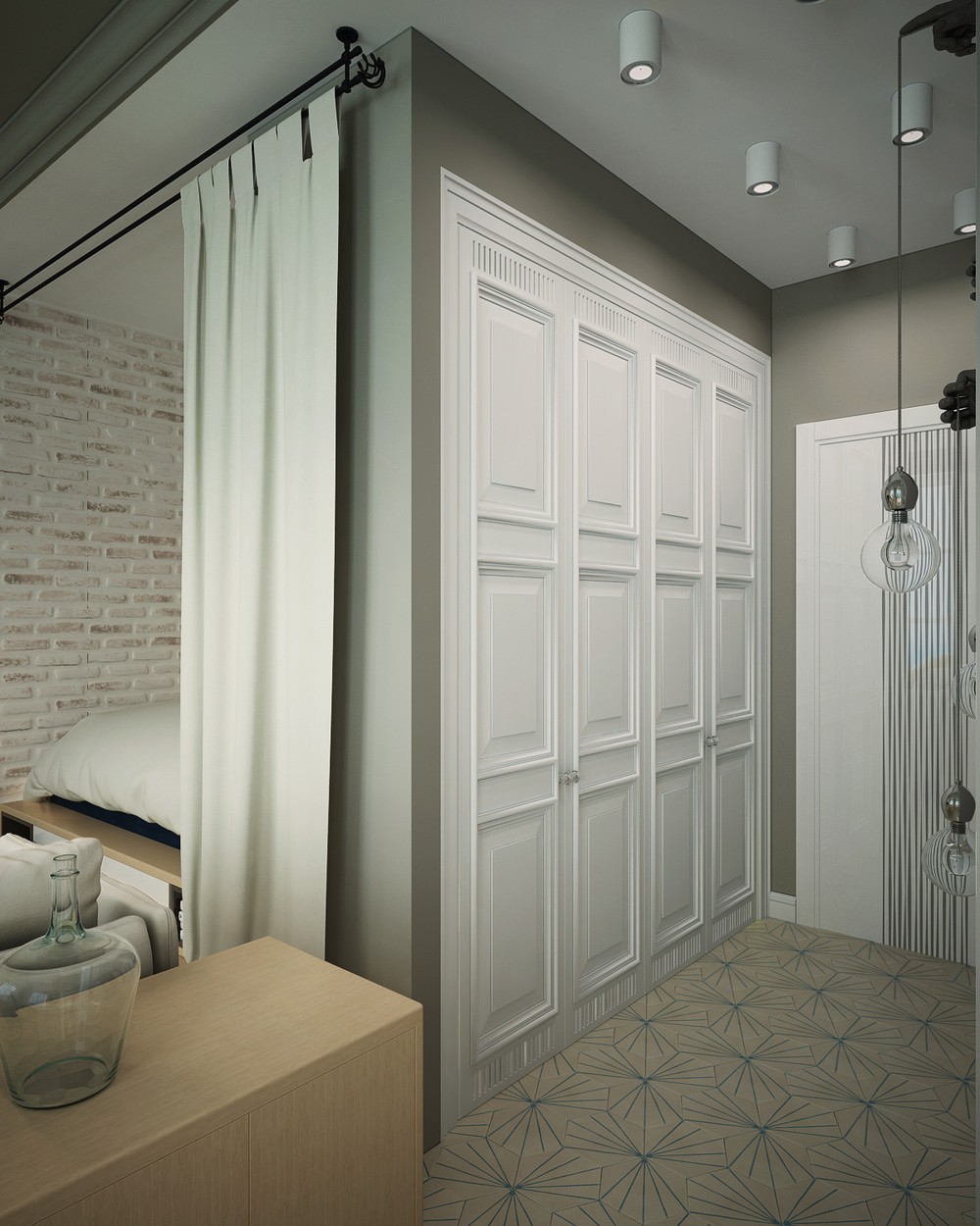
Beautiful! Bucking the trend of minimalistic cabinet faces, these closet doors feature spectacularly intricate boiserie.
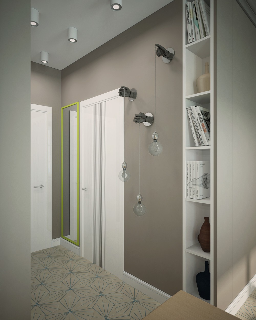
The other door boasts decorative pinstripes. And check out those cool hand-shaped hooks on the wall, a great way to transform ordinary pendant lamps into wall lighting.
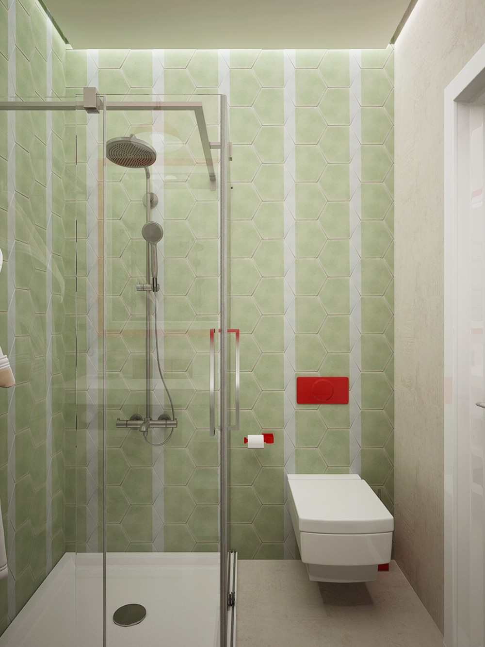
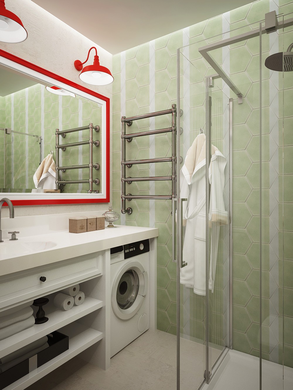
Definitely an interesting color theme, especially for a bathroom – this space contrasts a retro pistachio green with bright fire engine red.
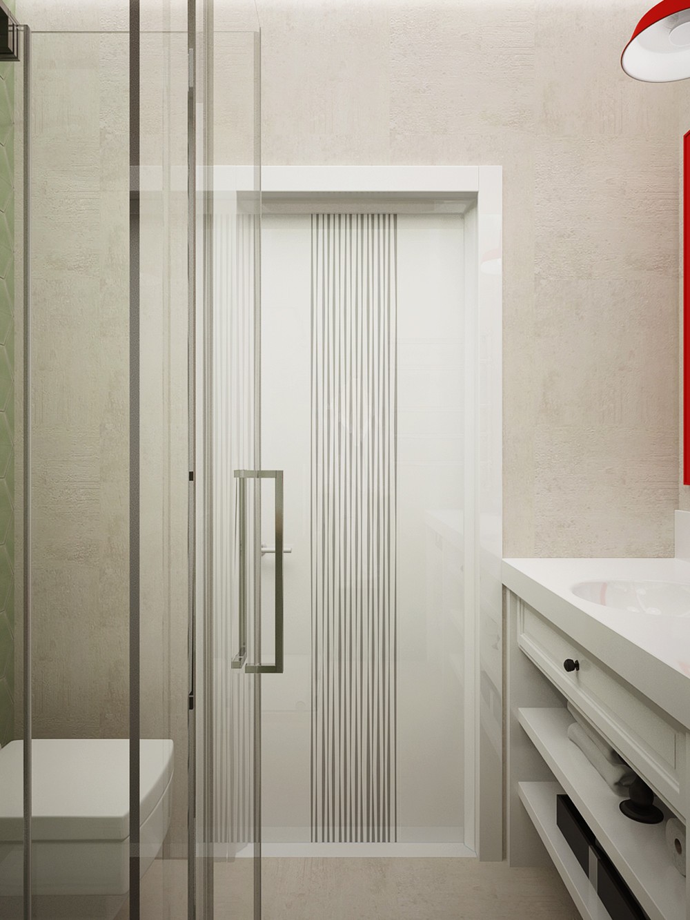
Glossy surfaces and metal-framed glass maintain a cleaner and more streamlined aesthetic on the other side of the bathroom.
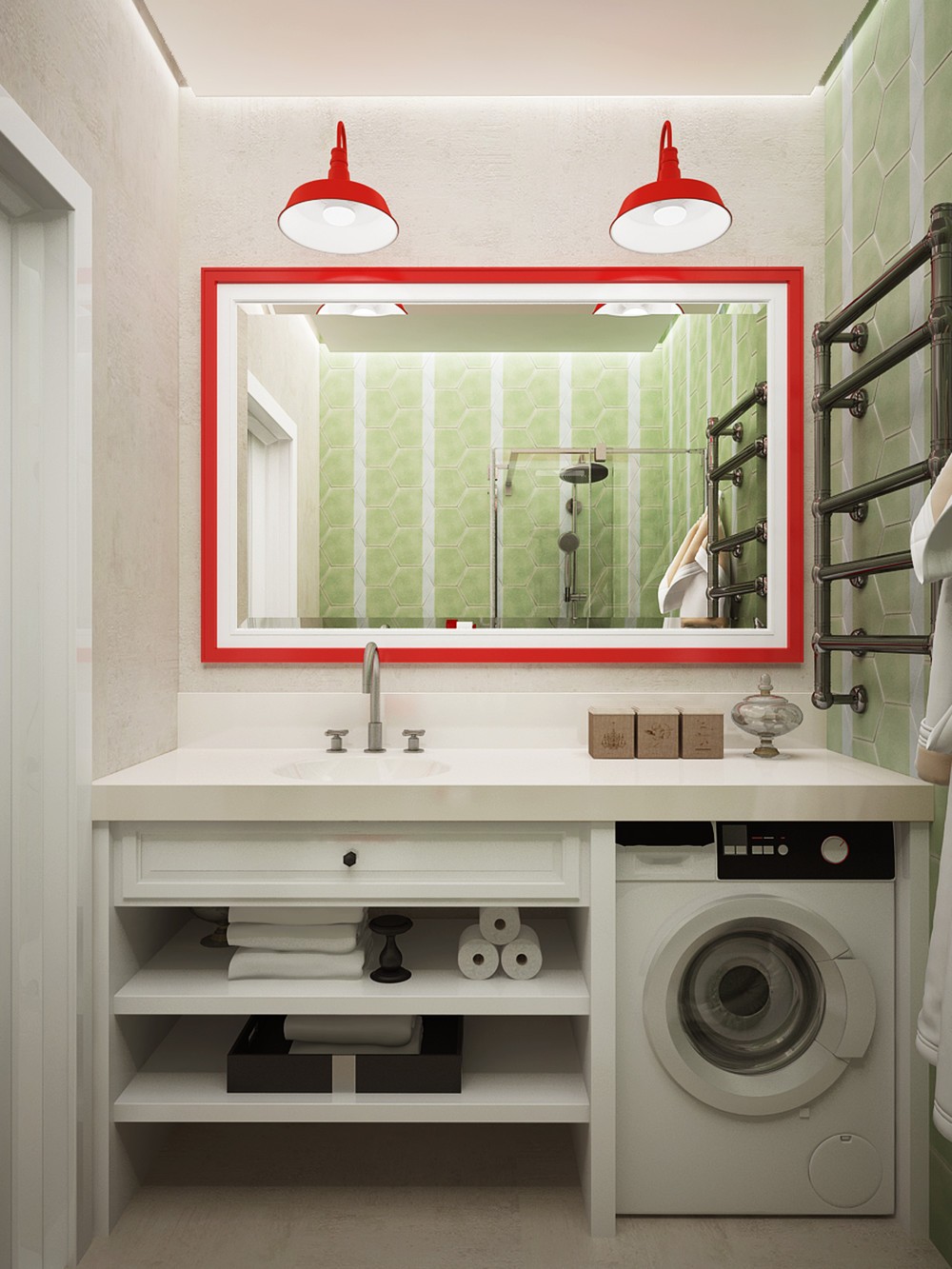
Its compact layout is quite inspiring as well! Here, there's plenty of room for storage as well as all the necessities for washing up.
