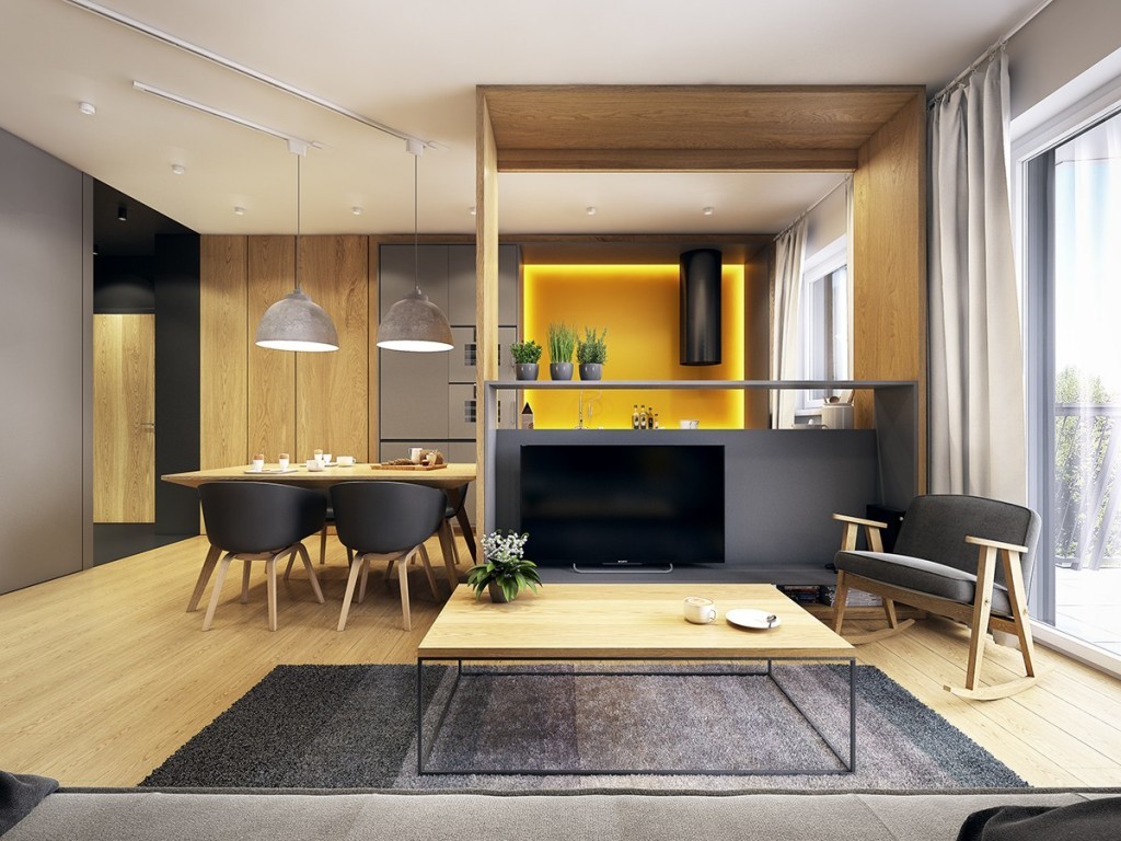
Designed by the Polish creative agency PLASTERLINA, this Warsaw apartment takes an innovative approach to the ever-popular Scandinavian style. The open plan living space retains the natural materials and clean lines of traditional Scandinavian-inspired interiors, but the designers chose eschew the typical all white palette in favor of a more dramatic charcoal theme with striking yellow accents. But that's not all – the areas outside of the main living volume employ a very different look, utilizing an inventive ultramodern aesthetic that reveals a different visual experience from every angle. Keep an eye out for the incredible DIY ideas.
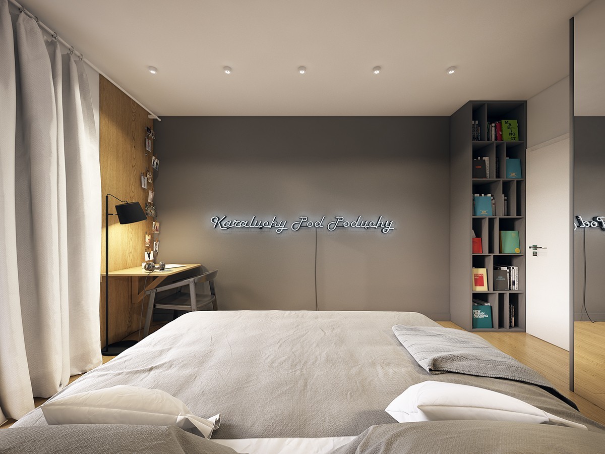
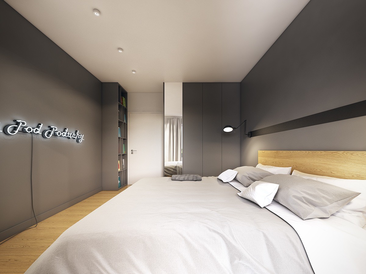
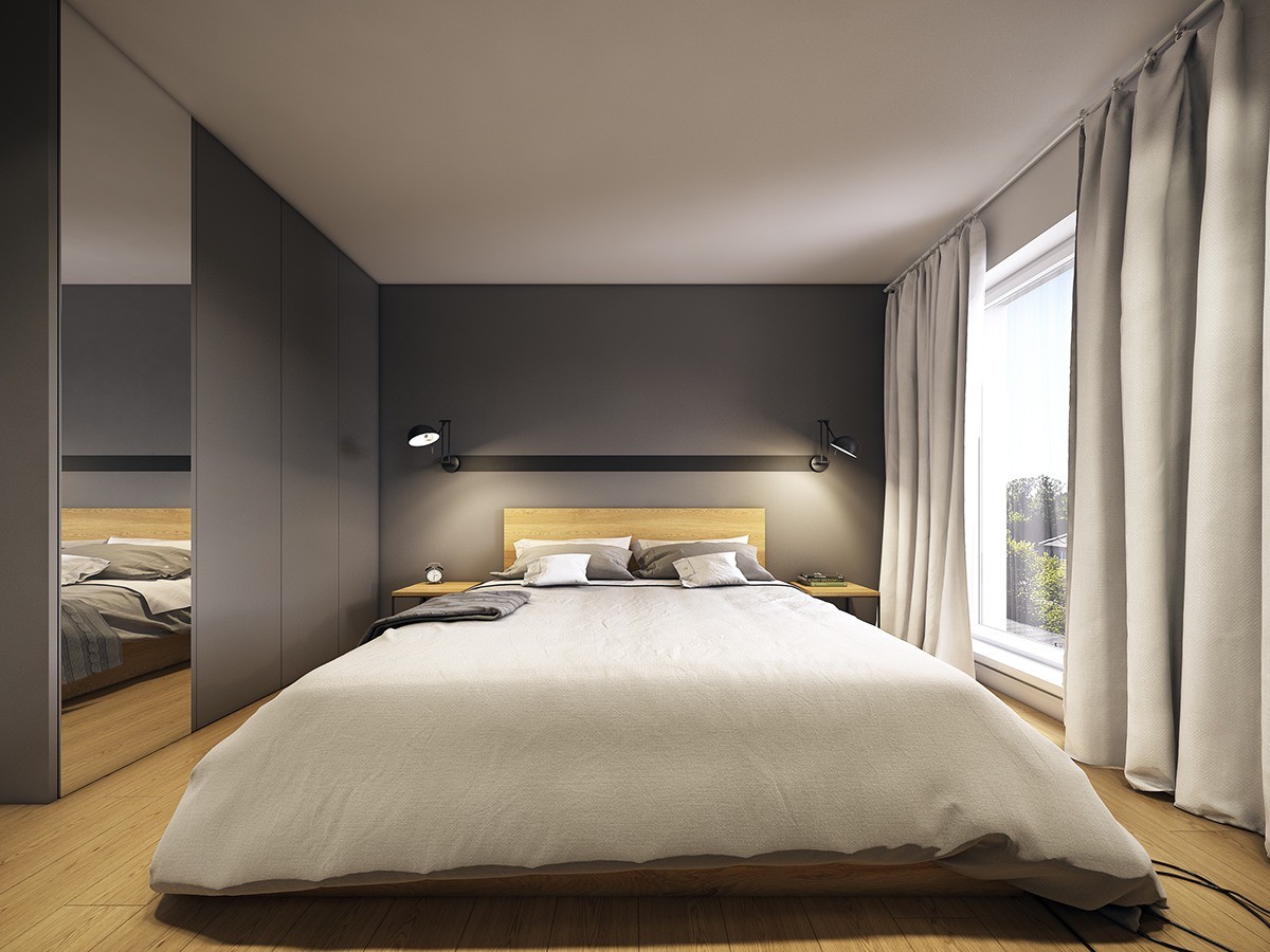
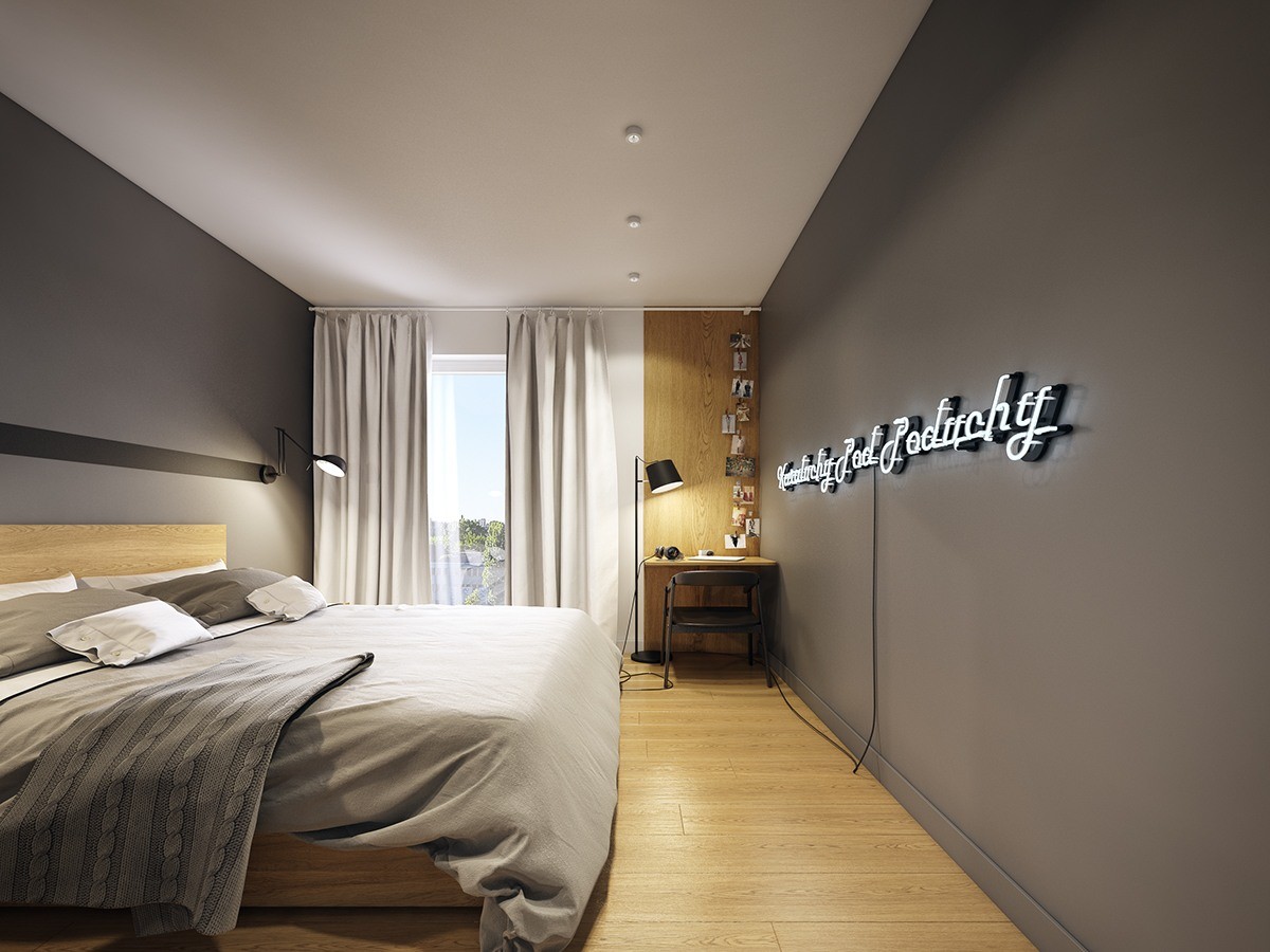
The bedroom takes us back to the simple Scandinavian-inspired aesthetic of the living room, but wood elements are used a little more sparingly.
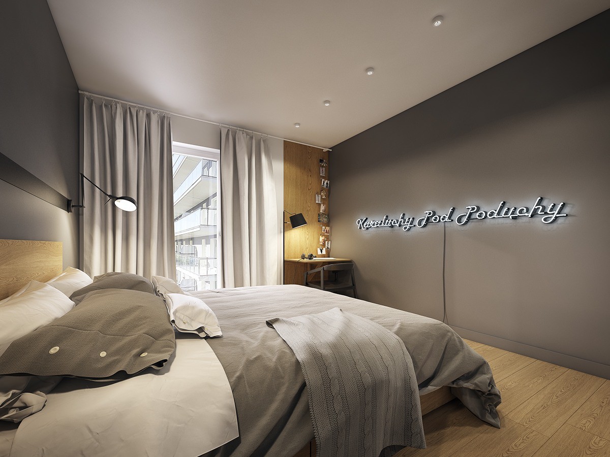
"Karaluchy pod poduchy" is a Polish bedtime phrase similar to "don't let the bedbugs bite" in English.
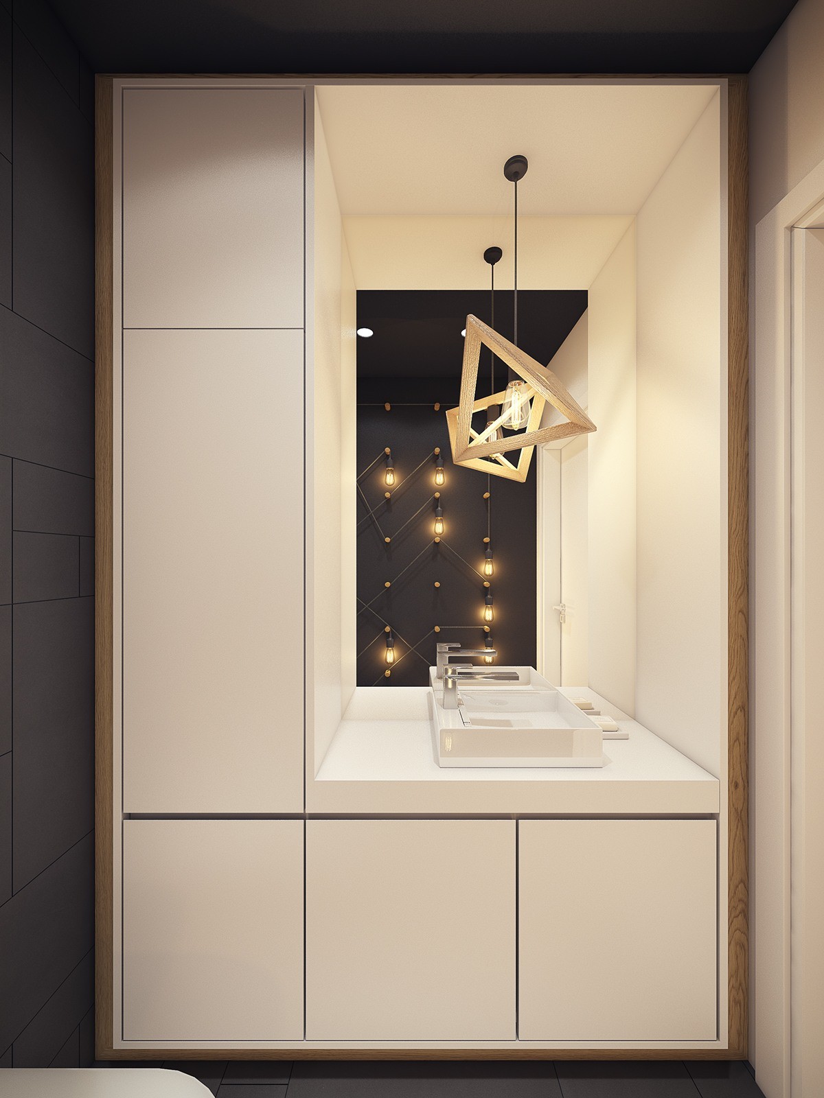
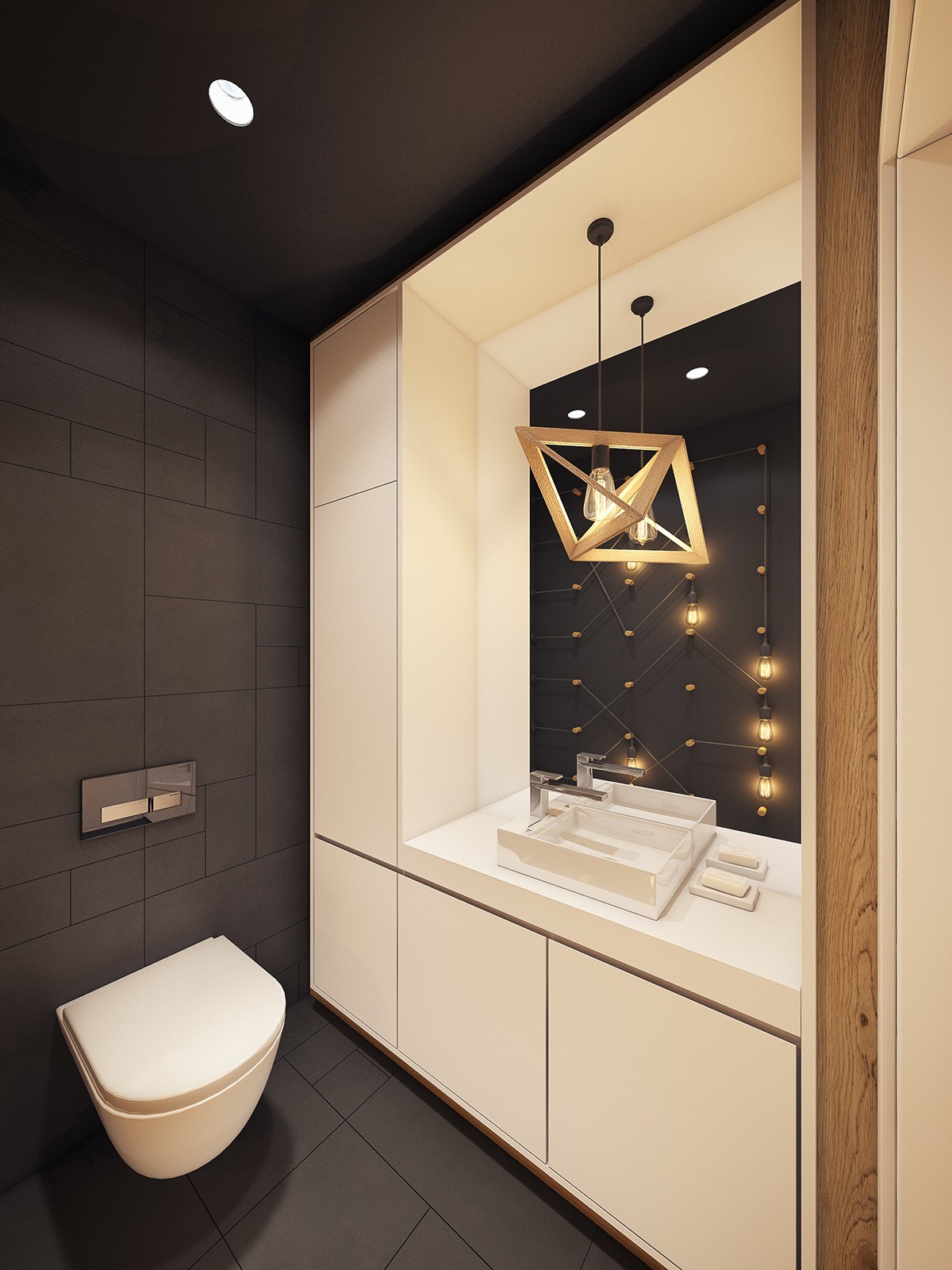
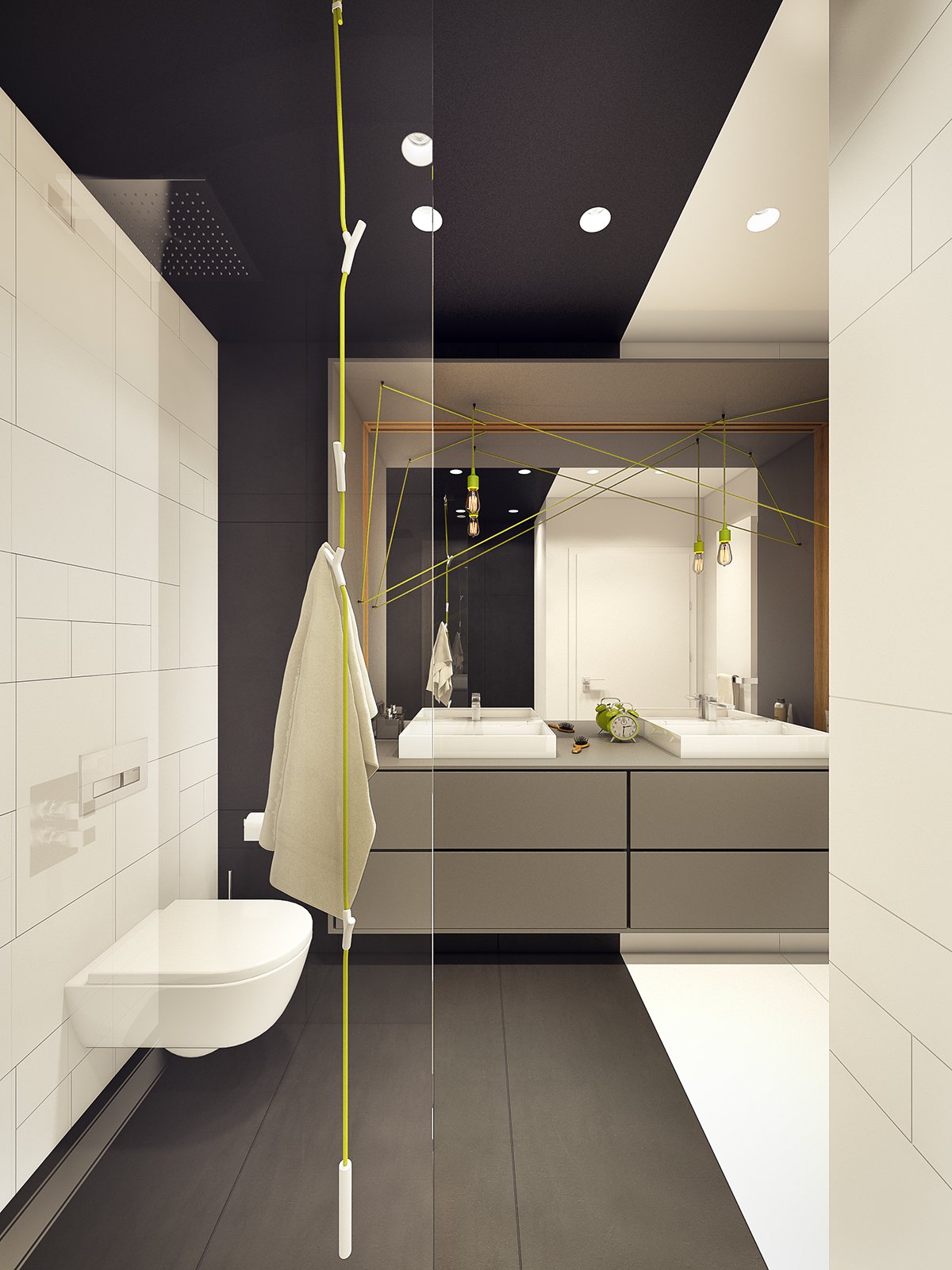
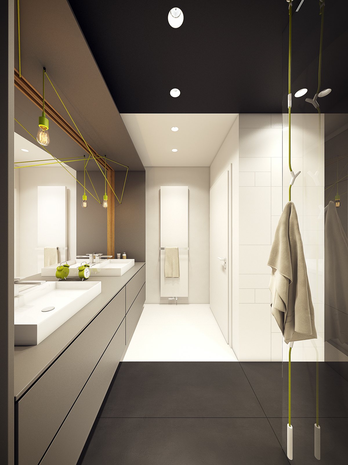
Of the two bathrooms, the first has a very minimalistic style – except for the lighting solutions, which are out-of-this-world amazing.
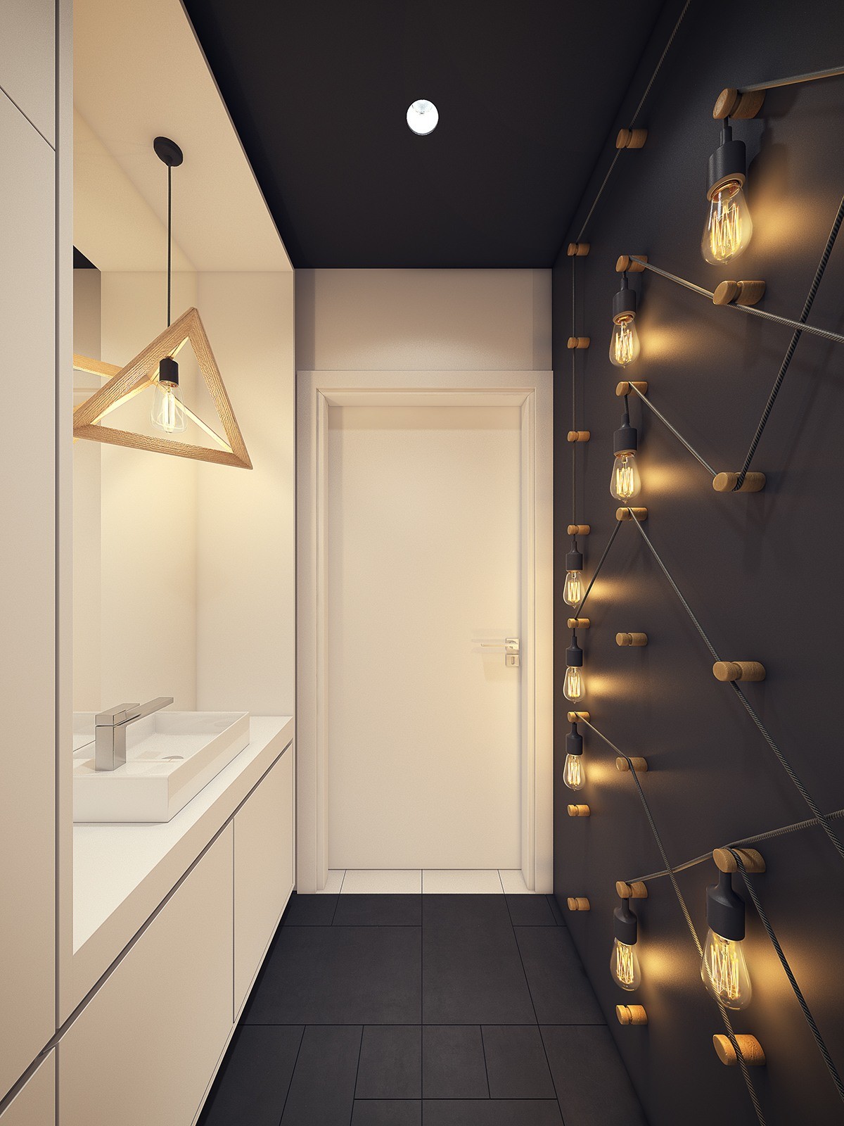
To the left, a Herr Mandel Lampframe pendant alludes to a subtle geometric theme. To the right, pegs guide the lamp wires across the wall.
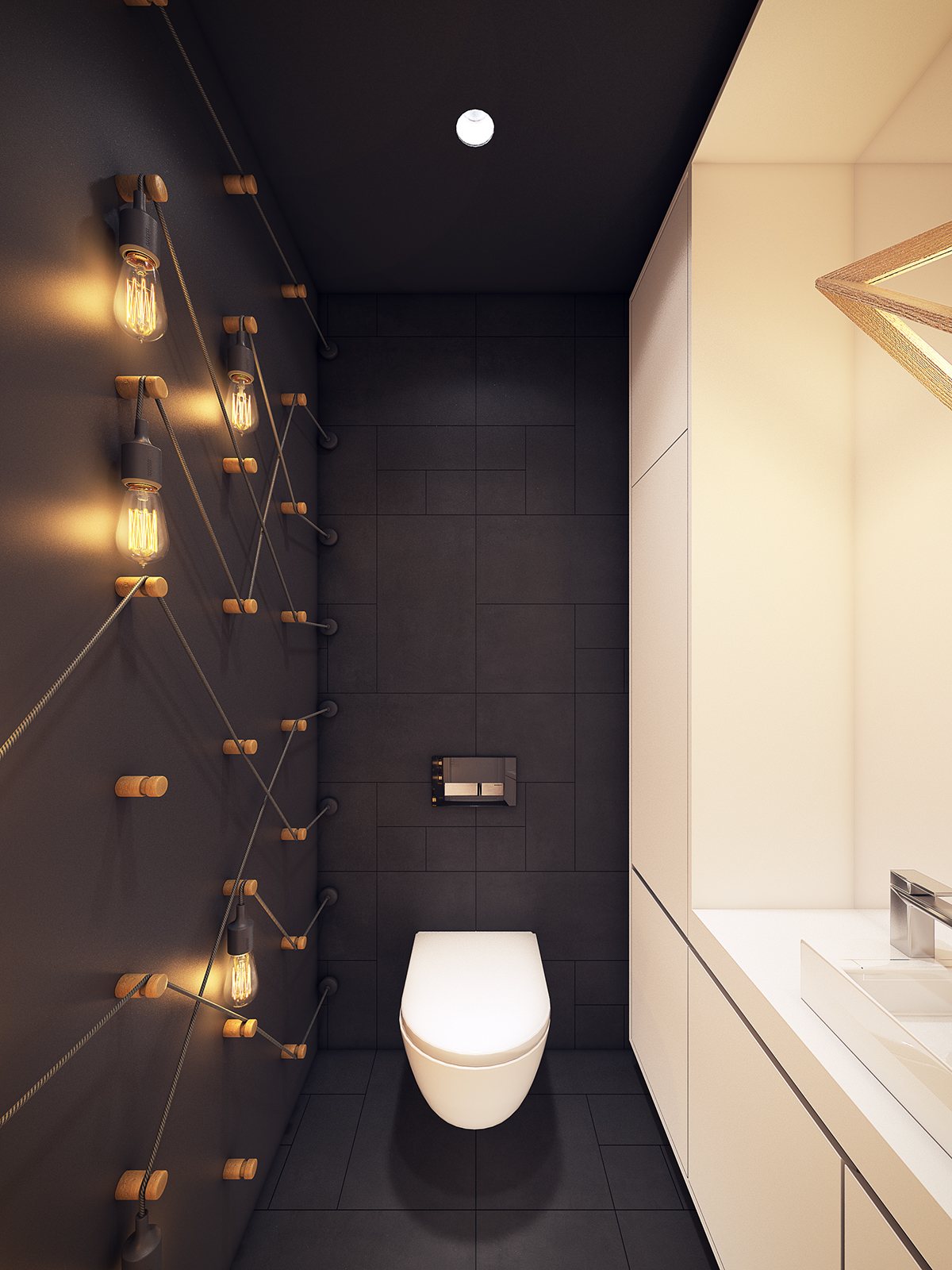
You don't need a special system to create this type of lighting installation, just lots of patience and very long cords. These fixtures were designed by Mattias Ståhlbom and you can find them by searching for the model name E27.
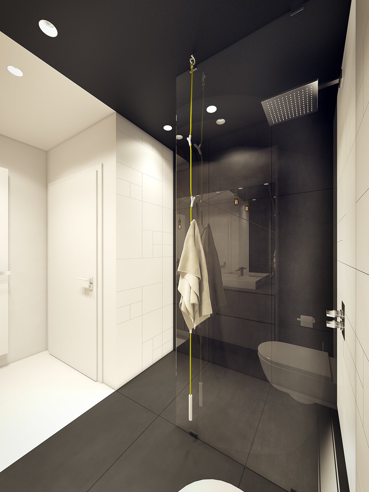
A hanging towel holder eliminates the need for a complicated mounting system, the perfect solution for a bathroom with a glass shower divider like this one.
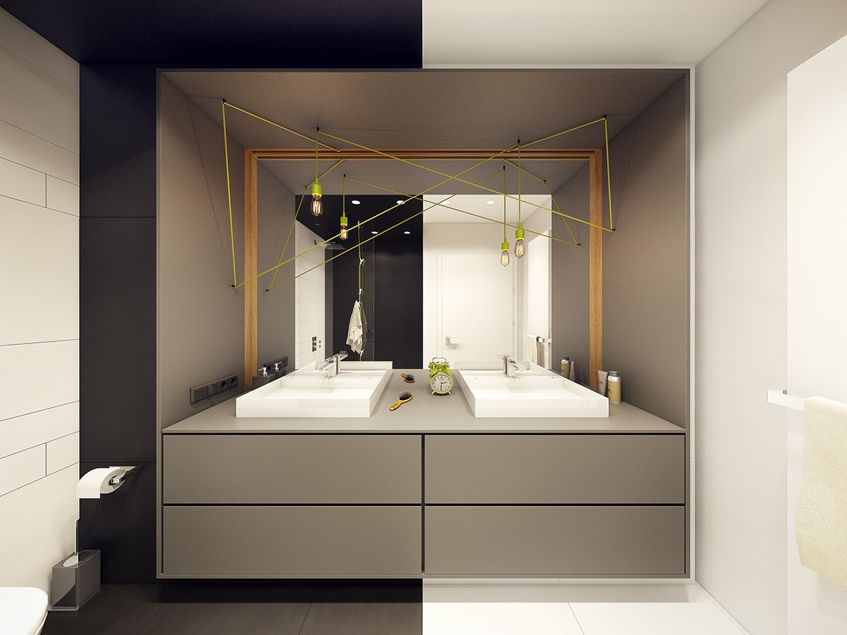
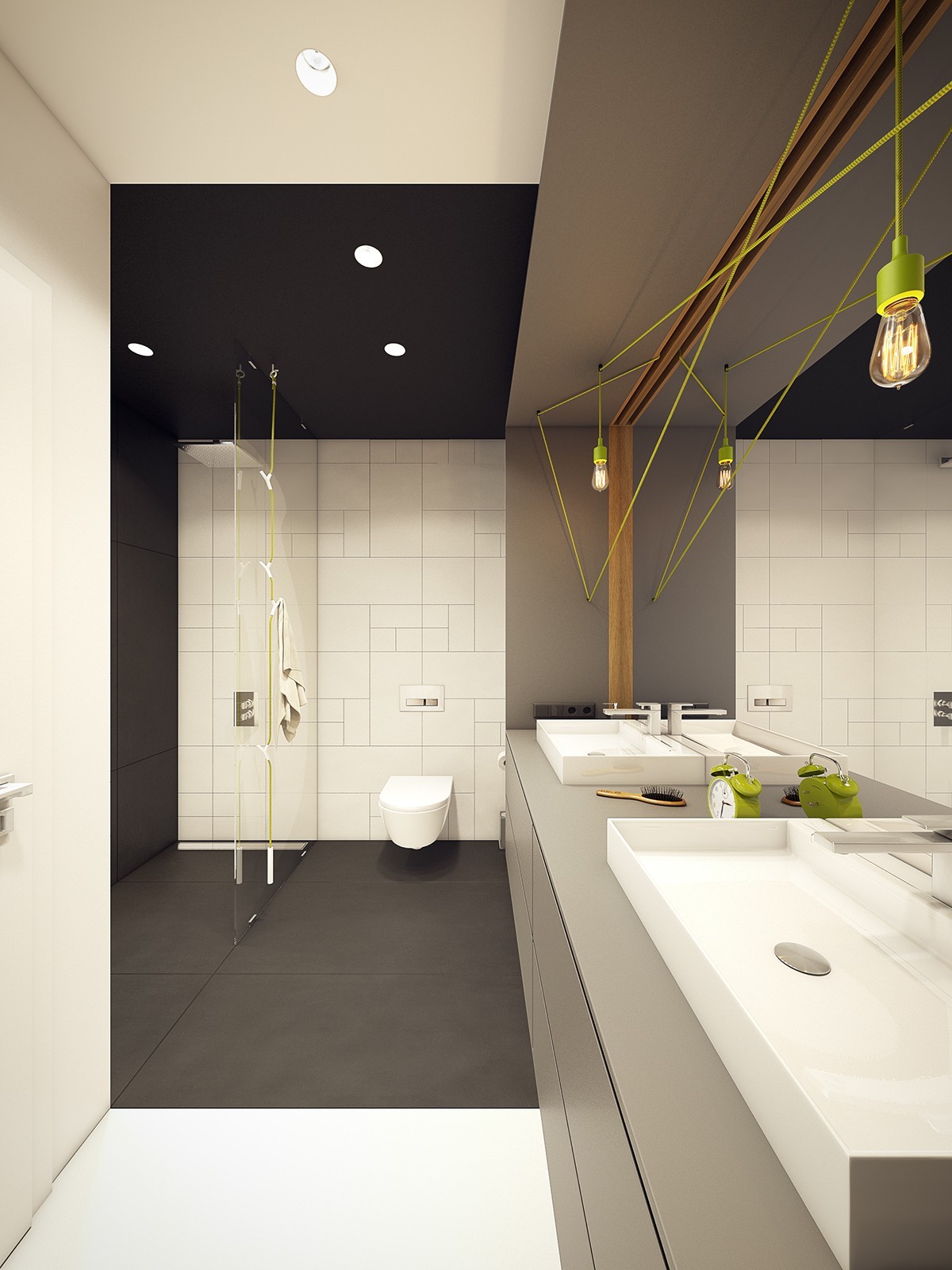
Like the other bathroom, this space also makes creative use of Mattias Ståhlbom's pendant lights, this time with a cool geometric arrangement.
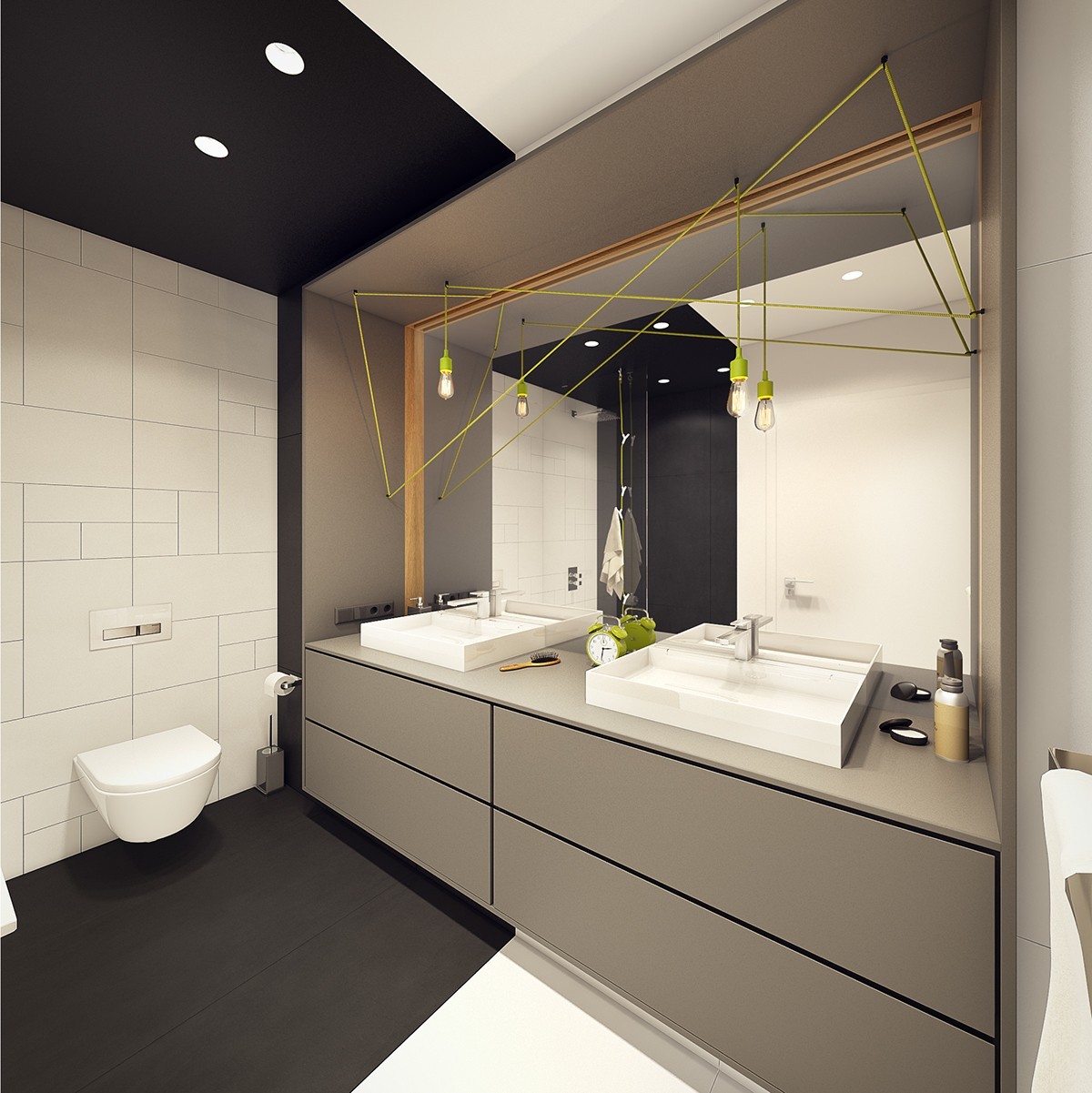
In the age of smartphones, the lime green alarm clock offers a whimsical yet functional appeal. Among all the incredible big-picture features, these little details add the spice of life.
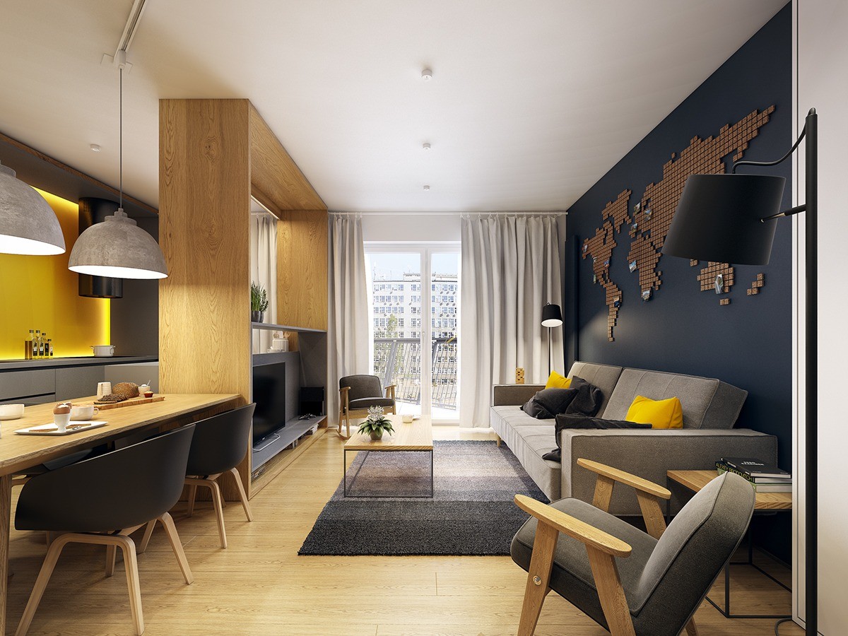
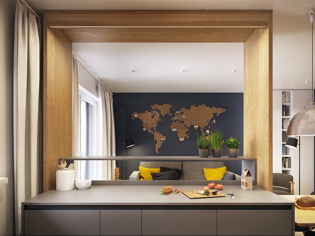
It's easy to see the intended resident is a traveler – the world map to the right is pinned with photos to mark past visits. With a few boxes of small cork tiles and a laser level, this might be a worthwhile project to recreate at home.
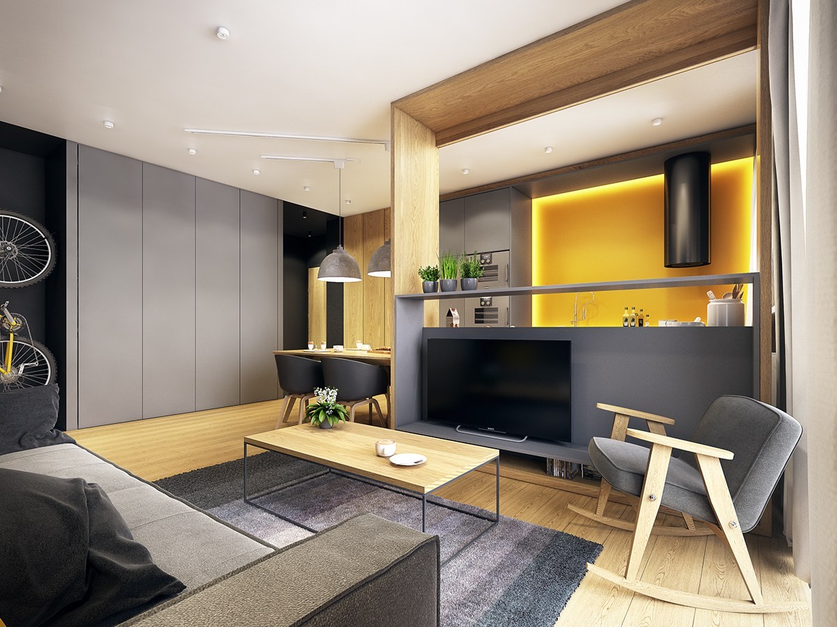
Neutral colors and simple decor are easy on the eye and allow the more adventurous features to stand out even brighter.
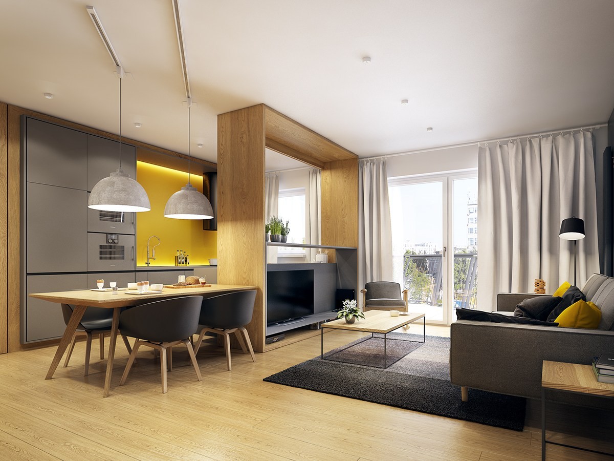
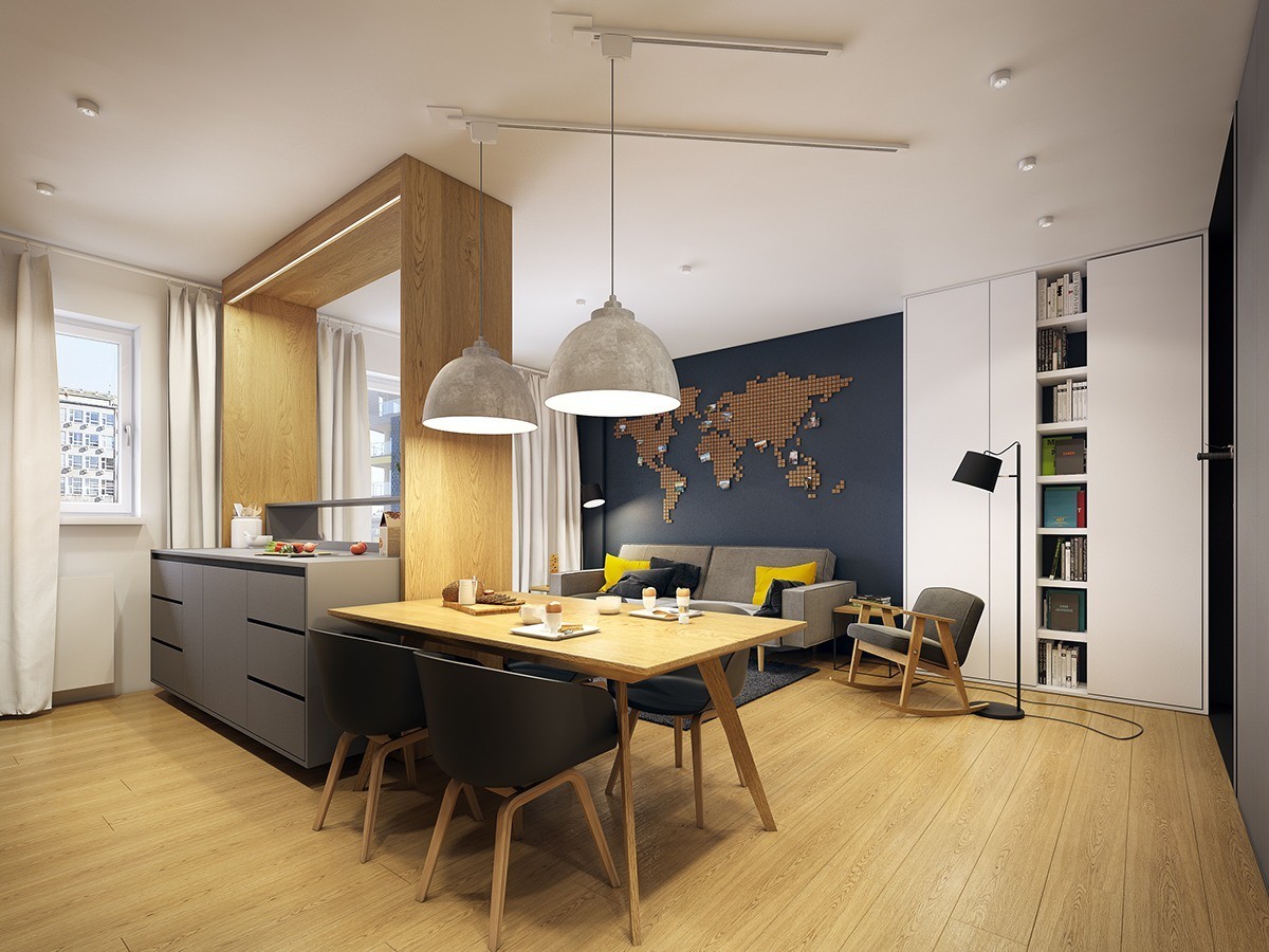
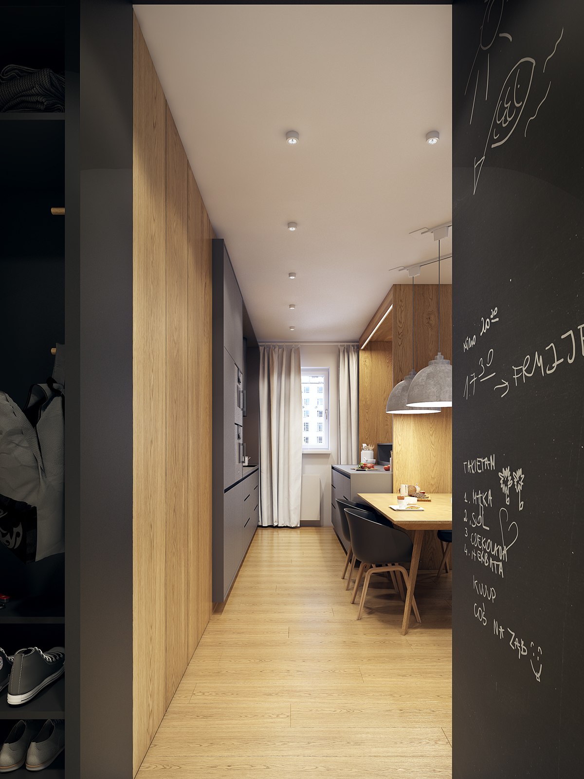
Each functional space is divided and well defined yet maintains an open line of visual communication with the others.
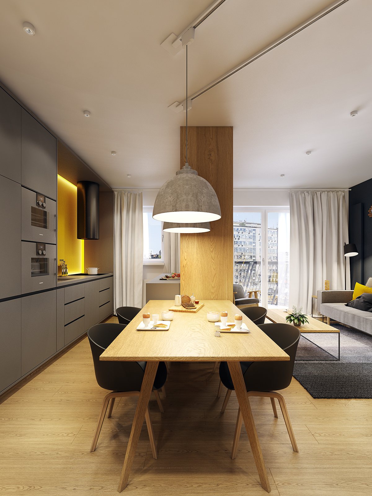
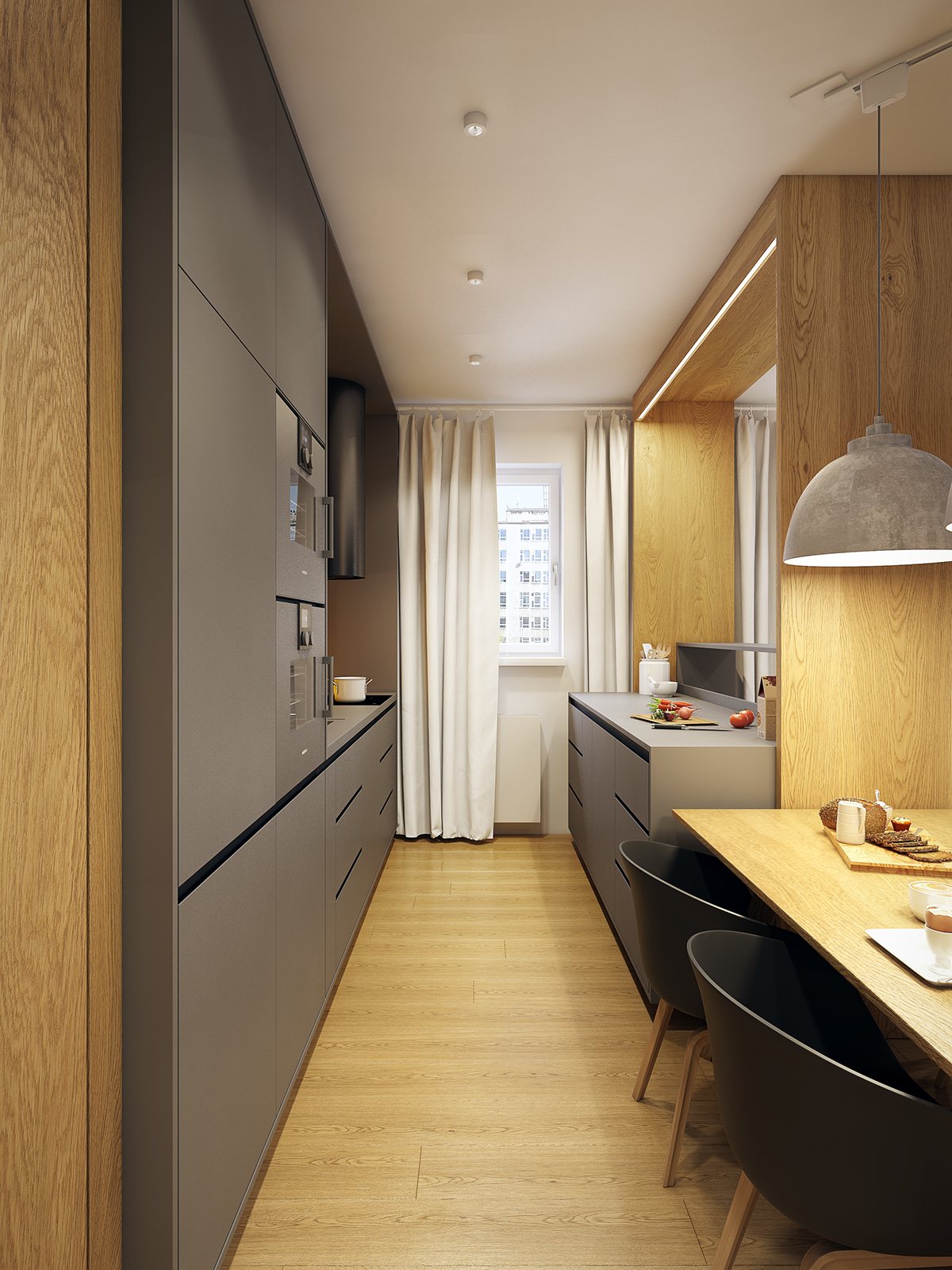
In line with the Scandinavian influence, the dining chairs are the work of Denmark-based designer Hee Welling. If you are looking for beautiful chairs that help you nail the Scandinavian look, do check out post on Scandinavian chairs.
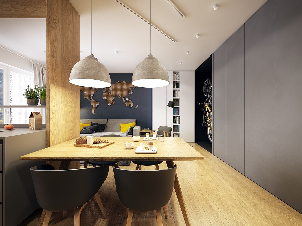
It's hard to ignore these pendant lamps! The outer surface features a concrete texture for a heavy and substantial look, but the shades are actually quite thin and elegant.
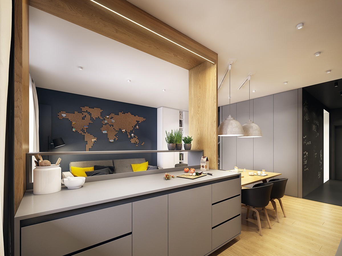
In addition to providing much-needed storage, this countertop offers a convenient serving station for the nearby dining area.

The living room makes an immediate impression with distinctive interior architecture. Rather than installing an interior wall, the designers chose to divide the living room and kitchen with an open wooden structure that doubles as housing for the media center.
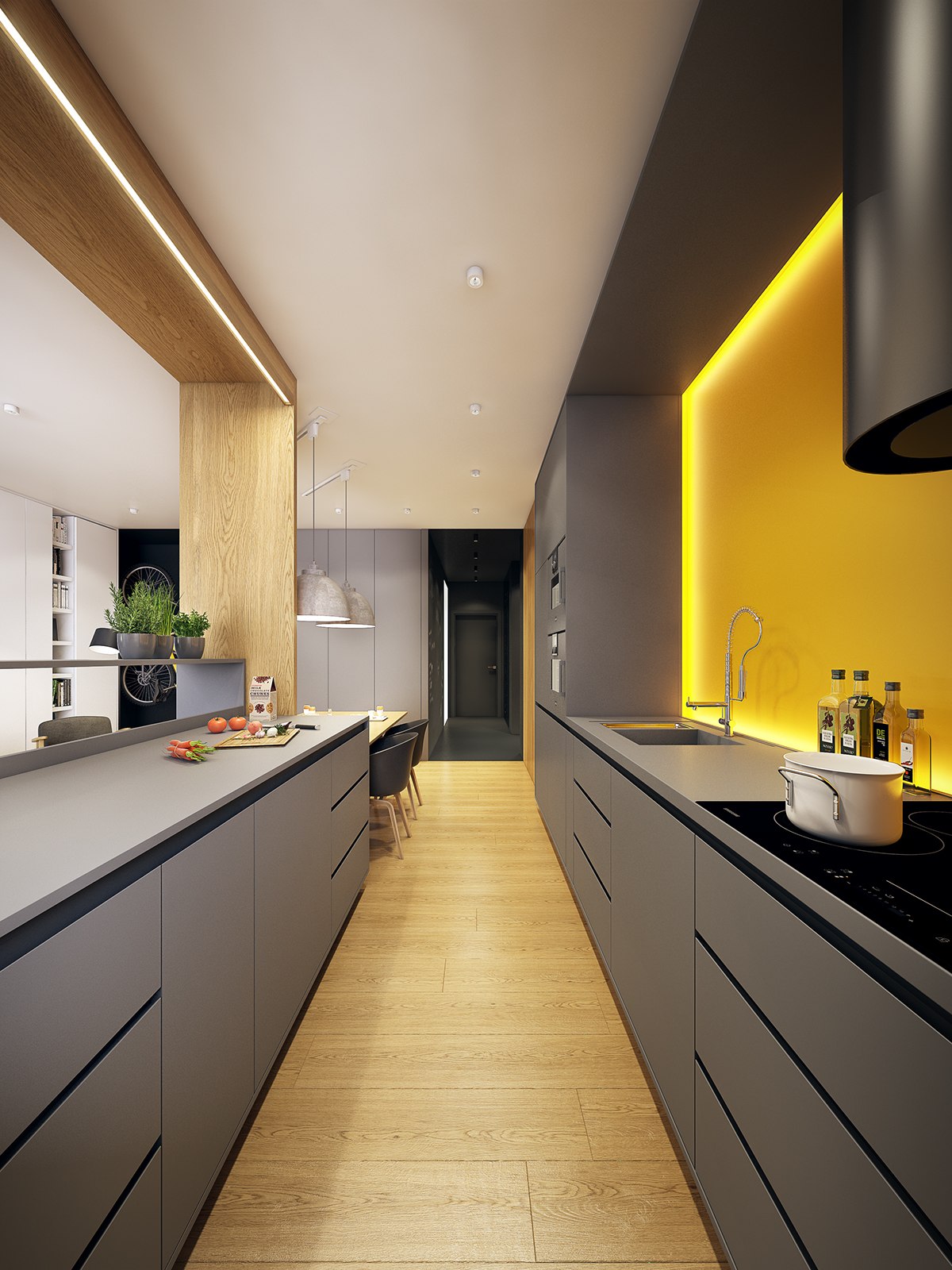
The integrated lighting solutions are quite inventive. The thin strip over the left countertop illuminates the work area, while the indirect lighting on the wall to the right energizes the yellow backsplash.
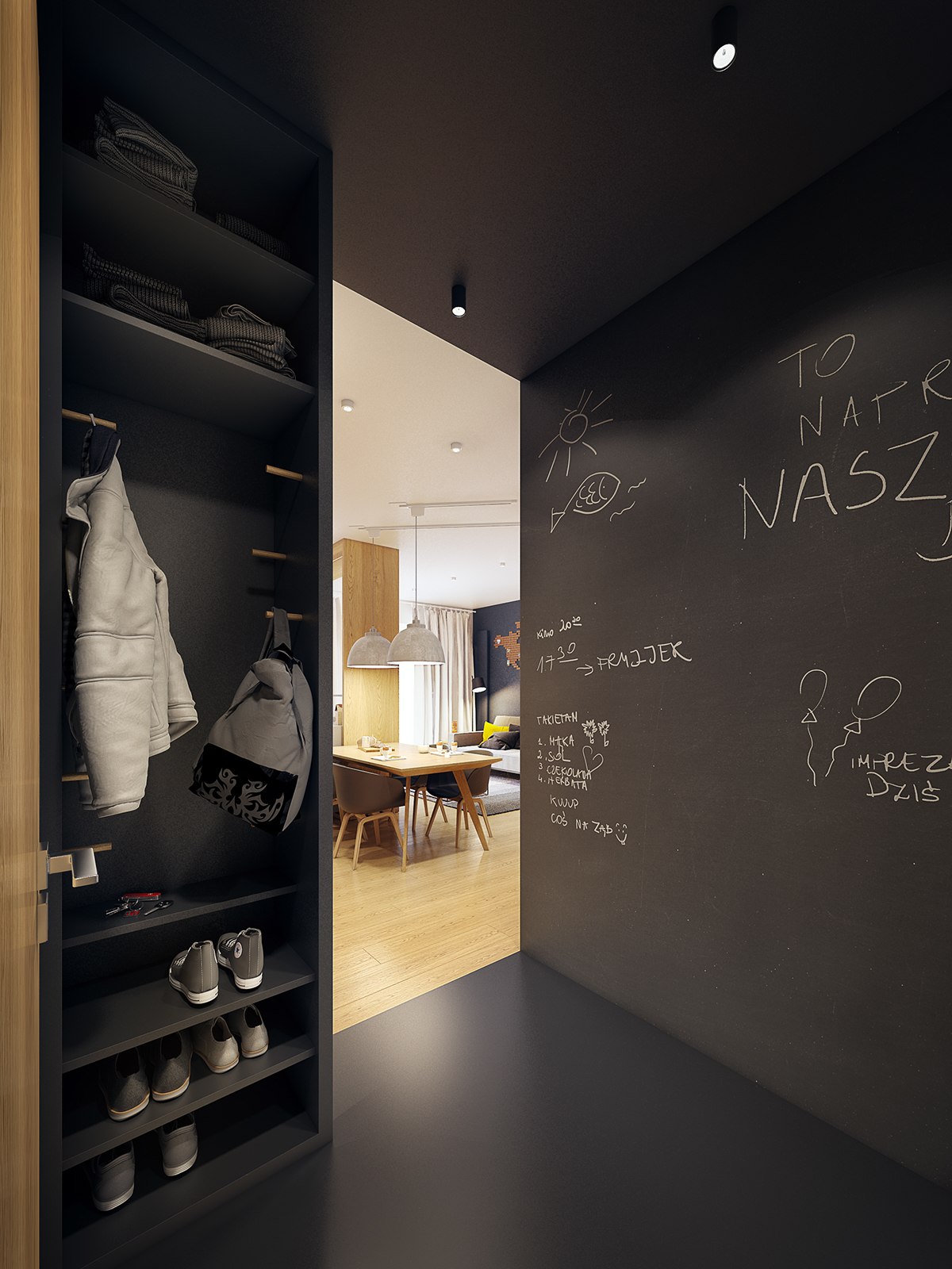
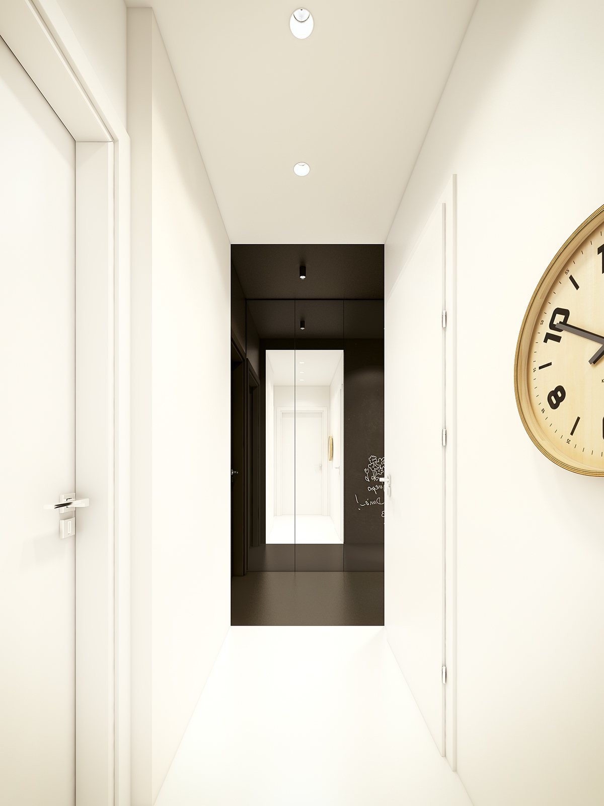
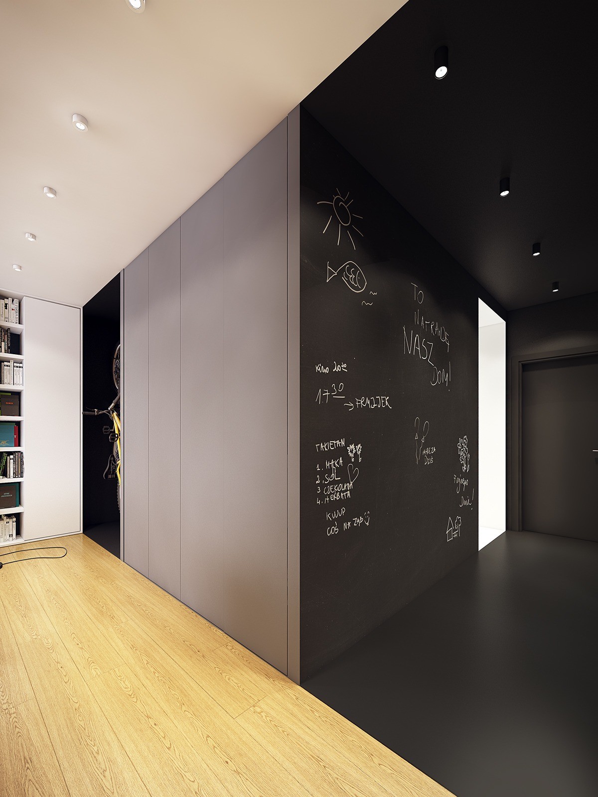
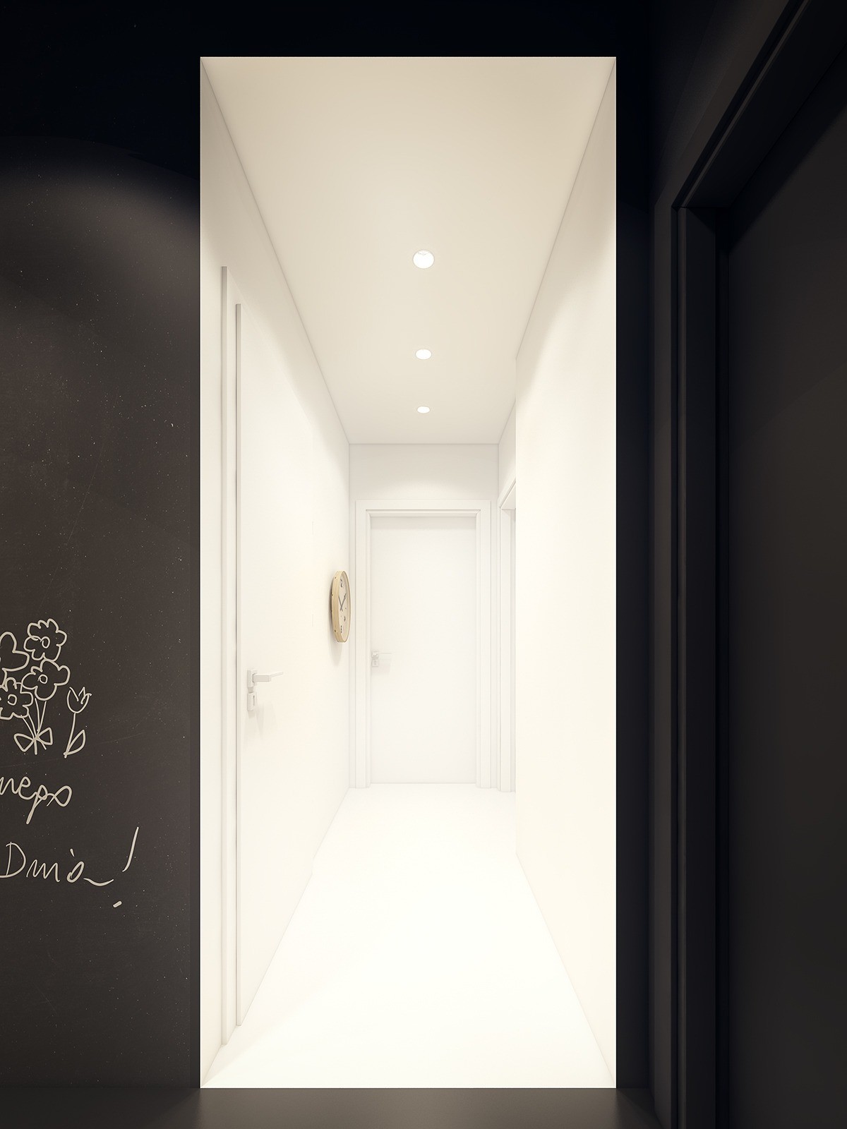
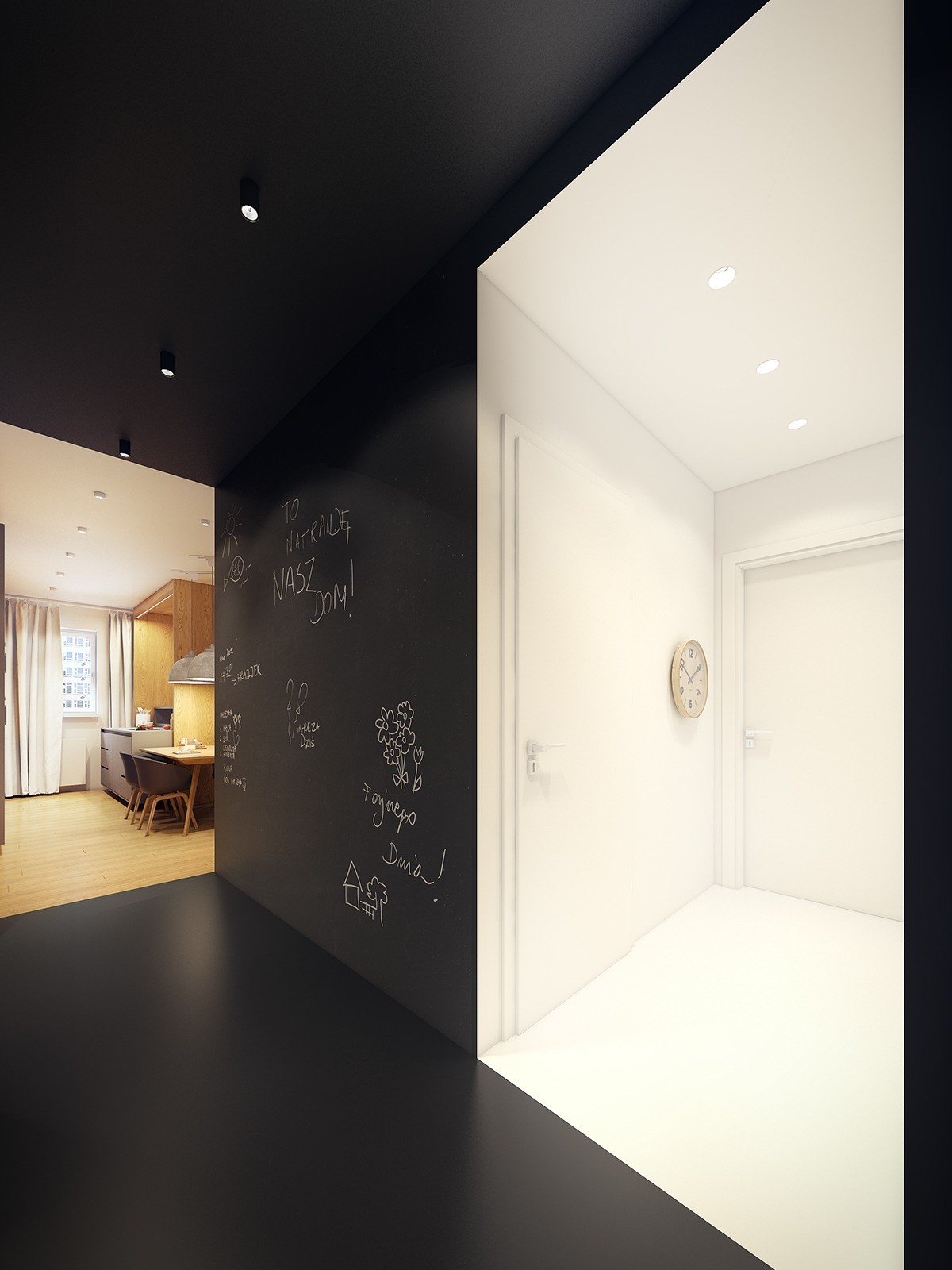
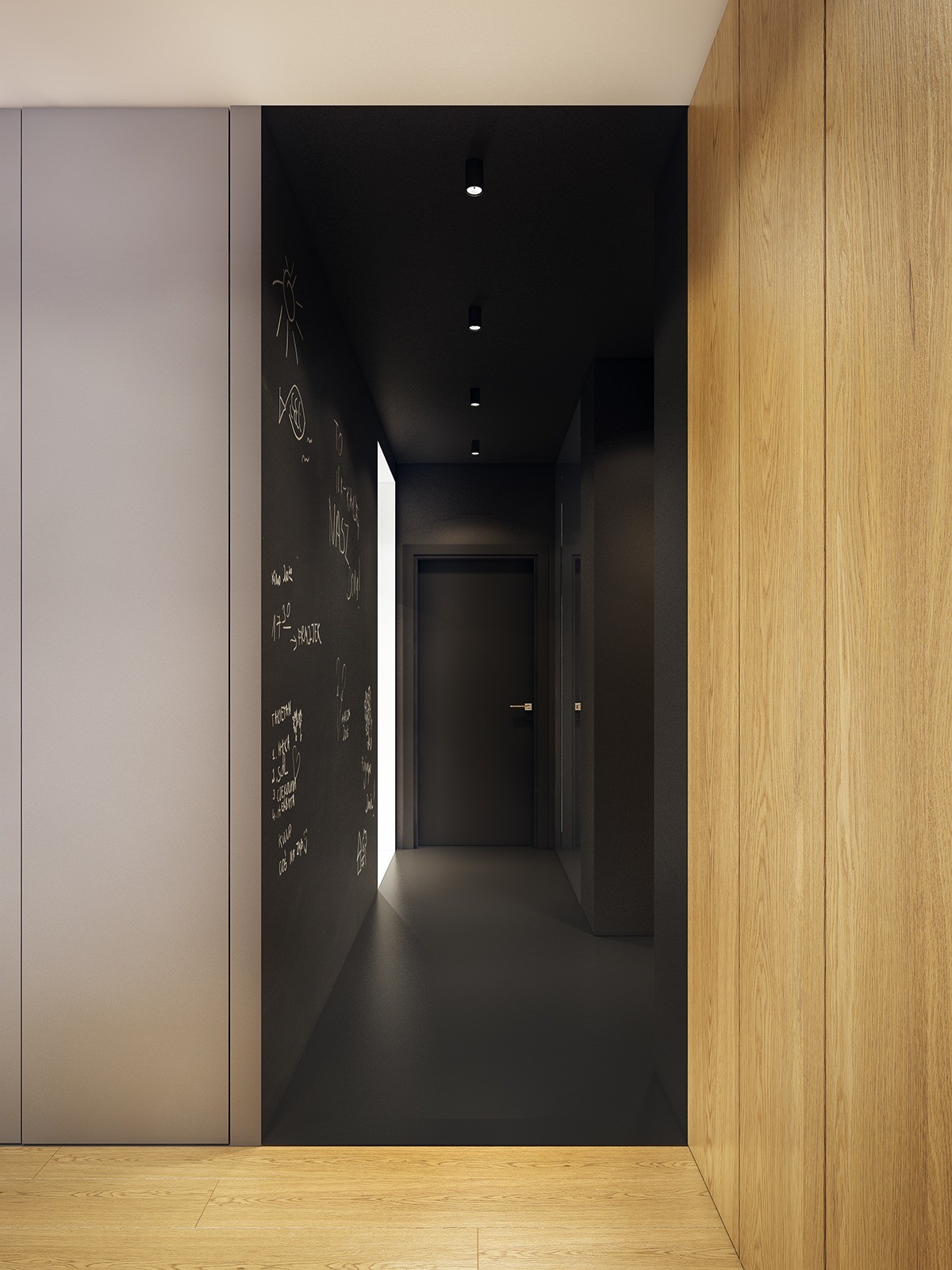
Here's where the huge contrast kicks in. While the main living spaces enjoy a touch of traditional design, this hallway marks the transition to a highly modernistic and experimental style.
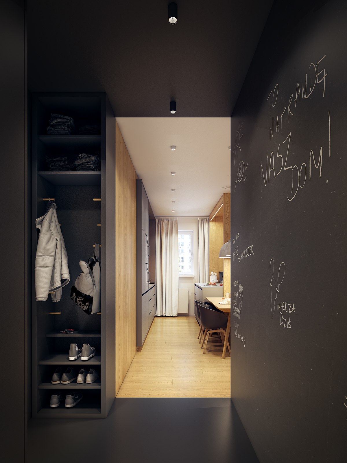
While chalkboard walls aren't new to the design world, pairing them with a black floor and ceiling has a very dramatic and surprising effect.
