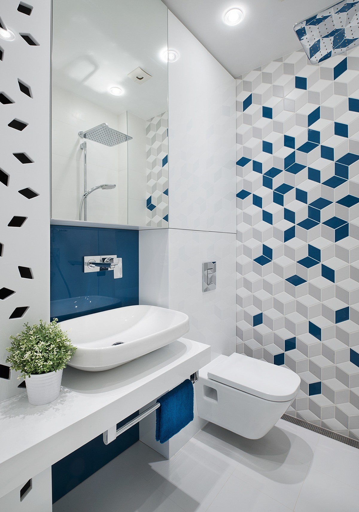
Mid-century modern enjoyed a massive surge of popularity starting in the 30s and hasn't left the home decor lexicon ever since – it's been reworked, refined, reimagined and fully ingrained into the way the world interacts with design. This apartment captures part of that evolution by combining the clean lines and smart functionality of mid-century style with today's most distinctive trends like bold geometric patterns. The creatives at Fimera Design likely chose this aesthetic as a nod to the apartment's 1950s construction, its renovation providing a chance to weave the building's history into a stylish and contemporary interior.

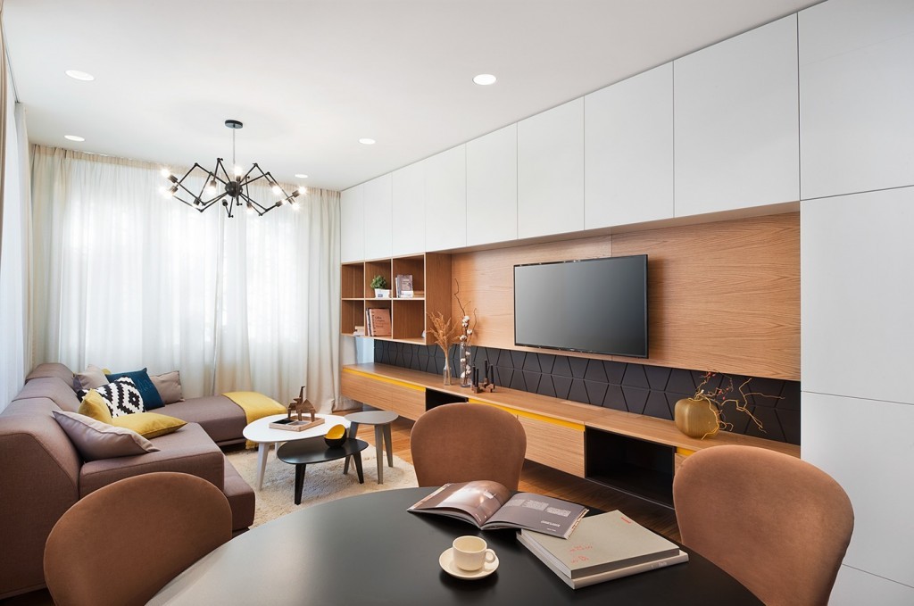
Let's start from the beginning - the living room offers a welcoming first impression with natural materials and bright yellow accents, creating a comfortable atmosphere within a sharp composition.
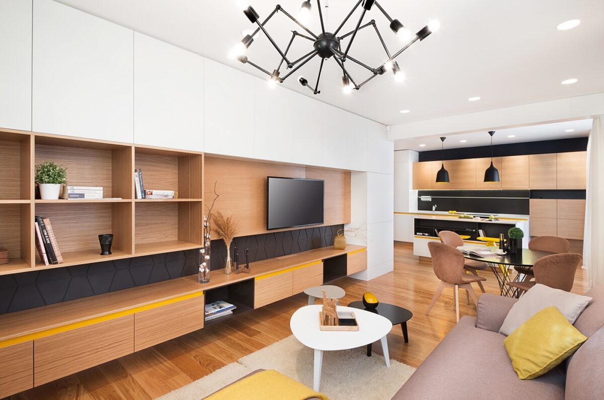
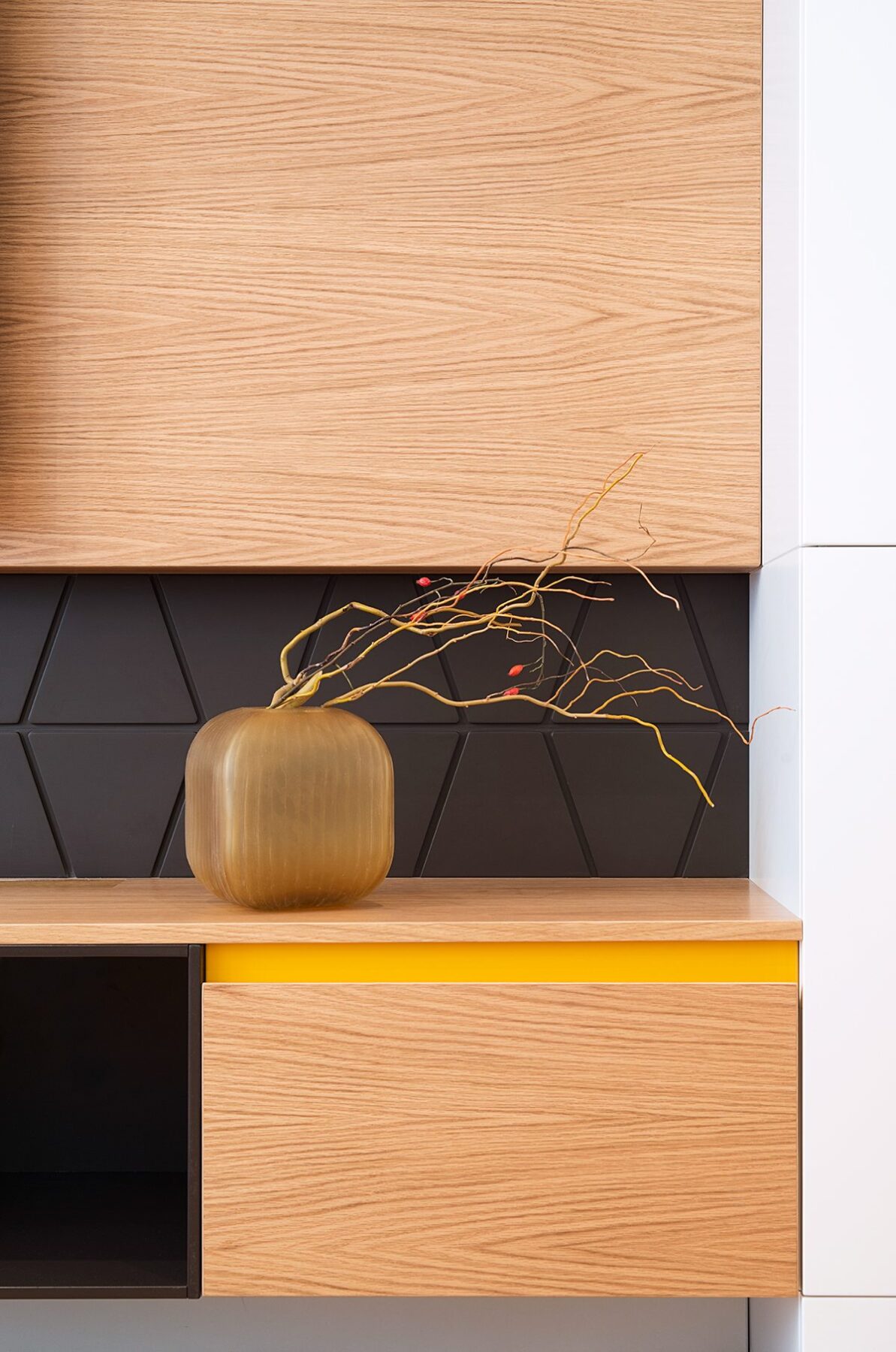
The low-profile media console is definitely a style familiar to many mid-century fans but its layered construction is a perfectly modern interpretation, as is the black stripe of geometric panels.
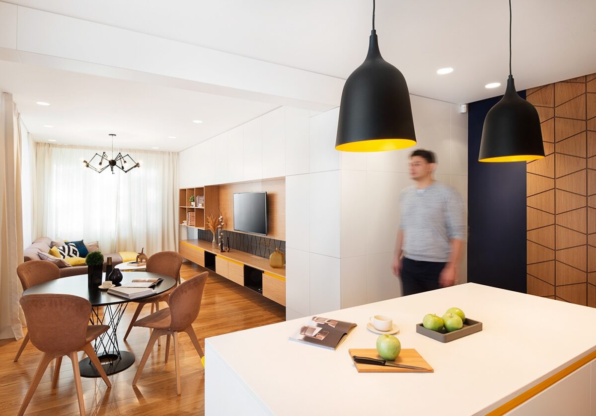
You might recognize the shade of yellow (harvest gold) as the star of every 70s interior, looking very fresh and current as used here.
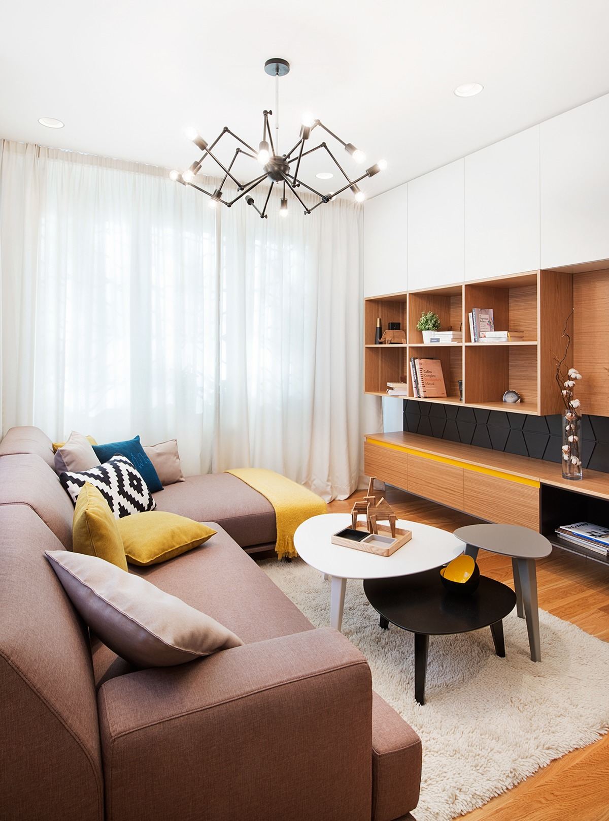
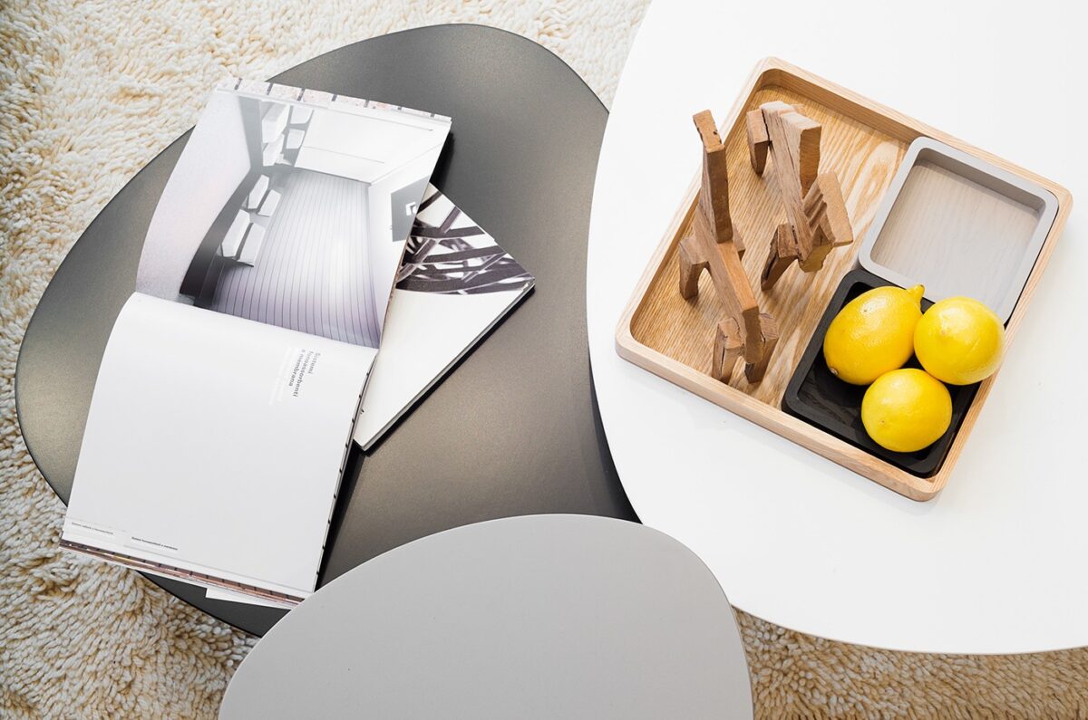
This rounded triangle table style was very popular in the era that inspired this interior! The chandelier is a modern piece, designed in 2005 by Seyhan Özdemir and Sefer Caglar.
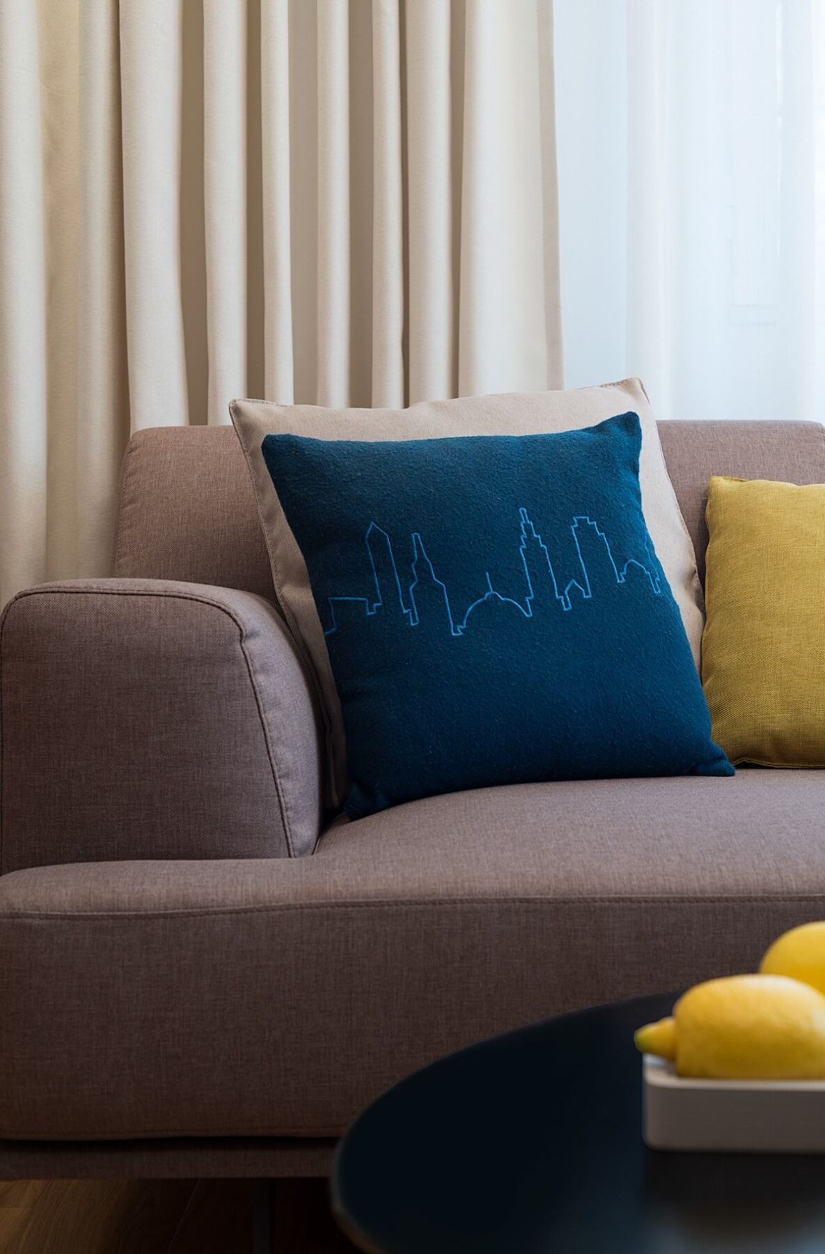
Charismatic accents bring the resident's personality into the mix. Skyline pillows – like the one featured here – are always a cool way to show love for a hometown or favorite travel destination.
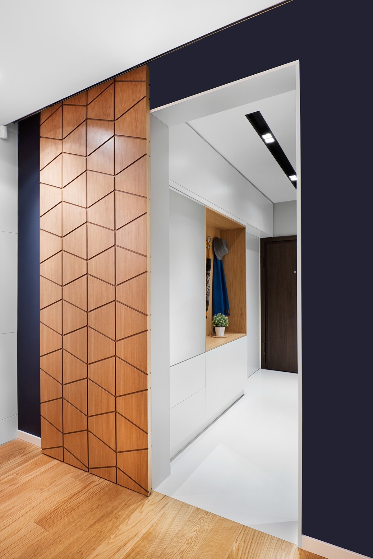
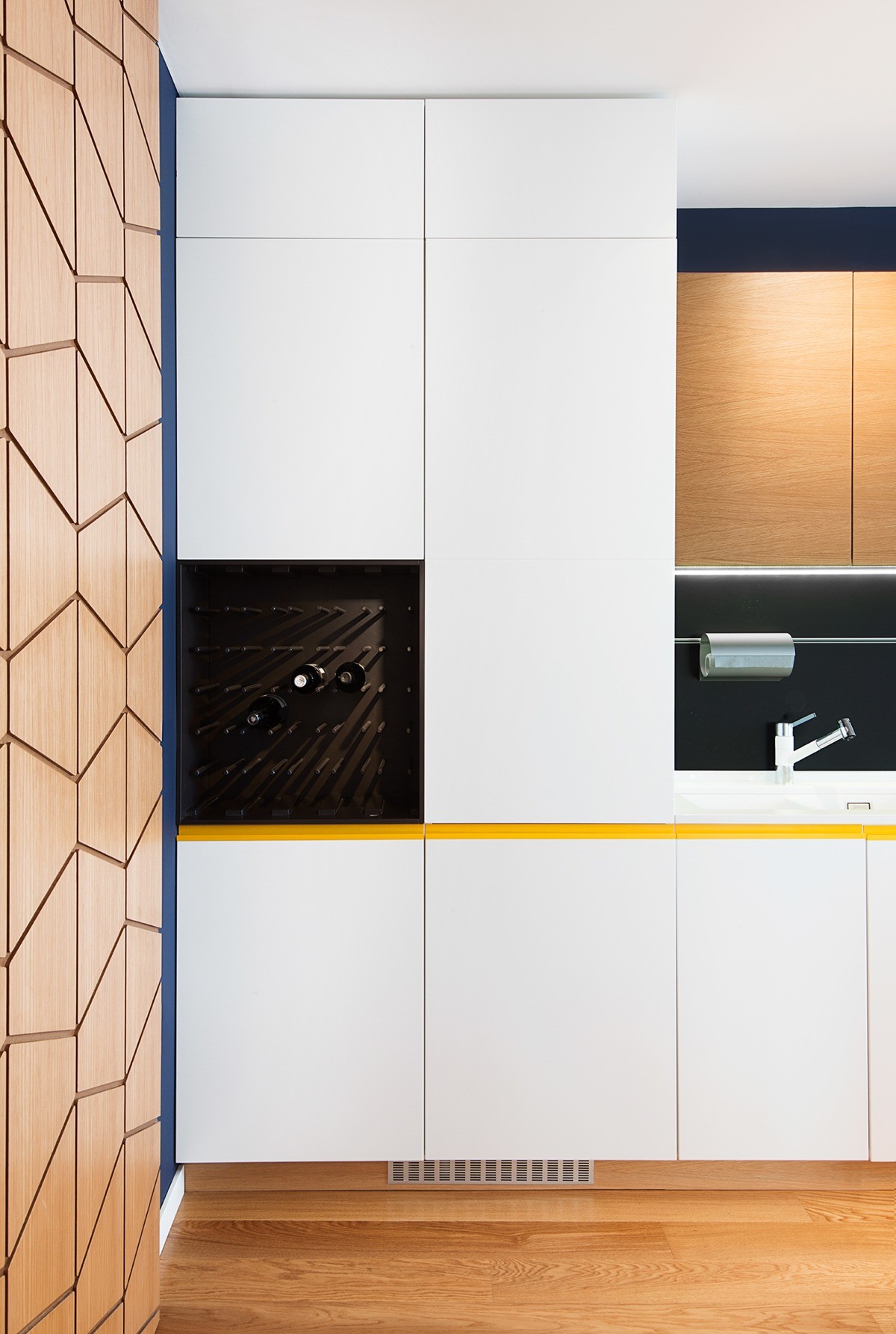
A peek at the entrance reveals a sliding door with a signature geometric pattern, giving way to a pristine white hallway with clever storage niches.
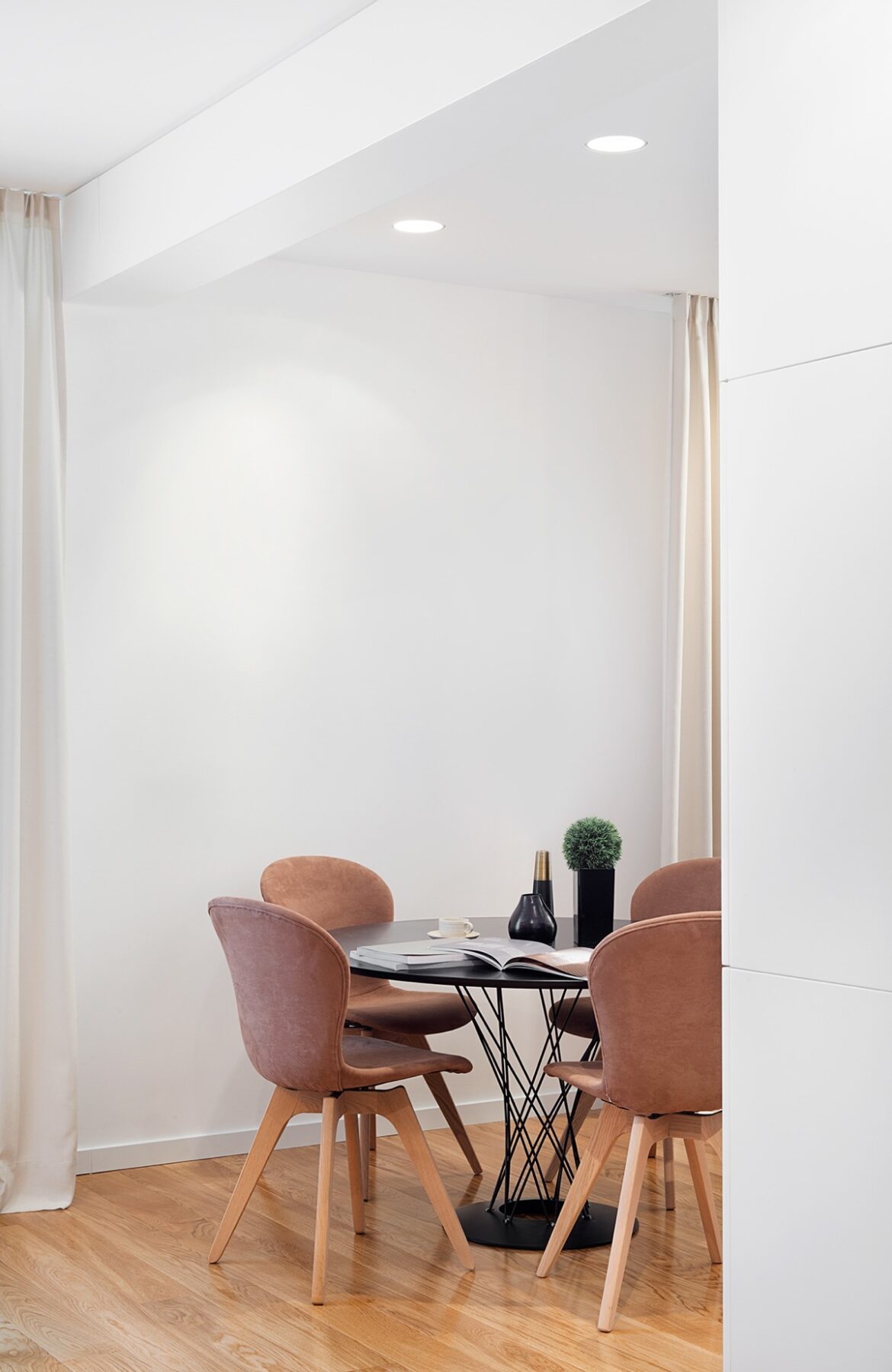
Isamu Noguchi designed the cyclone table in 1957 and it still stands as a strong staple in modern design to this day.
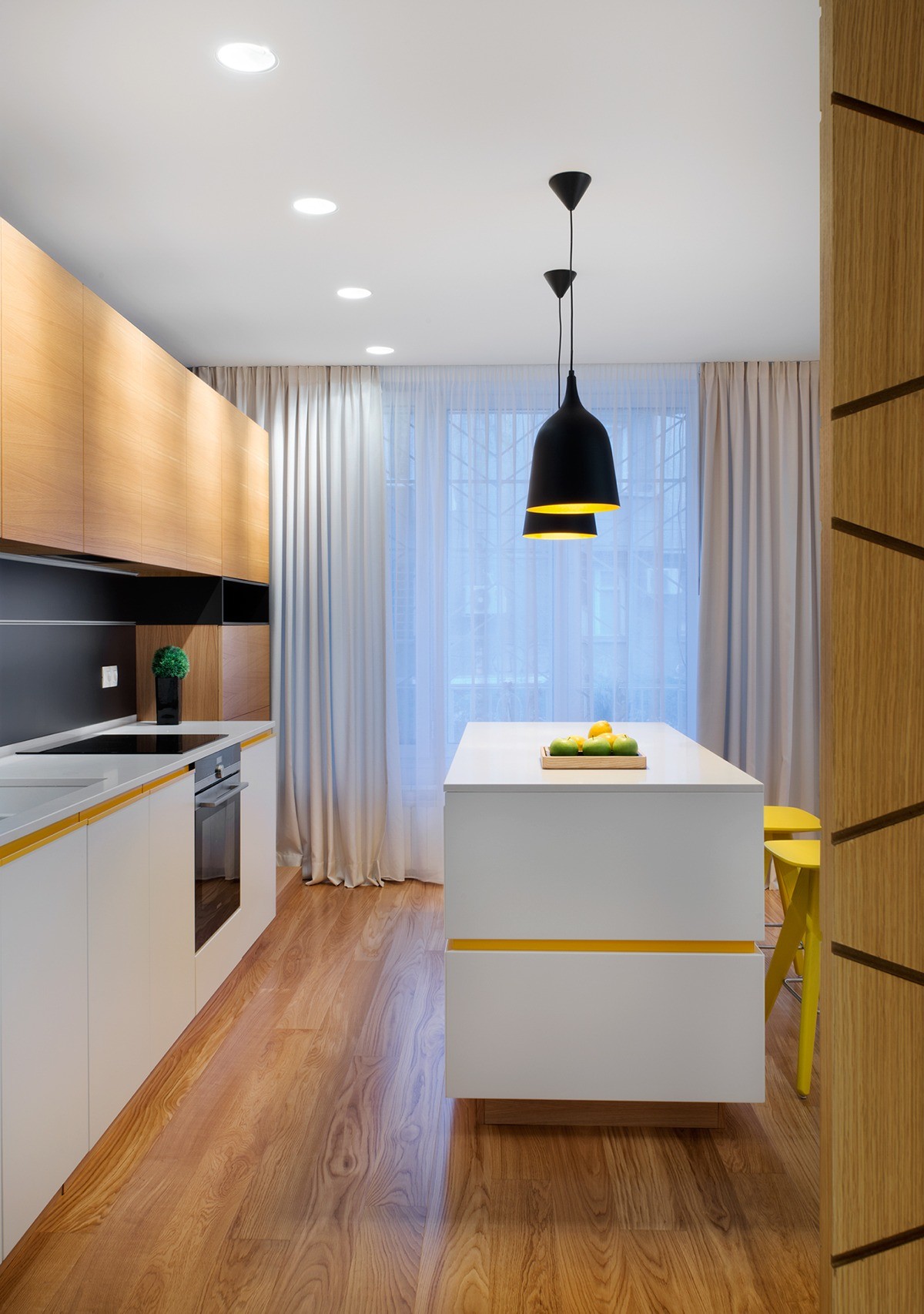
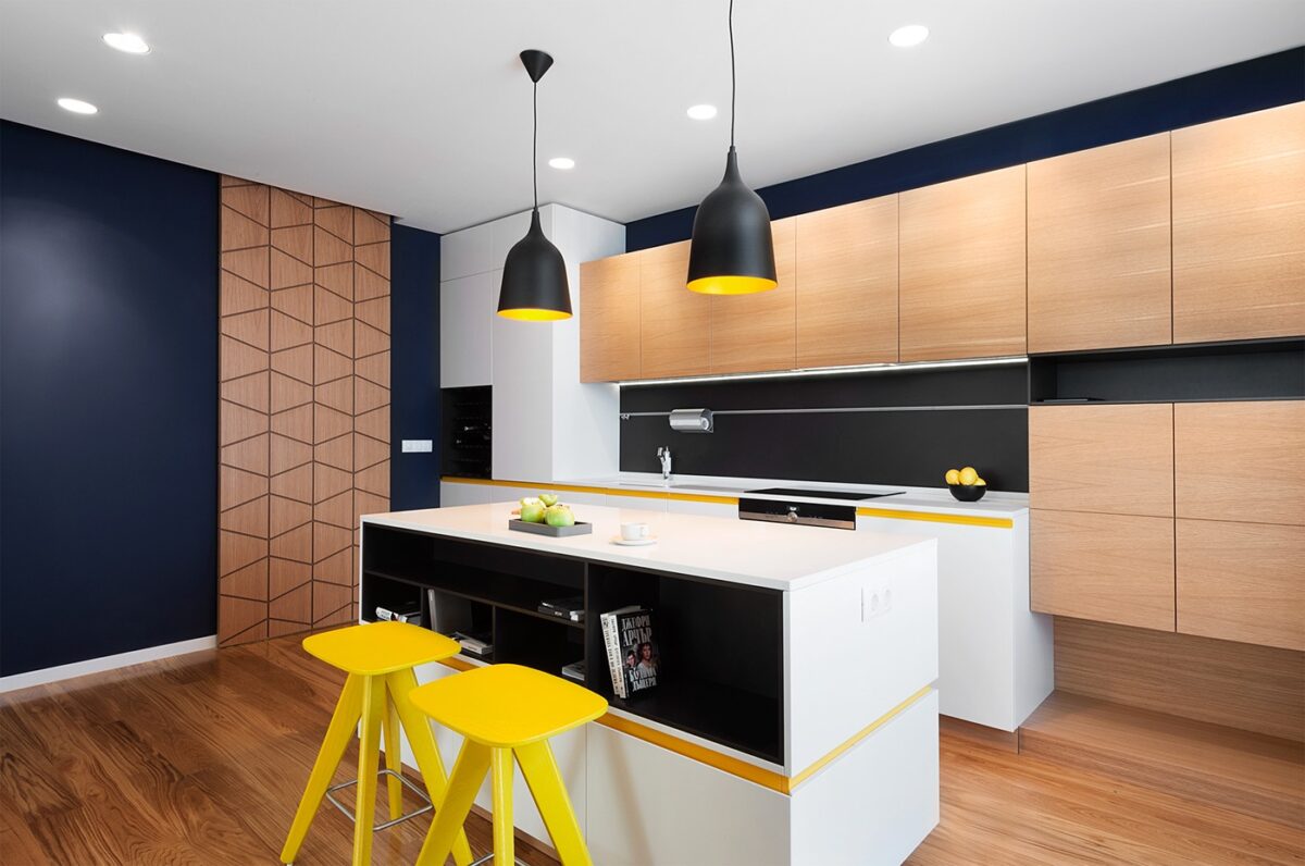
Bands of yellow brighten the sleek and modern kitchen space while adding a touch of that imaginative retro charm that makes this home stand out.
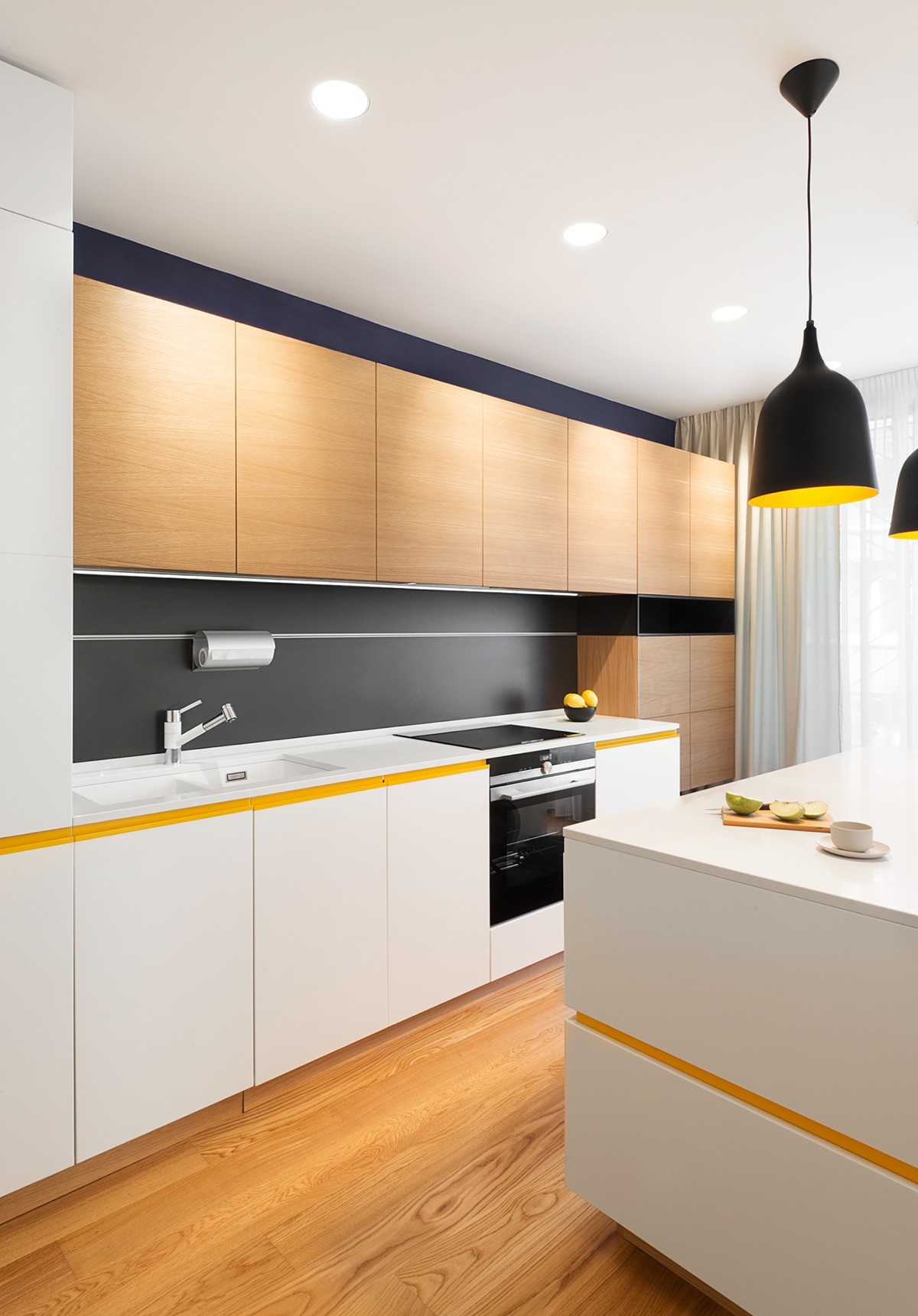
Details make all the difference – within such a streamlined design, every inch matters. The precise layering of the cabinetry encourages the eye to linger and appreciate.
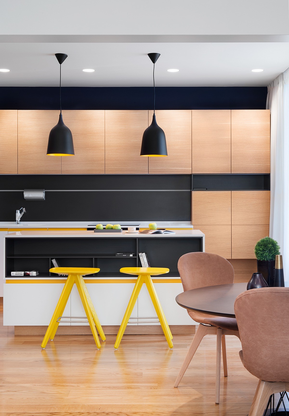
Don't you just love the bookshelf integrated with the kitchen island? If the resident decided to store the cookbooks elsewhere, it would serve as a handy place to store decorative dishes that guests could appreciate from the dining table or living room.
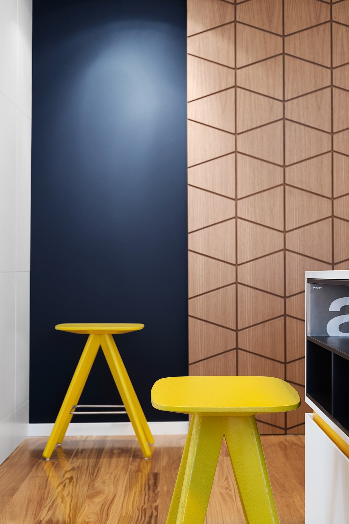
Note the royal blue accent wall in the background. It's rich and dark enough to blend with the black details used elsewhere in the home, but it helps the yellow accents pop with even more energy.
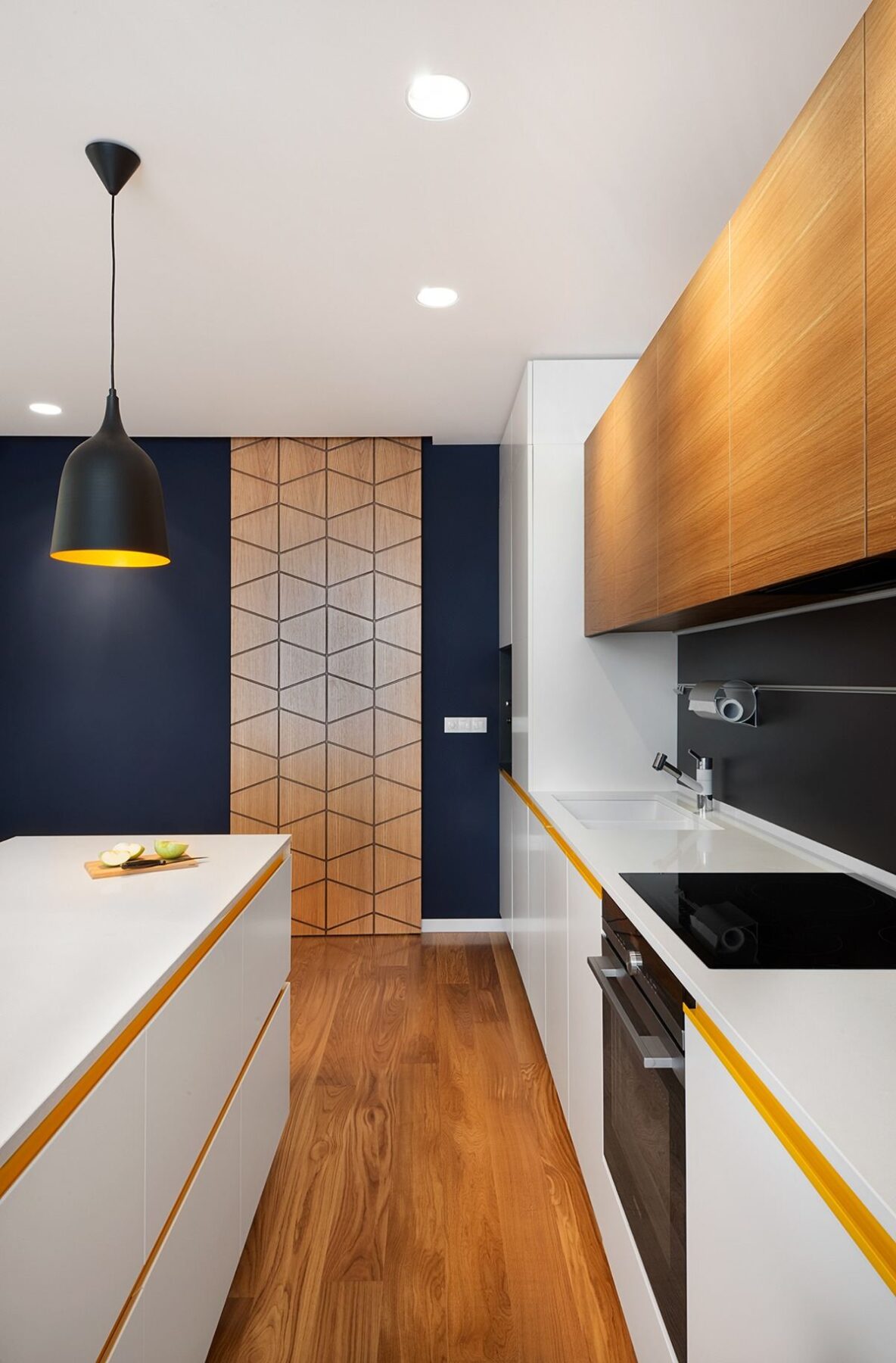
Strong horizontal lines draw the eye toward the decorative door or draw the eye into the home, depending on whether a guest is entering or leaving.
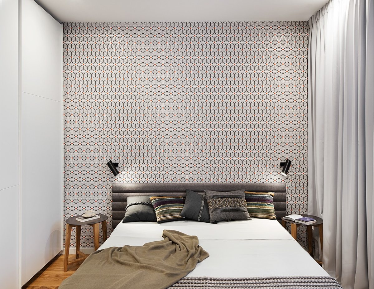
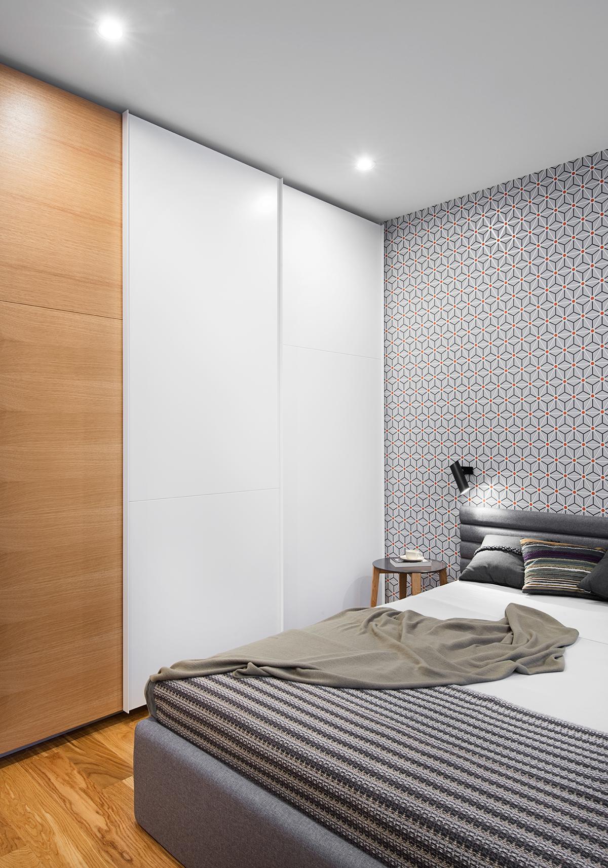
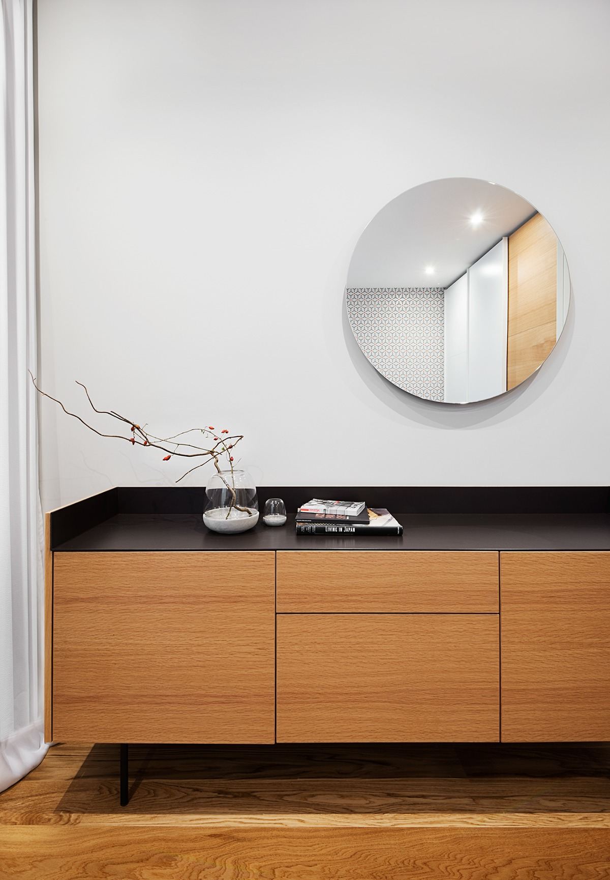
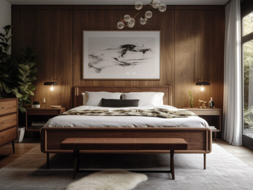
The bedroom takes a bold approach with tessellated geometric wallpaper, while the rest of the furnishings remain simple.
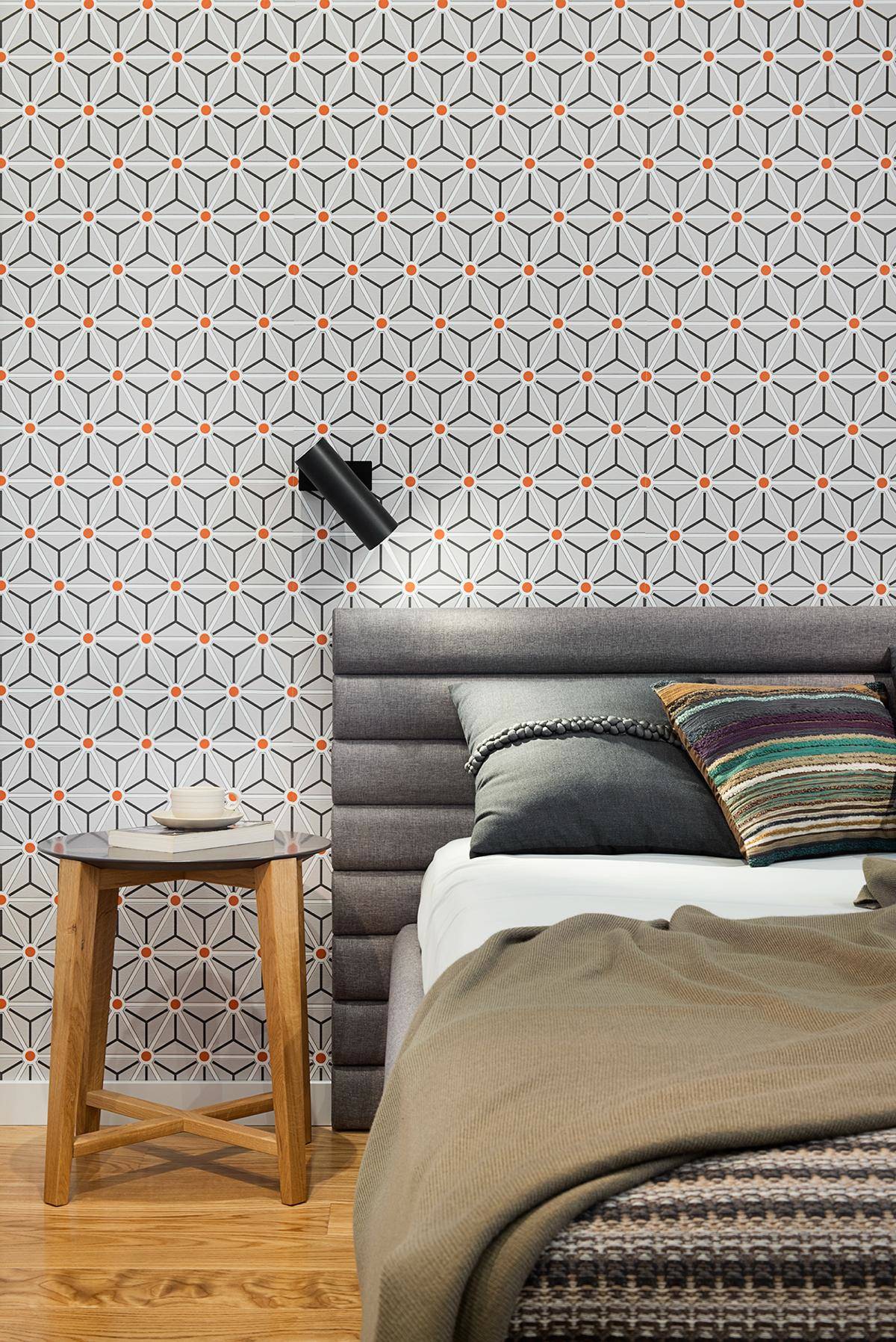
The side tables and bedding fabrics offer the only hint of mid century influence – subtle and charming.
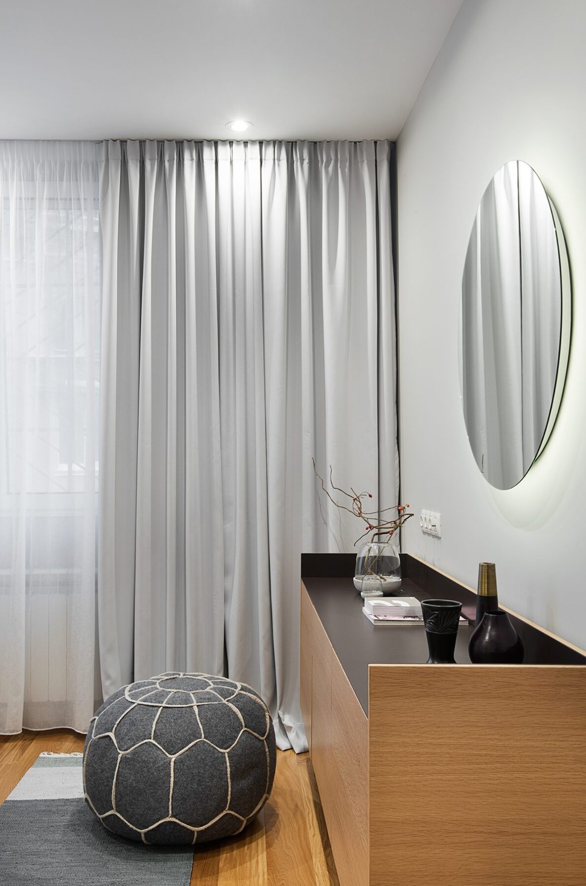
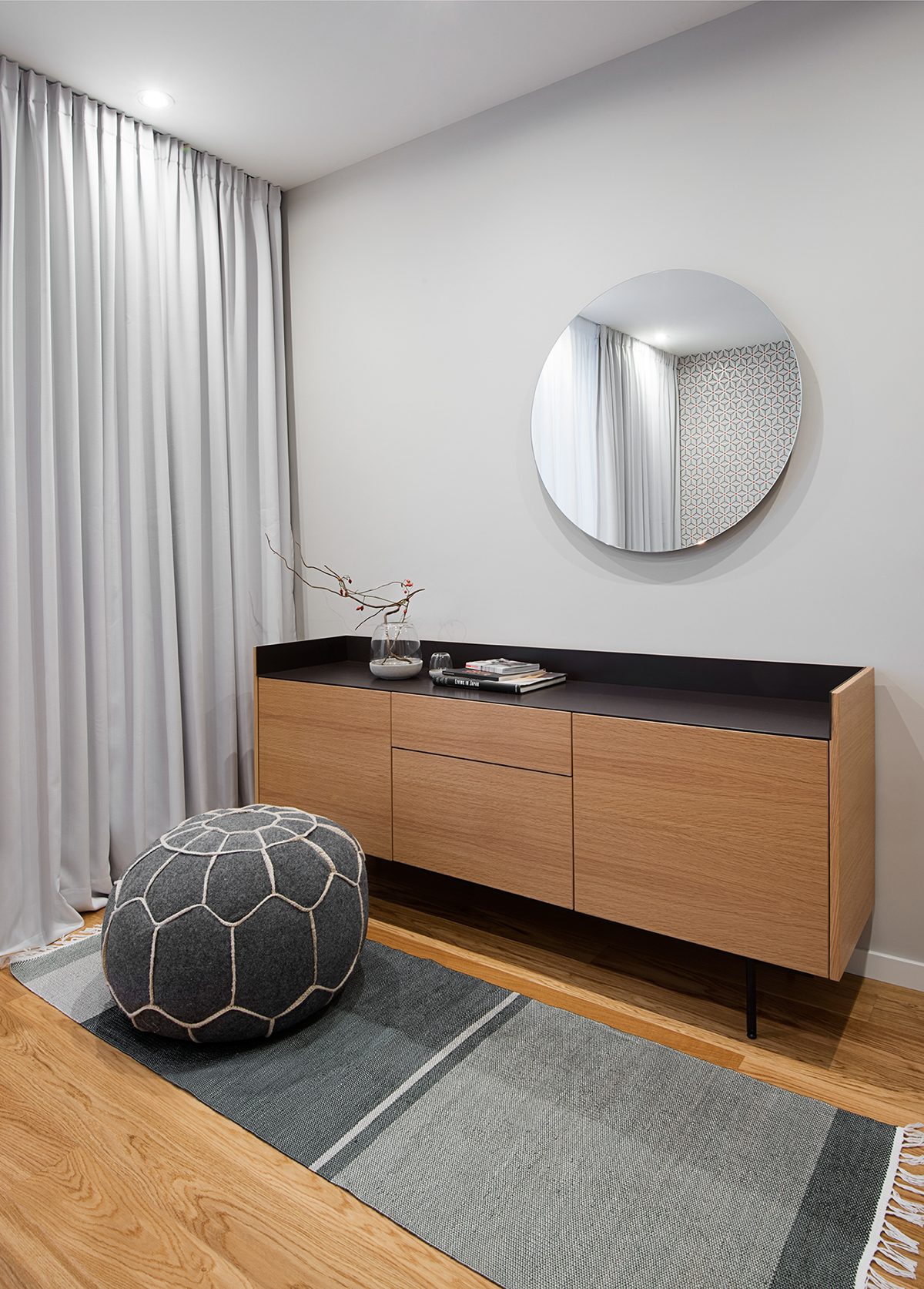
Other round elements, like this playful pouf, stand in contrast to the sharp lines and crisp patterns found elsewhere in the room.
