Interior designers are well familiar with the paradox where space constraints actually enhance creativity by requiring an approach that breaks a problem down to its most basic parts. These 6 apartments make 30 square meters look comfortable rather than limited - every piece of furniture makes a big visual impact but leaves plenty of legroom, and each accessory serves a purpose rather than simply filling a void. Browse through these inspiring small apartments and their super-compact floor plans for a nice variety of organization techniques to try at home.
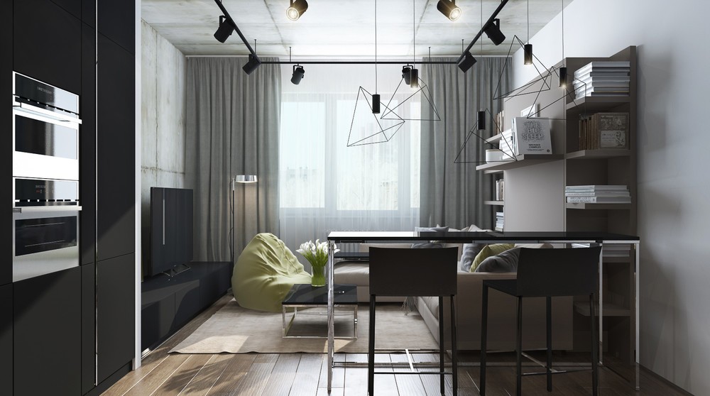
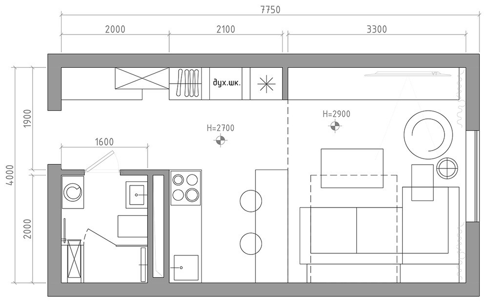
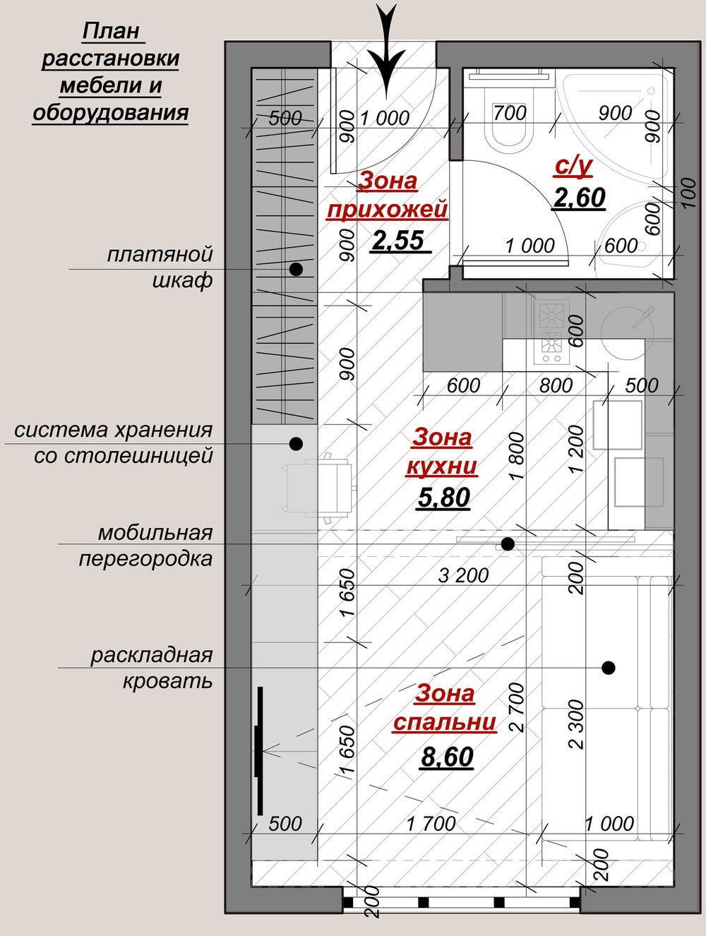
Yelena Potemkin designed this studio apartment to fit the client's requirements of a sleek and functional interior on a modest budget, with the intention of creating a home anyone would love to rent. At just 29 square meters (not counting the balcony) this small studio makes the most of simple furniture to maintain a sense of spaciousness. The neutral palettes and smart storage solutions leave plenty of room for a tenant to explore different decor themes.
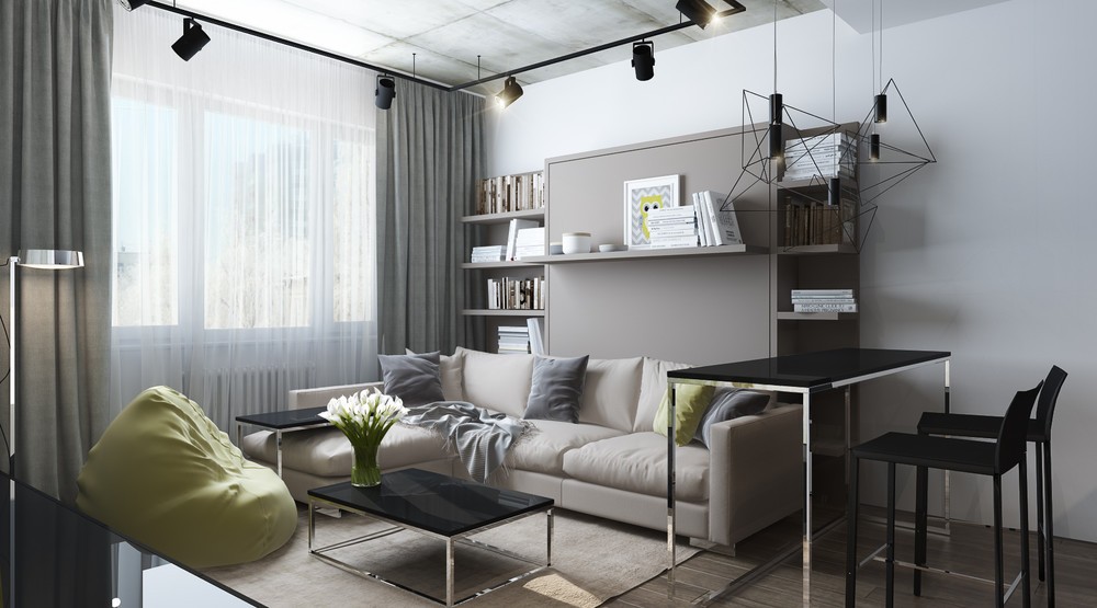
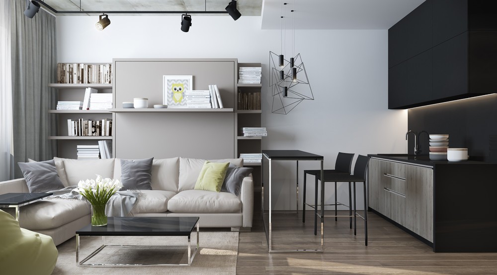
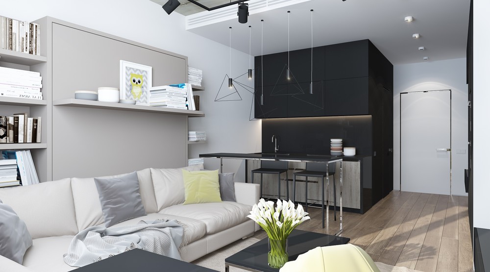
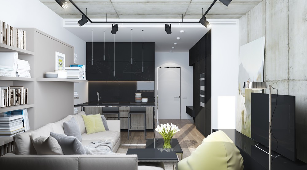
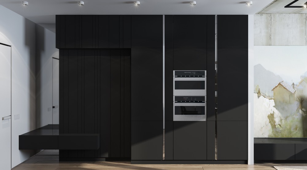
Black and chrome pair perfectly with the concrete ceiling. The industrial influence is easy to appreciate but an occupant with different tastes would have no trouble adapting it.
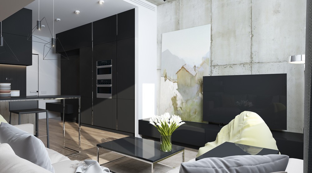
A simple interior doesn't have to lack decorative flair. This soft watercolor painting both complements and opposes the scored concrete wall behind it.
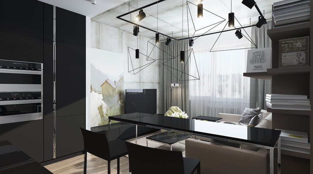
Geometric pendant lights in the foreground provide illumination over the dining table without obscuring the view from anywhere in the apartment.
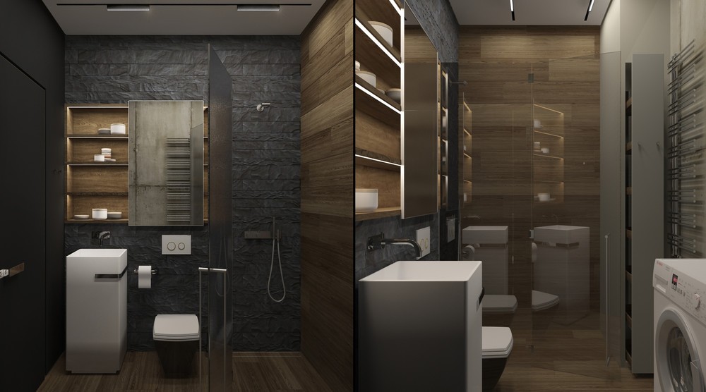
A textural black stone wall makes up the main portion of the bathroom, and wood cladding defines the other.
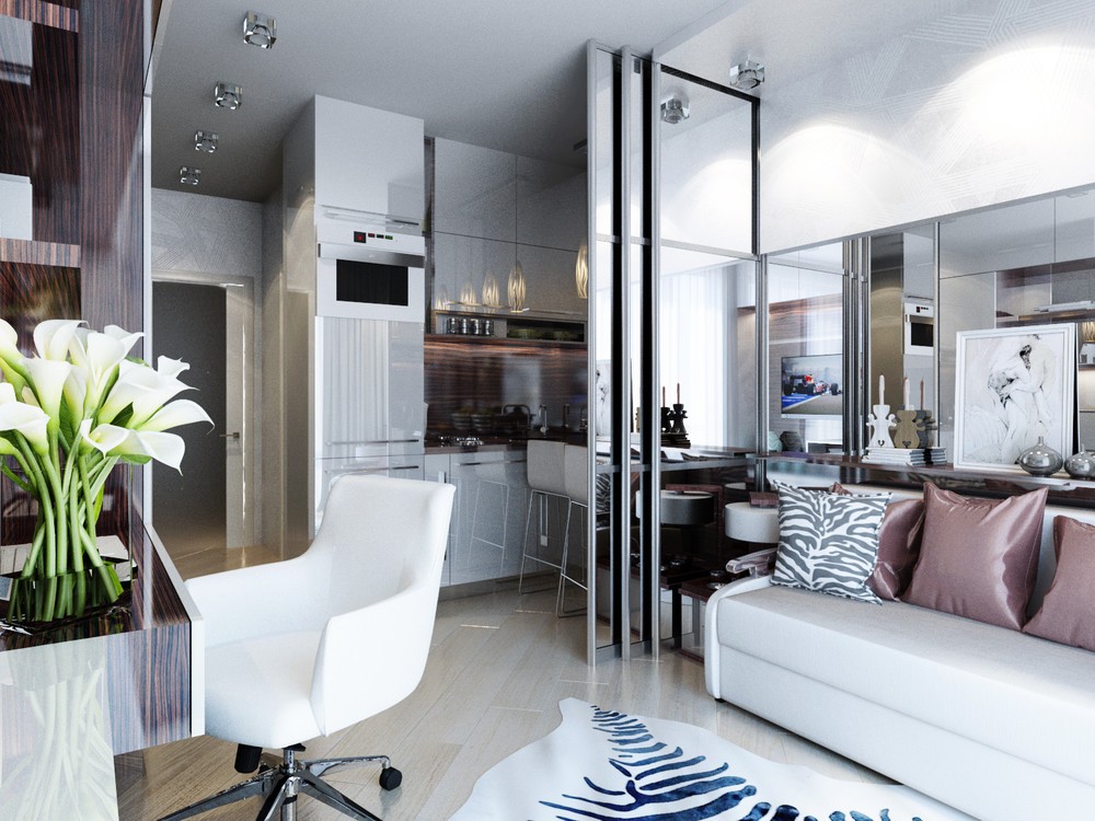
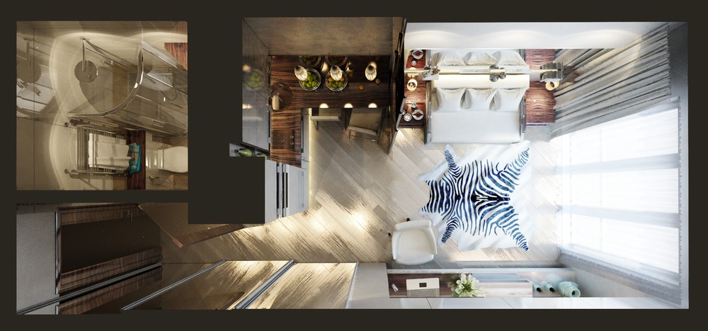
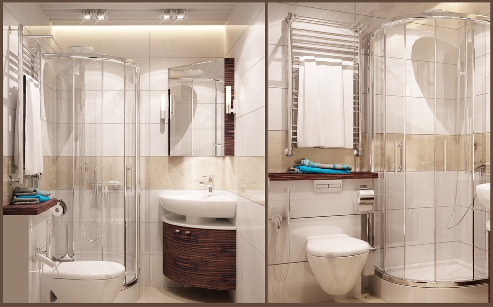
Catherine Remizov designed this apartment with a surprisingly classic and luxurious vibe despite its restrictive 20 square meter floor plan – and the result is bursting with personality! It contains all the necessities, some of which are hidden away with clever tricks to save visual real estate. Every inch of this apartment reflects a strong and adventurous personality, and seems to utilize each available surface for the purpose of expression. Keep reading to see the room visualized in several subtly different styles.
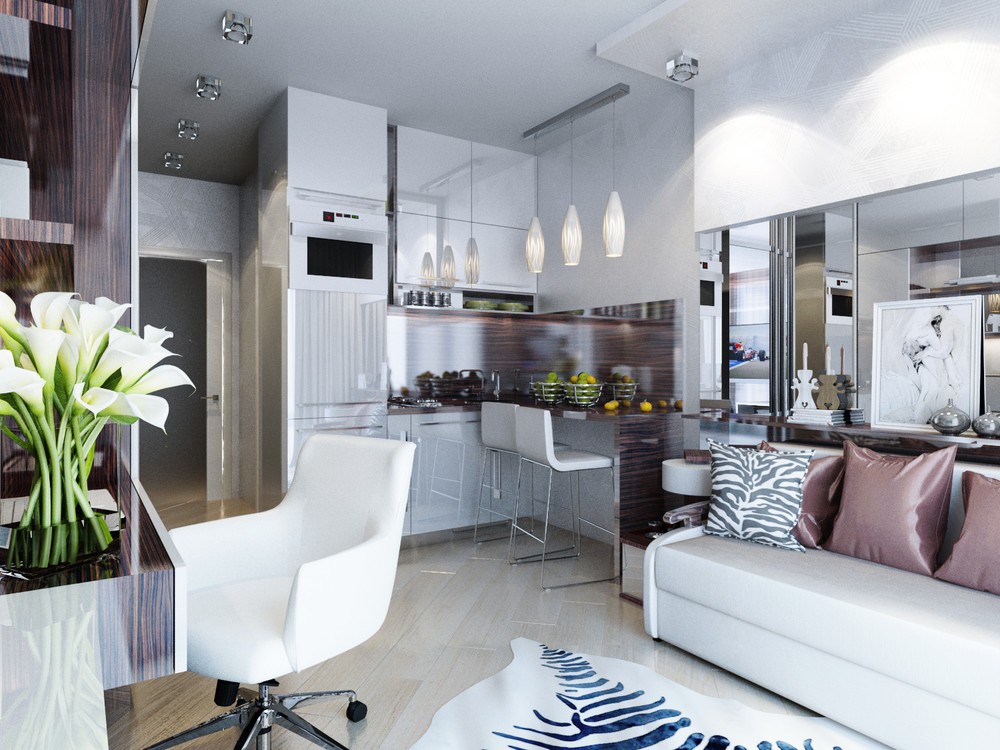
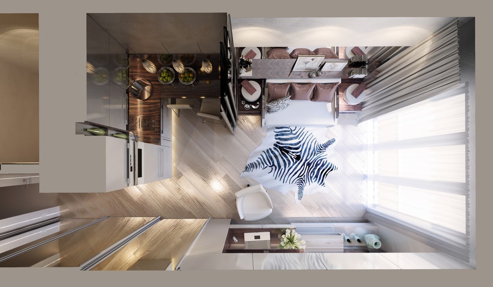
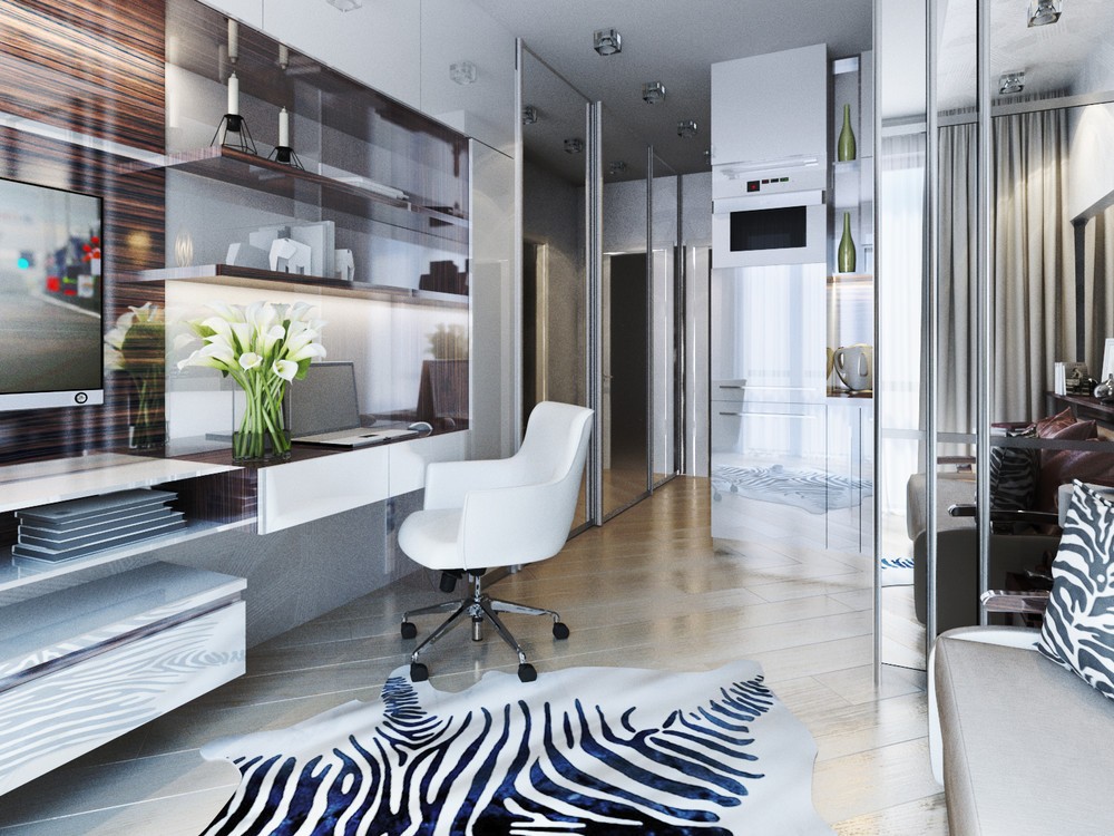
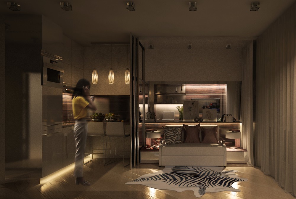
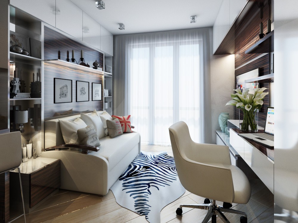
This interior certainly doesn't back down from bold accessories like zebra print, silky pillows in orchid pink, and shapely accessories on the shelf behind the sofa. Diagonal wood floors offer another irreplaceable source of personality.
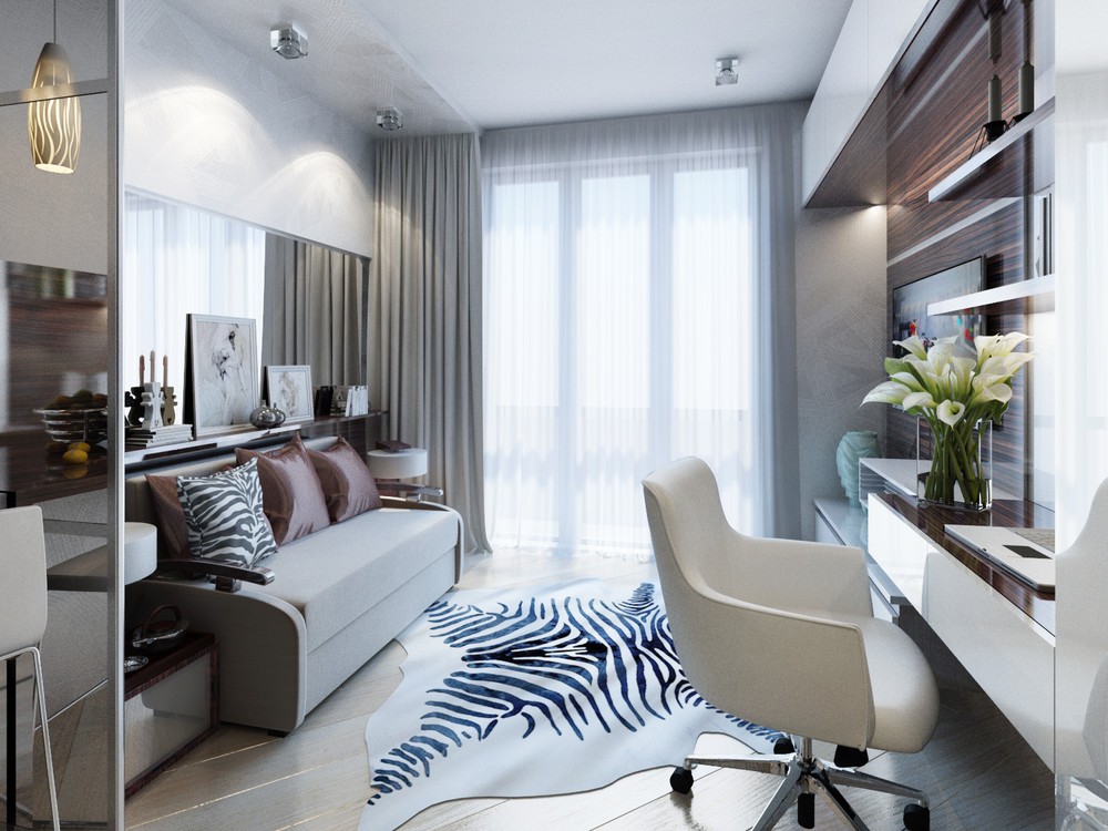
Mirrors and glossy surfaces maximize the amount of light this apartment gets from its single large window.
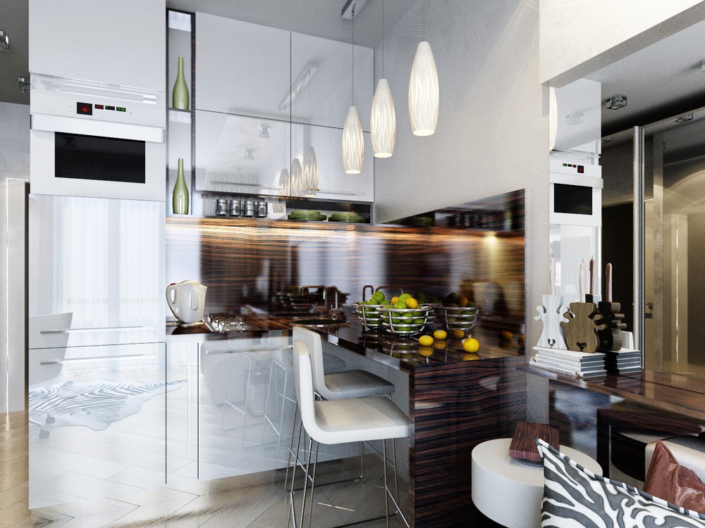
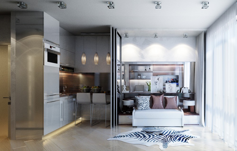
The kitchen is especially polished. High-gloss cabinetry in white reflects a tremendous amount of light back toward the living room, while exotic wood panels with rich grain make it feel unique and welcoming. Beautiful kitchen pendants complete the effect.
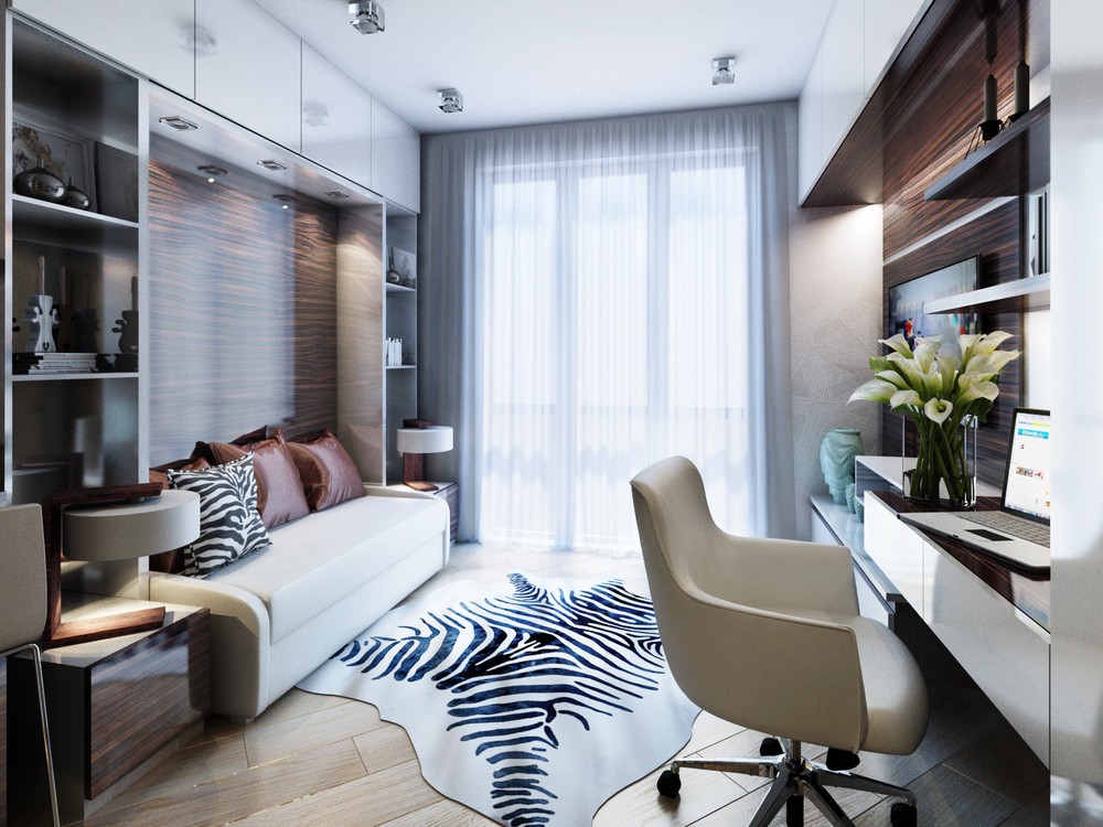
Now, let's take a look at some of the other bedroom configurations the designer visualized to see how flexible this interior really is. This one features sleek wooden paneling behind the sofa-bed, the same pattern used in the kitchen. Shelving surrounds the sofa on all sides.
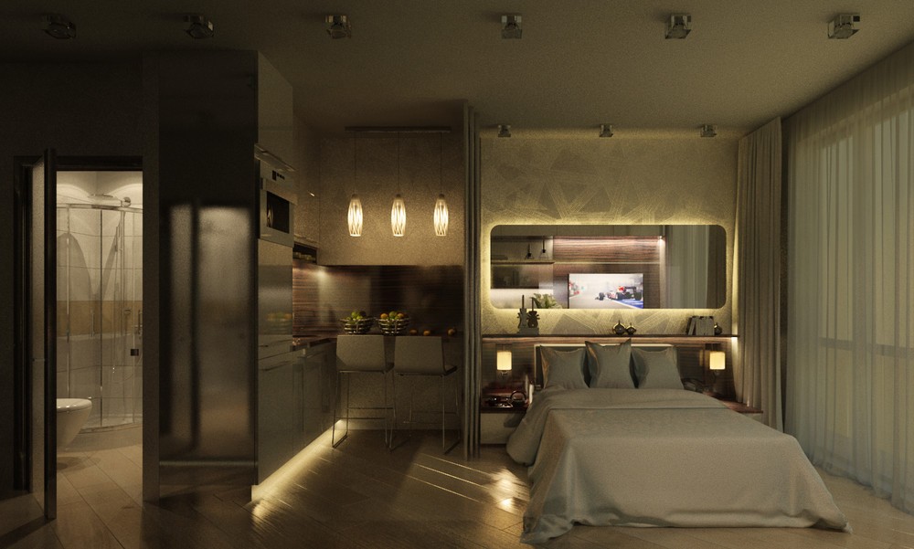
Here's a visualization of the same space with a rounded retro-style mirror. This is also a good view of the bed fully extended – a smart design for such a small space.
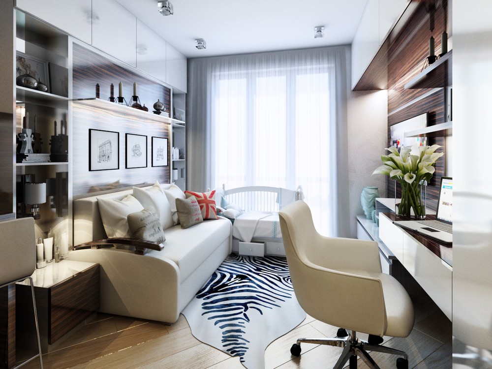
This time the headboard is decorated with framed architectural sketches. Note the cute child's bed in front of the window with drawers beneath.
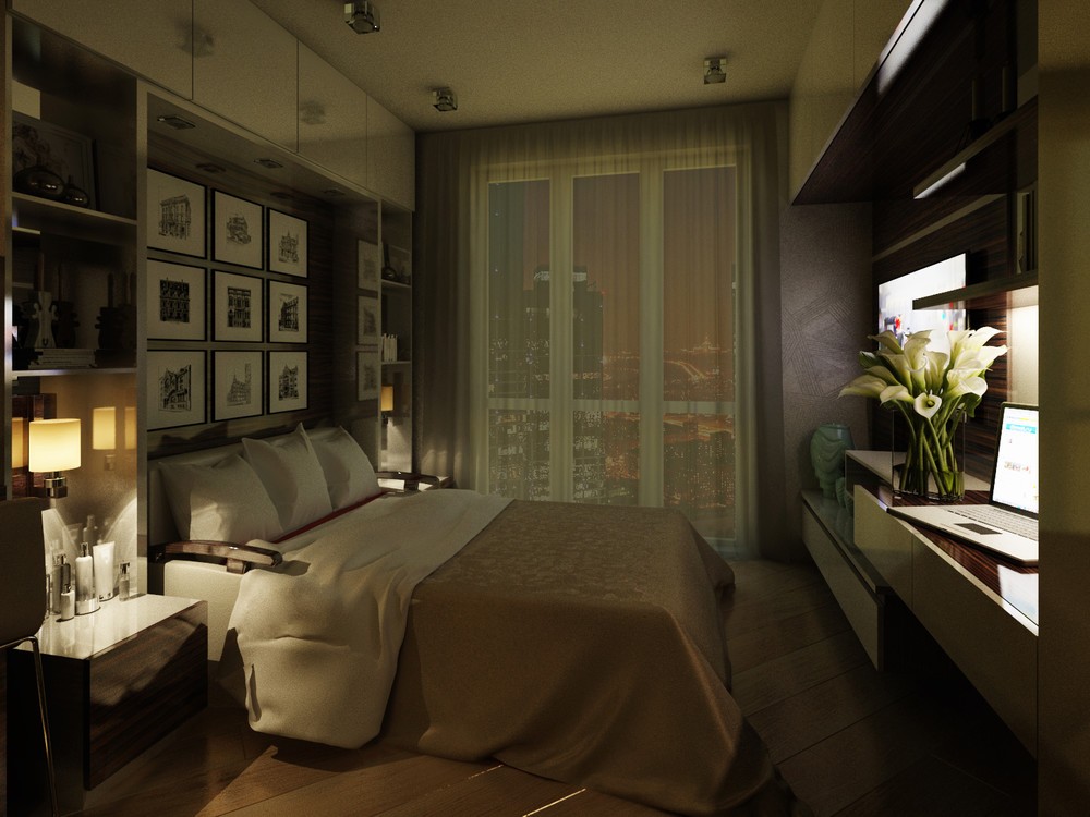
The Murphy bed is pulled down to reveal three rows of architectural sketches. The shelf visible in the previous visualization likely swings down to become the end legs of the bed.
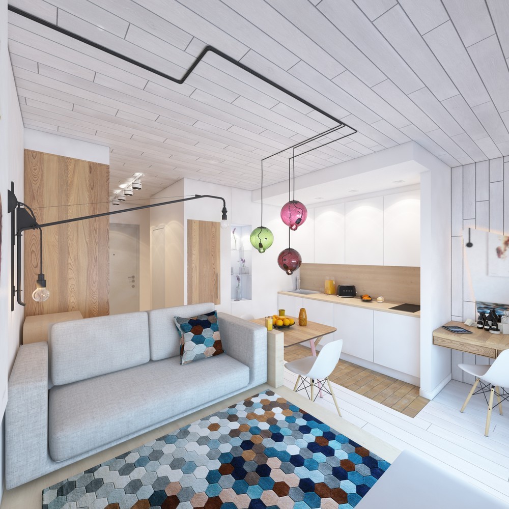
This home by Stanislav Aynulov takes a clever approach to space management by integrating dual-purpose furniture and storage wherever possible. Its 28 square meter interior looks simple and spacious – brightened by a colorful geometric rug and gem-toned dining pendant lights.
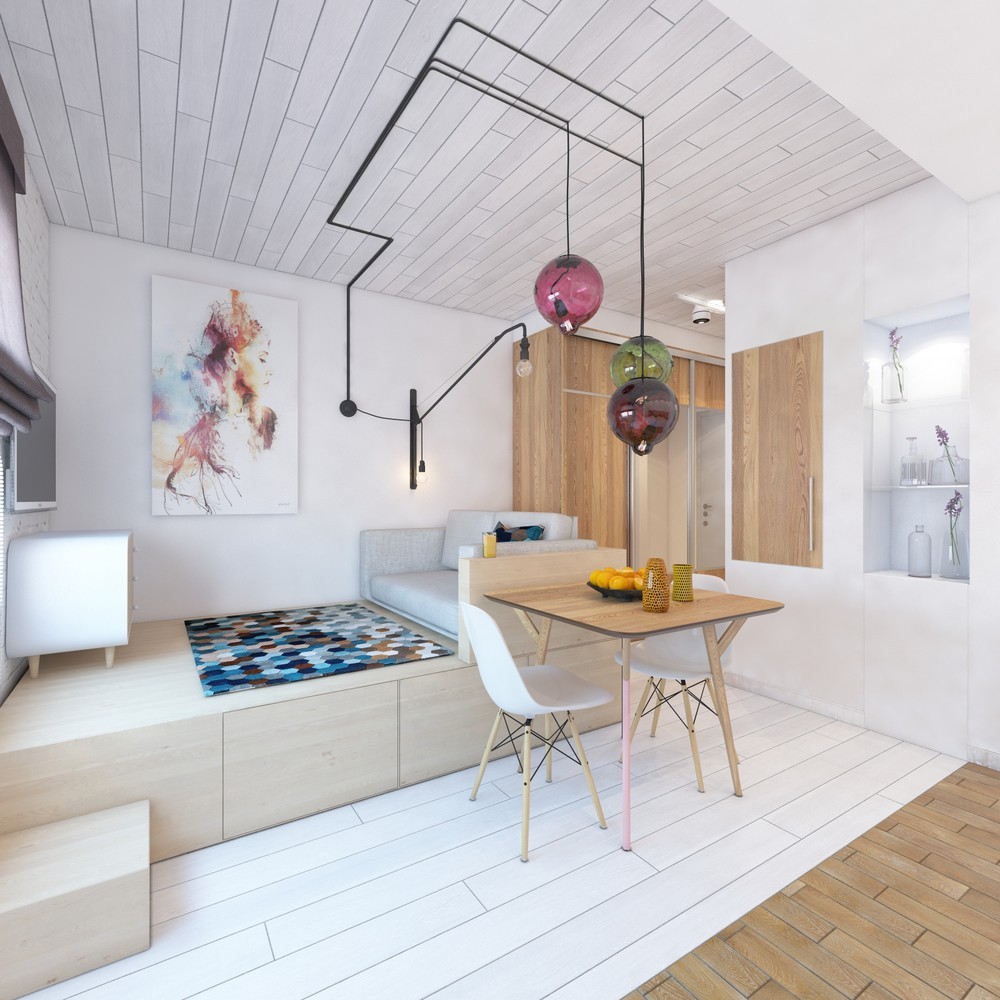
The raised sofa/bed platform offers plenty of room for storage beneath, and modern artwork unifies the rainbow color theme.
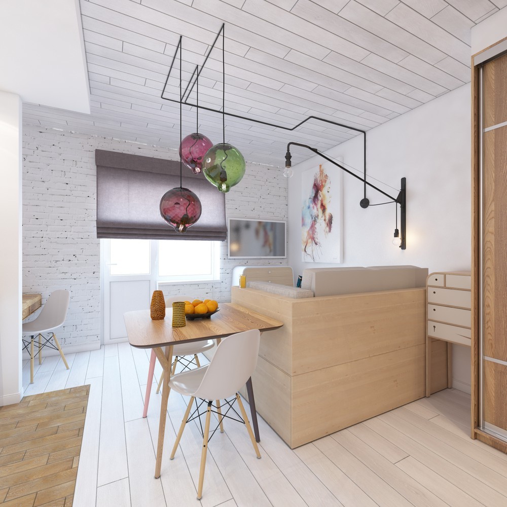
Pendant lamp wires are routed carefully along the ceiling. This contributes to a cool industrial flavor, enhanced by the iron cantilever wall lamps and the painted brick walls in the background.
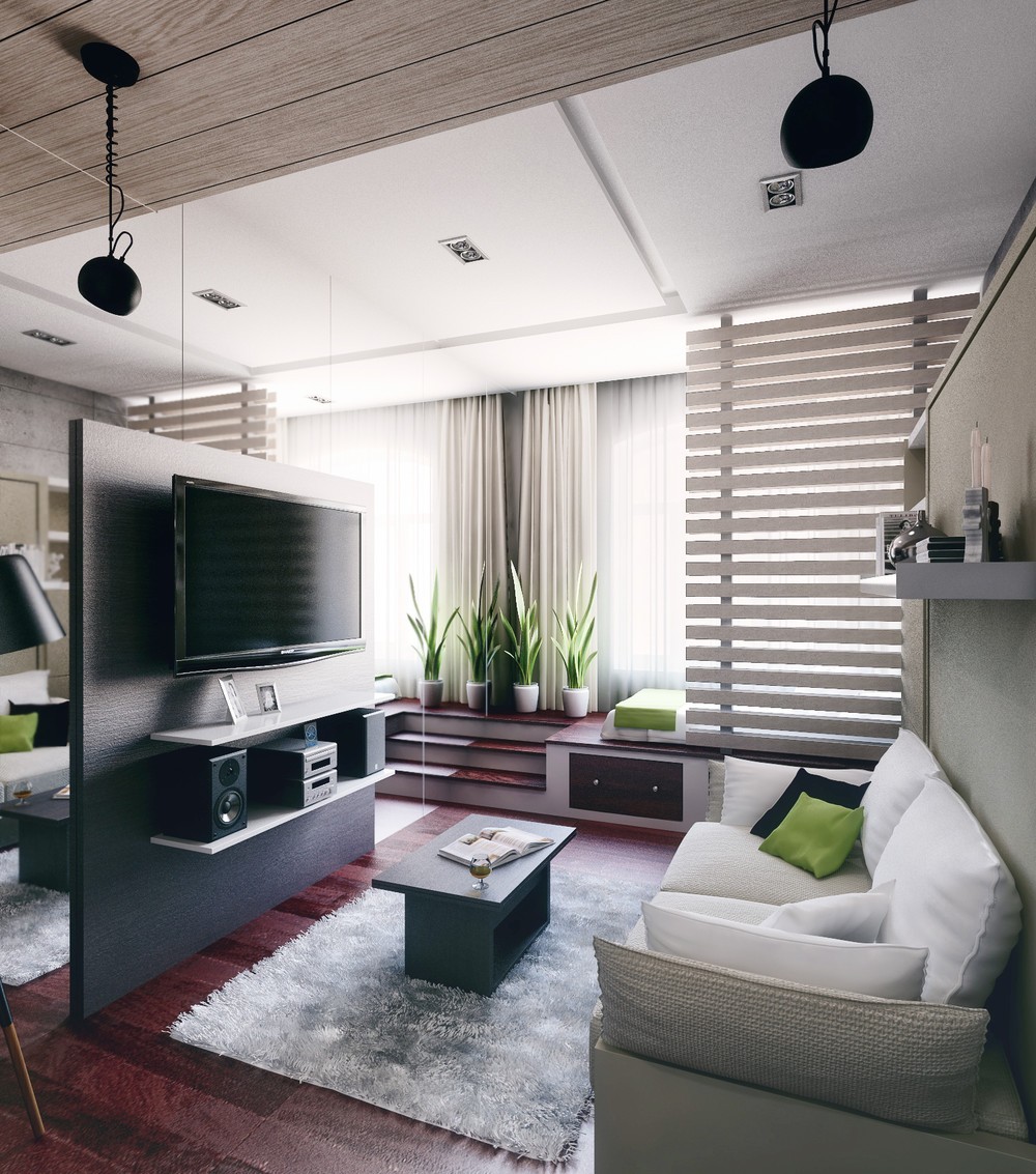
Designer Eugene Han had to overcome a number of unique challenges to transform this apartment into the stylish and modern abode it is today. Located in an older building, it was necessary to refit the interior to accommodate a family of three – in just 21 square meters. This renovation balances the needs of the family with a strong respect for historic architecture.
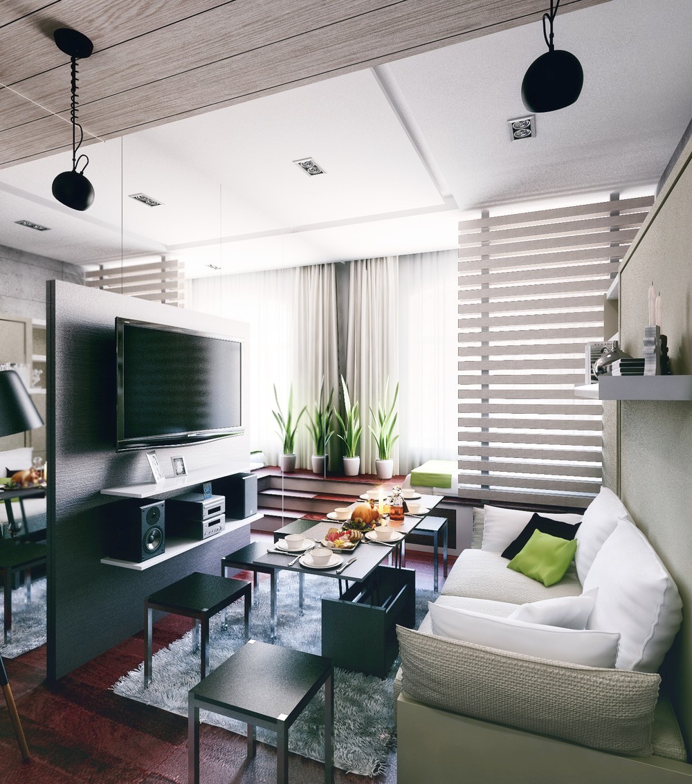
Already, smart space-saving solutions come into play with a coffee table that lifts and expands to create a full dining setup. The small chairs have no backs and slide easily under the table in case anybody needs to get through. At least two table places are accommodated by the sofa itself.
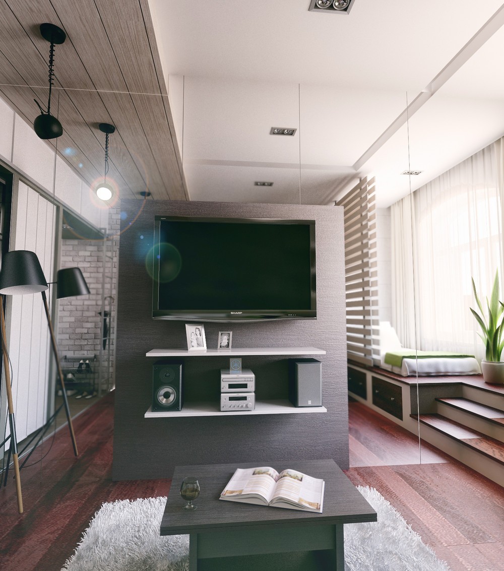
No, the room isn't huge – that's just a full length mirror on the wall behind the entertainment console.
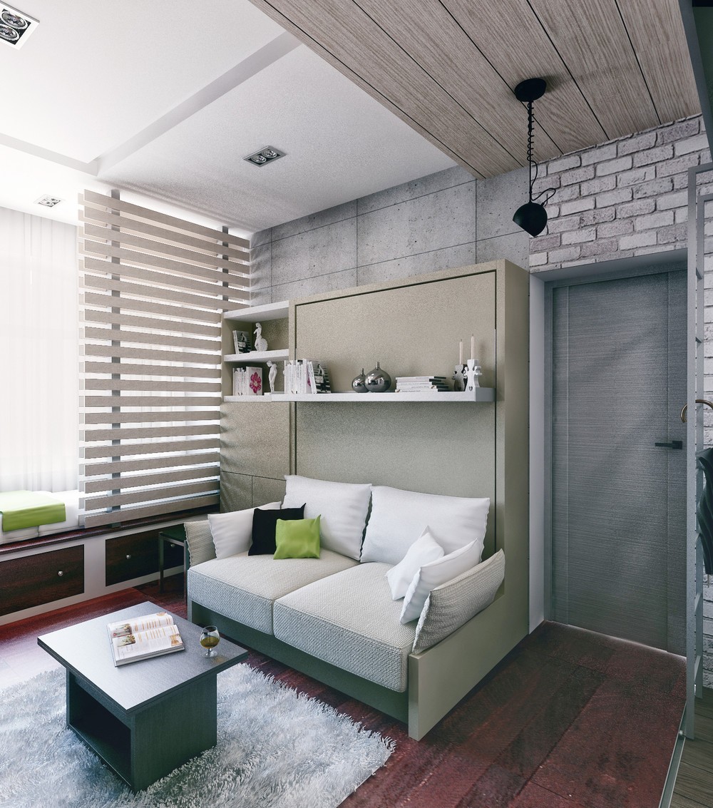
The Murphy bed and sofa combination has quite a few tricks up its sleeve. Pay extra attention to the lower shelves on the left hand side, and compare to the next picture…
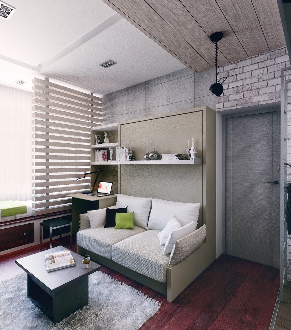
…surprise! A panel folds down and two cabinets open up to create a sturdy and functional desk for working or studying.
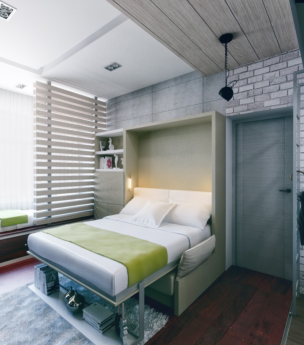
But, the coolest thing about this Murphy bed is the unique shelf design – rather than needing to clear the shelf to use the bed, it simply swings forward to serve as support.
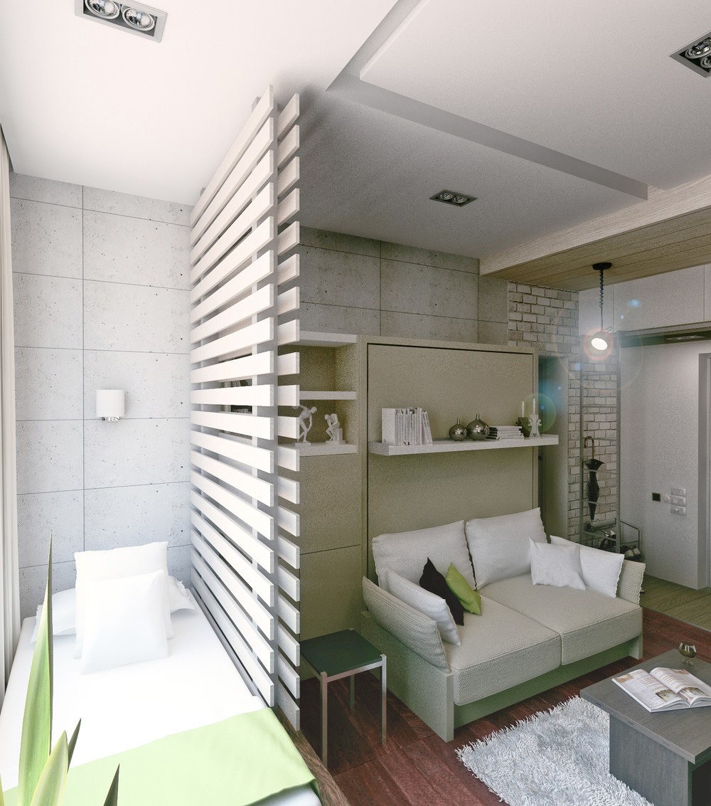
A small bed for the children occupies the platform in front of the window and conveniently doubles as a comfortable bench seat for socializing. A cute wood slat screen slides out to provide some privacy for sleeping.
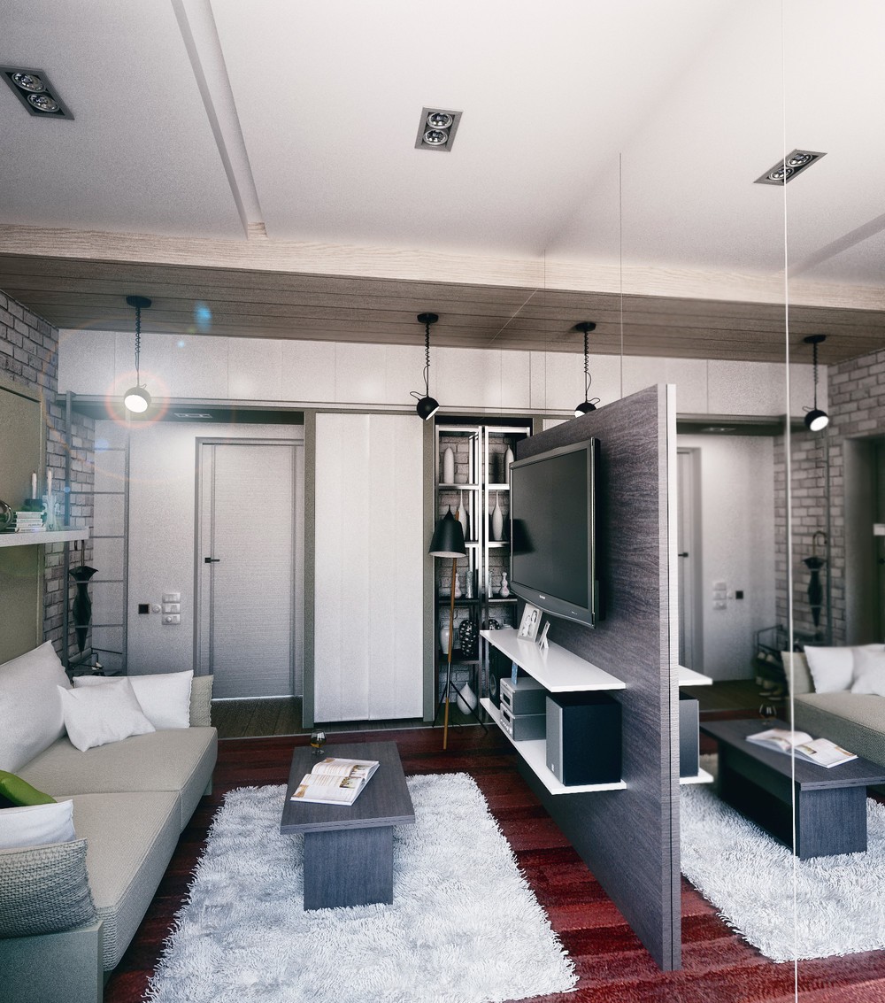
Don't you just love those rich red floors? This color warms the room and adds visual interest without compromising the monochromatic interior theme.
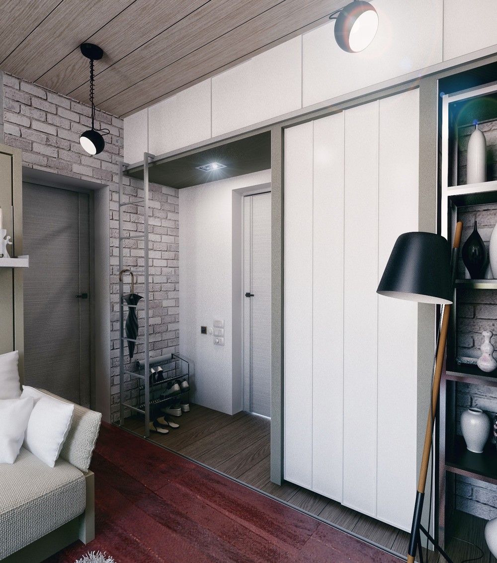
In a home this compact, it makes sense to take advantage of every inch of storage space available. Here, you can see the cabinetry above the entryway, accessible by a sleek sliding ladder.
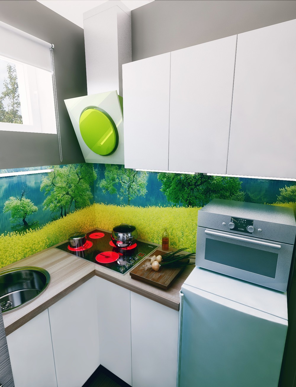
With a high window making it difficult to see outdoors, this fabulous backsplash mural offers a breathtaking view – not one to be found from most apartments.
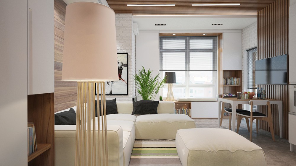
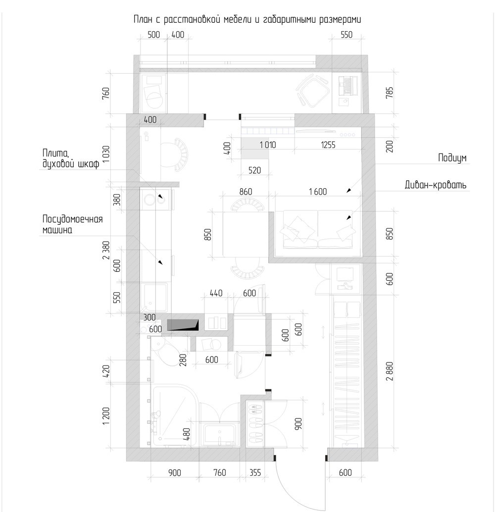
Olga Chekmaryov designed this small apartment within a new residential complex – to make the space attractive to renters, natural materials and neutral colors provide the interior with an appealing blank canvas suited to the needs of any future occupant. Warm textures and materials make it feel like home. This apartment is compact but certainly doesn't feel cramped.
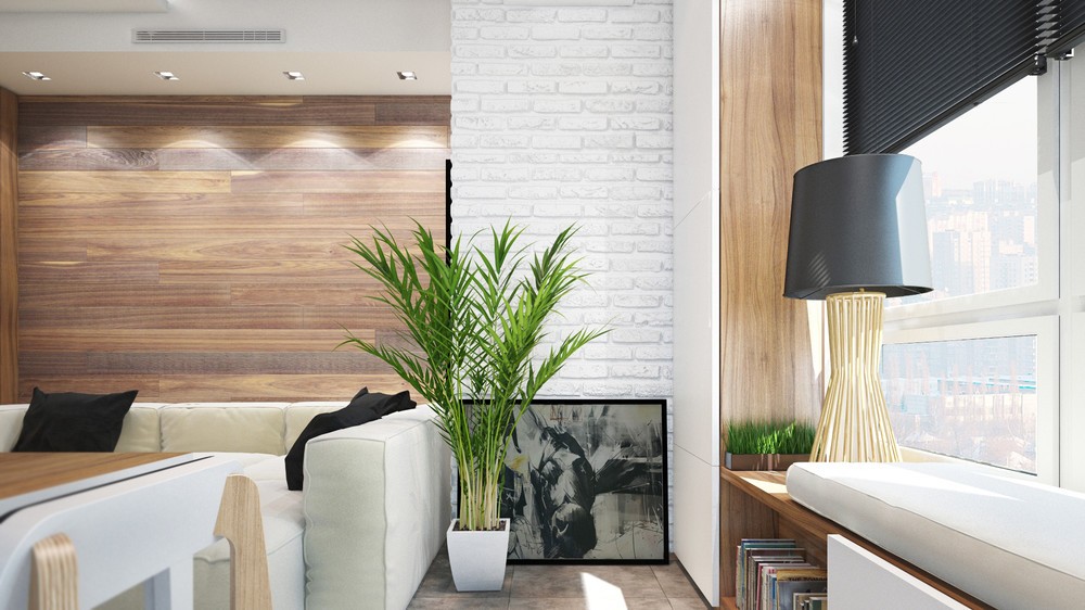
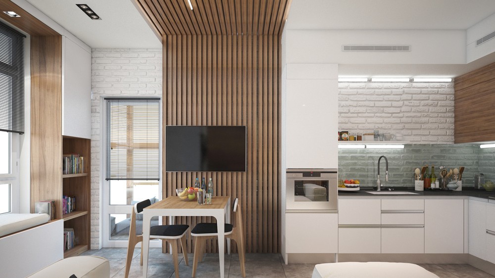
Painted white brick and warm wood cladding are perfectly in line with today's trends, but these classic materials never really go out of style. The Areca palm spotted here is one of the best indoor plants to have.
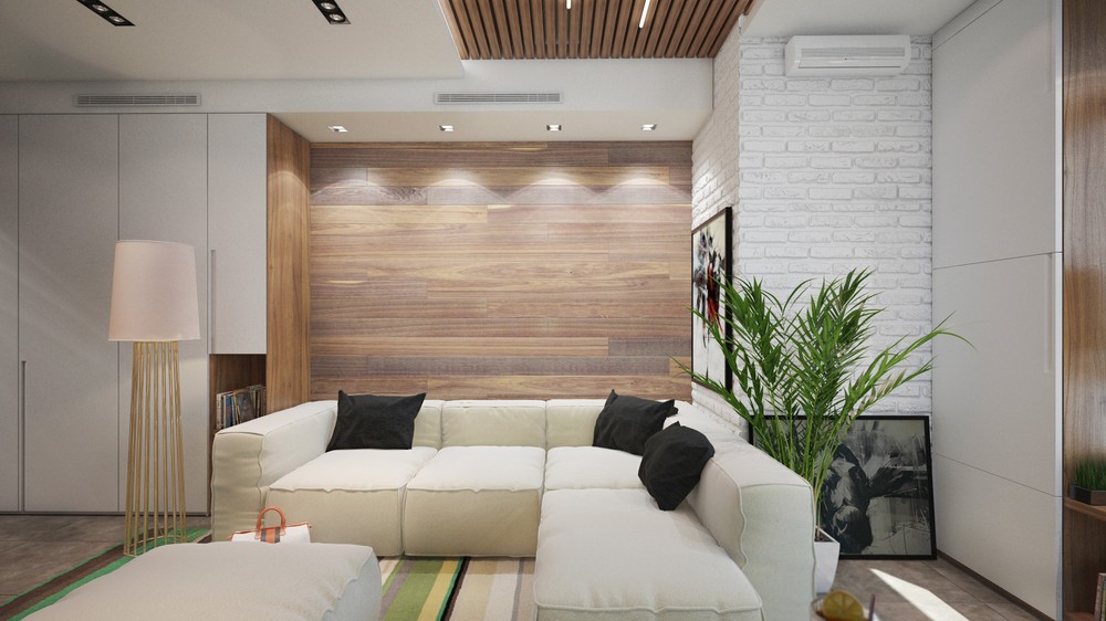
The walls are lined with convenient storage spaces. Tall cabinets occupy the left, while extra-wide cabinets occupy the right. The unique floor lamp adds a nice touch.
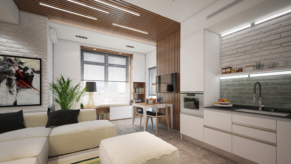
It's not just a decorative touch – to visually divide the dining room from the kitchen and living room, a band of wood slats traverses the right wall and reaches across the ceiling overhead. Implied boundaries are much more space effective than dividing walls.
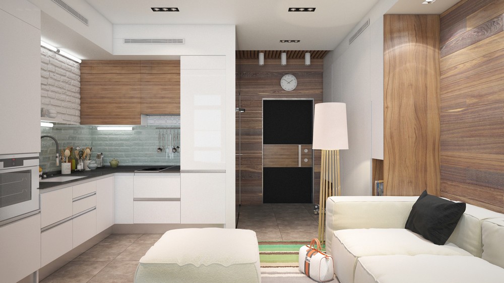
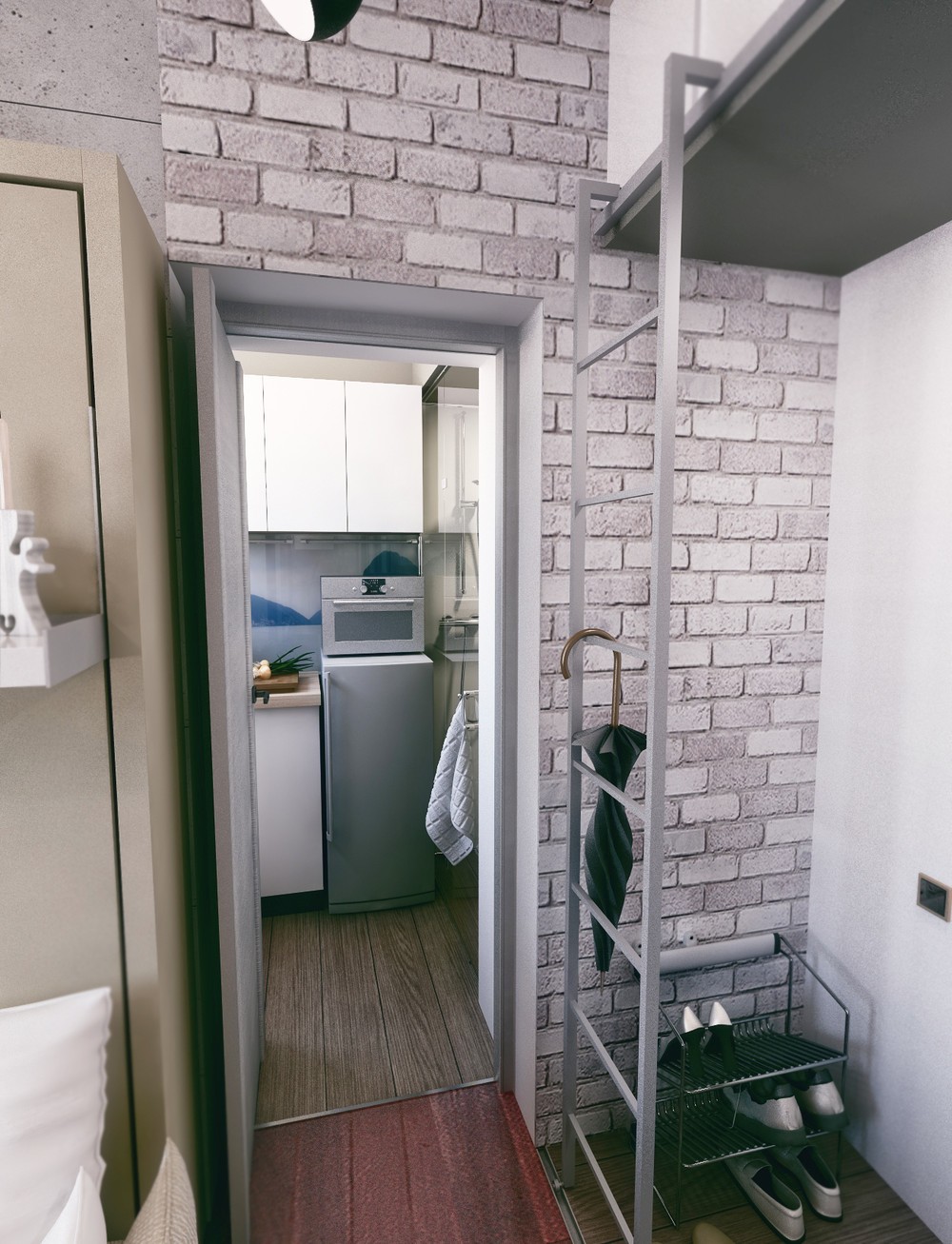
It's rare to see such an attractive entryway! The matte black door wraps back into the wood theme with a bar of paneling stretching across the middle portion, decorated with a clock and three lights above.
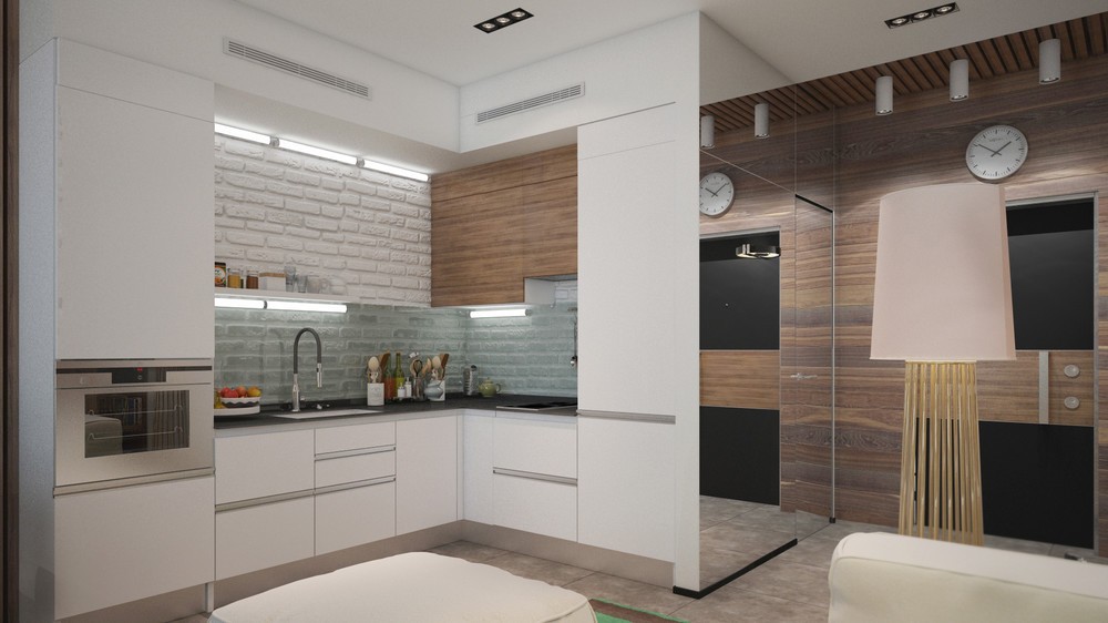
Large mirrored panels help open the entryway to make it feel more spacious and lively. The bathroom is tucked away behind the nearly-invisible mirrored door.
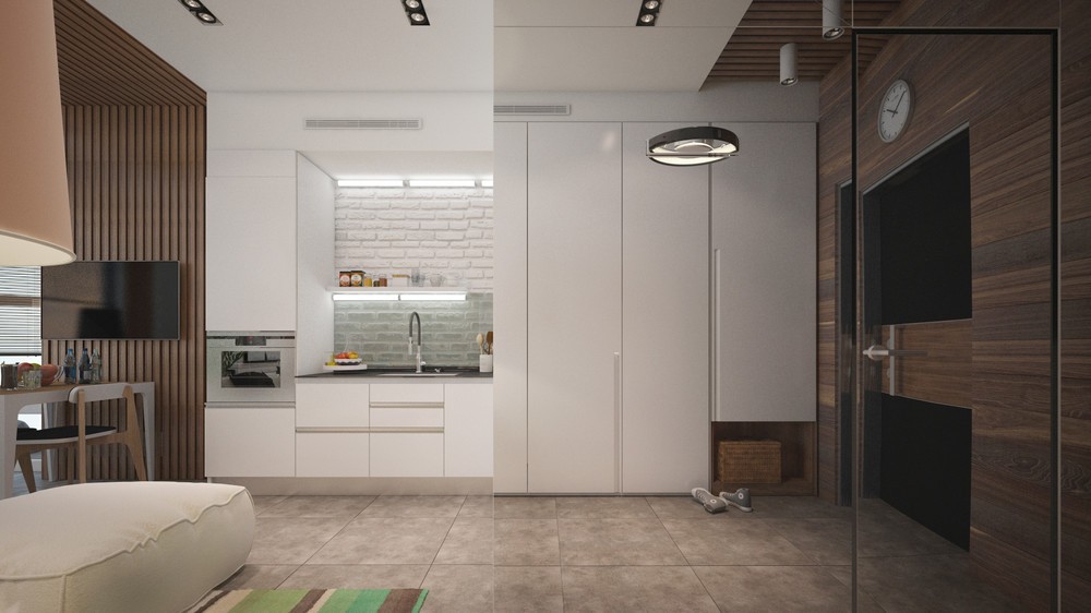
The mirrored door might disorient visitors at first, but it's a smart way to make the space look larger while bouncing more light into the far corners of the room.
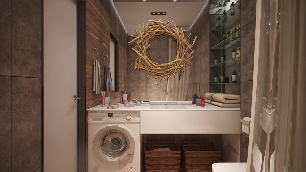
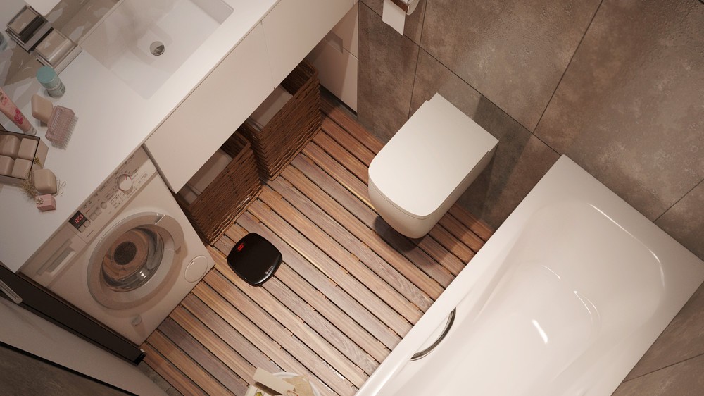
Such a cute idea! A driftwood wreath hangs from the full-size bathroom mirror to create a sort of frame – this would be such a fun and easy idea to recreate.
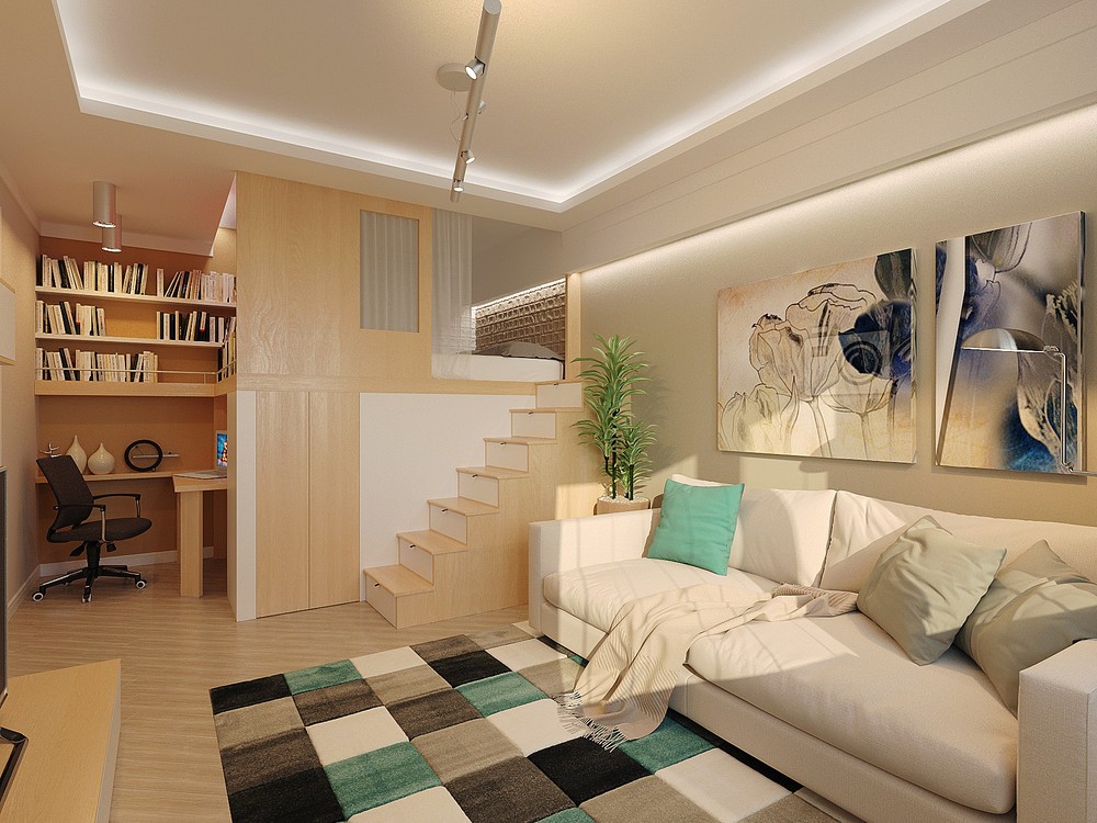
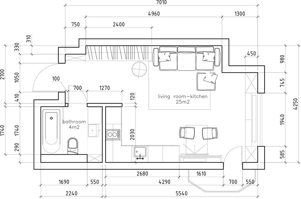
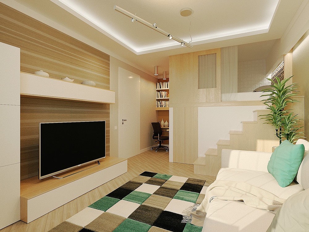
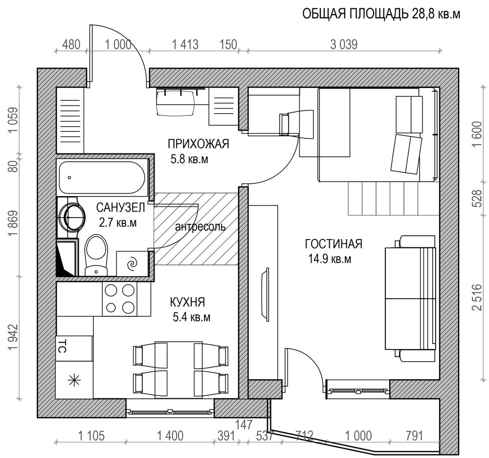
Our final compact home design is the work of Yulia Baranova, with a sweet and stylish home decorated in white and gray with abundant wood cladding. Bright teal accents demonstrate the flexibility of the design – how it could be decorated to fit any style. But perhaps the most impressive feature is the loft bed that takes advantage of the home's high ceilings, freeing up space for storage beneath.
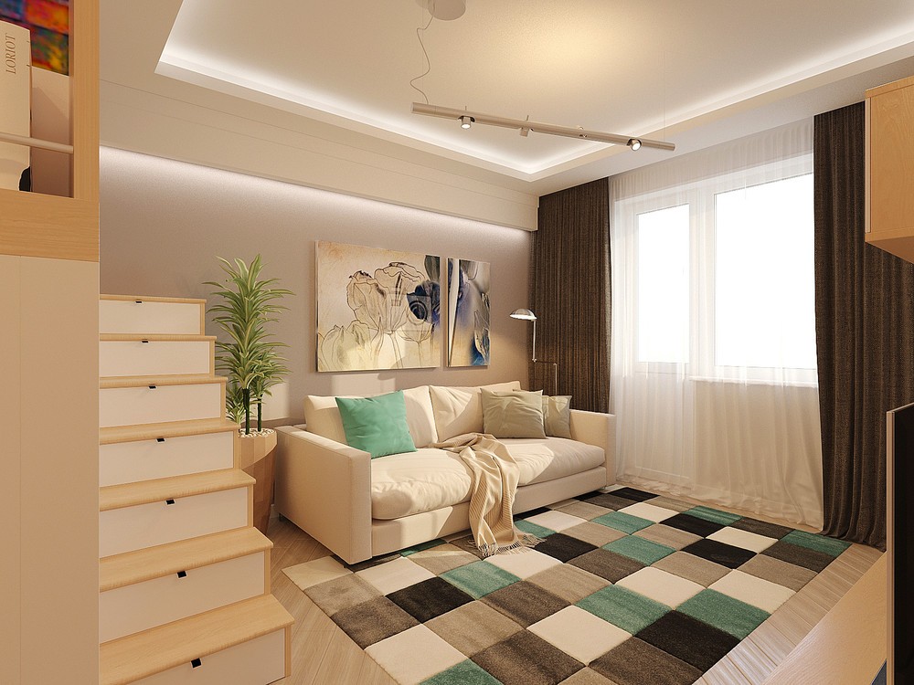
Even the stairs to the loft bed contain drawers for extra storage. This abundance of storage eliminates the need for dressers and cabinets so the rest of the interior can maintain its sleek minimalistic theme.
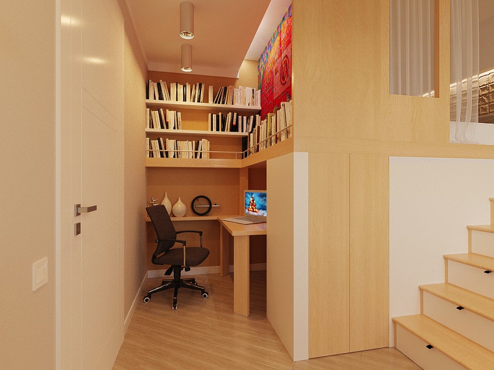
Despite fitting in a space barely large enough for the chair, this little office offers quite a robust setup. Three rows of bookshelves hold a great deal of reference material, with a cute little guard rail on the bottom shelf for style and stability.
