Are you looking for ways to make the most of your small floorplan? Each of these four homes occupies less than 300 square feet (27 square meters) but packs an incredible amount of personality, color, and inspiration into each space. You'll see clever storage solutions and multipurpose furniture, smart organization tactics and plenty of must-try DIY ideas. Sure, small spaces might require a few sacrifices but style definitely doesn't have to be one of them. These compact interior designs demonstrate how even the most restrictive spaces can offer luxurious amenities and comfort - let's take a look!
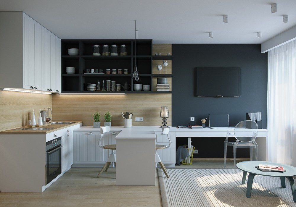
Designed for a young woman, this interior is defined by its smart layout and expertly framed zones. Within 26 square meters, the requirements included a kitchen that feels independent, a spacious wardrobe, and a workable office space. Here you can see the office taking up residence tucked beneath the television, and the transparent Louis Ghost Chair by Phillipe Starck ensures the view goes without obstruction.
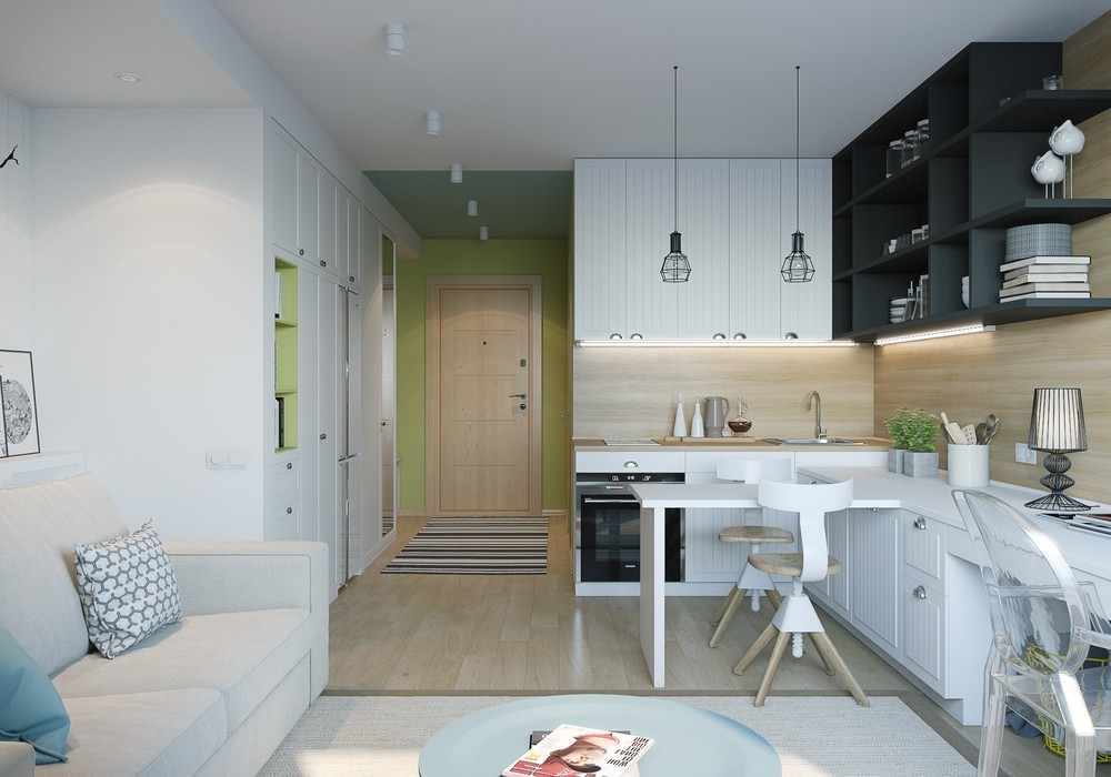
Colorful accents include green and blue. The matte white interior theme paired with light wooden tones provides the ultimate blank canvas for personal expression.
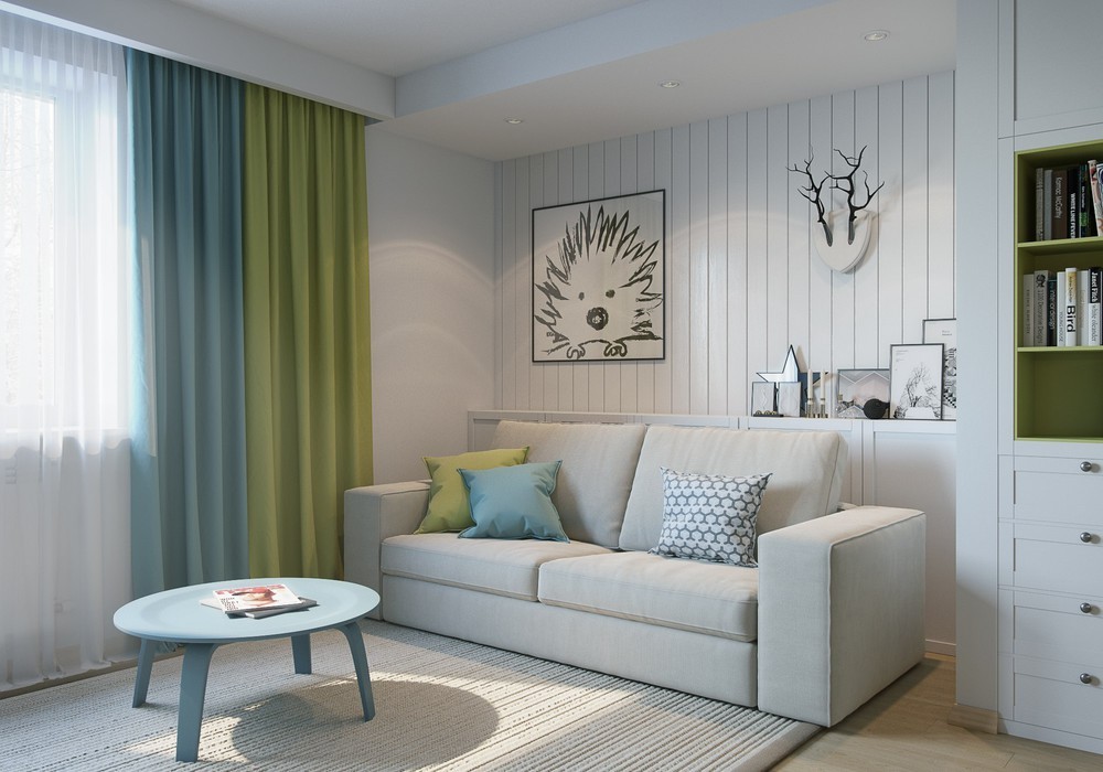
Pastel blue and green are such incredibly cheerful colors. It's hard to go wrong with a palette inspired by nature.
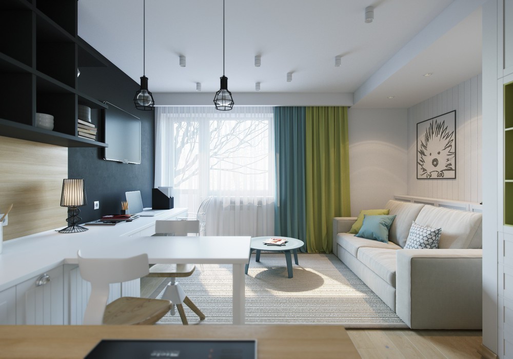
The layout is as simple and compact as can be. The living room and office share their spaces seamlessly, and the kitchen overlooks the social areas for a nice view out the picture window.
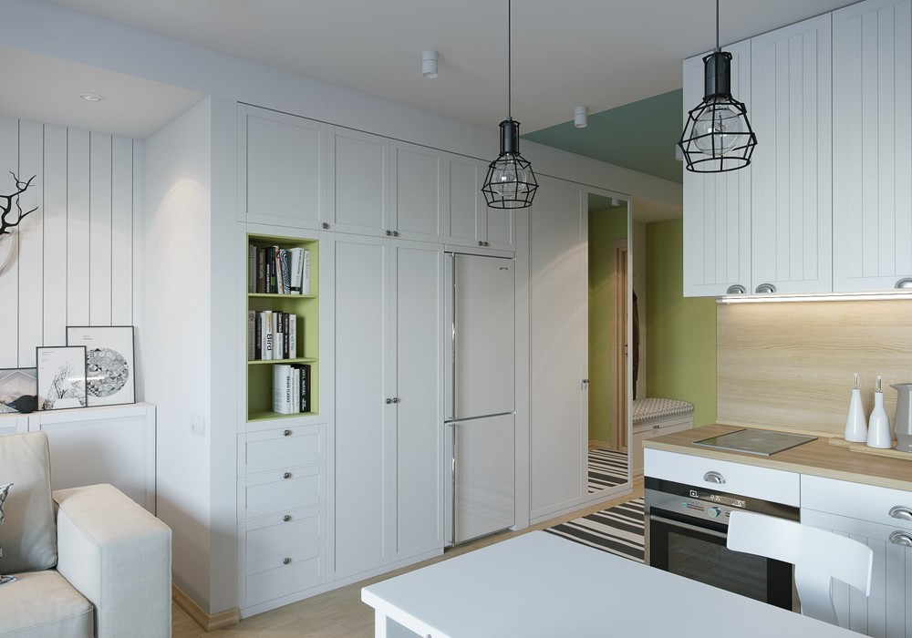
Now for the most important part: the built-in storage along the hallway facilitates the streamlined design in several ways. It not only houses the bookshelves and drawers, but also includes a spot for the refrigerator and the wardrobe.
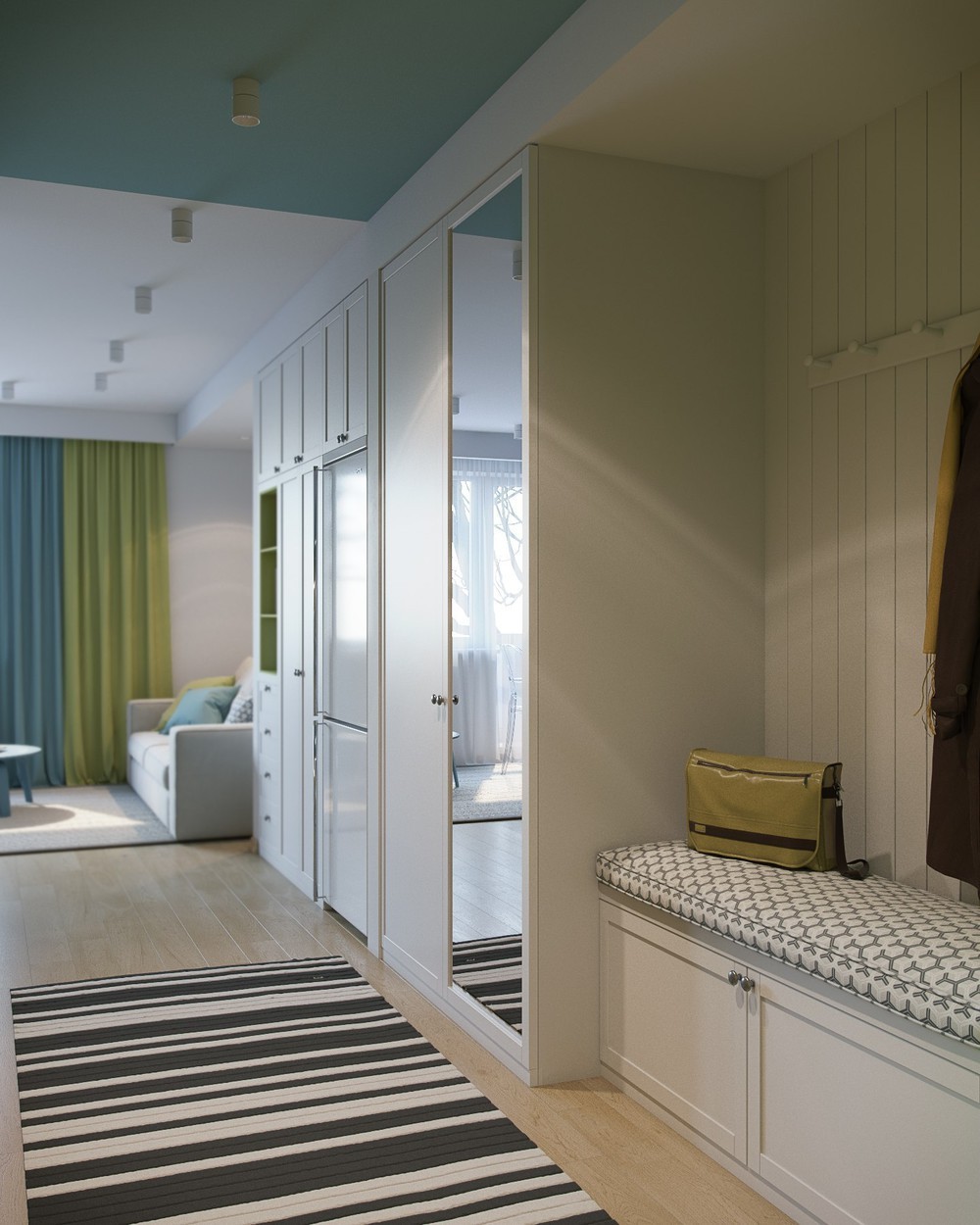
These mirrors aren't just decorative – they also offer a bright and spacious first impression to visitors.
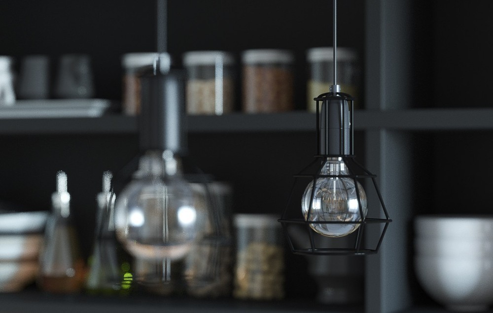
Form Us With Love won a Red Dot Design Award with these caged pendant lamps. They look wonderful here.
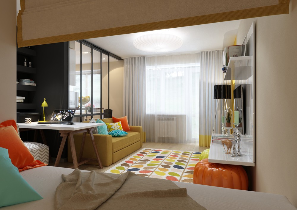
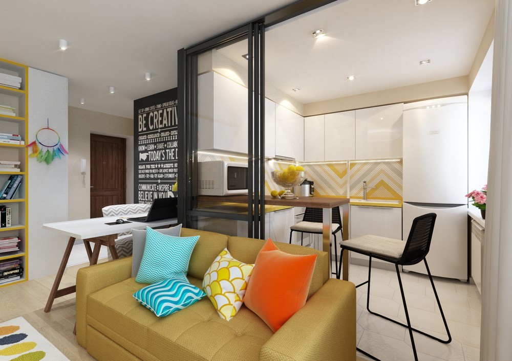
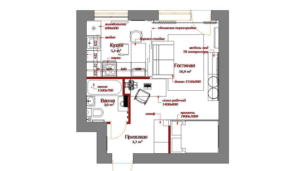
Working with a small space and worried about adding too much color? This small apartment isn't afraid of bold color themes at all! Delightful retro hues energize every square inch: oranges, blues, yellows, and greens… Each color adopts a bright tone, breathing plenty of life into an otherwise restrictive floor plan.
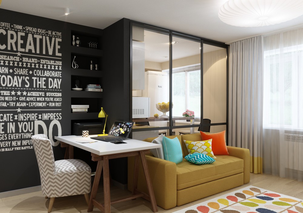
A compact A-frame table separates the living area from the kitchen, doubling as a dining area and an office in one.
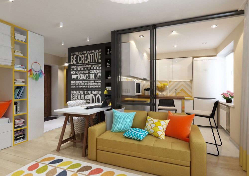
The kitchen itself enjoys the flexibility of sliding glass doors. These doors divide the areas functionally but not visually.
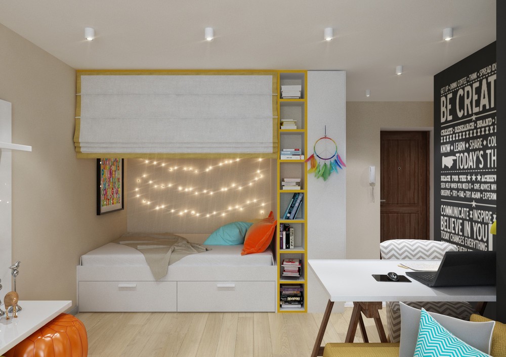
But look at this cute bed area! The folding shade offers a sense of privacy, under bed storage caters to the organized soul, and string lights bring the ambiance.
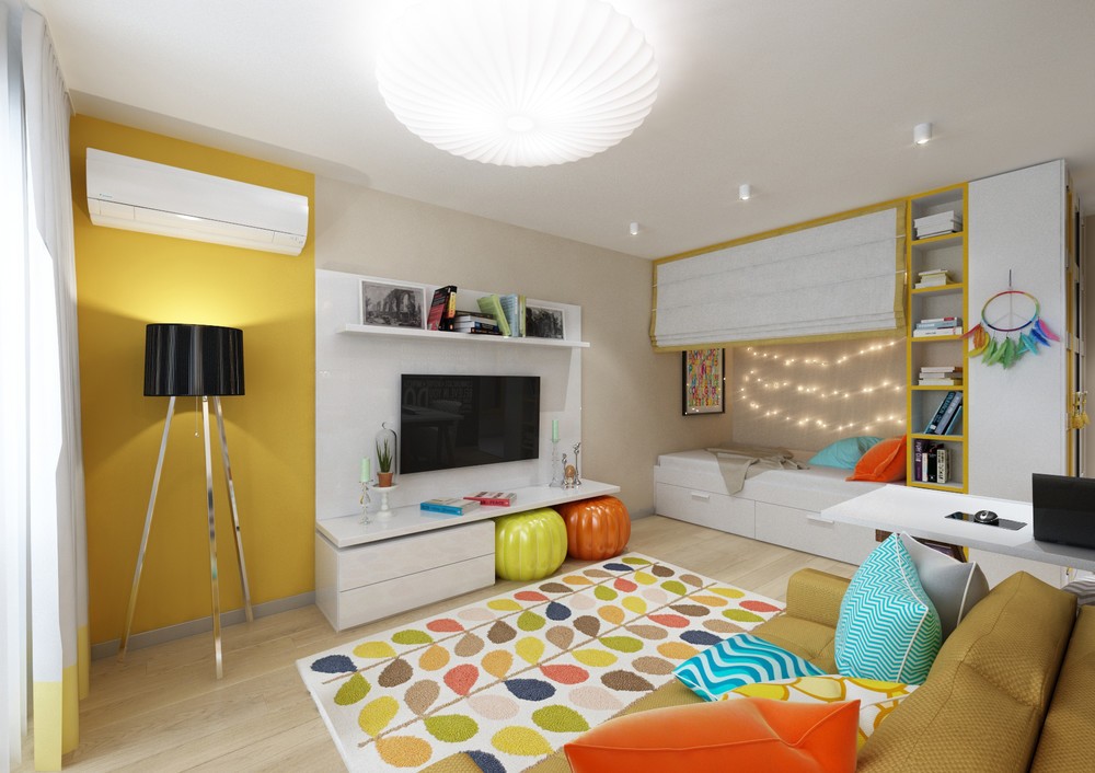
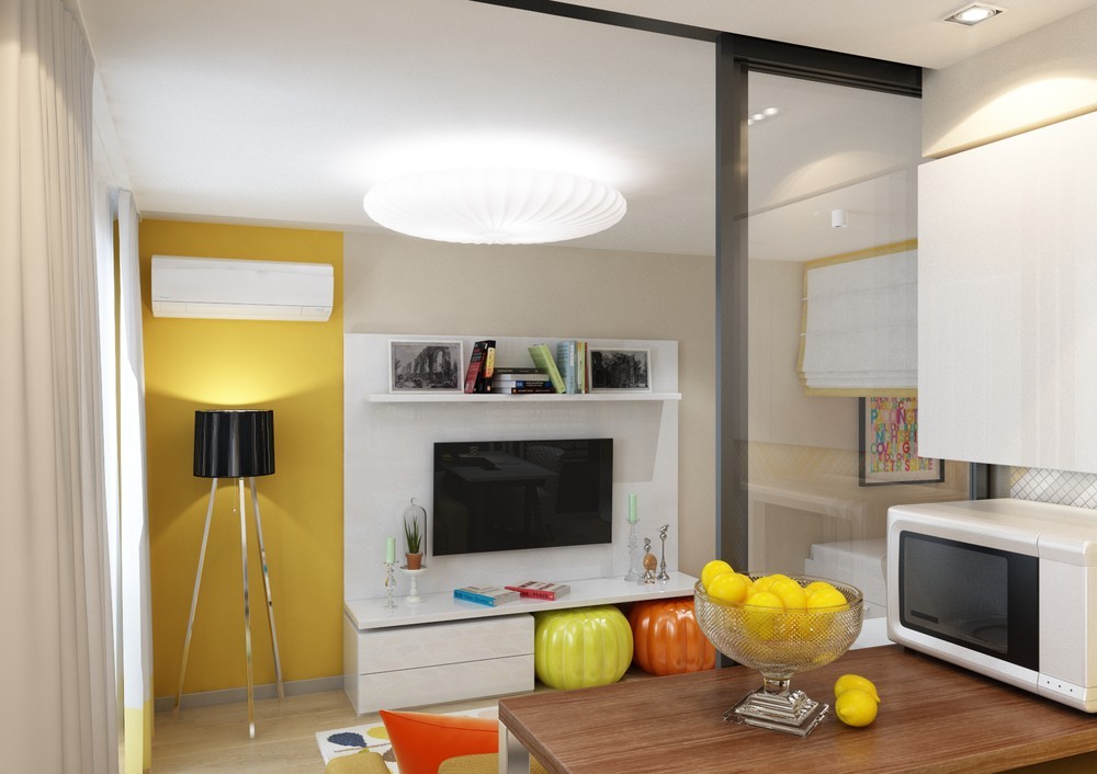
While a full accent wall may have proved too much for such a small space, this refreshing stripe of lemon yellow really hits the spot.
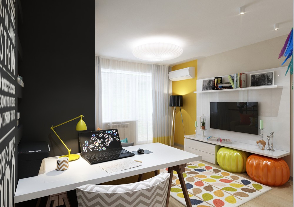
Glossy leather poufs have a perfect home beneath the TV stand – decorative, yet out of the way until needed.
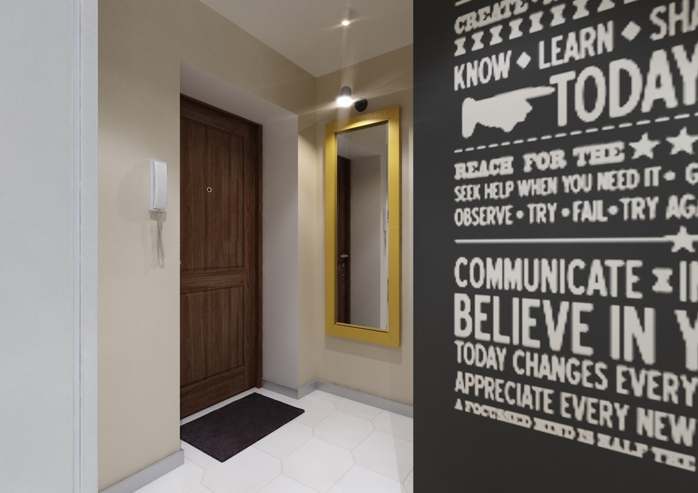
Tiles in the entryway eschew the traditional square pattern in favor of cool polygons for a fabulous first impression.
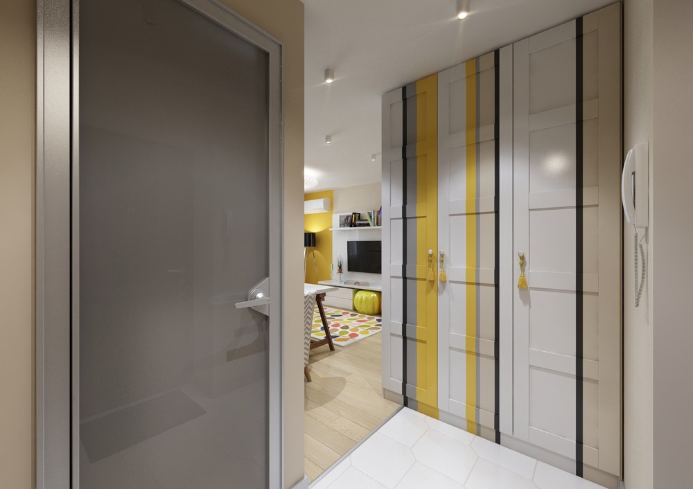
Upon entering, painted doors blur the line between classic and modern – traditional paneling meets contemporary aesthetics.
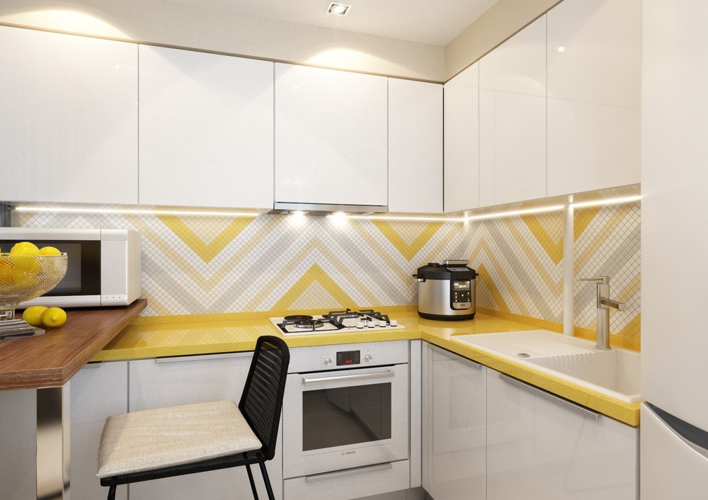
Chevron stripes match the patterns used throughout the living room, yet easily make an impact standing on their own.
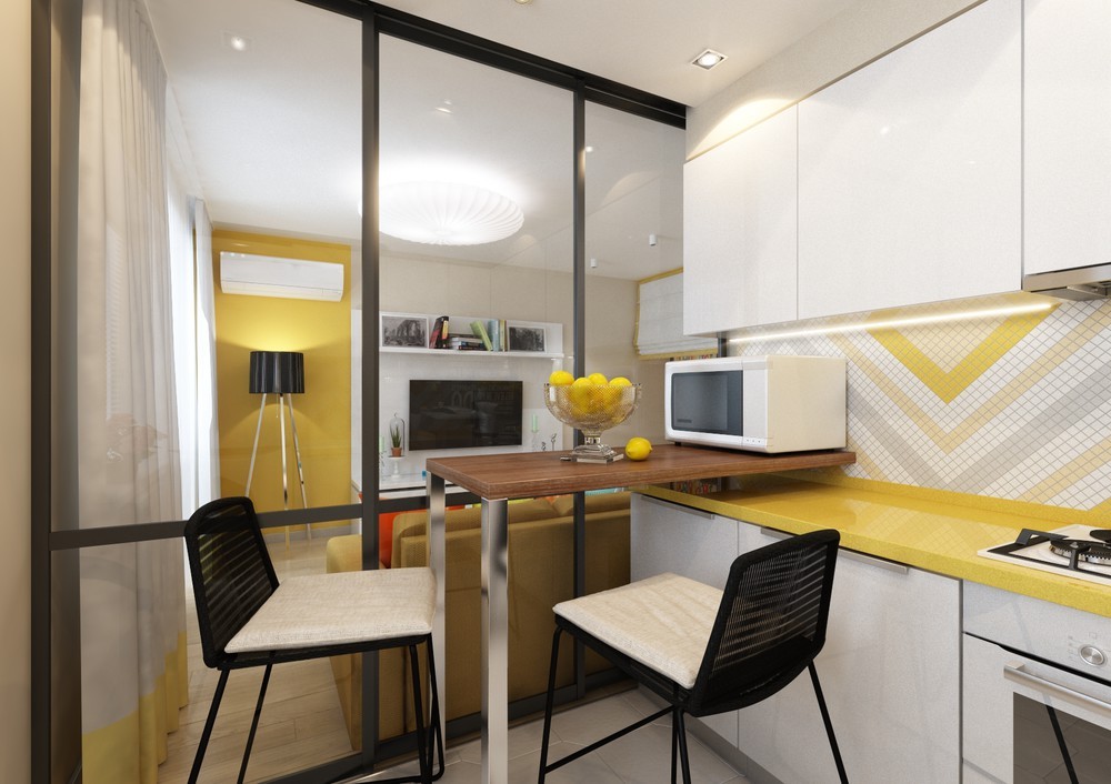
The raised breakfast bar leaves a tiny gap below the microwave for semi-hidden storage. Small spice jars could fit well here.
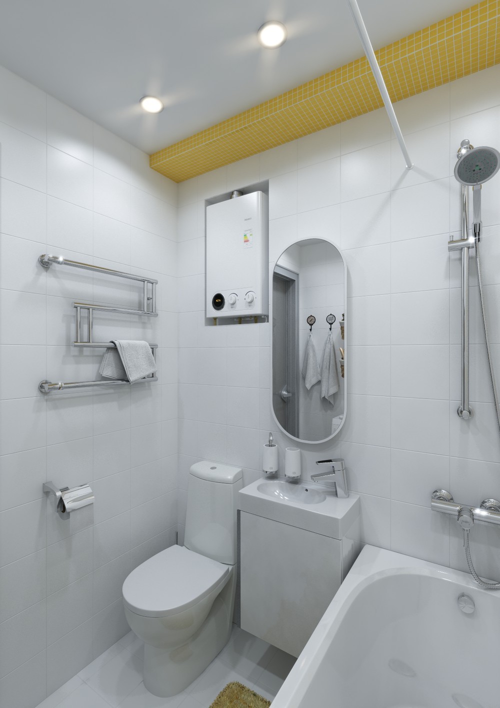
Decorated in plain white tile, the bathroom enjoys an overall traditional look with a few cool contemporary features – like the modern fixtures and interesting oval mirror.
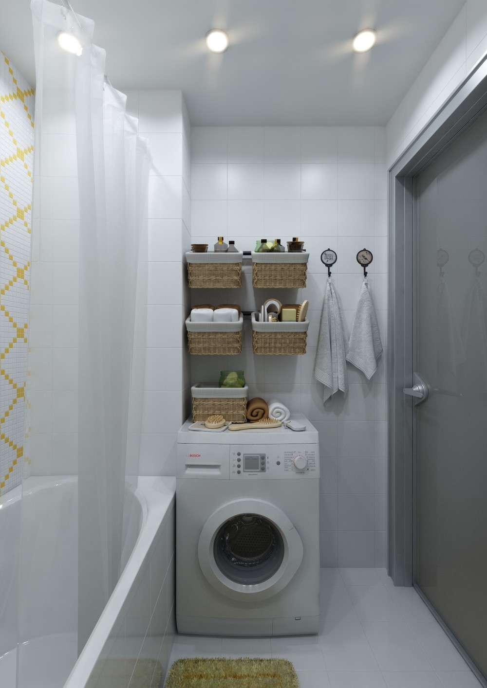
Wicker baskets offer convenient storage. The towel hooks seem to come from repurposed pressure gauges.
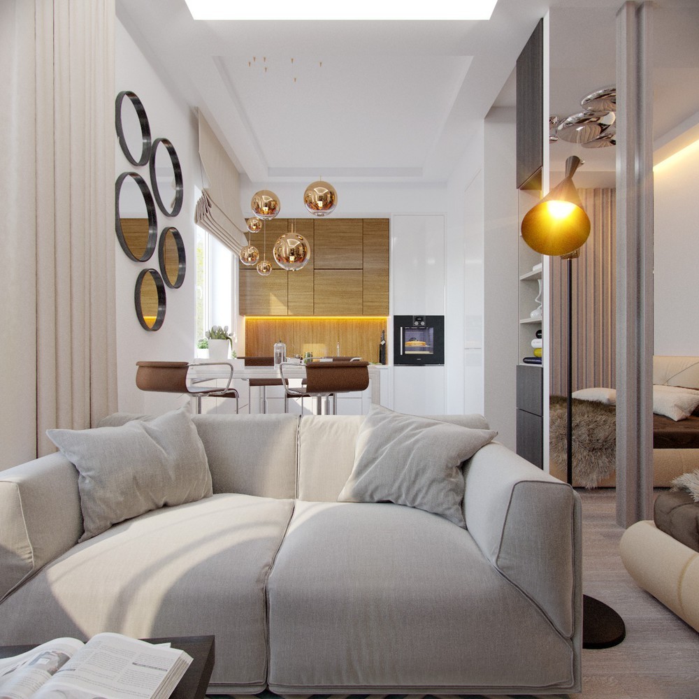
Here's another home designed for a young woman – one who travels often. The designer was inspired by Scandinavian design principals, hence the light-colored wood and the incredible sense of spaciousness. This home utilizes a mostly neutral theme with plenty of warm accents, and a good variety of distinctive round decor for visual interest At under 30 square meters, the amount of division between each space is truly inspiring!
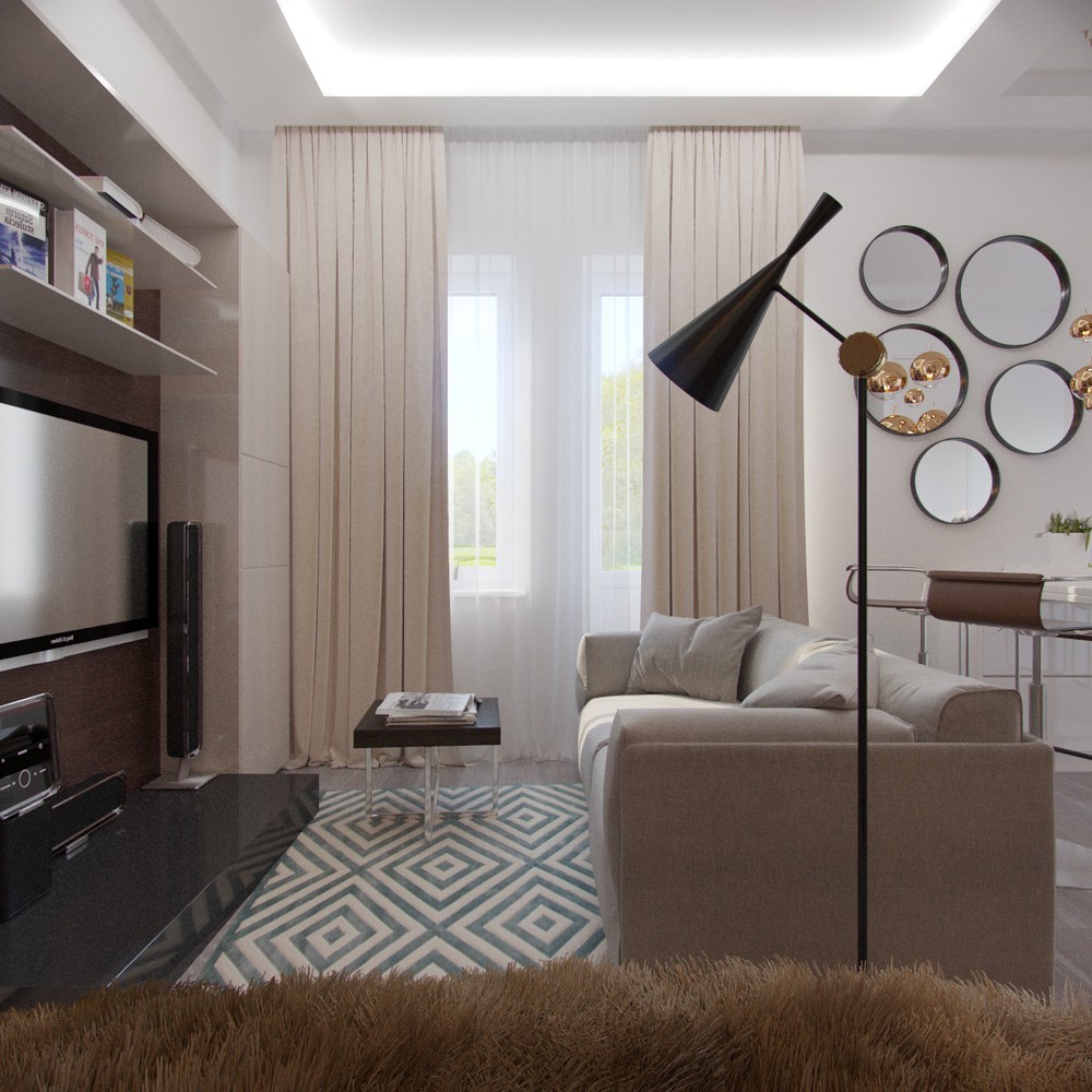
Geometric themes make a big first impression. A blue diamond rug takes center stage and bubbly round mirrors immediately draw the eye to the right.
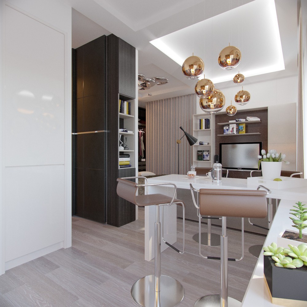
It's hard to go wrong with the classic piston breakfast stools and the current Tom Dixon pendant lights.
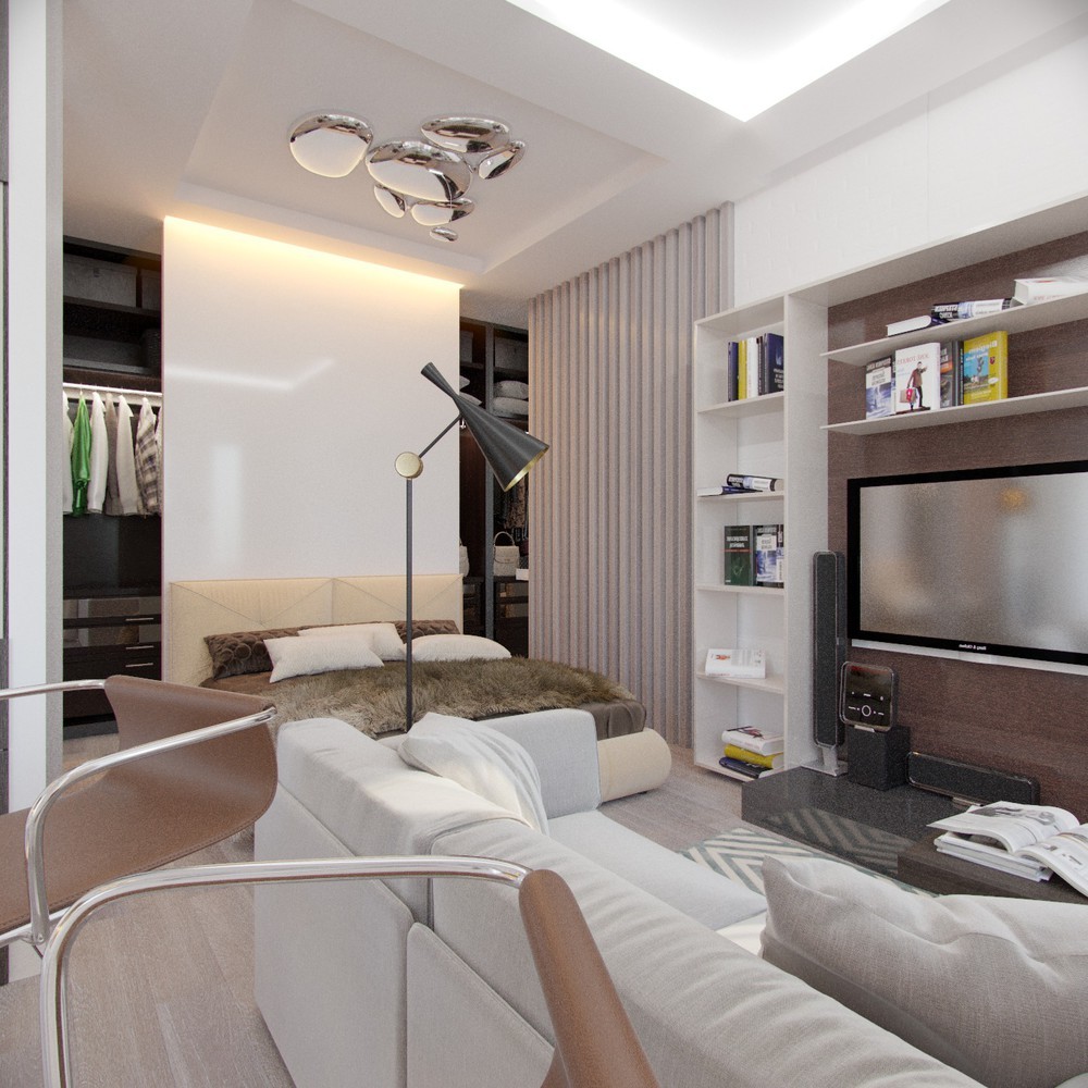
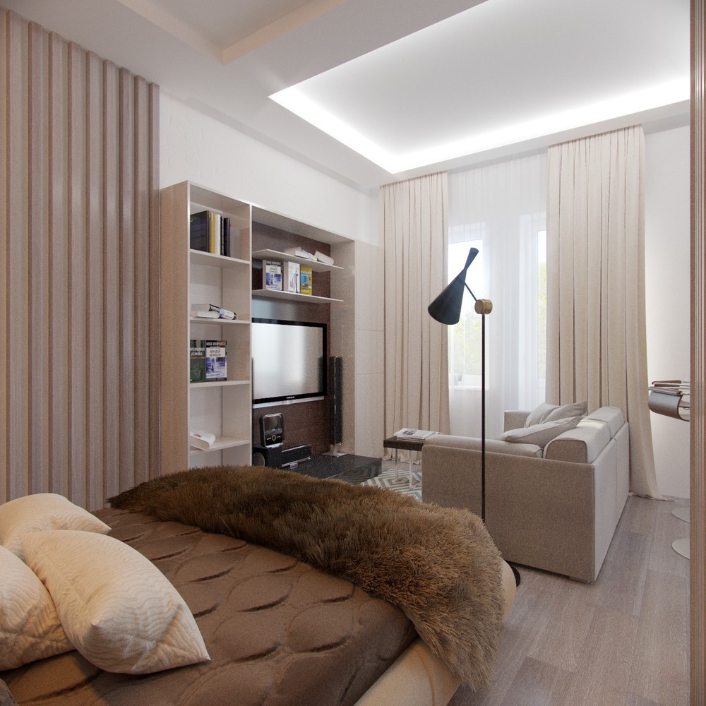
Tucked away off to one side, the bedroom utilizes cream tones to make the space look more warm and inviting.
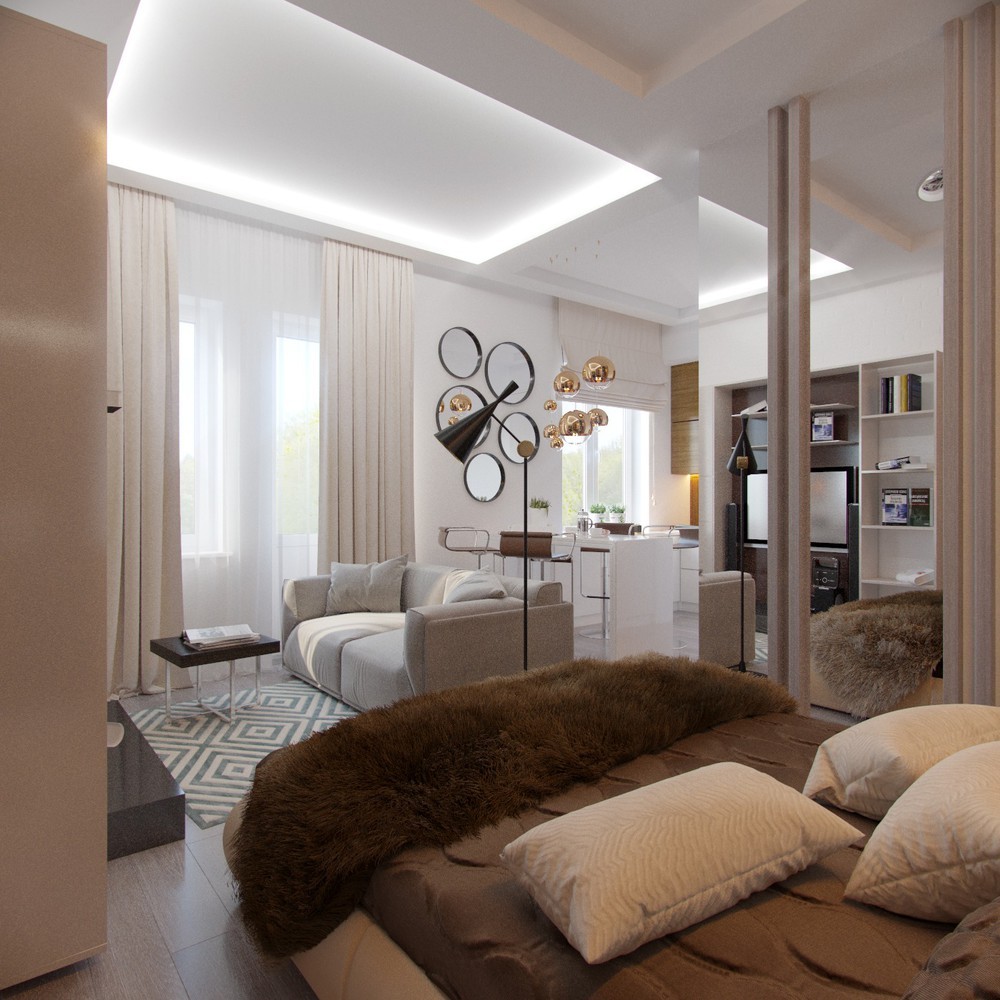
Although there isn't much privacy, there's still a divider between the bed and the entryway. Here, you can see the mirror that facilitates the closet behind the bed.
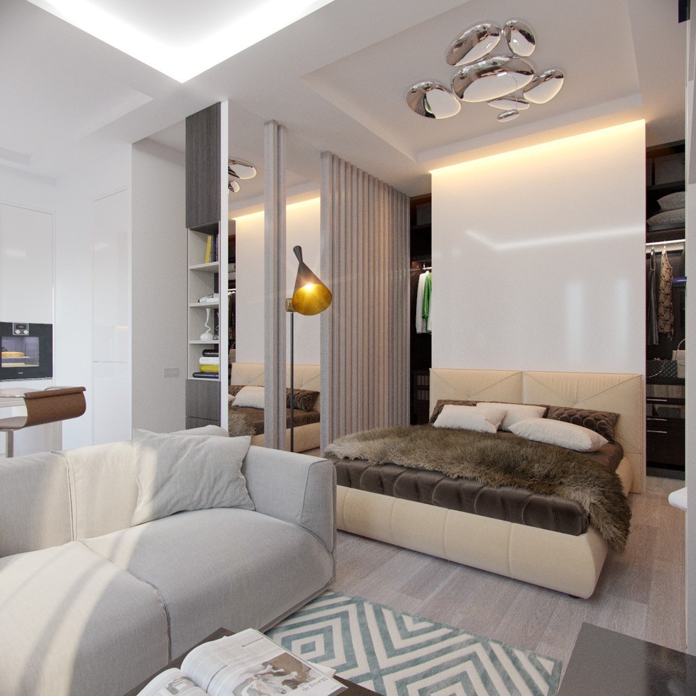
The closet actually continues all the way across behind the bed. The headboard volume provides privacy for changing.
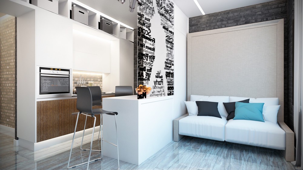
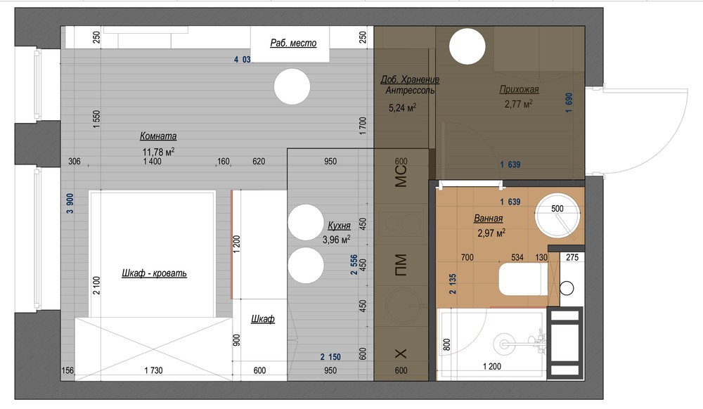
Gorgeous and efficient! This home centers around a living and sleeping area in neutral colors with blue accents, utilizing a Murphy bed from Clei Italy to preserve floor space without giving up any comfort or sophistication. This home offers abundant inspiration for anyone who needs to work around the smallest of interior floor plans.
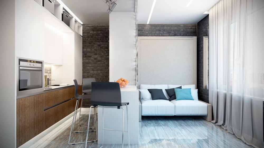
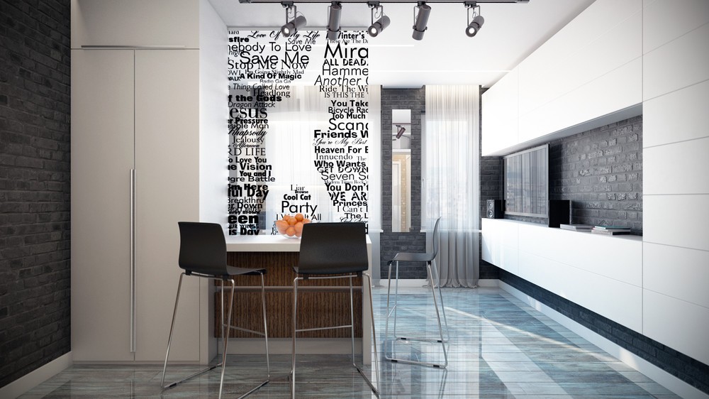
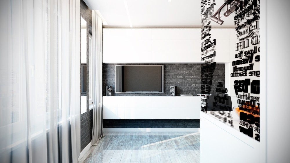
Brick accent walls offer an interesting backdrop with a strong industrial appeal, its dark charcoal treatment providing a moody and urban atmosphere.
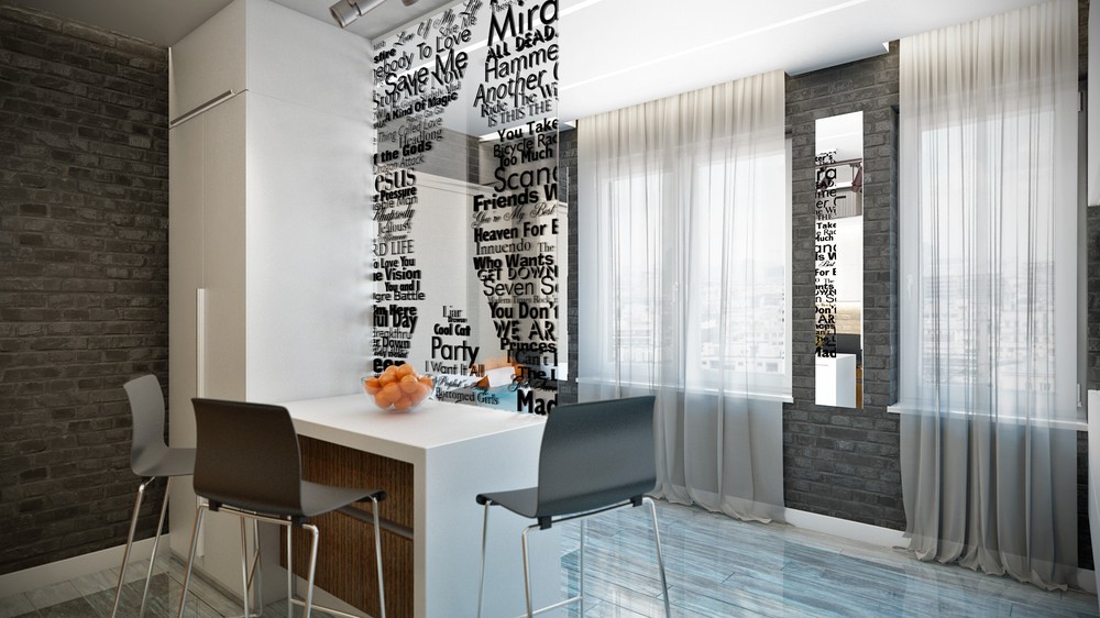
Printed onto a clear sheet of acrylic, the typography-inspired screen divides the social spaces from the functional spaces without blocking the passage of light or visual contact.
