Ever wondered how those magazine-worthy modern homes maintain such a clean and flawless interior? "Where do they put their STUFF?" It's a good question! While freestanding bookshelves and standalone cabinets can actually contribute to the cluttered look, smart integrated storage looks like it actually belongs, as if it were part of the architecture itself – even if it isn't truly built in. The four homes featured here each take their own unique approach to attractive storage, with plenty of ideas and inspiration to use within your own home. Who couldn't use more storage techniques?
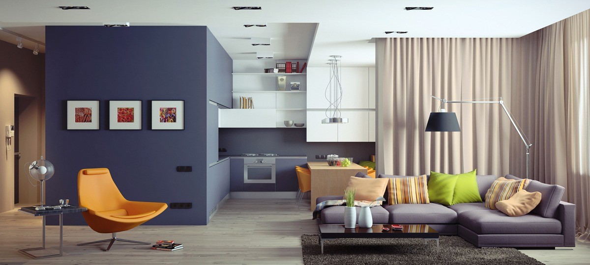
This colorful apartment in Kiev was designed by Andrew Sokruta – filled with oceanic and tropical hues throughout. Immediately, the most noticeable feature is the large volume that separates the kitchen from the hallway to the left. It houses some extra storage on the kitchen side in addition to providing a nice interior compartment for added useable space accessible from the hall.
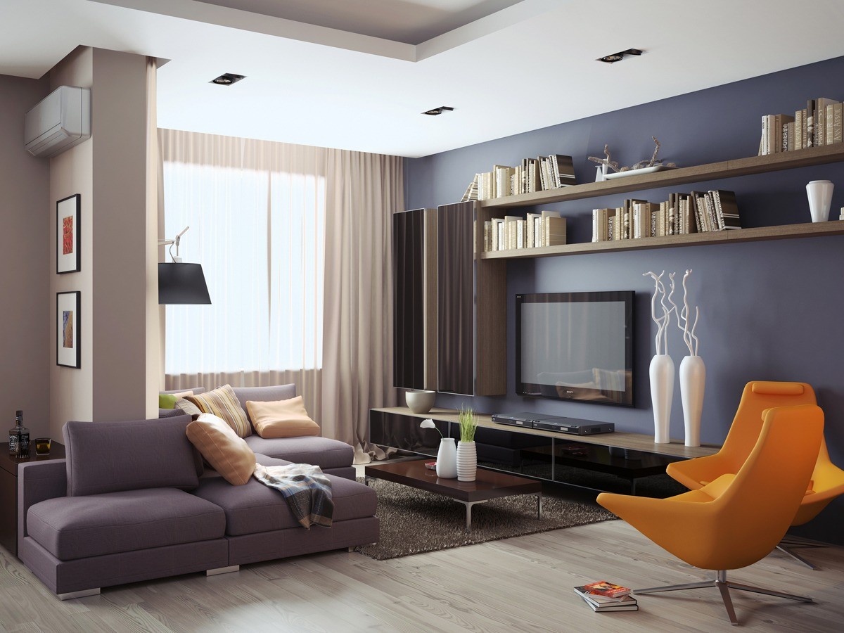
On the entertainment wall, a versatile array of cabinetry allows functional space for storage. The shelves above house only the most presentable items, like coordinated books and driftwood art.
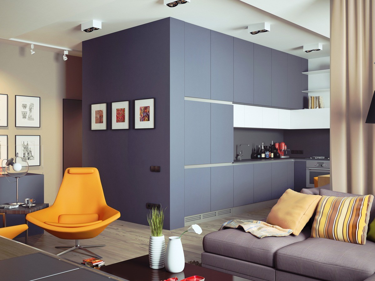
While the large dividing volume seems to take up an ample amount of floor space, just imagine how much visual real estate would have been occupied without the extra available storage. These tall cabinets could easily serve more than just the kitchen.
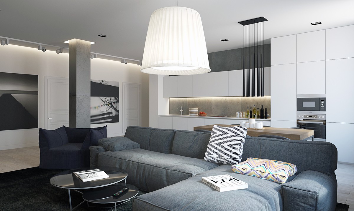
This apartment, designed by Azbuka Dom Design Studio and visualized by Stanislav Borozdinskiy, does not make a great show out of its integrated storage options. This space focuses more on sleek minimalism and fantastic design – of which the storage is just an effective facilitating factor.
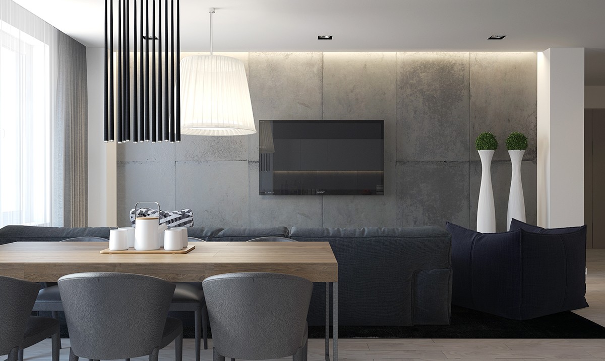
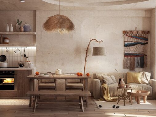
Texture matching across materials is notoriously difficult to pull off. Here, concrete cladding and upholstered dining chairs seem to blend seamlessly. The soft fabric sofa serves as a sort of intermediary and does blend flawlessly under the right lighting conditions.
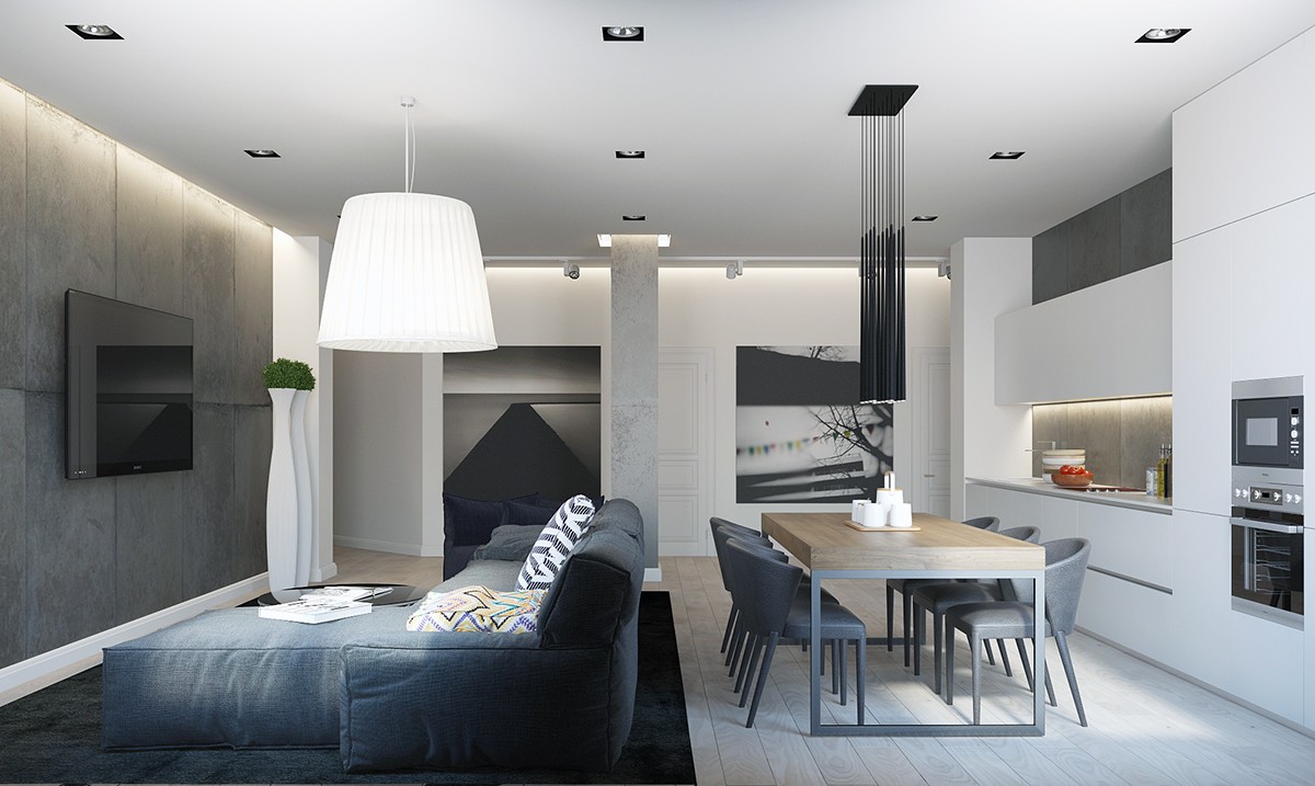
Large art prints capture attention from the background. Dining room furniture maintains a streamlined profile to allow the artwork to show through. "But where's all the stuff?" Likely hiding behind any of the built-in cabinets!
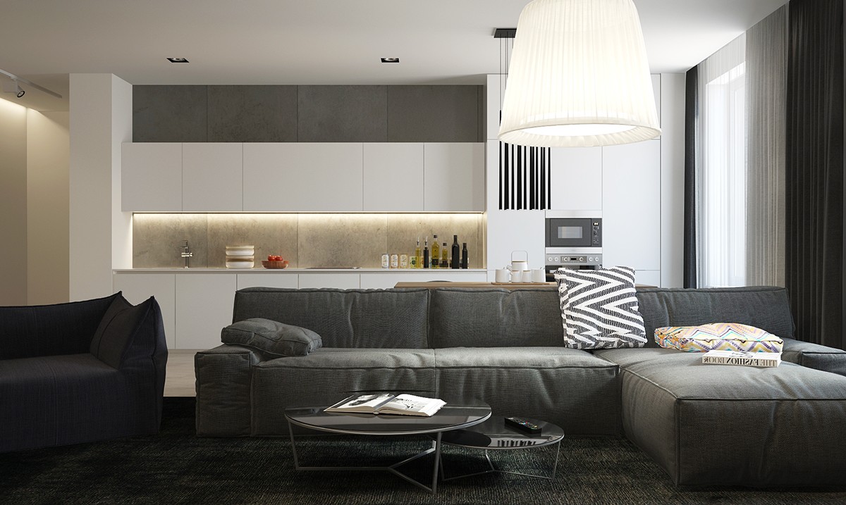
Integrated kitchen storage allows for a brilliantly tailored display. Only the most attractive items are visible: quality olive oils, beautiful bowls, and a nice arrangement of spice holders.
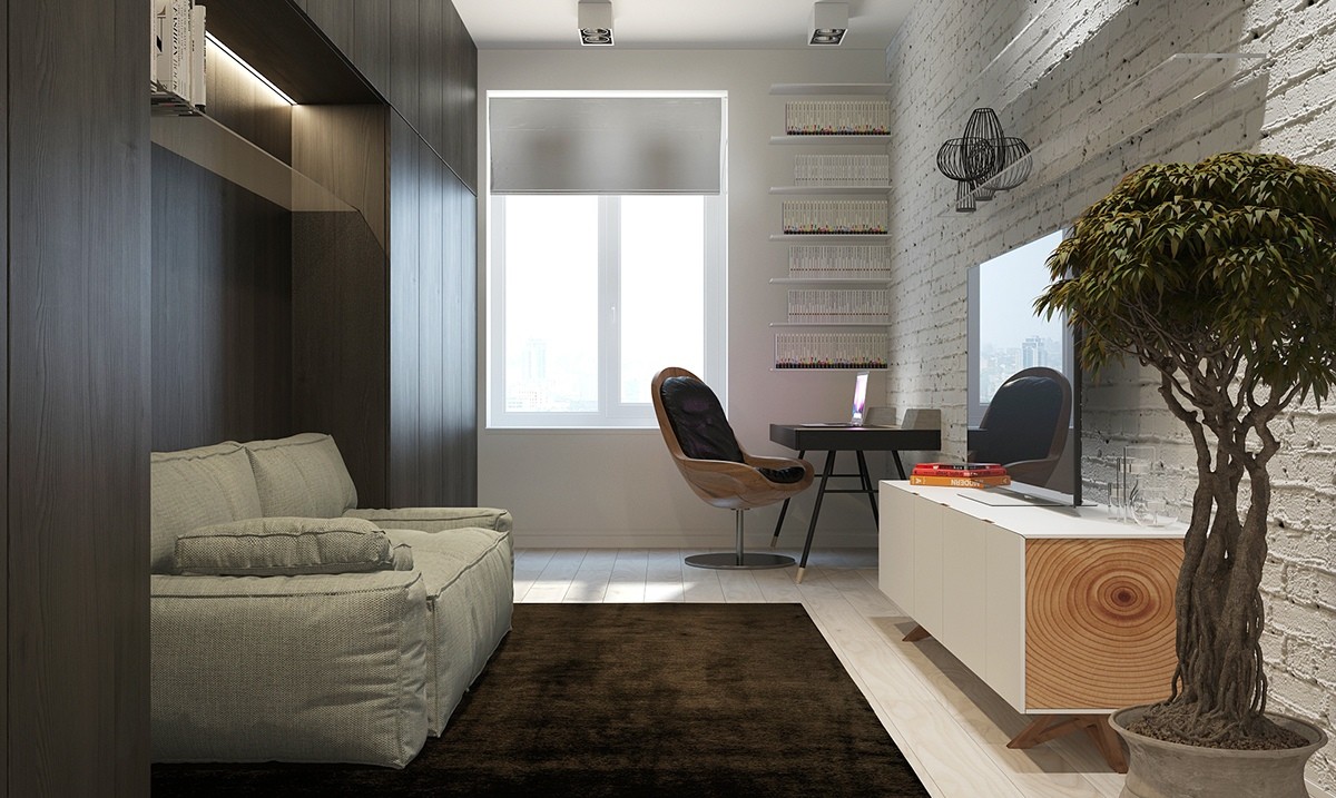
A hidden entertainment area features surrounding storage solutions. The encompassing construction creates a more intimate area around the sofa - the shelves near the desk and the cabinets held within the entertainment console are almost invisible, the hallmark of an effective integrated storage scheme.
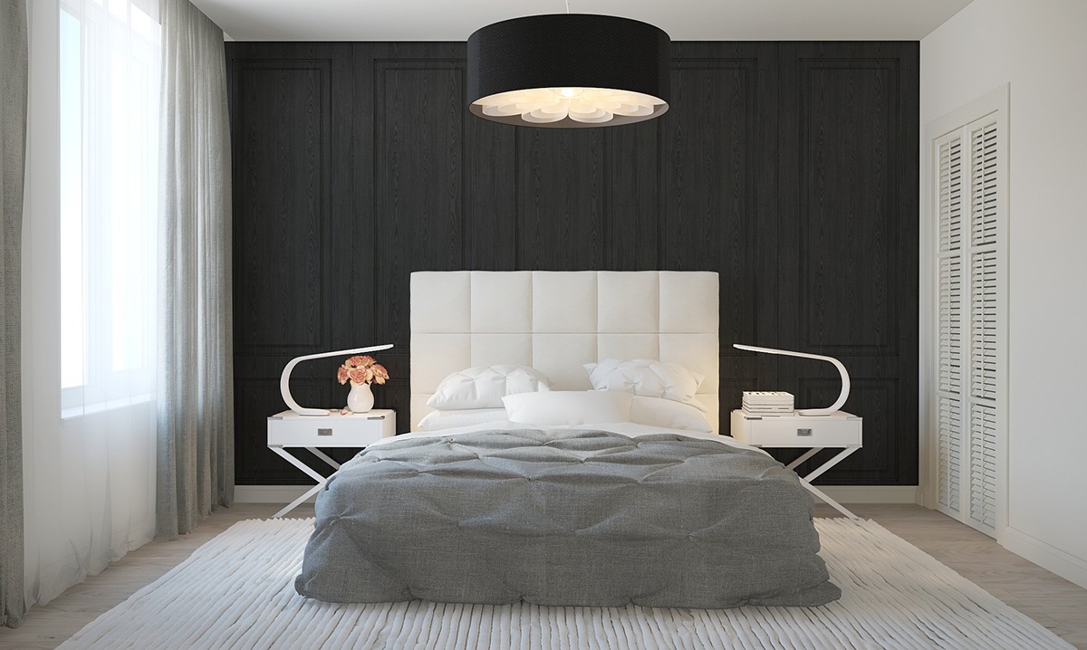
The bedroom, on the other hand, takes a more classical approach to storage. While the rest of the room makes brilliant use of modern colors and geometric forms, the closet enjoys a classic slat design.
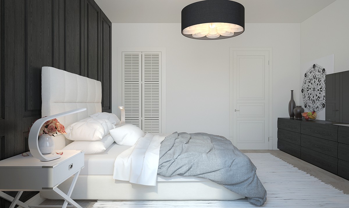
Other natural-feeling storage solutions include the luggage-inspired side tables and the modern sideboard shelves housing the television.
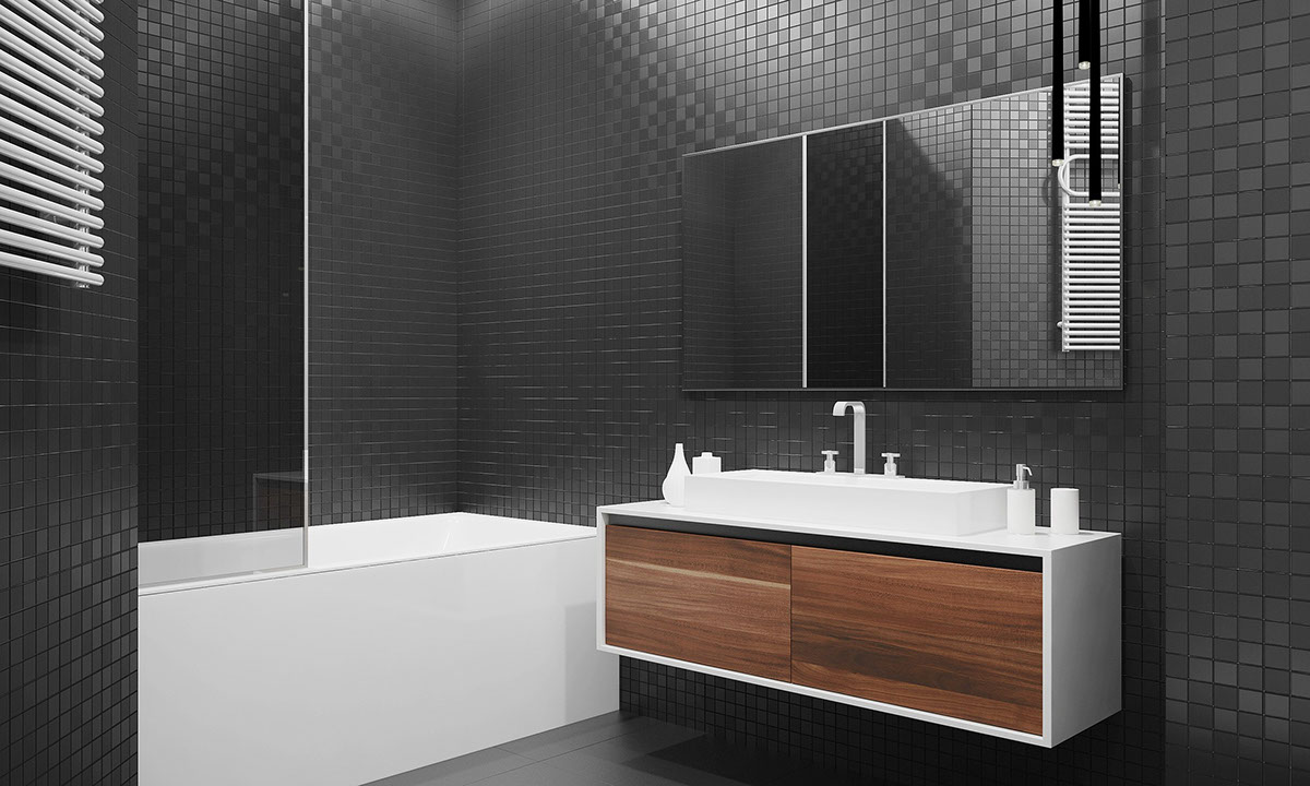
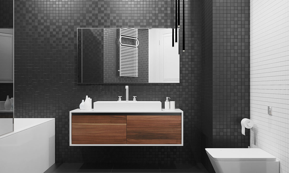
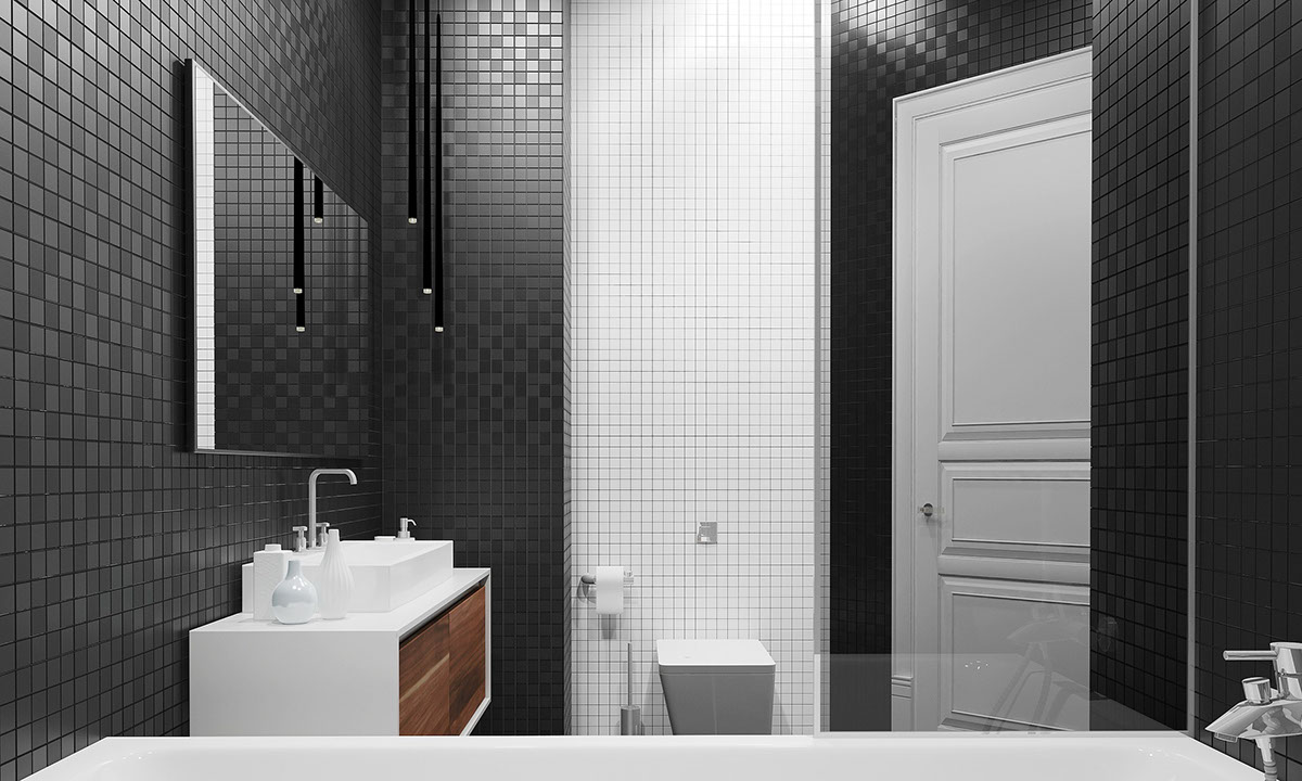
Completely monochromatic – except for the bathroom vanity. This is a rare example where highlighting the storage can enhance the design of a room. Alternating glossy and matte tiles embrace this space with an abundance of luxury, while the wood-clad cabinets ground the space.
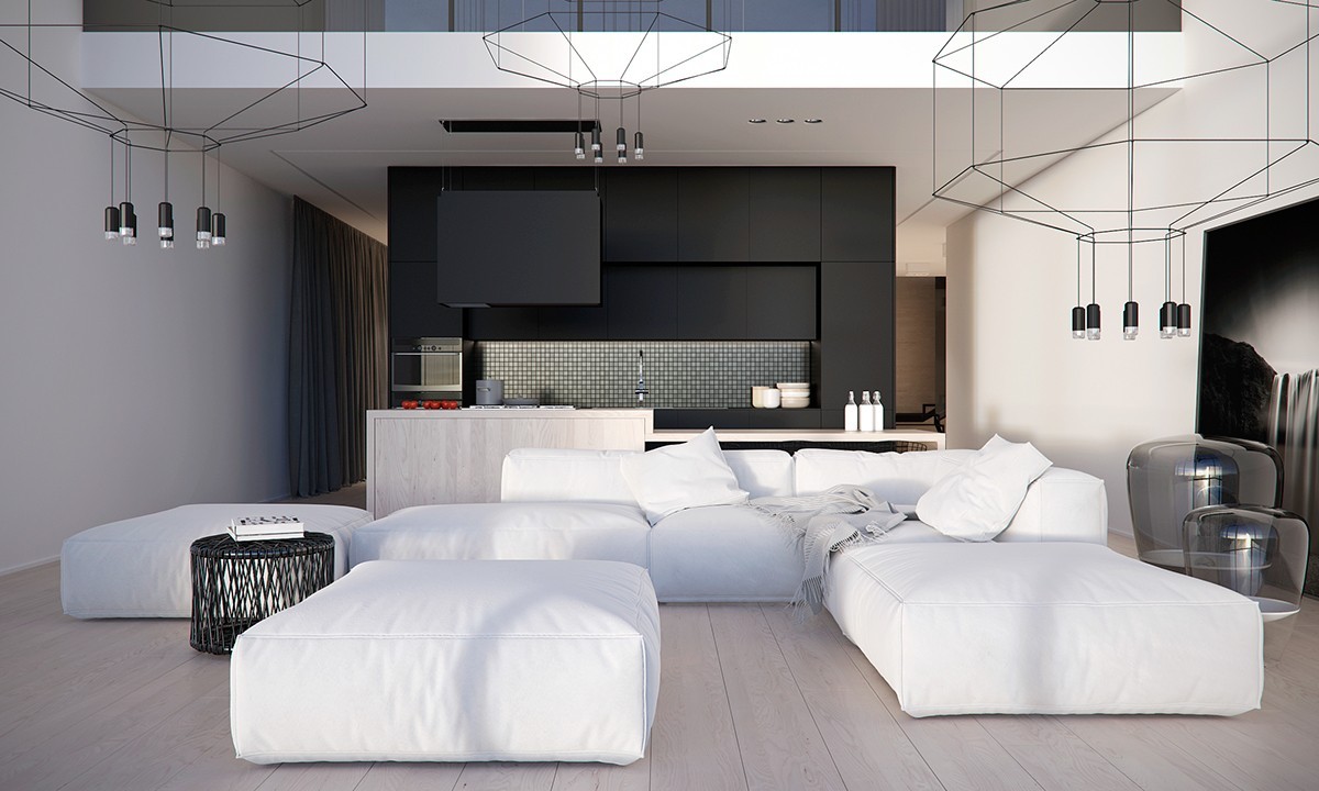
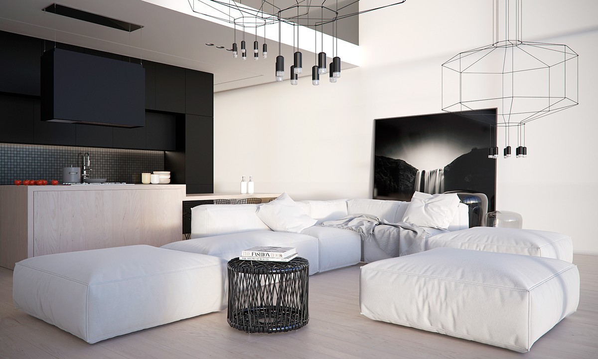
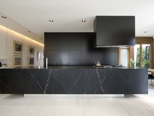
Another brilliant apartment from Stanislav Borozdinskiy – a home with simple furniture, iconic lighting from brilliant designers, and perfectly streamlined decor. Notice the abundance of integrated storage within the kitchen portion of this open floor plan, a volume clad in matte black that separates the two hallways from one another.
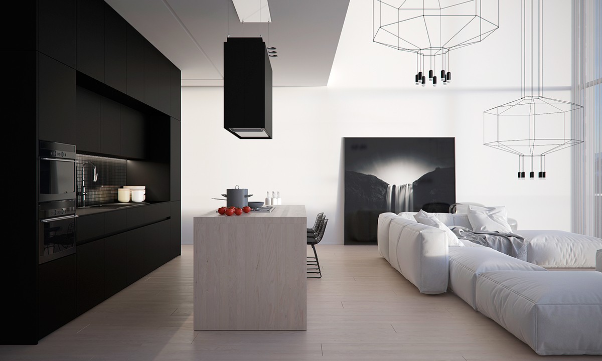
From the previous vantage points, the suspended range hood blended in to the kitchen unit behind it – matte on matte themes are a fantastic method of flattening an interior layout where it matters. This application allows the breakfast bar to stand out.
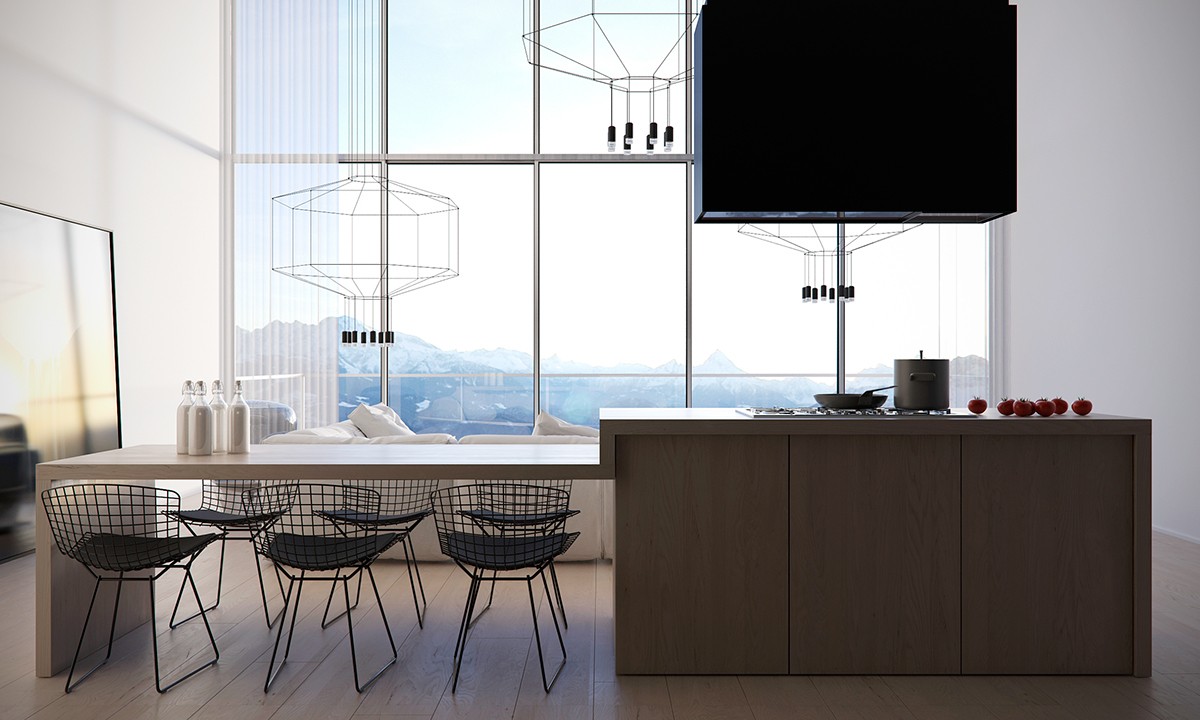
This view highlights the gorgeous lighter-than-air appeal of the Bertoia side chairs and WIREFLOW lamps.
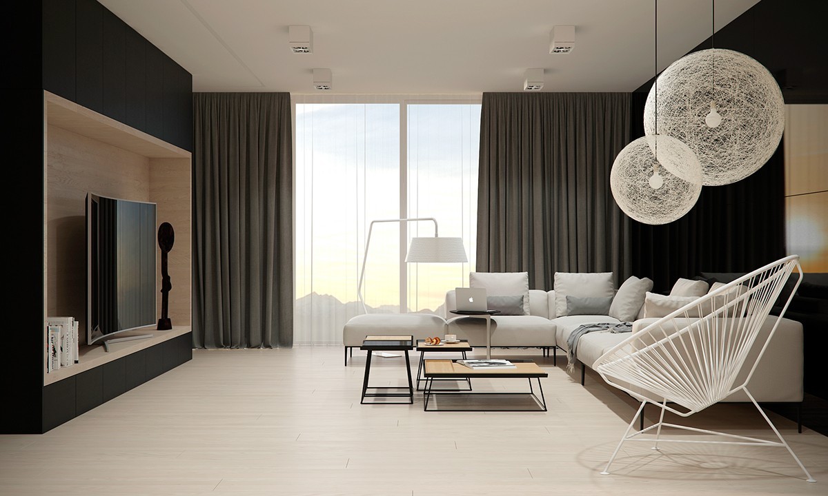
Another living room centers on a smooth entertainment console. Moooi Random Lights, an Acapulco chair, and skew-legged occasional tables grant the space an unmissable designer appeal.
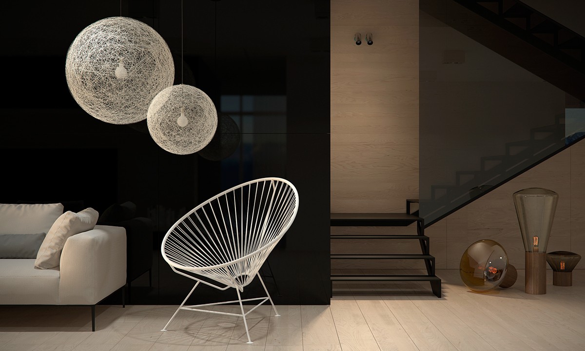
From this view, a nice variety of Muffin lamps (complete with faintly glowing Edison bulbs) stand next to a lightweight staircase partially shielded by a tinted glass wall.
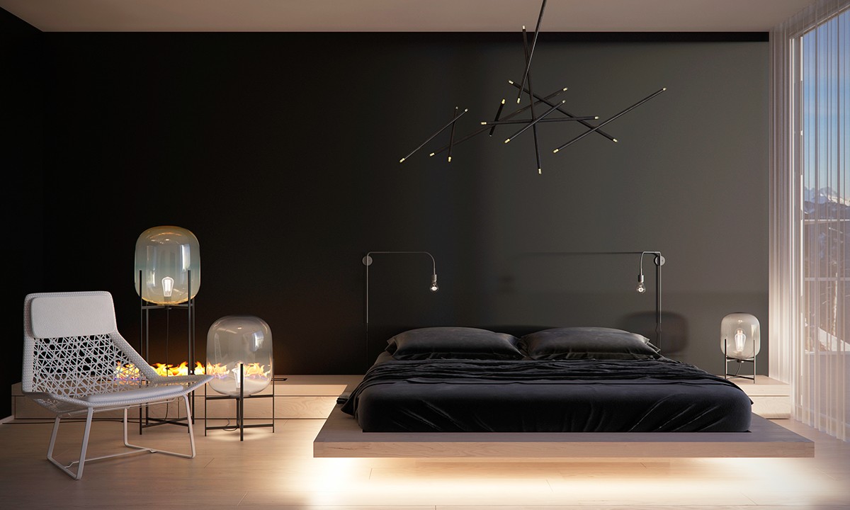
Here, an incredible variety of lighting options opens the bedroom to a world of possibilities. Oda lamps by Sebastian Herkner set the mood next to the fireplace, and industrial Søren Rose bedside lamps create an implied headboard for the bed.
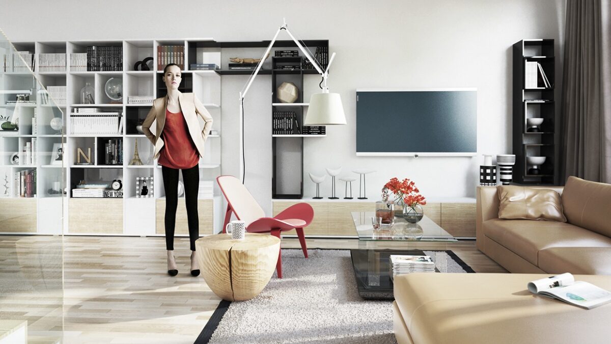
Designed by Model Morden and visualized by Nguyen Duy Thanh, this apartment in Saigon places a heavy emphasis on bold shelves – note the cube shaped bookshelves to the left and right. This clever arrangement of exposed storage certainly helps distract from the concealed cabinets along the floor beneath.
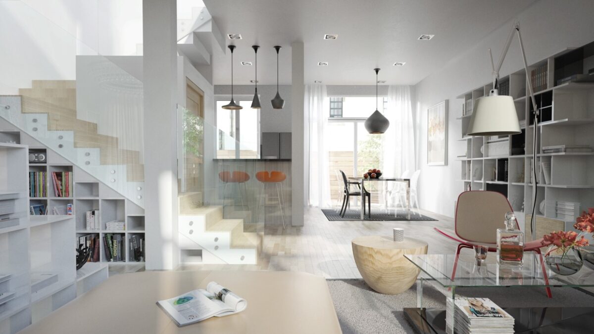
Don't you love the eclectic decor? Unique furniture mixed with iconic pieces from famous designers like Tom Dixon, Hans Wegner, etc.
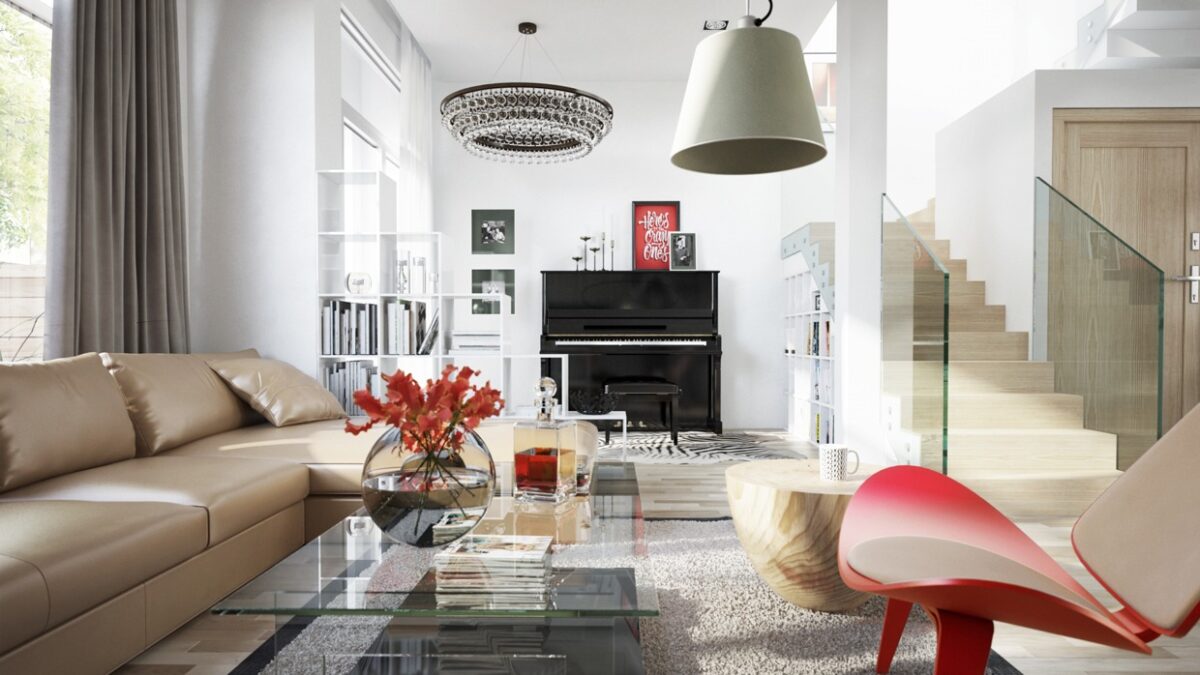
Open storage shelves divide the living room from the piano space, and extra shelves hide beneath the staircase.
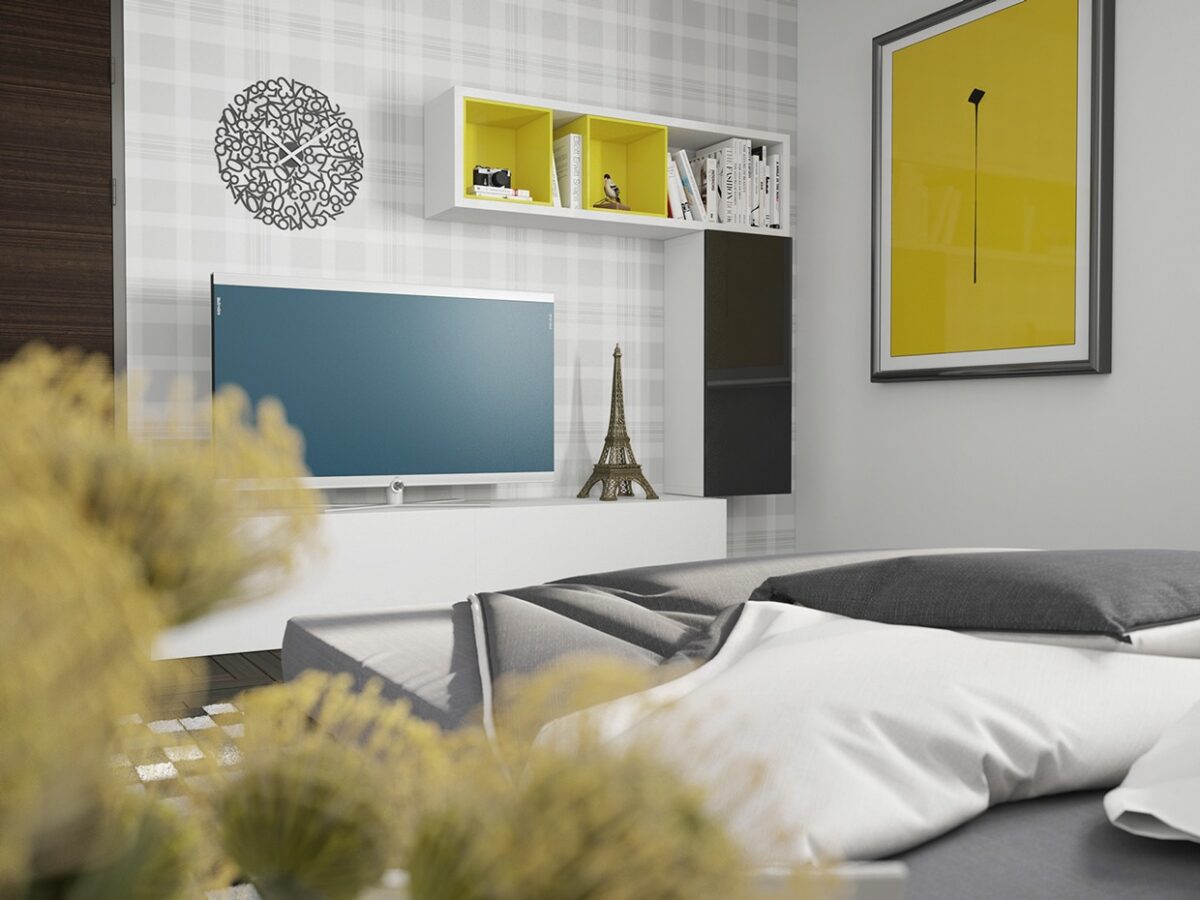
Such a colorful blue and yellow bedroom! Here, storage plays an interactive role in the design – yellow and black shelving systems perfectly coordinate with the framed art to the right.
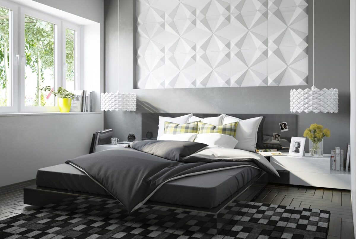
Geometric themes rule the bedroom, from the highly textured wall cladding and lampshades to the playfully printed rug and accent pillows.

