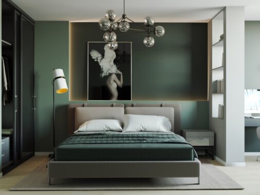
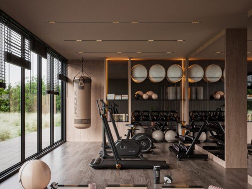
Using bold geometric patterns is nothing new to the world of interior design, but the trend definitely made a huge resurgence recently and underwent quite a spectacular evolution as it spread. The field of geometry is inherently diverse, a study of every shape and form – so it's no surprise to find that geometric design offers equally limitless possibilities within the home. From the retro appeal of interlocking patterns to modernistic low-poly figures, you'll never run out of styles to explore. All three homes below express their own interpretation of this powerful trend.
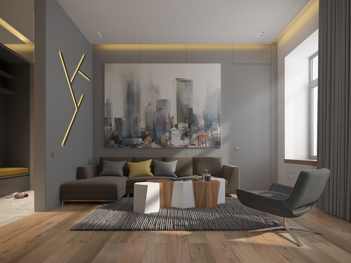
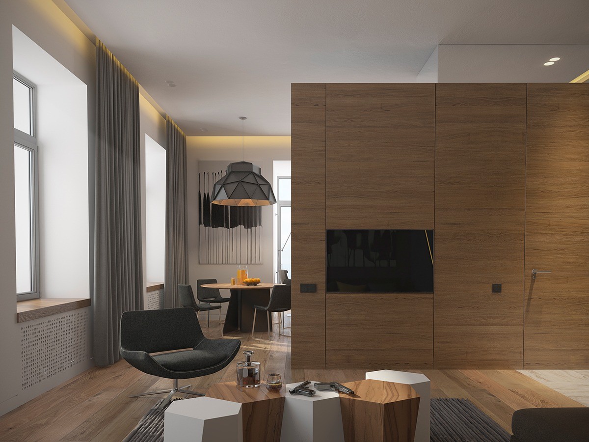
Designed by Archiplastica and visualized by Wladimir Sapyan, this home is titled "Men's Apartment" and emphasizes a certain chic masculine style with subdued neutral colors and subtle yet rugged textures. Here, our foray into geometric design begins with a fabulous modular table with irregular angles and a cool arrangement of wall mounted lights to the left.
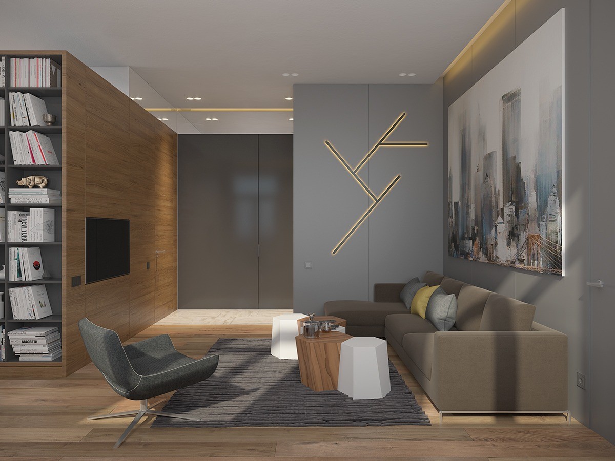
Overall, squared shapes and clean lines rule the space. An abundance of indirect lighting sources set the mood when the recessed ceiling lights would prove too bright.
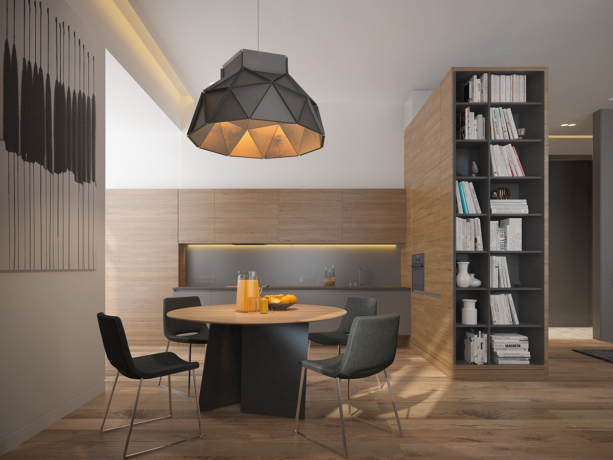
A large divider visually separates the kitchen from the living areas – it seems to take up a lot of precious square footage, but both sides feature an abundance of convenient hidden storage. One side houses the apartment's small library.
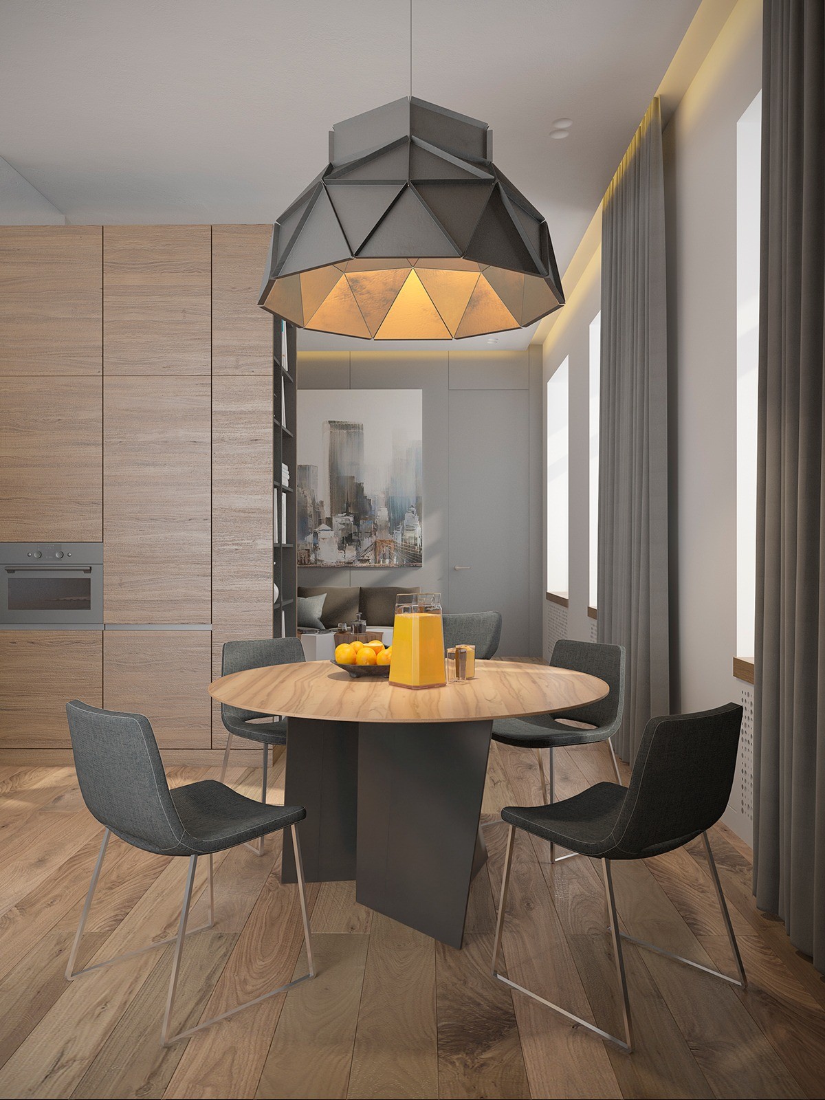
The dining area is rather cozy, capped by a huge oversized pendant lamp with a faceted geometric surface. Note the incredible rhythm created by the matte black surfaces, making the thin wooden tabletop appear light as can be.
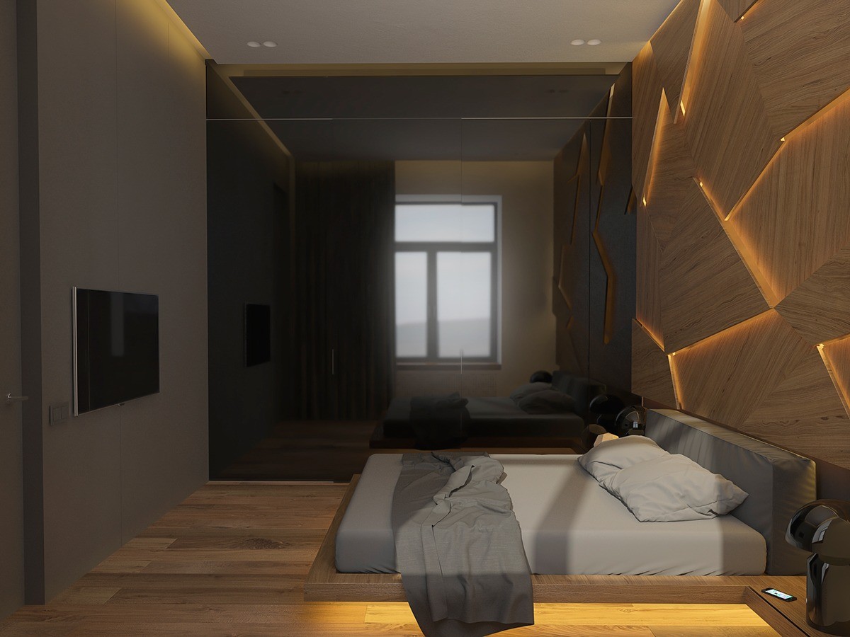
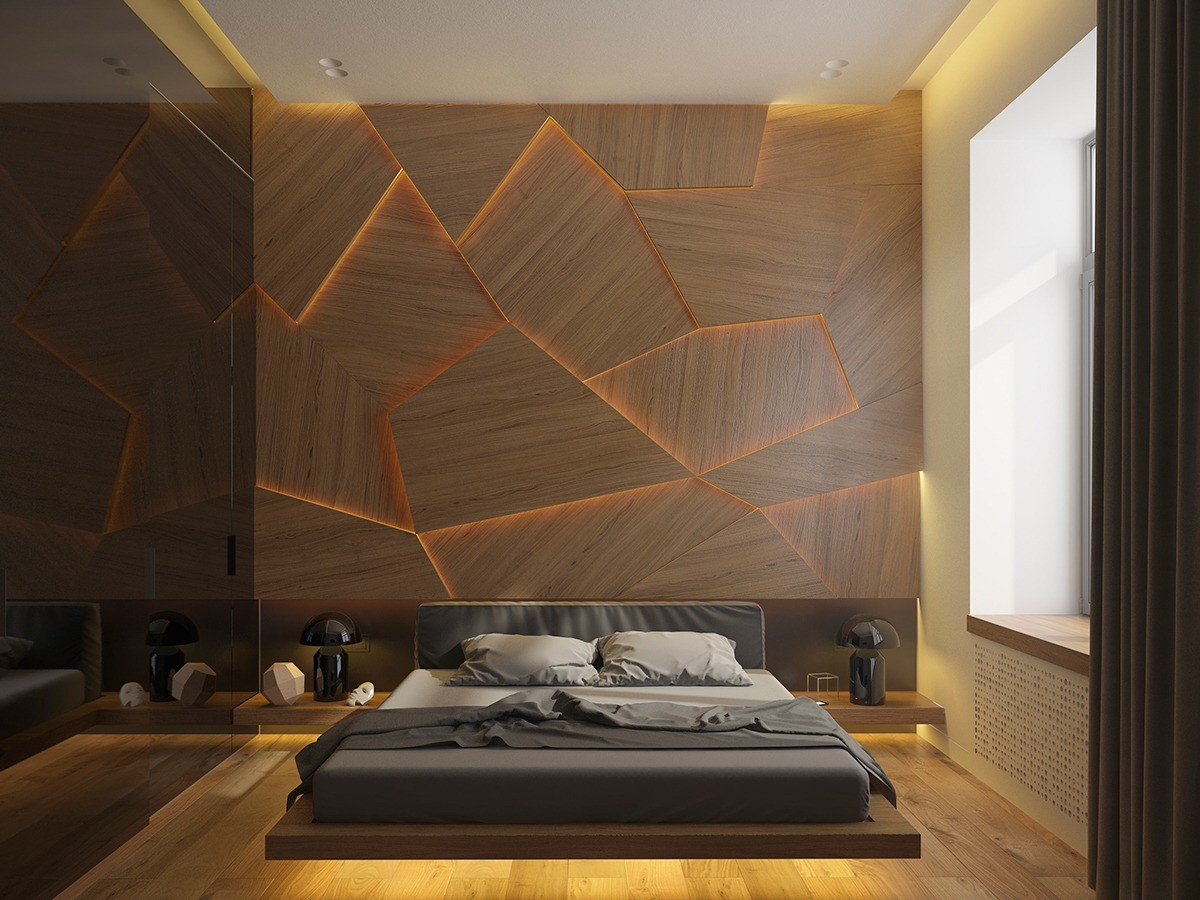
The bed itself maintains a rather low profile to preserve emphasis on the spectacular scene behind it. It rests on an even lower-profile wood platform with integrated side tables, flanked by glossy Atollo side table lamps by Vico Magistretti. A high gloss black wall reflects the scene and scatters the light.
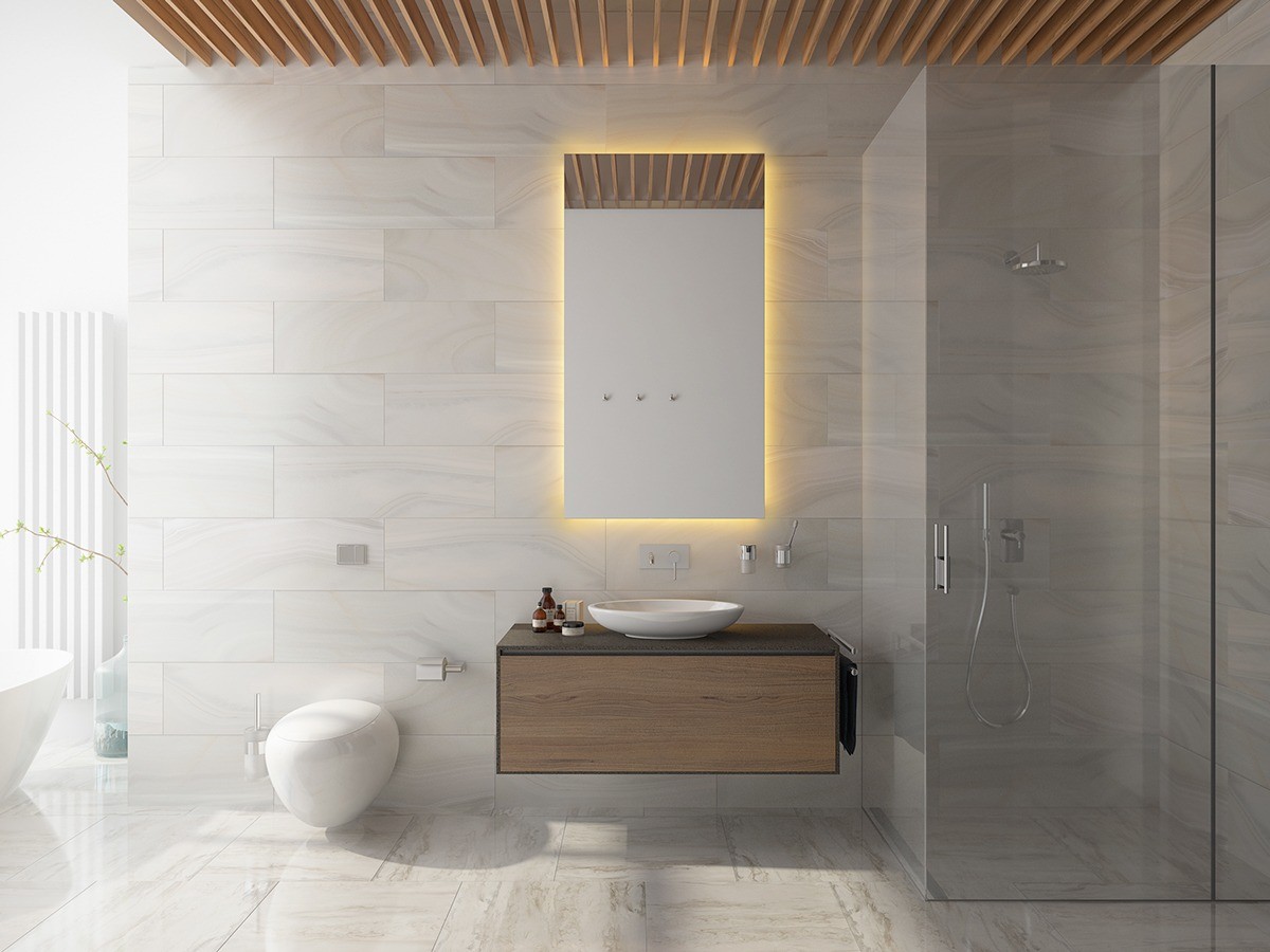
Clean marble cladding keeps the bathroom looking bright and fresh. Wood accents are used sparingly to add a touch of variety.
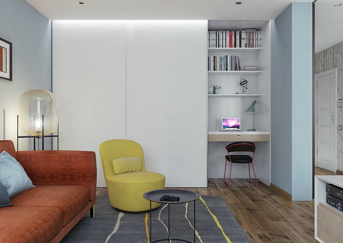
This next home takes a more organic approach to geometrically-inspired interior decor, using bright color blocks in the living spaces and subtle geometric prints elsewhere. Designer Andrew Skliarov had to fit a lot of usefulness into a 60 square meter floorplan – as evidenced by creative solutions such as the hideaway office in the background here.
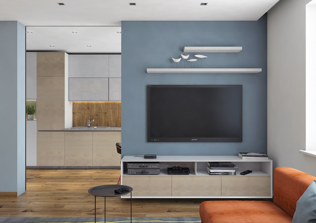
Clean lines, squared shapes, and simple materials define the living room and kitchen. It's nice to see a geometric theme expressed mostly through furniture and decor in a public area such as this, considering that wall coverings or architectural details would be harder to change as trends come and go.
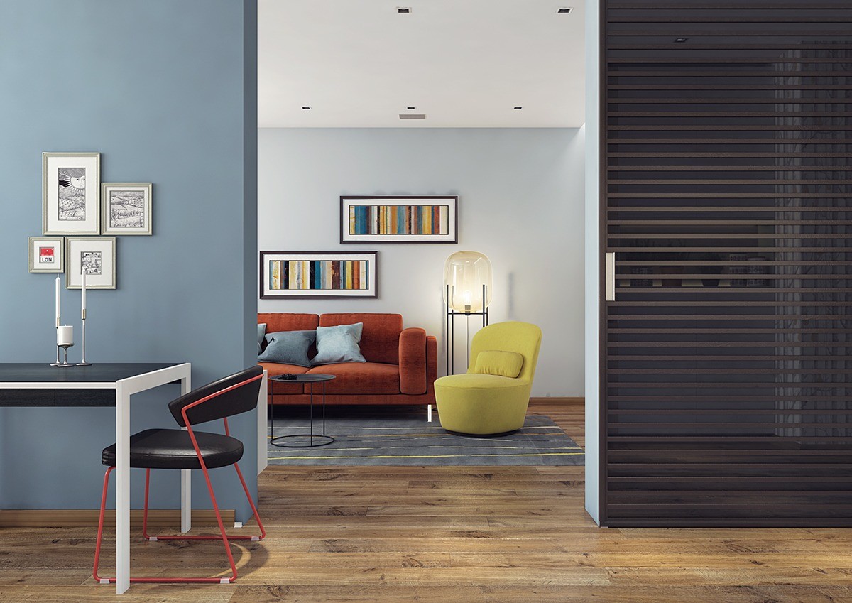
In a home with few windows, such as this small apartment, it makes sense to create extra depth by using contrasting dark and light wall colors from room to room.
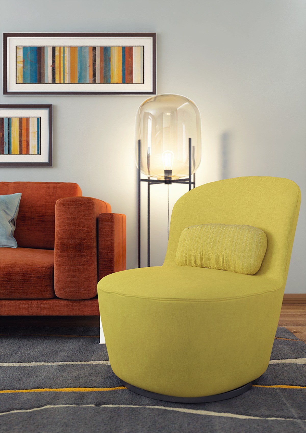
The curvaceous chair and round-edge sofa create a lovely sense of contrast against the striped prints and organic linear rug. The big Oda floor lamp by Sebastian Herkner combines the best of both themes.
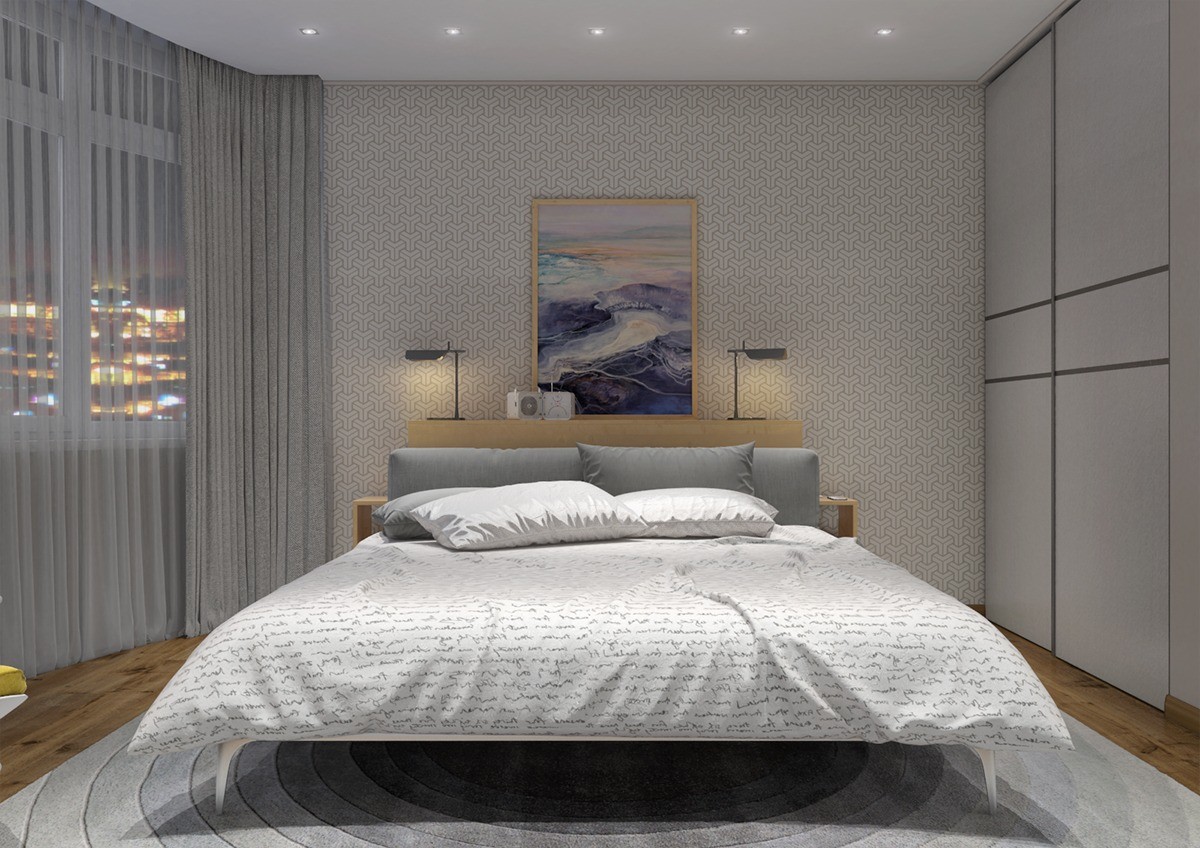
Tessellated wallpaper on the accent wall gives this room subtle geometric flavor while the concentric circles of the rug help center the eye. A bedspread printed with handwriting provides an organic offset for contrast.
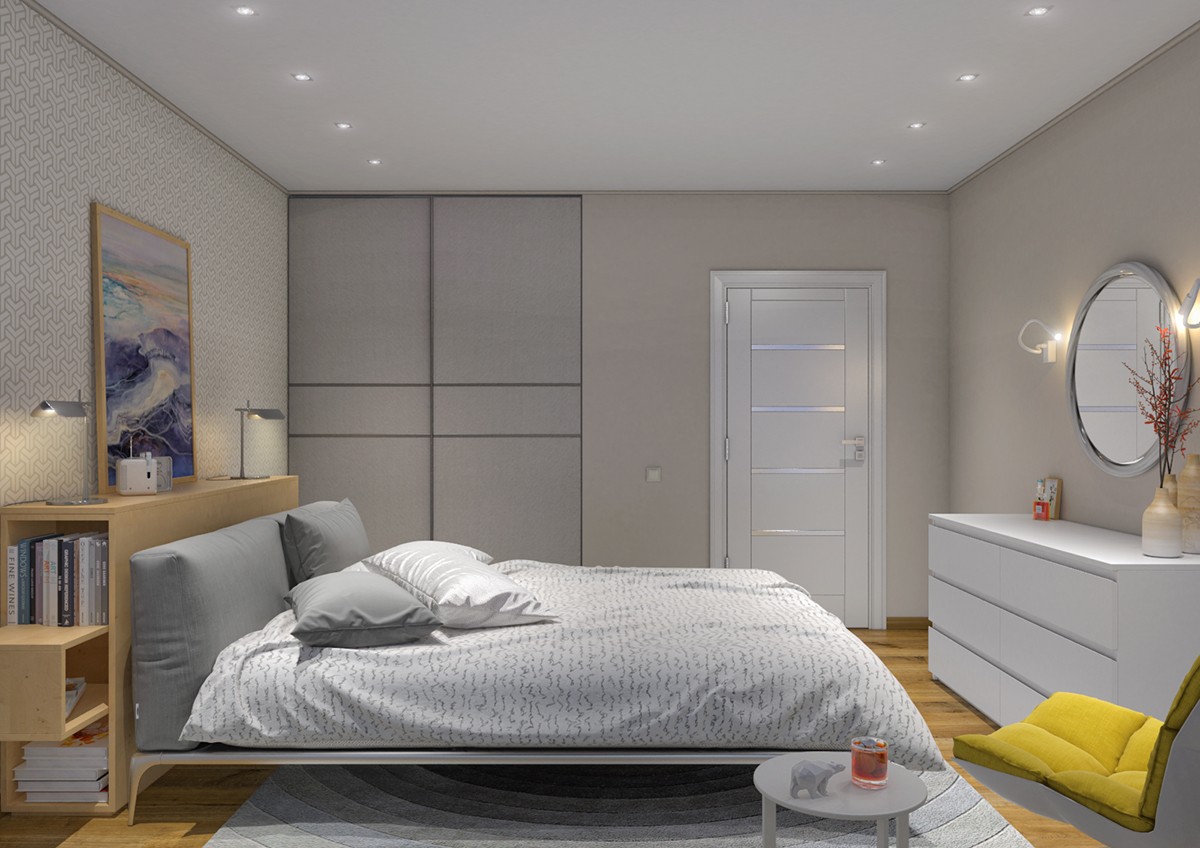
Besides the rug, other circular elements include an elegant decorative wall mirror and a convenient small side table. Here, you can also see Patricia Urquiola's iconic husk chair – a great furniture choice for any geometrically-inspired interior theme.
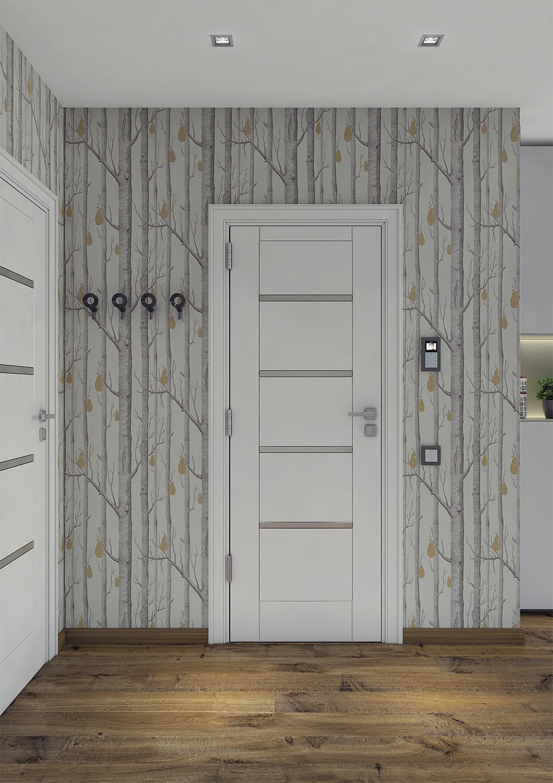
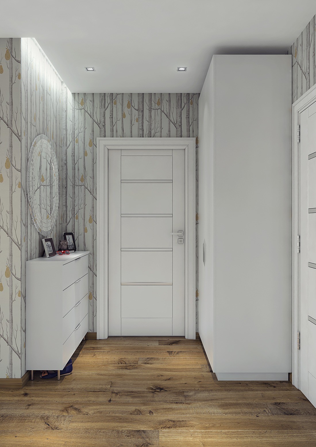
Do tree motifs count as geometric themes, perhaps because of their fractal nature? This wallpaper is gorgeous regardless and adds plenty of life to the entryway.
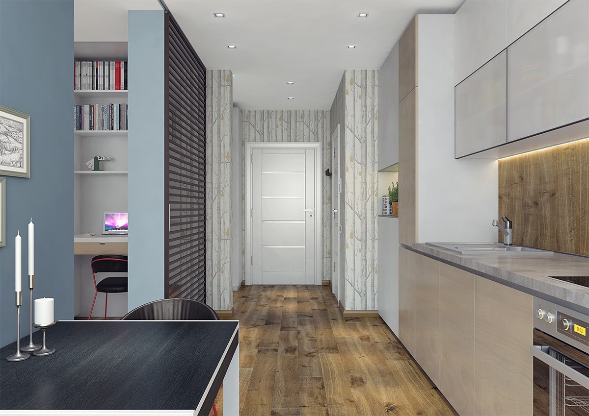
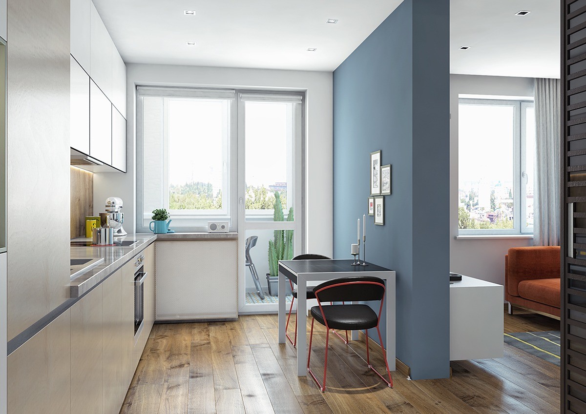
The view from the kitchen reveals a variety of natural materials.. The combination of wood colors and grain alignments offer a uniquely attractive "chaos" compared to the careful balance used throughout the rest of the home.
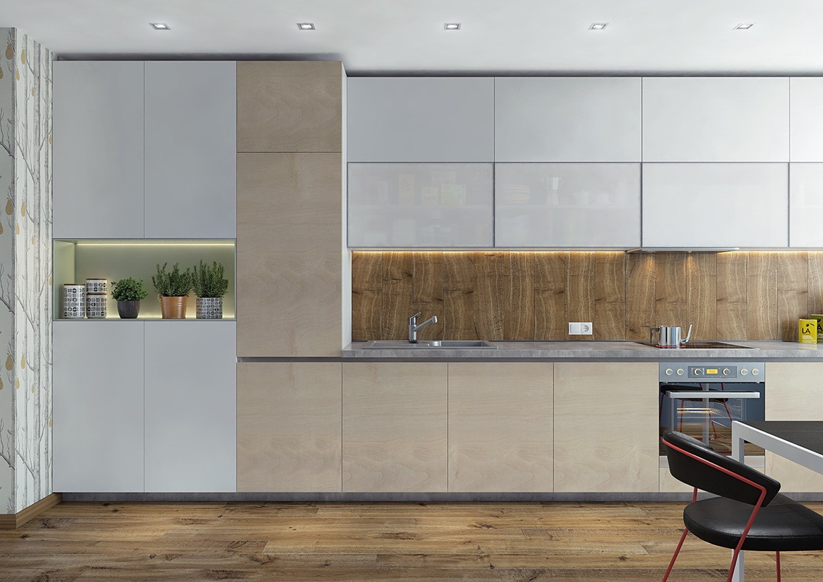
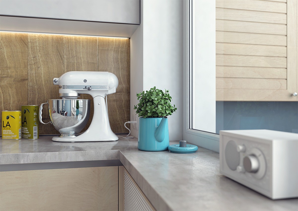
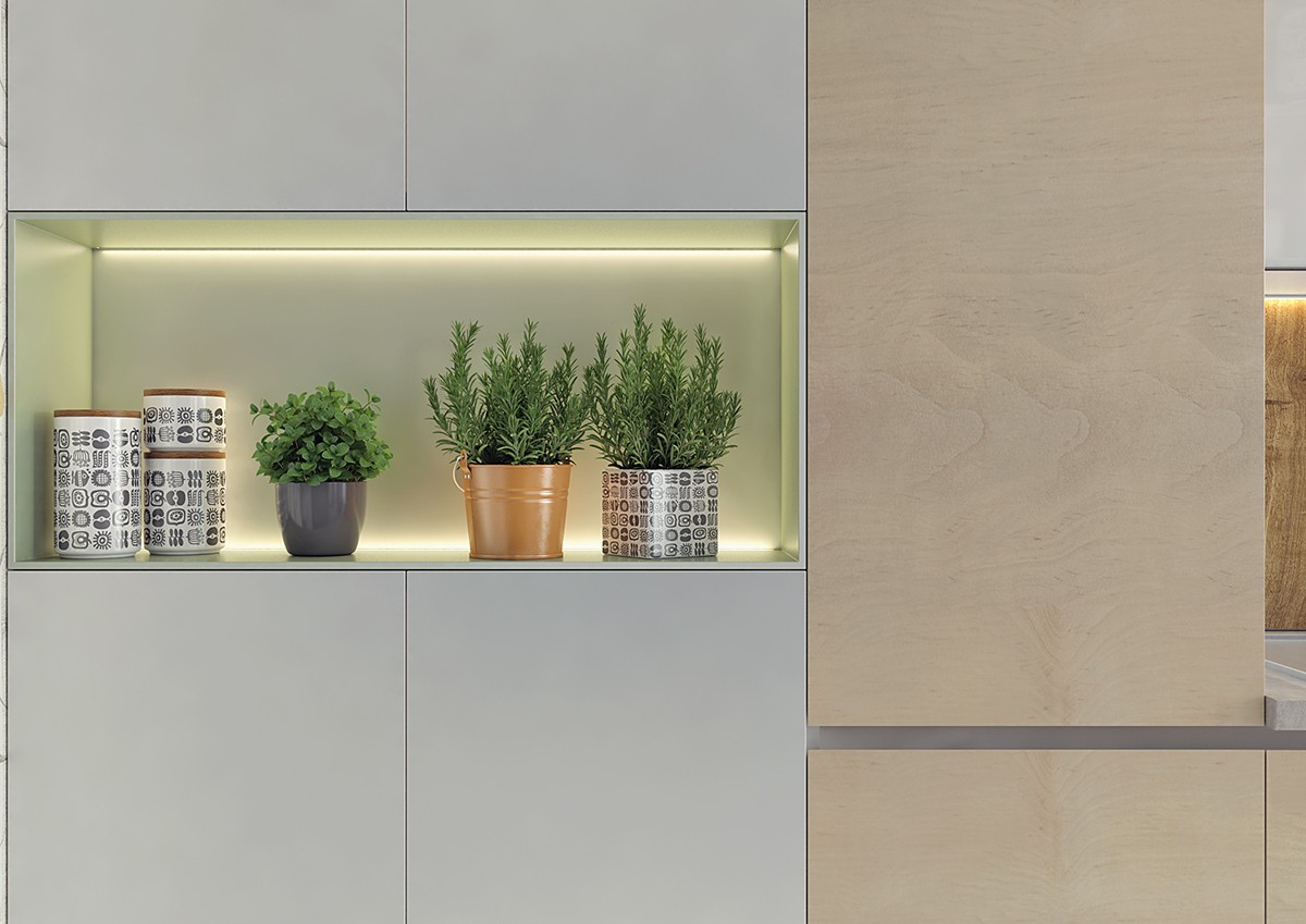
From another angle, the chaos of natural textures once again reveals itself to be part of a highly coordinated and well-measured composition.
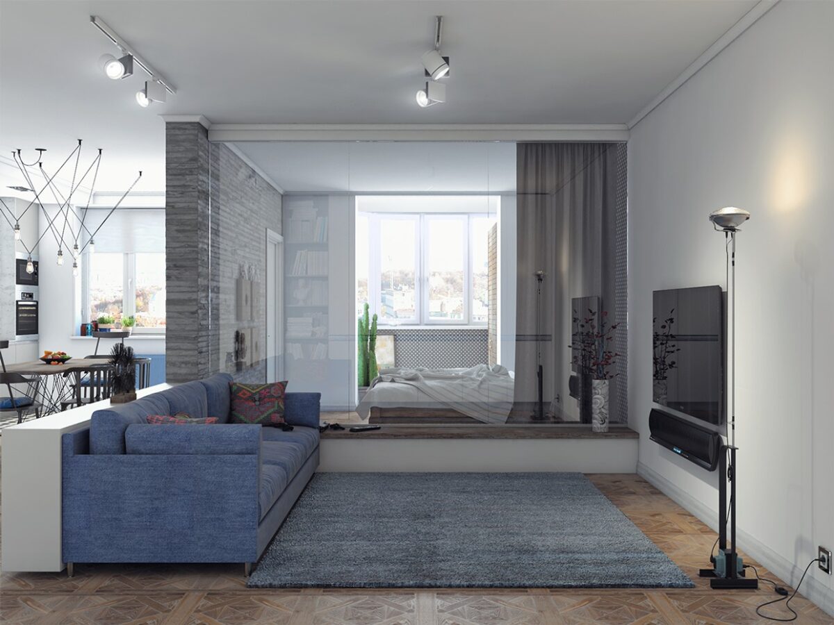
This final home started as an open loft-style plan but the designer chose to give the bedroom its own separate space. Careful attention is paid to lighting and layout in order to accommodate this division in a relatively small area just above 50 square meters.
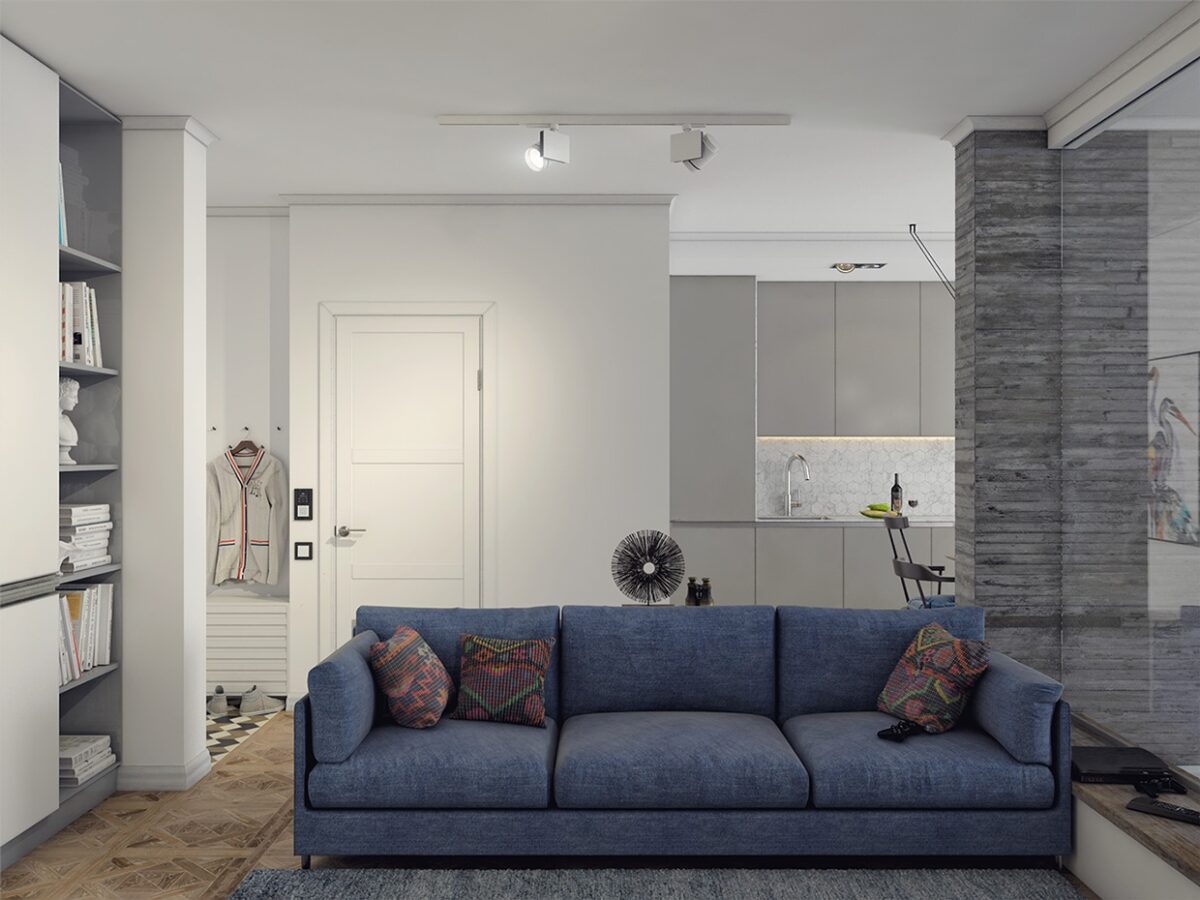
Geometry-inspired decor influences are limited to details. Small and subtle patterns are less likely to overwhelm the eye, so the designer saved the most eye-catching pieces for private spaces.
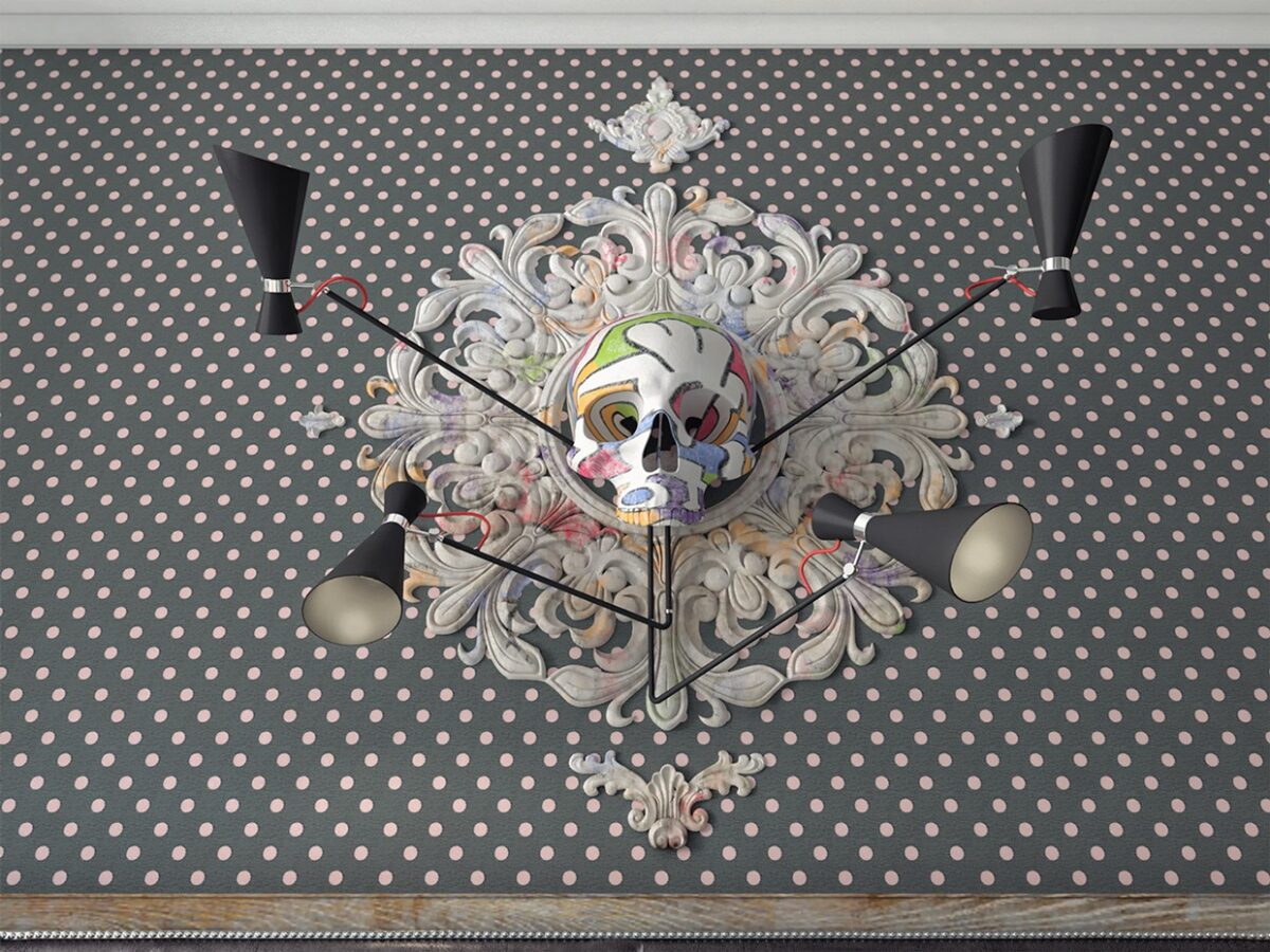
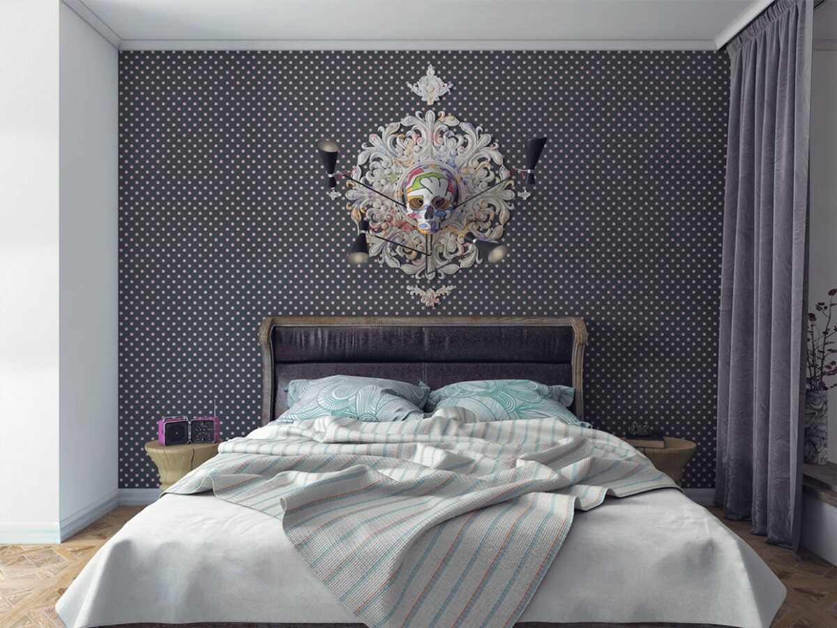
The centerpiece above the headboard is an original creation by Andrew Skliarov, composed of a painted gypsum skull and rosette, illuminated by Simone lamps from Delightfull. The design is intended to reflect the artistic interests of the clients - specifically Renaissance and Vanitas era art.
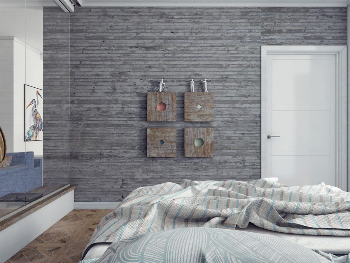
The bedroom is bright and brilliant. Because it stands between the entertainment area and one of the few windows, it serves as a kind of window itself. A large glass wall lets the light filter through into the home proper but can be covered by roll-down shades when the need for privacy emerges.
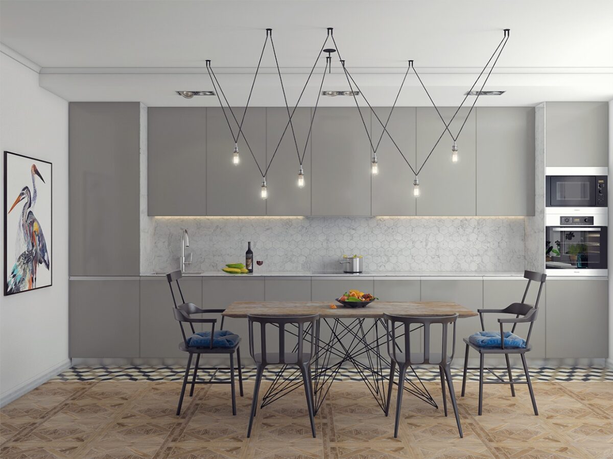
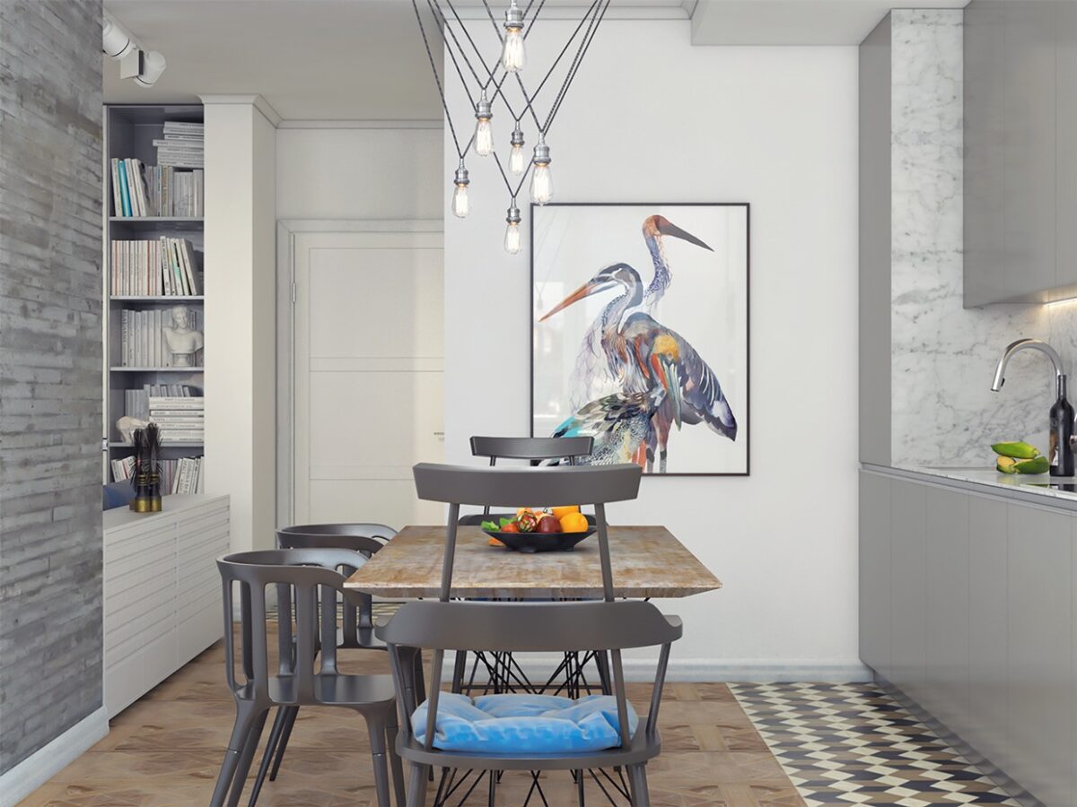
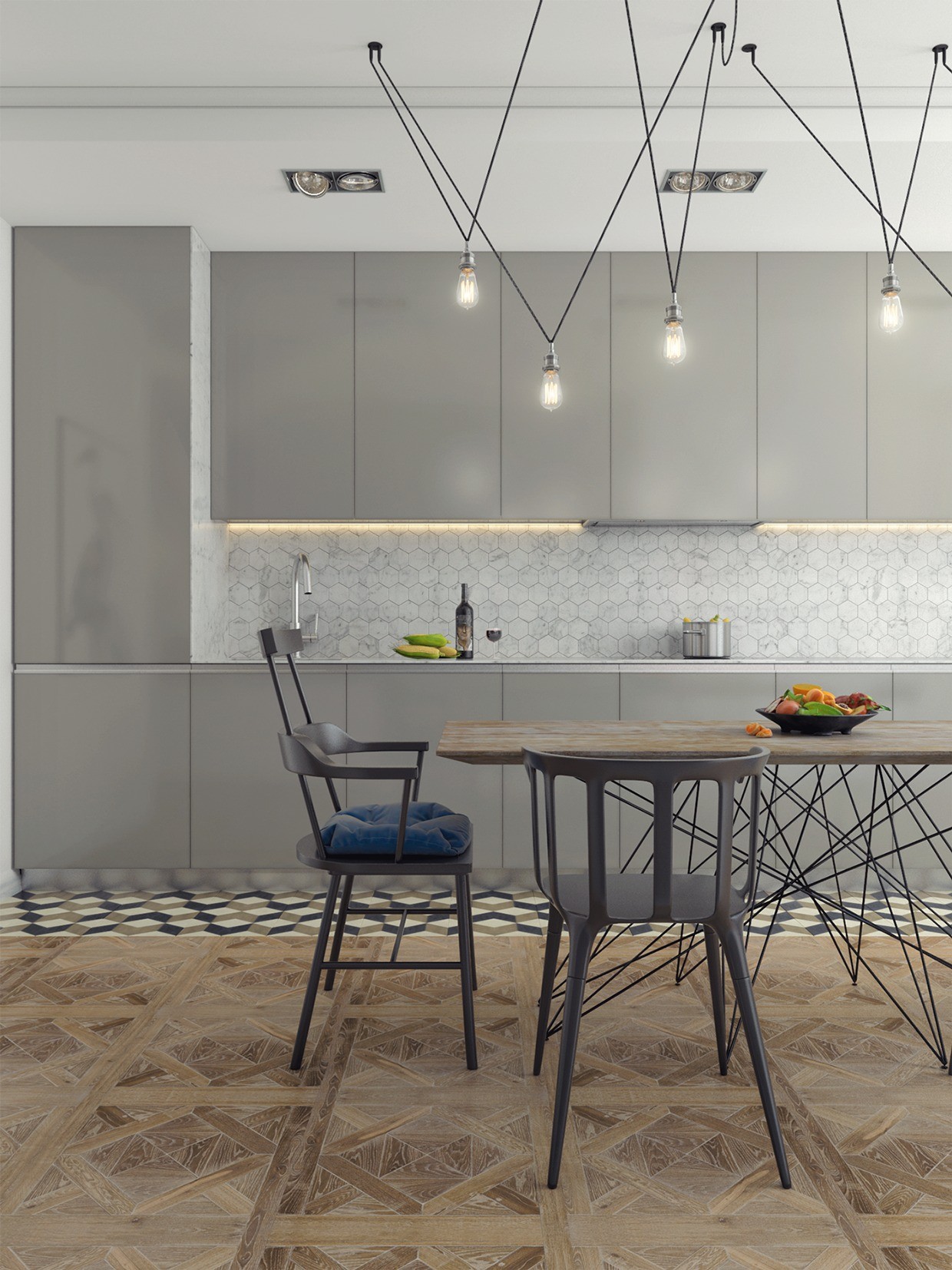
While the rest of the home is light on geometric details, the kitchen and dining areas utilize a theme based almost entirely around symmetric patterns and coordinated lines. Angular hanging MATCH lights by Jordi Vilardell & Meritxell Vidal flawlessly echo the wire leg table below.

