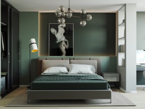
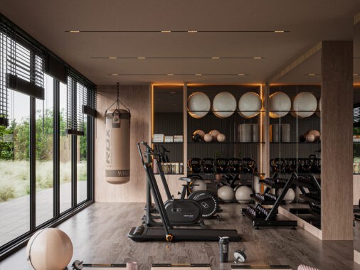
Carefully scaled furniture and smart arrangement schemes are two well-known ways to deal with small floor plans. But color plays an important role in perceived spaciousness too! Using color everywhere can create a quirky and homey aesthetic, but in some cases, the visual busyness can make an already cramped space feel even smaller than it really is. The small apartments showcased here make the best use of their under-50-square-meter layouts by relying on monochromatic palettes for a streamlined appearance, but what makes these spaces unique are the clever pops of energetic color used throughout.
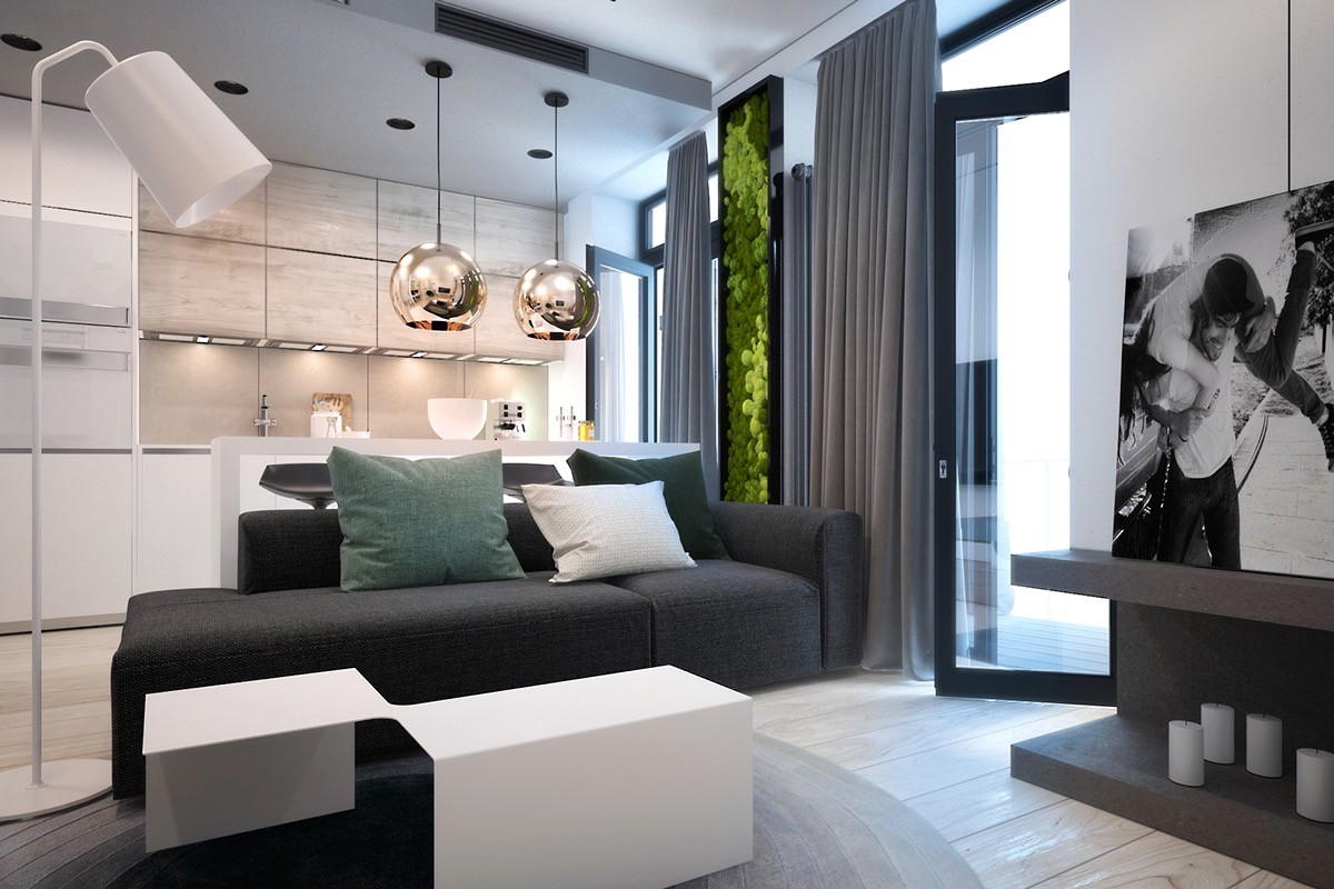
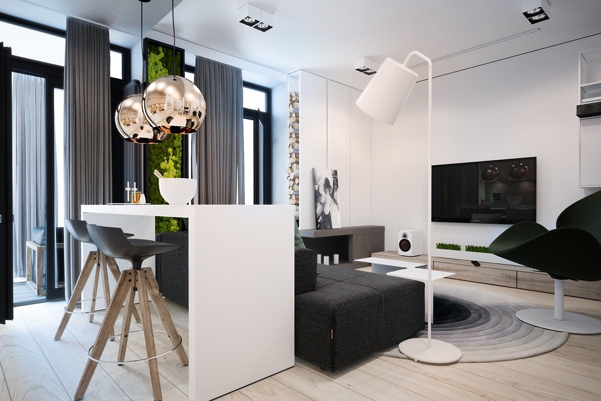
This interior, designed for a young family in Kyiv, features a grayscale color scheme and smart simple furniture. But it doesn't feel like the typical monochromatic minimalist space. The occasional splash of green makes all the difference. The centerpiece – a moss garden reaching from the floor to the ceiling – gives this home a verdant and youthful attitude very fitting to the client specifications.
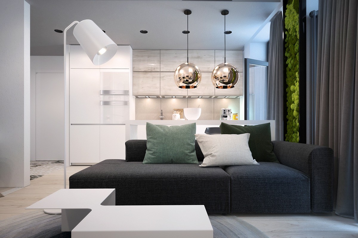
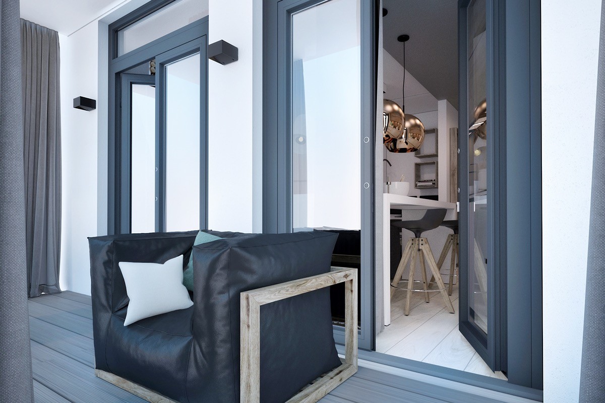
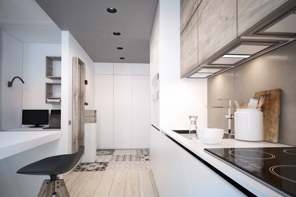
Polished brass pendant lamps coordinate with the wood cabinets and cream backsplash in the kitchen. The warm hues also provide a surprisingly pleasant contrast to the textural greenery found throughout the living room.
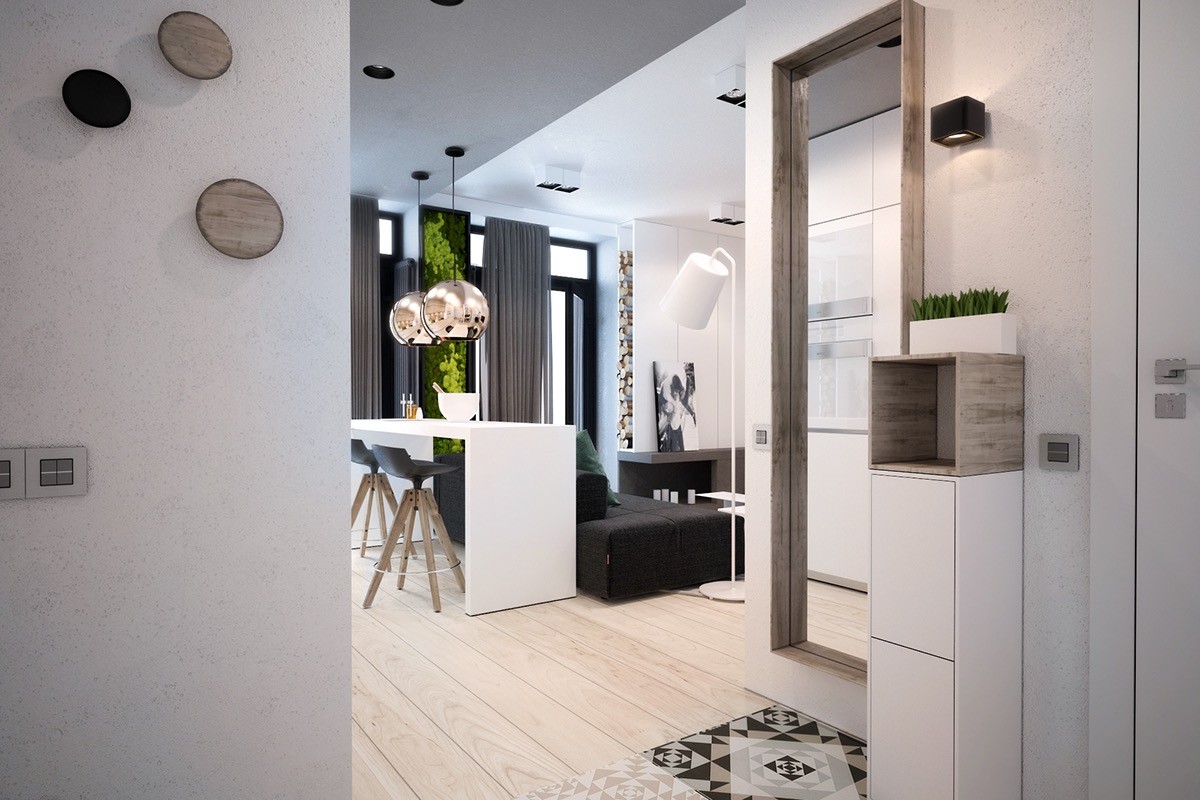
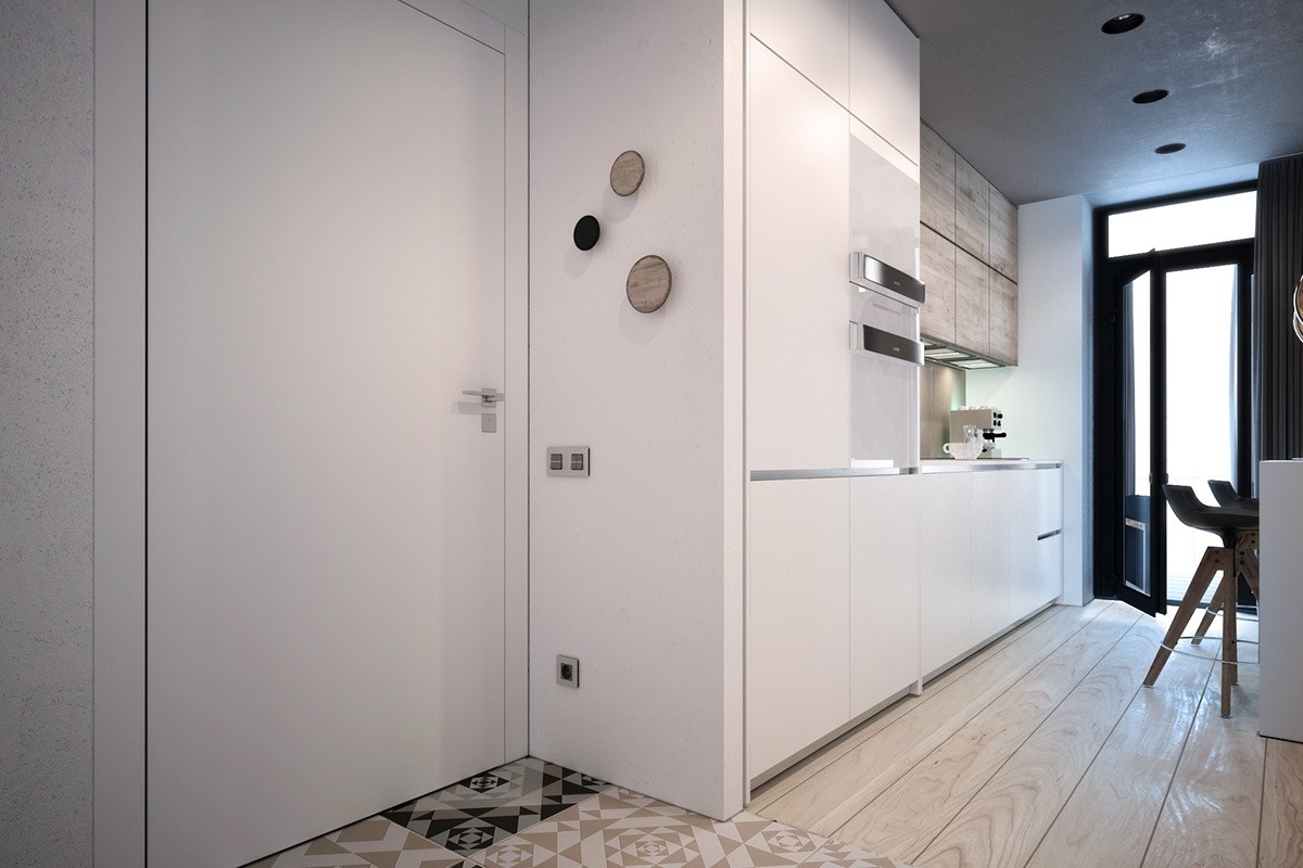
Unfinished wood mirror frame, shelf, and wall decorations make the white hallway look chic as can be. The recurring natural themes are subtle but add a necessary touch of fragility to an otherwise strong urban home design.
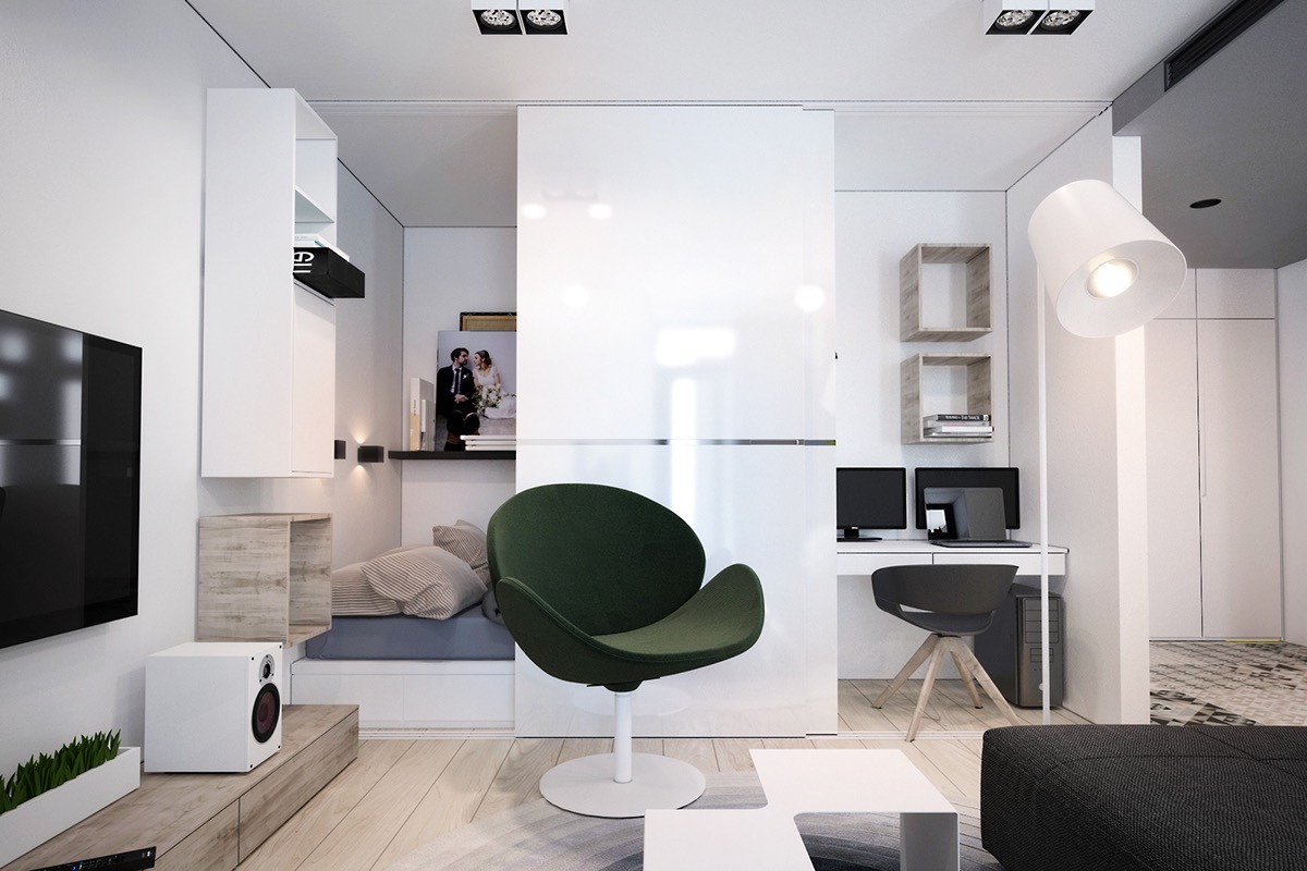
A cube containing the bedroom and office employs a few creative techniques to maximize space and privacy. A sliding door can hide either or both spaces when not in use, allowing the rest of the room to look lighter and more spacious. The mattress is elevated on a white platform with storage underneath.
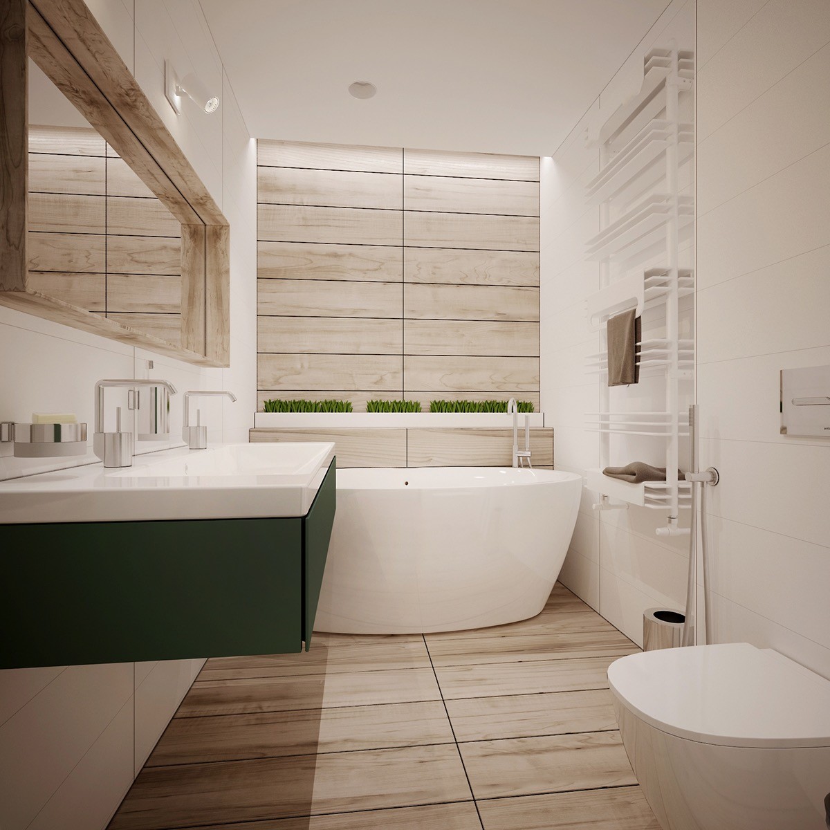
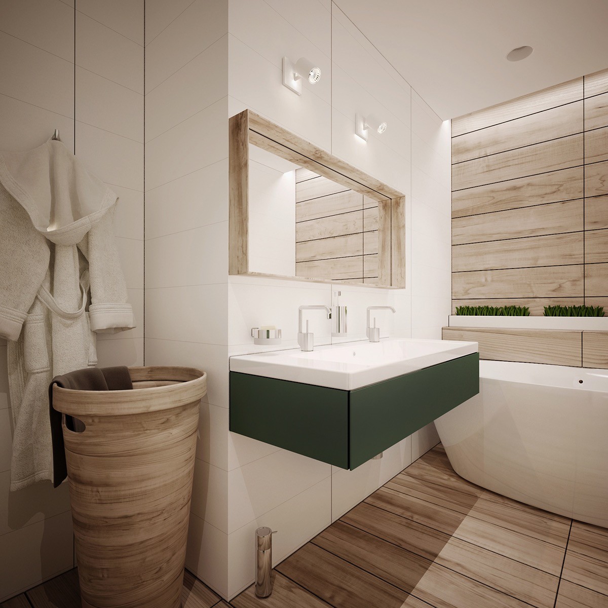
The bathroom is especially gorgeous! Wood tile clads the far wall and the floor sandwiched by white tile on either side, a clever arrangement that makes the room look more elongated. The freestanding tub is extra compact and makes up for the lost legroom with plenty of depth, backed by a long white planter filled with tranquil grass – the same type tucked into cute spaces throughout the rest of the house.
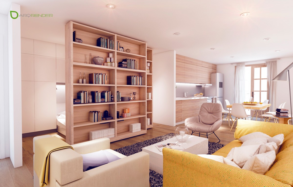
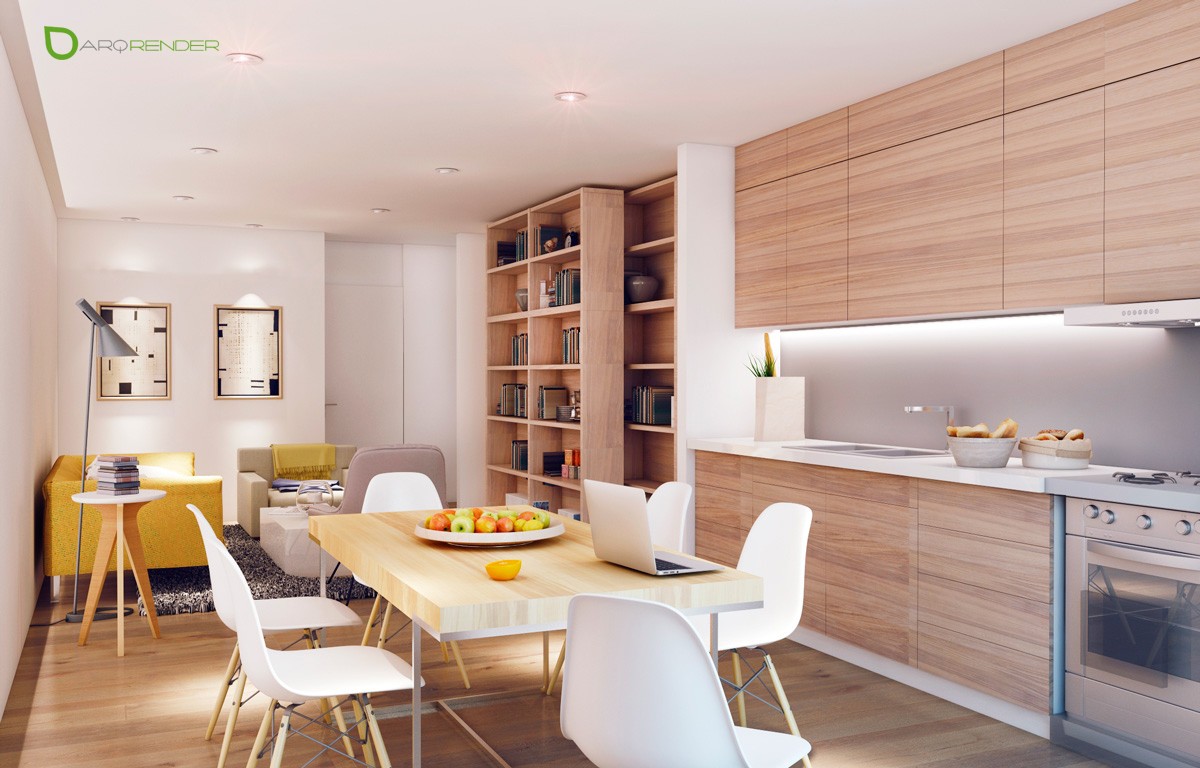
Bright and cheery, this yellow interior concept has only has one window, making the application of happy colors so much more important. To prevent the wood from absorbing too much light, the designer chose a slightly reflective satin finish for irresistible sheen. Cool sliding bookshelves hide the bedroom and ensure that not a single inch of square footage goes to waste.
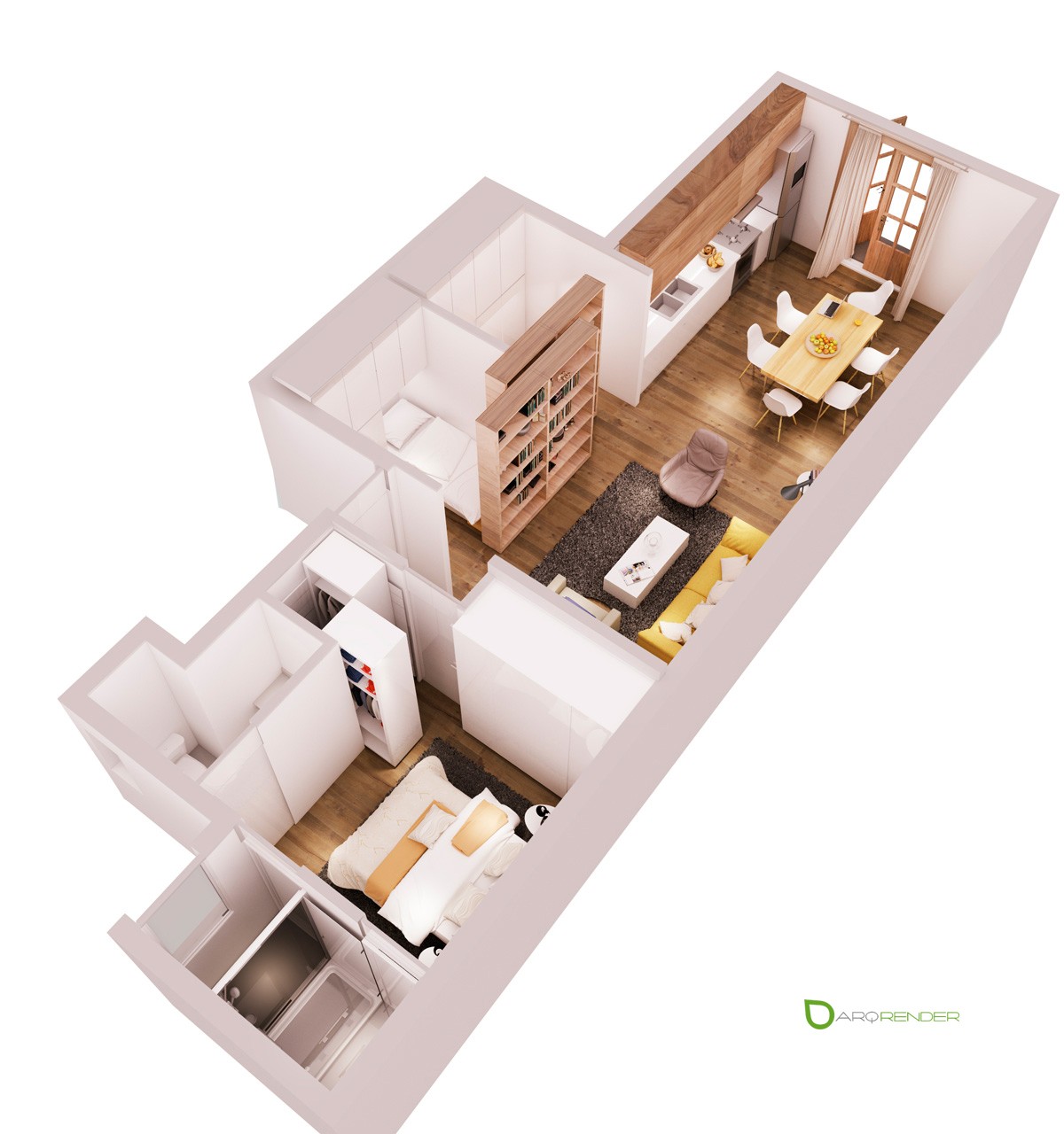
The floorplan demonstrates just how compact this concept really is. Note the generous use of sliding doors and panels to save space – even the bedroom closets slide in and out like large vertical drawers.
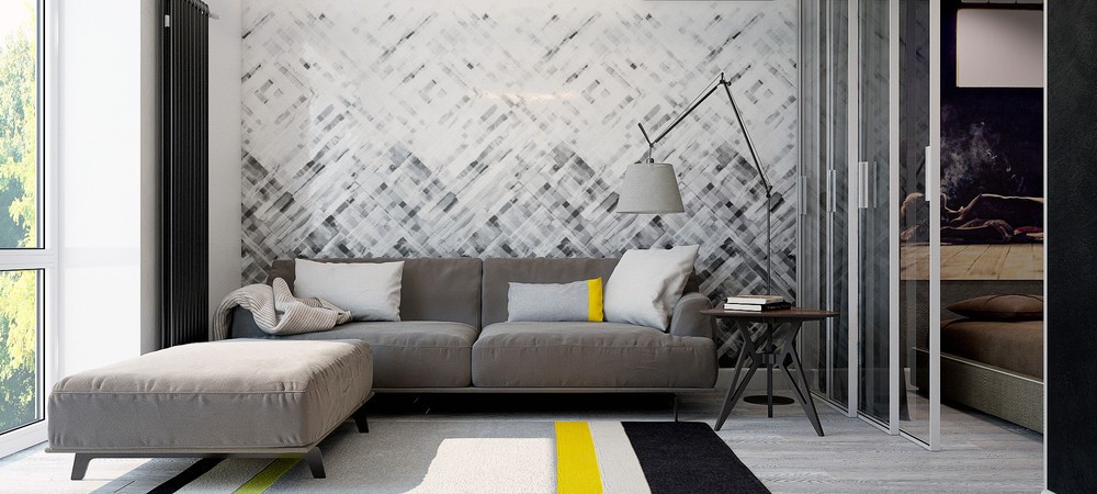
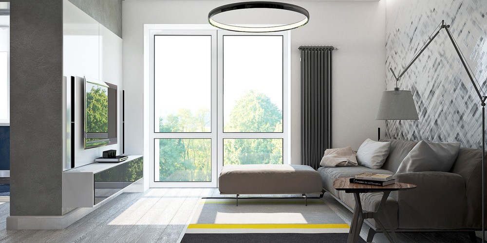
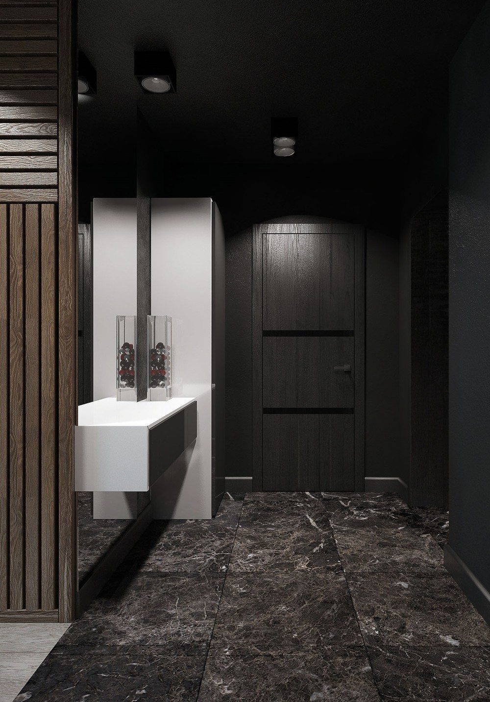
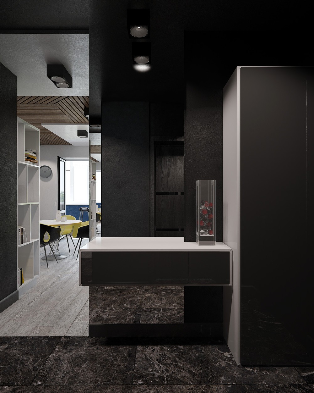
Designed for a young man in Moscow, this studio apartment uses a mostly-grayscale color scheme brought to life by shots of brilliant yellow – and it doesn't shy away from using bold textures and prints wherever possible.
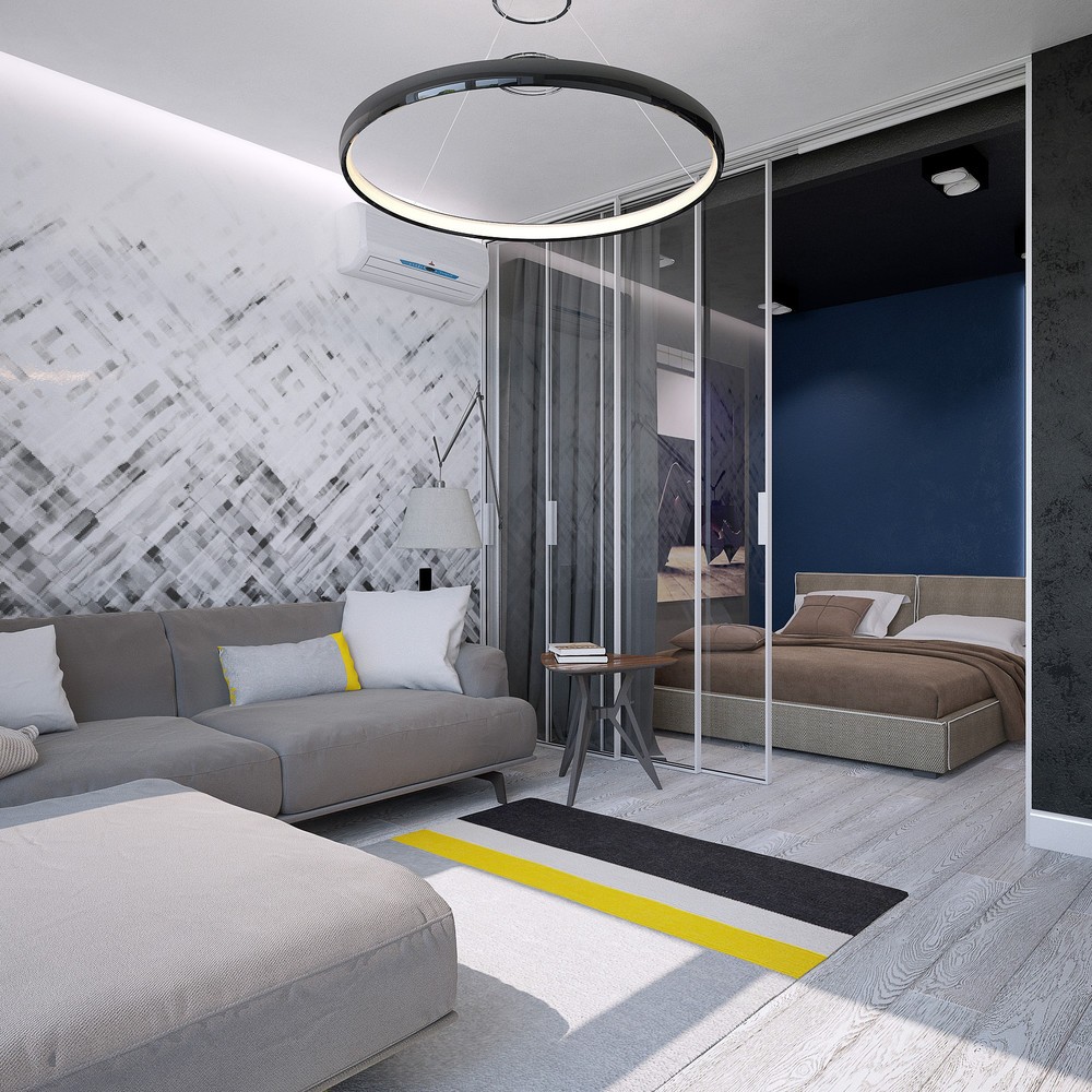
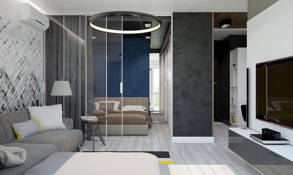
A ring-shaped pendant light and triangular side table adds a touch of geometric variation to a room based largely on rectangles and lines. The white edges on the glass bedroom panels look amazing when the divider is fanned open.
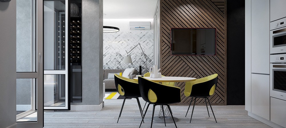
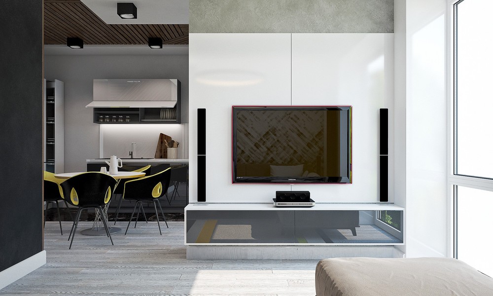
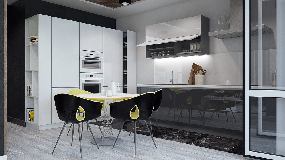
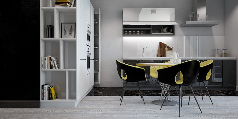
The dining room continues the yellow theme. Isamu Noguchi's Cyclone dining table offers a touch of industrial appeal, surrounded by the distinctive Ginger Ale Armchair from Roberto Lazzeroni upholstered with coordinated perfection.
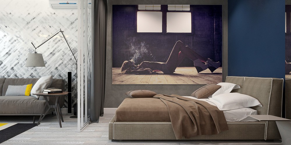
The bedroom faces the sitting room, separated by a glass wall with a sliding privacy curtain. The color scheme in this room is more sensual: royal blue, violet, and coffee.
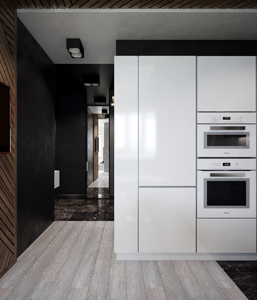
A compact kitchen unit integrates all the necessary appliances, plus plenty of room for storage. This is also a great angle to view the dramatic transition from dark marbled tile to ash gray wood flooring.
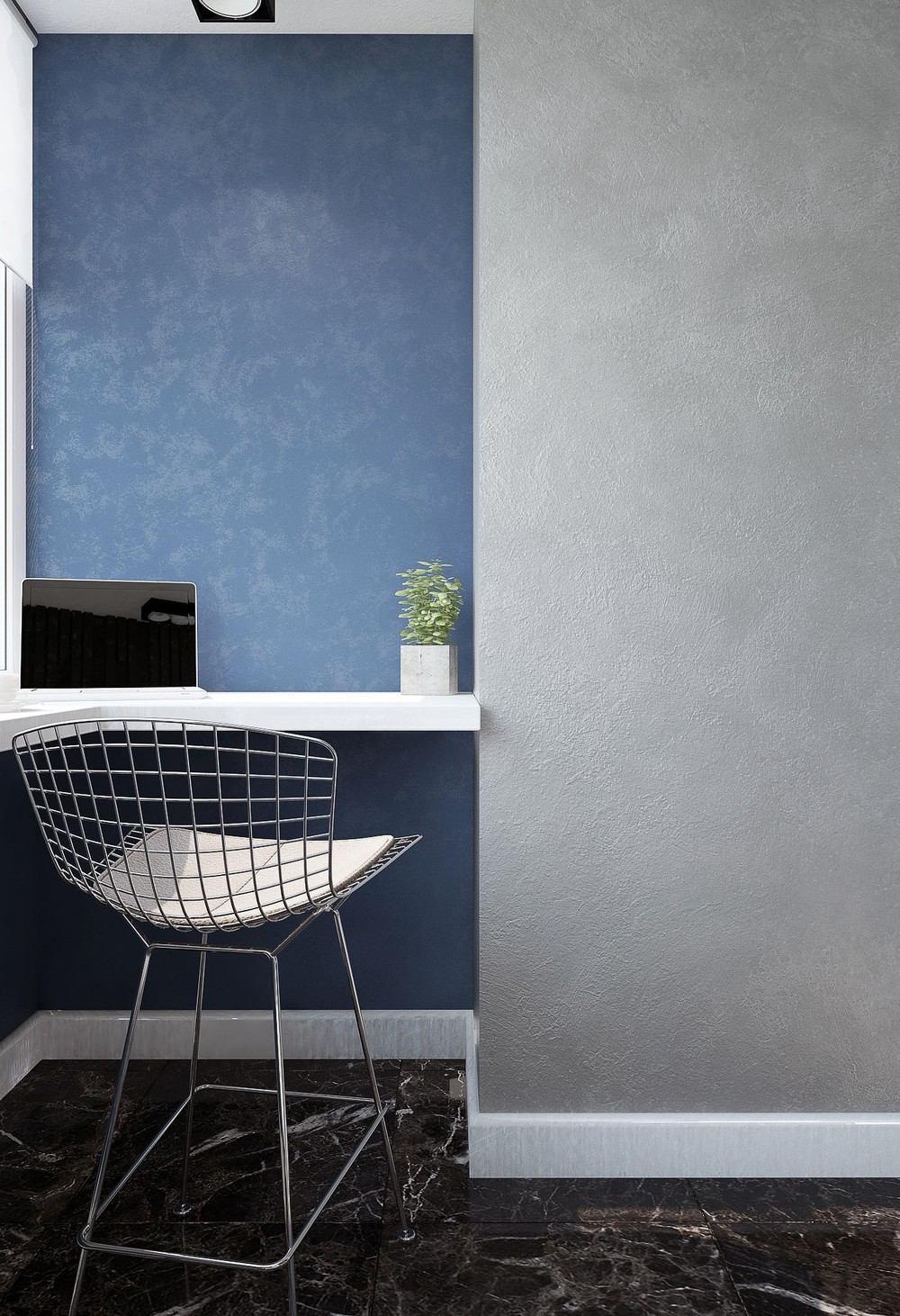
The office breaks the theme of black, white, and yellow with a splash of comforting blue, more comparable to the bedroom than any other room.
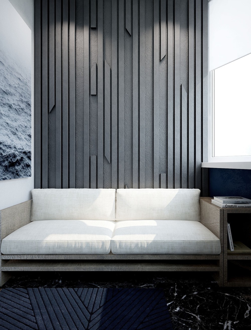
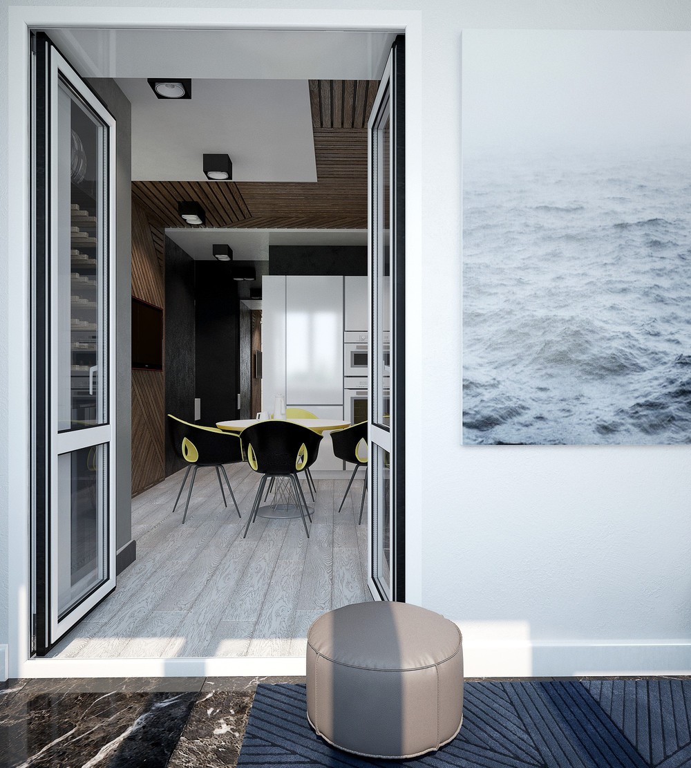
The ocean print and subdued colors – combined with a strong textural accent wall – would surely help foster a relaxed and casual home office environment.
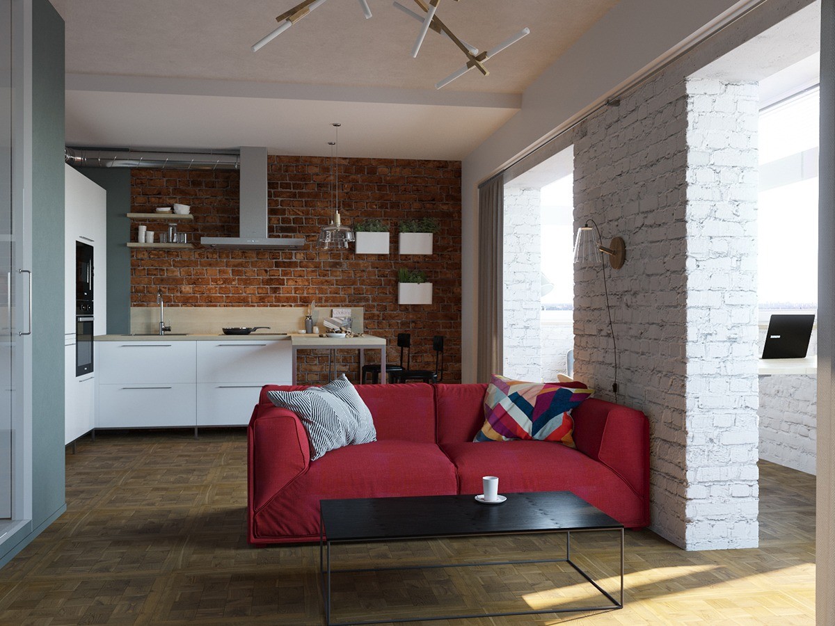
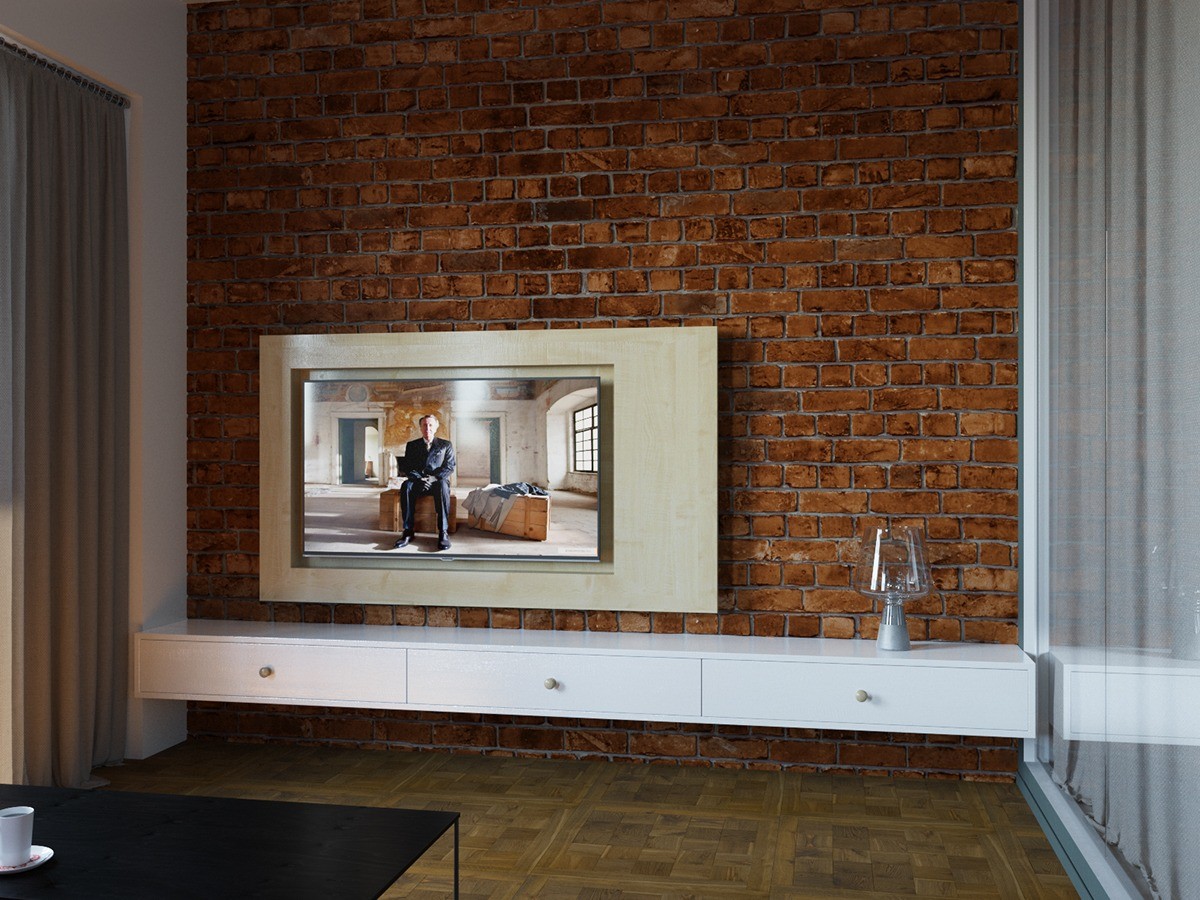
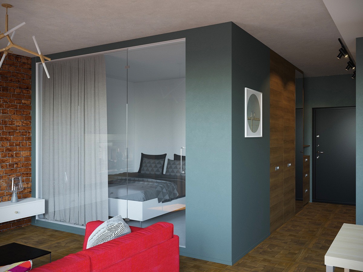
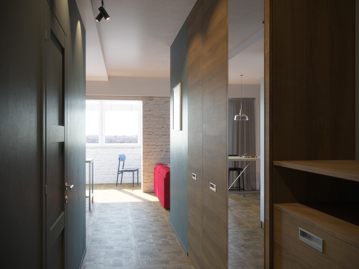
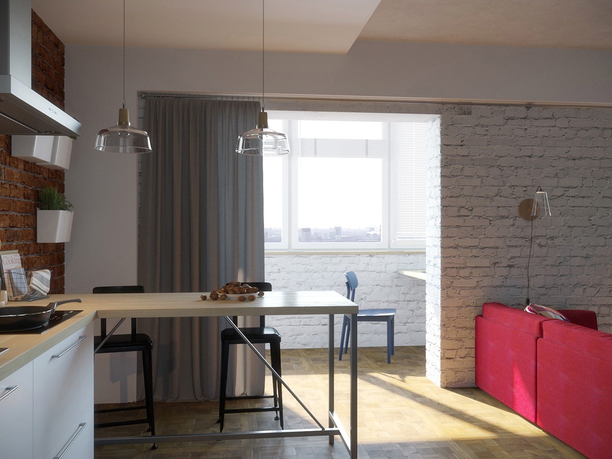
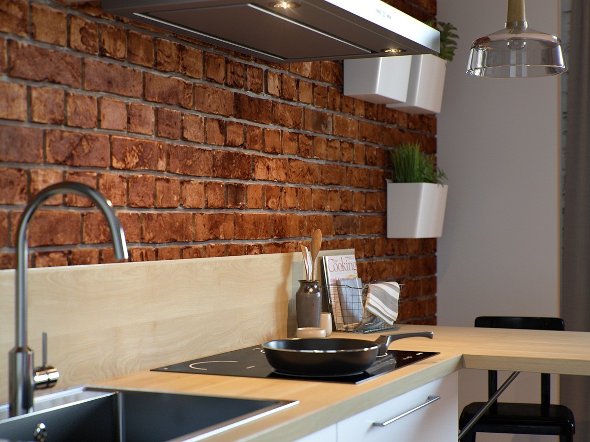
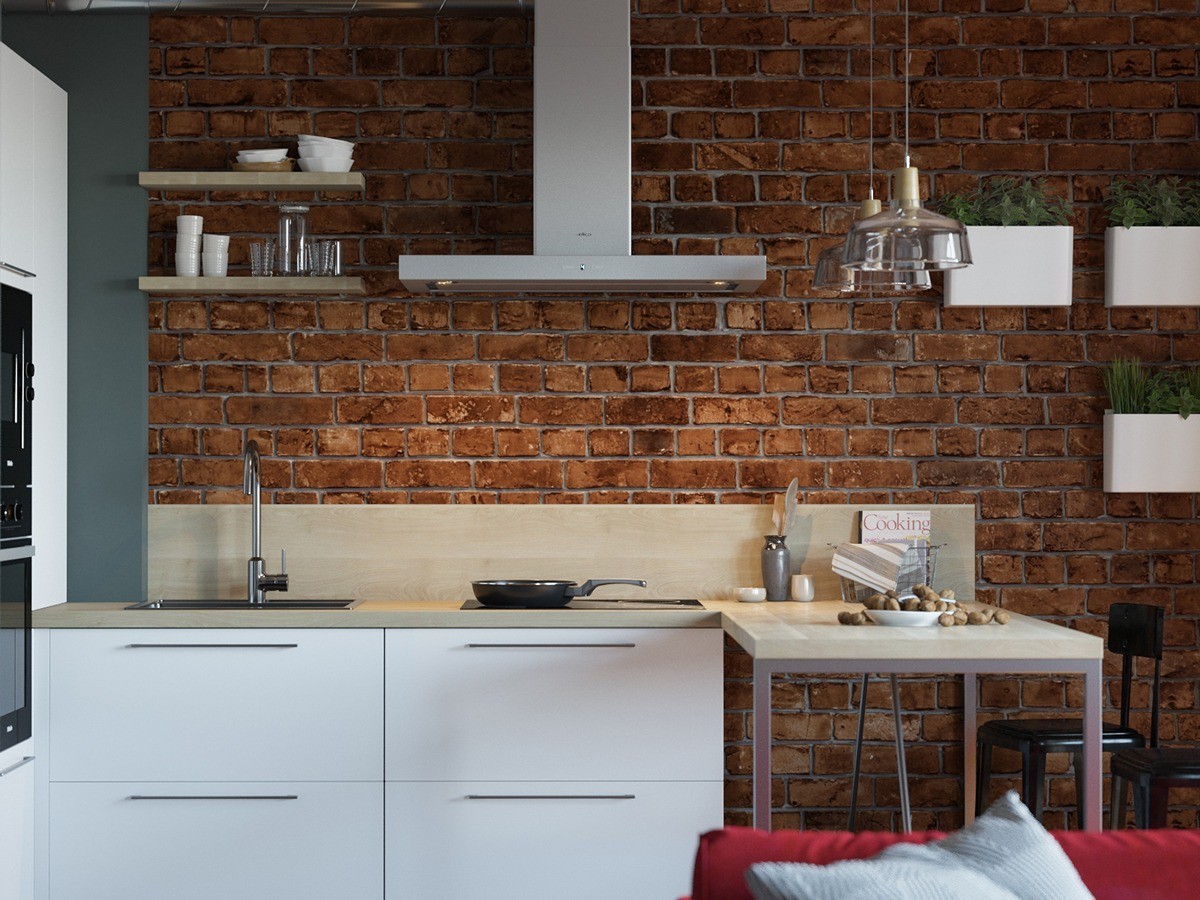
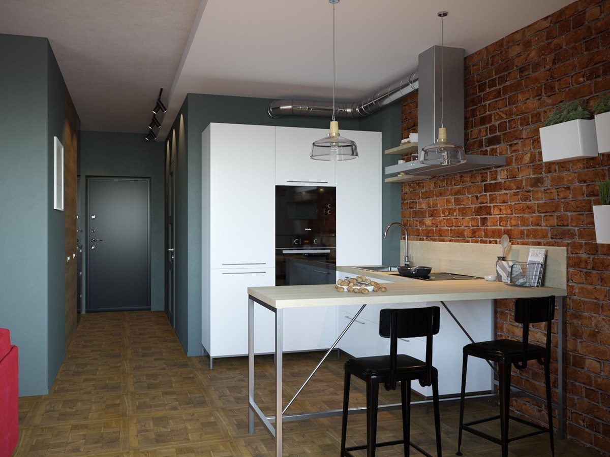
Clocking in at just under 35 square meters, this small apartment takes advantage of its unique architecture and layout in a few inspiring ways. Parquet flooring and rough brick set the scene – accented with a bright red couch and contrasting steel blue accents. The overstuffed red couch creates a kind of "signature look", distinctive and casual.
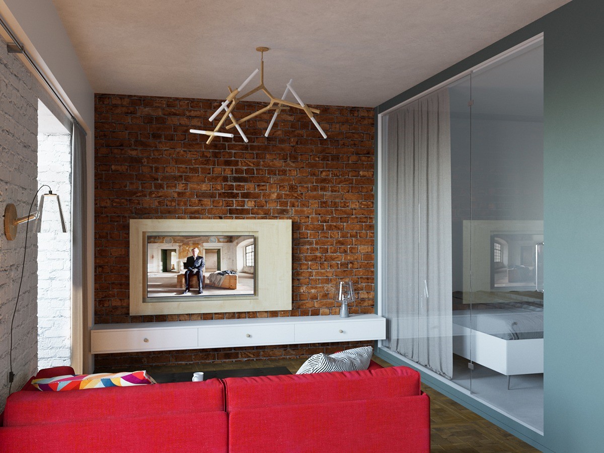
The cantilever pendant lamp looks quite similar to the Agnes line from Lindsey Adelman, an organic branching chandelier with modular construction.
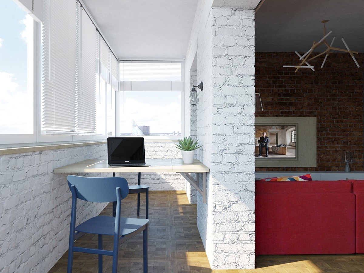
A small office resides on an open sun room. Suspended in the center of the room between the walls, the desk enjoys plenty of space ahead and behind, easily avoiding the small room dilemma that causes many designers to simply push the workspace against a wall. The free and uncluttered atmosphere would certainly help boost concentration.

