Haven't you always admired homes with gorgeous floor-to-ceiling windows? They make it seem so easy to integrate natural decor elements because the real thing is right there, behind nothing but a pane of glass. Each of the following homes place a heavy emphasis on natural elements but each one takes a different approach. The first utilizes organic Scandinavian inspired accents, the second highlights its natural surroundings via stark modern contrast, and the third opens itself up to the world outside through unique transparent architecture – and all three make fantastic use of full length windows.
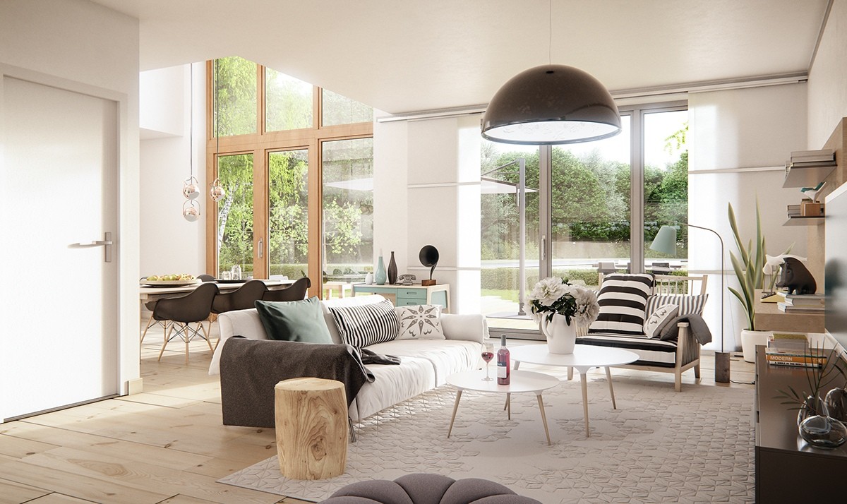
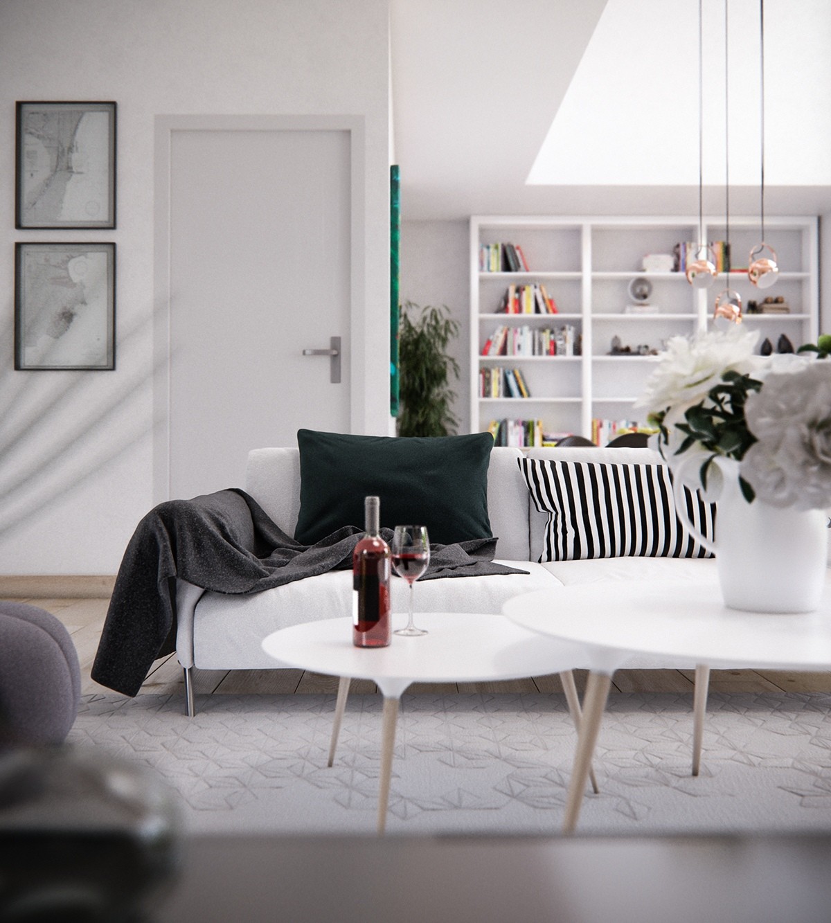
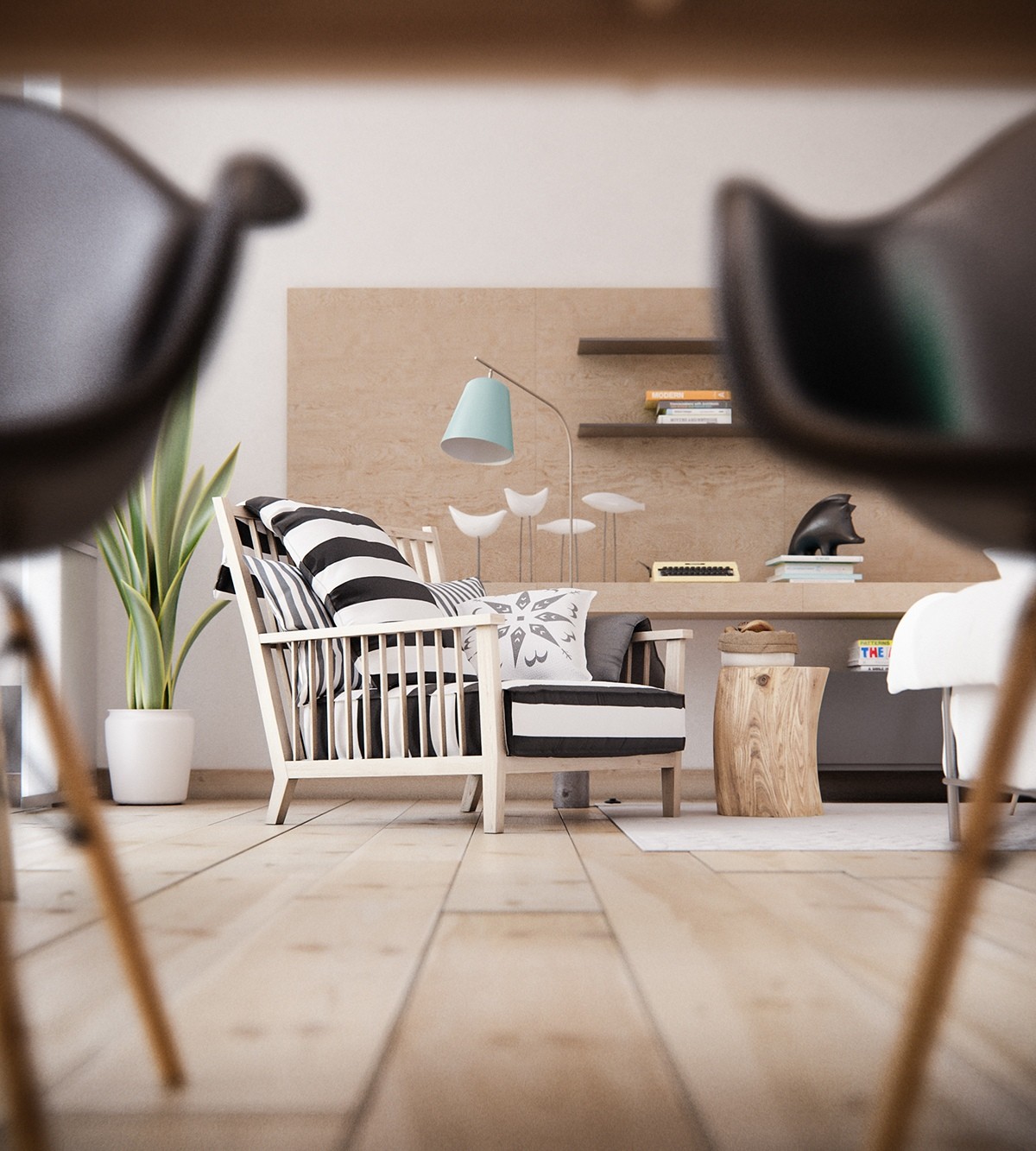
Everything about this interior concept by Mooneye is fun, quirky, colorful, and undeniably Scandinavian. Soft pale teal combines with natural wood accents and expanses of white to form a cohesive and comfortable interior anyone could love.
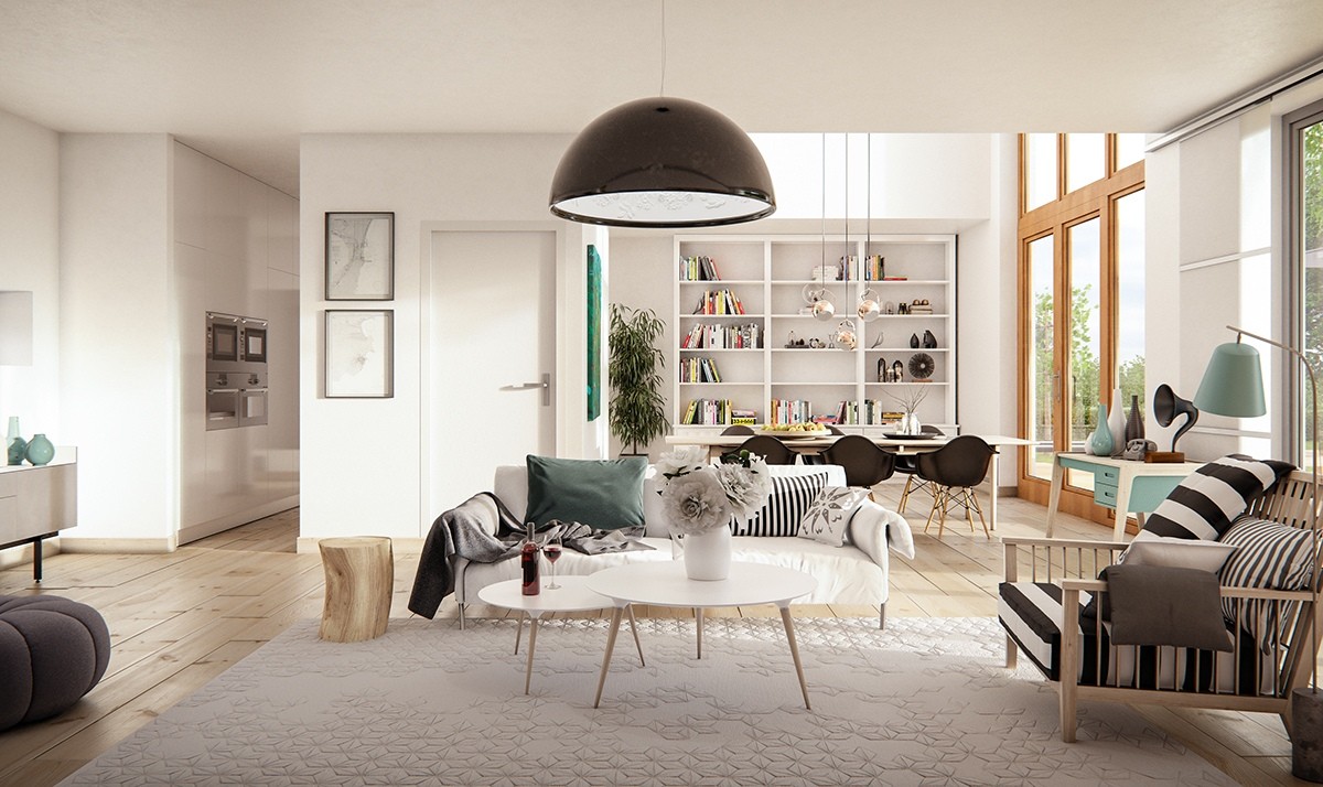
Bold black and white patterns create points of interest throughout, balanced in such a way that no singular object stands out too much above the rest – just one of many visually engaging elements to keep the winter blues at bay.
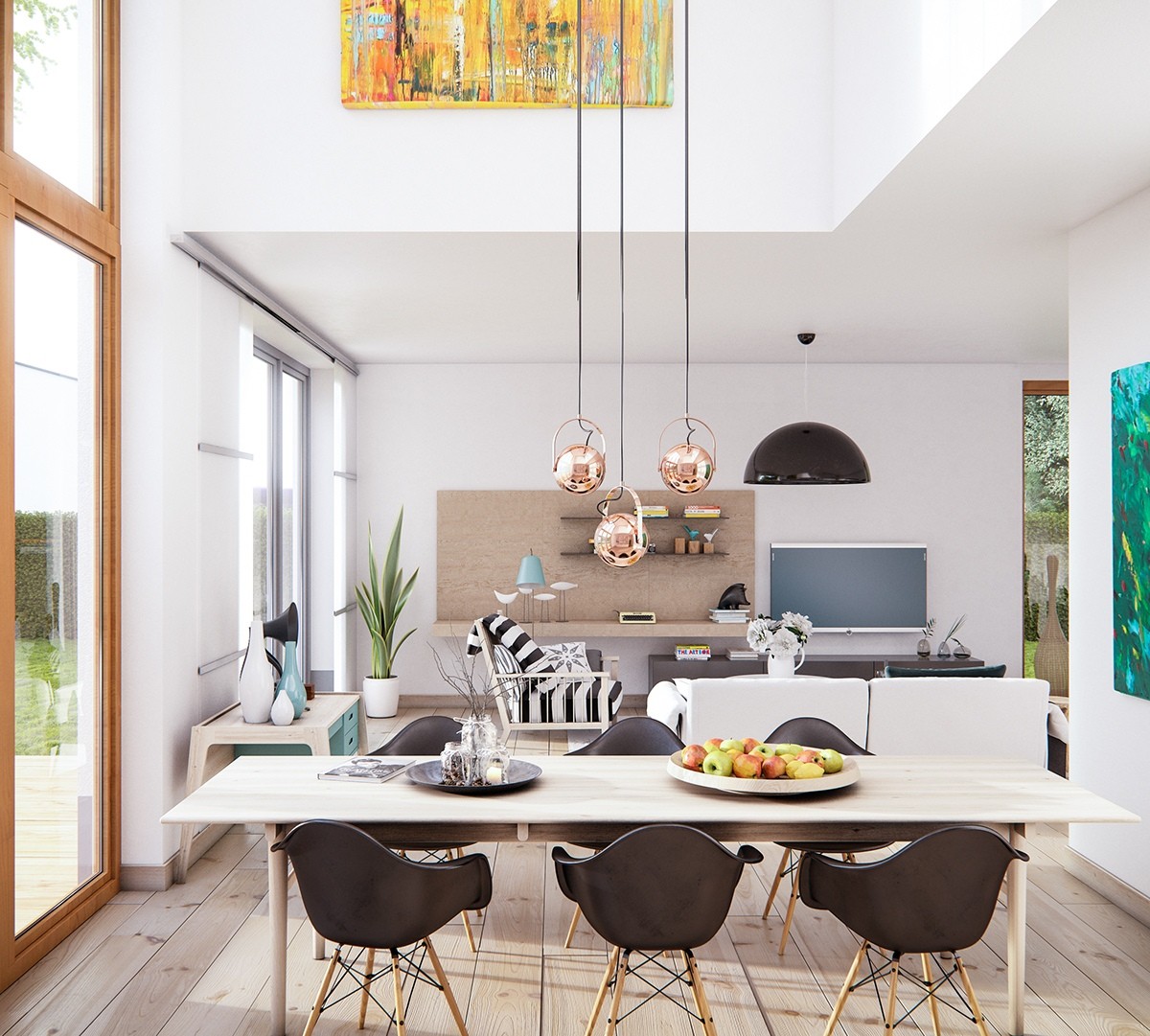
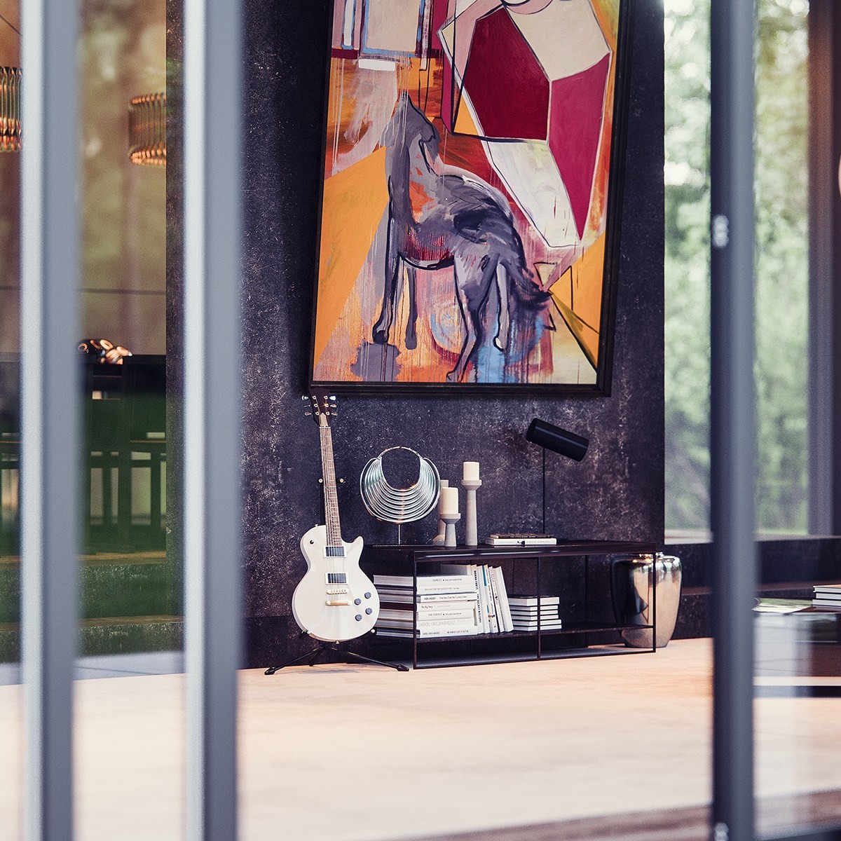
Note the high positioning of the colorful painting – it's hard to fill the upper portion of an atrium and this piece does the job nicely, the orange providing a nice contrast to the greenery as seen through the abundant windows to the left.
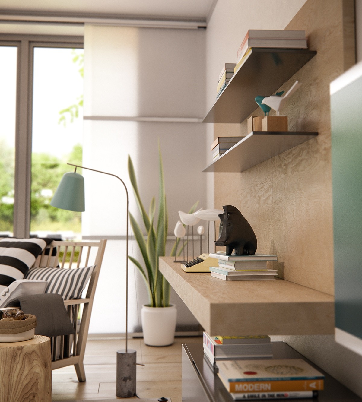
Adorable figurines of fish and birds join a carved boar on the shelves – another expression of natural decoration. Animal motifs are often overlooked as a design element, but they're a charming and fun way to add personality to a space as playful as this one.
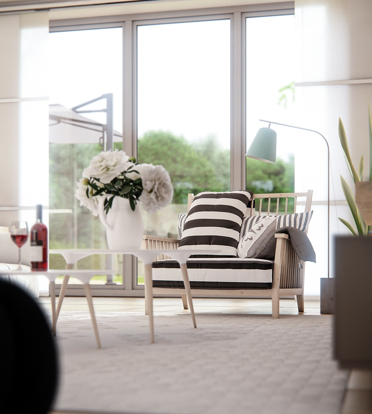
Eclectic decor is hard to coordinate, but having an overarching theme like nature or Scandinavian design makes it easier.
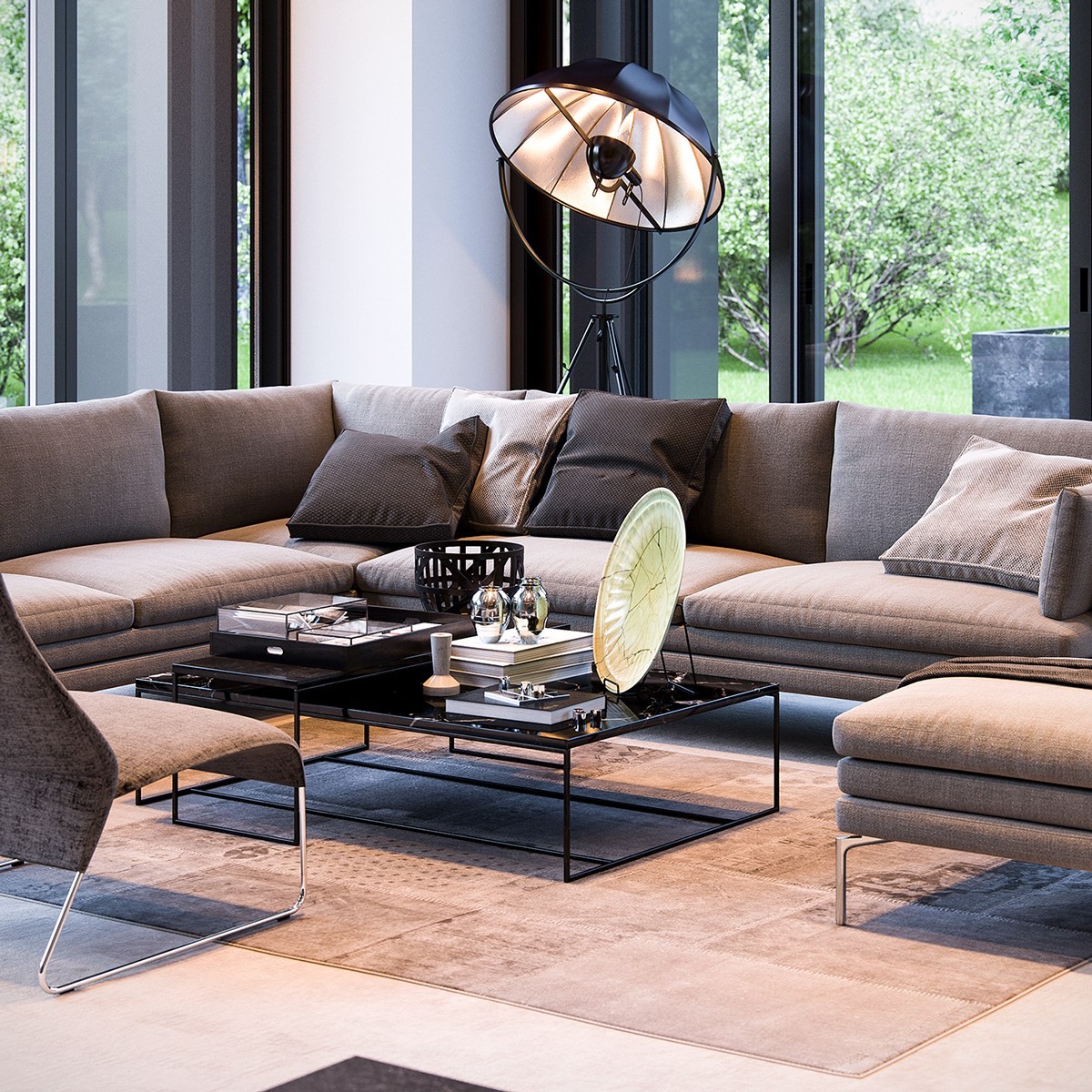
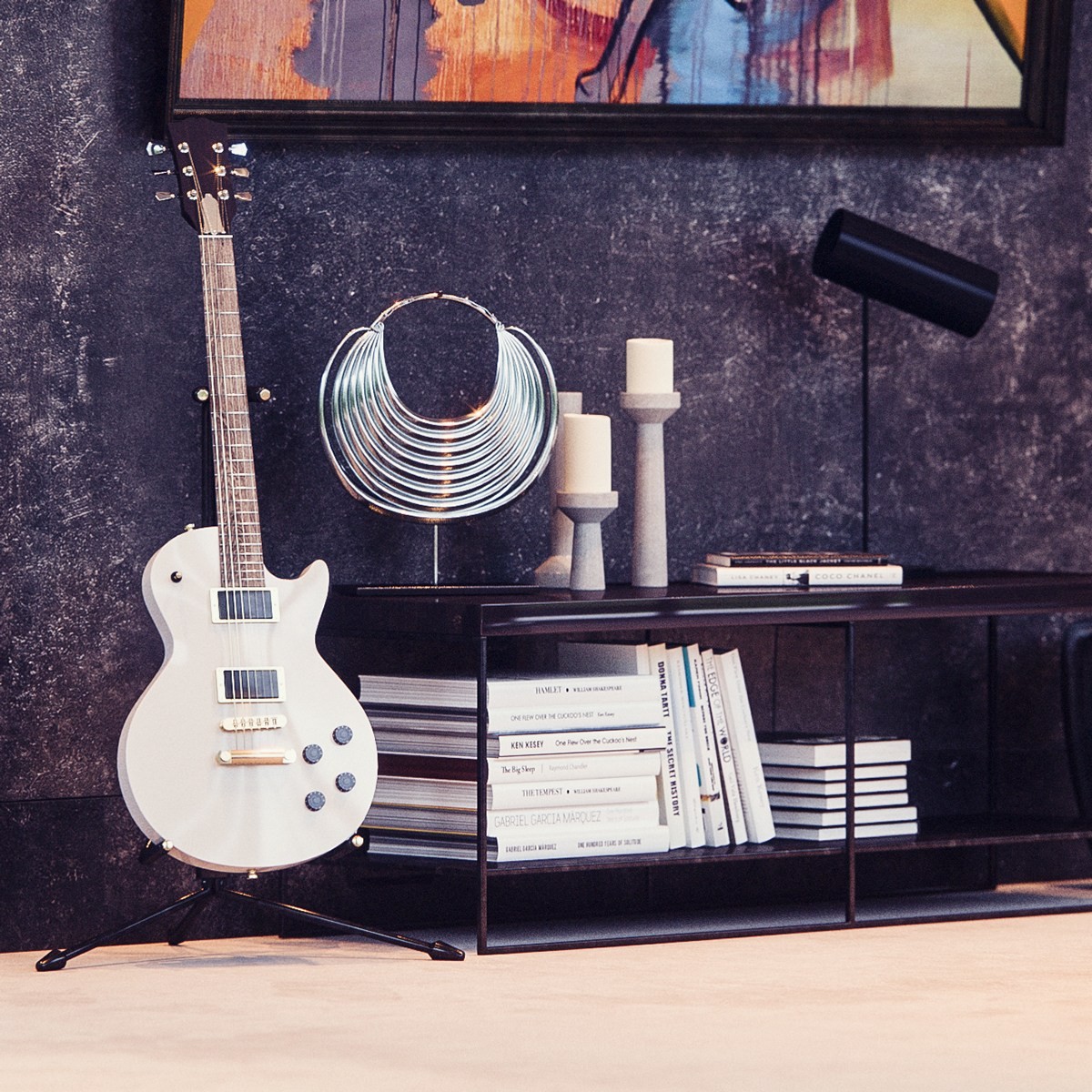
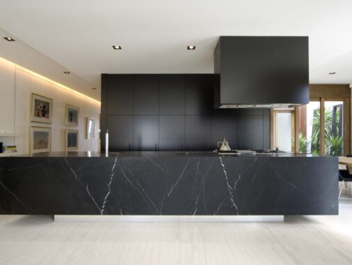
This next home – a fantastic interior by Double Aye – represents a completely different style from the Scandinavian home above. It's more of a sleek and modernist concept, with lots of glossy black and luxury materials.
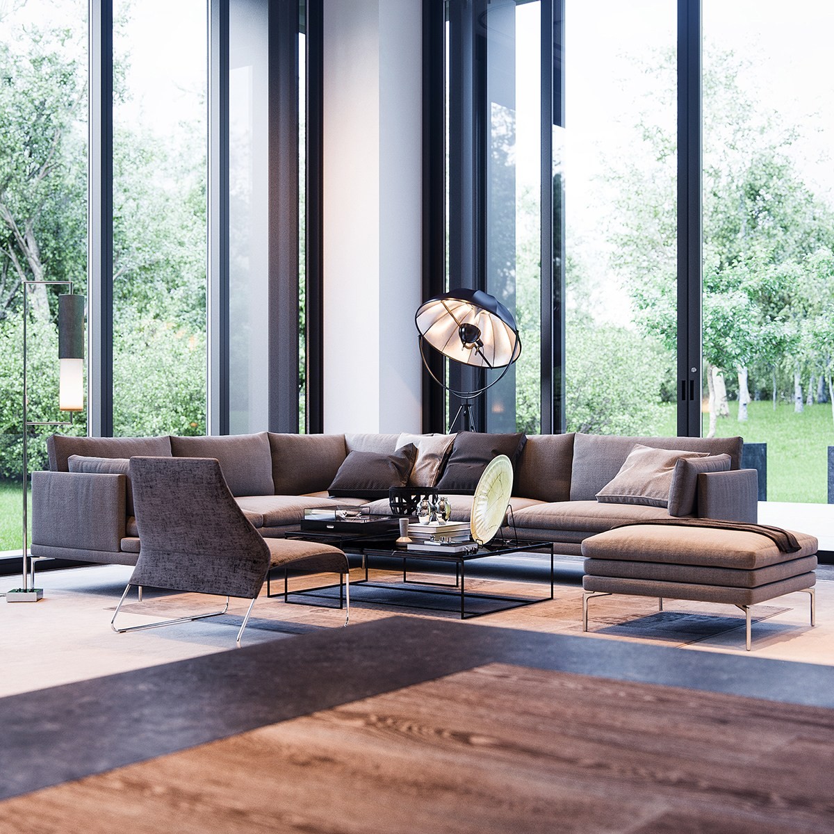
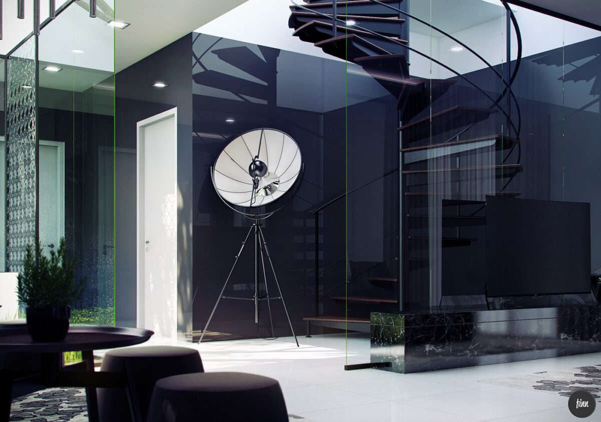
Besides contributing nicely to the semi-industrial theme, the lamp has a fascinating history. Mariano Fortuny y Madrazo was a Spanish fashion designer who eventually became interested in theatrical lighting, best known for inventing the cyclorama dome before experimenting with other indirect lighting techniques. One of these inventions was the Moda lamp, patented in 1903 and never intended for mass production, which nonetheless became an interior design icon.
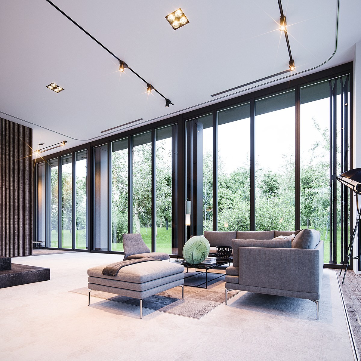
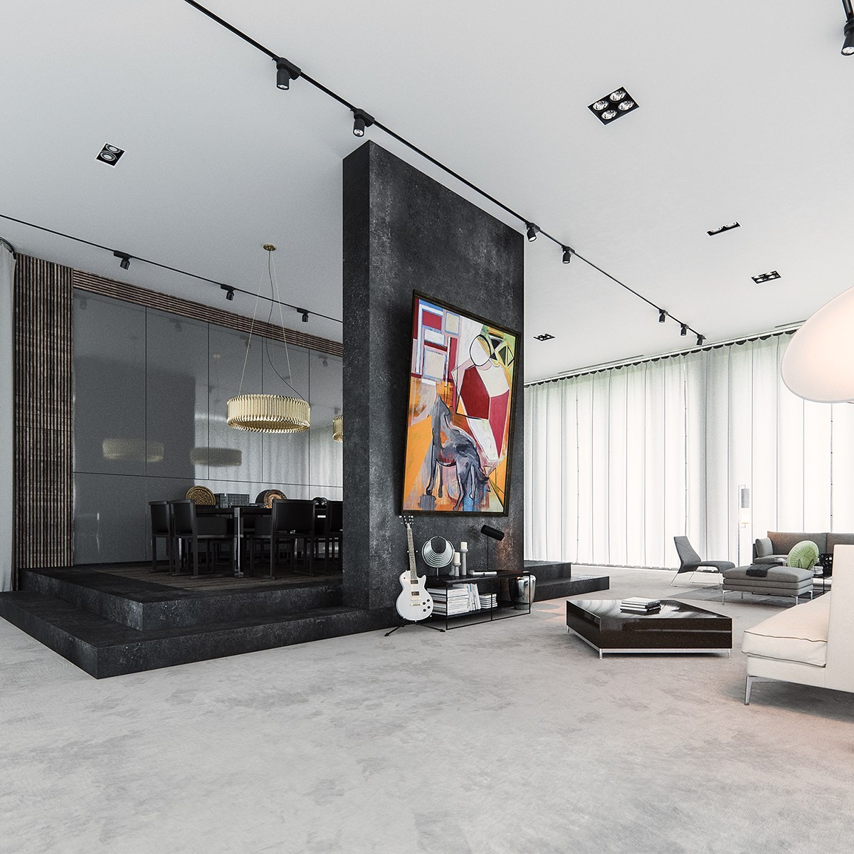
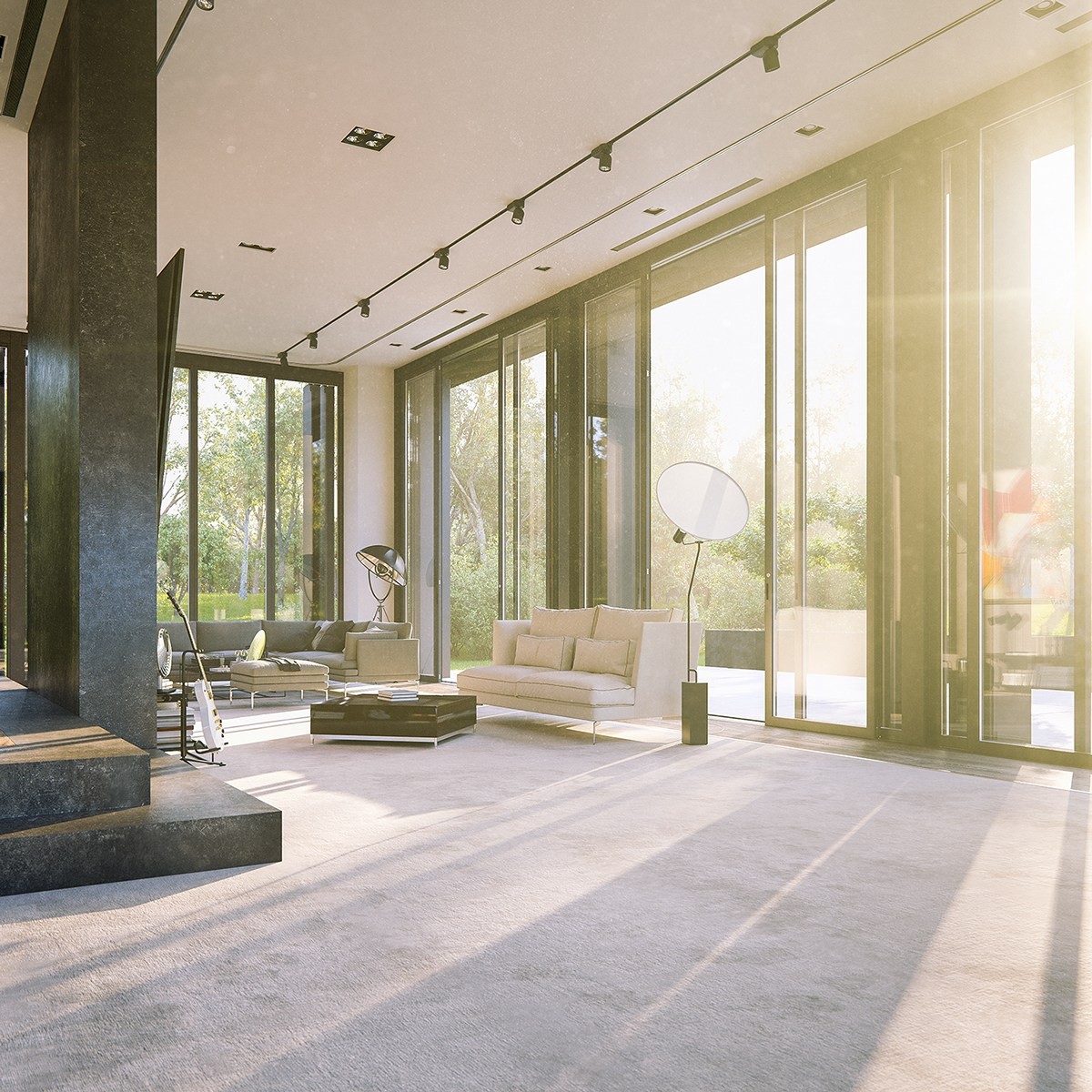
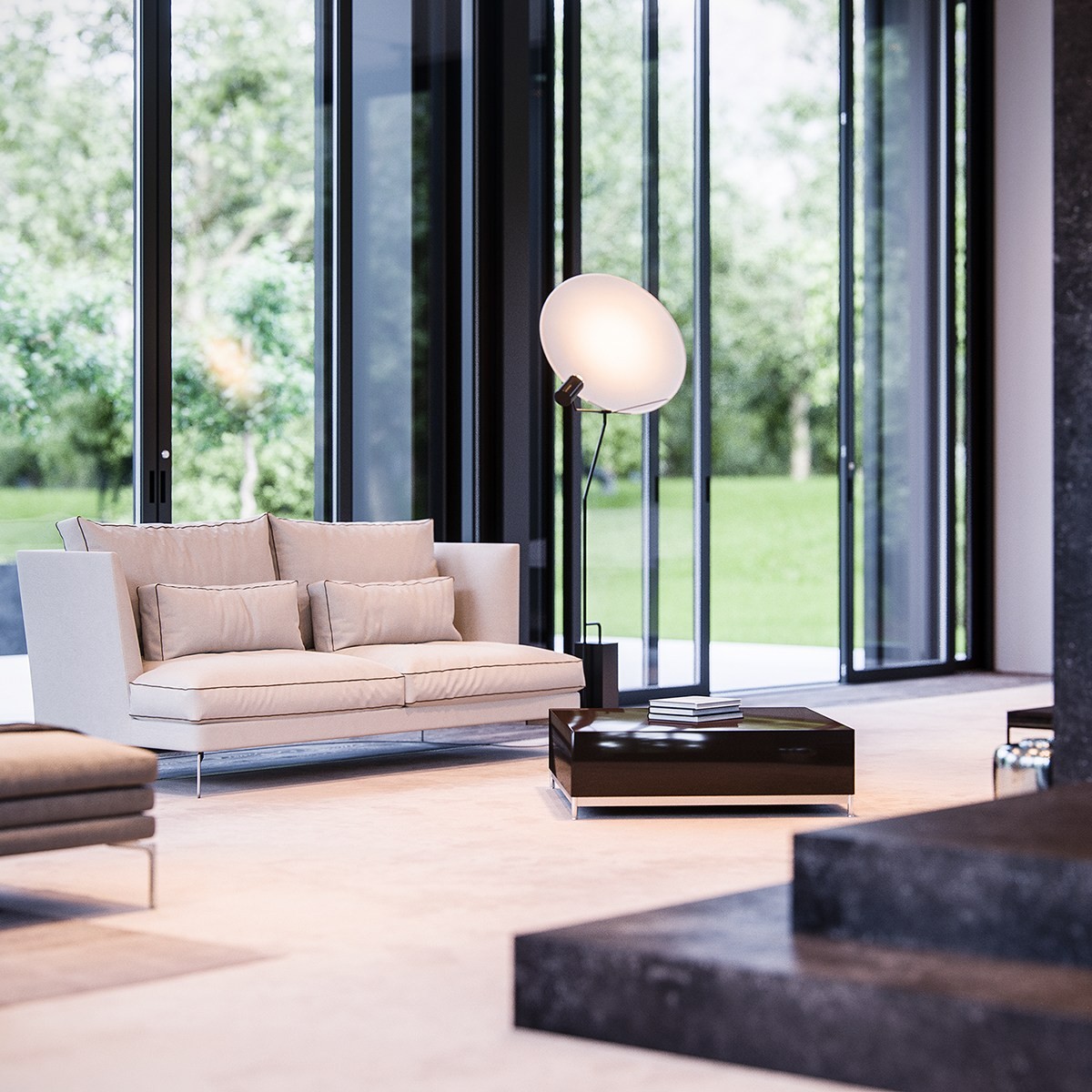
The sense of contrast is extreme and beautifully provocative – structure, order, and refinement seem in direct opposition to the verdant gardens outside. The floor-to-ceiling windows provide enough decoration to prevent the minimalistic interior from seeming sparse or plain.
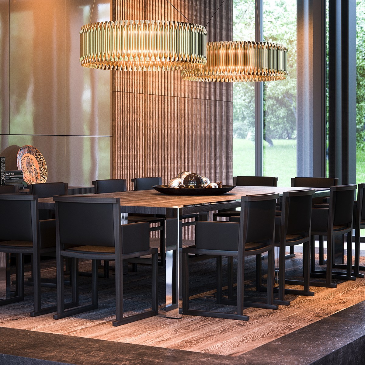
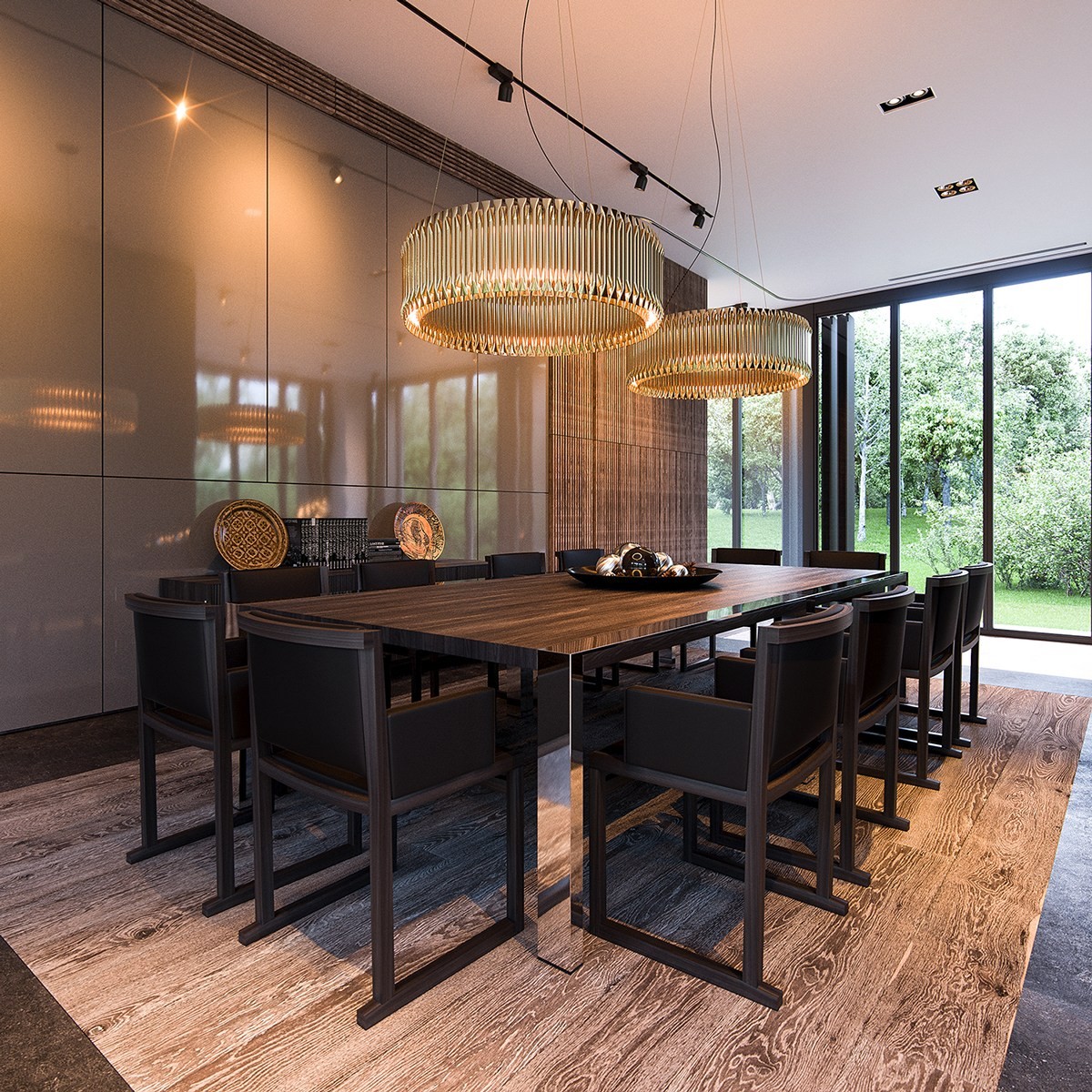
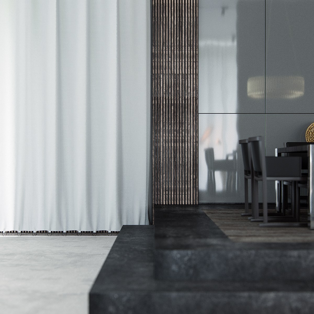
Hidden behind the stone-textured entertainment console is a spectacularly luxurious dining room. Here, gorgeous wooden elements tie into the outdoors. It's warm and decorative, in contrast to the cool and clean living spaces throughout the rest of the home.
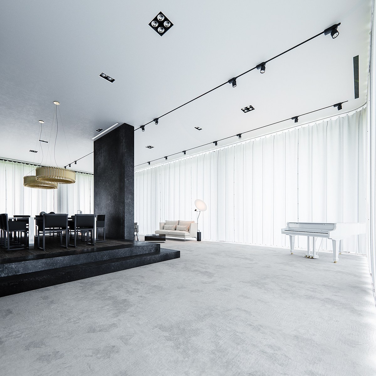
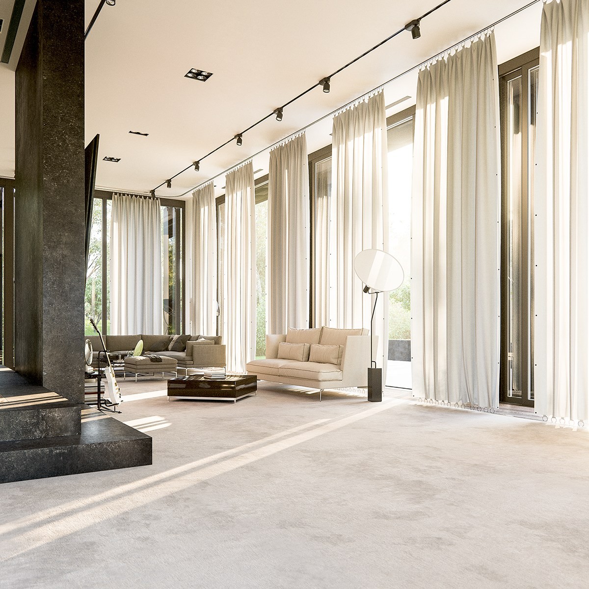
The vast living space takes on a completely different aesthetic with the floor-to-ceiling windows covered – cold yet stylish, a wintery landscape that has little in common with the space as viewed with a natural backdrop.
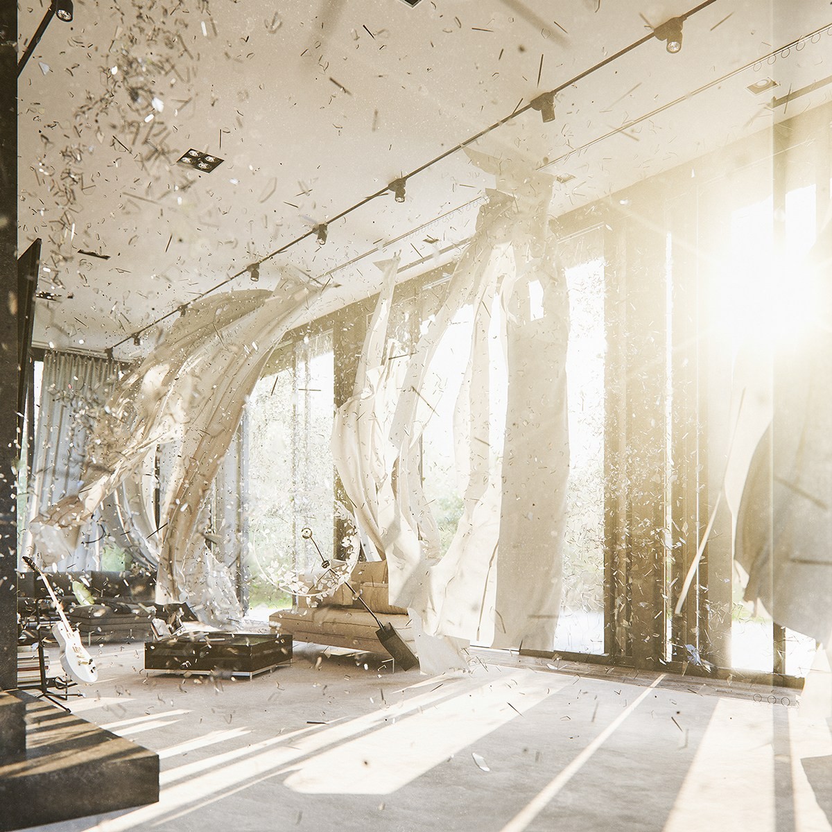
These exploding windows are not an interior design style anyone would want to implement at home, but a very clever display of the visualizer's CGI prowess. Perhaps this imagery intends to represent the erasure of boundaries separating the manufactured world from its surroundings – only the artist could say for sure.
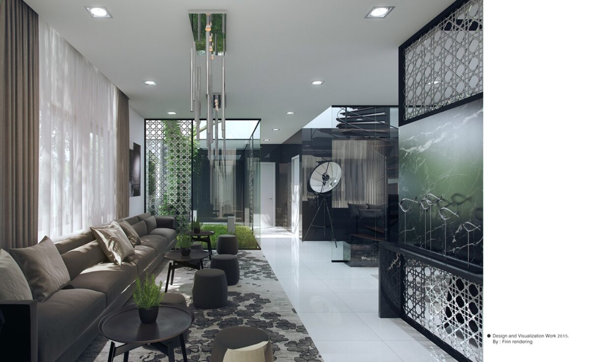
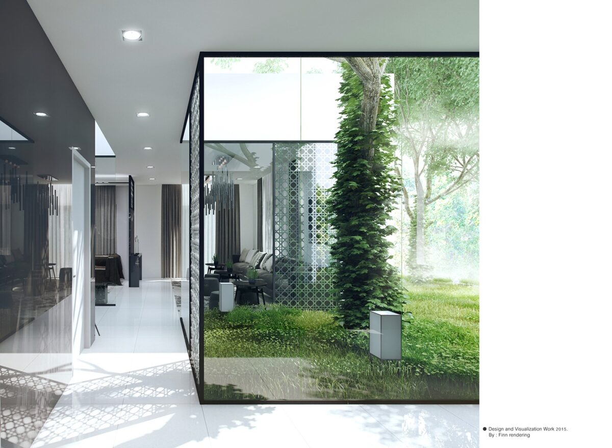
Last, but certainly not least, this interior concept from Finn Rendering (based in Bangkok) demonstrates an extreme erasure of boundaries between the modern interior and the natural world outside. It's a guest home concept with floor-to-ceiling windows – not just facing outward, but used to divide rooms indoors as well. Each angle reveals something new.
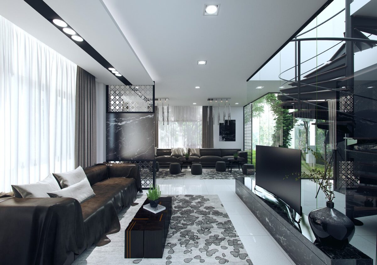
In the background, you can see the living space featured in the first visualization, including its pond-like arrangement of round ottomans. The foreground living space takes a different approach more in line with its purpose as an entertainment area – sharper shapes and sleeker materials take center stage.
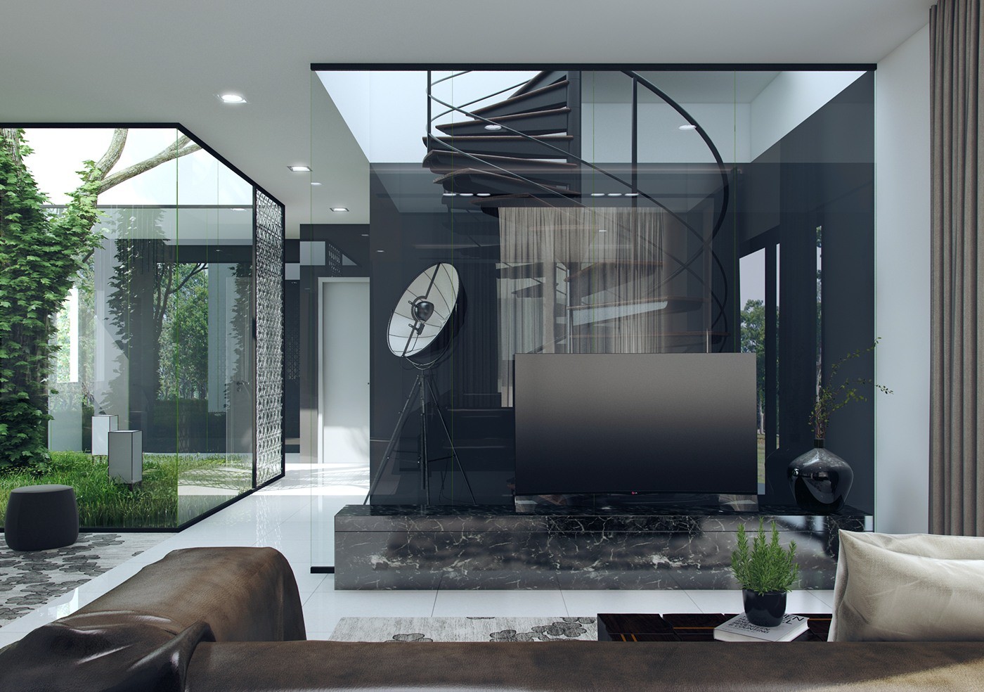
Seamless glass walls offer a clear look at the impressive spiral staircase in the center of the structure. Another class-encased void to the left reveals a vine-covered tree providing a gorgeous focal point.

