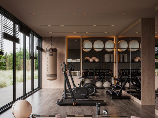
In order for an apartment to be beautiful, it does not have to glitter and sparkle with gold or have heavy velvet curtains and a spacious gourmet kitchen. More than any of that, a home should be comfortable, warm, and welcoming. These two apartments, both of which come from the designers at Plasterlina, have tons of sunshine, simple furnishings and a few quirky, fun design elements that will make you feel like the designer is right there throwing you a big wink.

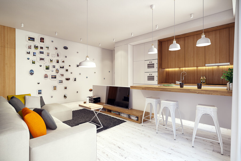
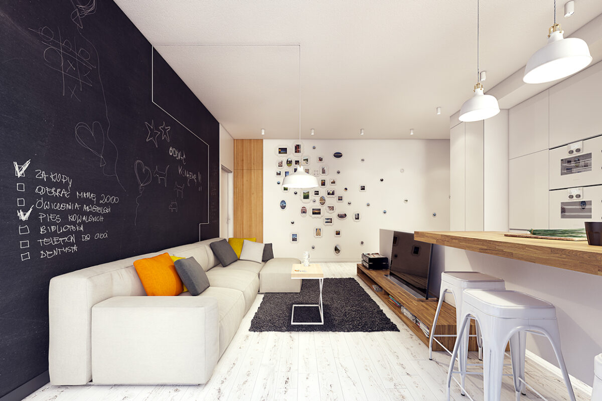
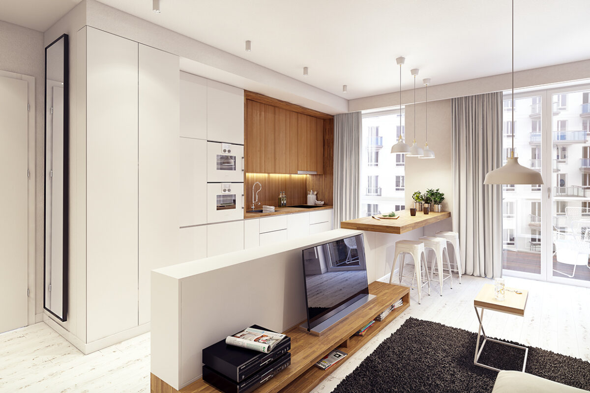
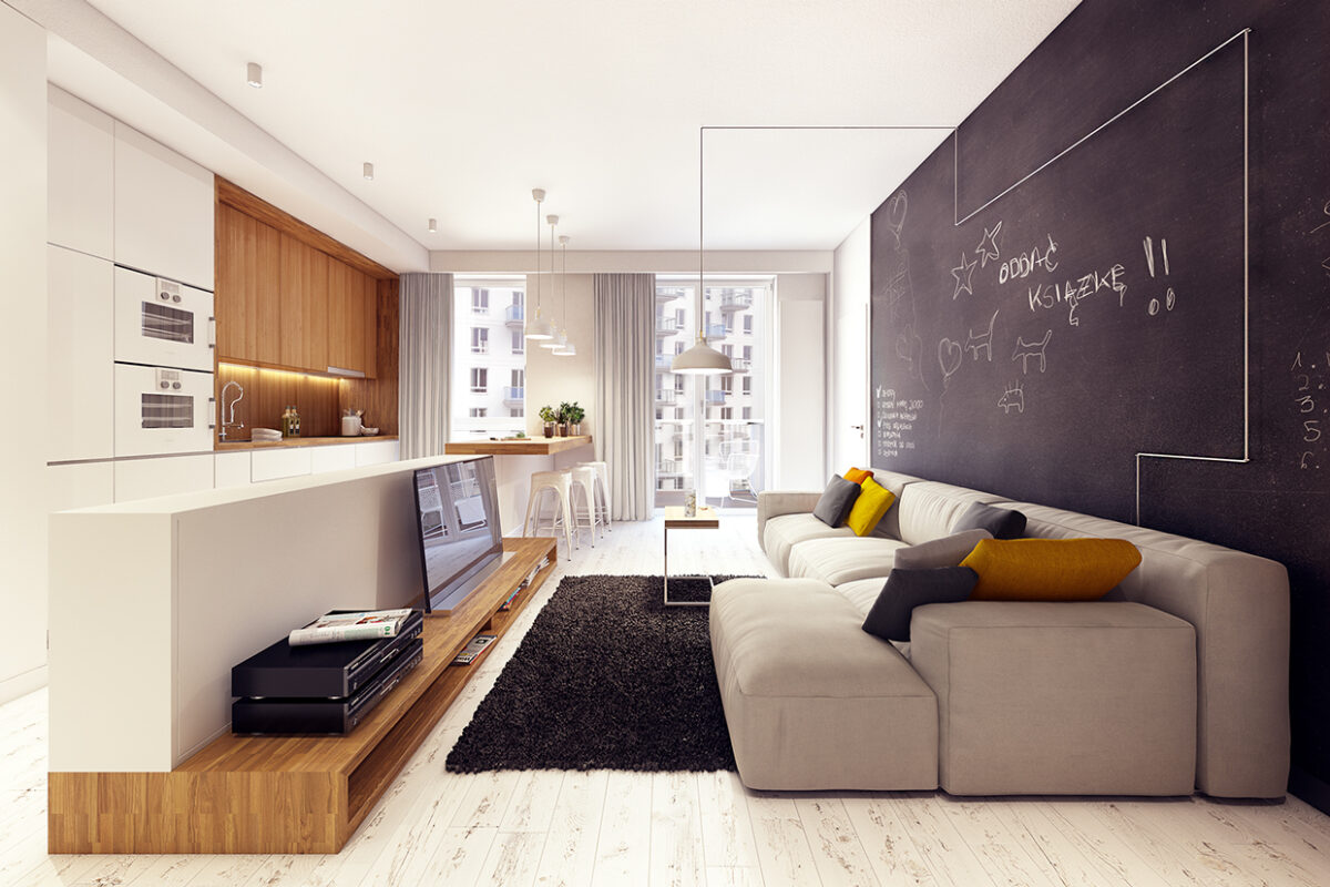
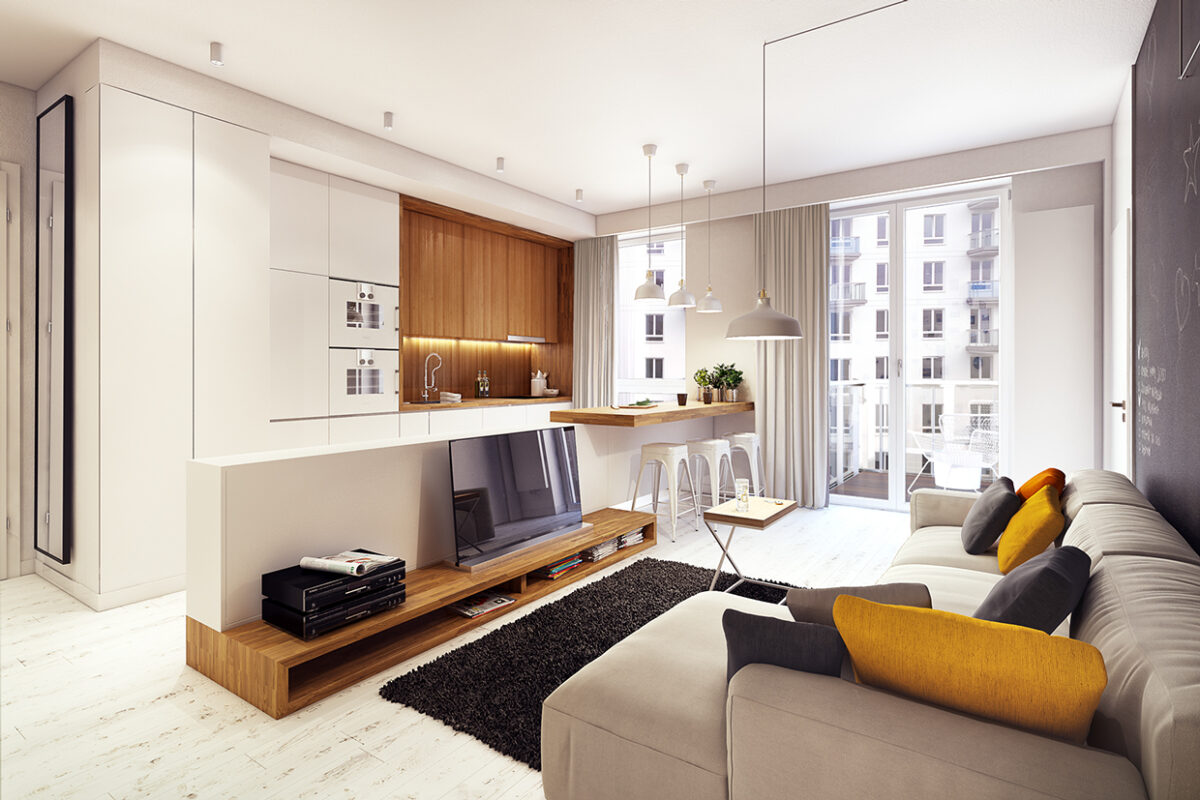
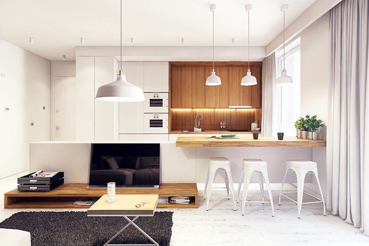
The first apartment is a home in Warsaw. The look uses quite a bit of white from the walls to the lacquered metal kitchen bar stools to the whitewashed floor, which serves to open up the space and bounce around plenty of natural light from the large windows.
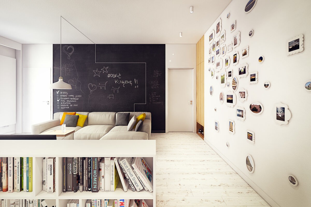
Behind the sofa is a chalkboard wall, which is an easy and highly affordable way to bring a spark of creative energy to any room. Though the overall color palette in the living space is neutral, a few splotches of tangerine and mustard bring in a vibe of spring.
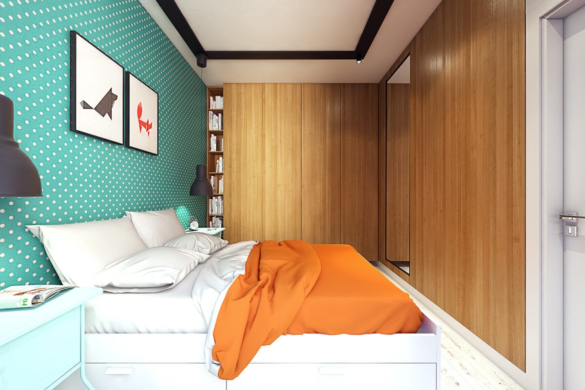
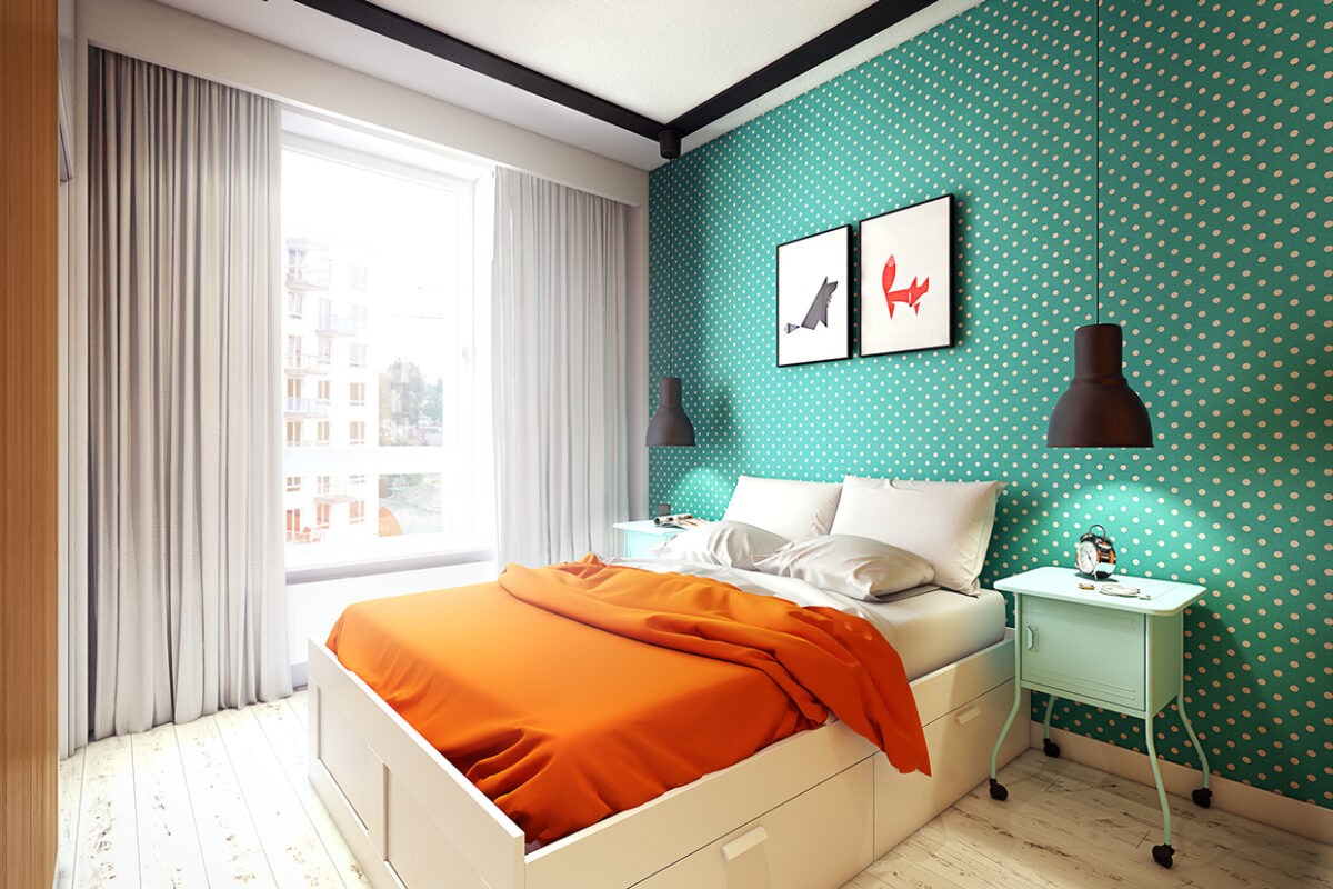
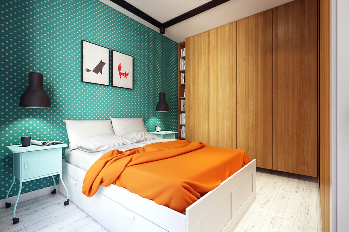
The bedroom brings even more color into play with a fantastic teal and white polka dot wallpaper and awesomely orange duvel. Clever geometric animal drawings over the bed are cute without being cutesy.
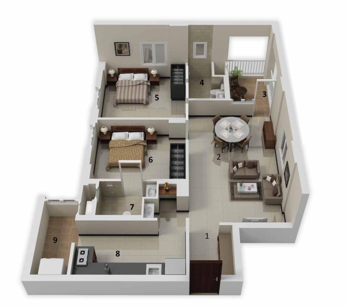
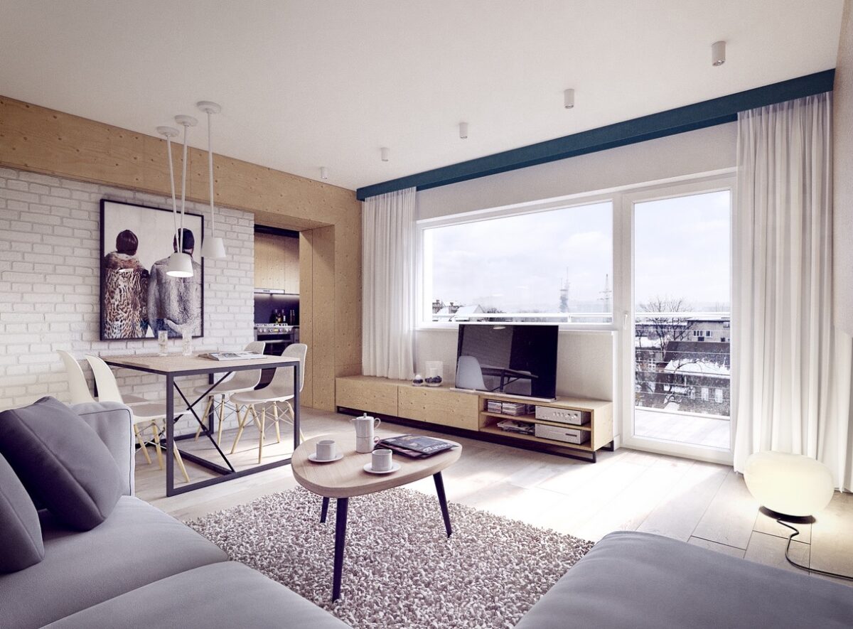
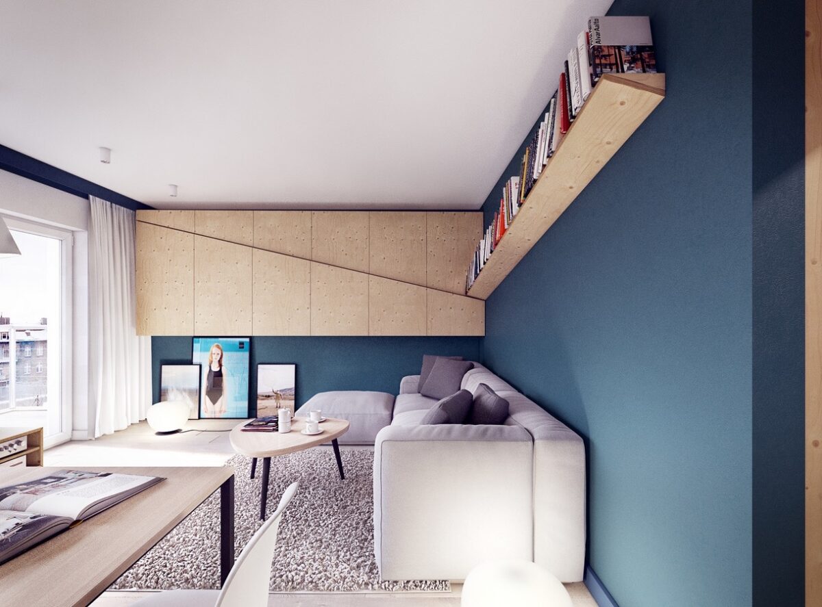
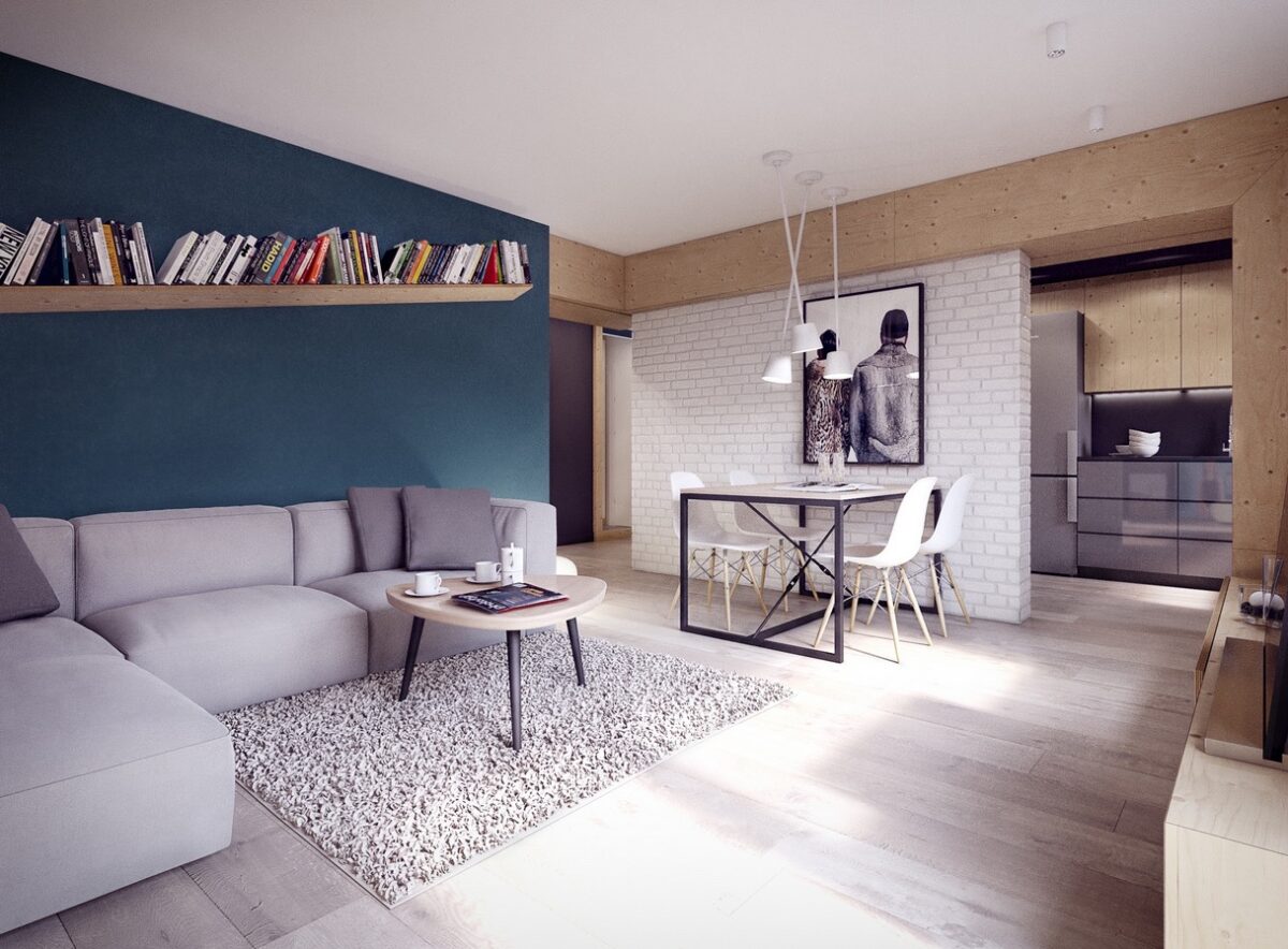
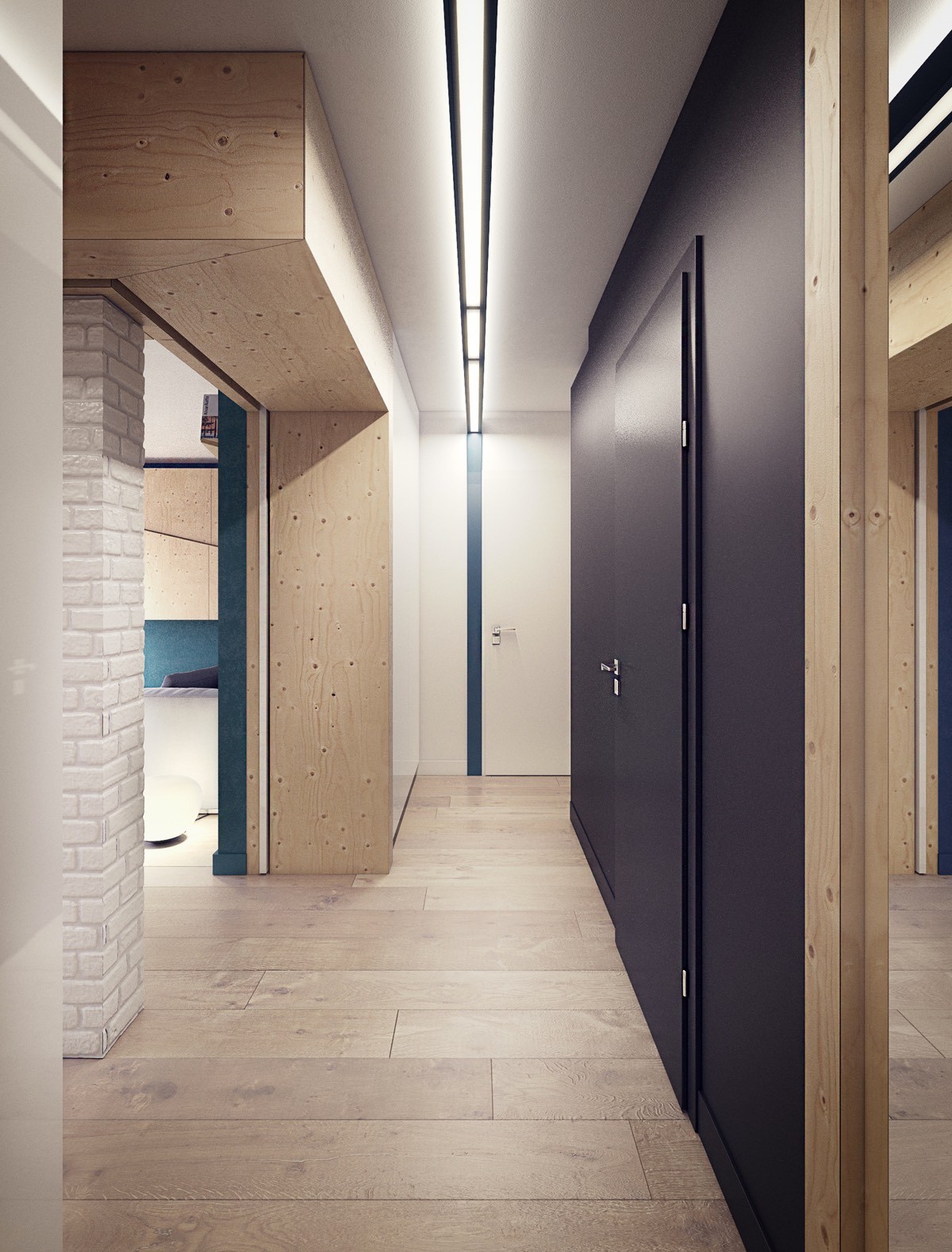
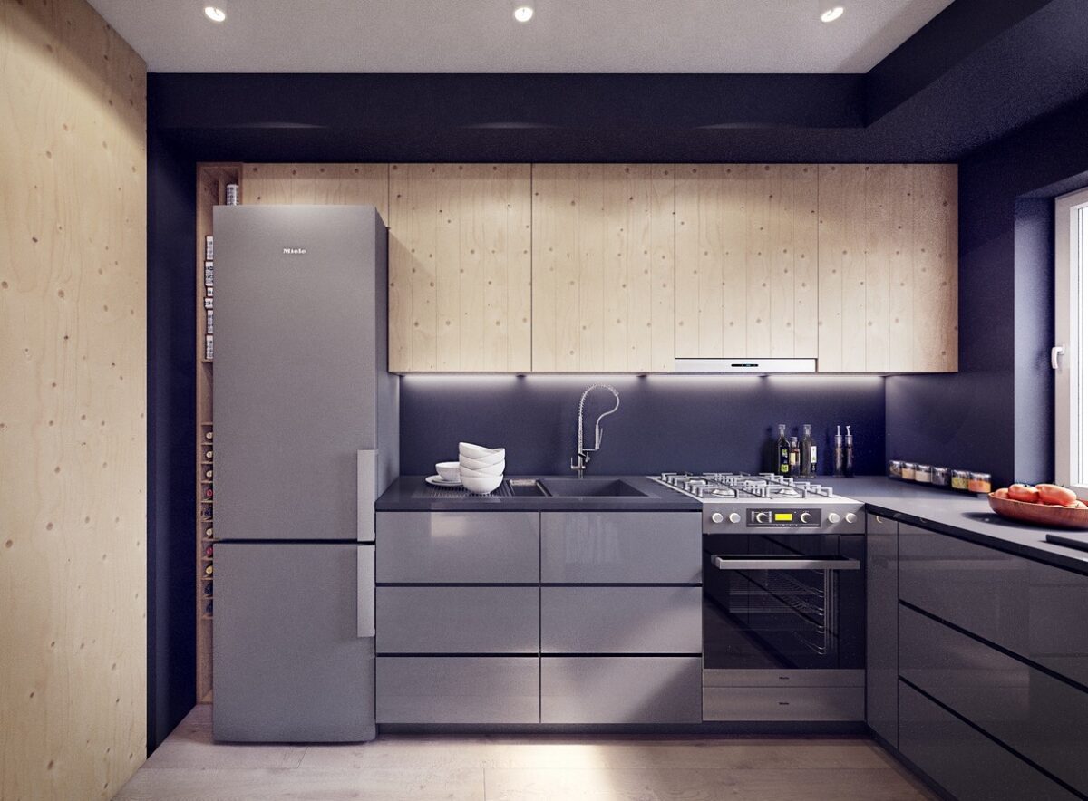
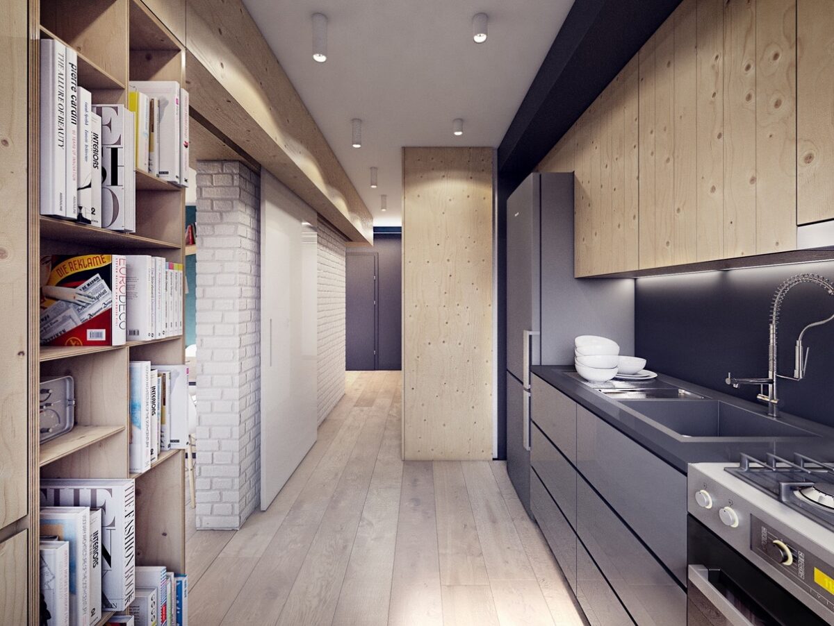
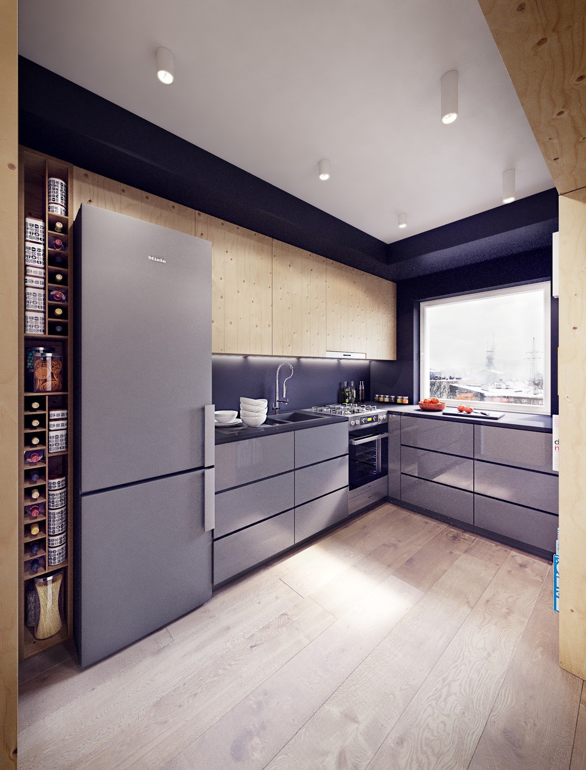
Plasterlina has given the second apartment, in the Polish city of Lodz, the theme "Less not Bore," which very clearly belies the idea that simplicity does not have to mean empty or cold.
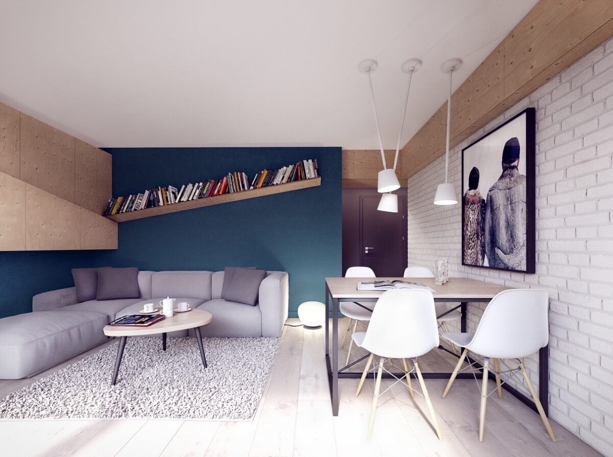
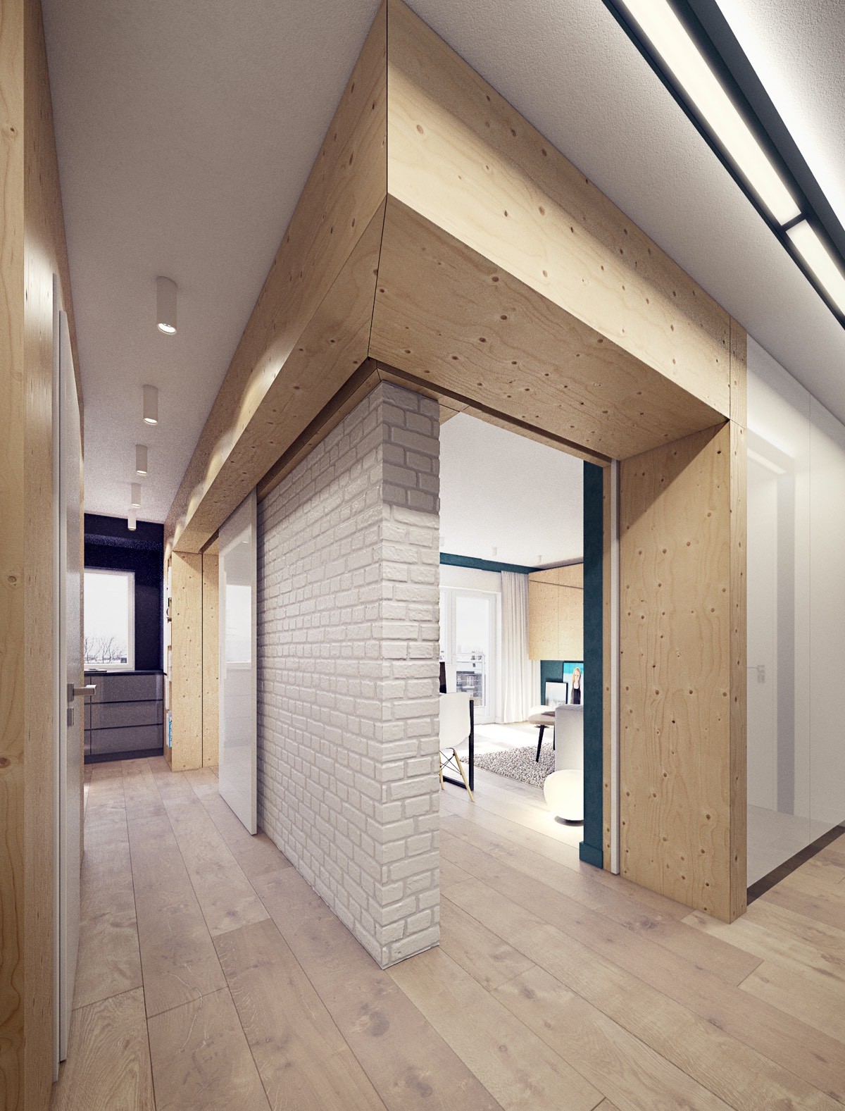
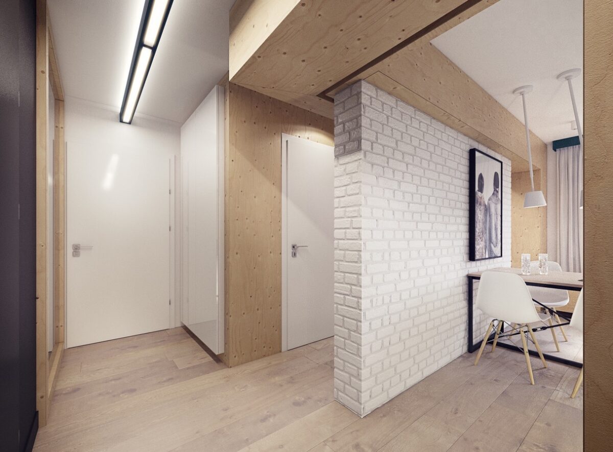
Here, light colors continue to take center stage from the white brick that calls to mind a modern Manhattan bistro to the natural wood flooring and custom shelves. We can also see this living room's nod to quirk with its amazing custom bookshelf that's situated such that it looks as though the books are pouring into another cabinet. The matte teal wall is certainly a trendy tone, but it works here in contrast with the otherwise neutral style.
