In a tiny apartment, everything must have its place and stay there. When you're working with just a few square meters of floor space, there is no room for a spontaneous floor lamp purchase or a flea market bean bag. From concept to design to the actual living in the apartment, you have to be meticulous. The two apartments features in this post are just that. Each item has a purpose and a place. Frivolity is not an option, but style is required.

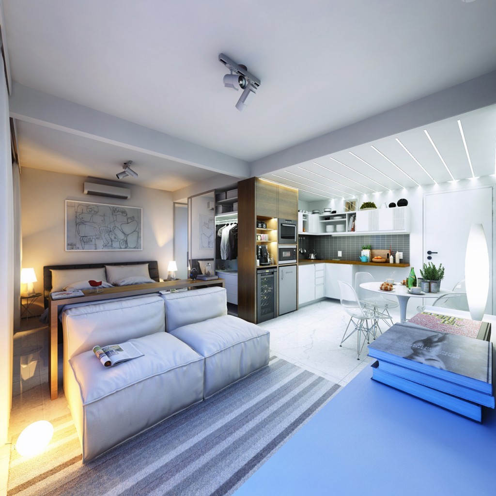
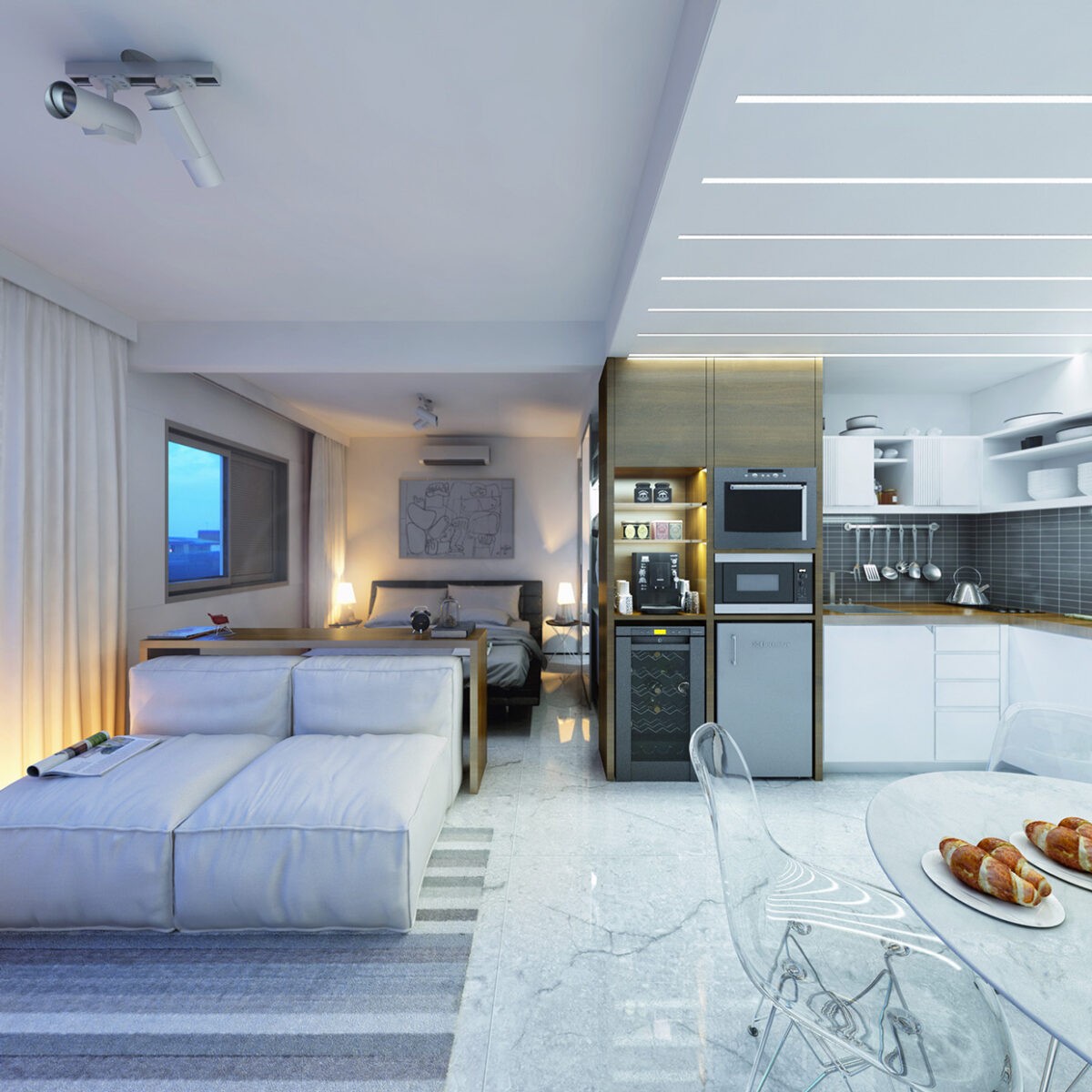
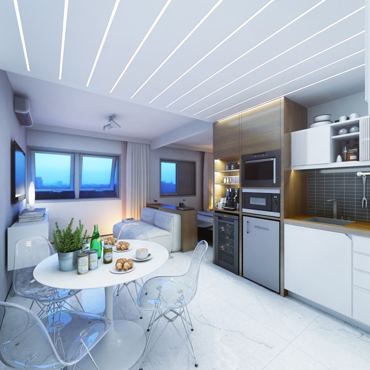
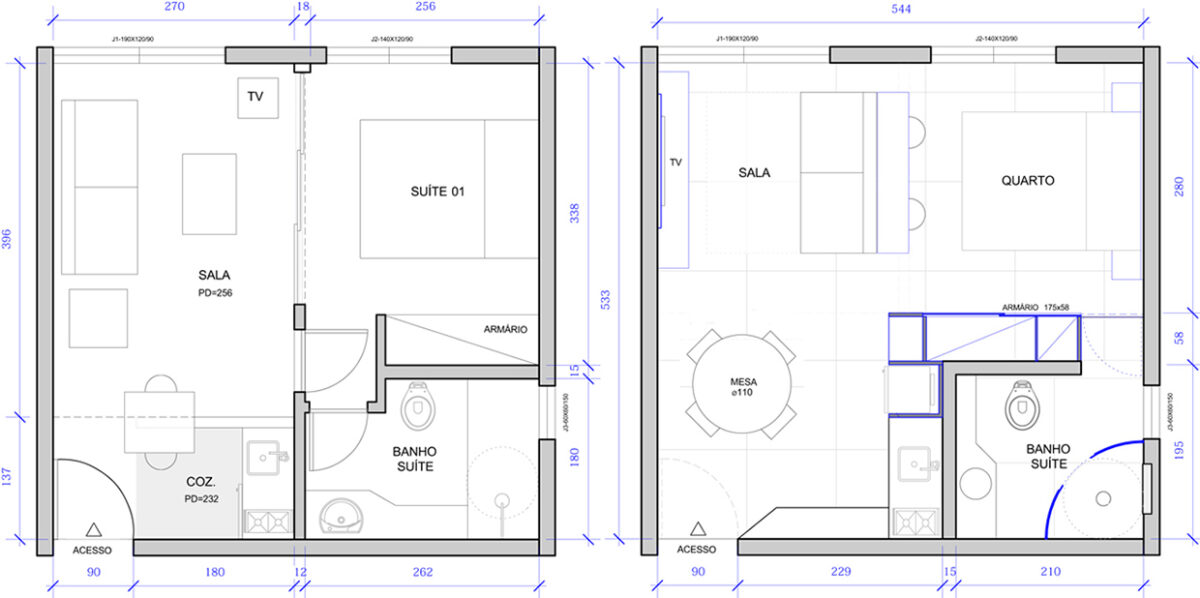
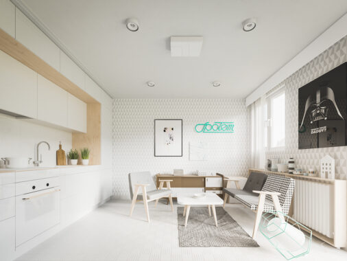
The first apartment, from designer Felipe Campolina of ArchViz is a masculine take on small space design. The apartment is just 29 square meters (312 square feet) but still manages to include the conveniences necessary for a modern bachelor life.
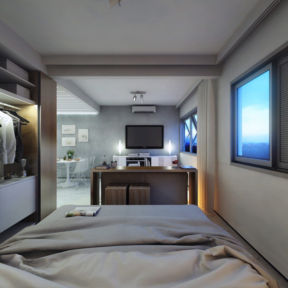
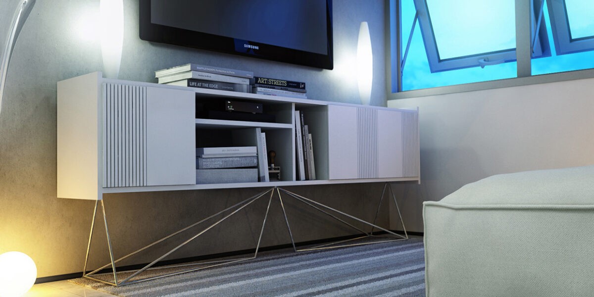
A neutral color scheme helps the space feel more open, despite the fact that a couple of small windows are the only view to the outside world. And those windows don't even open all the way.
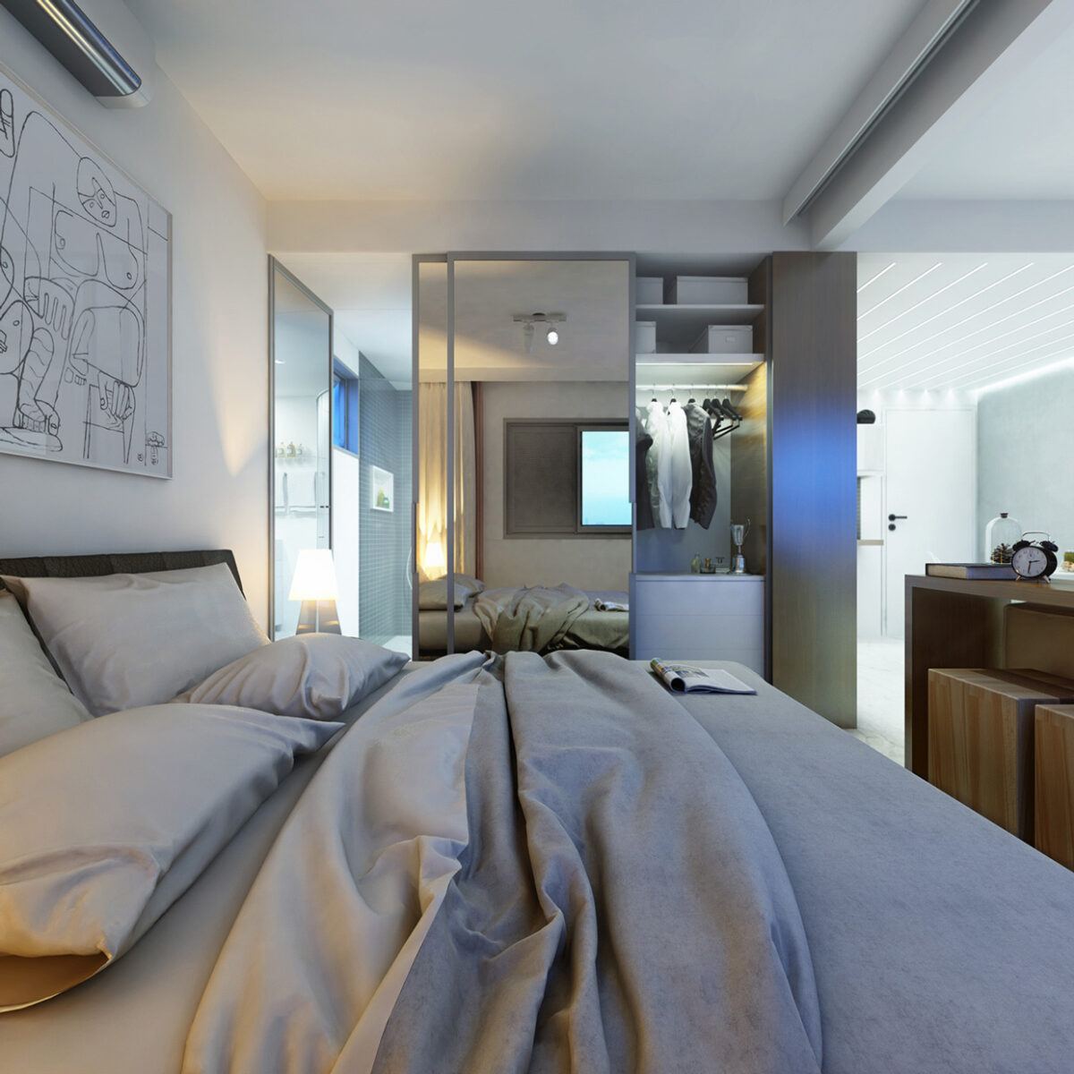
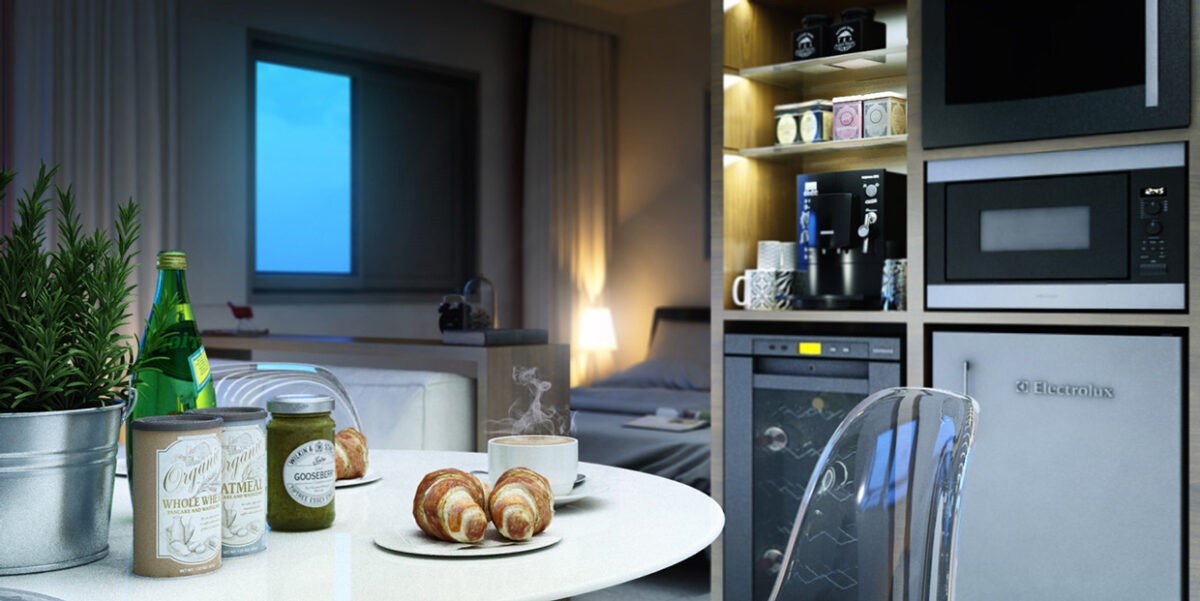
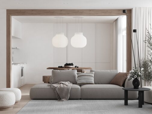
The use of natural wood with white and gray also means it is easy to add and subtract from the design when necessary, without overthinking it. It's the perfect blank canvas for an intimate dinner, for instance, since it lets the colors of the meal take over instantly.
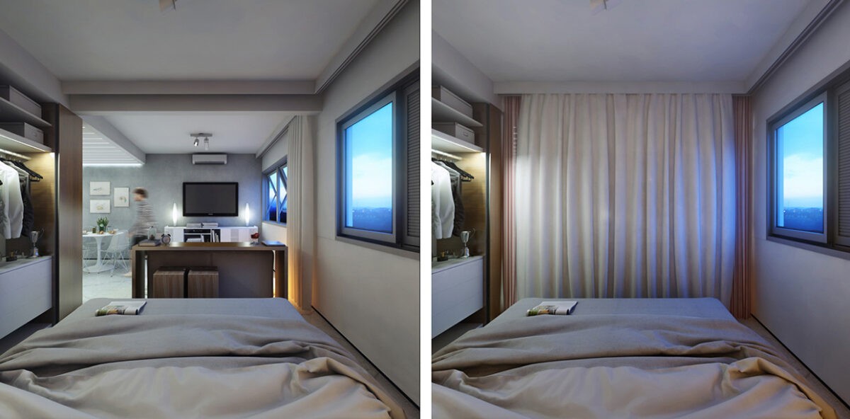
While the bedroom (such as it is) is technically part of the same space as the living room, a privacy curtain can be drawn closed if necessary, or left open to keep the space feeling full.
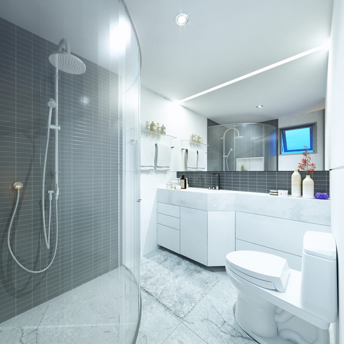
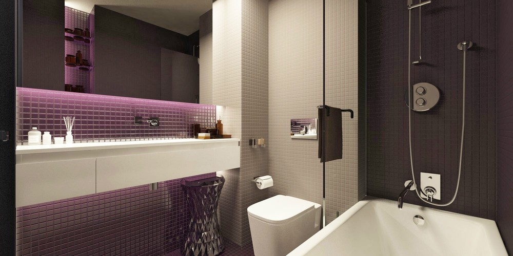
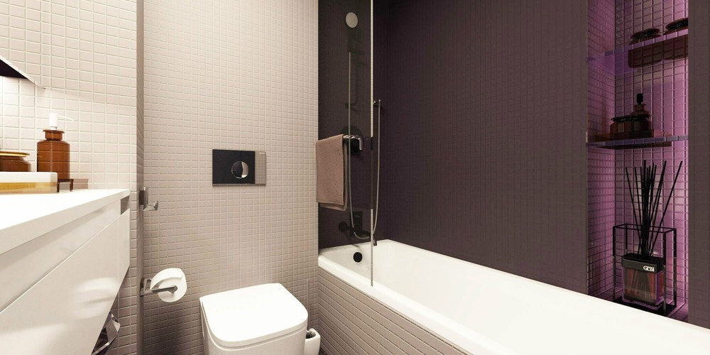
As far as apartment bathrooms go, this one is not too bad considering the overall area of this place. A classic white design works perfectly with the corner shower and surprisingly spacious countertop.
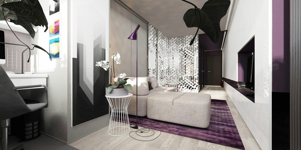
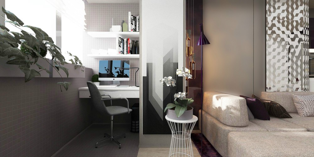
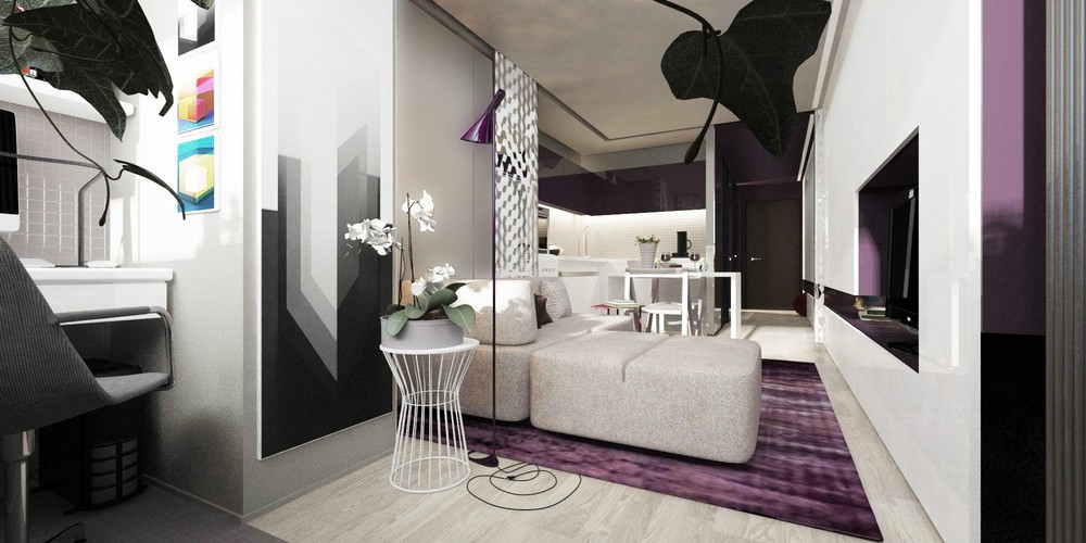
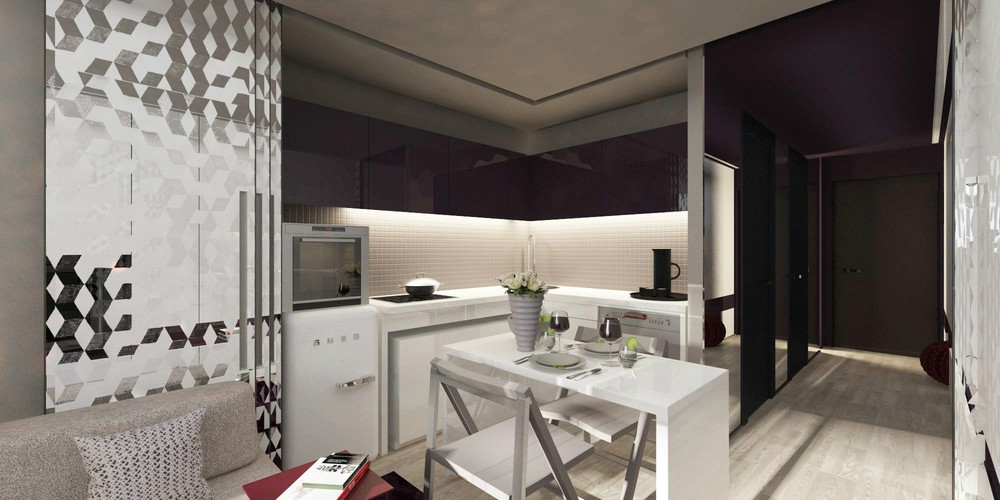
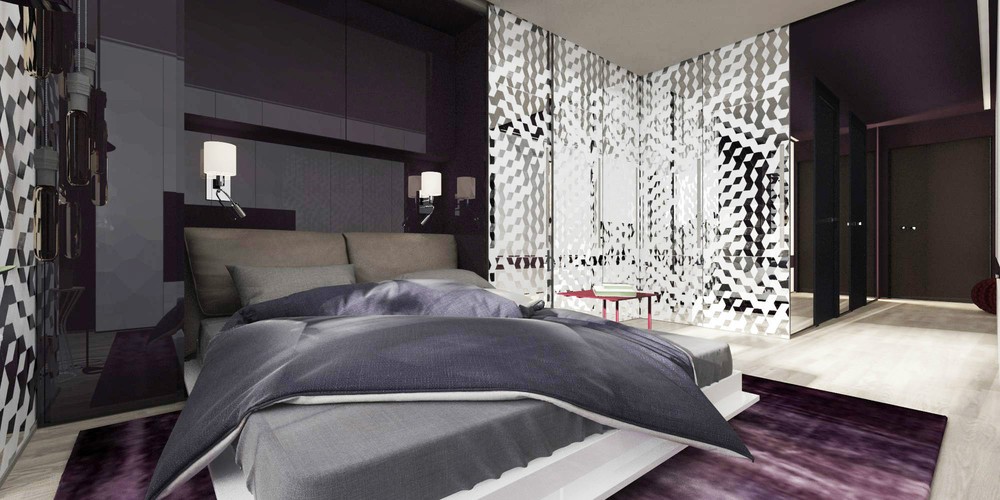
The second apartment lends a more feminine air to the idea of small spaces. The detailed design of this 20 square meter (322 square feet) comes from Art Studio Design as intended for a young female designer.
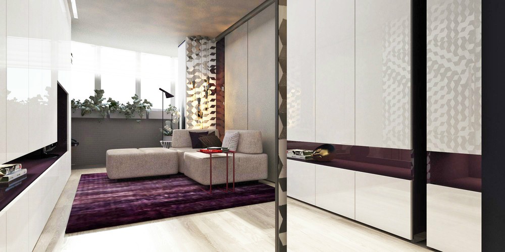
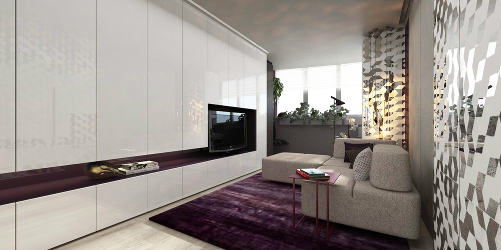
A purple area rug and matching living room lamp make a colourful splash.
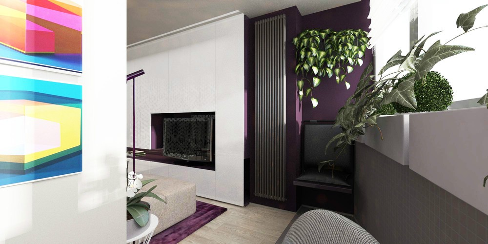
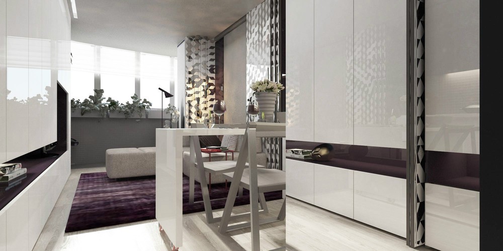
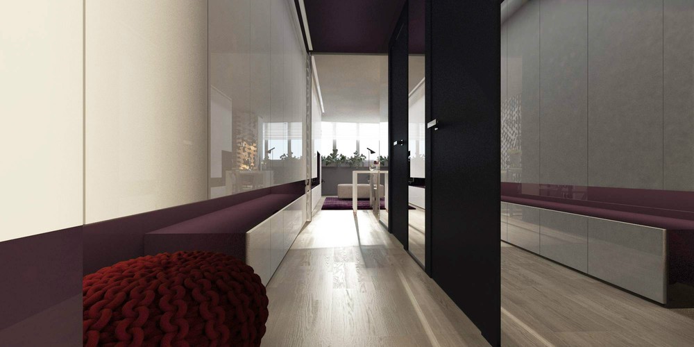
More than simply sliding a curtain over an open doorway, this space makes more creative use of the space it does have, starting with the tall white cabinetry that lines the wall. These massive storage spaces actually become the walls, giving the apartment a modern feel while disguising this essential design element.
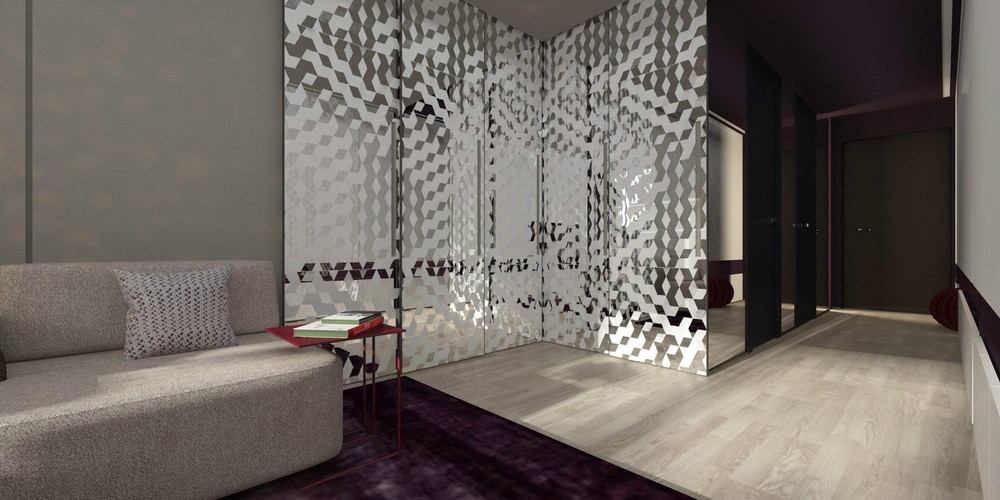
Mirrored wall dividers slide around easily, shutting off portions of the apartment that are not in use and giving a clean and intimate feel to those that are.
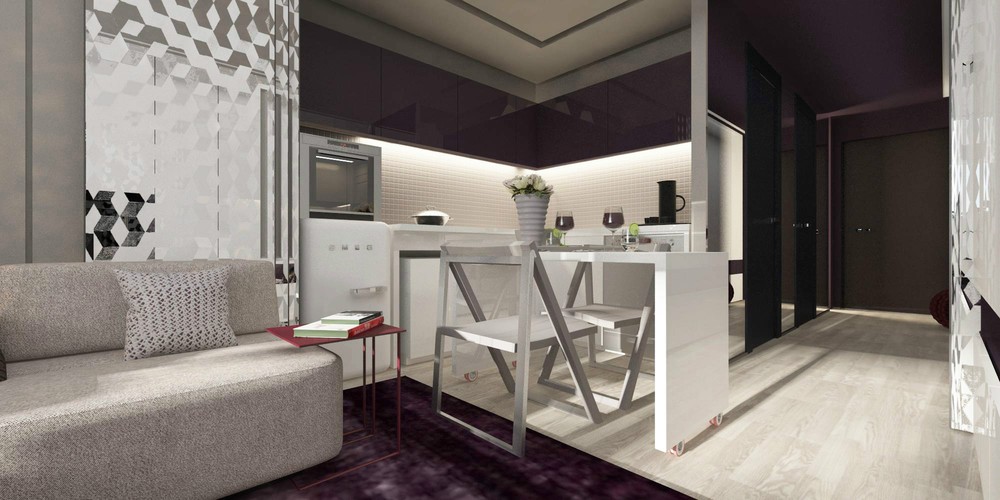
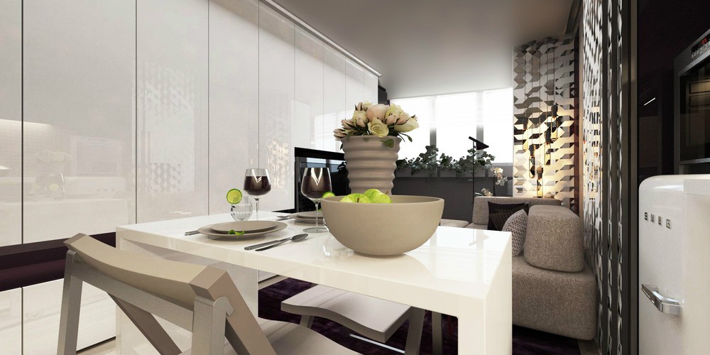
The dining room table is on casters, rolling out of the way when it isn't needed so that the entire kitchen area can be cordoned off.
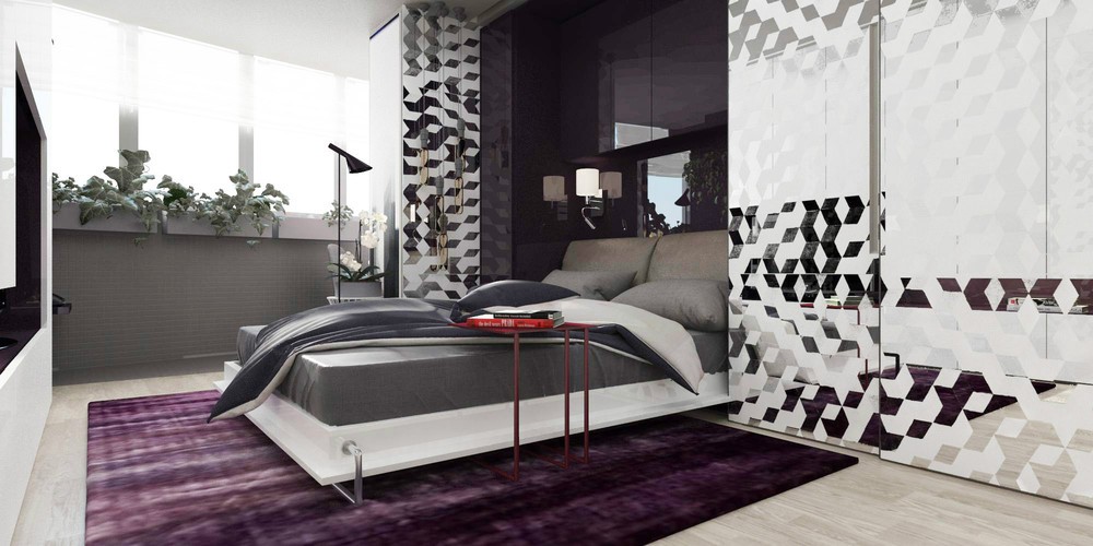
Even the bed hides away when not in use. This contemporary answer to the murphy bed is far from old fashioned.
