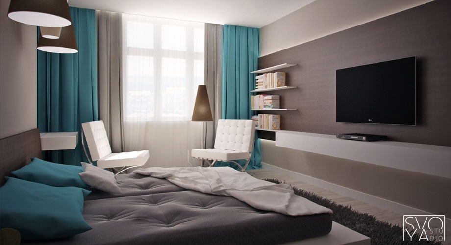
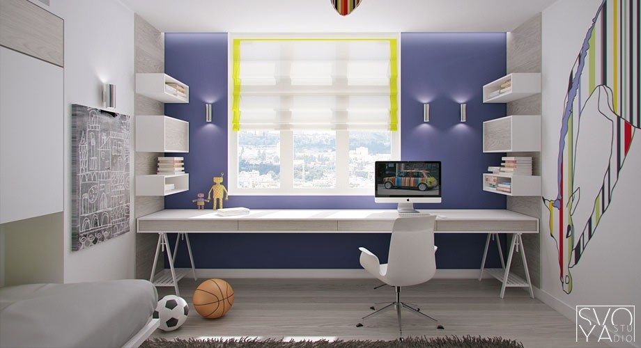
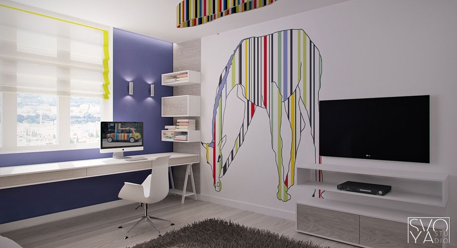
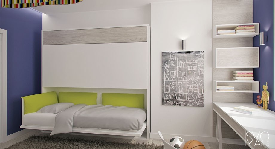
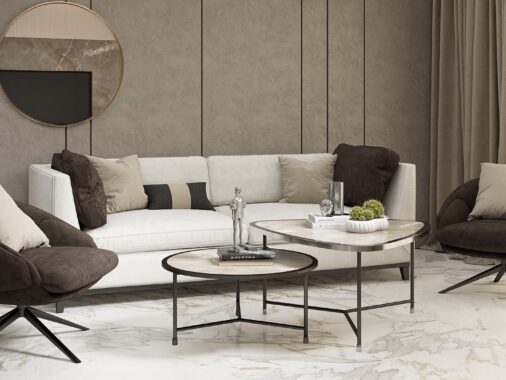
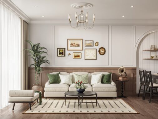
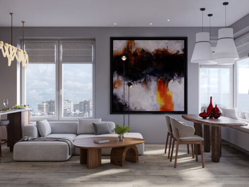
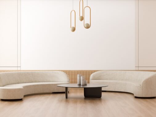
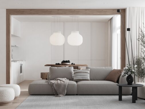
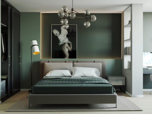
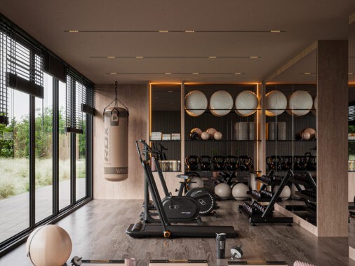
If you were to ask us to associate thoughts with Ukraine, we might think of wheat farming, or perogies (Yum!!) or even the current crisis around Crimea but we probably would not immediately have said, “Cutting edge interior design!”. These two apartments, rendered by Dnepropetrovsk-based Svoya studio are the epitome of where interior design is going next.
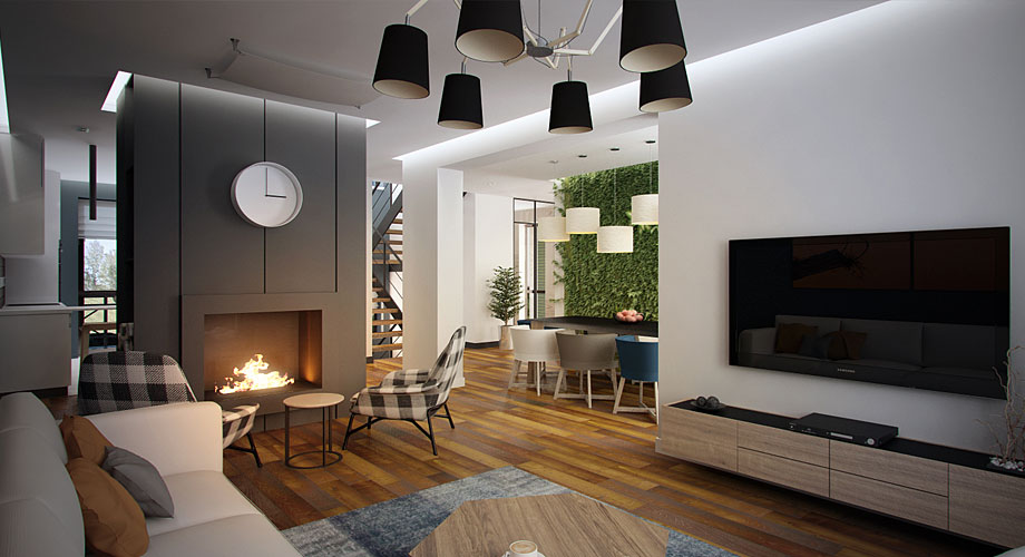
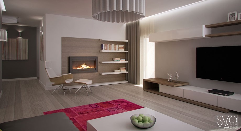
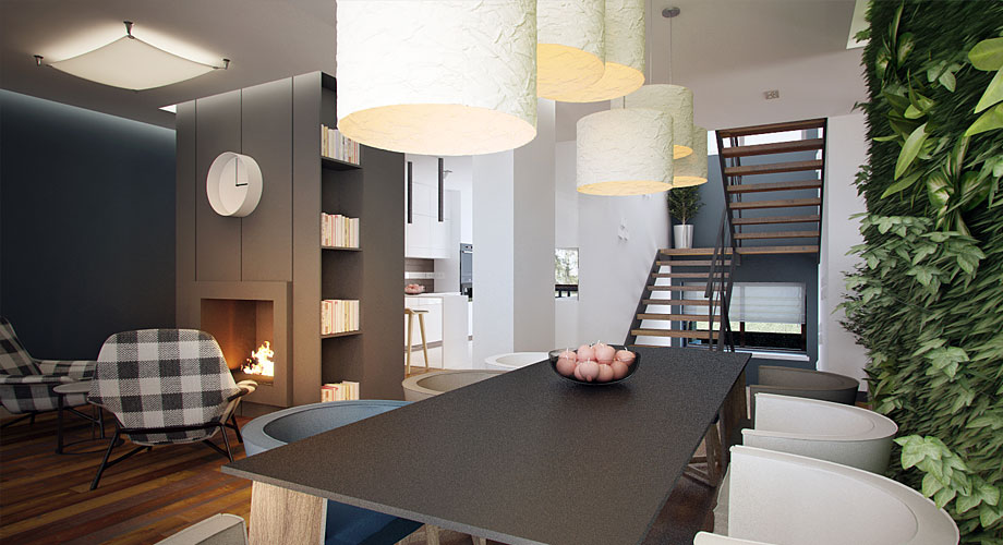
While clean sparse modernism dominates the 'bones' of the design, Svoya has achieved a warm welcoming feeling by throwing in a little bit of plaid, and using wood plank flooring that looks like it has a long story to tell. Of course, nothing says "Welcome to the warmth" like a roaring fire!
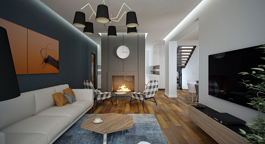
A consistent feature throughout Svoya's designs is the use of innovative lighting. Multiple jointed arms on this modern chandelier recall the versatility of task lamps, adding elements of mystery and surprise - the room says: "This is how you see me now, but can you imagine the rooms that I turn into when you're not around?" Note also, how the angles of these arms reflect the angled lines of the coffee table.
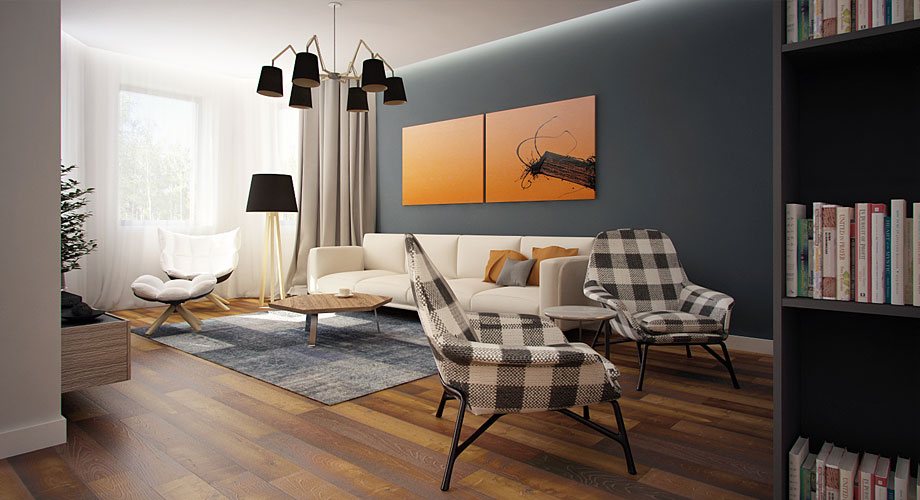
Modernism started out with lines that met, almost exclusively at 90 degree angles. In the 80's, all cool designs featured at least some 45 degree angles. Some designs now feature a complete lack of straight lines, while others, like these examples, make use of angles other than 90 or 45 degrees. Furniture legs continue this trend.
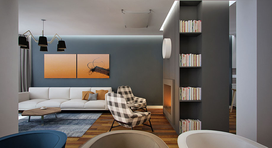
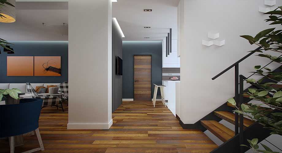
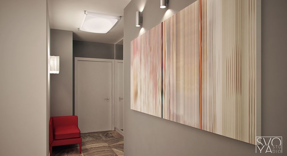
A double-panelled minimalist art piece picks up the warm tones of the floor, fire, and throw cushions. Many people think of natural wood finishes as 'neutrals', but we see clearly here how wood can introduce a non-neutral accent colour to a room.
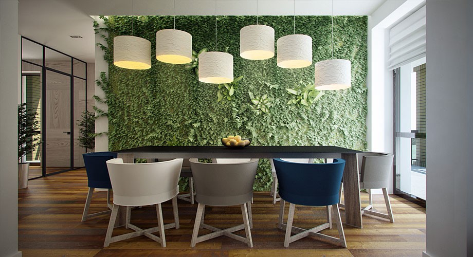
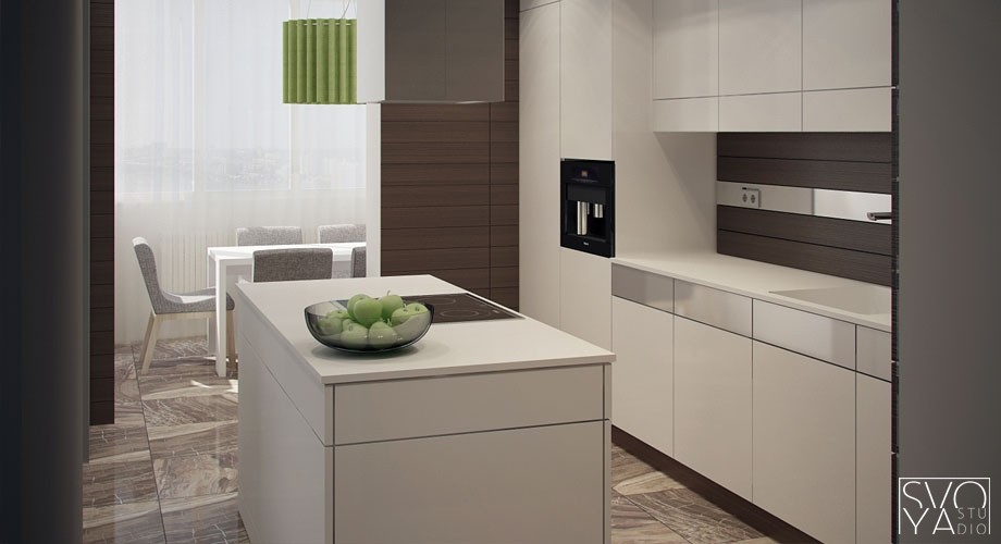
Nothing says '21st century' quite like a green wall. Bringing some of the outdoors inside while taking up minimal floor space and improving indoor air quality, a green wall adds loads of colour and texture to a design. If you plan to install one, look for a space like this near large windows, because living plants require ample light indoors. Also, plan from the beginning how your plants will get their water, and where the excess water will go. These dining pendant lamps express the design elements of rhythm and repetition, while adding surprise with varied heights. They almost look like musical notes on paper!
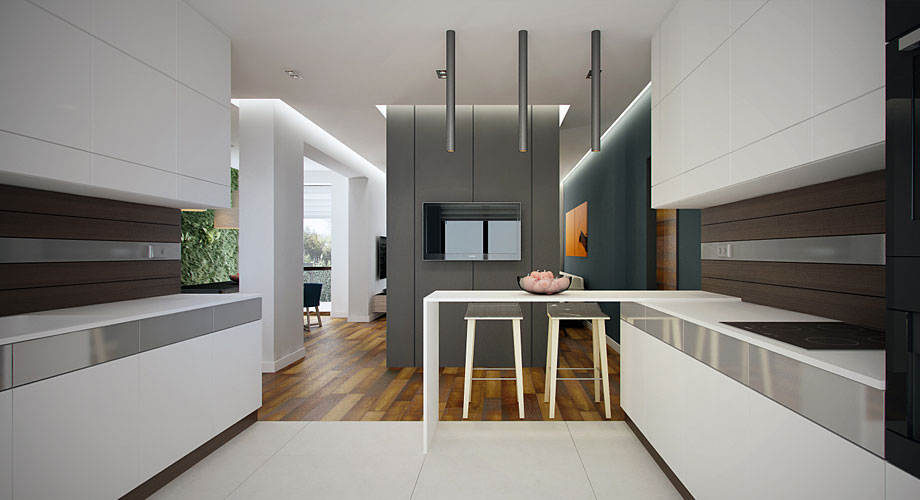
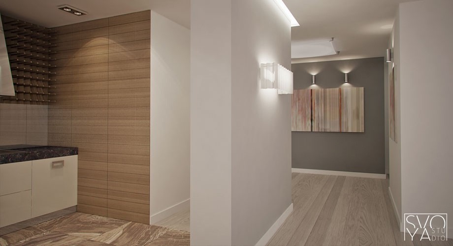
Structural columns can be the bane of a designer's existence, but with careful planning, the one in the center of this picture becomes a room divider separating the kitchen from living and dining areas without completely closing the rooms off from each other.
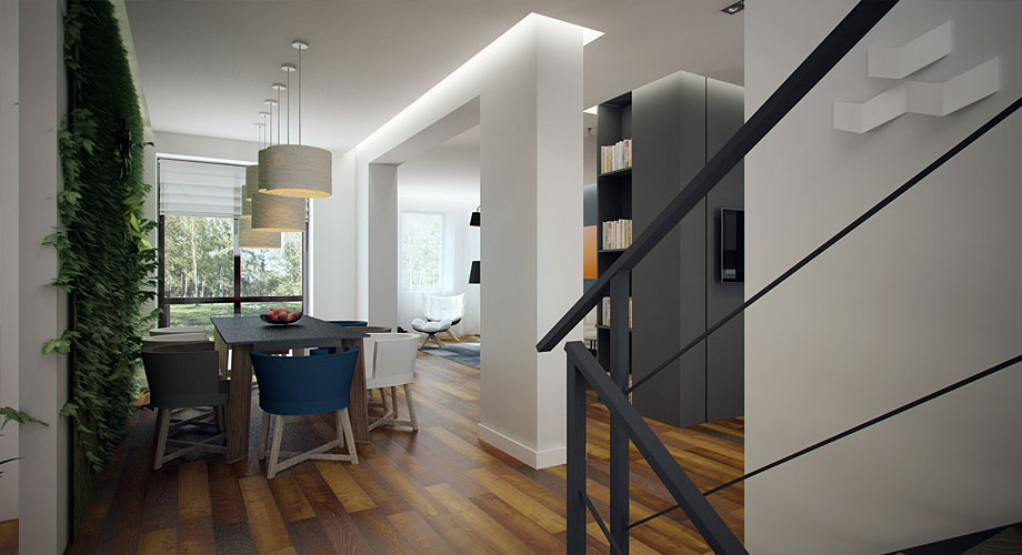
Svoya doesn't just make use of innovative lamps, but also uses lighting in subtle indirect ways. Indirect cove lighting, such as we see here surrounding an arch where it meets the ceiling, is often the hallmark of a professional design.
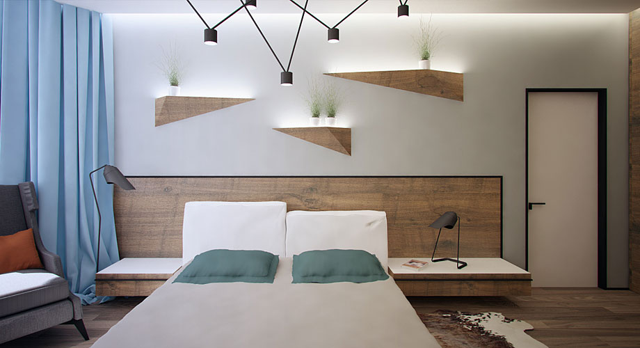
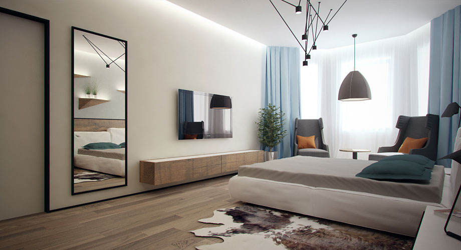
More surprising angles and innovative lighting in the master bedroom with a pulley-style pendant assembly over the bed and faceted shelves that match the flooring and headboard while bathing the plants that they hold in a soft glow from beneath.
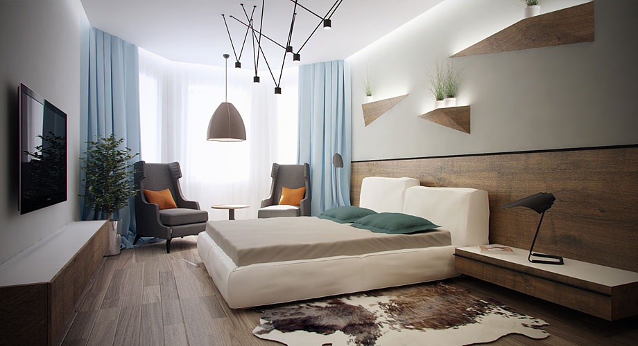
Night table lamps and a pendant over the reading corner still don't complete the rooms lighting - there is yet more hidden in a cove around the upper edge of the room. Such a large number of lights may seem wasteful, but given independent (and often automated) switches, can actually save energy by ensuring that the occupants have exactly the right type and amount of light at all times.
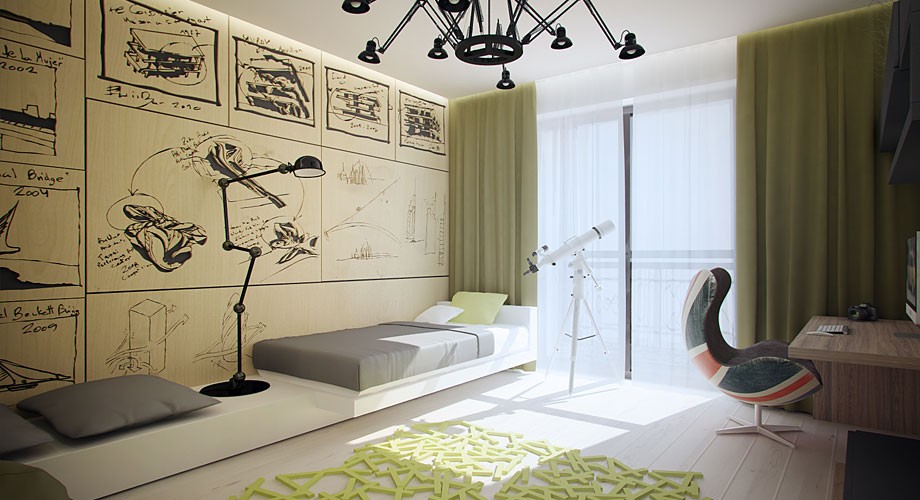
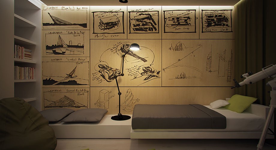
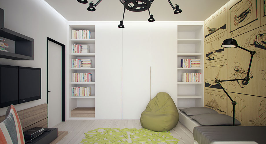
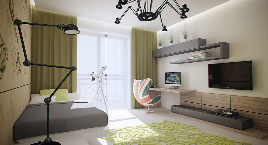
This is a room where creativity happens! Wall panels printed with rough ideation sketches, a task lamp suited to work on the bed, the seating area or the floor, and a telescope and Union Jack chair, to dream of places far away. The theme of irregular angles continues here in the floor lamp, chandelier, wall art, and area rug.
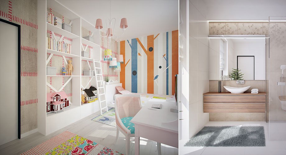
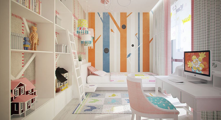
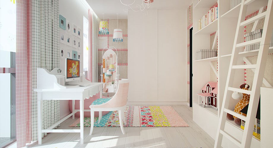
For a younger child, a ladder has been considerately supplied so she can reach the higher shelves and be in control of her own space. A feminine traditional chandelier and workstation chair combine with bolder, more androgynous wall finishes to produce a very individual, eclectic room.
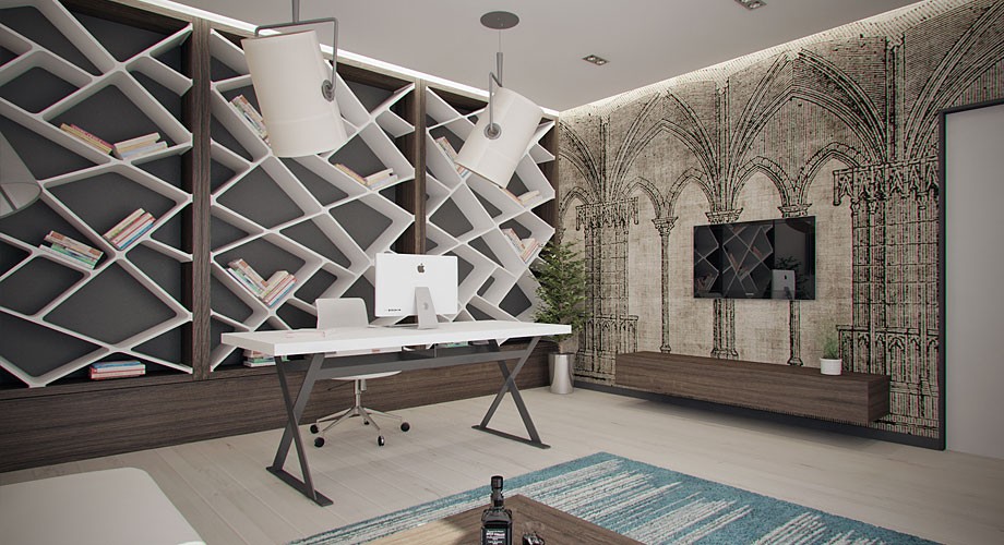
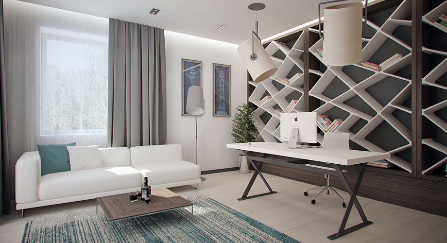
In an adult's home office, the apartment's surprising angles find their boldest expression, while Gothic wall art expresses the past in an up to the minute way.
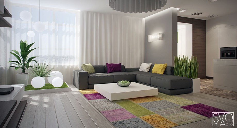
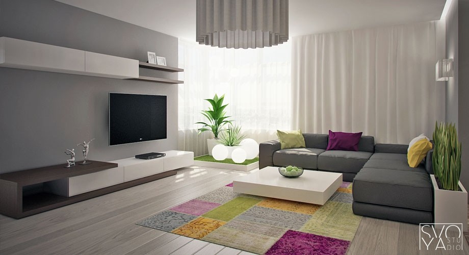
In this second design, Svoya takes the lighting surprises further, adding glowing globes to a cluster of plants on a raised green platform.
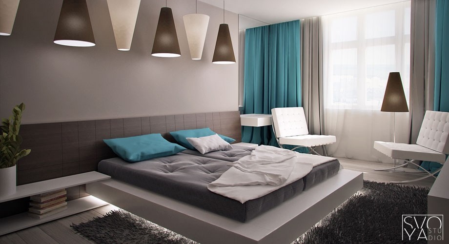
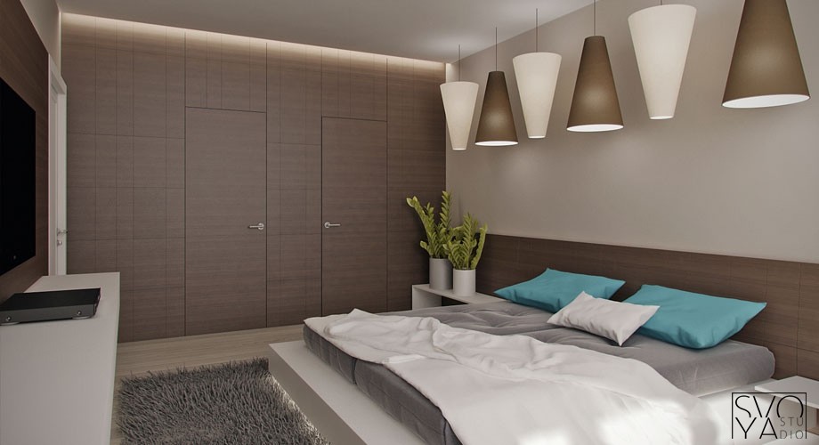
Coved lighting hidden in the edges of the bed platform make it appear to float, while alternating lampshades of the bedroom pendants create a fun rhythm that reminds us of piano keys.
