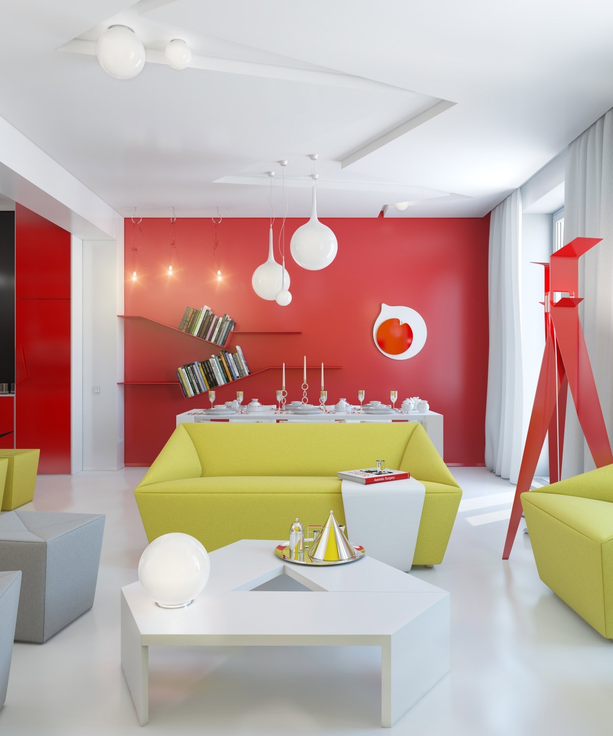
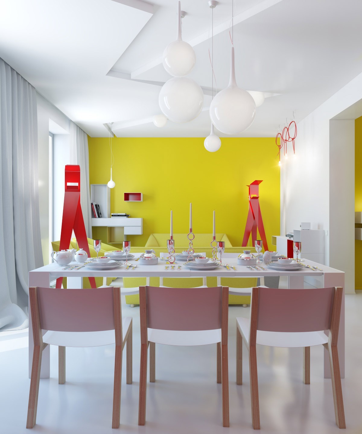
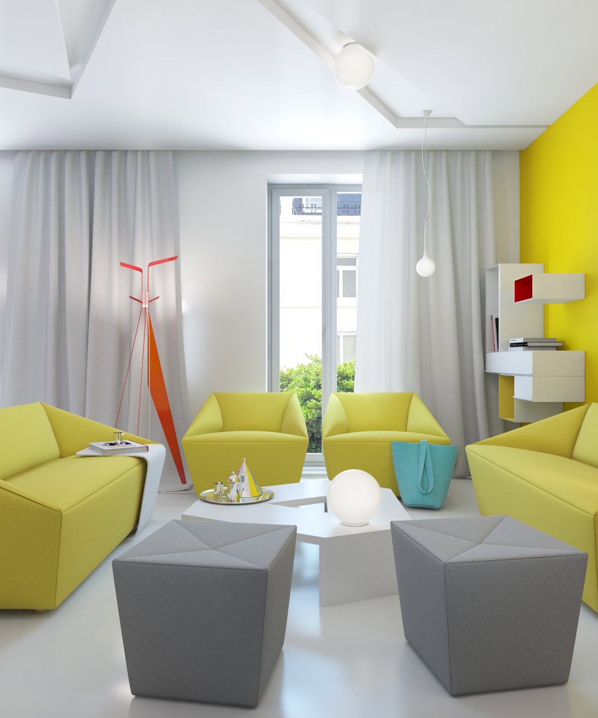
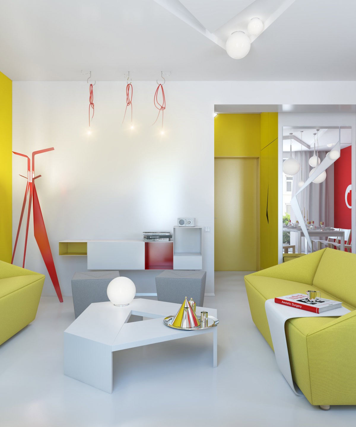
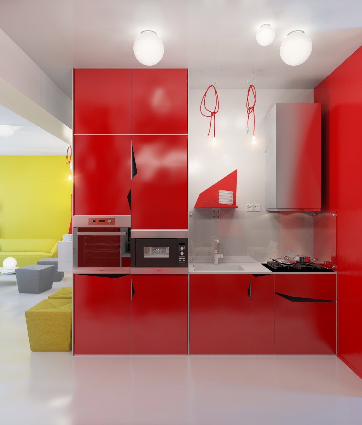
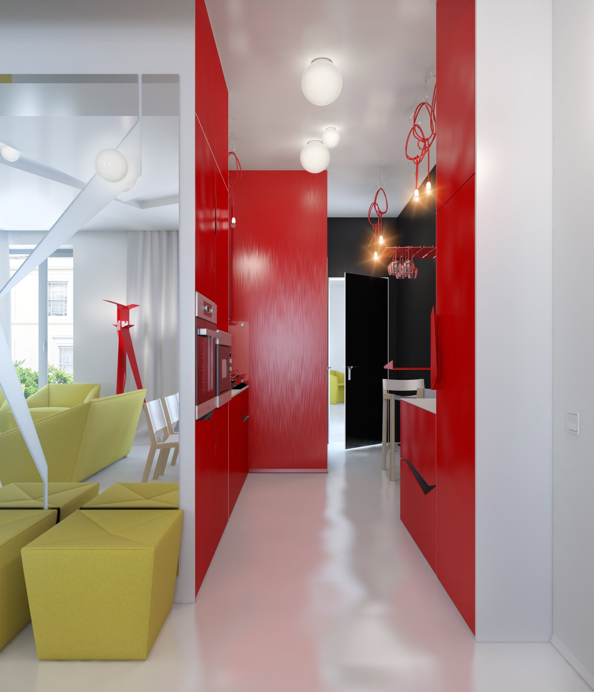
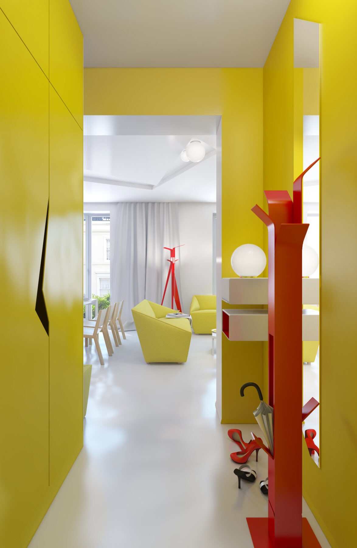
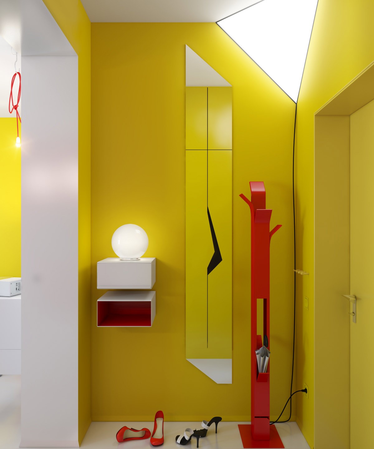
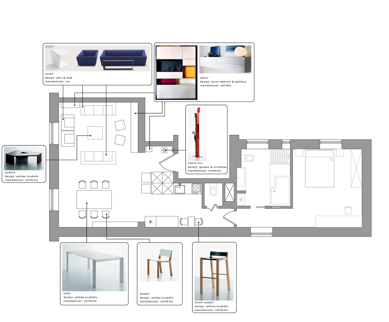
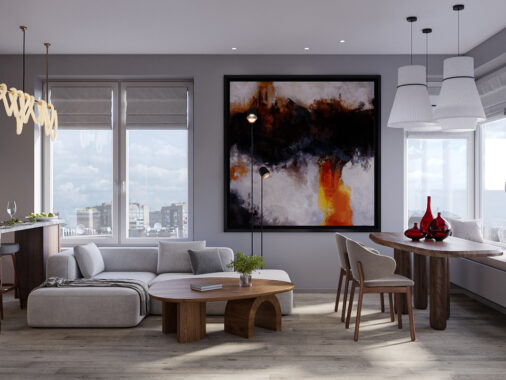
This conceptual apartment, by Anna Marinenko, is positively bursting with bright decor decisions in the choice of paint, furniture, and accessories, but the vivacious palette finds success in this small space by limiting the hues, combining only two colors amidst clean white and fleeting bases of black and grey.
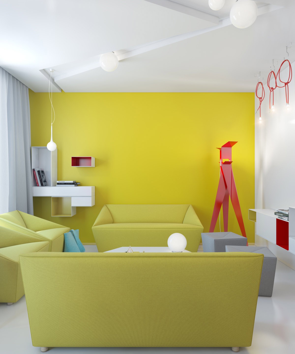
The artist states: "The idea is to make a colorful and bright interior, but do not overdo it with colors, and do not get in the end white interior with small spots of color, although it is also very nice, but too simple. I hope I was able to find a middle ground."
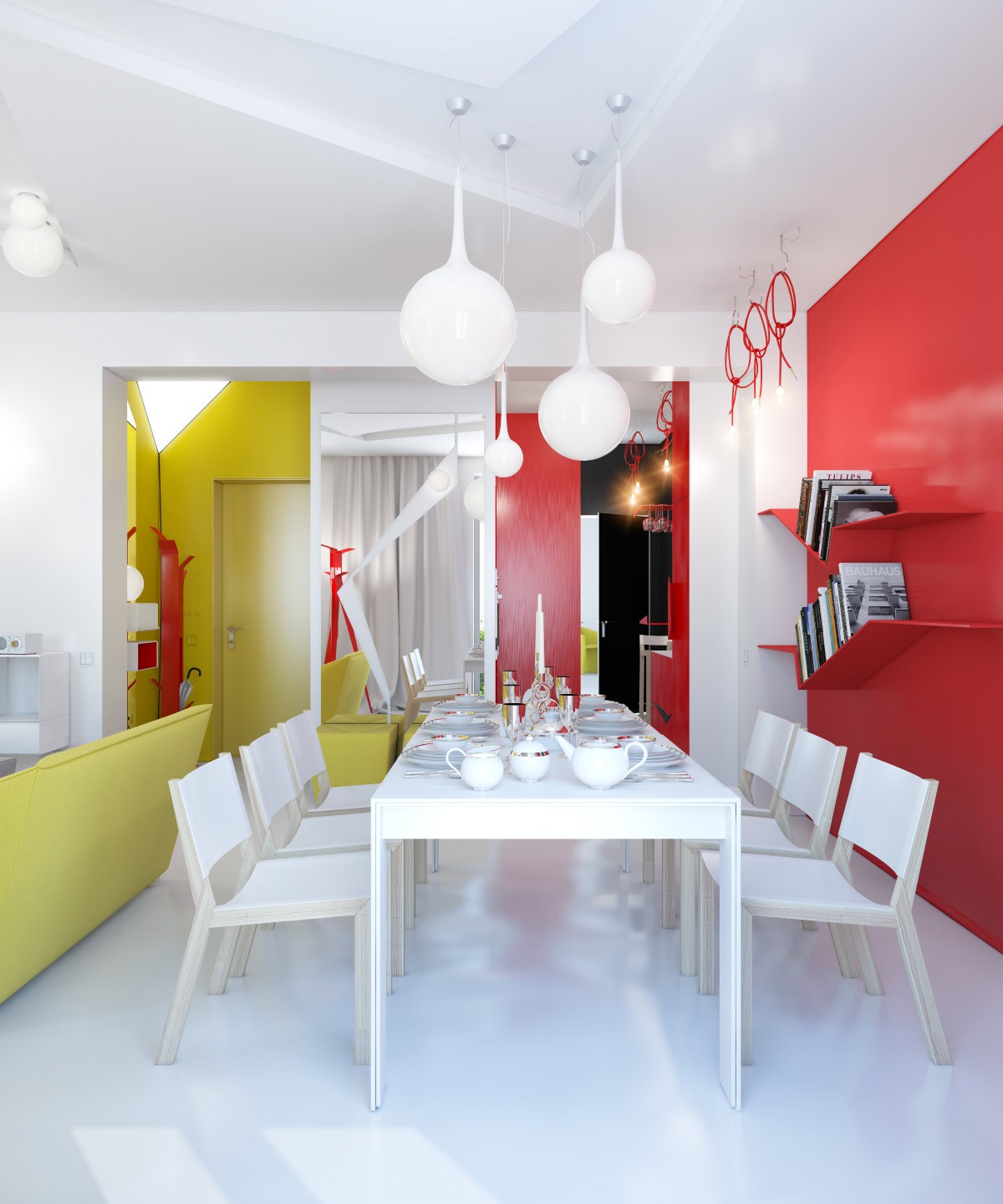
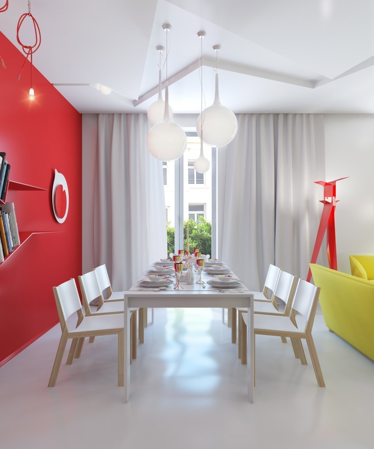
The bold red and yellow color story begins at the front door and continues throughout the entire apartment, with an overall look reminiscent of a pop art painting (or dare we say it, a little like a McDonalds Happy Meal?) This décor scheme won't be for everyone admits Marinenko "The apartment is designed for a short stay in it, for example, for guests or for being alone there and take a break from the daily monotonous life."
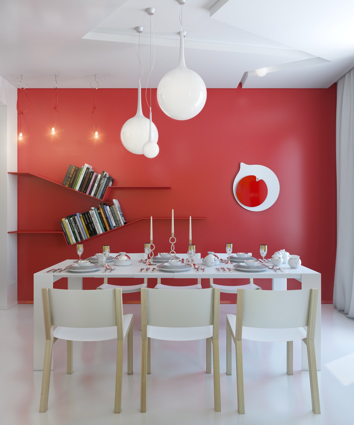
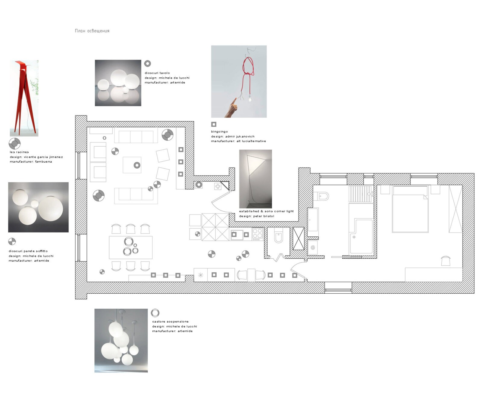
The chandelier over the dining table loosely imitates paint drips, interestingly the light shades are an area devoid of color in contrast to the vivid accent walls and flashes of contemporary furniture and accessories, but the spherical theme can be found all over the design in lamps, tableware, and in the 'Japan Clock' by Marinenko herself, which all provide good contrast against the choice of angular seating and sharp color-matched shelving.

