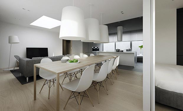
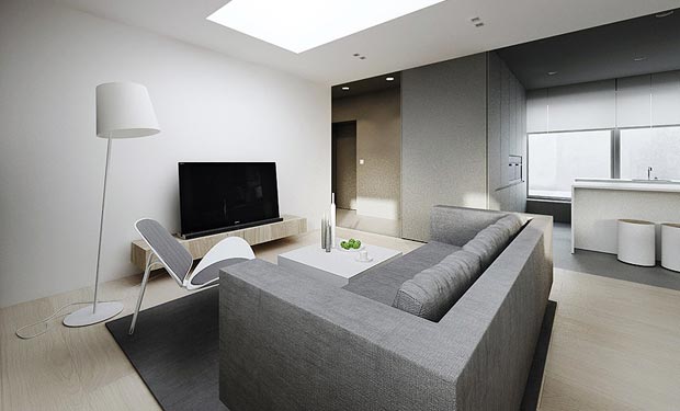
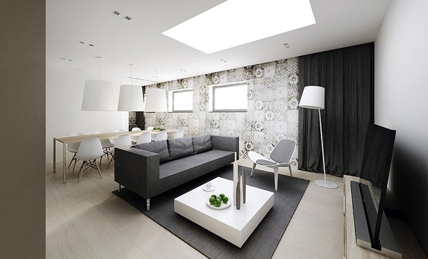
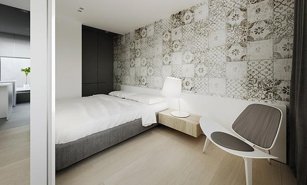
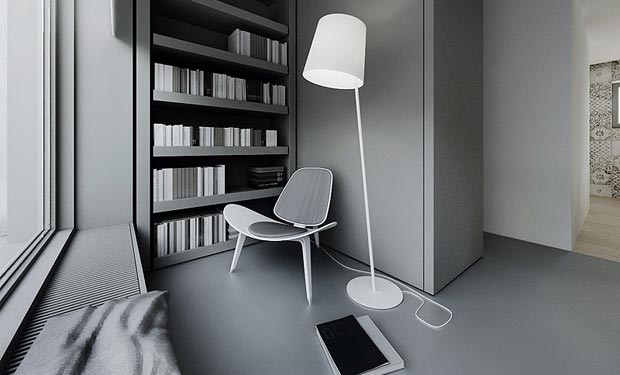
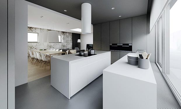
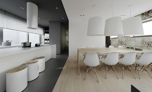
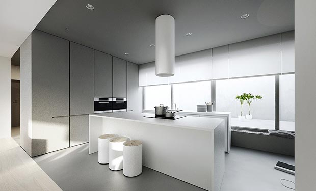
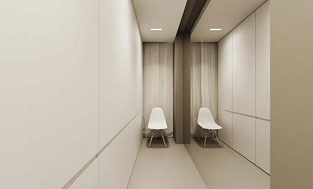
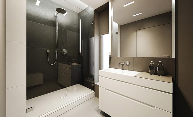
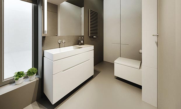
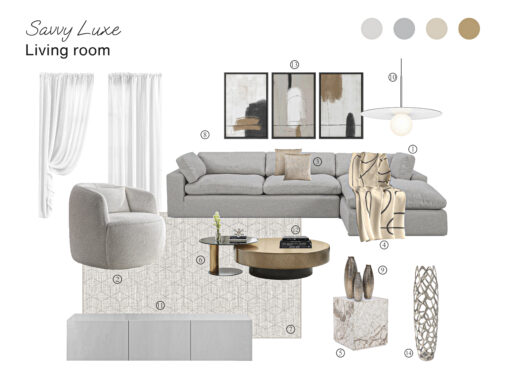
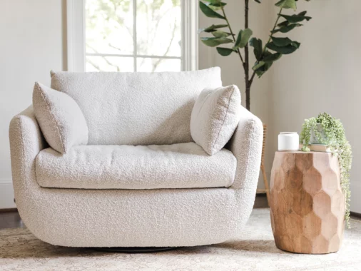
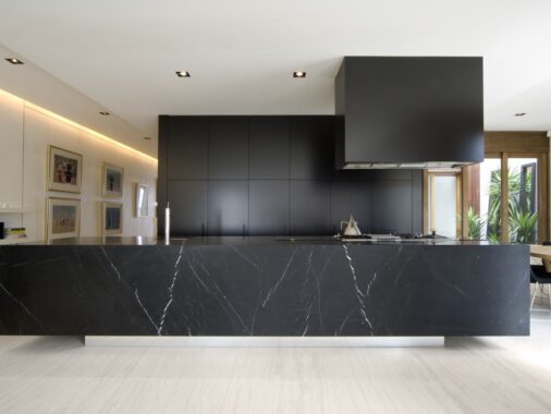
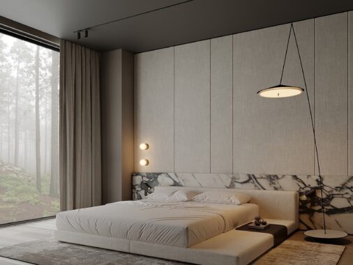
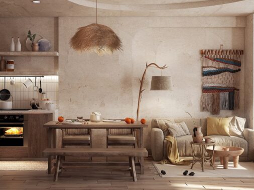
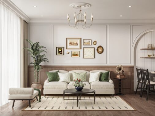
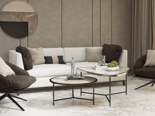
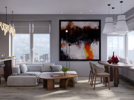
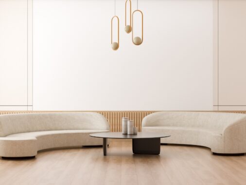
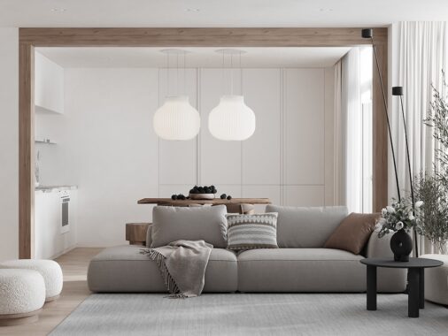
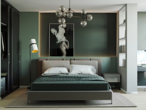
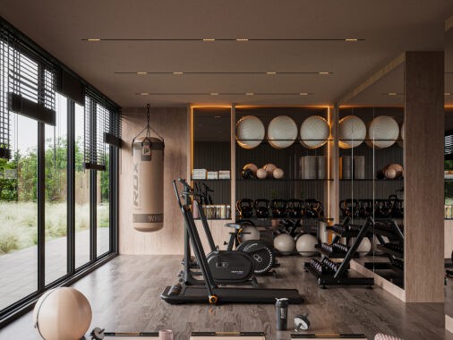
When trying to create something visually impressive, it is naturally tempting to want to use lots of eye candy or overloaded detail. However, the simplest solution can sometimes be the best. We like this beautifully simple minimalist flat design by Polish studio Tamizo. From a designer's eye, this type of simplicity is the ultimate sophistication. Designers know why they love this type of design, but they must always consider the average person's perspective who may not find it visually appealing. For example a designer will see the space as "beautifully minimal", while a non-designer's thought may be "just plain boring". Therefore, it is critical that when venturing into this territory, that not only must it be done with the proper balance and proportion, but also with a focus. These photos show a color combination of white and gray/silver tones which invoke feelings of serenity and inner order, while the choice of black accents in moderation helps to achieve a feeling of sophisticated contentment. The warm neutral tan colors introduced by the floor and table interject a calming note to the rooms. Add a little "pop" of color, such as a plate of green apples and a bamboo plant, and suddenly....the room sings. Notice a focus? We think "Modern Ideal Refuge".
Share this story
Subscribe to our newsletter
Join a growing community of over 20,000 design enthusiasts and get exclusive insights, insider content, and hand-picked articles delivered to your inbox weekly.
