For fans of the crafty, Swedish furniture designer, every new catalog is like a sweet treat we just can't wait to savor. Maybe it's because Ikea's designs are functional, affordable, yet sleek and stylish too. Maybe it's because they can complement a pricier piece of furniture beautifully. Or maybe it's the fact that they design the type of furniture a real home full of family, children, and pets should have. We love visiting the store to admire the tastefully put-together set-ups and to indulge in the Swedish meatballs. :) Whatever the reason you may be a fan, you'll be excited to see the new 2012 catalog we are covering here.
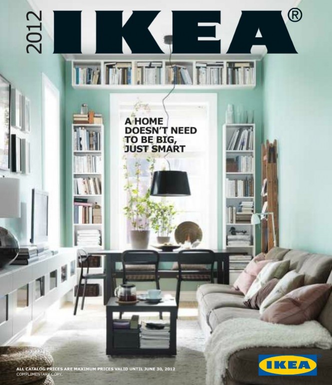 We have embedded a pdf of the catalog below. You can also download it from here. If you just prefer a quick look through, keep scrolling.
We are sure many of you can admire and relate to the quote on their cover-page - "A home doesn't need to be big, just smart." And IKEA is a master at maximizing the use of space while still providing functionality and style. The cover-page is what IKEA's philosophy stands for, and what the contents of the new catalog will maintain. Their catalogs feature spaces that actually look like they are inhabited by humans.
IKEA 2012 Living Rooms
The living room designs are comfortable, vibrant and stylish.
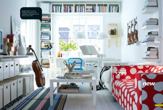 With this white living room, we see the IKEA space-saving philosophy come into play again, with extensive shelving along the walls, as well as plenty of storage bins, and hanging lights. I personally enjoy the relieving pop of color the red and white polka dot couch provides.
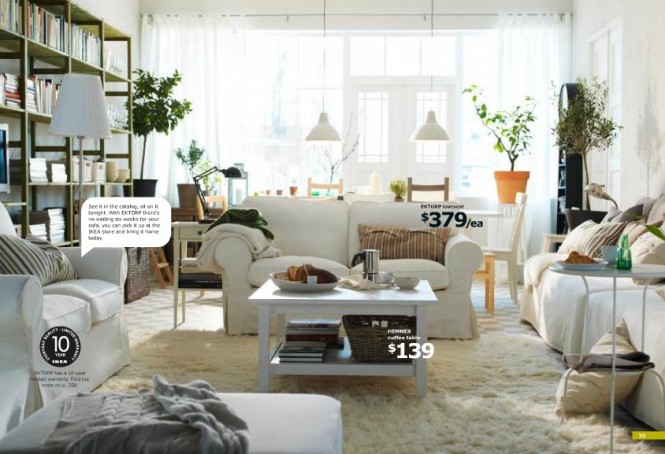 This all-white living room is a cozy, comfy charmer with its white fuzzy rug, and laid-back white furniture. It manages to be classic and rustic at the same time and the couches are all squarely placed around the coffee table, for organization and aesthetic purposes.
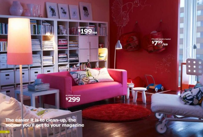 This vibrantly furnished living room is the perfect play area combined with relaxation area, because of the exceptional organization of the room and the fun, yet relaxing color scheme.
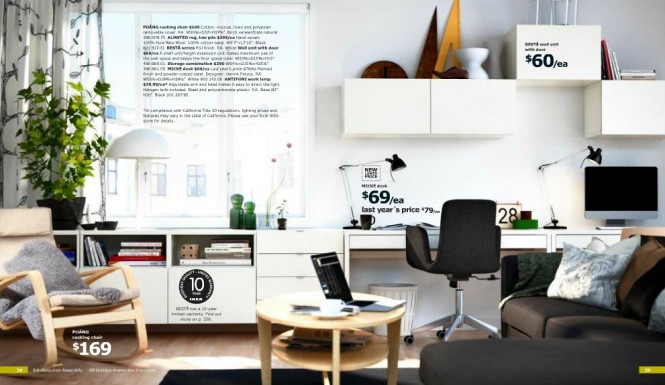
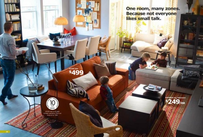 We love this room. Watch how the room is split into different'zones'. One zone is the reading/lounge zone characterized by the white lounge chair in the window alcove. The ottomans and couch and chair outline the sitting area. There is also a separate dining room in this relatively small living area.
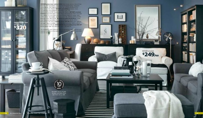
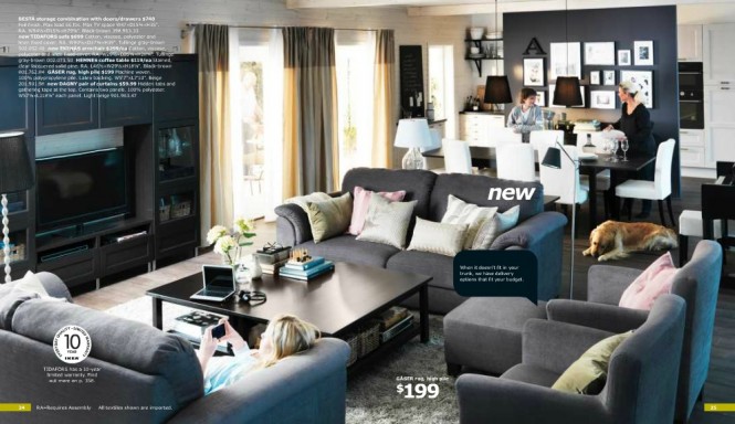
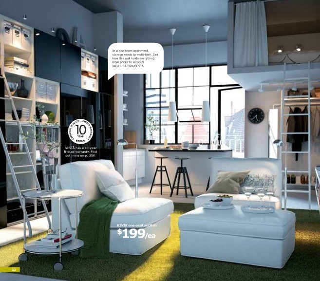
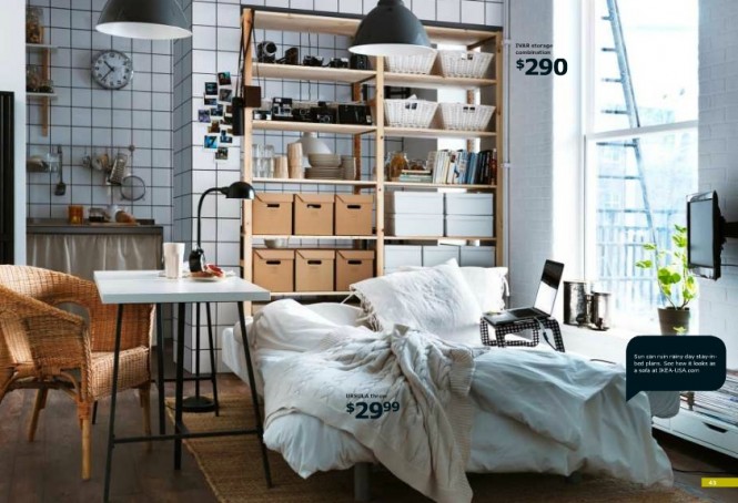 IKEA is amazing for the city-dweller, particularly, because of their make-use-of-every-inch style. This design is reminiscent of a tiny, New York City studio where space is minimal and challenging. The extensive use of shelves, storage bins, and smaller appliances make this space not only livable, but comfortable and functional as well.
2012 IKEA Bedrooms
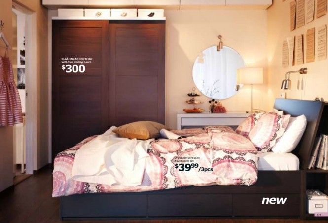
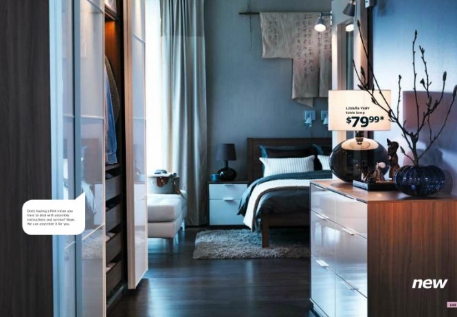
The different IKEA bedroom designs seem to respond to the varying challenges posed by varying types of bedrooms--from the country bedroom to the city bedroom with no closets, to the attic bedroom, they have a solution for everyone.
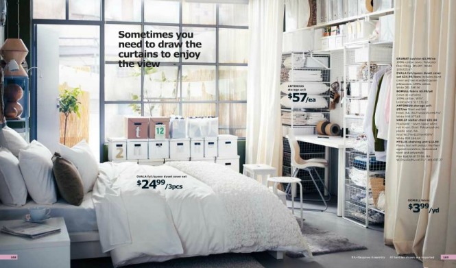 Here, we see a bedroom with no real closets, so IKEA proposes you buy a lot of their plastic storage shelves, and simply hang a curtain in front of them when you need to cover your "closet" up. They even suggest placing the desk along with the shelves, and using as many storage bins as possible.
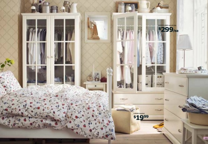 This white, country-style bedroom also works with no real closet, because the IKEA white closet dressers and regular dresser can hold your stuff for you.
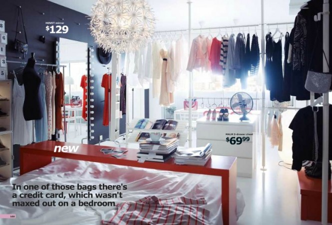 This idea will perhaps appeal to the fashion maven, with no real closet. You can use your clothes as decoration and accordingly, hang them on bars around your bedroom. A red skinny table serves as a desk or breakfast tray and is easily placed above the bed.
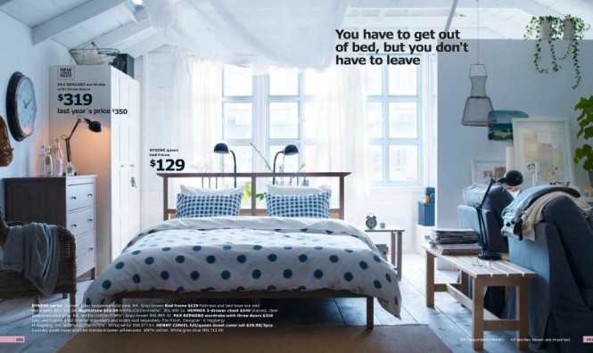 For those of us with a bedroom and living room in one, IKEA shows us how to separate using benches and dividing furniture, all in a similar color scheme as the entire room.
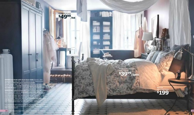
IKEA 2012 Kitchens
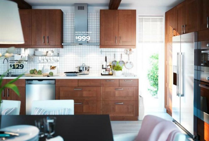
IKEA seems to believe everyone should have a large kitchen, despite the space of the remaining rooms. And while we wholeheartedly agree, we are happy they are offering at least one take on their design for a much smaller, "city-size" kitchen below.
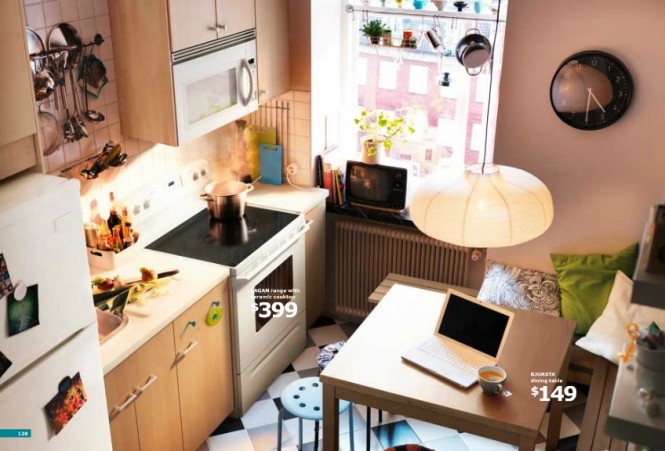 As small as it is, this kitchen is absolutely adorable! Ikea suggests the use of many, many hanging shelves and racks for your kitchenwares, smaller tables that do not sacrifice the use of nice wood finishes, and brightening up the space with pops of color.
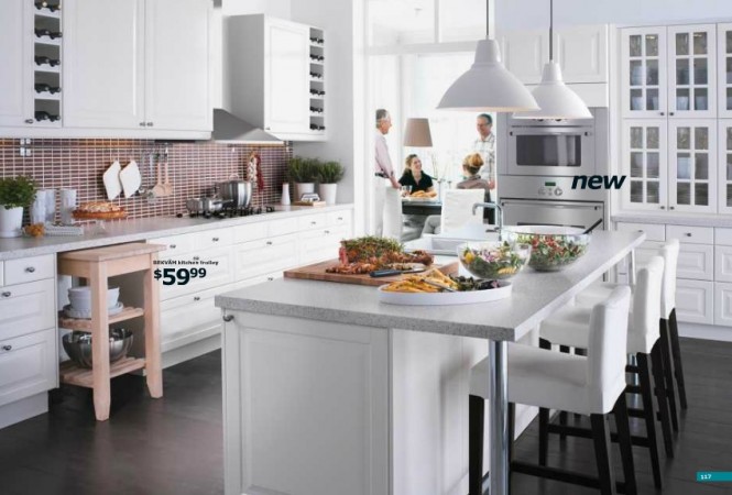
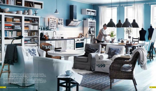
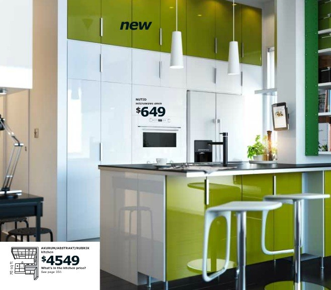
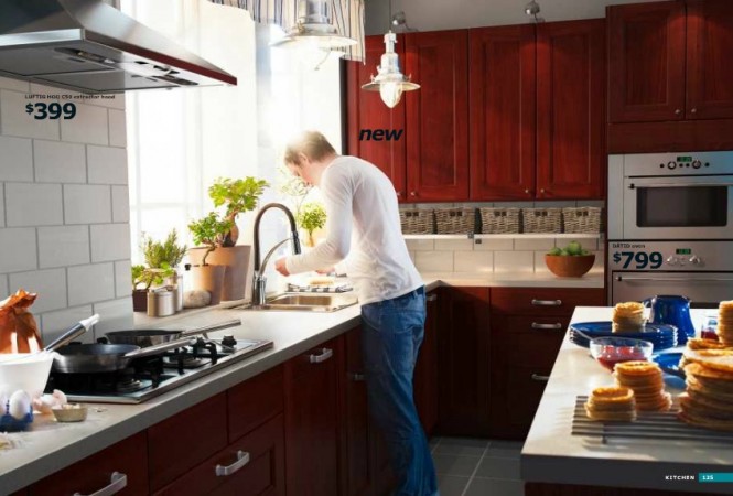
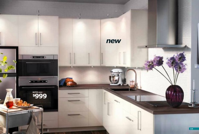
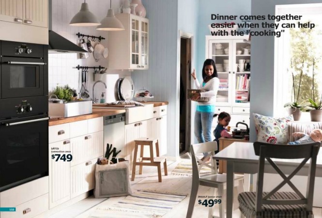 This space meshes the kitchen with the dining area, yet with the extensive use of shelves, racks, and cupboards and simple design, the space does not look cluttered, but streamlined and semi-spacious. It also works to provide more flow and connection between the two spaces.
IKEA 2012 Workspaces
As for workspaces, IKEA covers them too, both large and tiny, vibrant and dark.
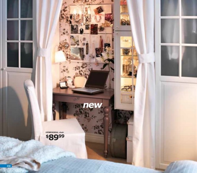 This one has to be our favorite, because it is absolutely tiny yet adorable. If you look closely, you will see that they have made use of a small wall between two closet spaces, and simply hung curtains to frame or cover it when necessary. A tiny work desk, tiny laptop decorate the space along with a wall-shelf and board that holds items. It is made its own space with the use of an eye-catching black and white wallpaper print on the wall.
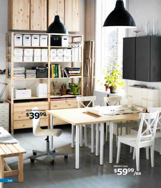
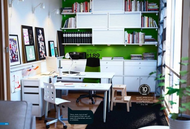
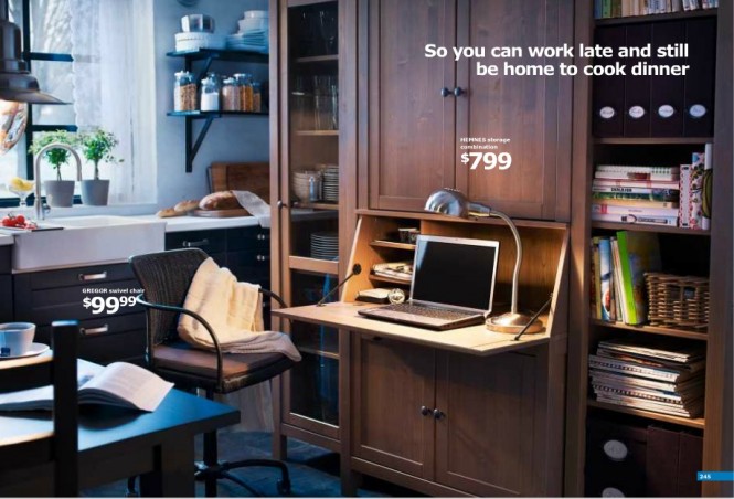 This particularly caught our eye. A workspace inside the kitchen, all made possible by a large storage closet, that can be used to store dishes and glasswares, but that also has a fold-out desk a laptop can easily be placed on!
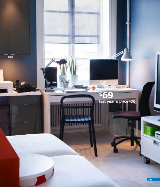 Adding a desk that is the same height as the countertop before it, in a small corner of the room, saves space but also looks much nicer.
IKEA 2012 Kids Rooms
IKEA is making me seriously consider moving into a smaller apartment, in order to make it look as adorable and charming as they do! Here are their takes on kids' rooms, especially those that are shared or baby rooms that are smaller than the norm.
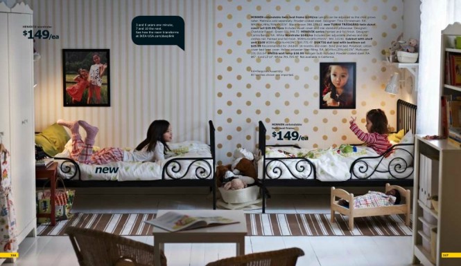 Check out how the wallpapers split at the middle of the room. The wall-attached lights also save room and easily provide nightly story-telling sessions.
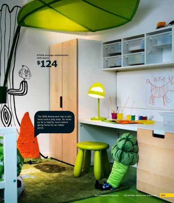
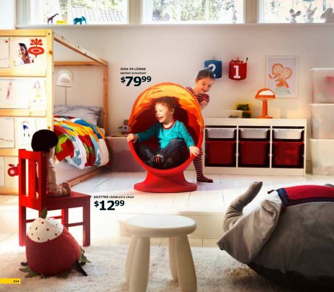 This room doubles as a play and sleep area.
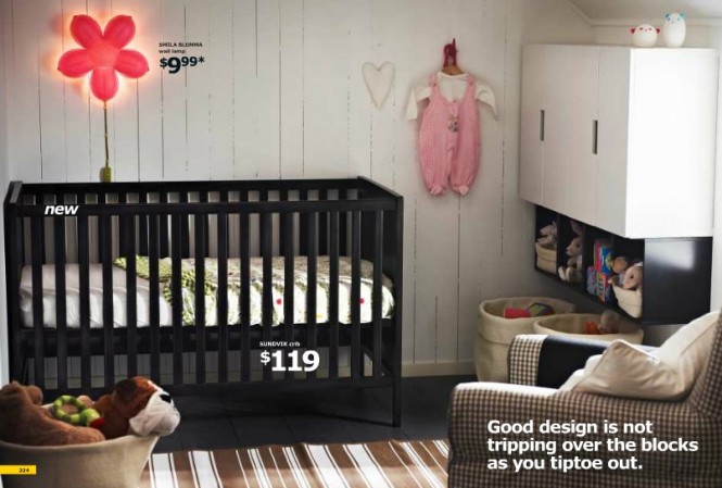 If you enjoyed this check out our post on other IKEA Catalogs: Previous IKEA Catalogs

