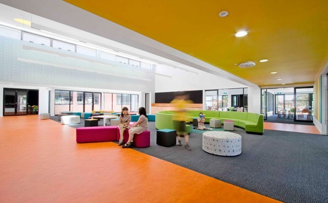
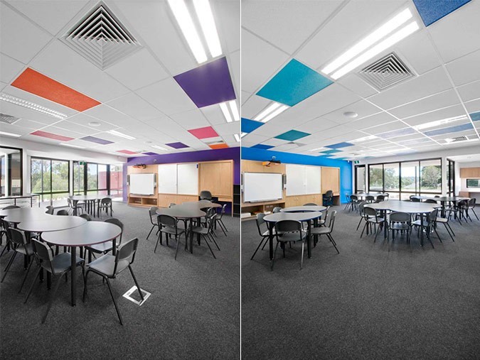
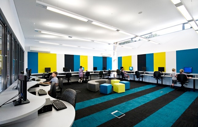
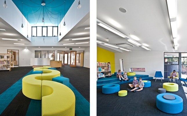
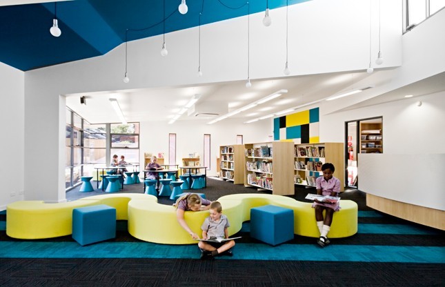
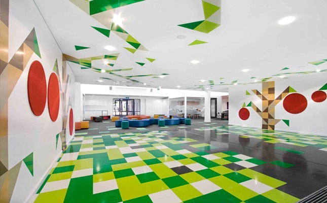
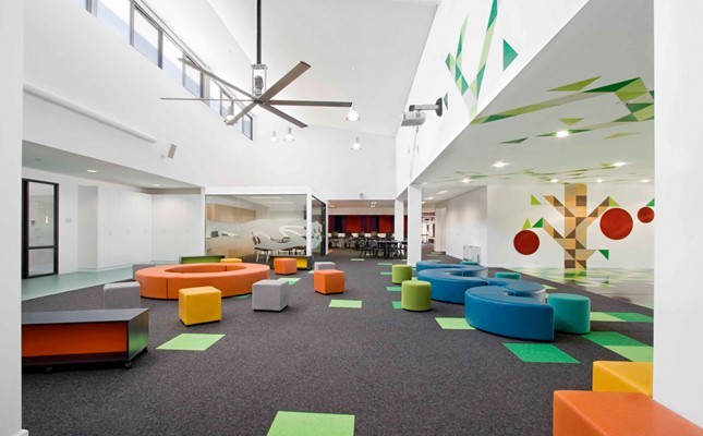
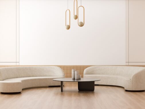
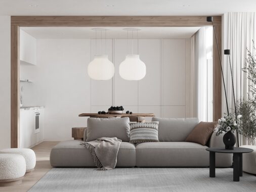
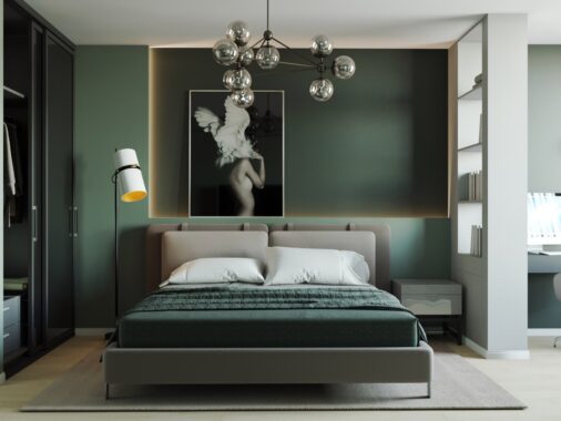
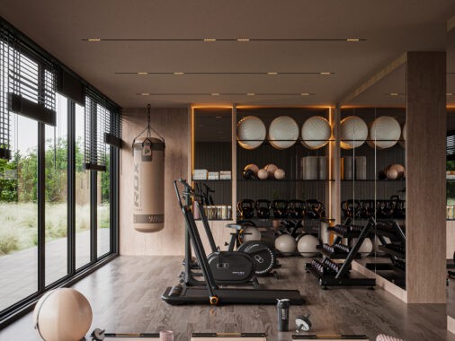
The driving force in the design of schools is the well being of the student's. With this in mind the Australia based architects smith+tracey have come up with solutions that both engage the students and deviate from what they would normally expect for a school environment. These spaces are adaptive and interesting. The use of colour breaks up the spaces into various zones for group work, classes and single study areas. The colour isn't just used on the walls though. It's usage includes the floors furniture and even the ceilings, stepping away from the typical drab colours which you will often find in schools. The colours are not overwhelming either, being balanced with a neutral base of white and grey. It's good to see designers stepping outside the box and not being afraid to try something new. As most parents will appreciate children become more engaged the more engaging the environment making this school environment ideal for children and adults alike.
Share this story
Subscribe to our newsletter
Join a growing community of over 20,000 design enthusiasts and get exclusive insights, insider content, and hand-picked articles delivered to your inbox weekly.
