The magic of movie making is alive and well, and clearly on display in the blockbuster Iron Man sequel. While Tony Stark's alter-ego Iron Man suit is a stunning work of effects, what is even cooler is Iron Man's house.
 The house doesn't really exist, and is actually a very clever use of CG. The film's director Jon Favreau explains that the exterior shots of the house are keyed in on, " a bluff called Point Dume in Malibu that is a National Park, so people in Los Angeles will recognize it. It's sort of like the best spot and nobody is allowed to build there, but we put a digital house there." In this video Favreau walks us through the sets of Iron Man 1. (If you are reading this through email, you need to visit this link to watch the video: https://www.home-designing.com/2010/05/iron-mans-house )
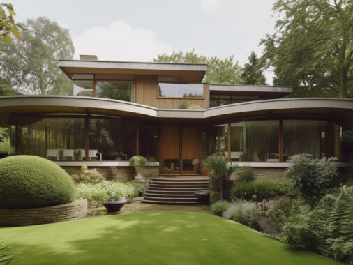
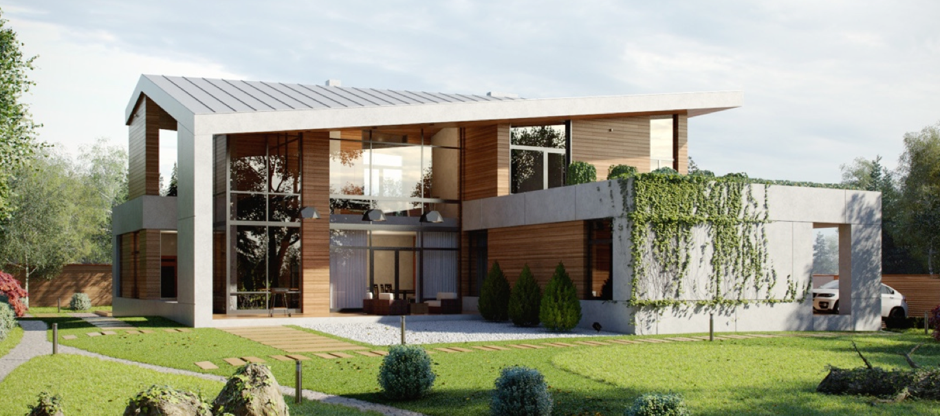
Here are some exterior artworks of the home, courtesy of Phil Saunders, the concept artist who visualized Iron Man's home for the movie.
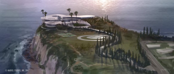
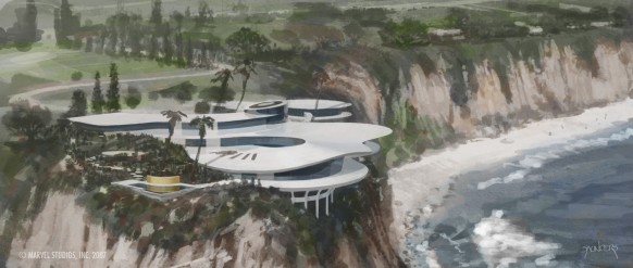 Phil Saunders' comments:
Production Designer Michael Riva mandated a Malibu cliffside home in the vein of John Lautner's really organic cast concrete & glass homes. The first designs were for set extensions of existing homes, but nothing we scouted looked like a billionaire's home. A few multi-millionaires homes but... So I came up with this design and perched it in the most decadent location I could think of, right on top of Point Dume, a California State Park. Who else but a billionaire could get those building permits? The garage under the cantilevered livingroom I really liked, looking out over the ocean between the buttresses. Since that's where Tony really lives, it should still have a nice view. The actual garage set is three times the size of the livingroom and would never fit in that space below, but thanks to the magic of movie geography, it's never apparent.
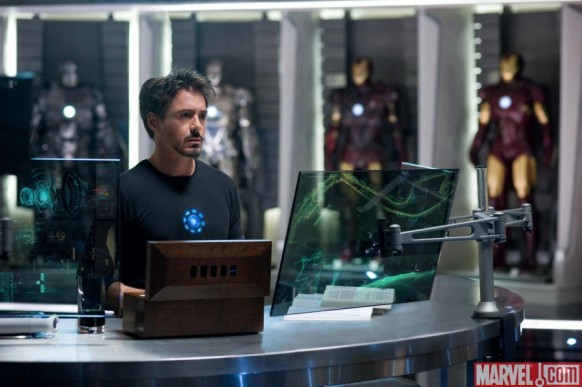
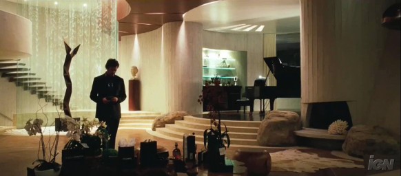
Meanwhile, the inside of the house is as fictional as the outside. The interior of Stark's home was built on a Los Angeles area soundstage, as is Stark's impressive workshop, where he tinkers with his creations, including the Iron Man suit. The workshop is a direct contrast to the rest of the house, which is "stark" and barely finished, without even a few mementos. The workshop is where the real action takes place.
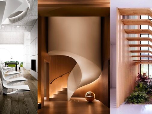
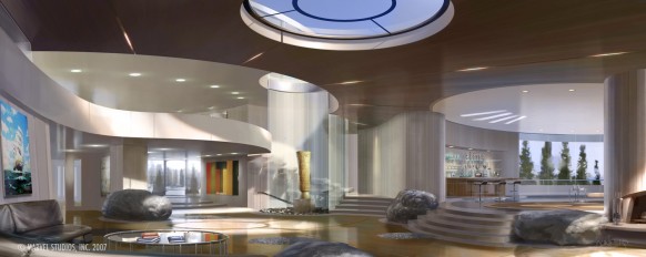
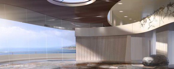
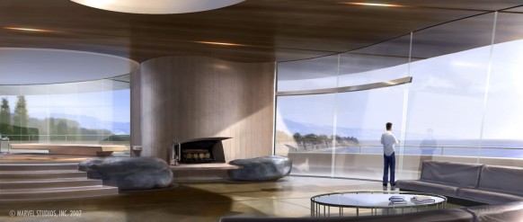
We went through a lot of variations of set dressing, the floor was originally cut stone, the area within the cylindrical glass waterfall/ spiral staircase was originally an arboretum, and there were creeping vines on the balconies (which you can still see in the east view.) The staircase started out as glass, supported by cast aluminum cantelever arms of graded heights fanning out from the glass, but structurally it wasn't feasable, so cast concrete steps similar to another Lautner house's were substituted. It actually makes the center a little cleaner.
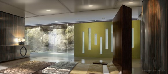
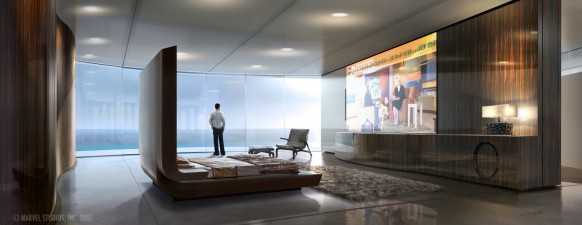
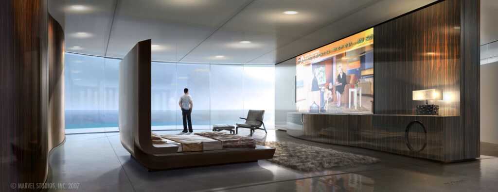
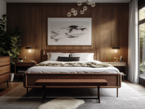
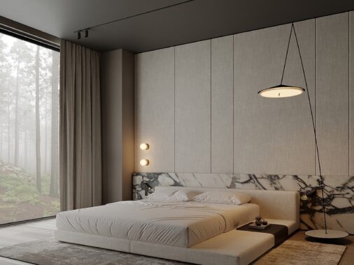
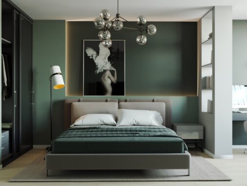
The attempt here was to create a 'stark' designer environment, something that reflected a complete absence of personal touch. Anything that reflected Tony's personality would be in his basement garage/workshop. This design also went through a lot of set-dressing variations, but once again came out much like the rendering. I was pretty thrilled with the bed & wall unit design (which separates the room from the bathroom which was designed but ultimately cut from the script.) They even managed to match the really bold woodgrain with a printed veneer.
Here is a small bonus video for our readers. It is a video from Perception (the studio that did part of the visual effects for Iron Man 2) that show a few behind the scenes shots of the technology behind Iron Man 2. References: Marvel, Phil Saunders & Perception Recommended Reading: Tron Movie Inspired Interiors Ex Machina Movie House Other Famous Movie Houses
