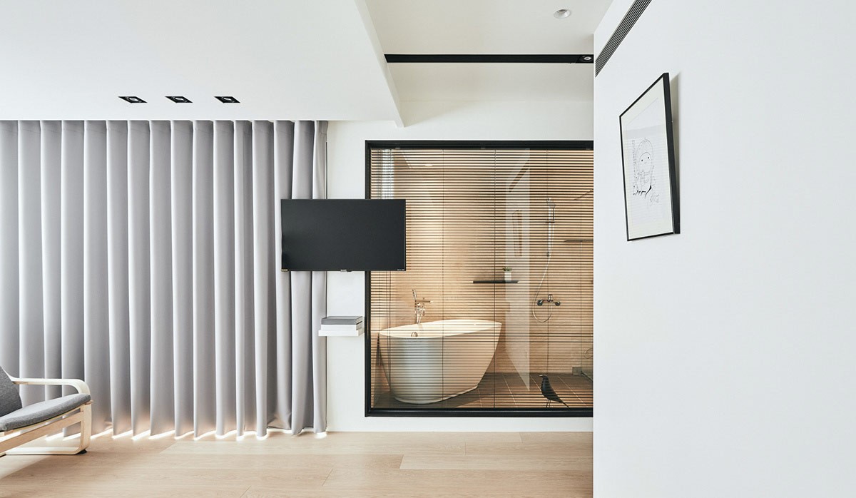
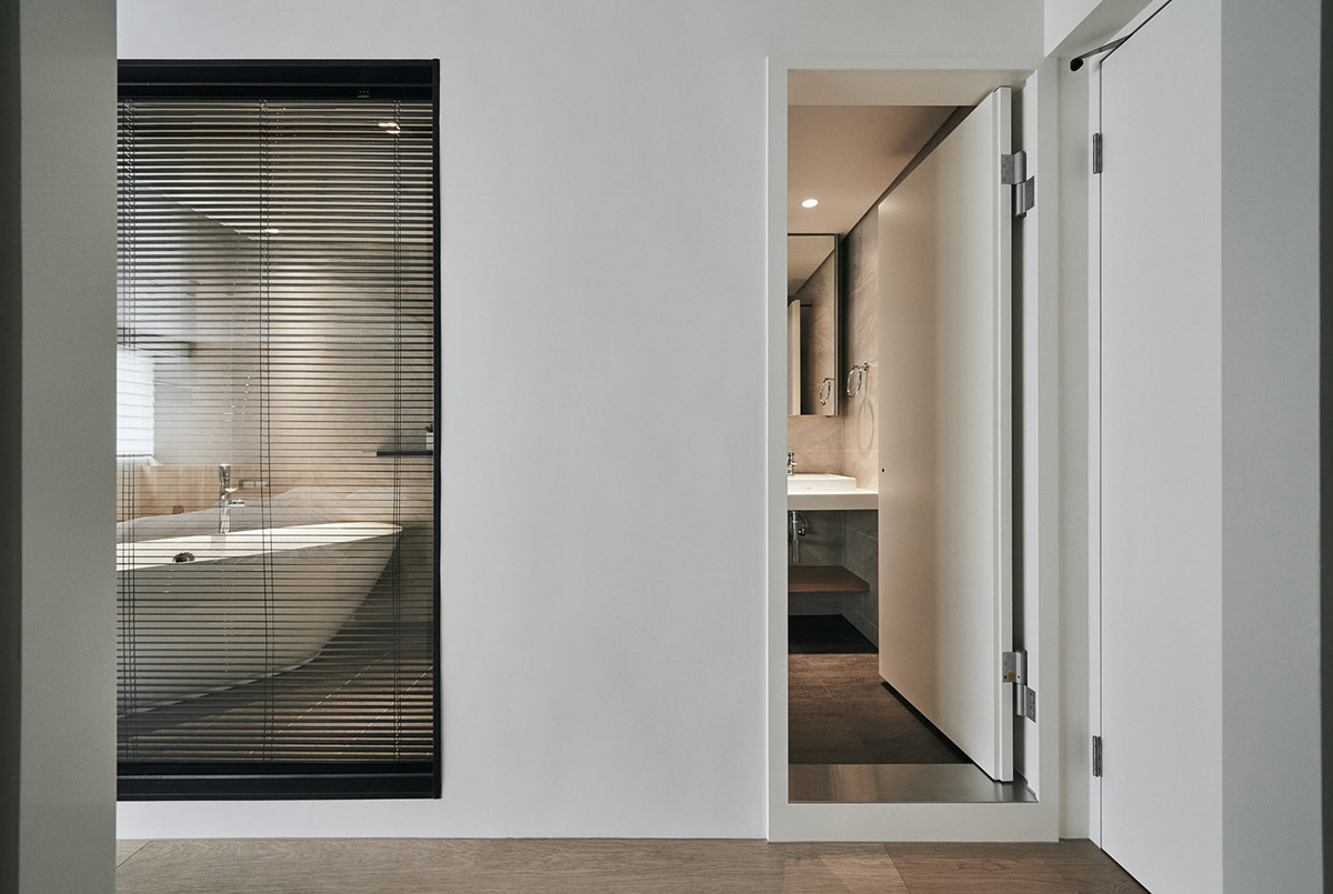
We visit two unique and unconventional home layouts today, each created by Indot Design. An initial minimalist aesthetic is apparent, but there is much more to these two interiors than simply serene decor. We’re met with a creative split level living room in home number one, which achieves a feeling of extra space, before a floating concrete staircase gives rise to an airy master suite with a glass wall bathroom. Home number two has a fluid layout that disguises all borders, and has hidden elements such as a cat wall camouflaged as a shelving arrangement. The rise and fall of wood, white and grey elements creates visual confusion, and closed volumes dismiss the questioning eye.

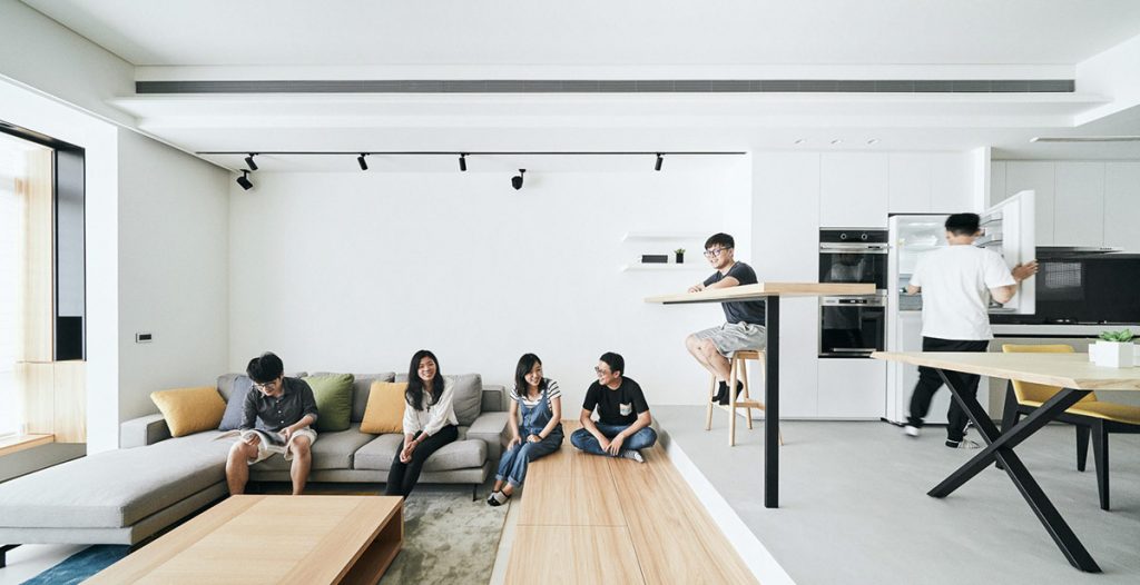
At our first stop, a split level modern living room design creates extra space in which family and friends can gather. The bar overlooking the lounge seems much further removed than if it had been situated upon the same floor height as the sofa. The wide wooden step down to the lounge also creates extra seating space, as well as opportunities for hidden storage.
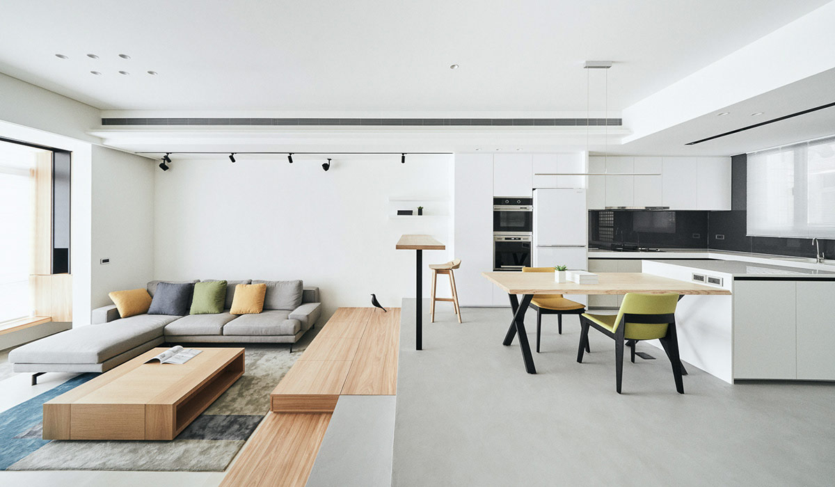
Even an Eames bird makes itself at home on the transitional step between the kitchen and lounge. Green and yellow cushions and accent pieces bring a freshness to the predominantly white and grey decor scheme.
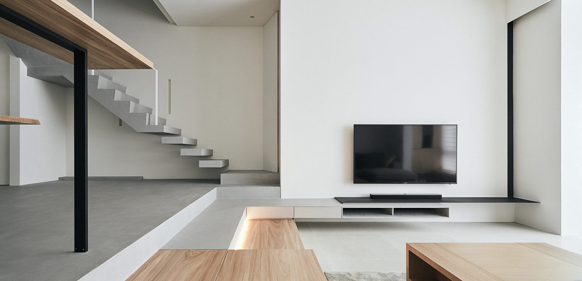
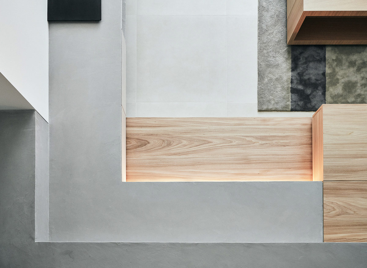
A section of the step down into the living room has a concrete top, to tie in with the solid concrete kitchen floor. Beneath the concrete, grey storage drawers hide away, running around in an L-shape to form a media unit beneath the TV.
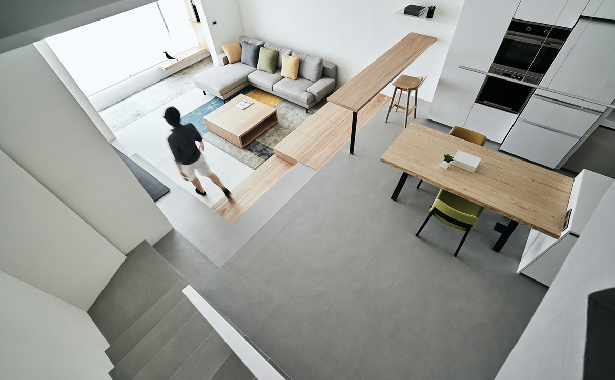
The wood and concrete volumes fit together like the pieces of a puzzle, to make one satisfying interlocked design.
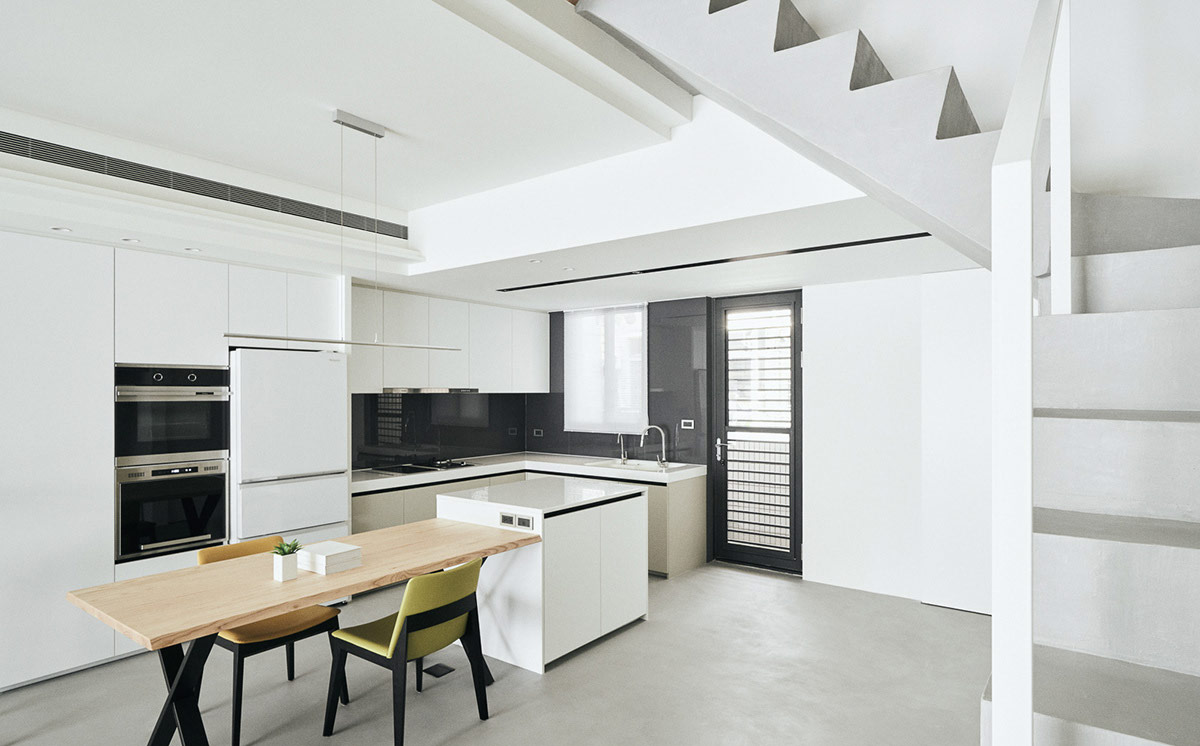
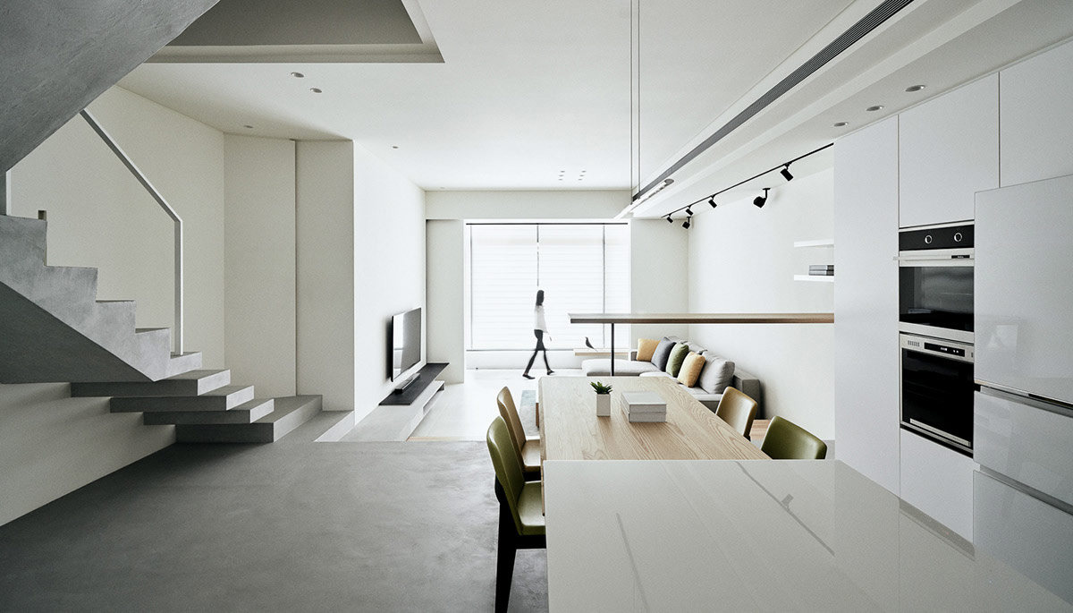
Across from the staircase, an L-shaped kitchen with island has a sleek handle-free finish.
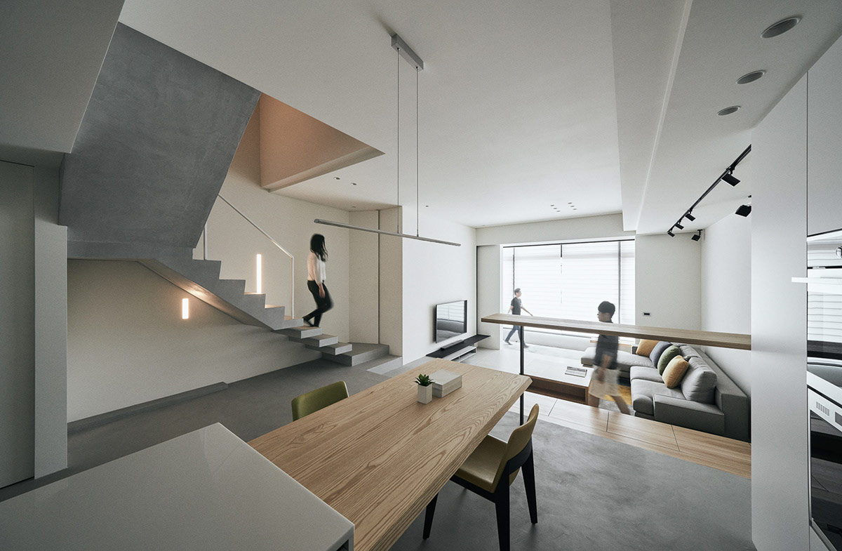
The kitchen island has a dining table attached to it, made from the same light wood effect as the kitchen bar and the storage step. An ultra thin bar suspension light illuminates the tabletop.
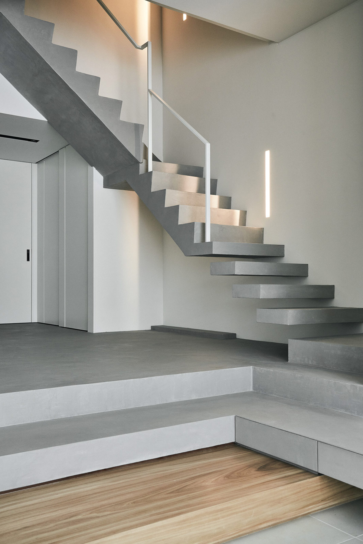
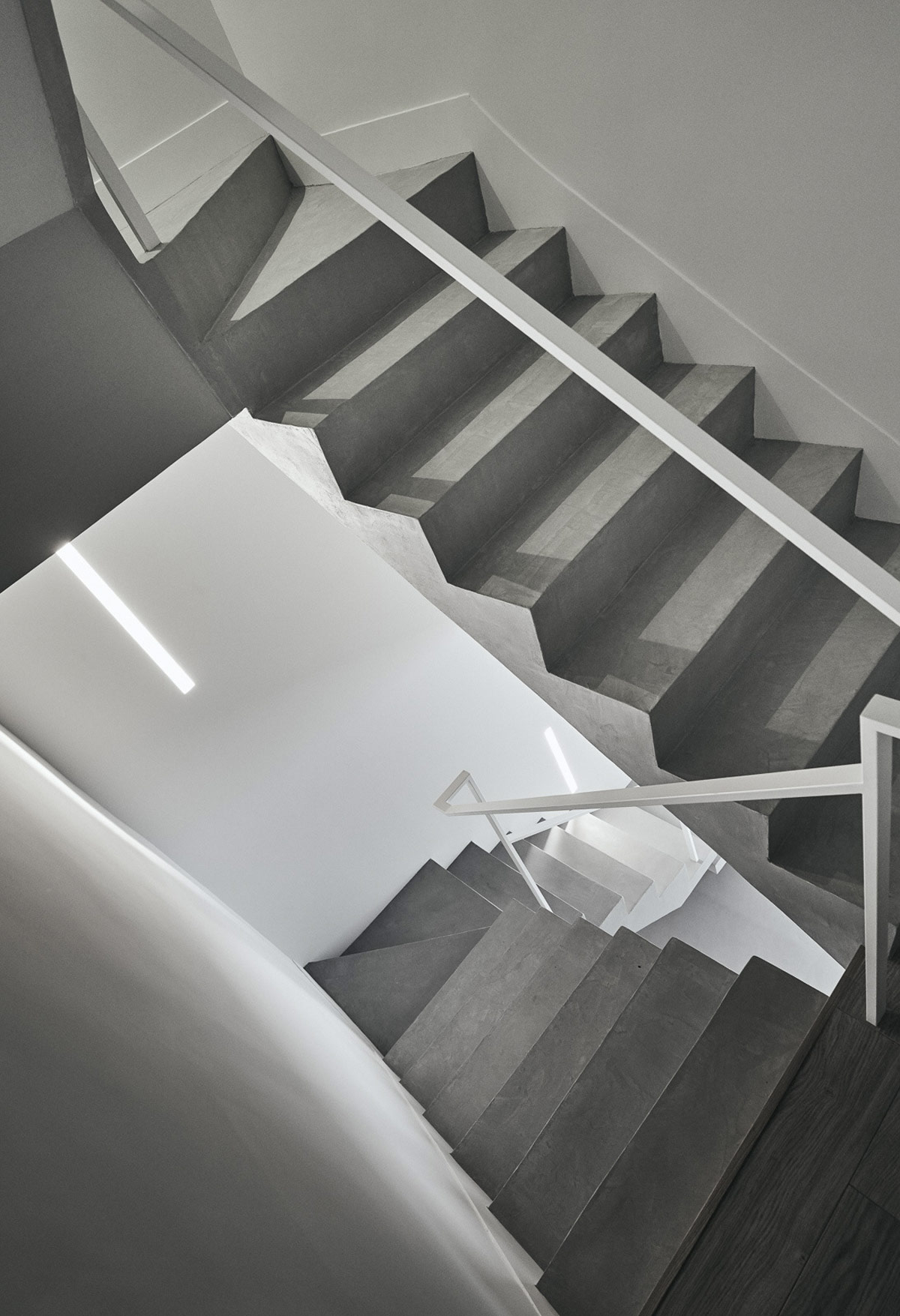
At the fifth tread, the floating staircase design becomes one solid concrete volume.
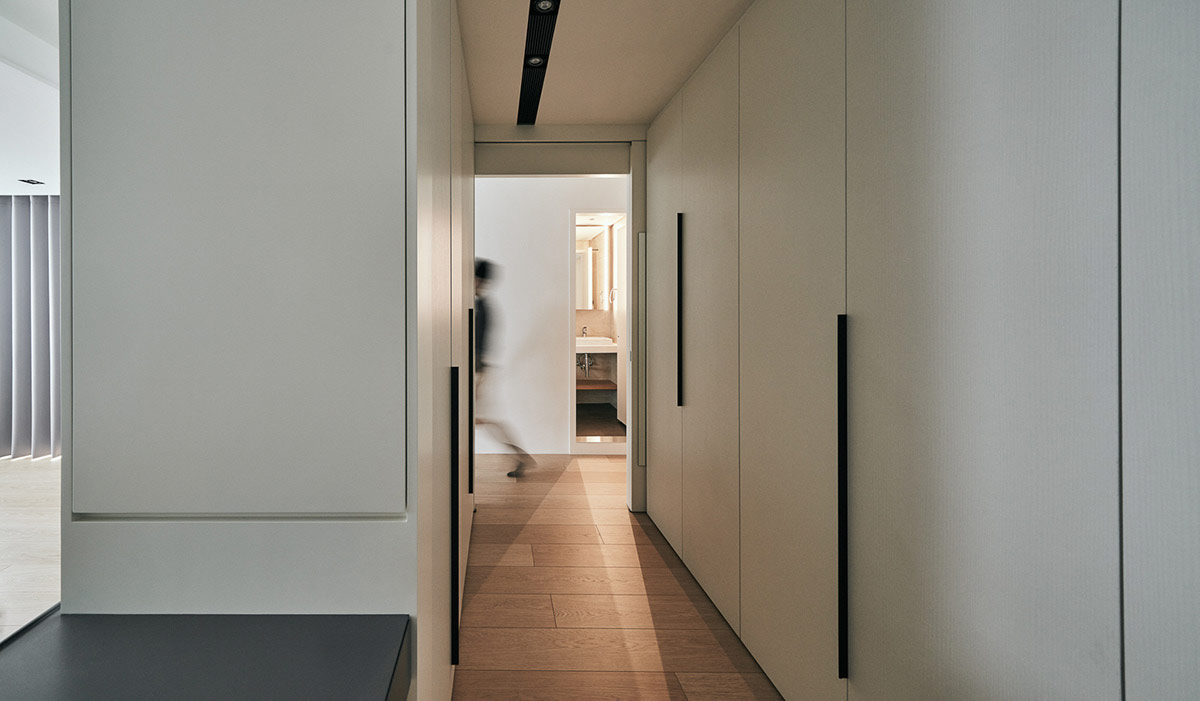
Upstairs, A hallway of made-to-measure white wardrobes with black handles provide a copious amount of deep storage space. A black light track matches the black hardware.
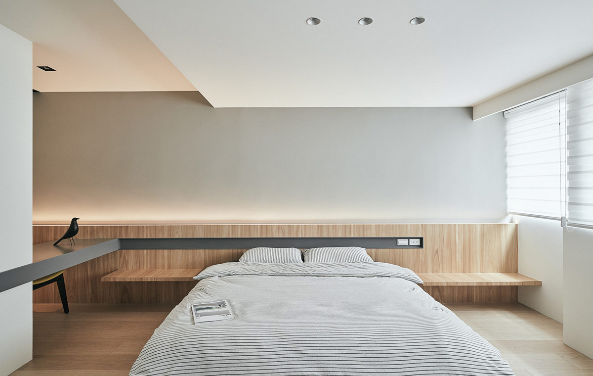
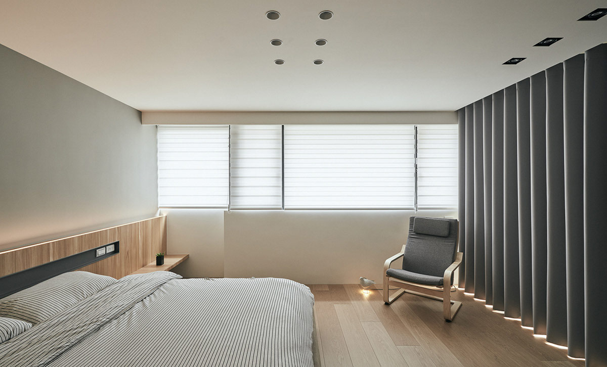
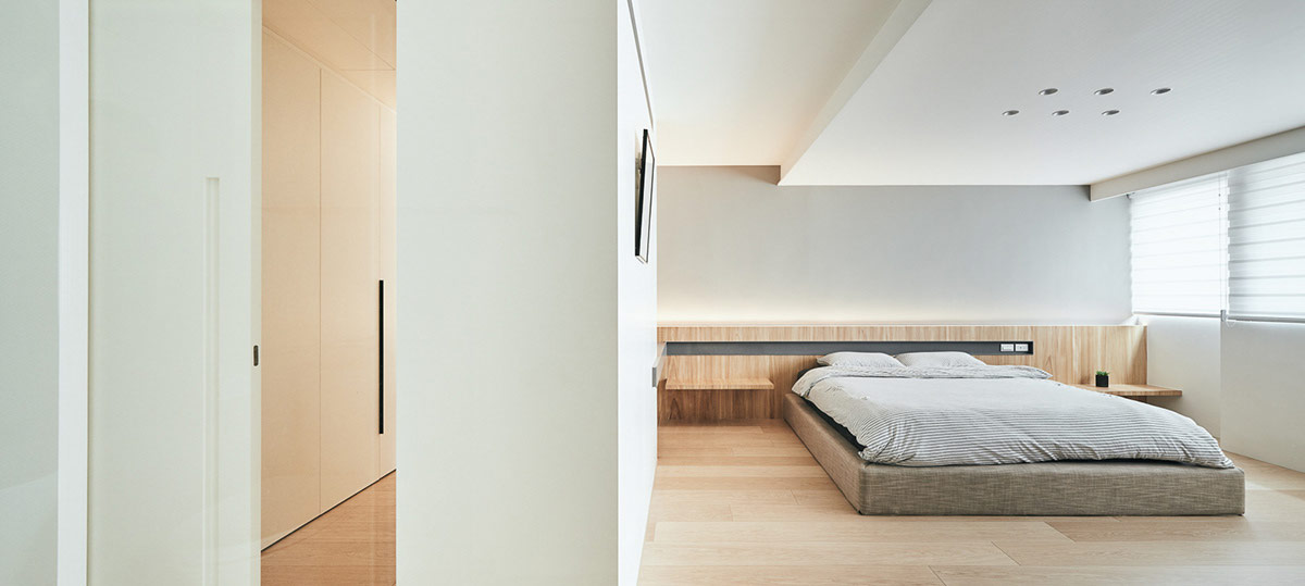
The minimalist bedroom follows the same white, wood and grey colour palette as is set in the design of the downstairs living quarters. Another Eames bird comes home to roost here too.
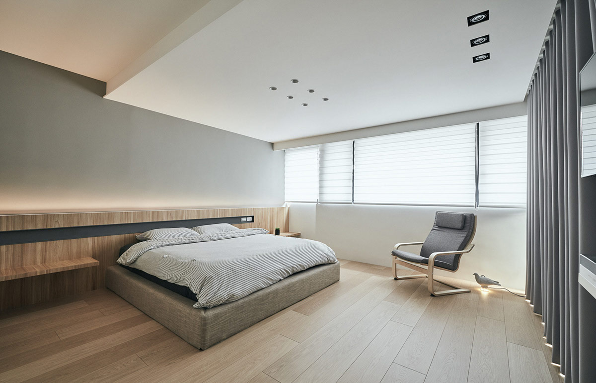
A grey bedroom chair rests by the window.
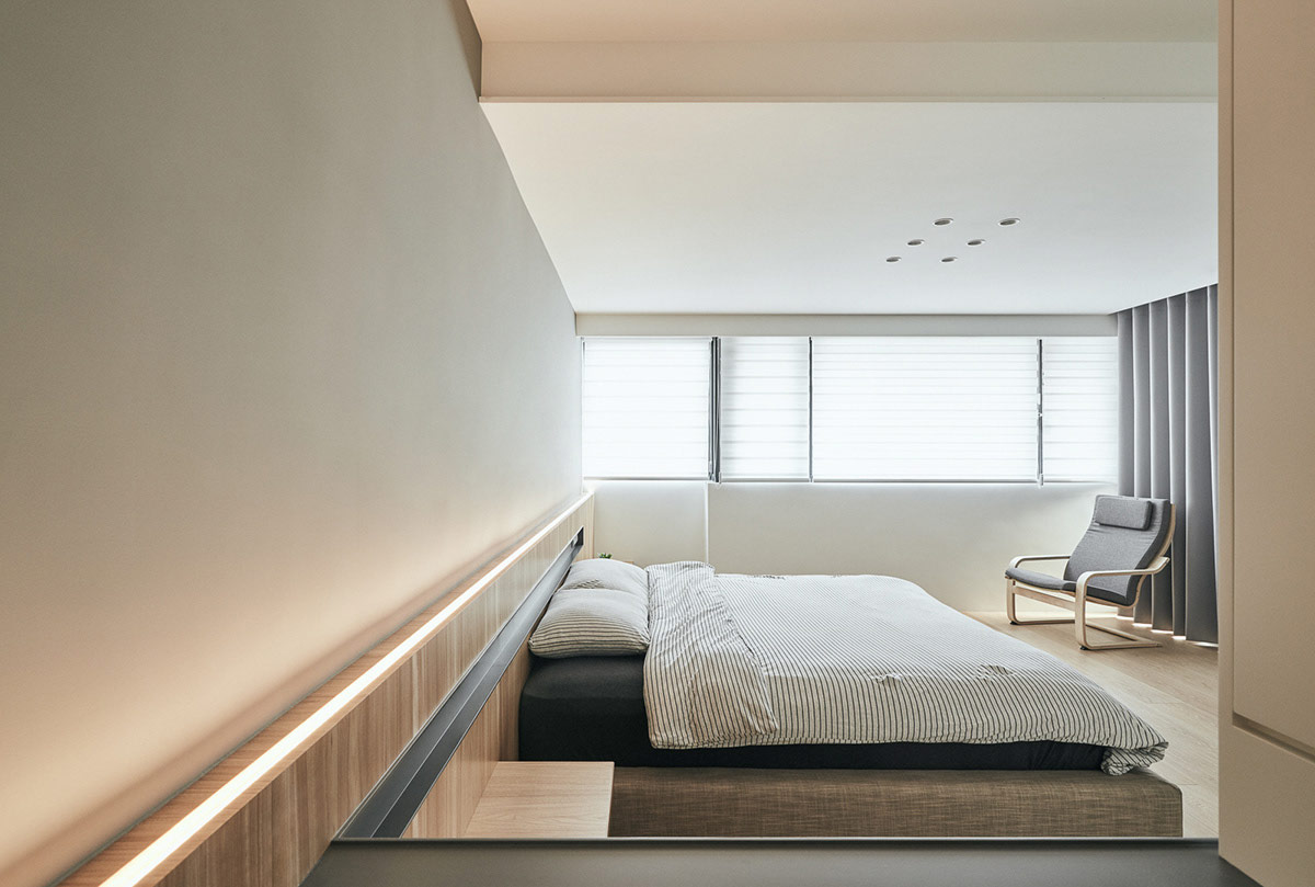
LED strip lights run along the top of an elongated headboard design that spans the full width of the bedroom.
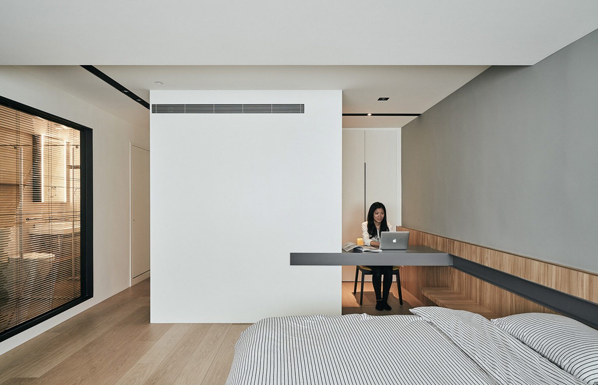
At the other end of the closet run, there is a home workspace that faces into the bedroom. The desktop is integrated into the side of the bespoke closets, and connects with the oversized headboard design.
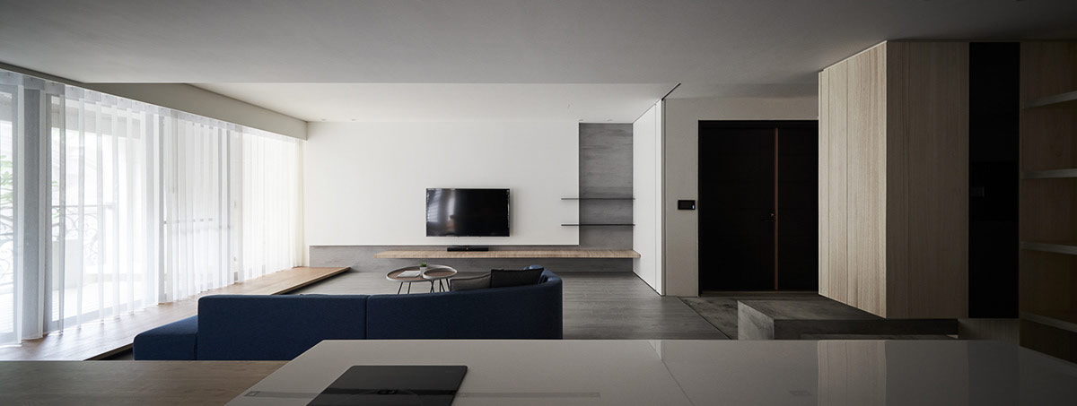
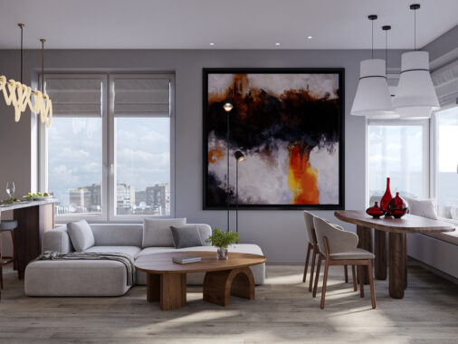
The second of our two interiors features a fluid layout, and a minimalist living room that contains only the essentials. A simple wooden shelf serves as a media unit, and matches the wood flooring of a raised walkway beneath the windows.
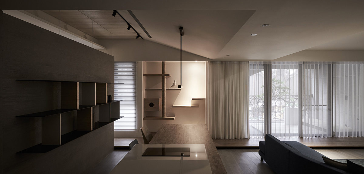
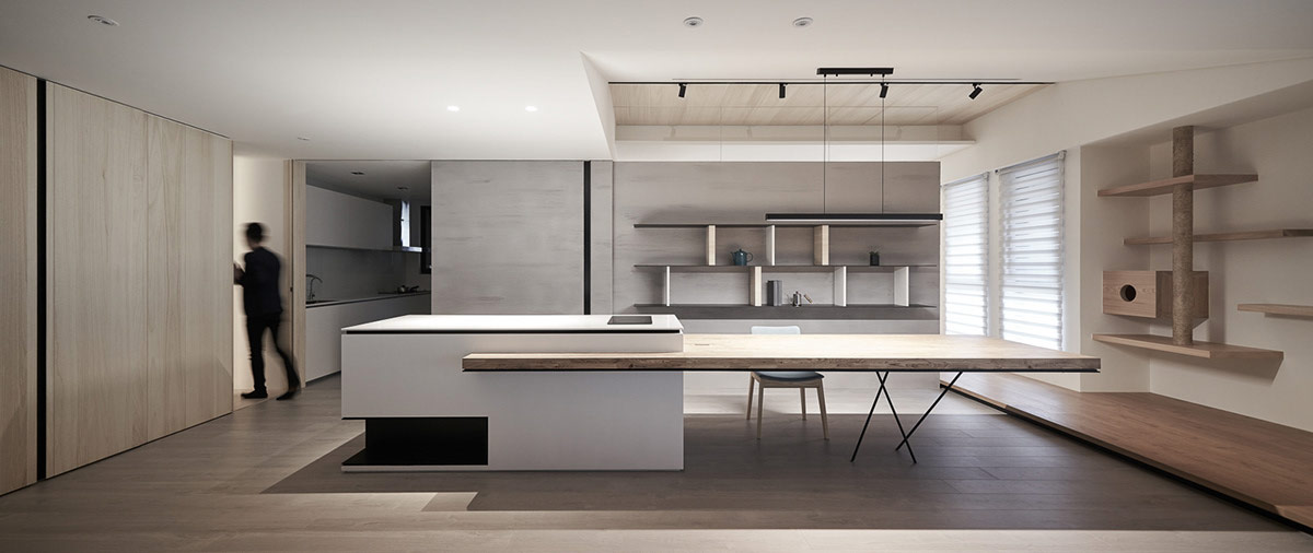
Cat furniture is disguised as a wall of shelving and an innocuous wooden unit, which slot conveniently into the depth of an alcove.
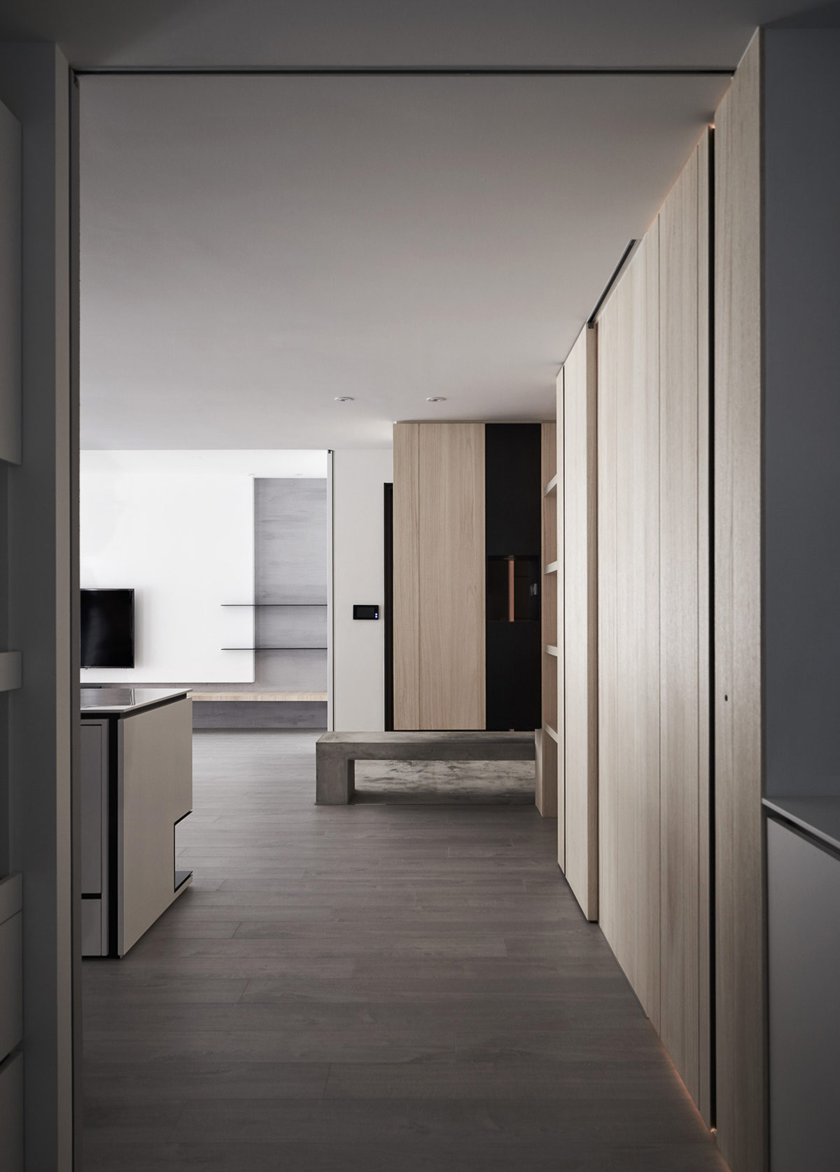
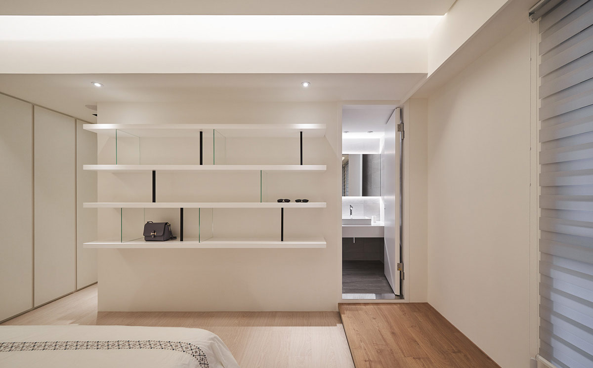
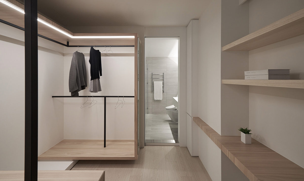
A multitude of shelves have been situated around the home, many of them set back into recesses to maintain the desired streamlined look.
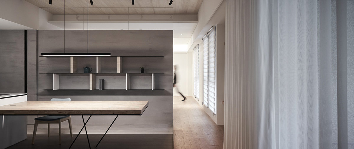
However, a number of larger unique shelving units decorate the walls of the home, like this set situated at the back of the open plan kitchen area.
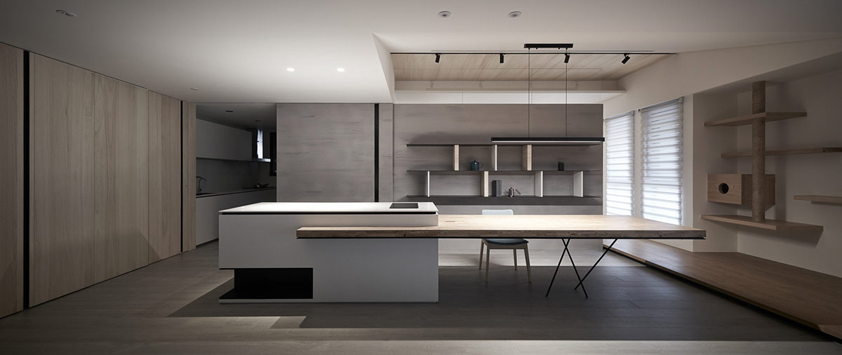
A bar suspension light drops down over the dining table extension, which could also comfortably double as a home workspace.
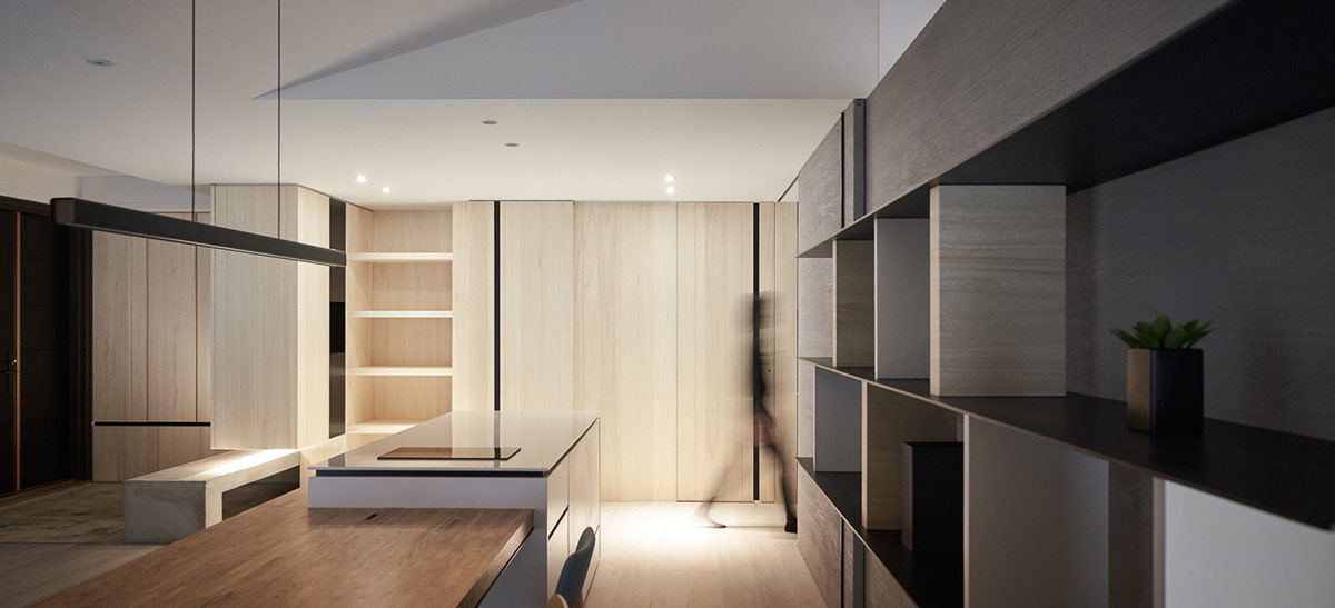
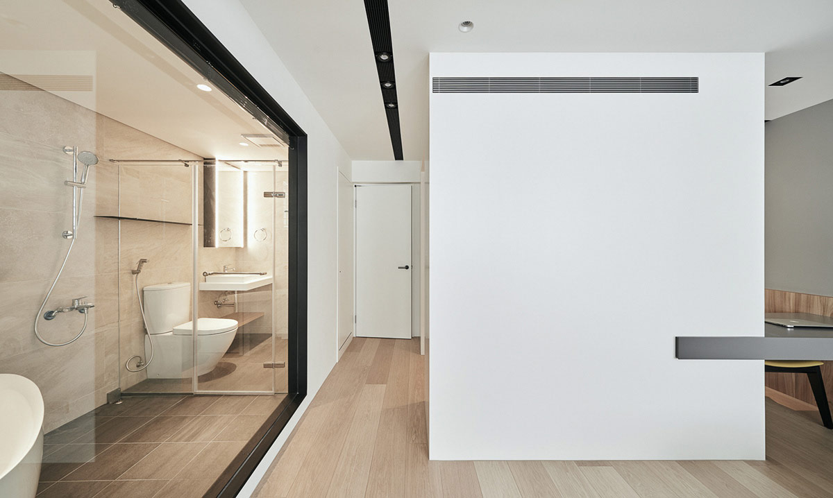
Intended function and room borders are intentionally blurred in this home, with hidden elements and lack of visible doors. Wood, white and grey volumes are plotted out to evoke a quiet curiosity, and an unconventional aesthetic.
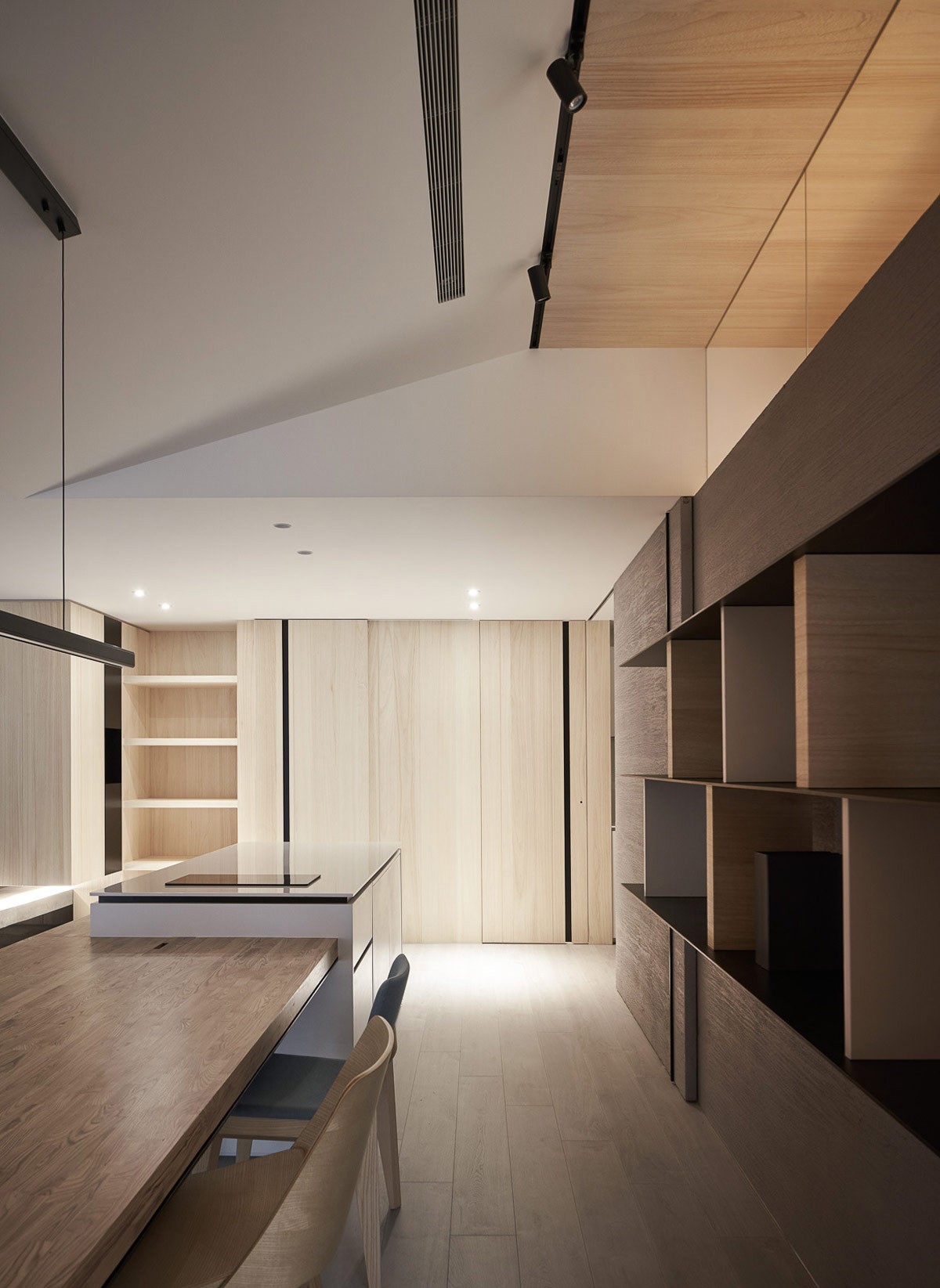
Light wood grain brings a subtle warmth to the simplistic interior. Black accents strike a modern note.
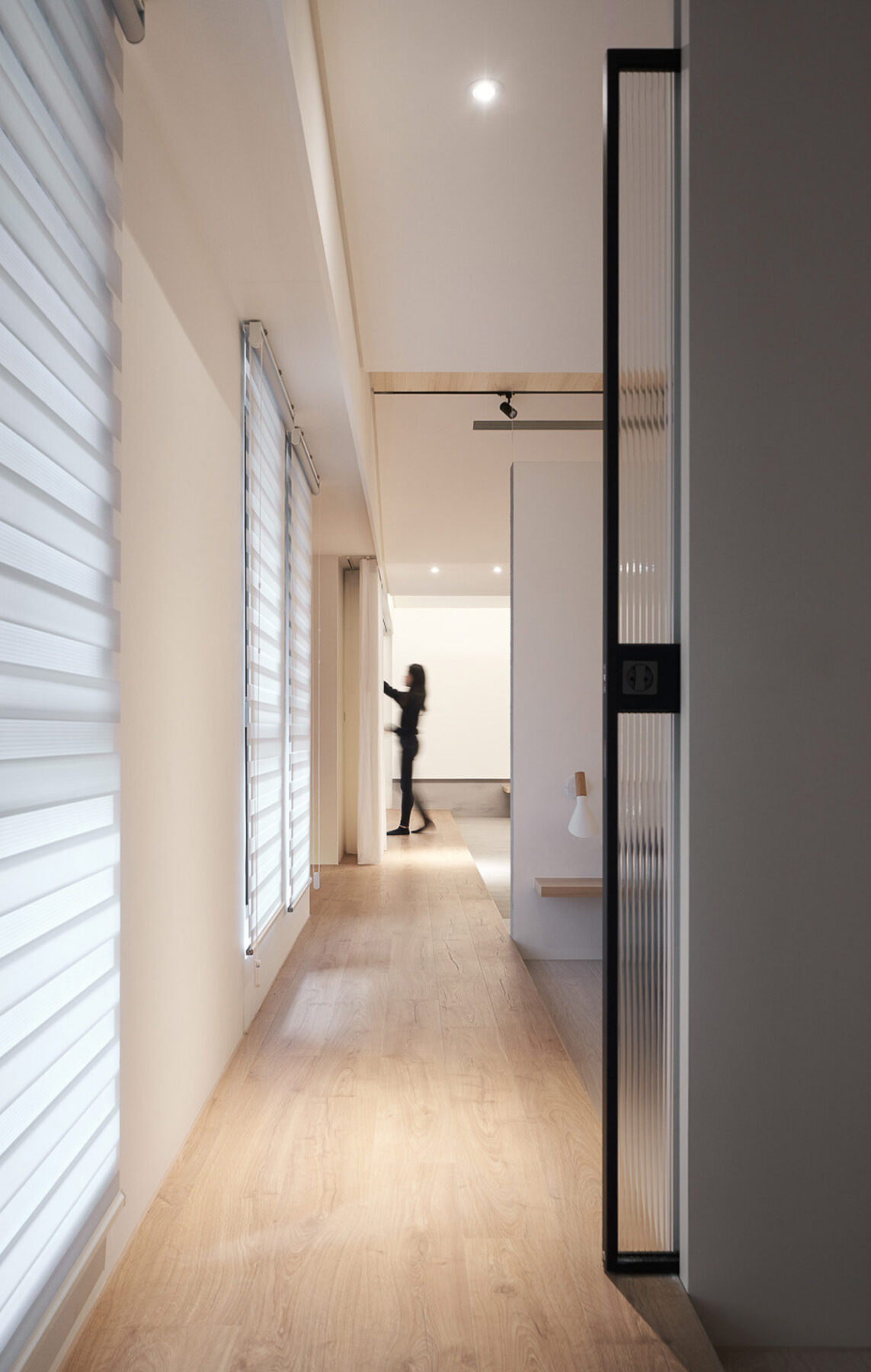
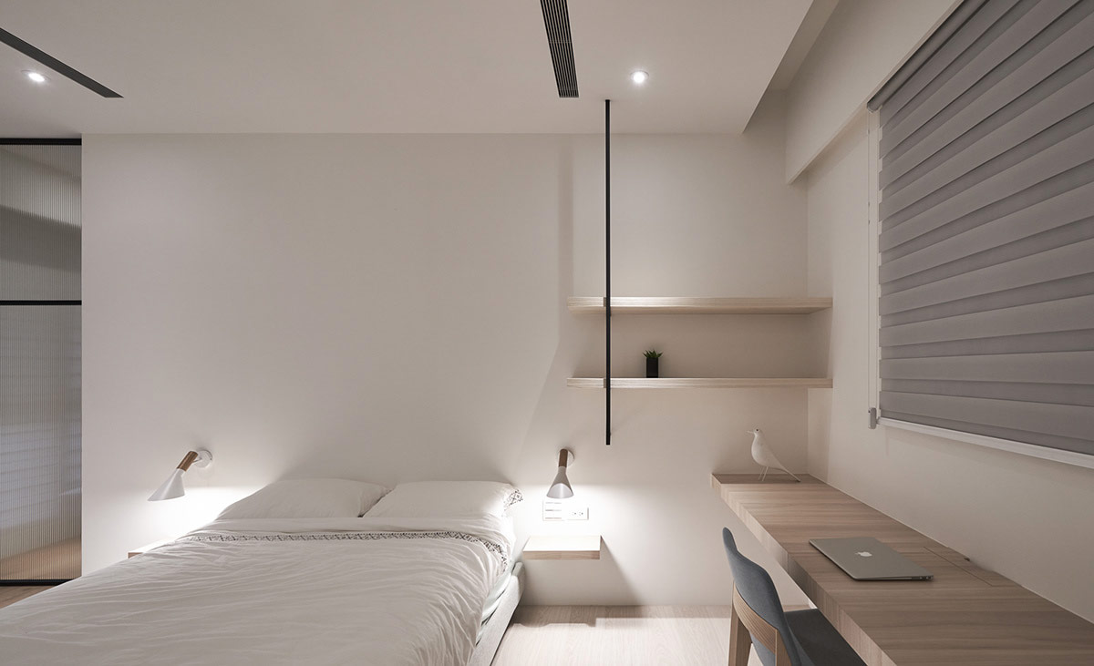
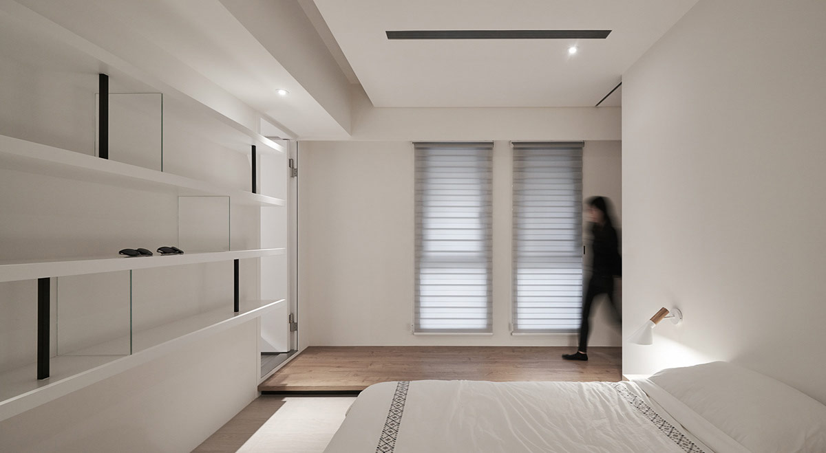
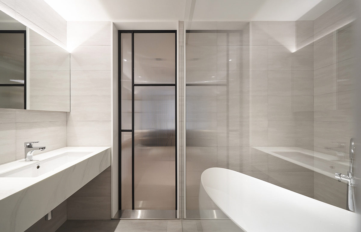
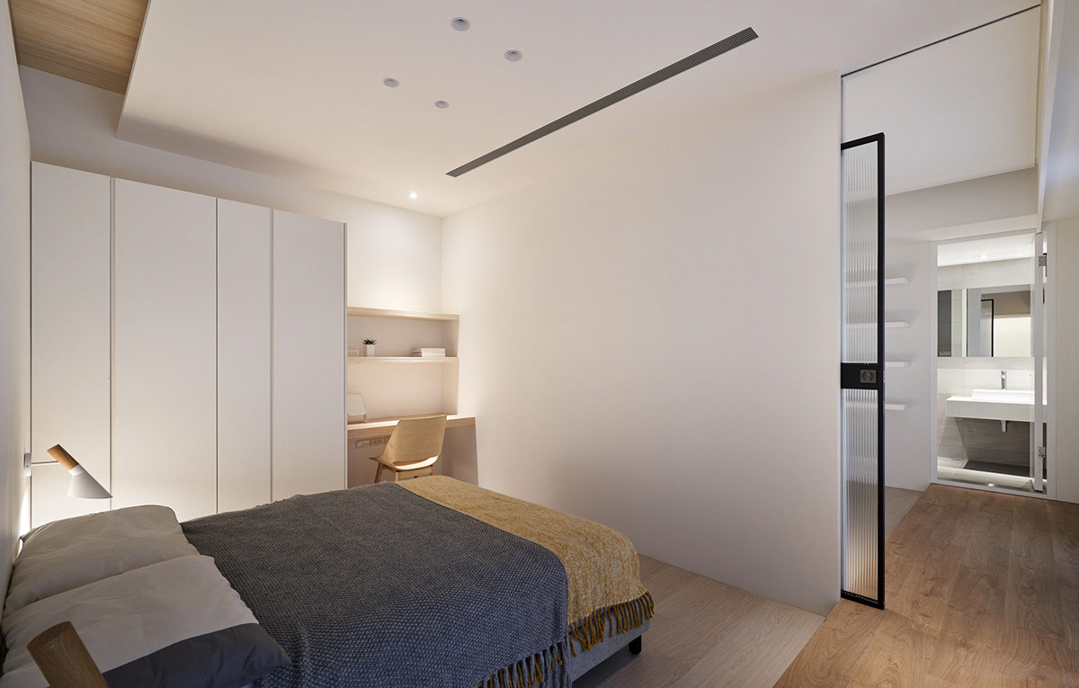
The wooden walkway stretches all the way across the living room and through the bedrooms, which are separated off using obscured glass pocket doors.
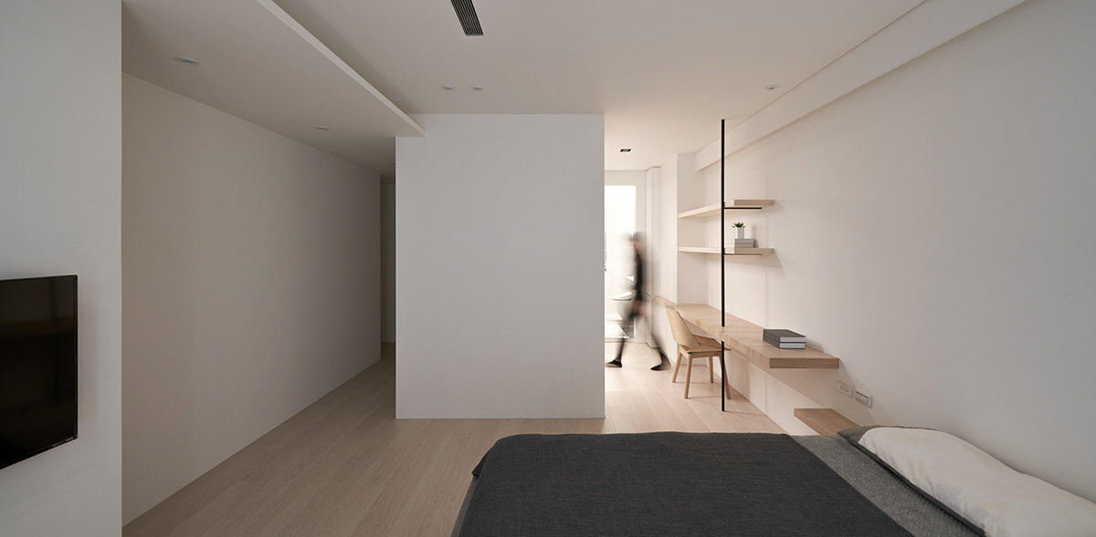
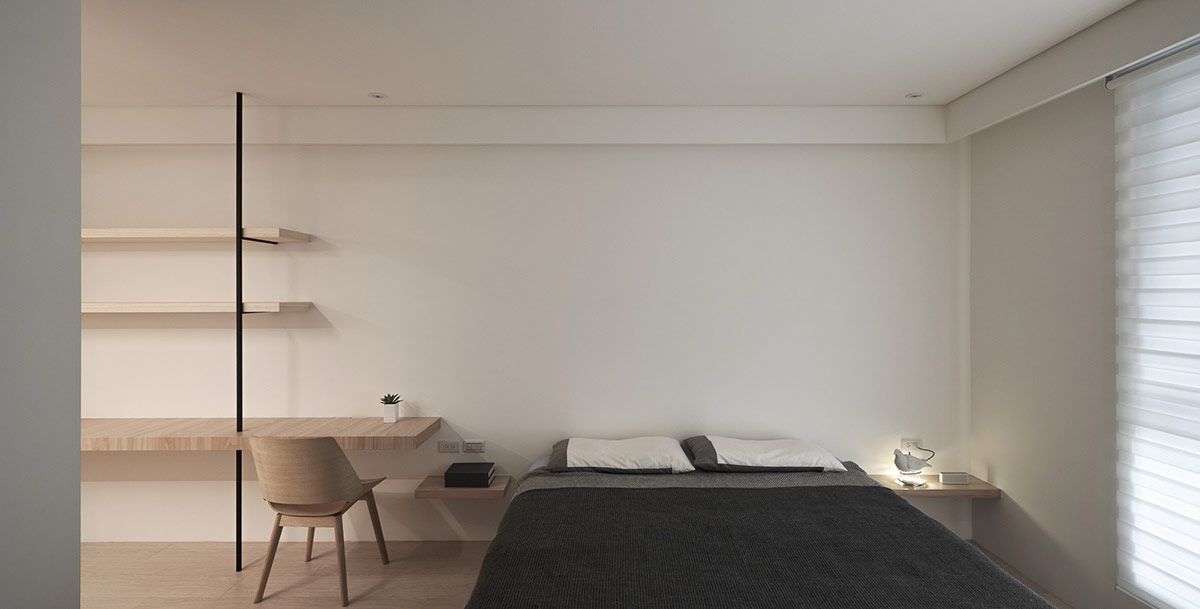
The home office area has a combined desk and shelving design, custom built in the same light wood that’s used throughout the home.
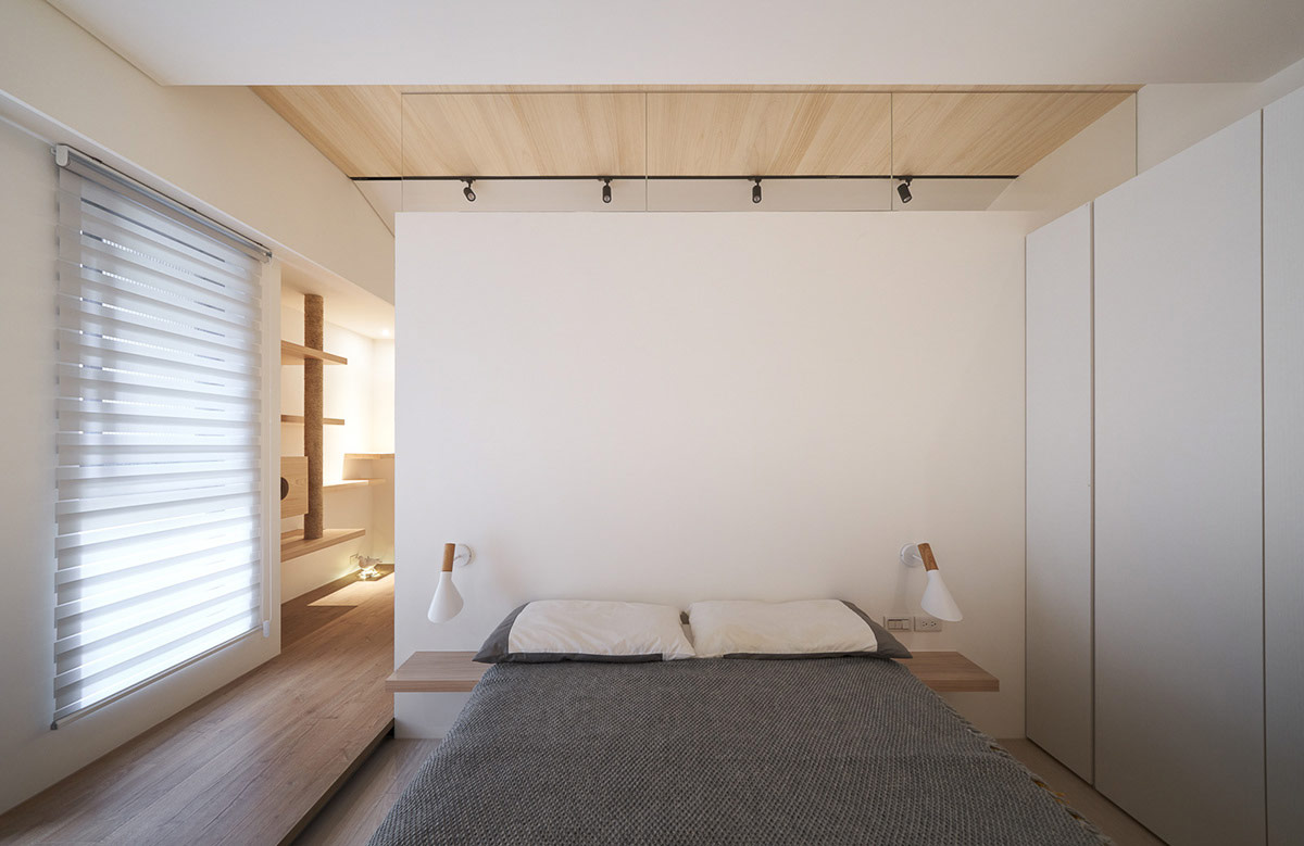
Modern wall lights are tipped with wooden accents, matching bedside shelves and a wood clad ceiling.
