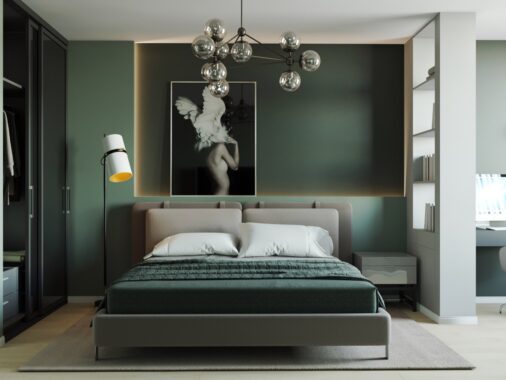
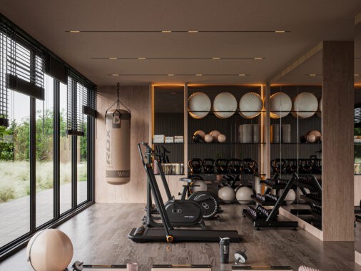
These gorgeous minimalist interiors – both by Oporski Architektura – demonstrate that high contrast themes are just as good at looking soft and casual as they are creating visual drama. Both enjoy the warmth of light-colored wood cladding carefully balanced with white walls. The first home goes heavy with black details by integrating them with semi-permanent features like countertops and large furniture, while the second home goes with a more flexible approach by using darker colors only on superficial elements like pendant lamps. Both rely on minimal staging to allow the imagination plenty of room to play.
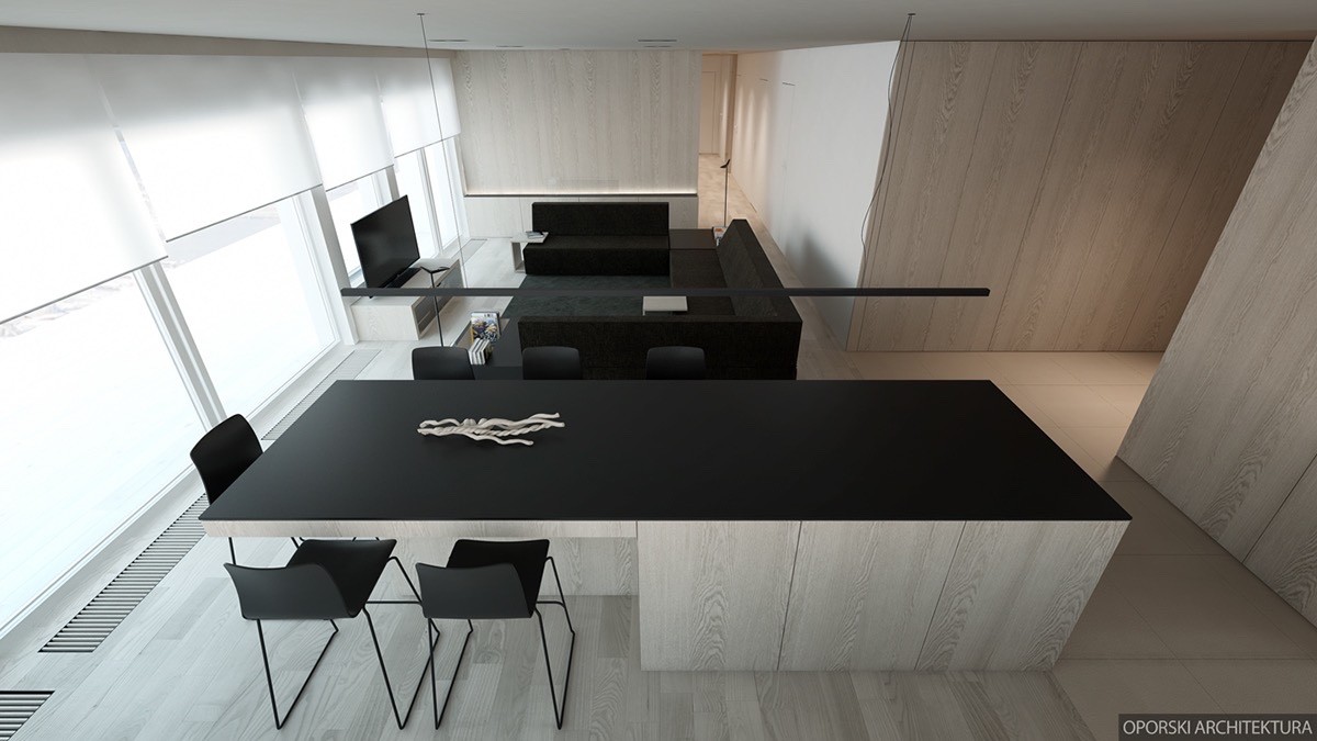
The first home is a small apartment for a family with young and older children. Light wood cladding replaces the endless planes of white ordinarily found in a home this minimalistic, a little warmer and more comfortable than the alternative. A wide row of windows illuminates the interior and ensures that the matte black elements don't overwhelm the desirable brightness.
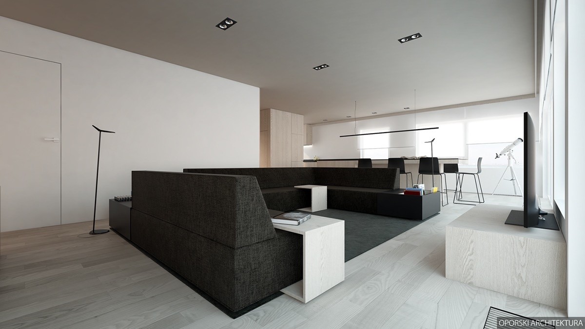
Open layouts like this are especially well suited for families with young children. Parents can keep an eye on the kids while cooking, or catch up on some television while the young ones doodle at the dining table.
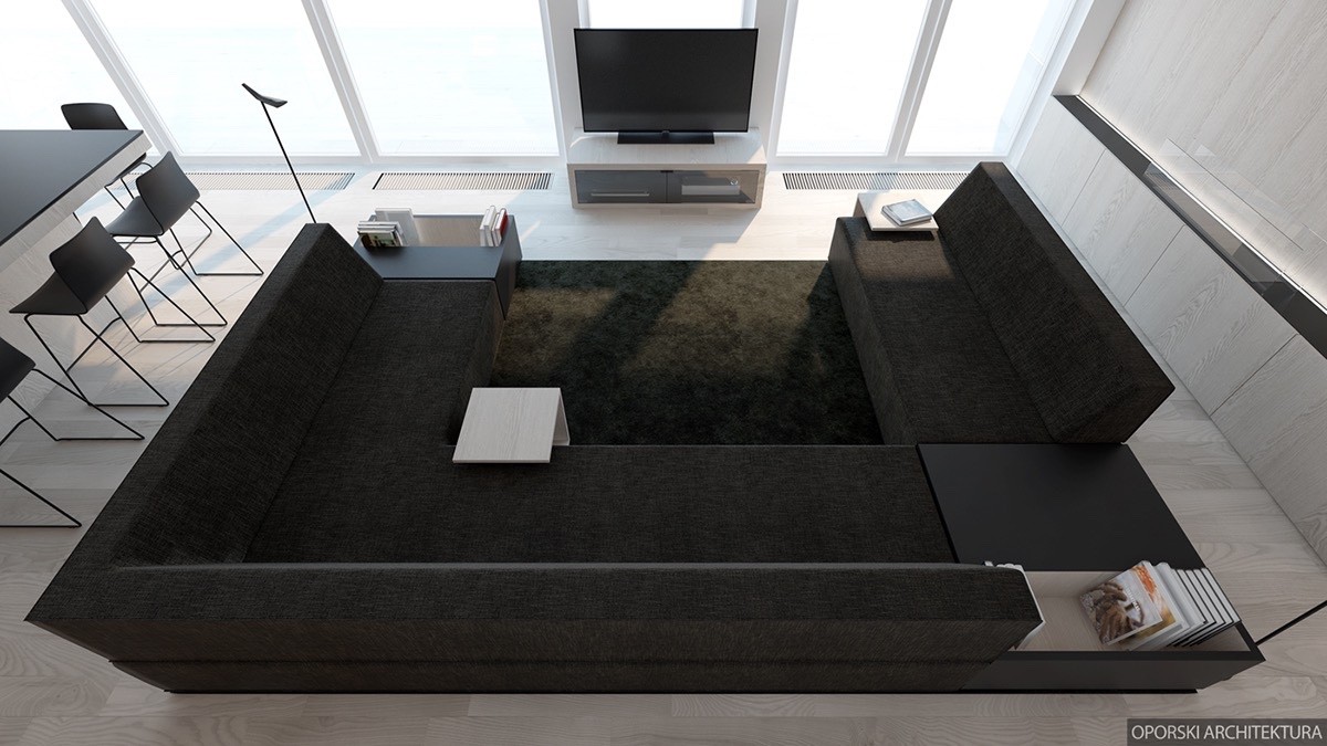
And this entertainment area is more than ideal for a growing family. Bookshelves, hard benches, and movable c-shaped tables make it easy to enjoy a variety of activities all in one place.
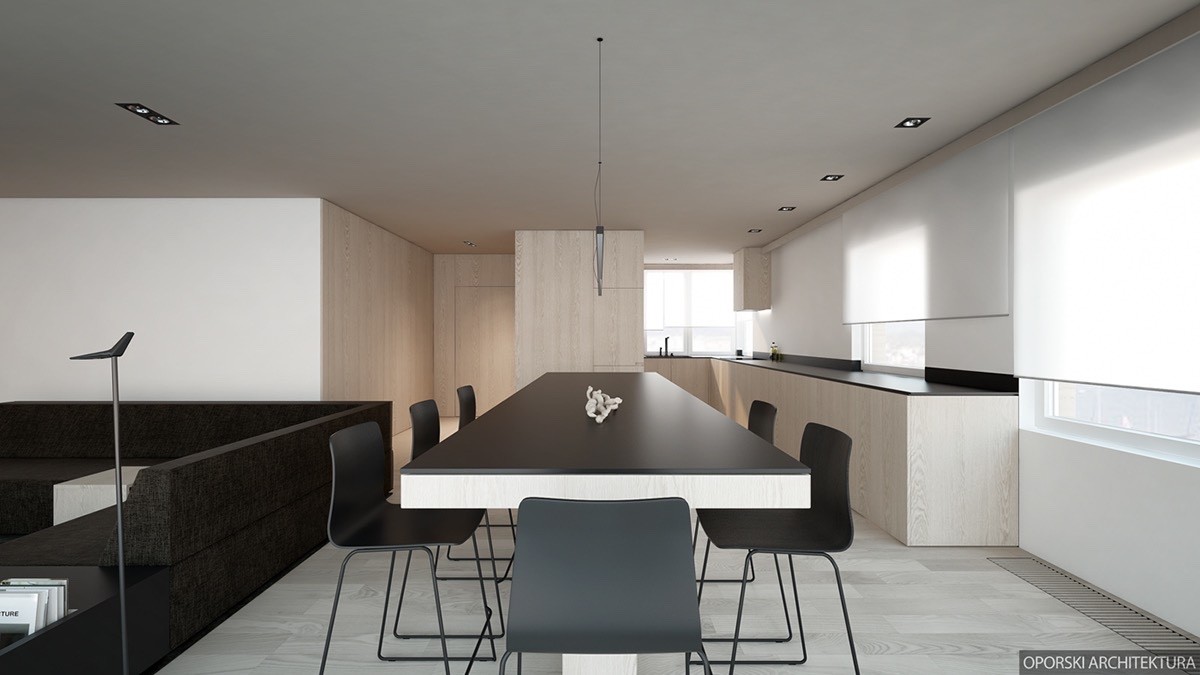
Dining space separates the living room from the kitchen area. The long table doubles up as extra workspace for the already generously equipped kitchen. There's more than enough room to prepare a huge holiday dinner.
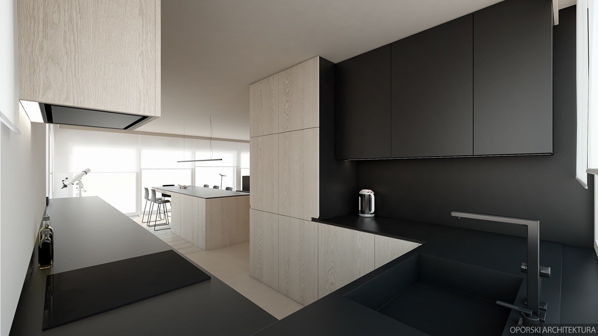
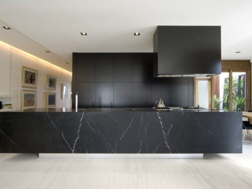
Gorgeous! Black cabinetry, backsplashes, and countertops all create one cohesive visual plane and reduce the feeling of clutter. Interestingly, it's just as easy to spot dirt on black countertops as it is on white ones – sometimes even easier.
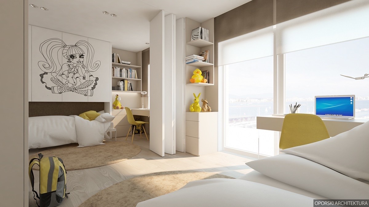
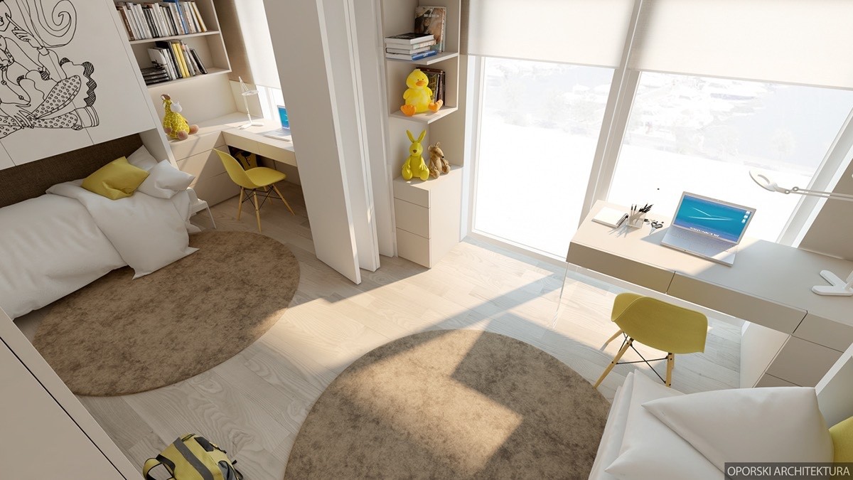
Both of the young girls share one large room, easily divided by an accordion screen for privacy (or just to create space during the inevitable sibling rivalries).
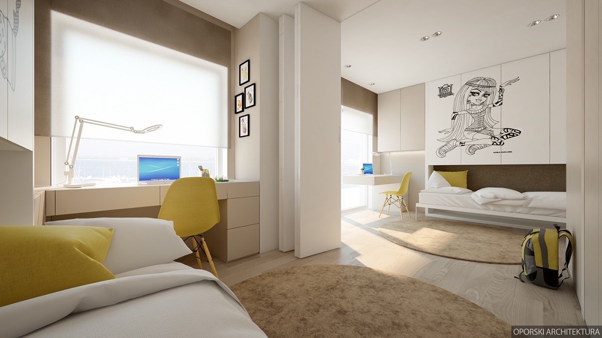
Each side of the room has its own desk, storage cabinets, and slightly inset beds with corkboard backing. Line art decals give both halves their own adventurous personalities.
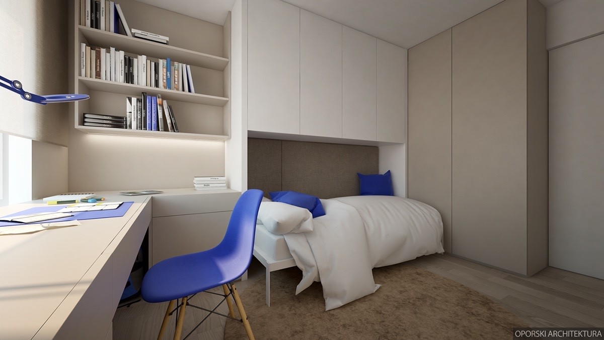
A separate bedroom uses the same general layout, but this time with bright blue accents. The good thing about the bedrooms having neutral themes is that color accents are easily swapped out as tastes change.
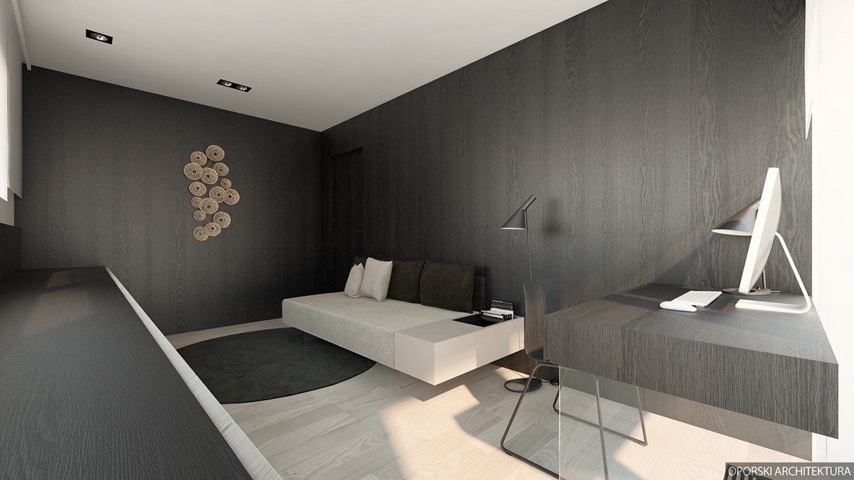
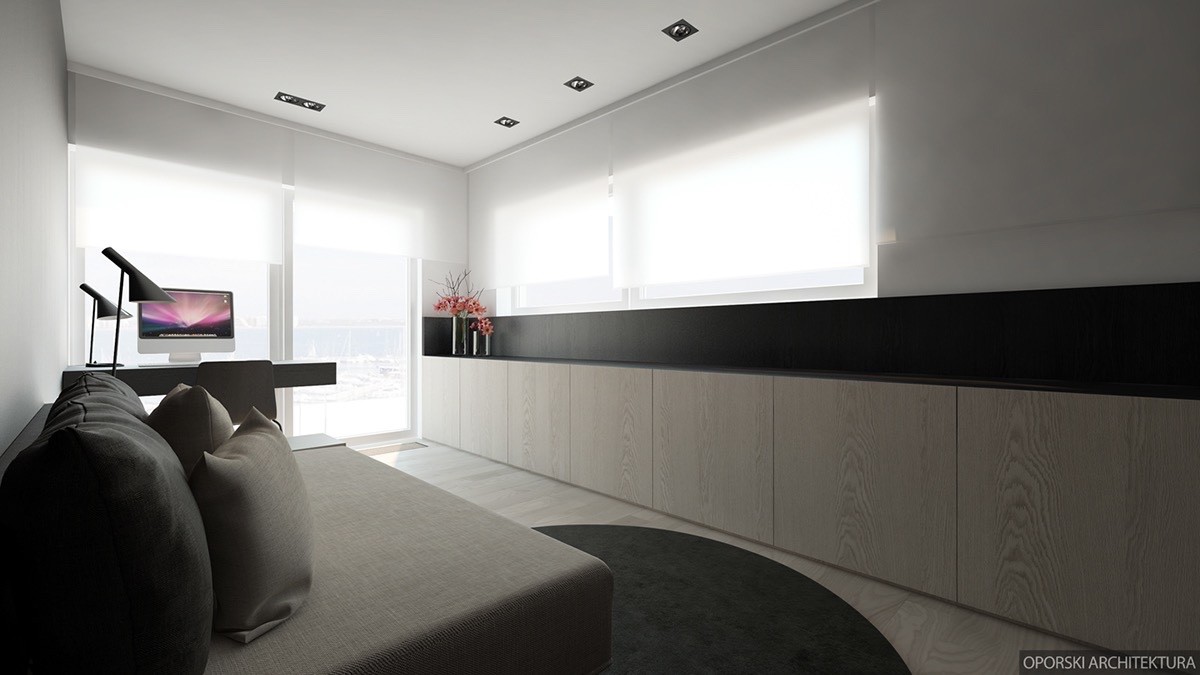
A dark and sophisticated office offers a place for young students to study and a place for the adults of the house to catch up on work over the weekends.
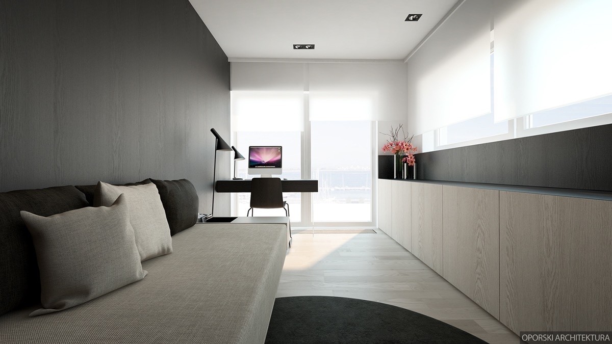
The sofa accommodates multiple uses, from seating for clients to a place for parents to sit and read while advising or supervising children while they type up essays for school.
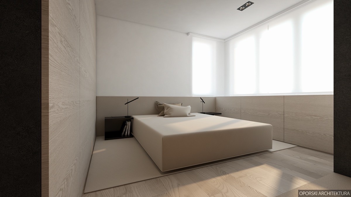
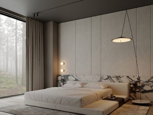
Finally, let's look at the master bedroom. Beige and light wood diffuse the light from the ample windows for a result that looks bright but not blinding, an effect sure to energize residents before a busy day.
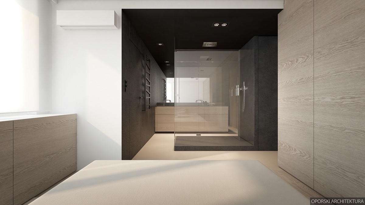
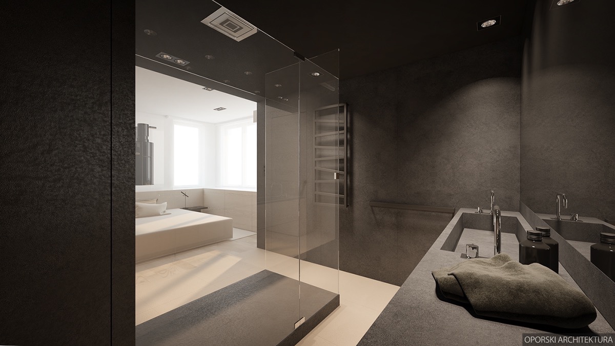
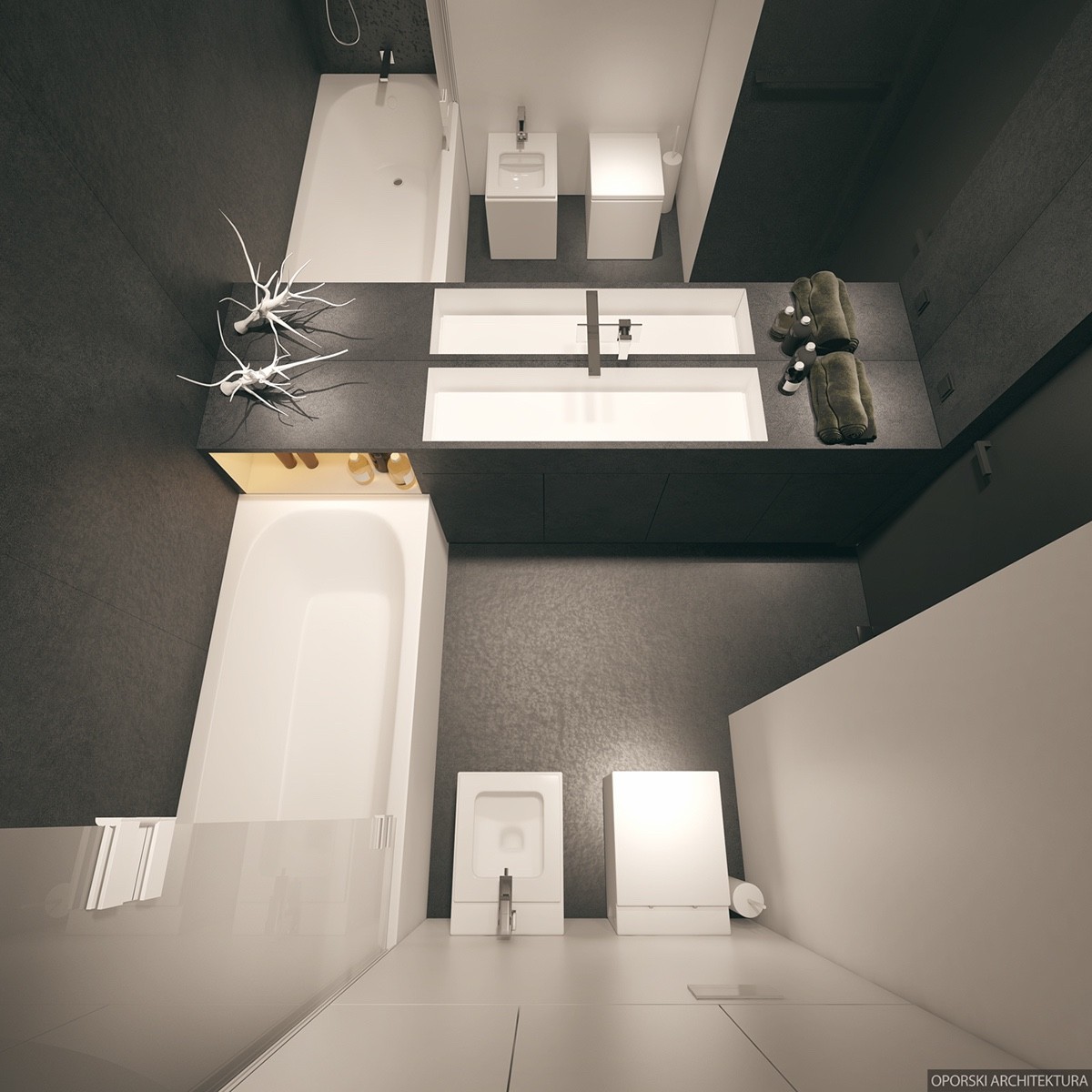
It leads directly into a stunning open bathroom, the freestanding shower occupying the direct center. Glass shower walls allow light to penetrate without dampening the drama of the moody color palette.
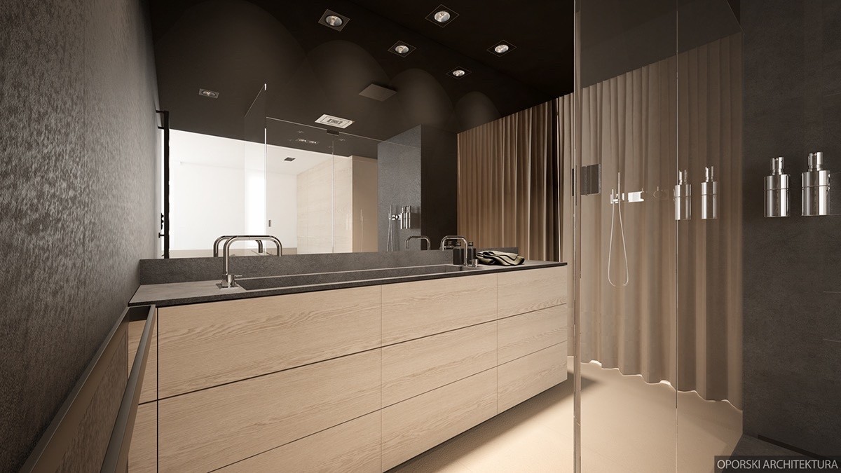
Double faucets share a single sink basin so both partners can freshen up in the morning without conflict.
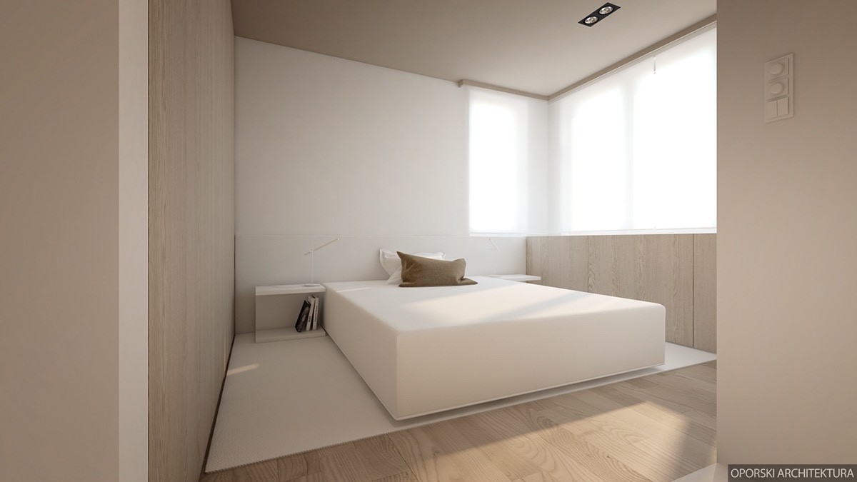
Here's another take on the same style of bedroom, this time with a white rug rather than beige, and white side tables rather than black ones. It’s a lighter and more minimalistic solution.
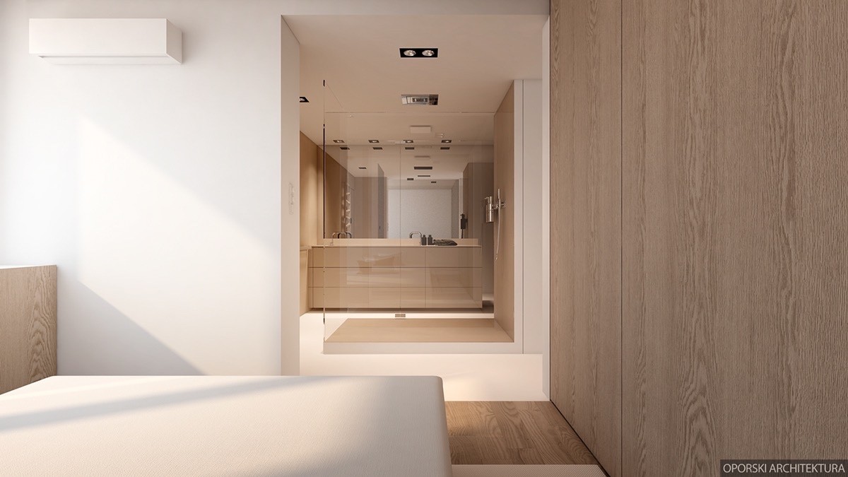
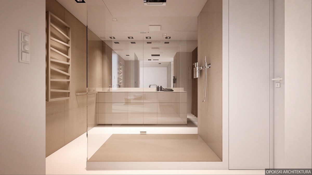
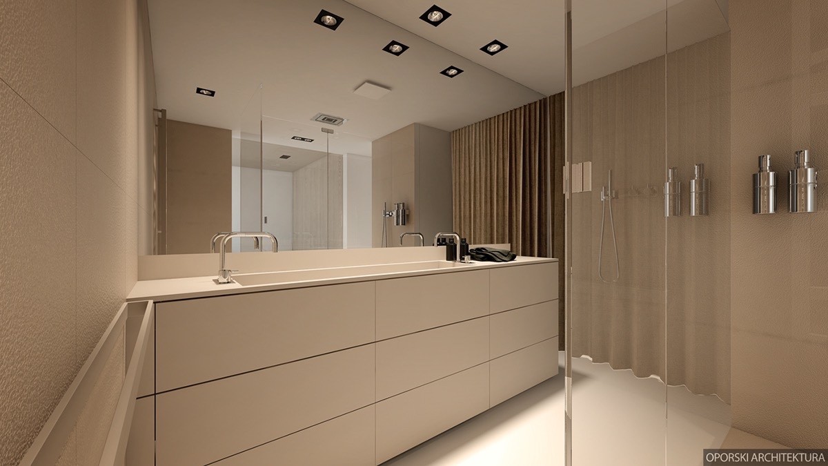
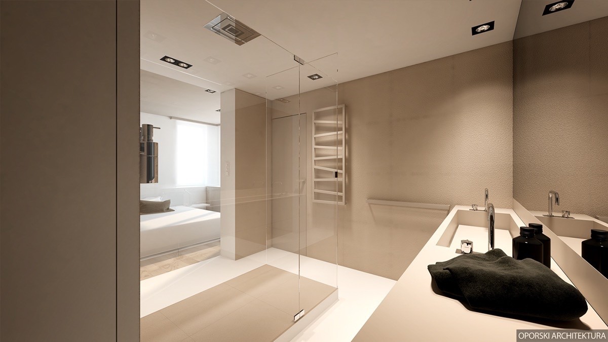
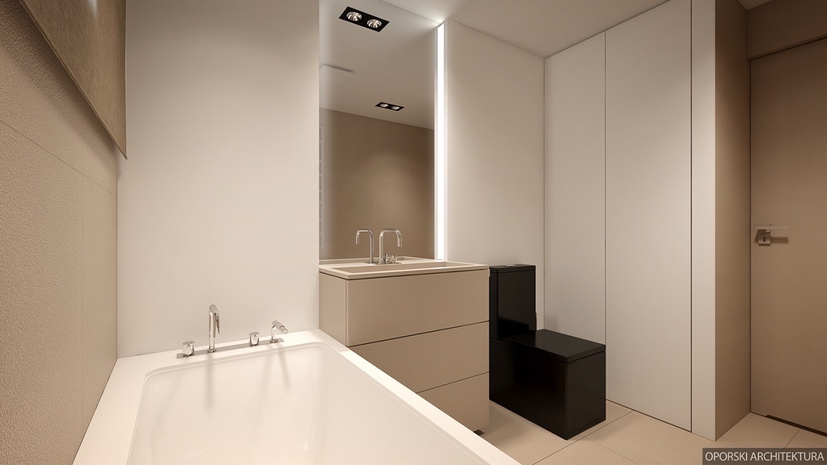
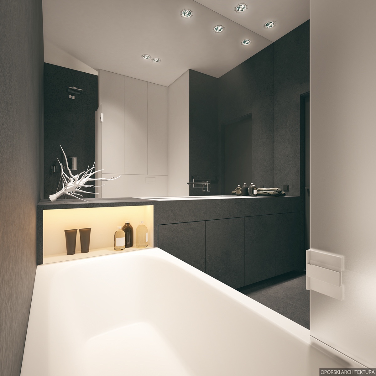
The bathroom also adopts a similar arrangement, but this time with a palette of soft beiges rather than the dark and dramatic tiling of the other style. Which one do you prefer?
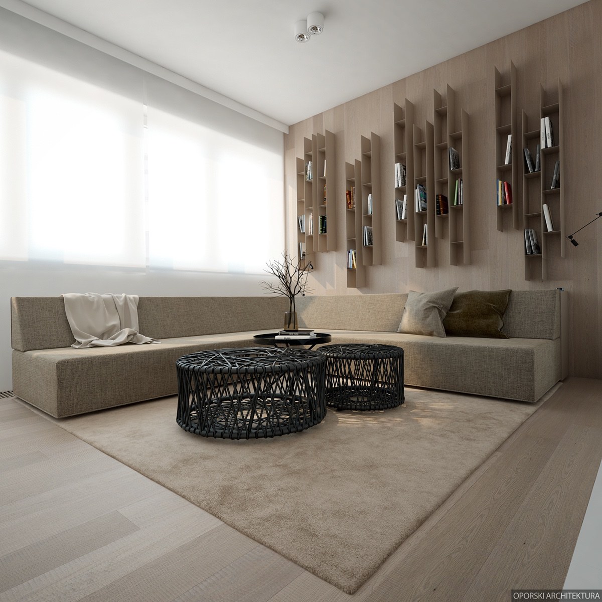
The second home in this tour uses the same clean lines and gorgeous neutrals, this time emphasizing the earthy tones over stark contrast. Black accents mostly stick to the realm of furniture rather than more permanent features, making it easy to switch things up later according to the owner's preferences. Spare staging and simple decor leave plenty of room for the imagination to fill in the blanks – it's a beautiful home with strong bones and plenty of potential.
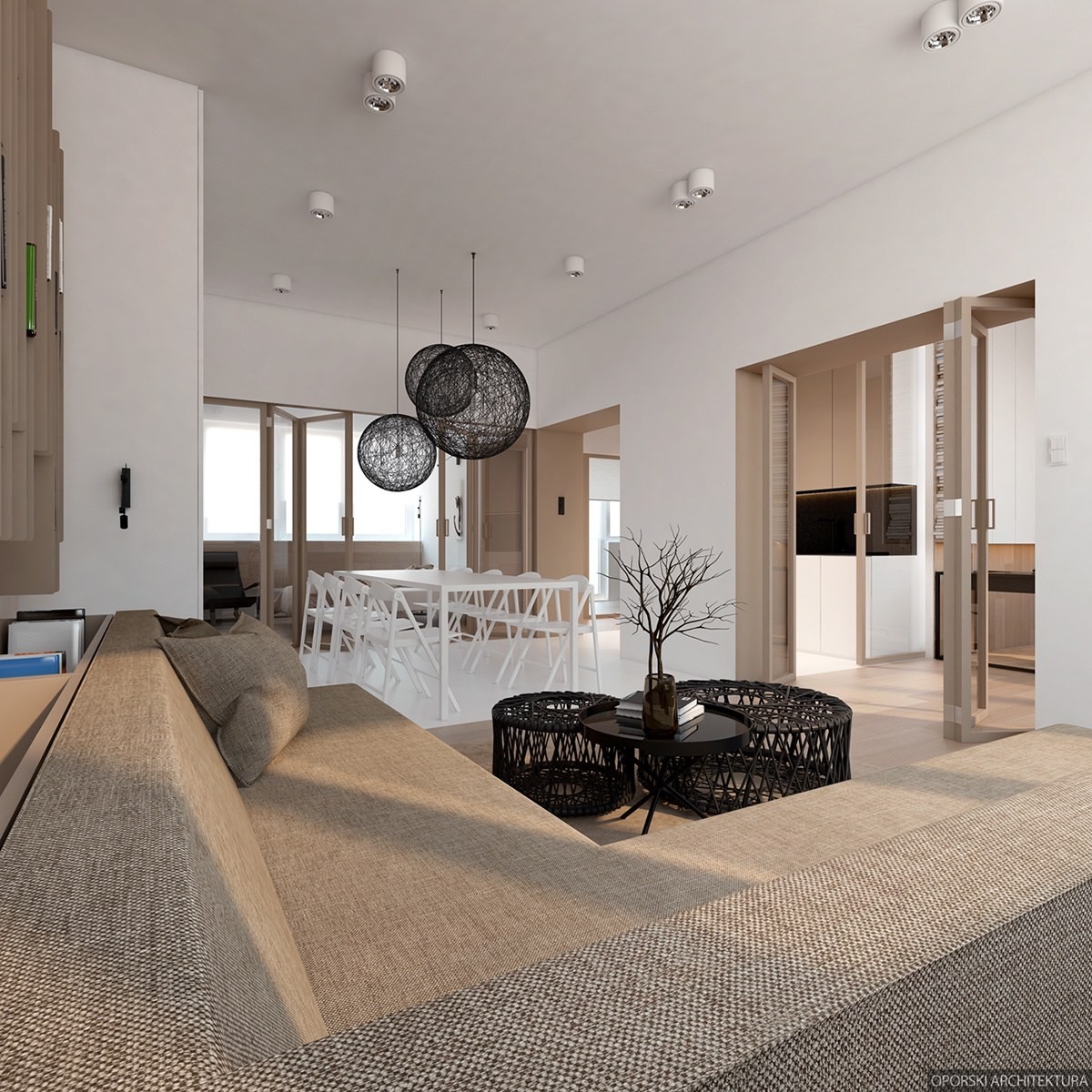
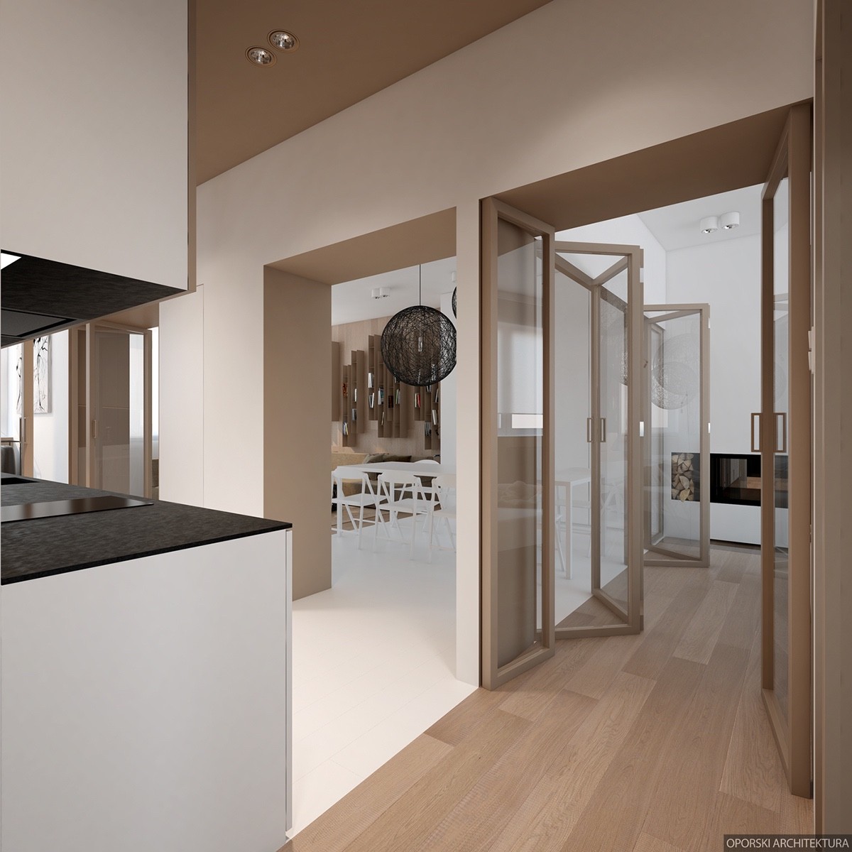
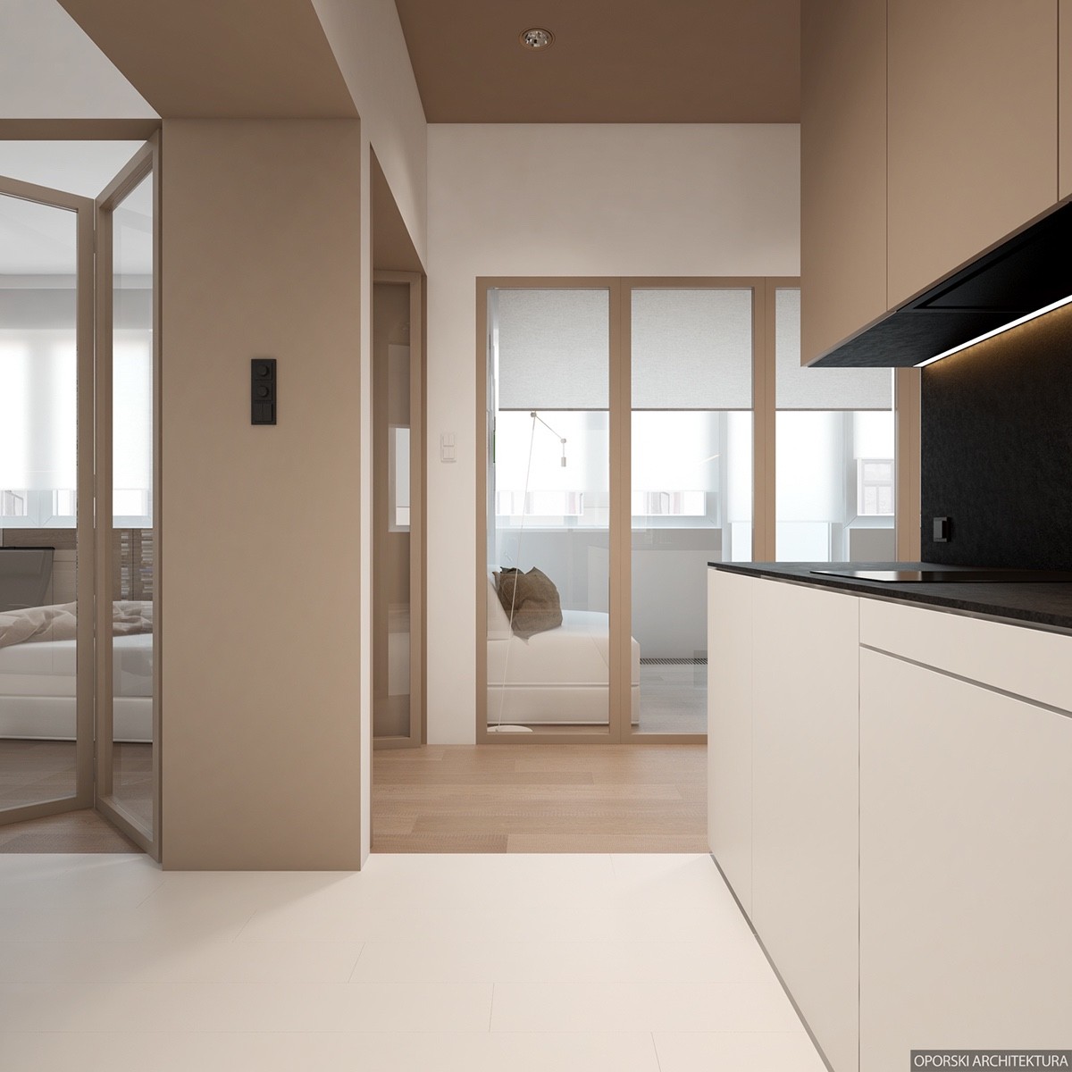
Graceful transitions define the interior. The khaki and wood tones of the living room hop over the bright white boundaries that define the dining area. The kitchen is visually available to both areas but retain the option for privacy thanks to a series of folding doors.
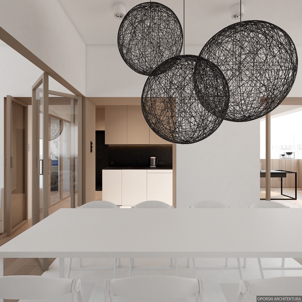
A trio of the famous Random Light hangs above the dining table, their lightweight black frames providing a stark contrast to the solid white arrangement below.
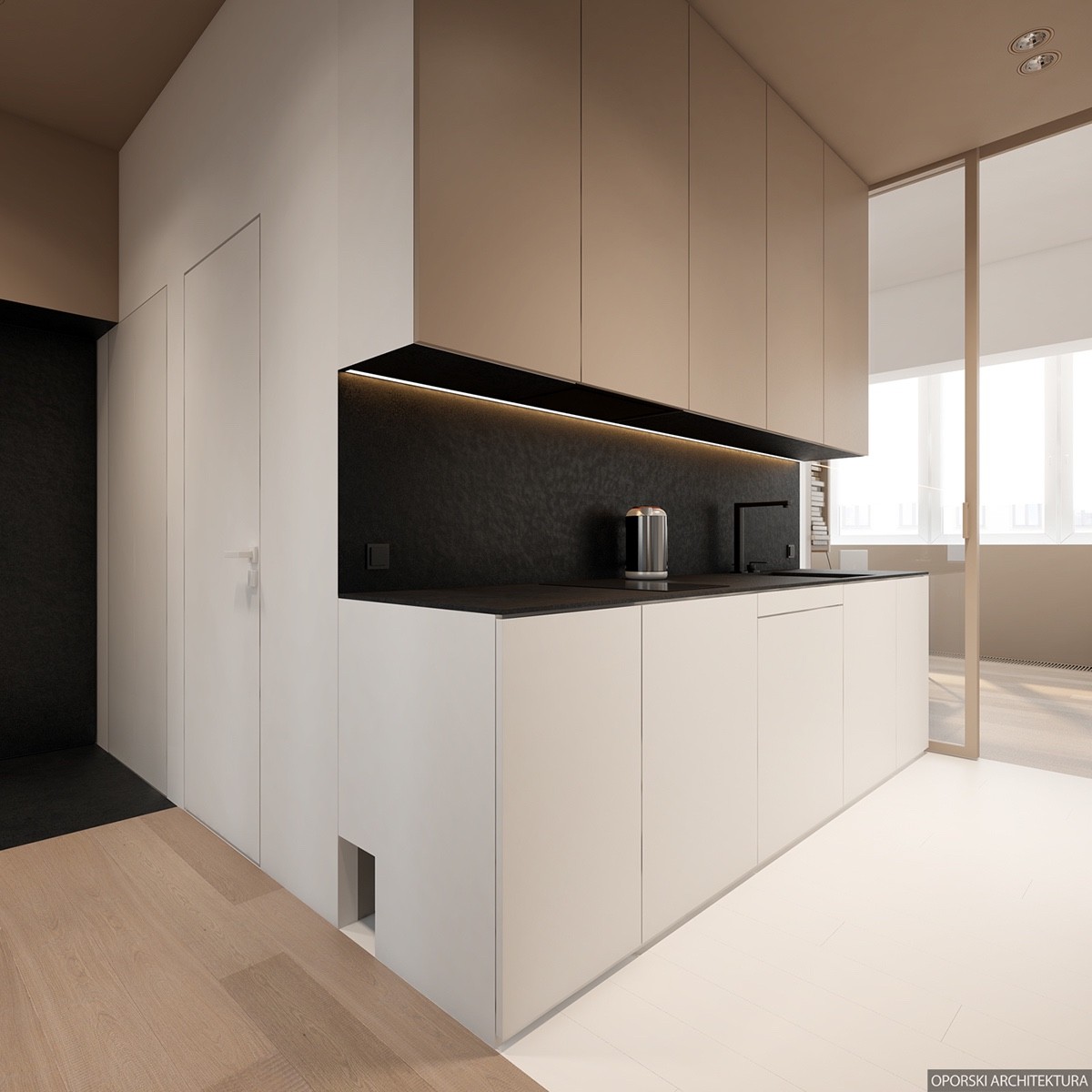
The kitchen layout is surprisingly compact when you consider the ample square footage that surrounds. It's probably not a place to prepare a 5 course meal, but more than meets the needs of casual entertainment and dining.
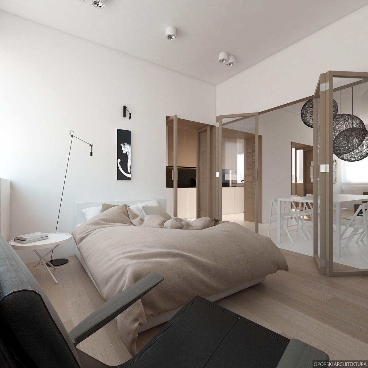
We already mentioned the open flow of traffic by way of the many interior doors, but even the master bedroom sits right off the main hallway with the dining room clearly in view.
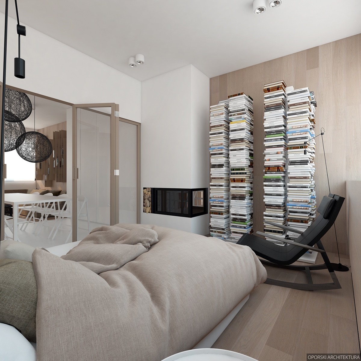
It includes its own faux fireplace and tall pillars of books nearby. The books aren't actually stacked, but take advantage of hidden shelves to create the same visual effect.
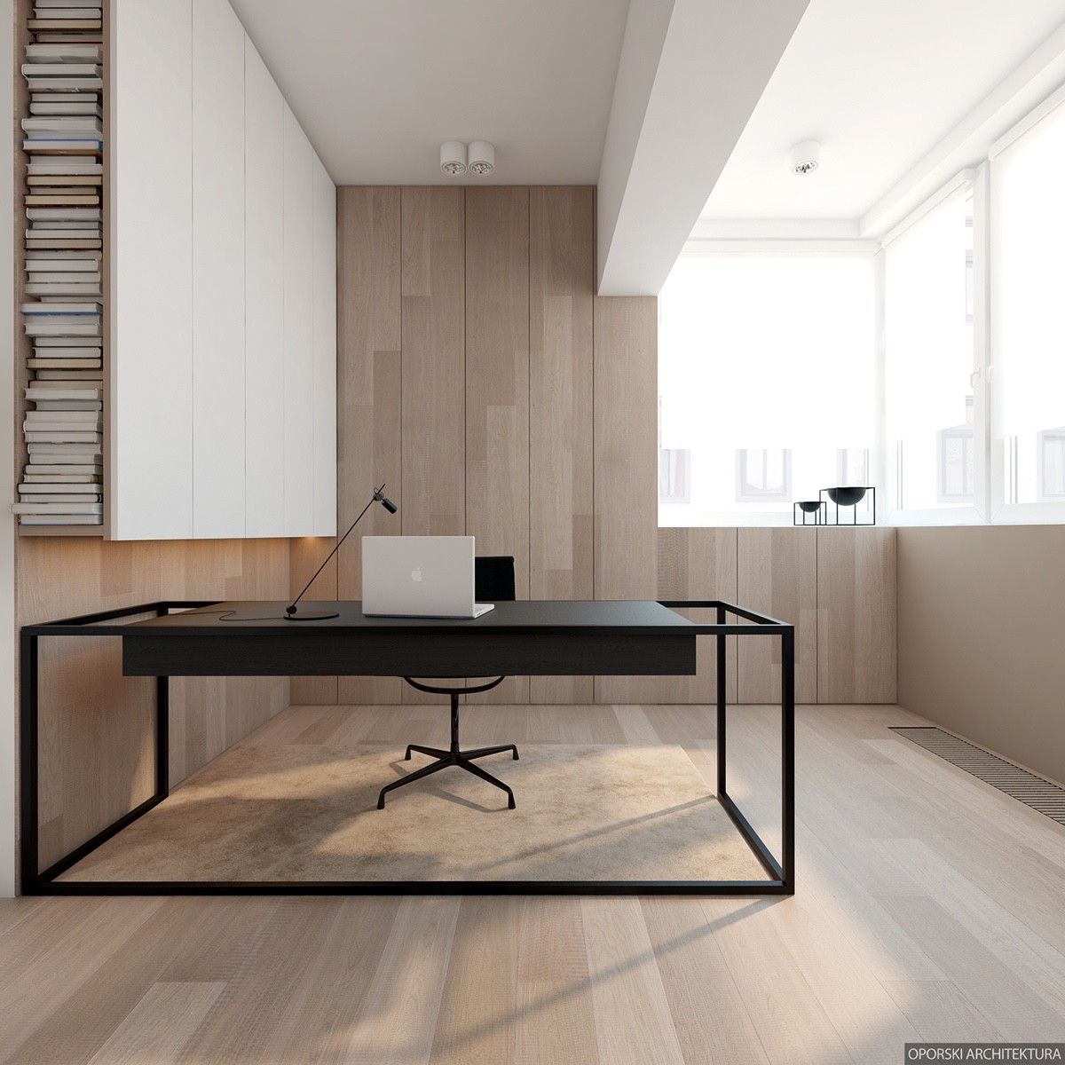
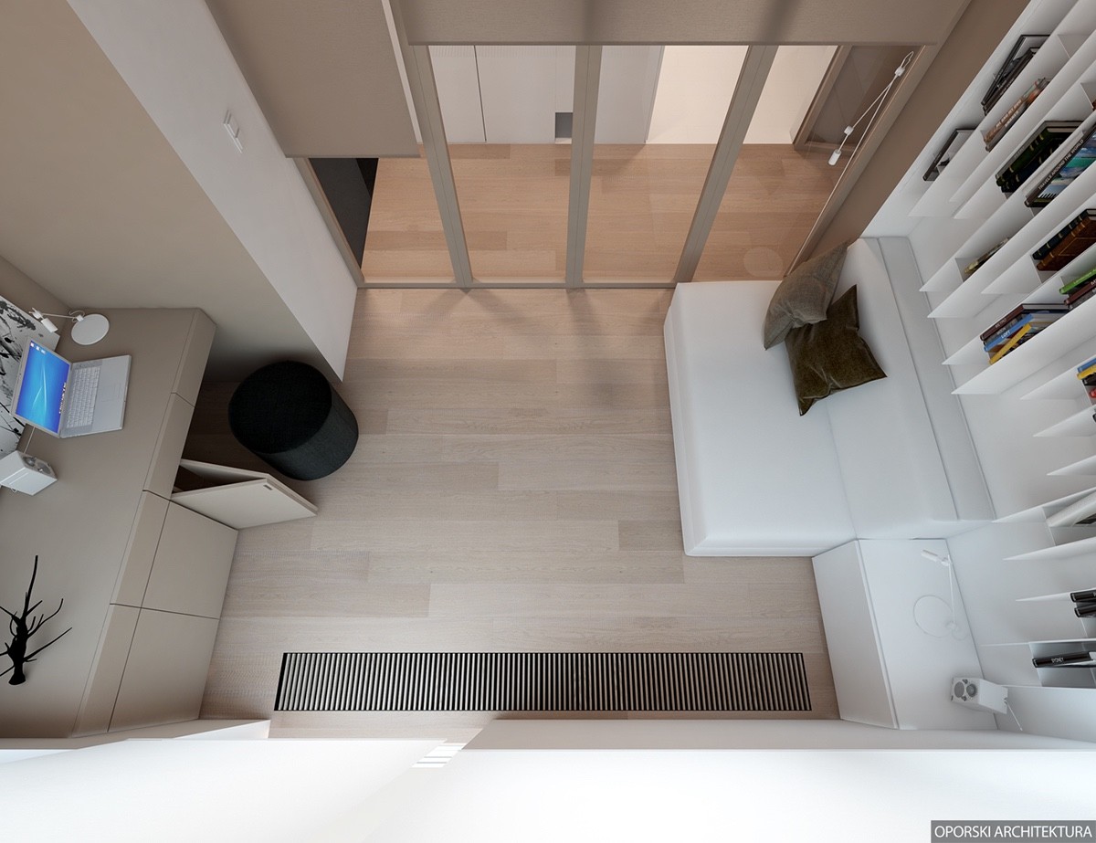
A minimalistic office nearby gives residents a chance to catch up on work with very little distraction.
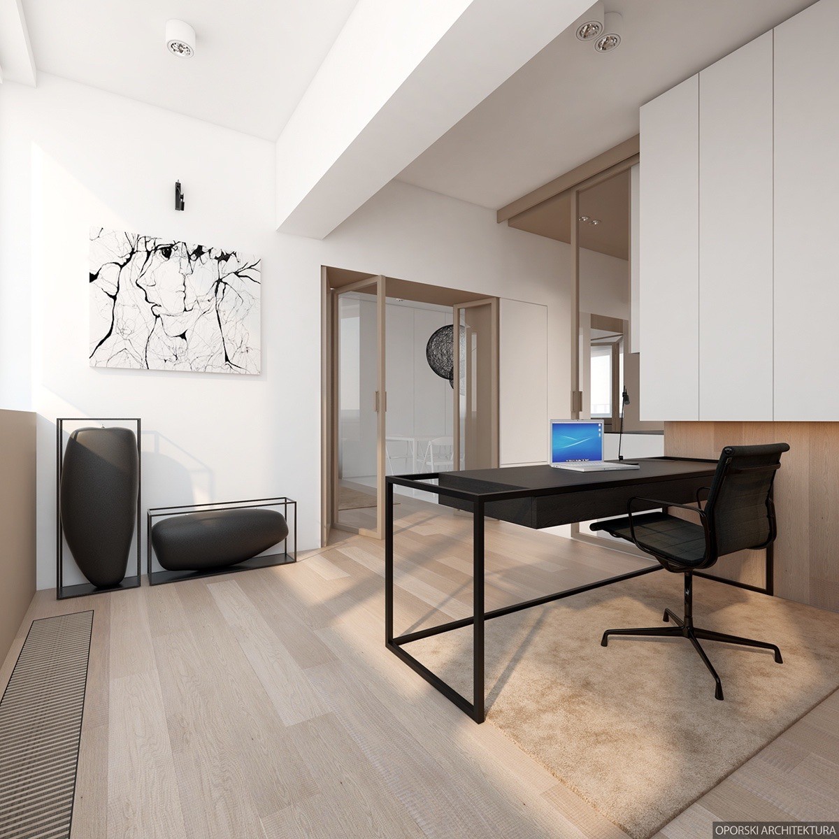
In fact, the only decor includes a simple abstract portrait and a pair of minimalistic wax sculptures.

